brynnaarobinson-blog
Brynna Robinson
A Visual Journal for my Visual Communications class.
20 posts
Don't wanna be here? Send us removal request.
Last Seen Blogs

bvcktome
I don't belong to anyone else.

rocketorca
rocketorca

sixofass
Barrel Boys And Gutter Girls

feluka
في قاعِ كُـلِّ شاهق تُربَتي

lyanna-lynch-blog1
and though she be but little
Text
Week 10, Own Choice, March 19th
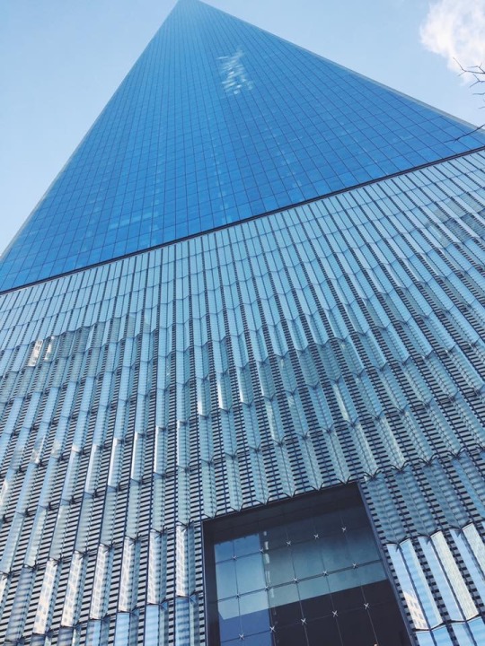
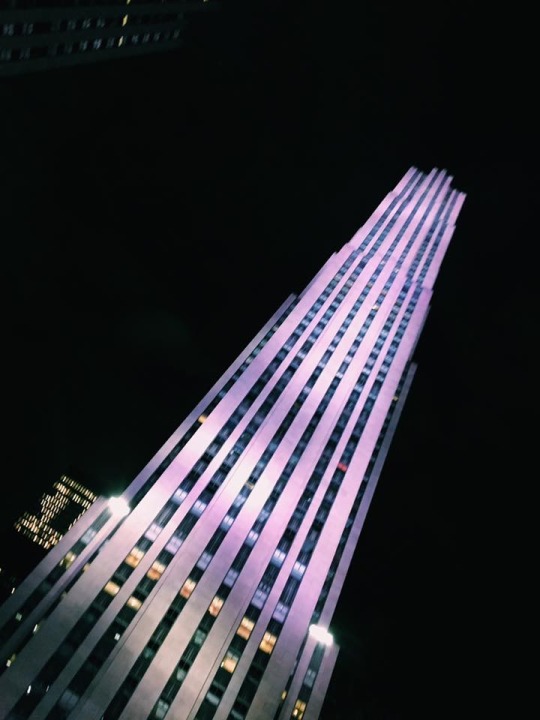
For this own choice I am exploring the different perspectives.
I still can not belive that our camera can take photos of an object and can see it from a completley different perspective then our very eyes.
The benefit of using a camera to capture something is that we can maniplulate the view.
While in New York I took these two photographs with my iPhone. I manipulated the photos by taking the picture at a different angle. I crouched down and pointed my iPhone 6 up at the large towers to create a more dramatic effect and the ilusion that the buildings were even taller than they already are.
I have a leading line in the photograph of the World Trade Centre/ One World Obervatory. The point in the top of the One World Trade Building brings your eye to it. It is the focal point. The perspective in which the photograph was taken tricks your eye into thinking that the building goes on for eternaty.
In real life you see what you see and you can not manipulate your vision. The cool thing about photography is that you can manipuate the real world even by just taking the photo from a different angle.
#photography#one world trade center#manipulation#perspective#iphone#iphonography#one world observatory
0 notes
Text
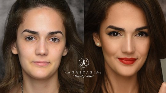
Week 10, Modern Propoganda, March 19th
This photo is taken off the makeup company Anastasia Beverly Hills Instagram page. The company used techniques of propoganda to intice customers to buy thier products.
Techniques of Propoganda used:
Assertion- the assertion technique relies on the premise that humans beleive everything they are told. In the case of this particular photograph, it is relying on the assumption that women look better with makeup.
Card Stacking- this ad also uses the card stacking tecniqu, this technique implies that by using the Anastasia Beverly Hlls makeup brand you too can look 1000x better by using these products. This claim is untrue, but many people in society beleive this. Products also don’t make people look better, it is how the products are applied. Makeup is an art and techniques and applications of makeup enhances a persons natural features, a product does not. The model also has a different hair style and facial expression in the second photo. This difference in hair and facial expression aids in the cardstacking effect. In the after phot, the models hair is more galmourous. In the after photo, the model aslo has a smile and a more confident look. This all enhances her apperance in the second photo.
0 notes
Text
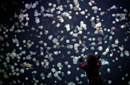
Week 9, Photojournalism, March 12th
Often when people think of photojournalism, they think of harsh, brutal events and photographs that make us feel upset. War photography often comes to mind when talking about photojournalism and is imperative to see to understand what is going on, create solutions and ensure the situation never happens again. War photography is a huge part of the photojournalism business but not the whole business.
This picture was taken by Andy Clark, a British Columbia freelancer who took this picture at the Vancouver Aquarium for Reuters Canada. The Jellyfish are the most photographed creatures at the aquarium according to the Vancouver Aquarium website.
This image makes you smile as you see the little kid mesmerized by all the jellyfish in the aquarium. It is truly an example of feel good photojournalism.
Photojournalism is photographs that tell a story. In this particular photo, the image is telling the story of a little toddler who went to the Jellyfish exhibit at the Vancouver Aquarium and was blown away.
The purpose of this photograph is to encourage other people, in particular, other families to go visit the Vancouver Aquarium. There is also a Jelly Invasion Photo Contest the Vancouver Aquarium holds annually every summer that gives prizes out to people who submit their photographs of the Jellyfish to the contest. Winners get prizes such as scuba diving lesson, a whale watching tour for two and so on. This photo taken by Andy Clark brings more awareness to the Aquarium and their contest.
Source: Andy Clark
https://widerimage.reuters.com/photographer/andy-clark
1 note
·
View note
Text
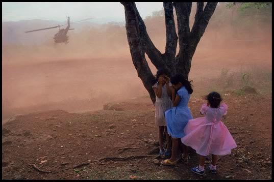
Week 9, James Nachtwey, March 11th
“I have been a witness, and these pictures are my testimony. The events I have recorded should not be forgotten and must not be repeated” -James Nachtwey
This photo was taken by James Nachtwey in El Salvador in 1984. It shows three young girls covering their eyes as an army helicopter is evacuating injured soldiers from the village football field.
From 1980-1992 The Salvadoran Civil War took place. The war was fought between the military-led government of El Salvador and five left-wing guerrilla groups.
According to United Nations reports 75,000 people died during The Salvadoran Civil War, and many were women and children.
This is one of the very few photographs James Nachtwey published that is not black and white. I think the reason he did not choose to not edit this photo in black and white is that this photograph is more effective in color. The color in this shot does not take away or distract from the meaning and message, it simply enhances it. The girls are in bright, colorful dresses. Princess like dresses many little girls here in Canada or in the United States might wear. Bridging the gap between the “us and them” contrast.
The girls James Nachtwey photographed do not deserve to be in such a devastating situation. This picture adequately brings attention to the “deeds of war” as James Natchwey describes.
Source: James Nachtwey
0 notes
Photo
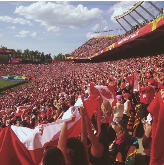
Reading Week Own Choice Post 2, March 10th (Week 7)
I took this photo at the FIFA Women’s World Cup Final that was hosted in Edmonton, Canada in 2015. This was the first time I’ve ever seen a sea of Canadian flags in a crowd before. Everyone was so proud to be Canadian and support their fellow Canadian Women’s Soccer team in their gold medal game.
All phones were pointed at the game and the players, but I thought it was important to take a picture of the crowd because it was unlike anything I’d ever seen before.
It was quite hard to take this photo as the Commonwealth stands were absolutely packed, and you could not move around. I remember having to awkwardly turn my body sideways and reach my phone in front of my sister’s face. I also had difficulty editing this photo. I had no idea how, as red doesn’t like to work with most filters. I ended up settling for a generic VSCO filter before I posted it on my Instagram feed.
The quality of the image is not that spectacular because it was shot on an iPhone 5. I do find this picture to be successful as most Canadians do not witness a sea of people with Canadian flags in their lifetime. Sometimes capturing moments are more important than the quality of framing of a photo.
#ownphoto#women's world cup#canada#photography#womenssoccer#international#internationalwomensday#peoplewhoinspire#makeitcount#nike#adidas#soccer#crowd#canada150
1 note
·
View note
Text
Reading Week Own Choice Post 1, March 6th (Week 7)

I took this photo a few Christmases ago when I was first discovering how to use a manual camera. At my high school, there was a photography class offered that taught students how to use manual cameras. Students were given the opportunity to go out and shoot photos for the majority of the class and then come back for the remaining 20 minutes and quickly upload a blog post on blogspot.ca. Although I only took the photography class in my first year of high school, I still see it as the most beneficial and enjoyable class I attended during my time there. I was so enthralled in taking photographs and getting to learn manual cameras, that I borrowed one over the Christmas holidays and captured every moment. Since then, I still love taking photos and have a deep appreciation for visual communication.
A picture is indeed worth a thousand words.
I’m aware that this photograph has many flaws, but I still am very drawn to it. I love the red bokeh style of the Christmas lights in the background. I am attracted to how the red Christmas lights reflected in the crystal chandelier. I love the elements of the mild and dark contracts in this photograph. To me, this picture is the perfect mix of simpleness elegance. The photo is not overcrowded but still, has appealing aspects.
I took this photo with a shutter speed of 1/50, an ISO of 100, and an aperture of f/3.5.
Source: Brynna Robinson
1 note
·
View note
Photo
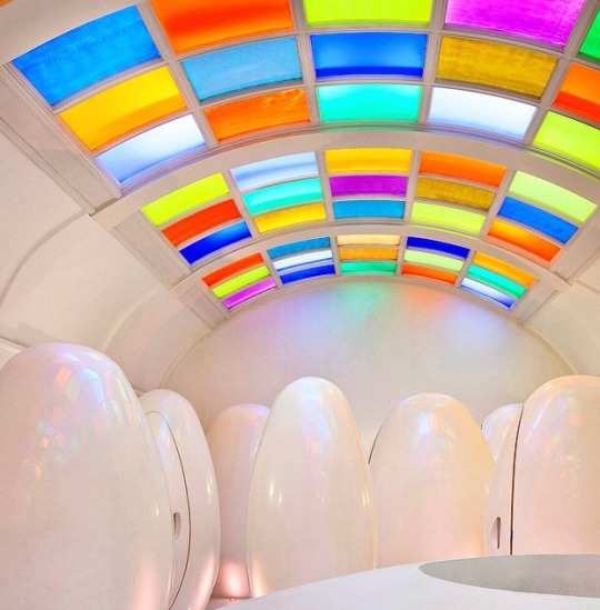
Week 8, Own Choice, March 5th
I love seeing touristy locations while visiting places I have never been before, but I also love to get a taste of what the locals like to do as well. I researched for months on end of what to do in London, England for my short 4-day experience there last summer. A humongous city and so much to do, but only 4 days came down to carefully picking and choosing places to go see. One of the places I went to was Sketch, a tea house in London comprised of several theme rooms and a photogenic pod bathroom pictured above. The bathroom is often photographed and posted on social media, but what surprised me is how the bathroom actually looks in real life. The white pods and the white walls in real life have more of a pinky tone to them as the futuristic ceiling shines down. Since the light panels are colored, there isn’t exactly bright light inside the room. It’s more of a warm lighting. People achieve the classic white pods and white ceilings by whitening them on various photo editing apps and softwares. It’s crazy to think how many ordinary citizens use photo editing tools on pictures they uploaded on social media. The real life perspective of a famously photographed location has now become less aesthetically pleasing than those edited and posted on social media.
Source:
@sketchlondon instagram
1 note
·
View note
Text
Week 8, Photoshop, February 28th

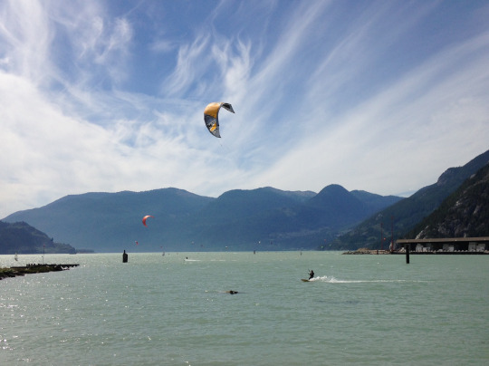
After looking at the Wind Surfer picture constructively, I found it to be too crowded. I started with the healing brush, taking out any points on the water that were distracting to the eye. In particular, I found the black rock in the water that was on the left side of the image to be the most hideous, so I removed it by using the healing brush. I then moved to the island that was on the left side of the image and took the healing tool to remove it and any objects that were behind it. I then wanted the focus to be primarily on the windsurfer with the largest and most colorful sail. I then decided the best way to becloud the view, was to remove all other surfers and their sails from the photograph. I achieved this by using the healing brush as well. I then decided to lighten up the waves generated by the windsurfer, to make this I used the dodge tool. I then used the dodge tool to create a fade in the water. I started out on the left side of the water and used the tool in the left side triangle to create the effect of light shining on the water on the left side. I then used the sharpening tool to sharpen the wind sail and the surfer to captivate even greater attention in the photo. I then added some contrast to the picture, and increased the hue of the cyan color, making the water and location to appear more tropical and appealing. I then pressed the Posterize adjustment, and it made the photograph seem more abstract, as the sky changed to a more dramatic look. I do not have a lot of experience using Photoshop and found editing this photo to be quite challenging as I had ideas of how I could improve the picture but did not have an idea of how to execute that idea. For example, I would have liked to change the sky to a sunset as I feel like the photo would have become one with more purpose and beauty. I would have also wanted to increase the surfer's size and add color to him as I found him to be quite annoying as a tiny spec. I also would have liked to change the size of the wind sail to increase the focal point of the photo. With the limited time and experience to accomplish this assignment, I was quite impressed with myself.
Below is a before and after comparison:
Before
After
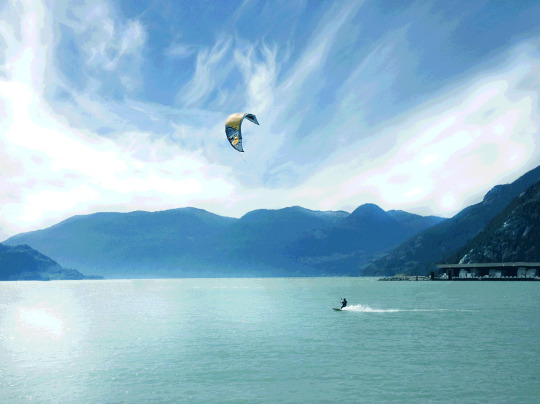
Source:
Photographer: Roberta Laurie
0 notes
Text
Week 6, Own Choice, February 14th
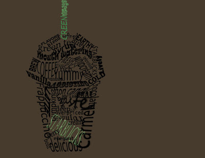
I’ll be the first to say that this is an example of ineffective typography. I have to admit I am the producer of this horrendous creation. I played around with photoshop trying to arrange certain words that are associated with the company Starbucks and their infamous frappuccinos. The words that had come up with were straightforward and unmeaningful such as yummy, caramel and brew.
One of the reasons this typography is unappealing to the eye is the green-brown background, I would have to argue that it might be the worst color ever created. The black wording fades easily into the dark background and does not stand out. The font of all the words arranged in the frappuccino shape are all too squishy and would have looked better if all the fonts were consistent and more readable.
The three words in the green are unsuccessful in portraying a compelling message, as the font and color of the wording are not consistent with the well-known brand. The only thing I’m not ashamed of in the efforts of this creation is the shape the typography words created. I do have to say the outline is at least recognizable and I can at least be proud of that.
Sometimes we fail.
Source: Brynna Robinson
0 notes
Text
Week Six, Typography, February 14th
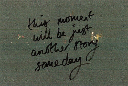
This is handwritten typography, and I’m probably most in love with this kind. To me, handwritten typography is the type that conveys the most personality and the most uniqueness. No two people have the exact same writing. Besides school assignments and school projects, if you are writing something down by hand it is important to you. Writing in a card for someone you care about or writing down an important thing for you to remember. When you are handwriting something, it has to mean to you and purpose.
In the example, I chose as an efficient use of typography is the message “this moment will be just another story someday.” I see this same post posted on various social media sites when someone has accomplished a milestone such as graduation or a vacation. The message is meaningful and resonates with people who have just accomplished or had a good experience of some sort. The handwritten Sharpie words resonate with viewers more because of the style of typography that was chosen. Since the message is handwritten and clearly done in sharpie viewers are able to relate more to the message because it comes across as human.
Source:
http://thegoodvybe.com/post/156898879765
0 notes
Text
Week five, Own Choice, February 11th
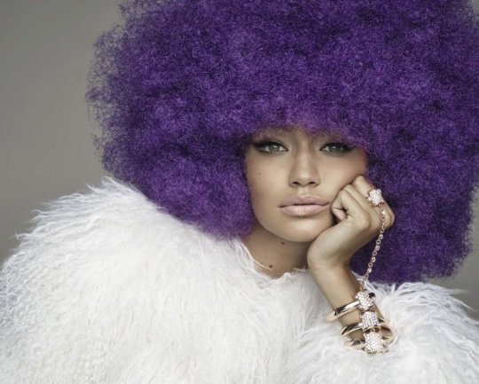
Vogue and the model Gigi Hadid have received significant backlash for this shoot recently. People are furious because Gigi is photographed wearing different colored afro’s to get the desired look. People are questioning if this was the look Vogue Italy had wanted, why didn't they just hire a black model in the first place?
What made people even more furious than the wig, was that Gigi is very tanned in this photo. She normally has very light white skin and just embraces it in her shoots. This time, she was photographed in a look that was not ordinary or associated with her.
People are upset that Vogue considers putting a wig on Gigi becomes “fashionable” “beautiful” “stunning” when ordinary African Americans are constantly being told in the media that their hair isn’t.
This is an issue that is very present in the pop culture industry. Different minority group characters are often cast by actors who do not have any association with that minority group. Many fans question why an actress or actor who is associated with the minority group isn't cast, to begin with.
Source: Vogue Italia
Photographer Steven Meisel
http://www.vogue.it/en/fashion/cover-fashion-stories/2015/11/10/gigi-hadid-the-power-of-personality-by-steven-meisel/
0 notes
Text
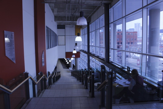
Week Five, Life at MacEwan, February 12th
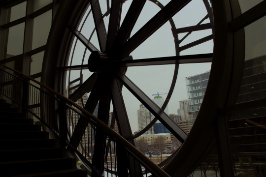

Welcome to the life of a MacEwan University student.
The first photo I chose was a picture of the clock tower in the library. I think this is the most iconic spot in the whole university as everyone knows where it is located and it gives the best curb appeal from outside. I’m a big fan of the aesthetic of the clock tower, I think it’s one of the things that makes MacEwan University unique, and it lets a lot of light in inside the library.
The second photo I chose was the staircase in building 9, as this is one of my favorite spots to study as I love all the natural light the big windows let in. I also love the atmosphere of this building. It's a very inviting space, people can discuss without getting death stares like in the library.
The third photo I took was a picture of a MacBook against the concrete wall in building 9. What amazes me is how my parents both went to university without the use of a laptop, today that would be impossible. Millennials or people who are in university at MacEwan at this time, really immensely on their laptops and devices. Without it, we wouldn't be able to get a lot of assignments done efficiently or effectively.
Source: All photos taken by me
0 notes
Photo
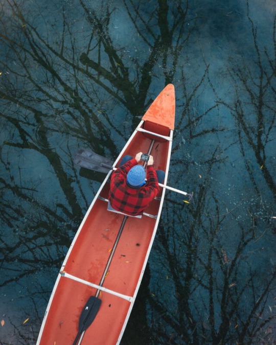
Week Four, Own Choice, February 5th
“And into the forest, I go, to lose my mind and find my soul”-unknown
This photo amazes me. I've always been a big fan of reflections on water as I find it calming and alluring. However, I've never seen a reflection on water from a bird's eye view angle. The perspective on this shot I think brings a lot of character and aids your imagination into picturing yourself on that canoe. This just goes to show how perspective can completely change how you think, feel and react to visual communication. If this photograph were taken from an average angle (i.e., level with the person on the canoe), it wouldn't have been as captivating and unique.
The bright pop of orange on the boat works perfectly as it brings a lively vibe to an otherwise dark and eerie background. This photo screams whimsical to me; the combination of the reflection and the darkness of the water reminds me of the Snow White and the Seven Dwarfs enchanted scenery. This photo also makes me reminisce on past adventures I've had canoeing on my grandparent's lake in the summer growing up. The photo evokes memories of smelling the crisp mountain air, taking the time to clear your mind and enjoying a much needed get away.
Source:
Photographer: Morgan Phillips
http://www.mpphotoblog.com/
@morgan-phillips
#Morgan Phillips#canoe#crisp air#getaway#reflection#enchanted#scenery#goodvibes#aventure#photography#morganphillips#morganphillipsphotography
0 notes
Photo
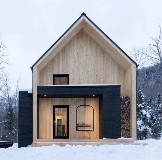
Week Four, Own Choice, February 5th
Beautiful things don't ask for attention.
This cabin is simplistic yet beautiful. I have a love for neutral colors; colors that don't scream for attention yet our eyes often find simple color pallets the nicest. The use of the contrast of the black accents with the light wood and pure white snow draws your attention. The different textures in this photo are also very visually appealing to me. You can see the horizontal lines found in the black beams, and the vertical wood pattern of the light wood. The stacked pile of logs to the right also captivates our attention as it also adds texture and depth to the photo. The outline of the glass door and the window draws attention to our view of the inside of the cabin, while also allowing our minds to curate what might be inside. The two pot lights on the black beam are evenly spaced and add a beautiful symmetry to the photo of the cabin. In this picture, we can see the background of the trees, but they are blurred. This is a nice effect as it created, even more, depth to the picture and allows us to focus on the main subject in this photograph, the cabin. The use of different shapes in this image also captivates my attention. The triangular roof with the straight across thick beams and the round outline of the swing add uniqueness and character to the picture and the cabin. The hazy sky in the picture mutes the background and allows viewers of this photograph to be captivated by the cabin as no competing brightness and contrast are going on anywhere else.
Source: @mslovejoy
1 note
·
View note
Text
Week Three, Ineffective Advertising, January 29th

In November 2016, Starbucks released this photo of the new winter cups. People were quick to take to Twitter to show their disapproval. Loyal Starbucks customers were expecting the Starbucks classic red Christmas cups but instead saw this unappealing green exterior with a mosaic of cartoon characters covering the entirety of the mug.
Customers did not like the marketing of the cups as it did not have the Starbucks logo present anywhere on the coffee cup. The missing logo played a huge role in the cause of the Twitter outrage.
The dark green color also made the commercialization of the cup ineffective. People got so used to the red Christmas cups that the change in color was not well liked. The mosaic was also covered in green which made the cartoons look even more unattractive and scary. A week later Starbucks released their classic red Christmas cups, and this ugly green one was gone and forgotten.
Source:
https://twitter.com/Starbucksnews/status/793348449869504512?ref_src=twsrc%5Etfw
Artist of the Cup: Shogo Ota
https://www.tiremanstudio.com/starbucks
Perez Hilton’s post on the ugly holiday cup:
http://perezhilton.com/2016-11-01-starbucks-holiday-cup-2016-green-people/?from=post
0 notes
Text
Week Three, Effective Advertising, January 28th
youtube
Casey Neistat a New York videographer was hired by Nike to create an ad for their product the FuelBand, fitness tracker. Nike gave him a budget to create a film, but Neistat spent it on traveling the world while he shot this video.
The FuelBand packaging was the source of the inspiration for the content of this video. “Life’s a sport. Make it count.” was on the side of the box.
The video was shot in a vlog style, making viewers able to relate more to Neistat and the product. This advertising video was compelling as it was a style that had never been done before and had a long lasting effect on viewers. The spontaneous and high-spirited video inspired audiences. People wanted to travel and make their life “count” as well.
The beautiful landscapes and inspiring quotes were just a few reasons why this video went viral back in 2012 and has more than 24 million views on YouTube today.
Neistat took a big risk in making this video. He pushed the boundaries. Pushing the boundaries and stepping out of the box is where excellence is created. This video is an example of an excellent and efficient ad.
Source: https://www.youtube.com/user/caseyneistat
0 notes
Text
Week 2, Episteme, January 22nd
Episteme is “a system of understanding or a body of ideas which give shape to the knowledge of that time.”
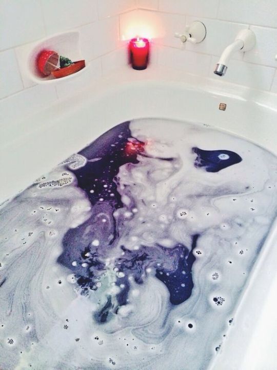
In the last few years, it has become very common to see pictures of bath bombs posted on social media. The phenomenon is a modern episteme.
The photos and videos of bath bombs that can be found on every social media platform provide insight into what is important to people in this modern age. People of this modern era are obsessed with visuals. We love things that are aesthetically pleasing and things we can post on our social medias.
Something so simple and ordinary such as taking a bath has become romanticized. Different bath bombs provide different outcomes of the visual result. The image above is a bath bomb that results in a purple galaxy design. The contrast of the white tub with the dark purple bomb gives our eyes the light and dark distinction we are fond of. The pop of added reddish pink color provides extra visual interest in the photo.
The reflection of the candle in the water of the bathtub increases the quality of the picture as we are able to see that the water is still water. These pictures of bath bombs often remind me of Vincent Van Gogh’s “Starry Night” painting. The colorful swirly design in the water resembles the colorful swirly design in the sky of the painting.
Photograph was taken by Michelle K. on Tumblr: http://fromtwoplanetsaway.tumblr.com/post/78619171251/2401-magical-baths-courtesy-of-lushs-shoot-for
Cosmo Article “The Real Reason People are so obsessed with Lush.”
http://www.cosmopolitan.com/style-beauty/a61890/lush-cosmetics-popularity/
0 notes