
willmoyer-blog
willmoyer
design, philosophy, photography, bad jokes
133 posts
Don't wanna be here? Send us removal request.
Last Seen Blogs

audie-tronsportback
Audi E-Tron Sportback

vaelcus
don't mind me just chillin' through

donnyd61
Untitled
vaelcus
don't mind me just chillin' through

octopocalyptic
Octopocalypse
Photo


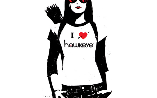


Fans of Hawkeye, get your hi-res David Aja wallpapers here:
http://willmoyer.com/hawkeye-wallpapers/
2 notes
·
View notes
Link
There is an eternal tension when adapting a work from one medium to another. How true do you stay to the source? How much do you embrace the qualities of the new medium?
The Hunger Games is a decent film, for many reasons, but my highest praise for it is just how well it handled this tension. The film is true to the source material, in nearly every aspect, yet at the same time it pushes the story firmly into the new medium. And it does it extremely well.
Read the full review.
2 notes
·
View notes
Quote
A master in the art of living draws no sharp distinction between his work and his play; his labor and his leisure; his mind and his body; his education and his recreation. He hardly knows which is which. He simply pursues his vision of excellence through whatever he is doing, and leaves others to determine whether he is working or playing. To himself, he always appears to be doing both.
L.P. Jack from his Education Through Recreation, published in 1932.
Liz sent this quote to me this morning. I won’t pretend to be a “master in the art of living” (still too clumsy at life, still finding my legs), but work looks ever more like play and play more like work. The similarities create all sorts of new complications involving the pursuit of uncomplicated pleasure, but I can not pretend for one moment that I do not love having the objects of my affection so close and accessible. We should all be so fortunate. Happy Valentine’s Day, everyone.
222 notes
·
View notes
Text
NochNoch.com
 Recently, I was approached to do a redesign of [NochNoch.com](http://nochnoch.com/). The site is a self-help, personal development blog written by a woman named Enoch Li. Unlike other similar self-help blogs, Enoch doesn't write "how-to" advice. Her content reads more like a personal letter, or journal entry, describing her experiences and what she's learned. It was this aspect of her site that I decided the new design should showcase. It sounds like a no-brainer, but the more experience I gain as a designer, the more I realize how important content-focused design is. It's easy to fill a page with decorations and graphics and make it "pop." It's much harder to cut down the distractions and fluff and really build the site from the [content out](http://www.markboulton.co.uk/journal/comments/a-richer-canvas). I wanted NochNoch.com to embody that feeling of a personal letter. I wanted readers to enjoy handcrafted text that was set beautifully following typographic principles. Read the page "[My Story](http://nochnoch.com/about-blog/)" for the perfect example of what I was trying to capture. And hopefully did. Trying to embody a handwritten letter or journal entry is great but this is the web, not a piece of paper. NochNoch.com has readers all over the world reading in multiple languages and on multiple devices. Prior to the redesign, Enoch was maintaining separate sites for Chinese and English, each with its own mobile version being served to small-screen users. The new design integrates this all into one. Traditional Chinese and English are now on one site and the appropriate language is automatically served based on a user's computer settings (with the option to change by clicking a button in the footer). Furthermore, the mobile versions have been abandoned in favor of a fully responsive design. Try resizing the browser window and you'll experience the site shrink, the font size adjust, and eventually the columns rearrange. This adaptive design is an elegant solution that allows every user to have a similiar experience whether they're on a big desktop monitor or tiny iPhone screen. And the experience is really what is important here. From the carefully set text, to the colors, to the soft transitions when you hover over links, every design decision was made to capture and sustain the personality of the site. It's for these reasons that this has been one of my favorite blog redesigns thus far. It was great working with Enoch. I'm grateful that she allowed me to experiment and the push the boundaries rather than settling for a "typical blog design." I think it paid off.
8 notes
·
View notes
Quote
Neoteny, one of my favorite words, means the retention of childlike attributions in adulthood. Childlike attributes include learning, idealism, experimentation, wonder, and creativity. In our rapidly changing world, not only do we need to continue to behave more like children - we can teach our children to retain those attributes that will allow them to be the world-changing, innovative adults who will help us reinvent the future.
Joi Ito “The Internet, Innovation, and Learning”
12 notes
·
View notes
Note
Question: Are you a one- or two-space after the period kinda guy? I've always been a two-fer but only because that's what habit they forced on me as a kid. Now I'm hearing and agreeing with arguments for the one-er, but its a tough habit to break. Thoughts?
Here's a two part nerdy explanation, just because I love talking about this sort of thing.**Semantic Argument**Spacing between words or sentences or paragraphs or whatever is a presentational decision. It should be kept separate from content.When you're typing and you hit the spacebar, you're adding in some content. A space counts as content. The size of that space, though, is a design decision. Just like the size of a letter is a design decision. By entering two spaces, you're actually adding more content with the aim of changing the presentation.Obviously, this single instance isn't that big of a deal. But the issue of separation of content and style is a big one on the web (and digital communication) and it's a good habit to foster.Even in something like Word, it's better to rely on its styling presets, rather than add content to your text to try to adjust the look.For example, changing the setting to increase the size between lines is far more preferable than manually adding a hard return at the end of every line. Why? Because the hard return becomes part of the content. This makes it a bitch to change it in the future. If you want the presentation to be different, you end up having to go in and edit out a bunch of content. It makes the content less transferable too. Who knows how it'll look when you paste it into an email?The same goes for spacing between letters, words, and sentences. Leave the style decisions separate from the content. Let a designer make them, or choose from software presets, or rely on the spacing defaults included in digital fonts. Don't muck up your beautifully written content.**Typographic Argument**From a typographic standpoint, extra space after a full stop is usually disruptive to the flow of text. A lot of the readability of text relies on consistent rhythm and flow, both vertically and horizontally.Even if readers aren't conscious of this, it makes text less enjoyable to read and causes more eye strain when things disrupt this flow.When you set an optimal measure (typically a paragraph width of 45 to 75 characters) the text naturally fills it in with an appropriate rhythm. A well designed font will have the proper sizes and spaces so that the text will look beautiful and be easy to read. Extra spacing between words – especially if it isn't consistent, like only adding in extra spacing after periods – disrupts this flow. It makes text more jarring and clunky and harder for a person's eyes to follow.Typographers like to gauge the “color” of a body of text. If you look at text block from far away, or while squinting, well set text will kind of blur into a solid gray block with even “color” throughout. Random extra spacing disrupts this nice even color, causing ugly gaps that reader's eyes will stumble over.So there you have it. Hope this helps explain things.
1 note
·
View note
Photo
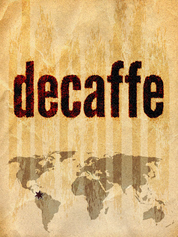
Another coffee card I designed for Rickshaw Roasters. These guys have the best coffee in Beijing. And they're about to launch their new website and start using the new product designs I created for them.
If you're in Beijing, be sure to stop by the Roastery or a Flatwhite cafe. Try to collect all the coffee cards!
Edit: By the way, in case you're wondering: This design is trying to say “you can still be intense even without caffeine.” :P
4 notes
·
View notes
Note
Hi Will ... I read your post about acquiring the MacBook Air just prior to purchasing one myself. I share a lot of the same observations, but I am wondering about how you feel now about gestures. When I read your comments I was sure I would have the same experience, but several weeks I have decided that I really like gestures and find them incredibly useful. I've also found the speakers surprisingly good for such a compact machine.
Thanks for the follow up. I'll use this is an answer as an addendum to my [MacBook Air review](http://blog.willmoyer.com/post/10239133254/so-i-bought-a-macbook-air).My feelings about the gestures have changed since I wrote the review, but not significantly. I still hate all the pinching and spreading gestures. They feel unnatural and awkward to me. Even the simple two finger zoom pinching is difficult for me to do comfortably. It just takes me out of my flow when I have to stop, pick up my hand, and perform a gesture.I do use the scrolling and swiping between desktop gestures all the time. It's totally unconscious for me at this point. Unless I'm writing or coding – in which case I still use CTRL+Left or Right – I'm always swiping between desktops at rapid speed using the trackpad.You're right about the speakers. They are damn good for being like half-an-inch thick and way less tinny than you'd expect. When I'm listening to music, though, I still prefer my Sennheiser HD-280 Pros. (For 80 bucks, they're the best value headphones… like ever. I've had mine for over three years.)One significant thing I'd like to add, is that my comment about the arrow keys feeling chintzy is absolutely the case. They suck. They are unbelievably bad. They are absolutely the worst arrow keys on any keyboard I've ever used. No hyperbole. Apple needs to fix these in future models. I've already had them replaced once. You know everything great I said about the rest of the machine? That tight, refined, well-crafted feeling. Solid construction and build. The arrow keys are the opposite of that. And it's a shame.Maybe it's just my model, and I got unlucky. But even when I visit the Apple store the keys feel chintzy. I don't know if other have experienced them breaking like mine though. How do yours feel?It doesn't make me regret my purchase, at all, the Air is a fantastic machine. But if there is anything unequivocally negative about it, it's these piece of shit arrow keys.Anyway, thanks a lot for your response. I'm glad I helped you make your decision!
0 notes
Photo
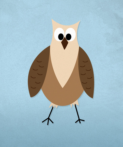
Happy Thanksgiving! (Technically, this is an owl. A great-horned one, I think. I illustrated it for a friend's blog. Enjoy!)
7 notes
·
View notes

Link
Merlin Mann on why Instapaper, and reading, are fantastic things. Here are my favorite parts:
The point is that my life always gets better when I decide to read things–and then actually read those things I decided to read. This is not a trivial point.
We’re all busy, and we’re all bombarded with 10,000 potential calls on our attention every day. Some days, we handle that better than others. Some days, we don’t handle it all.
All I know, is that, throughout my life, deciding to read has made that life better.
When you’re in line at the ATM or the professional sporting event, what do you do?
If you’re like a lot of people, you hit your mobile device like a pigeon on a goddamned pellet. Then, you decide what happens.
You can decide to throw birds at pigs. You can decide to check in on which strangers are pretending to like you today. You may even decide to see what you would look like if you were really fat.
Thing is, you could also decide to read. Just for a couple minutes. Maybe more. Maybe less. Who knows. It’s your decision.
0 notes
Text
Chinese R&D
Two friends from Philadelphia recently moved to Beijing, and I was curious to find out if they overpaid for housing. I decided to check The Beijinger for some local prices.
On one of that ads, the agent said to see his blog for more apartment listings. So I open up his NetEase (blog.163.com) page and this is what I see:
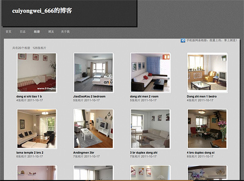
I was shocked to see the similarity between a random Chinese real estate agent’s blog and the Tumblr theme I developed last year. Here is a shot of my theme:
But I thought, Okay, maybe it’s just a coincidence. There’s nothing about my theme that is so original that couldn’t have also been made by somebody else.
I clicked around NetEase and found the actual theme page. It’s called “Studio” and the author’s name is “Bad Song”.
I started checking out some of the theme assets, and sure enough, they’re mine. The background is the exact dimensions and size as mine. Seriously, they’re both 528px by 490px and 58,015 bytes. Exactly the same. No way that’s coincidence.
Anyway, I’m not really angry or anything. I’m more shocked by the randomness of finding a Chinese guy with a blog theme ripped off from me.
But maybe it wasn’t so random, especially since this “Studio” theme has over a hundred thousand users. A hundred thousand users!
I might email this Bad Song fellow and call him out on it. Just to see how he responds.
Anyway, there you have it. This is why everyone picks on Chinese designers for their approach to R&D: research and duplicate.
13 notes
·
View notes
Text
Introducing BaselineMe
[](http://www.baselineme.com) *Web designers, do you lay out your sites using a baseline grid? Do you love the sweet, sweet smell of vertical rhythm in the morning? Do you hate blog posts written to sound like marketing text?* So do I. I also hate having to open Photoshop just to make a one pixel wide image every time I want guides for my baseline grid. That's why I made [BaselineMe](http://www.baselineme.com). BaselineMe is a little experimental web app that generates a vector image to use when establishing a typographic baseline grid. ## How To Use It Type set consistently on a baseline grid creates a beautiful vertical rhythm. Cue [Bringhurst](http://en.wikipedia.org/wiki/Robert_Bringhurst): >Space in typography is like time in music. It is infinitely divisible, but a few proportional intervals can be much more useful than a limitless choice of arbitrary quantities. >The metering of horizontal space is accomplished almost unconsciously in typography. You choose and prepare a font, and you choose a measure (the width of the column). When you set the type, the measure fills with the varied rhythm of repeating letter shapes, which are music to the eye. >Vertical space is metered in a different way. You must choose not only the overall measure – the depth of the column or page – but also a basical rhythmical unit. This unit is the leading, which is the distance from one baseline to the next. When setting text with HTML and CSS, this rhythmical unit is determined by the `line-height` property. If you have a line-height of 24 pixels, you're going to want all vertical measurements to be multiples of 24 pixels. Therefore if you have headings, blockquotes, lists, or even images (including padding and margins) your text always ends up following the same cadence. In order to check the math and ensure that the text is lining up properly, most designers create an image to use as a guide. Typically, this image has a width of 1px and a height of the line-height. Then, they repeat the image vertically on the page using CSS. The declaration looks something like this: `background: url('img/line-height-guide.png') center top repeat;` And the result:  BaselineMe allows you to do the same thing, but you don't have to create the image. You can just use a URL in the CSS declaration. If you have a line-height of 24px, just use this: `background: url('http://www.baselineme.com/24');` What about 16px? Bam: `background: url('http://www.baselineme.com/16');` Easy, peasy, lemon-squeezy. And if you want to save the file for local use, you can paste the URL into your browser. Save the page as an SVG and you're all set. For more details about setting type on a baseline grid, see this [A List Apart](http://www.alistapart.com/articles/settingtypeontheweb) article or this tutorial on [Webdesign Tuts+](http://webdesign.tutsplus.com/articles/design-theory/setting-web-type-to-a-baseline-grid/). ## To Any Programmers Out There BaselineMe is a really simple application. Basically, it's just an SVG file with a little bit of PHP in it to grab the URL. Pretty cool, right? Anyway, I'm sure the are better ways to do it and more options that would be useful to people. If anybody out there is interested in improving BaselineMe, please [email me](mailto:[email protected])!
8 notes
·
View notes
Photo

Taken in southwest Liaoning province on the northern coast of the Bohai Sea.
15 notes
·
View notes
Photo


#[America in Color from 1939-1943](http://extras.denverpost.com/archive/captured.asp) >These images, by photographers of the Farm Security Administration/Office of War Information, are some of the only color photographs taken of the effects of the Depression on America’s rural and small town populations. The photographs are the property of the Library of Congress and were included in a 2006 exhibit Bound for Glory: America in Color.
5 notes
·
View notes
Photo
Great shot.

Taken in a hutong in the Dongcheng district of Beijing
20 notes
·
View notes