
textwrapper
Textwrapper
Type, punctuation, etymology, &c
6 posts
Don't wanna be here? Send us removal request.
Last Seen Blogs

reborn-in-flame
Peaceful Resistance

gloryshielded
When the world fights back, I will raise my SHIELD for you

jackedjacket
Like Fuckin Whatever Man

385bookreviews
385 Tales, 175 Worlds

midiariodecine
Mi Diario de Cine
Photo

“I stept into my Closet, tore off the top of Mr. Caslon’s Specimen, and produced it to him as yours...“
Benjamin Franklin’s waggish defense
of John Baskerville’s type
In 1760, the American printer, Benjamin Franklin wrote to John Baskerville and paid him a visit.
Baskerville’s reputation, and even his eponymous typeface, had been maligned by “gentlemen” who may have been jealous of Baskerville’s talent, nonconformism, and increasing success. Baskerville used excerpts from one of Franklin’s letters as an “unsolicited testimonial“ in advertisements, but typographers will appreciate how clever Franklin was in his support of Baskerville:
“Dear Sir, Let me give you a pleasant Instance of the Prejudice some have entertained against your Work. Soon after I returned, discoursing with a Gentleman concerning the Artists of Birmingham, he said you would be a Means of blinding all the Readers in the Nation; for the Strokes of your Letters, being too thin and narrow, hurt the Eye, and he could never read a Line of them without Pain. I thought, said I, you were going to complain of the Gloss on the Paper, some object to. No, no, says he, I have heard that mentioned; but it is not that—it is in the Form and Cut of the Letters themselves: They have not that natural and easy Proportion between the Height and Thickness of the Stroke which makes the common Printing so much the more comfortable to the Eye.— You see this Gentleman was a Connoisseur. In vain I endeavoured to support your Character against the Charge: He knew what he felt, and could see the Reason of it, and several other Gentlemen among his Friends had made the same Observation, &c.— Yesterday he called to visit me, when, mischievously bent to try his Judgment, I stept into my Closet, tore off the top of Mr. Caslon’s Specimen, and produced it to him as yours brought with me from Birmingham, saying, I had been examining it since he spoke to me, and could not for my Life perceive the Disproportion he mentioned, desiring him to point it out to me. He readily undertook it, and went over the several Founts, showing me every where what he thought Instances of that Disproportion; and declared, that he could not then read the Specimen without feeling very strongly the Pain he had mentioned to me. I spared him that Time the Confusion of being told, that these were the Types he had been reading all his Life with so much Ease to his Eyes; the Types his adored Newton is printed with, on which he has pored not a little; nay, the very Types his own Book is printed with, for he is himself an Author, and yet never discovered this painful Disproportion in them, till he thought they were yours.
I am, &c.”
From John Baskerville of Birmingham, Letter-Founder & Printer by F. E. Pardoe 1975
707.444.2644
1 note
·
View note
Photo
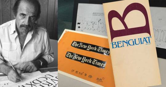
Ed Benguiat (1927-2020)
Ed Benguiat may be best known to the general public for his eponymous typeface, but he designed many typefaces. While working for Photo-Lettering, Inc (known as PLINC), and for ITC (International Typeface Corporation) Benguiat designed Barcelona, Bookman, Caslon No. 224, ITC Century Handtooled, ITC Edwardian Script, Souvenir, Tiffany and other popular faces. He was a teacher and a mentor. He inspired a collection of typefaces by House Industries.
Designer and typographer, David Quay, related this story upon hearing of Benguiat’s passing: Many years ago I designed three titles in a trilogy of novels for Penguin Books. They were novels set in Russia. I had just received the latest U&lc magazine from New York displaying Ed Benguiat’s new typeface ITC Benguiat, it was perfect for the subject. I photostated the alphabet and pasted up the 3 headlines. Penguin gave the ok, then I realized ITC Benguiat was not yet available, U&lc was pre-release publicity! I was stuck, Penguin wanted the artwork very quickly and there was not enough time to hand letter all the long titles or retouch the rather crude photostats! I phoned my friend Tony Di Spigna who worked with Herb Lubalin. He said “I will take care of it.” Four days later by special post, an envelope arrived with 3 photographic prints with the titles perfectly set and ligatured. A note enclosed said, “I am pleased you like the typeface, you are the first to use it, Ed.”
Release announcement for ITC Benguiat in the December 1977 issue of ITC’s U&lc magazine.

1 note
·
View note
Text
Indecorous display

©1982 B. Kliban—Notice that he didn’t use the current popular term “font”
Bernard “Hap” Kliban (1935–1990) offered Barf Bold, a Decorative Typeface in one of his hilarious cartoon collections in the early ’80s. Kliban created the cartoon genre that consisted of a single panel with a droll, third person narration (e.g., “Houdini escaping from New Jersey”), a style which Gary Larson of “The Far Side” later became famous for.
Kliban’s correct use of the term “decorative typeface” (he could have also used “display face”) is especially notable now that most people use the term “font” broadly to mean a printed face, a typographic family, a specific typeface, or (correctly) the licensed software that allows us to reproduce type on our computers.
7 notes
·
View notes
Text
Deciphering Al Jazeera’s logo

Animation created by Jovan Cormac for Wikimedia Commons
Al Jazeera has one of the most recognizable logos in the world. The plucky network began broadcasting in 1996 and has survived US bombings of their bureaus in both Kabul and Baghdad. President George W. Bush even considered bombing Al Jazeera’s headquarters in Qatar, yet Al Jazeera has become a trusted provider of broadcast news worldwide.
The distinctive logo consists of a teardrop-shaped glyph with the words Al Jazeera below in Arabic or English. What non-Arabic speakers might not realize is that the glyph itself also spells out “the Island,” al Jazeera, in Arabic script. It was quickly designed by a Qatari man who entered it in a design contest he heard about on the radio, and it was selected by the Emir of Qatar.
By the way, the al in Al Jazeera is a definite article, which is the source of so many “al” words in Spanish (e.g., alcalde, albóndiga, almohada). Some of these Iberian Arabic words are now common in English and other European languages — almirante (admiral), albacora (albacore), alfalfa, alcohól, albaricoque (apricot), alcachofa (artichoke) algoritmo (algorithm).
0 notes
Text
Epigram, epithet, epigraph, epitaph…

The language quarterly Verbatim once published a mnemonic, in the form of a poem, to help us differentiate between these similar-sounding, but not-to-be-confused words.
Primer by David Galef, Oxford, Mississippi
The epigram’s a pithy saying, Full of paradox and wit.
The epithet’s a brief description. A clever name that scores a hit.
The epigraph’s a type of preface, Like the lead-in to a writ.
The epitaph is seen on tombstones, Related to who’s under it.
All four are commonly confused, But in each usage, three don’t fit.
0 notes
Text
‘Font’ versus ‘typeface’ (there’s a difference)

Still from the documentary “Helvetica,” by Gary Hustwit, ©2007 Swiss Dots Ltd.
Until the late mid 1980s, ‘font’ was a word that one never heard outside of the printing trades. When desktop computing made multiple typefaces available to the general public, ‘font’ entered the vernacular. It now refers to both the typeface—the design and appearance—and to the software file that generates it.
Traditionally, a font was a set of foundry type in a single point size (e.g., Helvetica is a typeface, and 48 point Helvetica Bold is a font). Few now make the distinction. Stephen Coles wrote, “When you talk about how much you like a tune, you don’t say: ‘That’s a great MP3,’ you say, ‘That’s a great song.’ The MP3 is the delivery mechanism, not the creative work, just as in type a font is the delivery mechanism and a typeface is the creative work.”
“Font” versus “Typeface”:
Typeface: “I love the Goudy Old Style.”
Font: “I’m going to install Caslon.”
Etymology:
Fom the French fonte “a casting,” from fondre to “melt” or to “cast.” This makes “font” a cognate of “foundry,” from the French fonderei, the industrial site where metal type was designed and cast.
3 notes
·
View notes