#type.weltkern
Photo

TWK Burns Black WIP together w/ Alberto Malossi 🔥👀
16 notes
·
View notes
Photo
@by_north Rebranding of @helgelandmuseum Helgeland Museum is a regional museum located in the southern part of Nordland, Norway. The museum manages and preserves natural and cultural collections and buildings, including Sami heritage. The museum also communicates and educates about natural and cultural heritage, history and current issues through its exhibitions and events, in its own venues and other locations.Helgeland Museum was in need of a fresh and modern visual identity that would both honor their rich history and cultural heritage and appeal to a modern audience. Working closely with the museum, we crafted a flexible branding system that seamlessly blends tradition with innovation.The new identity is anchored by the redesigned version of the ancient rock carving “Skiløperen” from Tro in Nordland. This powerful symbol represents the museum’s mission to bring the past to life and connect it with the present and future. The visual identity seamlessly combines the shapes and lines of the carving with a clean and minimalist design, capturing the museum’s unique blend of nature and culture.The system also allows for multiple departments and collections within the museum to be represented in a cohesive way. By making the content the hero and positioning the museum as a modern and dynamic sender, we were able to achieve the museum’s goal of modernizing their brand and communication. Images: © Helgeland museum © Levanger fotomuseum Font in use: TWK Everett by @type.weltkern #by_north #helgelandmuseum #museum #exhibition #art #history #branding #brandidentity #graphicdesign #logo #visualidentity #worldbranddesign #inspofinds #motiongraphics #designpiration #designfeed #madesomewhere #visualjurnal #projectmono #designsystem #underconsideration #brandingdesigner #identitydesign #thebrandingcollective #logodesign #logodesigner #logotype #logoanimation #theddod #collectgraphics https://www.instagram.com/p/Co2EtGByRX_/?igshid=NGJjMDIxMWI=
#by_north#helgelandmuseum#museum#exhibition#art#history#branding#brandidentity#graphicdesign#logo#visualidentity#worldbranddesign#inspofinds#motiongraphics#designpiration#designfeed#madesomewhere#visualjurnal#projectmono#designsystem#underconsideration#brandingdesigner#identitydesign#thebrandingcollective#logodesign#logodesigner#logotype#logoanimation#theddod#collectgraphics
2 notes
·
View notes
Text
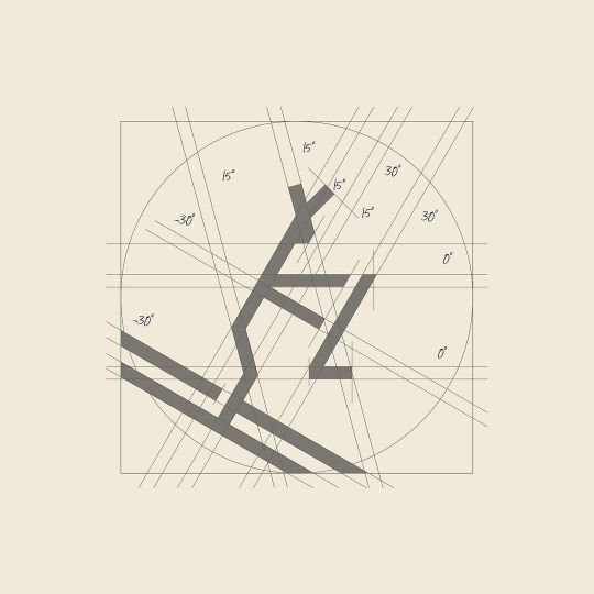
Week 2: Spectral Further Research
Spectral in Use
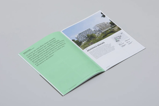
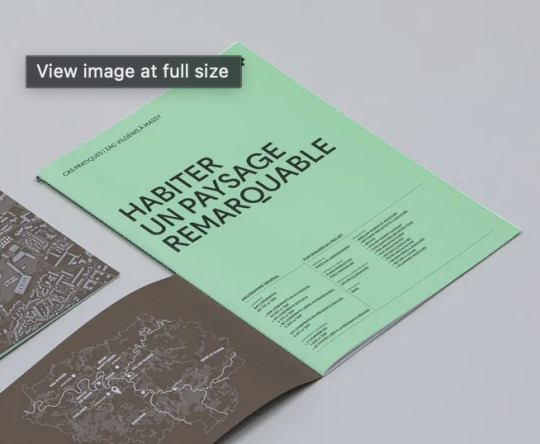
Habiter Un Paysage Remarquable – Canopée
Canopée is the creation of a new neighborhood in the former park of the Château de Vilgénis in Massy: a project that takes advantage of the landscape qualities of the site as much as it preserves them. The project is expected to be completed in 2024. Vinci Immobilier wanted to share this way of building a city by closely blending the built and the living. The result? A 24-page booklet that sheds educational light on the choices made, the first opus in the Cas Pratiques collection.
Designed by Travaux-Pratiques, the booklet is designed uses a combination of NewPanam Skyline for titles and captions and Spectral for text content.
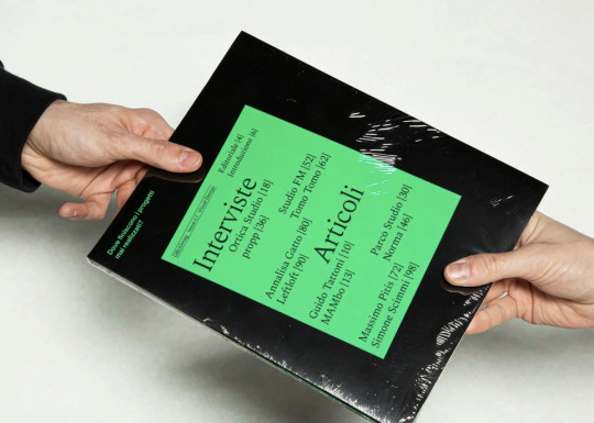
Oblio mag
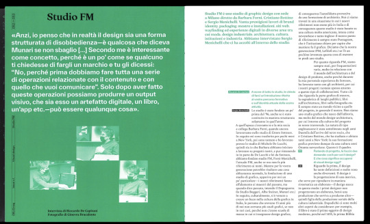
Oblio is a magazine that describes the world of visual design from an unusual point of view: the projects that were never realized due to failure, rejection, lack of time or money. We interviewed seven studios and three designers, asking them about the meaning of visual design, their vision related to failure and the future evolution of visual designers. During the meetings, each of them showed us projects that were never completed or realized. In conclusion they provided us useful advice aimed at those who, like us, have yet to take their first steps in this world.
The two main typefaces used in this edition are Spectral (Production Type) and Everett (Type.weltkern). Selected headlines use Ortica Bold (Colllettivo).
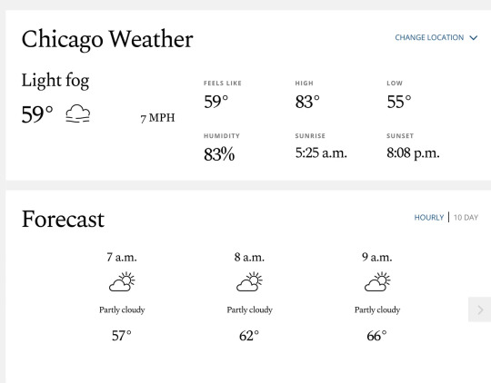
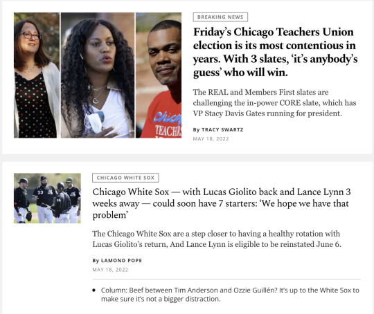
Chicago Tribune website
Founded in 1847, the Chicago Tribune is the daily newspaper for Chicago and the Great Lakes region. But it draws way beyond: it ranks sixth with regards to its nationwide circulation across the United States.
The newspaper’s website was redesigned in 2022 and since then displays a mix of three typefaces. Matthew Carter’s Georgia is the roman in use for reading texts. It is paired with Steve Matteson’s Open Sans for categories, dates, author names, and other navigational items and meta data.
What adds a spark of flavor and finesse to the site is Spectral by Production Type. This serif family is being used for headlines, lead-ins and snippets, mainly in three of its seven weights (Regular, Medium Bold). It was designed by Jean-Baptiste Levée, specifically with the use for Google Docs and Sheets in mind. As such, it’s a formidable choice for on-screen reading. Since Spectral was originally designed for medium to small text sizes, it is relatively loosely spaced. The designers of the Chicago Tribune reduced the letter spacing via CSS, finetuning the balance of black and white so that it is appropriate again for their use in slightly larger sizes.
0 notes
Photo
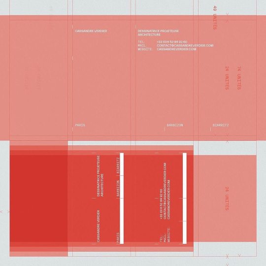
By @integraltypography At the end of last year we designed a visual system for @cassandre_verdier Like the architect who invests the space in his own way, identity and content can be arranged in different formats that follow the same grid. Graphic design: @endvc Blind embossing + black hot foil stamping on Inapa Pur Coton. Using Everett by @nolan_paparelli – @type.weltkern — • • • • • #design#graphicdesign #graphicindex #typedesign #typebeats #visualgraphic #projectmo #collectgraphics #darksideoftypography #digitalarchive #curatory #designsystem #digitaldesign #designinspiration #designeveryday #printdesign https://www.instagram.com/p/CeRY5XHDI01/?igshid=NGJjMDIxMWI=
#design#graphicdesign#graphicindex#typedesign#typebeats#visualgraphic#projectmo#collectgraphics#darksideoftypography#digitalarchive#curatory#designsystem#digitaldesign#designinspiration#designeveryday#printdesign
0 notes
Photo


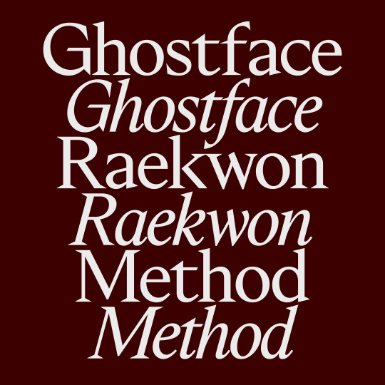
TWK Ghost out now on TYPE.WELTKERN®! 🎊
64 notes
·
View notes
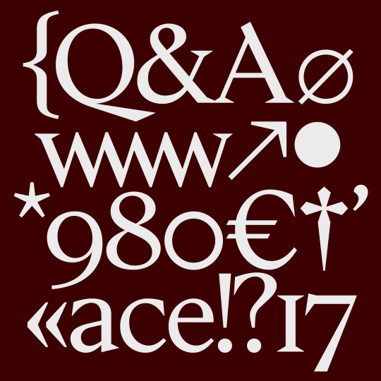
Photo
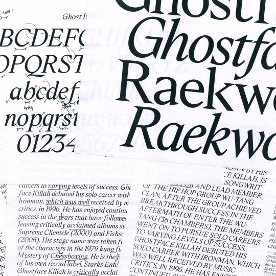
TWK GHOST WIP (TBA, 2022)
45 notes
·
View notes
Photo
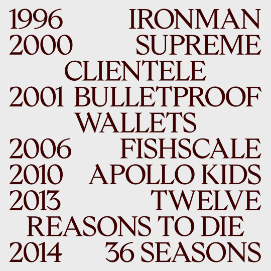
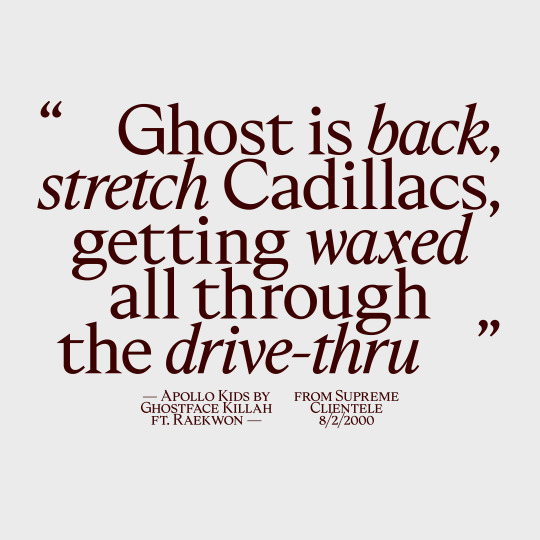

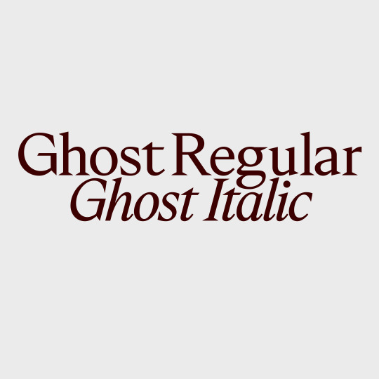
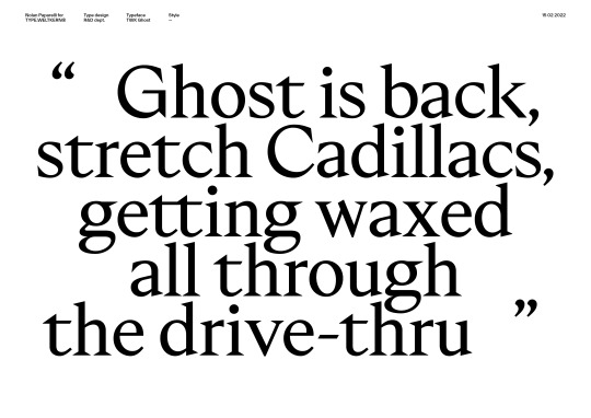
Upcoming: TWK Ghost! 👻 Long time in the making, Ghost will soon start its journey into the wild with two styles: Regular and Italic! I’ve been working intensively on these two cuts the last few months and I can’t wait to finally release this one, as usual over TYPE.WELTKERN®. More info soon!
#typeweltkern#twkghost#type#typedesign#typeface#typography#serif#sharp#regular#italic#ghostface#wutang#ghost
350 notes
·
View notes
Last Seen Blogs

xiiv-ai-blog
Valentine-Ai

cinemanuelino
MANUEL.MORETTI.

iceicekatie-blog1
Ferris Bueller's Year Off

amp-lifes
amp lifes

writewrong
Shreyas Waghmare