2022504jessicapressnell
2022_504_JessicaPressnell
106 posts
Don't wanna be here? Send us removal request.
Last Seen Blogs
alunasky-blog
Alunasky


aftonroboticz
woohoo song

accidentallydomesticated
easily distracted
gieyandme
Gieyandme
Video
Final MP4 04
My last animation! I am so pleased to be finished with these and reflect on how far I have come in the last 8 weeks.
0 notes
Video
Final MP4 03
This is my final video timeline animation. I am quite pleased with this one as it reflects the most modernity out of all of my animations.
0 notes
Text
Rationale
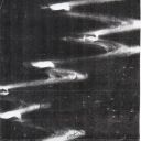
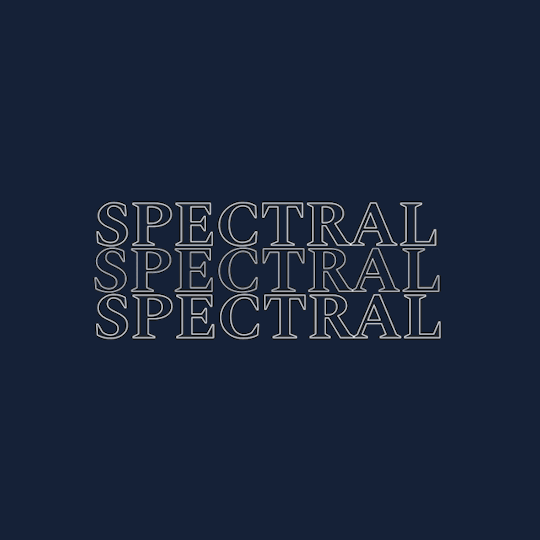
My “Type in Motion” project investigates Spectral as a versatile typeface, with my animations depiciting the typeface’s modernity and my initial impression of it. An intense, powerful, and sophisticated introduction of my allocated typeface with a modern spin on a historic style serves to illustrate the main concept. In order to inform my animation decisions, I have integrated several components from my type specimen book. My type specimen conveyed Spectral in an eery, ghostly way, which I wanted to translate to my animations.
Instead of using bold colors that detract from the font, the palette was subdued and understated to keep the viewer’s attention on the type. The dark blue used in my animations, which I drew from my type specimen book, represents the night and the moment in time when light serves as a guide in the dark. The white lettering in my animations functions as a focal guide.
Color blocking, fading, circles that expanded to fill the screen, the inversion of bright to dark colours, and sliding were used as frame transitions. As a method to refer back to the idea of my type specimen book, I used a significant amount of typography with a stroke to add the sense of absence and flashes that imitate flickering lights.
I didn’t think that including any visual images would improve the conceptual or graphical aspects of my animation, same to how I didn’t think it would with my type specimen book. Any additional visuals would be unneeded and unnecessary because the viewer is already highly stimulated by the way the text behaves.
I believe I could have provided more of Spectral’s unique features, such as specific languages or a wider glyph display, for future consideration. I believe that experimenting with more challenging transitions will further test me. Since I have found this project to be challenging, improvement can only come from continued practice. Overall, I am satisfied with the quality of work I have produced during this project as I myself have had a lot of personal challenges that have impacted my ability to strive for my absolute best.
0 notes
Text
Final GIF 01
here is my final GIF 01! I am satisfied with the way that I have perceived this animation to create something that stands next to the theme of my type specimen whilst also adding a more intense and eery feel to the typeface.

0 notes
Text
Reflection
I began this project with quite a negative bias towards general animation. I tend to struggle with the adaption to new processes, especially if they are ones I may not be passionate about. I initially thought I wouldn’t enjoy this project however, my perception of animation quickly changed once I had gotten the gist of photoshop frame by frame animation and video timeline animation techniques and processes.
Our in-class tutorials are what benefited me the most throughout this project. Each lesson, we were introduced to new and effective ways to produce kinetic typography by one of our lecturers Trajano. Although there were a few interruptions for me this last half of semester which impacted my ability to physically be in class, the recordings supplied on canvas were very valuable when catching up on the teachings.
The biggest obstacle I encountered during this project was how long I underestimated the animation process to take. As a designer who works well when creating and producing copious amounts of work as a way to feel inspired, I found the tedious and slow-paced nature of animation quite difficult. Once I had produced finished work, I was able to see the development of my animations in one go as opposed to seeing the designs evolve throughout the process. I think due to this, I have had to creatively trust myself a lot more and discover ways to solve problems in a way that hasn’t felt like my conventional way of working.
My favourite thing over the last 7 weeks has been to watch my love for animation grow way beyond what I thought was capable. I have certainly developed an understanding of how kinetic typography can completely transform a design, whilst adding a further layer to type that can convey endless meanings. I can confidently say I have improved significantly over the past 7 weeks and additionally, I have improved notably as a designer this year due to the teachings of Materials and Media.
0 notes
Text
Final GIF 02
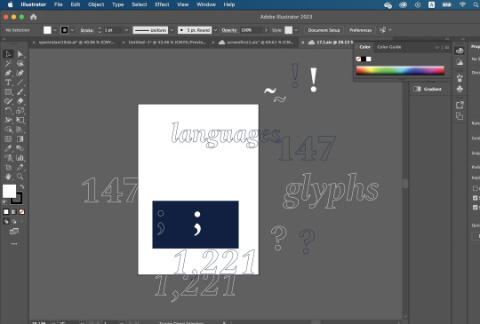
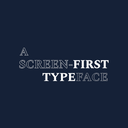
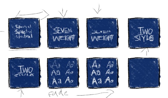
My final second GIF! This one displays the different attributes and assets that Spectral provides, the glyphs included in the typeface, the languages it supports, the fact that it is a screen first typeface and the traits that Spectral displays. I think this animation is one of my most successful ones. It incorporates a range of different transitions, weights and also includes some additional tones of blue that add a bit of softness and freshness.

0 notes
Text
GIF Developments - Gif 2 Gif 2 development 2
My second development incorporates the transition of the period from the semi-colon expands and eventually fills the screen. I prefer this to what I originally had as it adds a further element of personality within the animation as opposed to just being constantly static. I am liking how the animation is coming together, it definitely portrays Spectral in a better and more interesting light than my previous animations had which was a very important element to me during this project.


0 notes
Text
GIF Developments - Gif 2 Gif 2 development 7
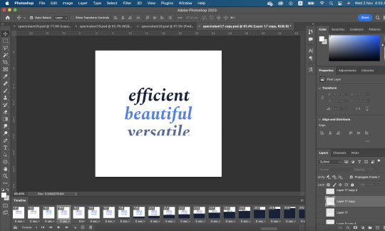
The third development is a change in the transition into the traits of spectral sequence ‘efficient, beautiful, versatile’. I had originally got some of the formatting wrong and instead of mirroring the other two words, versatile somehow was transitioning under as opposed to over. I adjusted the transition and feel as though it looks significantly better.

0 notes
Text
GIF Developments - Gif 2 Gif 2 development 4
For my fourth development, I have played with the scale of the glyphs as they appear on screen, to further reiterate the eery and intense nature of my animations. I also think it provides a bit more interactivity with the viewer as it elicits an excitable tone. I definitely feel as though there is a lot more room for development of this animation and there are small transitions and areas that need refining.


0 notes
Text
GIF Developments - Gif 2 Gif 2 development 6
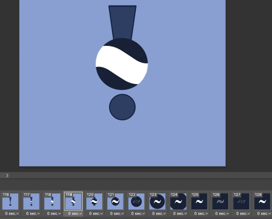
For my sixth development of gif 2, I have added some subtle transition differences to help the animation flow better. When transitioning from the 1,221 glyphs to the question mark, I have added in an opacity drop of the lighter background so that it flows into the darker one rather than abruptly change. I have also added what the Spectral outro is more likely to look like at the end of the development

0 notes
Text
GIF DEVELOPMENTS - Gif 2
Gif 1 Development 5
For my fifth development of this gif animation, I have removed the white stroke from the dash that expands and rotates. I made this decision due to the low quality that the dash appeared to be when it had the stroke on it, it was quite pixelated and messy which I did not like. I also think it flows nicer as it works as a good transition to the next sequence where it expands into a background.
I have also adjusted the colour of the background in the last sequence so that it would loop nicely to the beginning of the animation. I have also started to add a spectral outro.


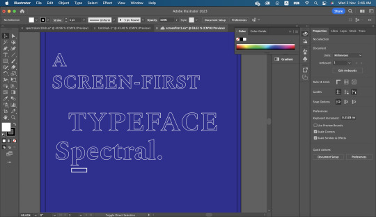
Below are screenshots of the assets I brought in from Adobe Illustrator -
0 notes
Text
GIF Developments - Gif 2 Gif 2 development 3
For my third development, I have played with layer masks to incorporate a new transition for my animation. I have added this transition to display the tilde glyph. I initially struggled with executing this transition as I was away sick for the class that was covering this technique however, I had one of my peers demonstrate how to create this transition which was immensely helpful.
0 notes
Text
GIF Developments Concept 1
My next development displays the additions of the different weights of Spectral. This was quite an essential aspect of Spectral that was to be included in my animations and I struggled quite a bit on how to exhibit the 14 different weights without it being too cramped or simple. I also need to figure out a way to include the last two weights, ExtraBold and ExtraBold Italic.

0 notes
Text
GIF Concept 1 Development 1
My first development for concept 1 incorporated the modern approach I wanted to take with my animations. I like the intro clip, it displays the effect of flickering lights really well. The demonstration of the different weights however, I really do not like. I think it’s because it doesn’t feel like a format that should belong in an animation.

0 notes
Text
Gif Developments - Concept 1 Development
This is one of my last developments for my work. I have added the last clip as an outro to my gif - ‘find spectral on google fonts’ gives the viewer a little more insight to the promotional video. It helps solidify the fact that this video is promoting Spectral. The typewriter style transition is something I had yet to experiment with so I decided to add it into my animation because it still showed links to the flashing type. I have added the scaled transition that gives the impression that the type is flashing which I believe fits cohesively with the rest of the animation and not something I have just added in.
0 notes
Text
GIF Developments Concept 1
I have added the ExtraBold and ExtraBold Italic weights to my animation in a seperate clip to the other two. I have added the opacity and stroke transitions to the type to show consistency throughout my animation and I have included the reveal of each seperate letterform one by one to demonstrate a typewriter effect. I am thinking of adding another transition to this clip though.
0 notes
Text
GIF Developments - Concept 1
To further add to the clips of the ExtraBold and ExtraBold Italic display, I have included a transition that involves the top and bottom type shifting to opposite sides and then panning out of frame, one going to the top, the other to the bottom. This adds a lot to the previous development. I think all that is left for me to do on this animation is to end it in a way that ties everything together.

0 notes