#thought id try a different visual format
Text
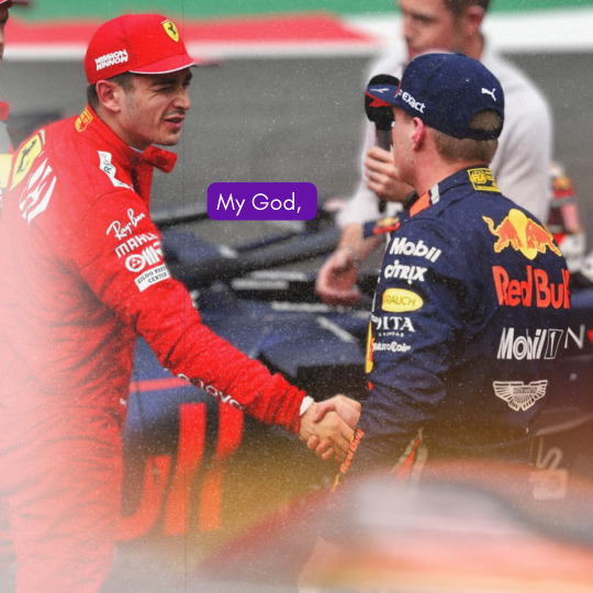


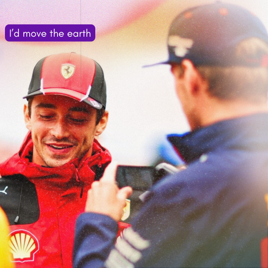
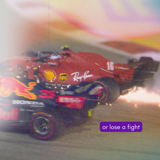
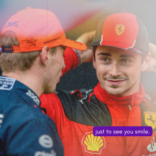
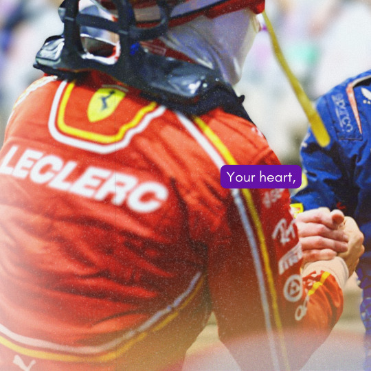
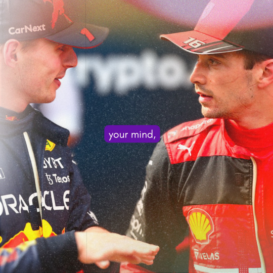

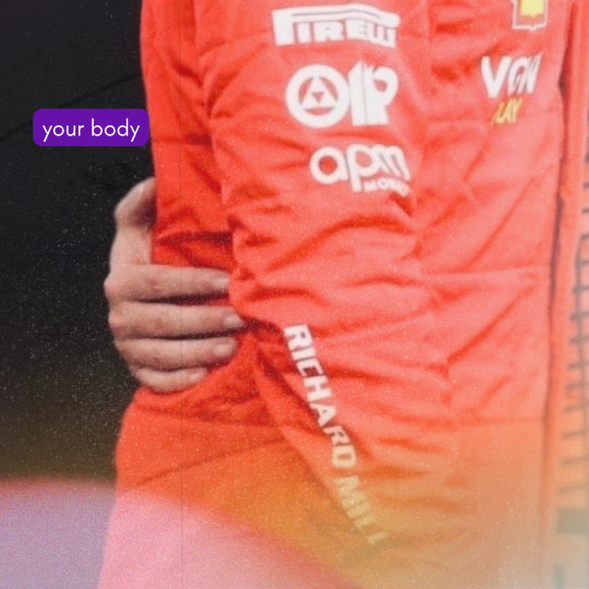
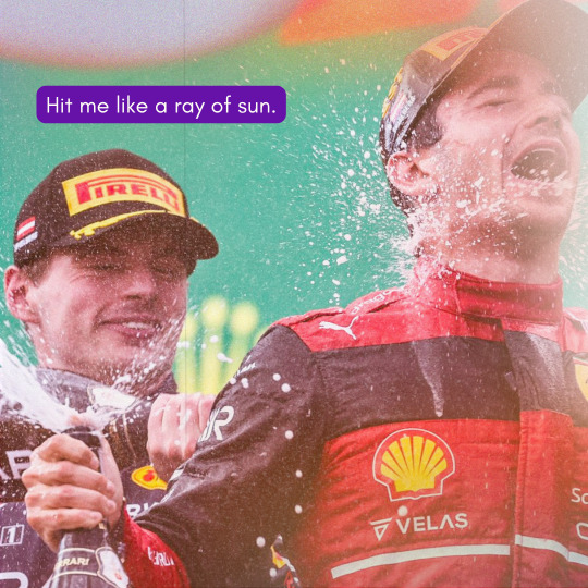

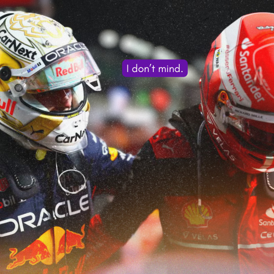
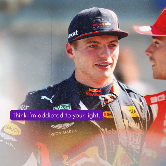


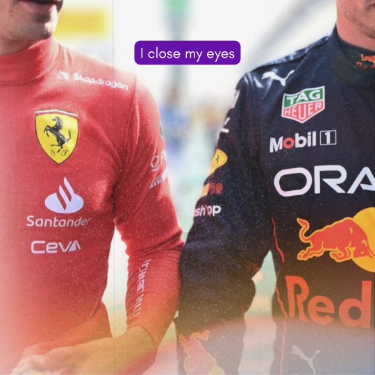
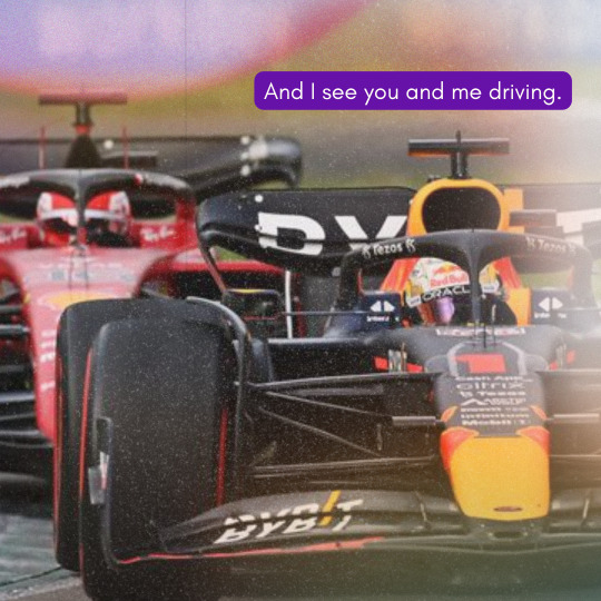
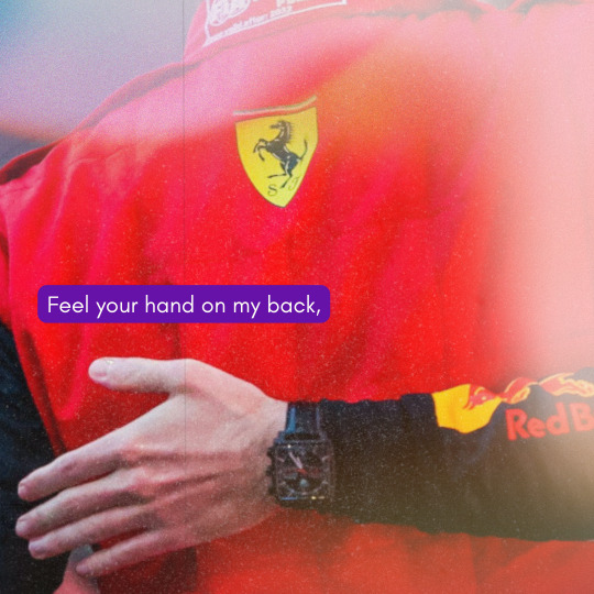

lestappen + my top songs of jan 2024 (x)
by row; one republic, secrets / jonas brothers, montana sky / jonas brothers, remember this / jonas brothers, what a man gotta do / nick jonas, close / nick jonas, close / beyoncé, halo / lauv, paris in the rain / beyoncé, halo / lauv, paris in the rain / lauv, paris in the rain / keane, silenced by the night / keane, silenced by the night / jonas brothers, shelf and jonas brothers, remember this / jonas brothers, remember this
#thought id try a different visual format#pls tell me what u think of it??#lestappen#f1weave#f1 web weaving#charles leclerc#max verstappen#f1 x music
114 notes
·
View notes
Text
Proposal Preview
This is a list of all current proposals. Please make note of your favorites, the ratings of these fics (Under 18 may not claim explicit fics), and if you have any questions, please message the mods.
Yes, this list starts with 02, instead of 01, because there is no proposal ID that is 01. Additionally, if you see any skipped numbers - for example 7 is also missing - don’t worry, this was intentional.
Furthermore if there is nothing where ‘art requests’ should be, this means that the writer did not request anything.
All works that have strike through like this are no longer available and have been claimed.
.
# 02
Work Title: Scrums and Teamwork
Archive Warnings: No Warnings Apply
Categories: M/M, Gen
Rating: General
Relationship(s): Alex Albon/George Russell, Max Fewtrell/Lando Norris, Pierre Gasly/Charles Leclerc
Character(s): George Russell, Daniel Riccardo, Lando Norris, Charles Leclerc, Arthur Leclerc, Lance Stroll, Yuki Tusonda, Pierre Gasly, Esteban Ocon, Mick Schumacher, Callum Illot, Oscar Pistari, Alex Albon, Lewis Hamilton, Max Fewtrell
Additional Tag(s): Rugby AU, 5+1, Angst, Hurt/Comfort, Misunderstandings
Word Count: 16616
Art Requests: I don't have a preference, I'm very happy to go with whatever the artist wants to go with.
Summary:
A rugby AU in which George Russell is the captain of the Formula Ruby team and has to deal with pre-season training, which turns out to be harder than he first thought.
One of the main reasons for this is the tension that is still left over from the Ruby World Cup and the ongoing difficult relationship between French players Pierre Gasly and Charles Leclerc whilst trying to form a coherent team.
George is also questioning the state of his relationship with Alex Albon (they get together in the end), and the issues surrounding the future of the English Ruby with the former coach Christian Horner getting fired.
It’s all a little bit of a mess. However, it works out in the end, with the team winning their first game of the season, and James Vowels takes over the role of England team coach.
The overall vibe of the whole thing is that it is a little bit messy but they are all trying their best to be dealing with feelings and the many issues surrounding teamwork.
Author Notes + Warnings:
So despite the fic surrounding the idea of rugby, there is no mention of anybody playing rugby. Instead, it focuses on all the little ins and out of the rugby team, the personalities within the team, how they bounce off each other, and the friendships and relationships created within it.
Each section is set up as a different day, following the 5+1 format.
Visuals include
• A lot of blues and reds, which made up their team kits. (Their shirts, their shorts, their studs and mouth guards.) Each player has his surname and number, which is included in the list at the top on the back of the shirt. I don’t have an idea of what the team badge looks like, but happy to leave that to the artist.
• There is a lot of focus on the team kits, both their countries' kits and their team kit.
• The training kits are similar blues to their kits with blue trainers.
• There are also a lot of greens with the pitch during the training seasons, whilst the match at the end is muddy with a lot of mud all over the place.
• Each player also has a red suitcase and holdall. Each player also has a little keyring reflected in their personalities, e.g. Alex has a cat whilst Oscar has a koala.
.
# 03
Work Title: play til you win
Archive Warnings: No Archive Warnings Apply
Categories: M/M
Rating: Explicit
Relationship(s): Daniel Ricciardo/Max Verstappen
Character(s): Daniel Ricciardo, Max Verstappen, Alex Albono, Pierre Gasly, Christian Horner
Additional Tag(s): Alternate Universe - Pop Punk Band, Alternate Universe - College/University, Alcohol Abuse/Alcoholism, Angst with a Happy Ending, Anal Sex, Blow Jobs, Marijuana
Word Count: 90000
Art Requests: I'm happy with whatever you make me
Summary:
"Well, Max. How do you feel about pop punk?" Daniel asks. He's grinning now, smile taking up his whole face.
Max feels a lot of things about pop punk actually. It had been forbidden at home, his father screaming at him and threatening to take away his stereo when he caught Max listening, insisting the only thing Max should be allowed to listen to was classical, that he should spend more time practicing and listening to the orchestral music that would get him into Juilliard, would make him a famous classical musician and composer his father think he's destined to be. But Max loves it. He'd spent hours listening to it in secret, through his headphones on mixed tapes and CDs his friends made him, on the long car trips he would take the moment he got his license, in his mom's basement, his sister by his side, explaining to her the difference between each band's sound. It had been the music that had made his heart beat faster and think maybe this is what I should be doing with my life.
Or: In 2004, Max and Daniel meet at college and form a pop punk band. They get a record deal and are really successful. The problem is, Max is in love with Daniel and it starts to take a toll on his mental health so he leaves the band. After Max, Daniel falls apart, starts drinking too much a sleeping to little trying to avoid the fact that he's missing Max more than he should. With the help of therapy, Daniel comes to grips with his sexuality and quits drinking. He goes to Max with a song that he's written and they get together.
Artist Notes + Warnings:
There's a lot of song lyrics in this fic and mentions of songs in from the 00s throughout the fic. It begins at Rutgers University in 2004 and stretches through 2009. There's a lot of mentions of old tech that have a lot of nostalgia for me and probably anyone who was a music lover in that era.
There's some light marijuana use.
Big warning: Daniel becomes an alcoholic in this fic. He has some internalized homophobia that in part fuels this problem.
.
# 04
Work Title: Let's figure it out together
Archive Warnings: No Archive Warnings Apply
Categories: M/M
Rating: Explicit
Relationship(s): Lewis Hamilton/Sebastian Vettel
Character(s): Lewis Hamilton, Sebastian Vettel, Nico Rosberg, Britta Roeske, Valtteri Bottas, Susie Wolff, Claire Williams
Additional Tag(s): Alternate Universe - Non-Famous, Alternate Universe - Photographer, Alternate Universe - Not Racing Drivers (Formula 1 RPF), Miscommunication, Friends to Lovers, Implied Previous Nico Rosberg/Lewis Hamilton
Word Count: 16000
Art Requests: Anything works! I'd be honored just by inspiring someone with my work.
Summary:
AU where Sebastian is an award-winning photographer and Lewis is an influential makeup artist/stylist, it's very loosely inspired by their actual racing careers. A 5+1 format that shows snapshots of their relationship growing in the same industry and their own struggles within it, Sebastian wants to move away from fashion photography to explore nature photography as it aligns better with his interests, and Lewis finds himself disenchanted with the reach his artform gets in fashion and wants to move further into a more "traditional" art setting, both of them seek more freedom to use their mediums exactly how they want. In the end, the separation of their careers because of those different paths is what makes them focus on their relationship, separating it from work and wanting to navigate that new dynamic.
It also features Lewis failing relationship with Nico, how Sebastian feels about it, and how it continues to haunt Lewis afterwards.
Artist Notes + Warnings:
I have taken some freedom to ignore some of the worst looks Lewis and Seb have wore over the years. Imagine that Lewis discovered how good braids and longer loose curls look earlier, so his timeline is more from 2016 to now. In Seb's case I'm mostly ignoring the aerocut, his fashion is not as relevant to the story as Lewis' other than as comparison. He's mostly featured with his cherub RB looks and his actual longer hair.
Some more general visuals are the indoor photography sets, Sebastian and Lewis working in them, there's also moments in nature from Sebastian's POV where Lewis stands out. Comparisons between their looks. Lewis focuses a lot on Sebastian with the camera, Sebastian is very aware of Lewis' fashion.
No real warnings other than Nico Rosberg not being painted in the best light, his relationship with Lewis (even when barely featured "on screen") feels tainted by working together, their different upbringing, and their personal differences about the fashion industry/their self expression.
.
# 05
Work Title: telegraph hill
Archive Warnings: No Archive Warnings Apply
Categories: M/M
Rating: Teen
Relationship(s): Esteban Ocon/Lance Stroll, Pierre Gasly/Charles Leclerc
Character(s): Esteban Ocon, Lance Stroll, Pierre Gasly, Charles Leclerc, Daniel Ricciardo, Sebastian Vettel, Fernando Alonso, Arthur Leclerc, Sacha Fenestraz, Clément Novalak, Theo Pourchaire, Victor Martins, Isack Hadjar
Additional Tag(s): Established Relationship, Fluff, Alternate Universe - Not Racing Drivers
Word Count: 15000
Summary:
Beginning in the summer, Esteban and Lance spend a year adjusting to being functional adults now that they've both finished university, in their adopted home of London. They move across the city into a flat share, where they are warmly welcomed by neighbours Daniel and Seb. Through a series of dates, they discover new areas of the city as well as new hobbies. Friend nights with Pierre, Charles, and the group of younger guys they seem to have befriended are also common, and often end in mild disaster, to Esteban's despair. But Lance is always there to surprise him with thoughtful words, intimate moments and, as summer rolls back around, a new stage in their relationship.
Author Notes + Warnings:
It's literally just Esteban and Lance being hopelessly in love for 15k words. With each other and with the city of London. There is repeated imagery of the city skyline at night, parks/forest areas, sharing food (usually candy).
There is one scene where Esteban becomes overwhelmed in a large crowd of people that is like an anxiety attack, but it is fairly mild.
.
# 06
Work Title: magnets, the pull of the moon
Archive Warnings: No Archive Warnings Apply
Categories: M/M
Rating: Explicit
Relationship(s): Daniel Ricciardo/Max Verstappen
Character(s): Daniel Ricciardo, Max Verstappen, Alexander Albon, George Russell (Formula 1 RPF), Zak Brown, Andreas Seidl
Additional Tag(s): Alternate Universe, Alternate Universe - Space, Getting Back Together
Word Count: 15000
Summary:
Skiff racer Daniel Ricciardo is in the zone for his home race, gunning for the win and loving the limelight. Tasked with showing a visiting group of officers a good time, his past comes back to haunt him when he comes face to face with Max Verstappen, the youngest captain in the fleet – and the man who broke Daniel’s heart five years earlier.
The more time he spends with Max, the more Daniel struggles to keep those old feelings from bubbling to the surface and disrupting his new life, trying to keep his focus even as he wonders if Max’s sudden return might not be entirely coincidental…
Under pressure from his team as the race approaches, Daniel will have to decide how far he’s willing to go to get what he wants, putting his life and his heart on the line for the chance of victory, and a second chance at love.
Or, a Persuasion AU in space (sort of).
Author Notes + Warnings:
Visuals include: glamorous/seedy casino planet AKA Space Monaco, sneaking out of a fancy gala to have a charged moment on a balcony, Max’s minimalist grey space shuttle quarters, bright blue geothermal lakes, fitted race suits and dramatic eye makeup, pod racing but make it sexy
Visual inspirations: The Fifth Element, Canto Bight (The Last Jedi), Speed Racer, Treasure Planet
.
# 08
Work Title: Trust/Fall
Archive Warnings: Creator Chose Not To Use Archive Warnings
Categories: M/M
Rating: Explicit
Relationship(s): Guillaume Rocquelin/Sebastian Vettel
Character(s): Guillaume Rocquelin, Sebastian Vettel
Additional Tag(s): Colleagues to Friends to Lovers, Age Difference, Flirting, Unhinged Twink Behaviour, Mild D/S, Praise Kink, Overstimulation, Edging, Explicit Sexual Content
Word Count: 30000
Art Requests: I would be delighted to receive any kind of art, to be honest. I think maybe more traditional drawing/painting or digital art would probably fit the feeling of the story because it's as close to canon as it can be, but genuinely anything works for me!
Summary:
Canon-accurate (mostly!) 2009 – 2014 seasons.
Rocky’s new driver seems like a nice enough young man, even if he is yet to understand what separates this particular gawky, eager kid from all the other hopefuls. But understanding people isn’t so very different from understanding race cars. Sebastian will figure out how his new ‘girl’ needs to be handled in order to perform at her best; Rocky will learn how to handle Sebastian.
In short, this is the story of a driver and his race engineer, and how they learn to trust each other and navigate their way from a purely professional relationship to something that's much, much more than that, as Seb grows into his full Championship-winning glory and Rocky discovers How To Train His Gremlin…
Author Notes + Warnings:
The overall vibe of the fic is very sweet and humorous, although there are a few moments that get a bit more intense.
As far as the visuals go… there are plenty of Seb-being-a-menace moments, flirting outrageously in the sim, sitting on the counter in Rocky’s flat learning how to make pasta… some sweet stuff like a very drunk Seb falling asleep in Rocky’s hotel room after the winner’s party in Monaco (think scruffy jeans and the oversized jacket he borrowed from DC), also some more serious scenes, in particular one that takes place in Seb’s driver room after his first Championship win, with Rocky massaging Seb’s sore hands…
I guess the only potentially sensitive content is the fact that there's a 13-year age difference between Seb and Rocky, and the slightly awkward fact of their working relationship. Oh, and of course the several explicit sex scenes! The D/S element is very very mild but some scenes do include things like edging and overstimulation.
.
# 09
Work Title: Cue all the love to leave my heart (it's time for me to fall apart)
Archive Warnings: Creator Chose Not To Use Archive Warnings
Categories: M/M
Rating: Mature
Relationship(s): Pierre Gasly/Charles Leclerc
Character(s): Pierre Gasly, Charles Leclerc, Minor Characters
Additional Tag(s): 5+1 things, Power Dynamics, Prisoner of War, Alternate Universe - Royalty, Organized Crime, Non-Graphic Violence, Temporary Character Death, Coma, Angst with a Happy Ending
Word Count: 12500
Summary:
"Why won't you turn around to look at me?" the voice that sounded too much like Charles' accused, and Pierre let out a pained scream that echoed around the void in response.
Or, the 5 lives Pierre never turned around when Charles called out his name, and the one time he's determined to make things right.
Author Notes + Warnings:
The overall vibe is angst throughout the 5 of the 5+1, in fact the angst lasts a fair bit into the +1 part but there will be a happy ending at the end :") The 5 lives aren't necessarily connected to each other, the only common thing among them being Charles and Pierre still meeting each other, only to end in an angsty separation for different reasons relevant to that particular life.
In one of the lifetimes, there is unequal power dynamics between Piarles (one of them is a mercenary while the other is a prisoner of war who becomes the mercenary's bedwarmer), which in itself could possibly lead to possible Stockholm syndrome (whether that actually happens is unclear). In another lifetime, one of the main characters work for a mafia. Although I do not plan to go down the direction of graphic description of violence, there will still be mentions of violent acts committed by the mafia, including a murder that will be mentioned for plot purposes, so I'm tagging that with non-graphic violence instead. In yet another lifetime, one of the main characters will die but technically I'm tagging it as temporary character death because in the grand scheme of things, that character doesn't die. Finally, at some point someone will get into an accident and be in a coma state for a while (but don't worry, that person will eventually wake!)
.
# 10
Work Title: in quest to hold the sacred urn
Archive Warnings: Underage
Categories: M/M
Rating: Explicit
Relationship(s): Oscar Piastri/Logan Sargeant
Character(s): Logan Sargeant, Oscar Piastri
Additional Tag(s): Alternate Universe, Childhood Friends, Boarding School, Cricket AU, Friends to Lovers to Rivals to Lovers
Word Count: 15000
Art Requests: While any is welcome, major preference for any imagery of Oscar and Logan in their respective Test uniforms.
Summary:
Logan is a resident of the Haileybury boarding school in England, thanks to his father’s work. The year he turns fifteen, Logan is given a new roommate: a boy from Australia named Oscar. And Oscar introduces him to a whole new world and a whole new sport, called cricket.
Despite his family’s initial disapproval, Logan learns to play, and his talent grows quickly. When Oscar returns to Australia to follow his dreams of donning the baggy green, Logan initially finds himself directionless – until an experienced county coach offers him a path of his own, a path that could lead to navy blue and three Lions of the English team.
And that journey leads to Oscar’s and Logan’s paths crossing once more, this time on the greatest field of all – The Ashes. With tensions between the two sides at an all-time high, intense media scrutiny of every moment and an old, risky tactic rearing its head alongside a newer fear, it seems impossible for an English player and Australian player to be friends, let alone more. Can they overcome sport’s greatest and oldest rivalry to find each other again?
Author Notes + Warnings:
There's a scene where Oscar and Logan meet again in the Long Room after not having seen each other for years, and realize that they can't speak like they used to, or touch or hug like they used to, because they're not teammates anymore, they're rivals, and it stings. The two of them are all dressed up in Test uniform for their official portraits, and there's a long moment of "if only"...
Extremely heavy-handed descriptions of cricket/cricketing skills/cricketing slang; teenage friendship-to-crush-to-separation-to-reunion; mentions of an offscreen minor character death; the main character inflicting sport-related violence/injury on the other main character (accidentally); sporting rivalry taken to its extreme; the baggy green and navy blue caps used symbolically; Logan’s parents behaving like dicks for a while; light xenophobia/anti-American sentiment.
.
# 11
Work Title: whispers would deafen me now
Archive Warnings: Graphic Depictions of Violence
Categories: M/M
Rating: Mature
Relationship(s): Lando Norris/Daniel Ricciardo, Minor or Background Relationship(s), Pierre Gasly/Charles Leclerc
Character(s): Max Verstappen, Charles Leclerc, Pierre Gasly, Lando Norris, Daniel Ricciardo
Additional Tag(s): Eventual Relationships, Violence, Guns, Gunshot Wounds, Hurt/Comfort, Angst, Alternate Universe - Post Apocalypse
Word Count: 18000
Art Requests: I'm already on the floor sobbing that anyone would make any art for me so please no worried there! I would love to see if anyone would draw what my main characters wear! (the jackets and backpacks and gloves and everything :)
Summary:
Sequel to its all so incredibly loud.
After the events of Monaco, Charles, Daniel, Pierre and Lando can't risk staying any longer. Their only guide and their only hope of survival is Max, who left them when they needed him most.
Told through Max's eyes, the journey from Monaco to the safety of Germany is not an easy one, and it's made a lot harder when the group starts lying to him.
Eventual Max/Daniel/Lando with established Piarles! Lots of angst and hurt/comfort, and lots of the group getting to know each other again.
Author Notes + Warnings:
as angsty as this is it's also an undercover love story. the bond between the Monaco four is strong, but they want Max there as well, even if he doesn't realize it.
Graphic description of violence, blood, guns, killing for survival, food insecurity/food problems due to post-apoc setting, and gunshot wounds.
.
# 13
Work Title: I Want To Write You A Song
Archive Warnings: No Archive Warnings Apply
Categories: M/M
Rating: Teen
Relationship(s): Pierre Gasly/Charles Leclerc, Pierre Gasly & Charles Leclerc & George Russell & Alexander Albon & Lando Norris
Character(s): Pierre Gasly, Charles Leclerc, George Russell (Formula 1 RPF), Alex Albon, Lando Norris, Christian Horner
Additional Tag(s): Alternate Universe - Bands, Inspired by One Direction, Social Media, Friends to Lovers, Feelings Realisation, Touring, Songwriting, Declarations of Love, Implied Alexander Albon/George Russell
Word Count: 25000
Art Requests: There is a lot of social media influence/references throughout the fic, so something along those lines might be nice? But honestly, I'm more than happy with anything <3
Summary:
Pierre, Charles, George, Alex and Lando are in the AU version of what's essentially One Direction: a boyband called One Formula. Just like in the actual 1D, fans are convinced that that the members are secretly dating/in love with each other. (Except in this AU, they're absolutely right.)
Pierre and Charles (#Piarles) are this universe's version of Larry Stylinson. Pierre, who starts the fic firmly believing he's straight, openly makes statements denying that they're together. Charles never does anything of the kind. This fic properly begins after a particularly harsh denial of Pierre's, which causes Charles to avoid him for a while. This in turn sends Pierre on a bit of a social media binge, and he spends a weekend going through Piarles compilations on Instagram and Tumblr until he comes to the shocking realization that oh my god, he actually IS in love with Charles.
Right after Pierre's had his big realization, the band has to go on tour for their next album. Pierre and Charles BOTH spend this tour hopelessly pining and writing/singing love songs at each other (while still firmly believing that the love is unrequited.) George, Alex and Lando are supportive - if increasingly exasperated - best friends to the pair of them. After a whole bunch of boyband-typical shenanigans, the boys FINALLY figure it out and get together.
Author Notes + Warnings:
Visuals include: matching boyband-y outfits! One-Direction-esque chaotic friendship shenanigans! Big stages with light effects, drums, band, microphones, the whole shebang. Tour buses! Interviews featuring only one couch! (Steamy get-together kisses backstage...)
There's also a subtle colour focus throughout the tour part, with Pierre in blue colours and Charles in red.
CW for Alcohol Use: nothing major and certainly nothing that can be considered alcohol abuse, but there are instances of characters drinking and making decisions slightly influenced by alcohol (no consent issues at any point, though.)
.
# 14
Work Title: Trick The Past Again
Archive Warnings: No Archive Warnings Apply
Categories: M/M
Rating: Teen
Relationship(s): Charles Leclerc/Sebastian Vettel, Charles Leclerc/Charlotte Siné
Character(s): Charles Leclerc, Sebastian Vettel, Lando Norris, Max Verstappen, Charlotte Siné, Mark Webber, George Russell (Formula 1 RPF), Jenson Button, Daniel Ricciardo, Lewis Hamilton, Pierre Gasly, Charlene Princess of Monaco, Arthur Leclerc
Additional Tag(s): Alternate Universe, Magic Realism, Movie Adaptation
Word Count: 26000
Art Requests: I'm happy with any kind of art, although I feel like a comic-ish style would work best for this purely based on the source material. A movie poster style thing would also be very fitting! Since this is an adaptation of a movie that is itself an adaptation of a comic, there should be plenty of reference material for the vibe that fits this fic, I think. But non-comic style would also work great, it's up to you!
The thing I've been daydreaming of while writing this fic is to have little bits of graphics already throughout the fic, to really capture a similar vibe to the movie. Think of coins when one of the evil exes is beaten, some words or phrases emphasized by turning them into lettering with hearts or dark clouds around them, *wham* *slam* things in the typical comic-style, stuff like that. So if you've ever wanted to do little doodles like that as well, I'd love to see that too! Willing to work with any ideas you might have as well <3
Summary:
This is a Scott Pilgrim vs The World adaptation simply because I could. Charles is just going through life, trying to make a name for himself in the glitch karting world with his team Quadrant (with Lando and Max as his teammates), dating Charlotte (an outsider who isn’t involved in motorsports), when he comes across Sebastian Vettel and immediately falls in love. Seb’s interested but hesitant, and Charles learns rather quickly that if he wants to be with Seb, he needs to defeat seven evil <s>ex boyfriends</s> exes. Meanwhile, Quadrant has signed up for a glitch karting competition that promises to finally be their big break, and oh right, he’s still dating Charlotte too, huh…
I changed the battle of the bands setting of the movie/comics to a karting competition to keep the F1 spirit alive. To add in the magical realism elements, I made it so karting also involves game-like glitches in this world, although what they are exactly is up to the reader’s imagination. Seb’s seven exes are as follows, in order: Jenson, Daniel, Lewis, Charlene, Kimi, Heikki, Mark. Charles battles all of them in increasingly unlikely racing situations. Pierre also shows up as Charles’s main ex alongside Lewis.
Most of the fic takes place in Monaco, specifically at a karting centre. There’s also some mention of sim-racing, but besides a few scenes there’s not much that takes place online. For the rest there’s scenes at homes (with George as Charles’s flatmate), some clubs, and the coffee shop Arthur works in. I have done my best to capture the comic/video game-y feel of the movie so hopefully it reads that way.
Author Notes + Warnings:
The general vibe plays at being a romcom, combined with a bit of highly stylized action. Overall it doesn't take itself very seriously and has a comic/video game-ish feel to it
There's what could be seen as violence in the fic, since there are fights. Some of them are through karting and are won through crashes, but it's not very serious. People don't actually get hurt, they don't die, it's video game logic and it's treated as such in-universe as well, which is why I'm not warning for it specifically but it should probably get mentioned. Also, there's a break-up between Charles and Charlotte, which isn't handled too well by the two of them but it does end well. And of course more talk of break-ups because this is about loads of exes.
.
# 15
Work Title: no grip
Archive Warnings: No Archive Warnings Apply
Categories: M/M
Rating: Mature
Relationship(s): George Russell & Max Verstappen, Max Verstappen/Daniel Ricciardo, George Russell & Alexander Albon, George Russell & Daniel Ricciardo
Character(s): George Russell (Formula 1 RPF), Alexander Albon, Max Verstappen, Daniel Ricciardo, Lewis Hamilton, Torger “Toto” Wolff
Additional Tag(s): Multiplicity/plurality, Dissociative Identity Disorder, OC Heavy, Mental Health Issues, Mental Breakdown, Multiple Perspectives, Implied/Referenced Child Abuse, Past Trauma
Word Count: 25000
Art Requests: I love non-traditional visual mediums (collage, sculpture, knitting/crochet/cross-stitch, etc) but I will be so happy with any form of art!
Summary:
Max has lived his whole life with the other people in his head. It’s never been something he’s viewed as an issue, simply a fact of life. Over the last year, he’s come to a more expansive awareness of the fact that he and his other people aren’t the only ones who share this experience.
George feels like he’s spinning out. Over the course of the 2023 season, he’s been fighting to appear together as his mental health falls apart and to ignore the other presences in his mind. And if he had to pick the worst person to discover this, he might just say Max Verstappen.
Author Notes + Warnings:
This fic focuses on three systems, and as such is pretty OC heavy. Below is listed the members of each who factor most in the story.
George&Co: George, Charlynn, Jackie, Dylan, Alfred/Freddy, Not Nessie
The Neighborhood: Daniel, Tiger, KJ, Summer, Carter
The Pride: Max, Jens, Bliksem, Cas, Brecht
If you have any questions about plurality, I will happily provide resources. Obviously that’s not that important for art but if you’re interested just ask. The fic has a lot of discussion of systems’ internal landscapes, which I think could be a really cool focus for the art to have.
This fic deals heavily with sensitive mental health issues and neurodivergences. For some characters, these were caused by childhood trauma. In connection to that, there is discussion of past parental abuse, difficult parent/child relationships, bullying, and medical trauma. The first draft mentions hospitalization but that's not carrying over to the finished fic.
The fic also discusses topics surrounding plurality/multiplicity and dissociative disorders that fall under that umbrella. These are topics that can be sensitive within the community, as can plurality as a concept. There is also a non-graphic description of a Formula 1 crash that results in no injuries.
.
# 16
Work Title: It Wasn't Easy To Be Happy For You
Archive Warnings: Creator Chose Not to Use Archive Warnings
Categories: M/M, Multi
Rating: Explicit
Relationship(s): Max Verstappen/Daniel Ricciardo, Max Fewtrell/Lando Norris, Charles Leclerc/Max Verstappen (mentioned), Charles Leclerc/Lando Norris, Charles Leclerc/Max Verstappen/Lando Norris (mentioned)
Character(s): Max Verstappen, Daniel Ricciardo, Lando Norris, Charles Leclerc, Max Fewtrell, Carlos Sainz (mentioned), Nico Hulkenburg (Mentioned)
Additional Tag(s): Alternate Universe - University, Childhood Friends and Lovers, Hurt/Comfort, Eastern WA, Long Distance Situationship, Angst with a Happy Ending
Word Count: 12000
Summary:
A modern day AU where Max and Daniel are Childhood friends and lovers who grew up together in Eastern WA just off the columbia river, it starts the day before Daniel leaves to go to the University of Alabama across the country while Max stays behind to repeat his senior year of high school after he had to drop out the previous year due to getting kicked out from his home.
As the school year progresses for the both of them, they learn how much the distance affects them and how maybe they’re not as sure and stable as they once thought they were, and maybe the unspoken promises should have been spoken. It all accumulates when Daniel breaks his promise to Max over Spring Break and their already strained relationship snaps apart.
When Max graduates and Daniel returns home, they have to reflect upon their relationship and what they really want from each other and the world and if their relationship is ultimately what they want.
Author Notes + Warnings:
Visuals/Themes; Thunderstorms, Start of School, Bonfires, Late Summer Heat, Coffee, Dry/Wet contrast, River Lookouts, Class Divide, Honda Accord vs OId Beater, Red (red car, ferrari backpack, red hats, red to represent Daniel and Max), Lattes, Ricciardos speak Italian at home, Draculino (Max’s nickname) = Possessive, Bagels, Coffee vs Redbull, pear scents comfort max, Childhood love, Growing relationships, House on Hill, Bare Skin around each other, Weed (Daniel smokes, Max doesn’t), creampies as a symbol of devotion
Max works at starbucks and Starbucks is a very important PNW staple so that’s often in the background. This whole fic is very PNW inspired and a love letter to my home.
This fic deals with slightly co-dependent relationships as well as a character struggling with depression and separation anxiety. There are also mentions of previous abuse from a parent and the effects of being kicked out. Unhealthy coping mechanisms are also mentioned. The characters are young adults so the communication is not the most effective or clear and that’s seen from all sides.
.
# 17
Work Title: random access memories
Archive Warnings: Creator Chose Not to Use Archive Warnings
Categories: M/M, Other
Rating: Mature
Relationship(s): Sebastian Vettel & Mark Webber, Sebastian Vettel & Max Verstappen, Sebastian Vettel & Daniel Ricciardo
Character(s): Sebastian Vettel, Max Verstappen, Mark Webber, Britta Roeske, Daniel Ricciardo, Mick Schumacher, Charles Leclerc
Additional Tag(s): Alternate Universe - Detroit: Become Human, Alternate Universe - Androids, Robot ethics, Existential
Word Count: 25000
Art Requests: I was thinking of doing a more epistolary fic so I'd really appreciate graphics, news paper clippings, etc. of the sort! But I'd be down for whatever you like :)
Summary:
What if you were destined to relive someone else's life? Would you be forced to make the same choices they did, make the same mistakes? Would you choose to be different?
Red Bull racing unveils an experimental technology that changes what it means to drive in F1, but what shocks people the most is who they model their android after. With other teams following way, android drivers replace the real ones. One thing is certain, the sport will never go back, and neither will humanity.
Author Notes + Warnings:
This is set in the Detroit: Become Human video game universe, and as such will have a futuristic dystopic vibe to it. It will also have some characters from the game pop up towards the end. This is more of a coming of age story, but it follows the vibe of the videogame a bit more.
The fic does deal with the aftermath and rights to identity of a real person who passed away (in universe). There will be a lot of discussion of death and maybe one chapter that explicitly explains how it happened. There will also be some discussion of android rights, (the teams do not treat them very well).
.
# 18
Work Title: the baker and the knight
Archive Warnings:
Creator Chose Not to Use Archive Warnings
Categories: M/M
Rating: Teen
Relationship(s): Lewis Hamilton/Sebastian Vettel, Mick Schumacher/Lance Stroll
Character(s): Lewis Hamilton, Sebastian Vettel, Mick Schumacher, Lance Stroll, Other(s)
Additional Tag(s): Alternate Universe - Fantasy, Magic, Dragon, Fluff and Angst, Friends to Lovers, Pinning, Minor Injuries,
Word Count: 16000
Art Requests: I have no preference, and i think the fic suits every medium :)
Summary:
classic fantasy!au, with magic, wizards, dragons.
Sebastian is a baker who inherited his family’s bakery, while Lewis is a knight who happens to love visiting him in the mornings. They’re somewhat friends, not as close as both of them would like. Sebastian starts to doubt his feelings about Lewis. Lewis has saved his life twice, so he’s not sure if what he’s feeling is guilt, or actual romantic interest. Seeing Lance and Mick interact helps him realize some things. Lewis doesn’t show much of his feelings, but that is due to the fic being in Seb’s POV. He has his own internal battle we just don’t see.
Lance is a Prince who will not inherit the throne so he decided he wants to be a baker as well and came to Seb to study but also because he has a crush on Mick, who is a fairy, Seb’s friend and owns the shop opposite the bakery. The three of them form a strong bond.
What sets things off is an injured dragon falling out of the sky into the middle of the town, and the efforts to protect it. The story then follows Lewis trying to do the right thing and ending up hurt, Seb returning the favour of saving his life, and the Dragon being the one to bring them together, even though his method scares the shit out of them.
Author Notes + Warnings:
okay, so half the fic is kind of whimsical, cosy, for the most part it focuses on the developing relationship between the characters. the action part is a little bit past the halfway point. most of the scenes happen in the town, seb’s bakery, his apartment above it, the castle and its grounds, some fields nearby, the town’s centre and the woods. it’s definitely a love story first, and a fantasy story second.
as for the characters: seb is baker, lewis is a knight, (there’s a little bit of focus on the sexy armour), lance is a prince and mick is a fairy. they have some descriptions, but besides the basics they don’t have too many details so there is room for interpretation.
there are mentions of violence, some injuries, an attack but with no casualties, some doubtful use of magic and the mention of killing people, but none of them are named. all of these are mild so i don’t think they need specific warnings.
6 notes
·
View notes
Note
hey! i saw you putting image ID tags on your posts which is really cool, thank you so much for thinking of partially sighted and blind people! xoxo
however, like a lot of well-meaning people on tumblr, you have kinda misunderstood how image ID tags work. if they have more than 10 words, they are useless unfortunately. keep your image descriptions blunt and to the point. no details, just the overall point. for example:
[ID: man looking through a fish tank]
is correct.
[ID: leonardo dicaprio, in baz luhrmann's romeo and juliet, looks through a fish tank at juliet. he is wearing a suit of armour, and the scene is coloured in tones of blue and green]
is incorrect.
tumblr has taught people to write novels and be very descriptive and in depth, but that's not how screen readers function and it makes it very confusing to navigate posts. just a heads up!
again, thank you so much for trying to include visually impaired people in your posts! it's so great! x
hi anon, thanks for your ask!
when i was writing the id, i myself was debating whether or not i should include the work names in the id bc on one hand, doing so makes them longer, but on the other hand, i wasn't sure how else to convey the format and layout of the set as a comparison set. i did end up taking out the directors' names as that was redundant with the caption itself, but i felt that having the work name in was pretty crucial to getting across my main points in this set as its comparing scenes in 4 different pieces of media.
i do worry that shortening the ids to the example you provided would omit essentially all of the details that my set was focused on highlighting (i.e. the coloring contrasts, the characters in the gifs being romantic interests, etc)
however, i do understand that overly long ids can present difficulties as well, so i guess my main question now is how/if i should shorten my ids without losing the point of my sets. i personally do not use a screenreader, so if anyone has thoughts or suggestions, those would be more than welcome!!
4 notes
·
View notes
Photo
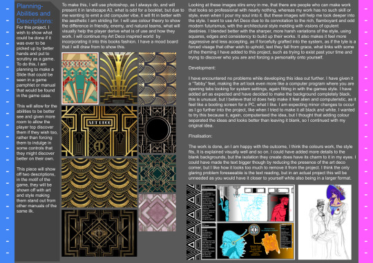
Planning-
Abilities and Descriptions:
For this project, I wish to show what could be done if it was ever to be picked up by better hands and put to scrutiny as a game. To do this, I am planning to make a Slide that could be seen in a game pamphlet or manual that would be found in the game case.
This will allow for the abilities to be better see and given more room to allow the player top discover them if they wish too, rather than forcing them to indulge in some controls that they might discover better on their own.
This piece will show off two descriptions, in the motif of the game, they will be shown off with art and style making them stand out from other manuals of the same ilk.
To make this, I will use photoshop, as I always do, and will present it in landscape A3, what is odd for a booklet, but due to me wanting to emit a old computer vibe, it will fit in better with the aesthetic I am striding for. I will use colour theory to show the difference in friendly, enemy, and natural teams, what will visually help the player derive what is of use and how they work. I will continue my Art Deco inspired world by incorporating it into this books fashion. I have a mood board that I will draw from to show this.
Looking at these images stirs envy in me, that there are people who can make work that looks so professional with nearly nothing, whereas my work has no such skill or style, even when I pour my soul into it. But these images will help me look deeper into the style. I want to use Art Deco due to its connotation to the rich, flamboyant and odd modern futurismus, with the architectural style melding with visions of opulent destinies. I blended better with the sharper, more harsh variations of the style, using squares, edges and consistency to build up their works. It also makes it feel more aggressive and less accepting, as if forcefully grafted into the system, as if the tyle is a forced visage that other wish to uphold, lest they fall from grace, what links with some of the theming I have added to this project, such as trying to exist past your time and trying to discover who you are and forcing a personality onto yourself.
Development:
I have encountered no problems while developing this idea out further. I have given it a “Tabby” feel, making the art look even more like a computer program where you are opening tabs looking for system settings, again fitting in with the games style. I have added art as expected and have decided to make the background completely black, this is unusual, but I believe that id does help make it feel alien and computeristic, as it feel like a booting screen for a PC, what I like. I am expecting minor changes to occur as I go further into the project, like when I tried to make it all black and white. I wanted to try this because it, again, computerised the idea, but I thought that adding colour separated the ideas and looks better than leaving it blank, so I continued with my original idea.
Finalisation:
The work is done, an I am happy with the outcome, I think the colours work, the style fits, It is explained visually well and so on. I could have added more details to the blank backgrounds, but the isolation they create does have its charm to it in my eyes. I could have made the text bigger though by reducing the presence of the art deco corner, but I like how it looks too much to remove it from the project. I think the only glaring problem foreseeable is the text reading, but in an actual project this will be unneeded as you would have it closer to yourself while also being in a larger format.
Finished Art:
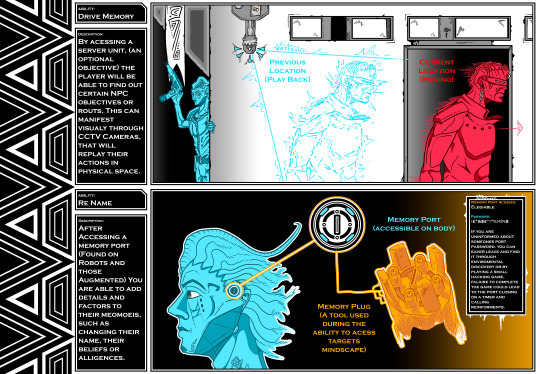
Testing Art Deco style:

0 notes
Text
USING YOUTUBE STORYBOARDS YOUR CREATIVE WORK WILL GET A LOT BETTER

Storyboarding is a process of visually creating a “comic strip” of a narrative, usually with images and dialogue. Storyboards make it easy to see every scene in your story, as well as adding visual details that can help you out when writing the script. If you are looking for more information on how to use YouTube Storyboard, we’ve got a blog post on here with tips and tricks!
WHAT IS A STORYBOARD?
Storyboards are a visual way to plan out your creative work. When you create a YouTube storyboard, you outline each scene in your video beforehand and then plot out how the scenes connect to create an overall narrative. This makes creating videos a lot easier because you know exactly what needs to happen in each scene and you can avoid wasting time and money on footage that won’t end up being used. If you’re new to story-boarding, here’s a quick primer on how it works:
1. Choose a visual style for your video. Whether you want to go with a traditional animation look or something more contemporary, having a visual style will help you stay organised while filming.
2. Decide on the scene layout. Storyboards typically have three panels: the top left panel usually contains the setting or background of the scene, the middle panel shows the main characters in action, and the bottom right panel depicts what happens after the scene has ended.
3. Brainstorming scenes. Once you have your layout figured out, start thinking of ideas for scenes that would fit into it. Try not to get bogged down by details at this point; just come up with general concepts that would work well in your video.
HOW CAN STORYBOARDS HELP YOUR CREATIVE WORK?
Storyboards have become an essential part of the creative process for both filmmakers and graphic designers. Used correctly, storyboards can help streamline your creative work, making it easier to communicate your ideas to others and to track progress. Here are four reasons why storyboards can help your creative work:
1. Storyboards can make the process of ideation more streamlined. By breaking down your idea into a series of sequential visuals, you can more easily communicate your thought process to others. This also allows you to track progress more effectively, ensuring that all of your ideas are represented in a clear and easy-to-follow format.
2. They can help to reduce the amount of time needed to complete a project. With storyboards as a guideline, you can quickly and easily create a visual representation of your ideas. This saves you time and money in the long run, since projects that are well organised and well-planned tend to be faster and cheaper to complete than those that are not.
3. They can help you improve upon your creative skills. Story boarding is a great way to practice your creativity and learn new techniques. By creating storyboards for different types of projects, you can improve upon your skills and possibly find new areas of interest. Over time, you can develop a strong portfolio of work, which is always useful as a professional.
4. They can help you build your reputation and name ID in the industry. To become well-known in an industry, it is necessary to have a particular skill set that allows you to create effective designs. Storyboards allow for easy execution of various types of projects, so it is possible to gain recognition for your abilities and develop a strong portfolio over time.
5. They are a great way to practice drawing skills and exercises. If you want to improve at drawing or any other type of art, story boarding is definitely a good way to do so! The creative processes involved in creating storyboards help improve skills that can help with other types of art (like taking life drawing classes or studying anatomy). To be honest, I often find that new artists who don’t have exceptional drawing skills suddenly realise as they start creating storyboards.
Why do you think many people choose to learn how to make storyboards? What is it about them that makes them a great tool for learning new skills or honing existing ones? Let me know in the comments below!
STEPS FOR CREATING A STORYBOARD
Storyboarding is a popular way to communicate and organize your creative work. It can help you to better plan and execute your ideas, and make your work look more professional. Here are five steps for creating a storyboard:
1. Define the overall goal of the project.
2. brainstorm ideas for scenes or sequences that will support the overall goal.
3. create rough sketches of each scene or sequence so that you have a visual idea of what you’re working on.
4. select the best scenes or sequences to build a full storyboard around.
5. add sound effects, music, and other graphic elements to complete the storyboard.
TIPS AND TRICKS TO MAKE YOUR STORYBOARDS MORE EFFECTIVE
If you’re like most creatives, you probably have some pretty cool ideas for videos that you want to make, but you don’t know how to get started. Well fear not! In this blog post, we’re going to teach you a few tips and tricks to help make your storyboards more effective and help you turn your great ideas into great videos.
One of the first things you’ll want to do is figure out what type of video you want to make. Are you looking to create a short educational video? A promotional video for your business? A funny clip? Whatever the case may be, it’s important that you break down the content of your video so that it can be created in a more organised fashion.
When creating a video, it’s important to think about what will be in the frame and what won’t. This means that if you’re planning on including background music or footage from other videos in your storyboard, make sure to account for those elements in your planning stages. Also, think about how long each scene should be and plan accordingly.
Once you have a rough outline for your video, it’s time to start putting together those storyboards! A storyboard is simply a visual representation of your video. It’s not an actual script, but it does include essential elements of your story-line. You can create a fully fleshed out storyboard that shows each scene of the video, but if you’re working with a smaller budget, or simply don’t have time to do so, you can still take some helpful notes to help guide you through the process. Your storyboard should also include any footage from other videos as well as any music that will be playing during your video. The images and thumbnails for these clips should then be placed in order on your storyboard.The next step is to create a timeline for your video. A timeline is simply a visual representation of where things are going in time and space.
0 notes
Text
Dear Yuletide Writer,
Thank you for writing for me or considering writing for me! Treats are enabled. Some fandoms/prompts may be more lengthy than others or different from last year- please try not to read too much into it. This is a product of many factors, but not my enthusiasm! I will be thrilled by a gift for any of these fandoms, whether you’re inspired by what I write here or whether I get to read a take on these fandoms completely different than anything I would have thought of myself!
General likes:
things that experiment with the possibilities of the medium! Whether The Good Place tricking you into dismissing demonic manipulation as classic sitcom coincidences, the gradual realization of the framing device in The Strange Case of Starship Iris, or The Bletchley Circle and The Queen’s Gambit turning internal thought processes into something that is focused on (creatively, gorgeously, in a way that builds tension) instead of invisible. So for fic, anything that plays with the (change in) medium is super exciting to me- from 5+1 to epistolary to Interactive Fiction to whatever weird formatting you want to experiment with.
Using that to bring us inside the uniqueness of a character’s though process
characters or authors showing off their specialized knowledge or overanalysis for absolutely any topic
worldbuilding
bittersweet
angst
forced to make difficult choices that have no get-out-of-jail-free, best-of-both-worlds escape hatch
loyalty- against all odds, or attempted loyalty that just isn’t enough
self-sacrifice
characters who enjoy being around each other (in their own idiosyncratic way)
Relationships that are non-monogamous, shifting, complex, difficult to define, involve competing needs, require negotiation, that are platonic yet extremely important to the people involved in them, that revolve around shared interests, that are extremely strong
characters who are messed up, abrasive, solitary, and/or super smart
making yourself better
making the world better
teamwork
team as family
The Bletchley Circle- any (Joan, Millie, Lucy, Susan)
Why I love it: Smart ladies! Who specialize in math! Well-defined characters with different strengths and ways of coping with a sexist society! Beautiful cinematography! Depicting internal thought processes is a challenge for visual mediums, so I love how the show depicts it as non-instantaneous, challenging, and also gorgeous. Teamwork!
Other notes: I’d be equally thrilled by a focus on all of these ladies, or any subset!
Feel free to draw from the San Francisco spinoff too, if you’ve seen it (I have).
DNW: PWP (explicit content fine, but not as the sole focus), gore (canon-typical crimes fine, just not detailed descriptions of injuries), character bashing (characters can be products of their time and have the universal trait of thinking of themselves first without being 1-dimensional antagonists)
Fic ideas: I’d love a fic focusing on any combination of 1, 2, 3, or 4 of these ladies, as a character study, friendship and/or romantic and/or sexual relationship. Some ideas:
A character’s relationship to her skills, talents, the work she does.
Bletchley era: snapshot of the work they’re doing.
Bletchley era: what kinds of relationships are going on, when they’re able to visit each other more freely?
Bletchley era: did they ever meet Joan Clarke, or Alan Turing?
Millie seems to take Susan’s decision to get married instead of travelling the world very personally. Were they in a relationship at Bletchley? What happened?
How did Susan end up deciding to marry Timothy? Does she decide to put more effort into repairing her marriage, or not? Does she succeed? Feel free to diverge before their decision to move away, or to elaborate on it.
The Good Place- Janet
Why I love it: A sitcom with heart, something to say, and fantasy worldbuilding! The ridiculous love polygon in 1x10 went right to my id, as did the self-sacrificial argument in 1x13!
DNW: PWP (explicit content fine, but not as the sole focus), gore, character bashing, soulmates are real (demons pretending they are is fine)
Other: I would equally enjoy fic focused on Janet or the whole gang together!
Fic ideas:
We hear a lot about what Janet’s not- not a robot, not a girl- but what exactly is a Janet?
Janet may very well want to continue doing the same job she always has by the time everyone else is moving on to their next phase of existence in the universe, but it bothers me that no one ever asked what she wanted. So, what does she want?
what does a Janet POV fic look like?
Tell me more about how the afterlife works! The bureaucracy? The abilities and limitations of immortal beings?
What happened during the other reboots? With some of the ridiculous glimpses we got, how was that situation explained, and how long did it take to figure it out?
angsty h/c where they end up in the real bad place?
There's no way the majority of the squad just so happens to pair off into seemingly-heterosexual monogamous pairs for the rest of eternity, right? Even if they have their favourite person who will always come first, I'm sure they hook up with other people they met during any stage of their afterlife for a few Jeremy Bearimys. What are some of those relationships like?
The Queen's Gambit- Beth
Why I love it: It keeps enough of the troubled genius trope to be fun for those of us who enjoy it, while deconstructing it enough to improve on it. She's a girl! Which impacts her story without being central to it! Her character struggles are a mix of inherent and a result of her experiences! She's talented, but does better when she admits she has to practice the parts that are less fun to her! And also when she learns to accept help! And she realizes drugs and madness aren’t only extraneous to her success, she does even better without them!
Other notes: I have provided prompts for the backstories of Alma, Annette Parker, and Beth’s bio mom- if you want to focus on one of these characters, using my prompt or not, I don’t expect Beth to also be a main focus.
The extent of my chess knowledge is the basic rules and a vague idea of the tournament system. Trust me, I will not know if you are fudging the details.
DNW: PWP (explicit content fine, but not as the sole focus), gore, character bashing, Beth/Borgov
Fic ideas:
tell me more about Annette Parker, that other girl at her first tournament? It must take a different type of courage to play against guys because you want to and should be allowed to and you’re just as good as them, instead of being able to prove that you’re superior.
tell me more about Alma? It sounds like she was also very good at something (piano), and that she had to give it up, and that that cost her.
her bio mom is clearly also a talented woman who's been through some stuff. What made her into the person we see?
was being banned from playing chess the extent of her punishment for the pill incident? How did she cope?
Beth clearly spends a lot of time alone reading chess books, while Jolene clearly has other friends to fill her time… what makes their bond special compared to the other girls at the orphanage?
Beth and Mr. Shaibel are both very much not people people; I adore their special friendship. Maybe fill in some gaps about their thoughts during their fight? Why didn't Beth pay back the $10?
for her chess friends/sometimes-lovers, I love domesticity, bonding over the shared love of the game, and the messiness of hurting each other without meaning to. More in-between moments of studying? Post canon or in an AU, does one of the canon pairings make it work? Or does Beth have more messy, complicated relationships like the young adult she is?
It’s a shame Beth’s one same-sex encounter directly preceded a disastrous game, but hey, she’s perfectly capable of making bad decisions without encouragement. I’d like to see Beth spending more time in Paris or globetrotting with Cleo, having a fun but dysfunctional time getting involved in her polyamorous bohemian lifestyle- if you can make it a function of these particular characters in this particular time of their lives rather than an inherently dysfunctional choice, even better.
Now that Beth is at the top of the chess world at barely 20… what does she do next? How does she stay sober? Or does she fall off the wagon a few more times?
This canon is ripe for a 5+1 or something with different character’s perspectives on themes like gender, chess, genius, and/or madness. Don’t worry, I won’t be put of if you go hard on stuff like this.
Just doing something fun with formatting to show us inside her head!
I saw a suggestion that characters and events could be metaphors for chess pieces or moves, and: yes, please! Don't worry, I'm not a lit professor or a chess player, I'll eat up whatever halfway plausible ideas you come up with.
The Strange Case of Starship Iris- Arkady, Brian, Sana, Violet
Why I love it: Complex characters! Who are super important to each other! And who work together! On the work of making the universe a better place! With great world building about what differences there would and wouldn't be between different civilizations! Linguistics is key to unravelling the plot multiple times!
Other notes: You can treat this as an OR request- I'd equally enjoy a fic about the whole S1 gang, or any subset (including Krejjh)!
DNW: PWP (explicit content fine, but not as the sole focus), gore, character bashing
Fic ideas:
Everyone has such tantalizing backstories- I want all the details.
More cultural comparisons. Do the humans learn about a Dwarnian culture different from Krejjh’s? Does the nanobot swarm struggle to understand the concept? What's the story behind fish bullying?
Arkady- being gruff and not touchy-feely, getting embarrassed with Violet
Brian- How did he get from grad student to criminal underworld? What else does he uncover about aliens through linguistics?
Sana- The stress of feeling responsible for everyone, does she find other “comfort out there”?
Violet- fighting through the fear, getting embarrassed with Arkady
Krejjh- cultural differences/similarities, being cute with Brian
How did Arkady & Sana become best friends?
Just the crew hanging out and enjoying each others' company. Maybe they solve a manageable problem, or celebrate a 22nd century holiday.
Alternately, putting them in dangerous situations where they have to worry about each other and protect each other.
0 notes
Note
I was wondering if you'd be willing to explain or link to an explanation of how to make Image ID's/Descriptions on the internet? I've seen it formatted a billion different ways and I'm not exactly sure what to pick out as important information to highlight in the description so it's been hard to learn by just seeing other people's ID's
It's totally cool if not! I've just been trying to learn about it for a week or so now and finding info on Google or explanations on tumblr hasn't been very helpful so I thought it might help to ask someone who does it for all the images on their page
@rjalker i think you have an explanation on how to make image descriptions on another blog? i couldn’t find it, would you mind linking it?
i’m not the best at explaining things, but i can give a few tips and stuff. As a general rule, image descriptions should be pretty straight to the point, but not without detail. Art especially should have enough detail to carry across an adequate description of what’s being depicted.
If describing someone’s comment, post, or tags, remember to only describe what’s relevant. Icon descriptions, for example, are often best to be avoided unless it’s relevant and necessary.
It’s also a good idea to avoid censoring things that remain uncensored in the orginal text.
Some people use image descriptions as a visual aid in more ways than one- if they can see the picture, but have trouble comphrending it, an image description can help. So they should be easy to read (spacing out separate parts helps with this) and not in tiny text.
I would add its best not to put them under a cut because hyperlinks can break and someone shouldn’t need to navigate through a link to someone’s blog to see the picture. If an image description is very long, it can be filtered out of the way with a #long post tag instead.
12 notes
·
View notes
Text
Only A Few Things But A Lot To Say On Some
1/2/2021: Ponyo
Beautiful. Holy shit. The best stuff. Everything in this is so lovely, it brought me to tears. I can barely put into words just how much I enjoyed this film. Aside from the Standard Ghibli Rules, it has moments of exceptional humanity which really push this film to its own level; everyone’s just so nice to each other. This might be my favourite Ghibli film.
2/2/2021: The Prince of Egypt
Really very good. Technically impressive all around. The art is beautiful, the VA is impressive and the music is powerful. Its even powerfully emotional at moments, especially just after they cross the Red Sea. I think notably here the integration of CG effects with the animation has aged quite well which helps moments such as the Red Sea climax remain especially impactful, I especially enjoyed Moses’ revelation scene where the animation is in the style of New Kingdom Egypt inscriptions, I felt that was an interesting style to animate and it reminded me of the classical Greek vase style of animation employed in Apotheon, a game I adore. The music is a key aspect and I think there are a couple of issues but I have mainly praise. Some of the numbers are not so memorable but at least they’re not actively bad; I feel Deliver Us does a fantastic job of carrying the rest of the film. Similarly it exemplifies the excellent Hebrew singing which I absolutely love the presence of, to a degree where I wish there had been more. Obviously this is lacking purely because it’s a film designed for western English audiences but I feel like the music could have been even better with a wider adoption of Hebrew vocals. There are also the excellent bridges in a couple of pieces which really feel like regional music and help root the film in its north African setting. I do feel however that the film suffers for appearing in the era where animated musicals were changing the format a little and I think the songs could do to be sung “physically” in the film with more consistency. Imagine how much more powerful the final scenes would be if you could see the Hebrews singing rather than simply waving random instruments around. I think this film also does an excellent job in not whitewashing a Jewish story as much as is typically found in western Christianity. I can’t speak to the hiring of white actors for Jewish and Egyptians roles as I do not know the casts nationality but I think that a western production portraying a non-white Moses would be notable in Christian media even by present standards.
4/2/2021: Corpse Bride
Wonderful, short and sweet and masterfully done. Id argue that every aspect of this film demonstrates excellence, VA through animation through directing through soundtrack. Especially the soundtrack, Mr Elfman is the MVP as per usual; I’m going to have this theme stuck in my head for hours. This is in no small part due to the sheer star power of the production, so many big names, though above all others it is a joy to hear Christopher Lees voice. The plot doesn’t bore as it is always moving; to be expected given the short run time but it isn’t so fast paced as to be overbearing. I feel the musical moments aid in that regard by effectively extending moments of exposition over longer periods than would be achieved merely through dialogue while adding a lot of fun. I think its evident that a lot of fun was also had in designing the characters and using undead qualities to create fun gimmicks though I wonder where on earth all the women’s organs are supposed to be? The humour is very good, very dry, but I like that. I don’t think anything falls flat. And I really appreciate the message about not always sticking to the plan and about finding your own way in a world that strives to constrain you, rolling with the punches and not letting misfortune and mistakes keep you down.
7/2/2021: Star Wars Battlefront 2 (2017, 14 hours inc. Resurrection DLC)
This is a good game with some problems, mostly minor though. Thankfully I didn’t play it while it was a hellhole of microtransactions but the legacy of that policy can still be felt. While it is good that all abilities and cosmetics are unlocked pretty much from the get go or after a couple hours of gameplay the “live service and microtransactions” design philosophy often creates an inefficient UI which manifests as all the character menus being a bit of a chore to work through especially when unlocking new abilities. The animations are nice but get old very quickly and id rather just have the damn thing. There is also that the story is pretty weak in both the main game and the dlc. Missions don’t feel like they play into a wider arc. There was certainly the potential to have a thoughtful examination of Iden Versio’s deradicalisation but it isn’t built as a slow process and doesn’t create any drama, she simply flips to the Good Guys pretty much immediately and I think that’s a shame as the story they’ve actually decided to tell is very weak given that it occurs almost entirely in 2 cutscenes and the rest of everything is just plot and events with no real purpose except to facilitate gameplay. There is also the issue of nostalgia where every other level of the story is a “remember this?” moment which serve simply as set pieces and a facsimile of what once was with Supermarket Own Brand versions of the OG characters. Resurrection is not much better but it is better, and I think its testament to the fact that the inferno squad actors were genuinely trying as it’s the only point of the story where I felt even a tinge of emotional rapport. There are some minor gameplay gripes, like why on earth does the game keep changing my loadout between levels and then provide a chest to alter then when it could in fact just use a preparation menu before the mission starts. Maybe also something should be done about enemies spawning in sight or even immediately behind you? Minor gripes aside the gameplay is solid and satisfying. Characters feel good to move with, guns are fun to shoot (though they don’t really differ too much in identity) and abilities feel impactful. I adore the idea behind the little reloading minigame, I think that is superb, as well as other additions to the battlefront format such as the expansion of class roles and abilities. Most of the heroes are very fun to play as, especially anyone with a jetpack, but I protest at the consistent failure to bring jedi into videogames. You just need to refer to the Jedi Knight games; it hasn’t been done better since. As is its fine but underwhelming. I think from a gameplay standpoint everything comes together as beautifully as the visuals but everything around it needs a little bit more attention.
#ponyo#prince of eqypt#corpse bride#star wars battlefront 2#star wars#film#animation#video games#opinion#i dont know what im doing
6 notes
·
View notes
Text
hey guys i know its been pretty quiet, so im posting to give u all a little update.
first of all, thank u for all the support and well-wishes. i really appreciate it in this difficult time.
secondly, ive been thinking about this story and how its delivered, and potentially there will be changes.
right now, i am posting this story as a comic 11 panels at a time. when i first started this blog, a comic was the format i chose (rather than fanfic) because i wanted to work on my drawing, i could easier match the show’s tone/storytelling style through visuals, i would be more likely to have a larger viewerbase, and because i already have a different “zircons on earth” au on ao3 with different characterisation/headcanons and didnt want confusion between the two.
when i first started, drawing an update was easy because i was so passionate about this project. i wouldnt even need a script sometimes because i had so many ideas, and i could get the sketches done in an hour and the digital done in another four. now, it takes me 4-5 hours just to do the script and sketches. i most likely have adhd, ive seen a doctor and im going to be tested soon, and when im not super passionate abt a project it can be completely impossible to focus on. sometimes ive had to split the sketching over two days because after a few hours of trying to work on it i could only get 3 panels done. its like i try to think and something blocks thoughts from forming, even though i usually know whatll happen in a page just figuring out how to script it is hard. after the sketching, the digital is another 4-5 hours, and while it was fun and quick-feeling once, now it’s something i really have to slog through, doing all the simplest panels first like im eating my potatoes before my brussel sprouts. the whole time i work, i feel stressed and frustrated and i want to be doing anything else. sometimes i end up staring at a wall for ten minutes because my brain is so unwilling to focus.
on top of that, a comic like mine moves at a glacial pace. if i keep posting 11 panels a week for a year from today, thatll be 612 panels. so far we’ve had over 100 and practically nothing has happened. it could take years to get through the whole story i had planned, and i dont want to work on this for years. when i started, i didnt realise my choices would make this such an undertaking. or i just assumed id always be passionate enough that it wouldnt feel like a chore.
an option ive considered is either partly or fully telling the story in writing instead. a single 2000 word chapter could bring six months worth of comic-told story, and take way less time. plus, im way way better at writing than drawing. however the problem is a single week’s update would take longer than drawing, because writing takes more effort and i hold myself to a higher standard with it. plus, writing gets less notes and noone will reblog it, and that mightnt seem like something i should care about but entertaining people is the only reason i keep working on this. so if i switched and my average notes dropped from 20 to 5 itd be disheartening.
another thought i had was just posting the dot-pointed story ideas i had and then ending the blog. the reasons i might do this:. im kind of losing my special interest in su. and my wrist issues keep recurring so i basically always am limited in how much i can write/draw each day, and i want to use my limited time to work on new story ideas im passionate to work on. also i have pretty bad depression to the point that i can really only set myself one big task every second day without feeling overwhelmed, and this blog can take up multiple of those slots since sometimes i have to split the work over 2-3 days. also, now that suf has been done for a while, the su fandom is less active and interaction is way down on my posts, indicating that i wont have an audience for much longer anyway. plus this is about the zircons and im pretty sure me and like 5 other ppl are the only ones posting/reblogging abt them anymore so theres no market for this idea. a reason i might not shut down the blog is that its personally disappointing to me to give up on a project i was once so excited to finish.
so yeah, let me know what u guys think.
21 notes
·
View notes
Text
-11.03.2021- Thursday Lecture Surrealism
The beginning of this lecture started with Julie showing a video of the brief history of surrealism which was presented by Peter Capaldi. I already found myself at ease with this formatting of information as I often find it very difficult to have a good basic understanding of a subject through how its presented by master’s degree lecturers. I have always found it difficult to gain a good understanding on the basics and in-depth segments of subjects and art movements such as surrealism or post-modernism (( or any )) as I cant take in the information the way its presented to me. I’ve tried multiple times to purchase and read books on several art movements and pivotal moments in history, but I just can’t take it in and understand it, and I find it makes some of these lectures difficult for me. I know the lectures cant possibly fit around my specific way of learning and taking in information, but part of me wishes they had more videos like this at the start of each lecture on a subject, or a simple overview of what it is. Even if it was just something they decided to email out after each lecture as a way of helping others like me gain a better understanding and foundation of each subject. Overall, I felt I learnt a lot about surrealism just from this small segment from TATE Shots. For example I learned how surrealism started in 1924 in the Les Deux Magots café by poet Andre Breton, which is something I never learned from all the over-complicated books and websites I found on surrealism as they always seemed to be over pinned by words I didn’t understand or pages of text before getting to where it started in the first place – its something very confusing and frustrating for me when this is something that seemingly comes so easy to others. I was happy to learn more throughout this clip such as how Breton published a manifest that was inspired by psychoanalysist Sigmund Freud who then wrote a book called The Interpretation of Dreams. Throughout this book he explored the idea of which he believed there was a deep layer of the human mind where memory and our most basic instincts are stored – he called this the unconscious mind, as most times we were unaware of it. Breton believed that art and literature could represent the unconscious mind. He found artists who also followed this belief such as Salvador Dali, Max Ernst, Meret Oppenheim and Claude Cahun - ((one of my personal favourite surrealist and Dadaist artists!)) Throughout the video it is then explained how a lot of surrealist art was about sex as Freud believed the motivation for all things in life was sex, to which he then later changed his mind. Surrealists enjoy putting objects together that aren’t normally associated with one another; a form of juxtaposition; to make something that was playful and disturbing at the same time in order to stimulate the unconscious mind. Something interesting I found when looking at the visuals shown throughout this explanation in the video was how I felt oddly connected to the idea of the fox head and the metronome and its additionally something id like to explore through a sketch of my own as a direct inspiration from this lecture and the movement of surrealism.
*show my sketch//idea – blood, metronome ticking and cutting throat, blood pooling*
Throughout this video it was also explained how there are two kinds of surrealist painting: one about dreams featuring lots of Freudian symbols such as apples, hats and birds. The other called Automatism, inspired by Freud’s idea of free association which was deigned to reveal the unconscious mind. An example of Automatism is a piece by Joan Miro with his piece Painting’ made in 1927. This piece is mainly blue as Miro liked to interpret dreams using the colour blue, the shapes are arbitrary and random as if drawn from the artist’s unconscious mind. Miro’s conscious mind has then turned the shapes into objects such as a shooting star, a breast or a horse.
There were also surrealist films such as the most famous called Un Chein Andalou in 1929 by artists Luis Bunuel and Salvador Dali. This film was best known for its scene in which Bunuel’s eye is cut open. I understand how some people are very put-off by this scene, which is understandable! For this reason I won’t be showing an image or clip of it for those sensitive to this sort of film, but for those interested just search Un Chein Andalou on YouTube :) I have always felt very drawn to this specific part of the piece, mainly for its intensely gory visuals of an eye being sliced open. I’ve always been very drawn to gore and horror within my own artwork and it’s something I find inspiring when I see elements of it with other artists work too.
Towards the end of the lecture it was explained how some people didn’t like surrealism, even Freud didn’t like it. He spent his life deciphering the codes of the unconscious mind so that people could understand themselves better. The thought artists should paint the conscious mind rather than wasting their time painting Freudian symbols such as apples, hats and birds. Although still even to this day, surrealism has had a large impact on culture and society as Breton said Surrealism is not just an art movement, it’s a way of thinking, a way of life, a way of transforming existence.
https://www.youtube.com/watch?v=uPD6okhfGzs
After this segment of the lecture, Julie then went to talk about different theories and methodologies to look at Surrealism through. The first she talked about was Biographical Theory in which you focus on the biography of the artist and how the work reflects the artists personal history or personality.
The next one to be talked about was Psychoanalytical Theory which is the method in which you analyse a physic or emotional phenomena. Psychoanalysis has been used at various times to address the subject matter or content of individual artworks; he relationship of artworks to the artist; the relationship of the viewer to the piece and the nature of creativity itself.
The last to be talked about was Reception Theory in which it argues that the viewer actively completes the work of art. Gombrich described this as ‘the beholders share’ – the viewer brings their own stock of images and experiences when they view the artwork.
One of the first pieces to be shown within the lecture was a piece by James Durden called Summer in Cumberland painted in 1925. When talking about this piece I realised Julie using reception theory when she started to tie in her own experiences of being a female when she commented on how the women depicted inside the house are trapped behind a wall; that wall being physically represented by the wall and windows of the house. They are shown as being enraptured by the domesticity of life as they are shown sat together drinking tea, dressed up nicely and seemly have nothing better to do than to talk to the cat. Meanwhile, the only man depicted in the painting is shown looking into the house freely while all the landscape is outside, belonging to the same side as the boy while the women are separated from the outside by a wall.
Another piece shown within this lecture was the work of Leonora Carrington. In the beginning of this segment Julie showed an interview with Carrington in which she was asked about her work. She then replied with “You’re trying to intellectualize something, desperately, and you’re wasting your time. That’s not a way of understanding, to make a sort of mini-logic, I’ve never understood that role.” When I heard her say this within the interview, I felt myself having such a strong connection to her. This is something I’ve had an issue with for a long time when considering my own work, how people always immediately go to the insides of something to try and find meaning or something larger than what it really is. It really bothers me, and I can see how it bothers Carrington too. For this reason, out of respect of Carrington, I wont delve into the meanings behind her work or try and find some intellectual meanings behind it as its clear this isn’t how she intended her work to be seen, especially considering she flat out said it herself. I really respect how she was clear about this, and how she refused to talk about her work at all throughout the interview and instead went to criticize why there needed to be any explanation of it in the first place. I really respect the response of that.
Overall, I found this lecture to be inspiring and intriguing. Although I found it intriguing how I learnt more from a short 5 minuite video breaking down surrealism than I did during the hour and a half lecture about it. Although I know this is just my personal way of learning and it isn’t a criticism of Julie, I loved this lecture and I found it interesting to see how others see surrealism, its just not how I would personally go about learning about this subject.
1 note
·
View note
Text
han’s Entire Thoughts and Feelings on GFriend’s “Crossroads”
youtube
IM F UCKING LATE IM SORRY!!!!!!!!!!!!!!!!!! IVE BEEN HELLA SICK FOR A HOT MINUTE BUT I FEEL BETTER NOW BUT ITS BEEN SO LONG I DECIDED TO TAKE OUT A SECTION I APOLOGIZE IF THIS TOO SHORT COMPARED TO MY OTHER ONES IM LOVE THEM-
OKAY LETS GET ON WITH THE BOP™
there are no read mores here so ¯\_(ツ)_/¯
ALRIGHT SO-
THE SONG THEIR MUSIC JUST ALWAYS SOUND LIKE MAGIC its the goddamn violin and piano its like im floating on a cloud..................... but im crying- of course their vocals be super powerful and really grabs you by the throat your heart and feel secret unlock-able emotions from deep in your soul uuuuUUUUH ESPECIALLY THAT CHORUS LIKE and yet i feel this sense of longing (?) and missing something pls im yearning for something and i dont even know what iT IS- BUT THEN THAT LAST PART???????? THAT LAST CHORUS?????? whAT????? THE GUITAR BICTH????? EXCUSE ME WHERE THE F CKU DID YOU COME FROM ILL BE THINKING ABOUT THAT FOR HOURS-
THE DANCE okay obviously the mv doesnt have any dancing scenes which is a shame bc theyre definitely a group that have hella good choreo HOWEVER i will be referring to this dance practice to do this section
AS USUAL the dance looks like a goddamn performance art and lots of satisfying formation changes their beginning dance always bE SO COOL LOOKING honestly its so satisfying to watch AND THEN the chorus and how it moves from one side to the other and how their arms swinging around with that movement LISTEN- the way eunha and umji got their own section in the middle......................... Poetic™ and then after that with the spin everyone does around yerin the ART™ and then the ENDING POSE HELLO-
WE LOVE STORY-BASED MUSIC VIDEOS THE VISUALS OF THIS VIDEO I SWEAR- i dunno what it is about gfriends music videos that gotta be super aesthetic and whoever does all the colors BUT THEY SURE AS HELL KNOW WHAT THE FKUC THEYRE DOING TOOK NOTES IN THAT DAMN COLOR THEORY COURSE and then the story showing their relationships of before being happy and then after where everything is just falling apart and s hit (along with their acting JESUS THEYRE GREAT)....................................... BICTH-
SOME SCENES THAT I LIKED AND WANNA MENTION:
the beginning that ALL I HAVE TO SAY
THE SCENES WITH SOWON IN THE CAR HELLO-
the scenes where umji is in her room and yerin is on like a subway or something......................... its the B LU E
THE AQUARIUM BICTH LISTEN- that like TEAL (???) and then like DARK BLUE and they blend together to the middle AND ITS ALL DARK AND MYSTERIOUS TO SHOW BUT YET IT SHOWS DIVIDE AND SEPARATION okay is it that deep tho
THE ENDING WITH THE FLARES AND THEYRE RUNNING OUTSIDE AND ITS DARK AND ORANGE BICTH IM CRYING-
and i must mention the ending scenes of them just standing and looking at the camera and like destruction is just EVERYWHERE
T H E M
okay this is the section i decided to take out PLS i REALLY WANNA TALK ABOUT THEM INDIVIDUALLY BUT I JUST DONT HAVE THE TIME BUT THEYRE ALL BEAUTIFUL AND I WILL TALK ABOUT NOTABLE LOOKS RIGHT NOW
HELLO BEAUTIFULS GOD DAMN!!!!!!!!!!!!!!!!!!!!!!!!! EUNHA DIDNT HAVE TO POP OFF THAT HARD WITH THAT PINK BOB I SWEAR TO GOD- SOWON IN THE CAR SHUT I CANT THE RED LIPSTICK HELL NAH NOT TODAY!!!!!!!!!!!!!!!!!!!!! OVERALL THO THE OUTFITS HITS SO HARD IN THIS MV LIKE- big clothes bc its cold and things like layers and different patterns like stripes and plaid it just looks so warm!!!!!!!!!!!! I DUNNO EVERYONE IN THIS GROUP IS JUST A LITTLE TOO PRETTY
LIKE this is just gfriends style!!!!!!!!!!!!!!!!!!!!! just like magical and try to tell a story and that s hit be hurtin you sometimes i wouldnt say id listen to this A LOT i think i gotta be in a specific mood for it like i mentioned earlier i probably gotta feel like im lost and missing something in my life or feel as tho i made a mistake at some point so i could wallow in being sad and wanting to fix something i messed up YKNOW that super specific feeling THAT BEING SAID-
IN CONCLUSION: ITS SO GOOD IT HAS ME CRYING AND MISSING SOMETHING I DONT EVEN GOT
3 notes
·
View notes
Text
February 12th-February 18th, 2020 Reader Favorites Archive
The archive for the Reader Favorites chat that occurred from February 12th, 2020 to February 18th, 2020. The chat focused on the following question:
When applicable, what about a creator’s art might convince you to check out their comic?
carcarchu
I like a wide range of art styles so it's hard to pinpoint specifics but if an artist is able to draw very attractive looking characters (recognizable character designs, outfits that don't look like they came out of 2004 gap catalogue, characters that can still be recognized even when they change their hair style) then i find that very appealing. beyond that how well an artist can integrate the characters with the actual space they exist in is something i find very important as well. a bunch of floating heads can only carry a series so far. if the artist can make the characters feel like they properly exist in the space i think it can really elevate the series although in practice this is something very difficult to do.
Deo101 [Millennium]
For me, honestly some art styles are very inspiring to me and that will sometimes get me to read just because I want to see the art more and learn from it. Things like textures, colors, character design... It can draw me in just by exciting me as a learning opportunity
chalcara
For me art‘s the hook and story the line. Come for the art, stay for the story, you know?
Funnily I‘m looking less for pretty art and more for good visual story telling. I want the art to show whats going on without having to rely on dialogue.
Cronaj (Whispers of the Past)
I'm honestly very picky about art styles when it comes to comics, and that's a personal issue It has some to do with art styles being attractive to me, but honestly, the most important aspects of a creator's style to me are (1) consistency of style and anatomy, (2) level of completion, and (3) clear communication of what's happening. When it comes to whether or not I check out the comic initially, the main things that come into play with the promotional materials, covers, and/or thumbnails are contrast of the image and cleanness of the rendering. Of course, obviously, my personal tastes play into it. (I tend to like semi-realistic styles, sort of anime-ish but with a twist, or painted styles that may resemble concept art.) But honestly, probably more important than grabbing me initially to begin reading is readership retention. And that's where the 3 qualities I look for come into play: (1) Consistency of style and anatomy: This is probably the most important part for me as a reader. If I can't tell who is who because the characters change appearance from panel to panel, I'm ducking out, because that affects the clarity of storytelling. I also cringe everytime I see a particularly egregious anatomy error. I know what people look like. I see them every day. If I feel pain from looking at an artist's work, I'm not sticking around. (To be fair, everyone makes some kind of anatomy mistakes, but really it's if the anatomy mistakes are really awful to me and aren't as a result of a deliberate style CHOICE. Keyword, C H O I C E.) (2) Level of completion: This really just means that if it looks like the artist rushed through the panels or they were being lazy, I feel like their comic isn't worth my time. I mean, if an artist themselves doesn't care about their work, why should I?(edited)
. (3) Clear communication of what's happening: Once again clarity of storytelling is absolutely essential. If the composition of a large portion of the panels don't clearly show the actions of the characters, I can't follow the story. Aaaaaand as a bonus: Please, please, for the love of all powers that be, please, make your fonts legible. If I can't read the comic without squinting because your text is too tiny or hard to read, I'm not going to try. I have bad eyesight as it is. Take pity on your readers. I'm not going to suffer for your work. I have dropped far too many comics to count because the creator didn't care enough to make sure that the font was legible. And this applies to both desktop view, mobile view, scrolling format, and page to page format. Just.... Make your fonts big and clear.(edited)
sssfrs (JOE IS DEAD)
That's interesting to think about how recognizable characters are when their hair style changes. I might try to use that as a character building exercise
Deo101 [Millennium]
Solid excercise: can you tell them all apart when they're bald and naked?
Cronaj (Whispers of the Past)
OoooooooOOOOOOOOOOHHHH
I
Might partake that challenge
Deo101 [Millennium]
Also it's really fun to draw characters in all sorts of hair and clothes so idk what id do if I couldn't tell them apart when doing that!!! That's like 40% of my art!
Cronaj (Whispers of the Past)
This just convinces me more and more to do AU art
Deo101 [Millennium]
Yeah aus are another 20% of what i draw LOL
Look im drawing the comic most of the time so I wish to partake in non canon things the rest
carcarchu
@sssfrs (JOE IS DEAD) i've read series before where the character gets a hair cut / dyes it and i'm like WHO ARE YOU? IS THIS A NEW CHARACTER?
Deo101 [Millennium]
Oh another good excercise is drawing your Characters in many different styles and seeing if they remain unique when not in yours.
Cronaj (Whispers of the Past)
I want to do all of this
This is stuff I hardly ever have time for
So I am extra attracted to it
Also, there IS a time later in the comic where a certain character's hair gets partially burned off
And then he cuts it pretty short to get rid of the singed edges
And I feel like his hair is like 80% of his character design
So I'm just a little scared about that
Deo101 [Millennium]
Also, @Cronaj (Whispers of the Past) , I am unsure what you mean by "readership retention" with something that makes you interested in a comic, could you explain?(edited)
Cronaj (Whispers of the Past)
By readership retention, I mean aspects of the art that decide whether I'll continue reading past the first few pages
(obviously story comes into play as well, but I won't pretend that the art in the first few pages of a comic don't contribute)
Deo101 [Millennium]
Oh okay, I thought you meant like how many readers have unfollowed or something
Cronaj (Whispers of the Past)
Nah
More like, "oh cool! Your cover and blurb seem interesting. Lemme check out the comic!"
And then after reading the first few pages/chapter:
"ah... Not for me." Or "Nice, I'll keep reading!"
Deo101 [Millennium]
Gotcha
Capitania do Azar
Ohh I don't feel like dissing particular artsyle choices, but I know a few aren't for me. I'm no big fan of ultra realistic, hyper detailed stuff you usually see in super hero comics (other genres pick that style too sometimes and I still don't really appreciate). I particularly like artstyles that are distinct and recognizable, I have a hard time with stuff from different authors that just looks... Like a carbon copy (sometimes, the style being referenced is waaay too obvious and that is always a big no for me) Good use of color is key. Give me some good values too. I want colors to make sense and I am very tired of pink. I also appreciate consistency. If you give me artwork with a more paintery style but then the comic is cellshaded, that might tip me off. But not necessarily (tho I appreciate inner consistency inside the comic itself). Rushed stuff, like mentioned above, is also not a good look, but only insofar as it distracts me from what's happening in the story. Consistency is a very important word here, because I love seeing a common line that is able to take in all the differences that are necessary in character design and backgrounds, but also make me believe that they all could live in the same world.
Oh! And also: if the artstyle involves using lineart, I am really fond of sharp, clear lines with weight variation
sagaholmgaard
I'm curious about what you guys mean with consistency- do you guys not like if an artist's art style changes over the several years it might take to make a finished webcomic? Is it that it peeves you when the backgrounds are done in, say, a painterly style while the characters are done with lineart? Is it when the artists makes ordinary illustration work in a completely different style from their comic pages? (This is genuine curiosity I hope no one's feeling attacked rn ^^)
carcarchu
i personally really like seeing an artist's skills improve and evolve over the many years it takes to draw a series
even at the expense of a more "consistent" final product
sagaholmgaard
Yeah me too, it's one thing i really like about webcomics
chalcara
Can‘t talk about the others, but I get thrown off when one page is sprite comic, the next painterly, third cell-shaded without having a in-story-reasons for those style changes, like flashbacks or pov-changes. But more commonly, the issue’s the classic „comic‘s usually coloured, but oops, this time you only get the pencils because I had no time to update“. If that happens too often and/or doesn‘t get fixed for the archive I just lose investment in the comic.
Art evolution is natural, both in webcomic and published work with a dedicated artist.
Ah, that‘s another source of inconsistency - people switching colourists or even artists around. Once in a while is fine, but if it happens every month or so, I tend to get annoyed by it. It‘s actually why I killed my first webcomic twenty years ago; it was a collaberation and life kept getting in the way forcing me to switch colourists every five pages or so.
carcarchu
oh actually i have read a webcomic where they changed artist's 18 chapters in. i really fell in love with the magical and dark tone of the original artist and was engrossed in the world that they set up. they had a painterly style and it really set the atmosphere of the entire series but then the new artist had a super clean and cutesy art style and the sudden tonal shift really threw me off. in the long run the new artist was actually extremely consistent and better at actually releasing long chapters and very good quality chapters and the writing actually improved too because of it but it was never able to recapture what it was that i really loved about the original art style. also the new artist changed the character designs a little so the heroine was no longer even recognizable as the same person
since it was relatively early in the series i definitely would have preferred if they just got the new artist to actually redraw the first 18 chapters in the new style just so the change wouldnt be so incredibly jarring
chalcara
Any harsh breaks like that will cause some people to break away from the comic, I found. I dumped one of my favourite-for-years comic because the creator got bored by their main character and completely sidelined her in favour of a group of minor characters I had absolutely no interest in.
Didn‘t mean the comic got worse - by all accounts its still beloved by quite a sizable audience - it just wasn‘t for me anymore.
sagaholmgaard
Ahh that I can relate to. I get super attached to the main character and usually have a hard time getting into any spinoffs with the rest of the cast, even if I want to (and im a hypocrite because i also want to make spinoffs for ever side character in my own comic LOL) i guess if the style changed a LOT from page to page that would throw me off too. that feels like the artist is trying to experiment, maybe making sort comedic comic strips would be more acceptable then? Every style would at least be contained to one strip at least
DanitheCarutor
That's... actually a really good question. I don't really go for a specific aesthetic. Sometimes what's going on in the thumbnail attracts me, or it could be the use of color, the style, a character design. I'll check out a comic with just about any art style. I guess maybe if I have an idea of what the creator is going for with their art? Like, the art may have a lot of kinks, but maybe being able to tell what style they're trying to go for makes me want to check out their work? Honestly, I don't have a really strong art bias, as long as the comic is readable I'll go for almost anything. Maybe I won't check something out if the style looks extremely uninspired... like if it were the most generic, based off Japanese cartoons, style ever then I might give it a pass. But even then I do sometimes check it out anyway, so I really don't know! This question is surprisingly hard to answer! To give my last quip about last week's topic, since I don't want to derail the current one. I feel the creator's personal life is no one's business. I understand if they're a legit bad person, but digging into a creator's life to see if they qualify to be supported is... I dunno. This mindset makes me feel that if someone who liked my work ever tried to get to know me, they would be doing it solely to see if I'm good enough for them, which feels really invasive and predatory. I fully understand most people can't just enjoy something, that's how the world is, it just kinda sucks sometimes. The world kind sucks sometimes. Alright! I'm doing with giving my final thoughts on that subject.(edited)
Deo101 [Millennium]
The question is specifically about what draws you to art, rather than what turns you away so if you don't want to rag on any art styles that's not what it was asking for I think! Though yes it's very closely related (and it's not bad to say what you don't like)
Eilidh (Lady Changeling)
I definitely am more likely to read a comic that has a distinctive style - no particular style preferences, really. Interesting use of colour/value is definitely a bonus. But as long as it's engaging and the composition is good/readable, I don't really mind whether the art is "good" or not.
DanitheCarutor
@Deo101 [Millennium] I wasn't trying to rag on anything. I couldn't specify what about someone's art would draw me to their comic, it was easier to the one thing that might not, but I still said that I may be drawn in regardless. Sorry if I came off like a douchebag, totally not my intention. <_<'
Deo101 [Millennium]
No I know, someone earlier said "I don't feel like dissi g particular styles" I'll be honest I was typing my post as you were and so I didn't even read yours til after I said something(edited)
Just kind of a general thing! Feels like it went to what turns us away instead of what draws us in so just kinda a reminder of the op
sagaholmgaard
Readability is definitely important for me to want to continue following a comic, but what about the art that makes me want to read something...? I definitely have a preference toward cartoony styles overall. A solid character design will make me wanna check out a comic. If the main character has a recognizable silhouette and interesting shape language. I also love really bold lineart, especially if it's used to create shadow and contrast. Interesting color schemes too. I think how the background is drawn can really make me want to read something as well. I know BGs aren't people's favorite thing to draw but to me if the setting looks very well though out and designed, that definitely motivates me to check something out. And awe-inspiring sceneries are always hella cool! I read a lot of things outside of my artistic preferences though, but I think these are the things that might make me pick something up based only on the art itself.
keii4ii
I think I tend to find more appeal in certain compositions, which is a more subtle aspect of style. I am a major sucker for evocative use of backshots/ not-showing-the-(whole)-face, for one thing. Compositions that make full use of the three dimensional space around the figure(s) is another (this doesn't necessarily mean putting a lot of stuff around the character; you can have a mostly empty space and still make it feel very 3D).
(I hope both of those things show in my own works... I just love those things soooo much )
Deo101 [Millennium]
Oh I LOVE when a panel like... Cuts a face. Something about it makes me lose my mind every time
DanitheCarutor
@Deo101 [Millennium] Ooh! Lol sorry about that! I was so caught up with off computer stuff that I didn't notice anything else typing while I was. I haven't read the whole conversation yet, but I can see how it would turn to that. "What draws you in" is a hard topic to stay on. At least I imagine it would be since it's hard for me to talk about.
Ah! I admit I really like shots focused on scale, specifically ones were you can feel how tiny the MC is compared to what the camera is focused on. Does that make sense? Like the panel shows this ginormous thing, and it has the MC in it to show how massive it really is. That's awesome when done right.
Deo101 [Millennium]
Tiny little person. Yes. Very good
DanitheCarutor
Tiny people in giant worlds are the best!
keii4ii
I love those too!
DanitheCarutor
Oh, also this isn't a webcomic, but I've been interested in reading Vinland Saga after seeing this page on Twitter.(edited)
Something about extremely hideous expressions on semi-realistic faces jives with me.
FeatherNotes(Krispy)
What draws me in easiest is the design aspect of characters, environment and the webcomic title! It's a bit of a turn off when the title doesn't look polished. That's one of the main draws for me is an intriguingly designed logo with a catchy name that follows through their chosen aesthetic. I've seen many comics that stand apart from the title image they chose and it's a bit jarring to see! Great examples of wonderful execution of these aesthetics are BlackOut City, O'Sarilho, Sink Your HookTeeth and Shadrunners(obvs there are many more) I have to agree with @sagaholmgaard about backgrounds! There are quite a few creators who avoid them and stick to simple colours and gradients that just dont keep me in the comic- though my fave genres include a lot of world building, so BGs in a romance may not be emphasized as much. Lastly, dynamic character design!! I love a wonderfully crafted cast that allows me to read the characters easily no matter what setting or outfit they're in. Also it's really random but i do love an artist who can draw really good shoes?? That is always a draw in for me (edited)
Capitania do Azar
Oh I meant it in the way that if you spend a lot of time experimenting with different styles and techniques, you'll never be good at any of them. Style and approach changing over time is, imo, inevitable and good :) @sagaholmgaard(edited)
@@FeatherNotes(Krispy) I constantly think my logo looks like crap next to other webcomics', so thank you (edited)
DanitheCarutor
Oh god, @FeatherNotes(Krispy). Titles and logos are legit my weakest point, that part of the comic creation process is the worst! I have this cosmic-horror/fantasy comic I've been developing since 2005, and it took me till just last year to come up with a decent title. It'll probably take another 14 years to come up with a passable logo. Lmao!
FeatherNotes(Krispy)
It is really hard! Because that image/logo and name represents the body of work so firmly, its also got to stand strong with what it's representing and stand up to other titles too! Basically, i like to think of something that will help generate top results when i search on google for the title, which to me helps it stand on its own on the web, and sound catchy enough for pitches in person! I don't want to steer the convo away too much from the prompt, but there is definitely more to discuss about titles and their chosen aesthetics
varethane
@DanitheCarutor have you read Golden Kamuy? If you love hilariously hideous expressions in manga, it seems like it may be your jam lol
(it's also set in a specific historical period and contains a lot of really interesting material about the time/place it takes place in)
Also I feel like I have never, even one time in my life, come up with a good title for anything-- both Chirault and Wychwood are placeholder titles that I used just to kinda name the story for myself, which I initially intended to change when something better came along, and then nothing ever did
LadyLazuli (Phantomarine)
I know I'm generally drawn into a comic if it's just... generally a visual feast? And it doesn't even have to be a beautiful feast - just... a feast! A super intriguing artstyle, beautiful or not, is something for my brain to pick apart and enjoy. Detailed backgrounds, intricate costumes, fascinating presentation/layout... all the way to crazy expressions and fun asides, and even some gory or scary bits to make me go EEK. Basically, if I'm reading it, and my hand is twitching with the prospect of drawing fan art, then I'm in for good.
DanitheCarutor
@FeatherNotes(Krispy) Urg that is such a nightmare! And there are only so many different styles you can do for a logo, and so many variations of words, it's like how there aren't any truly original stories anymore. I got lucky with the title for my current comic, it's the most generic thing ever, but fits in a tongue-in-cheek way. @varethane I've never heard of it, but the face compilations I'm seeing are intriguing! Man, I love stupid facial expressions.
Capitania do Azar
@varethane golden kamuy, I see you are a fellow of taste as well
varethane
(I love it so much)
Capitania do Azar
@DanitheCarutor oh idk about the "only so many things you can do with logos", I've seen amazing things in this world, if there's a limit I'm not seeing it
varethane
(I can always tell exactly when I was binging it because there's a big chunk of my phone's photo gallery that's all screencaps of Asirpa making dumb faces)
Capitania do Azar
@varethane guys shooting each other in the woods? I'm always in for that
DanitheCarutor
@Capitania do Azar Lol I guess? I can't see how you can have an infinite number of designs for writing, while still trying to keep it vaguely readable. But I really don't like lettering, so my imagination is hardcore lacking in that department.
Capitania do Azar
Lettering and logo design are their own fields of expertise, it's ok
meek
Hmm I'm similar to a lot of previous responses where I can't pinpoint a specific style or trend of art work that draws me in because the styles of comics I read differ incredibly. That being said, there are some things that I do look for to keep me coming back: 1) Consistency of style/anatomy: unless there's a specific reason for the general art style to change (not including semi-deformed or chibi versions of characters), I appreciate characters staying proportionate or just otherwise consistent throughout the comic. And art evolution isn't something that's at odds with consistency, it can actually help that by making characters more distinct and easier to distinguish from each other. 2) Potential for art evolution: Almost the opposite of the previous point lmao but if I find a new comic and I see the latest page is of a much higher skill level than the first page, I'm immediately hooked. I want to see the journey. And I want to see how far that journey goes, even past the point where the art "gets good". There's at least one comic that I can think of where once it hit the style that it wanted to, the art has stayed consistent for the past several years but so much so it's almost plateaued and become stagnant. It's still good art, by all means! But I want to see it grow and evolve more. 3) Good panel/speech layout: Okay it's not quite art in the same sense but someone else mentioned this above and I think it's important too? There are so many comics I can think of that I couldn't read or I dropped off at a point because reading was a chore, either because of giant or unsightly speech bubbles, tiny or ill-fitting font, a combination of the two, etc. Sure, graphic design and layout is a skillset completely different from pure illustration, but it's one worth knowing because otherwise you could do a disservice to your art and your story.
Cronaj (Whispers of the Past)
@meek Seriously, the text is so important to me, and I consider it a large part of page layout and design
meek
Agreed!! It's something that bothers me with printed comics all the time. I've tried to read so many "classic" graphic novels and I just.. I can't get past the giant text boxes with small font with miniscule kerning and ESPECIALLY if they then add color to it. Please, keep in mind your readers with reading difficulties But to turn this into a positive One of my favorite things that also helps make a comic feel more personal is when the creator turns their handwriting into a font or otherwise have FUN with the speech bubbles
Cronaj (Whispers of the Past)
YES. As someone with bad eyesight, typography is one of my favorite aspects of finishing a comic page.
Deo101 [Millennium]
It also is super important for me with ADHD, reading is hard enough as is! so bubble layout and clarity can really bring the whole thing together and elevate a comic
Eightfish (Puppeteer)
I tried that but got the feedback that my text is hard to read and the way i format my speech bubbles is distracting (: But some people have said they really like it so ¯\_(ツ)_/¯ Though I do think I could have done better with the font. I have good eyesight and bad handwriting do I think i have a much easier time reading weird text than many. Since you guys care so much about text, would you mind taking a quick glance at my comic and telling me how readable it is? It'd be nice getting feedback from random people as opposed to only my readers who felt strongly enough to leave a comment unprompted
meek
Oh man I have this specific panel in mind from some early 2006 Avengers comic of like.. what not to do Basically it was a bright yellow text box with this white/light blue font. It was just. It was a nightmare to read Oh sure!! Definitely send me a link
Cronaj (Whispers of the Past)
Yep! Send me a link too! I'd love to help you out
I also have a good typography book to recommend if you're interested. I can drop it into #art_resources(edited)
Eightfish (Puppeteer)
Here is link: https://www.webtoons.comen/challenge/puppeteer/list?title_no=290620
Thanks for taking the time to give me critique!
Cronaj (Whispers of the Past)
The link's not working, but I can probably find it on Webtoon
Eightfish (Puppeteer)
And I think i dould find a typography book interesting, so yes please do send the link
Sorry, i think the link is missing a slash
Did we both delete the link
Deo101 [Millennium]
did we both delete a
yah
i got it
Eightfish (Puppeteer)
Lol
Deo101 [Millennium]
https://www.webtoons.com/en/challenge/puppeteer/list?title_no=290620
Eightfish (Puppeteer)
Thanks
Cronaj (Whispers of the Past)
I found it
(The font is a bit small on mobile, but the font is fine?)
Eightfish (Puppeteer)
Wait can we move to shop talk?
FeatherNotes(Krispy)
(maybe we can have this discussion on shop talk channel? )
Cronaj (Whispers of the Past)
Sure
FeatherNotes(Krispy)
OH LOL
DanitheCarutor
@Capitania do Azar Oh god, they so are! I envy anyone who enjoys that craft, I'm a lot better than I was, but lettering is still so hard. ;v; At least the fancy stuff is hard, regular speechbubble lettering is easy as long as my hand cooperates.
Cronaj (Whispers of the Past)
There's a book I had to read for a web design course I took, and it is seriously a life saver
It put text in a whole new perspective
DanitheCarutor
I do all my lettering traditionally, but maybe that book would be helpful, I legit hate doing it no matter what medium I use. (sorry for continuing to derail the channel.)
Capitania do Azar
@DanitheCarutor i used a website that converts handwriting to fonts + font forge for tweaks to get personalised fonts
DanitheCarutor
I used to type bubbles out, and I've thought about it for my current comic but I mix up words and letters really bad, and I forget to add words entirely while typing. It wouldn't be so bad if my brain saw the mistakes while rereading everything, although sometimes it takes a couple days or another set of eyes for me to actually see them. When I write the bubbles in with a pen I make a lot less mistakes since it takes more effort to write out each letter, also my brain can keep better track of the ones I do make. I feel like that's an excuse that makes no sense.
Deo101 [Millennium]
no it totally makes sense
snuffysam (Super Galaxy Knights)
I can't say I'm ever especially drawn in by art? Besides the sense of "it looks like a lighthearted action story and I like lighthearted action stories", not much catches my eye. Though, I will drop a comic if I'm put off by the art. Like I can forgive if some things look janky at the start of the comic, but if that jankiness doesn't improve over time, I'll drop the comic. I'll also drop the comic if the character designs are bad (i.e. indistinguishable from each other, or in rare cases just too gross to look at). But again, I can't exactly say "good character designs draw me into the comic" because a lot of comic banners/thumbnails don't really show off full character designs.
chalcara
Varied bodytypes are catnip for me. And I like comics with expressive characters over comics that limit expressiveness to keep the characters pretty.
Eightfish (Puppeteer)
Oh, definitely agree with that second part. Comics where it looks like everyone has had a ton of Botox is a huge pet peeve of mine
Like, eyebrows are not the only part of the face that can move.
Do more
renieplayerone
Yeah i agree with the janky art thought. I think it helps me follow through the jank if i see that the later pages, the artist has shown growth, and i dont want to force anyone into a "gotta redraw it" loop if thats not something they want (of course everyone has their reasons and theyre also valid af) Ill tend to be more forgiving about the jank if i know its someones first webcomic or first comic in general, because you cant learn how to make comics without actually sitting down and making the dang thing. So yeah, the jank can be a double edged sword(edited)
What super draws me in is comics with a great sense of color. While i love anything vibrant, if the softer watercolors are done well, they're chefs kiss. Prime example of that is Stand Still Stay Silent
mariah (rainy day dreams)
I've been thinking about this question all week and I think I finally boiled my answer down to something short, sweet, and to the point. It's gotta be some kind of spooky and some kind of cute I have a pretty broad range of art styles I like and I definitely also read stuff that doesn't fall under those categories, but I think my favorite stories or artists are some blend of those two things. I don't really have a preference between color and greyscale. Like I definitely love a good color feast comic, but if you know how to use your grey tones or even just black and white well it's just as good for me. Maybe that's also just me trying to justify being mostly a greyscale artist to myself TuT
FeatherNotes(Krispy)
@mariah (rainy day dreams) devils candy would def be up your alley then!
mariah (rainy day dreams)
Devil's candy v good
renieplayerone
Devils Candy is amazing
mariah (rainy day dreams)
I love to combination of cute monsters and action also.
DanitheCarutor
@renieplayerone I'm not sure if it fits totally with your preference, but if you're looking for watercolor Lost Honey is gorgeous! https://www.losthoney.com/
mariah (rainy day dreams)
Lost Honey is another great comic great to look at, really interesting world
DanitheCarutor
It's one of my faves! ;v; There is another comic that was half watercolor half digital that I used to love reading (if I remember right pages set in the current time were digital, and backstory stuff was in watercolor.), but it has been discontinued for years now. It was called Toilet Genie/D00R, a comic about a genie who was locked in a public toilet and was awakened by a pug that got thrown out by her owners. It was so pretty, with such an interesting style!
mariah (rainy day dreams)
Oh wow I haven't thought about that comic in 5 years! X'D I didn't read much of it, because I don't think there was much of it available at the time, but yeah, that one was also very pretty (edited)
renieplayerone
Oh those colors are really pretty!!
DanitheCarutor
Right? Lost Honey is total eye candy. @mariah (rainy day dreams) Yeah, it's sad the creator never got to finish it. I think about it every so often since it's one of the extremely rare (semi)watercolor webcomics out there.
Also I'm extra attached to traditional mediums since I work in a traditional medium myself.
mariah (rainy day dreams)
Same. Got that ink wash/watercolor bias.
Eilidh (Lady Changeling)
My current comic is marker shaded but I so want to do something with ink wash after this one...
DanitheCarutor
Yeah, right now I'm working with color pencils since they're cheap but I want to give gouache or acrylic a try for my next project, depending on which story I do.
Kabocha
Hm, the question is... a lil' challenging to answer. I think in a lot of cases, the art isn't necessarily what gets me, but when it does -- Sometimes it's when someone uses a resource I like/made and I can go "OOOH! I know that thing you used!" Screentones are another one that gets my attention pretty quick. Sparkles... And probably effective spot color use. As much as I enjoy many full color webcomics, there are many that get tiring to try to read for one reason or another (usually it's either a font or a saturation issue - too many similarly saturated colors near one another gets tiring to read). Also, soft coloring. Oooh, just... when the art feels like it ought to be printed on those soft-touch covers... Yeah, that gets my attention. ...and watercolor/inkwash, too. ... okay that's a lot of things that grab my attention, but tl;dr: oh hey look at all that cool stuff that people can do!
mariah (rainy day dreams)
That was part of what was so hard for me thinking about this question cuz really, a lot of things get my attention X') and the more I thought about it the more I was like "I like when a comic is like X, but oh also Y is great and I do really enjoy Z as well!" I just ... like so many things. But I think that's better than being really picky. I've meet some folks that are super picky about art and basically only like one style and I'm just like... you're missing out on so many amazing things!
Kabocha
Right? And heck, even in some comics where the style would normally be unappealing (to me), there's just something about the art and the aesthetic that clicks to make it all work together for that project.(edited)
I do think, though, that there's always going to be a special place in my heart for greyscale or screentoned comics. There's just something about art that knows how to effectively make use of shading and contrast to make their work... well, work for me.
kayotics
Art is probably the first thing that draws me in to read a comic. The top, top tier thing that gets me to pay attention to a comic is really strong inks. I love inking, and unusual inking styles. To those who know me, that's probably incredibly unsurprising. I also love really angular styles. Some other stuff I gravitate towards: cartoony styles, expressive faces, and kind of ugly characters. I enjoy seeing characters that might be described as plain or are drawn in a bit of an ugly way. The last thing that draws me in? Hands. If an art style pays attention to hands, then I'm all for it.
mariah (rainy day dreams)
Does a comic have characters with big, crooked, toothy grins? I'm down for the count X'D https://media.tenor.com/images/618576ebcc4f6d2a12438624be77c54f/tenor.gif
varethane
oh hey, did someone mention webcomics done in ink wash/marker?
Chirault was that!
1367 pages of..... ink with greyscale marker..........
FeatherNotes(Krispy)
honestly blows me away that you toned it traditionally like, all of GJS is inked trad, but to ink AND tone in marker is just.....damn
sssfrs (JOE IS DEAD)
I love ugly characters
RebelVampire
When it comes to art, I'd say there are about four factors that will draw me in.
First, readability. Can I visually follow wtf is going on in the comic? I have no interest in the visuals if I can't understand what action characters are taking. So the first point is always for if that is true.
Second, character distinguishability. Can I tell one character from another? I am notoriously bad even in real life at being able to tell people apart, so when reading for fun, it's super important to me that I don't have to put a lot of effort into telling characters apart (exceptions for identical twins, of course). Third, personal appeal. Do I think the art is pretty or cute? Like, obviously this is subjective so I can't really put into words why I'd find one style appealing and the other not. But ya know, I like stuff I think is pretty to look at. Fourth, backgrounds. If a creator puts a lot of effort into their background scenery, I'm very sold on it. I love beautiful backgrounds, and the effort put into them give me an overall better impression of the comic as a whole. Since it takes some real passion to take care with backgrounds. All this being said, I'm not much of a stickler for art. If a comic is well-written enough, they can fail all these points and I'll still read it. This is just a list of what aspects have to be in the art for it to draw me in.
Eightfish (Puppeteer)
My points are pretty much the same as Rebel's, with the addition of a few things: I adore comics with dramatic facial expressions and consistently excellent anatomy. Also, if the art style is unique? If I feel like I've never seen someone draw that way before? That's ++. So good. I've read comics where I thought the art was good but the story was mediocre, but I've never read a comic where the art met all my points (and Rebel's), where it made me go, "holy fuck," audibly, and then had the story disappoint. Comics where the art made me go "holy fuck" audibly: Excecutioner's Academy: The art is so pointy and colorful and detailed and weird. It's full of personality and life and so are the characters. Warning: hiatus comic ): https://tapas.io/series/Ex-Ac Ava's Demon: You guys know about Ava's Demon, right? With original music and animations ending every chapter, this might be the most effortful comic I've ever seen. https://www.avasdemon.com/pages.php#2611 Sfeer Theory: Everyone looks so different from each other, it's fantastic. Some characters are not conventionally beautiful, yet they're still so appealing. And backgrounds! And a thought-out and unique magic system! https://sfeertheory.com/comic/01-00/ Electric Bones: Backgrounds! Banter! http://electricbonescomic.com/index.php/comic/page-001/ I also loved Prague Race, but unfortunately it was cancelled ):
If anyone else has recommendations for comics with amazing art, I'd love to hear them!
Cap’n Lee (Flowerlark Studios)
For me, it just has to be an art style I like to attract my attention. I generally like realistic art, stylised art, or pretty much any style that hasn’t been done to death (like generic anime art; much as I love manga, I’m really tired of the over-saturation of bland and soulless anime-inspired art). Pretty much anything unique and well executed will grab my attention. I especially like greyscale and limited palettes.(edited)
And just to clarify, I do like anime-style art when it has expression and/or skill behind it; just not when it looks generic and manufactured. Overall, though, it’s the writing that’s ultimately the most important thing to me in a comic, so I’ll enjoy comics for their writing even if I’m not a fan of the art.
#ctparchive#comics#webcomics#indie comics#comic chat#comic discussion#comic tea party#ctp#reader favorites
1 note
·
View note
Note
W.I.T.C.H. Reboot! W.I.T.C.H. Reboot! W.I.T.C.H. Reboot!
hi love! so, with the plethora of reboots kicking around mainstream media these days, its no surprise that the question of a w.i.t.c.h reboot has been broached by its fans. i have so, so, so many thoughts and this, but ill divide them into three categories for the purpose of brevity: firstly, general thoughts on what i would like to see if a w.i.t.c.h reboot is on the cards; secondly, what i would like to see in a live-action w.i.t.c.h reboot; and finally, what a decent animated reboot of w.i.t.c.h might entail. this is not an exhaustive list so please feel free to add onto this if youve any more thoughts! without further ado because jesus, we might be here a while….
general thoughts:
a w.i.t.c.h live action reboot should largely use the comics are source material. while the cartoons are beloved by many including myself, i reckon the good parts of each should be combined to be thematically consistent, fix plot holes etc. but the comics should be the bible here
the target demographic of younger women and girls would need to be established early on by the producers (personally i would love to see a slightly more mature, w.i.t.c.h college AU where the target demographic could be teens/young adult women and girls, but more on that later). this isnt to say that young men and boys would be absolutely excluded as an audience, but misogyny is alive and well in 2019, and our voices as women need to be uplifted. this is exemplified by the fact that caleb was given far, far, far too much screentime in the cartoon so that the show could reach a young, male audience, and his characters was mangled by chauvinistic tendencies. thank u, next.
i have my own preferences wrt to ships, but i think we can all agree that introducing male characters as mere plot devices for drama/conflict only to put them ‘on a bus’ when theyre no longer useful is just plain bad writing. this is a critique levelled both at the cartoon and comics, but largely the comics (see: Eric)(rip in peace).
i also believe that sticking to the conventions of a particular genre, or hybrid genre, would be preferable if a w.i.t.c.h reboot were to take place. some shows get it right, but I’ve seen a ton of shows go off the rails when they try to be a fantasy/comedy/crime/drama/horror/sci-fi/occult/soap-opera extravaganza all in one. i reckon a YA fantasy drama with comedic moments, something with a similar vibe to Shadowhunters or The Shannara Chronicles, could work really well. if we’re talking animated reboot, something with a similar tonal atmosphere to The Dragon Prince or Into the Spiderverse, would also be great
this shouldnt even need to be said but please, for the love of god, no musical episodes (heres looking at you, Riverdale).
i think i speak on everyones behalf when i say that, irrespective of the age demographic of the show, LGBT rep in w.i.t.c.h would be amazing. irma/cornelia have always been a practically canon fan favourite, but cassidy and nerissa’s relationship is definitely more than strictly platonic, so that could be developed upon too. trans/nonbinary!will is also a popular headcanon that could work. once there are lgbt heroes, and not just lgbt villains, i think we’ll all be happy.
similarly, seeing some neurodivergency in the characters could also be great: elyon dealing with pts after the fallout with phobos; irma struggling with adhd in school or college; hay lin and taranee also exhibit some traits of anxiety in canon. autistic!will would also work, and someone else in the squad is bound to be affected by depression given its pervasive nature these days.
much and all as i adore the guardian outfits, i think there would need to be a few changes made. the midriff-and-leg-baring get-ups, though very cute, become very jarring when you realise the characters are meant to range in age from 12 to 14. i dont have any specific thoughts on how improvements could be made, but lengthening hemlines could be a start. if anyone has any more thoughts, i’d love to hear them!
of course, there needs to be women in the writers room, lgbt people in the writers room, poc in the writers room, people with neurodivergencies in the writers room, etc. we all know what happens when writers rooms lack diversity, and it sure as hell aint pretty.
body diversity was something that was tentatively approached in the comics (irma is curvier than the others, at least in her mundane form), but eschewed almost entirely in the cartoon, with all the girls maintaining similar heights and waifish proportions. it would be worthwhile, not to mention realistic, for the girls to go through some body-image hang ups. maybe will is insecure about her ‘underdeveloped’ body, or maybe taranee longs to have the same curvaceous figures as other dancers her age. i think if they were to go for a message of body positivity, irma, loud and brash with no fucks to give, should love every inch of her fat body and encourage the girls to adopt her 'devil-may-care’ attitude. the patriarchy be damned.
one flaw with the comics AND the cartoons are that they dont really explore the worldbuilding a lot. we do spend some time on meridian in the comics and the cartoon, but largely from the perspective of either elyon, or caleb and the rebels. i wonder what a day on meridian would look like for the average meridianite peasant? what do meridianites do for fun? what language(s) do they speak? what are their religious/spiritual belief(s)? what are the styles of dress dictated by? meridian is based on medieval societies, and a caste system is suggested, but i would have loved to see the social hierarchies expanded on a little more. does the matriarchal nature of meridian rule value women and their labour? what about LGBT people on meridian? people with disabilities and neurodivergencies? is there any discrimination against the different species on meridian? in fact, i dont know if it was ever explicitly outlined to us the different species of peoples on meridian, in the cartoon or the comics. honestly id be happy to see a filler, AtLA Tales of Ba Sing Se-esque episode on meridian to cover all of these bases
one thing i loved from the comics that didnt translate as well in the cartoon were the girls’ passions and interests. will is obsessed with frogs, she rides her bike to her job at pet store, she swims, stresses over math homework. irma loves music and talking to her pet turtle, leafy; i could totally see her doing a stint at the college radio station or working part time at a record store. cornelia loves ice skating and has received tons of awards and accolades for her achievements on the ice. taranee is an avid photographer and dancer, but i could totally see her spending her spare time at rallies and protests too. hay lin is a proficient artist, making her own clothes and poring over paintings between shifts at the silver dragon. all of these things and more are what make these characters so well-rounded, relatable, likeable. their hobbies need to be weaved into the fabric of the show (not just brought up once for a silly plot device in cornelia’s case, or never brought up at all in taranee’s, as seen in the cartoon) in order for it to work
live action reboot thoughts:
this should go out without saying, but a live action w.i.t.c.h reboot should cast actors of colour to play characters of colour. hay lin, and by extension her family, need to be played by Chinese actors, while taranee needs to be played by a black actor, preferably one of east asian descent, etc. if they add a little more diversity to the cast i would be totally pleased. latina!irma is a popular headcanon that i ascribe to, and will has always been kinda ambiguously brown, so adding less ambiguous representation for poc to the cast would really be excellent
of course, age-appropriate casting is a must. more specifically, there should not be any 25-30 year olds playing characters in their mid-late teens, unless ofc they could actually pass for the age they are trying to play. shows like The OA and The End of the Fucking World really get this right (most other teen/YA dramas, not so much. less of the chiseled abs and rock hard pecs on teens, please)
this one might be tricky to get right, particularly with budget constraints, but i think a really good CGI/visual effects team is necessary for a w.i.t.c.h reboot to work. unless an adequate amount of the budget is spent on making sure the magic looks realistic, almost plausible, it will make everything else look cheap by comparison
also, this is more of a personal preference, but i’d love to see someone with a really beautiful visual aesthetic and scope of cinematography. i’m talking Sense8-esque levels of cinematographic beauty
i’m really rambling now but, similarly, it’d be so cool to see someone who could use lighting/colour theory in very particular ways. in Marvel’s Netflix Originals, each character has their own theme colour; in Jessica Jones, for example, all of the scenes are very blue and almost leeched of warmth, while in Luke Cage there seems to be a warm yellow filter over everything. how cool would it be if all Taranee-centric scenes had a slight gold hue? or if all of cornelia’s scenes were lit with green? maybe all of the colours could combine in the a subtle yet effective way when all of the guardians are together to show their unity and combined strength.
thoughts on an animated reboot:
i know very little about animation so these thoughts will be brief, but an art and animation style something like that of Into the Spiderverse would be really gorgeous. it is fluid, dynamic, beautiful to look at and, most importantly, reflects the comic format in a moving image perfectly. alternatively, the animation studio behind The Legend of Korra could also be wonderful. the visual effects used for magic would look absolutely incredible
one thing i have to praise the Jetix cartoon for is their choice of voice actors, which were, in many cases, spot on. while cornelia’s VA was annoying and shrill, the actors playing characters of colour were themselves people of colour. if an animated reboot was on the cards, i think it could be a great opportunity to once again include some diversity to the cast, namely hiring actors of colour to play characters of colour
please let no one who worked on voltron near a w.i.t.c.h animated reboot with a ten foot pole. no i will not elaborate
tl;dr at the risk of sounding like an entitled millennial, a w.i.t.c.h reboot should be less about creating something entirely new for a brand new audience, and more about building on what the longtime fans of w.i.t.c.h already love and bringing it forward for the older generation. all on all, we grew up with w.i.t.c.h, so it’s time for us to have our reboot. thanks for coming to my TED talk!
#phew!#w.i.t.c.h.#w.i.t.c.h. reboot#will vandom#irma lair#taranee cook#cornelia hale#hay lin#elyon brown#elyon escanor#phobos#cedric#finally got around to this adfds#anyway if anyone has any thoughts or disagrees with anything pls add on!! or msg me!!! idm either#always down to talk w.i.t.c.h reboots#since it could go sooo well if its ever on the cards#or it could go to absolute shit#ask to tag#i know it seems like a rambled a lot here but there are a lot of things i could rant aboutfor days so if anyone wants anything elaborared o#n you know what to do
45 notes
·
View notes
Text
Who are You?
The Brief
Overview.
Without the use of words produce a series of connected images that visually illustrate who you are?
Create.
Exploring the work of other photographers and/or artists will help you develop a ‘visual story’ for your own work.
Give some thought to the things that are important to you. Everything you have ever done, the places you visit, the music you love, the stuff you keep, the memories and mementos carefully stored away are all part of what makes you unique. Consider how you might best illustrate who you are?
Produce.
1. Relevant research, planning and development of your work in your blog page.
2. One A3 ‘triptych’ portfolio quality print.
(The three images must include:
a. A self-portrait.
b. A place you’re connected to.
c. An object significant to you.
3. Three Individual full res 300ppi jpg files uploaded to My City.
4. An evaluation of the project in your blog page.
What is a Triptych in photography?

Modern photographic triptych
A photographic triptych is a common style used in modern commercial artwork. The photographs are usually arranged with a plain border between them. The work may consist of separate images that are variants on a theme, or may be one larger image split into three.
Source: Wikipedia https://en.wikipedia.org/wiki/Triptych
Research
Examples:

Alex Efimov “Three persons? Not sure” 2009
Source: https://www.artmajeur.com/en/e-gallery/artworks/3842743/triptych
I like this set up and treatment to portray 3 different sides of the one character.
Dimitri Mais
Source: https://www.dimitrimais.com/about-2
Could my Triptych show my self-portrait from behind and my 3 images? (including the self-portrait) as 3 images in a gallery space (which could be my special place?)
Concepts
Having researched other photographers work using Triptychs, I observe they often tell a story and when using self-portraits, use their images to convey their characters (inwardly and outwardly.) I like the concept of a single image spanning 3 panes with white between, which allows your mind to complete the picture in the unseen areas and when well executed (as in the picture used for the brief) can cover the portrait, place and object sections of the brief in a single, well composed image split into 3.
My concept is to incorporate my self-portrait into all 3 frames of the Triptych in an attempt to convey the 3 different roles I play on a daily basis The “Family Man” (centre frame with portrait shot from behind showing me looking at a photograph of my family (or objects that show I’m a father…Father’s Day gifts?), casually dressed – CENTRAL (and selfless represented by the back of my head shot focusing outwardly on my family) on to everything I do and matter most to me), “Business Man” (left hand frame in profile, looking to the right in an office/corporate environment, looking an object that typifies the business I work in - Still life of Sharpie, LX tape, open MacBook showing set visual? - dressed in business attire) and “Student” (right hand frame, in profile, looking to the left showing the College in the background, which would be the place that means a lot to me as it’s where I’m leaving the old businessman on the left frame to re-educate to be the photographer and new businessman on the right frame.
On reflection, some of the above concepts are fairly basic and possibly overly self-explanatory so I need to think of objects that more subtly hint at the message I’m trying to convey to the viewer and allow them to draw their own conclusions…
Treatment of 3 images:
I could maybe have the image on the left fade or become slightly out of focus to represent the fact that this part of my life is slipping into the past and have the image on the right-hand side coming into focus and sharpness to represent the future… How do I achieve this? Colours and tone of all 3 shots need to be sympathetic to each other, similar feel/family. Slow shutter speed on images left and right to show blurred action in the background and demonstrate fast paced action of both student and business?
Specific examples relating to the 3 stills I’m looking to shoot:
Possible type of shots for student portrait


Possible type of shots for business portrait

Possible type of shots for family portrait
Possible type of shots for family portrait

“Old School” photo album from ‘70’s
Father’s Day gifts
Today’s shoot captured the “Place” aspect of the project
This is my home studio where I spend time writing and recording music. Usually for pleasure, but occasionally for video projects or live events I’ve worked on over the years. This is my creative place that means a lot to me.
These are my favourite 2 shots...

Contact sheet from this shoot:
Today I shot the “Stiil life” part of the project and the “Self portrait” shots. Below are the contact sheets from these sessions:
Individual shots chosen for first attempt:
I chose this one as I thought it would work better with the still life shot as it was sharper with the focus being on the mixing desk, rather than using the shallow depth of field shot I had previously chosen above.
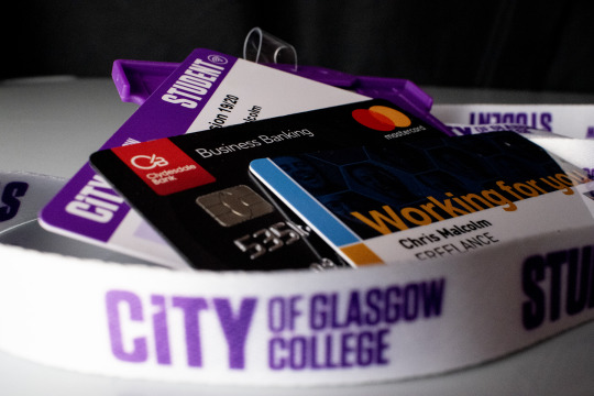
I liked this shot as it encompassed the various aspects of my life in ID cards and a business credit card, with the lanyard encompassing everything, hopefully showing it’s importance in the shot.
This, quite subtle silhouette portrait, was chosen as I wanted to show myself working in my office to demonstrate the business part of my life.
Full Colour Triptych

I thought the 3 images would work together better if I made the outside 2 square.
Black & White Triptych
I wasn’t happy that the tonality of all three images worked together well, so I converted them all to black and white in Photoshop. This helps with the tonality, however, I think it’s probably a bit of a cop out so need to look at better ways of making the 3 images work together as a triptych.
Class and lecturer Feedback
The feedback I received from my class mates was comments like “They are a working man”, “Productive lifestyle”, “Workaholic - puts a lot of energy into their work”, “Hard working person, enjoys studying and is passionate” and other very similar comments. This feedback was really useful as it showed I had conveyed part of the message of “Who am I” but also highlighted that I had not conveyed the family part of my message and should look at using the full versions of some of the original shots, which show the other aspects of my character and life. I had constructive feedback from my lecturer too, which gave me ideas on how to improve the shots and hopefully make them “hang” together better as a triptych.
Second attempt at triptych shots
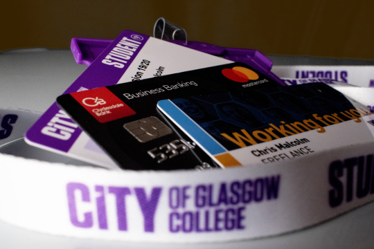
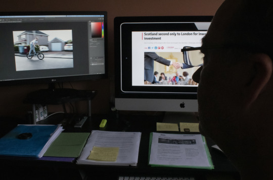
My initial feeling is that while these images MAY be ok individually (although I am no longer happy with the self portrait as I feel it’s too dark), by the time they are put together as a triptych, there is just WAY too much going on in them and no real flow to them. I need to have a re-think and maybe look at shooting 3 more images that work well together, tell the story, as per the brief and I am happy with creatively. A better self portrait could be the answer, so I will re-shoot that this week.
Final shoot for triptych
Contact Sheet:
I realised today, that the best way to make sure all 3 images worked together tonally well, was to shoot them in the same place. Although I was reasonably happy with the still life, it was out of place in the triptych so I decided to drop that shot (along with the very dark and not too obvious) self portrait. The only shot I was happy with was the “place” one, so today, as the natural light coming into my studio/office was really nice and golden due to the time of year and cast interesting shadows, I decided to shoot the portrait there, in the next section of the room and the final “object” shot in the last part of the room, as the sunlight moved and illuminated the different areas in interesting ways.
For the portrait, I selected a shot I thought would work well, used in portrait format, in the centre of the triptych. I think the shot is fairly enigmatic and works quite well with the effects created by the sunlight and shadows. I would have liked better catchlights, however, I think the fact they aren’t prominent lends an air of mystique and maybe even sadness to the portrait.
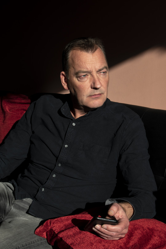
For the “still life”, I decided to show my object as my iMac, as this is where I spend a lot of time working on content for my events, studying photography and viewing pictures of my family over the years. I dropped in several shots on the monitor on the left to show family are a large part of my life, however, finding a shot that tonally worked and didn’t look really cheesy and posed was not possible so, unfortunately, I dropped that idea from my final triptych and used a shot I think still told a bit of the story but really worked much better to give the flow I was looking for (and the picture within a picture). I really like the shapes in this image and think it works quite well.

Final Triptych

Evaluation
My initial research didn’t really give me anything in particular I wanted to emulate or I thought would work particularly well, with the concept I was trying to portray. The first 3 images (apart from the “place” one), were a bit literal and “corporate” and that was the message I got from the feedback (rightly so). I am happier with my final 3 images as I think the flow together in this triptych much better than the previous 3 which I realised were not only quite detached from each other but also were WAY to busy to allow the viewers eyes to view as single images but more importantly, as one overall image that wasn’t confusing but hopefully interesting, balanced and intriguing. I think that I am so used to thinking in terms of individual images rather than how they would all work together as a series, I found this brief quite hard, however, I am happier with my final triptych and look forward to feedback.
Today I had feedback with my lecturer who suggested cropping the self portrait as a square as he thought this would work better and show more of a relationship between the centre and right images, I did this and think it helps and gives a better balance. Below is the square portrait edit and beneath that, my final revised triptych.

2 notes
·
View notes
Text
Q&A post with the Mods!!!!
This is going to be a long one oh boy
How strict is the delineation of creative control vis-a-vis characters/plays between the mods? (@pedanticlecturer)
We generally have the plays split up along lines of “what we know”— we have a list at the very beginning of the blog. Sometimes we’ll draw the others’ characters (mostly me drawing some of Star’s…) but even then the final say on characterization is up to the “main” mod for that play — mod aster
what aster said -- mod star
What is your favorite play? What is your favorite character in terms of how they were written in the source material? (@pedanticlecturer)
I think my favorite play overall is Macbeth, just because I like the vibes (and the fact that I too could kill Macbeth), the fact that you don’t say it’s name in theatres, and the fact that it’s a play I did a full read through and analysis of in class. Favorite character? Puck from Midsummer. — mod aster
uhhhh,, hmm. ive always had a soft spot for midsummer since i saw it with aster esp bc of how fun the costumes were. of the comedies it has the largest potential to be the most visually pleasing bc of the concept of fairies,,,and im gay and dramatic so i love that. id die if i got to costume design for midsummer,,,or be in it,,,yeah. fav character. hmm. probably mercutio?? i recently saw a version of romeo and juliet where mercutio was played by a woman and oh my god it was amazing!!! not to mention mercutio’s portrayal in baz luhrmann's INCREDIBLE version of r n j!!! (I based my mercutio design on him) he just spends the entire time making dick jokes. love that. -- mod star
How do you answer asks so fast? I mean it's great but I'm impressed 😂 (Anon)
Personally, it’s a mix of: notifications on, quick drawing speed, and using the blog to avoid my class work — mod aster
aster is fast and (as you can see from all of my answers) im lazey -- mod star
Are there any elements/characters of the plays you're covering that you would have liked to work into this blog's plot, but couldn't due to the constraints of the setting or the synthetic nature of the blog? (@pedanticlecturer)
I wanted to make everyone gay but unfortunately due to plot constraints we have to have some hets but that wont stop me from making it lgbt as possible. -- mod star
I did want to make The Tempest more of a central play, but it just didn’t translate well. Similarly, other supernatural elements like the witches in Macbeth. This isn’t so much a constraint mentioned, but my own time/energy means that I want to show the Macbeth backstory, in a specific format, but I can’t right now— mod aster
Is there a hierarchy of import when it comes to each play's individualized impact on shakespeare high's general arc? If so, what plays are crucial to the foundation of the story? Which ones did you do mostly for shits and giggles? (@pedanticlecturer)
This is phrased like an ACT question and i might not answer it right so sorry in advance but: mod aster and i only selected a few plays for each of us to do given we dont know all of shakespeare’s works, but we tend to put more emphasis on the the more well known. But it also comes down to 1. How much we have plotted out for each play and 2. What the followers ask about most. Our two most popular are hamlet and macbeth bc people are familiar w those but around march caesar always becomes relevant again. I didnt even have designs for some of the characters until someone asked about them. -- mod star
I would say the same as star— it generally comes down to what people ask about. I will say that the overall plot is sort of separated into “has happened” and “is happening”. Like, the human potion of Midsummer, Julius Caesar, and Macbeth are all in the “aftermath” portion, while Twelfth Night, Hamlet, and Romeo and Juliet, among others, are happening. We’re trying to incorporate as much as we can, and I don’t think any of them were really put in without some thought.— mod aster
What personal significance does shakespeare hold in ur guys' lives? (@pedanticlecturer)
I go to a theater school rn and so ive dealt w shakespeare (although not all of them) it also helps that i was in loves labours lost last year as moth and that i read hamlet and r n j. Theres also a theater in my state that always does One Big Shakespeare per season and they always do them super well!!! My love for shakespeare probably started w seeing midsummer at that theater w mod aster!!! So. Theater kid rights!! -- mod star
To be honest, I got back into Shakespeare Because of the blog. I’ve been friends with some people that got really Pretentious about Shakespeare, and it kinda put me off of it. I did have a book of abridged plays (the plays’ plots written out in prose, basically) that I read as a kid, which is what got me into not only the plots of a lot of the plays, but also the idea of having them illustrated. And, same as star, the theater in state does the One Big Shakespeare— and they tend to do some really cool things with the costumes, setting them in diff time periods. I haven’t been able to see any lately since I’ve moved, but they still slap. — mod aster
🥰😘💙🥰🥰💜💟🥰I 😍💗💚😍😍LOVE🖤🖤 YALL ♥️♥️🧡💛💚💝❣️💕💘💖💗💓💞💝❤️💛💜 okay now i have a question i swear— how long have the two of you been doing art??? and what were your first shakespeare plays??? (@hellaghosts)
Uhh i started drawing when i was like idk 12 and i have the giant boxes of sketchbooks to prove it!!! I moved to digital art at abt 14-15 but mostly stayed traditional until this yr when i got a Neat New Tablet so some of my sketchbooks are sitting abandoned rip. My first shakespeare was either romeo and juliet or midsummer nights dream and i love both of them v much!!! I have a very old piece of art that i did for r n j for my freshman class assignment on it and it hasnt aged well alsdjfjafd circa 2016 i think??? -- mod star
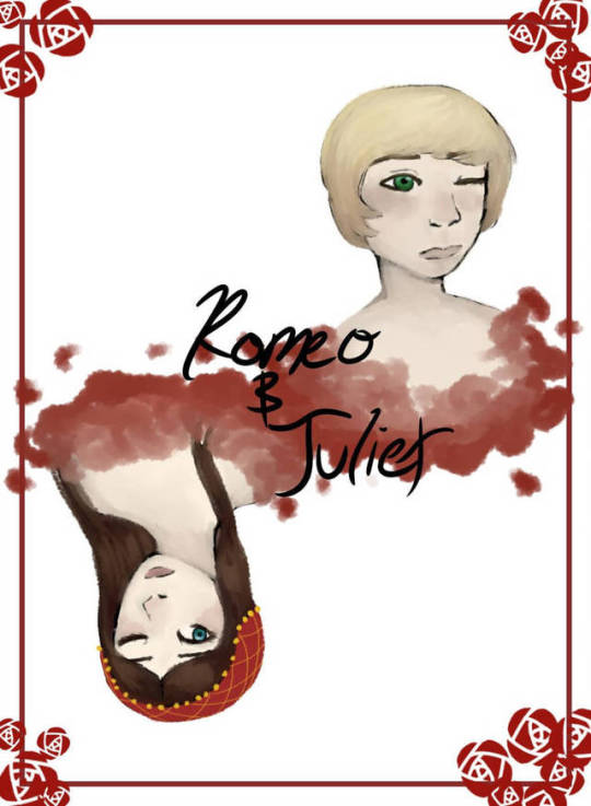
Oh man. I started drawing when I was about 10, but it was Bad. I don’t think I got much into drawing again until I was about 14? Sometime around the end of middle school/beginning of high school. I would say I started getting into drawing as more than doodling/coloring edits sometime around 2015-16? I would draw on my iPad with my finger, then I got a tablet for my computer, and now I pretty much stick to my iPad with an Apple Pencil. My first Shakespeare play was….. uh…… probably Midsummer???? I have No idea. We would go to plays when I was little, so I honestly don’t remember if I saw others before. It may have been Romeo and Juliet— I had that book where it was the original and the “modernized” with the little dog that explained things— which, if you know it makes sense, but if you don’t is probably a bonkers answer. — mod aster
Do you think this blog has like? An overarching thesis (be it b/c intentionally or simply b/c ur own take on the world has bled thru to the point where u believe it’s central to the piece at this point)? (@pedanticlecturer)
Not gonna lie, I had to read that like three times AND dm you to figure out what you were asking from us and all I have is “be gay, respect women, write your own happy endings”. — mod aster
This blog started with an ides of march shitpost and you think we have enough brain energy to write a whole thesis? I projected feelings of found family onto my half of the blog but idk if that counts. Be gay do crime 420 69 -- mod star
What’s the nature/rough dynamic of ur relationship? How do y’all know each other? (@pedanticlecturer)
Met mod aster when i was like 4 and even tho we didnt live close we became like, best friends although the Best part didnt start until we were like 13-ish and eventually we talked like non stop (about anime and homestuck. Yknow. 13 year old kid things) and we didnt see each other a lot bc of Distance and now its even worse bc aster is in colleg.,e but we consider each other siblings regardless of family bc we’re adopted into our own respective families so that bled over into our friendship and it would feel weird calling him anything other than my brother now. We’ve seen each other at our best and worst and if you really want a good insight on what we’re like as siblings watch griffin and justin mcelroy’s overview video of catlateral damage wherein i am griffin and he is the long suffering justin. -- mod star
Star is basically my long distance sibling and functionally the only cousin I recognize bc like their parents are basically an aunt and uncle and like our dads look enough alike that we’ve both accidentally gotten the wrong dad for a hug or similar so like. Anyways yeah Star is the Griffin to my Justin, complete with our absent middle brother who we love dearly— mod aster
Dubiously relevant q but what kind of music do y’all listen to when u do art (if that is indeed a habit either of u partake in) (@pedanticlecturer)
It can depend on the piece? I was working on some (unrelated) oc prints that were song-focused, and for those I just listened to said song on loop. Sometimes I have playlists. Sometimes I’ll just be in a Mood and throw a song on loop. But a lot of time for the blog, I’ll listen to The Adventure Zone for the billionth time, because I have Too Much Attention. I’ve also, on request from Star, linked the most recent “loop song”.— mod aster
I tend to obsess over the same like 3 songs every few weeks so those get listened to on repeat but it also depends on the tone of what im drawing or who im drawing i might genre switch bc of that. If im drawing ophelia i stick to lana del rey and if im drawing hamlet its the neighborhood, horatio is sufjan stevens etc. i have categorized,. Most of the characters i draw into different songs/genres/energies of music but not like i ever follow that. Sometimes i just pull up a really long nonsense video and forget to draw. Essentially: ¯\_(ツ)_/¯ -- mod star
How’d y’all come up with ur pseudonyms? (@pedanticlecturer)
I love space so much and my main blog is starryeydsailor space gay rights!! Im also tiny and full of energy and bright so basically i;m star -- mod star
Uhhhh i was like “hey i want to do uhhhhhh flower?” And then I google searched flower names until I found one I liked —- mod aster
How did you end up deciding the rough timeline of events in canon? (@pedanticlecturer)
It’s mostly determined by like. How we choose per story? If that makes sense. Like, we just take story by story, and decide “is it happening, has it happened, and when?” And then we fit them together in relation to each other just by dint of. All existing at once. Like, I knew I wanted Macbeth to be in aftermath, because like, even though there’s no murder, the way I’ve translated it to the AU is still kinda heavy, and it’s something that I don’t know that I could do properly if it were happening right now. Also, it’s more interesting IMO to have them at different times. Tl;dr we wing it per story and slot them together— mod aster (mod star agrees I just can word better, in theory)
If you could tell the story of shakespeare high in a different format than an ask blog, would you? Obviously y'all are making very good use of the format, but would you want to write this as a animated series or like? a comic book? or is the form inseparable from the story? (@pedanticlecturer)
I kinda wanted to do a webcomic or maybe to plot develop through like, animatics but the element of surprise comes from the asks we get and really makes us think so the blog is a good start. We didnt think we’d get this far -- mod star
Pretty much what Star said— there are certain elements where it’d be neat to do as a comic or as an animatic. Like, the fantasy dream is like, an anthology webcomic of each story, where you can like, see other characters in the background and stuff. But to be honest, we develop a lot by what we’re asked— there was a post about developing worldbuilding by being asked questions and then pretending you’ve thought about the answer, and it’s not far off. Personally, it’s hard to just lay out a story, because I have a whole WORLD and what’s relevant? What are people interested in? It’s by getting questions that I can then focus in on an area to develop. And yeah, we Super didn’t think we’d get this far lmao — mod aster
Any headcanons about your characters that you don't think will ever come up on the blog through asks or plot posts? (@pedanticlecturer)
I could make a whole separate post for this!!!!! Mostly its voice headcanons (and by mostly i mean like 1 or 2) or relationship hcs!!!! -- mod star
Honestly same. I don’t think I have voice headcanons for mine, though I bet I could find some. I’ve got a bunch of miscellaneous headcanons that just kinda float around, but like they’re scattered, too numerous for this post, and also not always things I’m sure are canon yet.— mod aster
#mod post#mod aster#mod star#q and a#birthday#we cant seem to read more AND tag so like brb gonna go kill god
5 notes
·
View notes
Text
ShareAlike three.0 Unported — CC BYFind the perfect Graphic Designer to your project and browse portfolios for emblem design, visual design and website design. These instruments are many and assorted, and which the graphic designer uses might be depending on their area of specialization within the field. In line with Upwork, freelance designers can charge a set, per undertaking charge for a visual. The cost can be excessive, you will not need to always micromanage or harass somebody for designs, and quality will normally be higher than hiring a freelancer.
Mobisoft's designers are each proficient and skilled and will produce alluring designs that change into an integral a part of your corporation. Designers should interpret shopper needs. Please do try my graphic design portfolio and get in touch particularly in case you're in need of a particular model id.
Clever, inventive results, that meet your wants, can solely be found by learning about you and what you are promoting. While developing your skills in certainly one of these Graphic Design specialisations you will discover ways to use devoted software program programmes. As vice chairman and division director of The Creative Group in Atlanta, she's been a firsthand witness to the rising need for design professionals.
Those working in computer programs design could have higher prospects than graphic designers who work for publishers. To rent the fitting designer or developer for your website, you first need to grasp what you are attempting to perform with your website. Hire graphic designers from Pune, India who are capable of creating an attention-grabbing cell app interface.
You probably have an edgy model, you want to look for an edgy design aesthetic throughout your portfolio evaluate; a designer who has loads of whimsical or company samples isn't going to be the appropriate fit. We'll break down eight core rules of composition and how they relate to graphic designers.
The Graphic Designer is a visionary who transforms your idea into a picture that perfectly says your thoughts. End up a military of designers, developers, marketers, and writers. SAG IPL helps the companies develop with devoted graphic design experts, positioned all through the world.
Graphic designers create visible communications to convey messages in an effective and aesthetically pleasing method. Graphic design can be overwhelming for newcomers with no previous expertise. Port Talbot, Neath-Port Talbot consists components like imagery, coloration, typeface, graphics and icons.
Luckily, the internet is full of communities of designers keen to offer feedback - that is why we prompt finding influencers and friends to engage with. This is a continuation of Graphic Design Bootcamp: Part 1, so it is supreme when you have completed that course nevertheless it's not required.
Drafters use software to convert the designs of engineers and architects into technical drawings. To reply these questions and more, I sat down with graphic designer Eduardo Barrios of Barrios Promoting. The good news for graphic designers is that almost all of these charged with writing code for an internet site simply aren't as gifted in terms of producing graphic and visible representations that enhance usability.
Since UI designers design website and web app layouts, it's essential to incorporate robust wireframing abilities in a UI design toolkit. Participated in workforce effort to produce streamlined manufacturing of policy manuals and educational materials for newly employed employees and freelance designers.
No matter you should design, BeFunky's Graphic Designer has completely pre-designed, customizable templates to spark your creativity. The one and only mission that a graphic design has is to sell the shopper's service or product (they act like visible salesmen).
However, most graphic design positions require not less than a bachelor's diploma. Easily connect with native Graphic design freelancers in Mississauga. If you want to rent a graphic designer to create a brand-new brochure, count on to pay somewhere from $300 to $600.
Some graphic designers additionally tackle the position of multimedia producer. An in-home designer is a good possibility if your online business model really requires a full time designer. With a design contest, designers compete to win your venture; you get to view a ton of various designs and choose the one you like greatest.
Most good emblem designers say the process requires upwards of 12 - 20 hours explore fully, dozens if not a whole lot of sketches, and intensive analysis on the topic(s) involved. To determine and develop a enterprise graphic design plays a significant position.
Website designers who were employed by different website homeowners. The tool gives easy 3 step designing process which is so streamlined that even without any designing skills, you may create a logo that matches your business needs.
I'm a self taught graphic designer. There are fundamental technical skills any designers or developers should have. Due to this fact, graphic designers should create and maintain a constant feel and look across many disciplines. banner ad design Nottingham, Nottinghamshire make your pictures and design projects stand out from the group.
When you really feel such as you need a cellphone name, meeting, or recommendation or steerage on what to create for your corporation - Designhill Duties will not be the best fit for you. Graphic Designers might use a combination of typography, visual arts and web page format methods to provide the ultimate creative outcome, to convey a particular message.
1 note
·
View note
Last Seen Blogs

miraculousmaker
MiraculousMaker
uhtcearre
きらきら
wiitzend
fair river-daughter

kabochacreates
Follow me on Instagram @kabochacreates

tovonind
Tovon Ind Ramblings