#there is a real spider that inspired most of the design and colour choices
Text

my spider-sona thing spider-kitty! (or spider-nyan)
#the silhouette is *chefs kiss*#i want to scream about it but idk#there is a real spider that inspired most of the design and colour choices#i think i might have a little bit of brain#anyways#oh yeah their web thing is that they make weapons out of webs#yeah#usually a big humongous hammer#eyy i should draw that#my art#art#digital art#oc#oc reference#spidersona#THEY HAVE A FROG FRIEN#their un-spider name is kit btw lmao i forgor#not gonna tag properly because thats not what my tags are for smh
87 notes
·
View notes
Text
Passion Project: Inspiration
I don’t think I’m starting at the beginning with this post. Keep your eyes peeled for later posts that explain what I’m doing and why.
After a month of thinking about, sketching and painting designs, I have finally done something. Essentially, recently watching two films has pushed me into action, and a part of me is ashamed to admit it. There isn’t a word count or any typesetting to curtail my thoughts here, so strap in.
When I created this brief I figured I’d draw a million wee skateboards, colour a few of them in, then fling my favourites into Adobe illustrator and make them look good. From there I would take the 5 best up to the skatepark and ask some of the patrons there which designs stood out to them. Next, I would adapt the three front-runners and create sweet PhotoShop mockups that would show what my designs would look like as skateboards. If I had the time, inclination or money by the end of the project, I would have the design laid onto a real skateboard (I’ve been looking to buy a new one for some time) and then be proud of myself.
So I’ve drawn some wee skateboards. Then I started upscaling the designs onto the floorboards of my loft:
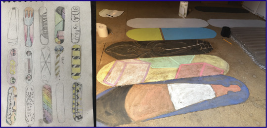
This was an exercise to let me see how small things need to be adapted to be blown up. Skateboards can have any level of detail that you like on them, I hadn’t considered this until I was trying to draw a semi-perfect triangle for the traffic cone, or until I was using chalk to recreate four cubes. It’s also been fun to work with different media on chipboard - I have learned that most kinds of pencil, paint, chalk and charcoal do not like being used on chipboard. Decorating paint, however, has no such issues. Thanks, Dulux!
And so, with a few of these under my belt, I decided to try some digital designs. So I jumped into Illustrator and totally ignored my sketchbook, coming up with three designs that were all inspired by the day I had just had. The top design, I’ll focus on last, for reasons that will become apparent (unless you follow me on Instagram, where you’ll already know that it’s an absolute hit, with over 19 likes already!). I was told by a guy at the skatepark that he likes decks with very basic designs, just a colour or two, nothing overly detailed. Another skater told me that he often likes the basic wood background with one small emblem or sticker just beside the wheels.
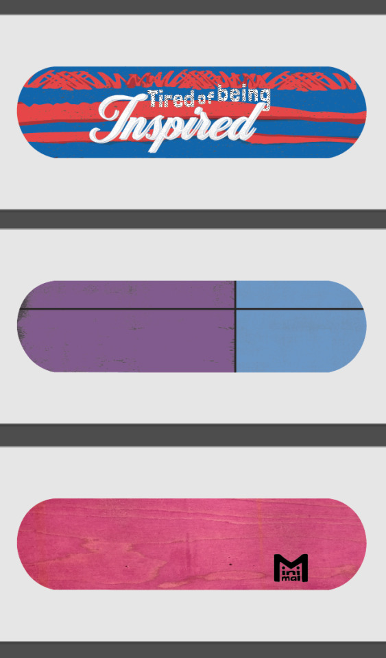
The duo-tone design felt nice, I’m usually one for over-complicating things. I definitely have an attitude of “If there’s more in it, there’s a greater chance someone will find something they like”. The first colour choice put my girlfriend in the mind of a hand-bag she had seen photographed in the arms of Carrie Fisher - it was designed to look like a Prozac pill. So I changed the colours up, and added the separating black lines and textures to give it some subtle character. I then went full meta with the Minimal design. And, if I’m being honest, I’m incredibly happy with how it looks like a wee character. Expect to see that making a comeback in the very near future. But the top design is what really got me going.
I’ve recently been watching...
...Spider-Man: Into the Spider-Verse, and have been loving Miles Morales’ multiple hobbies of graffiti, mixing beats and saving his neighbourhood from a variety of dangers.

I then went to the cinema to see In The Heights, telling the tale of the Latin community during a blackout in North Manhattan. I found myself wrapped up in the romance, tribulations and music of the cast, and was felt oddly proud of Lin Manuel Miranda - who wrote this as a stage-musical while he was in college, had a modicum of success with it, then went on to create Hamilton, one of the most important musicals of our time. With the success of that particular show taking the entire world by storm, he was given the opportunity to make his old, relatively only semi-popular play into a blockbuster film. You can’t help but be inspired by someone like that.
I often find towards the end of a film I’m inspired by the characters’ journeys: be that from zero to hero, from lonely to loved or from rags to riches. Then I walk out and carry on with my normal life doing normal things. And as the hero of the story’s dreams all came true in the closing minutes (sorry for the spoiler, but it’s a musical, they rarely end in despair), a thought floated across my mind:
I’m utterly sick of being inspired
Now, to my credit, I did figure out in the car home that ‘tired’ would be a far more fitting and rhythmic word to use in this sentence, but this was a mentality that I found resonated really strongly with me. I’m very good at being inspired, I think most people are. We hear stories of people starting their own business, achieving some sporting brilliance or overcoming a personal hurdle and we say “Wow, isn’t that inspiring?” or
“It really inspires you to go out and make a difference!” or
“They are such an inspirational speaker!”
Then we go off about our day, not acting on the inspiration, and, for the most part, remaining uninspired. So I decided to act.
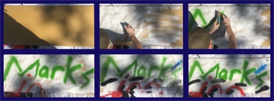
I did some very quick research (/acquiring of images of graffiti) in order to get the right shapes and textures to create a spray paint effect in Illustrator. I did some very quick research (/confirming the colours) of South American flags, taking the blue and red used in flags of the home nations of Miles Morales from Spider-Man and Usnavi from In The Heights. And I created the top design.
YES! I had been inspired and I had drawn a wee picture to show that - I had acted on my inspirations!
Then I looked to my left and spotted three, blank skate decks that I had bought on a whim from Re:Ply (a wonderful wee company who do a great deal of charity work supplying boards to people who need them, selling boards to people who can afford them, and for a very reasonable fee, providing unusable decks to people who want to use them for artistic purposes). I realised I hadn’t acted on my inspiration, I had just drawn a few pictures of skateboards with the eventual aim of PhotoShopping them onto other pictures of skateboards.
So I took myself...
... into the city centre with a shoddily prepared speech: “I’m looking for some cheap, small cans of spray paint. I’ve no idea what I’m doing, or if I’ll be good at it, so don’t want to invest too much into this.” Hiding behind this self-deprecating shield I barged into multiple art-, pound- and model-shops and pleaded with the staff to help a young idiot out. Amazingly, a very kind shop assistant pointed me in the direction of Fat Buddha, a clothes shop I’d always ignored as it seemed a bit to “...” for me. I don’t know what it seemed, but I knew it wasn't my kind of shop. Happy to prove me wrong, the guys in there were super helpful and they helped me buy my first cans of spray paint.
Now I’d spent money...
... and as a skinflint, that meant I had to get use out of my purchases. I had tricked myself into being inspired. Inspiration led me to the drawing, inspiration had led me to buy decks and the paint, now inspiration had to make me spray paint.
I’ll stop yammering on now. Essentially, I had planned on creating some analogue designs then digitising them (I’m guessing I should do a post on my brief, yeah? Might just upload the PDF to save me talking more), but then I found that I was doing the complete opposite. Genuinely accidentally. I had played with a few typefaces from various websites to get fonts that represented the ideas I wanted. The top one was semi-stolen (I can’t use the word ‘inspired’ any more in this post) from the end credits of In The Heights. The larger font is something of a nod to inspirational quotes you see on Facebook or on glittery frames in B&M.
I printed those out and cut them into stencils (very impressed that my digital boards have been drawn to a workable scale, thanks Maths). And after putting down a tack-layer (GRAFFITI JARGON (I think)) I sprayed the whole lot in blue.
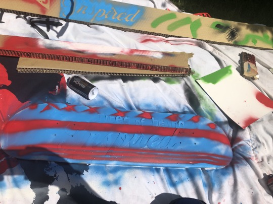
Next, I tried to get a little fancy. Using cardboard blockers to create straight lines I added stars* (borrowed from the Puerto Rican flag) and made the bottom stripes vaguely reminiscent of America’s Old Glory.
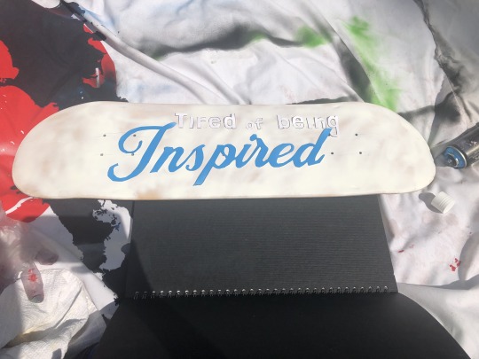
I peeled the lettering off, and I’d done it. I may have to explain the overtly-negative inspirational quote to people, but to me it’s a clear sign that there’s no point in just being inspired, and that’s all I wanted.
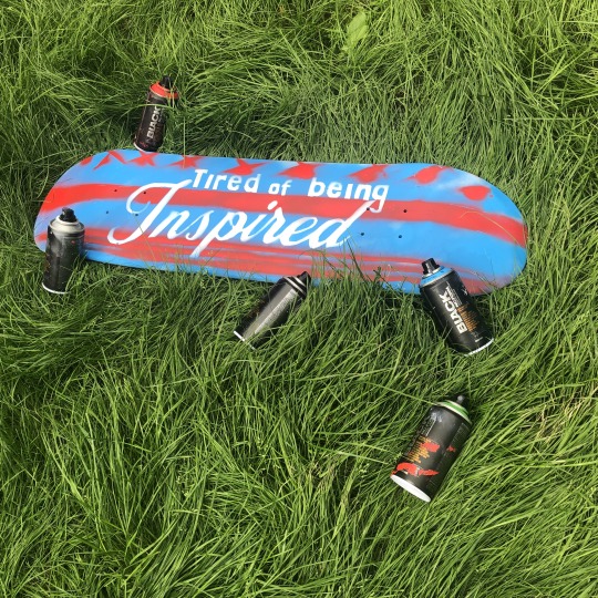
A weight I didn’t know I was carrying was lifted from my shoulders. The plan was to possibly end up with a self-designed skateboard. And now I have one.
*Yes, I know they’re crosses.
4 notes
·
View notes
Text
BA1b Summary: Week 4
Animated Sketchbook
This week in Animated Sketchbook, I’ve begun developing on the drawing tasks introduced previously and introduced to the idea of spatial awareness in drawing. Last week, I established my interest in motion referencing (quickly sketching images from a video) in order to develop my understanding of a specific animal over time. I decided to tackle another animal this week: the snake.
The independent session began by completing some quick sketches of what I thought a snake looked like, going through a series of poses that I personally assigned to a snake. From this, I then watched some visual reference of various snakes through imagery and film, and quickly sketched from this. These sketches were much more successful, as I’m beginning to develop an understanding of the creature’s shape and form.
We also had the opportunity to visit the Norwich Castle, drawing on-location as a way to observe, record and study subjects and our environment. The session asked us to step out of comfort zone, drawing people and objects in public and acquiring visual experiences. This was the main takeaway from the session: not to go out and create a singular realistic drawing, but to explore a form through quick, explorative sketches.
When looking at an object, I should try and find any straight lines and effectively ‘box in’ my subject. This helps the brain and eye see it in a three dimensional space, and thus I can begin to sketch the object too. This idea of ‘thinking inside the box’ was actually a revolutionary idea for me, and I can completely see how it helps in perspective building. To complete the day, I created a few quick sketches observing a very interesting-looking bird, sketching from different angles in order to take in the entire form. These were more interesting, I feel, as I’m exploring a complex animal form.
In this session, I learned a quite interesting and novel idea: when drawing on location, and from observation, capture the subject, not the image. Through this project, I hope to challenge and work upon this idea, developing my drawing skills.
Digital Principles
This week in Digital Principles, my focus was on experimentation and colour. My main goal for the week was to experiment in the 3D workspace of After Effects, to begin putting things together for my morphing animation.
Through my experimentations this week, I was finally able to decide on a colour palette - pulling from the dark, deep tones from inside the Shell and reworking them for both the alien language and the ship itself. It’s a limited palette, almost entirely monochromatic, however I feel like this will work very nicely and allow the transitions of the morphing animations to be more easily understood and followed.
Following this, I decided to do some more visual research: looking back at the film, and most importantly, concept art. My research led me to exploring the work of Meinert Hansen, a concept artist who worked on the film in it’s early stages. It was mainly his Shell Interior concept art that I looked at, which presented the set with visual clarity, texture and a real depth. Looking at these artworks led me to take an entirely different approach to my opening sequence - one which challenges my skills in After Effects and Illustrator.
Whilst researching the industry of motion graphics, I found the work of Emanuael Colombo, an award winning motion designer based in Milan. I did a little bit of digging into the artist’s process, which starts in Illustrator to do most of the actual design work.
Whilst my initial approach to the first sequence was very minimal and geometric, I now wanted to produce two digital illustrations of the Shell’s interior, and have a digital camera pan through, in a paralaxxing motion. Although this is much more intensive, this week we were given a deadline extention: due to absences and other occurrences, we have been afforded the luxury of a later deadline for this (and the sketchbook) project. This means that I have a little bit more time working on the animation, (hopefully) allowing me to produce a final outcome that I’m happy with.
I’ve made two illustrations that adhere to the sleek, minimal and flat design language inspired by my motion graphics visual research, and challenged myself to move past a strictly linear and simple approach to this sequence.
Additionally, after playing around with a 3D replication of the Shell, I’ve decided to focus on a 2D approach to this project. Whilst experimenting in the 3D workspace has been exciting, I can’t help but feel like I’ve reached the extent of the extrusion 3D effects potential here.
Next week, I want to begin designing the props of the sequence in Illustrator using simple shape layers, a flat design aesthetic and my new colour palette.
Narrative Research
This week’s Narrative Research session took a step back from introducing new ideas and concepts, and instead asked us to develop our understanding of theory that we’ve already explored. In this case, it was applying our knowledge of the Seven Character Archetypes as described by writer Christopher Vogler and exploring how the character’s in Pixar’s Up fit these roles. The task was to produce a plot summary, and analyse how the cast fit the archetypes, in a written analysis.
We were shown the film in class, and I took this opportunity to begin writing my analysis straight after the ending credits began rolling. As the film is relatively short, we were afforded a bit of time before class ended, and I could complete my written analysis of the session. Not only was this an example of good time management on my part, it also allowed me to discuss the film and it’s application of Vogler’s theory with my peers. This ended up shaping my final written analysis, an amalgamation of my ideas and the concepts suggested by fellow students.
When writing up my initial plot synopsis, I decided I wanted to push this task further by analysing the narrative using Vogler’s modern adaptation of Joseph Campbell’s mono-myth, the Hero’s Journey. In doing this, I’m not only challenging myself, but developing my understanding of narrative theory beyond what’s expected in the session. It was interesting to see how easily the film followed the plot structure, but naturally. Pixar subverted the audience’s expectation of the mentor character in young Russel, the little boyscout who rekindles Carl’s liveliness. In an ordinary narrative, the mentor would typically be an old, wise man to a younger, plucky hero: however, when the hero is an old man, this concept is instantly flipped on it’s head. The plot is appealing, engaging and exciting: very much driven character-drive, and I find it hard to believe the talented writers at Pixar would have followed such a rigid stricture - hinting at the fact that the mono-myth may be intertwined with Western society and our idealism more intimately that previously thought.
This session was helpful to those considering exploring the Hero’s Journey as an essay question: a subject I’m heavily considering given my new-found choice of Spider-Man: Into the Spider-Verse as subject of study. The film centres around what it means to be a hero, and so analysing the film with this structure (and character archetypes from said structure) is something I will definitely be doing when gathering research and information on the film.
Despite this, I have considered a few animated films to analyse for this essay. Next, I will begin writing these notes up as a way to evidence more than one approach to the task, and how I reached the conclusion of Spider-Man: Into the Spider-Verse.
0 notes
Text
Building Mr Nancy the Raspberry Pider robot
Before I start, I should explain that I am very, very much a beginner. I have only a little knowledge of robotics, coding or electronics. However since doing the (very, very excellent) free Picademy course run by the Raspberry Pi Foundation, I have gained the confidence to introduce the Special Needs students I teach to more and more physical computing, coding and electronics projects.
So what you are about to read is how to build a robot spider from a beginners perspective. It is, I feel, a great little project for a beginner or child but my instructions are by no means definitive. I am sure that more experienced makers will be able to give better tips and pointers. If you are one of these people then do please comment. Also, anyone is free to ask questions :)
Can I thank all of the people in the wonderful Raspberry Pi community on twitter and on the forums, who have been very patient giving me advice about the coding part of this project.
So I was shopping in Tiger and for £5 I saw this Build your own DIY spider toy. On a whim I bought it, thinking, ‘Mmmm possible future robot project. Will give me some practice ready for work’.

And a couple of weeks later, I used it to build a robot spider that follows lines (sort of), avoids obstacles (sort of) and can be operated by remote control (really). Below I will post the build photos I took so that I could remember how I did it if I wanted to do it again.

A couple of weeks after buying the kit, I went to the Raspberry Pi 5th Birthday Party in Cambridge. Whilst there I bought the latest version of the Pi the Zero W.
When I got the Zero W home I realised that the perfect use for it would be as the basis for a robot project, so out came the spider kit I had previously bought.
When I studied the picture and the instructions I quickly realised that the kit would make a simple toy that walked in one direction. I would be able to use the Raspberry Pi to remotely make it walk forwards and maybe backwards, but nothing else :)
I realised though that if I bought a second kit, chopped the legs off one side and added it to this kit with the legs chopped off the other side then I would have two independently controllable sides to a spider. This would allow manoeuvrability, line following, obstacle avoidance, etc.
So I bought another £5 kit.

To these two kits I added:
Zero W (£10)
CamJam Edukit #3 (£18 from PiHut but I didn’t use the motors or wheels from it)
Powerpack (£1 from Poundland)
Male Hammer Header (£2 from Pimoroni or £6 including jig and female)
Googly eyes
Lolly sticks
AA batteries

Below are the photos of the build. They are largely self-explanatory though here and there I have added notes (particularly when things went wrong).
I started with a Zero W (and a cup of tea of course)

I am not good at soldering.
Really not good.
The Zero W comes without a GPIO header (the pins used to control robots) so you have to solder one on. Fortunately, the wonderful Pimoroni chaps have recently introduced a product which dispenses with hours of swearing at a soldering iron. They sell ‘Hammer Headers’ which just require some gentle hammer action:


With the GPIO header in place on the Raspberry Pi Zero W it was time to move onto building the kits:

At this point, I should have sprayed WD 40 onto the gears and into the gearboxes as I built them but I didn’t. Instead, I had to try spraying it in at a later point which was rather messy.

Each kit comes with two sets of four legs making eight per kit or sixteen altogther.
Each kit has one motor which is designed to drive two sets of legs simultaneously. You need each motor to drive just one set of legs (four) so need to hacksaw off the spare drive shafts:


With the basic chassis built it is time to introduce the Zero W together with the motor controller HAT from the CamJam Edukit #3 (from The PiHut). Here it is plugged into the powerpack from Poundland

The motor board from the CamJam kit is a very simple H-bridge that allows each motor to be powered separately backwards or forwards with it own separate power supply (AA batteries)

Next I started connecting the motor board up using the instructions from the CamJam website.
I decided to solder the wires to the battery contacts in the spider chassis but they could be attached by trapping them in the little springs.


I was later to discover that two batteries are not enough to power this robot, so I added two more batteries in a battery box much later (see later photos). You will probably want to do this at this point.


Blu Tack is your friend!


You will need some really widdly screwdrivers to attach the wires to the motor board.


You can now make the Pider walk around by remote control but to do this you will need to be able to wirelessly access the Pi Zero W. I use Real VNC to do this over wifi. You activate the Real VNC Server on the Pi Zero then you need another device to be running Real VNC Viewer.
Real VNC runs on a range of different platforms, I have it installed on my Lapdock Raspberry PI, a Windows Laptop and on a Chromebook. By preference, I use the Chromebook to access the Zero in the robot.


Next I wanted to add the ability to follow a line.


NOTE: The wires included in the CamJam kit were all white. This makes the wiring VERY difficult. So I replaced them with coloured wires. This is something that the people at The PiHut who make these kits need to consider :)

Once you have tested that the sensor is working it can be attached.


NOTE: You’ll notice that the line above is rather wide. The reason for this is twofold. Firstly, the Pider rocks from left to right as it walks. This means that if the line is too thin the Pider will see black then white, black then white as it walks. Secondly I cheated on the code and used Scratch to tell the Pider to turn left if it sees black and right if it sees white. This does work, after a fashion.
With Mr Nancy happily (just about) following a line course (after a certain amount of colourful language) it was time to add a distance sensor so that he could avoid obstructions.


To hook up the wiring and resistors for the distance sensor you have to add a breadboard to the robot. I did this by building a little platform on the back.


I also had to build a front for the sensor to be glued to.
NOTE: To begin with I used self-adhesive velcro to fix the distance sensor to the front of the motors. This fell off over night. Next I glued the sensor directly to the front of the motor not realising that this would completely gum up the motors and stop them from turning. that is when I opted (after using some choice words) to build a front piece raised forward from the motors.


Again, follow the wiring instructions from the CamJam website.


I had been increasingly concerned at how weedy the motors seemed to be. The Pider struggled to walk most of the time. I wondered if adding more batteries would help, so I added an extra battery compartment (more soldering, aarrgghh)

Success! The additional batteries transformed the Pider, so much so that there was too much power and Mr Nancy leapt all over the place. Then I had to learn how to control the power using something called pwm.
You will note that I haven’t really mentioned coding here. this is for two reasons. People have their own preferences and should really use whatever language they are most comfortable with. Also because I am so ins=experienced at coding I wouldn’t want anyone to copy my bad code.
I suggest checking out the code on the CamJam website though I used it more for inspiration. I used a combination of Scratch (for the line follower and remote control) and Python (for the distance sensor, obstacle avoidance) making use of Ben Nuttall’s excellent GPIOzero which specifically supports the CamJam Edukit #3.


Finally, you will find you have two spare sets of four legs. Each set of legs can be calibrated to take short or long steps. So I have two sets set to long and two sets set to short. You can then pull off and push on different sets of legs according to your needs :)

0 notes
Text
Pokeverse: Button Mechanic
Because this is one of those verses that is going to cover all the muses in various different ways. But there are technically going to be two variations on this concept, depending on how the threads are set up...
Also who doesn’t like Pokémon aus? Come on!
So first off, let’s talk about Aothur’s version of things. Both variations... not that it really matters too much. The only variations between the two Pokeverse aus are whether it’s in the actual Pokémon world, or Pokémon just kind of exist in their regular world because... Well just because.
Pokeverse: Aothur
First off, I’m going to list out his Pokémon, and then explain the choices of them, since I really do love doing that! Since there actually is typically a reason behind a choice, and sometimes those reasons are just as important as the pokémon themselves you know... So you guys ready? Okay, well here’s his team!
Dedenne(technically Galaham turned into one)
Rotom
Kirlia
Banette
Galvantula
Buizel(shiny)
Alright, see those six... Remember those six, because it is time to explain them.
Dedenne: The most obvious one first, Dedenne I mean sheesh, since Dedenne is one of the only pokémon that might have been based off of a hamster(although the design also takes inspiration from the Japanese dormouse and gerbils) I kind of had to give him one. Especailly since seriously. Seriously, had to keep Galaham there somehow. So technically the Dedenne I gave him is just the Galaham of his world.
And yes, due to familiar rules, he can talk.
That and well, Aothur needs someone who can respond to him... But also, there are a few other reasons I selected dedenne for this. For one thing, just go and have a look at how adorable dedenne is. A round small pokémon with big ears and a long tail! Those cute little radar style whiskers... just gosh...
Also there is the typing to take into consideration, I just love that dedenne is an electric/fairy type pokémon especially since that is something that fits, because Aothur is a mechanic, who goes off hunting down the paranormal... which includes the fair folk. Whether they be mischievous or not... It’s just fitting.
Also because I like having this stuff for a reference, I would say the ability is Pickup and the Move Set is Nuzzle, Thunderbolt, Thief and Protect...
The reasoning behind the move set and ability is just... well eh. Not really that fazed about explaining. But I’m sure a cute Dedenne as Galaham makes perfect sense.
Rotom: Because honestly, rotom isn’t a legendary pokémon and that’s my one real rule for these kinds of things... but also, we all know rotom. The mischievous electric/ghost pokémon that possesses people’s appliances and makes them go a bit wild. I mean seriously, rotom is just... the most fitting pokémon... I mean, even including the whole Rotomdex thing...
But anyway, do I really need to explain this one to you guys? We all know rotom, and we know why it’s a fitting pokémon. A pokémon that is more or less pure energy held together, and that loves to mess around with electrical equipment but can be occasionally helpful... Yes please.
It’s only ability is levitate and well, as for the move set well; Electro Ball, Ominous Wind, Swagger, and Sleep Talk
Because you know what, yes.
Kirlia: Because Aothur is a big baby who feels a lot of things... Okay, but seriously. Seriously, why would I pick a kirlia of all pokémon to give to him? Because well, here’s the thing. Kirlia are really sensitive pokémon, and honestly, they’re pokémon who are emotion driven, and care a lot for those who care for them. Basically, kirlia is his support pokémon really, along with Galaham the dedenne. But you know...
There has to be more of a point to it than that... so let’s talk about it. Kirlia is literally called the Emotion Pokémon it dances when it’s trainer is happy, and it’s also a pokémon with the power to peer into the future and see what may be coming. It’s a sensitive pokémon, it dances when happy, and gets sad when those around it are sad, it’s also a pokémon that gets more beautiful when loved by its trainers... by which I take that to mean it glows with its happiness and really looks healthy. Which yeah...
It’s also a psychic/fairy type.
Now why is that important? Well because here’s the thing, when I initially done this list, I had an idea of what the baseline Arthur’s team is... and so these guys are more offshoots, and types matter. We’ve already talked about why dedenne being an electric/fairy type works, so fairy is covered... but psychic? Well here’s the thing. Mediums channel psychic energy to do what they do. Also, empathy. And a little bit of my original soleil concept, but ahh, who cares about that. The fact is, psychic energy is something that Aothur technically has access to.
So why not a pokémon with those abilities. And since Kirlia is what it is... it fits the best.
The ability his kirlia has is telepathy and it has the move set of: Heal Pulse, Psychic, Hypnosis, and Dazzling Gleam
Banette: Feel like tossing away an old toy of yours? Haha, but seriously, banette is one that is for this verse only really. I mean seriously, the marionette pokémon with my button eyed Aothur? It’s just too fitting. Also, a bit of the voodoo kind of hints, along with the simple fact that it’s a ghost type.
Maybe it’s a bit vengeful, but hey, not everything would be perfect.
Has the ability Insomnia, and the move set; Shadow Sneak, Curse, Will-O-Wisp and Phantom Force.
Galvantula: Come on into my web said the spider to the fly... Again a verse exclusive pokémon. Despite spiders bringing up bad associations. You have to understand that Aothur uses strings to deal with some of his problems... and despite the whole, spider-Beldam associations, there is other things to consider regarding this choice.
But seriously, I have a reason for this pokémon despite many people assuming that he would automatically avoid all spider based pokémon. And the reason is well, here’s the thing, I know it’s kind of ridiculous, but the muse wants what the muse wants. Also, generally speaking, look at how fuzzy galvantula looks... Also, again, there is the typing. Electric types are definitely Aothur’s bread and butter, and Galvantula is an interesting pokémon both because of its typing, but also moveset... and just seriously...
Do I have to explain myself that much...
The ability that it has is Unnerve. And of course the move set is; Electroweb, Bug Bite, Thunderbolt and Poison Jab
Buizel(Shiny): Now I’ll be perfectly honest, when the muse demanded this pokémon... I just burst out laughing for a good long while, because really Aothur? Really? But okay, for you to understand why I’m laughing so much, you need to understand a personal rule I have when it comes to a character’s theme animal. Barring some relatively specific circumstances, said animal cannot be their favourite animal... so Aothur doesn’t have hamsters as his animal... what animal did I go with? Otters, and yeah alright, Buizel is slightly more weasel like than otter, but it is still technically an otter pokémon.
Maybe more the river otter than a sea otter though.
So yeah... heh... Aothur decided he had to have one of the otter pokémon, and buizel won out over oshawott. So here he is, and a golden yellow shiny one as well. Because you know, the colouring... also buzel can fly according to the anime, so allusions to a certain other twin-tailed flier.
So yeah. Swift Swim is the ability of his Buizel and well it has the move set of Aqua Tail, Agility, Ice Beam, and Mud-Slap
And that’s his whole team! So yeah... Fun right?
Also, just because welp.
MDPokeverse: Aothur
I’m going to be honest with you guys about this, when it comes to PMD verses, I kind of limit my choices by a lot of things... But that isn’t stuff for you guys to really worry about... so I will just give you my answer for what he would be if it were a PMD style thread and that answer is...
*drum roll*
Emolga...
Now I’m sure there are some people staring because what... but yeah. My limits won’t be explained, nor will my choice. You’re just going to have to roll with it. So, neh.
Oh, also because I really, really like the bows from PMD: Explorers... I will have to additionally add what his Aura and subsequent bow is... It’s... A brilliant green... which leads to him having the Lime Bow. Which yeah... it’s a light greeny-yellow colour really. Got to say, he’s been affected by things, whee.
0 notes
Note
sorry to bug ya, im sure you get this a lot, but i love the way you design characters alot?? esp your splatoon stuff. i was scrolling through your blog and i was so happy to see some actual anthro fishes, and not just, like, human versions with sea creature hair?? all your art is really inspiring and its really just a joy to look at. anyways, i was wondering if you have any tips for character design? i hope you have a great week, keep up the great work!!
Oof I’ll admit I’m not all that great with words, so I’ll keep this short and to the point. For me, I try to keep my designs fairly simple. This mostly means using a limited colour pallete of no more than around 3 colours (4 is pushing it). Usually I’ll use two colours that are very similar, and then a colour that compliments them. So for example in this picture
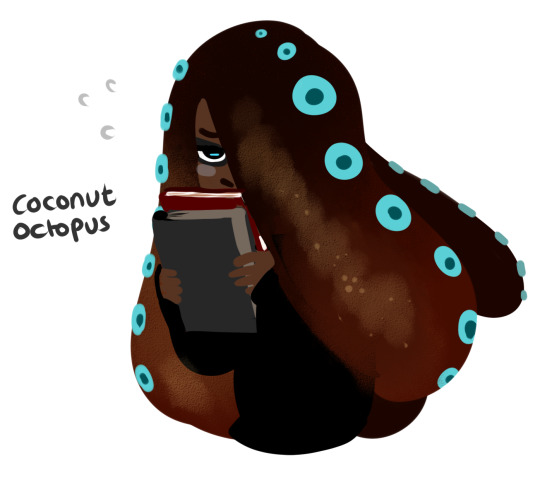
my primary colour palette was dark browns, with just a hint of yellow peeking though. Teal is the complimentary colour here, and in my opinion, complimentaries should be used sparingly, like to colour the eyes or nails. Small spaces that are evenly distributed across the character’s silhouette. You can use use them in larger spaces, or even push the limit of your colour palette to something as large as five different colours, but I would stick with 3 for the most part. It’s basic colour theory and research into it is quick and easily accessible so I wont go too much into it.
The other thing I like to do is, if I’m designing a character based on something else, like a creature, for example, I try to sneak in as many visual references as I can. For example
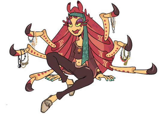
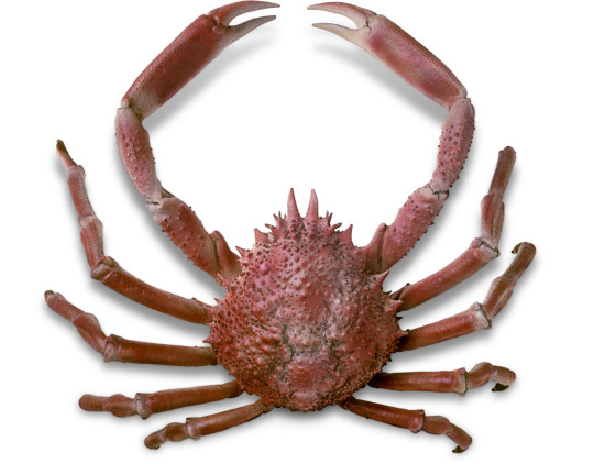
with my character Athena, the spider crab, I wanted to incorporate the shape of the crab’s carapace into her final design. The easiest way for me to do that was to translate the shape into her hair, so that from the back, she would look almost identical to the real life thing. It’s a pretty easy and straightforward design choice, but it works well, and I think it’s a good example to use therefore.
Basically, try and keep it simple. Characters don’t need to be cluttered and have retina burning saturated colours to look good and be memorable. Some of the most iconic characters to date, like Mickey Mouse, Sonic, Mario and Bugs Bunny have super simple colour palettes, and easily readable designs and silhouettes. And yet they’re recognized all over the world.
106 notes
·
View notes
Last Seen Blogs

lobster169
Untitled
delicatefl0wers
Princess Joana

mariahlynnmonroe
mariah lynn
ainslielab
Ainslie Lab @ UNC