#thephotographiceye
Text
Martin Parr - Only Human
290319
Martin Parr (1952) is a British documentary photographer, photojournalist and collector. His photographic projects often adopt a satirical slant and document the eccentricities of the British social classes. The Martin Parr Foundation was founded in 2014 and it is located in his hometown of Bristol. It acts as an archive for the British photography that he has curated and as a gallery space. He has been a member of Magnum Photos since joining in 1994 and a former president from 2013-2017.
‘Only Human’ is Parr’s current exhibition at The National Portrait Gallery. It discusses themes such as Britishness, Brexit, belonging, globalisation and consumerism. The room ‘Celebrity’ is an assembly of his commercial commissions. These images represent the juncture between social documentary and formal portraiture. His photograph of designer ‘Paul Smith’ 2016 is an environmental portrait created for Apple Music, which aims to capture the subject’s British absurdness. Smith appears surrounded by the paraphernalia of his office and each book, fabric sample and kitsch piece of furniture becomes implicit of his personality. The appropriately entitled ‘Everybody Dance Now’ is a collection of images depicting individuals dancing. Any inhibition is cast aside regardless of age, class and social background. It was a theme of interest for Parr during his studies at Manchester Polytechnic, where he photographed parties at local pubs and ballrooms. ‘Dinner Dance’ 2016 is an exemplary photograph from this display that captures the joyous expression of a gentleman at the Savoy Hotel who is breaching the formalities of British reserve.
Seasides are a recurrent location of fascination for Parr. ‘The Last Resort’ 1983-1985 is one of his best known series and presented the realities of the British holiday in forensic detail. At the exhibition, ‘Beside the Seaside’ is an extension of this area of photographic study. He comments upon the behaviours of people in such a context across several nations, each with their own cultural traditions to separate them. Universally, the seaside remains a setting that is both private and public inviting the photographer to explore with his indiscriminately lens. ‘Sorrento’ 2014 is shot from a high vantage point to isolate close up details of the inhabitants. The subjects are unaware of his presence and his approach is unapologetic in capturing their intimate predicament. The beach towels present compounding sections of colour that appear in contrast against the grey sand. The scale of this piece adds to the overall chaotic discomfort, which is in keeping with the rest of the exhibition’s temperament.

Martin Parr, Dinner Dance, 2016
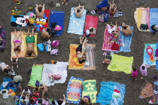
Martin Parr, Sorrento, 2014
2 notes
·
View notes
Text
Editing and Sequencing Photos
Neil Matheson’s lecture – 17.10.2018
Editing: - Identifying your best images, find a series that work together
(coherent)
- Image quality (on a more technical side)
Sequencing: - Order/way in which we choose to present our images
Knowing what we want to achieve for the assignment should be something we are already aware at this stage of a project. We don’t have to follow any rules of composition, we can break any stereopticon rules ever made in photography is that’s what we want.
Visual expression and communication need to be coherent, starting and ending with a strong image is what we should be aiming for. Relations between sequence need to make sense
William Klein’s book called ‘Life is Good & Good for you in New York City’ is a good example of coherent project. He wanted to “take revenge” on New York for the way he was treating as a child and represent the city under in a honest but harsh way.
Before digital photography was invented, contact sheets (from the darkroom) were the way to make your editing. Henri Cartier-Bresson once compared a contact sheet to a “psychoanalyst casebook” as it records the moment the photographers was shooting and not just one photograph. In the 20’s and 30’s magazine such as ‘Vu’ or ‘Life’ were a way for photographers to have their work feature as a series and make money. This meant that they needed to have something to show and tell, a narrative.
Bill Brandt, A Night in London, 1938
‘A Night in London’ was one of Bill Brandt project. The way he decided to present his images (order) is very interesting and probably an excellent example on how to sequence your work. What Brandt was trying to show was this idea of a city than never sleep, showing different social class (opposite between rich and poor) from working to higher class. He didn’t really worried about his images being authentic as many of them were staged and many of them had reference to movies (such as Hitchcock’s movies). Over this body of work, we can notice a visual rhetoric in his presentation.
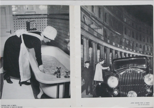
Bill Brandt’s layout of the page from his book.
Walker Evans, American Photographs, 1938
The way this project was first published was with the text behind the image which pushed the viewer to concentrate and make his own interpretation of the photograph. We can find different sequences, containing ironic comparisons between reality and idealized representation.
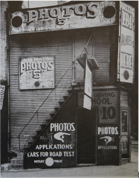
Starting image of Walker Evans’ project ‘American Photographs’
Other interesting project good for example:
Chris Killip, In Flagrante, 1988
Paul Graham, A1 The Great North Road, 1983
Tony Ray-Jones, A Day Off, 1974
2 notes
·
View notes
Photo
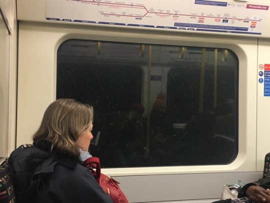
Thought that i had to take a picture of it. Reflections
1 note
·
View note
Photo
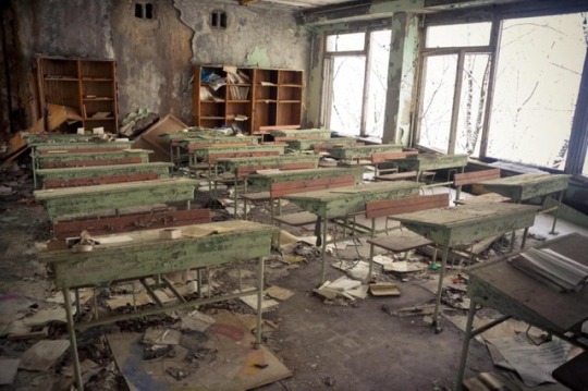
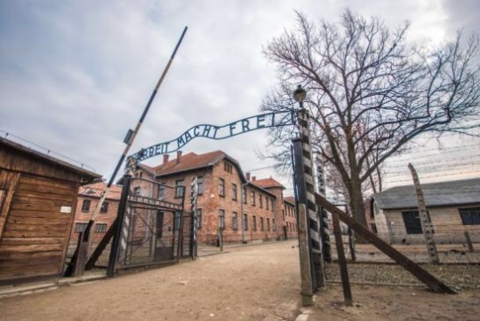
Chernobyl and Auschwitz.
4 notes
·
View notes
Photo
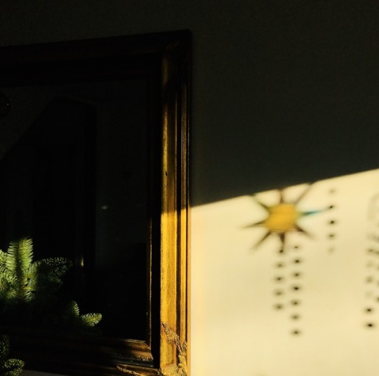
When light overtakes dark
1 note
·
View note
Photo
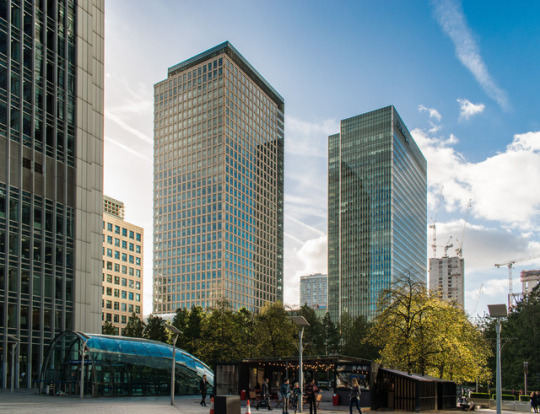
These are my final 8 chosen pictures of the project ‘Time-Space-Light’ , and this is the sequence I decided to choose for my series.
#4imag001w#timespacelight#thephotographiceye#final#series#canarywharf#london#modern#architecture#nature
2 notes
·
View notes
Photo
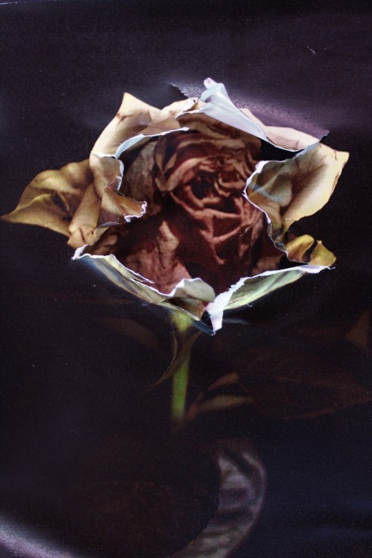
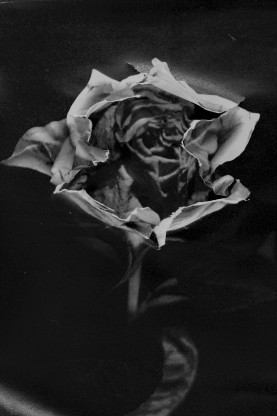
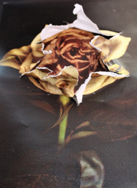
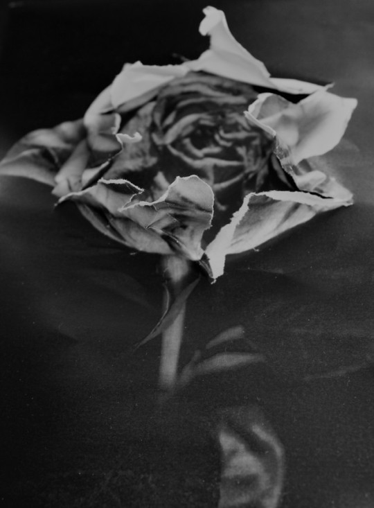
An Absence of Beauty.
Inspired by Mark Jacob Bulford, I attempt to emulate his layering technique in multiple photographs seen here. I came across his work of mind bending distortions and his unique style during A Levels which instantly intrigued me to create my own using this technique as my muse. While creating these reformed images, I focused on manipulating my subject to uncover just how ugly some subjects can be. While analysing my images and assessing every detail, using the same analytical skill we can see that it can portray the superficial and absence of beauty within our society.
1 note
·
View note
Photo
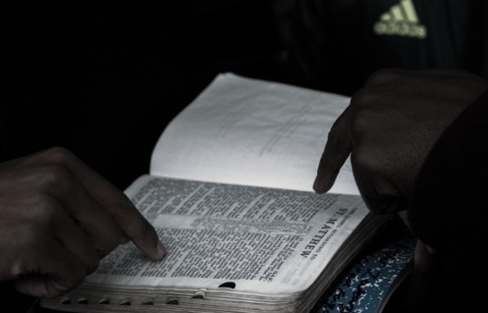
This is my favourite image from my initial photoshoot as I feelit highlights conflict between religions.
1 note
·
View note
Text
Project Critical Evaluation
100419
Project Title
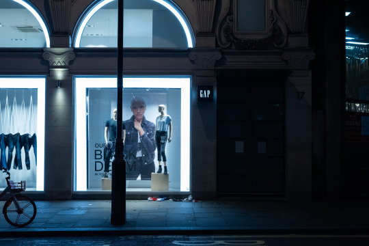
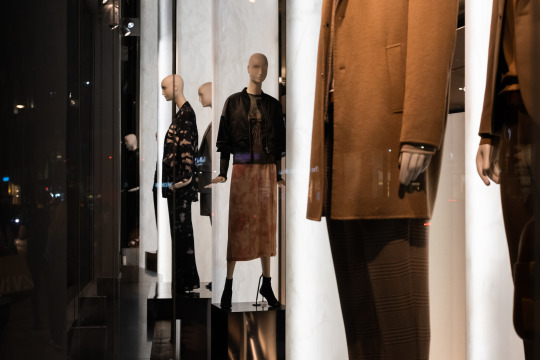
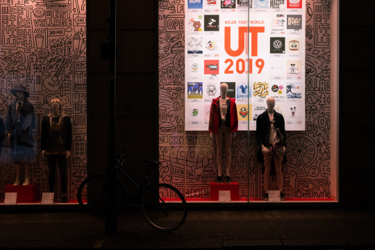
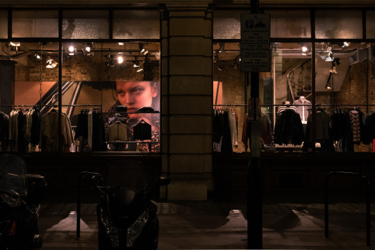
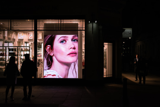
The title ‘Object / Fetish’ remained a constant throughout my project. It is a play on the terms ‘objective’ and ‘commodity fetishism’.
Subject
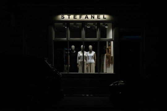
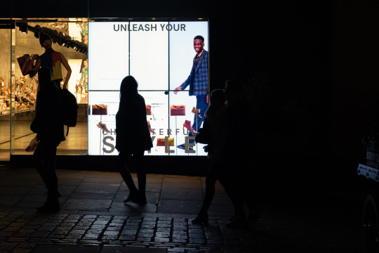
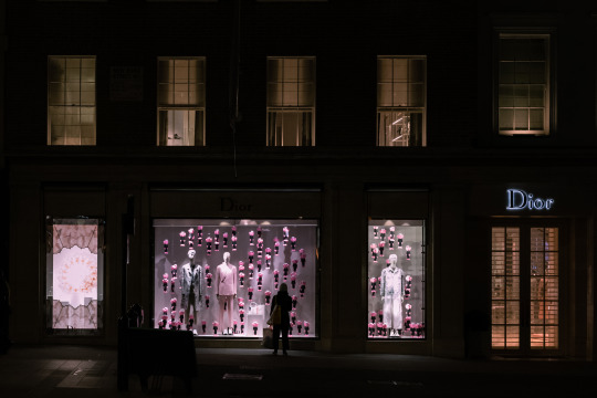
The Roland Barthes essay ‘The Rhetoric of the Image’ 1964 and David Campany’s critique of the subject matter provided the basis for my study. Retailers impose commodity fetishism upon consumers in the pursuit of commercial gain by making their products deceptively appealing. I decided to photograph store windows in the retail districts of London to comment upon this issue. The final outcome deviated from my proposal due to the observations that I made as each shoot progressed.
Aims / Objectives / Concept
My initial objective was to reveal the realities of luxury products and the devices that retailers employ to make them appear aspirational. Oxford Street and the surrounding areas became my main location of interest. I had a brief diversion into China Town to photograph products that may be perceived as kitsch to parody luxury items. Given that our brief specified a final edit of five to nine images, I felt that these would be a distraction from the overall theme. Patterns began to form in my photographs due to the conformity of each store unit and the fluorescent presence of their signs. The function of this urban landscape is historically commodity fetishism. I felt it was fitting that the dimensions of the space, such as pavements and central islands in the roads, dictated the composition that I produced. Furthermore, the LED panels in store windows meant that many of my pieces recontextualise and distort the photographs that appear inside them.
Form / Medium / Presentation
My Nikon D750 is a full frame DSLR camera. It has an aspect ratio that resembles 35mm film and I decided to maintain a landscape format throughout the project. I collated in excess of 150 photographs over three evening sessions. The editing software Lightroom was useful to catalogue these images into collections, which automatically record the time each was made. I added a further detail, which was the location of each shoot. A simple blue tag was placed onto any photograph of interest and a collection was made that brought these all together for consideration.
An aperture of f/8.0 was a consistent choice to ensure that most of the detail I captured was sharp and in focus. Since I wanted minimal motion blur, I worked in ISO 3200. Many of the exposure histograms of my photographs were in a well exposed range. The main edits that I made in Lightroom were the addition of +30 contrast and -30 highlights. This was to counter the brightness of signs and panels. Clarity +10 was added with luminance +20, a step added to correct any digital noise that might have been problematic. Patch tool was used a few times to remove distracting reflections in areas of total darkness. Finally, lens correction and the transform modules were useful to align the horizontal and vertical features within each photograph. If any of the horizons or store features were skewed this would have been distracting. My production journal comments on specific colour saturation preferences.
Prior to printing, each image was sharpened in Photoshop with the unsharp mask function. A white border was added because the printer was not able to produce full bleed photographs. As a consequence I feel that the borders actually add to each piece, as the white contrasts the colours on display making them appear bolder. Their lustre finish is also complementary to the fluorescent nature of the works.
Mock up versions of each piece were printed and cut out to allow colleagues to suggest their interpretation of the final edit. Since every image is the same aspect ratio and in landscape it was a challenge to present them as a montage. A single linear formation worked well; however, since they appear all at once compositional choices regarding form, line, colour and subject matter determined their organisation. I would like to propose a book format for the final piece with the photographs appearing in linear chronological order. This would allow the viewer to appreciate each piece without distraction. Interestingly, they actually group in a sequence of three store windows with mannequins, three photographs being photographed and a final three that tie these themes together. With further time and budget the photo book would have many more entries and there would be a possibility to add the time and date as captions.
Research
The works of photographer Rut Blees Luxemburg appealed to me the most during our opening lecture. She was of particular interest to me given that she is a former Westminster graduate student. The main attraction of her take on street photography was her use of colour to imply the intonation of each piece. The Deutsche Börse Photography Foundation Prize 2019 nominee Mark Ruwedel became another reference for his objective study on the effect of historic and political agendas on a physical landscape. There was an implied parallel to my project and photographing a shopping district. Recontextualising a photograph became another theme of my series. Sherrie Levine and twins Doug and Mike Starn have approached this subject in their artwork. Please refer to my production logs for more information.
Working Edit
Final Edit

1 note
·
View note
Text
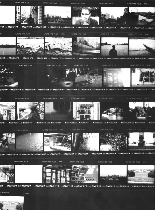
Printing Contact Sheet in the Darkroom
Rachel’s lesson - 19.11.2018
This Monday, we learned how to print contact sheet. I used the negatives I had from an exercise I did with Miro when we were first introduce to the SLR camera. The exposures on the neg weren’t perfect but it was still good enough to be used.
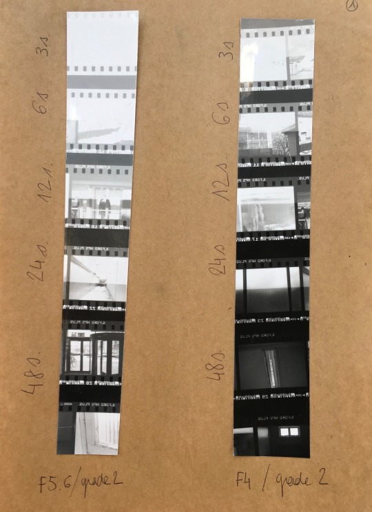
I started with a test strip trying different exposure times. I quickly realised that I should open up my aperture otherwise I would end up having a really long exposure which isn’t really practical. I opened it up from one stop and ended up with a 12 seconds exposure. I printed a full test strip using that specific time but realised that it could be a bit longer. Rachel told me to open up my aperture from half a stop to had 6 seconds without actually wait 6 seconds longer but I was scared to completely loose my settings as the lens wasn’t working really well, so I just decided to be careful and just add 6 seconds to my timer. When I finally printed my full contact sheet, my settings were the following:
Aperture F4
18 seconds
Grade 2
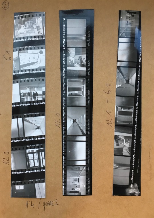
Note to myself:
You don’t like glossy paper, so don’t use it and don’t buy it! (In case you forget)
1 note
·
View note
Photo
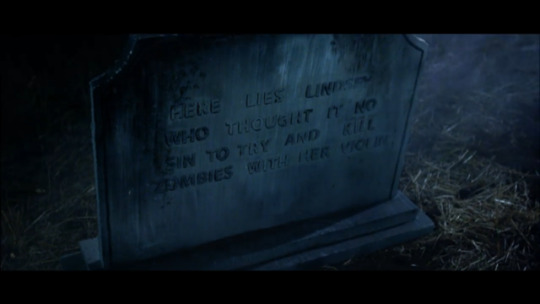
Some inspirational shots from Lindsey Stirlings Music video to Moon Trance.
1 note
·
View note
Photo
1 note
·
View note
Text
The Photographic Eye:
Group Tutorial and feedback made me realise where I can see my project going. I was looking into and thinking about absent parents in families and how they are portrayed as I’m currently a single parent.
For years I spent my life as the perfect housewife/mum. In theory you could say I was present at home but in my mind I was absent as I was very unhappy.
Now I’m alone with my two children and I’m not trying to portray the perfect housewife or mum I’m just being me and doing what I want to do. I work, I go to university and I have my own life outside of the home and children. I’m more absent than present and in a way not present at home when I am there as I’m so busy with my new lease of life. Nether the less I am a mum I provide for them and love my children but this project has opened my eyes to my life and how society puts pressure on families especially single mums.
Therefore I’m going to look more into the impact it has on my children and how society and the media portray how our lifestyle should be.
20th October 2017
1 note
·
View note
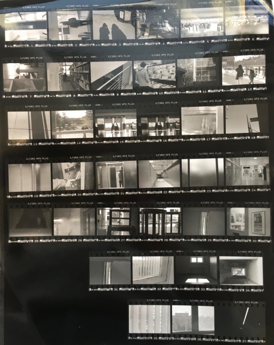
Photo
first contact sheet from first ever roll this semester
0 notes
Last Seen Blogs

wearethepeculiars
The Peculiars™

largando
Untitled
khhbitch
sad virgo.

alunasky-blog
Alunasky

temptationanddesires
54, W - Male, USA