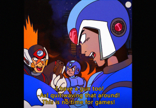
#the other is fanart of blues and bass taking a selfie and the text is WHAT I LIKE ABOUT PROTOMAN IS THAT HIS SHIELD CAN DEFLECT PROJECTILES
Text
theres so many of these top text bottom text / impact font memes with literally no punchline or joke at all that loop back to being funny just because theres no purpose to them but they all use stolen fanart so i cant share them
#2 that i just found again are I FIND THIS TRIO IMPORTANT AS THEY ARE SEEING DOING DIFFERENT THINGS#and its just an img of rock blues n bass together#the other is fanart of blues and bass taking a selfie and the text is WHAT I LIKE ABOUT PROTOMAN IS THAT HIS SHIELD CAN DEFLECT PROJECTILES#and theyre all kind of like that#theres also a genre of it where its a character doing something and theyre like THIS IS [CHARACTER] [DOING SOMETHING]#sometimes with made up context like its a hypothetical situation like THIS IS PROTO MAN THINKING ABOUT DUO i saw one liek that too#n it was just fanart of blues looking off into the distance#theyre so nothing that its rlly funny but its always fanart that def is not being credited u_u
76 notes
·
View notes
Text
2018 Megaman Summer Fanart Contest Part 1.0 Results!!
Again, thank you everyone for your patience. Too many random things popping up over the last 2 weeks. ^^; Whew, just got this posted before midnight. Sorry for the late night post for those of us in the US, but it’s kinda my thing, isn’t it?
14 total entries between the two categories, but as always, a nice mix of new participants and veterans to this contest. Are the usual players coming away with the goodies, or have the newbies snuck in to wow us with their creative styles? While tumblr will shrink down all the images, I will include the full size uploads (well, almost for all - 2 were way too big) on my imgbox account. Just click on the “(FULL VIEW)” link for each one. Hopefully this way, there won’t be people who have trouble viewing them this time around.
My thanks to @digitallyfanged and @jaybird-c for helping me judge the entries this time around!! We were all sorta on the same page it seems for our individual results, but it’s always harder when there is a smaller total of participants, because everyone is deserving in their own way.
Thanks once again also to all who participated! For all winners [and there are 10 of you, out of 14], I will be contacting you as soon as I can about your prizes. If you didn’t win, there’s always next time...which starts as soon as tomorrow, when I announce Contest Part 1.1 (as in Mega Man 11)!!
Without further ado, after the break, here are your top 3 winners for each category, the raffle winners, and all of the fantabulous artwork!
CATEGORY 1: Ride Armor Road Trip
[FULL GALLERY HERE]
1.) @follyknight: (FULL VIEW MAIN IMAGE LINK) (PHOTOS 1) (PHOTOS 2)

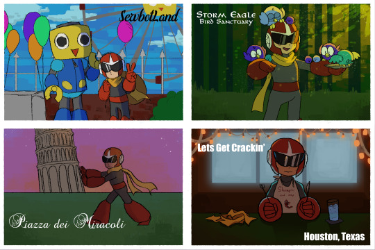
*Tabby’s #1 - I felt like out of all of the pieces, this hit the theme the hardest. Definitely showing the back of one of the cards was a really unique touch to the piece as well. And that LaLinde postcard. The CHEEK. “Hey dad, I visited your girlfriend while on vacation.”
*Jay’s #1 - I have got to hand it to Folly Knight, above and beyond doesn't begin to cover this. Eight postcards, each with a unique theme, composition, and aesthetic, and then all presented together? That's fantastic.
Miyabi’s #1 - Even as simple, everyday objects, that book and cup of coffee are painted so well! I appreciate all the various scenes you presented in your postcards, with emotions ranging in each one of them. From the hilarious “Shrimpin’ Ain’t Easy” bib to Blues’ loneliness in Fiji, your entry was varied and unique. I also felt your entry really represented the theme very, very well.
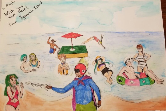
2.) @multiple-sages: (FULL VIEW LINK PIC 1) (FULL VIEW PIC 2)


*Tabby’s #2 - This is very cute. I like that it showed summer activities from sort of a different perspective/culture. Not everything is action and traveling. Sometimes it’s small festivals and quiet cafes with friends. Zero definitely seems like the type to sit around in a cat cafe for hours.
*Jay’s #2 - Man, it was hard to pick -- a lot of these have great composition, but I think the #2 Spot should go to [multiple-sages for] Cinnamon and Zero. It does a great job at setting the scene for the moment and raises a lot of interesting questions as to how exactly we got here. Obon postcard is also very good, but of the two, this is a slightly less evocative piece (that is, there's less story apparent here)
*Miyabi’s #2 - Both cards look super cute, and show different ways the hunters spend their time not battling Mavericks, while experiencing tradition in Japan. The Maverick Hunter logo stamp on Axl’s was a nice touch. The little kitties are all adorable, either sleeping or pawing around with Zero’s luxurious golden teaser toy hair. Like Cinny is trying, it’s hard to hide your smile while looking at that scene!
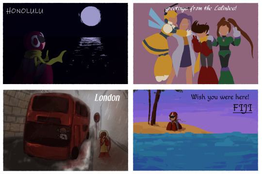
3.) Steph O’Dell: (FULL VIEW PIC)

*Tabby’s #3 - A very cute image of the ladies at the beach. Everyone needs some sun! I do dig how you made it sort of look like a selfie.
*Miyabi’s #3 - While the hubby is away, the girls will play. Haruka finally gets out of the house and to the beach with some friends. The selfie style was a different take compared to the other entries, while still feeling like a postcard. While the palm trees look like they’re just ‘shopped in, the rest of the background ocean and sand is deceptive enough where I couldn’t tell you had worked on that until I zoomed in closer. So kudos for making that part of your background look photorealisitic!
.
Runners up (in alphabetical order):
@bracedshark *RAFFLE WINNER ~ X7 4KOMA*: (FULL VIEW PIC)
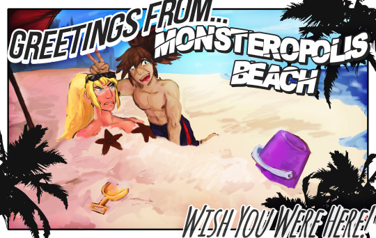
*Jay’s #3 (tie) - Very appealing and exceedingly well-composed, but kind of suffers a little from how they handle the text. There's a sizing issue the cuts some of the text short.
*Miyabi says - I didn’t know I needed to see starfish booblight Zero, but I am amused! XD I totally liked where you were going with the curved arc format for the text to match that familiar typefont on so many postcards, but I agree that the ‘from’ getting partially chopped feels like it just needed to be resized down a little more. Otherwise, a fun pic that fit the theme well!
@chaudandfrends *RAFFLE WINNER ~ ZERO ACCESSORY SET*: (FULL VIEW PIC)
*Jay wrote - This drawing is ambitious, but I'm afraid it's more pictures with text over postcards.
*Miyabi says - I don’t care if I need to eat my calcium, I am not touching those fishbones, Captain Beefhead. Good mix of action with Yai, Dingo and Netto jumping into the water, to the rest of the crew reclining and enjoying their refreshing dip. The watercolor look to your sky and sand give a little contrast to the rest of your coloring technique for all the characters. LOL at Enzan ducky on his inner tube.
@forceway: (FULL VIEW PIC)

*Miyabi says - Much like myself, a Shadow vacation involves not really going anywhere, not really doing anything, and just enjoying the simple things outdoors near home, while sipping an ice cold beverage. XD While you won’t see many Polaroids around these days, it feels fitting for these two bots. I felt it was a wonderful composition, and very enjoyable piece.
@seabyrocks: (FULL VIEW PIC)

*Jay wrote - I gotta say, I love Seabyrocks' sunset lighting, but I'm afraid the pose is a little simple and, I hate to break it to you, Rock, but you put your hands on backwards.
*Miyabi says - Nobody should visit Mega City without a commemorative autographed heroic Rock Light postcard! I do think you did wonderful blending those sunset colors in, on the right side of the pic. The purples and oranges are so pretty in the sky. Very cute!
@tealsalmon: (FULL VIEW PIC)

*Jay’s #3 (tie) - Very appealing and exceedingly well-composed, but kind of suffers a little from how they handle the text, as it blends in with the darker parts of the background.
*Miyabi says - This turned out very pretty, and also gave me a laugh with Zero’s pointy helmet tips poking through his straw hat. Having a butterfly land on X’s finger feels so fitting for his peace-loving ways, and I loved the E-Tank being used as a container to hold all those fresh strawberries. Even the little details like the dirt and grass on Zero’s shovel are well done.
CATEGORY 2: Ruby-Spears Mega Man: Plasma Powered Up!!
[FULL GALLERY HERE]
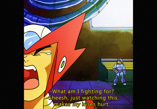
1.) @irissempi: (FULL VIEW ZERO SHEET RETRO)
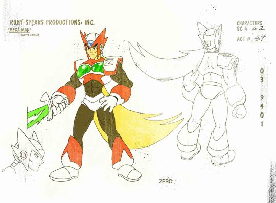
(FULL VIEW ZERO SHEET CLEAN)
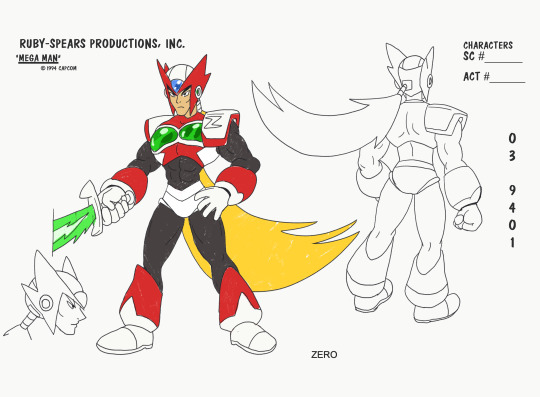
(FULL VIEW ZERO CAP RETRO)

(FULL VIEW ZERO CAP CLEAN)
(FULL VIEW ZERO CAP 2 RETRO)

(FULL VIEW ZERO CAP 2 CLEAN)

(FULL VIEW AXL SHEET RETRO)
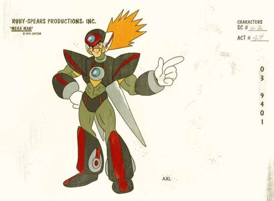
(FULL VIEW AXL SHEET CLEAN)

(FULL VIEW X SCREENCAP)
(FULL VIEW LUMINE CAP RETRO)

(FULL VIEW LUMINE CAP CLEAN)

*Jay’s #1 - This. This is the picture that caught my eye immediately. The composition, the lighting -- this is one of those iconic series' images that gives you everything a character stands for. Lumine is going to end the world, and every second of it's gonna rock. Goofball Axl and hardcore samurai Zero are also winners.
*Tabby’s #1 - I love this. I love everything about this. I love the extra mile on making the design sheets, and making it look like a horribly ripped off tv shot. The corny dialogue. Clearly Ruby Spears needed to continue and make us an X series.
*Miyabi’s #1 - You get major kudos for using an actual Ruby Spears production sheet as your format, and adding those effects to make it look just like it was a photocopy I scanned. The grainy filter to make the ‘screencaps’ feel like they came from a VHS tape, and punny one-liners are wonderful! Thanks for putting in all the work to make your entry feel like it would fit in perfectly with the original series! (P.S. - those aren’t booblights for Zero anymore. Those are mammoth pec sunglasses, that would blind anyone who dares to stare at his super cool, manly chest!!! LOL)
2.) @kaitlinexe: (FULL VIEW PIC)
*Miyabi’s #2 - Of course this theme was right up your alley, and you certainly didn’t disappoint! I can’t believe how many characters you tried to fit into this collage. While at first glance it might feel like you focused on mostly existing RS-characters, you really did add quite a few updated designs. I just have this feeling that you planned to be even more ambitious than this, but weren’t able to finish it as you hoped. But regardless of the lack of background, the work you put in drawing all of these characters is amazing! Kalinka, Treble Boost Bass, and Time Man are probably my favorites of your redesigns.The more pronounced spikes for Bass’ helmet and claws look so, so good!!
*Jay’s #3 - I gotta love all your new designs, and is your Skull Man taking notes from Hitoshi Ariga or am I just getting my hopes up? Bonus points for all the attention to detail and going out of your way to replicate the original style.
*Tabby’s #3 - You definitely have the style down pat here. It’s super clean. This would make a great poster, with a little bit of background work.
3.) @pstart: (FULL VIEW PIC)
*Tabby’s #2 - Dat Forte. You really changed up his and Gospel’s design quite a bit, and it definitely works within the Ruby Spears theme. Super kudos on the retro graphic design going on here. It almost looks like the back of the old DVD covers too.
*Miyabi’s #3 - Just from the look on his face, I feel like Bass would have the same wisecracks and would sound almost just like Proto Man...only with a deeper voice. And now I’m imagining Proto and Bass both harassing Mega in stereo. XD I like the "super” title twist to your ad, which would have played off the actual game well, if Ruby Spears got another season to coincide with Megaman 7′s release. It does feel like an ad I’d see in old gaming mags.
*Jay wrote - I like your poster design. Good job cleaving to the show's style, good job with the little details like the marketing schlock and copyright, great job with the classy reference to the old school instruction manuals.
Runners up (in alphabetical order):
@forceduser *RAFFLE WINNER ~ RUBY SPEARS WILY CEL*: (FULL VIEW PIC)
*Jay wrote - Block Man is a neat design; the plunging neckline is certainly evocative. This one, too, could've stood to have more personality exhibited.
*Miyabi says - From what little we’ve heard, Block Man’s dialogue in Megaman 11 is like by far the most fitting to be used in Ruby Spears. So he was a good, and relevant choice to try to tackle. Definitely can see his chiseled pecs hiding under his main shell, and feels like he’s at least been working out on leg day, doing squats while lifting his heavy body around everywhere.
@hyperbole1729: (FULL VIEW COMIC) (FULL VIEW BURST)
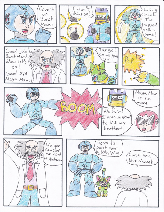
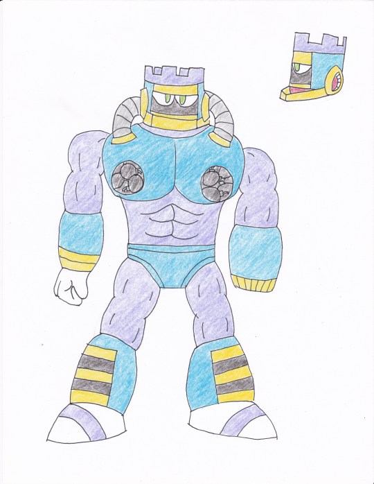
*Jay wrote - Your Burst Man is something. The explosive nipples are going to haunt me. But as stand-out as your design is, I wish you would've shown off more of Burst Man's personality.
*Miyabi says - Your comic totally has the right tone with the dialogue, from Proto’s complaint not being able to deal the final blow, Wily being Wily, and the obligatory ‘sizzling circuits.’ It flows well, has some drama, and I totally read it all in their Ruby-Spears voices. Burst does seem like he’s bulked up just right, with some minor changes to his classic design.
@3-oclock-blues *RAFFLE WINNER ~ ARCHIE COMIC INKED PAGE*: (FULL VIEW PIC) (FULL VIEW SPLASH)


*Jay’s #2 - Now THIS is promotional material. I love how well Bass is introduced by simply having him rage off into the distance. Everybody else, they're mad because they hate this moment. Bass? Bass just hates everything. Splash Woman is also a neat design, but also shows off more design than personality.
*Miyabi says - BUT I WON’T MISS THIS TIME...With all the rage and fear from everyone around them, it’s quite amusing to see the two brothers smiling as they hold their glowing busters to each other. It’s chaotic, but also nicely almost ties in with the photo theme of the first category, too. Splashy’s side fins and more flowing waves protruding from her helmet are nice touches to her design. Would have been interested to see how she and other Light/Wily bots would have fit into that family photo.
32 notes
·
View notes
Last Seen Blogs
lumea-art
Lumea | NSFW

rinasa37-blog
Meagatron9000
rioshinfillcher
Rioshin Fillcher
desterio
Error 404

aussiemale52
I'm Probably Into It