#tag:layoutdesign
Text
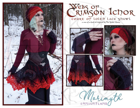
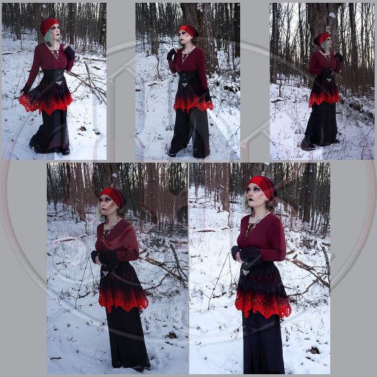

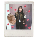
More @morimyth work for the collection! This one-of-a-kind commission was promoted on Morimyth's Instagram after I created the cover image and edited the provided photography.
As always, if you like these works, you can pick up expertly-crafted items on Morimyth's Ko-Fi page!
🕸🕷🕸🕷🕸🕷
The Court of Lolth knows when it's time to show, and when it's time to tell. When a court's ambition requires a look that says "slay", naturally, you slay.
🕸🕷🕸🕷🕸🕷
#graphic design#designers on tumblr#artists on tumblr#ad design#advertising design#marketing photography#tag:layoutdesign#tag:morimythcraft
4 notes
·
View notes
Text

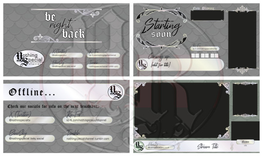
Besides the overlays and logo design, I also designed templates to be used with various social media purposes.
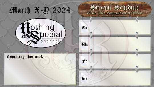
Twitch has integrated panel options that are displayed on a channel's page - I started out making them entirely images, laid out and designed as pictured, but ended up only using the "sign" titles for accessibility and legibility reasons.
The calendar is sized to a template I made that accounts for various ideal social media post site images, including BlueSky, Facebook, Instagram, and Ko-Fi. As there are multiple people who will be streaming on the page at various intervals, I made an "Appearing This Week" space on the calendar to ensure avatars and names have place to be listed without crowding what's planned on the listed days.
#tag:nscassets#graphic design#designers on tumblr#artists on tumblr#tag:layoutdesign#tag:branding#twitch stream
3 notes
·
View notes
Text


New work? New work! Kind of.
January 2024 felt like a year in and of itself. Many creatives were hit with the post-holidays slow season like a speeding bus. A few small projects were scattered around, but nothing was sustainable of itself. So, we addressed the problem ourselves, myself and some friends teaming up with one goal: take the scraps of a pile of projects and assemble something more cohesive.
We created "Nothing Special", a variety channel named for the common response to a number of questions: what do you want to watch? What kind of logo are you looking for? What do you want to eat? - it's a ubiquitous, all-encompassing title for an amalgamation of ideas that makes up the Nothing Special channel.
I took up management of the channel, handling everything from social media to behind-the-scenes production, and of course, visuals. The logo is based on my own, not only out of considering this an extension of my own productions, but also because, initially, I considered absorbing my own professional existence into a "branch" of Nothing Special. The logo was then expanded into other planned branches, including but not limited to gaming content. craft-alongs and item sales, and even tarot and other witchy things.
Figuring out how stream overlays worked and integrated with broadcasting software was a massive hurdle, and learning how to break down a designed layout into layers appropriate for streaming software was an endeavor all of itself. While many of the vector designs were stock, I applied graphic styles to match the opalescent background of the logo. The core colorways for each "branch" are also part of the opalescent background, and I colored backgrounds for each individually as well as a multicolored version to represent the channel as a whole.
Do you feel like watching something, but not sure what? Nothing special, perhaps? Check out our website here or follow us on Twitch - lots of content coming soon!
#graphic design#designers on tumblr#artists on tumblr#stream coming soon#new streamer#variety streamer#stream overlay#branding design#logo illustration#logo design#tag:branding#tag:layoutdesign#tag:nscassets
3 notes
·
View notes
Text
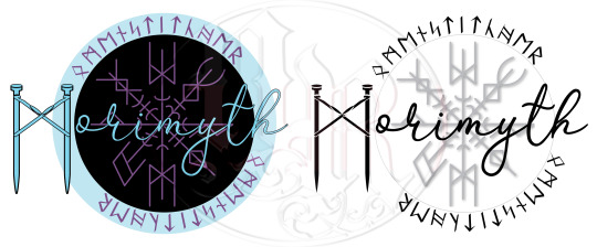


November 2023, I reached out to a fellow artist, Aisling “Morimyth” Weaver, who was starting up their own business, selling handmade fiber arts as well as etched stone rune sets, tarot readings, and other witchcraft accessories. As branding was low on their priorities in favor of keeping wares in stock, I offered my skills to create a full branding package for their use.
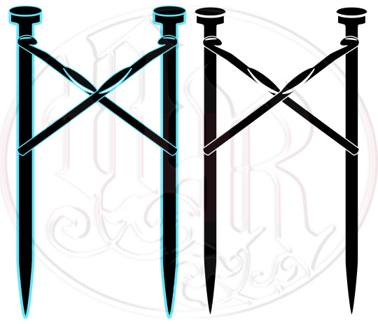
Already being familiar with their works and style after following their art for a few years, I quickly came up with a few sketches that I then presented to Aisling to choose what to develop further. The proposed package included digitizing and cleaning up a sketch of their own runic “signature” as well as watermarks for photography, a handwritten-like logo, and a logotype of crossed crochet hooks over knitting needles in the shape of their runic ‘M’ initial. Finally, I provided a branding standards sheet with all information regarding fonts, colors, and the logotypes for easy access, reference, and use on anything in the future.
If you like their products and want to pick up some fun things while supporting another independent artist, check out their sites!
Tumblr | Ko-Fi
#graphic design#designers on tumblr#artists on tumblr#layout#layout design#page layout#branding design#logo illustration#logo design#tag:layoutdesign#tag:branding#tag:morimythcraft
2 notes
·
View notes
Text
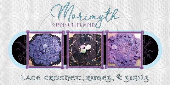
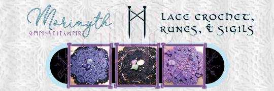
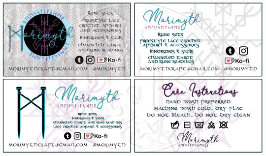

With the branding for Morimyth complete and their business progressing forward, additional assets were found to be needed. The Ko-Fi site's header needed an update, so I created one to Ko-Fi's specifications and one for more general usage. Aisling also requested business cards, some for typical usage to leave at businesses where their products were sold, and a few with a care instructions back for inclusion in shipped orders; as well as a standalone 4" x 4" card in other purchases.
If you like their products and want to pick up some fun things while supporting another independent artist, check out their sites!
Tumblr | Ko-Fi
#graphic design#designers on tumblr#artists on tumblr#layout#layout design#page layout#branding design#logo illustration#tag:layoutdesign#tag:branding#tag:morimythcraft
1 note
·
View note
Text


One of the longest-term, constantly-evolving projects I managed at Myer Farm Distillers was creating and maintaining a cohesive media kit document. This organized, easy-to-update file was kept updated frequently for quick access and reference, with the entire folder including logo, labels, and other branding assets. This was available to be distributed to wholesale clients, press and media interviewers, and other interested parties in a timely and efficient manner.
#graphic design#designers on tumblr#artists on tumblr#layout#layout design#page layout#myer farm distillers#craft spirits#craft distillery#small business advertising#small business design#tag:layoutdesign
0 notes
Text


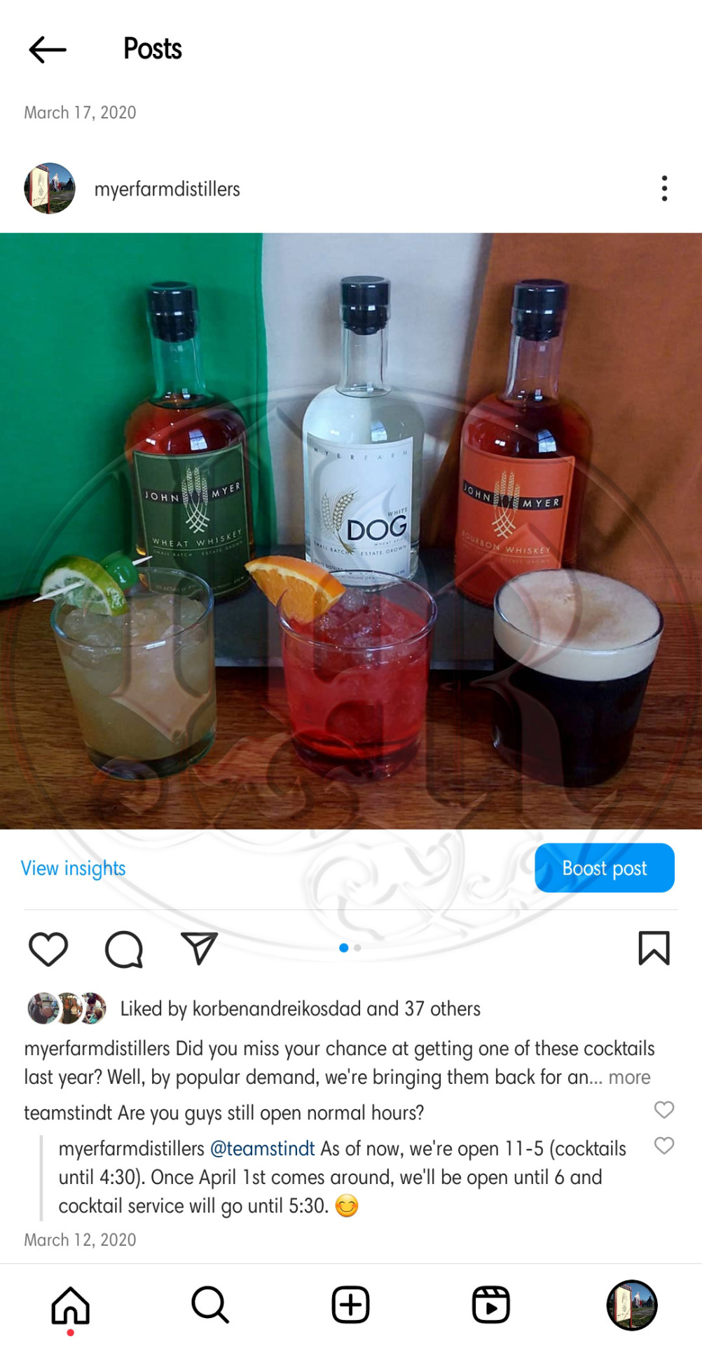
Once the Finger Lakes region was cleared to re-open for alcohol service in a manner that Myer Farm Distillers was able to comply, many customers hoped to return and find the same level of drink service that was available pre-pandemic. Unfortunately, due to remaining restrictions, a dearth of staffing, and having changed most of the bar set-up to accommodate a new, COVID-friendly style of service, that wasn't possible.
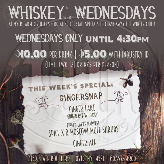
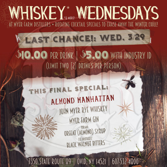
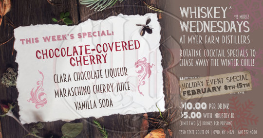
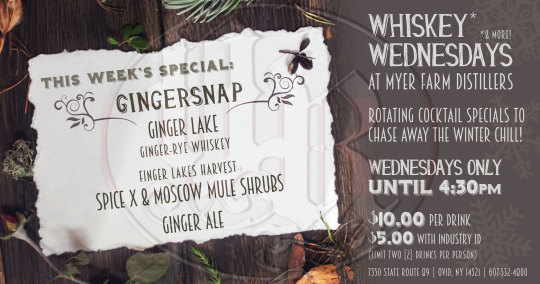
To mitigate customer desires with the distillery's capabilities, my coworker and I pitched an idea for "Whiskey Wednesdays" in which we would feature a certain drink that rotated each week, drawing in people who wanted to have a cocktail in-house without stretching the capabilities of a thinned staffing coverage.
I created a system of templates to promote the drinks on Instagram and Facebook each week, allowing a quick turnover of creating the drink special each week and preparing the images to be posted.
#graphic design#designers on tumblr#artists on tumblr#product photo#cocktail photography#drink photography#marketing photography#myer farm distillers#craft spirits#craft distillery#small business advertising#small business design#tag:layoutdesign#tag:mfdcocktails
0 notes
Text

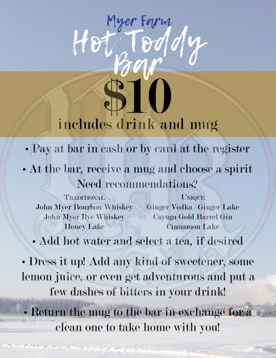
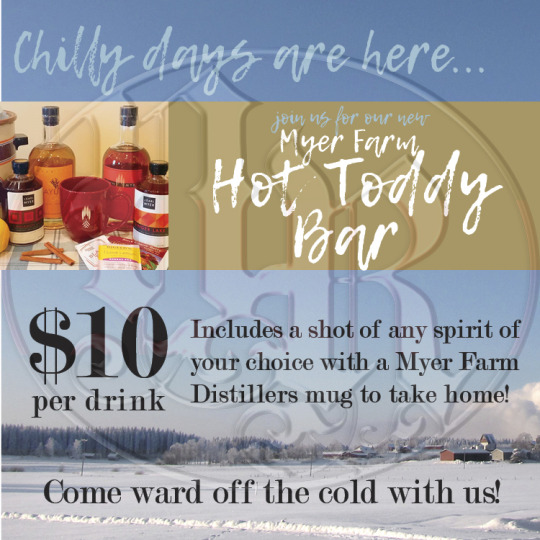

Winter in the Finger Lakes is often snowy, sometimes icy, and always cold. Myer Farm Distillers created a range of products that paired fantastically with hot toddies - some traditional, like John Myer Bourbon Whiskey for a classic toddy, or J. Earl Myer Honey Lake that was already infused with honey and lemon peel; and some like Cayuga Gold Barrel Gin and Electa: Fig Liqueur that were unexpected, but nonetheless delicious with the right tea and fixings.
I headed a January initiative that provided a hot water kettle, numerous teas (traditional black, vanilla chai, decaf green, lemon, berry); usual additions like lemon juice, simple syrup, and honey; and a few fun, nontraditional fixin's like cinnamon sticks, fresh lemon, and Fee Brothers' (Rochester, NY) Bitters and Syrups for unexpected creativity in custom hot toddies for every customers' preferences.
After planning and sourcing all of the ingredients to be offered, I designed a series of posters for in-house advertising and instruction, as well as social media posts including the poster and a staged photo with a sample of what could be used.
#graphic design#designers on tumblr#artists on tumblr#product photo#cocktail photography#drink photography#marketing photography#myer farm distillers#craft spirits#craft distillery#small business advertising#small business design#tag:productphotography#tag:layoutdesign#tag:mfdcocktails
0 notes
Text
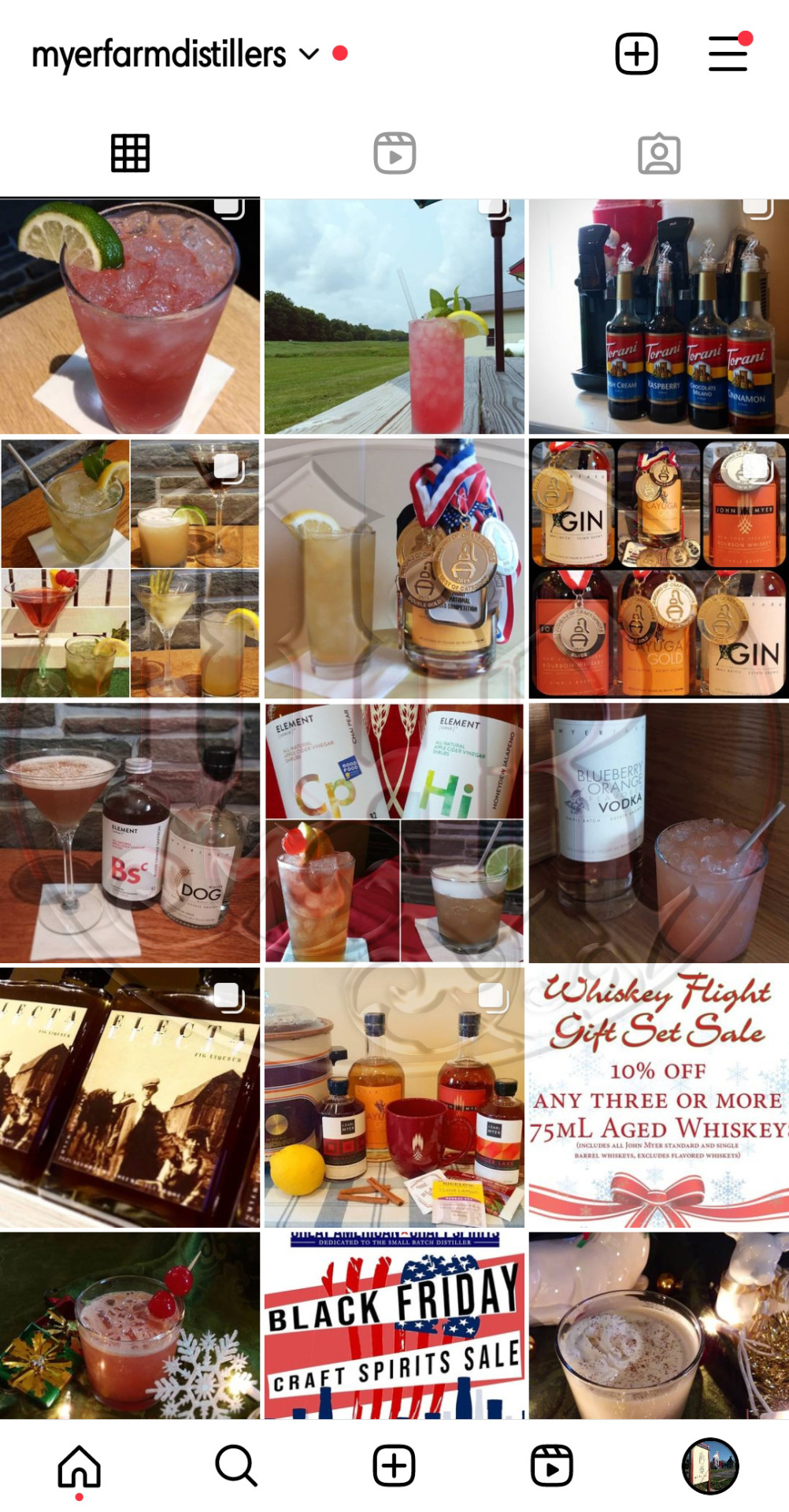


I developed over 150 cocktails for Myer Farm Distillers' monthly specials, as well as holidays and various Cayuga Lake Wine Trail events. Each of these drinks were also photographed, edited, and posted them on the distillery’s Instagram page. Many were created with local ingredients in mind, such as herbs from the distillery’s gardens, shrubs and bitters from Finger Lakes Harvest (Geneva, NY), and other small companies like Element [Shrub]® (Arlington, VA) and Vena’s Fizz House (Portland, ME).
When COVID forced Myer Farm Distillers' bar service to close in 2020, I went through my records of all 150+ drinks and created a directory for every recipe, as well as a recipe card template on standard 5"x7" photo paper. These cards were printed and trimmed in-house and provided to take home with the purchased spirits.
#graphic design#designers on tumblr#artists on tumblr#product photo#cocktail photography#drink photography#marketing photography#myer farm distillers#craft spirits#craft distillery#small business advertising#small business design#tag:productphotography#tag:layoutdesign#tag:mfdcocktails#tag:mfdcphotog
0 notes
Text


These posters were created for special, one-time, in-house events.
The left was to promote a party celebrating a revamped edition of Myer Farm Distillers' Blueberry Orange Vodka and the entirely new, aged Straight Corn Whiskey. As the musician and refreshments provided were in a jazzy, semi-fanciful style, the design of the poster reflected that with baroque accents among the illustrations for each respective product release, and typography that complemented both the older style with the modern illustrations.
The right was a rare opportunity to host a touring group of automotive enthusiasts who had lovingly restored and care for dozens of car models from the Brass Era, prior to 1916. The group selected the distillery as a planned stop along their Finger Lakes tour, filling the parking lot with beautifully maintained vehicles. This poster was used in the tasting room to promote the event to locals, encouraging them to come by on the selected Tuesday to have a drink and enjoy the views while the car club passed through.
#graphic design#designers on tumblr#artists on tumblr#advertising design#ad design#ad systems#myer farm distillers#craft spirits#craft distillery#small business advertising#tag:mfdads#tag:mfdadspecials#tag:layoutdesign
0 notes
Text


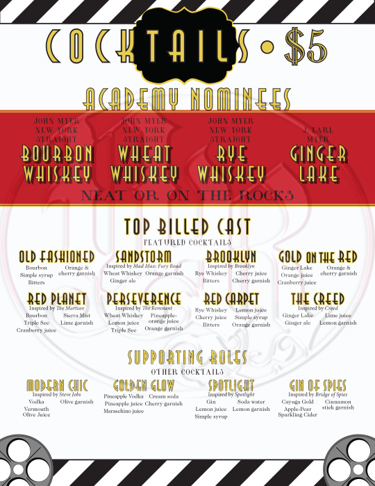

For in-house events, I created wide-ranging systems of posters, social media images, and menus. For this 2016 Oscars-themed release party celebrating Myer Farm Distillers' release of four special-edition whiskeys: Ginger Lake, a ginger-flavored rye whiskey, and three single-barrel editions of John Myer Bourbon Whiskey, John Myer Wheat Whiskey, and John Myer Rye Whiskey.
The distillery advertised for this in multiple ways, from facebook posts and a special header promoting the upcoming event, as well as an email campaign that allowed our returning customers extra perks during the party--including an Oscars-ceremony-like opening of envelopes for raffle winners. I designed the cocktail menu as well, both the drinks themselves and the printout, all themed around elements of the Oscars: red carpet illustrations, featuring the new specials as "academy nominees" and specialty cocktails with flavors and names inspired by movies that were up for awards at the actual Oscars that year.
#graphic design#designers on tumblr#artists on tumblr#advertising design#ad design#ad systems#myer farm distillers#craft spirits#craft distillery#small business advertising#tag:mfdads#tag:mfdadspecials#tag:layoutdesign
0 notes
Text
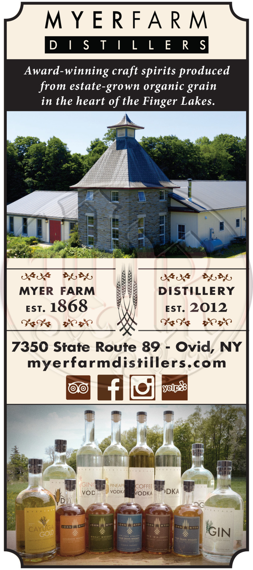

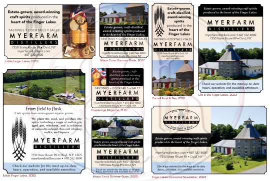

Advertising is crucial to the success of any business - though different outlets have different specifications and requirements, a business must have consistency across its advertising to ensure information is communicated clearly and memorably to prospective customers. I developed a customizable and fluid, but recognizable design for advertising Myer Farm Distillers across multiple channels, from local newspapers, tourism publications, and signage both inside and outside of the Distillery property. In 2019, I also worked with a local news network, FOX40 Binghamton, to facilitate a short video promoting Myer Farm for the distillery’s 6th anniversary and the farm’s 150th for WICZ’s Destination: Cayuga Lake segment.
Whenever events called for specialized advertising, posters, and other deliverables, I ensured each piece reflected something unique about the event, locale, or celebration without sacrificing the consistency of Myer Farm Distillers advertising style.
In addition to layout of said print advertising, I also coordinated and shot most of the photography, such as bottle imagery and scenes from around the distillery and production sites. Any photos that I did not take myself, such as the drone imagery showcasing the site from an aerial view, I edited for uses best suited for the advertising materials in question.
#graphic design#designers on tumblr#artists on tumblr#tag:layoutdesign#advertising design#ad design#ad systems#tag:mfdads
0 notes
Text
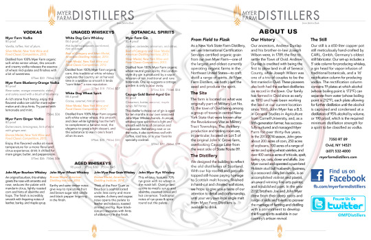


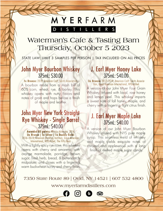
With an ever-changing line of products and offerings, a menu presented to customers has to be flexible and easily managed to reflect such changes. Over nine years at Myer Farm Distillers, I took charge of handling said flexibility and adjustments, adding and removing information as the product line developed and shifted, knowing what information must be kept and deciding what needed to be trimmed to ensure organized, clear, and effective communication to patrons.
#graphic design#designers on tumblr#artists on tumblr#tasting menus#menu layout#layout design#page layout#myer farm distillers#craft distillery#craft spirits#small business design#tag:layoutdesign
0 notes
Text


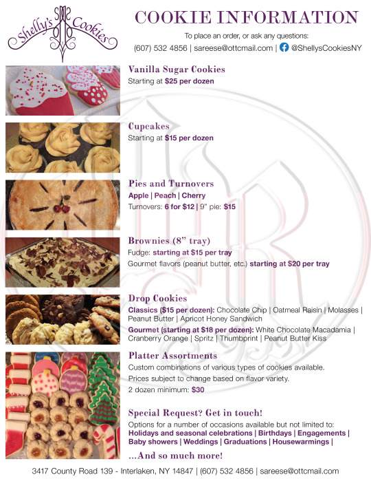

One of my first “professional” projects was to create a logo for my mom’s casual baking pursuits as she began taking “orders” from friends and family. The original logo was based on some casual pinstripe-like designs in her favorite shade of purple, overlaid with one simple line that was what everyone always asked for: “Shelly’s Cookies.” In 2021, she decided to expand from a casual passion into a full business endeavor, acquiring a home processing license and attending farmers’ markets and other local events to sell cookies, pies, and other baked goods based on favorite family recipes.
The original logo has been used since then, although with expanding offerings and packaging needs, we’ve worked to brainstorm some alternative logos that would fit better at other scales, proportions, and the wider-reaching packaging needs. But, so far, the original has been the baker’s preferred choice, and has thus remained in use.
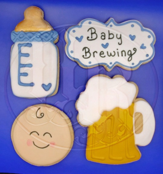
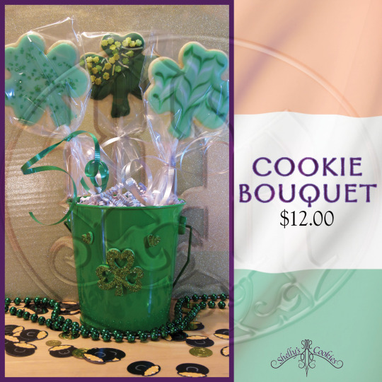
Besides the logo itself, I have also created and upkept order forms, business cards, packaging labels, social media post assets, product photography, and other work for the everyday needs of a small home bakery.
And, hey, if you live in New York state and want to order some really tasty baked goods, visit her page and message for an order! Shelly's Cookies on Facebook.
#graphic design#designers on tumblr#artists on tumblr#layout#layout design#small business design#page layout#tag:scphotography#tag:layoutdesign#tag:branding#tag:shellyscookies
0 notes
Last Seen Blogs
icechuu
🦋we’ll be alright🦋
theothardus
the great unseen flow
munsonluhvr
Helen

kipo-memes-because-yes
Mostly my own memes/drawings but some reblogs too