#so I'm going to lean into that color scheme but combine it with pieces from each of the Margot Robbie movies as well
Text
I had three tiny things left to buy for my Rhaenyra cosplay -- jump rings in the appropriate antique gold/bronze color, lacing points that wouldn’t be ridiculously too big for the 2mm cord I’m using, and round flat filigree beads for the cuffs of the sleeves. And I managed to find one Etsy seller with workable options for all three! And they’re in the US! Woot!
The very first thing I ordered for this project was way back on December 29th, even before I drafted the pattern or sewed the mock-up. It was the wide trim for the neckline, since I’d found the one I wanted but it was vintage and I didn’t want to run the risk of it selling out. Nearly six months later the very last little piece has been ordered, and the dress is really starting to look like the screen-used dress, even if I do have a lot of handsewing still ahead of me. But hey all the shopping is done. End of an era, I suppose.
On the other hand, in discussion with Jack this morning we decided that there’s no reason for me not to start ordering pieces for my Harley-Quinn-in-a-Taylor-Swift-tshirt cosplay, so I’ll be diving into all my bookmarks I gathered while sourcing and starting to order some of that soon. There is one piece for that cosplay that I want to sew if I have enough time once Rhaenyra is all done (sequin shorts like the ones she wears in Suicide Squad, but in classic black and red instead of the movie’s blue and red) but I have already sourced an easily purchased alternative if I just completely run out of time.
My plan is to order everything except the sequin fabric and those backup shorts, just so I can start putting it together and figuring out if there are any other detail pieces I want to add to really make the crossover concept work. Then once I’m all done sewing RRD (and styling the wig and making a little bag to carry my essentials in), I’ll decide if I have time to try to tackle the sequin shorts, and if not I’ll just buy the pretty-good alternative instead.
11 weeks to go, and I’m really hoping to get both of these finished to my perfectionist standards. I should probably get back to handsewing.
#my cosplay#cosplay plans#RRD cosplay#Harley Quinn Swiftie cosplay#which is officially a GO! WOOOOO!#the concept is pretty straight forward: post-breakup Harley wearing the 'we are never getting back together. like ever.' tshirt from the#Eras tour#it's black and red and white which are the classic Harley Quinn colors#so I'm going to lean into that color scheme but combine it with pieces from each of the Margot Robbie movies as well#I think the point will come across well#Swifties will get the shirt reference. but even casual radio listeners probably know the song#and I recently found out there's going to be a Harley Quinn meetup on Friday at Dragon Con so now I'm REALLY motivated to get this one done#hopefully with the sequin shorts but eh it'll work without too#and on that note I should go get some handsewing done
3 notes
·
View notes
Text
Submas sketchdump! Vol. 1
April-June 2022
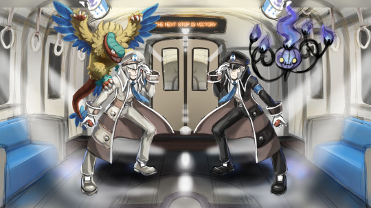
Literally dumping all the presentable works as promised, whether I'm proud of them or not! This is where I started, even before the first thing I posted online (That subway station one). Many of these are not on Twitter yet so there's lots to see!
The top piece above the header is my very first digital Submas artwork!! I never finished it bc I didn't know how to pull my vision of as I wanted & started modeling the train and didn't finish that either, whoops! I really want to remake this later and make it super cool!
^^^ My reaction to breaking 500 likes & 100 followers in a single day with my first tweet (the battle subway one) all the way back in May!! I was completely floored by all the attention, oh how it skyrocketed my excitement and anxiety! Crazy times, I was so super nervous to be there with so many amazing artists and doubted if I could ever survive there ahahah!! Many had joined the community much much earlier than me, so I had arrived with a late train to PLA/neo Submas hype!
Next up is a bunch of stuff I haven't posted before:

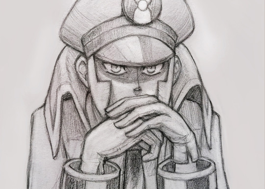
One of my fav sketches! Been saving this for so long bc I really really want to finish this one day!
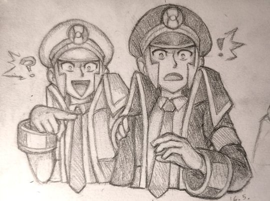
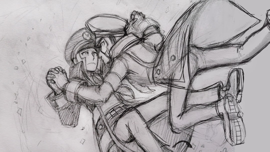
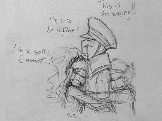
One of the first submas sketches with an actual story behind it! The subway bosses are running late for their flight because they didn't pass the safety check! The irony!! This would never happen as bosses are always on schedule. But Emmet hadn't noticed a wild Joltik hiding under his coat, so he set up the alarm and they got examined and interrogated of smuggling! How embarrassing for them! The bosses resolved the situation by catching the Joltik, but will they be able to catch their flight anymore?? Maybe if Elesa can distract the stuerts performing the safety protocol for a minute!
More sketchbook stuff...


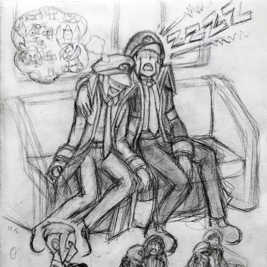
In case you can't make any sense of it, Emmet's dreaming of different combinations of pokémon. Meanwhile Ingo snores louder than the train! HONK SHOO!
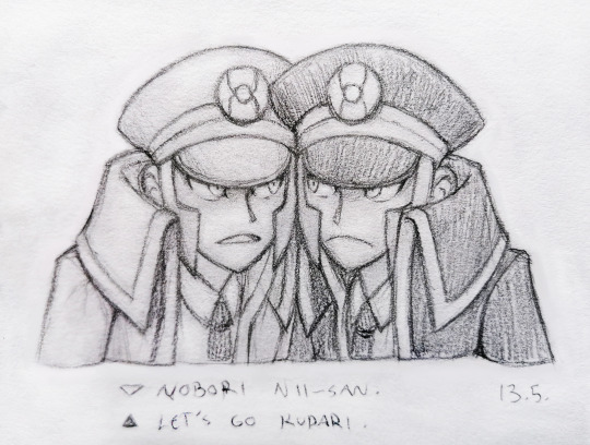
Top 7 every submas fan draws at some point!
Submas trademark posing
submas sleeping in a train
sad Emmet
Emmet with Joltik
Ingo with a cool solo pose
Emmet being chaotic & Ingo reacting to it
a bunch of mirrored submas poses
I sure have a full bingo card lmao, most of them you can see here XD
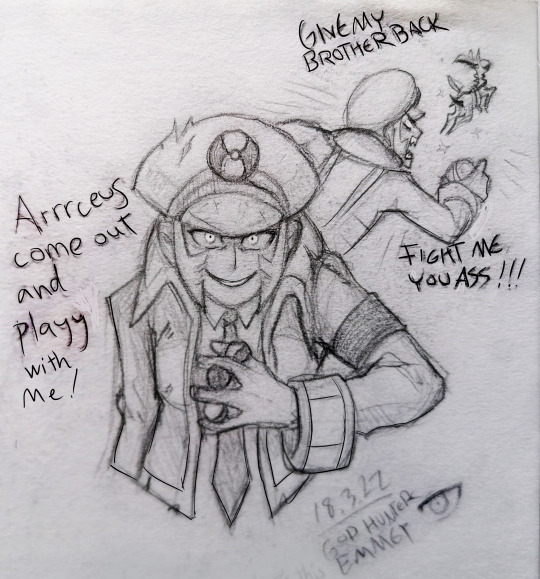
Next up is a sad man...

Stay strong our friends!
My typical sketchbook pages, crammed and messy as usual. x)
Post-PLA exploration:
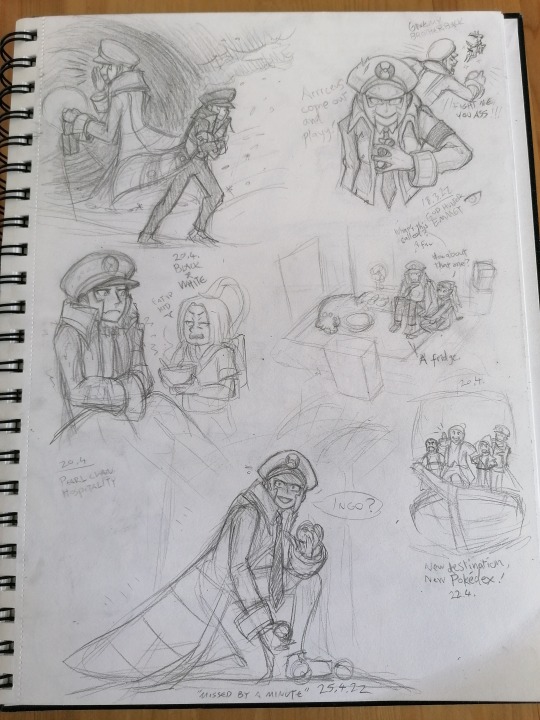
A few examples of how my pencil sketches evolve.

I've done so much art experimenting with submas. I really like this black & white painting but I don't think I'll finish it anytime soon.
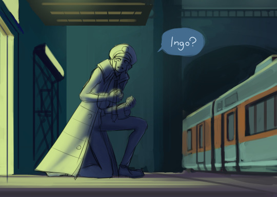
Where did you go?
The way I draw the twins' faces has changed a lot. They started with softer features and somewhat neutral emotions, because I wasn't as familiar with them or comfortable drawing them yet. Now there's hundreds of submas sketches, and they still keep evolving! My style is also kinda hard to pull off well, so their features differ from picture to picture.

This one was inspired by some submas music videos, can't recall their names anymore. The glowing eerie eyes and yellow&orange + black&white color schemes were neat!


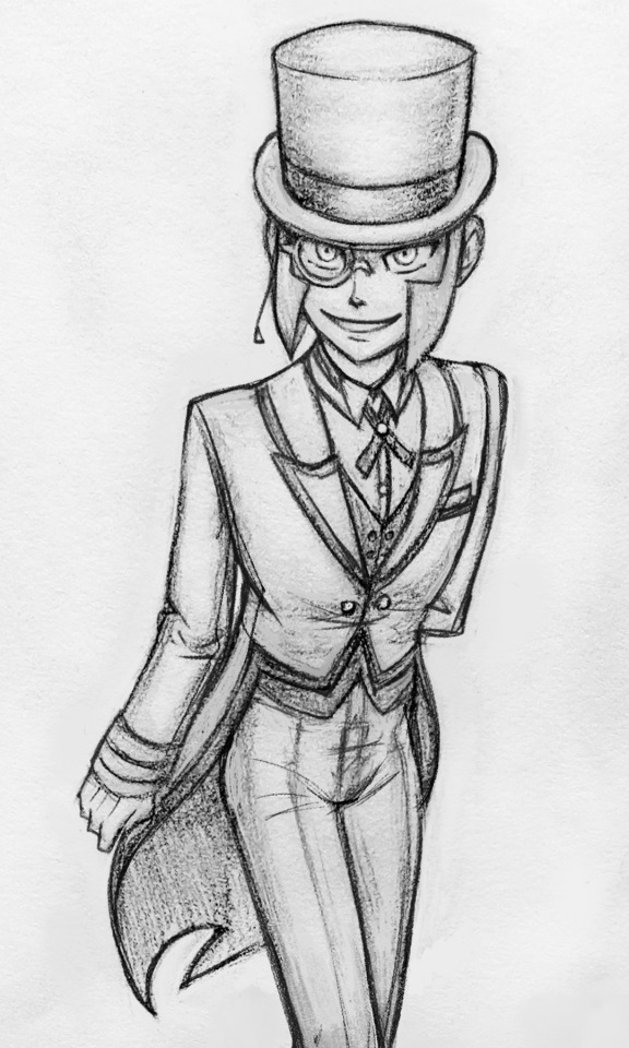
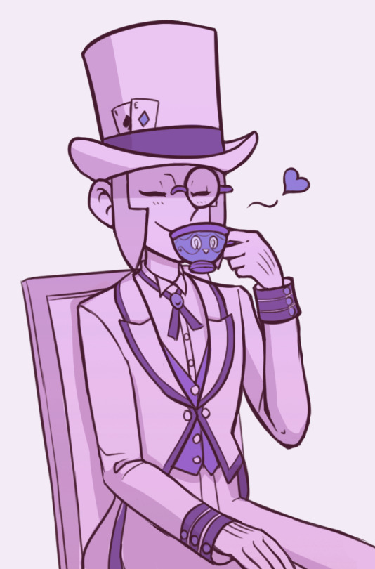
I keep telling myself I need to draw more butlers, these twinks look so lean and neat and have more color and are posh with their monocles and have fun tailcoats!
(...why eyeglasses are not called binocles??)

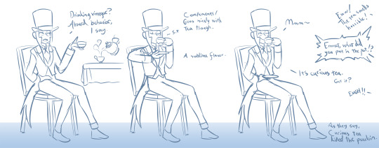
I was there for the vinegar chaos. Good times!
That's all for now, I hope you got something fun out of this! Still got loads more art to share but I'll save them for another time. Next round I'll bring in my first submas comic!
#submas#sbms#submas ingo#submas emmet#pokemon ingo#pokemon emmet#subway boss ingo#subway boss emmet#ingo and emmet#sketch dump#chandelure#archeops#sinistea#submas butlers#butler ingo#butler emmet#too many ideas#butlermas
1K notes
·
View notes
Text
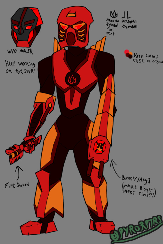
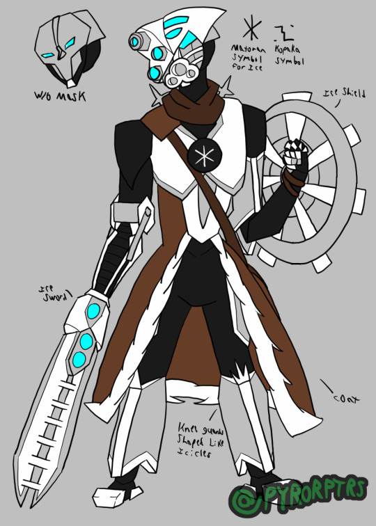
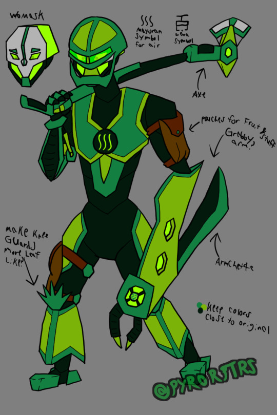
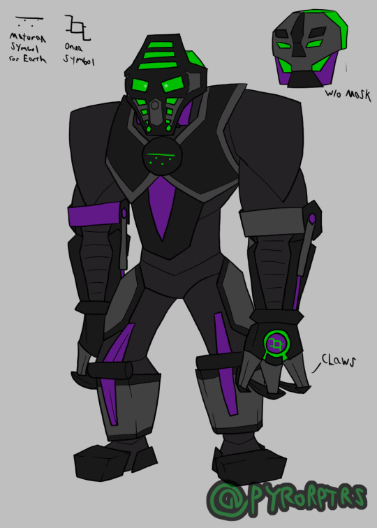
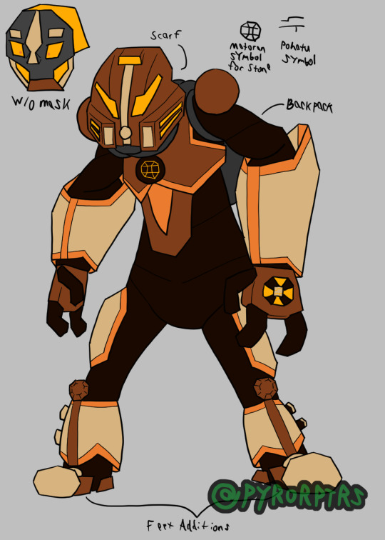
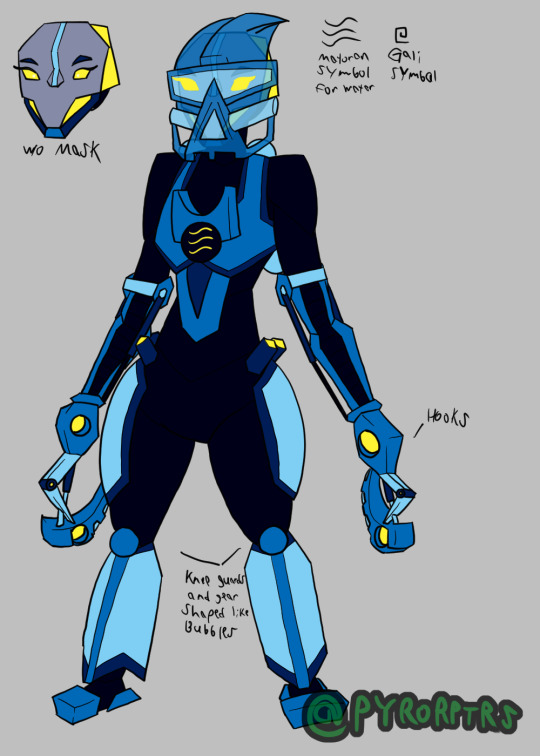
Awhile back I did my own redesign of the Toa Mata from Bionicle. Mostly just trying to find a way to draw them without having to keep the toys permanently on hand for reference and a bit more streamlined to make them easier to draw in general. As far as universal details go, I gave them a segmented body template to lean into the biomechanical aspect of them, I also tried to find a consistent way to draw some of the more common limbs they had. I also tried to play with the gears on the back by giving each of them something unique and tried to give them unique kneeguards. I also tried to incorporate the orbs they had their chest by incorporating their elements matoran symbols into them
Tahu - Tahu served as kind of the template for the others, so he's probably the most standard out of them. I wanted to stick primarily with his original colors so made the bright red and orange the most prominent colors on him, but I also used the dark red he sported later as an accent color for more color blocking. His sword is based more on the Bionicle Heroes interpretation of it, though I may change that if I ever redraw this design. His left arm was never really stated to be anything, so I tried to purpose it as a sort of Aegis; it still matches his more aggressive personality, but also gives it a more utility. I also modeled his back gear after exhaust pipes to relate towards his element. Though it probably won't be seen that much, I did try to define his head too, making it kinda broad; specifically basing the heads off a combination of the originals, the glatorian heads from the end of the original line, and the heads from the reboot.
Kopaka - Since Toa of Ice tend to stick around cold places, I incorporated a bit of a coat into his armor for insulation. His sword also draws some inspiration from the Heroes version, but it also still works like his toy. His left arm was a bit awkward so I limited the armor to mostly just his bicep, I also tried to make the shield look like a snowflake on top of the radar dish look it obviously was piece wise. Kopaka was also one of the few toa consistently depicted is hauling around the McGuffins for whatever saga they're directly involved in, so I gave him a satchel to call back to that. His back gear is directly modeled after a snowflake like his shield, but a bit more obviously. I also tried to make his kneeguards resemble icicles. I tried to give his head a sharper look to call back to his cold and distant personality.
Lewa - Tried to make Lewa look a bit more lanky compared to the others since he's supposed to be the resident tree swinger. His axe leans more towards the original, but I still tried to incorporate aspects of the heroes version for fun. I tried to make his left arm a big grabby arm since most people turn it into a gun or something, but BlazeTBW thought it looked like a machete so I incorporated a fold-our arm blade to help him cut up vines and foliage as he swings around. His kneeguards are supposed to look like palm leaves but I'm not satisfied with how they turned out. I also gave him a few pouches since I figured he's want to keep a few snacks on hand or maybe even swipe a souvenir here and there.
Onua - Tried to make Onua look pretty broad since he's supposed to be strong even without his mask buffing him. Unfortunately his monochromatic color scheme can make things hard to color block, so I threw in some purple from his G2 version in order to help highlight some parts of his body. obviously made his claws his actual hands. I also did something a bit different with his legs sinw his original toy had them flipped around to bulk them, so I tried leaning into that while also making it look like a heavy duty hinge. I also tried to make his head particularly broad too.
Pohatu - Pohatu was pretty different from the original toa in that his torso was flipped around to make him more bottom heavy, so I tried to call back to that with his body shape. I also took inspiration from the toys arms to make them bigger than the others. I did include the two orbs on his shoulders, but recolored them to make them different from the chest one and included the extra pins on the leg. Since Toa of Stone live in the dessert I gave him a scarf to wrap around his head for sandstorms and gave him a decently sized backpack since he's also been happy to regale his own adventures (so it works for holding souvenirs). His kneeguards are based on boulders. I also inlcluded the orange his Phnatoka version sported to highlight parts of his armor
Gali - Obviously Gali's body is mostly just a female version of the standard one I came up with. I did call back to the pins her original toy had in her hips and I incorporated the mata hand into the chest orb I try to include on all of them. Her hooks are intended to slip onto her hands more-so than replace them. Her back-gear and kneeguards are also based on a bunch of bubbles. finally I incorporated her Mistaka colors as a highlight to add more color blocking.
#Bionicle#Toa#Mata#Tahu#Fire#Kopaka#Ice#Lewa#Air#Onua#Earth#Pohatu#Stone#Gali#Water#Hau#Akaku#Miru#Pakari#Kakama#Kaukau
43 notes
·
View notes
Note
okay so feel free to delete this message for asking you about TP crimes. but I'm curious if you have any purely aesthetic thoughts about the Link + Zelda designs, as well as the Zora designs, in TP? like how do you feel about the designs on their own, even apart from your distaste for the general atmosphere + story. again feel free to ignore this for TP crimes and no harm done!
yeah ok. disclaimer for those who don't know. i don't like twilight princess and i think the art direction was almost as bad as the story. do not argue with me about this. let's get into it. link first
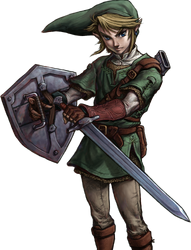
from a purely character-design standpoint I don't think this design is bad, but I don't think it's all that special either. it's very evocative of oot link, which I'm SURE was intentional based off everything else in the game. it does a decent job of complicating the outfit to the standards of tp's setting without going too overboard in terms of little details. the long hat looks stupid but i understand what they were going for. my biggest critique of the design itself is the desaturated color scheme, which I understand was present in the game at large but. I don't like it. I honestly do think that taking away the vibrance and colorfulness of loz takes a lot of the fun out of it. these games were originally for the NES. we're working off of 8-color pixel graphics. link's tunic should be eye-searingly green no matter how dark and brooding you want his story to be, because without that brightness and vibrance the games cease to feel like loz imo.
anyway. the real PROBLEM with this design, and with most of the art direction in tp, lies in how it was actually handled in-game. twilight princess was a game for the wii & gamecube, released in 2006. while advancements in graphics were GETTING THERE, the models were still relatively low-poly. The franchise had already seen a lot of success working with low-poly models in oot and ww, specifically because they leaned into the limitations of low-poly graphics and went for a more cartoonish, unrendered art style which made the blocky models seem purposefully stylized instead of limiting. twilight princess, however, did a complete 180 with the art direction and decided to attempt to HIDE the low-poly graphics behind over-rendered textures. this combined with the desaturated color palette of the character designs makes everything look very flat and lifeless.


in every close shot of link throughout this game i was constantly distracted by how awful the textures made the model look. the rendered folds of his tunic being slapped onto a flat surface, the rendering in his hair being an obvious coverup for the fact that it's one mass on the model with no physics, etc etc. the textures seldom rendered perfectly smoothly on the wii either, so the painted rendering would be strangely pixelated or blurry compared to the model's sharp edges. the game's lighting also seems to operate entirely in harsh black gradients, making the color and rendering choices on the model all the more obvious. Again, I understand that these are limitations of the medium the devs were working with, but i think that art direction that takes the medium into account and works WITH it instead of AGAINST it is almost always more successful than attempts to cover your ass after the fact, and i think that twilight princess could have been a more visually pleasing game if the art direction hadn't been so focused on covering the flatness of the models with hyper realistic textures.
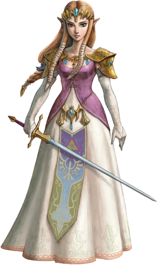
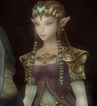
onto zelda. again, we have a theme here of taking the oot design and overcomplicating it. i think the color choices are better here than they are with link, but i would have liked a brighter pink on her bodice. I also think that the dress's neckline was... pretty obviously a sexualization attempt. there's a reason men love this zelda. imo if they were going to keep oot zelda's shoulder armor they should also have kept the breastplate-ish piece in the middle and the high neckline from that dress. you cant say ooh look shes a swordfighter see she has armor!! and then leave her fucking jugular exposed. no wonder she got possessed by ganon immediately. other than my general complaints with the over-rendering i don't have much else to say about her tho. shes fine

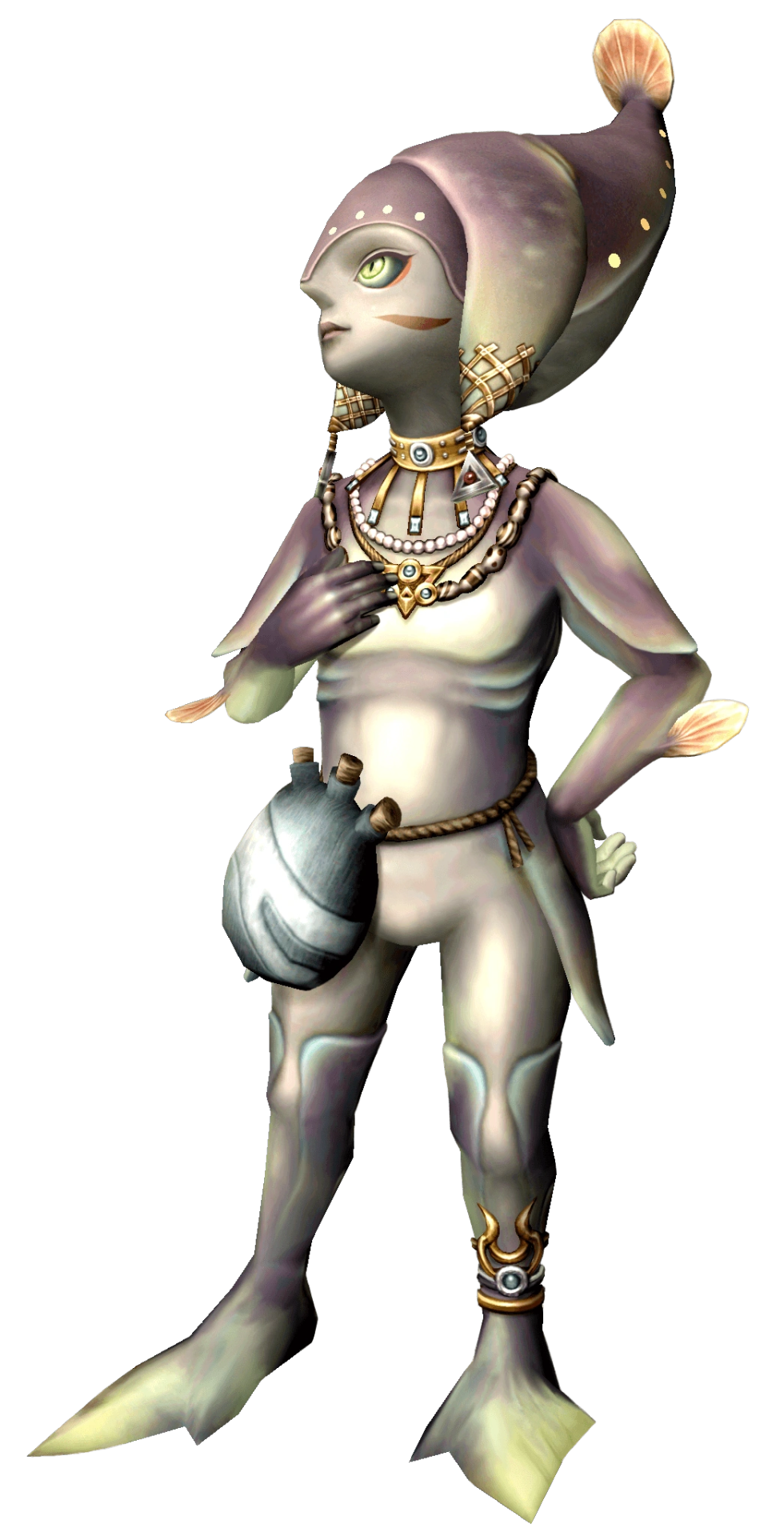

the zora tho... this is where i start to get pissed off. HOW ARE YOU GONNA DESIGN A SPECIES OF FISH PEOPLE BASED ON TROPICAL FUCKING FISH AND THEN REFUSE TO PUT A SINGLE SATURATED COLOR INTO ANY OF THEIR DESIGNS. the way these designs could all be improved by about a hundred percent if you just TURNED UP THE GODDAMN SATURATION. GIVE ME A REAL RED. IM BEGGING. UGGHHHHHHHHHH. i also think the ugly rendering REALLY shows through on these guys because they don't have a lot of detail on them to cover it all up. someone needs to explain to these designers that you don't shade with black. like. god. the designs truly are not bad in terms of like creature design i dont think but they are so DESPERATELY in need of color that it's fucking distracting. color is not your enemy guys please
#tp critical#twilight princess art direction my detested. bane of my fucking existence#COLOR IS NOT EVILLLL YOU CAN PUT SATURATED COLORS IN YOUR DESIGNS ITS OK. ITS NOT GOIGN TO BITE YOU#asks
65 notes
·
View notes
Last Seen Blogs