#rambly*
Note
Opinion on indigo park?
10/10 game
Would recommend
Adopting rambly and finley as my new children
No, they don’t have a choice
67 notes
·
View notes
Text
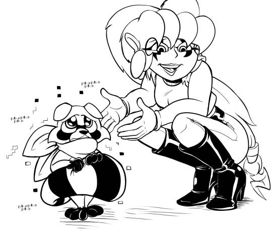
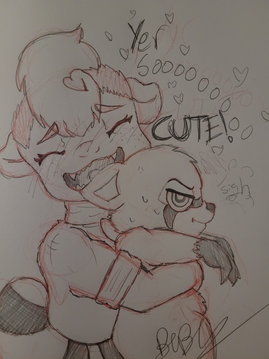
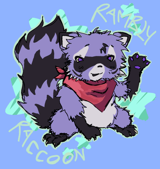
"Just look at him and his little scarf."
44 notes
·
View notes
Note
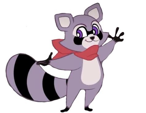
rambley the racoon and lloyd the lion from indigo park are divorced !!
Rambley the Racoon and Lloyd the Lion from Indigo Park are Divorced!


51 notes
·
View notes
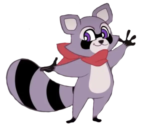
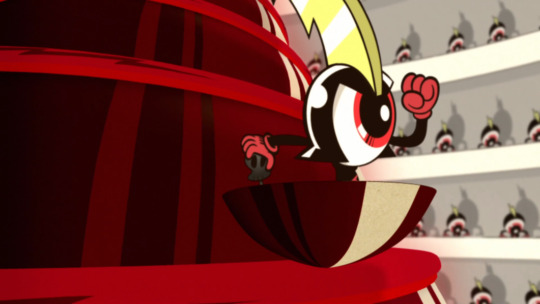
Text
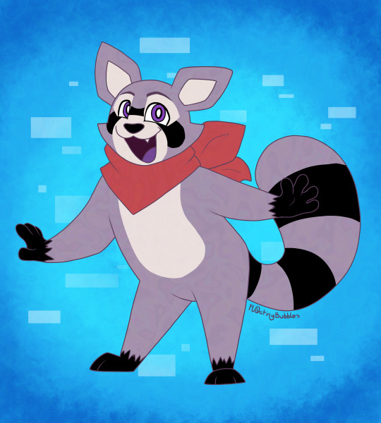
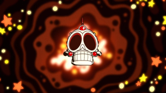
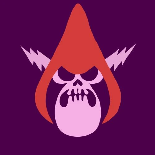
I fuckin love this little guy
#indigo park#rambly#rambly the racoon#digital artwork#digital art#digital art tag#digital artwork tag#indigo park rambley#indigo park fanart#rambly fanart#fanart#rambly review#digital artist#drawing#digital drawing#digital fanart#artist on tumblr#artists on tumblr#mod cd
52 notes
·
View notes
Text
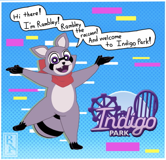
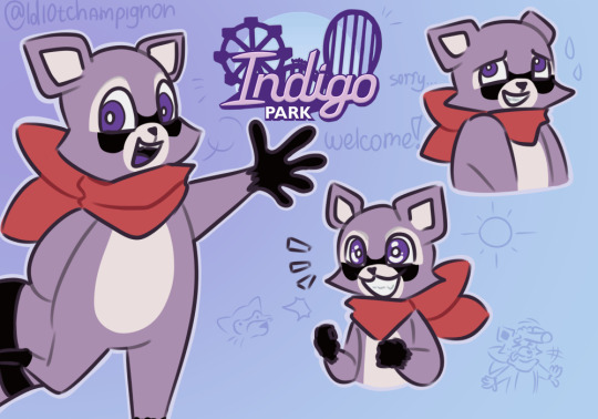
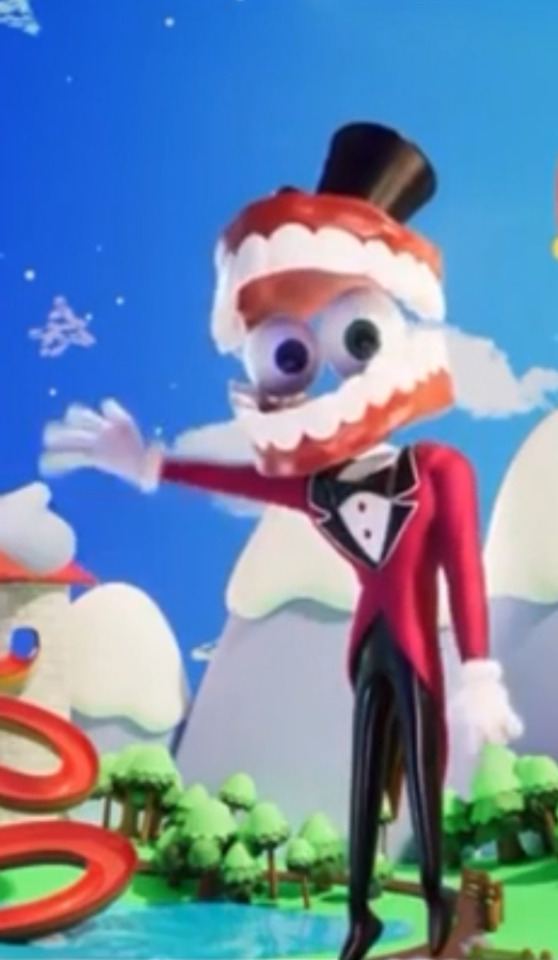
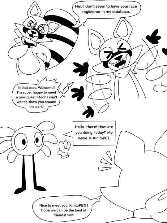
Welcome to Indigo Park
Hey there! Allow Rambley the raccoon to guide you trough Indigo Park! Have fun!
32 notes
·
View notes
Text
Indigo park looks like alot of fun and im really excited to see how the story unfolds!
#rambly#rambly raccoon#indigo park#indigopark#fanart#my art#traditional art#oc#my oc#traditional#art
22 notes
·
View notes
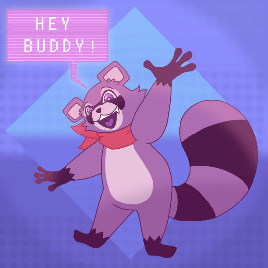
Text
🦝
22 notes
·
View notes
Text
yep I 100% have a type( /non romantic)
lonley AI my beloved
special cases time
implied lonleyness issues via tumblr posts but unconfirmed
not AI but loneliness issues and Robot creator and fan
put in one of these bad boys and ill be all over your price of media
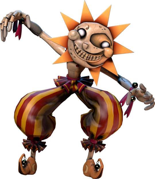
#glitch productions#tadc#murder drones#n murder drones#serial designation n#tadc caine#project sekai#rambly#indigo park#fnaf#sun fnaf#rui kamishiro
16 notes
·
View notes
Text
Rambley has been living in my head rent free
#indigo park#rambly#kinito the axolotl#fanart#crossover fanart#art#cartoonist#rambley the raccoon#indigo park rambley
112 notes
·
View notes
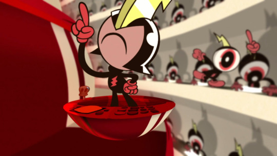
Text
“Cause I like trains :3”
I'm not normally a fanart person, but this bean has stolen by soul and I had no say in it
if you haven't played Indigo Park, GO DO IT. it's free on steam there's nothing stopping you >:3
✨reblogs greatly apricated✨
#art#artists on tumblr#furry#indigo park#rambly#rambly the racoon#my fanart#fanart#digital art#artwork#my art
82 notes
·
View notes
Text
hi look !!!! im not dead!!!!

been having a tough time drawing recently, some personal stuff happened and absolutely murdered my motivation to draw and. do anything in general. i'm picking myself back up though, hopefully i'll get a burst of motivation soon !
in the meantime, here's a Rambly.
51 notes
·
View notes
Text
DONT BE SAD IT'S NOT YOUR FAULT
#may or may not have hopped into the Indigo Park fandom#had to watch a gameplay of it since Im too broke the buy the game myself#indigo park#rambly the racoon#my art#digital art#rambly#ive only had rambly for a day but if anything happened to him id kill everyone here then myself
53 notes
·
View notes
Text
Woa Raccoon be upon you
This is my contribution to the new game I played the first chapter and I love it so much Murder Droens and Indigo Park au when? (let me cook while I'm at work)
#murder drones#murder drones j#indigo park#rambly the racoon#rambly#indigo park rambly#serial designation j#murder drones art
42 notes
·
View notes
Text
currently obsessing over this new game ong i love rambly so much hes so me
--- 🚂
37 notes
·
View notes
Text
Differences of the WoY visual style between the pilot and the final show (Along some other stuff) (Part 1)
So a crap-ton of cartoon show bibles and pilots surfaced recently, which is kind of fucking cool, and it included stuff from Wander over Yonder, which is way fucking cooler.
First thing I did was over-analyze the show's visual style and I figure I should put my findings somewhere, so here you go! In a chronological order, it's easier that way (and builds suspense for the real good stuff, ooohooooh (in a spooky ghost voice)).

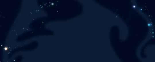
The first shot alone already brings forth some differences. As far as I know, the show never illustrates space like this, entirely black with just a couple of stars to break the void. There's usually some blue star dust or something, kinda like this:
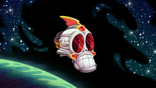
The skullship was planned to be 3D-animated apparently, instead of being drawn in the same style as the backgrounds. This allows for WAY more complex movements, since it's easier to pull off.

We then get to take a looksie inside of the ship... this isn't like ANYTHING in the show.
We do see control rooms on occasion, but not one like this. It's a circular room with rows of watchdogs on the wall, watching monitors, circulating the middle where Hater sits on his throne. The railings on its support carry Peepers and his cockpit. Two watchdogs control the ship (I think) at the front. That blue goop at the top might be the ship's brain (you can also already see some animation errors in the front, peep their grabbers).
There ain't ever been a color palette inside the ship like this, they usually opt for red and black rather than red and white. This might have been their solution to making the characters native to Hater pop out against the background before deciding to just substitute black for purple.
There's still bright locations within the skullship, but they're non-threatening ones, like the food court.
Commander Peepers and the watchdogs have designs that, while closer to their final versions than the pitch bible (or whatever that cover of that graphic novel was supposed to be), carry some traits still worth pointing out (well, so does everything here, but pshhhshshhhshh).
SHINY
COLLARS
Puffy collars around necks, wrists and ankles.
Detailed irises.
Detailed soles on shoes.
Those lines on their gloves that you see in your grandpa's toons.
(bugs bunny pictured flipping the bird)
This is specific to Peepers; the jagged thunder-spike on his helmet has dimension to it, as opposed to the implied dimension in his final design. Spikes on the side are also way longer here.

His eye/face emotes differently by just utilizing a black eyelid, rather than turning the hat into a pseudo-eyebrow, kinda like Double D from Ed, Edd n' Eddy.


We then get a glimpse at Hater's design...
Despite his face missing, you can already see some differences, like his arms resembling more those of an actual skeleton and packing a lot less mass. His hood is also a bit more tout and the folds surrounding it have more empathis.
Another space shot with some shapes to break up the infinite black; it's not always you see a warm color palette for space in the actual show.
Maybe here, when Wander and Sylvia stop the sun from blowing up in "The Good Deed".


When entering the city that's about to get its shit stirred by Hater, we notice that there aren't ANY other locations illustrated like this. We usually have smooth, airbrushy looking stuff, when this is more reminiscent of a comic strip, with clear lines and some hatching to indicate weight here and there. Same goes for the townsfolk, they remind me of... Krazy Kat or something. Craig McCracken has gone on record saying he drew a lot of inspiration from old comic strips, but I don't know if Krazy Kat is one of them. I just thought of it :)


The inside of the skullship looked different so this place might have had an unique artstyle to other locations we would've seen in this version of the show, but that would also be a big difference since the actual show keeps the background style consistent throughout the whole run (as far as I know).

Goes in hand with the skullship; the watchdogs are 3D-animated here, although subtly.
Different gun designs... they look more like water guns here. Big ol' TUBES. Their guns in the show are more sci-fi-esque.

Hater's logo is different, in-line with his design. Way flatter design too. Might as well take a look at his actual face now.
Well, more like next time. Just found out you can only use up to 30 images in one post. Oopsies. I'll continue this when I have the energy! I'll continue my chronological analysis/rambling and perhaps talk about the general art-style and animation at the end. Might take me a couple of more posts.
#wander over yonder#WoY#animation#this is by far the longest post on here up until now#i was fascinated with the pilot when i saw it so y'know i had to put everything i was doing aside and write this out#rambly#long post
41 notes
·
View notes
Text
I devoured (pun intended) Dungeon Meshi in a week because I got curious about a manga page that came by my dash at some point. Amazing story and my favorite part has to be how the entire climax ends with the main villain going "Laios what do you have there in your mouth. Laios. Laios stop eating that this instant" very dog owner behaviour.
#rambly#dungeon meshi#it's a surprisingly light comedy considering the heavy places it goes to sometimes#and the art... oh i just adore the sight of every character and every monster#really great really well written. and the Themes#also and i'm sure everyone remarked on that already but. the autism (touden) siblings <3
40 notes
·
View notes
Last Seen Blogs

rambamboooff
RamBamBoo
heavensdoorways
Heaven's Doorways

thereisabutton
thereisabutton

krysten-itscalledwhiskey-ritter
Krysten Ritter