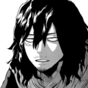
#officially adding the ear tufts to my design cause they look so good
Text
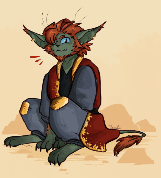
dubious little creature
#mcyt#empires smp#empires s2#fwhip#my art#thinking about him again <3#officially adding the ear tufts to my design cause they look so good
396 notes
·
View notes
Text
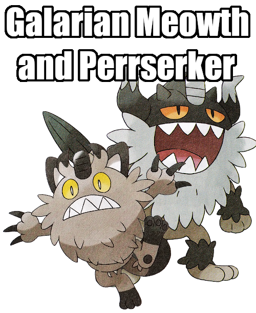
Let’s Talk About Pokemon - Galarian Meowth and Perrserker
Okay, change of plans. Since it is now mid-January; two whole months after the dang games have come out and we STILL don't have good and high-quality official artwork, I'm gonna have to make due with the middling quality scans we have at the moment. Especially since SwSh are now getting DLC updates that are introducing even more new Pokemon. Though I'm gonna wait on the DLC to come out before I go over those.
I had also said something about the reviews having a little more “oomph” this time around. That's sadly not gonna be happening like I thought it was. I WAS gonna go full-on animation critic since animations have become such a big deal to Pokemon lately and judge all the noteworthy animations the Pokemon have, but sadly all the sprite resources I usually use don't have such things uploaded as of yet. And I can't find them out in the wild cause good luck googling “Sword and Shield/Gen 8 Animations” without just finding a giant wall of that goddang gif of Scorbunny using Double Kick. But it might be something I might come back to in the future, anyways. I'll still point out some nice animations if I happen to have decent gifs of them.
I will also be putting a bit more effort into analyzing these designs either way. Especially when we get to the completely new Pokemon. Doing a personal project that involves designing a LOT of my own monsters has seen me pay a lot more attention to smaller details and such. With me for the most part getting more in-depth about the designs of these things, I'm gonna move to a thrice-a-week schedule. Once on Monday, Wednesday, and Friday.
FINAL BIT: The order of operations here. We'll be touching on Galarian forms first (obviously), including their new regional evolutions. After we're done with them, we'll hit on the Gigantamax forms of pre-existing Pokemon, and then once we've reviewed Gigantamax Melmetal, we can finally move onto Gen 8 itself with Grookey.
ANYWAY
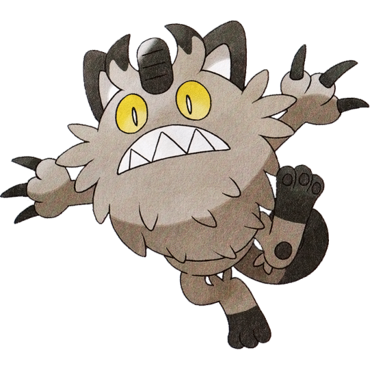
Galarian Meowth:
Ahhh, feels good to just review a single Pokemon again. Today we're starting our Galarian adventures with none other than the new batch of regional variants! Would you get a load of that cat!! It's quite a step up from Meowth's Alolan counterpart, which was little more than a recolor. This crazy new spin on our old friend sports what is reasonable to assume a big fluffy coat over its body. But if you were to turn this Pokemon to its backside...
Nah, that's no fluff. It's a stinkin BEARD. Talk about a facelift! Indeed, a lot of the regional variants this time around feel a lot more differing from their original selves. Alolan Regionals definitely suffered from a little too many of them just boiling down to being a different color with some extra bits added on here and there. Galar opts to be a bit more adventurous with the concept. Meowth's whole attitude shifted here! Easily my favorite part about it are those big yellow eyes and that wide, toothy grin that makes it look like a mini-Totoro.
So, what type is the bearded, gray-tinged Meowth then? None other than Steel, OBVIOUSLY. Nah, that one caught me off guard when I first found out about it. It's definitely a type that makes more sense after it evolves, but it could still at least make sense for a Meowth given the emphasis on the coin on its forehead. Though the Pokedex states that the way Galarian Meowth came to be was Meowth sailing the seas on boats hardened its fur, turning it into the Steel type. I know Pokedex states some pretty sketch pseudoscience but even THAT seems like a hilarious stretch.
So like, is a regional variant of Meowth going to become a new tradition in the same vein as every generation having a Pika-clone? I can't say I'd mind it, honestly. While Meowth is from Gen 1 and Gamefreak is notorious with shouting out Gen 1 all the time, I feel like Meowth has just enough of a downplayed popularity that it doesn't feel overly egregious to do this as say, booting out Venusaur and Blastoise but Charizard not only returns but gets a whole new dang form to go with it. I just hope it won't mean no more new feline Pokemon, or that other feline Pokemon are being bullied out of getting their own regional variants. Just saying, Glameow and Purrloin could REALLY use a fresh coat of paint.
But either way, it'd help bolster the number of cat species represented in Pokemon as a whole too. There's countless domestic cat breeds that could all see some fun interpretations if you just took those animals and turned them into a different shape of Meowth. Meowth on its own is just a solid cat design, y'know?

863: Perrserker
Galarian Meowth, shock of all shocks, doesn't actually evolve into a Galarian Persian at all, but instead becomes an entirely new Pokemon, Perrserker! And do I adore this concept. The idea of giving past generations Pokemon new evolutions (neverminding Sylveon) hasn't been seen since Gen 4 over a decade ago. Regional evolutions is a really neat way to bring the idea back! And in a way that grants so much more room to still be able to create future iterations. It feels like every Pokemon that has an original form that's much nicer than its evolution now has a second chance at getting a better evolution to its name.
But even so, wow this Pokemon in particular feels. Weird. Weirder than all the other Regional Evos this gen. After years on top of years on top of years of knowing Meowth evolves into Persian, not only do we get a new split evolution. But said split evolution rather than looking ANYTHING like Persian at all elects to be Bigger Meowth. The other Galarian form that turns into a split-evo, Yamask into Runerigus, you COULD reasonably mistake Runerigas for just being Galarian Cofagrigus. Which only makes Perrserker look even funnier to me from a metacontextual level. Is that just me? Might be, I dunno.
Admittedly Perrserker had to grow on me. My main turn-off was the fact that it very clearly has lost its ears, and replaced them with a metal helmet with stereotypical viking horns. It's so unsubtle they even just up and call it a “Viking Pokemon” in its classification. (Though note, vikings never actually wore helmets with horns on them due to how hilariously impracticable they are in battle. But pop culture is a powerful beast, so horned helmets be the signifier for vikings.)
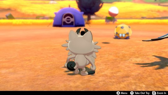
And to solidify its design together, it has retractable claws, but when the claws are extended they become sword-like and merge into one. AND of course, Perrserker gets its name from Berserker, a class of viking with a particular bloodlust caused by a lack of empathy and a drunken rage. Clearly shown in how its attack animations feature its eyes rolling into the back of its head. One last little detail bringing it all together is how it has tufts of fur on its arms and legs, not unlike viking warriors who wore fur this way for obvious keep-warm reasons.
In the end, it's A LOT to get used to, and the lack of ears still puts me off somewhat. If it were me making a viking version of Meowth like this, I'd probably put ear holes ON said horns or something, but whatever. I'll probably just get used to it. But I do like the design in the end. Its face is great and is yet another Pokemon that is unfairly called “ugly” even though that's the point of some of these things. Not all animals are pretty, cute, or cool! Some are just downright unappealing looking and that's fine.
I do also like that it's a Pokemon with a more lowkey color scheme. Not that I think the majority of Pokemon being bright and colorful is a bad thing but color schemes like these definitely feel like a minority these days.
A solid pair, overall! Certainly takes a lot of unsuspected turns, but I like that direction when approaching regional variants. It’s like a whole new flavor of Meowth!

Personal Score: 8/10

29 notes
·
View notes
Photo

Well, it’s certainly been a while since I drew this guy. ^^ Okay, some context for those who haven’t heard of any of this. Some time ago, I used to be a big fan of a podcast called “Welcome to Night Vale.” I really loved the show, but I sorta fell behind on episodes for a while, then I fell further behind, then so many episodes piled up that I felt overwhelmed at the thought of trying to catch back up. That was a few years ago. Recently, with my new job and being able to do some of my work while listening to something in one ear, I decided to get myself back into Night Vale. I recently caught back up, and my love for the podcast has returned full-force. :D I have now listened to all of the episodes, and have read both of the novels, and loved them all (though some of the continuity stuff in “It Devours” is a bit weird, and I overall preferred the first novel I think). For those who haven’t heard of this podcast before, “Welcome to Night Vale” is a podcast that takes the form of a local radio show of a fictional US town, Night Vale, located somewhere in the desert. Anything supernatural or horrifying, like a Faceless Old Woman Who Secretly Lives in Your Home, or hooded figures that lurk around a forbidden dog park, or the Sheriff having a Secret Police force, or government agents watching everyone’s every move, are all seen as completely ordinary and mundane to those living in Night Vale. ^^ The radio show is hosted by a man named Cecil, who reports on the events that happen in his town, occasionally sharing his own thoughts on the matter, and gushes over the handsome scientist who just moved into town. ^^ The fun of the podcast is seeing what bizarre events happen in the town, and how most of it is seen as run-of-the-mill to those who live there. The fun of it is also the great writing, wonderful characters, wonderful relationships between those characters, and great representation for minorities and for the LGBT community. :D Anyway, I decided to make a new design for the main character, Cecil, since I drew my old design for him ages ago. Since the podcast is all audio and no visual, and since Cecil’s appearance is never described to us, fans are able to depict Cecil however they like, although tentacle tattoos, white/gray hair, and a third eye are all common in fan depictions of Cecil. There were certain aspects of my old design for him that I retained for this design, but I changed a fair bit of it. And yes, I know, I know, my design looks like just about every other skinny, white-haired, tattooed Cecil design out there. I wasn’t going for originality so much as trying to just come up with a design that felt the most like Cecil to me, if that makes sense, that I could make to fit my mental image of him. And I’ve seen far too many white-haired, tentacle-tattooed Cecil designs over the years to wildly alter my mental image of him at this point. And I didn’t really want to. I just wanted to have fun coming up with my own version of him to fit my mental image while still being sorta original in my design. Anyway, the design itself. I kept a similar idea of the hair sorta swooping back and then tufting back up. But I was able to portray that much better here, the way I meant for it to look, not the wild, mad scientist sorta hair I drew him with before. :P His hair isn’t as tall and doesn’t stick up as much as on his old design. I also changed the coloring, as the gray from before with all of the flecks of other colors just didn’t look right anymore. Instead, I played around with a bunch of different options before finally settling on a two-toned look like other Cecil designs I’ve seen. It seems that most two-toned hairstyles like this involve the dark part of the hair being very short and close to the scalp to contrast with the lighter hair being longer, but… oh well. :P I like the look of him having full hair throughout, at least for my design, there’s definitely good and cool designs of him out there with the short hair on part of the head. :D I always intended for Cecil to have a very narrow sort of face. I made it really thin and long in his old design, and I was not very good at portraying that in a realistic manner. :P Here, I think I managed to get that across much better, while still having his face look fairly realistic. Fun fact – I actually used pictures of Hugh Laurie as a reference while drawing this. ^^ He has the sort of narrow-faced look I was going for, though I didn’t copy the elements of his face exactly, I just used the pictures to help suss out the anatomy at this angle. I used a mix of yellow and purple in his old tattoo designs, sort of trying to emphasize how Night Vale and Desert Bluffs are connected. While I liked that idea, I just couldn’t get that blend of colors to look right on this new design, so I ditched the yellow and just stuck to various shades of purple. Before, I had given him unusually-large amber irises, with a pupil that was just a darker shade of amber rather than black. I didn’t have any particular reason for this, I just thought it looked cool, and emphasized Cecil’s not-quite-human-ness. :P But before coming up with this design, I had an interesting idea, and I’m honestly not sure if anyone’s incorporated this into a Cecil design before (probably) – instead of regular eyes, what if I made the eye-moon thing in the Night Vale logo his actual eyes? I decided to try it out, and I really liked how it looked, so I stuck with it. :D I like to think that Cecil was born with normal eyes, maybe brown or something, but when he was officially declared the new Voice of Night Vale, as such an important representative and voice of their weird little community, his eyes literally became the symbol of Night Vale, symbolizing how he represents and speaks for the town. I really like how those eyes look on him. It shows his connection with the town, it’s a cool color for his eyes, and the lack of white in his eyes or black pupils further emphasizes his not-quite-human-ness. I image they’re also quite freaky to those not from Night Vale and not used to its ways. Carlos was probably quite alarmed when he first saw those eyes, and also quite confused as to why he found such frightening eyes attractive, before eventually getting used to Night Vale and its strangeness and fully embracing how attractive he found Cecil. ^^ I also changed my design for his facial tattoos, though I think his arm tattoos will mostly stay the same, though the colors will be simplified to just light and dark purple, and some of the design might be simplified and shifted around. I’m pretty sure I’ll also keep the tattoo monster thing on his chest and back, ‘cause I like the idea of it. ^^ Anyway, I decided to get rid of the lines and shapes on his face from his old design, and just go for a few tentacle tattoos on his face framing his eyes. I kept the moon-eye on his forehead, but I added some eyelashes just to make it stand out, and I got rid of the line around it and just put more tentacle tattoos beside it. As I said before, I got rid of the yellow in the tattoo coloration, and just used dark purple as the outline, and a light, pinkish purple to fill in the tattoo. I think the colors work really well together, and I like how the tattoos came out looking. :D Overall, I’m really happy with this new design for Cecil. :D I was too lazy to draw a full body shot of him, and I really just wanted to focus on his face at the moment, but maybe some time I’ll draw his full design with his new tattoos. I know Night Vale’s fashion sense, and Cecil’s in particular, is supposed to be completely ridiculous and nonsensical and over-the-top and not matching – Cecil has been described as wearing antlers and hip-weighters, furry pants, a poncho with cat ears and goulashes, and god knows what else - but I just can’t seem to get rid of my mental image of him in a nice shirt and waistcoat, it’s just been my mental image of him for too long. Maybe one day I’ll eventually embrace his canonical mis-matching fashion sense, but for now I’ll just keep drawing him this way. :P I decided to keep the shading simple on this, and I just added a bit of a starry background so it wasn’t too plain. Honestly though, for not having drawn humans for several years, I’m honestly ridiculously proud of how this turned out. :D The anatomy looks way better than the last time I drew humans, and it just looks really good, I think. :D
1 note
·
View note
Last Seen Blogs

morella-aka-eyes
Cassidy

mehul12298-blog
Untitled
shewantsthewillofd
Ayyyyy le'mao
australian-models
Australian Models.
theimplicationsofsigmarpolke
A Bunch Of Silly Shit I Vaguely Recall