#messing with lineart and rendering styles just a bit here
Text
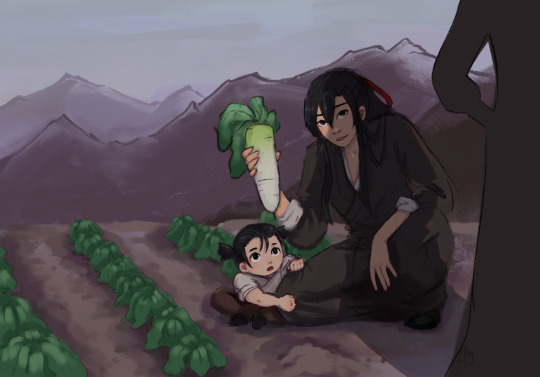
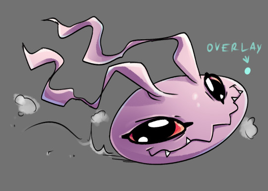
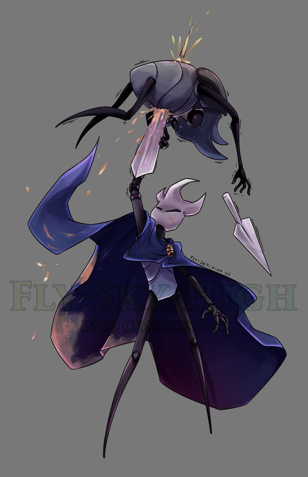
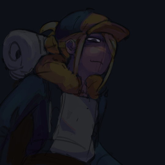
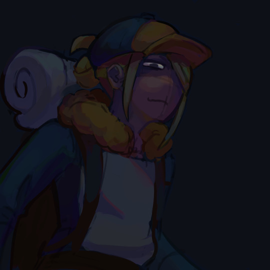
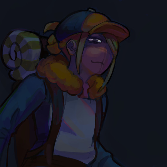
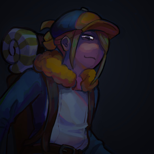
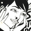
#mdzs#wei wuxian#a-yuan#wen qing#(she’s the looming shadow)#burial mounds days#I guess this is#yiling laozu#he’s very scary he is sitting in the radish field with a child#messing with lineart and rendering styles just a bit here#I regret deciding to render a radish field#teleport warning draws
266 notes
·
View notes
Note
Do you have any tips or tricks on how to start a comic like this? Or even just how you got started?? I've had my own au for years that I so badly wanna put out into the world but I've been struggling with finding a good way to start it!!!!
Hm!! Ok!! This is a tough question with many different answers even just from me. I'll do my best to answer tho!! 😮
The main bit of advice I want to give, and which I think is vital to anyone creating anything:
☆ Know yourself.
When looking up advice for creating, people love to tell you that by doing things a specific way is the best and only way to go. Often advice of this sort has solid points, you should plan ahead, you should have easy character designs, buut... You don't have to.
I do not work well with outlines or scripts. I dislike sketching. You'd think that'd make being a long form comic artist impossible for me, but nope.
I know theres things I cannot do, so I've put all my practise to what I can do. My lineart style allows me to almost skip sketching completely, my scripts are more of an A to B structure than law. I improv 90% of the time when making pages. It's kinda like dnd with myself.
I would absolutely not reccomend what I'm doing to others, but I know it works for me. People can tell me I'm doing it wrong but its either wrong or no comic at all, SO. Suck it. 👍
Er. Rambling now.
My point is, figure out what you can and cant do, and do your best to give yourself the ideal work enviorment and process.
☆ Deal with being overwhelmed
Making just a few panels and suddenly realising its gonna take years to get anywhere is SO demoralising. It's gonna happen and its gonna happen again, and again, and—
But continuing with the earlier advice, you gotta ask yourself what would help you. Are you willing to sacrifice quality? Do you just need a break? Maybe you're like me and like to include smth you love in every update so you'll have something to get excited about making.
That feeling of overwhelm is trying to tell you something, so figure out what that is so it wont end the project for you.
☆ Start it
You wont like what you make when starting. I've never heard of an artist who has.
I'm not saying start this instant, not everyone is as into improv and flailing around as me. But I will say you'll never feel ready. Figure out the minimun of what you need to start and do it. Show friends first if youre afraid to post.
Also where to start? Well sure there's lots of good advice online about that, but you can also just doodle random stuff until you feel like diving deeper. That's what LV started with, just Twi and Wild hanging out with animals and some headcanons. It may not be the most tightly written work but theres beauty in the humanity of a mess.
☆ Extras
A "failed project" or "forgotten WIP" is only a failure if you let yourself feel that way. Yea it can be a hauntingly strong feeling thats hard to deal with... But it can be beaten. WIPS are proof you tried and not everyone can say they have.
Lv is far from done and I have no intention of dropping it, but because the journey has been so nice I'd satisfied even if I had to call it here. Its smth that helps me with the overwhelm... What I've made is beautiful even now.
Comparing yourself to others is gonna rip your heart out. I love that theres other links meet aus out there and hope the best for those artists but I caNNot follow any of them or I'll crumble to dust.
So Uhm.
Basically. Have fun and be yourself. 👍
Ps. Readability is basically the most important thing for a comic artist to pay attention to, that and not destroying yourself with details and rendering. 🙌 Good luck out there!
#Ask#I love discussing stuff like that but it always ends up so rambly and long ahsjjdjr#I hope I said at least smth slightly concrete
84 notes
·
View notes
Text
(reblog appreciated ❤️)
this is my boyfriend everyday he comes home and i throw a knife at his head and he’s like wow thanks for helping me with my timing honey you’re incredible and i shake my head knowing i failed once again
(i haven’t done his quest yet i’m behind on other story quests please don’t spoil it thank you 🫡)
process discussion under the cut 👍
so, for this one i wanted to stay away from a strict process and instead try to learn from an art style i liked! i was browsing pinterest and found the portraits used during the persona 5 x granblue fantasy collab, and i really liked the art style of them! i mostly used the persona 5 portraits for the reference (since i don’t play granblue and wouldn’t really know where to start otherwise!)
i didn’t want to restrict myself to copying the style completely, since my goal here was to push my boundaries in regards to colour and light. i really like how the art team rendered black clothes in particular so i took this chance to get two birds with one stone with this lyney drawing! (hey i managed to get to a trend on time)

i noticed that when multiple instances of the same colour are layered on top of each other, they airbrush a lighter colour to separate the two (see jokers sleeve on the right image)
i also liked the use of hatching in addition to the painted shadows on black clothing as well. i couldn’t really apply that to this drawing since lyney’s outfit is very tight and has no clothing folds, but it’s something i already add occasionally to my art (usually faces in paintings) so i liked this part a lot!
i’m still learning how to paint light, and these references didn’t exactly help since they use rim lighting instead of the direct spotlight i had in my piece, but i’m slowly figuring it out with the add + opacity layer??? i found a cool way to do the casted background shadows..
which is two copies of the silhouettes, with the bottom layer a dark teal and the top layer a mid tone red. the bottom is set to multiply with the top set to opacity, and then just messing with the layer opacity + erasing with an airbrush before blurring.
also, i did a bit of a combination method on this one process-wise. on my regular lineart pieces (the sun haven ones in particular) i’d do the shadows without any flat colours, which lets me get past the shading a lot quicker. that’s what i did with this one for the darkest shadows, then i changed it to a dark green before painting on mid tones/transition shades on a separate layer above. i think it’s an effective combo for me! shading is the slowest part of a painting for me, and this lets me get through it much faster.
^ that is assuming i did lineart though, but it didn’t get in the way of my flow this time, so i think i’m getting to a better process overall!
#my art#fanart#genshin impact#genshin fanart#genshin fontaine#genshin impact lyney#genshin lyney#digital art#artists on tumblr#art#digital painting#anime#lyney
41 notes
·
View notes
Note
HII I’m not sure if this is the right blog but I’m so curious about how you color artwork, like what brushes you use, I really love your style and have thought about taking some inspiration from it
Hi! :D This is fine, I'll reblog it to my art blog so it can be easier to find, no worries.
I'm not the type that uses too many different brushes! I ended up comfortable with just a single brush for most of my work unless the style calls for something else (like soft look of Rain World, which I did a little step by step for here~)
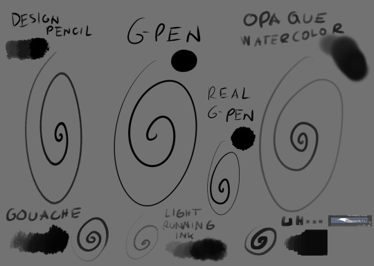
The main brush I use for just about everything is Design Brush. I use it for sketching, I use it for lineart and I use it to add shadows and highlights! I also like to mess with the backgrounds with it
I got hooked to Real G-pen recently for fun lines and texture! Opaque watercolor is what I use for soft rendering like slugcats~ Gouche is very fun to paint with also because of the texture! I haven't used in awhile tho. Light running ink is what I use for smokey effects, clouds, stuff like that! I love the brush! And uh... the last brush is called *checks the source* Nouchika Square Brush. It's free! It's square! It's new to me! very fun to use!
Details about the steps with Design pencil:
After sketching, I basically just lineart with the same brush in a different layer (or multiple of them, if needed!). Once done, I also duplicate the lineart layer to make the previous a little sharper, since depending on the pressure the brush can be faint or very strong, which will come in handy with colors later!
Single layer VS doubled:

Next, for easy color in, I select the areas outside of lineart, invert selection and even shrink it by 1 pixel. Then, I color the new layer bellow lineart flat with one base (in this case, Koromon's pinkish color)
Above it, I hand fill other colors and yes, there are probably easier ways to do that but I am way to used to the hard way XD Note that I rely on this: Hold CTRL and click on base color layer to select everything in that layer, then make a layer and color within that, so I don't cross the border/lines.

I usually lock layers for the next part but you can also just make a new layer above.
Use gradient tool (with which ever options) and select colors that are slightly shifted in hue and saturation from the base color picked one and toss in a bit of gradient shadow and highlight in each locked color!

Remember, color picker is your best friend ever to befriend in any art program! it will help you find hues in this gradient you can work with to add to the shape while doing the simple render!
Now, I use the same brush still but I change sizes depending on which area I'm going to go across. Nice part about it is the aforementioned pressure that can apply less or more color depending on how much you press down. I go with the light strokes over first and then stronger ones above! you can get softer shading this way! Same with highlight~ If something feels off somewhere, color pick the nearest hue and stroke the mistake away~ You can do the same if you want to use any present hue in another part of the figure

after that's done, I then tend to put another layer and select Overlay option on it to add at least a little bit more shadow or highlight (I chose highlight in this case). There is no background for this drawing so I figured it would be nice to add a little bit of cold colors to the warm ones Koromon is made of.
You can play with other layer options or even edit and color adjustments like tone curve, color balance and brightness/contrast, with any color layer! I do it a lot actually~
You add some extras if you want and you're done~
There is not much to it, so I use this for a simple style commission!
#ask#my art#sorry if something sounds odd it's a little later here as I toss this together dfgjgh#I dunno how good is to use the brush I use I'm just a bit too used to it with how I handle my pen pressure#I noticed it has a different(?) texture on my older tablet somehow?#might be the dps difference between tablets#but anyway#that's how I roll~
14 notes
·
View notes
Text
gonna post progress pics from my volo painting and write a bit about my process since some1 asked for them!
excluding adjustment layers this has 20 layers in all. i wont show all of them bc some of them just have minor differences but ill show my general progress
sketch. just super loose but has enough visual clarity to be able to work off of and not have to fix issues caused by poor anatomy etc later
background color + painting under sketch. to choose colors, i go on the color wheel and just kinda choose colors freely and almost randomly & paint w them by very lightly pressing with a hard round elliptical opacity brush set to a large size, blending other colors on top of them this way. i dont use this brush the whole way through but honestly i couldve and it still wouldve turned out good
a lot of trial and error but because were doing it so loosely its pretty easy to find something that works quickly (also sorry the painting is so dark at this point oops)
developed painting a bit more and upped saturation in some places using an adjustment layer.
to get a lot of the color variations im getting here, i colorpick from other areas of the piece, ie colorpicking from the face and using it as subtle lighting for the hair, seeing i like how those colors look, and using that as a jumping off point and using a more intense pink for the hair shading. you can also see i got some of the yellowish on the sleeping bag or whatever tf he has on his back from the hair/hat/etc, just brushed it on there really lightly and it looks cool. another place i like to colorpick from is where the sketch overlaps with the colors underneath, it creates some interesting desaturated colors.
you can also see im developing linework a tiny bit here, its pretty early on and a lot of it will be painted over later anyways but i start being like, okay the 3d forms i've been making are working, let's draw on top of the sketch a bit to encapsulate those areas
but yeah uhh definitely a lot of this is just testing stuff out when i'm this early in the painting, i am aaaalways in motion, never stopping and just working off of instinct and what looks cool. and if i mess something up, i can just erase it and i'll have the layer underneath to fall back on.
also im just straight up not thinking about anything at this point unless im trying to closely replicate a reference image, which i didnt do very much. i use reference for eeeeeeverything i make. i took a pic of myself at a similar angle to this and then loosely based the sketch off of it, looked at pics of volo, later on looked at some reference of how ppl paint fabric, grabbed some pics of how i drew one of my ocs who makes a similar expression w his eyes, grabbed images of other digital paintings i'd made! because i wanted to work in a certain style i'd done maybe only twice before. for reference images, i use pureref, which i would highly recommend to any artist, especially ones without dual monitors (like me). basically just allows you to make a reference board and pin it on the very top of your screen
just developed more in the same fashion, then threw a couple adjustment layers over it. i toned back some of these adjustments later but yeah. you can see the lineart really starting to come together, a lot of the color variation on it colorpicked from accidental overlapping colors that ended up looking cool. btw i need to make it clear i do lineart and rendering on the same layers. also i did the stripes on the pack just by using a multiply layer, then giving it more love on the layer immediately above it so it doesnt look cheap
more rendering, got a vignette going w a multiply layer. actually started using reference for fabric folds. theyre really simply done honestly and dont look like. amazing. but they work
painted over the vignette in the background to make it a bit more interesting & not just a gradient, more rendering as usual, threw in some subtle highlights to make it a little more interesting! i probably couldve gone further with them honestly. also decided to do a really subtle outline around him cuz it looks cool. lineart is basically done at this point and this is where i started to think i was just about done

desaturated it a little bit, re-added some details i forgot about, generally fiddled with stuff and corrected some mistakes, added signature. and its DONE. i think this took me about four-four and a half hours? yeah something like that
other general notes:
-probably favorite part of this is the sleeping bag or whatever the hell that thing is on his backpack
-not entirely happy with how i did the fluffy part, it has some really cool color shifts but it doesnt feel like a proper 3d form all the way through to me. definitely pretty 2 dimensional in spots, but i was like eh i dont care enough to fix it
-although i think the pose works well enough, its definitely another example of me using pretty static poses and basic composition in my art. which isnt too terrible but i really need to start getting outside of my comfort zone on that stuff. this definitely couldve looked cooler if i developed the pose more and did better foreshortening but i didnt cuz that shiht is hard to me. im really awful at foreshortening
-on that same note, i worked off of the first sketch i made and didnt warm up beforehand which you do NOT want to do. thumbnail stuff out and make multiple sketches. 80% of the time the sketches following the first one will be better
-IM NOT AN EXPERT lots of stuff i still need to learn dont follow this 1:1
OVERALL im really satisfied with this though especially for how quickly it took me to make it. & i hope this was interesting, lmk if you have any more questions on my process !
12 notes
·
View notes
Note
How do you start your sketches? Like when you first get an idea, do you do figurettes first or just start drawing? Your art is incredible btw!!!!!!!
aah thank you!!!
what a great question! I thought about this for a bit and, well. it really depends on the idea, how I got the idea, and the kind of art I’m making! I tend to mess around with different styles and processes a lot, so there’s not like one set way I go about things.
but that’s super unhelpful and very generic, so I figured I’d break down some of my sketches and show you a bit of my process for individual pieces.
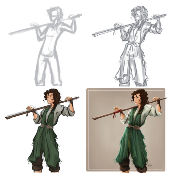
First, here’s the process for the bantha sketch from last year:

We start with my pitiful attempt at a bantha without reference. Then comes the second try (based on sleeping elephants), followed by the attempt to block out Obi-Wan (my google history is well-acquainted with the phrase ‘sleeping cowboy’).
Then we get into basic lines, and that’s around when I realised that the super-rendered painting with horns glinting in the moonlight and embers glowing from a dying fire was a tad unrealistic. so I added some line weight, to clarify things, and then a bit of lighting to set the mood, and left it at that.
I hope that made some kind of sense?
obviously most of my drawings don’t involve big fluffy creatures, so sketching looks different in other circumstances. this is getting very long, but I’ve added some more examples under the cut if you’re interested:
Here’s an interesting sketch process from some non-sw art from about a year ago:

symmetry was crucial so I started with some guidelines and a rough idea of where everything needed to go, another rough sketch of details, and then colour. this project was pretty experimental (ended up with over 80 layers yikes), usually I’m a bit more streamlined lmao
This is also from a year ago so don’t look too closely, but this is often how it goes for the simpler character art!
these days I tend to lean more into lineart than painting, so the later stages look a bit different, but the sketch is pretty similar still! faint circles and boxes to lay out proportions, lines for direction, and then a bit more detail on top. a lil quirk of mine is that I always have to start at the head or the whole thing falls apart.
so in conclusion: my sketching is all over the place! I try different things and start from different places depending on things like reference, how clear my idea is in my head (some ideas are super detailed, others literally boil down to “drama lighting and sleeve!!!!!” and I have to go from there), and how elaborate the final project will be.
A general rule of thumb for me is that the more I know will happen in the final product, the more effort I need to put into making the sketch legible. If there’s dramatic lighting, funky clothes, or a lot of movement coming up, then the sketch needs to be aware of that or else it’s going to be a pain to add later. not that it can’t work, (for example Obi-Wan staring at a plant was essentially constant escalation without a plan) but it can get pretty stressful imo
but yeah. hope that made sense, sorry for the huge essay! as you can tell I really love talking about the process, and I usually save a lot of the initial stages of most projects. so if there’s more questions or if you ever want to see behind the scenes of some of my finished art, please ask away!
#thank you for the ask!!#i mean at this point#thank you for coming to my ted talk#sorry I really love to ramble about this stuff haha#did i answer your question? I sure can't tell#I hope some of it made sense at least#art process#my art#she speaks#and answers
16 notes
·
View notes
Photo

Continuing with my New Year project of redrawing old pieces from the previous years, here's one of my first attempts at painting a woman digitally. I hadn't figured out rendering yet, proportions are a mess and the composition is non existent.
This time around I opted to fix the pose, make sure the subject was in focus, play around with the design a bit and really show a good level up of my skills.
It's not perfect, but it's a solid improvement. There's still some things I figured out while painting, such as trying to layer on colour using oil paint style brushes but with a ink pen styled lineart doesn't look great (it only turned out okay because I ended up just flattening everything). The next piece will be a further test of my skills. This piece was a character redraw, and the one before was an environment. So now I'm going to tie them together and do an environment illustration with a character.
#digitalart#digital painting#digital artist#character art#character design#cat girl#sailor scout#mischievous#mischief#redraw#draw this again#redraw challenge
1 note
·
View note
Last Seen Blogs
somelokivariant
Rémus

bruno-bahia
Estúdio Bruno Bahia
k-madura
Just messing around...

falcontheartist
The Falcon’s Nest
north-star-dreamer-69
North-Star revisited. (cursed-by-the-stars)