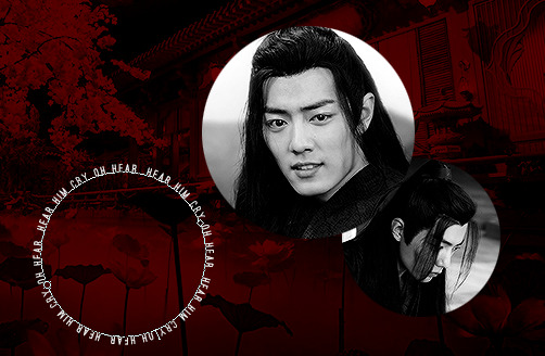
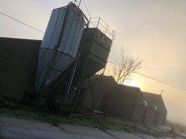
#me trying to do something new with my typography but it's mostly the same as what i usually do lmfao
Note
What is it about the Victorian era that interests you the most? Specific decades, and also things like technology, social and intellectual movements, fashion history, etc. What do you wish was more well-known about the Victorians?
This is such a fun question! I've made two passes at this and they both turn out essay length, so apologies in advance for the beast of a post here, haha.
The overarching thing that I'd say fascinates me is that to study the Victorian era is to ingest a heady blend of modernity and antiquity--in so many ways the people of the 19th century were the architects of the modern day, and I'm continually surprised by the tiny ways in which the Victorian era feels so much closer than ~150ish years ago. And yet it's also so distant in so many ways, and particularly early in the period or in rural areas, the rhythms of life are quite alien to us. Madame Bovary is a novel about the wife of a doctor who mounts his horse to make house calls; the pharmacist in it keeps a jar of arsenic on his shelf; yet it's also a book where I thought "I know someone exactly like this" about pretty much every character. That to me is the fascinating thing about history generally, but especially about the 19th century, so far and yet so close.
I think this extends to pretty much everything. The books of the 19th century use mostly familiar words and the same punctuation as today, but across genres and authors there's such a distinct 19th century tone and style and word choice. Technologically the century is full of so many interesting first passes and middle chapters; the steel pen superseded the quill but is generally obsoleted today by the ballpoint, as an archetypal example. The list goes on.
In more specific terms: one thing I love is Victorian print culture. I'm a printing and typography nerd; I love the neat hairline strokes of 19th century body text typefaces, the wild maximalism of the era's display fonts. I love the seven column broadsheets that jam as much news as possible into four pages with zero pictures; I love the magazines and periodicals lavishly illustrated with steel and copper engravings. I love to imagine what they would have felt like to read when they were first printed, try to put myself in the shoes of the people of the past, get in their heads. (As my writing style probably indicates I have read far too many old books and newspapers, and as a result Victorian sentence structure and phraseology has irreversibly seeped into my brain.)
Fashion history is another big interest of mine. My big interest is in men's clothing, particularly around midcentury—the pinched waists and long hair, the puffy shirts and narrow pants. I like 19th century clothing generally, of course, and I like the Regency tailcoats and breeches, and the boxy sack coats of century's end, as much as the next guy; but something about that midcentury style is just my favorite. I don't have too much philosophy or deeper meaning on this one, if I'm being perfectly honest; I mostly just like the look, here. But I think fashion and textiles history is a pretty interesting field and well worth study in its own right. Learning what exactly broadcloth is, for instance, helped me understand much more intimately why one of the underpinnings of the Industrial Revolution was the textiles industry.
There's a lot of artistic and literary movements that I'm interested in; Victorian medievalism is always fascinating, I'm fond of Romanticism, and, well, maybe not quite so much Gothic proper, per se, but the post-Gothic echoes of Victorian literature, The Signalman and In A Glass Darkly and The Picture of Dorian Grey and Dracula, anything by Poe, the 'golden age' of ghost stories c. 1890-1920.
I could list off a great many other things that interest me—I'm fascinated by the early history of socialism (now and then lately I've been reading Karl Marx's correspondence and his old New York Herald articles,) I'm of course always interested in that historian's holy grail of Trying To Better Understand Everyday Life, I like architectural and art history, maritime history is a perennial favorite—but to write down every last thing would be to make this absurdly long post even longer, so I'll have to make this highlights reel suffice.
Things I wish were more well-known... I think this is maybe one of those topics where I know enough that my idea of what the "average person" knows is skewed, so I might have to sit on that one for a while before I can think up something interesting; I encounter a lot of odd and interesting misconceptions at work, but none of them are fresh in my mind. I suppose a classic go-to would be that 19th century clothing (and, honestly, historical clothing more generally) is way more comfortable than it looks.
#long post#history#reread this hours later and realized i went way overboard with the semicolons again. oh well
2 notes
·
View notes
Note
Hello Hanyi how are you? Hope that everything is okay and that your days are happy 🩷 You are a huge inspiration to me and I admire you so much. I wanted to ask for your advice or maybe for you to just read this, i need to tell this. How do you find inspiration for a new project (gifset)? Where do you usually find it and what things motivate you? I'm feeling really sad and unmotivated because my sets have less notes every time 😿 the last few reblogs on my sets are self reblogs. I know not everybody has to like what I do, and that I should do it for myself. But one of the main reasons I do gifs is to share, and for the other people to enjoy too. But my last three sets haven't reach 200 notes, the last ones not even 100. It's been weeks since someone reblogged from me, i'm just so sad, gifs is the way i found to express myself and I don't wanna lose that.
hello! I'm doing okay! questioning my life and what I'm doing with it, but what's new (ノ= ⩊ = )ノ
I don't know what to say besides thank you; I'm hardly the most encouraging or talented or patient person around here, and I'd never think I'd be a source of inspiration or admiration for anyone. it really made my day when I saw that!
a lot of (if not most of) the time, I get inspired by other creations I see here! I tag things that inspire me in different ways (layout, concept, typography, quote, etc.), and sometimes when I know I want (or need) to make something but have no idea what to do, I just go back to those tags and trawl around and pray something hits me ∠( ᐛ 」∠)_ a lot of people here are unbelievably talented and I'd kill for even an ounce of that (tbvh it's kind of embarrassing the extent to which I learn from and get inspired by other people, really most of the stuff I make aren't original original)
please, please don't get discouraged! I definitely feel that tumblr in recent days has gotten a lot more... disheartening, in terms of response. when I first started making gifsets a couple of years back in the thick of the plague, it was so much easier to get a really good response and a high note count even though the quality of my stuff back then was absolute trash. these days, getting even over 100 seems like a miracle, let alone 200. it's all the tougher since I rarely do scene-only gifsets as shows air (it bores and stresses me out at the same time), and it's painful and disheartening that complicated edits tend to do worse than scene-only sets, even though they take a lot more time and effort to do.
and you're right! at this point, despite this, I'm doing it mostly for myself too, and I've learned to brush it off and not check back at the notes at all. these days, it kinda feels like I'm tossing my posts into the wide world and after I schedule my self-reblogs, they're just out there fending for themselves (ノ°∀°)ノ⌒・*:.。. .。.:*・゜゚・*☆
I'd be lying if I said it didn't bother me, because it did, and sometimes, it still does. but I try to focus more on the few people who appreciate and enjoy the things I make, no matter how few they are in number, and it really, really makes my day when they leave nice comments in the tags, no matter how few notes that set gets ( ´ ꒳ ` )
I don't regret learning how to make and edit gifs, because it has been an outlet for me to express myself as well and I've met a lot of new people through it. but as much as I'd love to encourage you to continue pushing yourself and learning new skills, it's good to also take a break for a little while if the responses gets too disheartening; I'm trying to slow down as well (I haven't been getting much response these days either anyway) and take the chance to spend some of my life outside tumblr and photoshop. maybe, it would help and be a little breather, instead of abandoning this hobby completely just because of the poor response you're getting, which I really hope you wouldn't do especially if it's something that you enjoy and find meaning in
I'm not sure if this will help in any way, but I hope it does give you some solace that what you're experiencing is not something that's happening to you alone; I've seen so many posts by content creators here (gifmakers and editors alike) about how response is getting more and more lacklustre despite all their effort, and the general lack of motivation >_< as disheartening as it is, it makes me all the more appreciative of the things that the people who remain do and the communities that we've fostered here.
if anything, please feel free to tag me in the things you make and I'll be happy to help reblog them (though it might take a while because I run on a queue and it usually takes ~10 days to show), and hopefully that might help give a little boost to your sets └(^^)┐ press on! (´。• ᵕ •。`) ♡
0 notes
Text
Physical Poster Examples
I recently paid a visit to Massey University. I noticed they have many many poster boards and posters around their campus. I don’t know if I just haven’t been in the right places on AUT City Campus, but I’ve hardly seen many posters here at all. I really liked some of the designs that Massey had up so I wanted to use them as examples for my 502 poster research. Apologies for the low quality :)

These are all mainly targeted towards students, who are mostly from Gen Z. This means they are already perfect examples of posters that are trying to reach the same target audience as myself. Below is a simple but captivating poster about smoking. They have a very simple and clean design that leaves no distraction and gets the point straight across. The tone seems serious and trying to be smart in a way. I really like the font choice because it reminds me of ashes or the end of a cigarette. The little cigarette icon at the bottom is also very cute and it even looks like they are chatting and having a conversation.

I saw these posters up all around as well. This is a great example of creating awareness. By simple encouraging students to wear black on Thursdays, a lot of people can easily be involved and encourage conversation around the topic. The design is also very simple and purely typography focused. The colours are commonly used to represent New Zealand because of the All Blacks and things like that who just use black and white. The hope is to reduce the amount of rape and violence in the world as you can see on the bottom right.

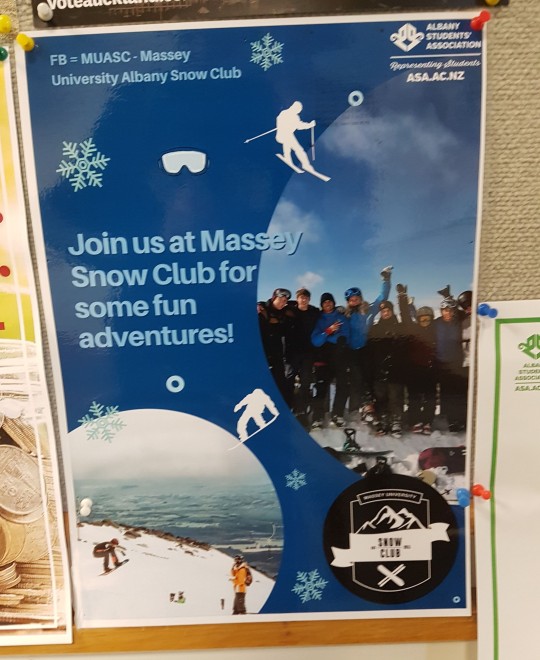
(Below) A Snow club poster I saw around the campus a few times as well. It has a very cheerful vibe and makes very cute poster to look at. I do think it feels a little bit too busy, but for the outcomes they hope to get, it works fine and will attract students to look at it. The colours and icons match the overall theme pretty well and create an idea of a fun adventure, which I would assume is the what the club wanted. I haven’t seen any club posters like these around our campus and honestly, if I wanted to join a club I wouldn't’ really know where to look. It would be great if AUT had a poster board for the clubs available like Massey does.
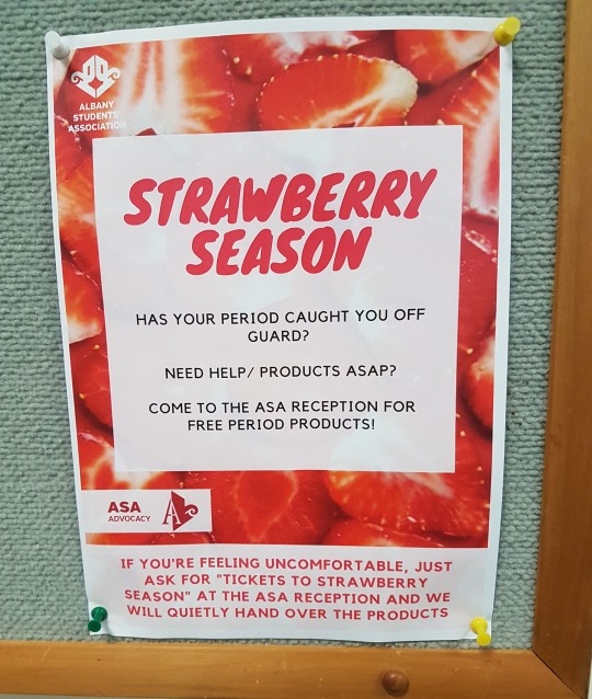
(Below) This one I found very cute and very important. At first glance it looks like some kind of strawberry farm or company inviting you to go pick strawberries or buy some, but actually this is about periods. They had these in the female bathrooms as well. Massey offers free period products for students who need them and all they have to do is go ask at the front desk. They even have a code word in case the person feels uncomfortable asking “Tickets to Strawberry Season”. This poster creates a very happy and encouraging tone. It also doesn’t shame the fact that women get periods. I’d feel very comfortable and appreciative that they even thought of something like this for the students. The design itself is easy to understand if you read it, but doesn’t give away the fact that we are actually talking about periods. This doesn’t create any shame when reading or looking at it.
0 notes
Photo

From planning to posting, share your process for making creative content!
To continue supporting content makers, this tag game is meant to show the entire process of making creative content: this can be for any creation.
RULES: When your work is tagged, show the process of its creation from planning to posting, then tag 5 people with a specific link to one of their creative works you’d like to see the process of. Use the tag #showyourprocess so we can find yours!
Thank you ali for the tag on this collaboration with @nyx4, ali! @wendashanren
tagging: (I mostly talk about collaboration for this one but if you check #showyourprocess most people talk about how they made their creations or check my first post about giffing here!)
@elysean for this set
@timothyolyphant for this set
@sugardaddyahxu for this set
@jun-hee for this set
@bloominflowers for this art
I wanted to collaborate with Jackie on a set. We’d talked about it anyway, and thought about what we could work on. So when I saw this request on mdzsnet, i knew this was the one for us.
wei wuxian, black/red, cql, yp!wwx/sunshot campaign scenes/nightless city scenes, the lyrics from "the war" by syml
I knew Jackie loved Syml, so she’d want to make this request, so I put both our names down to claim it, then when Jackie was online checked if she’d prefer to do this one solo, or shared. She loved the idea of a collab, so we got to work.
First we listened to the song a couple of times, thinking about how it worked for wei wuxian. then we broke down which lyrics we wanted to use and the general scenes for them.

We split them out across a number of gifs (originally it was 4 but I don’t have a screenshot of that) with a general idea of scenes we’d work from for each. As you can see, I do plan but my notes tend to be sparse reminders rather than detailed. jackie wanted to dig the angst knife in deep and wanted the ‘my war is over’ to coincide with wei wuxian falling off the cliff, so we worked back from that for our scene choices.
Jackie:
Originally it was going to be 4 gifs, all of them with the lyrics that made it to the final set, but it would have been too much text on each gif so first we decided on a gif without text in the middle before deciding on spreading out the song a bit more which led to the 7 gif set.
We started making gifs 1 and 3. in my usual fashion i made about 10 gifs to pick which scenes i wanted to work with & jackie made 1 because she isn’t an idiot.
Jackie:
Kareena does make a ton of gifs just to choose one or two, which is both amusing and amazing. I have proof!
Luckily we’re both admins on WoHDaily, so we used the drafts in there to share a post we could both edit gifs in & out of.
I’d wanted to do a silhouette edit similar to one in @lan-xichens lovely overlay tutorial, but it wasn’t coming out the way i’d liked, so I had to keep trying different things until it worked as I’d envisioned.
I finished a touch before Jackie who had taken time to pick emotionally devastating scenes for her gif, so we used my red throughout both, but then tweaked each gif with feedback from each other.
Jackie:
When we first decided on the scenes, I waited for her to do the first gif so I could match her colors. Once she made the first one, I showed her this template I made so we could visualize how it’d look.
Then we moved on to the next gifs. This was harder, because we didn’t want to overload the set by making every single gif super fancy, so we tried out a variety of things to see what would hang together nicely.

Above is an example of one idea of mine that got discarded. I think i had 3 iterations before we got to the gif below.

Jackie:
I then moved on to gif #6 and I made a gif which Kareena completely shut down. She said, Jackie, this is really ugly. I accepted it, because she is the one with the skills here, and because she was right. (KAREENA: this is a lie - the gif is *gorgeous* but it just has a lot going on in an already busy gifset.)
There was too much going on in that gif and it didn’t really fit with the set we were making. The gif we ended up with fit much better and I’m glad she said something. For the last gif, I showed her a few shots and we both agreed on those two (wwx crying, walking backwards on the cliff). I made a couple of gifs that Kareena was nice enough to say were gorgeous, but I thought they sucked. Third one is what we ended up with.
For me, most of the work was in getting the scenes to fit the lyrics and to work with the color scheme that the requester gave us.
We continued to work this way, making ideas and sharing them, tweaking or discarding or remaking as necessary until we were both happy with the gifs. It wasn’t too hard to get them to work as a set, it was mostly about communication and honesty. jackie and i get on well enough to crit each others gifs without worry, so we both liked what was created. We pushed each other, Jackie knows I’m very lazy & she didn’t let me slack. I pushed her in other areas so that we both tried out new skills.
Once the seven gifs were made, it was time for typography! We spent a little time discussing our love of simple fonts, sharing a few examples, before I handed over to jackie as the typography queen.
Now, fonts:
Yup, I like simple fonts and for the typography not to take over the whole set. Luckily, Kareena feels the same way, so early on we decided on two fonts, one of them to highlight a word here or there. I showered her some fonts samples, we agreed on a style, and then I got to work.
The fonts used were:
Ostrich Sans https://www.fontsquirrel.com/fonts/ostrich-sans
Memories https://www.dafont.com/memories-2.font
I kept it simple, just looking where the text would look best. I didn’t know how to wrap text around a shape before, which is what I wanted for gif #3. Turns out it’s very easy and people probably know this already but I’m a ps noob (lie). Still putting this here just in case anyone wants to know.
Using the Ellipse Tool/Custom Shape Tool, I made a circle 2px bigger than the bw gif i wanted to wrap the text around. I didn’t want the shape to be visible, so I chose Path there. (If you choose shape, the actual shape will be visible in whatever color you have chosen)

With the Type Tool, just hover over the line of the shape and a squiggly thing will appear. Click and start typing. I then dragged the text and fit it over the bw gif. I made the shape on the side so I could see it clearly, but you can make it over the actual shape you want the text to wrap around. Listen, this is the best I can describe it ✌
We discussed how to post the set. Since it was a group effort, should one of us post it or should we post it via the net? Since we’ve also got another request lined up to collaborate on, we decided that I would post this set & Jackie would post the next one.
TLDR:
It was fun, it was about communication and compromise. Pushing each other in our weak spots, nitpicking at each gif to make them the best we could, agreeing why one gif might not work in this set. It was about mixing two styles but still creating something we both liked! It was enough fun we have two more collaborations planned, just to keep having fun and to keep learning.
21 notes
·
View notes
Text
So, Do You Remember the 80s ‘Jazz Revival’?
Prodded by my memories of Rip, Rig & Panic, (the group, not the Roland Kirk number), I’m taken back to the UK ‘Jazz Revival’ of (roughly) the 1985-1990 vintage. For a brief period, in London at least, jazz music experienced its very own Retromania, and seemed to as cool/hot and hip/hep as it imagined itself to have been back in the ur-bebop and hard bop days. Much has been written about the ultimately conservative nature of this revival, with its memorialising of ‘sharp men in even smarter Italian suits’ (anyone remember The Tommy Chase Quartet?) and the Blue Note, ‘instant classic’ photo artistry of Francis Wolff, but which ultimately served to the disadvantage of the more experimental and ‘risky’. (It’s easy to lay the blame at the feet of Wynton Marsalis, but the seeds were always there for absolutism, from the very start, with influential USA critics like Albert Murray and Stanley Crouch, early neo-cons who increasingly decried the avant garde and post-Free Jazz experimentalism.) For me, this era coincided with my own reintroduction to jazz music, a process which began around 1981, and represented a return, this time permanent, to a music that I had first explored in the early/mid-70s, but which had been sidelined by punk and post-punk from 1976-1981. Bands like Rip, Rig & Panic served as a gateway back to jazz (and beyond), and the New Musical Express (NME) helped me in this, through such writers as Richard Cook, Andy Gill and Graham Lock. So this ‘revival’ was at once both personally-experienced and externally-informed.
There are a few literary signifiers that help to sum up these times, times which, in retrospect, seem to have been somewhat of a triumph of style over substance? (The 80s also arguably marked a significant lessening in quality in rock and reggae music, and we still await a definitive account of this entire troubled decade.) Have a look at the development of The Wire typography, once it became a monthly rather than a quarterly publication (i.e.from 1984 onward): The Face pointed the way forward, an alternative to the ‘inkies’ of the NME, Melody Maker and Sounds, and The Wire in turn fully bought into the aim of more stylish presentational values, with the increased involvement of designers and ‘creatives’, as what clothes the musicians wore seemed to become as important as what they played. The Wire remained both a pleasure to read (featuring, despite everything, mostly more ‘left field’ jazz players, with even free improvisers also in evidence), and also to look at (the front covers were events in themselves, as they still remain). The bubble, however, had burst by 1990, and the covers began to feature the likes of Michael Jackson, Van Morrison and Jimi Hendrix, a reflection of the decreasing influence of ‘pure’ jazz, and an inexorable move towards what ‘hip’ young people were actually listening to, once they found out that Art Blakey and Max Roach were not, in actual fact, “great to dance to”. Electronic dance music soon became the default option of the tragically hip, an option which The Wire was soon to take up, especially after Drum and Bass / ’Jungle’ upped the avant stakes. (Main’s Hydra-Calm, from what I remember, won its 1992 ‘Album of the Year’, for an example of the magazine’s ‘new direction’).
In 1986, three of the older older NME writer ‘purists’, Roy Carr, Brian Case and Fred Dellar, put out ‘The Hip: Hipsters, Jazz and The Beat Generation’, which was a self-explanatory coffee table book, and exactly suited the whole ‘jazz revival’ shtick, “Hip has shifted more shades than any other philosophy throughout history”, proclaimed the back cover, rather vaguely, but which at least demonstrated that the authors didn’t take it all entirely seriously, unlike Robin Tomens. The latter published (only one printing, I must assume, in 2000?) his ‘Points of Departure: Essays on Modern Jazz’, a rather ambitious title for what was essentially a collection of what would now be called blogs, trying to demonstrate how hip and jazz-anointed he was (he doesn’t cover free improv, however). Although the book is often cringeworthy, in its attempts to glorify its author’s second-hand insights into various examples of the post-WW2 jazz modernists (mostly American), I have always had a sneaking fondness for it, as it in many ways mirrors my own tentative paths of discovery in the same time-period (1982-1988), alluding to a shared gaucheness, as we both tried to negotiate the various entries into the music, at points at which it all seemed insurmountable. His accounts of shopping in Ray’s Jazz Shop and Mole Jazz are priceless, and his reflections are basically those of a fan first, writer second, a position to which I can completely relate.
I’m no-one to talk: I sent in my own list to The Wire of ‘10 albums that I am currently listening to’, a regular spot in the magazine at the time (to show off my listening tastes, basically and embarrassingly, in retrospect), and which appeared in a 1986 edition of the magazine, from what I can recall (it soon, very correctly, ditched the whole daft concept). It seems that I wanted my own ‘brilliant corner’, however tiny and naff (to use a very 80s word), in the ‘revival’! What put me off, eventually, was the almost inevitably cosy, ‘closed shop’ mentality that most cliques and ‘scenes’ tend to engender (and which Tomens, for one, appeared to love), but which quickly prove to be so transient and gone-so-soon.
We can now, thankfully, postulate another ‘revival’, one centered on Cafe Oto since its opening in 2008/9, one that appears not to seek validation in places like The Wag Club. (Oto’s various presentations usually transcend ‘jazz’, or, at the very least, transmutes it, and transmutation should be something that jazz has always welcomed?) With more musicians of colour and more female improvisers, this updated ‘scene with no name’ seemed built to last, at least until Covid-19 put it all on hold (at least in the area of live, in-person performance). One of the positives of the 80s scene was the clearly increased involvement of women and black musicians: this was undoubtedly an incremental and undoubted fact by 2020, exemplified, for me at least, in the line-up, at Oto in 2018, of a group led by Louis Moholo, and featuring Jason Yarde, Shabaka Hutchings, Alexander Hawkins and John Edwards. No women in this band though...Doh!! ( If I remember correctly,I think they called themselves ‘Five Blokes’!)
2 notes
·
View notes
Note
hello, i hope you're having a good day!! i was wondering, do you have any tips for making amvs? like, what programmes you use, how you handle the timing, etc. thank you for all the fun edits you make!!
hi!! sorry for the delay in answering this, i just wanted to take the time to answer it thoroughly and i kept forgetting lol & thank you! i already typed this once and tumblr made it disappear so i apologize if anything i say comes out short ‘cause i’m just trying to remember all that i typed before lol
ok so ill just go through my general editing process in Vegas, i dont know any other program well enough to talk about it at length:
(disclaimer: this is just how i do it, i dont watch tutorials and my editing friends and i don’t watch each other edit often so i would assume that my way is very different from other ways you’ve probably seen! i might even do something in a very stupidly hard way, please feel free to tell me if theres an easier way to do anything lol)
1. Song: So skipping past the “choosing song and ship/character/show” theme, I’ll dive straight into CUTTING THE SONG! I’m not about that Editing The Entire Song life, and neither is most of the editing community anymore, so I cut it up into a shorter thing that I’m better equipped to edit to. I’m just using a random example but here I’ve taken this long ass song and turned it into this:
(the next step just kind of depends on my mood, or ill do both, doesnt matter)
2-A. Subclips: if im making a shorter video or a video where i’m not 100% super familiar with the footage, i will immediately start making subclips using the episodes ive already pulled into the project. if it’s a ship/character that i’ve edited before, i’ll just go to Import->Media from Project and import the subclips i made previously. either way, subclips are there!
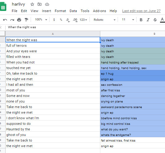
2-B. Sheets: for ships that i know very well/have a lot of footage/im concerned about potentially repeating something, i will go to Google Sheets/Excel and take the lyrics im editing to and put them in column A, separating by pauses in the singing. then i put corresponding footage i think will go well in column B! im often not super specific because i know the beats are gonna be different than i remember, so i usually stick to referencing whole scenes instead of specifics moments. here’s an example:
3. Clip placement: Then I start placing clips down! Below is how I organize my timeline tho I know a lot of editors who put the music on top, this is just how I like it. I also keep a single muted audio layer in between for the video footage’s audio and then I’ll delete that layer when I’m done (or sometimes I don’t, it doesn’t really matter)
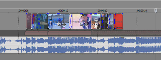
I think it’s good to hit the beats as much as possible, it makes for a more dynamic audio-visual experience! In general I try to make my videos so that, if I didn’t add any zooms or typography or coloring, it would still be a good amv. And don’t limit yourself to just one layer, you can have as many layers as you’d like and put clips on top of each other (cookie cutter/changing the layer to dodge or add or screen or whatever) is a good way to mix things up
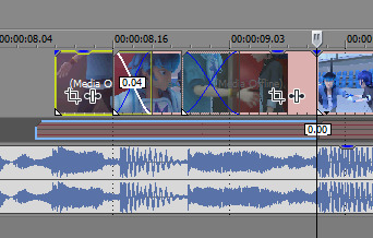
when I zoom in you can see I’ve got some variety already in my transitions, I know I use that motion-blur-zoom a lot these days but I still try to mix it up and keep my brain invested
4. Typography: After all the clips have been placed (or most of the clips, ofc sometimes I’ll want to add more later) I move on to typography! I’m lazy so the first thing I’ll do it just put down unedited text where I think I’ll want it to go. It just helps me organize myself. Then I’ll pretty up the text afterwards.
Typography isn’t necessary for a good AMV, but really nice typography can really spruce things up. I’ve only very recently gotten confident in my text editing skills, and I just kept watching typography done by editors I really like until I figured out what they were doing. My recommendation is to just KEEP ADDING EFFECTS! Convolution kernel, gaussian blur, mask the text so it appears from angles that the transitions wouldn’t be able to do - of course there’s gotta be a limit for taste, but just add stuff until you like how it looks. Also changing the blending style of the text layer is good, dodge and difference are my go-tos for typography layers.
5. Transitions: I don’t go crazy with transitions, but it’s fun to mess around with them. You don’t want too many crazy/different transitions, you want them to match the mood of the song and the type of beat you’re hitting. I usually ensure that all similar beats in the song have the same transition type on them, bbbbbbut that’s cuz I’m overly obsessed with parallel structure. There’s plenty of fantastic AMVs where they just go ham and do whatever types of transitions they want to in each part of the song and they make it work just fine
(next step, once again, kind of depends on my mood lol)
6-A. Zooms: Time for zooms! I usually just use the pan/crop for zooming, but often I’ll incorporate Sapphire FX BlurMoCurves or NewBlue AutoPan, especially if I’m trying to zoom typography with the footage at the same rate. I try to keep my zooms short and slower, I mean obv it just depends on the song but yeah. There’s a lot of different ways to do zooms so I recommend experimenting and just playing around with different effects
6-B. Zooms...but different: Another way that I’ll do zooms which is definitely pretty different (but this is what I do for crossovers like 95% of the time because I am laaaaaaaaaaazy) is I’ll drag the project into a new project timeline and start editing it there. It’s similar to how After Effects works and it makes it easier to put effects overtop of multiple layers without having to pre-render anything.
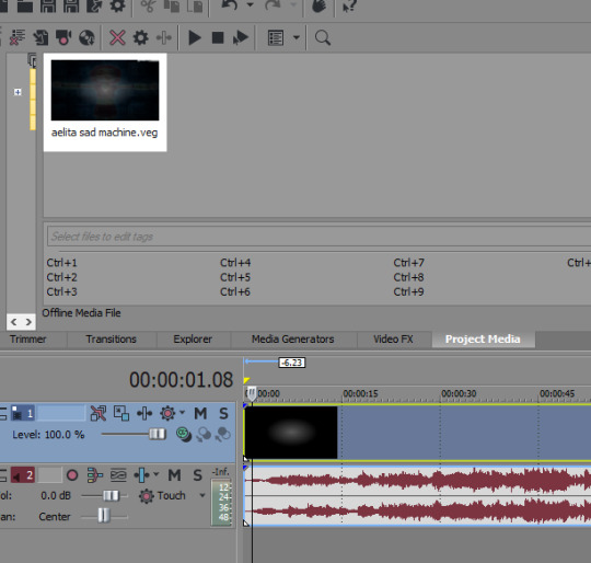
So you can see I’ve just pulled in the .VEG file and popped it in the timeline! So this way I can add zooms and transitions without worrying about layers. And if I see a mistake I need to fix, I can just go back into the original .VEG file and edit it, and it’ll be edited when I come back here. So it’s much easier than pre-rendering or trying to do zooms on a lot of layers. To be clear tho, this doesn’t work well if you have a lot of fade transitions, it’s best for sharp transitions and it’s great when you’re using Sapphire FX BlurMoCurves a lot.
7. Overlays: After that I’ll add more typography (or if you didn’t add any earlier, you can add some here overtop of the new project file) that kind of goes on top of everything. And then I’ll add any overlays or objects or whatever else I wanna add! I’m not someone who uses a lot of backgrounds cuz I don’t have a background-creative-brain so I stick to simple overlays at the most.
8. Coloring!!! This is very sad but I only JUST learned a few weeks ago that you can add coloring/effects to your entire video with this button here, so in case anyone else hates watching tutorials as much as I do here’s where I’m talking about:
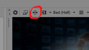
This shit would’ve made my life so much easier throughout the years lol But alas. Anyway so for coloring there are some effects that are popular for any colorings you’ll find on YT (but you can certainly just download some, Riverdale editors in particular share a lot of really great colorings but you’ll find them anywhere in the live action editing community):
Channel Blend, Color Curves, Color Blend, Color Balance, Convolution Kernel (best for live action footage or footage that isnt very crisp), Color Corrector Secondary
These are all just fun to mess with. Channel Blend in particular is something of a mystery for me, I haven’t studied it fully to understand what I’m doing so I mostly just mess with it randomly until I like what I see lol
9. Render time! First render, anyway. Usually there’ll be some random problem in the footage or something and I’ll have to either go back into the project and fix it OR if I’m feeling particularly sour (or maybe if I’ve rendered like 3-4 times already) I will just take the finished render and manually remove any errors, stretching out the good footage to cover my tracks. You’d be surprised how often I end up doing that lol
And then it’s good to post! I primarily render as .WMV but I also go for .MP4s every once in a while. If I want to upload it to Twitter I’ll do an .MP4 but it’s a new thing for me so I’m still stuck on .WMV mostly.
Anyway I hope this answered your question at least a little bit, I can go into more detail about certain parts of this if you’d like!
8 notes
·
View notes
Text
My Three Ideas
Idea One:
Dog Friendly App
My first idea is a 'dog friendly' app. This app would consist of lots of information on areas which are dog friendly in Belfast/Northern Ireland. Belfast specifically, is continuously becoming more dog friendly - therefore I believe people need a more easily accessable way to find out all of the pooch-friendly places.
Pros:
A huge pro is that I am part of the target audience! I have two dogs of my own, and I am always looking for dog friendly things to do. I have joined Facebook groups, and researched deep into the internet to find fun things to do with my pups. Therefore I not only understand how much of an unnecessary hassle this can be, but I also am widely knowledged in this area!
This is something that has little to no competition as it has not been done before within Northern Ireland. The information is online, however this means people have to go out of their way to find it, and it is very difficult to find specifics such as whether they want to find a dog friendly hotel, or a dog friendlt cafe etc. I would include a filtering option on the app, so that users can filter by area, type of venue or activity.
Cons:
I would use Adobe XD for the design creation of this app - which I am completely new to. I would need to do vast research on how to use the programme efficiently - which is fine because I have a huge interest in learning XD anyway, this just gives me a push!
This will be my first time creating an app, so I will need to research further into User Experience, and how to make the user journey as easy and as fun as possible! I will also need to consider accessability issues, so that the app is free to be used by all!
Target Audience
This app would be specifically for dog owners/lovers in Northern Ireland; however, I do believe most users will come from Belfast as that is the more popular area for dog friendly activities at the current time.
What's the business model?
If I created this app, I would like it to be free. This is because the information is already out there, I would just be making it more user friendly. Making it free could also then boost the amount of users, therefore helping me gain exposure! I could attempt to get featured in articles, since this is new and specific for the local area, news companies may be interested in featuring this new and exciting application.
As the app grew, I could start to earn money through some dog friendly advertising. Such as dog day cares, dog bakeries, and even the dog friendly companies who maybe have events going on.
Idea Two
Paw Prints
The idea of this product is dog themed printables. This will include digital drawings of multiple different dog breeds with dog related quotes, dog memorials and maybe even birthday cards!
Pros:
Being a dog lover, I have looked a lot into this type of product myself. Being the target audience for your own product will definitely aid the creation process, as I will be making things that I would want to buy.
I already know typography basics, which will benefit me for any text focused posters. I am also reatively experienced in Illustrator and InDesign - therefore, I will not need to learn any new programmes.
I worked with Belfast Met for 7 months on full time placement, creating posters and other things for print. Therefore I generally know the rules for print, like what resolution is required and how to stay within the bleed etc.
One of the designers I keep up to date with, Alice Thorpe, just opened her own printables site on Shopify, I have kept up to date with her journey and I have been very inspired! I could base my knowledge of watching her journey, to help with my own!
Cons:
I have not made anything like this before, therefore I know I am going to struggle with with a few things. Being a perfectionist doesn't help either, and I know I am going to spend a while trying to perfect this new 'skill' of making printables.
Even though I am relatively good at using Illustrator, that does not mean that I am any good at drawing. Therefore, this will be something that will be very challenging. The drawings may be downgraded to silhouettes rather than detailed drawings. However, I am willing to challenge myself as this may be a project that could pay off if the additional hard work is put in!
There would be a lot of world-wide competition, especially if selling on Etsy. I would try to stand out with my different aesthetics, and also my contribution to animal charities could aid my ability to stand out.
I would also need to use my own money to do multiple test prints
How will it be built?
As I mentioned before, I will be using Adobe Illustrator and (maybe) InDesign. Illustrator will be used for the custom text and drawings, then InDesign can be used for positioning of everything and making sure the documents are print ready.
I also mentioned that I have been following a girl called Alice Thorpe, who released a similar product on Shopify, therefore I know that this is an option. However, I think it would be easier and more efficient to open a shop on a site like Etsy, and let people download the PDF printables to print at home, rather than to have it printed and sent out to them? Maybe there could be an option for them to download them on the promotional website as well?
Target Audience:
This product is definitely not for everyone, however it is widely targeted to dog lovers. Dog lovers are not age specific, however I'd say between 18 to 40 would be the main target audience of the type of products I would product. This may also only be targeting to an audience who own the breed specific products I design, therefore I am aware to make some more neutral dog themed products in order to widen the number of people who may be interested. The audience would be world-wide, since the product is just a PDF.
What's the business model?
Since I am only interested in making PDF printables, I believe the price should be very low. I considered free but then I had an idea to give a percentage of the profit to an Animal Rescue Centre? Not only is this something that I would love to do, but it is also something that could get the product more exposure! Being a dog lover myself, I know of some of the best Animal Rescue Centres in Belfast, and they have some impressive audiences themselves. If every print goes for £2, then the Rescue Centre could get £1? I could also work on a specific print where 100% of the profit goes to the chosen centre, maybe with "adopt dont shop" quote etc.
If I make rescue specific prints, I could print a few myself and give them to a few centres, for them to sell to new rescue dog owners. They would keep this money, but I could attach my business card and a web address to where they can buy similar prints. Therefore I am loosing money, but potentially gaining more exposure.
I could have an email list set up on the promotional website, and anyone who pre orders one print, gets it for 50% off, or something similar in order to try and boost the initial sales.
Idea Three
Quirky Quards
This product would be cards for all kinds of events. I have always been fussy when buying people cards, I prefer the simplistic and funny cards to the over crowded tacky cards. I therefore would create cards similar to those that I would love to buy people myself. These cards would be fun and creative, I would include lots of different options for different audiences. Cards for dog walkers, people with foster parents, congratulation cards for transgenders and much more!
Pros:
I would once again be the target audience and therefore all I need to do is make things that I would like to buy! Cards like these are relatively hard to find, or when you do find them theyre usually about £4/5 for a basic simplistic card. I would like to try and do the same style of card, for a much cheaper price.
"The average person recieves 20 cards a year". Cards are always being purchased, and different types of cards are always required!
I already know the software in order to create the design of the card.
Cons:
Learning to draw, and learning how to print these cards in the most cost effective way.
There is also a good bit of competition when it comes to making cards. Although I will be trying to stand out with the ability to create unusual cards and keeping them affordable.
How will it be built?
I would use illustrator for the creation of the illustrations and typography of the card. I would consider printing these myself, however I know it would be an investment. If this was not possible, then using websites like Shopify and Printify to print on demand might be an option.
Target Audience:
People like me who have a certain aesthetic when it comes to cards, I always shop at Urban Outfitters and Paperchase for cards, this is where they are usually priced at around £4/5 for a basic small square card. I would use these shops as inspiration, and target the same audience. This audience would definitely be mostly teenagers, probably 16 to 23. As I said previously, I would also be targeting these cards to minority groups who do not usually have many card options, although this is not the specific audience.
What's the business model?
As I mentioned before, these would need to be sold somehow. As it is going to cost money one way or another to create.
I could also promote the cards by making them out of recyled paper and envelopes, not only is this a great thing to do for the environment, but it will gain interest of those who wish to help the environment also!
If this idea does not go to planned, I could always create the graphics and come up with a new technology focused way of sending cards! Rather than E-Cards, I could create the graphics so people could share the card over messenger and text etc. I could maybe even create some sort of Instagram story template for peoples friends to post and tag them on their birthday - many people wish their friends and family a happy birthday over social media now, so this could be a more fun way of doing it!
1 note
·
View note
Text
Celebrity designers, context collapse, and rethinking how I teach design history
My first typography professor loved introducing us to her favorite designers. I remember learning about Paula Scher, Stefan Sagmeister, Milton Glaser, Neville Brody, and David Carson in that class. (She loved David Carson! We saw a lot of his work that semester — this was the mid-2000s, Sagmeister was at the height of his career and the shadow of Carson still loomed.) She wanted us to see work from history, as well as the contemporary work she found exciting so that it could inspire, inform, and guide our own work. Looking at the earliest work I did in school, you can see what designers had caught my interest at various points in my undergraduate career: the Vignelli phase came first, then it was Pentagram. By junior year, I was interested in illustration, and my work looked like Charley Harper's and Frank Chimero's. I had an infographic phase inspired by Nicholas Felton and an embarrassing handlettering period that mostly resulted in bad Jessica Hische knock-offs.
My classmates were the same way. There was a group of us who closely followed design blogs, tracking the 'celebrity designers' of the time. Some of us even got really excited by the two required design history surveys, saving images to our pre-Pinterest inspiration files and trying on the styles of different designers likes costumes. I remember one student particularly well who, following the lecture on Art Nouveau, decided he was going to make every project look like an Alphonse Mucha poster for the rest of the semester. I still cringe at the Russian-Constructivist-inspired poster I designed for a school function. We named dropped in critiques, showing off with our knowledge of history or our awareness of the trendy designers of the moment, completely unaware that half the class was rolling their eyes. For myself and my friends, it felt like part of being a good designer was knowing those names.
When I found myself back in the classroom — nearly a decade later, this time as the teacher — I was surprised to find how many of my students, at every level, had little sense of the history of graphic design, not to mention the 'celebrity designers' of today. Design history is largely foreign to them; it's an optional course in many design programs. It's rare for a student to know Sagmeister, Carson, and Scher (or Rudnick, Hu, and Walsh) if I mention one in class. I once had an upper level student who had never heard of Pentagram. Pentagram!
It's not that this generation of designers isn't consuming design media but the way they do is wildly different than when I was in school. At their age, we read blogs to find out who was doing the most interesting work, but those don't exist anymore. My students aren't reading It's Nice That or Eye on Design. They are on Instagram, on Behance, on Pinterest. Their design awareness, sensibilities, and taste is constructed through likes, pins, and retweets. They might not know the name Michael Bierut or have heard of Wolff Olins but they've seen the work. And they've also seen work from countless other designers flying below the mainstream design press radar.
Consuming design this way creates a peculiar context collapse. Everything moves fast, the thumb occasionally pausing for a closer look, where work from an international branding agency can sit next to a great poster by a high school student in India. These images travel from board to board, retweet to retweet, ever so slowly removing any sense of where it came from — the designer is often anonymous, the subject matter irrelevant. A quick tap saves it and then it's on to the next image. My students don't know the names of designers or agencies or studios but they do know what's trending, the popular styles, and the latest rebrand. Eventually, all the work starts to look the same.
Kids these days, I caught myself thinking. I had become the cranky old man complaining about how the next generation doesn't understand it sooner than I had thought I would. I mean, I'm only thirty and here I was worried about what this meant for the future. It was better when I was in school, I thought.
But what if this isn't necessarily a bad thing? Maybe this is an opportunity to teach design history and culture another way. Maybe it's a good thing for the idea of the 'celebrity designer' to die. The myth of the solo genius, alone in his studio, doesn't work anymore, and far too often it continues to only elevate the white male designer. Design conferences continue to feature the same designers year after year, sometimes even when at least one of those designers probably deserves to be cancelled. This perpetuates a particular idea of what a successful designer looks like and what makes for 'good design'.
Whether intended or not, the images my undergraduate professors showed us became the standard by which we judged design, and the names attached subconsciously became the people we were supposed to be emulating. The design history courses I took a decade ago were surveys: the professor would click through images on the screen in the front of the room; a list of names and styles we had to memorize. We spent little time talking about the content or articulating the context it sits within. Like my students now, I would get excited by something else I saw and use it in my own projects, regardless of context or content. Where we knew names, they know styles. Is one of these really worse than the other?
To be clear: this is not to say that names shouldn't be attached to the work or that we should disregard history. I believe these to be important elements of any design education. But inspiration is not enough. Trends are not enough. Simply collecting images is not enough. To move beyond inspiration, to dig deeper than trends and avoid celebrity design culture, we must make space for our students to reflect on this work and think about how it connects to their own blossoming practices.
In every class I teach, at both the undergraduate and graduate level, I've started requiring students to keep a visual journal — a dedicated place to keep images, PDFs, videos, photos — a simple attempt to encourage them to be more thoughtful about what they are consuming and saving. I try to build time into class for students to reflect on the work they are finding, and at the same time, I'm sharing the things I'm looking at and thinking about. (And I make it clear that what I share isn't always an endorsement.) Together we try to figure out why we are drawn to these things. Or repulsed by them. Or why they are trending. Or where they come from. We talk as a group about art movements and trends and gaps in history. We lean into the aesthetics, the contexts, the politics, and the ideologies that may or may not be embedded in the work. We dissect the visual moves the designer did and why she may have made those decisions. We find out more about the designer, of course, but we let the work speak for itself. Just because it came from a particular designer or a particular studio doesn't mean it's automatically great. Some of the best moments I've had in the classroom are when the students start debating these ideas — amongst themselves, without any guidance from me — trying to formulate their own point of view.
I want to create a space for young designers to feel comfortable conducting a thoughtful interrogation of images, visual culture, and the very profession they are about to enter — perhaps a small step in dismantling the celebrity designer complex while moving beyond the trends of their time. Looking at other design will always be central to the young designer's process, but they should't feel bound to trends, to styles, to celebrity as they move through their careers. The problem isn't that students don't know designers' names or are blindly following trends, it's that it is all moving too fast. Instead of fighting the new consumption paradigms, I've started to embrace it. Where I once looked down on these new modes of consuming media, romanticizing my own college experience, I now see the design students today as better equipped to do this work than I was at their age. They are well-versed in reading images, fluent in media literacy, and far less interested in celebrity. They get to experience more design — from all across the world — than any previous generation. If any of us can move beyond celebrity and dig deeper than the latest trend, it is them. We just need to be sure they have the critical tools, along with space and time, to do this work. The kids, I'm beginning to think, will be alright.
2 notes
·
View notes
Text
Weekend Top Ten #480
Top Ten Videogame Logos
I like games. I’ve been playing them for a long time; since the 1980s, which was over seven years ago. In that time I’ve seen many ages of gaming come and go – remember full motion video? – but one thing I have noticed is that game packaging has shrunk and shrunk and shrunk. From large sturdy cardboard boxes the size of two hardback books back in the early nineties, to slim ‘n sexy DVD cases around the turn of the millennium, to – well – absolutely nothing these days as we oxidise games from the air. And one of the things that used to – and, I guess, still can do – make a game’s box art really pop was a sexy, elaborate, or otherwise just really frickin’ cool logo.
Now, by “logo” I’m basically talking about the design and typeface of the title itself. I don’t really mean the lambda sign from Half-Life, or – to step outside specific games for a second – the famous Ghostbusters symbol. Some games do actually end up with iconography incorporated into their title design, and you might see a little bit of it here; but for the sake of argument, I’m using “logo” to mean “title”, and how pretty that title is.
And I gotta say, some games had very, very pretty titles.
Now, I know, from research, that 8-bit games released in the eighties often had wild and wacky logos. However, there’s precious little of that on my list, because I didn’t really notice it at the time. I can appreciate it now, looking back, but it meant nothing to me forty years ago because, well, I wasn’t born or was simply far too young to notice. I didn’t really pay attention to box art until I had my Amiga, and that was about 1990. So there’s precious little here that’s genuinely old. That being said, I do seriously think that the golden age of logo design was that late eighties/early nineties period, as we transitioned from 8-bit to 16-bit home computers, with a legacy that continued into the PC dominance years of the mid-to-late-nineties. I think at this point the industry benefited from beginning to have certain established patterns and artists, but was still loose enough to allow a huge deal of experimentation and a feel of general lawlessness. It was in this era that Roger Dean reigned supreme, a vastly talented artist whose airbrush style defined the Amiga 500 for me. His work can be seen on this list, and – surprise – it’s at number one. Dean was so good that not only did his artwork grace dozens of boxes, but he also designed the greatest logo for a game developer of all time.
(Just as an aside: I had a lot of Psygnosis games for the Amiga. I remember vividly my cousin and I would desperately try to parse the wording of that logo – “Is it a P-S-V? P-S-V-C?” – during the brief time it appeared on screen whilst the game loaded. Ah, those exotic early years, full of wonder and possibility… but I digress)
Anyway, there were loads of bright, bold, colourful logos in those days. I think they mostly wanted box art that leaped out from a crowded computer shop shelf, and generally there was probably an assumption that the audience would be either young or nerdy, so there was no outward desire to be elegant or minimalist. Huge, chunky logos were popular; large text, airbrushed artwork, characters incorporated into the logo itself; plenty of shading and embossing effects were used to make a logo stand out proud on the box.
As time wore on, and the target audience aged and maybe wanted to appear a bit cooler, logos seemed to grow smaller. 3D extruded block text was replaced with simple white font work and elegant design. As such, into this new millennium, there are very few really exciting logos nowadays. Even my beloved Half-Life has a really minimalist design, which works, yeah, but it’s not exactly an all-timer. We do still get some very good logos now and again; I’ll go to bat for Halo any day of the week, but even that is twenty years old now. BioShock’s was pretty cool, too, with its rusted brass façade, but even that’s, what, 14 at this point? Blimey.
I think the evolution of the game logo can best be illustrated by comparing the original Doom logo to the one used in the 2016 remake. Vibrant colour versus flat white. I know which I prefer.
So there we are; my ten favourite game logos. And as these are game logos, I’ve banned anything that’s adapted from external media, whether it’s a Star War or Spider-Man or even Cyberpunk 2077 (which does have a cracking logo but is more or less a version of the one used in the original role-playing game). Anyway. Let’s have at it.
Shadow of the Beast (1989): not the first Roger Dean box art, but arguably the most famous, and certainly the one that caught my attention. Well, actually, it was Beast II in 1990 that I saw, but I’m picking this original logo as it’s a bit cleaner without the “II”. Anyway, what’s not to like? Dean’s fantasy-metal style is evident, with a logo that’s kind of threatening to look at, the pointed curls descending from the letters connoting teeth or claws, but the brushed, metallic detailing giving it a technological bent. Supremely cool, freakish, and a style carried very strongly into the game (and moreso the sequel).
Elite (1984): a rare example of a relatively minimalist piece of box art for the eighties, but all the same this logo is something else. Huge and bold, carved out of solid gold, its eagle wings suggesting the power of flight whilst the strangely-crowned head suggests something almost majestic or godlike. It’s the perfect logo for a game about space exploration, yet it also has echoes of Nazi symbolism or even Judge Dredd, giving the game a subtle sense of menace.
Lemmings (1991): unlike the other two, this was a fun, bouncy game, whose childish, cartoony stylings hid a dark and fierce puzzling heart (and also supremely distressing scenes of Lemmings getting mutilated). But this logo is beautiful, its jolly, chunky green typeface reflecting both pastoral beauty and the hair of the little critters; the misaligned letters reminiscent of the undulating hills the levels hint at (but don’t actually contain, particularly). And we get the heads of the Lemming poking out, squarely cementing them as an important part of the experience, their character the defining characteristic of the game itself and all its associated art.
Doom (1993): a seminal moment in gaming, and a seminal logo too. Surprisingly colourful for a game about the ravages of hell, this is a bold and bright bit of typography, the extruded letters suggestive of the 3D nature of the game itself; the almost terracotta tiles meshing with the complex mechanical geometry on the letters reminiscent of the game’s merging of the supernatural with the highly technological. And there’s the pointed extremities of the word, directed down like fangs, hinting at the horrors and dangers to come. Quite simply brilliant.
Minecraft (2009): the most recent game on the list, but its logo is almost a throwback. Thick, square, blocky letters reflect the cuboid nature of the gameworld; the angle away from the camera suggests height and importance, subtly hinting at the scale of the game itself. This is an iconic piece of iconography, instantly recognisable by children – to the extent that trying to draw a logo like Minecraft, or recreate the Minecraft logo itself, is fairly common in our house. I also like that one of the letters appears to be a Creeper.
Pac-Man (1980): and here we have the oldest logo! But so iconic. The chunky font, with letters comprised of thick shapes, devoid of some of their detailing, is cool enough; despite being released at the beginning of the eighties it has an almost sixties vibe. The “C”, of course, looks like Pac-Man himself. But what really makes it art is the offset colours, giving it the air of a misprint or of looking at 3D without glasses. It’s a deeply cool effect and helps make the logo feel timeless.
Dizzy (1987): another oldie, making its first appearance in ‘87’s Dizzy: The Ultimate Cartoon Adventure, although the logo design was very slightly tweaked and refined by the follow year’s Treasure Island Dizzy. Simplistic 3D block letters, but what makes it sing is that they’re dizzy; linework suggests them spinning, but it’s how the perspective differs from letter to letter, giving them a confused and discordant feel, that gives it just that little bit extra.
Zool (1992): perhaps a lesser-known and less iconic logo, unless you were a huge Amiga game in the early nineties. The airbrushing to give it a metallic, embossed effect is very of the moment, but what I love is the eyes. The double-O is rendered as Zool’s cross-looking eyes in his ninja bandana. On one hand, making the Os eyes is rather first-base, but partly it’s how they’re executed that I like; it’s also just because the big angry eyes are rather funny.
Pokémon (1996): first appearing on the cover of Pokémon Red and Green in ’96, the general Pokémon logo is a beaut. Again, it gives the appearance of simplicity, but the execution is complex. Chunky, friendly lettering, yellow like kid favourite Pikachu; kids’ll love that. The blue outline and drop shadow help it pop and give it a subtle, almost 3D effect. And the letters are discordant; rather than a regimented logo, it’s all over the shop, different sizes and weights of letter, all jostling for position on the page. It perfectly encapsulates the tone of the game.
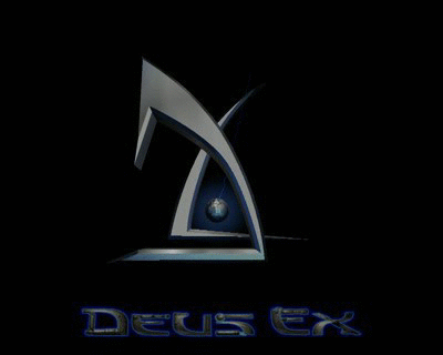
Deus Ex (2000): I’ve more-or-less steered clear of the sci-fi design of “metallic logo that’s otherwise just the title”. I like logos with a bit of something extra; hence no Perfect Dark or Halo, despite those being great in and of themselves. Deus Ex takes the spot, though, partly because the letters seem built out of something, cobbled together in a dystopic, cyberpunk-y way. As you play a cyborg, this feels apt. And then there’s the logo itself, a towering corporate-looking edifice, a brilliant juxtaposition of two shapes that together suggest a D and an X. It’s slick and shiny, and is present in the game itself as a gently rotating loading screen, reflective of the advanced 3D graphics the game possessed.
Honourable mentions go to Theme Park, with a logo that’s suitably corporate and also reflective of a roller coaster, and Quake, just for that really cool nail-through-the-Q effect.
0 notes
Text
Evaluation
Many of the pieces i have done for multiverse have been based on ‘The Old Nurse’s Story’ by Elizabeth Gaskell. It is a Victorian ghost story about a young orphan who goes to live in a big manor house owned by her cold and distant great aunt. It is full of strange characters and mysterious goings on, a typical Victorian gothic tale. The only two sympathetic characters are the little girl and her old nurse. The main words and phrases I have taken from it are:
gnarled thorn trees, desolate Cumberland fells, manor house, grand, gothic, old, spooky, stormy, tragedy, ghostly, dark.
In this eight week project there has been three artists that I have really liked and have influenced me/introduced me to different styles, that I really want to use more in my future works. They are all completely different, the first one (who is my favourite) is Shaun Kardinal. He collages and then stitches into it, I really like this style. The landscape photos with the geometric shapes in the middle work really well and I hadn’t seen anything like this before him.

The second artist does layered illustration art, he is Brooks Salzwedel. I really enjoyed doing this style in college and I liked his work in particular because he creates really dreamlike worlds and a soft pastel colour palette. He also puts a hard edge on some of his work which makes it look a bit 3D that I really like. I also really like how he said that he wants to ‘evoke feelings of desolation, loneliness, lapse in time, and confusion of places’. I want to keep doing this style and think more about how I want people to feel/the feelings I put into my work. As I haven’t really thought about this kind of thing whilst creating my art before.
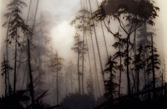
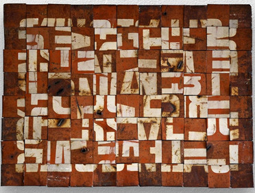
The other artist that made me interested in their style of work is Fabio Zanino, who does woven typography pieces. When we cut up the typography, I chose to weave them because I really like that style on baskets and other things like that and had never seen it done like this before. I really like Fabio’s work in particular because it looks industrial and futuristic. Almost looks like something you would see in an apocalypse like a weird sign. In his work he observes the effects of time on matter, human action and the process of dissolution. I find this really cool and like how he portrays this in his work. Zanino uses decostruzioni which I find is a really interesting concept. This is also what I would like to try and experiment with, in the future.
For this project, I really like the theme of the multiverse and creating something otherworldly. I have never done anything like this before and have always just drawn what I see, so I found this really exciting and interesting trying all of these different styles and creating things that seemed more futuristic/from another world. All of the work I did this project was new and I feel like it is more experimental than the last project. They are all very different although they all come from the same idea within my little black penguin book ‘The Old Nurse’s Story’ and being otherworldly.
Most of this project was an experiment for me, as I have never woven typography before or stitched into paper and collage before or drawn on layers of tracing paper. What I really liked and have learnt through this project is that you can photocopy all of the pieces of work and change the colours, so you can experiment so much more and quicker. For me this was really good because I mostly work in monochrome, I worry about putting colour on my work and ruining it, so I never try and just leave it in black and white. So this is a much easier way of testing to see what it looks like in other colours/styles. You can also change things on photoshop which I also find really helpful.
I really enjoyed Thursdays drawing lessons with the layered illustrations, collage with stitch and disjoined typography. Everything we did in these classes I want to keep doing them in the future. All of it was nothing I had done before and I also found doing the work was quite therapeutic and relaxing, it didn’t feel boring or like I just had to get through it, I really liked it.
The piece of artwork that I think was the most successful that I produced in this project, was the layered illustrations on tracing paper and for me was the most impactful to how I want to do my own art in the future. I really like this style in general and I enjoyed doing it. It opened up lots of things for me like the idea of tracing elements of different photos and putting them together in one image to create a new world, was something I had never thought about before. I was also really pleased with my outcomes for this work and think they look quite good, the two that I did. I also really liked them in all of the different colours from the photocopier. I think that out of all of the styles that we have learnt at collage, this is the one that I want to use the most in the future.
I found it quite difficult making the final outcomes on photoshop. The obvious reason is that I have only used photoshop this year and don’t know much about it. But I have always wanted to be able to use it well and want to use it a lot more in collage. But the other reason for finding it hard was because I didn’t know how to start it or what to put down first on the page, this is also what I find difficult about any artwork though so that is one of the things I want to get better at in this course. I also haven’t animated any of them, but I will look up how to and put that on my Tumblr.
The journey of the development of my layered tracing paper illustrations
1. Research – Dreamlike, mystical and otherworldly.

2. Inspiration – misty, industrial and engineering.

3. Design – abandoned, rough and experimental.

4. Final product – mysterious, unique and obscure.


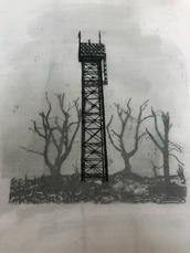

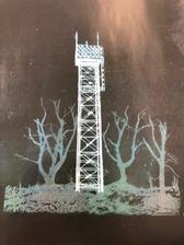
The first point is of the research, I liked these two artists the most even though they are both really different they both are very dreamlike, so I wanted to add parts of their work to mine. The second is the inspiration, they are pictures I took while I was out on a walk. From this I wanted to create a misty landscape with industrial elements. For the design I did exactly this, with the nature combined with unrealistic industrial structures to make a dreamlike world. Adding to this even more, I created an otherworldly place with all of the different colours.
I think that through this course I am learning to be bolder with my work and more experimental. My photoshop skills have improved slightly, but mostly this project has opened up my eyes to lots of different styles and ways of thinking that I had never done before. I also think that it has helped me to improve my creative thinking and to think outside the box more, not just thinking about the traditional styles. What I want to work on more during this course is to be quicker, I spend too much time worrying about how to start and that I don’t want to mess up, rather than just getting something down on the page. It doesn’t matter if you make lots of mistakes to get to the final piece you are happy with. This is what I want to think for my work.
0 notes
Text
Week 4 Mastery Journal - Organizational Structures
Connecting / Synthesizing/Transforming
According to Cousins of Design Shack, kinetic typography is a great tool to utilize in projects where you want to create emotional content or capture attention. Kitney of Creativeblog provides an area with many examples of creative kinetic typography and they many emotions it can emphasis. A connection can be made between the two of these resources that shows kinetic typography can cover a wide variety of projects and the entire spectrum of emotions all based upon how animated text is utilized. For instance, fast moving or shaky objects can emphasize a chaotic or fast paced environment. Where slow moving texts and animations can be utilized to emphasize a sad or even peaceful emotions. Research has also shown that an audience is more likely to be captured by animated text versus the use of static typography (Abry, 2012). To show this in my work I had chosen to create a kinetic typography video based on the chaotic ramblings of Donald Trump. To emphasize how he is all over the place in his speech with no coherent thoughts, I chose to have the typography appear on the screen from many different angles in a quick and chaotic manner. The use of color was also used to emphasize different words such as highlighting a question mark in red when even though the speaker was asking the question it was meant to emphasize that we as the audience want to know that same thing (e.g. why would anyone go see him talk).

Problem Solving
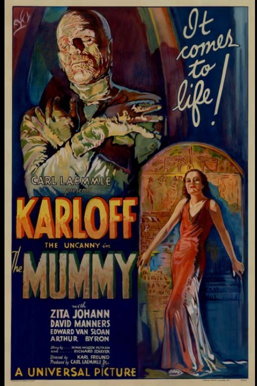
During this months' work one problem that I experienced occurred during the motion movie poster project. In this project we were given a poster that we were to animate into a motion movie poster. This is a process that can help a movie poster come to life (McGregor, 2017). The problem that I encountered was that the tutorial of the project assumed that you already had a specific baseline knowledge of Adobe Photoshop and skipped the steps needed to break down the image into a format that could be easily used for motion movie posters (C.M. de la VEGA, 2017). One solution to solve this would be to watch a tutorial specific to the skills that I needed which were to break down a flat image into a multi-layer image while preserving the background. Another option would be to try to find a tutorial that included every step from the beginning without any assumptions. Since I felt more comfortable than I had with the Adobe suite in the past, I opted to find a tutorial about removing objects in photoshop while preserving the background instead of looking for an all in one solution. For this I found a video that focused primarily on removing objects since I already knew how to create and add layers (Photoshop Tutorials by Webflippy, 2018). In the end the project was a success and I was able to create a movie poster that looked as if the mummy was moving and the environment felt like it was lit with a lantern light flickering. Thought I still have some room for improvement as you can still see a bit of the background that does not quite look natural and could be blended a bit better.
Innovative Thinking:
Comparing how my work compares to others is a bit hard at this point with such a limited portfolio. At this point there is still a ton I need to learn on the technical side to truly be competitive among my peers. As for my kinetic typography assignment, it shows both innovative thinking as well as copying elements or styles from existing artists. My design for instance was inspired by the design by StepDraw where they created a kinetic typography video based off a skit from the show The Office (Stepdraw, 2015). The inspiration of which topic to focus my kinetic typography came from a Rolling Stones article about a Trump speech in which he talks of how great a speaker is, then proceeds to ramble complete non-sense (Bort, 2018). In this case I feel the design itself was innovative as it did not follow too closely to the original inspiration, but shared some elements. Realistically innovative thinking is in the eye of the viewer as some people may view what innovation is differently from simple changes to completely new ideas (Owen, 2012).

Acquiring Competencies
This entire month was filled with learning new concepts and technologies.
1. Adobe Premiere
a. This software suite was a new experience for me and provides a powerful tool for video editing.
b. This skill set can be used in both the academic and professional environments.
c. The premiere suite a was a new technical skill set, but still relies on video concepts to effectively use.
2. Adobe After Effects
a. The After Effects suite offered powerful new ways to enhance video and motion graphics.\
b. This tool can be utilized in both the academic and occupational environments.
c. This tool I would describe as a new technical skill set.
3. Editing
a. This month we learned many different techniques that editors use to enhance their motion design
b. I would consider this both a conceptual and technical skill set.
c. This could be used in both the academic and professional setting.
4. Motion Design Insights
a. From the pitching process to final product, we've learned many techniques to find inspiration in motion design and avoid overload.
b. I would consider this a conceptual skill
c. I feel that this falls in the occupational and academic setting.
5. How the brain visualizes
a. This month we learned how our brain interprets motion and how motion designers can take advantage of how our brain works for maximum effect within design.
b. I feel that this an academic topic that is carried over to the occupational side.
c. I also feel that this is mostly conceptual from the graphics designer perspective.
6. Human Centered Design
a. Human centered design focuses more on how the audience interacts with the design versus the physical aspects of the design itself.
b. This can be both academic and occupational as we need to learn this skill set to enhance how we employ it in the occupational setting.
c. This would fall under the conceptual area versus technical.
7. Unintended Consequences
a. This month we also learned about un-intended consequences in graphic design which can have both positive and negative impacts on the viewer.
b. This again can be considered both academic and occupational as everyone needs to read into their design and request feedback to help avoid any un-intentional negative consequences. Now if the consequence has a positive unintended impact that is always good.
c. This is both conceptual but still utilizes technical skills such as feedback workshops to help identify.
8. Animated Logo
a. Animated logos add a way to spice up traditional logos and help achieve a positive customer impact.
b. The theory behind animated logos and their concepts is conceptual, however to create them in tools such as After Effects requires technical skills.
c. This skill would primarily be used in the occupational setting, but there's nothing that says it couldn't be used in an academic setting as well.
9. Motion Movie Posters
a. The motion movie poster is a way of taking a static graphical movie poster and adding motion elements to it to help capture the eye of your target audience.
b. I feel that this would most likely be used in the occupational setting as there is probably little need of this in the academic environment with the exception of teaching motion graphics.
c. This skills requires conceptual theories for the underlying goal of what you're doing, but emphasizes technical skill in practice.
Kitney, A. (2019, October 4). Kinetic typography: 42 must-see examples. Creative Bloq. https://www.creativebloq.com/typography/examples-kinetic-typography-11121304
Cousins, C. (2015, August 5). Kinetic Typography: An Introductory Guide. Design Shack. https://designshack.net/articles/typography/kinetic-typography-an-introductory-guide/
Abry, M. (2012, October 31). Textual Emotion: Kinetic Typography | Talking Typography. Talking Typography. https://blogs.uoregon.edu/kmabry/2012/10/31/textual-emotion-kinetic-typography/
C.M. de la VEGA. (2017, May 14). After Effects Tutorial - Create a Movie Motion Poster. YouTube. https://www.youtube.com/watch?v=v-Ly2hN8-sA
Photoshop Tutorials by Webflippy. (2018, September 2). How To Remove ANYTHING From a Photo in Photoshop. YouTube. https://www.youtube.com/watch?v=q2DSXNEqStQ
McGregor, L. (2017, July 13). Bring Your Film Marketing To Life With a Motion Poster — PremiumBeat. The Beat: A Blog by PremiumBeat. https://www.premiumbeat.com/blog/create-marketing-motion-poster/
Stepdraw. (2015, November 27). The Office・Kinetic Typography Animation. YouTube. https://www.youtube.com/watch?v=vAQ82U6oWFo&feature=youtu.be
Bort, R. (2018, July 6). Extremely Focused Trump Now Comparing Himself to Elton John. Rolling Stones. https://www.rollingstone.com/politics/politics-news/trump-elton-john-696490/
Owen, M. (2012, February 6). What makes something innovative? Econsultancy. https://econsultancy.com/what-makes-something-innovative/
0 notes
Text
Seeking Inspiration
Video games
Travel
Cuisine - Restaurant posters / food packaging ect
Are the three main areas that I have found particular interest in. I have started a Pinterest board for each of these units and have been gathering my own photos and internet images from all over the internet.
I have been looking at the overlap between graphic design and all of these above points. I looked at the blogs provided and found myself falling down a rabbit hole or two.
Below are the sections and some interesting examples of each.
Video games
Journalism
Looking at video games in particular, I feel that there is a lot of contrast between older and newer graphic design. Especially in magazine layouts. There aren’t as many video game magazines these days, as many sites now cover developments. But Japan still releases them, maybe not as frequently. Weekly Famitsu is something that I have several copies of an I enjoyed looking through the advertisements and layouts for this exercise. These images below are an example of vintage video game adverts from both American/English and Japanese magazines. These are scans from the internet archive and they always seem to provide an great deal of images from the past.

UI design
Modern day video game graphic design is mostly web or in game based, either though UI design or Video game Journalism.
I have been reading “The design of everyday things” and this has led me to think about everything design wise, and UI design is a very important part of video games. The thing that binds everything else together is a well designed attractive system.
Some examples of excellent UI design in games are:
Tomb Raider
“Tomb Raider is another good example of a UI staying quiet until you need it. And when it does pop up, it doesn’t distract you.” Its an excellent use of design that lets you access information, all the while letting you be immersed in the title screen.

Assassins creed
The menus on this game are so beautifully designed and implemented. All of it feels like a moving work of art.The colour scheme is minimal and clean and it pulls together all of the images and information in an attractive way.

Persona 5
I found this excellent quote from a medium article:
Persona 5 has by far the most stylish, chaotic, insane, over-the-top UI to ever grace a video game. It oozes personality and visual spectacle in every menu, every animation, and every screen transition. The interface is such a big attraction of the game that it keeps players going just to see what the UI for a new gameplay feature looks like.
There’s a very strong thematic tie-in to the game’s lore with the menus. A large part of the gameplay takes place in an alternate dimension, where everything is a manifestation of the distorted and twisted desires of a person’s mind. The menus to reflect this sense of disorder and chaos perfectly, with its punk-frenzy aesthetic morphing and streaking across the screen with extreme visual flair and elegance.
Another article I found on this games UI was https://ridwankhan.com/the-ui-and-ux-of-persona-5-183180eb7cce - this is a deep dive into why and how this games UX/XI is so important and why it was designed in such a way.
I learned tons from this deep dive, here are some parts and quotes I found interesting.
Style and usability are not in a zero-sum conflict. One of the UI/UX lessons I’ve learned from Persona 5 itself is that “usable” doesn’t mean dull...
UI and UX are a part of storytelling, and can reinforce a product’s overall narrative and themes. Designers are storytellers.

I could write forever about the design of the game. Its one of the most eye-catching uses of UI design I have ever seen. Most video games try to incorporate the text, and make it as minimal and no intrusive as possible. However Persona 5 really lets you know that it is there, Its bright and bold and beautiful to look at.
I feel like this is a really important in Game UI design history, there is rarely anything this impactful. it has a clear design path, looking into the inspirations for this game really helped me to understand the decisions that they made.
Both the red/white/black color scheme and the punk-influenced English font seems to recall both ransom notes (the Phantom Thieves) and amatuer punk magazines (individuality and anarchy).
This use of integrated design is something that I will be coming back to into the future, as I feel that it is a masterclass on design.
Game Covers
Then there are the game covers themselves. The aesthetic of Nintendo games is one of my favourites, the designs, the company message. It’s all something that already appeals to me. Then there is like a subsection of their games. The crafted games, like yoshi or Kirby. They feature video game characters that feel like a child’s play world.
There are so many different subsections of video game design and I have only scratched the surface. I will continue to look at different areas of video game designs and update my Pinterest as such as I can.
Travel
Travel is a huge section of graphic design and illustration in general. I will break down travel into a few sections that I have categorised my research into. I have placed a few images that I have collected from a larger Pinterest archive and selected a few that caught my eye and turned them into mood boards. Below are some images that I found interesting.
Deciding on the place you want to travel to
There are a huge amount of amount of advertisements telling you to visit and travel the world. They come in a majority of different forms, I looked at a lot of tv advertisements and magazine advertisements showing you the benefits of visiting them. I find these pieces of design to be so varried and interesting. Below are some that I found impactful.They are from a range of time periods and different countries, but they all aim to show their location in the best light possible and draw your eye to them.
Getting there
Then there is getting there, this section is all about travelling, travelling on planes and train and looking at the airline services and train services. I am really drawn to the Air France advertisements, I feel like their layout and general design is so attractive and minimal. Really makes me want to incorporate this into my own artwork.
Designs for travel
The final section is design on public transport while in the place you are travelling to. There are a lot of these in Japan, they have manner posters on display to encourage good behaviour. I adore the yellow Japanese designs, they are simplistic and charming and they communicate a sense of fun but also responsibility.
I feel the same for the ones based around the underground. They are simplistic and actually quite beautiful, easy to read from a distance and yet they tell you all of the information that you need to know.

There is so much more to learn about travel design, this has just scratched the surface and I can't wait to keep collecting and documenting what I see around me when I travel out and about.
Cuisine
Cusine is my last area of interest and just like before I have divided this subject into smaller units that I feel represent different areas of culinary design.
Menus
Menus are a subsection that we don't really look at all that often, yet we use them more than we think. I really liked looking at the designs of Wagamama and yo sushi. they have this minimalistic vibe that I really like.
They are mainly executed with typography and minimal imagery. below are a few examples that I just liked the design of. I have a few other menus collected, but I just liked these ones the best. They convey information so concisely and clearly I want to take simplicity into my work.

Food advertisements
Food advertisements are a huge one. There are so many advertisements for every type of food you can imagine. I complied a few that I liked a lot. They are either quirky, memorable or just good design. I really love the deconstructed burger and the Nutella advertisements. These designs are something that I like to look at from time to time as they seem to combine a lot of photography with typography. This is something that I would like to work on more. I don't feel confident with using photography in my designs as I feel like its not “my work”. This is something that I need to abandon as I work further into this degree.
All of these posters and advertisements are similar, they all “Show the product” but they manage to create different feelings and emotions. I have a lot to learn from advertisements like this.

Food packaging
Finally for the areas that I have put emphasis into there is food packaging. I love food packaging, looking at all the different designs on shelves is really fun, I love walking around the super market looking at all of the well designed packaging. Below are some that caught my eye, apparently I really like colourful packaging as these are all bright and bold images.
Food packaging is designed to be bright and colourful and draw you to them and I think that this is something I will try and incorporate into future pieces.

I haven't really got a concussion to this exercise, I did so much research for this part and I have collected hundreds of images for each part, and will continue to do so.
All through this exercise I found it hard to separate all these areas, I have a lot of image that are both food and travel combined. There is also a whole selection of illustrations, photographs. (These are all provided in a link to my Pinterest account, which I will post up here)
0 notes
Text
FMP reflection preparation.
• Drawing. Why?
I figure out I really like drawing. I used to let myself draw a lot on a daily basis, which was mostly random doodles. But actually its how I express creatively where fun ideas and thoughts I didn’t even been able to think a about pops out. Recently I went back to some drawings, and I think I’ll keep on developing my skills and creativity. I believe drawing would be a crucial tool for driving my work forward.
• 3D. Why?
For me, I really like to experiment with 3D stuff. A physical touch and feeling of 3D things can be really powerful. Also I’m really interested in Art Direction in terms of set design of film… e.i. Therefore, I really like how designers uses 3D works to make bigger impact. For me, I don’t want to work specifically on 2D surfaces, so learning to work with spaces is what I’ve been trying to do throughout part 2.
• Photography. Why?
I experimented with different kind of photography. Fine art context and commercial. What I think i lack is how to take good pictures of my work, which I think will definitely develop through practice but I need a more proactive attitude on how to improve it.
• Film. Why?
I’ve been learning and playing with editing for years. Film for me is a quickest way to express my ideas. I like editing and love films, and I would really want to work in the industry. I want to create more through films after having the foundation experience. I can definitely use a different workflow and approach to films comparing to how i used to do them.
• Animation. Why?
For me animation is just moving illustration. Animation is one of the thing i don’t enjoy that much. I think as soon as I finished the work (which takes A LOT of time), I get a bit worn out with the project and really need to find ways to re-motivate myself. Maybe it’s not an good media for me. I think, for example, films really makes to more excited with the project and that’s crucial for every project, which is enjoying and feeling more engaged in every aspect and process of the work.
• Print. Why?
I think print to be have two layers. Print is such a good way to communicate, also the physicality of prints are really moving. One thing is there’re so many possibilities to it and I really have to know how to develop and visual and make it work.
• Typography. Why?
I enjoy typography a lot, but I think i focus more on the surface. Of course, its the people who used the typography that gave it some history or meaning, so maybe that’s why I don’t really thing the past history context of a typeface is that important. To me, I enjoy the form of it and really like creating beautiful shapes. Another thing I’ve realized that is how different a typography designer designing Alphabets and mandarin is. Alphabets and Chinese characters has huge difference in a lot of terms.
• Book / zines. Why?
I really like buying books, but I don’t really enjoy making it? I think for me the importance of it is the content, it’s never about what media/platform/form it was presented on. So to me, a book or a zine is just a place to present ideas.
• Words / language. Why?
Words and language are created by human beings. And one can never perfectly translate anything thing from a language to another, it would never be accurate. I think there’s and joy in the ambiguity of this fact but at the same time, that’s why I’m interested in creating visual languages that doesn’t need words to express ideas.
• Campaigns: Why?
I think a lot of my work ARE campaigns. I want to CHANGE things, and that’s my thoughts on design. To me, design has to work, it needs to have a purpose. Having a purpose meaning it does something, and it means it change things in any way.
• Interaction. Why?
I always want people to be engaged into my work. Its the joy to see people react to it. I don’t want my work to be just something that’s stored in a display, I want people to feel it as much as possible.
• Research. Why?
I think the more work I’ve done the clearer yet confusing research to me is. I want to consider every research i can do for the project, and researching is also a learning process to me. For my work, I would want to know as much as I can about it. The confusing part is there’re so many things to look at, and in a limited time how to select the right things to consume. Also I haven’t been doing much practioners’ research, I wonder and am really interested in what would change if I’ve done for my work.
• Group work. Why?
I think I haven’t get to enjoy great group work yet. It needs a certain degree of trust. Also I have been thinking about the leading and working process. Sometimes I get really controlling but others seem fine with it, I don’t want to be controlling but doesn’t that seem like leading? and the importance of learning how to lead a group trying to get all the good bits out of everyone.
• Exploring processes. Why?
I think I’ve learned a lot on how to drive my project forward. If I get stuck, i switch to either making or thinking depending on which one I was on. I really enjoy having new discovery in each stages. Also, i think it’s what you discovered that makes your work original and authentic.
• 1-day projects. Why?
I really enjoy one day projects, its fun and sometimes fun ideas i never anticipated comes out. I think it’s crucial to give myself some one day works sometimes
• 2-week projects. Why?
2 weeks project is nice because you got enough time to think about the concept and the making. Although it can go bad, but 2 weeks is not that long to learn from a mistake. I think now I’m used to working in a longer term because you can consider about more things, also in the industry the project can be really long. Adapting to working in longer projects might help with working in BA.
0 notes
Text
Telling the Story of Graphic Design
Let me just frame this for you: we're going to take a piece of production UI from a Sketch file, break it down into pieces of information and then build it up into a story we tell our friends. Our friends might be hearing, or seeing, or touching the story so we are going to interpret and translate the same information for different people. We're going to interpret the colors and the typography and even the sizes, and express them in different ways. And we really want everyone to pay attention. This story mustn't be boring or frustrating; it's got to be easy to follow, understand and remember. And it's got to, got to, make sense, from beginning to end.
I've asked my colleague Katie to choose a component she has designed in Sketch. I'll go through and mark it up (we mainly use SCSS, Twig and Craft but the templating language is not very important), then she will respond briefly. Hopefully I'll get most of it right, and then one or two things wrong, so we can look at how things get lost during handoff.
In white label or framework type front-end, the focus is on building pieces that are as flexible and adaptable as possible, as content and style-agnostic as possible (within the scope of the product), because you simply will never know where the code is going and for what, ultimately it is being used. But recently I moved to a web design agency, which has a complete inversion of this focus. It is particular. It is bespoke. It's all about really deeply engaging with the particular client you have and the particular clients they have, and designing something that suits them, as a tailor would.
Working so closely with a graphic designer like Katie, with highly finished pixel-spaced UI, instead of directly from wireframes or stories is an adjustment and an education, but there are still lots of things I can bring to the table. Chiefly: document design.
Document design, which admittedly is just the old semantic web with an accessibility hat on, is really looking at graphic design, engaging with it as a system of communication, and translating the underlying purpose of the colors/type/layout into an accessible, linearizable, and traversable DOM. It's HTML, kids. It's just HTML. You'd think we all knew it by now… but look around you. You'd be wrong!
Katie has slung me a Sketch file chock full of artboards, and she's pretty great at writing out what she wants so I don't have to think too hard:

Event card
First I look through the whole UI file and figure out what is actually a card on this site — it turns out there are six or seven components that use this paradigm. Let's make some observations:
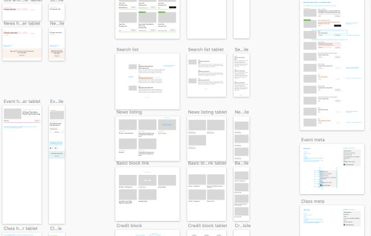
Zoom out on section of artboards

Another card, classes this time.
A card is a block of meta data about a page on the site.
It has an image/media and metadata — it's a media object.
It's shown in a group of objects.
That group is always typed (there's no view where there are search results and news articles and classes are all mixed up).
Each object has a single link to a page and no other actions.
Each object has a call to action (Book, etc.).
Each object may have times, categories, badges, and calls to action.
Each object must have media, title, and link.
So a card is the major way my user is going to find their way around this site. They are going to be clicking through guided pathways where they get a set of cards they can choose from, based on top pages like "what's on" or "classes." They're not getting options on this card. It's not really an interactive element — it's a guide, an index card, that sets her onto her path: in this case a purchase path where she books a ticket for a show at this arts centre.
Before going on, let me just frame this for you:
Imagine you were looking at a flyer for a show and discussing it on the phone. If you actually wanted to go to this show in real life. What would you do? You wouldn't just read the flyer out, would you? That's the text. And it might have all kinds of random stuff on it if you started literally at the top. You wouldn't start with "Twentieth Century Fox" or "Buy Hot Dog Get Cola Free" or "Comedy Drama Musical Family Friendly." (I would actually hang up on you if you did!) And you wouldn't simply describe the color or fonts. That's the CSS. You'd talk through the information on the flyer. You'd say, "It's The Greatest Showman and it's on Tuesday, starts at 7:30. It's at the Odeon on Oxford Street by the tram." Right?
This is the document. Keep that person on the phone in your mind.
Count, group, and name
So let's say we'll deliver a card as the inside of a list item. We want a group and that group should be countable. We've already named the page with an <h1> so we'll introduce and describe the group with a heading, an <h2>. First we'll name it, then we'll deliver it, so someone using a screen reader can:
Get the list signaled in the headings overview.
Get a count up front of the number of items on a page.
Know they can skip to the next list item to get the next card.
Know they can skip the group at any point and go to the next page — the pagination is the very next element and it will be labelled as a landmark.
See the Pen
Cards delivered as a countable list with descriptive heading by limograf (@Sally_McGrath)
on CodePen.
Anchor
In this particular case, I'm gonna wrap this whole card in an anchor element (<a>). There's only one link on the card and I want to front load that information so someone can click as soon as they know it's the right card, instead of having to search forward for the action. A big clickable area is nice too, though of course that can be taken too far and make an interface a sort of booby trap! But these cards are not too enormous and I can see they have a nice gutter around them, so there's a rest space that will reduce accidental clicking for people with more limited dexterity.
Title

Event card "title" element
Then we'll jump down a heading level and mark up the name of each show as a heading, an <h3>. The designer has made this type the focus and we will too. Some people browse super fast by jumping to the next heading, then next heading, so I'm not going to put any important information before the heading — they'll jump right over it. I will put the image there, though, as I know in this case, I can't get meaningful image descriptions from the API so those images are hidden and have empty alt attributes. Now the user can guess (correctly in my case) that the developer is actually describing the content in some meaningful way and might flip back to headings overview (list headings level 3) and just get a list of the shows.
Now let's deliver our metadata. Let's list it:
Badge
Date/Time
Categories
Badge

Event card "badge" element
This seems to be something the venue adds to a card to highlight it. As a developer, I can't immediately see why a user would look for this, but it's emphasized strongly by the designer, so I'll make sure it stays in. Katie has moved the badge up out of the flow, but I know that with a headings jump our user could miss it. So I'll just put the wording directly after the title, I think. I'll either put it first or last, so make it easier to account for in a non-visual browse and not be too crazy paving in a tabbing, visual browse.
<p class="c-card__badge"><abbr title="Harrow Arts Centre">HAC</abbr> Highlight.</p>
...But on second thought, I won't put an <abbr> after all. It's the brand color, so it's really a statement of ownership by this venue, and we've already said HAC a million times by now, so the user knows where they are.
<p class="c-card__badge">HAC Highlight </p>
See the Pen
Badge by limograf (@Sally_McGrath)
on CodePen.
A quick aside: the 'badging' is very specific to this organisation. They want to show people clearly and quickly which events they've programmed themselves, and which are run by other organizations who've hired their venue.
Date/Time

Event card "date/time" element
Now date and time. Katie is keying me in to this decision point by styling the dates in bold. Dates are important. I'm going to pop it in an <h4>, because I'm thinking it looks like someone might be quickly scanning a page of events looking for the matinee, for example, or looking for a news article published on a particular day. I don't always put dates into headings, especially if there are millions on a page, but I do always make sure they're in a <time> element with a complete value so the <time>Thu</time> or <time>Mon</time> Katie has specified is read out as comprehensible English words "Thursday" instead of garblage. I could also have used hidden completion or <abbr> with a title.
Categories/ Tags
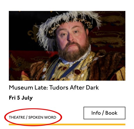
Event card "categories/tags" element
Next come the categories, and I'm putting them after badge and date. This section is next in the visual order reading top-to-bottom, left-to-right, of course, but it also seems to be deprioritized: it's been pushed down on the left and the type is smaller. This works for our linear storytelling. As a rule, we don't want people to sit through repeated or more general content (cinema, cinema, cinema) to get to unique or more specific content (Monday, Tuesday, Wednesday). Remember, we are inside our card: we know it has already been sorted in a few general ways (news, show, class, etc), so it's likely to have a lot of repeated pieces. We want to ensure that the user will go from specific to general if we can.
There is a primary category that is sorted first and then some other categories sometimes. I won't deliver this as a countable list as there's mostly just one category, and loads of lists of one item is not much use. But I will put a little tag beforehand because otherwise, it's a slightly impenetrable announcement. MOVEMENT! SPOKEN WORD! (I mean, you can work it out retrospectively, but we always try to name things first and then show them, in linear order. This isn't Memento.) I used to use title="" fairly heavily but I've gotten complaints about the tooltip so I route around. Note the use of colon or full stop to give us a "breath." That's a nice bit of polish.
<p class="c-card__tags h-text--label> <span class="h-accessibility">Categories: </span> </p>
Also I'm hard-coding in my spaces to make sure the categories never run together into complete garblage even with text compression or spaceless rendering turned on somewhere down the pipeline. (This can happen with screen readers and spans and it's rather alarming!)
There's a piece of this design I will do in the CSS but haven't really pulled into the document design: the color-coding on primary category. I am not describing the color to the reader as it seems arbitrary, not evocative. If there were some subtextual element to the color coding beyond tagging categories (if horticultural classes were green, say), then I might bring it through, but in this case it's a non-verbal key to a category, so we don't want it in our verbal key.
I'm sorting the primary category to the front of the category paragraph, but I'm not labeling it as primary. This is because there's a sorting filter before this list that sorts on primary category, and it's my surmise that it would be easier and less annoying to select a category from that dropdown than to read through each card saying Categories Primary Category Music Secondary Categories Dance. I could be wrong about that! Striking a balance between useful and too much labeling is sometimes a bit tricky. You have to consider the page context. We may be building components but our user is on a page.
See the Pen
Dummies in page context by limograf (@Sally_McGrath)
on CodePen.
Action
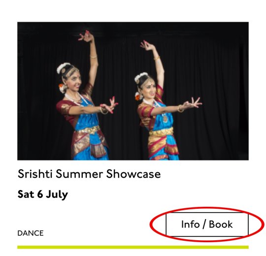
Event card "action" element
Last, the action. The direction to the user, to Book, or Learn More, or whatever it is, has been styled as a button. It's not actually a button, it's just a direction, so I'll mark it up as a span in this case. I definitely want this to come last in the linear document. It's a call to action and also a signal that we've reached the end of this card. The action is the exit point in both cases: if the user acts, we go to the target entry; if they do not, we go to the next card. We definitely never want any data to come after the action, as they might have left by then.
See the Pen
Card by limograf (@Sally_McGrath)
on CodePen.
My conclusion
This markup, which counts, groups, and names data, delivers linear and non-linear interactions. The page makes sense if you read it top to bottom, makes sense if you read parts of it out of context, and helps you jump around.
Katie, over to you...
Katie Parry, designer
What an ace article! Really interesting. (I particularly like that "Mon," "Tue," etc. on cards are read as "Monday," "Tuesday"... smart!)
One thing that struck me is that using assistive tech means users get information served to them in a "set" order that we've decided. So, unless there's a filter, someone browsing for dance events, for example, has to sit/tab through a title, badge, dates, and maybe several other categories to find out whether an event's for them or not. Bit tiresome. But that's not something you've got wrong — it's just how the internet works. Something for me to think about in the future.
Most of our clients are arts and cultural venues that need to sell tickets for events so I design a lot of event cards. They're one of the very first things I'll work on when designing a site. (Before even settling on a type hierarchy for the rest of the site.)
Thinking visually, here's how I'd describe the general conventions of an event card:
It must look like a list – so people understand how to use it.
It needs to provide enough information for folks to decide if they're interested or not. (The minimum information is likely an image, title, date, and link.)
It needs to include a clear call to action — usually a link to find out more information.
It needs to be easily scannable, visually.
Making information visually scannable is a pretty straightforward case of ensuring every information type (e.g. image, title, date, category, link) is sitting in the same place on every card and follows a clear hierarchy.
I focus a lot on typography in my work anyway but clearly: titles are styled to be highly prominent; dates are styled the same as each other but are different from titles; categories look different again – so that folks can easily pick-out the information they're interested in from simply scanning the page. I'm composing the card for the user, saying, "Hey, look here's the event's name, this is when it's on — and here's where you go to get your tickets!"
The type styles – and particularly the spacing between them – are doing a lot of work, so I will point out here that the spacings are not quite right in the code sample:

Spacing between the title and dates, dates and button, and button and piping don't match the design.
This is important. Users need to be able to scan information quickly as they aren't all looking for the same thing in order to make the decision to go to an event. Too much or too little space between elements can be distracting.
Here, let me tighten that up for you:
See the Pen
Card with accurate spacings by limograf (@Sally_McGrath)
on CodePen.
Perfect!
Some people just want a general mooch at what's coming up at their local venue. Others may have seen an advert for a specific show that tickles their fancy, and want to buy tickets. There are people who love music but don't care for theatre who just want a list of gigs; nothing else. And some folks who feel like going out at the weekend but aren't that fussed about what it is they go to. So, I design cards to be easy to scan — because most users aren't at all reading from top to bottom.
Despite the conventions I just laid out, cards certainly don't all look the same — or work in the same way — across projects.
There is always a tension in web design between making an interface familiar to the user and original to the client. Custom typefaces and color palettes do a lot here, but the other piece of it is through discovery.
I spend time reading-up about a client, including who their audience is by reading what they say on review sites and social media, as well as working directly with the client. Listening to people talk through how they work, what feedback they get from their audience/users often uncovers some interesting little nuggets which influence a design. Developers aren't typically involved much in discovery, which is something I'd like to change, but for now, I need to make it super-clear to Sally what's special about this event card for each new project. I write many, many (many) notes on Sketch files, but find they can tend to get lost, so sometimes we have a spreadsheet defining particular functionality.
And soon a data populator instead! :P
See the Pen
Cards in page context, scraped from production by limograf (@Sally_McGrath)
on CodePen.
The post Telling the Story of Graphic Design appeared first on CSS-Tricks.
Telling the Story of Graphic Design published first on https://deskbysnafu.tumblr.com/
0 notes
Text
#personal
The last seven or so weeks have been brutal. I think this weekend is the first I’ve woken up to where I didn’t have to travel to the suburbs to check on my mom. This isn’t to say I particularly minded that whole experience. People definitely recognize my face when I head out there. For what I don’t really know anymore. I get that people think I’m cool and progressive. Who would really complain about people looking up to you? If I believe in any sort of sophisticated art theory about street wear, it’s that it belongs in the streets. I’ve had more conversations about fashion on the far south and west side than in the city. So maybe the last seven weeks sort of humbled me when it comes to being myself. When kids ask you where you buy your clothes on the bus, you tell them New York. They ask if you are from the East Coast. They seem genuinely excited. The truth is I live here like the rest of everybody else. I wake up to flute players at five thirty in the morning and cats on my porch. That might be a singular experience for me. There really is somebody playing a flute somewhere off in the distance. Shit has been pretty weird here all the way around. When you are both physically and emotionally exhausted it can be a little much. Not to mention nobody really sees behind the scenes. People watch for sure. I don’t know that I’ve been too concerned since I got back from the Big Apple. There’s a certain level of networking to what I do that no one has really ever thought to clarify. There’s always an assumption on people’s behalf they know everything about the how and why of what I do. Like I’m some mystery or Easter Egg they’ve solved. To be truthful I’ve been referencing that scene in Ready Player One a lot to blank stares. The fact they play Adventure trying to win but that’s not the point. The point was to break the system entirely and see behind the veil. When you see behind it there’s a certain amount of responsibility. The old you break it you buy it. Steven Spielberg movie plots aside, this oversimplifies things for me a bit. I’ve had to take matters into my own hands when it comes to my life. That’s nothing new. I found my path along the way and the hidden pockets of support that circle around me. And yet it feels like there’s so much more distance to traverse.
I said this cryptic thing in the elevator at work. You don’t run a marathon by worrying about other people’s goal posts. Everybody is different and only you know how to pace yourself. Last weekend it occurred to me that maybe you look at me a little differently now. Maybe you trust me a little more. The you can be very specific but it applies when applicable. When I come out of tense times and resurface for air mornings like these, I remember how much you mean to me. I get angry all week because things take the energy out of me to enjoy the thought of you. And so I adjust my schedule. I pick and choose my time out in public. I walk around metaphysical land mines every day to avoid complicating matters. And I start to feel like maybe there’s things that I could do to get things out of the way. I never really have expectations on problem solving. I see a problem in my life. I know what I control and how to go about fixing it. Most of what I do in private is plan. I have a budget and a spreadsheet. I just opened another checking account in an effort to move money away from banks and into a credit union. How I even became part of a credit union is a much more interesting story than how much music I’ve made. I paid off my flight to New York in August. I’ve been thinking about simply doing the same thing for the rest of the year. Every two months. There’s nothing really stopping me from doing that. I’ve been networking a bit more professionally in terms of my resume and what I do. I’ve working on my options around some of these stumbling blocks that have seemingly buried me here. If the last seven weeks are proof of anything it’s that people pay attention to what I do. Even if it’s just going to the grocery store. How I feel about that varies. I can definitely see very complex layers at work in America. I feel at the center of it sometimes. People trust that I pay attention. Mostly because I know how much people don’t. They say things to be heard and question nothing. They’re motivated by unsustainable things and measuring yourself against them always disappoints. There was a very nice Nike email that went out about Being True. It talked about how sometimes when you lead, it’s because nobody else will. There is nobody doing what you do. Do you wait for someone to do it for you? Or do you go out there and say fuck it and be that person. For me last weekend, it really felt like the person I was trying to be is the person I am trusted as. How I know this is far more cryptic than my elevator wisdom. My marathon is with you and I was always simply trying to keep up with you. Somehow you’re always right there by my side whether I know it or not.
I really like the idea behind NASA’s hidden figures. It’s been no great secret I’ve had my own way of fighting for voices to be heard. Sometimes we need to lift each other up for the sake of what is right. And sometimes the gravity of the situation crushes you. Nobody sees it. They don’t really care. If they did they might see how they little they contribute outside of discussion. I don’t always agree with Mao but I read a great quote from him recently. He talks about Idealism being infinite when it comes to words. You can talk forever about how it should be. How much I love you. And then there’s the actions. Jane Addams said the proper theater for ethics is in the street. Hidden Figures way celebrates the women of NASA who helped get us off this planet. A planet that if our situation suddenly stopped supporting human life would blink out of existence like a memory. No context for all our collective suffering. No legacy of peace, only endless wars washed away in the dust. I went to Boeing HQ the other day to buy my dad a gift. I bought a ISS patch. I’ve long been a fan of their typography. I also fly American Airlines and get nervous just like anybody else when I see MAX after 737. I’m the first one to point the finger at corporate profit and how we suffer because of it. Nike got a sizable amount of shit for sweatshops in the nineties and rightfully so. We hold these companies accountable as consumers. And then again we seemingly plead to these brands to recognize our worth. When jobs are threatened, it’s the first thing we feel. That our symbols will abandon us. That we won’t be able to afford our lifestyle how bare it is. That we walk the streets like a catwalk hoping for the scraps of publicity companies throw out to get your business and money. That suddenly we’ll be worth something again. I’ve seen a lot when it comes to working around these industries and people. I know the glass ceiling still exists. I know that aggressive and passive aggressive men still control the world. Mostly because of economic disparity. I know that I don’t help much by talking about it. I do help by redefining how I value myself and present myself against that backdrop of white corporate male oppression and otherwise. I do find it ironic that I come across as invisible in spite of everything. I use that more to my advantage than anybody knows. Somebody at work called me a horrible poker player. Isn’t that the whole point of that Lady Gaga song? If you called my bluff tomorrow, I’d still say I love you. Keep that card close to your heart and I’ll do the same. <3 Tim
0 notes
Text
PRESENTATION TO DEREK + FAKE STEVE
FULL PRESENTATION HERE IN THIS HANDY LITTLE LINK <3
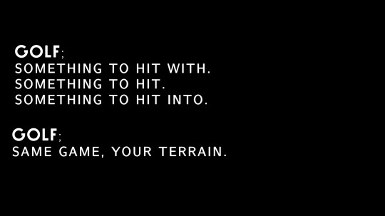
My copy is the most important part of my campaign ideas, as it’s the element that actually explains what the campaign is in a concise way - though I kept the copy of ‘Golf. Same Game, Your Terrain’ in this presentation, the way in which I titled the idea as purely ‘Same Game. Your Terrain’ is actually more visually appealing. It’s not too long, and it allows me to let the visual element speak for itself in terms of reference to the sport. The addition of ‘golf’ also doesn’t actually make sense within the copy on reflection, it’s a bit cackhanded, as within the copy itself I haven’t introduced the difference between golf and what I’m proposing, so I’m telling the audience it’s the same game, but I haven’t demonstrated why it wouldn’t be. The photography can speak for both this and the sport, utilising standard golf posing with non-standard equipment to demonstrate how it’s the same game, just your terrain.

Another new addition to this campaign that was introduced in the presentation is a lead on from the pub game ‘Shot Per Shot’, looking at alternate ways to get people involved in golf through things they are already doing, or things that they should be doing. This new idea revolves around styling recycling bins as golf holes, and getting people the putt their recycling into the bins, turning something good for the environment into a game for the consumer.
VIDEO LINK
Another element I added to this insight was an example of how the challenge may look visually through video uploads, with my mum and her coworkers creating their own DIY golf in their office.


Following on from OG Steve’s advice surrounding the fashion campaign, I developed the activation of a pop-up store that only appears on golf courses, and to enter the store you have to get your ball into the hole, which opens the door - instead of push to enter, you putt to enter. Boom Boom.
This gets the audience involved in the sport by enticing them in with the exclusivity of the fashion collection. Alongside this, following along the thread of getting people involved by inflating their ego and offering them something special, I developed the idea of Tuity Fruity rewards, a system that partners with golf courses and/or driving range to allow free access to those that are sporting the Tuity Fruity Geezer collection, sparking both interest in the clothes and also enticing the consumer to play the sport through the special offer they get through purchasing the clothes. Nobody knocks a freebie.

For the third insight, I began to actually mockup some typography layouts for possible implementation into posters at a later date, which also lead me to begin to look at different typefaces that could be used within my campaigns.

I looked mostly at Sans-Serif fonts, with a few serif just to explore my options, as I wanted to convey that Golf isn’t the stuffy and boring font that people assume it is. Sans-serif has a more modern and trendy approach, whereas people who aren’t familiar or versed in type-faces associate all serif fonts with Times New Roman, the Daddy of Serif. The typfaces with the more rounded G’s are the most visually engaging, especially when talking about Golf, as they kind of have the visual connotations of a ball.
Though a bit of an obvious choice, green was the main colour that I experimented with in my initial mockups for my third insight. I looked mostly at brighter greens, or muted greens, instead of grass greens, to show that you don’t have to fit with the expectations of golf, but you’re still worthy of playing, you’re still allowed to play. It’s green, but not golf green, and yet you still associate it with golf and visually recognise it in association with golf.
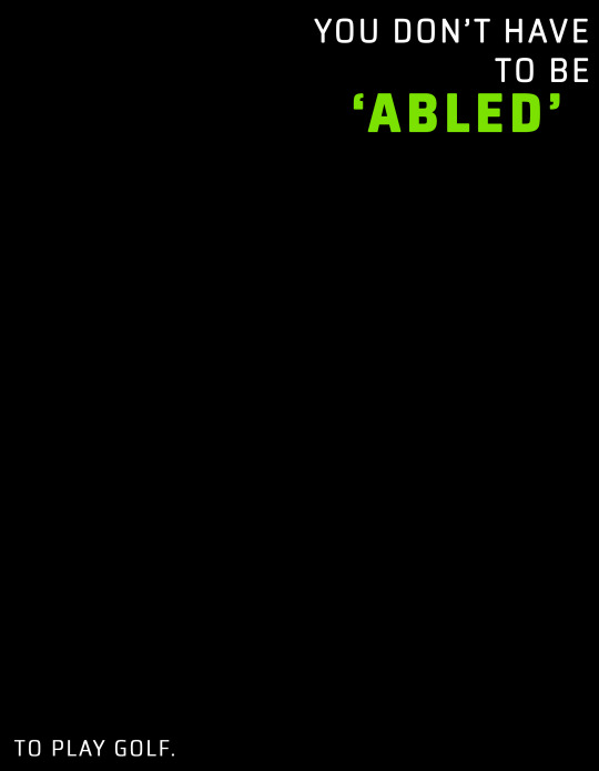

I didn’t include any imagery on these mockups, wanting to explore with text originally and work my imagery around my typography as opposed to vice versa. In the first poster, I explored keeping the ‘To Play Golf’ text smaller than the rest, and separated from it - by having the main bulk of the typography in the top righthand corner and the smaller secondary text in the bottom left, I could create imagery that directs the consumers eye down to the secondary text - they see what you don’t have to be first, are confronted with the imagery that slashes through these stereotypes, and then see what it’s in reference to, pushing the message in the top right alone ‘You don’t have to be abled’, and then specifying what you don’t need to be abled for in this case.
In the second mockup, I collected the text into a single location, but used the macro-micro structure from our workshop in term 2 to explore enlarging what you don’t have to be (’A Granddad’), and playing it next to the smaller text beside and below, trying to draw the consumer in with the confusing standalone, and then give clarity with the surrounding.
The style of photography I proposed to use for this idea was very close up, personal portraiture, referencing Lee Jeffries - his imagery is very high clarity, very intimate, and is often of the homeless, so he uses this in-your-face (literally) photography to confront the audience with the opposite of their expectations when they imagine this group of people. My goal is the same.

FEEDBACK FROM DEREK AND FAKE STEVE
DEREK:
- A massive ego boost. All three ideas are campaign-able, and can be spread across multiple activations. They have longevity.
- Some of the copy needs work - just a bit of tweaking in some cases. Especially the ‘Golf. Something to hit, Something to hit with, and something to hit into’. - bit long winded.
- He didn’t say it but I’m guessing he wants me to work on my visual because he always does xoxo
FAKE STEVE:
- Steve wasn’t fond of the recycling idea or the pub idea; he said it made things a bit messy, and diluted the original idea, which he thought was really strong. He said to reconsider including them, and expand on the other paths presented instead. It’s an idea with the potential to go down a lot of different routes, but this route ain’t one son.
0 notes
Last Seen Blogs

women-fitbody
Untitled

vampyrasa
𝔻 ℝ 𝔸 ℂ 𝕌 𝕃 𝔸
wolfertinger666
🌙 𝙼𝙾𝙾𝙽𝙲𝙰𝚃𝙲𝙷𝙴𝚁🌙

lestatbaby
Lestating

kyky-amazing99-blog
Mr. Magbanua