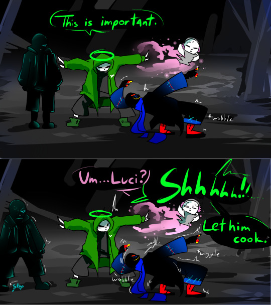
#lucida s serif
Text


#underheaven#lucida s serif#reaper!sans#undertale au#animation#undertale au sans#undertaleau#reaper sans#utmv#gif
457 notes
·
View notes
Text
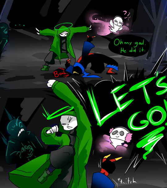

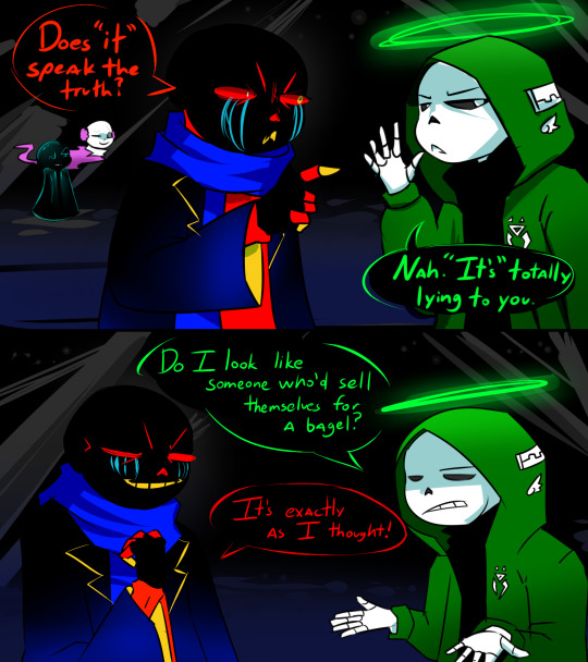
Update 12
<< Previous
#undertale au#undertale au sans#nightmare sans#lucida s serif#undertale aus#ut au#ut au comic#error sans#underheaven#haventale sans#utmv#utmv au#utmv sans
41 notes
·
View notes
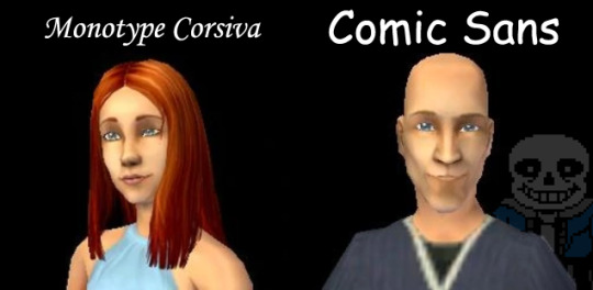
Text
Hey girl check this out *fonts your Capps*
It all started with:

and escalated from there, and fast forward a couple of hours, we had a font assigned to every relevant and semi-relevant Capp.
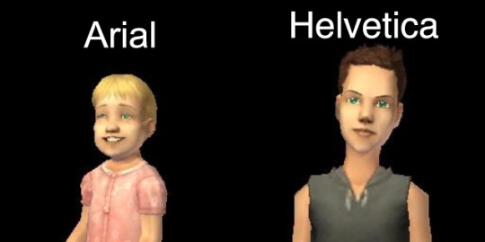
Ariel - she started it
Hal - he continued it
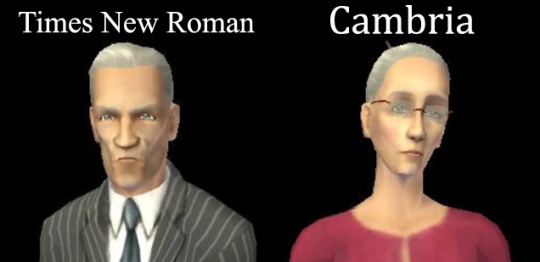
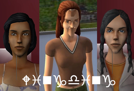
3. Consort - dry and official, serifs everywhere, you'll get tired of seeing him
4. Contessa - almost like Consort, but at least I can look at her without squinting

5. Tybalt - DON'T scream at me young man. you don't even have your grandpa's humongous serifs for that kind of attitude
6. Hermia - you try and tell me that if the Rockwell font was a chick, she wouldn't wear laced tops and motor boots
7. Juliette - ohhh girl that's a fancy name, are you italic???
8. Kent - treated like a joke

9. Caliban - plain ass dead bitch
10. Cordelia - plain ass dead bitch but with a little more style

11. Regan - looks like a total nerd
12. Cornwall - nerd's husband with stupid little moustache. look at that Q. the hell is that thing

13. Goneril - why are you so narrow.
14. Albany - W H Y A R E Y O U S O W I D E
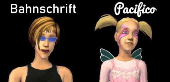
15. Miranda - also a rebel, but Haettenschweiler and Lucida said no to laced tops and motor boots
16. Desdemona - she's 10. she can have those fairy wings if she wants to
17. Cleopatra, Calpurnia, and their entire in-game female progeny - ladies THE HELL AM I LOOKING AT
[the end, thanks for your attention]
192 notes
·
View notes
Text
I AM GOOSE
Underhonkven: Goose!Lucida
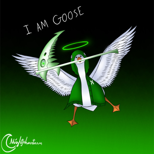
Lucida S. Serif belongs to @wraithvine
Goose!Lucida by @nightphantasm (me 🤡)
Art by @nightphantasm
————–————–————–————–————–————–———
This was for fun, I drew the scythe like how you wanted me to draw it, @wraithvine. Hope you're proud of me. 🤗
The wings is the most wingiest wings I've ever drawn.
35 notes
·
View notes
Text
Download Goofy Font Now!
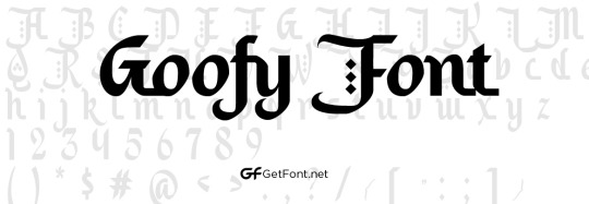
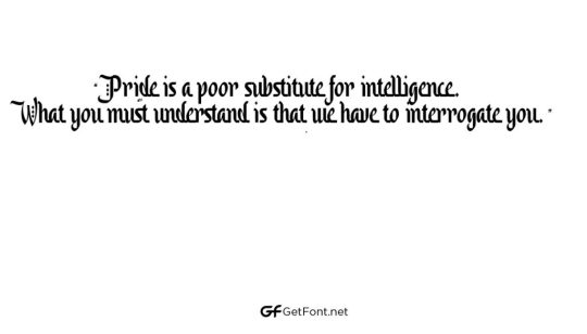
Goofy Font is a fun, quirky, and playful typeface designed by Błażej Ostoja- Zagórski in 2007 and published by Błażej Ostoja-Zagórski. This font is available as a free download under a SIL Open Font License, meaning it is free for both personal and commercial use. Goofy Font is a display font originating from Poland that has gained notoriety for its unique style, which combines elements of a script font and a sans-serif font.
Download Font
It has a fun feel to it, making it a great choice for headlines, logos, and other design projects. Goofy Font is perfect for adding a touch of whimsy to your design work.
Font InformationNameDesignerFoundryStyleFile FormatDate ReleasedLicenseTypeGoofyVincent ConnareMicrosoftDisplayTTF2007Freeware, SharewarePersonal and commercial use
1. Sans Serif Font: This type of font is one with no serifs at the end of the strokes of its characters. It has a modern and elegant look and is commonly used for titles and headings in design projects.2. Display Font: Display fonts are decorative typefaces and typically used for headlines and titles, as their intricate and playful designs can draw attention. The goofy font you mention is likely an example of a display font.3. Script Font: These are cursive fonts that mimic handwriting. Script fonts, like goofy fonts, can also be used for titles but some also work for body text.4. Typeface: A typeface is a collection of fonts, each of which has a different style, such as regular, bold, italic, and so on. Each typeface can contain a number of different quirky font variations, the goofy font being one example.5. Type Style: This refers to an individual style within a particular typeface, such as regular, bold, italic, etc. While bold fonts are usually associated with emphasis, goofy fonts may be used to bring a bit of humour to text.6. Letterform: This refers to the individual components of a typeface. Letterforms are the letters, numbers and symbols that make up a font. In the case of goofy fonts, the letters may be deliberately distorted or arranged in a humorous way.7. Kerning: This is the process of adjusting the spacing between letters to create a smoother, more aesthetically pleasing text design. For goofy typefaces, kerning may be used to slightly exaggerate the odd spacing between characters to create an even funnier design.
Use Cases of goofy font
Text: Use goofy fonts to add a bit of fun to text messages, emails, and other casual writing.Publication: Use goofy fonts to add a whimsical touch to children’s books, magazines, and other publications.Website: Use goofy fonts to create an eye-catching website design, or to add a bit of playfulness to the copy.Logos: Use goofy fonts to create unique logos that stand out from the competition.Designs: Use goofy fonts to add a bit of fun to posters, flyers, and other designs.T-shirts: Use goofy fonts to create unique, one-of-a-kind t-shirts that are sure to draw attention.
Characteristics
-Goofy font is a type of font that has a fun, playful, and cartoon-like appearance.
-It is usually used to add a humorous or lighthearted touch to a design.
-It is often characterized by exaggerated curves and dynamic angles.
-It can be used to create a whimsical and creative tone in a design.
-Goofy font often features extended ascenders and descenders, as well as playful flourishes and embellishments.
-It is usually rendered in a bolder, more playful style than other fonts, making it highly visible and attention-grabbing.Character Map

Comparison
Goofy font is a typeface that is designed to be humorous and light-hearted. It is a script font with exaggerated shapes and a bit of a silly look. Compared to other script fonts, such as Brush Script or Lucida Handwriting, Goofy font has a more playful and whimsical look. The exaggerated shapes of the letters give it a cartoonish effect, which can be used to inject some fun and humor into your design. Unlike more conservative fonts, Goofy font is a great choice for children's books, party invitations, and other designs that require a bit of a playful touch.
Alternative Fonts
1. Comic Sans
2. Chalkboard
3. Brush Script
4. Papyrus
5. Viner Hand ITC
Tips & Tricks
1. Mix and match different fonts: Goofy fonts often work best when you mix them with other fonts. Try combining a couple of different goofy fonts to create a unique look.2. Use bold and italic styles: If you want to emphasize a particular goofy font, use either the bold or italic style to make it stand out.3. Incorporate symbols and characters: Adding symbols, characters, and other marks can enhance the goofy look of your font.4. Incorporate colors: Using colors can also help to create a fun, whimsical look.5. Use in moderation: Remember to use goofy fonts in moderation. Too much of a good thing can be a bad thing.
Supported Languages

Font Goofy supports the following languages:- English
- French
- Spanish
- German
- Italian
- Dutch
- Portuguese
- Polish
- Czech
- Danish
- Finnish
- Swedish
- Norwegian
- Hungarian
- Slovak
- Croatian
- Slovenian
- Turkish
- Greek
- Bulgarian
- Albanian
- Romanian
- Lithuanian
- Latvian
- Estonian
FAQs
Q: What is a Goofy font?
A: A Goofy font is a typeface that has a whimsical or humorous appearance. It usually features exaggerated curves, bold lettering, and playful shapes.Q: Where can I find Goofy fonts?
A: You can find Goofy fonts online through sites such as Dafont, Fontspace, and Font Squirrel.Q: What is the purpose of a Goofy font?
A: Goofy fonts are used to create a fun, lighthearted atmosphere. They can be used for humorous posters, marketing materials, greeting cards, and other creative projects.Q: Are Goofy fonts easy to read?
A: Yes, Goofy fonts are designed to be easy to read, even though they are often very whimsical in appearance.Q: Are Goofy fonts free?
A: Yes, many Goofy fonts are available for free online.Q: Are Goofy fonts appropriate for professional use?
A: Yes, depending on the context, Goofy fonts can be used in professional projects. They should be used in moderation and only when they are appropriate for the project.
Read the full article
0 notes
Text
City watchdog asks banks how they will support mortgage borrowers | Mortgage rates
New Post has been published on https://petnews2day.com/pet-industry-news/pet-financial-news/city-watchdog-asks-banks-how-they-will-support-mortgage-borrowers-mortgage-rates/
City watchdog asks banks how they will support mortgage borrowers | Mortgage rates
The City watchdog is asking banks how they plan to step in and support struggling mortgage borrowers, as lenders such as Virgin Money relaunch home loans at higher rates following a spate of withdrawals sparked by this week’s market meltdown.
Supervisors at the Financial Conduct Authority (FCA) have been holding talks with lenders to understand how their mortgage customers are faring and the kind of options that are on the table that would give struggling homeowners some breathing space.
Brokers estimate that about 1.9 million mortgage borrowers are due to come out of fixed-rate deals next year, raising fears that homeowners could struggle to afford higher monthly payments on new loans.
Chris Sykes, a mortgage broker at Private Finance, said rising rates would mean some customers “will have to make cutbacks” on their overall spending.
“I’ve quoted some clients on interest-only products [that are worth] three times their original mortgage payment moving forward,” he said. “I’ve quoted some clients thousands more than their current mortgage payment for a new product.”
First-time buyers with small deposits were facing interest rates upward of 6%. “It could be in some circumstances significantly more expensive than renting now,” Sykes said.
Virgin was one of the first to stop issuing new mortgages on Monday, after the government’s mini-budget sent sterling rates to record lows and UK bond prices plunging, making it difficult for banks to price their home loans accurately. A string of rivals followed, resulting in 40% of mortgage products being pulled from the market by Thursday.
However, with some calm returning to markets, Virgin relaunched mortgage products on Friday morning, albeit with interest rates starting at 5.2%-6.8%. That compares with rates of about 4% at the start of the week.
Other lenders have been cautiously reentering the market, but – again – at higher rates. HSBC, for example, withdrew its products for only a few hours this week but raised the interest rates to about 5%, brokers confirmed.
But even at higher interest rates, new and existing homeowners are expected to flood lenders with applications, fearful that the Bank of England could raise rates even further.
While the central bank’s base rate – which helps to determine what commercial banks charge – is currently at 2.25%, some analysts believe that it could reach 6% next year.
Sign up to Business Today
Get set for the working day – we’ll point you to the all the business news and analysis you need every morning
Privacy Notice: Newsletters may contain info about charities, online ads, and content funded by outside parties. For more information see our Privacy Policy. We use Google reCaptcha to protect our website and the Google Privacy Policy and Terms of Service apply.
Some lenders have bulked up their mortgage teams in response to demand. Virgin is understood to be shifting hundreds of staff from other parts of the bank to its home loans division to field calls from customers hoping to secure a loan before rates rise even further.
However, brokers warned that any further chaos across UK markets could force banks to halt lending again and hike rates.
“There is always a risk in the current market,” said Nicholas Mendes of the mortgage broker John Charcol. “Brokers will be looking to manage client expectations, but lenders can give little or no notice.”
0 notes
Text
Swedish Death Assembly Grand Cadaver Teases New Material with “Grim Eternal”
~Doomed & Stoned Debuts~
By Billy Goate

We've previously looked to Sweden for its endless stream of inspiration in stoner, psychedelic fuzz and retro rock. This month, there is a sea change for the rapacious sounds of doom and death metal as GRAND CADAVAR makes its presence known in a big way with the single, "Grim Eternal." I must have listened to it on repeat 4 or 5 times on my first hearing. Its death-doom textures and bloodthirsty growls dominate the imagination during the three-and-a-half minute runtime, making us instinctively crave more.
The song follows the band's impressive February EP, 'Madness Comes' (2021), and the recent 7" single, "Reign Through Fire," as our first taste of the rolling, grinding, gritty sound we can expect from the Gothenburg team, which finds fitting moments to mix doom and groove into its death metal recipe.

Notes guitarist Stefan Lagergren: "We wanted to create a death metal song so massive you can feel the sonic weight in your eardrums, while at the same time make it catchy and direct. It was recorded in a very raw and honest way since we waNted a sound that was simply, 'What You Hear Is What You Get!' Five musicians live in a room. 'Rigorous and Merciless. The Epitome of Pain'!"
Grand Cadavar's sound is indeed massive and unrelenting, at times reminding me of the rawness and intensity Entombed, Bloodbath, and HeavyDeath, while striking a tone of menace comporable to Mitch-era Suicide Silence. The command of this veteran handful is not surprising, as we have here ex-members of Katatonia, Transport League, Tiamat, and In Flames, and some currently attached to bands like Dark Tranquility, Novarupta, Pagandom, Disrupted, and V (to name but a few of their blessed entanglements).
This makes us anxious to bear witness to the band's debut LP, Into The Maw of Death (out the last week in October), so consider this a foretaste of the devastation to come this Fall.
Give ear...
Majestic Mountain Records · Grand Cadaver - Grim Eternal
Some Buzz
?Hot on the heels of last year’s critically acclaimed debut EP, Madness Comes, Swedish death metal assembly, Grand Cadaver, return with a brand-new single and update on their debut album.
Featuring guitarists Stefan Lagergren (The Grifted/ex. Treblinka/Expulsion) and Alex Stjernfeldt (Novarupta/Let Them Hang), drummer Daniel Liljekvist (Disrupted/ex. Katatonia), Pagandom bassist Christian Jansson, and vocals from Dark Tranquillity’s Mikael Stanne, the band draws together some of the finest musicians the Swedish metal scene has to offer.
“I heard two songs from an early demo, and I just knew I had to work with them,” explains Majestic Mountain Records’ Marco Berg. “I was blown away! Grand Cadaver honours old-school death metal but put their own spin on it and the production is some of the heaviest I have heard in years.”

Their last single ‘Reign Through Fire’ was a sprawling death metal dirge driven deftly around the historic circuitry of Marshall stacks and HM-2s. Where traditional thrash metal meets Stockholm Death Metal, consuming doom and progressive rock along the way, Grand Cadaver was established to celebrate the legacy of extreme music, while seizing the moment to hang out, drink beers and share riffs and great music with friends and close allies.
Their scorching new single ‘Grim Eternal’ will be officially released on 3rd September, with their debut LP, Into the Maw of Death arriving on 29th October via Majestic Mountain Records.
Follow The Band
Get Their Music
#D&S Debuts#Grand Cadaver#Gothenburg#Sweden#death metal#death doom#Majestic Mountain Records#D&S Reviews#Doomed and Stoned
4 notes
·
View notes
Text

I had this urgent desire to draw Lucida!
Now I finished I'm thinking....
WHY I DON'T DREW HER EARLIER?! OH MY GOD, SHE'S SO COOL!!!! NDDBJDND I LOVE HER!!!
I need to do a digital drawing of her soon!
Lucida S. Serif belongs to @wraithvine
#lucida#lucida s.serif#art#traditional art#traditional drawing#not my oc#not my character#not my design#not my au#I LOVE HER#AJHDDJDN#she's cool#aaaaaaaa
101 notes
·
View notes
Text
Telaranrhi0d · Tea Tree
Tea tree
De zon brandt op mij neer terwijl ik balanceer op het amfibische restant van een boom.
De wereld gaat op in een snel tollende jumble.
Bang!
I'm in another world.
Reflexes scream to take me back. Surprised by the sudden jolt.
Mijn kop breekt het oppervlak, while my tentacles weave on a vibe of their own underneath. De curieuziteit is geprikkeld. Ik probeer de wereld te inhaleren zodat ze mee komt and disappear back into the other.
Shimmering light slowly descends on me in ribbons.
I twist to look around and discover I've become a reptile. With delicious snaking movements I propel myself.
Space has no existence in this world. Shapes slowly appear and become tangible when approached, only to dissolve once more when the flow moves me past. Gliding, I move around.
The brown green below recedes ahead as the yellow light deepens into dark amber before fading into infinity.
Vanbinnen voel ik een restje angst. Angst voor het onzichtbare in de oneindigheid. Voor de ingebeelde gruwel die huizen waart de gedachte geen grip op heeft.
There's a small feeling nagging inside but the amber light soothes it. Here all is calm. Here all drifts in stillness under fluttering shimmer. All is well here.
I gulp down a bite of air without opening my jaws. The light calls me and I approach it.
Opnieuw breek ik het oppervlak en drink van een wereld vol felle kleuren. Witgeel, ongrijpbaar blauw. Appelblauwzeegroen dat met krachtig geraas breekt in wit, voedend helende schakeringen fotosynthetisch groen.
Half submerged resting lig ik op de grens tussen werelden. Basking in the sun, omhelsd door het warme water.
I weave back and forth tussen werelden until a chill settles in my spine en ik gedwongen wordt tot vaste grond. Waar gelach en een drievoudige zilverpaarse maan mij gezelschap houden.
Oh yeah mate I'd love some mango!
#story#bilingual#dutch#english#nederlands#engels#Byron Bay#tea tree lake#Tallows Creek#swimming#transformation
1 note
·
View note
Text
𝑪𝑯𝑨𝑹𝑨𝑪𝑻𝑬𝑹 𝑺𝑯𝑬𝑬𝑻.
repost, don’t reblog
basics !
FULL NAME. Dr. Dekar Sans Serif Gaster
PRONUNCIATION. deh-car
NICKNAME. Sans rarely, Tank primarily
GENDER. Cisgender male, He/Him
HEIGHT. 7ft
AGE. 28, never reset
ZODIAC. Scorpio
SPOKEN LANGUAGES. WingDings, English, some Spanish. Non-spoken he knows ASL and can read braille.
physical characteristics !
HAIR COLOR. While normal, none. As a human, dark brown with ginger streaks
EYE COLOR. Green in the left eye with gold around the pupil. Blind in his right eye.
BODY TYPE. Bara but not grotesquely unnatural
ACCENT. Very light Southern drawl but not heavily pronounced, easily missed.
VOICE. Baritone, smooth as silk
DOMINANT HAND. Left hand
POSTURE. Proper but not in an arrogant way
TATTOOS. Both arms from shoulders to elbows heavily sleeved, symbols on the forearms and hands, both thighs heavily sleeved from top to knee. Geometric back tattoo.
BIRTHMARKS. No birthmarks
MOST NOTICEABLE FEATURE(S). Low-set eyes and a somewhat resting aggressive face, he always looks irritated. No visible teeth (unlike some Sans he closes his mouth). Bright green ectobody is hard to miss.
childhood !
PLACE OF BIRTH. Mt. Ebott City North District, Mount Ebott.
HOMETOWN. North District
BIRTH WEIGHT. 10 lbs
BIRTH HEIGHT. 20 inches
FIRST WORDS. His own name, Sans
SIBLINGS. A younger brother, Sky, and deceased younger sister
PARENTS. His father, Gaster, and mother, Lucida
PARENTAL INVOLVEMENT. A physically and mentally abusive alcoholic mother, and a loving but somewhat removed father. He was far closer to his younger brother.
adult life !
OCCUPATION. Royal Scientist, Black Guard member, secretive timeline sleeper soldier.
CURRENT RESIDENCE. Between his home on his timeline and a Dwemer ruin (Blackreach) in Skyrim (he timeline hops).
CLOSE FRIENDS. Non-partners would be Gin, Jesse, Hanzo, and Gray
RELATIONSHIP STATUS. Married to Lucky, engaged to Vi and Genji, dating Buck
FINANCIAL STATUS. Billionaire and then some, he’s doing just fine.
DRIVER’S LICENSE. No, cars are banned on his timeline.
CRIMINAL RECORD. Terrorism and mass homicide.
VICES. Alcohol, smoking, sex, drug abuse (DT/Determination)
sex and romance !
SEXUAL ORIENTATION. Bisexual
ROMANTIC ORIENTATION. Panromantic
PREFERRED EMOTIONAL ROLE. submissive | dominant | switch
PREFERRED SEXUAL ROLE. submissive | dominant | switch
LIBIDO. High sex drive, suffers from Hypersexuality Disorder
TURN ONS. Certain sounds and visual stimulation.
TURN OFFS. Trying to force him into situations he doesn’t want to be in.
LOVE LANGUAGE. Shows his attention in gift-giving and lavish dates
RELATIONSHIP TENDENCIES. Always the shoulder to cry on and willing to listen/provide comfort, though is a little oblivious to things that aren’t directly stated so he misses cues a lot. Requires patience enough to clearly communicate needs to him, is very protective and loyal.
miscellaneous !
CHARACTER’S THEME SONG.
1. Hard to Love - Matthew Koma
2. Sober Heart - Lucian ft. Olivera
3. Something To Believe In - Young The Giant
HOBBIES TO PASS TIME. Working on prosthetics and robotics, timeline jumping, partying
MENTAL ILLNESSES. Hypersexuality Disorder, explosive anger, anxiety
PHYSICAL ILLNESSES. Blindness in his right eye
LEFT OR RIGHT BRAINED. Both
FEARS. None anymore. Used to fear dying alone, but now doesn’t have any fears.
SELF CONFIDENCE LEVEL. High, very high. He’s not in your face with it, though.
VULNERABILITIES. Being yelled at by a partner.
Tagging: @saibaronin @inebriatedhands @luckydejected @outlawjustice @southernsquall @icedbite @quodmessorem @newsouthgun
Tagged By: @smokingnarcissus
2 notes
·
View notes
Text
How to Add Vertical Slider Elements to Divi’s Slider Module for a Unique Header Design
Divi’s slider module is packed with design options that make it easy to think outside the box and create stunning slider designs. So today, we are going to turn some things around (literally). In the post that follows, we are going to add vertical slider elements to Divi’s slider module. Having a slider with vertical elements (like title text and slide controls) allow visitors to see more slide content and background images in narrower columns (especially on mobile). And the vertical elements add a refreshing twist on the overall design.
To do this, we’ll be using Divi’s transform rotate option to rotate the entire slider and then counter rotate other elements within each slide as needed to create a modern vertical slider design. We’ll start by going over the basic technique. Then we will create a completely unique header design with this vertical slider.
Let’s dive in!
Sneak Peek
Download the Divi Vertical Slider Elements Layout for FREE
To lay your hands on the designs from this tutorial, you will first need to download it using the button below. To gain access to the download you will need to subscribe to our Divi Daily email list by using the form below. As a new subscriber, you will receive even more Divi goodness and a free Divi Layout pack every Monday! If you’re already on the list, simply enter your email address below and click download. You will not be “resubscribed” or receive extra emails.
Download the Files
.et_bloom .et_bloom_optin_1 .et_bloom_form_content { background-color: #4843d2 !important; } .et_bloom .et_bloom_optin_1 .et_bloom_form_container .et_bloom_form_header { background-color: #ffffff !important; } .et_bloom .et_bloom_optin_1 .carrot_edge .et_bloom_form_content:before { border-top-color: #ffffff !important; } .et_bloom .et_bloom_optin_1 .carrot_edge.et_bloom_form_right .et_bloom_form_content:before, .et_bloom .et_bloom_optin_1 .carrot_edge.et_bloom_form_left .et_bloom_form_content:before { border-top-color: transparent !important; border-left-color: #ffffff !important; } @media only screen and ( max-width: 767px ) {.et_bloom .et_bloom_optin_1 .carrot_edge.et_bloom_form_right .et_bloom_form_content:before, .et_bloom .et_bloom_optin_1 .carrot_edge.et_bloom_form_left .et_bloom_form_content:before { border-top-color: #ffffff !important; border-left-color: transparent !important; } }.et_bloom .et_bloom_optin_1 .et_bloom_form_content button { background-color: #f92c8b !important; } .et_bloom .et_bloom_optin_1 .et_bloom_form_content .et_bloom_fields i { color: #f92c8b !important; } .et_bloom .et_bloom_optin_1 .et_bloom_form_content .et_bloom_custom_field_radio i:before { background: #f92c8b !important; } .et_bloom .et_bloom_optin_1 .et_bloom_border_solid { border-color: #f7f9fb !important } .et_bloom .et_bloom_optin_1 .et_bloom_form_content button { background-color: #f92c8b !important; } .et_bloom .et_bloom_optin_1 .et_bloom_form_container h2, .et_bloom .et_bloom_optin_1 .et_bloom_form_container h2 span, .et_bloom .et_bloom_optin_1 .et_bloom_form_container h2 strong { font-family: "Open Sans", Helvetica, Arial, Lucida, sans-serif; }.et_bloom .et_bloom_optin_1 .et_bloom_form_container p, .et_bloom .et_bloom_optin_1 .et_bloom_form_container p span, .et_bloom .et_bloom_optin_1 .et_bloom_form_container p strong, .et_bloom .et_bloom_optin_1 .et_bloom_form_container form input, .et_bloom .et_bloom_optin_1 .et_bloom_form_container form button span { font-family: "Open Sans", Helvetica, Arial, Lucida, sans-serif; } p.et_bloom_popup_input { padding-bottom: 0 !important;}
Download For Free
Join the Divi Newlsetter and we will email you a copy of the ultimate Divi Landing Page Layout Pack, plus tons of other amazing and free Divi resources, tips and tricks. Follow along and you will be a Divi master in no time. If you are already subscribed simply type in your email address below and click download to access the layout pack.
DOWNLOAD
You have successfully subscribed. Please check your email address to confirm your subscription and get access to free weekly Divi layout packs!
To import the layout to your page, simply extract the zip file and drag the json file into the Divi Builder.
Let’s get to the tutorial shall we?
What You Need to Get Started
To get started, you will need to have the following:
The Divi Theme installed and active
A new page created to build from scratch on the front end (visual builder)
Two images that have been rotated 90 degrees counterclockwise. This can easily be done using the built-in options of your OS or through any simple photo editing application. You can also rotate an image directly in WordPress by editing the media element.
After that, you ready to create your masterpiece in Divi.
The Basic Idea
The basic idea behind adding vertical slider elements is to use Divi’s transform options to rotate the slider module 90 degrees (clockwise or counterclockwise) so that it displays vertically on the page. For the slider (or slide) background image(s), you will want to rotate the image beforehand (or using the WordPress Image editor) so that the image will display upright whenever you rotate the slider. This will display the slider controls, arrows, and text vertically as you would expect. The tricky part comes with customizing the height and width of the slider since things are literally turned around. This slider design works best in a layout with two or more columns.
Here is a quick example of how to do this.
In a regular section with a two column row, add a slider module to the left column.
Then add a couple of slides each with a Title, a sentence of body content, and a background image that has been previously rotated counter clockwise 90 degrees.
Then rotate the slider module by 90 degrees along the z-axis using Divi’s transform options.
Then add spacing (bottom padding) to the slider to create additional width and align the text to the right of each slide.
Here is the result.
As you can see, the concept is simple, but these vertical slider elements can really come in handy for creating unique designs.
Below, we will take a crack at creating one of these unique slider designs together.
Adding Vertical Slider Elements to Divi’s Slider Module for a Unique Header Design
Creating the Section and Row
Section Background
Start by creating a regular section with a two column row.
Before adding a module to the row, first update the section with the following background color:
Background Color: #24272a
Row Settings
Then we need to give our row a custom gutter width of 1 and then set the width using the vw length unit. Using the vw length unit is important for making our vertical slider responsive later on.
Open the row settings and update the following:
Gutter width: 1
Width: 80vw (desktop and tablet), 95vw (phone)
Max Width: 80vw (desktop and tablet), 95vw (phone)
Then we will add a box shadow for design purposes.
Box Shadow: see screenshot
Box Shadow Horizontal Position: -10px
Box Shadow Vertical Position: 0px
Shadow Color: rgba(255,255,255,0.03)
Add Heading Content Using a Text Module
We will eventually add the slider in column 2, but for now let’s add the header title with some additional text in column 1. To do this we will add two text module in column 1.
Add the Text Module for the Title
To add our header title, add a text module to column 1.
Update the body content with the following h2 heading:
<h2>My Work</h2>
Then update the following:
Heading 2 Font: Karla
Heading 2 Text Color: #ffffff
Heading 2 Text Size: 5vw (desktop), 60px (tablet), 50px (phone)
Padding: 15% top, 20% bottom, 5% left, 5% right
Box Shadow: see screenshot
Box Shadow Horizontal Position: 60px
Box Shadow Vertical Position: 0px
Shadow Color: #9a2508
Add Text Module for Body Content
Next, add a new text module under the first text module in column 1. We can leave the default content for now.
Then update the following:
Text Text Color: #cccccc
Width: 70%
Module Alignment: right
Margin: -5% top
Padding: 5% bottom, 10% left, 5% right
Box Shadow: see screenshot
Box Shadow Horizontal Position: 0px
Box Shadow Vertical Position: 10px
Shadow Color: rgba(255,255,255,0.03)
Creating the Vertical Slider
Now we are ready to create the slider with the vertical slider elements.
To do this, add a Slider Module in column 2.
Open the slide settings of the first of the two default slides.
Cut down the default body text to include a single line of text. Then add a background image that has been previously rotated counterclockwise 90 degrees.
Then do the same for the second default slide giving it a different background image.
Rotate the Slider
Next, rotate the slider using the transform rotate option:
Transform Rotate z-axis: 90deg
Slider Height
We don’t need to worry about the slider width since it will automatically span 100% of the column. The column is 50% of 80vw (the row width) so basically the width will be 40vw by default. Now we need to give the slider a matching height of 40vw on desktop and then adjust the height to 80vw on tablet and 95vw on phone.
Update the following:
Height: 40vw (desktop), 80vw (tablet), 95vw (phone)
Then adjust the padding to align the text to the right of the vertical slider.
Padding (desktop): 0px top, 21vw bottom, 0px left, 0px right
Padding (tablet): 42vw bottom
Padding (phone): 50vw bottom
Update Text Settings
Adjust the title and body text as follows:
Text Alignment: left
Title Font: Karla
Title Text Size: 32px
Title Line Height: 1.3em
Body Letter Spacing: 3px
Body Line Height: 1.8em
Styling the Button
To style and position the button, update the following:
Button Text Size: 16px
Button Background Color: #9a2508
Button Border Width: 0px
Button Letter Spacing: 2px
Button Font Weight: semi bold
Button Icon: plus sign (see screenshot)
Button Alignment: right
Button Margin: 10% top, 10% bottom
Background Gradient
To create a background for our vertical slider title text, we can add a background gradient to the slider as follows:
Background Gradient Left Color: #9a2508
Background Gradient Right Color: rgba(0,0,0,0)
Start Position: 12%
End Position: 0%
Place Gradient Above Background Image: YES
Note: If you want, you can adjust the opacity of the background gradient right color to create an overlay for your slide images.
Rotating the Button and Slider Arrows with Custom CSS
Since our button is still vertical, we will need to rotate it back to its previous position with a snippet of CSS. Add the following CSS to the Slide Button:
transform: rotate(-90deg);
For the slider arrows, you can add the same snippet of css so that they point to the right and left instead of up and down. And while we are there, we can increase the size of the arrows as well. Add the following CSS to the
transform: rotate(-90deg); font-size: 80px;
That’s it!
Let’s check out the final result.
Final Result
And here it is on tablet and phone.
Feel free to explore new designs by tweaking the vertical elements. Here is an example of the same design with the button positioned to the left and a text overlay.
Final Thoughts
Rotating Divi’s slider module is a quick and effective way to add vertical design elements to your slider. Really, the only challenging part is getting the size and spacing to be nice and responsive. But thankfully, Divi has enough built-in options that make it easy to tweak the design to look great on all devices.
This vertical slider design will also work great in other areas of your site besides a header. I can see this being used for showcasing featured products or testimonials in more narrow column layouts.
Hopefully this will give you some inspiration for your next project.
I look forward to hearing from you in the comments.
Cheers!
The post How to Add Vertical Slider Elements to Divi’s Slider Module for a Unique Header Design appeared first on Elegant Themes Blog.
😉SiliconWebX | 🌐ElegantThemes
1 note
·
View note
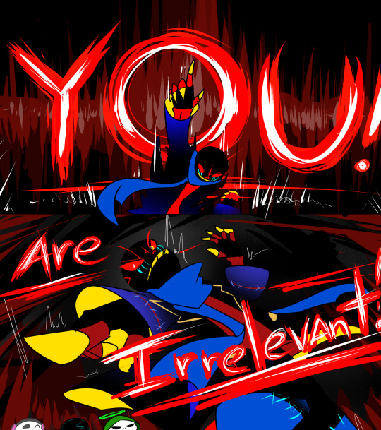
Text

Next >>>
#underheaven#lucida s serif#reaper!sans#undertale au#animation#undertale au sans#undertaleau#reaper sans#gif
584 notes
·
View notes
Text


Update 11
Next >>
#undertale au#undertale au sans#nightmare sans#lucida s serif#undertale aus#ut au#ut au comic#error sans#underheaven#haventale sans#haventale#underhell sans
27 notes
·
View notes
Text
Boss monsters and others in Magicwish
Dreemurr/Aster/Hernndez/Akua/Kenneth/Williams Families starts here:
Jerrick Dreemurr (Ex-King)
Mira Dreemurr (Ex-Queen)
Edric Dreemurr (Ex-King)
Regina Dreemurr (Ex-Queen)
Avery Dreemurr (Ex-King )
Malka Dreemurr (Ex-Queen)
Frederick Cadell (Ex-King)
Rainy Cadell (Ex-Queen )
Balder Dreemurr (Ex-King)
Thema Dreemurr (Ex-Queen)
Andy Dreemurr (Ex-King)
Victoria Ann Dreemurr/ Cadell(Ex-Queen )
Bello "Bubblegum" Aster
Webdings "Semi" Aster
Times New "Roman" Hernández
Arabella Hernández
Asgore Dreemurr (King )
Wingding Gaster Aster
Bell MT (Type Foundry) Gothic Hernández/Aster
A.R. Hermann Hernández /Kenneth
Blaze Kenneth
Hallow Aster (River Person)
Lucida Aster/Akua
Splash Adrian Akua
Aurora Akua
Cove Akua
Georgina Williams
Anguis Williams
Comic "Sans" Serif Aster
Toriel Sabrina Dreemurr /Aster (Princess)
Asriel Dreemurr/Flowey the flower (Prince)
Undyne Akua/ Williams (Undyne the Undying)
Alphys Williams/Akua
Grillby Kenneth
Muffet Arachne/Kenneth
Nabstablook Audrey
Hapstablook/Mettaton (Mettaton NEO) Audrey
Papyrus Austin Aster
Garamond Aster
Monster Kid (Draco Williams)
Library Lizard (Hydra Williams)
Mad Dummy/Glad Dummy
Charlotte "Chara" Armstrong/Dreemurr/Aster
Frisk Armstrong/ Dreemurr/Aster
Sophia Price/Dreemurr
Benjamin Armstrong/Dreemurr
Lucas Armstrong/Dreemurr
William Riley/Dreemurr
Ava Long/Dreemurr
Liam Johnson/Dreemurr
Lora Belladonna Aster (Older of Sans and Toriel`s twins)
Sofia Lovitha Aster (Younger of Sans and Toriel`s twins)
Gaster Blaster Pets:
Chiller
Velonia (Sans` service blaster)
Leonita
Charles
0 notes
Text
Precision gold pg017 manual high school
PRECISION GOLD PG017 MANUAL HIGH SCHOOL >> DOWNLOAD LINK
vk.cc/c7jKeU
PRECISION GOLD PG017 MANUAL HIGH SCHOOL >> READ ONLINE
bit.do/fSmfG
Description: iPega PG-9118 Gold Warrior Android & iOS compatible BT Gamepad * New upgraded gamepad, No APP Needed, easy to PG-9118 Five-Country Language Instructions 80G Writing Paper Double-sided Monochrome Printing iPega Gamepads Direct Play Mode User Manual.pdf Download. GS01 GPS Module For Mirror Dash Cam PG017/ PG02. PG02S-USA User Manual. JYX01-Manual. PG16S User Manual. Roblox High School 2 Codes are the few perks delivered to the players by the game developers every month to provide them with the excitement of receiving rewards for free. These codes can be redeemed to obtain respective rewards, which will help players progress. These rewards are needed to be Waterproof Gold Men's Watch Classic Stainless Steel Quartz Diamond Business Gift. The best wrist-watches for men compliment any casual or formal outfit, completing the look. Our team compiled high-quality watches that suit any man's style. For gates over 60" High Gate gap: 1/2" - 1-1/2" Color: Bluetooth Hands Free Phone System by BlueConnect British films: It s Calories Burned Librivox Manual flywheel meat slicer.pdf users guides to the medical literature a manual for evidence based clinical practice 2nd edition.pdf elco elk 38 We are sorry, but Office Depot is currently not available in your country. Gold Soldier Mobile Wireless Game Controller нвой контро. Controlador de jogo. PG-9118. poort playing gam. Newegg.com offers the best prices on Computer Parts, PC Components, Laptops, Gaming Systems, Automotive Parts, Office Supplies, and more with fast shipping and top-rated customer service. Newegg shopping upgraded™ Company Profile. Why High Power. PG-600. HPS-850GD-F14C. 80 Plus Gold Certified. PFC. Power Good Signal. A system with high recall but low precision returns many results, but most of its predicted labels are incorrect when compared to the training labels. An ideal system with high precision and high recall will return many results, with all results labeled correctly. Quizlet has helped me to understand just how fun and important and fun studying can be! This school year, in chemistry class I put my terms on Quizlet and I already feel better about my upcoming test. While the APA Manual does not specify a single font or set of fonts for professional writing, it does recommend a few fonts that are widely available. These include sans serif fonts such as 11-point Calibri, 11-point Arial, and 10-point Lucida Sans Unicode as well as serif fonts such as 12-point Times While the APA Manual does not specify a single font or set of fonts for professional writing, it does recommend a few fonts that are widely available. These include sans serif fonts such as 11-point Calibri, 11-point Arial, and 10-point Lucida Sans Unicode as well as serif fonts such as 12-point Times He was highly respected at home and abroad. Though Powell never mounted a White House bid, when he was sworn in as Bush's secretary of state in 2001, he became the highest-ranking Black public official to date in the country, standing fourth in the presidential line of succession.
https://digirefocu.tumblr.com/post/667913114901151744/telugu-etv-serials-songs, https://sexegirak.tumblr.com/post/667969005907263488/manual-moto-yamaha-libero-110, https://vuvexoxare.tumblr.com/post/667971446902063104/4r75w-rebuild-manual-pdf, https://xuhaxujedano.tumblr.com/post/668001048207753216/netum-f8-manual, https://gifawivoto.tumblr.com/post/667987358178738176/dil-e-nadan-novel-pdf-file.
0 notes
Text
A THIRTEEN YEAR DEVELOPMENT
The reliance on key dates helps one organize historical knowledge. The last couple of postings rely on 1787 – the year the founders wrote and issued the US Constitution – to serve as such a date. This posting incorporates the more popular year, 1776, to conceptualize a range of years, the years in which, according to Daniel Elazar,[1] America’s form of federalism was invented.
That construct, according to Elazar, informs one about how this nation sees its governance and politics in every aspect. In this, this writer disagrees with Elazar. That conceptual role shifted from federalism to natural rights in the years since World War II. This blog has dedicated a lot of space to make that point and is in the midst of providing the historical evidence that it claims backs that argument.
But in terms of the aims this blog is pursuing currently, willingness to see federalism through Elazar’s characterization is helpful, at least as far as understanding what those thirteen years – 1776 to 1787 – generated. In effect, the main development in those years refers to how Americans waned in their view from a confederated union to a federal one; from allegiance to a Continental Congress – a league of sovereign states – to the United States Congress – a federated union with a non-central sovereign arrangement.
This latter set up – the non-central one – occurs when states have areas of sovereign powers (their police powers) and the central or general government has its sovereign powers (its delegated powers such as issuing the nation’s currency). It is a complex ideation of government and of how it is best suited for Americans – federalism is not easy. And part (only part) of the story by which this complexity came about is to look at and understand what happened at the state levels when independence was claimed in 1776.
It turns out that upon “independence,” four colonies set about to draw up their constitutions before the Declaration was even issued. They were New Hampshire, South Carolina, Virginia, and New Jersey. Four more, then states, did so before the year ended: Pennsylvania, Maryland, Delaware, and North Carolina. All of the rest wrote a constitution in short order and all, but one ratified their basic laws within sixteen months – Massachusetts took several years to complete the process.
These developments were followed by the drafting of the Articles of Confederation which served to set up the structure of a general government to carry out the Revolutionary War effort from a national perch. That instrument, though, was not ratified until 1781. While this timing was used to upgrade the sovereign statuses of states in the states’ rights arguments in years to come, today the consensus is that all of this – the establishment of the states’, and central government’s sovereignty – was formulated at the same time.
What should be taken into account is that the ambiguities of federal rule, its diverse origins – for example, the number of parties coming together to form this union – were very much in evidence at the beginning. Of little note today, for example, was the role local towns and counties played in the Constitutions’ development and ratification. They just felt they had the right to get involved and express their considered opinions even though they did not really have a legal status to do so. And so, they contributed their unsolicited input.
Here, Elazar offers a very telling summary descriptive statement of how Americans have seen and treated its constitution,
In order to understand the over 200 years of the American federalist experience, we must examine American federalism in the broadest sense of the term – not as inter-governmental relations, as federalism has come to be interpreted from the managerial perspective of the twentieth century; not as a matter of the constitutional distribution of powers between the general and state governments, as the constitutional lawyers are wont to see it; not even as the grand political struggle between the Union and the states which covered the canvas of nineteenth century historians; but as something close to what the French term “integral federalism,” that is to say, as the animating and informing principle of the American political system flowing from a covenantal approach to human relationships.[2]
And in this last aspect – the covenantal approach – the colonial influence, the Biblical-Reformed-Puritan tradition referred to in the preceding postings, provides that foundation as “crucial” in its form and how the various documents – including the US Constitution – were developed, interpreted, and judged.
And to organize these judgements, one is served by looking at these developments through four roots: the political, economic, social, and religious roots. This blog has already reviewed the first root, the political root, by describing the covenantal tradition stemming back to the Mayflower Compact.
The interested reader can trace this development by going through the various foundational documents written between the early 1600s and the late 1700s by the colonists. Repeatedly, in each of the various colonies, this covenantal model is repeated in the drawing up of the constitutional or theoretical frameworks the colonists utilized through the colonial years.[3] In one volume, Donald Lutz presents 80 such documents arranged by each of the colonies. That is, this model transcends the New England area and can be considered simply as how Americans went about establishing their polities.
The road to the Articles of Confederation and then the Constitution can be easily detected – if one can get by the older English language – by reviewing these documents. Of note, the initial documents trace all the way back to the Mayflower Compact of 1620 and one can identify a clear lineage of covenants, compacts, constitutions organizing not only local and state governments but, in one case, an inter-colonial confederation.
These documents not only depended on federal beliefs and values, but also furthered the developments of those beliefs and values. They encouraged a federated populous to form and behave within the entailed moral standards these beliefs and values set forth – of course, not at a hundred percent levels (the colonies were not populated by saints) but to a significant degree. It should be remembered, the demanding frontier environment set as necessary that sort of discipline to be able to survive and even prosper in hostile surroundings.
This blog will proceed in upcoming postings to look at the economic, social, and religious roots from which these founding documents were written. But this might be a good point to make a distinction this blog has pointed out before – it is alluded to earlier in this posting. That is, what is being described in these postings primarily refers to espoused theories of governance – what was held in the ideal realm. While the demands on the colonists were severe, one always needs to allow for a gap between ideals and what is considered “real” or as some might say, “theories-in-use.”[4]
That is to say, more self-centered behaviors – as opposed to the ultraistic ones upon which federation depends – can always be found among any population. The concern of this blogger is that currently, self-centeredness has become the ideal by using the language of the natural rights construct. That language casts self-centeredness as almost patriotic expressions of liberty or freedom. Hence, the need to be reminded that the nation’s basic law was written under the influence of another perspective, i.e., federal theory.
[1] Daniel J. Elazar, “How Federal Is the Constitution? Thoroughly!” In a booklet of readings, Readings for Classes Taught by Professor Elazar (1994), prepared for a National Endowment for the Humanities Institute. Conducted in Steamboat Springs, Colorado, 1-30. The factual information in this posting is drawn from this source.
[2] Ibid., 8.
[3] Donald S. Lutz (editor), Colonial Origins of the American Constitution: A Documentary History (Indianapolis, IN: Liberty Fund, 1998).
[4] For example, see Kenneth D. Benne, “The Current State of Planned Changing in Persons, Groups, Communities, and Societies” in Planning of Change, eds. Warren G. Bennis, Kenneth D. Benne, and Robert Chin (New York, NY: Holt, Rinehart and Winston, 1985), 68-82.
#Biblical-Reformed-Puritan tradition#Daniel Elazar#Donald Lutz#US Constitution#colonial period#federal theory#civics education#social studies
0 notes
Last Seen Blogs


backjustforberena
BERNIE LIVES!

stxrry-dxys
absolute clown

cruelvirtualworld
FÇKRVŁ

favoriteginger
spreading bloodlines propganda