#left ones have a transparent background so u can change the color :3
Text


spiked collar blinkie templates (150x20px) made by me
feel free to use • tip jar
#blinkies#blinkie templates#spiked collar#warrior cats scourge#gif warning#goth blinkies#goth#collars#flashing lights#left ones have a transparent background so u can change the color :3#blank blinkies#my blinkies#collar blinkies#puppyposting
73 notes
·
View notes
Text
Krita tutorial the way I know it.
Basics: What is where.
Gimmicks.
Specific advice on specific tools.
Basics: What is where.

Upon opening the program this is what you're met with. First of all, must comment: The layout is HEAVILY editable so you can just drag menus anywhere you want, even leave them floating amidst the sheet you're drawing on.
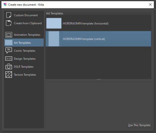
You can create custom art templates, I have two o'mine here as both have my signature background color.
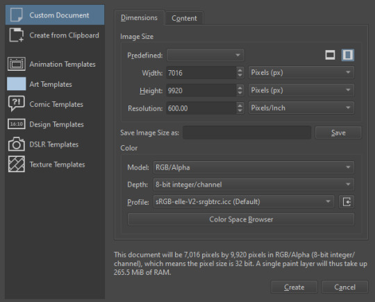
As well, you can edit the custom document settings, as in what size you want it, what resolution, even the initial content of the image. As well you can create from clipboard: Just copy some image from your browser and Krita will recognize it (useful for making meme edits lol).

Now, once you have your file, I will show you what is where.
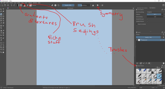
Brushes:
Brushes are easy to edit and there are tons of free bundles to download online. I myself only got one bundle, Jackpack (bit hard to find now due to original source being lost, it is still available but bit tricky to come by).
There. Are. Tons.

Some of these are my custom brushes for calligraphy in neography, you might even guess which ones. You can edit existing brushes, make new ones from the ones you've edited without changing the original, and all sorts of stuff (more below in the third chapter).
There are numerous packages of brushes once you enter Krita, but only one/two are available when you first open it. To unlock them all, click here:
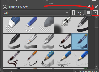
And make sure all bundles are dark gray in color (example of both dark and light below).
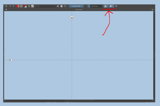
Now Tools Options: those will pop up depending on what tool you're using.
Symmetry: Fun stuff. You can drag the lines depending on how you need them and then center them back to the center of the screen if needed.
Gradients and Textures also have their tools options, you can play with those to get the feeling what they can do (more in third chapter).

The Filters tab is useful too. Blurring, motion blurring, color mapping, artistic filters and all that: Quite fun.
Gimmicks.
Krita allows you to customize your workspace freely. Floating menus, tabs, anything you want. It has quite many drivers at that-
To access the workspace templates, go to Window and choose Workspace.
Krita allows for copy-pasting any image onto the sheet. Though, for me it sometimes crashes if I accidentally copy-paste text into it without choosing the Text tool first.
The software allows for both raster and vector work. It is basically Photoshop sharpened to be used by artists primarily.
There are some interesting mechanics regarding the Eraser (default bind E).

You can use it with any brush, allowing for textured erasure/quick work. Good for sketching.
You can use it on gradients (given there's a transparent point on the gradient preset).
There's a Multibrush tool:

People say Krita is good for animation but my brain can't wrap around it yet honestly @~@.
The keybinds:
B - Brush tool.
E - Erase tool option.
M - Mirror (useful for checking accuracy from a new angle).
Ctrl - Color pick (when used with brush or other color-using tools).
Shift+L.Mouse+drag - Changes the size of the brush by dragging left and right.
Ctrl+E - Merge layer with the one below.
Ctrl+G - Group selected layers.
Ctrl+A - Select whole sheet.
Ctrl+Shift+A - Deselect everything.
F - Bucket tool.
G - Gradient tool.
Ctrl+S - Save document.
Ctrl+Shift+S - Save As document.
Ctrl+N - New document.
Ctrl+O - Open document (will be seen in a new tab on top of the sheet).
Ctrl+C - Copy selected layer or selection.
Ctrl+X - Cut selected layer or selection.
Ctrl+V - Paste copied/cut layer or selection.
Q - Multibrush tool.
R.Mouse - Interesting thing: Opens up a quick selector for brushes and colors you've already used in the piece.
1 - Zoom 100%.
2 - Zoom to fit the piece vertically.
3 - Zoom to fit the piece horizontally.
4, 5, 6 - Turn 15 degrees (4 and 6) or undo the turning whatsoever (5).
Ctrl+I - Negative filter applied to layer.
Ctrl+U - Color editing on the layer.
Ctrl+Y - Soft proofing mode (for color mistakes and stuff like that, mostly annoying for me tbh).
Ctrl+T - Transform selection/layer.
Ctrl+R - Square select tool.
Ctrl+J - Lasso select tool.
Honestly you can just hover your mouse over tools and see their shortcut binds, as well. Or edit them in Settings.
Specific advice on specific tools.
Brush:
Brush editor is a great tool for making custom brushes, and it even has a sratchpad to test them out. Lots of settings, but no need to be afraid; Most of them you might never use on purpose.
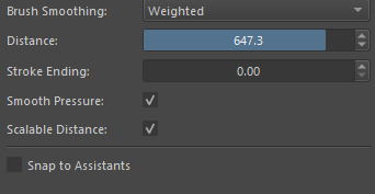
Use Brush Smoothing for great and pretty lines in lining pieces or making calligraphy.
Gradient:
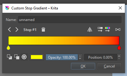
The four icons to the right top are:
Mirror gradient.
Arrange by lightness value.
Arrange by color value.
Space the stops evenly.
Click the gradient to add a new stop. The three things to the left are:
Make the stop use Primary Color.
Make the stop use Secondary Color.
Make the stop use a fixed color.
230 notes
·
View notes
Note
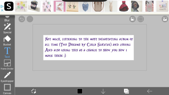
HOW ARE YOU DOING/WHAT ARE YOU UP TO?
[^PRETEND IT'S SPARKLY AND FUN BECAUSE I DON'T KNOW HOW TO MAKE THE COOL THINGS]
below the cut ~~
So the sparkle things are gifs, which means we need to
1.) make the frames and
2.) turn the frames into a gif
Step 1: Making the frames
I use ibispaint bc its free and has great versatility, it doesnt matter what photo editing app you use it will just change how you add the glitter. To keep this super simple im just going to show you how to glitter
In ibispaint, open whatever size canvas you want/open the image youre glittering. Choose the text tool and add your chosen text
On the bottom row here ^^ you can see a little button with a number two, its where you can open the layer/canvas menu. Click that
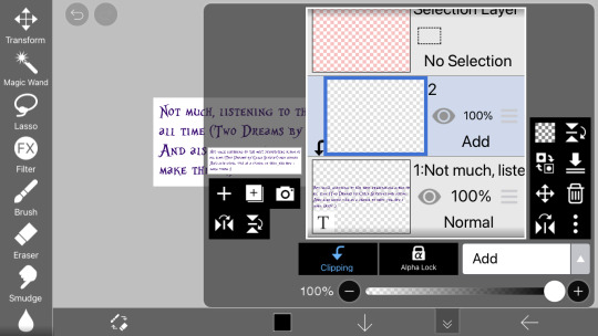
Click the "+" on the left hand side, click clipping, and click the dropdown that says "normal" and choose "add" (this is the blending mode). Your screen should now look the same as above.
in the menu on the righthand side (the "tools" menu), click the fx filter icon
Scroll to "artistic"

Fix the settings until they look like the ones above
Type: color
Strength: 75
Amount: 25
And blending mode normal
Click the green check
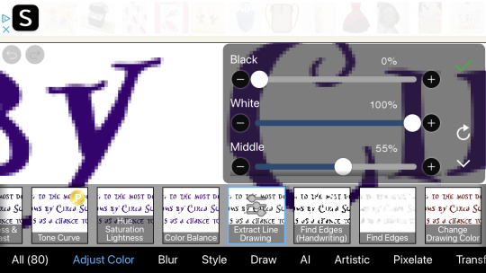
Now go to the adjust color section and click "exact line drawing" and match it to the settings above
Black: 0
White: 100
And middle: 55
Click the check
The layer is now going to be black rather than the colors it was before, that means youre on the right track
Click the x to leave the filter menu, go back to the layers/canvas menu
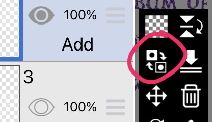
Click this little flippy button, "invert layer color" now you should have a glitter layer!! This glitter layer is going to be part of one of our frames
Now repeat the steps of making a new layer, clipping it and changing the blending mode, adding the filters, and inverting the layer color 1-2 more times to have two or three glitter layers (yes theyll be stacked on one another but that is okay for now)
Saving the frames to make a gif:
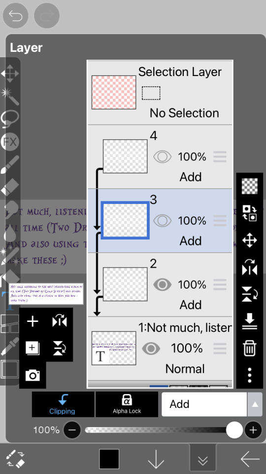
Now we have several layer, descending they should be:
2-3 glitter layers
A text layer
(And an empty base layer, just ignore it lols its just chillin, u can delete it if you want it doesnt matter)
All these layers have eye images on them. If the eye is dark the layer is visible. If its not its invisible. We are going to save every glitter layer over the text layer individually to get the frames for our gif
The text layer needs to be visible at all times during these next steps.
Turn off the visibility of all the glitter layers except the bottom one (by clicking the eye icon on the layer)
Only one should be visible while we're saving the frames
There is an arrow on the bottom bar all the way at the right
Saving as transparent png makes the background see through like the gif above, save as png makes the background white. Pick whichever, but choose the same one for all of them (if you choose transparent choose transparent for all frames)
Go back to the layer canvas menu, make the glitter layer that is currently visible invisible. Click the eye on the layer above that one to make it visible (the second glitter layer)
Repeat the saving process. If you have a third glitter frame, make glitter frame 2 invisible, glitter layer 3 visible, and save.
Part 2: making the gif itself
go to ezgif dot com. ezgif dot com is the best simple gif maker. ezgif dot com is now your best friend. hashtag not sponsored
Click gif maker
Click "choose files", "photo library", add the glitter frames you made and click add or choose whatever is at the top idr
(I wound up using 3 frames not 2) where it says delay under each gif, delete the "20" and add 12 to one and 13 to the rest (the delay is how much time each frame will take in the gif, using one number thats different keeps tumblr from screwing up and accidentally converting them into videos. Idk why that happens but sometimes it does.)
Ignore all the rest of the settings, you dont need to mess with them just for lil glitter gifs and click the create button at the bottom
Now you can either click download when your gif pops up or you can long press to save it directly to your camera roll
Extra notes:
If you want your glitters to be rainbow, skip the "exact line drawing" and "invert layer color" steps
Ezgif isnt good for high quality gifs. For the gifs on my website i make the frames in ibispaint and use photopea (a free online photoshop) to make the gifs themselves. But thats more difficult to do as you cant really use photopea on mobile without a mouse and its much more complicated (so thats a separate tutorial if you ever need high quality gifs)
#If any part of this was confusing or if you need help lmk on discord im more than happy to help you ^w^#gifs#crimson answers#crimson explains#kaikaikaikaikai
3 notes
·
View notes
Note
Hey, did you have any coloring tutorials regarding your pride headcanon gifsets? The coloring looks so nice and I wanted to try and attempt to use some coloring for my gifs but I dont know how
thank you !! its usually kinda specific to each gif but i can try! theres usually 2 ways i go about it
using the color overlay feature:
this is probably the easier one as it can be used with more scenes
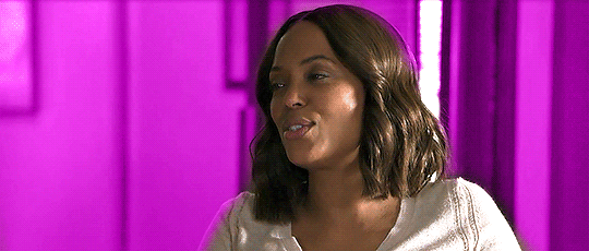
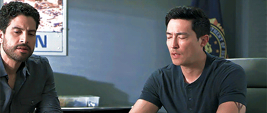
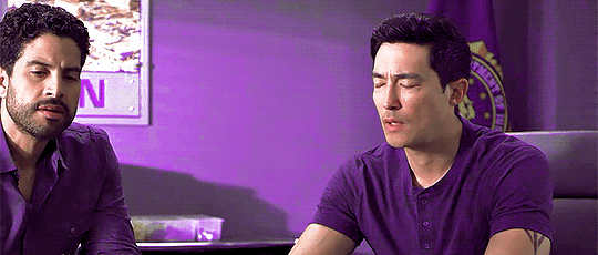
you need to find a scene where the person you're giffing/the camera moves very little (here she moves a bit but its fine enough for me)
colour and sharpen the gif as you normally would
then create a new layer and simply colour the background in the colour you want
it will look ridiculous at first but then u wanna change the overlay setting from normal to color (the drop-down next to the opacity)
and it should look something like this:
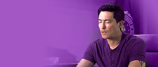
and then sometimes i add a gradient (pink to transparent) on a new layer on each side if i want a bit pinker (i mess around with the opacity of this layer to whatever i think fits this is around 70% opacity)
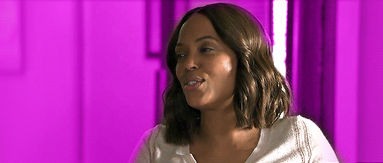
it doesnt make a ton of difference here but i tend to use it more when there are things happening on the far left that i want to draw attention away from as it makes those areas more opaque
and thats basically it for this way!
the cons to this way are sometimes you can see gaps/overlap where the character moves at certain points of the gif
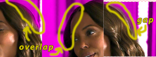
im usually pedantic about these things but its honestly not as noticable as you think it is and ive uploaded gifs that have overlap (i tend to think overlap is better than a gap but thats personal preference)
using selective colour:
this is harder to do as you need the background to be a specific colour (but i think it tends to look better)
this colour can be the colour you want the gif to be but from my experience blue backgrounds tend to be most easily manipulated
red/yellow/pink backgrounds are hardest to change as they affect the skin colour of the character (but it can sometimes work if the character doesnt move much as you can use a layer mask and erase your colouring from the person)
im gonna try and colour this gif (idk if it will work yet as the background is a greyish blue rather than a brighter blue like the sky would be but it should do)
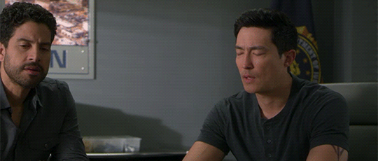
colour and sharpen as normal (i also recommend using a blue/cool photo filter layer to really get rid of the yellow undertones the later cm seasons have it makes a world of difference for me but its up to you/how you colour things)
then from here honestly its a lot of trial and error; im gonna try and make it pinky purple
this is gonna be different for each gif but for reference i added 2 selective colour layers (as the bg is blue im only gonna change the cyan/blue and maybe black/green) and one hue/saturation
1st selective colour:
GREEN (C = -100, M = +100, Y = -100)
CYAN (C = -100, M = +100, Y = -23)
BLUE (C = -100, M = +100, Y = -91)
BLACK (C = +1, M = +13)
2nd selective colour:
GREEN (C = -100, M = +100, Y = -100)
CYAN (C = -100, M = +100, Y = -23)
BLUE (C = -100, M = +100, Y = -91)
hue/saturation: (the background is now pinky/purple)
MAGENTA (hue = +1, saturation = +32, lightness = +19)
this is my result:
as you can see their skin tone hasnt changed as i didnt touch the red/yellow selective colour options. if your background is one of these colour you could add a layer mask to that selective colour layer and erase the area of the person but this might cause effects similar to first version i showed you (gaps or overlap)
im still not entirely happy with it as firstly, luke is in the picture as we want to draw attention away from him and secondly, there are still some non-purple colours in the background
to fix this is once again use the color overlay feature from the first version to touch up some of the areas (i colourdrop a colour from the background)
there shouldnt be much overlap/gapping as im not colouring precisely around their skin (and if there is it wont be as noticable as the background/shirt is the same colour)
and then to get rid of luke i simply draw over him in a colour from the background and then add a gradient and move it so the opaque side of the gradient is near the edge of where i stopped drawing over luke (i also transform it and mush it inwards so the more transparent side doesnt go all the way over to matt just next to him)
this is what it looks like finished!
it turned out pretty well considering it was a random video i had on hand !!
also dont be scared to experiment with overlays/opacity etc and its okay to realise that it’s just not working for this gif and scrapping (ive lost many gifs </3)
im not the best at explaining things but i hope this somewhat helped!! if you have anymore questions feel free to ask <3
17 notes
·
View notes
Text
How To Do Masking Photos In Photoshop cs6 In 2021
What is one of the most salient parts in terms of Photoshop is, Masking photos. Why do we usually do that? Of course to hide an intended part of an image with some editions, which is completely nondestructive.
But don’t worry about the fact that, once you did masking to your photo, you can reveal it to its original view anymore. Let me tell you in an easy word that you can make it visible or invisible whenever you would want.
Now the question is, how to do that? For this reason, I have accumulated a specific concept of guideline which can help you in masking photos.
Masking Photos: Exposition and Procedure
To make you understand more precisely about Masking photos, why not interpret with an example? In general, we use a mask to cover our faces. Photo masking is exactly like that. But what it does, is hide a segment or part of your image.
You may contemplate that, the opacity and fill are there to do such transparency. But that’s for the masking of the whole image. Sometimes the situation may come to light that you want the left side of your image masked and the right side to be disclosed. That time what comes in handy is the Masking Photos In Photoshop.
There are two types of masks that can be created.
These are
Layer Mask – This is a type of mask which is used to edit images of bitmaps relied on resolution through pant and selection tools.
2. Vector Mask – Such masks are totally independent and don’t rely on resolution. The tools that it uses are shape and pen tool
Till now, you have understood what is masking? But now we will get to know how it actually works. Mainly it runs in two ways. You will see at the bottom of the layer palette, there is a third option. You can use that easy to add a mask on any layer of your image.
There is also another way, which is the adjustment layer. This layer always comes with a mask. So, this option may seem convenient as well.
Before going through the procedure, keep in mind that the white color will be used to let out and the black color will be used to tuck away.
White divulges, Black covers
First, if all, select any image which is saturated with black and white effects. Make a duplicate of the image background, then desaturase it and impart it from the effect. To do that, press Shift+Control+U from your keyboard.
Now what you have to do is, inverse the white mask to a black mask by pressing Ctrl from your keyboard. In this way, your image will turn into a picture filled with color.
At the initial stage of masking, take into account that it will remain white. But it’s completely up to you if you want to convert it into black or not. That time you have to invert the mask by pressing Ctrl+I from your keyboard. As a matter of choice, you can just simply press Alt and you will see it resulting in a black mask.
Some extremities :
Press D from your keyboard. It will transform the background of your image into black color and foreground into white color
Choose the mask you want to use
To fill the foreground with black, press Alt+Backspace, and to fill the background with white, press Ctrl+Backspace. Another alternative to swapping the colors is, simply press on X
What’s left more?
Painting the mask using a brush key. One thing that needs to be considered is that the foreground color should appeal as an opposite color of the mask.
When you paint with black color on a white mask, those parts will become transparent. On the other hand, the remaining parts you did not color, won’t change and persist as it was. Again, if you paint white on a black mask then transparent parts will be back to their actual cast.
Furthermore, there are options to control the fill and opacity by setting up the percentage. For example a tree in the picture. If you paint the tree using a black brush above the white mask, the color will be more visible from the layer.
Understanding with Specimen
Suppose, there are two different photos wherein one photo there are written fruits and in the other photo, there are written flowers. Now we are going to layer these Masking Photos In Photoshop. We know that cakes, burgers, sandwiches are made with different layers. Just like that, we are going to place one photo above another photo similar to the layers of cakes and burgers.
Suppose, we put the image of fruit above the image flower and after that, we will produce a layer mask. Now let’s get started with some traits.
Layer Mask
Can you see a square button that has a circle in it? You will find it under the layer, simply press that. Make sure of the thing that you have selected the image which you want to use for masking.
View the left side, where you will see there is a box of white color background beside the image written fruit. That is the layer mask you have to go with.
Want to know how you can add a layer mask?
Then have a look at these particular points.
Convey any image on Photoshop and don’t select any part of it. Or, go to the select option and click on deselect from their
Now, go to the Layers panel and select layers or group
We will now reveal the whole layer by creating a mask. So, go to the Layers panel again and click on Add Layers
This point will define hiding the layer. Press the Alt button from your keyboard or go to the Layers panel, select layer mask, and then hide all.
Conversely, if you want to hide a part of a layer instead of the whole layer, then you are to proceed with some further points.
Go to the Layers panel, then select layers group consequence
Select those areas your image which you want to hide
Twice, you have gone to the Layers panel and click the layer mask button.
This is going to reveal the areas you have just selected
Press the Alt button from your keyboard and go to the Add Layer Mask button situated on the layers panel. It will create a mask and hide your selection firmly
This is how you can use the layer mask to hide your image as per your desire. Be it the whole image, or a part of your image.
Solution
You must have heard about the eraser/ erasing tool. Why do we use it? Definitely to erase something from your file. And once we erase anything we are surely not going to get the removed part back.
For that reason, we are to do such tasks so carefully. Since everything is uncertain, there can also be the possibility of having mistakes. So, to meet up with this complication, we have to use the layer mask. Some further tools are associated with it, like- paintbrush, black color, and white color.
Another Solution
Now, here a question arises: what’s the function of black color and white color? Instead of erasing we are going to make visible the segment which we intend to. Because, if we erase it we won’t get the original form back. But if we make it invisible using the layer mask, we can get that back assuredly.
Always be cognizant of the term that, black is used for invisibility, and white is used for visibility. In other words, assemble the foreground with black color at the time of erasing or making it invisible. And in the same way precise the foreground with white color when you want to in-erase it or make it visible.
Masking Photo Actions
In the case of the Masking Photos In Photoshop action, always remember to select the layer mask, not the layer thumbnail. Primarily, you will see that the layer mask’s default color will appear to be white. Why is it showing us white? Because the layer is totally visible right now.
Now it’s time to erase the top layer of the image. Before all else, select the foreground color black and paint certain areas of the image with the help of Paint Brush. Let’s have a glance more finely using treads.
Tread 1
As I told you before, we are going to put the image written flower under and the image written fruit above. Then use the Paintbrush and operate the layers where the fruit is written. At the same time, the picture written flower which was kept under will be revealed.
You may feel like you painted solely. But don’t worry. We have already selected the layer mask that’s going to affect.
Tread 2
If you gaze at the layer mask thumbnail, you will see there is a little black color on the white box. It signifies that the Masking Photos In Photoshop has been done nicely.
It can happen that you are not satisfied with the edition, so you want to rectify it. Don’t be hyped by thinking that it’s not possible. You can do that merely by transforming the foreground color into white. Then paint those areas which you have just erased.
Tread 3
The original areas will start to appear once you are done setting the foreground with white color. In this way, we can bring some of the fruit layers back.
After this step, you may add some supplement options like- Curve Adjustments, Levels, Adjustment Layers. These come automatically to refer you to make more changes if you want.
The Bottom Line
The Masking Photos will not be a difficult task if you get affiliated with the right and foremost knowledge about it. But what needs to be considered is, without wasting time getting to know the exact points with extra volume. That’s the kind of guideline I have provided here.
So, that’s it. I hope you like the entire concept of image masking and thinking of following it as it has been prescribed. Happy learning.
0 notes
Video
youtube
transparent render tutorial/process vid, v2: beginners’ edition! (written walkthrough under the cut)
yeah okay the last video was really only helpful if you already know the basics of making caps, so here’s another manga panel rendering tutorial for anyone who’s never made a cap in their life, complete with drop-down menus instead of keyboard shortcuts! I tried to be pretty explicit, keeping in mind what things I had to figure out myself when I was learning... still, steps are under the cut!
oh, and bonus: watch me do this at 1500% speed
final product:

Note: i’ve changed a few of my keyboard shortcuts, so yours might not be identical; as such, I tried to avoid them as much as possible!
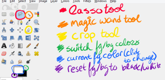
first of all, useful GIMP navigation shortcuts:
ctrl+R = reset view
scroll wheel = scroll up/down
shift+scroll wheel = scroll left/right
ctrl+scroll wheel = zoom in/out
and tools we’re gonna use:
and finally, the how to:
1. open the page with your panel in GIMP or copy-paste it in, and save your project
2. use the crop tool (shift+C or yellow above) to select the area around what you want to render, then click on that area to crop it
3. click your foreground color (in blue above) and change it to any color you like
4. create a new layer (either by going to Layer>New Layer or Ctrl+Shift+L), and make sure “foreground color” is selected, then click OK
5. drag your new layer below the manga panel layer on the right, then select your manga panel layer again so that it’s highlighted in blue
6. click the little squares (indicated in purple above) to reset your fg/bg colors, then the arrows (in green above) to switch them so that white is your foreground color
7. Layer>Transparency>Color to Alpha, make sure it’s set to pure white (it should be by default) and hit OK
8. Layer>Mask>Add Layer Mask, make sure “White (full opacity)” is selected and click OK! This creates a “layer mask”, which basically lets you erase without permanently erasing
(you should probably save here)
9. Click the lasso tool (in red above) and start carefully clicking points to outline the spot you want to render. You don’t have to be as precise as I am (I’m really anal about it), but notice what spots i’m cutting out:
you also might need to cut out certain spots, but I’m a complete idiot and used keyboard shortcuts for this in the video so here’s how you do it:

I made a note of it in the video itself, too! Also, I don’t know if Feather Edges is on by default, but if it is, TURN IT OFF IMMEDIATELY. it’s the absolute worst just trust me
(you might wanna save again)
10. Select>Invert (Ctrl+I) and hit the DEL key, then Select>None (Ctrl+Shift+A)
11. Right click on your layer>Duplicate Layer, right click>Apply Layer mask, right click>duplicate layer (again), & hide the bottom version (the one that still has the layer mask) by clicking the eyeball- it’s just there to be a backup
12. select the top layer and then go to Layer>Transparency>Threshold Alpha, i usually set it to about 123-127 but you may want to go lower; a higher number means it’ll be sharper, but you may have holes in the outline you’ll need to fill in
13. click this little icon to lock the layer:
then Ctrl+F to fill with white, then that little icon again to unlock the layer
14. use the magic wand tool on the area that’s going to be transparent, using Add to Selection if needed, invert the selection, and Ctrl+F to fill with white
(NOTE: if there are gaps you’ll need to either fill them or go back and do it again but with a lower threshold for threshold alpha. You can see me do the former in this one)
15. drag the white layer below your other visible copy, crop how you like, and you’re done! I recommend exporting two versions: one with the colored background visible, and one without it. make sure they’re .png files too!
congrats friend u just made a transparent render like a pro
that got a bit wordy but don’t worry, it’s really not that complicated! It took me longer to write this than it did to make the render pffft
feel free to ask if you have any questions!
#world trigger#wtgraphics#mangacap tutorial#graphic tutorial#gimp tutorial#this time ft izuchika#theyre rly easy!! seriously#i made this like 3 days ago and forgot to post it#cookie's edits#//emerges from the dumpster
54 notes
·
View notes
Text
How to Draw an Office Background in Adobe Illustrator
What You'll Be Creating
In this tutorial, you will learn how to use the Mesh Tool and Blend in Adobe Illustrator to create a professional office desk background!
If you'd like to skip the tutorial and just use this vector in your work, you can go ahead and purchase the Office Background from GraphicRiver!
Office Background
1. How to Draw a Cup of Coffee
Step 1
Let's begin by creating a base for all of the circular shapes in this tutorial.
Because I want the Mesh to be easy to manipulate and precise, I don't apply Mesh to a circle, but instead to a rectangle, which I then bend into a circular shape.
As the latter is pretty tricky to do, I am attaching a base for you to work with in this tutorial (press the Download Attachment button on the left of this article). Create a few copies of it for further use.
Once you have made your own circle or downloaded mine, grab the Mesh Tool (Control-U) and by clicking inside the shape, place mesh nodes as indicated in the screenshot below.
Next, select the outer edge of the circle and color it with #CAC6C3.
Proceed by coloring more nodes (selected in the image below) with #E6E5E3.
Step 2
Let's create our first Blend!
We will need two circles, slightly different in size, with the bigger one being white and the smaller one colored with #44392F. Place the brown circle on top of the white one and change the bigger circle's Opacity to 0%.
Step 3
Proceed to Object > Blend > Blend Options, and select Specified Steps, 30.
Next, select both circles and go to Object > Blend > Make, creating a transparent shadow.
Step 4
Change the shadow's transparency mode to Multiply.
Step 5
Grab a copy of the white Mesh circle from earlier, and then color its edges with #CAC6C3 and its middle with #C8C5C1.
Step 6
You will need another copy of the mesh circle. This time, color the whole thing with #695C45. Then make the middle #0C0706 (follow the selected nodes), and finally color some nodes with #72634A.
Step 7
Create a foundation for another blend, this time using two shapes filled with #888483 and #010101. Make the bigger shape transparent.
Step 8
Use the same settings as in Step 3 for Object > Blend > Make.
Step 9
Change the shape to Screen with 80% Opacity.
Step 10
Create another Blend using the same method as before. You will need the same colors as in Step 7.
Don't forget to apply Screen to the resulting image.
Step 11
Place the highlights on top of the coffee base.
Step 12
This Mesh is a bit more complicated, but all you have to do is follow the screenshots closely. You will need these colors:
#F3F2F1
#E0DDDB
#CBC6C3
Step 13
Finish drawing the handle of the cup in three more steps.
#FFFFFF
#F6F4F4
#BEB9B5
Step 14
Create another Blend out of #B8B4B0 and #E0DDDB shapes.
Apply Multiply and 30% Opacity to the result.
Step 15
Assemble the cup out of the elements we've made so far.
Step 16
Let's draw bubbles! You will need to grab one more copy of the Mesh circle for this.
#251B12
#7E6E55
#F0F0EF
Step 17
Make the edges transparent.
Step 18
Grab another copy.
#251B12
#7E6E55
Step 19
Make the edges transparent.
Step 20
Create a semi-circle out of the bubbles.
Step 21
Finally, add them to the surface of the coffee.
2. How to Draw the Pen and Pencil
Step 1
Draw the base of the pencil with Mesh.
#252525
#555555
#3F3F3F
Step 2
Stretch the Mesh to make it long enough for a pencil, and then create a jagged left edge.
Step 3
Draw the tip of the pencil.
#D4B999
#EDDDC0
#C6AB8D
#4C4C4C
#9C9C9C
Step 4
Add the tip.
Step 5
Draw another Blend—you will need a #535353 shape and a #E5E3E0 shape.
Step 6
Make the Blend with the usual settings.
Step 7
Add the shadow under the pencil.
Step 8
Draw the base of the pen.
#BEBEBE
#909090
#AAAAAA
#D9D9D9
#A8A8A8
#C4C4C4
Step 9
Bend the end of the Mesh into a triangle.
Step 10
Draw another part of the pen.
#2D2D2D
#6B6B6B
#C4C4C4
Step 11
Draw the tip.
#DEC394
#F6E9B1
#F4D5AE
#C1A780
Step 12
Assemble the pen. Add a copy of the shadow we used with the pencil.
3. How to Draw the Notepad and Tablet
Step 1
Draw a shape and apply a Linear Gradient to its Stroke. (#4B4A4A - #919090 - #4B4A4A)
Select the result and go to Object > Expand Appearance.
Step 2
Modify the Mesh of the shape a bit, and then add a new shape at the lower edge.
#313131
#FBFBFB
#313131
Step 3
Create a row of these.
Step 4
Draw a sheet of paper.
#FFFFFF
#EAEAEA
Step 5
Draw a #313131 cover for the notepad.
Step 6
Make a Blend shadow, using a #E5E3E0 and #191717 rectangle. Set the result to Multiply.
Step 7
Assemble the notepad.
Step 8
Add the Blend shadow under the sheet of paper, but set its Opacity to 50%.
Step 9
Draw the tablet out of two shapes—one white and one black.
Step 10
Create another Blend shadow, using a #505050 shape and a #E5E3E0 shape.
Step 11
Add the shadow under the tablet.
Step 12
Assemble all elements on a #E5E3E0 background.
Step 13
Draw a rectangle, outlining what you'd like to keep in your background.
Step 14
Select everything, right-click, and press Make Clipping Mask.
Step 15
Enjoy your office background!
Awesome Work, You're Now Done!
What now? You can try any of my other tutorials from my profile, or check out my portfolio on GraphicRiver, as well as the original vector we recreated in this tutorial.
I hope you enjoyed the tutorial, and I would be super happy to see any results in the comments below!
Office Background
from Envato Tuts+ Design & Illustration http://ift.tt/2GiqDLv via http://www.webmasterforum.ws/rankwyz-discount-code-2015-coupons/
0 notes
Text
December Hemp Cigar - Weekly Promos
New Post has been published on https://acmehemplabs.com/promotional/december-hemp-cigar-weekly-promos/
December Hemp Cigar - Weekly Promos
2019 December Hemp Cigar Promotional
So we’ve been rolling around some ideas for December for what kind of deals we’ll be doing (and you can scroll down to the bottom to see them). Of course we’ll be always doing something in all honesty it’s just the way we want to do our business. Because right now we’re working to build our brand and our relationship with you, and how we can do what we are doing better in every way possible. So every chance to serve you, our customer, you’re giving us a little bit more experience to make what we are doing better for you, us and everyone else that tries a hemp cigar in the future!
Quality Increases while Prices Drop!
Being that our hemp cigars are priced around how much it costs to simply just BUY the hemp flower, we are really giving you a hell of a deal already! Why do we do that? Because we know in the end it’s all about you the customer and the experience. The more we can be a quality provider of alternative hemp smoking products for you the better we get, the faster we become and the more affordable in the end that our product becomes, so our goal literally is to help as many people understand that HEMP cigars are NOT what you initially think.
You’re Not Smoking Your Grandpa’s Hemp Rope!
Here I am enjoying a smoke filled room while test smoking an aromatic/flavored Primo (coming next year)
I’ll be honest with you about my own smoking habits. When I was in my early 20’s I smoked weed for awhile, especially while working construction (digging holes and what not) and when working out and after. But at a certain point either I just couldn’t handle it or the weed in Colorado was just getting too damn strong, I became a 1 toke Tommy really fast it seemed. Either way I stopped smoking for a long while, but then once we here at Acme Hemp Labs (Acme 420) started rolling these hemp cigars I started smoking again and I found that I get ALL the positive points of smoking the high CBD hemp cigars that got from smoking weed, of course without the shot to the moon anxious feeling I would get.
Don’t get me wrong though, I actually got to the point where I got high, but it wasn’t from the THC, I believe it’s from the CBD and the other complexities of our hemp cigars syn-energized and created a grade A smoking experience, the THC levels in all our products are below the .3% THC. Instead of the anxiety that I would get from actually getting high with marijuana this high was what I always felt like I should have felt while smoking weed (what was always being portrayed on TV, magazines etc).
When I smoke hemp cigars I get HAPPY and giddy, a roll of the back type of attitude in a good way and a positive look towards the past, current and future events. Don’t get me wrong I’ve had this when I smoked a lot too but not to this degree.
SO. I challenge you to try a hemp cigar and truly see for yourself, because I get it all day long:
“I don’t, nor do I know ANYONE that smokes hemp!” <- actual quote!
Well funny being that most people that sit down and smoke one have a quick change of heart, and with our December promotional discounts it will help you either
A. Be able to try a hemp cigar yourself for a huge discount or
B. Get a hell of a deal for some Christmas presents for someone you know would love to try them too!
These literally are lose leaders for us but we feel it’s a win/win for everyone involved because we truly believe you’ll experience smoking at a completely new level with our products and you’ll refer others over to us friends and family as well as purchase from us again!
The plan for our promotional discounts goes as follows:
The schedule goes:
On the 6th 6pm to 12am Hemperettes will be 50% OFF when you buy 5.
On the 13th 6pm to 12am Mini Hemp Cigars will be 50% OFF when you buy 5.
On the 20th 6pm to 12am Frodo Cigars will be 50% OFF when you buy 5.
On the 27th 6pm to 12am Primo Cigars will be 50% OFF when you buy 5.
@import url("//fonts.googleapis.com/css?family=Allerta+Stencil:400,&subset=latin");@media (min-width: 300px)[data-css="tve-u-35de9a32ecf29e"] h3 margin: 0px !important; padding: 0px !important; [data-css="tve-u-35de9a32ecf29e"] p margin: 0px !important; padding: 0px !important; [data-css="tve-u-35de9a32ecf29e"] h2 margin: 0px !important; padding: 0px !important; [data-css="tve-u-35de9a32ecf29e"] h1 margin: 0px !important; padding: 0px !important; [data-css="tve-u-75de9a32ecf2a8"] margin-bottom: 40px !important; [data-css="tve-u-85de9a32ecf2aa"] img filter: grayscale(100%) blur(0px); [data-css="tve-u-115de9a32ecf2b4"] clip-path: url("#clip-bottom-tv2sgktcsmvjb"); background-image: repeating-radial-gradient(circle at center center, rgba(25, 153, 4, 0.7), rgba(25, 153, 4, 0.7) 1px, transparent 1px, transparent 100%) !important; background-size: 3px 3px !important; background-position: 50% 50% !important; background-attachment: scroll !important; background-repeat: repeat !important; [data-css="tve-u-125de9a32ecf2b7"] min-height: 188px; [data-css="tve-u-105de9a32ecf2b1"] top: -16px; left: -18px; padding: 0px !important; margin: 0px !important; [data-css="tve-u-205de9a32ecf2d7"] padding: 50px 40px 0px 0px !important; [data-css="tve-u-195de9a32ecf2d5"] max-width: 53.7%; [data-css="tve-u-65de9a32ecf2a6"] max-width: 46.3%; [data-css="tve-u-45de9a32ecf2a1"] margin: 0px !important; [data-css="tve-u-55de9a32ecf2a3"] margin-left: -44px; padding: 0px !important; [data-css="tve-u-55de9a32ecf2a3"] > .tcb-flex-col padding-left: 44px; [data-css="tve-u-85de9a32ecf2aa"] + div clear: none; [data-css="tve-u-85de9a32ecf2aa"] float: none; width: 741px; position: absolute; top: 50px; z-index: 7; box-shadow: rgba(0, 0, 0, 0.35) 16px 15px 36px 0px; left: 0px; margin: 0px !important; [data-css="tve-u-35de9a32ecf29e"] min-height: 265px !important; [data-css="tve-u-25de9a32ecf29c"] background-color: rgb(19, 19, 19) !important; [data-css="tve-u-15de9a32ecf299"] padding: 0px 0px 50px !important; margin-top: 0px !important; [data-css="tve-u-225de9a32ecf2dc"] line-height: 1.2em !important; :not(#tve) [data-css="tve-u-225de9a32ecf2dc"] font-family: "Allerta Stencil" !important; font-weight: 400 !important; color: rgb(255, 255, 255) !important; font-size: 26px !important; [data-css="tve-u-275de9a32ecf2ed"] max-width: 438px; float: none; padding: 0px !important; margin-bottom: 22px !important; margin-left: auto !important; margin-right: auto !important; [data-css="tve-u-145de9a32ecf2bd"] clip-path: url("#clip-bottom-jc9ckh8masr9e"); background-image: repeating-radial-gradient(circle at center center, rgb(42, 159, 32), rgb(42, 159, 32) 1px, transparent 1px, transparent 100%) !important; background-size: 3px 3px !important; background-position: 50% 50% !important; background-attachment: scroll !important; background-repeat: repeat !important; [data-css="tve-u-135de9a32ecf2ba"] top: 124px; left: 0px; padding: 0px !important; margin: 0px !important; [data-css="tve-u-175de9a32ecf2ce"] clip-path: url("#clip-bottom-x6qdvm37ylfcf"); background-image: repeating-linear-gradient(135deg, rgba(59, 255, 0, 0.7), rgba(59, 255, 0, 0.7) 3px, transparent 3px, transparent 6px) !important; background-size: auto !important; background-position: 50% 50% !important; background-attachment: scroll !important; background-repeat: repeat !important; [data-css="tve-u-185de9a32ecf2d2"] min-height: 105px; [data-css="tve-u-165de9a32ecf2cb"] max-width: 170px; top: 123px; right: 0px; padding: 0px !important; margin: 0px !important; [data-css="tve-u-155de9a32ecf2c2"] min-height: 207px; [data-css="tve-u-235de9a32ecf2de"] color: rgb(245, 0, 0) !important; [data-css="tve-u-245de9a32ecf2e1"] color: rgb(252, 1, 1) !important; [data-css="tve-u-255de9a32ecf2e3"] margin-top: 6px !important; background-image: none !important; [data-css="tve-u-215de9a32ecf2d9"] max-width: 438px; float: none; padding: 0px !important; margin: -28px auto 22px !important; [data-css="tve-u-95de9a32ecf2ad"] margin-top: 0px; margin-left: 0px; :not(#tve) [data-css="tve-u-265de9a32ecf2ea"] button background-image: none !important; background-color: rgb(26, 130, 40) !important; @media (max-width: 1023px)[data-css="tve-u-75de9a32ecf2a8"] margin: 0px !important; [data-css="tve-u-05de9a32ecf291"] padding: 12px !important; [data-css="tve-u-15de9a32ecf299"] margin-top: 0px !important; [data-css="tve-u-175de9a32ecf2ce"] clip-path: url("#clip-tablet-bottom-x6qdvm37ylfcf"); [data-css="tve-u-155de9a32ecf2c2"] min-height: 212px; [data-css="tve-u-125de9a32ecf2b7"] min-height: 1px; [data-css="tve-u-165de9a32ecf2cb"] top: 105px; left: 0px; max-width: 157px; [data-css="tve-u-85de9a32ecf2aa"] top: 24px; left: 0px; width: 304px; [data-css="tve-u-115de9a32ecf2b4"] clip-path: url("#clip-tablet-bottom-tv2sgktcsmvjb"); [data-css="tve-u-135de9a32ecf2ba"] top: -3px; left: 0px; [data-css="tve-u-105de9a32ecf2b1"] top: 100px; left: 0px; [data-css="tve-u-145de9a32ecf2bd"] clip-path: url("#clip-tablet-bottom-jc9ckh8masr9e"); @media (max-width: 767px)[data-css="tve-u-05de9a32ecf291"] padding: 0px !important; [data-css="tve-u-55de9a32ecf2a3"] .tcb-flex-col flex-basis: 265px !important; [data-css="tve-u-15de9a32ecf299"] margin-top: 0px !important; padding-bottom: 0px !important; [data-css="tve-u-205de9a32ecf2d7"] padding: 30px !important; [data-css="tve-u-275de9a32ecf2ed"] margin-top: 0px !important; [data-css="tve-u-85de9a32ecf2aa"] width: 300px; left: 0px; top: 0px; [data-css="tve-u-165de9a32ecf2cb"] top: 158px; left: 0px; [data-css="tve-u-175de9a32ecf2ce"] clip-path: url("#clip-mobile-bottom-x6qdvm37ylfcf"); [data-css="tve-u-135de9a32ecf2ba"] top: 0px; left: 0px; max-width: 120px; [data-css="tve-u-105de9a32ecf2b1"] top: 0px; left: 0px; padding: 0px !important; [data-css="tve-u-215de9a32ecf2d9"] margin-top: 0px !important; .tve-leads-conversion-object .thrv_heading h1,.tve-leads-conversion-object .thrv_heading h2,.tve-leads-conversion-object .thrv_heading h3margin:0;padding:0.tve-leads-conversion-object .thrv_text_element p,.tve-leads-conversion-object .thrv_text_element h1,.tve-leads-conversion-object .thrv_text_element h2,.tve-leads-conversion-object .thrv_text_element h3margin:0
Get 50% OFF This December!
Sign Up & Save!
SEND ME MY PROMO CODES
TO GET YOUR PROMOTIONAL COUPON CODES BE SURE TO SIGN UP
FOR OUR NEWSLETTER OR BE ON OUR FACEBOOK FAN PAGE.
Got questions, shoot us an email or contact us on Facebook.
– Acme Hemp Labs
PS: Again, Coupon Codes Will Be Delivered in Your Inbox or on Facebook an Hour Before the Promotional
0 notes
Text
5 Creative Divi Button Module Designs & How to Make Them
In this post, I’ll show you 5 creative divi button module designs you can easily achieve with Divi’s Button Module. The button module is one of the most popular of all the Divi modules because buttons are so important for leading visitors to your desired objectives throughout a website. Therefore, it’s very important that we as designers and developers make these buttons appealing and eye catching.
Let’s dig in!
5 Divi Button Module Designs & How to Make Them
1. Left Arrow Border Button
To start, create a new section with a one column row and add a button module to the row.
Then change the default content text of the button to read “Get Started” (or whatever you want actually).
Now its time to jump over to the design settings and update the following:
Use Custom Styles for Button: YES
Button Text Color: #ffffff
Button Background Color: #324376
Border Width: 0px
Button Letter Spacing: 0.2em
Button Font: Fira Sans
Font Style: TT (uppercase), U (underlined)
Underline Color: rgba(255,255,255,0.2)
Underline Style: double
Button Icon: see screenshot
Button Icon Color: #ff4751
Button Icon Placement: Left
Custom Padding: 40px Left, 20px Right
Box Shadow: see screenshot
Box Shadow Horizontal Position: 22px
Box Shadow Vertical Position: 0px
Shadow Color: #ff4751
(The custom left padding of 40px creates a fixed space that is being filled with the box shadow to sit flush against the left arrow button icon.)
Since the left box shadow is flush against the start of the arrow icon, this creates a nice arrow border effect. If for some reason it doesnt sit flush against the icon, you can adjust the horizontal position as needed. The beauty of this design is that the left arrow border will remain in place even when adding different amounts of button text.
Here is the final result.
2. Moving Line Button
This next button style has more of a technical and minimalist feel. The lines are created using a box shadow and a background gradient separated by a transparent border. I’ve also added a hover effect that moves the box shadow to the right which in turn moves the bottom line slightly to the right for a subtle interaction.
To start, create a new section with a one column row and add a button module to the row.
Update the button text content to whatever you want. I’m leaving the default “click here” for this example. Then update the design settings as follows:
Use Custom Styles for Button: YES
Button Text color: #3b7986
Button Background Gradient Left Color: rgba(255,255,255,0)
Button Background Gradient Right Color: #3b7986
Gradient Direction: 180deg
Start Position: 96%
End Position: 0%
Button Border Width: 10px
Button Border color: rgba(0,0,0,0)
Button Border Radius: 0px
Button Letter Spacing: 6px
Button Font: Exo 2
Font Weight: Bold
Font Style: Tt (small caps)
Button Icon: Right Arrow (see screenshot)
Only Show Icon on Hover for Button: NO
Custom Padding: 0px Bottom
Box Shadow: see screenshot
Box Shadow Horizontal Position: -15px
Box Shadow Vertical Positon: 15px
Box Shadow Spread Strength: -13px
Shadow Color: #3b7986
You may need to set the background color to #ffffff on hover as well since this is the default setting for the button.
The key to this design is the background color gradient and the box shadow. By setting the background color gradient starting point to 96%, this creates a line that is 4% width at the bottom of the button. Then once we position and color the box shadow, we have another line element that wraps the button nicely. Plus, the right arrow icon works well with the line design elements as well.
Here is the final design.
To add the hover effect that moves the box shadow, go back to the design settings and hover over the option “Box Shadow Horizontal Position”. You will see an arrow icon popup right next to the text. Click on it to open the hover options for that particular setting.
Then click on the hover tab and change the value to 13px.
You will see the hover effect previewed in the visual builder.
Here is what the hover effect looks like:
3. Pull Tab Button
This next button design adds a box shadow to frame the right button icon that remains in an absolute position. On hover the button extends to the right creating the effect that you are pulling a tab.
To create the button, first create a new section with a one column row and then add a button module to the row.
Open the button module setings and update the button text under the content tab to whatever you want (I’m going to use the text “Learn More”).
Then jump over to the design tab and update the following:
Use Custom Styles for Button: YES
Button Text Color: #ffffff
Button Background Gradient Left Color: #7D80DA
Button Background Gradient Right Color: #8EEDF7
Gradient Direction: 90deg
Button Border Width: 0px
Button Border Radius: 10px
Button Letter Spacing: 1px
Button Font: Source Sans Pro
Font Weight: Bold
Font Style: TT
Button Icon: See Screenshot
Button Icon Color: #ffffff
Custom Padding: 1em Left, 2.5em Right
Box Shadow: See Screenshot
Box Shadow Horizontal Position: -35px
Box Shadow Vertical Position: 0px
Shadow Color: #7d80da
The key to this design is the box shadow on the right that will frame the icon. But right now the icon needs to be positioned to fit inside the gradient area. To do this, we need to add some custom CSS.
Go to the Advanced tab and enter the following CSS inside the After input box:
position: absolute; right: 5%;
This CSS targets the location of the icon and gives it an absolute position 5% from the right edge of the button.
Check out the design so far.
Now to add the hover effect, we just need to update the right padding option under the hover tab. To do this, open the button settings and open the hover options by hovering over the custom padding element and clicking the cursor icon that pops up. Then select the hover tab and enter the following:
Custom Padding: 4em Right
Now let’s check out the final result.
4. Circle Logo Button
For the next design, we are going to transform a circle icon/image into a clickable button with a cool hover effect that shows a short call to action.
To get things started, create a new section with a one column row and add a button module to the row.
Then open the button design settings. Under the content tab, add the word “Go” for the button text.
Then go to the design settings and select to use the the custom button styles. First add the circle image as a background image for the button. In order for this to design to work, make sure you use a png image of a logo or icon that is a perfect circle and that the image dimensions are the same height and width. The image I’m using is a png that is 118px by 118px. Grab it here if you want:
Once you add the background image, make sure the background image size is set to “Actual Size.” This will make sure the image retains it’s original dimensions (118px by 118px).
Next we want to size our button to be the exact dimensions of our cirlce image. To do this, jump over to the Advanced tab and enter the following custom CSS in the Main Element:
width: 118px; height: 118px; line-height: 118px !important; text-align: center;
Notice that the css sets the width, height, and line-height all to the same value of 118px. This is the same width and height of our image. Now the image fits perfectly in the button. The line-height is set to 118px so that the text inside the button will be vertically centered within the button (its not perfectly centered yet because there is still some padding we need to get rid of that is throwing it off). And the text-align: center makes sure the text inside the button stays centered even when the button module is left or right aligned.
Now all we need to do is finish up with some design settings that will complete the design. Go the design tab and update the following:
Button Text Color (default): rgba(0,0,0,0)
Button Text Color (hover): #ffffff
(This hides the button text by default and shows it in white on hover)
Background Color (default): #121212
Background Color (hover): #da00f2
(This shows a black background behind the image by default and then a bright pink background color on hover.)
Button Border Width: 0px
Button Radius: 50%;
(Setting the button radius to 50% will change the button into a circle shape because the height and width of the button has been set to 118px in custom css.)
Button Font: Poppins
Font Weight: Bold
Font Style: TT
Show Button Icon: NO (having a button icon will throw off the centered text)
Custom Padding: 0px Top, 0px Bottom
(It is important to take out the top and bottom padding so that the line-height we set in custom css will make the text vertically centered.)
Box Shadow: see screenshot
Box Shadow Vertical Position: 0px
Shadow Color (default): rgba(0,0,0,0)
Shadow Color (hover): rgba(0,0,0,0.68)
(This will show a slight box shadow around the circle on hover for an additional popout effect.)
Here is the final design with the hover effect.
5. Glow Button
This last design is pretty straight forward and simple to do. All it takes is a creative use of background gradient colors and box shadow colors. The hover effect simply increases the size of the box shadow to give more of a glow effect.
To get started, create a new section with a one column row and add a button module to the row. Before you update the button module, open the section settings and give the section a dark background color (#333333).
Now open the button settings.
You can leave the default button text “Click Here”. Then update the following design settings:
Button Alignment: Center
Use Custom Styles for Button: YES
Button Text Size: 18px
Button text color: #ffffff
Button Background Gradient Left Color: #00ff8c
Button Background Gradient Right Color: #15c39a
Gradient Type: Radial
Radial Direction: Center
End Position: 75%
(Setting the gradient type to Radial will give the gradient a circle shape that expands outward. Make sure the lighter color shows in the middle of the gradient to create the glow effect.)
Button Border Width: 0px
Button Border Radius: 100px
Button Letter Spacing (default): 4px
Button Letter Spacing (hover): 5px
(Increasing the letter spacing on hover will slightly expand the entire button for a nice effect)
Font Weight: Ultra Bold
Font Style: I, TT
Button Icon: right arrow (see screenshot)
Custom Padding: 20px Top, 20px bottom, 30px left, 50px right
(you need more right padding to account for the right arrow button icon)
Box Shadow: see screenshot
Box Shadow Vertical Position: 0px
Box Shadow Blur Strength (default): 64px
Box Shadow Blur Strength (hover): 100px
Box Shadow Spread Strength: -12px
Shadow Color: rgba(0,255,140,0.66)
(The box shadow add to the glow effect when you match the shadow color with the color of the button. Increasing the blur strength on hover will also magnify the glow of the button)
Check out the final design with the hover effect.
More Button Inspiration
To learn about inspiration on button styles, check out some of these other articles:
How to create icon font button with Divi
Design a Unique Full Screen Divi Layout with an Animated Scroll Button
How to Style Your Monarch Social Buttons to Match Your Site’s Design
7 Keys to Creating an Irresistable Subscribe Button
Final Thoughts
I hope these examples have inspired you to maximize the Divi Button Module in creative new ways! Because a call to action is so important to your website, it is always good to have variety of ideas in our tool box to create some unique button options. Feel free to use these ideas to come up with some amazing button styles of your own!
I look forward to hearing from you in the comments.
Cheers!
Featured image via vasabii / shutterstock.com
The post 5 Creative Divi Button Module Designs & How to Make Them appeared first on Elegant Themes Blog.
😉SiliconWebX | 🌐ElegantThemes
0 notes
Text
CS BREAKDOWNS: 02 - Sneglii Projectile Shader
Introduction: This is a step-by-step breakdown of one of our character’s projectiles, shown below. The focus lies predominantly on the actual shader construction, not so much individual variables such as specific images and values. When attempting to recreate anything shown here, try to experiment with changing these variables and observe the effects of said changes – it can be very beneficial to the learning process.
Difficulty: Intermediate
Subjects: Fresnel, Light Dispersion, Refraction, Screen-Space Effects, UV Manipulation (Panning, Flowmaps)
Prerequisites: Elementary understanding of Shader Forge (or similar node-based shader editors) and its terminology. Some elements build upon the previous breakdown, so be sure to (re)visit it if necessary.

1.) The Bubble
Sneglii’s right arm is based on that of the pistol shrimp; a creature capable of using its oversized claw to propel “bubble bullets” at potential prey. As such, this projectile will have the characteristics of a bubble: a transparent surface that refracts shapes behind it. As this is Counterspell, the projectile also requires a clear colour indication. To start, we’ll set up a simple bubble using a Fresnel effect to also outfit it with a distinguishable colour. A default sphere will work fine to preview this shader while you work on it.
For reasons stated in the previous breakdown, we will use the Unlit shader again.
Use the Fresnel Node, multiply it with a colour of choice and then plug it into the emission. Adjusting values for the Fresnel’s exponent controls the thickness of the rim; high values for a thin rim, lower values for something more broad.

We got the colour system in place, but it’s anything but transparent. This is easily fixed by using the Fresnel for opacity.

2.) Refraction
Refraction is an operation that distorts the pixels behind the object as you look through it. The particulars of this distortion can be managed by using a normal map.
Considering this distortion is achieved by offsetting UVs, the effect expects the red and green channels associated with UV operations. Extract these channels from the RGB normal map texture by using a Component Mask. Use a Remap Node to tweak the intensity as desired.
To get some movement in the newly created refraction, we’ll pan the UVs of the normal map texture. Having values in both U (horizontal) and V (vertical) will get you a nice diagonal scroll.

In order to make the object look more like a liquid, we’ll conjure another flowmap. The setup is similar to that of the Eileen Projectile, bar one addition; whereas the animation in the distortion there was driven by the rotation of the UVs, here we will actually animate the flowmap itself as well. To achieve this, create a sine with the Time Node and multiply it with the conventional flowmap setup. Finally add the output to the already panning UVs.


It’s starting to look like a bubble now, but there’s another element that can be added to make it a tad more interesting to look at.
3.) Light Dispersion
Dispersion occurs when white light is separated and “split” into different wavelengths. This concept is often demonstrated with the use of a prism, or commonly observed as a natural phenomenon in the form of a rainbow.

Knowing how this effect occurs in the real world, it is now possible to figure out how to simulate a recreation in the shader; we basically need to offset the colours that we see through the projectile. To achieve this, we need to extract the colours that are present in your scene. Conveniently enough, Shader Forge has a Scene Color Node for that. The extraction of the scene colours effectively simulates transparency, so we no longer need to have the Fresnel generating opacity.

Unfortunately this has created a new problem. As you might be able to notice, the projectile’s colour is significantly lighter. This is because the Fresnel is now blended with the scene colour data behind it. This means that the colour will be different depending on its background, causing potential inconsistencies in projectile colours. This is highly undesirable in Counterspell, as this may have a negative impact on readability. To correct newly surfaced problem we can use the Fresnel that we have as a mask of sorts to tell the shader to only take the scene colour where the Fresnel doesn’t cover the background.
A good method to achieve this is by inverting the Fresnel using the One Minus Node, and subsequently multiply the scene colour with it.

In order to offset the different “wavelengths” we need to split the RGB channels of the extracted scene colour, so we can adjust these individually.

With that out of the way, we can start building a system to actually perform the offset. The core of this system is the Screen Position Node, which we use to shift UVs in screen-space. When adding a value to either the U or the V we can ultimately offset colour channels vertically or horizontally. In order to offset to both left and right with the same value we add a Negate Node. You can see the setup in action below.

Now all there’s left to do is hooking up the offset system to the separated scene colour channels.
Check out Counterspell on Greenlight!
https://steamcommunity.com/sharedfiles/filedetails/?id=643651505
To stay up to date with our latest news, follow us on Twitter!
@PunchButton_DEV
You can also like us on Facebook!
https://www.facebook.com/punchbuttonstudios
#counterspell#shader#Shader Forge#breakdown#tutorial#unity3d#video games#indiedev#flowmap#animated#light dispersion#fresnel#screenspace
0 notes
Text
How to create an animated loading icon GIF using Photoshop
For this tutorial, I am going to be creating a 200px by 200px basic spinning circle loading icon. This same method can be used to create any loading icon of your choice, just follow the same instructions but substitute shapes. After completing this tutorial once, it is fairly easy to learn how to use different shapes and colors to create more diverse loading GIF’s.
vimeo
1. Create a Photoshop document that is the same size as the largest your loading icon will be. I am creating an icon that will remain the same size, so I am going to set my height and width to 200px. Open Adobe Photoshop and click File>New or press Cmd+N. Choose the Art & Illustration tab at the top, then enter the width/height of your icon in pixels. Make sure the background contents are set to transparent and then click Create.

2. Select the ellipse tool on the sidebar, or by pressing U. Click once on your artboard and set the width/height of the ellipse to the same size as the artboard (which for me was 200px by 200px). Then make sure From Center is checked off and click OK.

3. Choose your Move tool from the side panel or press V. Align the ellipse with the center of the artboard.

4. Set the fill color to transparent, and the stroke color to the color of your choice. Set the stroke outline to your choice. I went with a thinner icon at 5px. Right click on the layer and convert it to a smart object.

5. Double click on the layer thumbnail (the small image of your ellipse on the layer’s panel next to its name). Then select the Direct Selection tool from the sidebar or press A. Make sure it is the white arrow, not the black one which is the Path selection tool. Click and drag with your mouse to highlight the bottom anchor only.

6. With the bottom anchor highlighted, press delete on a mac, or backspace on a computer running windows to delete the bottom half of the circle. Click yes on the box, close the smart object and click save. This should bring you back to the original Photoshop File with a semi-circle.

7. Click window on the command bar, then click Timeline. Click create video timeline, then click the arrow to the left of Ellipse 1 and click on the stopwatch next to the word Transform. This will add a yellow diamond in between two arrows next to the stopwatch.

8. Click and drag the playhead (the blue shape on the timeline above the purple rectangle) to 15f. The number on the bottom right corner will read 0:00:00:15. With the playhead at this point, rotate the circle 180 degrees by pressing Cmd+T, and rotating the shape while holding the shift key till it hits 180 degrees. Press enter or click the check on the top bar after the shape has been rotated.

9. Drag the playhead to 1:00f, and rotate the shape 180 degrees again, returning it back to its starting position.

10. Drag the playhead back exactly 1 frame (the timer in the bottom right will say 0:00:00:29), and then click the hamburger icon menu above and to the right of the purple rectangle. Hover over Move and Trim, and then click on Trim End at Playhead.

11. Click on the settings wheel next to the volume icon, and make sure that loop playback is selected, you can now hit the spacebar and watch your icon in motion.

12. Click File>Export>Save for Web (Legacy)… Then change the file type to GIF, make sure transparency is selected, and at the bottom of the options change the Looping Options to Forever. Click Save… and save it wherever you would like.

Your loading icon is now complete. When it is linked to on a web page it will spin as it did after you hit space in step 11. If the looping options were set to Forever when it was saved it will never stop looping.
Here is an example of the completed loading icon:

Here are several links to sites which have loading icons you can use for inspiration to create your own more complex icons:
http://loading.io/
http://www.flaticon.com/free-icons/loading_32601
http://www.collegehumor.com/post/7004769/24-mesmerizing-loading-icons-thatll-make-you-drool
0 notes
Last Seen Blogs
aurguries
bets on losing dogs
singkamasxz347-blog
롤네임드【 KON20。COM 】러브인카지
mydeathdayparty
Optimistic Misanthrope
patanahibhay
rxst3d