#it’s hard to explain but i do this specific ask game based on intuition low-key~ felt like you’d get some comfort from these :>
Note
🎧!
Hiiii hello :))) thank you for sending in! hehe ^^ ;; your blog mostly has reblogs of gifsets & fics (nothing wrong with it obviously kdjdjjd) so i tried to base the songs off your layout <3!
x
send me a 🎧 and i’ll assign your blog a song i like, based on the vibes/aes! <3
#📬; aleyna’s mailbox#🍶; ask games!#b1ueboi-jiyong#🌸; my petals!#i saw mostly txt with a few sprinkles of bts in your recent activity#oh and also g-dragon but those posts were from 4 yrs ago so i didn’t consider them... hope that’s okay 🙉#and i hope you like the songs...? i mean i’m sure you’ve already listened to deep down but listen to it again maybe <3 and also what are we#if you want to of course ^^#it’s hard to explain but i do this specific ask game based on intuition low-key~ felt like you’d get some comfort from these :>
5 notes
·
View notes
Text
Cultivating an enjoyable video games experience with non gamers aka How do I get my non-gamer significant other to play games with me?
Video games.
Once a niche hobby of adult programmers in the 70s, before targeting 10 year old boys in the 80s and 90s, video games are now a mainstream hobby and entertainment product that has shown tremendous growth in the past 30 years. While films and serialized shows have shown some developments, with new technologies and the invent of streaming, the gaming industry has undergone a complete transformation in only a few short decades. Entire genres have been created, along with improved graphics, mechanics, and storytelling.
But with more people getting into video games now more than ever, the age-old question continuously resurfaces:
“How do I get my significant other to play video games with me?”
And it’s an understandable question! Games are an important hobby to some, and it’s nice to be able to share in that passion and joy with the person you love most. I completely understand this. I’m a cosplayer and I’ve definitely conned my boyfriend into pressing seams for me or sitting in hour long panels about EVA foam. It’s not exactly his number 1 priority, but we have fun together doing it, and he’s able to appreciate my craft a little more because of it.
Similarly, he’s not an artist, but he always helps me table in Artist Alley, gives advice on new prints to make (“If you’re going to make a niche DnD print, at least display it near the DnD stuff to be a conversation starter”) and stays up til 2am cutting stickers with me. It’s exhausting, but we have a lot of good memories from doing it together.
It’s nice to include your significant others in activities that bring you joy.
So how the hell do you convince your partner to engage with video games… if they never have before? And what kinds of games are going to give you the best experience?
Hi. Welcome. This is where I come in.
I’m not a gamer. At all. I’m awful at video games. Whilst my boyfriend was growing up and devouring every console he could convince his parents to buy, I was being a horse girl. No Halo for me today, sir, I have a showjumping class to attend. The only video game I would willingly participate in was Singstar during sleep overs, and that was because I was a musical theatre kid and knew this would be the only video game that I could completely decimate my peers with. Street fighter? No thank you. But I will wreck your shit with Stacy’s Mom by Fountains of Wayne.
But somehow, even though this is my upbringing, I have to acknowledge the fact that over the past 10 years I’ve actually played… a lot of video games. I think I’ve figured out the key. I think I’ve distilled the answer. Now obviously this is purely based on my experience, and everyone will have slightly different results, but I will now present you with my scientific anthropological findings of how you may be able to repeat this process.
“How do I get my significant other to play video games with me?”
Now I think there are two ways to go about this.
1. Play a video game together where both of you are holding a controller and in charge of some aspect of the game. Ie. Character, assistant, the right foot, etc.
Now I realize this seems obvious.
“You mean I can play a video game with my significant other by actually playing a game with my significant other??? Uhhhh yeah…. I WOULD THINK SO”
But hear me out. Out of the two ways you can go about this, I actually think this is the hardest way (I’ll explain why soon). My partner and I do not often play games together like this. What we usually do, and what I would be more likely to recommend is:
2. Play a game where you (the gamer) have the controller, and your SO participates or watches from the couch.
This is what my boyfriend and I usually do, and it’s the less likely of the two options to cause arguments, fights, and tears.
But let’s first look at option 1.
Playing a game together
Do you remember when you were in high school and you had to do a film study for a semester? And your teacher would explain all the different camera shots and angles and what they meant? A low angle shot where a character towers above makes them seem intimidating. A character cloaked in shadow indicates that the character is sneaky.

Your teacher told you all this, but in reality, all of these meanings were probably pretty obvious to you. You intuitively knew what they meant because you had been raised on watching movies. You were already familiar with this language of film because it had always been present in your life.
Well guess what? Video games have a language too.
And just like film, if you have played video games your whole life, you might be surprised at just how much of this language you have absorbed, and how much of this literacy is REQUIRED to play a modern video game.
The fact that triangle is always jump, x to interact, L2 to aim, R2 to shoot, circle to crouch, square to reload… all of that is assumed knowledge that you would probably have ingested over time, so it comes completely natural to you now.
Your SO doesn’t know any of this. They probably don’t even know that the L and R buttons exist. I didn’t. I still forget.
This is why choosing a game to play together is so difficult. When you finally do choose one? You have to be patient. You cannot get annoyed when your SO has to ask every five minutes what jump is again. They may have difficulty navigating around menus and UI. They may have difficulty moving around in game. Side scrollers are pretty intuitive, but games that require you to position a camera? Ie. Most third person or first person anything? Oof. That’s hard. They might fall off a lot of bridges or stare at the ground a lot. This is a skill you have to build up. You have it already. They don’t. It’s important to remember that saying anything like “You can do it, it’s easy!” or “Why are you having so much trouble with this?” is NOT HELPFUL. It’s only going to make your SO feel stupid/bad. Remember, they don’t give a shit about video games. Their life has been just fine without them until now, and it will continue to be just fine without games. They are only doing this FOR YOU. So why would you want to make someone feel stupid for just trying to make you happy?
Treat them like a baby deer. Gently. Tentatively. You are slowly drawing them into the clearing. Any harsh comment will send them running.
Based on all this, here are some recommendations on games that work well to play with your SO.
1. Games you are SUPPOSED to be bad at.
You know how I just talked about how there are general conventions over controls? And that it can be frustrating for your SO to learn these whilst they come intuitively for you?
Well what if you eliminated that disparity by playing games where the controls intentionally make no goddamn sense? By playing a game with whacky controls, it evens the playing field. Your SO is learning and struggling with controls, but so are you! This way your stupidity is not humiliating, it creates a sense of comradery. There’s no shame, just silliness and fun. The game I played with my partner that made me first realise the genius of this was… Octodad.
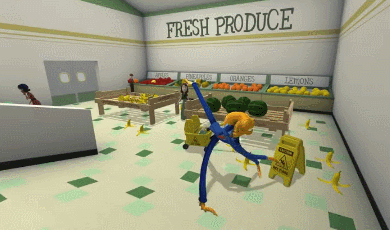
Octodad is collaborative. It’s an absolute nightmare to control, but for once my boyfriend’s muscle memory was actually a detriment. He would instinctively go to move like he would in other games, but that’s not how Octodad works. So he was rewiring his muscle memory whilst I was just a blank slate.
“Trigger to grab things? Yeah sure. Why not? I don’t know any better.”
It also hits that sweet spot of being short enough that the silliness doesn’t grow stale, and has a sincere enough story that you do become invested in the fate of the octopus in your hands.
10/10 Octodad. Highly recommend.
Other games in this genre that I feel would be worth a look:
- Man Fall Flat
- QWOP
- Surgeon Simulator
- Super Bunny Man
2. Hey! It’s Nintendo!
Ah Nintendo. It’s where most children start, so it seems like a logical place for a burgeoning gamer to begin. But specifically, what I want to recommend are the range of excellent Nintendo party games that are simple to navigate, fun, and often cooperative. I can’t play an FPS, but Mario Kart comes very easy to me…. Or as easy as it does to anyone. Similarly, Mario Party requires almost no video game literacy, and you can introduce it to your SO as “It’s just a board game that happens to be a video game”.
Although we do joke about Mario Kart and Mario Party being “friendship killers” because of their competitive nature and how easy it is to sabotage other players. If you are worried about these games maybe causing to much distress, I would also recommend the tried and true Wii Sports or the more modern 1-2-Switch. It has a cow milking game! It’s fun! And you can laugh at one another as you make terrible dick jokes.
I DO NOT RECOMMEND SUPER SMASH BROS. THAT IS NOT AN INTRODUCTORY GAME.
If you really want, play it on co-op team mode.
In summary, when picking a game to play with your SO my general recommendations are:
- make sure the game has very simple controls and linear movement (if any at all)
- or have a game with bonkers controls so you can learn them together
- avoid competitive games to start. Or play competitive games that require no video game literacy. The best FPS or Tekken player is NOT going to win Mario Party. It’s just luck.
Playing games this way with my partner is fun, but not how we usually play games. This is because if I want to play a AAA title, or maybe a great JRPG I’ve heard about, I have to move on to the second method.
Playing games where the gamer has the control and the non-gamer watches/participates via other means.
This is how my partner and I generally play games. Because my partner is the one holding the controller, navigating the game, combat and menus, I am not required to have any of that assumed knowledge I mentioned earlier.
But how can you make watching a video game compelling?
It’s actually not as difficult as you might imagine, but you’re right in that it does rule out a chunk of games. If you have grand dreams of your non-gamer girlfriend fawning over your sweet League of Legends skills… then I think you need a bit of a wake-up call. Competitive online games, FPS and sports games (such as FIFA) are generally not fun to watch. This isn’t a blanket statement! Some non-gamers could find these fun. But generally, if you don’t know the skill it requires to perform certain moves or strategies, or are unfamiliar with even the basic rules… these games just look like a mess.
Me watching someone play Overwatch: “Wow… I suddenly have motion sickness”
I find the most compelling games to watch are: Narrative driven
Think of all the games that are basically movies with some gameplay thrown in. Uncharted and the Tomb Raider reboot are just long form Indiana Jones movies. The Last of Us is a survival, drama, horror movie that makes you question your morals and how far you are willing to go to help humanity. The Witcher captures a rich narrative and lore comparable only to the Lord of the Rings films. The Yakuza series might be the best mob movie I’ve ever seen. All of these games are great and as engrossing to watch as they are to play. Lovable characters, compelling obstacles, and a good dose of spectacle keep them entertaining. Narrative driven games are my favorite to just sit and watch whilst my partner plays.
However, “narrative driven games” encapsulates thousands of titles, with some being more suited to watching than others. To help narrow down games that are enjoyable without a controller, I’ve narrowed it down into 3.5 sub categories.
1. Games with a looser/more predictable narrative, but the visuals are just so damn appealing
2. Choice based games – with the sub category of puzzle games
3. Mediocre games, but they’re fun
Each of these categories creates a uniquely different gaming experience, ranging from a cinematic “sit and watch” style, to a higher participation, more co-operative team based style. Let’s start with the first as it’s the easiest to define.
1. Games with a looser narrative, but engrossing visuals
Sometimes games will have a good story, but you’re just not sure if it’s good enough to sustain someone’s attention for 20+ hours. Maybe it’s a little predictable. Maybe you know the hero is destined to save the day. Will this be enough to hold my SOs attention?
And I think you are really the only one to answer that.
But let me first tell you about one of my favorite games, and probably only the second game I ever played with my partner.
DMC.
I fucking adore this game.

Eat my ass. It’s great.
But is the story that great? I mean it’s cool. Half angel, half demon boys. Long lost twin brothers. An evil demon who killed your father and has now essentially become a mob boss and corrupted your city. It’s cool. It’s interesting enough, but at the end of the day, you know Vergil is going to betray you. You know your cardboard cut out girlfriend(?) is going to be a liability. You know you’re going to defeat that demon boss with your big sword.
But god damn, if it isn’t a riot to watch. Devil May Cry has some of the most stylish and slick combat, that it’s really entertaining to just witness. You can cheer on your SO on as they climb up to a SSS ranking and maintain their combo over 5 whole minutes. The soundtrack is blasting. The level design and art direction are stunning. Watching Dante get dragged into Limbo is always an experience, and you’re never quite sure what you’re going to walk into this time. DMC still has one of the most inventive boss fights I’ve ever seen and I’m honestly waiting for another game to top it.
So, I think if your visuals are captivating enough… that can definitely save a game with maybe just a good to average story. It’s just a treat for the senses.
Other games I would put in this category would be:
- The Arkham games, particularly Arkham City and Arkham Knight. God the combat is just great to watch, with each punch really feeling brutal and heavy. The spookiness of Gotham is eerily beautiful, and finding all the easter eggs in the world is a real treat.
- The latest Spider-man game from Insomniac games
- Breath of the Wild – I just like… being in this game
-Nier Automata – this one is a bit weird. I wasn’t sure which category to put it in, but felt because of the interesting mechanics and gimmick of playing over and over again to reveal more of the world and story, I decided to put it here.
2. Choice based games
This is definitely my favorite type of game to play, and the one that I think is the easiest to engage with, despite the lack of controller in my hand.
The whole reason I started playing games with my partner is because he was playing a game and after a while I just… sat down… and started watching.
The game was Mass Effect 3, and I just became really involved in the story and the choices my partner was making. We have since gone back and played the entire Mass Effect series multiple times, and I feel it really exemplifies what is so fantastic about playing a choice-based game with a non-gamer.
Choice based games still allow your SO to be heavily involved. If you are letting your SO make choices, then they are still playing the game. Just because I wasn’t the one actively shooting Collectors does not mean I had no impact on our game experience. It was my choice to cure the genophage. My choice to spare the Rachni queen, and you can be damn sure that it was my choice to romance Garrus across the series. Choice based games are fantastic for keeping your SO engaged and the two of you can cultivate your own story and endure consequences together.
Obviously I love Mass Effect, but some similar games in this style would be:
- Until Dawn
- The Witcher
- The Persona series – but be careful! These games are long so may not be great as an introductory game
Visual Novels! – Visual novels are excellent for this! They’re purely choice based, and it doesn’t matter who is clicking the next button. For an added amount of goofiness, take on roles and do stupid voices. Do it. It’s great. Nothing makes me laugh harder than romancing an anime schoolgirl with an old man voice.
They’re short, but can be replayed for a different ending if you wish. My partner and I played Dream Daddy together multiple times and were avid about who our favorite dads were. I liked Robert and Craig. My partner liked Damian and Brian.
My partner and I have actually just started playing a new visual novel, but along with it being choice based, I would also classify it as a puzzle/problem solving game.
2.5 Puzzle/problem solving games
Puzzle games are great for a similar reason as choice-based games, as they keep your SO involved. Only this time they are helping to problem solve. Many times I’ve been able to figure something out before my boyfriend, so I can go “ohhhh take that, drop it here, then move that here” and it’ll work!
Currently we’re making our way through the Danganronpa series, which is a bit of a hybrid between a visual novel and puzzle game. It’s not a difficult game to control or navigate at all, so I could play it on my own, but I like playing it with my partner as we bounce theories off of one another and work together to solve a crime. I’ll remember certain pieces of evidence he doesn’t, or he’ll remember one throw away line from the opening 3 minutes of the game that is now an alibi. During free time, we’ll each pick a character to talk to, so we both get to learn more about our favorite characters.
“I wanna talk to Sakura because she seems sweet and I want her to have friends”
“Ok, then I’ll talk to Mondo because he seems funky.”
And so on. The process is collaborative.
Some games of a similar genre that might be fun:
- Catherine from Atlus
- Portal 1 and 2
- The Phoenix Wright series
- Resident evil 2 – this one is a bit odd, but resident evil 2 is almost a memory game as you work to remember all the things you’ve picked up, the pieces you need to unlock doors, and prioritize the weapons you’ll take with you. “No take the grenade rounds. If we’re going in the offices, we left that face hugger there, remember?”
Finally this brings us to our third category, and also the most difficult to explain. So I’ve just called it:
3. Average Games, but there’s just something enjoyable about them
Sometimes games are just… fun. Sometimes the story is alright, the gameplay is repetitive, but the characters and writing are just so inherently likeable or interesting that you can keep watching. For me, this whole category was created as a way for me to justify my fondness for the Saints Row series.
Saints Row is, on paper, pretty unremarkable. It’s a ridiculous series of games about a street gang coming into fame and eventually political power, and the outlandish things they have to do to climb that ladder. Often cited as a “GTA clone” the gameplay is repetitive and almost boring at times, with most of the missions falling into the “Go here, kill people” category. The world isn’t particularly pretty or interesting. It’s just a city. One that you’ve seen a million times if you’ve played any city-based open world game.
So why do I love this unremarkable series? Why am I oddly attached to these characters?
Ultimately, I think it comes down to the characters being written with a certain amount of honesty, and the interactions between them feel genuine and oddly heartfelt. I don’t really care about rival gangs or accumulating money, but if it lets me ride in the car and have another sing along with Pierce, then I’m going to do it.
I like the weird sexual tension between the Boss and Shaundi, which only seems to become more prominent if you play as the female Boss. I love Matt Miller and him ranting about his Nyte blayde fan fiction. I like finding out the Boss has read Jane Austen.
It’s just silly and fun, with a good amount of ridiculous spectacle. It’s definitely not a series that I could recommend. It just kind of appealed to something in me. I think there are lots of games that could fit this category. Most people will say that the Borderlands series is “Alright” but it has a lot of fun dialogue and characters who keep it entertaining. Similarly, despite lack luster reviews, I know a lot of people really enjoyed the 2013 Deadpool game because Deadpool was written just like he is in the comics.
This category is the hardest to nail, and you may go through several games that you think are “hilarious” or “crazy fun” that just don’t gel with your SO. That’s ok. As you play more, you’ll eventually be able to develop a sense of each other’s tastes and what will appeal to you.
General Advice in closing
TL;DR, here are some good parameters to stick to until you reach a consensus of what games your SO might enjoy.
- Games with a good story and compelling characters will always be entertaining
- If the combat is long and takes up a good proportion of the game, it should be visually interesting to look at. If the combat is repetitive or boring to watch, it should clip along at a good pace and only come in short bursts. Bonus points if there’s party banter!
- Start with shorter games, then build up. It’s a big demand on someone to sit through a 60+ hour game for your first few attempts. Maybe put that Tales game on the shelf for now.
I’ve tried to keep this advice general, but obviously you and your SO will have different interests, and you should appeal to those. I love anime. I love hot boys. Due to these factors, I am more than willing to sit through a long form JRPG about two rival noble boys, as it appeals to my weeb sensibilities. This is not something I would expect others to be able to do.
I generally don’t like films about heists or organized crime. It’s just not a genre that appeals to me, so asking me to sit through Grand Theft Auto is probably not the wisest choice. I have played GTA5 for those that are curious, and it’s not my favorite. It’s definitely not bad, and I do expect other non-gamers would be entertained playing through the story of it. There’s definitely a good story there! It’s just not one that satisfies all of my needs. Just like how I don’t expect every person to love sitting through God of War or Jak and Daxter.
Getting to learn each other’s likes and dislikes takes time. Favorite movies can be a bit of an indicator, but transferring to a different medium complicates things. The most important thing is to listen to each other and be respectful. If your SO doesn’t like your favorite game of all time, that’s not a personal insult. You are likely just experiencing the game in a different way than they are, and they can’t relate to that.
Along with being respectful, obviously don’t pressure your SO into anything. Sometimes you’ll find that your SO might not want to play games with you because they had such an awful experience trying to play with their exes or other friends previously. I know I was really hesitant to ever pick up a controller again after an incident where I couldn’t navigate my character over a log, because I was not used to controlling a camera, and was made to feel really stupid and useless. I threw up my hands and said “Fuck this shit” for a long time. Your SO might be hesitant to play games with you because they worry that you’ll just get frustrated with how bad they are. You can reassure them that this won’t happen, but it’s still their choice to say no.
At the end of the day, it’s ok to have different hobbies. You don’t have to share everything. If you are lucky enough that your non-gamer SO might want to try playing games with you, then be kind, and be patient. When picking games to play together, try to pick something you can both enjoy. Go on a journey together. Have fun!
It’s a game after all.
176 notes
·
View notes
Text
The King vs. Pawn Game of UI Design
If you want to improve your UI design skills, have you tried looking at chess? I know it sounds contrived, but hear me out. I’m going to take a concept from chess and use it to build a toolkit of UI design strategies. By the end, we’ll have covered color, typography, lighting and shadows, and more.
But it all starts with rooks and pawns.
I want you to think back to the first time you ever played chess (if you’ve never played chess, humor me for a second—and no biggie; you will still understand this article). If your experience was anything like mine, your friend set up the board like this:
And you got your explanation of all the pieces. This one’s a pawn and it moves like this, and this one is a rook and it moves like this, but the knight goes like this or this—still with me?—and the bishop moves diagonally, and the king can only do this, but the queen is your best piece, like a combo of the rook and the bishop. OK, want to play?
This is probably the most common way of explaining chess, and it’s enough to make me hate board games forever. I don’t want to sit through an arbitrary lecture. I want to play.
One particular chess player happens to agree with me. His name is Josh Waitzkin, and he’s actually pretty good. Not only at chess (where he’s a grandmaster), but also at Tai Chi Push Hands (he’s a world champion) and Brazilian Jiu Jitsu (he’s the first black belt under 5x world champion Marcelo Garcia). Now he trains financiers to go from the top 1% to the top .01% in their profession.
Point is: this dude knows a lot about getting good at stuff.
Now here’s the crazy part. When Josh teaches you chess, the board looks like this:
King vs. King and Pawn
Whoa.
Compared to what we saw above, this is stupidly simple.
And, if you know how to play chess, it’s even more mind-blowing that someone would start teaching with this board. In the actual game of chess, you never see a board like this. Someone would have won long ago. This is the chess equivalent of a street fight where both guys break every bone in their body, dislocate both their arms, can hardly see out of their swollen eyes, yet continue to fight for another half-hour.
What gives?
Here’s Josh’s thinking: when you strip the game down to its core, everything you learn is a universal principle.
That sounds pretty lofty, but I think it makes sense when you consider it. There are lots of things to distract a beginning chess player by a fully-loaded board, but everything you start learning in a king-pawn situation is fundamentally important to chess:
using two pieces to apply pressure together;
which spaces are “hot”;
and the difference between driving for a checkmate and a draw.
Are you wondering if I’m ever going to start talking about design? Glad you asked.
The simplest possible scenario
What if, instead of trying to design an entire page with dozens of elements (nav, text, input controls, a logo, etc.), we consciously started by designing the simplest thing possible? We deliberately limit the playing field to one, tiny thing and see what we learn? Let’s try.
What is the simplest possible element? I vote that it’s a button.
This is the most basic, default button I could muster. It’s Helvetica (default font) with a 16px font size (pretty default) on a plain, Sketch-default-blue rectangle. It’s 40px tall (nice, round number) and has 20px of horizontal padding on each side.
So yeah, I’ve already made a bunch of design decisions, but can we agree I basically just used default values instead of making decisions for principled, design-related reasons?
Now let’s start playing with this button. What properties are modifiable here?
the font (and text styling)
the color
the border radius
the border
the shadows
These are just the first things that come to my mind. There are even more, of course.
Typography
Playing with the font is a pretty easy place to start.
Blown up to show font detail.
Now I’ve changed the font to Moon (available for free on Behance for personal use). It’s rounded and soft, unlike Helvetica, which felt a little more squared-off—or at least not as overtly friendly.
The funny thing is: do you see how the perfectly square edges now look a tad awkward with the rounded font?
Let’s round the corners a bit.
Bam. Nice. That’s a 3px border radius.
But that’s kind of weird, isn’t it? We adjusted the border radius of a button because of the shape of the letterforms in our font. I wouldn’t want you thinking fonts are just loosey-goosey works of art that only work when you say the right incantations.
No, fonts are shapes. Shapes have connotations. It’s not rocket science.
Here’s another popular font, DIN.
With its squared edges, DIN is a clean and solid workhorse font.
Specifically, this is a version called DIN 2014 (available for cheap on Typekit). It’s the epitome of a squared-off-but-still-readable font. A bit harsh and no-nonsense, but in a bureaucratic way.
It’s the official font of the German government, and it looks the part.
So let’s test our working hypothesis with DIN.
How does DIN look with those rounded corners?
Well, we need to compare it to square corners now, don’t we?
Ahhh, the squared-off corners are better here. It’s a much more consistent feel.
Now look at our two buttons with their separate fonts. Which is more readable? I think Moon has a slight advantage here. DIN’s letters just look too cramped by comparison. Let’s add a bit of letter-spacing.
When we add some letter-spacing, it’s far more relaxed.
This is a key law of typography: always letter-space your uppercase text. Why? Because unless a font doesn’t have lowercase characters, it was designed for sentence-case reading, and characters in uppercase words will ALWAYS appear too cramped. (Moon is the special exception here—it only has uppercase characters, and notice how the letter-spacing is built into the font.)
We’ll review later, but so far we’ve noticed two things that apply not just to buttons, but to all elements:
Rounded fonts go better with rounded shapes; squared-off fonts with squared-off shapes.
Fonts designed for sentence case should be letter-spaced when used in words that are all uppercase.
Let’s keep moving for now.
Color
Seeing the plain default Sketch blue is annoying me. It’s begging to be changed into something that matches the typefaces we’re using.
How can a color match a font? Well, I’ll hand it to you. This one is a bit more loosey-goosey.
For our Moon button, we want something a bit more friendly. To me, a staid blue says default, unstyled, trustworthy, takes-no-risks, design-by-committee. How do you inject some fun into it?
Well, like all problems of modifying color, it helps to think in the HSB color system (hue, saturation, and brightness). When we boil color down to three intuitive numbers, we give ourselves levers to pull.
For instance, let’s look at hue. We have two directions we can push hue: down to aqua or up to indigo. Which sounds more in line with Moon? To me, aqua does. A bit less staid, a bit more Caribbean sea. Let’s try it. We’ll move the hue to 180° or so.
Ah, Moon Button, now you’ve got a beach vibe going on. You’re a vibrant sea foam!
This is a critical lesson about color. “Blue” is not a monolith; it’s a starting point. I’ve taught hundreds of students UI design, and this comes up again and again: just because blue was one color in kindergarten doesn’t mean that we can’t find interesting variations around it as designers.
“Blue” is not a monolith. Variations are listed in HSB, with CSS color names given below each swatch.
Aqua is a great variation with a much cooler feel, but it’s also much harder to read that white text. So now we have another problem to fix.
“Hard to read” is actually a numerically-specific property. The World Wide Web Consortium has published guidelines for contrast between text and background, and if we use a tool to test those, we find we’re lacking in a couple departments.
White text on an aqua button doesn’t provide enough contrast, failing to pass either AA or AAA WCAG recommendations.
According to Stark (which is my preferred Sketch plugin for checking contrast—check out Lea Verou’s Contrast Ratio for a similar web-based tool), we’ve failed our contrast guidelines across the board!
How do you make the white text more legible against the aqua button? Let’s think of our HSB properties again.
Brightness. Let’s decrease it. That much should be obvious.
Saturation. We’re going to increase it. Why? Because we’re contrasting with white text, and white has a saturation of zero. So a higher saturation will naturally stand out more.
Hue. We’ll leave this alone since we like its vibe. But if the contrast continued to be too low, you could lower the aqua’s luminosity by shifting its hue up toward blue.
So now, we’ve got a teal button:
Much better?
Much better.
For what it’s worth, I’m not particularly concerned about missing the AAA standard here. WCAG developed the levels as relative descriptors of how much contrast there is, not as an absolute benchmark of, say, some particular percentage of people to being able to read the text. The gold standard is—as always—to test with real people. AAA is best to hit, but at times, AA may be as good as you’re going to get with the colors you have to work with.
Some of the ideas we’ve used to make a button’s blue a bit more fun and legible against white are actually deeper lessons about color that apply to almost everything else you design:
Think in HSB, as it gives you intuitive levers to pull when modifying color.
If you like the general feel of a color, shifting the hue in either direction can be a baseline for getting interesting variations on it (e.g., we wanted to spice up the default blue, but not by, say, changing it to red).
Modify saturation and brightness at the same time (but always in opposite directions) to increase or decrease contrast.
OK, now let’s switch over to our DIN button. What color goes with its harsh edges and squared-off feel?
The first thing that comes to mind is black.
But let’s keep brainstorming. Maybe a stark red would also work.
Or even a construction-grade orange.
(But not the red and orange together. Yikes! In general, two adjacent hues with high saturations will not look great next to each other.)
Now, ignoring that the text of this is “Learn More” and a button like this probably doesn’t need to be blaze orange, I want you to pay attention to the colors I’m picking. We’re trying to maintain consistency with the official-y, squared-off DIN. So the colors we go to naturally have some of the same connotations: engineered, decisive, no funny business.
Sure, this match-a-color-and-a-font business is more subjective, but there’s something solid to it: note that the words I used to describe the colors (“stark” and “construction-grade”) apply equally well to DIN—a fact I am only noticing now, not something done intentionally.
Want to match a color with a font? This is another lesson applicable to all of branding. It’s best to start with adjectives/emotions, then match everything to those. Practically by accident, we’ve uncovered something fundamental in the branding design process.
Shadows
Let’s shift gears to work with shadows for a bit.
There are a couple directions we could go with shadows, but the two main categories are (for lack of better terms):
realistic shadows;
and cartoon-y shadows.
Here’s an example of each:
The top button’s shadow is more photorealistic. It behaves like a shadow in the real world.
The bottom button’s shadow is a bit lower-fidelity. It shows that the button is raised up, but it’s a cartoon version, with a slightly unrealistic, idealized bottom edge—and without a normal shadow, which would be present in the real world.
The bottom works better for the button we’re crafting. The smoothness, the friendliness, the cartoon fidelity—it all goes together.
As for our DIN button?
I’m more ambivalent here. Maybe the shadow is for a hover state, à la Material Design?
In any case, with a black background, a darkened bottom edge is impossible—you can’t get any darker than black.
By the way, you may not have noticed it above, but the black button has a much stronger shadow. Compare:
The teal button’s shadow is 30%-opacity black, shifted 1 pixel down on the y-axis, with a 2-pixel blur (0 1px 2px). The black button’s is 50%-opacity black, shifted 2 pixels down on the y-axis, with a 4-pixel blur (0 2px 4px). What’s more, the stronger shadow looks awful on the teal button.
Why is that? The answer, like so many questions that involve color, is in luminosity. When we put the button’s background in luminosity blend mode, converting it to a gray of equal natural lightness, we see something interesting.
The shadow, at its darkest, is basically as dark as the button itself. Or, at least, the rate of change of luminosity is steady between each row of pixels.
The top row is the button itself, not shadow.
Shadows that are too close to the luminosity of their element’s backgrounds will appear too strong. And while this may sound like an overly specific lesson, it’s actually broadly applicable across elements. You know where else you see it?
Borders
Let’s put a border on our teal button.
Now the way I’ve added this border is something that a bunch of people have thought of: make the border translucent black so that it works on any background color. In this case, I’ve used a single-pixel-wide border of 20%-opacity black.
However, if I switch the background color to a more standard blue, which is naturally a lot less luminous, that border all but disappears.
In fact, to see it on blue just as much as you can see it on teal, you’ve got to crank up black’s opacity to something like 50%.
This is a generalizable rule: when you want to layer black on another color, it needs to be a more opaque black to show up the same amount on less luminous background colors. Where else would you apply this idea?
Spoiler alert: shadows!
Each of these buttons has the same shadow (0 2px 3px) except for different opacities. The top two buttons’ shadows have opacity 20%, and the bottom two have opacity 40%. Note how what’s fine on a white background (top left) is hardly noticeable on a dark background (top right). And what’s too dark on a white background (lower left) works fine on a dark background (lower right).
Icons
I want to change gears one more time and talk about icons.
Here’s the download icon from Font Awesome, my least favorite icon set of all time.
I dislike it, not only because it’s completely overused, but also because the icons are really bubbly and soft. Yet most of the time, they’re used in clean, crisp websites. They just don’t fit.
You can see it works better with a soft, rounded font. I’m less opposed to this sort of thing.
But there’s still a problem: the icon has these insanely small details! The dots are never going to show up at size, and even the space between the arrow and the disk is a fraction of a pixel in practice. Compared to the letterforms, it doesn’t look like quite the same style.
But what good is my complaining if I don’t offer a solution?
Let’s create a new take on the “download” icon, but with some different guiding principles:
We’ll use a stroke weight that’s equivalent (or basically equivalent) to the text weight.
We’ll use corner radii that are similar to the corner radii of our font: squared off for DIN, rounded for Moon.
We’ll use a simpler icon shape so the differences are easy to see.
Let’s see how it looks:
I call this “drawing with the same pen.” Each of these icons looks like it could basically be a character in the font used in the button. And that’s the point here. I’m not saying all icons will appear this way, but for an icon that appears inline with text like this, it’s a fantastic rule of thumb.
Wrapping it up
Now this is just the beginning. Buttons can take all kinds of styles.
But we’ve got a good start here considering we designed just two buttons. In doing so, we covered a bunch of the things that are focal points of my day-to-day work as a UI designer:
lighting and shadows;
color;
typography;
consistency;
and brand.
And the lessons we’ve learned in those areas are fundamental to the entirety of UI design, not just one element. Recall:
Letterforms are shapes. You can analyze fonts as sets of shapes, not simply as works of art.
You should letter-space uppercase text, since most fonts were designed for sentence case.
Think in HSB to modify colors.
You can find more interesting variations on a “basic” color (like a CSS default shade of blue or red) by tweaking the hue in either direction.
Saturation and brightness are levers that you can move in opposite directions to control luminosity.
Find colors that match the same descriptors that you would give your typeface and your overall brand.
Use darker shadows or black borders on darker backgrounds—and vice versa.
For inline icons, choose or design them to appear as though they were drawn with the same pen as the font you’re using.
You can thank Josh Waitzkin for making me a pedant. I know, you just read an entire essay on buttons. But next time you’re struggling with a redesign or even something you’re designing from scratch, try stripping out all the elements that you think you should be including already, and just mess around with the simplest players on the board. Get a feel for the fundamentals, and go from there.
Weird? Sure. But if it’s good enough for a grandmaster, I’ll take it.
http://ift.tt/2BnocDc
0 notes
Link
The following blog post, unless otherwise noted, was written by a member of Gamasutra’s community.
The thoughts and opinions expressed are those of the writer and not Gamasutra or its parent company.
[Note: This post (originally published at darklorde.com) is all about the Engines of Play. If you are not familiar with Taste/Satisfaction Maps and their uses, the Big 5, Self-Determination Theory, etc, I highly recommend watching this video before reading the article. It will make so much more sense. Like, Oh Em Gee.]
A Random Encounter With Relic
I’m in San Francisco. It’s GDC, so the sidewalks of the Moscone Center are packed to bursting with nerds of every stripe. The day is bright. I cross Fourth street, on my way to Moscone North--and someone calls, “Jason!”
I wasn't surprised--it happens to me a lot at GDC. Stay in the games biz for long enough, and GDC will eventually become one big reunion.
What happened next, though, absolutely does not happen every day.
A friendly-faced fella pushes his way out of the crowd, and introduces himself as one Mitch Lagran, a Lead Designer at Relic Entertainment. While I unsuccessfully suppressed my fanboy reaction (because DAWN OF WAR OMFG), Mitch explains that he had attended my Engines of Play talk last year...
...and that Relic had actually implemented the methods I had laid out in that talk.
He claimed that he wanted to thank me for it because it had made a huge difference to their process and was great stuff. I stared at him and tried to think who had put him up to this.
I mean, no one actually implements that stuff. Come on! That’s not how the GDC works!
The GDC is supposed to be a place where you go and listen to people talking about lessons and techniques--ones that you desperately wish you could apply because wow it would make your dev life so much better--and then you go back to your studio and everyone tells you about how yeah maybe that stuff worked for those guys, but that it won’t work here, see, because our situation is different.
And then you sigh, and maybe you try again in three months. Eventually you just go about your business.
GDC is not where RELIC FREAKING ENTERTAINMENT goes to find whole new process for their game conception phases.
But, here’s this guy, and he’s shaking my hand, and he's expressing his gratitude and his appreciation, and I so I play it cool and say, “Really?! You… actually used my stuff?!?"
He nods.
I ask, "Uh… so, what happened?!”
He told me. Later, he sent me a more detailed description of what the results had been. And what he said blew my mind.
So, I asked him if I could write it up, and share it.
A More Proper Introduction
That’s the back story for what this post is about. Ladies and gentlemen, I would like to present something akin to an actual case study for what happens when you apply the Engines of Play (which includes these charts called Taste Maps, and the process of analysis that goes into them) to a real dev environment.
Hrm.
By “actual case study” what I really mean is “the guys at Relic were kind enough to describe in some detail what they did with the ideas, and what the results were”. That isn’t quite a full case study. It's more like a front-line report or something. BUT STILL. CLOSE ENOUGH.
I mean COME ON! How often does this kind of thing just happen?! Never. That's how often.
A quick reminder: The Engines of Play is a way to figure out what kind of player taste you are trying to target with your game, in a way that is quite a bit more specific than “achievers” or “shooter players”. The methods involved do require a little bit of coming-up-to-speed, but they benefit from being both fairly intuitive and being backed up by systems that have a metric-fuck-ton of academic white papers and research done on them.
Remember all that? No? Well, here's a couple of videos for you.
Good now? Great!
A Conversation With Relic
I mentioned earlier that Mitch Lagran was kind enough to send me a long description of how he and his team have used said Engines. For our purposes here, I think it’s best if I let Mitch speak for himself.
Mitch: Hey Jason, it was nice getting to meet you down at GDC. Hope you had a good one this year.
Likewise. You have a cool beard.
Mitch: Given that you seemed interested in feedback around our use of Engines of Play at Relic, I figured I’d give you a run-down of how we’ve used it and how it has worked out.
You da man.
Prepro: Good
Mitch: It’s worth keeping in mind that we are still early on in our production, so we haven’t started adapting your model with a production oriented mentality yet. I’m guessing that when we do, there may be some slight shifts on how we use it to communicate.
I can tell you from experience that its use in production is likely to simply diminish. Once the key design targets have been set, we found that the model drifts into the “background lore” of the project. It doesn’t seem to be all that useful during the meat of production.
We did find that near the end of production we experienced a brief resurgence in interest in the work. As we prepared our communication plans, and as the game was starting to come together, there was a storm of new conversations around confirming whether or not we had built what we had intended to build--and Taste Maps are great for that.
At that point, too, there were a lot of new people coming onto the project who had not been exposed to the method, and both found it surprising that we had done all that work so far in advance and found it surprising that it seemed to work.
So: high use in preproduction. Low use during production. Brief flurry of use right as the launch plans are being discussed in earnest for the first time. That was our experience, anyway.
I look forward to learning whether or not your experience turns out to be similar!
Broad Appeal
Mitch: Overall we’ve found a fairly strong degree of success in using it both as a design lens and as a communication tool for the team.
It came along as part of a larger initiative pushing towards more intent driven design and as a part of a broader design structure shift, so it is a bit difficult to separate its effects from everything else, but it has been called out as a valuable part of the changes.
It has seen praise that extends from our executive level down to junior devs, which seems pretty damn impressive to me.
I know, right?!?
That was the part about this approach that surprised me the most—that so many completely different groups of people involved in the production found it to be useful.
I originally designed the approach as a tool for designers, and expected that the sell would be a hard one with the marketing and business teams. But we found quite the opposite to be true! The biz people were enthusiastic, and (in my experience) already prepared to look at our game through this lens. Instant adopters.
I am psyched to hear that this might be a repeatable phenomenon.
Satisfaction Is Hard
Mitch: Generally, taste maps have had a stronger adoption than satisfaction maps.
I think that may be partly due to me not having pushed satisfaction maps quite as strongly, so it’s something I am planning on trying to work on (especially because I want to ensure that we have a strong connection to the PENS model on our team).
However, I also think that it is because Taste Maps include a more visual component, so team members find them easier to latch onto and express. Given that, I am hoping to explore some ways to present the satisfaction maps / PENS model in a way that will give people a stronger connection to it.
I found the same thing. I think there are many complicating factors here.
Here's one: I found that discussing satisfaction is just harder than discussing taste. My theory is that because its effects are so much more remote than the immediate-gratification of taste that most people are simply under-prepared to think about the whole concept. I know that I was, and that it took long years of effort to really get the feeling for how satisfaction works. It’s still a work in progress for me, in fact.
That said: wow is long-term satisfaction important. I have come to understand that if you make a game that only offers short-term taste satisfaction, that people will play it for 30 minutes and then never come back. The core three satisfactions of Self-Determination Theory / PENS give us the reasons why people will come to believe that your game is worth spending some of their precious time on this planet on.
It is tricky to think about. But learn it: the success of your game depends on it.
(I agree with you about the part about the visual component for SDT kinda sucking. I think the way I laid out satisfaction maps was sort of a cop-out, and deserves a better approach than just “fill in these three boxes”. We’ll see if something better can be developed.)
Brand Analysis FTW
Mitch: As our team is not working on a new IP,
(FOR THE EMPEROR!!!!)
we might have had some different uses for it than you on For Honor. Specifically, we went through an early exercise analyzing past entries in our franchise using taste maps and satisfaction maps.
That’s... so... cooooooooooool!!
Mitch: This was part of a larger effort aimed at a reverse / hindsight engineering of the overall creative direction of the franchise. Engines of Play was a hugely valuable tool in this process.
It gave us a strong lens to view the successes of the franchise through. We then used that to base future development off of.
We basically took the franchise maps as a base that we should build on, and used the taste maps as a way to choose targeted areas we wanted to improve. Our output was ultimately an overlay of the two, showing the original franchise maps with our targeted improvements on top.
This also gave us a tool to discuss the scope of both improvements and maintenance (the latter being the amount of work required to maintain the same degree of success in any specific axis in a modern iteration of the franchise).
So basically, if we had rated the franchise has having best-in-class coop in the initial taste-map, we did an assessment of how changes in coop play in modern games would affect our ability to hit that mark.
From there, we would choose specific areas where the past franchise had scored lower and we felt would be strong candidates for ratcheting up the next iteration, based on how feasible it would be to fit into our scope and how closely the different axes aligned with existing creative direction.
I am so impressed by this. I had some vague notion as we were working on this that you could maybe apply taste maps to genres, or something, but I never investigated it. What you describe here, with taste map overlays (overlays!!) frankly seems so obvious now that you’ve explained it that I am going to just adopt it into my design process.
I also adore the idea of re-evaluating the viability of your features through the lens of “are we still best-in-class?” during pre-production. That sounds to me like a process that literally everyone involved in production could get behind, understand, and participate in.
Good one, guys.
Brand Satisfaction Is Stable
Mitch: In the process above, Satisfaction Maps were used in a similar way. We used them to establish where the sense of satisfaction has come from in the past, with the idea that we can use that as a required foundational base.
Basically, it gave us the parts of the game we should not disturb, but should instead aim to improve and build around.
It’s funny, right? Satisfaction theory (SDT, etc) is so damned important, but once the core pieces are in place and working (which, if you have made a successful game, must be true), you can then largely rely on them.
Building a game with a high opportunity for mastery, or with extensive customization and self-expression options, or with strong social systems that give the player a clear idea of where they stand in the community—these are things that players will always want, in some form or another. So, you’re right: if that part ain’t broke, don’t fix it.
That said, if you discover in your analysis that one of your three satisfaction pillars is a tad weak, then a new version is a perfect time to shore that up. It will always pay off, if you can execute on those features well.
It Brings Out Disagreements Early
Mitch: Our process of creating our own taste maps saw initial discussions of franchise maps, followed by members of our senior leadership team each creating their own versions of what our taste maps should be. These were then used as discussion drivers in creative meetings aimed at establishing our direction.
We often found that one member of the team would have a significantly different take on where we should target on a specific axis.
This would tend to indicate a very different perspective, which was useful in driving discussion and debate. It also resulted in a large portion of our team having a deeper understanding of our direction and a sense of ownership over it that they hadn’t in past productions.
I’m going to go ahead and state that I think you have hit on the #1 most valuable part of integrating this tool into a dev team’s process.
What happened for you is exactly what happened for us. And, resolving those differences and disagreements about what we were shooting for (years in advance of the game’s release!) produced several key things (some of which you mention above):
We caught the disagreements ahead of time, before they could cause much damage (in the form of lost work or game incoherence).
Once the disagreement was resolved, we all had a clearer idea of where we were all going.
Collectively, we had more confidence in our direction, since we all understood why we were targeting that specific feature or experience.
Having the why in place well ahead of ramping up for production meant that when we did go wide and started working on everything at once, our key leadership all were very clear about the vision and the goal, and in a way that was easy to remember.
It is difficult to measure how valuable this was. The effect of that knowledge would be that we would not need to have as many discussions on this topic, so how do we measure the impact?
Still, my experience on other projects tells me that it mattered quite a lot. Since we already understood the goals, we didn't improvise quite as much. I believe it was a huge part of our success.
Some Axes Are Unclear
Mitch: Through the process of discussing our Taste Maps, we ran into several tension points where there was disagreement and uncertainty on what the different axes mean.
A lot of discussion, for instance, revolved around the differences and specific definitions of Multiplayer, Solo, Coop, and Combat.
This wasn’t necessarily a bad thing, as it gave our team a valuable tool to align our own definitions of these things. However, our experience was that there was a degree of uncertainty in the specific meanings of the axes, which could result in each team using the model with customized definitions, making cross-team communication a bit more difficult.
We found similar problems, and sometimes around the same axes. I think those ones could use a naming update.
If I were to approach that problem today, I might do something like this: Crowd <—> Alone (NPCs don’t count, only real people), and Together <—> Against.
I’m not 100% sure that this would resolve the problem. But that’s how I see it today.
Would Be Great To Have Personas
Mitch: I have noticed a bit of an issue around the need for more memorable or chunky information from the maps, but I think this is basically solved by what you mentioned around building some player personas.
[ Reader: The context for this is that there is one part of the whole mapping process that I didn’t find a good way to explain in my GDC talk (given the time constraints and the amount of information I was already downloading onto my audience): player personas.
What we did (in brief) was to take our taste maps and then generate four imaginary players that covered all of the most extreme tastes in our chart (by simply placing four dots on our map, one dot per Domain, in the furthest corner of the taste zone). We then generated some basic demographics about who they might be.
At that point, we could use those personas as a more accessible way of talking about what the maps meant in terms of real players.
So... I shared this info with Mitch on the sidewalk at GDC when he mentioned some of the challenges he had faced using the system. After I got done explaining the missing link, he looked at me...
...and for a minute I thought he was gonna punch me or something. Like, “DUDE. WHY DID YOU NOT MENTION THIS IN YOUR TALK.”
But then he smiled, and said something like “Yeah! I bet that would do it!” and moved on.
He didn't punch me at all! Nice guys, these Relic people! ]
Mitch: I attempted to improve it a bit for our team by breaking out some broadly categorized player types based on our maps, but I think your idea of building more fleshed out characters would work better.
The main issue is just that people sometimes have troubles keeping the maps as a whole in their mind, whereas more chunked info like “George” or “Skilled Builders” is a bit easier for people to grok and use in discussion. So a tool like the personas you described seems like a pretty solid add-on to the existing model based on our experience.
Yup. I wish I had presented it in the first talk. Maybe the next one!
It Reduces Team Tension
Mitch: A major benefit I’ve found has definitely been the ability for the design team to specify our focus and intent based on the taste maps to other team members.
This has actually relieved a lot of tension on our team related to past projects. I’d guess you may have seen similar things on For Honor, but because RTS games are a bit of a niche it’s helped us communicate much better why specific team members aren’t connecting with our current drives (eg: team members who may be more strongly attached to building and solo gameplay and don’t connect with the game while we worked on skilled multiplayer focused features are no longer uncomfortable with the situation).
Yes! Yes, yes, yes. And, furthermore, YES.
One of the hardest moments to get through smoothly in game development is the moment where a dev who is working on a feature says “well, I don’t even get why we’re making this. I mean, players want <the opposite of what the feature offers>, not <the thing the feature offers>.”
Awkward.
Because what do you do? At that moment, your team member is not asking to be educated about the broad variety in player tastes, and probably has been simmering on this gripe for quite a while! It’s a moment that is fraught with peril for a team culture…
…and having the taste map to refer to is an amazing method of short-cutting the assumption of unanimity among players that is the core problem there. The chart demonstrates in clear terms not only that variety exists on these spectra, but what the positive opposite of your personal taste actually is.
We found exactly what you have found: a team that understands the broad variety of their player’s tastes can work more smoothly, because then your personal taste doesn’t have to be treated as though it were right or wrong.
Seems Like It Works
Mitch: The TL;DR is that your model is definitely working well for us. There’s some tweaks I’d like to make on our usage around satisfaction maps and getting more digestible player types, but overall it’s been great.
Thanks for going to all the work of putting together your model and process and sharing it by the way, it’s been super helpful for us.
Nothing beats learning that the work has actually mattered to someone else, man. Thank you.
Conclusion
What is so amazing to me about Mitch’s commentary and his team’s experience of using the tool is how precisely it mirrors our own experience. It would be one thing if the tool simply worked as designed, right? But here, what I see is that the exact same follow-on effects have developed on his team.
The increase in clarity and commitment. The broad acceptance of the tool as valuable. The decrease in tension.
These appear to not only be effects local to the For Honor team. Once is a fluke, but twice is maybe a pattern.
If the deployment of the Engines of Play into a project can produce those kinds of effects even just more often than not, then that goes a long way towards demonstrating that maybe it isn’t just a pretty model.
I’m excited to be able to make the claim that maybe it’s actually a good idea, and to have some data to back it up.
Thanks, Mitch, for taking the time to share your team’s experience. Thanks, Relic people, for letting me write this piece. And thanks to all the amazing devs at Relic Entertainment: congratulations on a huge launch. I look forward to enjoying your games for many years to come.
0 notes
Last Seen Blogs

143staytiny
A Flower For You?

hunterjanda88
Untitled
stevesleftboobgrab
Untitled
naariel
Naariel Illustrations

thatfan290
Unbetitelt