#indanthrone blue
Text
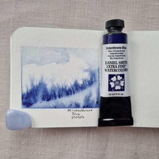
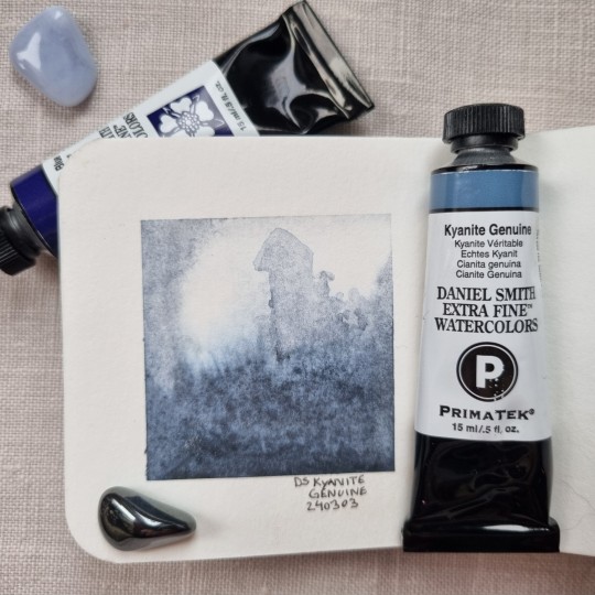
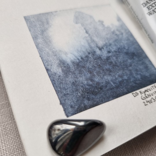
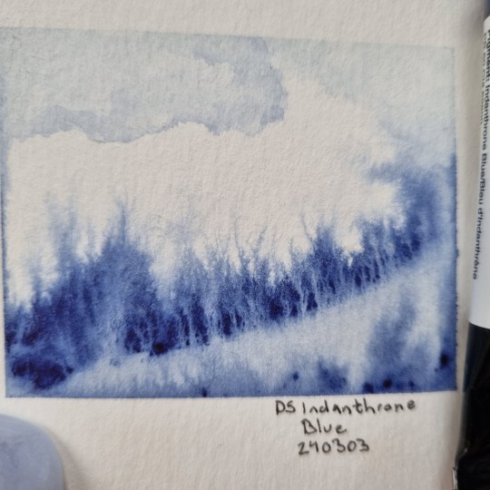
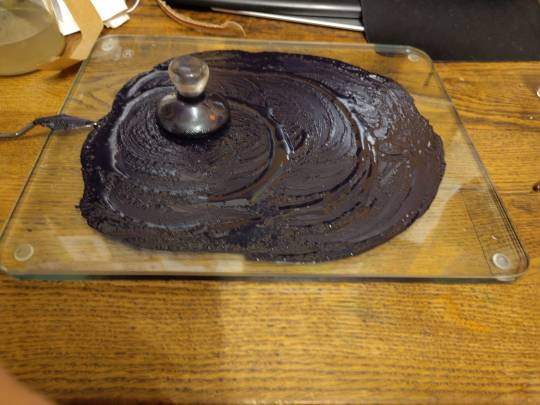
I got two new Daniel Smith Watercolors this weekend and tested them out on wet on wet and let the paint and wter basically do it's thing on it's own. Once dried I tried to make a castle in the background on one of them, I just don't like how the castle came out (too thickly made tower for example, should have been made smaller)
Kyanite Genuine is a paint with crushed Kyanite in it, which makes the paint sparkle a tiny bit. ❤️
#Art#watercolor#watercolorart#daniel smith#artportfolio#traditional art#kyanite genuine#indanthrone blue#illustration#minipainting#painting
8 notes
·
View notes
Text
Me all day yesterday: Ooohh and then tonight I'll make some Cool Cat, my perylene maroon!
Me, last night:
Ah yes, so red.
(I had a quarter pan of Cat's Pajamas standing forlornly around and wanted to fill that up first)
2 notes
·
View notes
Text
Today’s SoC will be up sometime this evening. In totally, completely unrelated news, I have discovered I enjoy painting with a limited color palette. ^_^
Also, I’m so so SO late checking my notifs, for which I apologize profusely. Anyway, Sarek is coming (heh) a little later! 💖 - DSD
#deepspacedukat rambles#I'm not saying I'm gonna be a lil late because I lost track of time while painting...#but I'm also not NOT saying it...#iykwim#indanthrone blue + burnt sienna watercolors if anyone was wondering#probably nobody was but there ya go
3 notes
·
View notes
Text
Pigment Blue
Pigment blue is one of the oldest pigments known to mankind. It is widely used in food, medicine, printing, and dyeing industries. The application of indigo as a fabric dye can be traced back to at least 2500 BC. Some clothes worn by ancient Egyptian mummies and blue linen fabrics unearthed from Mawangdui in China are dyed with indigo. A branch of Yao nationality in China is named "blue indigo Yao" because of its unique technology of producing and using indigo-dyed cloth.

0 notes
Text


"What if an old anime promo art was also a 1920s-1930s Shanghai commercial poster?" feat. Qi Dandan
ho hoo, anything to trick me into doing digital painting I suppose
Previously posted on Patreon for patrens, where I also detail some info on its inspirations.
127 notes
·
View notes
Text

fallen - unfinished gouache/watercolor plein air studies
I have been making my paint palettes portable, telling myself I Should go outside to paint studies from life while I have access to a yard. but the process of plein air painting, even in the yard of the house where I live, was enough to put me into a flare.
it was a bad time, actually, carrying everything out there (and trying to do it with my dog attached). and the standing, maneuvering, trying to see details while balancing my work and the palette, realizing I was already in pain and pushing through…
I didn’t make a good composition for the view I did have (mid-distant), and standing/leaning to view and paint moss without sitting in the mud (so wet) for the composition I liked (closeup) were bad decisions.
I was making bad decisions the whole time, very pain brain of me. I hadn’t brought any titanium white outside, and for some reason I thought my pastelized indanthrone blue would be FINE? as a substitute?!?! after I did that, I considered the painting failed and packed it up.
I said I would plein air paint, and I did. so I met my goal, and that was a success.
If I wanted to try again, I did learn some things that I could improve on. (defining/blocking composition way sooner, watching more James Gurney).
but like… maybe plein air isn’t for me anymore? and that’s okay.
I guess I don’t hear many artists talk about when their disabilities are disabling.
1 note
·
View note
Note
Get to Know Me Uncomfortably Well
5, 28, 50, 94 🩵❤️
5. What is your favourite colour?
Goes back and forth between dark-ish, rich blues like cobalt and indanthrone and cool greenish blues like turquoise and teal.
28. What type of music do you like?
I actually enjoy a wide range of music. Jazz, Metal, Rock, Electro Swing, EBM, Synth Pop (gimme some Depeche Mode any day), Neue Deutsche Härte, some pop, some Dubstep .... It all depends on my mood.
50. Left or right handed?
Right dominant, but getting more ambidextrous.
94. What are your strengths?
I do like to think that I am good at allowing myself to change my mind on things where I've been proven wrong and I know when to admit I fucked up. It'S my two strengths I'm most proud of.
1 note
·
View note
Text
there are so many names specifically for colors that sound like toxic chemicals. dioxazine purple. indanthrone blue. cadmium orange. carmine. celadon green. phthalo green and blue.
and then, on the other end, there are color names that are like from types of dirt they used to make paint from. all of the colors of ochre. raw and burnt sienna. raw burnt and light umber. vermilion
#cadmium is like actually toxic so it's an outlier.#most of the colors are being marked as wrong by spell check for some reason
0 notes
Text
Swap palette sans

SWAP PALETTE SANS FULL
SWAP PALETTE SANS PLUS
+increased guaranteed hitstun on j.s by 2f (7->9).
-j.s active frames increased by 1 (4->5).
+reduced startup on all air normals by 1f.
To see complete mixes using four of these five colors, see my downloadable 14-color palette mixing chart.Īnd I'm totally open to new ideas, so I'd love to hear about your favorite pigments for capturing coastal scenes! Leave me a comment to share your favorite seaside hues. If it works, I'll let you know!Įven if you don't whittle your seaside palette down to five colors, I hope this gives you a few ideas about what these amazing pigments can do. I may bring my palette up to 8 colors and see if I can use that year around.
SWAP PALETTE SANS FULL
And through I enjoy the ease (and even the challenge!) of only 5 colors, I find myself often waiting until I have my full palette to paint certain scenes. We are constantly on the go, and my goal was to see how little I truly needed during our outings to the beach. So will I stick with only 5 colors for painting the sea? Summer is the busiest season for our family of four. Crimson can also look lovely in shadows and foliage like in the beach path sketch above. It can also be used to make a serious black- great for capturing lighthouses and other seaside structures- or fabulous purples which often show up in the water and sky. For deep orange sunsets, mix with yellow. I rarely see sunrises or sunsets around an ocean without some serious pinks in them, and most of the time these crimson hues will be reflected on the sand and sea.Īlso, Alizarin crimson's mixing range is vast. I wouldn't call it necessary but, wow, how I would miss it! I keep Daniel Smith's Quinacridone Rose (PV19) in my permanent palette, but right now I prefer crimson's boldness at the beach.Ī cool red works wonders for skies around coastal areas. Clear, reflecting colors tend to capture the coastal light much better than warm opaques, so for the most part I'm sticking with Hansa. However, I tend to avoid orange-ish yellows at the seashore. I also use AZO Yellow (PY151), and I even substituted Yellow Ochre in the coastal painting below because I knew I needed a warmer, more opaque yellow for this scene. Use a mixture of wet-on-wet and dry techniques to get the best effect.Īlmost any cool, clear yellow works well for sunshine and when mixing greens for water, grasses and foliage like in the maritime marsh painting above. Since sand is so pebbled and shows every footprint and indention, I like to pack a small toothbrush to make splatter effects with the earth tones. It is a beautiful color, adding warmth to sand and excellent in mixes. In fact, if I were to add a sixth color to this palette, it would be burnt sienna.
SWAP PALETTE SANS PLUS
However, I do like the variety Buff provides plus the way it works to tone down other colors in mixes.ĭepending on the color of the sand in your area, burnt sienna could be substituted for either of the earth tones in this palette. If you want to pack ultralight, Buff Titanium is super convenient for sand color, but watering down raw umber can produce almost the same effect. Plus, Phthalo green with yellow or raw umber can produce a beautiful range of greens that are useful in a maritime landscape.įor more examples of various blues for sea and sky, see my post on The Best Blue Watercolors. Ultra-strong Phthalo is ghastly alone but mixed with ultramarine it creates a gorgeous Caribbean blue. If I were traveling to a tropical destination (note to Husband: trips make great anniversary presents!), I'd be tempted to add Phthalo green. Though I can obtain similar by mixing ultramarine with raw umber, it is easier and faster to reach for this deep, indigo shade. If you want to capture a smoky sea and sky like in the photo, swap out the yellow (which you won't need) or even the ultramarine for Indanthrone Blue. If I added a blue, I'd choose Manganese Blue Hue (PB15)- great for clear skies! Cobalt is another popular blue that is cooler than ultramarine but can work well. Mixing with a touch of yellow creates a gorgeous seagrass green.ĭepending upon your location and/or subject matter, you could swap out ultramarine for something else, or even add a blue. Ultramarine plus buff produces a light, more opaque blue- perfect for certain sky conditions. Almost any seaside painting begins with blue, and I prefer ultramarine because of its warmth and beauty when mixing.įor example, ultramarine plus raw umber produces a beautiful range from smoky gray to deep blue.
0 notes
Text

It's been a bit quiet here, but I have made several new paints, among which Cat's Pajamas, an indanthrone blue.
2 notes
·
View notes
Photo

A watercolor and guache painting
#warercolor#watercolour#watercolor painting#paint#painting#art#artists on tumblr#illustration#eye#surreal art#portrait#flowers#Indanthrone blue#Daniel Smith#arches
20 notes
·
View notes
Photo


my new favourite hobby is just putting my watercolour pans into gradually smaller and smaller boxes
#sorry for pigment blogging ive been going slowly insane watching denise soden's pigment videos#i want. PERYLENE GREEN.#i want quinacrodone gold & burnt orange & magenta…#i want INDANTHRONE BLUE???????#i will use up at least One Pan Of Paint before i buy more pigmence i promise but. i AM crying though#shut up phee#supplies
346 notes
·
View notes
Text
Tidied up my Robin Hood painting from last night’s art hangout!
Materials: Daniel Smith watercolour + Turner gouache on Arches Rough 300 gsm.
Technical thoughts:
- sloppy anatomy, based on an older sketch
- DS Indanthrone Blue has a shine in masstone. Not sure what that’s all about
- I want to understand DS Cascade Green more
- DS Moonglow + rough paper = easy stone texture, although not lightfast
9 notes
·
View notes
Photo
Day 3! I got a bunch of new paint for my birthday in April and I’ve only been able to use a couple of them in full paintings so far, but I managed to use 4 new colors in this piece! (Indanthrone blue, cobalt blue, green gold and sleeping beauty turquoise) I deviated a bit from my color comp, but decided not to add the Quinacridone Rose to the tail and keep with a much more blue-centric color scheme. It was a good choice, I think. . . . . . #art #artistsoninstagram #artistsofinstagram #mermay2021 #mermay #mermaid #watercolor #painting #danielsmithwatercolors #archeswatercolorpaper #🎨 #🧜♀️ https://instagr.am/p/CObGrX3jFaP/
23 notes
·
View notes
Text
Daniel Smith Extra Fine Indanthrone Blue

First: To describe my swatch cards. They are lazy. Incredibly lazy. Upper left is "Mass tone and bloom back". Upper Right is "gradient and very lazy opacity test". Bottom Left is "Even lazier lifting test." I do them this way because that's what works for me.
DS' Indanthrone Blue is an absolutely gorgeous, complex, "ink blue" - y'know how some old blue ballpoint pens had an almost... metallic purple sheen to the ink if you really went hard? This is that color, including the warm, pseudo-metallic, flash.
DS's featured swatch appears far, far, far, warmer and more purple than my own. https://danielsmith.com/color-stories/indanthrone-blue/
A good descriptor for this one is "blue jeans".
Pigment: PB 60 | Series: 2
Lightfastness: I – Excellent
Transparency: Transparent
Staining: 3-Medium Staining
Granulation: Non-Granulating
3 notes
·
View notes
Last Seen Blogs

thatsleepyre
Sleepyre

jakkesalgs-blog
parajumpers masterpiece passport


therivercastle01
New Launch Property In Lucknow

jawstore
Jawstore