#i like the composition of this one. kinda neato
Note
ou say that Sol is kinda scruffy and I do think you capture his "so tired he's tattered" vibes in your drawings. That being said, I feel said Sol drawings have a pretty vibe to them too at the same time? Like he's pretty? I'm not even into guys but even I can tell he's a bonafide pretty boy with a stoic yet melancholic expression. *marge voice* I just think it's neato and I can't think of other words aside from your Sols are pretty men.
Shout out to the flowy way you draw the ponytail, it's so unique and recognizable!!
Hahah thank you so much!!! For the most part, I really like all of Sol’s designs throughout the history of GG, but in some of them he’s definitely got that pretty boy thing going on and I try to channel those drawings in particular when I draw him. I’m gonna stick the ones I reference the most under a readmore down below and you’ll see what I mean.
I LOOOOOOVE drawing long hair with all my heart. The flowing shapes and organic nature of it is very calming to work with. I’d really like to draw Sol without his Gear suppressor some day so I can really go ham with his hair (since even the top is long without the suppressor) but I haven’t thought up a composition I like just yet...
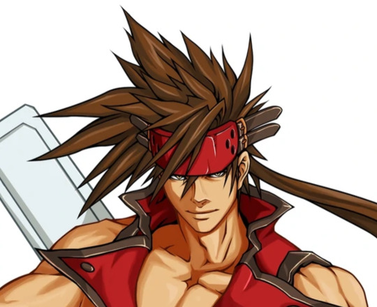
Sol’s XX art from the Accent Core version art update is probably the oldest art I reference for his face. He’s got those iconic eyebags in this art, but the dark lines on the outer parts of his eyes give the impression he’s got some glorious eyelashes too. I’m not actually sure if Daisuke did this art or not. The style is pretty different from how he drew during that era and it’s digital art. But some of his recent art is in this clean cell shaded style so who knows.
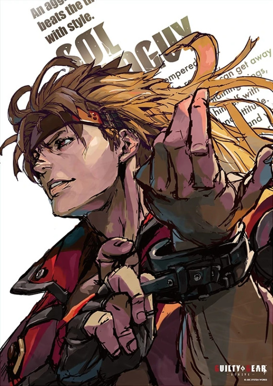
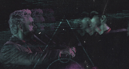
I’m gonna paste the entire image for this because it’s for real one of my favorite official Sol illustrations and I’m GRUMPY that I can’t find a high resolution file of it anywhere. It was done for a GG x Seiko collab where they made Sol themed watches. The watches came with a print of this. Daisuke made Sol exceptionally beautiful in this one for some reason and every day I am grateful. Look at those pretty eyes and voluminous mane.
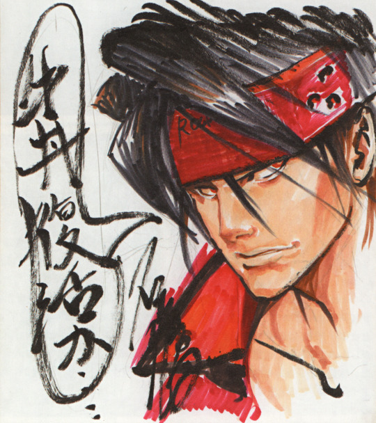
Last one. This was done for a caption contest for Gemaga magazine in December 2006. It’s in the GGX art book I post scans from but I’m never satisfied with my translation for the caption that goes with it so I’ve never posted it... Daisuke made him really pretty here too, even though it was just a doodle on a piece of card. I like how he’s kinda got cheekbones in this sketch and the shape of his eyes too, even if they don’t have the big eyelashes lol
This was the winning caption and I’m pretty sure he’s saying something like ‘Is there gyuudon/has the gyuudon come back [in stock]’ but I’m REALLY BAD at reading hand written Japanese ahh........ Gyuudon is a rice and beef bowl.
Sorry that got kinda long ^^;;
#asks#I could talk for 90000 years about Sol art I really like rofl#Thank you for the compliment again though <3
2 notes
·
View notes
Text
Editing tips, I guess?
Hey uhhhhh, so I've gotten lots of new followers over the past few weeks and wanted to do some kind of thank you?? Also, I have seen a fair share of "omg HOW" in the tags on my edits (which??? always make my day?? my week??? my life????)
Anyway, I thought I'd share some of my ~techniques with y'all? So here goes:
(lmao this got really fuckin long so cuuuuuut)
1. Make EVERYTHING a Smart Object
Okay, maybe not EVERYTHING, but seriously. Do it. It will save ur editing life. You ever shrink something down and then an hour later change your mind and decide you want it bigger? If you're not using a smart object, it’ll get blurry when you scale it back up and you’ll be fuCKED!
To make a layer/group a smart object, just right click on it in the layers panel and select "convert to smart object". This makes Photoshop store the layer's original data in a separate space for safe keeping (an embedded .psb file, to be exact) -- so you can shrink it and enlarge it as many times as you want without any lossiness.
As soon as I paste/place a screencap, texture, or whatever into my document, the first thing I always, ALWAYS do is convert it to a smart object!!
Why, you might ask?? Continue to item No.2 :)))
2. Harness the POWER of Smart Objects!!
The reason I am obsessed with Smart Objects is because I am obsessed with making any edits as non-destructive as possible. If you use “Image > Adjustments > Levels/Selective Color/etc” on a regular layer, that’s a destructive edit. Same goes for any Filters (such as blur/sharpen) and transforms (Warp, distort, perspective). You lose the original data that was there and the only way it can be undone is with ctrl+z. Might not seem like a huge deal at first, but if you keep chugging along for an hour and decide, “hmm, maybe i went too hard on that levels adjustment after all...” your only options are deleting the layer and starting over, or uh... hoping it’s still in your history panel.
However, it's really easy to avoid destructive edits when you use smart objects!! Because all those adjustments, filters, and transforms become “Smart Filters”. Smart Filters have all the non-destructive advantages of performing these adjustments via adjustment layers, but have the added bonus of ONLY effecting the layer they’ve been applied to, instead of cascading down and effecting all the layers beneath. (Which can be a good thing sometimes, but that’s a whole other topic)
Smart filters are attached to their ‘parent layers’, and can be hidden, deleted, or modified (by double-clicking their names) at any time:

Can I hear a wahoo???
Other cool things about Smart Objects:
You can copy a Smart Filter with all its settings to another layer by alt+click+dragging it over
You can change the order in which Smart Filters are applied by clicking and dragging them around
You can edit a smart object independently/in a sort of 'isolated' mode by double-clicking on its thumbnail!! I like to use this for edits that are specific to a given screencap-- like cutting out the background and any initial adjustments, like levels and selective coloring. Once you’re done editing the contents of the smart object, hit ctrl+s and it will automatically update in the main document!
But really, the biggest thing for me here is psychological. I know I’m much more willing to try things and experiment when I know that I can easily go back and tweaks things at any time. Otherwise, I’d stick with adjustments I don’t really like all that much simply because it would take too much time/effort to redo them.
3. Don't even THINK ABOUT using the eraser tool or I will STOMP YOU to death with my hooves!!
Use a layer mask instead. Please I am begging you. It all comes back to making your edits as non-destructive as possible. If you erase something, it's gone forever. When you mask something, you can make changes to which parts are visible/not visible as often as you want.
For the newbies or the otherwise unacquainted, a mask is a greyscale ‘map’ attached to a layer (or layer group) that controls its opacity. Black areas give the layer 0% opacity, white areas will give it 100% opacity, and you can use shades of grey to achieve partial transparency. You ‘draw’ on these layers with the your trusty brush and paint bucket tools.
You can create a mask by selecting a layer and then clicking the little mask icon at the bottom of the layers panel (it’s the one with the little circle inside the box). Draw black on the parts you want to hide, and if you erase too much on accident? Just paint back over it with white!
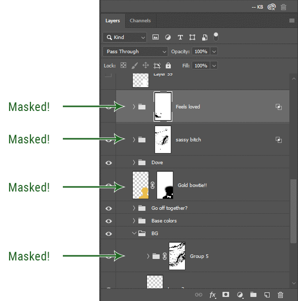
I love masks, and sometimes i will throw an already masked layer inside a layer group and apply a second mask to said group. This way I have two masks that can be edited independently from each other. Like layer mask-ception.
So anyway, yes. Eraser tool? Don’t know her.
4. Try using channels to create masks!
This is a technique that works REALLY well for cutting out complex shapes, such as wispy hair (or feathers!) -- provided there's strong contrast between the subject and the background, and the background isn't too busy.
This is also a fantastic method for capturing alpha transparency. For example: If you have a neato paint stroke/splatter/watercolor texture you want to use as a mask, but has a solid background that’s getting in the way of things. This method will capture all the semi-opaque areas flawlessly!!
While editing your image (which you had better have made into a Smart Object!!!) do the following:
Switch from the "layers" panel to the "Channels" panel.
Toggle through the R, G, and B channels, and decide which one has the most contrast for the areas you are trying to mask.
Ctrl+Click that channel's thumbnail. This will create a selection marquee.
Switch back to the layers panel
Click on the target layer/group (the one you are trying to mask)
Click the mask icon at the bottom of the panel (the one with the circle inside a box)
Release the selection and invert the mask if necessary
If you're using this method to cut out a subject from its background, you probably won't want alpha transparency. In this case, select the mask thumbnail and use a levels adjustment on the mask itself to bump the contrast until you have more of a cutout effect!
It sounds like a lot of steps, but it’s really simple! So I made this handy GIF: (click to view from beginning)
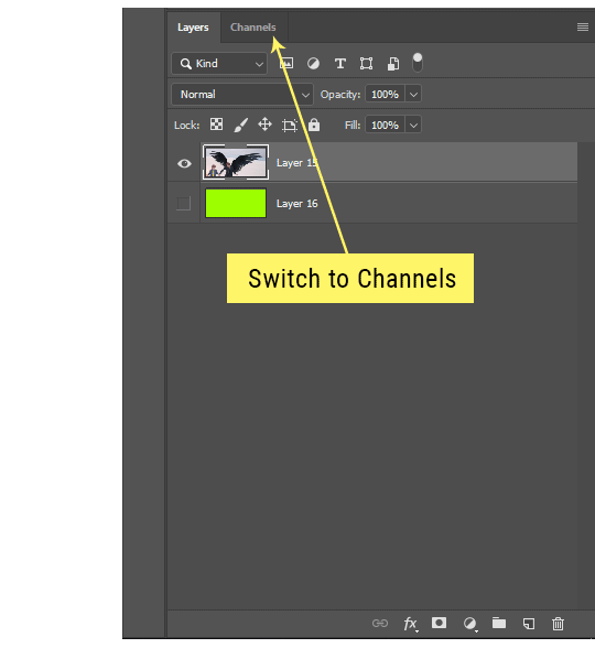
Sometimes you won’t want to use this method for the entire image, but just a specific part. For example, if you’ve cut out a character with some other method (magic wand, manual brushwork), but are having a hard time with their hair in particular. Use this method to create the selection, but instead of converting the whole selection into a mask, use the brush tool to apply the mask only where you need it! You can invert the selection itself with shift+ctrl+i.
5. Outlining text
The font I used here is Salomé, which is actually a solid typeface with no outlined version. But you can make virtually any font into an outlined version if you so desire!
There's two possible methods here, actually:
The Easy Way:
Add a stroke layer effect to the text layer (by selecting the layer, clicking the little “fx” button at the bottom of the layers panel, and choosing “Stroke...”)
As far as settings go, aligning the stroke to the inside usually yields the best result/maintains the integrity of the letterforms.
Make the color of the text itself match the background.
If necessary, use the lighten/darken blend modes to create the illusion of transparency.
If you need true transparency (which I didn't until I decided I wanted to apply a gradient over the text), you'll have to try something else-- The Also Easy But Less Than Ideal Way:
Right click the text layer in the layers panel and select "convert to shape".
Now you can edit the fill/stroke the same way you would any other vector shape.
Again, you’ll want to set the stroke alignment to ‘inside’. For vector shapes, those settings are a little hidden. You’ll wanna open up that little dropdown in the toolbar with the line in it, and click “More Options”.
This is semi-destructive, so if you're working with a lot of text you might have to edit later, consider duplicating and hiding those text layers first so you'll have a 'backup' of it.
And while I’m on the topic of text...
6. Try breaking up your text layers!
I know a lot of people like to draw a neat little text box to put their text in, and then they center it all nice and neat and probably use a small font size to make it subtle and stuff... and that’s cool. Everyone’s got their different styles and things they like to emphasize in their edits and there’s absolutely merit to that sort of thing (case and point: the bulk of my dear @herzdieb’s work), but. Listen.
I love typography. I love a good typeface. The stroke widths, the letterforms, the ligatures, the serifs... I get like, horny on main for a good typeface. I like to make the text on my edits BIG, so that those details can shine. I also like doing interesting things with the text. Jumbling words/letters around, distorting them, deconstructing them and just... letting the text really ~interact with the rest of the composition instead of just kinda politely floating on top of it.
I’m not saying you have to do that kinda stuff. Or that I think neat little floaty text boxes are boring, or lazy, or whatever. It’s just... personally, I get really inspired by type. Fun type treatments are one of those things I LIVE FOR, something of a ~signature of mine, and I encourage everyone to just... try it? To use text as more of an integral Design Element and less of a... idk. A caption?
So if you have a quote, or even just a word... put each word (or letter) on its own text layer. And then: make ‘em different sizes. Make the words so big they don’t fit on the canvas. Rotate each one at a fun angle. Scatter them around. Go nuts. Use masks to chop parts of the letterforms off. Make ‘em overlap. Just have at it. Or, as the kids these days are saying: go absolutely fuckin feral.
If that really just isn’t your style, or doesn’t work/make sense for the edit you’re doing, fine. Delete all the layers and just do a text box or whatever. But. I’m tellin u.
Give it a try.
At least once.
Just... a lil taste.
7. Understand the difference between lighten/darken vs screen/multiply
For a while in my photoshoppin' youth, my understanding of these blend modes basically amounted to "darken makes things darker, and multiply makes things really darker", and vice versa for lighten/screen. But there's an important difference between how these blend modes work, and if you understand them, you can use them more... strategically? I guess?
Darken and Lighten are kinda misnomers tbh, because they technically don't really darken or lighten anything. What they actually do is make it so that only the areas of the layer that are darker or lighter than the content of the layers beneath them are visible. This produces some pretty nifty layering effects that you can't achieve with screen and multiply.
Here’s an example: (if you’re reading this on a phone with the brightness dimmed down you probably won’t be able to see the differences)
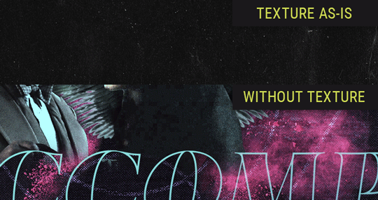
Without any the texture applied, you can really see the noise/graininess of Crowley’s jacket in the screencap. You can also see the ‘seam’ where Crowley fades into the background-- the jacket is a green-ish black, while the background it’s fading into is more of a purple-black.
With the texture set to ‘Screen’, the whole image becomes lighter across the board. Crowley’s jacket gets lighter, and so does Aziraphale’s jacket and the pink cloud thing. This does little to nothing to obscure the poor image quality and disguise that ‘seam’.
But with the ‘Lighten’ blend mode, ONLY the dark parts of the image appear lightened, and not only do they appear lightened, but they get kinda equalized. Notice how the patchy jpeg artifacts on Crowley’s jacket disappear, how that color seam smooths out, and how the brightness of Aziraphale’s jacket and the pink cloud doesn’t change at all.
This isn’t to say that lighten/darken are better and that you shouldn’t use screen/multiply. They each have their uses. But most often, I find myself using lighten/darken because the way they work is honestly really helpful? And just cool af?
8. Masking individual frames on gifs
If you ever feel like torturing yourself by making a gif that has frame-by-frame masking, my advice is don't try to mask each frame from scratch. You'll get patchy/wobbly results from the masks being slightly different on each frame.
Instead, mask the first frame, then alt+click and drag that mask onto the next frame. Make any minor adjustments to the new mask as needed, and repeat for each frame. This saves time and more importantly, keeps the masking consistent on areas with little to no movement, which makes a HUGE difference in how smooth the final product will be.

If you look at the edges of the animation, they’re nice and steady and consistent. It’s only the parts that have a lot of movement (like the back of his neck) where you can see any ‘ghosting’/wobbly-ness happening.
Sometimes the mask will move when I copy it to the next frame. Like, for the whole document. It gets nudged 20 pixels down or to the left or s/t every time. I have yet to figure out why, but I’m betting it has something to do with shooting myself in the foot with the frame 1 propagation settings at some point during editing?? ANYWAY, when this happens, just unlock the mask from its layer (click the little chain icon between their thumbnails) and move it back into place.
In these cases, I also like to pick a spot with a hard edge (such as the shoulder in the above gif) as a reference point of where it needs to be moved to. It kinda sucks having to do this for every frame, but you already signed up for some suckage when u decided to mask every frame of a gif, so I mean... 👀
9. Don't be afraid/too intimidated to do manips as needed!
Manips can be tricky if you're really striving for realism. There's light sources and color grading and perspectives to reconcile!! But when you're doing an artsy Edit with a capital E, odds are those kinds of discrepancies will be thoroughly camouflaged by all the levels, black and white, etc adjustments you're doing!
Something I run into often is, "I like this screencap, but the top of their head/hair is chopped off :(" But if I go back through all the screencaps from the scene, there's usually another frame where the camera is planned/zoomed out enough that I can steal the rest of their head/limb from it! And since it's from the same scene/shot, the lighting and color grading should already be a perfect match!
A super simple example:
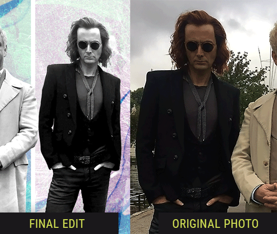
So I wanted to use this picture of David and Michael for this edit, but 1) They’re standing on the wrong sides for their characters, and 2) part of David’s arm is covered up by Michael’s.
Of course, the easiest course of action would be to just mirror the photo so they’re on the correct sides, but 1) mirroring faces tends to yield wonky results, and 2) that still wouldn’t give me a perfect, free-standing cutout of Crowley to place wherever I want in my composition (as opposed to being forced to awkwardly position him off the edge of the canvas to hide the fact that the other arm is missing)
Fortunately, it only took all of like, two (2) minutes to draw a crude selection around his good arm, copy and paste it into a new layer, flip it around, and add any necessary masking to get the shape right.
My point here isn’t to teach y’all how to do manips, or to pass this off as an impressive example of one. Because it’s really, REALLY not. My point here is to demonstrate that even something as tiny and simple as this can really open up your options for what you can actually do with an edit/composition.
So next time you’re feeling limited/inconvenienced by the crop of a screencap, just... you know. Consider whether or not it’s worth attempting a quick and dirty manip to fix it.
Another Example:

Sometimes you’re torn between two screencaps. You like one element from Screencap A but also want some other element from Screencap B. What to do? Just frankenstein ‘em together. Layer one on top of the other, get them lined up, and mask out the necessary parts.
It’s easy to get hung up on stuff like “Uh... should Crowley’s shoulder be doing that?” but let me assure you that like... the people looking at the final product are none the wiser to your butcherwork and will not notice. Especially if you’re going to add a bunch of contrast and color adjustments later on. (in fact, sometimes I’ll apply those adjustments first so I’m not distracted by any discrepancies that are going to come out in the wash anyway)
“I dunno... 🤔🤔 doesn’t seem anatomically correct... 🤔🤔🤔🤔” thought no one.
Point is... point is... dolphins you can get away with a LOT more than you think you can. Don’t let the desire to make these kinds of manips perfect get in the way of just... making them good enough. The bar isn’t that high, I promise.
10. Know what inspires you
What types of edits get you EXCITED? What kind of work do you see on your dash and go, "oh, I'm reblobbin' THAT!!1!"
I know for herzdieb, she's all about emotional pieces. She likes matching words/lyrics/poetry to on-screen moments and punching you in the feels with both. She hears a song, or reads a poem, and the lightbulbs go off for her, and she does her thing.
As for myself, I just live for the aesthetics of an edit. The colors, the fonts, the composition. I almost never know what text/screencaps I'm going to use when I start an edit. I just see a font I like, or a color palette, or a texture, and think, "I wanna use that!"
And once you know what inspires you, collect that inspo! I hoard textures and fonts. I have them organized into neat lil folders. When I wanna make an edit, that’s where I start. I just browse through them all until one or two start calling my name. Herzdieb collects songs and quotes and poems. Maybe your thing is color palettes, or aesthetic-y photos. Or whatever.
The point here is make the kinda stuff you like/want to see. Not the kinda stuff everyone else is making or the kinda stuff you notice gets the most notes.
11. Be able to let go of things that aren't working
I often begin an edit with a rough idea of the style, colors, or layout I'm going for. And I almost always end up doing... something totally different.
So don't get too fixated on what your initial ideas are. Be open to experimenting and just let the edit be what it wants to be. If something looks nice, do it. If it doesn't, don't try to force it just because, "well, I was inspired by this piece that did xyz and I wanna try it too".
When you see a certain effect that inspires you, just keep it in mind as a possible solution for the next time you make something-- don't make it into a benchmark, or some imaginary 'goal' you have to meet for This Edit You Are Working On Right This Moment. In fact, sometimes the elements I end up ditching are the very ones I started with, that initially sparked my inspiration. And that's okay. Inspiration can be a moving target, and if your vision for something changes, let it.
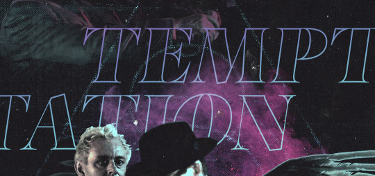
You wanna know what inspo reference I was looking at when I started that “Temptation Accomplished” edit?
Fucking this: https://search.muz.li/YTdiNjkwN2Rh
You might be thinking, “how the fUCK was that the inspiration??!! Your edit looks nothing like that at all!” ...and you would be 100% correct, and that is 100% my point. I spent a good hour or two trying to incorporate that cutout text layering effect before finally accepting the fact that it just wasn’t working for the edit I was making. And it wasn’t until then that it actually started to come together.
12. Be patient, and take the time to explore all your options!
I’m not gonna lie, y’all. I spend hours on my edits. I usually complete them over the course of 2-3 days/sittings. I rarely have a plan. 99% of the time I'm just throwing things at the wall and seeing what sticks. When I get stuck (when, not if), it helps to step away from it and come back later with a fresh perspective/set of eyes.
Every single edit I've posted, I have at some point felt like giving up on because I thought it looked like garbage (and not just because I was being self-deprecating/doubting myself, but because at those points, they simply weren't finished/something about the composition just wasn't working for me)
Work through those moments, and if necessary, take a break/sleep on it. It's always after I've exhausted my early ideas that the really good ones start to come to mind!
Here’s how the character poster edits I did progressed:

In Classic Me™ Fashion, I literally started off with just... textures I liked, and a font that I liked. Now, there were obviously a lot more ‘steps’ involved in both designs, but hopefully at the very least this gives a sense of how things get from point A to point B.
So uh... thanks 4 comin 2 my TED talk. I hope u learned at least one (1) cool new thing or maybe just feel vaguely inspired by this rambling mess?
158 notes
·
View notes
Text
Album Discussion- Viva La Vida- Coldplay
Oh shit, is Rad gunning for the throat of what was once one of the biggest bands in the world again, no actually, I really like this album, why would I talk about albums I hate. I’m not sure I have the comedic acumen to manage that yet, but I guess we’ll find out when I inevitably try.

Viva La Vida is Coldplay’s 4th studio album and one I have a lot of personal nostalgia for. It’s permanently associated with a particular time in my life, where I got the album added to an MP3 player I had and listened to it constantly over and over, and somehow didn’t get sick of it. It’s also the last album from the era in which they were actually good (haven’t listened to Everyday Life yet though), though it’s kinda a major departure from the sound and tone of the previous 3.
It’s also the first one where they really start getting up their own ass. Like, that font? And the French Revolution imagery? I guess there’s something to be said for such but relatively clean band having artwork featuring someone’s entire tiddy out on their album, but I suppose it’s considered a tasteful nude given the context of the original painting. Anyway.
The album opens with Life in Technicolor, spelled without the u despite them being British because fuck me, I guess. This instrumental really quickly establishes that this is going to be a different one- Coldplay’s previous work is extremely solid if vaguely generic alt-rock instrumentation, and here comes this song with a…. (looks it up)…santoor? Which sounds completely different to anything else they’ve put out. It’s also, again, an instrumental, which is pretty unique for the band considering how heavy a focus Chris Martin’s vocals tend to get. What we end up with is this short and sweet little introductory piece that I don’t have much else to say about other than I really like it. What I can briefly comment on is Life in Technicolor II, the version released as a single and on the EP immediately following this album. It’s like, twice as long, as full on vocals, and as a result overstays its welcome by quite a bit. It’s not like the vocals are bad, but they really do feel tacked on.
Cemeteries of London is next up, a ghost story of a track with heavy Christian themes and folk influences. There’s this echoey guitar in the backdrop of this that gives it an eerie edge, even with the relatively chill acoustic lead. I think putting so much clapping in such a minor-key track is a bold play, and it seems to have paid off for them. This song feels almost bleak, even desperate at times, like the vocals’ peak describing an encounter with God that doesn’t quite work out. There’s an unspoken tragedy here. It’s another of the album’s better tracks.
Lost! (exclamation point is part of the title) is a bit more uptempo, but not really any more upbeat. I don’t know what instrument is making that beat, but it sounds neato, and they just have a church organ running through this whole thing, because why not, sounds aight. It’s kinda U2-ey, which isn’t really a compliment coming from me. I would be very interested in another artist’s take on this track- and I don’t mean Lost+, that’s awful and doesn’t fucking count.
42 is the next track, and I don’t think that’s a Hitchhiker’s Guide reference. It’s again, extremely moody, or at least, the first part is. The composition of this is actually really interesting, it’s basically three separate songs mashed into one. The first part is the moody piano bit, the middle a banging instrumental bit, and the last bit this really fun collision of both types of instrumentation. Ultimately, 42 is an experiment that was probably for the best, since I’m entirely confident any part of this being the full song would get old real quick. But the split means none of them overstay their welcome.
Speaking of overstaying welcomes, Lovers in Japan is almost 7 minutes, and as a result was the track I always skipped as a kid. This is because the album version contains a second song in it, “Reign of Love”, which isn’t its own track for reasons that are completely alien to me. Much like Lost!, Lovers in Japan feels extremely U2, soaring guitars and choruses, but I just did not vibe with that as a kid and it’s hard to come back to now as a result. Reign of Love, on the other hand, basically just feels like 3 entire minutes of piano-based outro, and is really not worth sitting through Lovers in Japan to experience.
Yes is the title of the next song and it opens with violins in a rock song fuck yes! It’s also one with two songs in it, this time with “Chinese Sleep Chant” (uhhhhh) attached at the end for a total track length of 7:06. This doesn’t bother me as much as weith Lovers in Japan/Reign of Love, because I actually like both halves of this one. Yes feels like VLV-era Coldplay’s take on something grungier, with Chris Martin going lower than I think he does on any other song in their discography. This simple vocal switch makes the song seriously stand out from their other works, a more traditional rock instrumental standing out from the rest of the album in its relative simplicity. There’s still a lot going on, but it feels tighter and more restrained. I do think Yes might be my favourite track on the album. Chinese Sleep Chant is…an ethereal wall of sound, with heavily affected vocals to the point where they feel more like part of the instrumental than anything. It’s otherworldly, and hardly the best example of a song like this, but it’s more than satisfactory.
youtube
The next song is the title track, Viva la Vida, and I’m not really sure what there is to say about this that hasn’t already been said. It’s just such an incredible piece of music, orchestral and sweeping, emotional and moving. Aside from being tied to some awkward memories (I used it to audition for a musical in middle school, something I haven’t managed to forget try as I might), I don’t really have any complaints about it. Actually, that’s a lie, I have one. It’s fucking criminal that it’s largely associated with the CaptainSparklez Fallen Kingdom Minecraft song, which I never liked (compared to Revenge/TNT at least), to the point where every time VLV comes up in a SiIvagunner rip people are referencing that instead of the original. It’s just kinda shite, basically.
youtube
Violet Hill, then. This rocks hard enough that it was in Guitar Hero III, standing proud alongside Through The Fire and Flames and The Number of the Beast in rock history. It’s pretty low-key for that lineup, of course, but it’s the heaviest thing on this album sonically, and probably lyrically, too- took me until googling it to find out it was an anti-war song, though some of the lyrics are more understandable (and decipherable) than others. The close of the song is soft and kinda heartbreaking, but the rest of it just goes. It used to be my favourite on the album. Not so much, I like Yes more now, sorry.
youtube
The penultimate track is Strawberry Swing, another one I didn’t connect to as a kid. It’s got a bouncy, “tribal” beat, some really panned out double bass (?) for the bassline, and sounds almost sugary sweet. This song is so unbelievably relaxing, which is a really odd thing for a Coldplay song to be, but it works pretty well. I’m genuinely finding it hard to write listening to that, I just kinda keep getting lost in it. I swear it’s not just my ADHD, this song just chills you out. That’s probably a good sign, right?
The final song is Death and All His Friends, is another bloody double song- except I’m not sure it was on the version I had as a kid? I might be remembering wrong, but I’m pretty sure I’d not heard The Escapist before going back to this as an adult. Regardless, Death and All His Friends spends a long time in this low piano mood, serene and reassuring, it’s about a minute of that. It then spends like, another minute building up into what I’d call the song proper, an instrumental bit that eventually breaks out into this just desperate cry against what I can only assume is life, or death, one or the other. The lyrics are relatively brief before the song folds in on itself and ends, taking what I thought was the album with it. I do particularly like the line “I don’t want a cycle of recycled revenge”, that’s just fun to hear. And then we get to The Escapist and-wait this is just the start of Life in Technicolor again. But Chris has some vocals on some of it. I guess it bookends the album, but this is kinda pointless. And if you’re listening to the Album+EP version, it runs right into Life in Technicolor II, which gets a little repetitive.
In essence, Viva la Vida is an artier, more variable take on Coldplay, with a somewhat up its own ass aesthetic that at least backs it up with interesting music much of which is absolutely worth the time. It is also the last gasp of Good Coldplay, with every release afterwards (again, I haven’t heard the latest album, it’s apparently decent) being not especially great- while most agree that the poppier direction of Mylo Xyloto alienated most of their fanbase, and it sure did me, I actually don’t like Prospekt’s March either. But that’s a story for another time.
0 notes
Text
Kingdom Hearts Asks, Part 2
(I’m gonna bring in some KH3 related answers to these, not really spoilery)
21.favourite disney character
Gotta go with Flynn Rider
22.least favourite heartless
THOSE FUCKING HOT RODS I HATE THEM SO MUCHHHHHHH
23.least favourite character
There’s a few I really don’t care about but it’s gotta be Larxene. The main reason being is because whenever she’s talking I really do kind of feel terrible, personally. I used to get teased a lot like how she bullies Sora. So you know.. I just really don’t like hearing her talk.
Kind of a shame because she’s the only woman in the Org and they just had to go and make her be that mean and cruel.
24.favorite disney villain
Tie between Maleficent and Hades
25.least favourite world
Deep Jungle, just a pain to go through. It’s not really terrible, otherwise, but I just hate navigating it. I ALWAYS get lost or turned around. No matter how many times I go through it.
26.favourite world theme
Arendelle is becoming a top favorite, honestly.
27.favourite boss theme
oh man this one is hard.. they’re all real bangers. A Shrouding Dark Cloud, The Encounter, Dismiss.. but Oscurità di Xehanort (not sure if actual title or not yet) is climbing it’s way to be my top fave because it’s like.. THE boss theme to end all boss themes, you know?
28.favourite heartless
never really thought about it, there’s so many. Always liked the Wyverns from Hollow Bastion, Invisibles are also neato.
29.favourite character
I already answered Sora and a couple others so.. I guess I’ll add Ventus to the list cause he goes through so much shit and it’s so sad and I feel bad for him.
30.favourite unversed
Metamorphosis looks cool
31.favourite keyblade
As simple as it is, I always liked Sleeping Lion, by design. While I’m not really thrilled about the KH3 keyblade designs, I really love the transformations. I found myself using the Ever After and Wheel of Fate keyblades a lot.
32. favourite outfit
I really do like how simplistic and uniform Sora’s outfit is in 3. But Aqua’s is pretty nice, too.
33.favourite nobody
Does Marluxia’s third form count lol, that shit is rad. If we’re just going for normal ones, I like the Dragoons.
34.favourite world
Kingdom of Corona might be my all time fave out of them all. It’s just so bright and colorful and full of life and the actual city/town was my favorite part with all the people and the dancing etc.
35.favourite scene
I mean... can you really go wrong with the entirety of The Battle of 1000 Heartless??
36.favourite song
again a hard question cause there’s just so much to choose from. I’m gonna go with Fantasia Alla Marcia from KH2, though. I love really long compositions and when all of the major themes are compiled together, plus it just gives off a great sense of adventure when listening to it.
37.notp
Hadn’t really checked on the shipping side of things lately, but I know I’ve seen Vanitas/Ventus and I’m not very fond of that one for obvious reasons.
38.otp
I used to be really into Axel/Roxas, but times have changed and after going through all of the games, Soriku kinda solidified itself as an otp. I’m sorry but it’s just hard NOT to see it.
39.ot3
Destiny Trio for life
#ask#kingdom hearts#my favorite scene is probably the hardest to choose#there's so many good/funny/sad moments#I mostly love the little stuff tho#like Sora's tech illiteracy or really silly moments
0 notes
Last Seen Blogs

gremling
Fable

funnysmartlifeontiktok
Laziness brought about by smart life
witchymomlife
Untitled

zeeckokey
Zeeck Okey