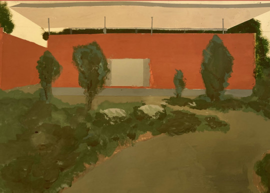
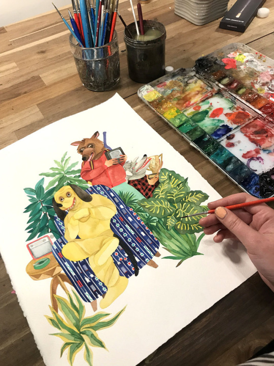
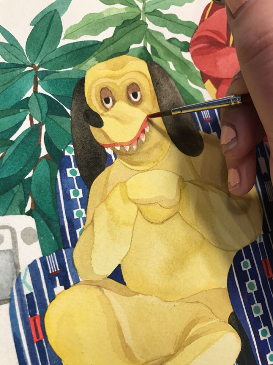
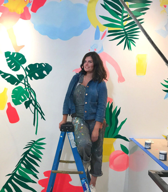
#i do not. like working large scale with gouache
Text
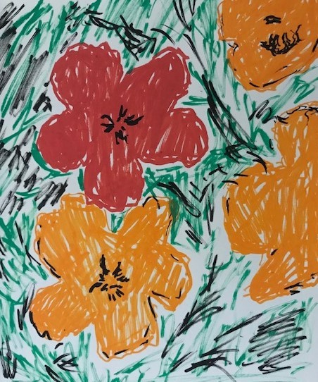
some stuff for my drawing class!
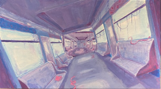
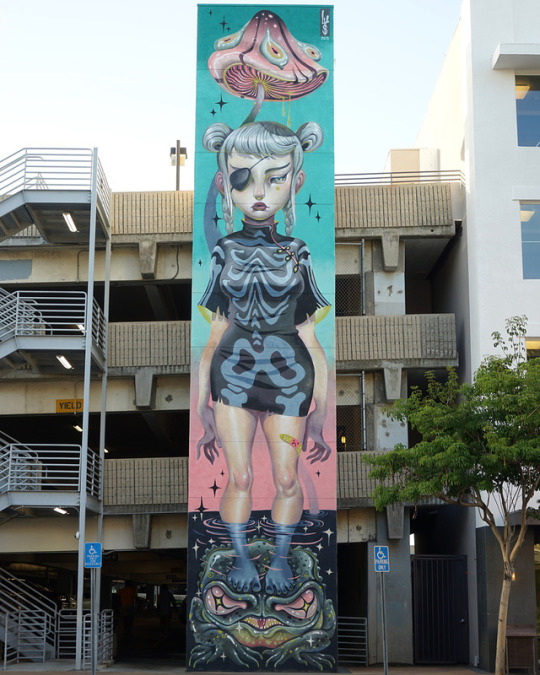
#not a huge fan of how this turned out#but i’m definitely not gonna fix anything haha#i do not. like working large scale with gouache#anyways#it’s sure been a while since i’ve posted anything full#college is getting a bit easier so i’ve started to have a bit more time to do things#so..maybe more art soon? we’ll see!#anyways have a great day :)#art#original art#froggtogs#train#metro#gouache#original painting#painting
47 notes
·
View notes
Note
also a slight side thing merely bc I'm curious: do you have a favoured canvas size when working digitally/a favoured scale you work to when doing traditional art?
Ooooh fun question!!!
At a minimum I like to do 2000x2000px. Anything else is larger from there. Often it's 2000x2800px, or 2000x2500px for just the average art piece.
When working with traditional art I prefer working large, like 24"x36" or bigger, but due to the expense of materials required for a large piece I don't do that as often as I like, and tend to stick more to a sketchbook or journal size (especially for gouache because I really like working in thick layers).
4 notes
·
View notes
Photo
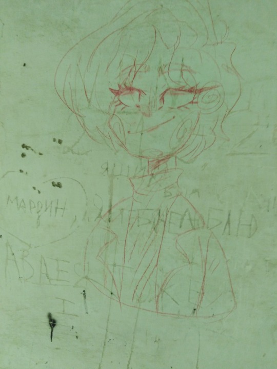
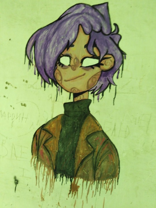
I hasten to share with you what happened to me today)
No, no, don't expect a huge adventure associated with this drawing on the wall of an abandoned dining room, I just want to talk about these feelings, because this was my first wall drawing)
I painted Rachel (the character in the photo) with ordinary children's gouache, but with the addition of white matte acrylic in some places. On this wall I drew not alone, but with my best friend, and we received such a great creative charge that we built a vague plan to decorate the ENTIRE dining room with gouache). This is not the post where I will teach many of you "how to paint on the wall", there is a special paint for this, or at least acrylic, but it was somehow easier for us to draw with gouache (how many people - so many opinions). When I was drawing this character, I felt like I was doing something very grand and big! Well, in fact, this is my biggest art in all my artistic experience, although it is not great (only 6 years). Of course, I see now a lot of jambs that I would be happy to fix, but then - I didn't really care about it. My attention was focused on the process itself, on what I am doing, how I am doing and how cool it all turned out! (well, for the first time, naturally)
It motivated me very much and made me believe that I could do everything (within reason), especially when you are a creator (it doesn't matter if you write, draw, sew, dance and so on - this is all creativity, what you do from everything hearts, not from the bulldozer!) and you have a rich imagination and a huge fantasy. After all, if you think very deeply, a person can create really large-scale and grandiose things, if only to imagine, set a goal and achieve it in all ways! (well god, within reason guys)
What did I want to say with this post, besides showing you my big three-hour work? Believe in yourself, and you will definitely succeed! <3
(if someone has something to add, I am always glad to read your thoughts)
3 notes
·
View notes
Text
Final Project Evaluation
Despite this project being something completely new to me, I found that overall I enjoyed it quite a bit and felt I learnt a lot about set design and the process overall. It was nice to get an insight on how it would work in real life which I found out from my own process as well as through my research.
Looking back at the original project proposal now, I’m very glad I chose something that interested me so much. My interests have a habit of changing a lot however my love of Alice Through the Looking Glass is one that never really goes so it was a smart choice from the start. I managed to keep interest throughout even when I didn’t particularly want to do certain parts because I simply found myself to enjoy the project because it was something I really enjoyed.
I felt like the process of this project has been a smooth one. With some of my other projects previously - be it from art foundation or college - I’ve found that my work can jump from one idea to another but with this project I felt that each step very successfully went from one stage to the next with a good amount of detail that allowed me to continue experimenting.
I always kept in mind my initial proposal when working. My main goals from that were to make a set inspired by the illustrations, book and other early related media. I felt my project has kept true to this thoroughly throughout. The only change was probably that at the beginning I didn’t know that I’d just do one set - to make the process easier and not too much of a difficulty - but I think that was something I simply learnt during the project that I couldn’t’ve known beforehand.
With the research I’ve done throughout the project, I felt it has all helped with the outcome. The research I did for the main theme of Alice Through the Looking glass really helped with my understanding of how to approach the sets and the designs of them. The research pertaining to the creation of sets also really helped in my understanding of how to lay out my project and how it is done in the real world.
I found myself going back to previous research to make sure I was on track. This included seeing how real set designers would present their final sets as well as looking back at coloured illustrations that I found early on and continuing research on them to find suitable colour palettes. I feel that my research has successfully aided my work and that I’ve kept using it throughout to keep a focus on a successful set and a faithfulness to the original book and its illustrations.
I feel like in this project I've improved on my skills regarding the creative practice. As said before, I found the process to be a lot smoother and well structured than previous ones which I believe shows how well I have improved with this project.
I found this project to be very fun and doing something I'd never done before in the 3D specialism helped me broaden my knowledge in 3D work. I'm still very interested in the idea of doing 3D further with model making because the broad subject and room for freedom is still very interesting for me.
If I were to do the project again I would have a lot more knowledge on the subject of set design so I think there would definitely be some things I would do differently. In a bigger project I would like to think about more aspects of a play such as costume, the script (although I did have this partially with the books text though it is still not exactly the same as a script) and lighting in more depth. This is because in a real production the whole team would have to work together to make each separate element work. If I could work on a bigger and longer project I would like to work in this scenario whether it be with other people or just another made up scenario. Another idea would be to find ways to streamline work such as printing out colours for set pieces or laser cutting card pieces so cutting and colouring isn't such a tedious process.
Some more simple changes if I did the project again or simply continued it would be to just do another one of the sets I designed near the start. I was very fond of a lot of the other designs so it would be fun to tackle one of them on the same scale as my final set. It would also be fun to work with different mediums other than paper, card MDF, etc. that I used in this set. Perhaps utilising existing miniatures or using another medium to sculpt objects for more detailed sets could be a fun and different approach to a set for the same play.
I feel in this project I've found a lot of problems and overcome them successfully. Whenever something didn't work or something wasn't right I made sure to fix it. I found this to especially prevalent near the end of the set box where I didn't give up with what I'd done and strived to continue to add to the set to make it look good. I also always took in feedback from my peers and I often found that suggestions from other people improved the sets design and feel.
I made sure to keep challenging myself during this project. Not only did I try something I'd never done before but I also made sure to use varied materials. I used watercolours for colouring the set pieces but also used gouache to stretch my ability and try a new colouring medium. The set box was also one of my biggest outcome pieces so far and to work in quite a large scale was a new skill to understand and learn how to create a successful outcome.
During the experimentation segments of this project I was quite set on ideas of what to do next so there wasn't a large amount of testing materials. I knew I wanted to use card for the set pieces to allow for colouring and because it was an easy material to work with. However whenever I could use multiple things for the piece I always experimented with different ideas. Although I knew I wanted to use watercolour to colour the set pieces, I chose to experiment with gouache paints since I was aware that they had a nice bright colour outcome. When I found I liked the colour the paints made I decided to use both them and watercolours together. I also experimented with the colours of cellophane to make sure I had the right colour effect with the spotlight lighting. I felt experimenting with different materials like this really enhanced the outcome visually as if I didn't the set as a whole wouldn't look as bright and striking.
Throughout this project there was a lot I learnt simply from trying out different things. Researching set design specifically also really helped me understand how I should approach the process properly. I also feel my reflection once an experimental section was done always helped the next part of the project. Looking back on what I’d done well and wrong helped me take the next steps better and think of how to improve and expand on the project. Overall, I’m very happy with the project especially with the final tweaks I did. When I looked back at what I thought was the final set I knew I wasn’t happy so my own reflections helped me decide to improve the set for the better. My own reflections as well as aid and critique from my peers have really helped this project go smoothly and make changed that I myself would not have thought about.
So overall this project was a great success and it hasn’t turned me away from the idea of doing more set design projects in the future. It has also helped me understand the creative process and its nature so that I can continue to use it well in future projects.
1 note
·
View note
Photo
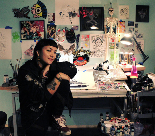
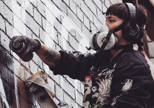
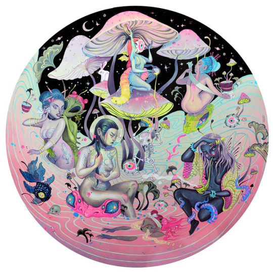
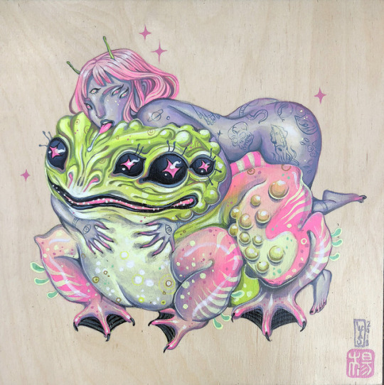
SKETCHY BEHAVIORS | INTERVIEW WITH LAUREN YS
From large scale murals to multi-layered works on canvas, LA based artist Lauren YS’s art captures everything from the female experience, addressing topics like sexuality, death, aliens, monsters, and the occult. Her works are complex much like her own experiences, so we’re super stoked to find out more about what drives her, who and what inspires her, and what challenges and advice she has for our readers in this awesome Sketchy Behaviors interview..
Take the leap!
Photographs courtesy of the artist.
Introduce yourself.
Hey! I’m Lauren YS - Hmm, something you might not know … I used to play ice hockey and my favorite candy are Peach O’s. I am a really good listener, but that also means I hate being interrupted. I dream, often, about being underwater.
Tell folks a little about your artwork and what do you love to make works about?
I make work about the female experience, sexuality, identity, space, aliens, heritage, death, monsters, nature, emotions, natural phenomena, the occult and whatever else I might be obsessing about. I like slimy creatures, kitsch, psychedelia, sex and Halloween, and mixing repulsion with attraction. I want the viewer to feel unsettled as much as engaged. I make things in an effort to try to process the beautiful shit rocket that is the world around me.
When did art become something you were aware you could do for a living or as a career you wanted to pursue?
I have always been making art, but I never thought it was possible to support oneself as an artist: It seemed really out of reach or surreal. It wasn’t until I had already been fully freelance for a year before I realized I was actually doing it. I think it’s just something that comes out of necessity, it’s like – if I want to keep making art as much as possible at the rate I am living, then damn, I’m going to learn how to make money off of it.
What’s a typical studio day for you like?
I tend to work nocturnally. I’ll paint through the night and sleep through the day and watch horror movies, listen to podcasts about art, serial killers and cults, and eat anywhere from 1-2 sacks of tangerines every day. I like to really plow through paintings as well, it’s hard for me to stop working on something once I start. After about three weeks in the studio like this, your mind starts to wander off into deep strange places, and that’s when the really good stuff comes out.
What’s your studio or creative space like? What do you keep around to constantly motivate or inspire you?
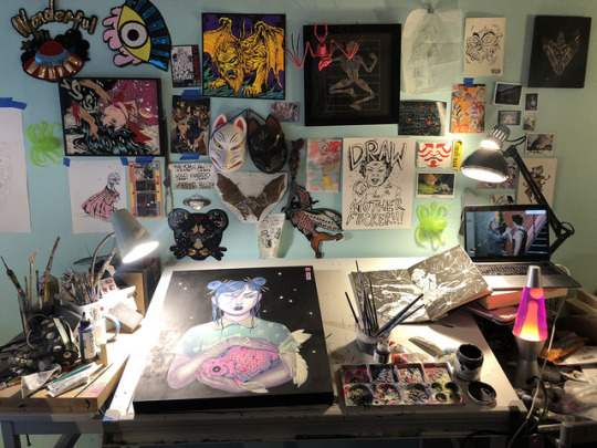
I have always worked best in a bit of “artistic chaos”–I like to fill my space with odds and ends, knick-knacks, items from my travels, talismans. I believe in the power of objects. I love my lava lamp and need to buy seven more. I also have this drawing I made of an Asian grandma screaming “DRAW, MOTHERFUCKER” which I plan to make into a screen print and give to all my artist friends.
When working on a body of paintings and works for a show, what is your process like? How long does it typically take you to complete a painting from start to finish?
Depending on the size of the gallery, it can take anywhere from 2-6-10 months to create a show, given that it is often punctuated by mural tours and big projects to pay the bills. I like to work on lots of pieces at the same time, so generally it’ll take a few days to a week or two to finish a piece. I am trying to get better at reworking pieces rather than just pushing through them one by one. Workflow is still sorting itself out. I also make a ton of pieces that end up being nixed from the final show. I am very prolific but also very psychotic.
Not only do you work on canvas, but you are also known for some of your amazing murals! When did you start going from painting on a regular scale to large scale works? What’s your process like for mapping out these large works?
Well shucks, thank you! I started painting murals around 2013, which was a sort of natural transition because I wanted to work bigger and bigger, I wanted to travel and be in the sun and use giant machines to make my art. I actually started learning color from using spray paint. I freehand everything because I like to feel independent of projectors or machines, especially if I’m in a foreign country or don’t have time or resources.
It makes me feel empowered to be able to make big things on my own. Maybe that comes from growing up under the common experience girls have, especially asian girls, where you’re expected to be small and quiet and obedient. I have always worked in active aggression against that stereotype.
Is there a medium you’d love to get your hands on, but yet to have the chance too? And what are your go-to materials?
I’d really love to learn how to use an airbrush, a la Sorayama. Outside of 2D I am dying to get back into stop motion animation. My favorite brand of spray paint is Montana Black (high pressure forever!), and I use a wide variety of acrylics and gouache in my paintings, specifically the Holbein gouaches from Japan.
What do you love about where you live, and what is the art community like in your area?
I never thought I’d move to LA, but I’ve been really enjoying it here. I’m a communal living person (been in and out of communities for about 9 years) and I am lucky to have found somewhere that fits with my work ethic (intense) and social vibe (weird). I like to be able to work alone while still having people bustling around and making things all the time. It helps me to feel like I’m not dead or a total solipsist.
I’ve also found that the artists in LA–especially the female artists–have proven to be really kind, generous and welcoming. There’s a lot of room for weirdos here; it might take a while to find them, but they’re here. We also have a one-eyed cat, did I mention that?
Who are some artists you’re inspired by and have influenced you throughout the years?
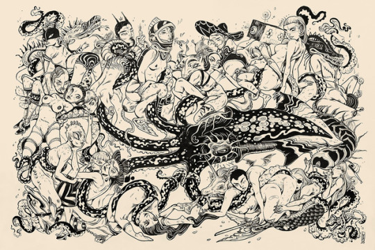
I’m a big fan of dark/psychedelic/erotic artists like Keiichi Tanaami, Suehiro Maruo, Sorayama and the whole Ero Guro movement. I also love Goya’s dark paintings and the sculpture work of Bernini. Some contemporary artists I’ve been into lately are Christian Rex Van Minnen, David Altmejd, Robin Francesca Williams and the fabric sculptures of Do Ho-Suh. Jamie Hewlett, Swoon, Andrew Hem, Aryz. I find that my taste changes constantly and I am always thirsty for different influences.
What’s been the most challenging part of your art career? What’s been the most rewarding? What do you do to keep the balance?
Something really challenging has been learning how to trust myself while growing in the industry and balancing business, work and travel. It’s a really solid test: moving to a new city, providing for yourself, going on tour, shifting from place to place, managing gallery work and mural work, all while protecting and nurturing your own ambition and positivity, and not feed into the shitstorm of capitalism and social media past what is required of you.
The muralist life is not for the faint of heart. I would hardly say that I keep any type of “balance”–art is my life and there isn’t much room for anything else, and that’s how I like it. It is the most rewarding thing to look around and feel like you’ve created something new and good and powerful, all on your own terms. It is similarly rewarding to feel the need to level up - I enjoy feeling stressed arguably more than I enjoy feeling accomplished.
What would your dream collaboration be? What do you enjoy most about collaborations with other artists or clients?
I would love to do something with Takashi Murakami and/or his gallery (Kaikai Kiki Gallery). There’s also this amazing Australian animator named Felix Colgrave whose work I’ve been obsessed with lately, I’d love to find a way to make an animated short with him! I love collaborating - especially on mural work - because it’s such a cool experience to be able to intermingle your visual world with someone else’s. Working with ONEQ in Hawaii this year was really great, she had so many suggestions and ideas from out of left field that made me rethink my own work as well. It also forces you to relinquish some control on the way you work, and reflect on the basic joys of making shit in the first place.
If you could paint a portrait of anyone living or dead, who would you choose and why?
I really want to do a tripped out portrait of Yayoi Kusama or Bjork or maybe Steve Buscemi—all heroes of mine.
What’s your advice to folks who see what you do and want to pursue art as a career?
I would say, go at it as hard as you possibly can! Make sure you really enjoy doing it! Not all parts of painting murals are glamorous (actually, few are) and it’s important to truly love every part of it if you’re going to commit your life to it.
This means: hustling walls, handling machinery, travel, people, logistics, finding somewhere to pee, dealing with unexpected bullshit, not complaining, being comfortable handling yourself in dangerous situations, being independent and resourceful, etc. I have reservations about artists who genuinely don’t seem to enjoy all the elements of mural painting going too deep into it. But if it’s something you love, there’s nothing better.
What are your FAVORITE Vans?
I’ve been rocking the classic authentic Vans in black/burgundy as paint shoes for years now. But I also love the Sk8-Hi boys in burgundy… I never wear them because I’m too scared to get paint on them, haha!
What other artists would you love to see interviewed for Sketchy Behaviors?
I’m currently really into Andrea Wan, Louise Zhang and Caratoes. It would also be really cool if you covered a GNC or trans artist, like Nomi Chi or Laughing Loone!
What’s next for you that you can share?
My first book is coming out this year with Von Zos, and I’m also going to be designing a tarot deck with them. April is my first mural tour in several months; I’ll be hopping from Australia - Guam - Peru, and then moving around South America for a while, trying to practice my spanish. After that, I’ll be starting work on my next big show, scheduled for a city in Asia, which I’m really, really excited about - keep an eye out!
FOLLOW LAUREN YS | WEBSITE | INSTAGRAM | SHOP
422 notes
·
View notes
Text
Fine Art and Decorative Painting by Chris Vaught Studios
(Custom wall decorative painting by Chris).
Fine artist and decorative painter, CHRIS VAUGHT, is living her best life. The creative world she dreamed of living decades ago is thriving with commissions for decorative abstract paintings and forward-thinking murals.
We spoke with Chris days before she embarked upon a two-week journey to Australia where she planned to focus on in-the-moment plein air landscapes in gouache that she would bring home and translate to abstracts in oil.
This sophisticated vision for her next line of work is a far cry from the whimsical children’s murals she painted on her daughters’ walls years ago. A student of art in college, Chris’ career didn’t really take off until young families in her neighborhood took note of her daughters’ playful bedroom walls and started asking her to paint their homes, too. As her kids grew older, she began painting murals for restaurants and designing faux finishes to make ethnic restaurants seem more authentic. She eventually employed a crew of several employees and staff before she scaled back her services to focus on more art-intensive smaller projects.
These days, she does almost entirely residential projects. Think contemporary decorative murals, not traditional landscapes. Chinoiserie decorative finishes. Large-scale original artwork for homes with vaulted living rooms and massive walls, like this project at a lake house, below.
(Custom lake house mural by Chris and design board to inspire the art).
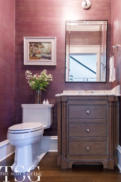
(Chris painted a deep plum “grasscloth look” from a Phillip Jeffries wallpaper sample for a powder room)
She recently partnered with Scout Guide member, VALERIE WHEELER INTERIORS, for a dining room project involving original artwork and a unique custom stencil design that replicated the look of much more costly wallpaper. It was one of her favorite projects.
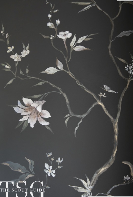
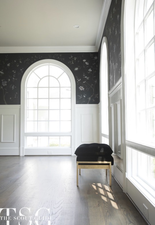
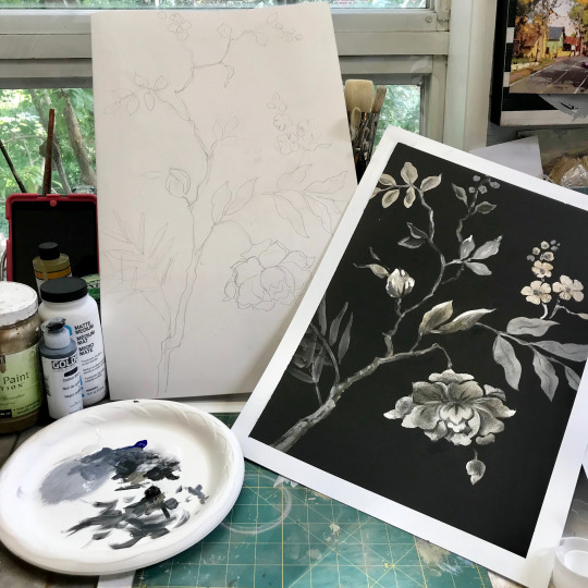
(The chinoiserie dining room and custom stencil designed by Chris).
Chris says, “I don’t do something with a pattern. The projects I do are always individual and rarely resemble other people’s projects.”
“I do barn wood looks, so people would buy a white door and I’d make it look like a real barn door,” she continues. “I also do a lot of fireplace redos over outdated brick colors. My goal is you should be able to look at my wall or door or fireplace, whatever, and have no sense at all that it did not look like that originally.”
(A fireplace before and after Chris’ decorative finishes).
Chris is living the artist’s ultimate dream. “I really have an opportunity to work on things that interest me. I’m in such a great place and get to do the work that I want to and push myself and challenge myself.”
CONTACT: CHRIS VAUGHT STUDIOS
@chrisvaughtstudios
2 notes
·
View notes
Note
Ive visited the back yard hives, but not the large scale area.
Im actualy using gouache, which works like a half and half between acrylics and watercolors. (Bold pigmented paint but acts like watercolor)
The headphones are both! They're wireless but have a cord i can plug in to use. Its pretty nice considering i forget to charge things frequently. -Arson
That sounds very fun. I hope you did not get stung, haha. I assume that the bees were more docile-- at least I hope so.
How exciting ! I do know about gouache. I understand that it has been quite popular lately. It seems like the best of both worlds. Are you painting on a canvas? I assume that you know about jelly gouache,,, maybe you are even using it.
That is wonderful. Also the best of both worlds, ha ha. It would be awful to need your headphones and not have them be charged. I think that is one of the main drawbacks of wireless.
0 notes
Text
The Best Watercolor Supplies for Beginners
Are you a watercolor beginner and are looking for supplies that will help you with your art journey? You’re in the right place because this post is going to be all about watercolor supplies for beginners – the things to consider and the many categories that may seem overwhelming for newbies.
I’ve always been fascinated with watercolors but was too intimidated to actually start working with them because the pieces of information I saw when it comes to choosing your first supplies as a beginner were overwhelming. When I got my first watercolor paint set, I was beaming with joy because the plethora of colors in front of me was so pleasing to the eyes. I slowly built my supplies from there with trial and error and a bit of help from the internet.
I want to help those who are starting their watercolor journey so you won’t end up as clueless as me, so I made this guide.
As someone practical, I am all for affordable yet quality products that will give you great results. So without further ado, here are the best watercolor supplies for beginners.
(Some links are affiliate links which means we earn a small commission if you purchase at no additional cost to you.)
Tips for Choosing Art Supplies
Before going to the main point of this article, I have two tips to give you when purchasing art supplies.
1. Buy the best supplies within your budget
As a beginner in watercolor painting, you don’t have to spend a lot of money on supplies to aid you in your journey. At the starting point, stick to your budget and look for the best supplies that you can afford. There are cheap alternatives and these ones, though they have a difference from the premium supplies, are workable and great to have as a beginner.
2. Quality over quantity
You don’t need 48 watercolor paints or 25 kinds of brushes. Start small and choose quality over quantity. Sometimes, investing in one good brush is better than buying the generic cheap brush sets that don’t really last or don’t have the best performance.
You will learn along the way what works for you and what doesn’t.
Watercolor Supplies for Beginners
Despite the many options available on the market, there are brands of art supplies that have quality products and made for beginners to build up your skills without making your wallet cry.
We’ve compiled the lot of them and made some recommendations on great products so you will have ideas and choices should you decide to get them for yourself.
Watercolor Paints
The first thing you need to have is, of course, watercolor paints. Sample sets might be the best place to start in this category.
There are a lot of high-quality brands that carry a variety of colors at very reasonable prices, and you will surely pick one to your liking.
Watercolor paints come in two forms – in tubes and pans. Tube paints are great but they are easily used up, so I personally recommend pan paints for those who are still exploring watercolor painting.
Read: The Best Watercolor Set for Beginners
Pan Paints
Watercolor paints in pans are most commonly used by beginners because of their convenience. Pan paints are highly portable, easy to clean up, mostly have a built-in mixing palette, and they typically last longer.
Look for reputable brands that offer quality products because quality watercolor makes all the difference as it gives you great pigments, color payoff, and workability.
Here are the things you need to know when you get pan paints:
they need to be activated with water before you can start mixing colors
they’re great for small to medium-sized paintings
they are great for traveling
they last longer than tube paints
Recommendations
Winsor & Newton Cotman Watercolours Sketchers’ Pocket Box
Sakura Koi Watercolor Sets
Sennelier La Petite Aquarelle
Tube Paints
Watercolor in tubes is in liquid form and is thick. They can be squeezed out on a mixing palette and thinned with water to have varying transparency. And just like watercolors in pans, dried tube paints can be re-activated with water.
The great thing with tube paints is they give intense pigments and are naturally more concentrated than pan paints. The disadvantage of tube paints though is that you can easily squeeze out too much product and end up using more.
Things you need to know when you about tube paints:
Colors are easy to mix together
they are great for large scale paintings
you have to get a mixing palette because tube paint sets often don’t come with it
you need to tightly close the tubes to keep the paints from drying.
Recommendations
Daniel Smith Extra Fine Essentials Introductory Watercolor
Van Gogh Watercolor Paint Set
Reeves Student Watercolor Set
Gouache (Opaque Watercolor)
While many consider gouache a different form of paint, it technically is an opaque form of watercolor. What’s special about it is it gives results that are similar to opaque paints like oils and acrylics. Some artists focus on making artworks using only gouache paint, but you can use this paint in conjunction with watercolors to intensify highlights and depths.
Recommendations
Winsor & Newton Designers’ Gouache Primary Color 6-Tube Paint Set
MIYA Gouache Paint Set
Arteza Gouache Paint
Watercolor Brushes
There are a ton of watercolor brushes on the market and the varieties can be overwhelming. What should you, as a beginner, get?
Watercolor brushes vary in handles, bristles, and prices, and recommending this art supply is difficult because it really comes down to personal preference. What I prefer may not work for you or vice versa.
It’s kind of like a trial and error when it comes to finding the perfect brush for you, but don’t worry, we have a few recommendations that will give you somewhere to start.
One thing to keep in mind is that there are a lot of brush sizes available and usually, the recommended brush for beginners is a round brush in a size 8 or 10. Using this size will allow you to paint almost anything you want.
As for the brush handles, they come in different lengths and materials. Long handles are great when you are working on an easel and are usually designed for acrylic paints. As for watercolors, shorter handles are commonly used as you’ll be working mostly on paper.
There are also various bristles available and most artists generally prefer the softer ones. Brushes made out of sable and goat hair are soft and are popular options, but there are also soft nylon brushes that many artists prefer because of their excellent spring and control.
Recommendations:
Pentel Aquash Water Brush Pens
Winsor & Newton Series 7 Kolinsky Brushes
Kuretake Water Brush – Medium
Princeton Aqua Elite, Series 4850
Watercolor Paper
Choosing the paper you’ll be working on is important in your watercolor painting journey. The paper made for watercolor is absorbent and it allows you to work on the paint for multiple applications without warping too much.
There are three main things you need to look out for when choosing your watercolor paper: weight/thickness, absorbency, and texture. Watercolor papers are categorized into three – rough, cold press, and hot press.
Cold Press
This type is the most popular and it’s referred to as “cold press” because the paper is manufactured by rolling them on cold cylinders which produces an irregular dimple pattern on the paper.
This type of watercolor paper has medium absorbency and medium texture. And it’s often the best type of paper for beginners.
Hot Press
This type of watercolor paper is a bit smoother because it is rolled on hot cylinders. The brush strokes are more visible in this paper.
Hotpress watercolor papers don’t absorb water and paint as quickly as the others so it allows you to work and move your paint on the surface for longer. This paper is great for artists who want to emphasize the details of their work.
Rough
Rough papers are not rolled in cylinders, instead, they are hard-pressed or not pressed at all. This results in a heavily textured paper and this type is the most absorbent out of the three.
Watercolor papers are available in different weights, the most common of which are 180 gsm (light-weight), 300 gsm (medium-weight), and 640 gsm (heavy-weight).
Light-weight papers buckle and warp very easily, unable to take in too much water.
Medium-weight papers can take a few washes, lifting, and other watercolor painting techniques, although there can be a tiny buckling so it needs to be taped down to minimize the warping.
While heavy-weight papers do not require you to tape it down as it allows multiple washes and wet-on-wet technique. Although this paper has the highest thickness, it doesn’t necessarily mean it’s better and it’s usually more expensive than the other two options.
Read: The Best Watercolor Paper for Beginners
Recommendations:
Canson Watercolor Pad
Strathmore Mixed Media Pad
Strathmore Watercolor Art Journal
Stillman & Birn Beta Series Softcover Sketchbook
MozArt Premium Cold Pressed Acid-Free Watercolor Paper
Mixing Palette
When you are using tube paints, having a good mixing palette is essential. You can use disposable ones like palette paper but those are not really practical because they are a bit wasteful. The watercolors left on the palette can be reactivated for future use and investing in a good palette will do you more good.
There are a variety of palettes available. There are plastic, acrylic, and ceramic palettes among others. I recommend using plastic palettes as they are the most affordable. If you are using a watercolor set that comes with a palette, then you are good to go.
Recommendations:
Ceramic Artist Paint Palette
Plastic Palette
Shappy Foldable Watercolor Palette
Masking Tape
When working with smaller paintings, you’d want to have your paper stay put and unmoving. You can use masking tape to adhere your watercolor paper to your work surface.
Spray Bottle
Have a handy spray bottle on your side when working on watercolors. You’ll need this to activate and moisten your watercolor paints in a pan so that you can easily pick them up with your brush.
Pencil and eraser
Some artists paint directly on blank paper while others sketch out a draft first. If you are one of the latter like me, you’ll need to have a trusty pencil and eraser.
A 2H or HB pencil will be useful to make your lines light enough so they won’t be visible through the paint. Although what pencil you’ll use will ultimately depend on your preference and the amount of force and pressure you exert on it.
Two Plastic or glass containers
As mentioned in our Watercolor for Beginners article, it’s recommended to use 2 jars of water. One jar is for rinsing your brush and the other one is for painting and mixing up your colors. It’s a simple hack so you won’t have to keep changing your water.
Paper towel or absorbent cloth
Of course, don’t forget your rag or paper towel when working on watercolors. This will come in handy when you need to wipe off excess water or paint. This will keep your workspace clean and mess-free.
Start Your Creative Journey!
Now that you know the basic watercolor supplies for beginners, you are ready to take on your art journey! It’s exciting to shop for art supplies, but it’s more exciting when you actually use those supplies to start creating your artwork!
Don’t worry about purchasing the affordable options first, you can always upgrade when you have already mastered your skills and are ready to move on to the next level.
I hope this list helped you. Don’t forget our motto, art is not perfect, so it’s okay to mess up a little bit. Learn from your mistakes and always strive to improve on your next try!
0 notes
Note
Hey what tools do you need to do basic face-ups and is an air brush necessary? Love ur work btw (^o^)
Hey there! First off, thank you, I really appreciate it! Sorry my response is a bit long :’DAn air brush is not necessary at all! Some artists prefer to use them, but I’m not comfortable using one since I don’t have the experience with them, and I feel much more in control with pastels. I do have one, but I haven’t actually used it yet? I may in the future, since I do want to repaint a very large area of one of my dolls. For materials, soft pastels and watered down acrylic paints are my main go-tos while doing faceups! Other things I’ve seen people use, and I want to try, are pigment powders, which I think contain glitter, holographic powder, and gouache paints. They differ from acrylics, but I’m not sure how. They do wash off better than acrylics though, if you make a mistake. But, on a budget, chalk pastels and acrylic paint work just fine! Do look out for pastels and paints that contain oil, though, oil is not good for resin.As for tools for faceups, I use a variety of brush sizes. For blushing, a soft, fine brush with a circular brush part works best. Imagine like a makeup brush, used for blush, but on a smaller scale to use for doll heads. Other good brushes are ones with firmer brush tips, when doing eyeshadow or deeper colored parts like lips or around the nose and ears. Very thin tipped brushes I use for painting individual hairs in the eyebrows or eyelashes (It’s not as hard as you think!) Stiff, almost toothbrush like tips, work really well if you want to do freckles or skin texturing ^^Another tool that’s really good for faceups is a Q-tip, surprisingly. They can hold a lot of color and works well for vibrancy in just a few layers. They’re also good for smoothing color or cleaning little paint mistakes. And they’re cheap, which is awesome. With a normal faceup, I go through about twenty, I think? But a big pack lasts a good while for me. Aside from them, other things to make your work pop are glosses and varnishes, if you want the lips and around the eyes to look shiny. Just little details, I like using them on my dolls’ lips. But they’re not necessary, just like an airbrush. It’s all personal preference :DI hope this helps! Thanks so much again, Anon!
2 notes
·
View notes
Text
Communications Task - Precedent Study
The first task for the communications module included being allocated a precedent to analyse and base our work around. For this, I was given the Maggie’s Centre based in West London.
Photograph Credits
Founded in 1995 by Maggie Jencks and her husband Charles Jencks, Maggie’s centres are located in several areas of the UK and Hong Kong. Maggie Jencks believed that buildings had the power to uplift people and so started a network of cancer centres built specifically to aid sufferers of the disease.
The West London Maggie’s centre finished construction in 2008 and is one of the most visited Maggie’s centres, averaging over 80 visitors daily. The centre was built by architectural firm Roger Stirk Harbour + Partners and is located next to the Charring Cross Hospital in Hammersmith surrounded by a wall of birch trees.
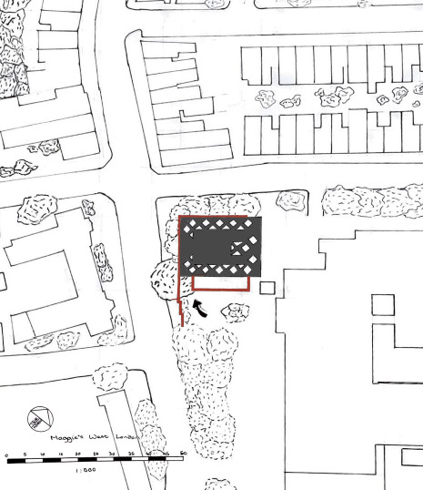
To understand the building’s structure and composition further I created a 1:100 scaled model from mountboard as can be seen below.
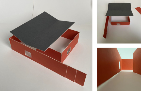
The structure consists of two floors and is wrapped in a large, red external envelope. As can be seen on the 1:100 floor plan and section below, there is a series of columns within the buildings structure intended for support due to the small number of solid walls located within the buildings span. These columns are also used to hold up temporary partitions so the space can easily change depending on the required use.

Despite being located within West London, the buildings surroundings allow for the centre to be a peaceful haven.

The centre is surrounded by trees not only for the healing benefits they provide but also to reduce noise pollution from the road the centre is located next to. The trees act as a buffer, so the sound of the cars is quieter, if heard at all, inside the Maggie’s centre.

The building is also designed to have a central “heart.” Historically, hearths have always played an important role within the house, being the area where residents and visitors gather and talk. Because of this, the hearth can be referred to as the heart of a building.
The Maggie’s centre mimics a hearth but with a kitchen, creating a communal place where people are able to gather. The building is built to allow access to the hearth, as can be seen in the diagram above, all entrances and windows lead to the hearth. This is to make the centre feel more like a house than a facility and allow visitors to feel like they are at home.
Above is an exterior perspective of the Maggie’s centre created with gouache paint. I enjoyed using different methods to render my drawings and would like to continue working with gouache to improve my rendering skills.
I learned a lot doing this precedent study and viewing the materials provided by the architectural firm. However, looking back less than four months later I can see many technical mistakes in my drawings such as the absence of scale bars.
0 notes
Text
Multiverse evaluation
There have been many challenges I've had to face in this project. This being the shortest project I've had to do (three weeks) I have struggled to produce outcomes that I'm happy with. In addition, it has been a challenge getting used to working from home without having an actual place to be. Usually the thing that would motivate me to get up and go to college was the fact I had an environment full of supportive people to go to. Now I get out of bed and walk 3 steps to my desk to be greeted with support through my laptop, it's not quite the same. On the contrary, I have been receiving all the help and advice I need through emails, information put onto google classroom and weekly online meetings. This has definitely helped me feel less stressed and much less alone. Even with these challenges I feel I can be proud of what I've achieved and the way I have worked off site considering the circumstances.
The theme of this project is multiverse. It's a MARS project so I had to make sure I was thinking about including math, art, religion and science into my work.
I began my project by focusing on researching my chosen words, as well as zines. I later moved on to researching artists and their processes that I hoped to use in my outcomes, for example Tony Orrico (a human spirograph artist), Kelsey Hammerton ( a pointillism artist) and Nick Taylor (a zine designer). Due to working offsite I have had to adapt what processes I can do at home without the proper equipment, so I went back through previous project sketchbooks and picked out a few techniques I enjoyed doing. These techniques included pointillism, two handed drawing, ink blotting and spirographs. After doing the research I needed I began planning and completing my outcomes. As a result of limited time I feel the outcomes I have produced aren't up to the standard of work I am capable of producing, and I had some very different initial ideas on where I wanted these outcomes to go. That being said I enjoyed using all the processes I had researched, plus I bought some snazzy new gouache paints!
The materials I used for this project were pretty simple as I didn't have access to college equipment. I decided early on in the project that I wanted to do this zine all hand based to give myself a short break from working digitally. I mainly used gouache paints, and I especially enjoyed using them to do my ink blot pieces. The particular reason they worked so well was because of their watercolour like personality, I could change the opacity of different colours to let other colours show through. An example of this is on the “space” pages, I chose to make the yellow opaque to allow the blues and pinks to come out from underneath. Alongside these paints I used uni-ball eye (black) and uni-ball signo (white) gel pens to outline and draw designs. I used the black pen for my pointillism pieces because it has a good ink flow and makes nice dots.
To make my zine I used good quality sketchbook paper and folded it in a common zine way. I made two of these and stuck them together to make a 12 page zine. It measures roughly 7.5 cm by 10 cm and I felt this is a good size because I wanted to make a small zine so I didn't give myself too much space to worry about filling. A preference of mine when creating is in miniature or smaller than average scale because having lots of space to fill on a page can be overwhelming, so this zine was a perfect size to get my context across to the viewer without having to fill large pages.
Conversely, my spirographs would have turned out better if they were on a slightly larger scale. This is because being on a smaller scale the design didn't quite match up geometrically, so when it came to fill in the design I struggled to find a common pattern. To make my spirographs I cut out a circle and a square from a very thick card. I then put a pin in one side/corner and drew round the shape, I would move it slightly clockwise and draw round it again. Each time I moved it I would keep the distance the same, this is where I think it went wrong because of the small scale I couldn't measure exactly how far I was rotating the shape each time.
Throughout this project I have been analysing what I've been doing each week and what I plan on doing the following week. This combined with having a cork board above my desk with the project plan and checklists has helped me to organise my time to get all the tasks done on time. I have managed my time well and I feel, even with one not-so-great week, I have been able to hit each assessment criteria.
0 notes
Text
Statement of Intent.
Prior to my last module, all of my University work has been based around the female form and the landscape that it holds within itself, that was until the final module of second year when a large proportion of my work was made within full lockdown restrictions. I investigated the rituals and repetition of this new everyday life, predominantly my own, collecting items and materials along the way. More importantly, as i dug deeper into my topic, i began to draw my focus on the walks, bike rides and runs that i was doing which were the only things drawing my out of my house. I looked at the maps that i was making within these and started to retrace these within my art work working layer upon layer to prolong the sense of repetition. I began to understand that I needed to maintain a sense of self within my works, but upon discussion with tutors, I realised that it was there all along, i was using myself and my sense of direction to map out the lines that were soon to become my art work.
One important aspect from my most recent module was how I tracked my walks and movements. I used an app called Strava that mapped out my movements for me showing exactly where I went and where it was on a physical map; this was tracked via GPS. To follow this, I find it crucial to work roughly first, sketching out ideas and designs in order to find out what it is that I actually want to be doing, it gives me time to experiment whilst also putting me into a more creative mindset which I normally struggle with. For this stage I enjoy working in watercolour paints, acrylic paint, my newly found gouache paints and more often that nor charcoal and chalks, whilst focusing mainly on the colour palette black and white. I always stick to a few muted palettes within my work, normally red hues, white and black.
As I worked in more of an abstract manner during my last module, this was new to me and it felt almost like an instinct so it is my main area of focus for this year that I want to dig deeper into. Whilst also maintaining the ideas of psychogeography in my practice as this was a major part of how my finalised pieces came together last term. The main struggle that I am going to find here is that I don't seem to get out as much here whilst in Plymouth as I do at home in Barnsley; however this could definitely be a changing point for this. However as i will still be looking into repetition and rituals, this would also be a good time to look for these in different areas of my life, for example, the routes taken around my house on the daily.
I will also be using our life drawing sessions as a time to map the form in the same way as my mapped pieces, using chalk and a single line drawing with no need for the figure to become a realistic and understandable form.
Towards the end of the module, I imagine that I will be working with oil paints and emulsion, hopefully on a larger scale. I really enjoyed working on a large scale for my last module too so this is something that i'm willing to explore, but i would also like to do more canvas work both loose and stretched. Prior to this I will do the majority of my experimental pieces in charcoal, acrylic paint and watercolour paint as they are cost effective but also materials that i know how to work with in this given area. I have also recently invested in some gouache paints so I am hopeful that I will be able to incorporate these somewhere, especially within my life drawing studies. I think that life drawing will be a very important part of my studies this year as I begin to look at the form in a new way and with a different style of drawing.
I am hopeful that my work within this module will not suffer as a result of covid-19, however my biggest worry is my motivation to work due to being in class much less often as i will struggle to get into a routine. I am also aware that if i visit home at any point i may not be able to come back to Plymouth due to certain restrictions. Other than this, I will be trying my best to continue on as normal, my practice and that I am hoping to produce won't take too much of a hit.
0 notes
Text
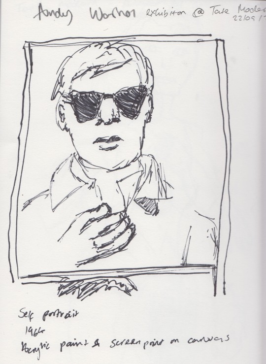
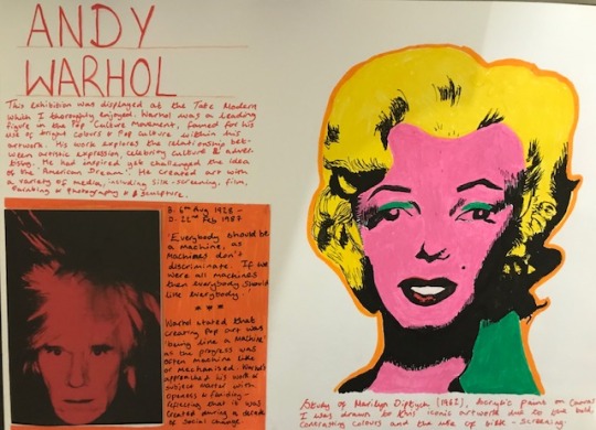
Andy Warhol Exhibition
Today I visited the Andy Warhol Exhibition at the Tate Modern.
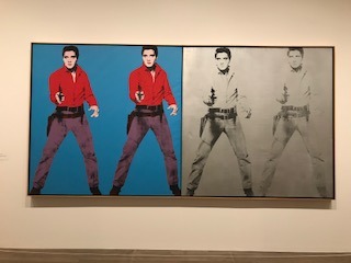
I thoroughly enjoyed this exhibition, particularly to see the original scale of certain art work- I was unaware of how large the Marilyn diptych was! It was also a good challenge to draw some pieces while in gallery.
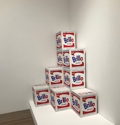
Below are some pieces that caught my attention.
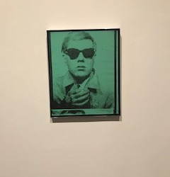
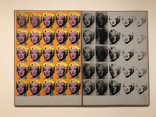
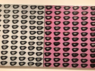
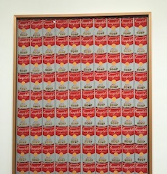
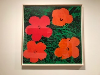
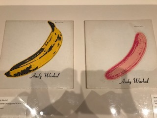
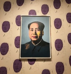
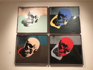
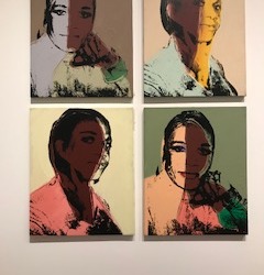
I was also intrigued how Warhol represented identity through his work. His upbringing is reflected in his work, Campbell’s Soup Cans, referencing to eating watered down tomato soup’ as a child. He also approaches his subjects with the same treatment- everyday, commercial objects to Hollywood stars in colourful and bold ways that Pop Art is renowned for. I was also interested in the artist’s technique, in which screen printing was used and how details were achieved through this.
Warhol was quoted to say creating pop art was ‘machine like’ and wished everyone was machine so there was no discrimination. As a homosexual, studies of his lovers in graphite and screen prints of trans people, reflects social changes during the 60′s and 70′s and represent supressed voices being promoted through his art.
Gallery Sketches
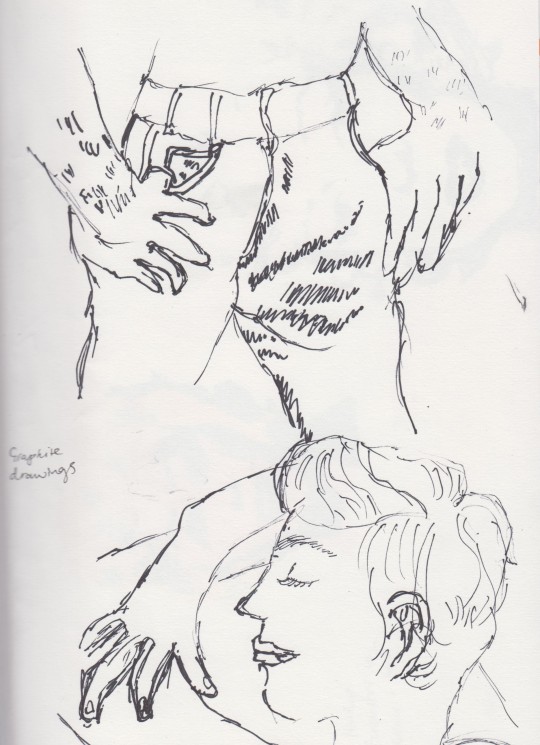
Sketchbook work, ideas and reflection...
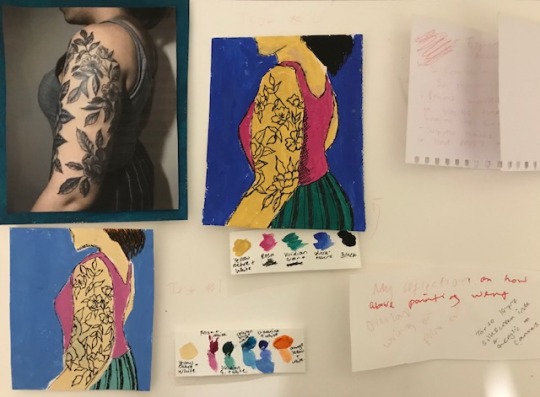
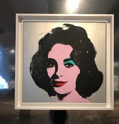
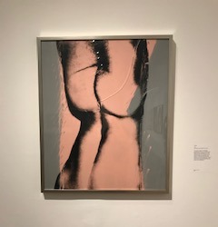
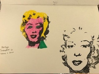
Then I experimented with some of the artist’s technique in my larger sketchbook. Based on the identity theme for the self directed project, I had chosen an image of myself, when my sleeve had just been tattooed. I was inspired by the vivid, block colours of the Marilyn Diptych and so painted two thumbnails in gouache of my sleeve photo. The first thumbnail ended up too light and wasn’t punchy enough as I had mixed white with the colours. I had also gone over parts with a black Posca pen, to pick up the details of the tattoos, trousers, hair and outline the body.
With my second attempt, I used the colours straight from the tube, apart from mixing yellow ochre with less white for the skin tone. I felt this was more successful, the colours stood out more and felt more pop art inspired. I had also painted the hair black and crosshatched details along the torso with the posca pen for added details and shading.
Overall, I thought the trip was very inspiring and had made me consider what medium and colour palette I could use for my self direct project. I enjoyed using the gouache to create a bold colour scheme and adding detail with Posca. Something I could do differently next time is play with scale- would the piece look as effective on a larger scale? As the final piece is required to be A1 in size, this would be something to consider.
0 notes
Photo
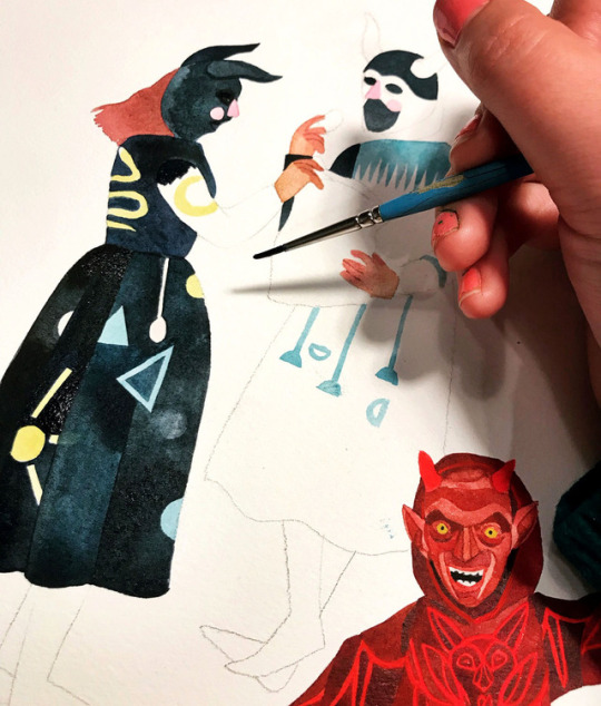
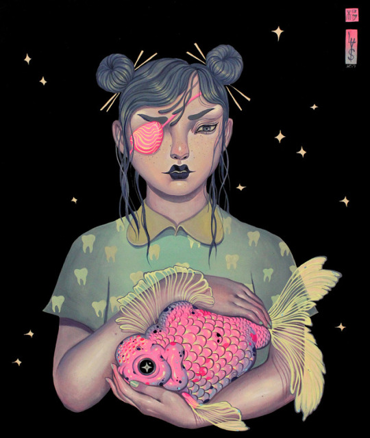
SKETCHY BEHAVIORS | Interview w/ STACEY ROZICH (LA)
From animal mask wearing people sifting through antiques to creepy mascots being arrested by equally creepy looking officers, Los Angeles based artist Stacey Rozich’s watercolor works are all things awesome. Strange, familiar, dark, humorous, and pleasantly eerie at times, Rozich’s paintings, while done in the style of folk traditional painting, are filtered through her own lens of modern pop culture. With some upcoming shows in the New Year–a group show at New Image in LA in February and a two-person show at Portland’s Talon Gallery in September–we couldn’t wait to chat with Stacey Rozich about her early experiences with drawing, her collaboration with Subpop Records, and her sketchiest story involving loud raucous metal heads and a little out-of-the-way saloon in Malibu in this latest Sketchy Behaviors.
Photographs courtesy of the artist | Portrait by Kyle Johnson
Tell us a little about yourself.
My name is Stacey Rozich, or Stace, Stace Ghost, etc. I’m from Seattle, but I now live in Los Angeles. I’ve been painting in watercolor for the past twelves years, and drawing before that since forever. I sometimes do large scale versions of my work as acrylic murals, which is something I stumbled into. I dig painting in the folk tradition, but through my own lens of modern pop culture, and way too much tv watching as a kid. Seriously, I was an insomniac in middle school and for some reason my parents gave me a tv in my room, so I stayed up all night watching VH1 Pop-Up Video and Adult Swim (circa late 90’s). I have an almost encyclopedic knowledge of The Simpsons seasons 3 - 8 — I used to recite monologues from the show to my family when I was a kid. And I still do!
What was your first experience with art / drawing? And who were some of your early artistic influences?
In Kindergarten I drew a many-legged leopard in the forest with crayons and I got a lot of praise for it from the other kids and the teacher. I felt a combination of pride and complete embarrassment for the attention I got for something I created without thinking. My earliest artistic influence was probably Sailor Moon. I wish I could say I was one of those really smart arty kids that loved Picasso, but honestly I wasn’t that aware of what “real art” was until later in pre teenhood. The flashy colors and character designs of Sailor Moon were so exciting for me! Even the lush watercolor backgrounds captivated me. I liked drawing people then so the outrageous proportions of the girls was something I could mimic in my own drawings.
Some of our favorite aspects of your work is your use of gouache and watercolors. Can you share with folks what it is about this particular medium you enjoy so much?
I absolutely love watercolor, and truthfully I don’t use gouache that much to consider myself proficient in it since it’s a slightly more opaque medium and I use it for accents. Especially the fluorescent gouaches I picked up in Tokyo, those against my watercolors pop nicely. But watercolor, yeah, I think I have that one in the bag. I remember using it in high school and absolutely loathing it — where was the control? One wrong move and it all just blended together into one big wet puddle. When I was a freshman at CCA (California College of the Arts in San Francisco) I took an intro Illustration class and the first thing our professor did was give us a watercolor demo; I was not looking forward to it. He was such a wizard with it! He gave us really smart instructions to not use very much water, and really “charge up the brush” with the pigments and paint it in and let it dry fully. That way edges of the paint have dried and created a barrier for the next application of color next to it. That’s why the barrier for entry with watercolor can seem too high, when it gets too slippery to work with there’s an overuse of water. I got that suddenly and it all clicked. Since i grew up drawing habitually I liked that I could use a very small brush and almost draw with watercolor, and large brushes to fill in certain planes with tonal washes. I like that I can wipe and dab away little pools of color and it creates a nice stained glass effect — that looks really lovely against a matte layer of watercolor that I’ve used extremely little water with.
Are there other mediums you’d like to try in the future?
In the future I would really like to start painting portraits of people in my life. Like, Alice Neel style portraits in oil. Oil intimidates me greatly so I think I’d start in acrylic.
What’s a day in the studio for you like?
I get to my studio around 10am since I’m not a very early riser, unfortunately. I so envy early morning people! One of my girlfriends who’s an incredible textile artist is up and at ‘em and hiking in Griffith Park by 6am. And there I am under the covers with a cat on stomach looking at her Instagramed hike thinking “Some day that will be me” — I like to lie to myself. Anyway! Once I roll into my studio I settle in to write some e-mails, putz around the Interwebs, and then get down to the task at hand. It’s usually 11 around this time so I’m usually really chugging along by 3, and then I’ll keep going for a few more hours. If it’s a painting for a commission or gallery show I tend to spread my timeline out so I don’t get burned out. If it’s a commercial gig there’s a lot more scanning, Photoshop clipping out and editing which can take me later into the evening.
What’s that process like?
My process always starts with loose sketches on paper, which can mean in a sketchbook or whatever blank piece is lying closest to me. I work out compositions with really doodly lines — they’re virtually unintelligible but I know what they mean. When I move to the final I mostly wing it when it comes to the color palette. If anyone has ever seen my watercolor palette they know it’s a goddang mess which works for me. I usually work with whatever shades I’ve pre mixed and let dry in the pan.
You’ve worked with various clients and companies over the years. Do you enjoy collaborating and what do you find the most challenging about it?
I do like working commercially, the collaboration with art directors can be incredibly rewarding. Though there are times it becomes a slog when you’ve created about four or five killer rough ideas and they go with the weakest one. Why does that always happen? You have to do what they say essentially, but still keep your voice even when it feels a little pinched.
In 2015, you collaborated with Subpop Records on some amazing record art and design? Can you tell us a little about that collaboration and process?
Subpop is one of my favorite labels to work with hands down. Their art director Sasha Barr is such a boss. I was really lucky when I was working on the Father John Misty album that I got to create the art and not worry about the editing process. I sent it up to them since they had access to a gigantic scanner to get a full high-resolution image. It meant a lot that I was able to do the art as an actual full scale piece, as opposed to broken up to little scraps and then scanned on my wee little ancient scanner. Sasha did all the leg work to clip out the whole thing and to figure out how to stage the multi-layered pop-up interior gatefold. Usually when I work with smaller clients they ask me to do all this which is…not a good idea. Ultimately that album packaging was nominated for a Grammy in Packaging Design in 2016, but we lost out to Jack White because of course. Damn you, Jack White!
What WOULD BE your ideal collaboration?
I would like to work with a great publishing house to do my own young adult series. Basically all the characters and worlds I’ve been painting distilled down into a serialized art book/graphic novel type thing. That’s a big dream of mine that swings from feeling so possible and exhilarating and then feeling completely futile because everyone has the worst things to say about the state of publishing right now. I still have hope that someday I’ll get it together to at least put forward a proposal.
On a different level I’ve love to design some patterns for Gucci. I’m not really up on the latest collections of luxury brands but Gucci is one I’ve noticed has been doing a fantastic job incorporating illustrations into their garments either as accents or printed motifs. The uniqueness of the artwork coupled with excellent hand done detailing makes my brain feel fuzzy in a really good way.
What type of music do you listen to when creating? Can you give us the top 5 bands you’ve been checking out?
I waffle back and forth between music and a lot of podcasts. For the times when I can’t listen to anyone talk anymore, I listen to Jim James, Solange, Charlotte Gainsbourg, Shabazz Palaces. I just started listening to Andy Shauf’s new album which is lovely, it reminds me a bit of Harry Nillson. Also there’s a great massive playlist on Spotify called Twin Peaks Vibes that is excellent.
What’s your strangest or sketchiest art story that you want to share?
I was eating lunch with some friends at this little out-of-the-way saloon in a canyon east of Malibu after a hike a few months ago. It’s pretty isolated down there — they’ve been using this place for filming Westerns since the 30’s so it’s a very specific strange and cool gem. I was sitting at the bar and these bros come in, being loud and raucous. I kind of internally rolled my eyes at them and ignored them. I hear one of them say “Excuse me — are you Stacey Rozich?” I got scared for a moment because anytime someone recognizes me by name I feel like I’m going to get into some trouble. I told him I was, and then he and his friends got very excited since they all were huge Southern Lord fans, and loved the album artwork I did years ago for the band Earth. I was really surprised (and relieved) and we had a good chat! It was a very unexpected encounter down at this little far away rustic saloon.
What’s a common misconception about artists?
Perhaps that we’re all lazy. That we don’t have a good work ethic since what we do is hard for most people to wrap their brain around. It’s a completely unconventional path to go down, and you have to be extremely dedicated to it. Yet somehow this doesn’t quite translate to most folks since it seems like basing your life and career on an unknown pursuit like art seems insane. And there’s an idea that artists have a lot of free time to spend laying around waiting for inspiration to strike.
What’s been the biggest challenge for you as an artist?
The largest challenge for me, honestly is: myself. I’ve been working solely on my artwork for the past six years and it’s been full of a lot of ups and downs: emotionally and financially for sure. There’s always a feeling of not being good enough, why aren’t I as good as this or that artist, why aren’t I doing X, Y or Z. Don’t get me wrong, I am proud of myself for what I have accomplished but I need to remind myself of that before I go down a spiral of anxiety. It comes from a fear of rejection which can prevent me from pursuing things, submitting a proposal for the aforementioned young adult series for example. Sometimes I need to remind myself to get out of my head and to get out of my own way.
What do you think you’d be doing if you weren’t an artist?
I’d probably be in finance, on Wall Street most likely. Kidding! I think about this sometimes. Being someone who creates has always been so tightly wrapped up in who I am as a person that it’s hard to extract myself from what I would be without. I would hope I would do something in Slavic studies. My dad’s side is Croatian (by way of Detroit) and while that’s been a huge inspiration for my artwork I’ve always been really fascinated with that region’s history of conflict and resilience. When I spent six weeks there back in 2012 it only deepened my love for that place and also my curiosity for what makes it tick.
What are your favorite Vans?
A pair of beat up, worn in, maybe a couple of holes at the toe blue or red Authentics. A true classic.
What’s a question you never get asked in an interview and would like to ask and answer yourself?
It would be, ‘If there was one person living or dead who you wished owned or could have owned your art — who would it be?’ To which I would say that’s such a hard question there’s so many people I admire! But as of this moment I think it would be rad if David Lynch had some of my art. I love his unstructured style of storytelling, all the loops and the sometimes frustrating dead ends his narrative world has. The effect of creating an unusual if not downright confusing vignette just for the sake of it reminds me of how I approach the storylines in my work.
What cool and interesting projects or shows that you’re working on - should folks keep an eye out for next year?
Since it’s the end of the year things are usually pretty quiet in terms of projects, but I’m in a group show in conjunction with Luke Pelletier’s solo show at New Image here in LA in February. I’m scheduled for a two-person show at Portland’s Talon Gallery in September and! Hopefully, if it all aligns, I’ll be headed Internationally to do some muraling. I’m stoked for it!
FOLLOW STACEY | Instagram | Website
#Art#Vans#Vans Art#Stacey Rozich#SKETCHY BEHAVIORS#female artist#vans girls#painting#gouache#watercolor
268 notes
·
View notes
Text
MEET GALLERIST STEFAN VON BARTHA
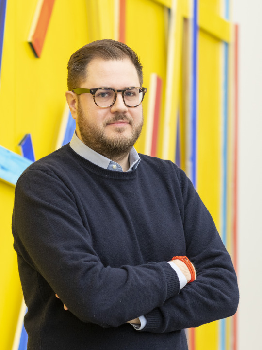
Image: Stefan von Bartha © Ben Koechlin
We recently caught up with gallerist and collector Stefan von Bartha of the Basel-based gallery von Bartha to discuss the cancellation of Art Basel, the impact of COVID-19, the changing art world, and the gallery’s upcoming programs. Von Bartha was established by Stefan’s parents Margareta and Miklos von Bartha in 1970 in their family home and has been under Stefan von Bartha’s direction since 2008. As one of the longest-running international contemporary art galleries, von Bartha is celebrating it’s 50 anniversary this year with a special group exhibition titled The Backward Glance can be a Glimpse into the Future, featuring a selection of the gallery’s modern and contemporary artists including Sarah Oppenheimer and Jean Tinguely. Von Bartha’s Online Viewing Room at Art Basel OVR will open to the public from June 19 – 26, and will feature a live streamed conversation between Stefan von Bartha and artist Jakob Fenger from Superflex on Friday, June 19 at 11am.
After its initial postponement to the fall, Art Basel is now officially canceled, what does this mean for your gallery and the city of Basel?
We are of course disappointed that the physical fair in Basel cannot take place this year, but it was the right decision on the part of the organizers. We look forward to participating in the next edition of Art Basel in Basel next June. In the meantime, we will present a group exhibition, The Backward Glance can be a Glimpse into the Future, at the gallery which opens on September 5th. The gallery celebrates its 50th anniversary this year, and this exhibition is on the subject of our 50-year history. The show will feature works by contemporary artists Anna Dickinson, Terry Haggerty and Sarah Oppenheimer and modern artists in our program like Camille Graeser, Yves Laloy, and Jean Tinguely. We look forward to welcoming visitors to the exhibition, which is curated by Beat Wismer. This year we launched our own online viewing rooms, and if you can’t get to Basel for this show, you will be able to view it through the viewing room on our website from September 5 to November 7, 2020.
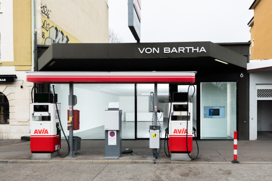
Image: Von Bartha Gallery Showroom, Basel © Ben Koechlin
Do you foresee a lasting impact due to COVID-19 on your gallery and the artworld in general?
Of course it will have an effect, but currently no one can really predict the scale. I think one must differ from the collector base, that for example our gallery has. We have a long tradition of working with collectors that collect as a passion and not as an investment. One should never invest in art as there is no guarantee how the prices will develop. COVID-19 has taken the physical fair opportunity away for now, but nevertheless we are in close contact with our collector base and continue to work the way we have before COVID-19. A positive outcome from this is that we actually have more time now to speak about art and experience works with our collectors, which is great.
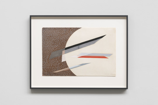
László Moholy-Nagy, Komposition, 1935, Gouache on paper
Your parents founded the gallery in the 1970s so you practically grew up in the artworld, how have you seen the artworld change over the past decades?
The artworld I grew up in was smaller, more intimate, and not as public and social as it is today. I am a big fan of the recent development of being able to see artwork prices online and having a much more transparent artworld. The part I miss is the ‘handshake attitude’ when experiencing art. I still prefer to show someone an artwork in person than online or via selling platforms. These are all great tools and I wouldn't want to miss them, but it presents art as a product and not as a passion. Art has a cultural importance which must be conveyed, now more than ever.
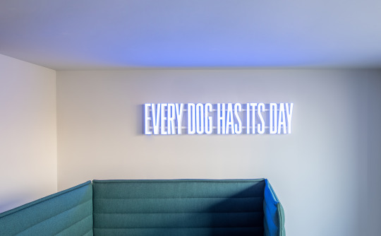
Superflex, Every Dog Has Its Day, 2019, LED lights, plexiglas, aluminum letters
You are participating in the Art Basel Virtual Viewing Rooms, what is it like to adapt to a virtual platform? And what will you be presenting?
We are excited to adapt to this new platform, and we are looking forward to participating. We will present works by contemporary artists such as Terry Haggerty, Landon Metz, and Superflex. We will also present a historical section highlighting the gallery’s four most important influences: Swiss Concrete Art (Camille Graeser); Hungarian Avant Garde (László Moholy-Nagy); 20th century Swedish art (Olle Baertling); and major works from the Latin American art movements Arte Concreto Invencion and Arte Madí.
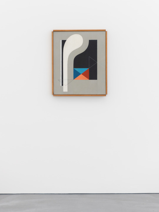
Camille Graeser, Untitled, 1938, Oil on canvas
What artists are you most excited about at the moment?
There are many but I am incredibly amazed by the latest works by Imi Knoebel that we will present at the gallery in November. Marina Adams is another great figure; I recently met her in person and I love her large paintings.
To learn more about von Bartha go to:
Website: www.vonbartha.com
Instagram: https://www.instagram.com/vonbartha/
Twitter: https://twitter.com/vonbartha
Facebook: https://www.facebook.com/galleryvonbartha
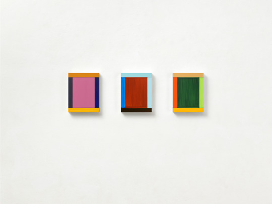
Imi Knoebel, Anima Mundi 42-3, 2019, Acrylic / Aluminium
0 notes
Text
Hyperallergic: The Pleasures of Slow Paintings
Suzan Frecon, “lantern” (2017), oil on linen, two (2) panels, overall: 87 1/2 x 108 x 1 1/2 inches. Panel, each: 43 3/4 x 108 x 1 1/2 inches (all images courtesy the artist and David Zwirner, New York/London)
I began looking at Suzan Frecon’s work shortly after I got to New York in 1975, when she had no gallery, and have been following it ever since. In 2005, when she was able to show her large paintings for the first time in New York, having previously shown small paintings and works on paper, I interviewed her for The Brooklyn Rail (November 2005). One of the things that she said in that interview has stayed with me:
All my decisions are made for visual reasons.
Inspiration, no matter what it might be, can never be the justification for a painting’s existence. In this, Frecon shares something with another abstract painter, Thomas Nozkowski. The difference is that Frecon works on a much larger scale, with a much smaller vocabulary. In that same interview, Frecon expressed her admiration for art that was ‘anonymous” and reached “a high plane of abstraction.” This goes against the commonplace model in which artists explain what they are to up, and how it is relevant, producing a readymade text of meaningfulness (or creative unmeaningfulness) that can be replicated in various ways.
As curious as we might be about what prompted a painting by Frecon — and it is never really just one thing — an attempt to discover it seems almost beside the point. Here, the critic must avoid the pitfall of showing off how many clever associations (or visual similarities) you can come up with. I think this is why people dislike certain kinds of painting so much: they cannot say what it is. They don’t like that uncertainty because it reminds them that life too is precarious, with the only guarantees being, as the saying goes, death and taxes.
Suzan Frecon, “vermilion” (2017), oil on linen, two (2) panels, overall: 84 1/8 x 104 x 1 1/2 inches. Panel, each: 84 1/8 x 52 x 1 1/2 inches
In the exhibition Suzan Frecon: recent oil paintings at David Zwirner (September 14–October 21, 2017), the artist exhibits seven large, two-panel paintings. In six, Frecon works with two colors, one for the figure (an elliptical or a semicircular abstract form) and one for the ground. The figure has a glossy, lacquer-like surface, while the ground is more thinly painted and matte. The material differences affect the painting in a number of ways, including its relationship to the ambient natural light filtering through the gallery’s skylights, and not supplemented by artificial lights. The day I visited the show was cloudy, and so the light in the gallery felt gray and muted.
There is a bench to sit on in one room, where there is one painting, “noh” (2017), hanging, but none in either the front gallery or the large main gallery, and there should be. These paintings are to be contemplated from afar as well as walked up to and scrutinized. They are what the artist calls “slow,” meaning that they reveal themselves quietly over time. They are an anomaly and have more in common with Ad Reinhardt, whose “Blue Paintings” are on display in Zwirner’s other Chelsea gallery space, than they do with the work of Frecon’s contemporaries. Partly this has to do with her temperament, but it is also her response to the revelatory Hilma af Klint show that Frecon saw at PS1 in 1989, which helped her return to geometric forms, which she abandoned earlier in her career to concentrate on colors and paint strokes.
In “noh” (2017), a cadmium red half-moon extends across most of the painting’s two terre verte panels, its rounded edge touching the left panel’s top left corner while drifting just below the right panel’s top edge. I wrote “half-moon,” but I immediately want to qualify that description. The right side of the form is a skewed quarter-circle, stretched between the panel’s right and left edges. The other part of the shape extends across the width of the left panel not all the way. Its curve is more rounded. Do each of the shapes occupy the same amount of area? What about the severity of the red shape’s bottom edge, which cuts across the surface of both panels like a scalpel? It is as if the muted, matte green ground falls below the form it appears to be physically holding it up. How can that be?
Suzan Frecon, “ultra terre verte” (2016), oil on linen, two (2) panels, overall: 87 3/8 x 108 inches. Panel, each: 87 3/8 x 54 inches
The shape is asymmetrical and particular; one inspirational source is likely the anonymous tantric paintings (done in tempera, gouache, and watercolor on salvaged paper) that have been shown in New York at the Drawing Center and at Feature in recent years. The source of these paintings at both venues was the French poet and translator, Franck Andre Jamme, a longtime friend of the artist. But Frecon does not replicate the often symmetrical tantric shapes, but instead kneads them into something as uniquely shaped as a baton of freshly baked bread. Like the rounded loaf, the shape she arrives at feels inevitable. The placement of the shape is also calibrated. The ones floating in the center or near the top of the image instill a state of calm buoyancy into the painting. I am thinking of “ultra terre verte” (2016), “vermillion” (2017), and “noh” (2017), in which the shape seems to be floating like a balloon, held within the pictorial space by the painting’s top edge. The tilt of the shape, as well as its symmetry, add a vibratory note: they are not still, despite all the stillness they embody.
While Frecon has talked about the way her use of red has evolved into “earth reds or red oxide colors” inspired by Pompeian frescos and the brilliant red found in Chinese wax seals and paper lanterns, among many other things, it seems to me that it is beside the point to make a connection between her red and violet palette, not to mention the half-moon shape in “lantern” or “noh,” to Chinese art. The half-moon in “lantern,” as in “noh,” is asymmetrical, but with its curved side here resting on the painting’s bottom edge. In addition to a half-moon, one can associate Frecon’s form with a slightly lopsided smile, an antique boat, or an Ellsworth Kelly shape, if one wishes, but those are cultural associations, part of the way the mind works, and do not necessarily help us see the painting better.
Suzan Frecon, “noh” (2017), oil on linen, two (2) panels, overall: 84 1/8 x 104 inches, panel, each: 84 1/8 x 52 inches
I think of Frecon’s shape as an abstract thing, a form that defies being turned into language or a message. I think her resistance to the tendency to easily convert her art into the cheapened language of the day deserves to be singled out.
Frecon’s merging of color and shape is an unexpected development, and, to my mind, her evocative use of color is rivaled only by Brice Marden, but is narrower and less seductive than his. Her attention to the various states of materiality that are synonymous with her paintings’ surface is unique to her work. Although Frecon might be considered the tortoise to Marden’s hare, she has slowly and patiently moved into a territory that is recognizably hers. It would behoove us to acknowledge that reputations are not etched in stone, and noteworthy artists who were previously not on the art world’s radar have been arriving with little if any fanfare of late. I doubt that Frecon would have it any other way.
Suzan Frecon: recent oil paintings continues at David Zwirner (525 West 19th Street, Chelsea, Manhattan) through October 21.
The post The Pleasures of Slow Paintings appeared first on Hyperallergic.
from Hyperallergic http://ift.tt/2xZT7bm
via IFTTT
2 notes
·
View notes
Last Seen Blogs
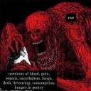
snixkers
SSA Snixkers

danycolombia
pantys y bikines

lesbianminifigures
Lego wuhluhwuhs

kamilamairink
Untitled
mystifyme-blog
Identity