#i didnt feel likw drawing them good
Text
Comically large sandwich
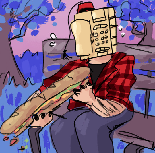
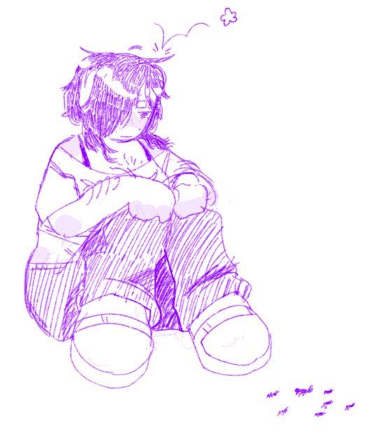
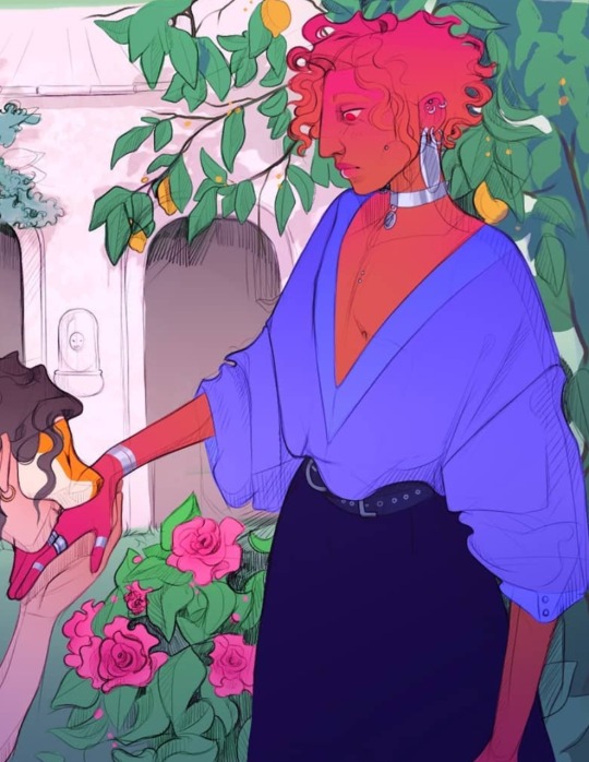
Day 90 of drawing Oliver Swift everyday until I get on HRT
#please ignore hoq fucked the hands look ok#i didnt feel likw drawing them good#daily oliver swift#oliver dialtown#oliver swift#dialtown
60 notes
·
View notes
Text
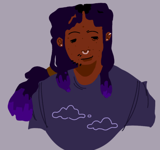


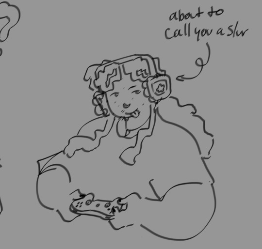
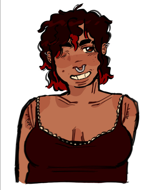
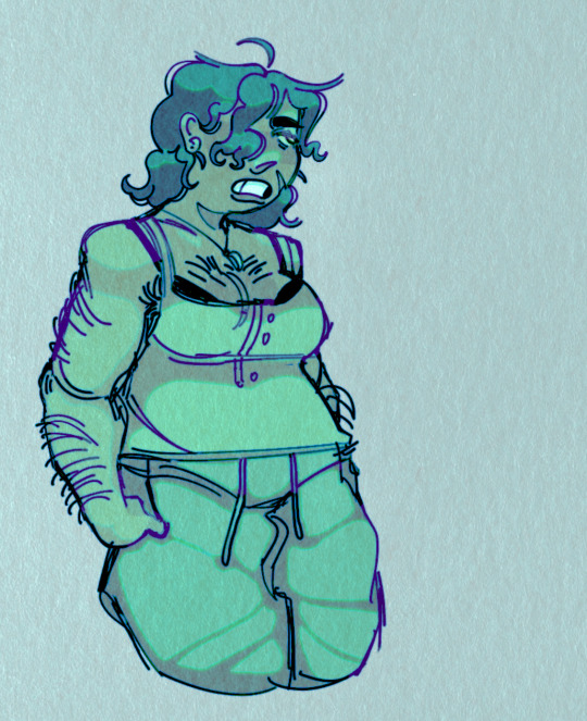
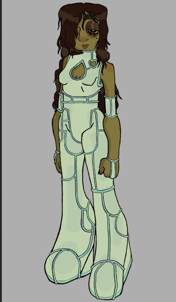
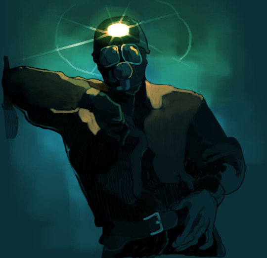
assorted old and somewhat unfinished oc art (except the second one thats recent)
#my art#art#trans#my ocs#ocs#trigger#gummy#i guess#i dont likw the name gabe caus ei kinda just threw it in for backstory points but theres no real reason#ill pick a diff name#and sunbeam doesnt even have an actual name yet im caught between sophie & sabrina but i cant keep sunbeam name#crazy to me how these guys started out i should post the first gummy art#it feels weird drawing them being nicento eachothwr. like how in animes characters will hate eachother so much but the official art isnthem#like kissing or something#i gotta practice art and get some story shit together that i can actually show ppl#i feel like i somehow draw worse than i did alpng the process of making em#the blue one wit trigger is my magnum opus of arms ive never drawn a single good arm atter that#i didnt even draw for like months after that bc notjijgn was good enough#ive been eating like a 16th century merchant lately#breads and rice with meat & soup#i had some really good apple and pear slices today i cut & spiralized like 10 apples#ok i dont really have anything else to say
42 notes
·
View notes
Note
do you have any art tips? your art really inspires me, and I was just wondering if you could share your secret /lhj
HEAA MWAA IT MEANS A LOT.... KISSIES....
I think a lot of my work comes from being inspired by OTHERS and OTHER THINGS so, ur on the right track!!!!! A big part of the art process for me is STUDYING literally everything, it's what I enjoy the most.... just looking at light and shadows irl, looking at how clothes fold, and managing to fall in love w it all :') if u have smth u love, take some time off just to stare at it and try to figure out what makes it so special!!!! I was very frusturated w my own art (well i still tend to be but) bcs it looked even more stiff, and the lines were not... working for me
Its fine linework...... does its work.... iys cute!!!! Id also likw to try more detailed thin lines one day again! But it didnt work bcs my understanding of weight was still very weak.


Here is some work by CLAIRE WENDLING. I.mean loOOOK AT THAT LINEWORK. JESUS. also their anatomyis SO GOOD. All of the odd awkward angles, makes everything feel not... natural but naturalistic, raw and good. Theres angles and a weird rythm of un-detailed spots vs very detailed spots. After a g e s of working on loosening up my arm and loosening up anatomy and trying 2 think of weight while drawing, Ive gotten here.

I still have stiffness in my work, but.... yk. Its a little better. I play w hands more, play w flat areas, w more jiggly lines... u.dont often see my lines on their own but i also use softer, more textured brushes that are a bit more similiar to pencil strokes.
Idk ig my advice is jusy stare at things and try.to figure out what makes tjem so great. Also recognize that art takes SO MUCH TIME. Compared to how small my development is, the first image & the latter images r years apart, and the difference in the subjects brought up here is SO.MINIMAL.
Ig more.than anything just...... find what makes.art enjoyable for u also???? Ik my method.might not make some happy.... for someone maybe drawing the same quitar makes them happy endlessly.....!!!!! And thats what they should do!!!!!! God i lov art i hope u do too....
10 notes
·
View notes
Text
Designing the mugs


I absolutely loved designing here mugs right from the start of the project when I illustrated in this style I found it really soothing, the care free feeling of continuous line brings me so much joy and I’m so happy that I could incorporate this style into my final pieces of work.
My idea has changed slightly since my final design (I know that’s really bad but it just happened and I think this is much better now). Instead of doing the fruit tea, the cake & biscuit, and the how to tea mugs I decided to just stick to the fruit teas. There are a few reasons for this;
- Although cakes and biscuits link with tea and Britishness they do not scream healthy eating and as my cafe is a healthy fresh food cafe the use of unhealthy sugary treats on their mugs would be highly contradicting.
- The tea recipe- it’s a shame because its a great idea and I did make an illustration based on it however when put next to the other mugs it simply didnt fit. And it would make much more sense for me to focus on the food in the cafe rather than the drinks.
- Even though the fruit teas still count as drink the fruit I illustrated for the mugs still link the the word fresh food so I decided that just sticking to the fruit designs would be the best option.


During the designing process I made small samples of different designs I could do the first was an english breakfast. The reasoning behind this idea was using play of words of english breakfast tea and an english breakfast. However having meat and beans on a mug didnt sound very appealing so I ended up scrapping this idea. Secondly I drew out a biscuit design as biscuits usually accompany tea. This is a lovely idea but I felt like this design didnt really link to what I was designing for, the cafe being a healthy food cafe. Thirdly, I drew out a pen and ink design of a cup of tea along with all the ingredients that goes into making a great cup of tea. This was a design I was really happy with however, when organising the drawing into a pattern it simply didnt look right. It’s a shame because I really likwe the drawing but it seems more like an illustration than a surface pattern design like the others. I hope I can use this illustration in some way in my final piece because it would be a shame to waste it. Finally, the plum mug, this design was nowhere near as detailed as the others and the colours were very plain and basic which was something I really didnt like, so for this reason I scrapped that idea straight away.
The Final Mugs-
The berry mug:
The berry mug is one of my favourites, I love the use of colour in the different berries making them look very dinsictive. I kept the illustrations fairly small but spaced apart so they weren’t too overcrowded. This design was inspired by the Kath kidson mugs I researched I loved how the strawberries looked on her mugs so I decided to draw them in the continuous style with pops of watercolour applied in a blotchy way to look like juice running from the berries.
The lemon and Ginger mug:
I followed a similar theme with this design filling the design with warm yellows and light browns for the pieces of ginger.I made the design much smaller this time clustering the illustrations together leaving barely any space inbetween.
The Kiwi and Cranberry mug:
This is the biggest pattern of the three designs I followed the same technique as the first but instead of widening the gap between each fruit I enlarged the fruit itself to make them stand out. This design worked so well and I was really happy with it.
The reasoning behind choosing these fruits when designing my mugs was partly due to the fruit teas on the menu but also due to the use of colour. Looking back on the article of colour physiology I wanted to make sure I chose suitable colours to represent the cafe. So I chose the berry mug with the colours red and orange to increase appetite and a feeling of calmness. I chose the lemon and ginger mug to fill the design with yellows and oranges which are also known to increase appetite and positivity. And finally with the kiwi and cranberry mug which I flooded with greens which is associated with good health, yellows, and a hint of red to increase hunger and positivity.
0 notes
Last Seen Blogs

baciavuoto-blog
baci a vuoto.

lilpixel-teddybear
Just need a Little☆Space
cronovoid
fade to grey

pinotorto
A friendly pine tree