#graded2
Text
Graded - Shoot 4
Although the planning of this shoot was rather rushed, I feel when it came to shooting it went smoothly. I unfortunately struggled to find orange napkins so opted for a sheet of coloured paper instead. Similar to my Asda shoot, I forgot to take another meter reading when moving the soft box around and so a majority of the contact sheets are a stop underexposed.

As described in my plan I have shot multiple angles on this particular shoot to see if it breaks up any monotony in my project. While I think I prefer the flat lay image here, I do think the close up is strong on its own, too. I plan to continue to take multiple shots in this way, and make a final decision for the overall project once I have all 10 places photographed. However, I think it was very valuable to try out a different idea. These shots were both photographed at 55mm so I am planning to shoot at 85mm my next time in studio.
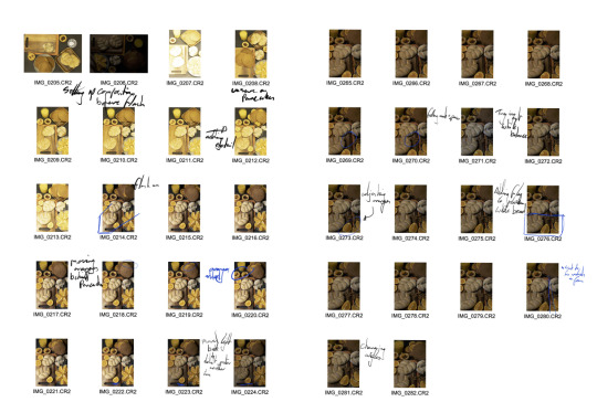
Example of contact sheets:
2 notes
·
View notes
Text
Graded - Shoot 3
Final Image:

Due to doing two shoots during the day, and Asda being the second, I wound up rather tired and frustrated while arranging this shot. I powered through, but at the time I wasn’t especially happy with the outcome of the photograph. However, after sleeping on it, I actually think it is my favourite of the set so far.
The overall scene was photographed a stop underexposed, though I didn’t realise during the shoot. I hope to be more on top of taking meter readings after changing lights in future shoots, but I was definitely cutting corners that afternoon.
Example of contact sheets:

I kept a similar lighting set-up to the Tesco shoot, the dark flag on one side allowing me to create quite a rustic look to the images that I rather enjoy. As described in planning, my green accents were a little more muted than I’d hoped. However, I think overall it worked very well together just as a different aesthetic to what I expected.
2 notes
·
View notes


Text
Graded - Preparing for printing
I have chosen to print with deadly digital as to make use of their student discount on 5 A3 prints at the moment. This was quite a lifesaver as I am already over budget when it comes to this project. I will be printing on lustre paper as to get a nice shine to the print- I did initially want to print matte but after doing tests I really like the texture on the image.
To prepare for printing I corrected the colour balance of the batch of 5 as to ensure they didn't all print with extremely different casts. I did this very simply in camera raw, as I knew especially the JJs shot was a little more blue cast than others. I did this by simply selecting the whitest thing in the frame with the white balance dropper, and again for each individual image.

0 notes
Text
Graded - Printing & Selection
Over the course of shooting, I of course ended up with some favourites from the project. After any post-production work needed, these became absolutes for both my overall 10 images as well as the 5 due for printing A3. I was able to do small test prints in order to have the images physically in front of me to choose from, as well as get some second opinions from classmates.
I believe these are my three best images from the project:
While these are my best, I think I am personally more inclined to the busier framing anyways. As such, my favourites are those with such aesthetics. I want to balance out the number of supermarkets and bakeries present in my 5 prints, too, as to stick to my concept as much as possible. With this in mind, I want my other two prints to be one from either. I also want them to be simpler compositionally than my first three picks.
Overall, pictured are my 5 shots for printing. My intention was originally to print matte, but after doing test prints I ended up quite liking the shinier look of the prints and so have chosen to print on lustre paper. I will be printing with deadly digital.
1 note
·
View note
Text
Graded - Further research
While I already pride myself a little on my understanding of colour, this article did inspire a lot of thought behind the project as well. I knew from initially planning the project that I wanted to use each brands colour, which is already picked for easy advertisement within the industry. However, in cases where the family owned bakers didn't have something like that, or even the likes of M&S who have a very monochromatic and sleek aesthetic to the shop, it was harder to bring in pops of colour. Reading up on colour theory and practices within food photography in particular, I was able to assemble colourful compositions that all worked well together. In fact, I think the most colourfully planned images from the project are the most successful.
I find the book ‘Conor Choices’ by Stephen Quiller massively helpful when it comes to understanding the fundamentals of colour and palette. I often keep it on hand for ideas in complementary colours, and although it's primarily looking at paint, it is still useful for me to take note of. A basic understanding of colour has been one of the biggest helps throughout the project- and Quillers example of palette is something I related to a lot:
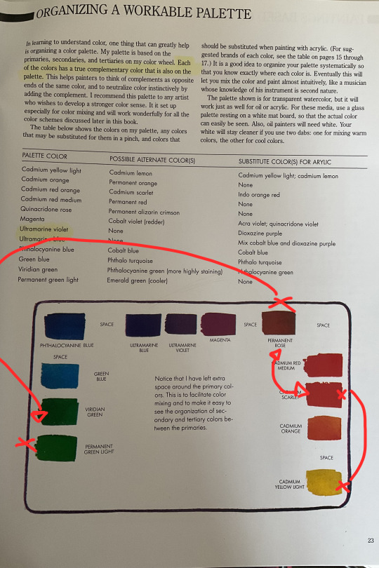
I had his pallet in mind especially when creating my image for Mor - I knew that I would've wanted all of the green accents on top of brown backdrops for them to pop in a way that wasn’t too aggressive. The brown and the green are complimentary, but far enough away from one another on the colour scale that the green would feel more like a burst of colour. Similarly in the Morrisons composition, I wanted an accent colour that would work well with the brightness of the yellow as well as possibly mellow it down a little. Working within the warm end of the scale as I still wanted a coordinated theme, the red contrasts strongly enough to pull your eyes from the yellow as well as complimenting the overall image.
0 notes
Text
Graded - Further research
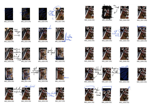
Throughout the project I used many different sources for tips and tricks when it came to food photography. Previous to the project, I knew there was many tricks behind food photography that made advertisements look the way that they did. I didn't want to go down the route of completely faking every shot, as I felt that took away from the authenticity of my concept.
A YouTube channel in particular that helped a lot throughout shooting was ‘We Eat Together’. Lots of my ideas surrounding composition and possible composites came from the channels instruction. In particular, he helped in my understanding of a “hero” food within the subject. The idea is to have one piece of subject matter be the sort of main event within the composition- wether it be the largest thing or most intriguing. The remaining set should be added to complement this food item. There are many examples where I’ve used this compositional trick throughout my project:

Every item circled were the first things I’d bought for each shoot, and the rest was put together according to this first purchase. This is how I used the “Hero food” to my advantage while putting compositions together. Thinking this way helped simplify set design in studio, too. The channel is full of tricks that helped me out, including simple common-sense type of things like setting out plating and food that won't wilt on camera first before anything that may be damaged. This helped especially when I was working with cream, and I always opted to work with any cream cakes in the morning instead of the afternoon shoots.
0 notes
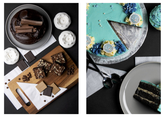
Text
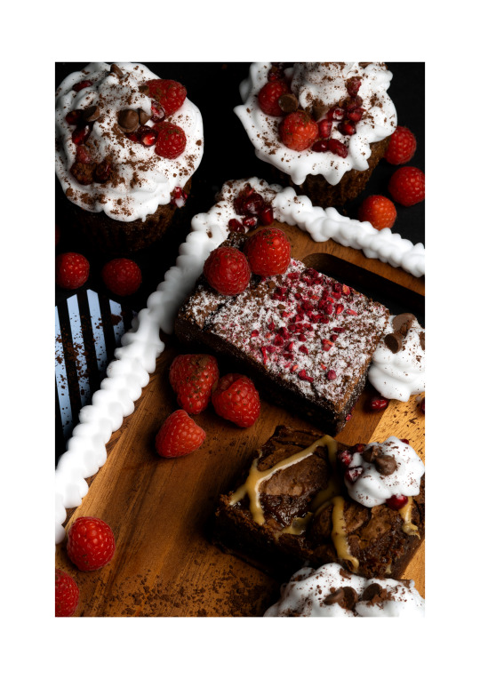
Graded - Shoot 9
Final Image:

I found it a little harder during this shoot to really get the frame correct, as I knew from my plan I’d most likely be shooting close in with the 85mm. I noticed nearly straight away that the cupcakes I’d gotten were the wrong choice. Originally they were carrot cake, and so had little carrots frosting on top with a warmer icing. This tone really clashes with the darker brownies and deep reds from the fruits, so I quickly opted for scraping off that icing and recreating it with the shaving foam I have been using as cream.
I feel this worked fairly well overall, though the design wasn’t as pretty as the carrots. Once it all matched in frame, it was easier to coordinate a close-up shot. I do in some ways regret not getting two of the same brownie, too, but on the other hand I’ not sure if that would have made everything a little too similar.
Example of contact sheets:
1 note
·
View note
Text
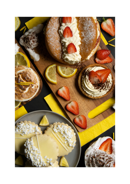
Graded - Shoot 9 planning
Unfortunately, I wasn’t able to get an awful lot of food items from Mimis Bakehouse again due to the short notice of picking them up. I wasn’t able to speak with the owners about an advertising opportunity on the day and so I did have to pay for the produce- which would be alright if I wasn’t already a bit over budget with the project. I only bought a few things, with the intention of photographing quite close in and using some form of fruit as space filler during the shoot.
I plan to base the image around the raspberry brownie I have, which has little dried raspberry bits on top. I will buy raspberries and pomegranate seeds to try to tie the frame in with the brownie. I also intend on using cream around the plating in order to fill my frame as much as possible, without breaking the bank any worse.
0 notes
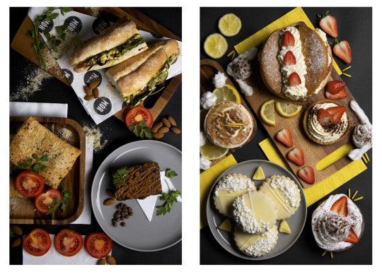
Text
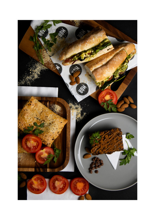
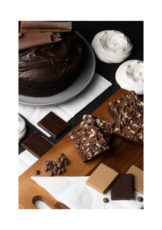
Graded - Shoot 8
Final Image:

This has been one of my favourite shoots of the project overall. I really enjoyed putting this composition together, and I had a clear idea of a photograph in my head when I picked produce up from the bakers that I feel I have executed well. As described in my plan, I wanted to use the sandwich as the hero and garnish the other food items in a way that tied it all in with the sandwich. I feel this has worked very well, and the pallet is very much to my liking.
Throughout the shoot I used a flag on the left hand side in order to deepen the shadows on both the sandwich and the brownie, which I feel has worked well in terms of giving the image a darker aesthetic. I wasn’t sure if the brownie would end up linking well with the others produce, but I think the garnish alongside the brown of the other boards has helped tie it in.
Example of contact sheets:

1 note
·
View note
Text
Graded - Shoot 8 planning
Due to having to replace two bakeries with two others on quite short notice, I didn’t have much of a plan for photographing before going to pick up goods from Mor Bakery. In shop, they had a variety of different sourdough sandwiches, one of which being pesto tomato and cheese. The green of the filling was enough for me to start to see the image in my head, and I quickly planned how to garnish the entire frame in green leaves and tomatoes to match with the sandwich.
The sandwich will be the hero food item, and I aim to fit everything else around it. I plan to buy parsley or spinach for a green leafy look so that I can accent everything in the same green as the sandwich filling as I feel it’ll tie the image altogether well. The produce I have is mainly savoury, however I have plans to also use a brownie as if to allude toward a lunch and desert from the bakers.
0 notes
Text
Graded - Shooting changes.
In my initial plan I listed the bakeries and supermarkets I planned to photograph from. Of course, the supermarket shoots were simple enough to finalise plans and shots from so I wanted to begin with them. I intended on having the supermarket shots ready to show an example of work to family businesses who may have wanted further explanation on what I was doing.
Upon contacting both Wallace Mill and the Bearded Bakers, both places fell through for my planning. Unfortunately Wallace Mill were in high demand for catering that week, and I got no information back from the Bearded Bakers. As such, I’ve had to change these two places from my original plan. I will now be photographing with Mimis Bakehouse and Mor. Bakeries, both located in Edinburgh. Both have agreed to be a part of the project and will be the replacement two for Wallace Mill and Bearded Bakers.
0 notes
Text
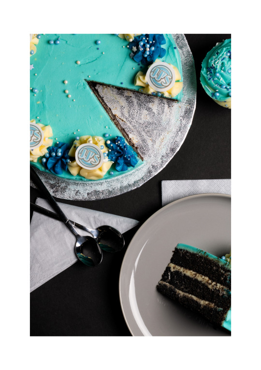
Graded - Shoot 7 development

This shoot has been the most heavily edited of all so far, but again only to tidy up the final image. Due to the cake being cut on set, I struggled with crumbs in the blue of the icing. Alongside this, for this image in particular I had planned to do a focus stacking composite. As seen in my contact sheets for the shoot, I had photographed two of the same shots; one with the middle ground in focus and one with the foreground. In photoshop I merged them by starting with the image with the middle ground in focus and then stacking the second image on top. I masked the second and painted in what was needed:
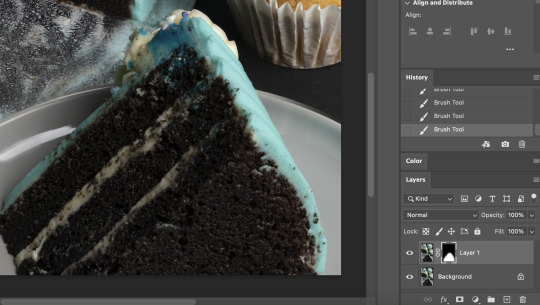
Once everything was focus stacked, I took to the whole image to give it a once over with the spot-heal tool. Anything that was harder to be rid of with just spot healing I used the clone stamp to smooth out. For example, the clone stamp was used to smooth out the edges of the cream filling and the icing on top of the cake slice.

I did the same edits in the centre of the large cake too, so that everything was clean of crumbs. There was only so much I could do on set to keep the icing clean, but I feel this edit has worked fairly well in cleaning the image up but keeping the cake realistic.
0 notes
Text
Graded - Shoot 7
Final images:

As described in my plan, I was aiming for a very simple composition here. I ended up going with the closer in flat-lay shot (85mm) as I really enjoy the crop and how it fills the frame completely. The bakery gave me a copy of their menu from their cafe, so I wanted to include it in some way. However, as I continued to shoot, the photos with the menu felt more social media like compared to the other shots I have:

I felt this composition did not suit the overall project, so unfortunately scrapped the menu idea. I continued the shoot organising the new composition without menus; the initial idea I’d had sketched out. I wanted to get the arrangement of plates, spoons and cupcakes perfect before cutting the large cake. I wanted to leave the cutting until last out of fear it would go wrong.
Cutting out the menus also helped the lighting situation a lot, as initially the white of the menu was causing me a lot of problems. I was still trying to get a dark, contrasting backdrop similar to all other photos in the set, but the menus were causing the highlights to blow out. Taking it out and moving the light to the other side for the cake helped control the highlights a significant amount more than before.
Example of contact sheets:

0 notes
Text
Graded - Shoot 7 planning
This was a shoot I had planned out from the beginning of the project, being that this is the bakery that inspired the concept originally. I am aiming for a very simplistic composition using just a round cake with a slice cut out of it. This sort of imagery was part of my initial moodboard, and now has heavily inspired this shoot.

Sketch plan:

The colour theme of this shoot will be a pale blue, as that is the JJs Bakehouse commercial colour scheme. Not pictured in the sketch are three cupcakes similarly styled to the main cake, of which I am going to position in frame during my time in studio. As I have done previously, I aim to photograph both a flatly image and a close-up detail shot. I will also shoot both 55mm and 85mm to see which of either I prefer.
1 note
·
View note
Last Seen Blogs
jameshasonebraincell
Welcome to Silent Hill

eli-skytail
I do the art and it is good
phiralovesloki
BEANS??

mudinyourshoes
Take the long road home
drkwaifu
Darkwaifu