
olliemackk
HN Photography log
Oliver Mackenzie class HN2B
326 posts
Don't wanna be here? Send us removal request.
Last Seen Blogs

bogoclean1-blog
Bez tytułu
flashmagazine
Flash Magazine

cockroachesunite
“Capsized to a T—”

yorkejames
𝐉.𝐓 𝐘𝐎𝐑𝐊𝐄

mi-tr
La Vipère Lubrique


Text
90s video
https://express.adobe.com/page/uiFD53Rxqmxzk/
0 notes
Text
3hr Landscape
Movement:
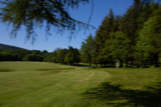
Miniature Landscape:
Perspective Warp:

0 notes


Text
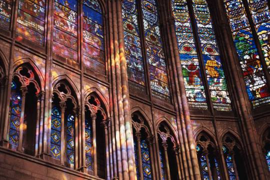
As explained, the first of glassware was found to be in ancient Egypt where they had begun creating hollow containers and goblets to drink from. By the 11th century, Venice had taken over in creating distinct renaissance style glasses- and by the 12th the Egyptians had invented glassblowing. This quickly spiralled into the gothic period, wherein stained glass windows were becoming the norm in castles and other royal structures.
The mirror was invented in France 1688, which were thoroughly enjoyed by the nobility. Around 1867 came the industrialisation of creating glassware, as machines were invented to adopt previously manually done glass blowing processes and by 1903 most of the man-made processing was replaced by machinery made by Michael J. Owens. His automatic gas blowing machine was able to mold and cut off individual bottles, creating about 2500 an hour. From then till the present age, we have continued to advance technologically when it comes to glass. Machinery is in place to advance the many uses of glass and creating glassware whether it be glasses, bottles, mirrors or windows is as accessible as ever.
Glassware & its history.
It isn’t entirely clear to archeologists the exact time that glass appeared in the world, and many have attempted and failed to pinpoint a time period for its discovery. Though glass beads from as far back as the third millennium BCE have been found, glassware truly sprung into popularity during the bronze age. It was massively popular among kings, being that it was able to be coloured and set apart from other wares during the bronze age. It is said that glass was valued at a similar rate to gemstones for ancient Egyptians. Back then, glass was usually opaque and heavily saturated in order to retain its value in its colouring. It was also previously made by crushed quartz as opposed to sand as it is nowadays.

One of the reasons it is so hard to pinpoint its beginnings is that glass was a highly exchanged material. It was often used as peacekeeping and gifts between ancient kings, and would be exchanged both as final products and raw material. Alongside this, the procedure of making glass items is very resourceful. The lack of waste produced by glassmaking makes it harder again to understand its origins.
Glass nowadays is preferred clear and translucent. It is a far more versatile material, having hundreds of different applicants. Ancients liked it as a particular showcase of status in the form of jewellery and molds. However, in the early 1600s it is recounted that the glass bottle and jar industry began with the invention of the glass melting furnace. Glass is now used for countless things, the production using sand instead of quartz now allowing for the more thin variety of glass used in windows and mirrors. Due to the nature of its more widespread production, glass did not retain its royal prestige from ancient Egypt and Greece. However it is now a material that holds value in its usage, as many things we take for granted are made of glass.
1 note
·
View note


Text
Graded - Preparing for printing
I have chosen to print with deadly digital as to make use of their student discount on 5 A3 prints at the moment. This was quite a lifesaver as I am already over budget when it comes to this project. I will be printing on lustre paper as to get a nice shine to the print- I did initially want to print matte but after doing tests I really like the texture on the image.
To prepare for printing I corrected the colour balance of the batch of 5 as to ensure they didn't all print with extremely different casts. I did this very simply in camera raw, as I knew especially the JJs shot was a little more blue cast than others. I did this by simply selecting the whitest thing in the frame with the white balance dropper, and again for each individual image.

0 notes
Text
Graded - Dark food research
The dark and moody style of food photography has been adopted by many photographers in the industry. In particular, those who work with more luxury or hipster esque branding are likely to have some high contrast and moody portfolios. The aesthetic can also be known as chiaroscuro.
I was inspired by this genre of photography especially in my Tesco and M&S shoots, as I had been advised to research the genre a little more during my planning period of the project. This stylisation often centres around shadows and grating contrast, which is something I was really trying for during the Marks and Spencers shoot as the produce was all almost monochrome. In particular, Lenkas lens was helpful to look at throughout shooting.
Beata Lubas is a food photographer who dabbles a little in this style.

While I prefer a busier composition, I can appreciate the use of light she uses a lot here. The deep blue sort of background is very commonly used in this sort of photography, too, it giving just the right amount of texture whilst not taking away from the subject matter. The deep shadows created by close side lighting and flagging on the opposite side is something I continued to recreate all through my project, although not quite as dark as this series of images. You can see this setup in many of my shoots behind the scenes.
Lisa Tutman-Oglesbys blog post about dark food photography was a massively helpful read. Although I didn't stick exactly to dark food photography for the entire project, as I was more experimental with colour as I went along- reading her blog inspires me to attempt a full project in that style. I can really appreciate someone uploading their process and trial and error with a certain style, and find it very helpful when learning for myself. While her photographs overall are not especially to my taste, I loved being able to find her blog and follow along to her attempts into the style of photography until it was to standard. Reading through it helped me coordinate my lighting better in studio, and too with styling the images with my wooden boards and plates.

0 notes
Text
Selection of 10
Having decided on 5 of the best for prints, the other 5 were fairly easy choices. Being that each shoot I did resulted in 1-2 final images and each shoot was one company, all I really needed was to pick out the one best of each shoot which has already been done throughout development. I did have a slight problem with my final shoot that had unfortunately fallen through. Due to this, I didn't have a tenth final shot.
I remedied this problem by making use of the second M&S photograph at a second angle. I’m grateful now for the advice to attempt new angles and have multiple shots per shoot, as without it I’d be in a frenzy now. Although it is from the same shoot, I feel the second image is different enough to feel new within the selection of ten and works just as well as others. The inclusion of more eye-level angles in the second half of the project I feel also aids in this image blending in.
Final choice of 10

Graded - Printing & Selection
Over the course of shooting, I of course ended up with some favourites from the project. After any post-production work needed, these became absolutes for both my overall 10 images as well as the 5 due for printing A3. I was able to do small test prints in order to have the images physically in front of me to choose from, as well as get some second opinions from classmates.
I believe these are my three best images from the project:
While these are my best, I think I am personally more inclined to the busier framing anyways. As such, my favourites are those with such aesthetics. I want to balance out the number of supermarkets and bakeries present in my 5 prints, too, as to stick to my concept as much as possible. With this in mind, I want my other two prints to be one from either. I also want them to be simpler compositionally than my first three picks.
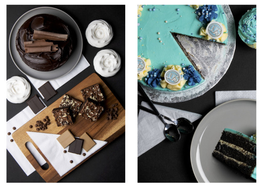
Overall, pictured are my 5 shots for printing. My intention was originally to print matte, but after doing test prints I ended up quite liking the shinier look of the prints and so have chosen to print on lustre paper. I will be printing with deadly digital.
1 note
·
View note
Text
Graded - Printing & Selection
Over the course of shooting, I of course ended up with some favourites from the project. After any post-production work needed, these became absolutes for both my overall 10 images as well as the 5 due for printing A3. I was able to do small test prints in order to have the images physically in front of me to choose from, as well as get some second opinions from classmates.
I believe these are my three best images from the project:
While these are my best, I think I am personally more inclined to the busier framing anyways. As such, my favourites are those with such aesthetics. I want to balance out the number of supermarkets and bakeries present in my 5 prints, too, as to stick to my concept as much as possible. With this in mind, I want my other two prints to be one from either. I also want them to be simpler compositionally than my first three picks.
Overall, pictured are my 5 shots for printing. My intention was originally to print matte, but after doing test prints I ended up quite liking the shinier look of the prints and so have chosen to print on lustre paper. I will be printing with deadly digital.
1 note
·
View note
Text
Graded - Further research
While I already pride myself a little on my understanding of colour, this article did inspire a lot of thought behind the project as well. I knew from initially planning the project that I wanted to use each brands colour, which is already picked for easy advertisement within the industry. However, in cases where the family owned bakers didn't have something like that, or even the likes of M&S who have a very monochromatic and sleek aesthetic to the shop, it was harder to bring in pops of colour. Reading up on colour theory and practices within food photography in particular, I was able to assemble colourful compositions that all worked well together. In fact, I think the most colourfully planned images from the project are the most successful.
I find the book ‘Conor Choices’ by Stephen Quiller massively helpful when it comes to understanding the fundamentals of colour and palette. I often keep it on hand for ideas in complementary colours, and although it's primarily looking at paint, it is still useful for me to take note of. A basic understanding of colour has been one of the biggest helps throughout the project- and Quillers example of palette is something I related to a lot:
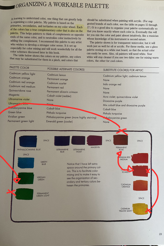
I had his pallet in mind especially when creating my image for Mor - I knew that I would've wanted all of the green accents on top of brown backdrops for them to pop in a way that wasn’t too aggressive. The brown and the green are complimentary, but far enough away from one another on the colour scale that the green would feel more like a burst of colour. Similarly in the Morrisons composition, I wanted an accent colour that would work well with the brightness of the yellow as well as possibly mellow it down a little. Working within the warm end of the scale as I still wanted a coordinated theme, the red contrasts strongly enough to pull your eyes from the yellow as well as complimenting the overall image.
0 notes
Text
Graded - Further research
Throughout the project I used many different sources for tips and tricks when it came to food photography. Previous to the project, I knew there was many tricks behind food photography that made advertisements look the way that they did. I didn't want to go down the route of completely faking every shot, as I felt that took away from the authenticity of my concept.
A YouTube channel in particular that helped a lot throughout shooting was ‘We Eat Together’. Lots of my ideas surrounding composition and possible composites came from the channels instruction. In particular, he helped in my understanding of a “hero” food within the subject. The idea is to have one piece of subject matter be the sort of main event within the composition- wether it be the largest thing or most intriguing. The remaining set should be added to complement this food item. There are many examples where I’ve used this compositional trick throughout my project:

Every item circled were the first things I’d bought for each shoot, and the rest was put together according to this first purchase. This is how I used the “Hero food” to my advantage while putting compositions together. Thinking this way helped simplify set design in studio, too. The channel is full of tricks that helped me out, including simple common-sense type of things like setting out plating and food that won't wilt on camera first before anything that may be damaged. This helped especially when I was working with cream, and I always opted to work with any cream cakes in the morning instead of the afternoon shoots.
0 notes
Text
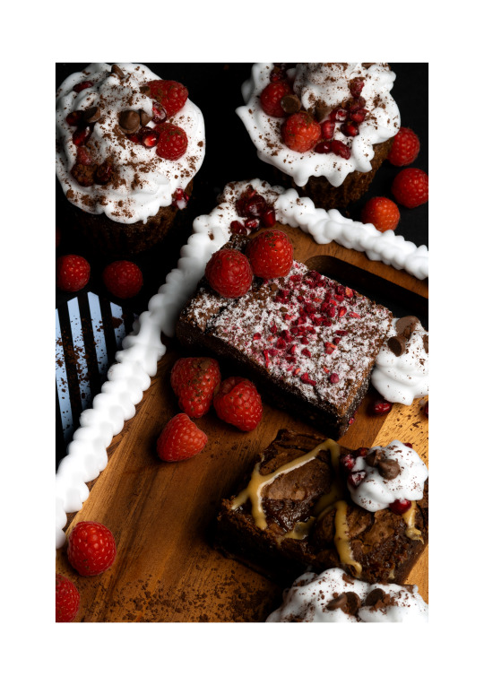
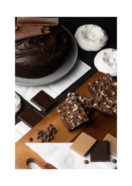
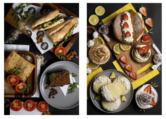
Graded - Shoot 9
Final Image:

I found it a little harder during this shoot to really get the frame correct, as I knew from my plan I’d most likely be shooting close in with the 85mm. I noticed nearly straight away that the cupcakes I’d gotten were the wrong choice. Originally they were carrot cake, and so had little carrots frosting on top with a warmer icing. This tone really clashes with the darker brownies and deep reds from the fruits, so I quickly opted for scraping off that icing and recreating it with the shaving foam I have been using as cream.
I feel this worked fairly well overall, though the design wasn’t as pretty as the carrots. Once it all matched in frame, it was easier to coordinate a close-up shot. I do in some ways regret not getting two of the same brownie, too, but on the other hand I’ not sure if that would have made everything a little too similar.
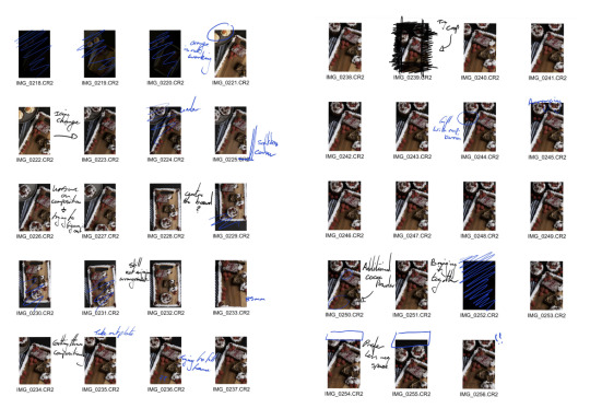
Example of contact sheets:
1 note
·
View note
Text
Graded - Shoot 9 planning
Unfortunately, I wasn’t able to get an awful lot of food items from Mimis Bakehouse again due to the short notice of picking them up. I wasn’t able to speak with the owners about an advertising opportunity on the day and so I did have to pay for the produce- which would be alright if I wasn’t already a bit over budget with the project. I only bought a few things, with the intention of photographing quite close in and using some form of fruit as space filler during the shoot.
I plan to base the image around the raspberry brownie I have, which has little dried raspberry bits on top. I will buy raspberries and pomegranate seeds to try to tie the frame in with the brownie. I also intend on using cream around the plating in order to fill my frame as much as possible, without breaking the bank any worse.
0 notes
Text
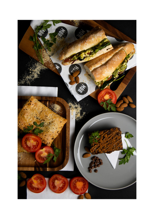
Graded - Shoot 8
Final Image:

This has been one of my favourite shoots of the project overall. I really enjoyed putting this composition together, and I had a clear idea of a photograph in my head when I picked produce up from the bakers that I feel I have executed well. As described in my plan, I wanted to use the sandwich as the hero and garnish the other food items in a way that tied it all in with the sandwich. I feel this has worked very well, and the pallet is very much to my liking.
Throughout the shoot I used a flag on the left hand side in order to deepen the shadows on both the sandwich and the brownie, which I feel has worked well in terms of giving the image a darker aesthetic. I wasn’t sure if the brownie would end up linking well with the others produce, but I think the garnish alongside the brown of the other boards has helped tie it in.
Example of contact sheets:

1 note
·
View note