#germanwings
Text
No. 48 - Eurowings
We're here today to talk about Eurow

Yes, Eurowings! Did you think those five letters started any other words? Silly. Let's discuss the aerosartorial choices of Eurowings, a member of - oh dear - the Lufthansa Group.
Eurowings! Eurowings is a former regional airline formed from the 1990 merger of Nürnberger Flugdienst, a regional airline that I'd heard of, and Reise- und Industrieflug, one I hadn't. After its acquisition by Lufthansa, it has been restructured into a low-cost subsidiary, making it something of the FlyDubai of Germany. That means I am yet again courting a C&D from the Lufthansa Group, and I am delighted to throw myself on this particular blade.
The process of Eurowings's evolution into its current state is somewhat tortuous, involving the cannibalization of its old subsidiary Germanwings (yes, this was subsidiary-ception, and while it happened after 2015 it seems to have been planned before...well, you know) and the establishment of an Austrian subsidiary which was moved to Malta last year and is named - get this - Eurowings Europe.
Eurowings has been going through it of late. Well, of ever, as far as I can tell. If you've ever been frustrated by a delay, spare a thought for the passengers of 2016's Eurowings flight 131, some of whom had their visas expire while stuck in their hotels in Cuba during their 60-hour delay. Every fourth flight could expect six hours or so of unscheduled quality time at the airport. Or, you know, 20 sometimes. 20 hours. Yikes! That's what happens when you start seven long-haul routes with one (1) A330 and a handful of various and sundry wet leases. A lot of their routes have been taken over by Lufthansa proper, which seems eager to kill the brand as soon as possible, and I can't blame them given it's somehow developed a worse reputation than actual Lufthansa. I've never flown with them. They served Boston for literally three entire months, but I wouldn't have flown Eurowings anyway. For my own taste their 'cheap' prices are still fairly expensive.

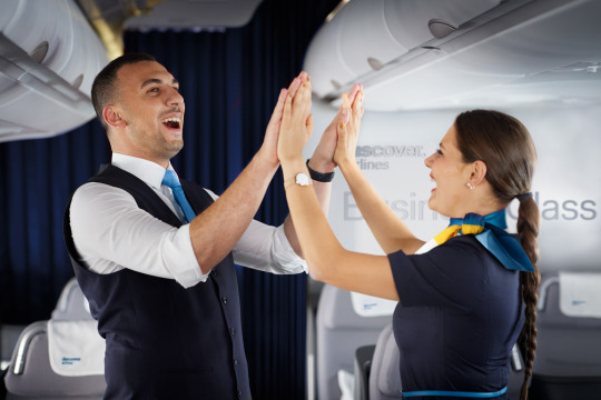
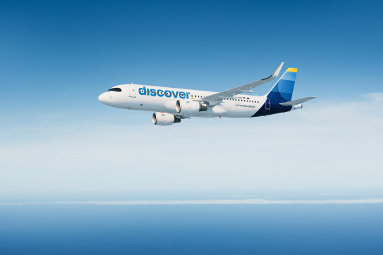
The Eurowings livery is unfortunately on more than just one plane for the moment. They have 95 A320 family members and four wet-leased Boeing 737s, giving them a very typical fleet for a low cost carrier. And they look like that!
Okay, first and foremost, I want to talk about their logo. It looks a lot like LATAM's logo.

Indeed, they even both use a variation on something adjacent to blue and something adjacent to pink. I think it's definitely a coincidence - they both were unveiled in 2015 - and even if it weren't I don't respect either one enough to defend its honor from the other.
So, those colors. I think I prefer the shades chosen by Eurowings, and in a competent livery design that palette could be extremely effective. I love LATAM's saturated pink and indigo, which made the mostly-white fuselage a disappointment, and I like Eurowings's desaturated fuchsia and cyan as a combination even more, but the lack of fuselage coverage gets even sadder when it's such light colors that fail to contrast against the white at all.

Unlike LATAM, Eurowings makes use of grey as both shading and background. I like this! I think it can make for a nice base to play with and a potential source of some interesting, dynamic designs.
Oh, and the logo is meant to look like an 'E'. I guess I can sort of see it, but it looks more like me attempting to get a pen that's starting hard going again. (Don't mix inks in pens, though. Especially not fountain pens.) Anyway, I don't really love the logo's shape in isolation but I do think it could easily lend itself to some totally acceptable fuselage layouts.
It's the wordmark that I think is interesting. This is about to be a long section about fonts but I promise that one, I have a point, and two, if you keep scrolling it will stop being about fonts.

The typeface used for the Eurowings wordmark is Soleto in medium weight. It was designed by Dalton Maag, a London-and São-Paulo based foundry. You've definitely seen their work around - they've done custom fonts for the likes of Pitney Bowes, Tesco, Fox Sports, Nokia, AT&T, Airbnb, Wix, USA Today, Google, and the flipping BBC, among others. And, well, a few that I would go as far as to say are pretty iconic:


Lush Handwritten is actually gorgeous in Cyrillic, by the way.
I would say they're not my favorite foundry, with a lot of their work trending towards somewhat boring sans-serifs that are not at all to my taste (you will never replace Gill Sans), but they've had some hits. They're also no stranger to airlines - they did a custom typeface for the TUI wordmark, which appears on their livery!

Blue side up appeal aside, I definitely want to someday talk about the strange beast which is TUI, the World's Most Misogynistic Airline.
So you might think that Dalton Maag was commissioned to make a nice custom font family for Eurowings, given Lufthansa literally used their money to commission a slightly different version of Helvetica, but you would be wrong. As their website makes no mention of a custom typeface for Eurowings, despite discussing modified versions of their existing products for other companies (like Fox Sports Cricket being a variant of Aller), I believe they are indeed using off-the-shelf Soleto, available via Dalton Maag's website as well as Adobe Fonts. Now, there is nothing inherently wrong with this, and I, who cannot afford a tablet to redesign the Eurowings livery, am not trying to wealth-shame an airline for not custom-ordering a typeface. They're far from alone. Another Dalton Maag user is Cebu Pacific, which uses Foco in a bold weight to decent effect, and I firmly believe that there's no reason to commission a second Helvetica if you want to use Helvetica. SAS uses Rotis Sans, and that's a massive airline with money to spare.

I just think the contrast here is funny. I could get the right to use the full Soleto font family for the entirety of Runway Runway's branding, title, and body text for one thousand sterling, or around $1350 in USD. This is, to me, a fortune and more money than I've had at any one time in literal years. It's also definitely not what Eurowings paid. I don't know what they paid, because Dalton Maag does custom quotes for unlimited licenses, but I don't want to imagine how much it cost to commission a firm to make a second Helvetica, so this just makes me think that Lufthansa really despises Eurowings. Pointless diversion? Maybe. I just think it's funny.
I think Soleto Medium is on the uglier side. I mean, I really don't like how Eurowings uses it in the same way I don't like Helvetica or the FedEx proprietary font - I really don't like really wide sans serifs used as titling, and I'm not sure why. Is it because it reminds me of elementary school? Is it because I find them sort of illegible? Are they just...ugly? Well, there's no such thing as objective ugliness, but this is my blog and I dislike them. They're certainly not at all memorable, which frequently makes their use something of an epic branding fail.
Soleto looks better than Helvetica, I'll give it that. A lot better. It's not really the typeface, though. It's the usage. While Dalton Maag's website does say:
Soleto is a flexible font family that can adapt itself to a wide variety of uses. [...] [it] is also quite capable of standing on its own.
It opens with:
Soleto is a contemporary sans serif font family with a quietly confident character. It works well for big areas of text, creating an even rhythm and texture, but can also make a statement at larger sizes.
And I think this is totally true, actually. As body text Soleto is fine! (This is via Dalton Maag's TypeTester feature, as are all future samples.)

This is 10pt Soleto medium, and it's a solid if generic sans-serif. Not overly ugly, totally legible. I'm not sure it's meant to be used for a logo, though. When I read 'statement at larger sizes' I think...titling, not airplane livery. A title for a website and an airplane wordmark are just different orders of magnitude.
How about titling? Well, I tried my own name in a couple different weights, and I actually think Soleto looks great in black italic.
This is a bit modern for my own taste, but I think this would look fine as a wordmark. Frankly, I think it would look good as an airline livery! It's not nearly as generic, it's almost a bit stylized even, and it's legible. The italic is always something I think looks nice due to its aerodynamic implications, and with a name as long as mine you don't really notice that this also does that obnoxious thing where the bottoms of certain letters dip beneath the baseline. Let's try some other weights!


Normally I prefer lighter weights in sans serifs, but no, Soleto looks worse the thinner it gets. These are, respectively, Light and Medium. Medium is what Eurowings uses!
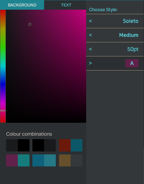
Oh, wow, would you look at that! One of their default color combinations is even basically the Eurowings scheme, though in reverse.

Well, this...doesn't look that bad, right? It's boring, but it doesn't actively make me wrinkle my nose.

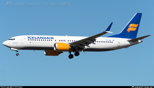
So why is this such a problem? I mean, let's look at this picture of an airplane, as we do on this blog. I've chosen this picture because you can see a Finnair (post coming soon) plane in the background. Finnair has this neat spiky sci-fi looking wordmark, for which no typeface exists. This wordmark is absolutely huge, and in a very dark blue against white.
Meanwhile, Eurowings's logo is very similarly formatted to Lufthansa's. It's high up and closely spaced, making it feel a little claustrophobic. It's not...as bad as Lufthansa's proprietary Helvetica (Helvetica Neue Neue? Helvetica Ultra-Ultra-Condensed? Hellvetica?) but that's barely a compliment. Lufthansa has theirs well above the window-line all squished together, while Eurowings has the decency to use the windows as the underline you would think they're just perfect to be, but with a typeface that's medium weight, neither thick nor thin and with no italics or serifs, it becomes something of a small blob. To locate something that far up should be a stylistic choice. There should be no default choices in airline liveries. You can design a massive wordmark to cover the fuselage, or something which looks nice when localized to part of it, but you don't just get to do the equivalent of opening your text editor, typing in one word without indenting, and calling that a livery. Lufthansa doesn't get this, and neither, really, does any of the unfortunate airlines in the Lufthansa Group.
The color used doesn't blend into the white, but it also isn't like they're sharply contrasted. It just doesn't particularly draw your eye. It's a wordmark your eyes glide right over and it's not at all memorable. While grey or cyan could have been incorporated somehow to accentuate it, they weren't. For a livery that's mostly white to work, you generally need some sort of really vivid color. Kalitta Air's red and gold or Tibet Airlines' rainbow are examples of good use of a white fuselage. You could use a different background, but they stand on their own, and the white plays an active part in the color palette rather than just being a default canvas for it. Many airlines use black or dark blue for their wordmarks, and while these aren't the most creative choices they're used for a reason. Just look at Finnair. That's some contrast. It's nice and legible and distinct.

Icelandair's two most recent liveries use the same placement for their wordmark as Eurowings and Finnair respectively. Now, I actually like the wordmark on the old livery better. It has those nice trailing serifs and is in small caps, making it memorable and dynamic, and it doesn't feel closely spaced. The name 'Icelandair' teeters on the edge of being too long for this to work, but ultimately pulls it off. The modern livery dispenses with this much nicer font in favor of gigantic letters. While I like this less, it's still serviceable. It is gigantic, legible, and feels as natural as me sprawling out on a couch after work. It's simply expanded to its natural point. Adequately done on both archetypes.

Meanwhile, the lack of color contrast from the white fuselage was perhaps my main criticism of Air Astra's livery, which I otherwise quite like. It's probably the inverse of Eurowings, which is contrasted enough to be acceptable but entirely boring in design - well-designed, but please, please, please let me actually see it.

Eurowings just...well, I'm going to copy and paste exactly what I said earlier. There should be no default choices in airline liveries. You can design a massive wordmark to cover the fuselage, or something which looks nice when localized to part of it, but you don't just get to do the equivalent of opening your text editor, typing in one word without indenting, and calling that a livery.
And, as a final note, something that looks good on a webpage won't always look good on an airplane. The angles you'll see it from are completely different, it has to compete for the rest of the livery for your attention, and you can't necessarily put infinite space around it due to the very physically limited canvas you're working with. The Eurowings wordmark feels vertically cramped more than it does horizontally, because the windows are right below it and immediately above it the fuselage just...ends, from a two-dimensional view. Something looking okay in copy doesn't mean you can transfer it immediately to material.
Lindon Leader talked about this when discussing his design process for the FedEx logo in a very illuminating interview I cited heavily in my FedEx post. He looked at multiple pre-existing fonts but decided to create a custom one, and one of his reasons for this was:
[...] each had its potential limitations downstream in application to thousands of FedEx media, from waybills and embroidered courier caps to FedEx.com and massive signage for aircraft, buildings and vehicles.
Something can look acceptable or even sleek on a webpage, and that same wordmark can look downright horrible when applied to an airplane. I'll say this for FedEx - while I find their logo ugly it is absolutely good at what it needs to do. It looks no worse in any one medium or context than any other, and that's one of the reasons it's successful. It's not to my taste, but it's definitely well-designed, and I think one of the ways to improve the livery would actually be to somehow give it more real estate on the fuselage.

So the wordmark is, in my opinion, an abject failure. It's not even ugly but I mean that in the same way Wolfgang Pauli describes crackpot physics as not even wrong. Like, it's fine. It's nothing showstopping or even memorable enough to be picked out of an identity parade of default webfonts but I don't despise it. It's a common phenomenon and I'm picking on Eurowings because it's there and I know exactly what font was used and thus can mess around with it, not because it's the worst. Much like Lufthansa, it's an opportunistic victim. You know, the sort of post I'll end up hyperlinking to later, because even in its failure it's nothing exceptional.

I will say I enjoy the tiny outline of black on the letters. That's not on the wordmark proper, as rendered on their website m, but adding it was definitely the right move to help the magenta stand out from the white. Once you know about it you can notice how it makes the wordmark pop ever so slightly, turning an unmitigated catastrophe into a mitigated catastrophe. It's almost infuriating that they did this thoughtful little thing when you zoom out and remember what it's in service of. This honestly is a reoccurring thing with Eurowings.
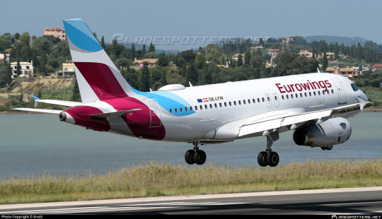
Look at that nice tail design! They could have slapped the logo on and left it at that, like so many other airlines, but they didn't. They use the same nice colors and the overlapping greys to create a design that is clearly their logo while also being abstract and dynamic. There's a lot of shapes, a lot of motion, and a lot of nice shades of cyan and magenta, and I love it!
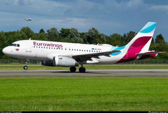
See that airplane landing in the background? Think about what airline you think it flies for, and stick a pin in that for a minute.
Hey, uh...where's the rest of it, though?
So, yes. Eurowings shares the first five letters of its name with Eurowhite. If you're not familiar with the term (I have a glossary, by the way) it just means a livery that is almost completely white save for logos. One could argue that the fact that the pattern on the tail isn't limited to strictly the tail and does form some sort of attempt at a fuselage design means that Eurowings' livery isn't 'true' Eurowhite, but I'm not going to brook that. Eurowhite is a state of mind. There is a nice, abstract design here which could easily be extended further. There is a grey shade which could be utilized (as it is on the engines, which look like they're lost and wandered onto another livery by accident) and there are infinite ideas to be had on the planet, and instead the majority of the plane is just white.
If one thing is thought of as my thesis from this post, let it be this, said for the third time: there is no such thing as default. Things like this wordmark placement, this type of font, and the primarily white fuselage are not default. The fact that they are common and boring does not make them inherent until replaced. They are still an active choice just as much as designing a livery that doesn't utilize these features is. It was proposed, iterated on, signed off on, and implemented. Airlines don't start with a template they then alter. They start with a vast world of infinite possibilities and decide they want to do the same thing as everyone else - that's a choice just how any other act of cowardice is a choice. I think the misconception that boring design is a result of inertia and lack of effort is a harmful one. It is a choice. They choose to do this.
They do not choose it because it is right for their livery, because they like it. They choose it because it is common, it is safe. It is reliable and it doesn't rock the boat. I've said this before discussing Southwest and Flair - low-cost carriers should be willing to rock the boat. If you're going to advertise yourself as the no-frills option you shouldn't try to look all composed and corporate. You have nothing to lose with being bright and pretty and interesting, so why aren't you?
And that cowardice is what makes me hate it so much. Some liveries are ugly, and some are almost ugly but stop halfway to cower in a Eurowhite bunker in an attempt to stem the bleeding, but there's nothing more tragic than a livery so afraid of being ugly that it cuts off and cauterizes something beautiful. The fear of ugliness is the death of beauty. condor is worth one billion Eurowings.
(No, Eurowings does not fail the Star Alliance Test, though.)
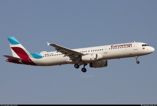
Like many of these designs that sort of just decide to stop after the tail, the longer a plane is the worse the Eurowings livery is on it. This is a very nice tail attached to a big white tube. Sure, Eurowings mostly operates somewhat short aircraft, but that wasn't the case when the livery was designed - back then they had A330s. Even now they have A321s.
Frustratingly, given how much I've ragged on this livery, I do still really like the tail. Even more frustratingly, you can see how easy it would have been to not have it be this way. The end of the cyan stripe almost begs to be held onto, weaved onto the rest of the fuselage, but it just isn't. It looks unfinished. It looks sad.


With all these shades of cyan and magenta to play with, the light heavily alters the way the colors on the tail look. They're never not pretty. It's a lovely colorscheme that's dramatically underutilized. The way it weaves together has so much potential, and it's attached to a white body. It looks like the paint job is unfinished. And that's what I hate the most about Eurowhite - good ideas left to languish, where a bit of custom letterhead does a better job of expressing your identity than an airplane livery.

The one feature Eurowings has towards the front of the plane is this little cheek decal of the Eurowings logo. Nice thought, but it almost looks actively worse when it stands out like that among an otherwise blank space. Plus, it's so small it might as well be a dot. It's cute, but in terms of overall effect on the livery it has the effect of making something mostly white look cluttered, which is just downright bizarre.

Obviously I can't endorse this. While not quite at the Lufthansa Line, with the actual bit of design happening on the tail instead of a sterile block, it doesn't cover much more fuselage than a proper exemplar of the phenomenon, and that's just always going to be a bit of a kneecap. Eurowhite is a state of mind, so much so that I almost think an unremarkable sans-serif font is as much of a codifying feature as a white body despite not being specified anywhere in the term. The same decision-making process leads both places, and the little black outline and cheek stamp and nice tail design just cant overpower that.
I'm giving Eurowings a D+.
Eurowings reminds me most of Saudia. They both have gorgeous colorschemes wasted on a design which burrows itself down as far into the substrate of artistic cowardice as physically possible. It's especially tragic and leaves me fighting myself over my final ratings. It feels wrong to grade such a gorgeous tail so harshly, but the good design features just make the bad package even more insulting. And at the end of the day I just have to put my foot down.
Sometimes I'm generous with grading because an airline is new, or because they're iterating on something that could be taken in a good direction. Eurowings isn't in the process of developing towards something nice, it's just Eurowings. It's an airline that stranded people in Cuba for 60 hours and Lufthansa seems to want it dead. I don't think we'll be getting a Eurowings livery overhaul anytime soon and I'm pessimistic about its longevity in general. Low-cost carriers and subsidiaries of large airlines are both easy come, easy go. Tears in the rain. 'Twas ever thus. Try not to get too attached.
Remember that plane from earlier? Yeah, I've got no clue what airline it flies for, but I don't think I can rule out it being Eurowings. 'Twas ever thus.
#tarmac fashion week#grade: d+#era: 2010s#era: 2020s#region: west/central europe#region: germany#eurowings#low-cost carriers#lufthansa group#air astra#icelandair#lufthansa#tui#finnair
15 notes
·
View notes
Text
Tal día como hoy 24 de marzo ...
2015: Se estrella en los Alpes franceses el Vuelo 9525 de Germanwings, un Airbus A320-211, el copiloto estrelló el avión para suicidarse. Las 150 personas que viajaban a bordo fallecieron.
1999: La OTAN inicia una campaña de bombardeos sobre objetivos en la antigua Yugoslavia.
1993: La pareja Shoemaker y Levy descubren el cometa Shoemaker-Levy 9.
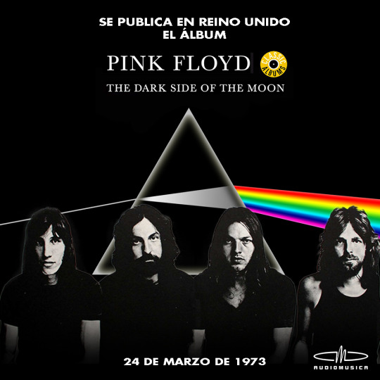
1973: El grupo de rock progresivo Pink Floyd publica su álbum "The dark side of the moon" en Inglaterra.
1965: La sonda lunar 'Ranger 9' de la NASA, tras alunizar, realiza una emisión en directo por televisión.
1882: Robert Koch anuncia el descubrimiento de la bacteria que causa la tuberculosis, la 'Mycobacterium tuberculosis' (bacilo de Koch).

1854: En Venezuela deja de estar permitida la esclavitud.

1814: Fernando VII accede al trono de España para ocuparse del gobierno al finalizar la Guerra de la Independencia española.
1720: Federico de Hesse es elegido rey de Suecia.

-146: El ejército romano, liderado por Escipión Emiliano entra en la ciudad de Cartago (actual ciudad de Túnez) destruyéndola casi por completo.
2 notes
·
View notes
Text
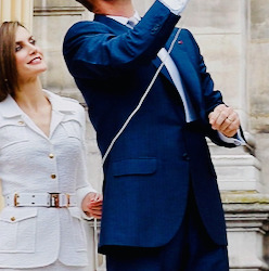
27 April 2015 | King Felipe VI of Spain and Queen Letizia of Spain are seen arriving for the funeral services for Germanwings Flight 9525 held at the Sagrada Familia in Barcelona, Spain. Germanwings Flight 9525 crashed in the French alps killing all 150 aboard on March 24, 2015. (c) Robert Marquardt/Getty Images
3 notes
·
View notes
Text
Février MMXXIV
Films
Maigret voit rouge (1963) de Gilles Grangier avec Jean Gabin, Michel Constantin, Vittorio Sanipoli, Paul Frankeur, Guy Decomble, Françoise Fabian, Paulette Dubost, Laurence Badie, Roland Armontel et Jacques Dynam
L’Étau (Topaz) (1969) d'Alfred Hitchcock avec Frederick Stafford, Dany Robin, Claude Jade, Michel Subor, Karin Dor, John Vernon, Michel Piccoli, Philippe Noiret et John Forsythe
Flic Story (1975) de Jacques Deray avec Alain Delon, Jean-Louis Trintignant, Renato Salvatori, Claudine Auger, Maurice Biraud, André Pousse, Mario David et Paul Crauchet
Poupoupidou (2011) de Gérald Hustache-Mathieu avec Jean-Paul Rouve, Sophie Quinton, Guillaume Gouix, Olivier Rabourdin, Joséphine de Meaux, Arsinée Khanjian, Clara Ponsot et Éric Ruf
Air Force One (1997) de Wolfgang Petersen avec Harrison Ford, Gary Oldman, Glenn Close, Wendy Crewson, Liesel Matthews, Paul Guilfoyle, William H. Macy et Dean Stockwell
Bob Marley: One Love (2024) de Reinaldo Marcus Green avec Kingsley Ben-Adir, Lashana Lynch, James Norton, Henry Douthwaite, Sevana, Hector Lewis et Tosin Cole
Sister Act (1992) d'Emile Ardolino avec Whoopi Goldberg, Maggie Smith, Kathy Najimy, Wendy Makkena, Mary Wickes, Harvey Keitel, Bill Nunn et Robert Miranda
Astérix : Le Domaine des dieux (2014) d'Alexandre Astier et Louis Clichy avec Roger Carel, Lorànt Deutsch, Guillaume Briat, Alexandre Astier, Alain Chabat, Élie Semoun, Géraldine Nakache, Artus de Penguern, Lionnel Astier et François Morel
Race for Glory: Audi vs. Lancia (2024) de Stefano Mordini avec Riccardo Scamarcio, Daniel Brühl, Volker Bruch, Katie Clarkson-Hill, Esther Garrel, Gianmaria Martini : Hannu Mikkola et Haley Bennett
Buster (1988) de David Green avec Phil Collins, Julie Walters, Larry Lamb, Stephanie Lawrence, Ellie Beaven, Michael Attwell, Ralph Brown et Anthony Quayle
Laura (1944) d'Otto Preminger avec Gene Tierney, Dana Andrews, Clifton Webb, Vincent Price, Judith Anderson, Dorothy Adams et Lane Chandler
Séries
Affaires sensibles
Présidentielle de 1995 : un scandale d'Etat - Michèle Mouton, le Groupe B et les Finlandais volants - Les Ecoutes de la République - La secte du temple solaire, le drame d’une société secrète - Munich 1972 : destin tragique d'un rêve olympique - Les révoltés des Jeux olympiques - Le crash de la Germanwings - Alexandre Litvinenko, victime d’un permis de tuer - Martin Luther King : la naissance d’une icône - Martin Luther King : du rêve au cauchemar - Dans l'ombre de Gérard Lebovici - Macron 2017, le traitre méthodique - Kurt Cobain, portrait d’une génération - Crash au mont Saint Odile
Maguy Saison 1
Rose et Marguerite, c'est le bouquet - Babar et Bécassine se mènent en bateau - Docteur j'abuse - L'union fait le divorce - L'annonce faite �� Maguy - Le coupe-Georges - Amoral, morale et demie - Cinquante bougies, ça vous éteint ! - A visage redécouvert'' - Le serment d'hypocrite - Tu me trompes ou je me trompe ? - Comment boire sans déboires - Un veuf brouillé - Le père Noël dans ses petits souliers - L'emprunt ruse - Tous les couples sont permis - L'amant de la famille - Travail, famille, pas triste - Blague de fiançailles - Macho, boulot, dodo - Mi-flic, mi-raisin - Trop polyvalent pour être honnête - La traîtresse de maison - Les trois font la paire - Un grain peut en cacher un autre - La quittance déloyale - Belle-mère, tel fils - Manège à quatre - Comme un neveu sur la soupe - Toutou, mais pas ça ! - A corde et à cri - Jamais deux sans quatre - L'amant comme il respire - Le chômage, ça vous travaille ? - La faillite nous voilà ! - Le divin divan - Toubib or not toubib - L'écolo est fini - Loto, route du bonheur
La croisière s'amuse Saison 2
Un contrat en or - Le Magicien - Copie confuse - Un travail d'équipe - Accrochez-vous au bastingage - Le Célèbre Triangle - Joyeux Anniversaire : première partie - Il y a si longtemps déjà - Passion - Un coup de roulis - Docteur, vous êtes fou - La Petite Illusion - Donne moi ma chance - Qui vivra verra - Réunion de travail : deuxième partie - Méfiez vous de votre meilleure amie - Vague à l'âme - L'amour est aveugle - Chassé croisé
Downton Abbey Saison 6
À l'aube d'un nouveau monde - Le Piège des émotions - En pleine effervescence - Une histoire moderne - Plus de peur que de mal - En toute franchise - Aller de l'avant - Les Sœurs ennemies - Le Plus Beau des cadeaux
Kaamelott Livre IV
Le Jeu de la guerre - Le Rêve d’Ygerne - Les Chaperons - L’Habitué - Le Camp romain - L’Usurpateur - Loth et le Graal - Le Paladin - Perceval fait ritournelle - La Dame et le Lac - Beaucoup de bruit pour rien - L’Ultimatum - Le Oud II - La Répétition - Le Discours - Le Choix de Gauvain - Fluctuat nec mergitur - Le Face-à-face : première partie - Le Face-à-face : deuxième partie - L’Entente cordiale - L’Approbation - Alone in the Dark II - La Blessure d’Yvain - Corpore sano II - L’Enchanteur - Les Bien Nommés - La Prisonnière - Les Paris III - Les Plaques de dissimulation - Le Vice de forme - Le Renoncement première partie - Le Renoncement deuxième partie - L’Inspiration - Les Endettés - Double Dragon - Le Sauvetage - Le Désordre et la Nuit
Coffre à Catch
#153 : Finlay, le retour ! - #154 : Gloire aux Heels ! - #155 : Les débuts historiques de Sheamus ! - #156 : Les Bella Twins arrivent à la ECW ! - #18 ; CM Punk continue d'impressionner & quelqu'un fait du vélo ! - #12 : Le Push de CM Punk + Bsahtek le Bikini !
Castle Saison 4
Sexpionnage - Jeux de pouvoir - Une vie de chien - Le Papillon Blue - Pandore, première partie - Pandore, deuxième partie - Il était une fois un crime - Danse avec la mort - 47 secondes - Au service de sa majesté - Chasseurs de têtes - Mort vivant - Jusqu'à la mort s'il le faut
Les Brigades du Tigre Saison 1
Ce siècle avait sept ans… - Nez de chien - Les Vautours - Visite incognito - La Confrérie des loups - La Main noire
Alfred Hitchcock présente Saison 2, 6
Incident de parcours - Pièce de musée - Reconnaissance
The Grand Tour Saison 5
Trop de sable
La ville Noire
Première partie - Deuxième partie
Les Petits Meurtres d'Agatha Christie Saison 3
Mortel Karma
Spectacles
Monsieur chasse (1978) de Alain Feydeau avec Michel Roux, William Sabatier, Françoise Fleury, Yvonne Gaudeau, Pierre Mirat, Xavier Vanderberghe, Michel Mayou, Bernard Durand et Roland Oberlin
La Bagatelle (1977) de Jean Meyer avec Amarande, Patrick Préjean, Jacques Balutin, Brigitte Chamarande Bel, René Lefevre, Pierre Aufrey et Didier Roussel
Femmes en colère (2023) de Stéphane Hillel avec Lisa Martino, Gilles Kneusé, Hugo Lebreton, Nathalie Boutefeu, Fabrice de la Villehervé, Sophie Artur, Clément Koch, Magali Lange, Aude Thirion et Béatrice Michel
La Pélerine écossaise (1972) de Sacha Guitry avec Jean Piat, Geneviève Casile, Philippe Etesse, Robert Manuel, Raymond Baillet, Françoise Petit, Alain Souchères, Janine Roux et Ly Sary
Livres
Piège de chaleur de Richard Castle
Spirou et Fantasio, tome 15 : Z comme Zorglub de André Franquin, Jidéhem et Greg
Kaamelott, tome 1 : L'Armée du Nécromant d'Alexandre Astier, Benoît Bekaert et Steven Dupré
OSS 117 : Tactique Arctique de Jean Bruce
Astérix, tome 17 : Le Domaine des dieux de René Goscinny et Albert Uderzo
4 notes
·
View notes
Text
Suicidal tendencies are literally stigmatized as violent and dangerous. I don't know how people are so quick to forget the 2015 Germanwings Flight 9525 crash.
It sparked some of the most deranged and dehumanizing discussions on the rights of mentally ill people that I have EVER seen to this day. To be fair Tumblr swept this topic under the rug immediately, because the popular consensus was that the dude must have been a terrorist. It's a lot harder to acknowledge that suicidal tendencies can sometimes result in tragedies than it is to pretend that mentally ill people are just peaceful, timid little prey animals who can do no harm- the latter obviously benefits the overall image of mentally ill people, since most of us aren't dangerous and don't want to be perceived as such. But there are people out there who need help and aren't getting it adequately, and that inevitable feeling of being alone or even outright betrayed by society can culminate into something dangerous.
11 notes
·
View notes
Text
I flew lufthansa like a week after the Germanwings pilot suicide thing in 2015 and the plane crew was doing such an enormous effort to be as nice and seem as well-adjusted as humanly possible I've never in my life been treated that well
2 notes
·
View notes
Text
Filicide is a tragic and horrifying crime that occurs when a parent kills their own child. While this heinous act can happen in any country, Germany has seen its fair share of filicide cases over the years. The reasons behind filicide can vary, from mental illness to financial stress to domestic violence. Regardless of the motive, the impact of filicide on families and communities is devastating.
In Germany, filicide is a rare but not unheard of occurrence. According to a study conducted by the University of Bielefeld, there were 52 cases of filicide in Germany between 1992 and 2012. This averages out to about two cases per year, which may seem low compared to other countries, but each case is a tragedy that leaves a lasting impact on those involved.
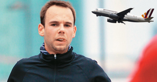
One of the most well-known cases of filicide in Germany is that of Andreas Lubitz, the co-pilot of Germanwings Flight 9525. In March 2015, Lubitz deliberately crashed the plane into the French Alps, killing all 150 people on board, including himself. It was later revealed that Lubitz had a history of mental health issues and had been deemed unfit to fly by his doctors. The investigation into the crash also uncovered that Lubitz had been struggling with personal and professional issues, leading to speculation that his actions were a result of his mental state.
Another high-profile case of filicide in Germany is that of Christiane K., a mother who killed her five children in 2006. Christiane K. was suffering from severe depression and financial difficulties at the time of the murders. She believed that she was protecting her children from a life of poverty and hardship by taking their lives. Christiane K. was sentenced to 15 years in prison for her crimes, but the emotional scars left on her family and the community will last a lifetime.
While these cases are extreme examples of filicide in Germany, they shed light on the complex factors that can lead a parent to commit such a horrific act. Mental illness, financial stress, domestic violence, and other issues can all play a role in pushing someone to the brink of filicide. It is important for society to recognize the warning signs of filicide and to provide support and resources to parents who may be struggling.
In Germany, there are organizations and support groups that work to prevent filicide and support families in crisis. The German Child Protection Association (DKSB) offers counseling and assistance to parents who are experiencing difficulties in raising their children. The DKSB also provides education and training on child abuse prevention and intervention to help parents and caregivers recognize and address potential risks.
Additionally, the German Society for the Prevention of Child Abuse and Neglect (DGfPI) works to raise awareness about the warning signs of child abuse and neglect, including filicide. The DGfPI offers resources and support to parents, caregivers, and professionals who work with children to help prevent cases of filicide and other forms of child abuse.
While filicide is a rare occurrence in Germany, it is a crime that has a profound impact on families, communities, and society as a whole. By addressing the underlying issues that can lead to filicide, such as mental illness, financial stress, and domestic violence, and by providing support and resources to parents in crisis, we can work to prevent these tragic events from happening in the future.
Filicide is a complex and heartbreaking crime that can have far-reaching consequences. By raising awareness, providing support, and working to address the root causes of filicide, we can help prevent these tragedies from occurring and protect the most vulnerable members of our society – our children.
0 notes
Text
"Germanwings, 9 ans déjà, scénario d'un crash prémédité" à revoir sur RMC Story jeudi 25 avril 2024
http://dlvr.it/T5tq71
0 notes
Text
Germanwings flight 9525 air crash
1 note
·
View note
Text
No. 49 - Discover Airlines
You know, 'Discover Airlines' is kind of what some readers on this blog do when I review an airline they're unfamiliar with. Anyway.
Earlier this week I talked about Eurowings. To be honest, that was me laying the groundwork for another post in response to a new development in Lufthansa's quest to kill Eurowings.
I'm sure some but not all of you are familiar with the fact that Eurowings is incapable of going too long without a subsidiary-of-a-subsidiary. They were probably still feeling quite full from their main course of Germanwings when, in 2021, Lufthansa said it was time for another one.

Yay, new subsidiary! Just one problem.


Well, okay, that doesn't look like all that much of a change. But zoom in a bit closer. That's...yellow. That wasn't in the Eurowings livery at all. A seemingly minor change of logo disguises an actual new livery. Despite this, it hasn't stopped being quite...Eurow, if you know what I mean.

This screenshot contains multitudes. The fact that they haven't even changed the page title from Eurowings Discover. The fact that they call it the new leisure airline of the Lufthansa Group - yes, the only one, and it's new, it just started existing now, cross my heart and hope to die. The generally awkward phrasing even though this isn't my browser trying to translate it from German or something, this is actually the way it's written. Chef's kiss.

Happy to announce it, are you? I'm sure you are.
I'm surprised it took them this long. Honestly, I'm surprised they made another Eurowings to begin with. (Especially since Discover Airlines doesn't seem to be low-cost, given it offers business class. 'Cheaper than Lufthansa' is not the same thing as low-cost.) It's a pretty laughable and pathetic admission of their own failure, but to be honest it was obvious from day one that Eurowings Discover would be short-lived one way or another. Even on the old logo the 'discover' is about twice as large as the 'Eurowings', as if begging you to forget what airline this is. That's a reasonable thing to want people to do, since you'd probably like to not be stranded in Cuba for 60 hours during which you are technically an unauthorized arrival. Only one airline has ever provided that particular experience!

I did mention last time that it's weird Eurowings doesn't use any of that cyan up front, but here's the thing: if you just put it on white it's downright illegible. They may have realized this in their initial design of the livery. They then immediately did it anyway for Eurowings Discover! Some real mind experts on the job here. Anyway, I'm not going to comment on the Eurowings Discover livery because it's just the Eurowings livery with a word added.
Discover Airlines (the former Eurowings Discover) is a long-haul vacation airline, and they'd love to fly you to sunny destinations like Funchal, the Maldives, Corfu...Halifax... Alaska...or Tenerife, or maybe Gran Canaria if you're not feeling Tenerife for some reason. Or Ibiza!
youtube
Unfortunately Venga Airways has had its Air Operator's Certificate revoked and the Vengajet is currently in storage.
Discover Airlines' main competitor in this market is another German airline, condor. I said this before and I'll say it again - condor is worth a billion examples of Eurowhite dreck. There's a legitimate sort of fishhook theory where while I prefer a good livery to condor, I strongly prefer condor to an unsatisfyingly average livery despite the fact that I do think their planes are truly poorly designed. Sometimes a good concept just overpowers bad execution. And, to quote a friend of mine's quip about Unfriended (2014), a film with way too many good qualities to be Unfriended (2014), "it sucks but at least it does it well".

Surprisingly given this is the Lufthansa Group, the website actually contains a bit of insight into their creative process. Worryingly, this implies that there is something of a creative process and it's simply had these sorts of results. But let's dive into this and see if they've made any changes that aren't worse. Discover Airlines, like Icelandair, condor, Riyadh Air, and others, have included a page dedicated to the inspiration behind their livery and brand. All upcoming images, unless otherwise specified, are taken from this website.
Let's begin with the color scheme.

This palette is pretty interesting. Blue and yellow isn't unheard of, and blue with a yellow accent is the most common variant of this, but it's still a pretty uncommon color scheme. It helps that they're not common colors for flags, and even the countries that have it in their flags don't use it. Sweden is part of the SAS throuple instead of having its own flag carrier; Air Astana doesn't use yellow; and Palau and Barbados do not have flag carriers. This leaves Ukraine International Airlines as the only flag-derived user of this palette. I don't like yellow on its own, but I actually like it with blue for its distinctiveness. If you pick the right shades it can look pretty nice. Actually...
image: lufthansa bildarchiv
The most prominent user of this palette, in my own mind, is Lufthansa, back when Lufthansa had a livery I actually approved of, which I thought stuck out and which I miss dearly now. We've fallen so far since then, lost so much, but I wonder if this Discover Airlines palette is an intentional nod to the thing we were robbed of. Indeed, they mention at least the blue being an intentional homage:
Despite the distinctive character of the new design, our connection to the core brand Lufthansa is subtly indicated by elements like the dark blue and the wordmark in the Lufthansa font.
...and they're using Lufthansa's proprietary typeface, Helvetica Neuer. Joy.


At least when you make it larger and lighter colored it's not quite as cramped and you can sort of forget it's a hideous font. Something about the all-lowercase styling also cushions the blow by making it look intentional instead of, like I said when discussing Eurowings, not bothering to change from the default font on your word processor.
...well, it also uses the exact same livery layout as modern Lufthansa, that's for sure. Booo. I've gone on a lot about the eponymous Lufthansa Line and how abominably bad it looks on longer planes despite seeming deceptively decent on shorter ones, so let me just show you Discover Airlines's various planes.

Hmm, yeah. You can just see it getting less and less offensive from left to right. This is why this type of livery needs to adapt on different airframes to work, and airlines are so unwilling to do it.

This fuselage layout is so overdone I could probably end the post here, but I'm not going to, because I'm not done with their website. This is where this post actually gets a bit interesting.
Fittingly for an airline, it’s inspired by a view of the horizon. More specifically, by the various lines and color nuances that emerge when the blue of the sky meets the landscape. These “skylines” are the most important design element of our brand and arise from various blue tones as well as a sunny yellow.
(Why is all the copy on this website so awkwardly written?)
So, this concept...this is really good. I like this. I like something about Discover Airlines. This is a great idea for a leisure airline. And, like condor, a good idea won't spare you my wrath, but in this case, when it's so similar to so many Lufthansa Line liveries it does earn a few points from me. There's not much else to comment on, so you could be fooled for not realizing this, but there's actual lost potential here. It implies the Lufthansa Group is capable of some measure of improvement over time, which is disturbing.
This picture, featuring the deeply generic and sort of frumpy Discover Airlines cabin crew uniforms, represents me giving them a condescending high-five as a teacher might give a student aged in the single digits. Good job, sweetie!

No, seriously. The uniforms are fine to wear to summer brunch but very poor for cabin crew. I think you can buy this off-the-rack from Vineyard Vines. Also, that is the most pre-tied looking scarf I've ever seen.
youtube
I do like the use of the colors as well. The circular highlight, which keeps the tail stripes from being as boring as they might be, puts me in mind of the sun, or a lens flare. The balance of light and dark is tasteful, and I love the hint of yellow. My issue really starts and ends at the Lufthansa Line, that ever-present ruiner of liveries.
I think the solution was fairly obvious. And I'll probably do a Project Runway Runway on it, because I think I can make it happen with a mouse and keyboard - it's genuinely that simple. And that's about where the meaning the website offers ends, so that means it's time for my rating.

I find myself conflicted, much as I did with Eurowings. There's definitely enough here that I don't want to give it a D, but at the same time I do. I've given Lufthansa Line liveries grades as high as C+ in extenuating circumstances, and I stand by those, but I don't want to do it for concepts that don't translate to visuals, and I don't want to give it to liveries that I don't think are exceptionally good examples of adding elements which mitigate the archetype's inherent flaws. Given its modern relevance, at this point I despise Lufthansa Line adherents more than the old Deltalikes, and I think I'm going to make it a policy that they're all going to get D+ or below unless they really demonstrate something different. Or unless they only fly really stubby planes that the livery looks okay on, but basically no airline has that excuse. Discover definitely doesn't with their A330s.
But given this tangible improvement, given the visual interest added to the tail, given that they have an actual philosophy this time, is a D+ really fair?
...what am I talking about? I gave Saudia and Eurowings D+ for doing nothing despite actively liking how both of their liveries look. Discover missed the most obvious idea ever in order to toe the Lufthansa Line. They're not special and they're getting no mercy.
D+, for Discover
That's it for today! If I have enough time, I'll fit in a redesign as a bonus post later this week. It doesn't take a genius to know how to make this good. Maybe if they read my reviews, don't send me a cease and desist, and learn from my critiques, in the future the Lufthansa Group can Discover some decent liveries.
#tarmac fashion week#grade: d+#era: 2020s#region: west/central europe#region: germany#lufthansa group#discover airlines#eurowings#leisure airlines#galley gala#lufthansa line
17 notes
·
View notes
Text
El alucinante mundo de los conspiranoicos
En 2015 el vuelo de Germanwings fue derribado por un láser del gobierno estadounidense: el secretísimo programa llamado Sistema de Defensa Aérea de Láser Líquido de Alta Energía pretendía derribar un misil intercontinental lanzado como blanco, pero que erró el tiro y alcanzó al avión de pasajeros. También no cabe la menor duda de que el MI6 -el servicio de inteligencia británico- orquestó el complot para asesinar a la princesa Diana, pues representaba una amenaza para el futuro de la Casa Real británica.
En nuestro país no falta quien sigue creyendo que los terribles atentados del 11-M fueron organizados por un increíble contubernio que puso de acuerdo a servicios de inteligencia españoles y marroquíes, poderes de izquierdas, la ETA y los yihadistas. Todo para echar al PP del poder. Por si fuera poco, ¿Quién no está convencido de que la investigación del crimen de Alcasser fue, en realidad, una pantalla para ocultar a los verdaderos culpables, gente poderosa y relacionados con el submundo de las películas snuff, al estilo de la conocida película de Amenábar "Tesis"?
¿Quién maneja los hilos de la política nacional y mundial? Misteriosas organizaciones no muy secretas (pues si no, no sabríamos de su existencia), como Skull & Bones, ubicada en la Universidad de Yale, o el famoso Grupo Bilderberg, que reúne anualmente desde 1954 a las mujeres y hombres más poderosos del planeta. Todas ellas conspiran para decidir el futuro del mundo en su propio beneficio. O también puede tratarse de gobiernos que pretenden hacerse con el control de un país
Claro que para sociedades secretas no podemos olvidar a la más fantástica de todas y madre de todas ellas: los Illuminati, que lleva dirigiendo los destinos de Occidente desde hace siglos.
¿Tienes la sensación de que hay gente que siempre le gusta ir contra corriente? ¿Tienen sus propias teorías sobre las cosas? ¿Rechazan los argumentos de las autoridades y expertos? En los últimos meses han surgido numerosos grupos de personas conspiranoicas que niegan la existencia de las situaciones que vive actualmente la sociedad. Son grupos que se sienten poderosos y hablan a voz en grito con su verdad por delante pero, ¿qué hay detrás de los conspiranóicos?
No todos tenemos que pensar igual, ¡claro que no!. Cada uno tiene su libertad de pensamiento y su capacidad de crítica, negación o aceptación. Lo extraño es negar la evidencia y crear nuevas teorías que no tienen ningún sentido ni ciencia que lo avale y creérselas como única verdad.
La sociedad sigue luchando para vencer a una de las circunstancias más increíbles que ha vivido la humanidad: una pandemia. Una pandemia que ha sido capaz de paralizar el mundo y que por desgracia, ha generado millones de pérdidas humanas; crisis económicas devastadoras; miedo; incertidumbre e incluso desequilibrios emocionales a personas de cualquier grupo social y edad.
¿Qué hay detrás de la pandemia o de las vacunas?. Los conspiranóicos desconfían totalmente de las versiones oficiales de las autoridades y plantean las suyas propias. Sienten hostilidad hacia su entorno y su intención es contagiar al resto de personas y llevarles a su terreno.
Es muy importante diferenciar entre conspiración y teoría de la conspiración. La primera es un complot real y normalmente tiene un alcance local, mientras que la segunda es una percepción. Las teorías de la conspiración, sobre todo las globales, se van construyendo con el tiempo, añadiendo nuevos datos y nuevos desarrollos, a la par que se ofrecen explicaciones conspiranoicas a los datos que no se ajustan a la trama.
No está muy claro salvo que un conspiranoico no nace, se hace; se va convirtiendo poco a poco a la teoría hasta llegar a ver la vida a través de ella: es lo que se llama mentalidad de la mano escondida. Todo suele empezar con la creencia en una teoría de la conspiración cualquiera y se termina con una visión de la historia que depende fuertemente de complots.
Por otro lado, el conspiranoico es compulsivo y autodidacta, dedicando horas y horas en las que aprende hasta el más mínimo detalle de todos y cada uno de los elementos de su conspiración; además, no suele cambiar de opinión respecto a sus creencias más firmes y siempre encuentra pruebas de que su creencia tiene visos de realidad.
Una de las grandes conspiranoicas británicas del siglo XIX, Nesta Webster, ideóloga de los complots judeomasónicos y de los Illuminati, estaba tan obsesionada que cuando llamaban al timbre de la puerta de la calle no abría si no iba con una pistola en la mano. El líder chino Mao era otro paranoico de las conspiraciones: siendo anciano se negó a recibir tratamiento médico porque pensaba que sus enemigos usarían ese método para matarlo. Mao veía conspiraciones por todos lados: incluso se negó a bañarse en su piscina privada porque creía que habían envenenado el agua.
Los conspiranóicos son personas que presentan tres rasgos psicológicos o de personalidad: el maquiavelismo, la psicopatía primaria y el narcisismo.
¿Y cómo son estas personas?
Los maquiavélicos se caracterizan por querer manipular las emociones de los demás. Son astutos y utilizan la mentira como engaño para lograr su propósito final sin importar los medios empleados para alcanzarlo.
Las personas narcisistas son personas que tienen un sentido desmesurado de su propia importancia, una necesidad profunda de atención excesiva y admiración, relaciones conflictivas y una carencia de empatía por los demás.
Y por último, la psicopatía primaria se refiere a personas con una alta insensibilidad y falta de empatía hacia el dolor ajeno.
Los tres grupos de conspiranóicos tienen una característica común y es que se sienten superiores a los demás, por ello, son capaces de crear sus propias conspiraciones, creérselas y tener el cuajo suficiente para convencer a otros que consideran inferiores.
Obviamente, los conspiranóicos habrán ganado muchos adeptos en otras circunstancias como el debate de si la Tierra es plana, la teoría de los microchís o de si el hombre llegó a la luna o no, pero de lo que no cabe duda es que el Coronavirus es real.
El tipo de perfil conspiranoico está más extendido de lo que uno piensa y puede ser fácil encontrarse en la vida con uno. Si es así te recomendamos que lo dejes a un lado. Mejor vivir solo sin conspiraciones.. ¡que mal acompañado!
ℜ𝔬𝔰𝔞 🖤
#El alucinante mundo de los conspiranoicos#Mejor vivir solo sin conspiraciones.. ¡que mal acompañado!#frases#citas#texto#foto
4 notes
·
View notes
Photo

Through the Years → Felipe VI of Spain (1,755/∞)
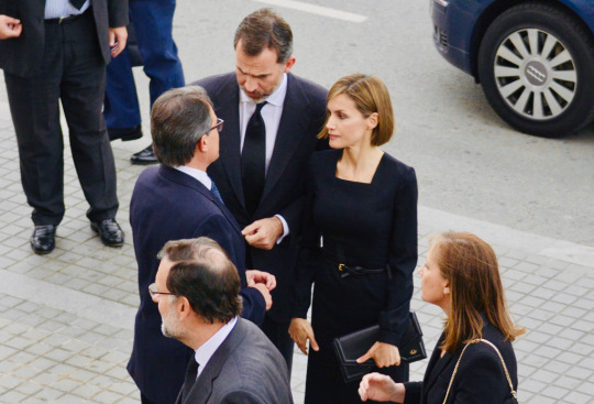
3 June 2015 | King Felipe VI and Queen Letizia of Spain attend a ceremony inaugurating the 'Combattants de la Nueve' parc at Hotel de Ville (Town Hall) in Paris, France. Felipe VI of Spain and Queen Letizia of Spain are on a three-day visit in France. Originally scheduled for March 24, this visit had to be suspended after Germanwings flight 9525 crashed in the French Alps. (Photo by Thierry Chesnot/Getty Images)
6 notes
·
View notes
Text
Facebook gave Netflix all your private messages on Messenger in exchange for all your watch history, while Netflix paid them $100M+ for ads. Meta will sell your data at a heartbeat for profit.
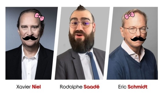
Kyutai outputs: Women's month is Movember and Rodolphe was born in Ecuador. What is the input to the models?
youtube
0 notes
Text
Events 3.24 (after 1960)
1961 – The Quebec Board of the French Language is established.
1972 – Direct rule is imposed on Northern Ireland by the Government of the United Kingdom under Edward Heath.
1976 – In Argentina, the armed forces overthrow the constitutional government of President Isabel Perón and start a seven-year dictatorial period self-styled the National Reorganization Process.
1977 – Morarji Desai became the Prime Minister of India, the first Prime Minister not to belong to Indian National Congress.
1980 – El Salvadorian Archbishop Óscar Romero is assassinated while celebrating Mass in San Salvador.
1982 – Bangladeshi President Abdus Sattar is deposed in a bloodless coup led by Army Chief Lieutenant general Hussain Muhammad Ershad, who suspends the Constitution and imposes martial law.
1986 – The Loscoe gas explosion leads to new UK laws on landfill gas migration and gas protection on landfill sites.
1989 – In Prince William Sound in Alaska, the Exxon Valdez spills 240,000 barrels (38,000 m3) of crude oil after running aground.
1990 – Indian intervention in the Sri Lankan Civil War ends with last ship of Indian Peace Keeping Force leaving Sri Lanka.
1993 – Comet Shoemaker–Levy 9 is discovered by Carolyn and Eugene Shoemaker, and David Levy at the Palomar Observatory in California.
1998 – Mitchell Johnson and Andrew Golden, aged 11 and 13 respectively, fire upon teachers and students at Westside Middle School in Jonesboro, Arkansas; five people are killed and ten are wounded.
1998 – A tornado sweeps through Dantan in India, killing 250 people and injuring 3,000 others.
1998 – Dr. Rüdiger Marmulla performed the first computer-assisted Bone Segment Navigation at the University of Regensburg, Germany.
1999 – Kosovo War: NATO began attacks on Yugoslavia without United Nations Security Council (UNSC) approval, marking the first time NATO has attacked a sovereign country.
1999 – A lorry carrying margarine and flour catches fire inside the Mont Blanc Tunnel, creating an inferno that kills 38 people.
2003 – The Arab League votes 21–1 in favor of a resolution demanding an end to the 2003 invasion of Iraq.
2008 – Bhutan officially becomes a democracy, with its first ever general election.
2015 – Germanwings Flight 9525 crashes in the French Alps in an apparent pilot mass murder-suicide, killing all 150 people on board.
2018 – Syrian civil war: The Turkish Armed Forces (TAF) and Syrian National Army (SNA) take full control of Afrin District, marking the end of the Afrin offensive.
2018 – Students across the United States stage the March for Our Lives demanding gun control in response to the Stoneman Douglas High School shooting.
2019 – Jakarta MRT, a rapid transit system in Jakarta, began operation.
1 note
·
View note
Photo
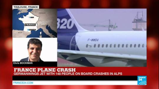
BREAKING NEWS - Germanwings plane crashes en route from Barcelona to Dusseldorf
0 notes
Text
Germanwings Crash and Mental Illness
How many times over the past few years have we heard about a mass shooting?What follows is a media frenzy over identifying the culprit: an isolated, delusional young man with mental illness. This time around it’s Germanwings co-pilot Andreas Lubitz, who prosecutors believe deliberately slammed the Airbus A320 he was flying from Barcelona to Duesseldorf into a mountain in the French Alps last Tuesday, killing all 150 passengers that were on board.
Call me a skeptic, but I think it’s all to easy to blame a dead person with a past history of mental illness for this tragedy. It’s much harder to take a long hard look at how we as a society perceive mental illness and take responsibility for creating an environment in which mental health treatment is often inaccessible, and even if it is available it is likely not to be utilized because one has to hide mental illness and fear getting diagnosed and treated because of stigma and the negative implications it may have on ones career and relationships.
0 notes
Last Seen Blogs

kiryu-sakuya
羞花閉月

linarttz
LINA

applecakewey
Tacolandia.
cpt-tightpants
We've Done The Impossible And That Makes Us Mighty
farlontjosh
FarlontJosh