#figured i should fix that if only so I can apply for zines
Text
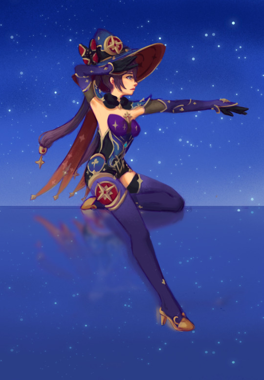
#mona megistus#mona genshin impact#genshin impact#pose referenced from a 1950s cole of California swimsuit ad#bc mona’s outfit is basically a swimsuit#realized I had very little fully rendered or whatever my equivalent of that is art of Genshin characters#figured i should fix that if only so I can apply for zines#threw a dart at the list of playable characters and got mona#teleport warning draws
9 notes
·
View notes
Text
Hall Spectacle Of The Other Pdf

Hall Spectacle Of The Other Pdf Reader
Hall Spectacle Of The Other Pdf Files
Hall Spectacle Of The Other Pdf Of One
Society Of The Spectacle Summary
Why are popular representations so drawn upon?
The Spectacle of the 'Other' - Stuart Hall In this chapter, Hall highlights racial and ethical difference and how they are represented in the media today - however his ideas can be equally applied to other dimensions of difference such as gender, sexuality, class, disability etc. These reflections may take any form, but must include: 1) reference to the course material or one theoretical concept for the week and 2) relation to one’s personal life and/or a popular culture example. Reflections may take the form of: a written paper, a video or vlog post, a song, podcast, zine, or any other form of creative work. (1997) ‘The spectacle of the “other”’ in Hall, S. (ed.) Representation: Cultural Representations and Signifying Practices. London/Thousand Oaks, CA. Are similar because they both fly – but I also have an idea that in other respects they are different, 01-HallCh-01.indd 3 12:23:49 PM. 4 Representation because one is part of nature while the other is man-made. This mixing and matching of relations.
Where did popular figures and stereotypes come from?
Hall Spectacle Of The Other Pdf Reader
How do we class ‘otherness’?

What is ‘other’?
These are all questions we should be asking ourselves.
Henrietta Lidchi looked at the Ethnographic museum (a national museum in Budapest, Hungary) and their project on “The West” from other cultures depict how the west live, racial and ethnic differences being prominent.
These stereotypes typically have been found to come form commercial adverting and magazine illustrations since the late nineteenth century beginning with the competitive world of modern day bodily aesthetics.
In “The chemical Olympics” magazine, a lead story was based on “Drug taking in athletes” specifically talking about Ben Johnson, when he used drugs to enhance his performance. Looking at the picture above before you knew that information, you could say it’s message is; ‘A triumphant moment for Johnson’ however when you know its also captioned ‘heros and villians’, it changes the meaning. When you are more informed, it could suggest that no matter what colour or race you are, everyone is susceptible to being a villain OR hero.
Hall Spectacle Of The Other Pdf Files
At a devotive level the image is “a picture of the 100 metres race”, however on a connotative level or sub theme being the drug story is ‘race’ and ‘difference’. Having these 2 meanings gives the magazine the choice with what to play on, giving the image a ‘preferred meaning’.
Roland Barths (1977) argues that when you caption an image, the words are stuck with it. The discourse of the words and discourse of the image produce a ‘fixed’ meaning. Barths would specifically talk about the image of Johnson and call it a ‘meta-message’ or myth about race, colour and otherness because of what I have spoken about above with duel meaning.
Similarly Linford Christie won the 100 meters as well, while on the British team. Some where racial to him, arguing he was not British. In answer to this, he explained he was born in Jamaica and lived there until he was seven when he moved to live in the UK. He was a British citizen 27 years before he won the medal. Just because he was not ‘white’ do not mean he should be ‘othered’ by our western society.
Hall Spectacle Of The Other Pdf Of One
E nemx tv box usb 2.0 drivers windows 10. Why does ‘difference’ matter?
Society Of The Spectacle Summary
It is something that is both necessary and dangerous. Without it ‘meaning’ would not exist, however it is far to easy for us to compare, which can digress to a negative. “we can only construct meaning through dialogue with “other” explains Mikhal Bakhtin.
0 notes
Photo
Eike König: Deliver the Unexpected
One word connects almost every graphic designer, illustrator, or young type enthusiast that I come across in Berlin: one inconspicuous code word that binds together a continually growing, ever-connected chain. That word is an expected one: it’s Hort, the German word for “nursery.”
“Hort is where I discovered my stencil technique,” says an illustrator selling prints at a zine market. “Hort is the best place to grow,” says a code wiz turned typographer. “Hort is where I realized I shouldn’t work ‘for’ a client but ‘with’ them,” says a graphic designer at a poster show.
They’re actually talking about Hort studio, the Berlin-based graphic design collective founded in 1994 by Eike König; a studio known for its commitment to reinvention, its support of young designers through its internship program, and its playful sensibility. It emerged from the Frankfurt techno scene in 1994, a disruptive, vibrant blip in an otherwise repetitive song: König deliberately rejected the agency model he observed around him, and also the idea that a designer should be associated with just one aesthetic.
Hort was founded on the principles of play, fair pay, honesty, change, and exploration. König penned eight golden rules for his dream studio, including 1. Have fun, 2. Get paid, 3. Don’t work with assholes, and perhaps most crucially, 8. Quit when you don’t have fun anymore. In 2007, the studio moved to Berlin, and has worked with institutions such as Bauhaus Dessau, and global brands IBM, Microsoft, Nike, and The New York Times.
Hort is not, and never has been, just König. As I write this, Hort is Anne Büttner, Eike König, Elizabeth Legate, Tim Rehm, Tim Schmitt, Tim Sürken, Alan Woo, and its network of freelancers. (By the time this is published, more names will probably have been added to the list.) Just like Hort is not just König, König is not just Hort: since 2011, he has been a professor at Offenbach University of the Arts, and since 2015, he has been producing his own artwork and prints. And just as the studio changes, grows, splinters, mutates, waxes, and wanes, though, so does König. It’s been a long process, and one that is by no means finished.
For this story, König was photographed throughout Berlin.
When did you first become aware of graphic design?
When I was quite young, during the Cold War years especially. Magazines were filled with infographics about the current global political climate: I found them touching and exciting. What was the power behind something so little? I figured out that the power was graphic design. I was also into music growing up. I loved records, especially the records that my cousins collected. I would go hang out with them and play close attention to the music that they were buying and listening to. I liked the ritual of a record: opening it up, taking out the vinyl, putting it on the player, and then listening to the music and looking at the artwork at the same time. There was a strong connection between the visual moment and the listening moment, which I was drawn to. Back then, I listened to music in a different way from how I do now. I took my time with it, I sat down, and I didn’t do anything else. Nowadays, music is more like having a nice background noise. It’s atmosphere in a room and not a ritual.
Were there particular sleeves where you found the connection between the visual and the aural was especially strong?
One of my cousins was listening to Pink Floyd a lot, so I got into Hipgnosis (fairly early on the designers behind Pink Floyd’s albums) I liked the way the covers told surreal stories using photography, and how by putting an image in an unusual context, a new story was created that you didn’t necessarily get straight away. I always appreciate it in design when there is something I recognize put into an unrecognizable context. Complex juxtapositions make you think in a deeper way. I found it very clever how Hipgnosis could translate the complexity of the music, the emotions of the music, into something that visually doesn’t just tell the same story as the songs but gives the album another layer of meaning.
After learning about Hipgnosis, I also got into Peter Seville of course, and his work for Joy Division. I admired the label 4AD, so I was looking at the work of Vaughan Oliver. At the same time, I got into magazines like i-D. With independent music labels and new youth culture magazines, designers were suddenly being connected to their output. Before, the designer had been invisible.
That’s how I got into design, and then I enrolled at the University of Applied Arts – they’ve since changed their name – in Darmstadt. I didn’t really know at that time what design was, though. The universities were focusing on educating people to go into ad agencies. When I got there, I realized that 90 percent of the students were going to go into advertising, which was a completely different world from where I wanted to be.
You were admiring independent practitioners like Saville and Oliver, so you were looking at a model that hadn’t yet become pervasive. The idea of an independent practitioner, let alone an independent design studio, was still rare.
Exactly. It was a shock getting to university and figuring out there that what I wanted to do didn’t yet have its own framework or structure. I also had no real understanding when I was 19 of what design could really do. Design was not taught in school. You only knew what art is and what music is, but not what design means in your life. Yet everything is design. It’s very important.
I think even nowadays, most students starting out don’t really know what graphic design is or what it can do – I see that with my new students every year at Offenbach. They don’t really know how broad it is. Most people think, like I did, of record sleeves and infographics. I didn’t think about what typography is, or what a way-finding system is. I thought design was creating artwork for a product. Getting to art school was frustrating because I was a big fan of people like David Carson. I was fascinated to see that there was a designer using a platform like Ray Gun magazine to experiment and provoke. I wanted to do that. I didn’t want to work in an ad agency.
What was it about Carson’s form of experimentation that you found so effective?
How he would take an image and place it somewhere else so that it didn’t have its previous context, but gained a new one, like what Hipgnosis did. If there is a disruptive moment, it instantly grabs your attention.
I started to wonder, How can I not simply follow the rules that come with a platform? How can I hack something? That fascinated me from the start. How can I question things that have been built and developed and ingrained into an audience’s way of perceiving? How can I not repeat, but create something new? How can I put my own signature onto something? How can I deliver something to society that is more than a repetition?
At university, they didn’t want that. They wanted to educate people so that they would become functional workers. You weren’t educated to be a critical designer. It was about selling things. It was, “How can you make something that’s not great-looking something that people will buy?” You know, it was all about capitalism and tricks.
Apart from this emphasis on advertising, was there anything else about the university’s approach to the design process that you objected to?
The school came out of the thinking of the Ulm School of Design, and emphasized a holistic, multidisciplinary approach like the Bauhaus had done. It was closed-minded about pop culture, though, and more interested in the idea of designing something timeless. I was more open to the idea of the contemporary. I was interested in history, of course, but I also thought history is history. I wanted to create work that is rooted in its specific time, so that people could work out later where it came from. I’ve always liked that people can say, “Oh, this is the first time that a designer worked with a computer.” I don’t want to design something that looks like it was designed in the 60’s.
When did you get to put these feelings into practice? When did you first get to design something that you felt was truly “timely”?
I worked in an advertising agency during university, but then I started working at a record company, a techno and dance label in Frankfurt called Logic Records. That’s when I started making work that felt rooted in its time. I was 23 or 24. I was interning at the label, and then eventually I was asked to be the art director. I decided to quit university and accept the position.
There was a new genre around: techno. It’s amazing to see a new genre rise. It doesn’t happen very often. Techno at the time had no fixed face, so being involved at its genesis meant that I was able to explore different visual looks for the new genre. It was during a time when Frankfurt was one of the most important cities for techno music.
What kind of “face” did you envision for Frankfurt techno?
I didn’t want to design a cliché. The cliché would have been to do what other people had done in the 80’s for electronic music, drawing on the idea of a utopia. Using electronic imagery felt too easy, and I never like to go with the first association that comes to mind. Why not give the audience a visual experience that is different from how the music sounds, to jar and juxtapose and create new connections?
The label was successful, and they were open-minded and said, “Do whatever you feel is right.” I could explore, using the format of the record sleeve. I decided to design every single sleeve in a completely different way. Sometimes I did collage; at other times, it was purely typographic and Swiss. Sometimes I had a photo concept. The label liked it and said, “We don’t want to have a fixed identity; we want every product to look individual.” There were other labels that had more of a recognizable face. Our face was to have many faces.
This sounds a lot like your approach at Hort, where you emphasize the importance of trying things out, experimenting, and starting from scratch. At Hort, you don’t want to repeat an idea too often. Do you think these techno record designs were the root of Hort?
Yes; it was the DNA of Hort. I didn’t ever want to repeat. It’s easy to find something that looks good and works well, and then reproduce it over and over again. It’s clever from a business perspective, but it’s not challenging. I didn’t want to be the kind of designer that has a visual identity that they put on each record. It then feels like I’m taking over. Like I’m using myself and my aesthetic as the promotional tool.
You don’t want to be a designer with a brand.
Every musician and producer I’ve ever worked with is unique, so they should get something unique from me.
You mentioned quitting university to work full-time at Logic. What did you learn at the label that you weren’t getting at school?
I was trained not just to be a designer, but to work with a team and find the right people to collaborate with. I learned how to support and motivate others, and how to critique.
After about a year, I had complete freedom; it was a dream job. I got money, I could work with a product that didn’t hurt people – unless it’s bad music…but then you can turn it off. – I was also going to clubs, raving a lot, so my lifestyle became my job, and I never expected that that could happen. I learned that the culture I was surrounded by could be part of my working life.
How did you come to the decision to leave the label, go out on your own, and set up as an independent designer?
The great thing with vinyl at the time was that it was like your business card. If someone saw the design and liked it, your name was written on the sleeve, so they could contact you and say, “I want to work with you.” That started happening to me quite a lot.
I suddenly found myself in a situation: Did I want to work for different people or one client? I didn’t have to think about it very long, though. I was 25; I was naïve. I was like, “Everything is running so smoothly so, why not just jump in and try being freelance?” I wasn’t scared; I had no idea how things worked, and I had no business plan.
Logic supported my decision to go and said I could continue to collaborate with them. And amazingly, everything worked perfectly. I never had to ask someone for work; word just spread around that I was available. The design scene in Germany at the time, especially for music, was very small.
You formed Eike’s Grafischer Hort. When and why did you drop the “Eike”?
I was flying first-class, staying in fancy hotels; I wasn’t saving money. After three of four years working in this way, I had a breakdown. I was so successful in such a short time and I started wondering, What will be the next step? What comes now? It was all too fast and I feared the blank page. I kept thinking, What happens if I don’t have another idea?
Because of that, I looked inside myself and realized, “OK, I want to work with other people.” This was in 1994. I wanted to learn by having discussions with others, so I got my first employee. I still want discussions; it’s a crucial part of my process. Eventually, we dropped the “Eike Grafischer” and just became Hort because I didn’t want the studio to be about me as a brand – I wanted it to be a collective. Now, we’re seven people in our office, plus a couple of interns and our network of freelancers outside the office.
How do you choose the people that you work with?
Designers often start as interns; it’s the way that I get to know them. They do internships for six or seven months, and then during that time I can figure out how well they fit into the idea of Hort. I like when people are up for conversations and are open to critique; when they step back from ego, when they can work in a team. Right now, I think more than 80 people have gone through Hort. We still have contact with a lot of them. We keep in contact and create a network. I also wanted a flat hierarchy from the start.
Can you tell me how the flat hierarchy works on a practical level?
We decide on jobs together. Everyone has their own little company within the studio, and they work on their own projects, so they can design their own future while being a part of ours. We only join forces on the bigger projects. It’s a modern way of working. It’s important that people also have their own thing going on because it keeps up the creative energy and flow and mental health. That’s always been important, for myself too.
When a new client comes in, how do you divide up work or decide who is going to get the project?
In the beginning, I had to think about people’s strengths and decide who would fit a project best. Now, though, we’ve worked together for such a long time that I don’t have to do that anymore. I usually get the first email from a new client, and then the whole team sits around the table and we discuss each job together. We debate whether it’s too small, too big, whether it’s challenging enough, whether there will be too many problems. We decide together; that means that the whole team is involved.
It’s completely organic. Back in the old days, especially, I would put people together who had never worked together before, in order to create a spark. The work you get out of collaboration is much better than if one person does it alone, especially if it’s two people who you might not necessarily think would fit together neatly.
When you put two people together who don’t normally work together, the drawback is that things become less efficient in terms of working under deadlines. Can you tell me about time management at Hort?
There’s a lot more discussion when you work this way, at the cost of time and energy. But people then learn from each other and share, and that’s what I always wanted. For sure, things do take longer. Absolutely. We have had to build this into our strategy. The way we work doesn’t have a rhythm. You can’t say, “In a week we’ll have completed that, and in the following week, we’ll have completed that.”
Often, we have to have quite difficult discussions with our clients to get them to understand that design is a process. In the beginning, clients come with a specific image in their mind and a concrete timetable. A new client will say, “We want a new identity.” We will ask, “When do you want it by?” and then the reply will be, “We want to launch in three months.” We’ll take a look at the brief and say, “Oh. It’ll take us two years.” The clients are always completely shocked.
If you’re allowed to take your time, than the outcome will be much more exciting and precise then if you follow a strict, systematic method. No single job is like another one. There’s no recipe for how to solve a problem.
When you’re working for certain music industry clients or smaller independent ventures, it’s a lot easier to negotiate the kind of freedom you’re describing. How did you negotiate time when taking on major international clients?
First, we deliver something that they don’t expect. I remember the first job we did for Nike, which started as a brief for the packaging design for the LeBron trainer. We thought, Sure, we could design the surface of the box, but then it’s just a nice skin. Why not create an entire system, and with that system, there could be a connection between the box, the poster, an in-store decoration, even the fashion? We created a typeface based on the characteristic of the shoe, so that Nike could do whatever they wanted with it. Nike was surprised but also pleased. They said, “Oh, why don’t you also do the visual guidelines for the entire season?” We developed the guidelines, including store applications, fashion components, posters, everything – a big identity that started off as the design of a box.
Nike now always expects something unforeseen from us, and I think that’s our trick. We don’t just deliver; we create something that lets them imagine a bigger picture, a picture they haven’t seen yet. It’s much more interesting to us than finishing a job in a short time and getting the money quickly. Most of our clients understand that. They come to us and are open about seeing where things could go. Everyone comes with a picture in their mind, but we prove that it’s not always about delivering that image by, first of all, showing them something unexpected.
We’ve talked about how you went from art director at a label to independent practitioner because you wanted to be on your own. Then you realized that what you thrived on was being in a team and bouncing off others. In the past two years, though, you’ve started working on your own again and reclaimed the name “Eike König” as something independent from Hort. You’ve been working on your own typographic prints and posters. How have you found it returning to something that is entirely your own and that has your name on it?
I do three things, and all with the same passion: I have the studio, I teach, and I do my personal work. With my personal work, I am still a designer. I still use the same methods of design and typography. It’s not like I’m knitting or creating sculptures. It’s the same as what I’ve always done, but with the stress of a schedule taken out of the process, and I find this incredibly rewarding.
Ultimately, I made the decision to spend some of my life focusing on my own personal work because I realized it’s good for my health and my brain. It’s not a different way of thinking from what I do at Hort, but it’s a different context. I’ve learned that I need three elements in my life: I need the team at Hort, I need my students, and I need time to work on my own design projects. It’s the combination of these three things that keeps me balanced.
0 notes
Text
Art F City: This Week’s Must-See Art Events: Skip Most Fairs, See The Real Hennessy Youngman
Jayson Musson
Plan comfortable shoes for the week: it’s another inundation of art fairs and satellite events.
Thankfully, Frieze and SPRING/BREAK’s new Brooklyn offshoot are the only big fairs we’re recommending by now, so fair fatigue shouldn’t be too much of a problem. But of course, the city is packed with art star openings, book launches, and more brunches than you can shake a croissant at. We’ve done you the favor of skimming only the best of the best events this week though, to save you from too much overload.
Highlights include Roxy Paine’s creepy interiors at Paul Kasmin Tuesday night, Martin Roth’s Twitter-fed lavender farm at the Austrian Cultural Forum on Wednesday, and Jon Rafman’s screening and book launch at Printed Matter on Thursday. If you’re not fair-pooped after Friday, check out Salon 94’s demon-wrestling solo show from Jayson Musson (of “Hennessy Youngman” fame) on Saturday and Columbia MFA candidates paying tribute to Walter Benjamin at the Jewish Museum on Sunday.
So much more below…
T
W
T
F
S
S
Tue
Paul Kasmin Gallery
293 & 297 10th Avenue
New York, NY
6:00 PM - 8:00 PMWebsite
Roxy Paine: Farewell Transmission
The first time I saw a photo of Roxy Paine’s dystopian dioramas, I assumed they were room-sized installations. Her work has an uncanny realism, wherein institutional blandscapes are rendered with such precision that the only things missing are the real world’s ubiquitous logos. In this show, she’s taking over both of Paul Kasmin’s 10th Avenue galleries. In one piece, a bedroom appears to be under surveillance from a two-way mirror for some pseudo-scientific or institutionally voyeuristic end. In another, a group of mismatched chairs is arranged in a depressing room (complete with faux drop ceiling) and folding table with coffee. It looks like a 12 step program is about to begin, eerily devoid of participants. You’ll definitely want to attend, though, even if the viewing experience makes you feel a little icky and complicit in some sinister plot.
Skarstedt Chelsea
550 West 21st Street
New York, NY
6:00 PM - 8:00 PMWebsite
Eric Fischl: Late America
I know a lot of people who aren’t big fans of Eric Fischl, and a lot of people who are. I have personally never had a strong feeling about most of his work one way or another, until Jerry Saltz described the titular piece, “Late America,” of these new post-election paintings as such:
“I read the painting a dozen different ways, all of them bigger than just a story of a man in a weird pose by a swimming pool, a boy, and a couple of workers. I saw dozens of different American narratives unfold. All the figures are male, so this is a story of the wreck of masculinity, something bankrupt, buckling, sick, unconscious of everything around it. Especially in the naked man, who is totally somaticized, I see an empire ending in an infantile whimper, a country identified by the heroism and pain it is forgetting, turning inward, being consumed by itself, pampered, deluded, duped, marooned, and wishing for stronger others to make quick fixes and take dramatic actions, to show the self-confidence that they lack, and to make those they feared go away by turning them into objects of open hatred and discrimination. So that we can be great again. Or forget that we haven’t lived up to our own expectations.”
It really is a phenomenally evocative work, and I’m excited there’s apparently more where that came from. The mysterious dramas here play out around suburban swimming pools, and I’d much rather be seeing these than more paintings set in art fairs, especially this week.
Wed
Austrian Cultural Forum New York
11 East 52nd Street
New York, NY
6:00 PM - 8:30 PMWebsite
Martin Roth: Exhibition Opening, Book Launch & Artist Talk
For roughly two months, a subterranean forest will sprout in the basement galleries of the Austrian Cultural Forum. At the center of this installation, a lavender field will grow under artificial lights. These lights are regulated by the Twitter activity of opinion-shapers. All that angry online bickering will, through a complicated-sounding mechanism, translate to the cultivation of lavender, which has medicinal properties to relieve stress.
This is the latest outdoors-indoor project from Martin Roth, whose 2015 installation of parakeets, frogs, rubble, and water in Louis B James we covered. At the Austrian Cultural Forum, Roth will be launching a new book and speaking about his work starting at 6, followed by a reception at 7.
Brooklyn Bridge Park Pier 1
Furman Street at Old Fulton Street
Brooklyn, NY
6:30 PM - 8:00 PMWebsite
Anish Kapoor: Descension
It sounds like a satirical headline from The Onion, but Anish Kapoor is installing a swirling black vortex of doom in Brooklyn. The piece promises to be the next big selfie magnet of public art, so try to get there early. Tickets to the opening reception are $10, which is probably worth it to stare into a bottomless whirlpool of sinister black liquid on the East River waterfront.
Lever House
390 Park Avenue
New York, NY
8:00 PM - 9:00 PMWebsite
MIDTOWN X FlucT
For fans of midcentury modern design, dance, and artists/designer hybrids such as the late Vito Acconci, this is going to be the week’s highlight.
Bushwick/Baltimore dance duo FlucT never disappoint. Here, they’ll be interacting with design objects and sculptures curated into the office spaces of the historic Lever House. The line-up of featured artists and designers is a doozy:
Vito Acconci, Anton Alvarez, Leonor Antunes, Thomas Barger, Jarrod Beck, Huma Bhabha, Carol Bove, Scott Burton, Nick Cave, Barbara Chase-Riboud, James Crosby, Alex Da Corte, Luca Dellaverson, Andile Dyalvane, Urs Fischer, Luis Flores, FlucT, Christina Forrer, Josep Grau-Garriga, Alex Hubbard, Dozie Kanu, Melike Kara, Jon Kessler, Rosy Keyser, Takuro Kuwata, Max Lamb, Kwangho Lee, Hannah Levy, Hanna Liden, Nate Lowman, Sarah Lucas, Carly Mark, Christine McHorse, Rodney McMillan, Marilyn Minter, Robert Morris, Senga Nengudi, Ruby Neri, Leon Niehues, Jo Nigoghossian, Jay Sae Jung Oh, Rick Owens, Virginia Overton, Anna-Bella Papp, Gaetano Pesce, Jessi Reaves, Max Hooper Schneider, Kenzi Shiokava, Lucien Smith, Keith Sonnier, Ryan Sullivan, Oscar Tuazon, Betty Woodman, Haegue Yang, Daisy Youngblood, Andrea Zittel, and Joe Zucker.
Thu
Metropolitan Museum of Art
1000 Fifth Avenue
New York, NY
10:00 AM - 5:30 PMWebsite
Rei Kawakubo / Comme des Garçons: Art of the In-Between
Rei Kawakubo: Art of the In-Between famously opens to celebrities and other really rich people on Monday night’s gala. For everyone else, it remains one of the most hotly-anticipated exhibitions of the year. The famously mysterious Kawakubo has insisted that none of her critically-informed garments be accompanied by wall text. Instead, they’ll be grouped by opposing conceptual concerns in a futuristic landscape. Every image we’ve seen so far has been gorgeous. This one’s definitely going to be worth the lines.
Printed Matter
231 Eleventh Ave.
New York, NY
6:00 PM - 8:00 PMWebsite
Jon Rafman: Nine Eyes Screening and Book Launch
Here at AFC we’re quite proud of Jon Rafman’s “The Nine Eyes of Google Street View,” which to this day remains one of our most popular IMG MGMT commissions. That essay was the result of years of exploration via the Google Maps feature, catching glimpses of humanity’s weirdness and the built environment the world over. Fans of Rafman’s screen-grabbing post-photography will be happy to know he’s also applied his lens (so to speak) to video and a book on the subject. We can’t wait to get a copy!
Alessandro Berni Gallery | c/o ITALIAN GREEN DESIGN
530 West 25th Street
New York, NY
6:00 PM - 8:00 PMWebsite
CITY BITES
For fans looking to pay their respect to Vito Acconci this week, we’re in luck his work is in a handful of shows!
We’re not entirely sure what this show is about (CITY BITES sounds like a food delivery startup app) but curator Asya Rotella has sure put together an impressive lineup:
Carla Accardi, Vito Acconci, Maurizio Cattelan, Jacopo Degl’Innocenti (JAPA), Jamie Martinez, Gilbert Salinas, Cecilia Yaghoubi, Fu Wenjun
Fri
Randall’s Island Park
New York, NY
11:00 AM - 8:00 PMWebsite
Frieze Art Fair
Frieze is one of New York’s biggest art fairs, and now that NADA has made the questionable switch to Armory Week,, is really the only big one worth seeing this week.
Yes, it’s worth seeing. Of course there’s always a proliferation of art fair schlock, but Frieze makes a better effort than most commercial fairs to have high-quality booths. Plus, it’s an excuse to ride a boat to Randalls Island. How can you pass that up?
It opens to the public on Friday, but it runs all weekend.
Washington Square Mews
New York, NY
4:00 PM - 8:00 PMWebsite
PRESS FEST!
Basically one big small-press-centric block party thrown by the Community of Literary Magazines and Presses [CLMP].
In their words: “Buy books. Party with publishers. Celebrate independent and international literature.”
If you like reading, this one’s a big obvious “duh”.
Sean Kelly
475 Tenth Ave
New York, NY
6:00 PM - 8:00 PMWebsite
Kehinde Wiley: Trickster
Kehinde Wiley needs no introduction. His art-historically-influenced portraits of mostly young black men are now part of the cannon, and we pretty much know what to expect. These will be big and colorful and great. This series is inspired by Goya, so expect plenty of drama!
Sat
Black Ball Projects |
374 Bedford Ave.
Brooklyn, NY
12:00 p.m. - 6:00 p.m. Website
POSTER Closing & Zine Release Party
Black Ball Projects has been hosting programming in response to Trump since the election. This project invited the public to contribute their protest signs, t shirts, and other ephemera to an installation that feels like a demonstration march. These pieces are being archived in a zine, which will be distributed at the closing. That should be a cool piece of history to take home.
Salon 94 Freemans
1 Freeman Alley
New York, NY
6:00 PM - 8:00 PMWebsite
Jayson Musson: Demon All Day
Jayson Musson, arguably better known as his YouTube alter ego Hennessy Youngman, is presenting a surprisingly conventional new series this week. Returning to his drawing roots, Musson has been exorcising some anxieties through illustration-like demon gauche paintings. They’re actually a really nice balance of considered composition and gestural brushwork, recalling sumi ink calligraphy, Grecian pottery, and numerous other art historical references.
City Point
300 Flatbush Avenue Extension
Brooklyn, NY
7:00 PM - 10:00 PMWebsite
SPRING/BREAK: BKLYN IMMERSIVE
We can’t get enough of the curator-driven SPRING/BREAK Art Show, always the highlight during Armory Week. So it’s good news for us that they’ve launched a satellite event during Frieze Week as well!
BRKLYN IMMERSIVE will launch large-scale installation and public works at megaproject City Point in Downtown Brooklyn. They’re in keeping with the theme of “Black Mirror”, which was a hit at their Times Square fair, so we’re excited to see what that looks like when artists have the space to work at a larger scale.
The fair kicks off with a reception Saturday night, and will be up for a week.
Sun
The Jewish Museum
1109 5th Ave at 92nd Street
New York, NY
6:30 PM - 8:00 PMWebsite
In Response: The Arcades
Walter Benjamin’s unfinished masterpiece “The Arcades Project” remains one of my personal favorite things to read. His unmatched capacity for observation has left quite an impression on the art world, and The Jewish Museum has a whole exhibition devoted to that legacy: The Arcades: Contemporary Art and Walter Benjamin.
As part of the programming, Columbia University Visual Arts MFA candidates have been invited to produce works in dialogue with the show. These include performance, video, and installations, which will be presented in the Scheuer Auditorium.
Participating Artists: Ivan Forde, Davey Hawkins, Cary Hulbert, Daria Irincheeva, Emily Kloppenburg, Leah Moskowitz, Ana Rivera, Rocio Olivares, Emily Shaffer, Jacqueline Silberbush, Sara Stern
from Art F City http://ift.tt/2ppGBfR
via IFTTT
0 notes
Last Seen Blogs

rainyqueenstrawberry
the mistress of self-reinvention
kittywyldchyld
kitty wyldchyld
butch4femmeeroticism
butch

leslovesfatties
Chubby Chaser™

lostseul
emily