#designgraphic
Text


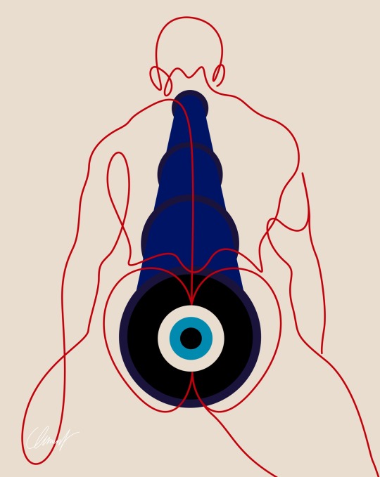


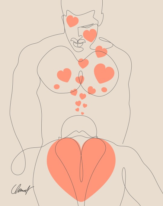
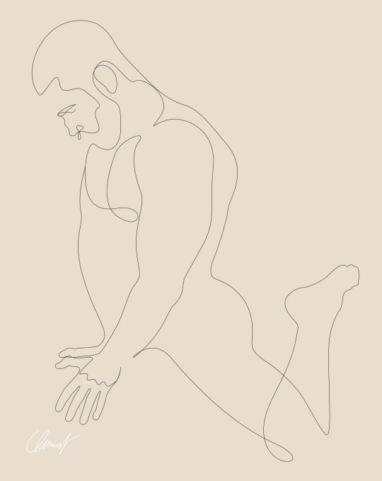

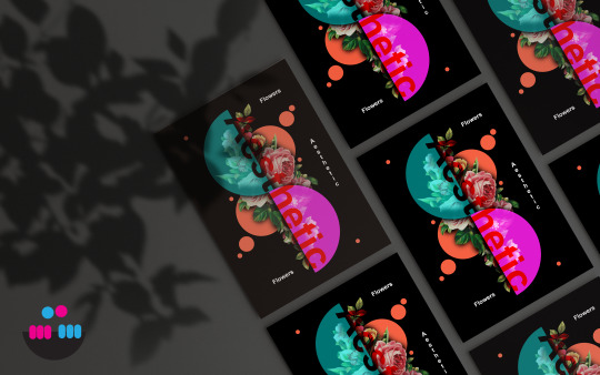
Rétrospective 2023
insta : @clemenlegrand
Plongée dans l’univers de mes créations qui ont suscité l’enthousiasme. Laquelle résonne le plus avec vos émotions? Dites-moi votre coup de cœur! 🖼️💬 (Part 1)
56 notes
·
View notes
Text
about me / sobre mim
[about me] [br/eng]
˚✧ antiseptic ݁ ੭
ela/dela I she/her🥀 18y 🖤 bissexual [assexual (?)] 💀 gótica! goth!~
eu sou a danielle, mas podem me chamar de moon, lilith, antiseptic, como preferirem! tenho 18 anos e estudo design ux/ui e figma, pretendo cursar uma faculdade de design grafico e quero ingressar na area mais cedo possivel. criei um blog pra postar meus processos criativos e conseguir alguns freelancers~
meu maior objetivo com esse blog é divulgar meus processos criativos com websites, quero me desenvolver com críticas e sugestões e colocar meus conhecimentos em prática, adquirindo todos os estilos e extensões de mundo e conhecer essa área incrível ♥︎ almejo conseguir alguns freelancers e pequenos trabalhos relacionados a:
website;
layouts;
cardápios digitais;
cartões de visita;
interfaces gerais;
interações com o usuário.
tudo o que possa haver com design, resumindo...
mas não quero usar esse blog como uma área profissional, quero compartilhar meus designs mas interagir de forma pessoal e não usarei de forma alguma como empresarial! (apenas quero alguns trabalhos, hihi)
✩ ︵ sou uma designer iniciante e sempre fui apaixonada pela teoria e estética desse mundo, ingressei ano passado na área e tenho feito grandes progressos com meus estudos. atualmente estudo ingles e alemao, amo gatos (sou mãe de quatro doidos) sou amante de café e jogo lol e genshin impact, caso queiram interagir sobre isso <3 (arlecchino e raiden shogun supremacy) ﹕
minhas ask's estão sempre abertas, então se sintam a vontade para me fazer perguntas ou conversar comigo ♥︎
alguns links que possam ser uteis:
te enganei :D nao tem nada! (em breve)⠀ 𓈒⠀ ⠀✧
IN ENGLISH, PLEASE!?
i'm danielle, but you can call me moon, lilith, antiseptic, whatever you prefer! I'm 18y and study UX/UI design and figma, planning to attend a graphic design college and aiming to enter the field as soon as possible. I've created a blog to share my creative processes and to find some freelancers~
my biggest goal with this blog is to showcase my creative processes with websites. i want to develop myself with critiques and suggestions and put my knowledge into practice, acquiring all styles and extensions of the world and getting to know this amazing field ♥︎ I aim to get some freelancers and small jobs related to:
websites;
layouts;
digital menus;
business cards;
general interfaces;
user interactions.
anything and everything related to design, in short...
i don't intend to use this blog as a professional platform; rather, I want to share my designs while interacting on a personal level. i won't use it in any way for business purposes! (just looking for some fun projects, hihi)
✩ ︵ i'm a beginner designer and have always been passionate about the theory and aesthetics of this world. i entered the field last year and have made great progress with my studies. currently, i'm studying english and german, i love cats (i'm a mother of four crazy ones), i'm a coffee lover, and I play lol and genshin impact, in case you want to interact about that <3 (arlecchino and raiden shogun supremacy) ﹕
my asks are always open, so feel free to ask me questions or chat with me ♥︎
some useful links:
i got you :D there's nothing here! (coming soon)⠀ 𓈒⠀ ⠀✧
#freelancedesign#apresentação#apresentation#introduction#designgraphic#designergrafico#cat lovers#coffeeaddict#gaming#gamingcommunity#genshin impact#league of legends#brasil#english#aesthetic#art#gothic#goth aesthetic#gotico#arlecchino genshin#arlecchino#raiden shogun#raiden ei#yae miko#genshin#genshinimpact#design#graphic design#designinspiration#digital art
8 notes
·
View notes
Text
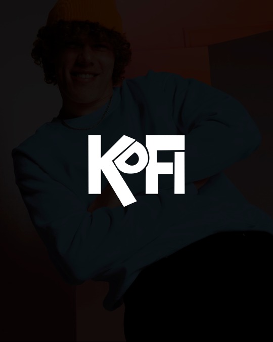

🤩TE PRESENTAMOS LAS ✨TARJETAS DE AGRADECIMIENTO✨
Son un detalle que hace que tus clientes vuelvan a comprarte🛍, dejando tus redes, tu página, dándole un incentivo para que suba una historia y te promocione📢!
Estás tarjetas las hicimos para koficlothes que también diseñamos su logo, nos encantó esta propuesta, jugamos con colores vibrantes ya que elegimos el azul en su paleta de colores.
Dime qué te pareció en los comentarios y no dudes de pedirme información si necesitas que diseñe para tu emprendimiento/negocio/servicio.
3 notes
·
View notes
Text
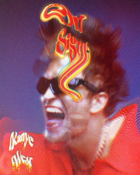
Affiche pour le titre "On Sight" de Kanye West
credit: shooting de Robert Pattinson pour le QG
3 notes
·
View notes
Text

Grainy Effect Vector - Bunny in Spring Season 🌸🌸
Seasonal cute animal edition
#bunny#rabbit#spring#springday#illustration#illustrator#art#artwork#desaingrafis#design#desaingrafisindonesia#designgraphic#desain#graphicdesign#graphicdesigner#vectors#vectorillustration#vector#vectorart
12 notes
·
View notes
Photo
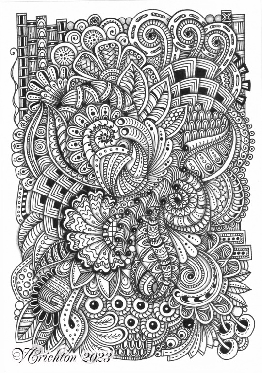
Zentangle art, black and white abstract, Viktoriya Crichton.
#ZentangleHouse#ViktoriyaCrichton#zenart#zentangleart#zentangleartist#zentangle#handdrawing#zentangleinspired#design#designgraphic#abstract#artistontumblr#artdrawing#Zendoodle#handmade#abstractart#black and white
9 notes
·
View notes
Text
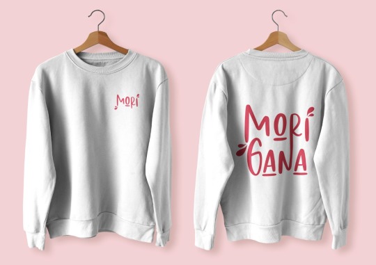
Some applications of my brand that I made just to see how this would look 🥺❤️
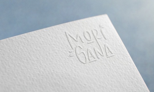


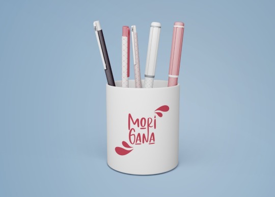


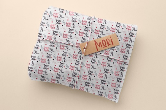
#brart#brazillian artist#digital art#art#artists on tumblr#brand design#designgraphic#graphic design#design#branding#brand identity#brazil#illustration#identity#visualdesign#visual identity#identidad
12 notes
·
View notes
Photo
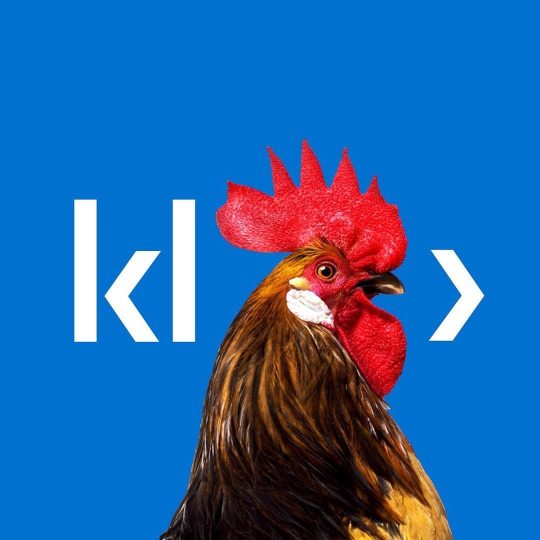
@grapheine_branding Klee Digital Creation of the visual and editorial identity of a new digital transformation service offering —— With 30 years of experience, Klee Group is a leading French company in IT consulting and digital solutions. It designs, invents and develops customised technological solutions. Klee Group's expertise covers both business and technical aspects, combined with a proven methodology. Klee Group wanted to increase its reputation in the private sector in order to rebalance its customer portfolio. The second objective was to strengthen its "360° consulting" brand image: Klee Group was too often contacted by its customers during the specification phase. It was therefore necessary to harmonise its discourse on Digital Transformation, which is a key vector of innovation and development for its customers. It is in this context that Graphéine accompanied Klee Group in September 2017. We defined the brand strategy and created the visual identity of its new 360 service entitled "Klee Digital". Klee digital's logotype is based on a typographic trick that we detected in the word "Klee". Being able to capitalise on a short, identifiable name opens up possibilities for typographic games and systems. With the change of the name to lowercase and an "open k" designed with an arrow, a code symbol seems to be emerging: an html tag </> Simply follow the word Klee with an arrow. This trick immediately connects Klee to the digital sector and creates a graphic force that can be further developed. By removing the "ee", we obtain a "kl>" tag logo which will act as a receptacle for the service's communication elements. #designgraphic #digital #transformationnumérique #branding #identité #marketing #identitévisuelle #logo #stratégie #entreprise #kleegroup #designsystem #logotype #logodesigns #grapheine #graphéine #graphicdesign #brandidentity #frenchtech #coding https://www.instagram.com/p/CmeKBQMSEVD/?igshid=NGJjMDIxMWI=
#designgraphic#digital#transformationnumérique#branding#identité#marketing#identitévisuelle#logo#stratégie#entreprise#kleegroup#designsystem#logotype#logodesigns#grapheine#graphéine#graphicdesign#brandidentity#frenchtech#coding
6 notes
·
View notes
Photo

Je vous souhaite un excellent Ramadan. Que dieu vous apporte la santé, la joie et la prospérité رمضان كريم وكل عام وانت بخير وصحة وسلامة يارب #studirassm#design#designgraphic#maroc#morroco🇲🇦 #arabictypographylogo #arabictypeface #arabicdisplay#arabisaoudite #dubai #egypt #algerie #tunisie #muslim (à ÉSAV Marrakech) https://www.instagram.com/p/CqGGy6TKISy/?igshid=NGJjMDIxMWI=
#studirassm#design#designgraphic#maroc#morroco🇲🇦#arabictypographylogo#arabictypeface#arabicdisplay#arabisaoudite#dubai#egypt#algerie#tunisie#muslim
6 notes
·
View notes
Text
Aesthetic Poster
#photoshop#art#artwork#design#graphic#designgraphic#graphicdesign#poster#designforsale#photoshopposter#aesthetic#aestheticposter#artworkforsale
2 notes
·
View notes
Photo

Project about: Flyer Design ©️ @rain_studio_s Available for Freelance work. Let's talk about your projects Full project see on Behance: www.behance.net/abdullaalrasel 📩 Order Now On Fiverr: www.fiverr.com/rainstudios 📁 Follow My page: @rain_studio_s @arvilstudio 💯 safety Provide service 📝 : Youtube intro (2d intro also 3D intro) Promo video (like a shot video of a product) Instagram story Facebook ads Birthday and anniversary wishing video and much more. Graphic design service 📝 : Logo design, I also design Landing Page, Instagram Stories, Instagram posts, Social media posts, logos, flyers A5, posters A4, Brochures, Menu A4, Business cards, etc. Contact Me: ____________________ Email: [email protected] Facebook: www.facebook.com/abdullaal.rasel.1/ WhatsApp: +8801680627226 OR Click HERE Telegram: @Rainstudios Whatsapp: https://wa.me/message/Z7UI5LTKE3VMD1 Telegram: https://t.me/Rainstudios Follow Me: ____________________ Dribbble: https://dribbble.com/Rain_studios Facebook: www.facebook.com/Rainstudioos Instagram: www.instagram.com/rain_studio_s/ Pinterest: www.pinterest.com/rainstudioss/ Twitter: https://twitter.com/Rainstudi_o LinkedIn: https://www.linkedin.com/in/abdulla-al-rasel Tumblr: https://www.tumblr.com/rainstudioslove Youtube Channel: https://youtube.com/c/RainStudio 2nd Channel: https://www.youtube.com/channel/UCeQ-uggStwaVRNG_TyWFZQQ/about Facebook Arvil Studio: https://www.facebook.com/arvilstudio Personal ID: https://www.facebook.com/abdullaal.rasel.1 KW: #graphicdesign #graphicdesigner #graphicsdesign #designgraphic #designergraphic #graphicaldesign . . . (at Los Angeles, California) https://www.instagram.com/p/CkLGPuTr4UW/?igshid=NGJjMDIxMWI=
3 notes
·
View notes
Text
Hi , We Are Graphic Ambade, We Are From Indonesia and Our Mission is to make Graphic and logo designs

2 notes
·
View notes
Text
processos zzzz / process zzzz
[ br / eng ]
[um pequeno processo criativo/meu primeiro projeto oficial]
lição mágica aprendida hoje: contraste.
˚✧ antiseptic ݁ ੭
BR :
⎯⎯ o processo criativo é a parte mais divertida de um design, as cores, fontes, formas, texturas, tudo é tão bom que me derreto por essa área ♥︎ fico extasiada em como os embasamentos realmente funcionam na prática.
meu PRIMEIRO projeto consistia em fazer um site de refrigeração nas cores azuladas, confesso que odeio não poder encher de símbolos e formas (tirem o figma de mim), mas trabalhar com estilos diferentes me fez refletir como os clientes veem o mundo, então decidi tentar! 𓆩♱𓆪
e o meu primeiro cliente foi meu pai! 🖤

pequenas explicações
é apenas a teoria do que pensei, não é necessário ler~
/⠀ ⠀TIPOGRAFIA ⠀⠀ 〜 ♱
𓏲 pesquisei diversas fontes, precisava de algo que não fosse retangular, mas não fosse tão redondo, apesar do aspecto profissional que eu quis passar. a psicologia por trás da forma redonda é bem simples: círculos são associados a suavidade, absoluto, movimento e facilidade, mas não exagere. nenhuma forma deve ser exagerada, isso causa a impressão de mal feito e afastamento, é necessário equilibrar para uma fórmula bem feita. ⛧
/⠀ ⠀CORES ⠀⠀ 〜 ♱
de fato, essa foi a parte mais fácil. a paleta de cores predominante é o azul, o que traz uma sensação de frieza, frio, gelo, tudo o que queremos, certo? (sim.) por se tratar de uma marca de refrigeração, não escolhi o preto como a cor das fontes, mas sim uma cor acinzentada, fugindo do padrão. o laranja foi escolhida por conta do círculo cromático das cores, ou, a velha teoria das cores.

fonte: sla peguei no google / https://blog.adobe.com/br/publish/2022/03/30/como-usar-o-circulo-cromatico-com-o-adobe-color-super-facil
─ é nítido que o azul e o laranja são cores contrárias, então, por que elas parecem tão harmonicas juntas? porque são cores complementares. um pequeno resumo: as cores complementares são aquelas que dão contraste uma a outra, um exemplo interessante é a rapunzel de enrolados, você percebe que a paleta de cor predominante nela é o roxo e o amarelo, pois são cores que se contrastam, ficando assim de forma harmonica.
,⠀cinza e branco: são cores análogas, estão presentes lado a lado no círculo cromático, o resultado é uma cor básica. (imagine aquele seu amigo que fala, aff isso não é roxo, é violeta! entao, é isso...) (eu sou essa chata, ok?) (voce nao pode falar que rosa choque é igual rosa ou eu irei atrás da sua familia) ☆
/⠀ ⠀CONCLUSÃO, uau ⠀⠀ 〜 ♱
é necessário durante a criação pensar no contraste das cores e dos elementos, as formas arrendondadas precisam ser equilibradas com formas retangulares de forma positiva, elementos que normalmente se dão bem juntos são aqueles que se contrastam, é muito interessante pensar em como é necessário dar atenção aos mínimos detalhes. o contraste é uma das ferramentas mais poderosas do design, se utilizada corretamente.
errr, sobre o site? ele continua na fase de programação, mas caso o post tenha uma repercussão boa, eu trarei ele com seu resultado. obrigada a todos que leram até aqui, um comentário e corações me deixariam muito feliz ♡
dúvidas, sugestões ou críticas? me mande um ask, ele está aberto para qualquer tipo de coisa que tenha surgido durante o post. ♥︎
ENG :
[a small creative process/my first official project]
magical lesson learned today: contrast.
⎯⎯ creative process is the most enjoyable part of design, the colors, fonts, shapes, textures, everything is so good that I melt for this area ♥︎ i am ecstatic about how the foundations really work in practice.
my FIRST project consisted of creating a cooling website in shades of blue, i confess that i hate not being able to fill it with symbols and shapes (take figma away from me), but working with different styles made me reflect on how clients see the world, so I decided to try! 𓆩♱𓆪
and my first client was my dad! 🖤
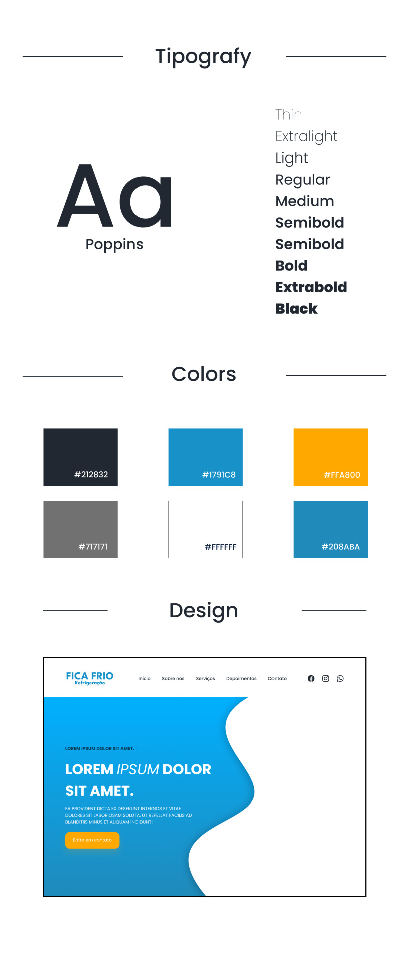
small explanations
it's just the theory of what I thought, no need to read~
/⠀ ⠀COLORS ⠀⠀ 〜 ♱
indeed, this was the easiest part. the predominant color palette is blue, which brings a sensation of coolness, cold, ice, everything we want, right? (yes.) as it's a cooling brand, I didn't choose black as the font color, but rather a grayish color, deviating from the norm. orange was chosen due to the color wheel theory, or, the old theory of colors.
font: idk, got it from google / https://blog.adobe.com/br/publish/2022/03/30/como-usar-o-circulo-cromatico-com-o-adobe-color-super-facil
─ it's clear that blue and orange are opposite colors, so why do they look so harmonious together? because they are complementary colors. a brief summary: complementary colors are those that contrast with each other, an interesting example is rapunzel from tangled, you notice that the predominant color palette on her is purple and yellow, because they are contrasting colors, thus appearing harmonious.
,⠀gray and white: they are analogous colors, present side by side on the color wheel, resulting in a basic color. (imagine that friend of yours who says, ugh, this isn't purple, it's violet! so, that's it...) (i'm that annoying person, okay?) (you can't say that hot pink is the same as pink or I'll go after your family) ☆
/⠀ ⠀CONCLUSION, wow ⠀⠀ 〜 ♱
it's necessary during creation to think about the contrast of colors and elements, rounded shapes need to be balanced with rectangular shapes positively, elements that usually work well together are those that contrast, it's very interesting to think about how attention to the smallest details is necessary. contrast is one of the most powerful tools in design, if used correctly.
uhh, about the website? it's still in the programming phase, but if the post has a good reception, i'll bring it with its result. thank you to everyone who read this far, a comment and hearts would make me very happy ♡
questions, suggestions, or criticisms? send me an ask, it's open to anything that came up during the post. ♥︎
#designgraphic#design#design ux#design ui#designinspiration#website#web design#art process#colors#theory#disscussion#brasil#english#creative#art#digital art#my art#aesthetic#figma#figmadesign#figma figure
9 notes
·
View notes
Photo

Table basse « Clover X « Multiplis de bouleau laqué noir, miroir, inserts laiton Design Profil Bas Studio #meublebois#table#tabledesign#plywood#plywoodfurniture#multiplisdebouleau#designgraphic#furniture#design#plywood#wooply#tablebasse #tablebasseoriginale #coffeside#miroir#Cuivre#brass#laiton#clover#profilbas @martinleguet @studioprofilbas @atelierhephaistos Photos @corentinmace_ (à Paris 14eme) https://www.instagram.com/p/CkgI9nkt4wy/?igshid=NGJjMDIxMWI=
#meublebois#table#tabledesign#plywood#plywoodfurniture#multiplisdebouleau#designgraphic#furniture#design#wooply#tablebasse#tablebasseoriginale#coffeside#miroir#cuivre#brass#laiton#clover#profilbas
2 notes
·
View notes
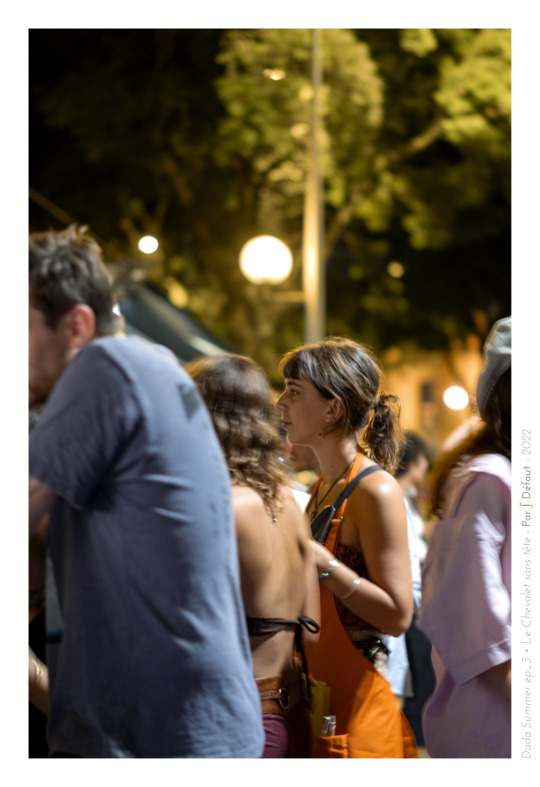
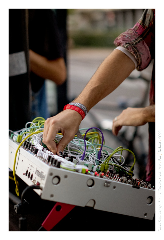
Video
EVENT 🍹 ATELIER
« Le Dada Summer » ep.3
Vernissage • Flashs Tattoos • Musique Live • Démos • Photo • Pêche aux canards
Kermesse Arty = Archi dinguerie ! Un immense² merci à toutes celles & ceux ayant galopé.e.s en masse, samedi soir dernier, en direction des écuries du Chevalet sans tête pour coudoyer ensemble !
Me voici comblé de voir qu'à l'aube de sa 3ème année, le Chevalet vit ainsi. Il est un lieu de démocratisation du fait culturel dont l'âtre brûle ardemment grâce à un public hétéroclite fait d'amateurs.trices, collectionneur.se.s, étudiant.e.s, enseignant.e.s, client.e.s & visiteurs. Une part de la production contemporaine continuera d'y régner tout en se propageant, tant que le/la spectateur.trice sera. Merci à toutes & tous pour la gratification faite, par votre présence, au travail personnel que nécessite la création, la communication & la réalisation de ce type d'événements. Il le fruit de quelques semaines de travail afin que les résidents {Odji, Honoré, David, etc...} puissent exercer leurs arts & vous le donner à voir dans les meilleures conditions, et ce, tout en vous observant apprécier la soirée de la sorte depuis mon canapé ! ;}
C'était une magnifique soirée dont il convient d'attribuer une part de la superbe tenue des événements aux écuyers émérites que sont Diane, Élise, Lucas, Soany, Maëlys, Camille & Thomas. Ils auront contribué à ce que rien ne vous manque !
Le Dada Summer du Chevalet s'achève donc dans la lumière sérotinale & aspire à vous retrouver très vite ¡
D'ici là, portez vous bien !
! ✌️ ¡
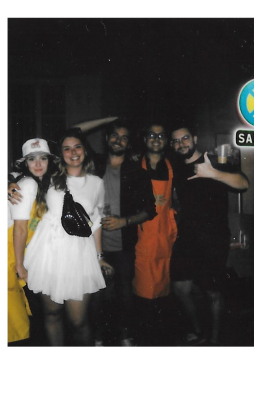


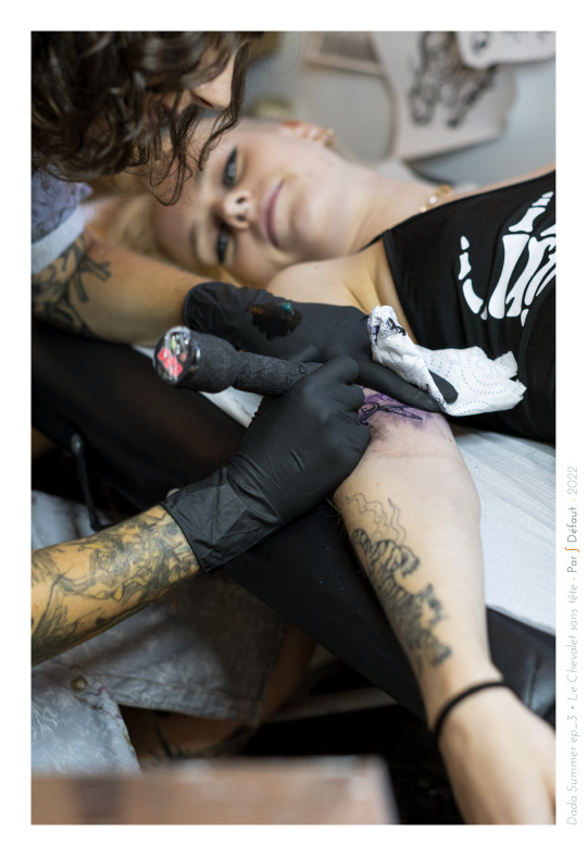


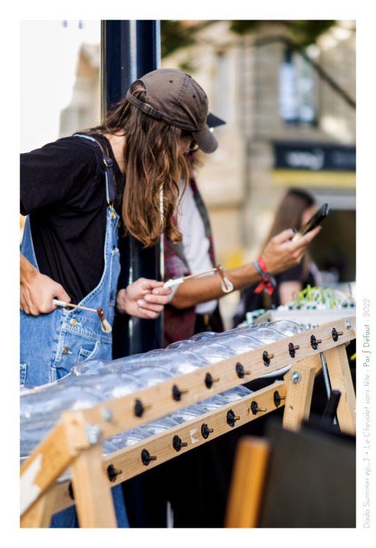
#fine arts#artstudios#paintings#musics#tattoos#photography#video games#learning#sculptur#designgraphic#motion design#animation
2 notes
·
View notes
Text
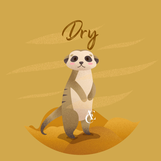
Grainy Effect Vector - Meerkat in Dry Season ⛱️⛱️
Seasonal cute animal edition
#meerkat#dryseason#dry#desert#illustration#illustrator#art#artwork#desaingrafis#design#desaingrafisindonesia#designgraphic#desain#graphicdesign#graphicdesigner#vectors#vectorillustration#vector#vectorart
7 notes
·
View notes
Last Seen Blogs
aclue-aclue
A Blue's Clues Anthropologist 🔍

dark-ethereal-visions
Ethereal Visions
priartes
Seja Cereja 🍒

shade74
Alex's Frozen Edits