#compf19
Text
Writing Journal 10/2
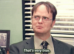
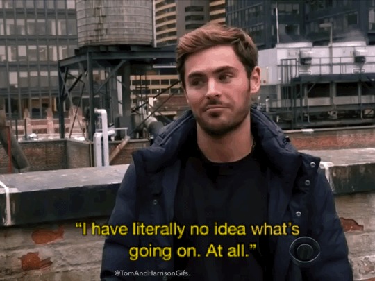
For this Wednesday’s reading on What is Rhetorical about Digital Rhetoric? Perspectives and Definitions of Digital Rhetoric it was about how digital rhetoric came to be and how is it a hard topic to define because everyone views digital rhetoric differently. Even in the video that is attached in the article, scholars themselves have a hard time defining what digital rhetoric is. Most of them joke about asking an easier question or tried to go around from answering the question. From that video, my understanding is that when talking about digital rhetoric there is a wide range of things that can perfectly fall under that definition. From the Indiana Digital Rhetoric Symposium I gathered that the people attending were challenged to our their minds and try to see from different perspectives and to consider the information that is being displayed to them. This conference made scholars think differently and maybe even change their views on digital rhetoric to be more wide ranged instead of viewing it to be one main topic of conversation. They also explained how culture also influences how people view digital rhetoric which makes it harder to create one definition. So, from this I learned that it depends on who is describing digital rhetoric because they will influence how they view and define digital rhetoric because it will be different from person to person.
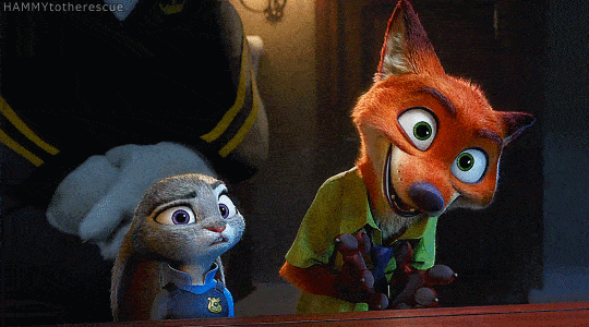
For this post I used linguistic and visual mode, I used linguistic because I felt it was the best way to express my thoughts on this reading. I also used visual because I thought this gif best described my face while doing the reading because of the confusion of trying to define digital rhetoric.
10 notes
·
View notes
Text
Writing Journal 11/4
As someone who is in a major that is going to heavily deal with people with disabilities, this week reading really hit home. As a “typical” human being, you don’t really think about how those who are disabled may struggle with everyday things that we take for granted. Something as simple as reading a sentence or hearing a song are hindered and not many people realize that there are quite simple fixes to these problems. When a developer is creating a new website or app, they need to keep in mind that not everyone can see size 12 font or can hear the videos they embed. This is where accessibility comes into play. Accessibility means that everyone, no matter their setback can have access to the same information and opportunities as everyone else. For some people who have low-vision or are blind, to many crazy colors and small font can make it difficult to read things. But what if they can’t read at all? The developer could include something that reads all of the text aloud and describes any pictures that may be present as well. In the article 7 Things Every Designer Needs to Know About Accessibility, they touch on things like font size and design that will make it easier for individuals with visual impairments or even colorblindness to read, see, and enjoy. Accessibility Guidelines for UX Designers also talked about how making something accessible allow all individuals to better understand and use the web. Kind of like how someone who is Deaf might need closed captioning on videos that way they aren’t left out. I think all people should think about accessibility and how people with certain limitations would be affected.
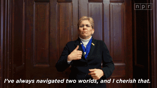
I chose linguistic as my main mode because I think it’s the best way to get my ideas across. I also chose visual because I think it helps tie everything together. I chose this gif specifically because when you’re constantly surrounded by “typical” people, I think those that are Deaf or blind might feel like they’re in a new world, especially if it isn’t accessible to them.
6 notes
·
View notes
Text
“Exploring Visual Literacy”
When reading the assigned graphic novel pdf, “Understanding Rhetoric Introduction and Issue 1,” something that JUMPED...

... RIGHT OUT AT ME WAS...
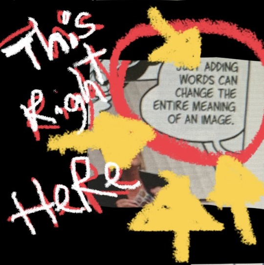
I thought to myself.... we do this with memes and gifs all the time.
We take a picture from a movie 🎥 or show 📺 etc.
Match the image with a caption, which captures our emotions, to convey a message which portrays the way we feel at that very moment.
With precision and timing, the created image has the potential to connect with hundreds dare I say, endless amounts of people, possibly giving birth to an, epic and timeless meme/gif.
Which we can always count on for a cheap, feel good laugh...
Taking our day from here...
To here....

Thanks Rhetoric!
I’m sure the way we use memes or gifs are not the way the originator of the image intended it to be used, however; when communicating with others creatively, using the rules of rhetoric, we can create a “space” to send our own messages and connect with others through something such as visual literacy.
We can send/deliver purposeful messages, to specific or nonspecific audiences, traditionally or untraditionally, formally or informally, uniquely and effectively, with the power of communication.
#KnowYourAudience#HaveKnowledgeOfTopic#WritingisDynamic#Analyze#Strategize#RhetoricToolbox:#SpeachisPower#TumblrJournaling#assignmentcomplete#dropmic#imout#peace✌️😎
12 notes
·
View notes
Text
writing journal 11/4
Jesse Hausler wrote, “7 Things Every Designer Needs to Know about Accessibility” to try and help designers in making webpages, blogs, articles, etc accessible to every individual. Hausler talks mentions how they are many ways that designers can create something that is still fun and entertaining, while making it accessible to all peoples. Hausler mentions how by making these pieces of “art” can make them more creative. These things that the designers can do to their pieces can make them stand out compared to other pieces.
I chose this gif because it shows that access can be available to anyone if the right actions are taken. This relates to Hausler because in the article it mentions how by making these small changes more people can have access to the designers work.
Hausler goes on to talk about the things that designers should stay away from or try to minimize. He talks about the font and font sizes that you should use. He talks about the colors that you should and should not use.
In “Accessibility guidelines for UX Designers”, Avinash Kaur talks about many of the same things that Hausler talks about. Kaur talks about understanding accessibility and the guidelines that come along with it. She talks about how you need to have empathy and knowing the mentality. She mentions all the individuals who have disabilities and how they are also users of many of these platforms that get information across.
Everyone should have access to whatever they want to be able to view no matter if they are colorblind, deaf, blind, etc. Accessibility is something that needs to be more accessible.
4 notes
·
View notes
Text
Tumblr Post 11/04/19
7 Things Every Designer Needs to Know About Accessibility is a great insightful passage that promotes and encourages website and digital developers to design their products to be more adaptable or “accessible” so that they may be used efficiently by all sorts of people, including those that struggle with various physical and mental disabilities.
The first of seven guidelines that the author lists so that a web and digital designer may follow in order to produce an effective product revolves around “Accessibility”. A product should be fluid, geared and comfortably accessible for people who may have physical disabilities such as: vision, hearing, mobility and cognitive Impairments. In addition, the products should also be designed with diversity in mind so that people ranging from young to old age, people who are novices in the use of technology, and those who are experienced and familiar in their operational use, all interact and navigate the software/hardware proficiently.
The second and third guidelines suggests the use of color to highlight, promote, and attract users visually towards an area of the website that needs attention. An example provided is the use of red borders around insert fields to indicate that there is an error. In addition, a combination of colors should also be used alongside icons and other text modifications such as text size, titles, bold headings, underlining, italics and etc. in order to stand out in the eyes of the user. With these implications, people with vision impairments may be able to read and navigate the designer’s product without issue and with assistance.
The fourth-seventh guidelines focus on the developer creating software that will have a symbiotic relationship with the hardware it is being built for. Such an example is being able to navigate a website while only using a keyboard and building certain functions and shortcuts that will allow a user to easily navigate throughout a website or program. Along with this development, information on how to properly use the software should be given and readily available to be accessed by the user. There should be borders implicated and built within the design of the product so that the user understands the limits and boundaries that they are able to navigate within the software. Details on all icons, symbols, actions and links should be properly displayed and described to provide as much information as possible so that the user has a better understanding on the program’s properties. All of these factors and important in the creation of assistive technology that makes a huge impact and difference in the daily lives of people who may have physical and cognitive disabilities.
These guidelines are further supported by the user experience/user interface article, Accessibility Guidelines for UX Designers, which reviews the same concepts as the previous reading. Content and structure should have meaningful links that pertain to whatever a user is searching for. By avoiding links that will lead to unrelated content and to limit the addition of unnecessary keyboard inputs, this will aid users that may have motor impairments, cognitive limitations or visual disabilities.
A combination of color, text, font and graphical objects, will create a helpful product that will be user friendly for people with partial sight, limited color vision, color blindness. Patterns of navigation should also be consistent so that repeated components occurring in the same order within different pages of the website/software, reflect user friendly components and teach its users, especially those that may have intellectual disabilities, that the website is predictable and therefore understood. There should always be different options and choices that give the user the ability to return to any desired location, page, tab, or settings within the program. The design of the software should always be linear and consistent with the aid of various multi-modal components such as visual, aural, and text so that the user can read and comprehend the layout and design of the product.
As a current medical worker, I personally love the critical importance of developing software and hardware that will have a positive Impact in the lives of patients who are suffering from physical and mental disabilities. It will aid health care workers to provided a better form of care and one in which patients can properly voice their concerns in regards to their health. I hope to one day help to promote exquisite health care for patients within the rehabilitation department with the assistance of devices that will provide the support needed to assure the safety and well being of my patients.
I used text to summarize the importance of both articles and guidelines as well as visual media in the form of the GIF above, in order to provide a physical interpretation and relationship to the readings.
4 notes
·
View notes
Text
Journal Post 10/16
Chapter 2 of “Sustaining Critical Literacies in the Digital Information Age: The Rhetoric of Sharing, Prosumerism, and Digital Algorithmic Surveillance”, it talked about sharing on social media. The article talked about how our social media activity dictates how a feeds show. So it takes what we like and share and next time we go on that social media we see a lot more posts of things we have an interest in. It can be a frightening thing that what we post on social media is saved into data bases that people can get a hold of and know pretty much everything about us and that can lead to major problems. I feel that us as a society have to be careful what we put out there because something we post that is sensitive information can land in the wrong hands and could cause major problems in our lives.
In the video, Danah Boyd is a researcher at Microsoft and the Founder and CEO of the institute of Data and Society. She talked about how social media manipulates what people see. She discussed how conspiracy people manipulate how information on crisis’ are spread and makes everyone go crazy researching things. Also talked about the measles outbreak in New York City that caused a lot of people to go frantic and research how to stay protected and what to do. She explained how search engines get manipulated and can show false information or beliefs out to the public and having them believe in fake news. How social media platforms amplify these crisis’ and trick users to stay on them and research false information believing it is all true. So you cannot believe everything you read on the internet is real. We need to be cautious of who is relaying the facts whether they are a reliable source or not.
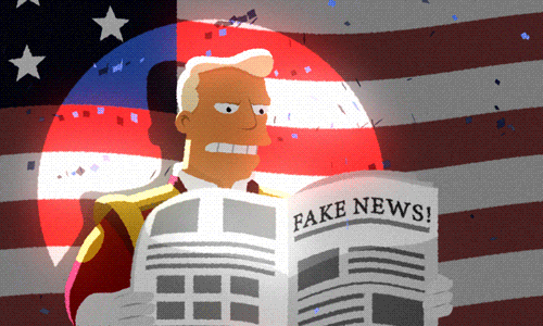
In this post I used the rhetoric strategies of linguistic and visual. I used the visual gif of fake news since it ties into what was discussed in Danah Boyd’s video. I used the strategy of linguistic to relay my thoughts and ideas of this information.
5 notes
·
View notes
Text
Journal 9/25
From the two readings, On Multimodal Composing and Women, Rhetoric, and Politics on Pinterest, different places and ways people used to composed were spoken about as well as where they are posted and put into the world. In On Multimodal Composing, the employees shown do their work in different places whether it be in the office, at home or a gym, they have their own processes on how to compose their writings. This reading also focuses on how these compositions are put into the world whether it be online communities or to crowds in person, their compositions are getting out and into the world. The other reading Women, Rhetoric, and Politics on Pinterest focuses on how many women use painters to discuss politics. With Pinterest being another social media platform where you can make different boards. it is interesting that these conversations would happen on this platform because for me personally, I use Pinterest for ideas for hairstyles or how to dress for different events. It is interesting to think how many ways there are to compose as well as get your compositions out into the world. Something that made me think from On Multimodal Composing is when the author said that composing is always happening whether we think it is or not; our brains never really stop working and we do not always realize it. Writing is different for everyone which we saw in On Multimodal Composing because their writers were working in many different spaces with different factors that can be a distraction to some. I know that personally I have to be in a space that has a desk and usually cannot be around many people otherwise I can get very distracted and not get done what I need to get done. Both of these writings show different ways composing is done.

The two modes I used in this journal were linguistic and visual. I used linguistic when I was first writing down main points as notes on paper as well as how I constructed my thoughts and sentences. I used visual with the gif above because it shows a man writing in a bath tub which I thought could apply to this reading because they spoke about how you can compose anywhere.
6 notes
·
View notes
Text
9/20 assignment
The world around us is honestly all technologically based. If we look at what we do from day to day, our day normally starts with looking at our cell phones whether it be to see what time it is, turning off our alarms, seeing our notifications, or looking to see if we received the beloved email “CLASS IS CANCELLED.” It is safe to say our world revolves around technology. In chapter 5, Sebler was making a point to say how important it is for educators to incorporate technology into their curriculum. He made points to talk about the computer technologies that there are today and the roles that they play in education. If we think about the amount of times we actually have to submit a paper or homework in person on the teachers desk, that answer is slim to none. Everything today is online. ESU has D2L and that is a big deal as we can upload assignments, see what we have to do for each class, get reminders on when an assignment is going to close or if we have a quiz coming up, everything is right there. I am not saying that D2L is completely user friendly, but once you get used to how to navigate it, life becomes a little easier. There are some professors that do not even know how to work some of the newer technologies and then there are some that know more than most students know. That is something that needs to change. Taking the time to learn how to work the newer technologies can be very beneficial to not just the students, but to the professors as well as they can sharpen up their skills. Every class is different and each teacher likes to teach in different ways or have their students submit things in a different manner, regardless, there is technology implemented in some way. Like I said, the world around us is evolving and if we have professors that are up to date and know how to use the up and coming advances and can teach us how to properly use them and navigate them so we can be more successful in the future with whatever career path we go down. I was spoiled in high school because we had an all online system where we submitted everything and we did everything on our own laptops. I came from knowing how to maneuver through a whole website, to coming into ESU with D2L and not knowing how to use anything because no one showed me how to use it. I know that with my major there are constantly new technological advances, such as the new Anatomage table in Koehler Fieldhouse, and without professors that knew how to work that new machine, I wouldn’t know how to work it.
I used linguistic and visual because using both of these helps get my point across. Using linguistic, I can describe what I want to say through words and with the visual aspect, I can use a GIF that can describe what I was trying to say. I think this GIF works because it shows a common face people make when a professor tells us that we should already know how to do something or use a tool when we have no idea how to use it but are too afraid to say that we don’t.
6 notes
·
View notes
Text
9/20 Writing Journal
These chapters of Multiliteracies for a Digital Age really discuss computer multiliteracy programs and how teachers and their institutions should go about integrating programs with literacy and technology. It begins to discuss as well though, that change is not going to happen right away and there needs to be more commitment over time for it to be integrated. However, in order to make a change, one must understand all the parts of change but also understand it as a whole because literacy and technology is always growing and changing. It states that in educational settings, technology is seen as the primary intervention and honestly, I find that to be so true. I feel like in education, our focus is always toward technology and work is always to be done with some sort of technology. The text talks about four requirements and their approaches, in chapter 5 specifically. The first requirement for implantation is technical. This refers to the computer infrastructures on campus and discussing the technological requirements. It is also important to ask questions so everyone can understand the technology. The second requirement is Pedagogical, and this refers to scaffolding and understanding that students should be taught and handed technology information slowly so everyone can understand the information. The third requirement is Curricular which refers to the actual implanting of putting technology in the curriculum where it fits and even adding it to certain specific courses. The fourth requirement is Departmental and Institutional. This refers to how everyone can help everyone construct a better understanding of technology. It includes the importance of having certain people in charge of helping and setting up technology and it is important to have comfortable technology environments for all to feel comfortable when it comes to new technology. When I reflect on these four requirements personally, I do see this trying to be implanted into ESU. Maybe ESU isn’t doing it perfectly and is not making everyone super happy, but I believe for a smaller institution, we are technologically advanced and also, with our generation, we typically are known to just understand technology better, but if we do happen to need help from others, there is always help available on campus. This ended on a high note explaining that if students want to be people of the positive technology change, our education needs to be relevant and meaningful to our digital age. I believe this to be much more than people just believing us to know how to use technology, but I believe that having us interact and do more than just typing papers on technology will also help us engage more.

I used visual and linguistic for my two rhetorical strategies. By using linguistic text, I can better explain my thought processes, but when I add the visual aspect, in this case, a gif, it makes the post more interesting and appealing to the eye. The reason I chose this gif is that I find it to be interesting. You can interpret this differently too and I believe it symbolizes the growth in technology through the flower, but it also shows how it is just as easy to fail with new technology and that you have to make a few mistakes in order to grow.
6 notes
·
View notes
Text
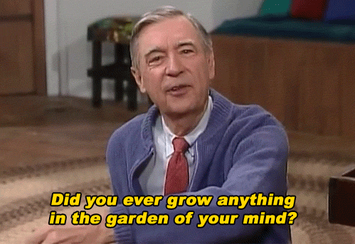
Journal 10/2
What is Rhetorical about Digital Rhetoric? discusses the intersection of rhetoric, media, and technology and to investigate the ways digital rhetoric connects to and is different to digital humanities. The term and peoples definitions of digital rhetoric is also heavily discussed. During the symposium participants were asked “How do you define digital rhetoric?” and most had trouble answering the question despite them utilizing it quite often. This surprised me very much so if one is using digital rhetoric within scholarships, projects, and teachings and cannot define the term. This was quite comical to me despite it being commended within the article, “While the field may still lack a clear definition of “digital rhetoric,” the essays... our inability to put a finger on this term-to nail it into place once and for all-is not to be lamented but embraced....” How can you utilize the term or even try an teach it to someone else when you yourself can't even grasp what it's about. I understand that it can be seen as better to let it go undefined due to it really bing up for interpretation and it changing every so often.
Defining and Expanding Digital Rhetorics, New Directions in Digital Rhetoric, Digital Rhetoric: Positions and Perspectives and Doing Digital Rhetorics are also discussed in sub categories within the article. Digital Rhetoric: Positions and Perspectives was one section that interested me most due to it discussing way to expand digital rhetoric to include a wider range of discourses and mainly its discussion of Digital Outragicity. I would have never thought that being outraged based on something on a social media platform had a term associated with it, “...that expression of outrage in digital spaces constitute ‘the feeling or sentiment of outrage over not a reality but a representation based on various levels of aware and unaware aggregations.” What will resonate with me most would be the example of digital outragicity based on the killing of Cecil the lion. I myself was saddened and angered over the killing of Cecil the lion when it first happened and took to social media to see how other people were reacting to it as well. I agree with the notion that emerging logic on reality is increasingly getting mixed with anger, backlash, and or aggregations. Overall this article has taught me that simply Digital Rhetoric is very vast and has various topics and information that goes along with it.

I utilized both these gifs because the first one describes how the definition of digital rhetoric was not understood and the second exemplifies being outraged. They were also equally funny!
6 notes
·
View notes
Text
Writing Journal 9/27
In chapter 9 of Writing in Knowledge Societies the focus is on the relationship between the development of scientific knowledge and rhetoric. Rhetoric is used by scientists in order to persuade other scholars on their new findings based off of research. Some scholars also think that the use of rhetoric aides them into looking at information in another perspective. Scholars have researched the topic of rhetoric and the way it helps scientists develop new ideas and develop more of an understanding on a set topic. This showed us that rhetoric is everywhere around us even in the world of science. Then they go on to research the meaning of metonymy and how it is like a metaphor but less complex. The reason why metonymy is less complex than a metaphor is because a metaphor offers two meanings within one word. The creation of metonymy relies on cultural models and encyclopaedic which means a person's experience with an idea or word. An example from within the reading where a person reads a set of text, how they might interpret the things that are real or “brute facts of nature” or the linguistic construction. For me, I know that I use metaphors when making comments either for someone to better understand what I am talking about or when making a joke.
For this post, I used linguistic and visual modes because I was able to effectively use linguistics to organize the summary of this chapter. I used visual because I thought this gif was cool because it is related to science like in chapter 9
6 notes
·
View notes
Text
10/2 Writing Journal
In this reading, What is Rhetorical about Digital Rhetoric? Perspectives and Definitions of Digital Rhetoric, looks into what is perceived as “digital rhetoric”. In the article, it talks about how it was realized that no one could really give a clear definition as to what it was or what it involved. This makes sense, because each individual person interprets things different ways based off of their past knowledge on the topic as well as experiences. Digital rhetoric could be described as showing what’s “in the eye of the beholder”, because no one will interpret it exactly the same. In the article, it talked about how Justin Hodgson and Scot Barnett attended a symposium that was based on digital rhetoric back in 2015. The symposium was geared towards digital rhetoricians and towards shedding a new light on what new digital rhetoric’s were being used. They also heard about how culture plays a role in all of this. It didn’t really help narrow down what digital rhetoric was but it did help show everyone how broad it is but how that can be beneficial being as that meant everyone could interpret it how it made sense to them. I really liked this article because it helped show why rhetoric is something that can’t and shouldn’t be narrowed down.
I chose linguistic because I love being able to write my ideas out. It’s the fastest and most effective way for me to work. I chose visual as well because I think it adds a fun element to something that others might find boring (linguistic). I chose this specific gif because just like gardens, each one is different and brings something new and exciting to the table. Just like each individuals interpretation of digital rhetoric, they may now be the same, but each person bring new ideas to the table.
5 notes
·
View notes
Text
Writing Journal - 9/24
The first reading, On Multimodal Composing, goes over the many different ways and requirements for composing using multiple modes. First, composing requires the use of many different mediums, tools, and interfaces. While typing and writing might be the most common, there are man other ways you can get out information. Additionally, writing and typing does not just have to be on paper or in a word doc, you can use sticky notes, smart phones, tablets, ect. to write and compose on that could lend to you writing and composing differently. Writing also requires the help of others to help expand upon your ideas and come up with better ways to present things. Furthermore, we tend to write things from experience that relate to us. So more people can help make it more relatable and allow for more creative minds to work together. Overall, this article was getting at the fact that more classes need to teach with multimodal composition in mind. The use of mulitmoldal composition helps others digest and learn more with the use of better examples and can help get your point across. Many classes devalue the importance of using more then just text on a word doc for every assignment and paper that needs to be done and try to make everything into a single repetitive mode for students and others to follow.
In the second article, Women, Rhetoric, and Politics on Pinterest, Deluca discusses what she has found researching how women posted and talked on Pinterest around the 2012 election as well as what is posted on the site that is typically seen as for women. First, she how social media is made to garner attention and discussion online. While liking a post may not seem like contributing to the discussion or using any form of rhetoric, liking it still shows interest and might lead to that person posting more. It also goes in depth about how people view Pinterest as a place of “silly feminine daydreams” even though that is far from the case. Many females might share recipes on Pinterest but there is also ongoing political discussion happening on Pinterest as well. Overall, Deluca is trying to show that just because a social media website might seem like a place for only sharing recipes, it can also contribute greatly to rhetorical discussion online (Deluca).
I agree with both articles. Multimodal composition should be values and taught more in all aspects of life. Using only one mode hinders your ability to be creative and express you meaning in the most ways to have people understand. Also, without using modes many generations will not be able to relevant discourse with the ever changing times. Additionally, all social media websites should not be considered strictly for women or only for sharing recipes. Going on to many of the you will find that there is numerous different discourses and uses of rhetoric on them. Many of which you might not even think would be on their like politics on Pinterest.
I feel that in the computer science field, working together and using different modes will help programs tremendously. Not only will their be more ideas but different solutions to get around the same problem. Also, when programming websites it is important to remember that they will most likely be used for more then just what you expect them to.
I used linguistic and visual stargazes in my post. I used linguistic to summarize and explain the main points of both articles. I used visual in the form of a GIF from the show IT Crowd to back up my statement that it is seen as not normal to use many different modes in the classroom.
5 notes
·
View notes
Text
Writing Journal 9/25
In “On Multimodal Composing” and “Women, Rhetoric, and Politics on Pinterest” , the authors both talk about how the settings that the writer is in influences the way the writing will come across.
I chose this gif because it shows an audience who most likely agree on something and when the author presents their work they need to connect to the audience.
I found it interesting that in the article “Women, Rhetoric , and Politics in Pinterest”, that Pinterest is mainly full of female users. I always thought that males and females both used it to get ideas for projects, recipes, etc. After reading that article went on Pinterest and looked at my followers and the files that I follow and I saw that about 97% of them were females. Also, a majority of the pins that are on the homepage are female or directed towards females.
The creators of Pinterest really thought about the audience that they wanted to attract.
In “On Multimodal Composing”, the authors talk about how individuals writing styles can be influenced by outside sources, audience, etc. I believe this is true because there is definitely different ways that individuals present different types of writing. If someone was writing a formal piece, they would not use language that they might talk to friends or family. They would be more professional. If someone was talking to friends or family members, they might abbreviate words or even use slang.
I chose this gif because not only is it funny, but it shows that peoples personalities can be different depending on who the audience of their writing is.
In conclusion, I learned a lot from the two articles. Pinterest has a majority of female users and that authors base their topics on who the audience is and what the audience believes.
5 notes
·
View notes
Text
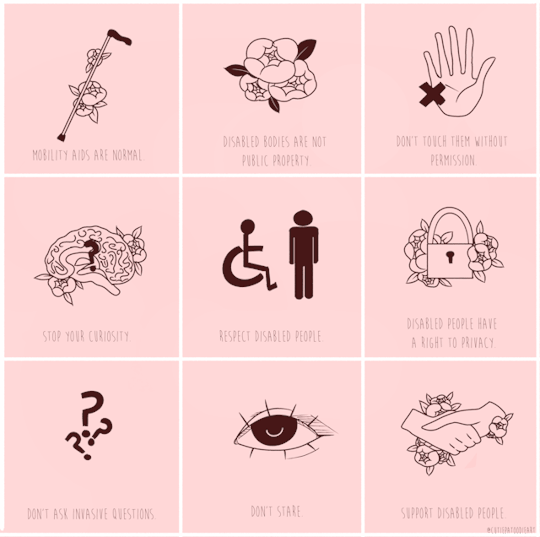
Writing Journal 11/4
After reading the assigned readings Design and Accessibility and Accessibility and Guidelines for UX Designers both had great points to bring to light about accessibility and how important it is to make websites accessible for not only people with long term disabilities but short term as well. When reading Design and Accessibility. I found it intriguing about how many different points to look at when making sure a website is accessible. The points can range from multiple ways to view a website to even the orientation you choose because it can affect somebody with dexterity impairments. When reading the second article it had a lot of similarities with the first one. It talked about ways to make websites more accessible through contrast and how accessibility is not a barrier to innovation but a means to even put diversity within a given product. The second article also goes into depth about how providing visual focus is a must when making a website accessible. In an ever increasing technological world I think it is extremely important that websites keep themselves accessible for many people with many disabilities. This topic of accessibility really hits home because with an older brother with autism I am always looking for different websites for him to play around with. The tools for website accessibility are extremely useful to a person looking for a good website for somebody and knows what to look out for rather it be multiple ways to access the website or just a colorful descriptive website. These readings tie into my major well because as a future pharmaceutical salesmen it is important to make my PowerPoint presentations accessible for everybody so I can get my sale across the right and positive way.
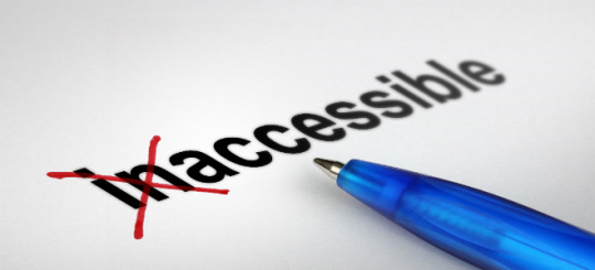
For my two rhetorical strategies I chose visual and linguistic. For visual I chose a picture of the word Inaccessible being changed to the word accessible because I thought it would be appropriate for what the readings were based on. For my linguistic rhetorical strategy I chose how I felt about the two readings.
3 notes
·
View notes
Text
Writing Journal 9/20
In the reading “Multiliteracies for a Digital Age”, chapters three through five the author rights about how important it is for education systems at all ages to incorporate computer literacy. From kindergarten to college students, online ways of learning are essential to the educational process. The problem with this is that no one necessarily tells students how to use it, we are expected to know because our generation has grown up with it. Since there is not a strict guide on how to use computers, it hurts students learning the process by them being too focused on how to turn an assignment in instead of doing the actual assignment and learning. At ESU most professors want us to turn in assignments through D2L and access all of the class information there as well. But when coming to the school new or as a freshman there isn't a guide to help students, and D2L is very confusing at first. I think with a written or video guide could help students and even older professors with D2L.
The world is surrounded by technology and we need to know how to use it since it is most likely it will be apart of our daily jobs as adults and our children's. After reading these chapters I was able to reflect my computer literacy and how I was never taught just was forced to learn. I think in the future there needs to be a change at a younger age to teach children how to use the internet for educational and noneducational so it is a safe and controlled learning environment.
I chose linguistic and visual because writing out my thoughts helps me learn and actually understand what I am learning and visual because it represents how I felt when trying how to use D2L as a freshman
5 notes
·
View notes
Last Seen Blogs

undyaddict
What's in your Top Drawer?

nareda
Nareda

izabellwit
this world is full of light

hudzcowa
journey around my thoughts
izabellwit
this world is full of light