#but yeah for the box art I already considered printing the old box version and putting it on top once I get the game
Text
A bunch of thoughts after the Showtime transformations trailer. This was supposed to be about the Cowgirl and Ninja one but then I got inactive for a while and another trailer dropped, so this post is about both.
Btw for those wanting to see more than the trailers, the descriptions for the Showtime trailers of Nintendo Japan, Nintendo of America and Nintendo France/Italy all have a link that leads to different sites, each with their own footage (the French and Italian ones are similar). I believe the youtube channel GamesXplain is also trying to group all the footage. It does spoil more things though.
Anyways, thoughts under the cut (around 3.2k words):
- Screaming biting clawing feeling insane I’M SO EXCITED FOR THIS GAME!!! WHAT DO YOU MEAN I HAVE TO WAIT ANOTHER MONTH FOR IT?!
- Very relieved they didn’t change anything other than the box art (not that they would have had the time to since the game is coming out this march, though the icon on the switch home menu will sadly probably be changed to the new art).
- Favorite design overall has to be Dashing Thief Peach. I adore the vibes going on with this costume! I’m also a big fan of Swordfighter (love the “fictional version of the Renaissance-era West-Europe” aesthetic), Figure Skater (the costume is so pretty!), Mermaid (also incredibly pretty, tho it’s funny how mermaid being the only one with her usual haircut makes her look almost weird compared to the other transformations), and Kung Fu (I especially like the color scheme).
I also really like Cowgirl Peach, though with that new trailer it’s going down a bit (she has an attitude I really like, it’s very unique for a character like Peach but there’s a level of playfulness to it that makes it work well, or maybe it’s the knowledge she’s acting, idk. And for some reason the Pow//ser shipper in me is very happy about Cowgirl Peach having horns on her hat).
- Least favorite is Mighty Peach. I want to say it’s because the design is too “basic” but in reality I think it’s just that I’m completely indifferent to Superheroes so this one just does nothing for me. I mean Detective Peach has a basic design and I’m giving it a pass since it’s a reference, which I’m pretty sure Mighty Peach is as well. So yeah, I think it has less to do with the design itself and more with it being a superhero transformation. The “stereotypical superhero run” she does is hilarious tho (from the french/italian websites).
I’m also not a big fan of Patissiere Peach, I think it’s the check pattern of her dress that I just don’t find appealing.
I also originally thought that I didn’t like Ninja Peach but in reality it’s one specific render that I dislike, the one where her scarf covers her mouth. I have no idea why I don’t like this render in particular but yeah, outside of it I do like Ninja Peach.
- Gameplay wise, Dashing Thief and Ninja Peach seem to be the most interesting (yes I like platforming, the stealth elements look really interesting too). Cowgirl Peach also looks really cool with a few diverse ideas. I’m pretty curious about what the Detective Peach segment will fully be about as well. Same for Figure Skater Peach, I’m very intrigued by it.
- Least favorite gameplay wise will probably be Patissiere Peach since I’m not really into that kind of games, with second being Swordfighter Peach due to how straightforwards and repetitive it looks. I also want to say I’m not sure how I feel about Mighty Peach’s gameplay, but again I think it’s just the superhero aesthetic I’m not into (I swear I don’t hate superheroes, I just don’t vibe with it, I also don’t like the “chosen one” trope which probably doesn’t help).
- Funnily enough, despite not finding the Patissiere segment all that interesting, I’m surprised there are no new minigame-centric costumes. Considering the original trailer gave us two action-oriented costumes (Kung-Fu and Swordfighter) and two minigames-oriented ones (Detective and Patissiere), I expected another two or three minigames ones. Like even Figure Skater is about beating up bad guys, and Mermaid Peach is more about exploring than music (ngl I expected a musical show at some point and Mermaid Peach would have been the perfect choice for it. Wdym Kingdom Hearts 2 did it and it sucked?).
That being said I’m still happy with what we got bc my main “fear” about there being too many action-oriented roles is with the possibility of the gameplay feeling too repetitive from one play to another. But from the looks of it, every play still remains unique, with each having their own way to beat up the sour bunch, so it’s all good!
On that note, Figure Skater Peach defeating enemies by dancing with them is the most Peach thing ever and low-key makes me wish the other action-oriented costumes also had unusual fighting styles (which might also be why as mentioned later I’m hoping for a magical girl finale).
- And since I mentioned repetitive gameplay, I’m glad they went with Mermaid instead of Pirate as some theorized, since with the Swordfighter transformation already being a thing, having a pirate one would have gotten repetitive.
- Also, despite not being a fan of Patissiere Peach, I’m still very happy that they gave Peach a baking-related transformation, considering how often her making cakes gets brought up in the mainline games. It’s a really sweet way to embrace and expand on such a recurring element.
- Thinking about it, Ninja Peach is pretty funny in concept. All those years of sneaking around Bowser’s Castle (or her own castle when Bowser takes it over) to send letters and items to Mario are finally paying off!
- In general all the transformations can be justified. Patissiere? She’s been into baking for years. Swordfighter? Doesn’t at least one Olympics game has a fencing minigame? Cowgirl? She’s been in enough sports to justify the use of a lasso, and at least one Olympics game has horse-riding. Ninja? Sneaking around is nothing new to her, same for platforming. Detective? She’s a smart person, of course she can do it. Kung Fu? Isn’t there a martial arts category in one of the Olympics games, meaning that even if it’s obviously not the same sport with the same techniques, it still justifies her ability to learn another sport that centers around physical fighting?
- Continuing on with the new transformations: Figure Skater? It’s in the Olympic Games. Dashing Thief? It seems to center around platforming so it’s nothing new to her. Mighty/Superhero? While unsure if it’s an actual attack the blast from her arms reminds me of the guns from the Rabbids games, and even outside of that the sport games can again justify her punching things. Mermaid? She 100% would, and if you want to dig deeper Superstar Saga claims her voice to be special.
- The more info and costumes we get about this game, the more it seems the internet understands why Bowser feels the way he does, which I find to be very funny.
- On that note, I’m incredibly happy to see not only how much Nintendo is promoting this game but also how positive the reception has been so far. Peach deserves her first fully original game to be a commercial success!
- There’s probably something to be said about how “games made for girls” (with the exception of indie games) usually suck with little effort put into them and how Showtime in comparison is a breath of fresh air that’s even able to include elements like dressing up while still taking their female audience seriously and giving them a high-quality product, but I don’t know enough about the topic to really say something meaningful about it.
- As someone who headcanons Peach as a Toad whose gem is what gives her human appearance, the fact each of her costumes (except Mighty) keep said gem makes me very happy.
- I’m curious what the final boss is going to be. Will we have a long level as some medley using all costumes one after the other? Will it be a brand new costume? Will it be normal Peach using Stella? Personally I’d love for the final boss to have a unique costume (*cough* Magical Girl *cough*), though I could also see the normal Peach one to allow Stella to punch Grape for ruining her theater, though the latter would kinda go against the point of the game being about theater and the costumes/acting. But I guess we’ll just have to wait and see.
- On that note, while I would go “the game ends with Grape dying bc Nintendo had killed their villains in RPGs many times”, I could also see something along the lines of Luigi’s Mansion 3 where at the end everyone lives and explains that all they wanted was to be included in the play, including Grape. So the game would end with Stella letting Grape and the Sour Bunch become actors as long as they stop doing shit like that and help cleaning up the mess.
Considering how kind of a person Peach is, an ending like that could work, and again it’s been done before with Luigi’s Mansion 3. Plus I’m pretty sure I saw a yt comment pointing out that as far as we know Peach is helping for the sake of helping, which is kind of true (unless it turns out her Toads get kidnapped). So far, it seems Peach has no personal stakes in this, unlike Mario going on adventures to save her or Pauline or prevent Bowser from taking over Kingdoms, and Luigi fighting the Boos to save his brother. So if she does have no personal stakes, it’s even more fitting with her unending kindness.
Granted I could also see the game ending with the Sour Bunch being defeated, or the Sour Bunch apologizing while Grape dies or is shunned from the group just like how King Boo is fully defeated in Mansion 3 and it’s the other ghosts who turn out to be nice.
- And since I keep comparing it to Luigi’s Mansion, does Luigi do the “thank you so much for playing my game” at the end of it? No bc if he does I want Peach to do so as well (on a related note I miss the characters saying “Nintendo” at the beginning of the DS games :( The Animal Crossing one was freaky I loved it)
- I’m curious how many segments we will play as “normal” Peach compared to the costume segments. Looking at the trailers and websites, my theory is that the first play (which seems to be Swordfighter) will have a fairly long segment with Normal Peach as tutorial before the transformation, while the other plays will have like one room/zone/screen with Normal Peach to set the tone and then immediately throw you into the transformation in the next room. Unless they throw some dialogues or puzzles at the beginning of each show to have Normal Peach stick around longer.
- Speaking of Normal Peach her little dancing animation when helping one of the theater people from the american website is absolutely adorable. I also love her idle animation.
- And since I’m talking websites, random observations but from the looks of it we will get a small cutscene both as Peach transforms and at the end of each segment. We can see it on the french/italian websites with Patissiere Peach giving a wink or the part from the trailer with Dashing Thief Peach paragliding in front of the moon, like she just escaped the place she stole from.
- On that note, I’m also curious what the coins will allow you to buy. More health? Something like Luigi’s Mansion 3 where you can buy a bone to stay alive? Some random collectibles?
- The voice will definitely take some time to get used to but I’m fine with it! I wouldn’t even call her new voice deep, it’s just a regular woman’s voice. Mario 64 gives her a “lower” voice than usual and it works very well.
Plus, Patissiere and possibly Figure Skater Peach use her usual higher pitch. “Normal” Peach also has her standard voice. So it does seem like this isn’t a permanent change, it’s just Peach being a good actor and changing her register to fit the character she’s playing as.
So while it will feel weird due to it being different, it’s a choice I can get behind (It might also feel weird due to Wonder keeping her high-pitched voice and even making it higher than usual at times, like when she gets a wonder seed; on that note Wonder is likely more proof that the change isn’t permanent; crazy how quick people are to forget this very recent game when freaking out about how Showtime might “change” Peach).
Gotta say I was surprised to hear Mermaid Peach having a deeper voice, but it’s also very fitting for a “siren” character to have this type of voice. It’s also funny that what is arguably the one overly-feminine costume is also the one with the deepest voice (her Figure Skater and Patissiere designs are also incredibly feminine but mermaids/sirens tend to be almost-exclusively women in stories and folklore).
Last minute addition since a few people were able to try out the game yesterday and put up some footage: the one negative thing I can say about her voice is that Normal Peach sounds very soft and quiet. I’m completely fine with her “Peach time” line and the noises she makes when using the ribbon, but other than that her “show time” and “let’s go” when entering a level on top of her cheering when unlocking something are all surprisingly lacking in enthusiasm.
It’s especially obvious when compared to the extended gameplay for Patissiere Peach who has a very cheerful and energetic tone. Now you could say Figure Skater Peach also has a softer tone but considering she’s acting and given the “serene” look on one of her promotional renders, it works. That’s also why I have nothing negative to say about her energy in the other costumes, she’s acting so it works. Then again given Patissiere is also a role I guess you could argue that her usual cheerfulness is actually her acting when being a Princess. 🤷♂️
(I’m actually surprised I wrote this much about the voice since, like I said, I’m fine with the changes. Like I’m looking at this part and going “I literally don’t care about it why is this so long???”. Tho I think it has to do with a mix of seeing other people focusing on it so I want to give my opinion, on top of some lingering worries of what Nintendo is going to do with Peach’s character in the years to come what with the mo//vie potentially influencing them; but yeah if it wasn’t for that worry I wouldn’t bat an eye about her voice being different.
This is actually a feeling I have about this game as a whole. Had the mo//vie either not come out or written Peach properly, I would be head over heels for Showtime without any apprehension since nothing about that game indicates a change in character.
But as it stands, part of me can’t help but be wary of what future games after Showtime will do with her, especially when looking at how much she smirks and her Cowgirl transformation on top of the deeper voice, all of which I would be completely fine with had the mo//vie not portrayed her the way it did. The box art change doesn’t help either.
Another reason I’m “blaming” the mo//vie for it is bc making that comparison post made me realize just how much I like Peach’s character. So no mo//vie with a bad portrayal, no comparison post, no realization, no concerns. And yes, having such worries over some random fictional character due to one portrayal out of fifty is both very dumb and very frustrating, I’m very much aware of that.)
- On a more negative note, I was originally 50/50 on the Kung Fu box art change (like her being more expressive, dislike the use of Mo//vie Peach’s facial features) and after seeing how expressive her game model is in that trailer and the new renders, I’m now fully against the box art change. They literally could have used the face she does in her kicking animation during the Kung Fu transformation from the get go, instead of putting a barely-emotive one and replacing it with a different character!
(And for the center one, if they wanted Peach to have a confident smirk on the box art, why not introduce Cowgirl Peach in the very first trailer and then have her on the box? Just saying)
- Not sure why but her eyebrows in particular bother me when looking at the box art changes. I’ve got two theories though:
1. I’m just used to how her face looks in the games so it being different makes it look weird. Especially since I have no issues with her having longer eyebrows when the rest of her face stays the same like in the Adventures Co//mic, some Stri//kers renders, some of the Showtime renders or even her in-game model for some transformations (tbh the difference in-game is so ridiculously small that complaining about it would be stupid, like that’s even more nitpicky than nitpicking). Or maybe it’s just the knowledge that the new art was based on the mo//vie, idk.
2. Considering the eyebrows didn’t bother me in the mo//vie but do in the box art, it might be due to people talking about how much more expressive the new art is, and eyebrows are heavily used when it comes to characters expressions so it’s easy to point the finger at them.
- Talking about all this actually makes me wonder if the box art change might have influenced some of the promotional renders, most notably the Cowgirl and Mighty “attacking” ones. But looking at how their eyebrows are drawn compared to the new Kung fu one, it doesn’t seem like it. Plus, the Kung Fu one was changed due to being on the cover. Then again, maybe there was in fact some influence, who knows.
- On that note, there’s something ironic about Cowgirl Peach, aka the costume based on the US, being the one whose facial expressions in the renders have a cockiness that could fit Mo//vie Peach very well, Mo//vie Peach being an original character from an US movie.
- With that said I’ve seen people complain about her dress being more like the mo//vie and I just don’t understand where this is coming from, including after going back to look at the mo//vie design. The most change I can think of is the bust part having visible stitches, but I see it the same way I see Mario in Odyssey having much more detailed overalls. Plus, the shoulder and “outside of stitches” parts in the mo//vie version are a darker shade of pink (at least it is in the wiki render), which isn’t the case in Showtime unless I’m missing something.
So yeah, I don’t see it. Had they added golden embroidery around her gem I would’ve understood the complains, but as it stands all they did was put one more detail on the dress, along with making the fabric more visible in general. Smash Bros have done more with it. Look I’m the first to agree Mo//vie Peach is a terrible adaptation and I don’t want her anywhere near the games, but there’s a difference between genuine complains and complaining for the sake of complaining.
- Oh yeah and I’m not buying the new joy cons. This shit is expensive and I already got working ones. Unless they put some art on it rather than just being one color, bc as it stands “it’s a joy con but pink!” isn’t enough to convince me to buy.
#Super Mario#Princess Peach#Princess Peach Showtime#Flor talks#long post#so excited for this game !!!!!!!#but yeah for the box art I already considered printing the old box version and putting it on top once I get the game#and this new trailer convinced me to do it#it will be in black and white but fuck it; I’m going on a useless war against a drawing#on that note the more we see of this game the funnier the new box art is bc the middle one stands out SO MUCH#especially when the websites keep putting her with the other Normal Peach renders; it’s hilarious how bad this looks in comparison#(would you believe me if I said this was supposed to be a small post but I just kept adding to it ?)
7 notes
·
View notes
Text
Hey y'all!!
First time posting on tumbrl, so, forgive me if something goes wrong. I have the same ability with technology as my 50 years old mom. Literally, me and technology? Nope. I'm basically a boomer.
Anyways, inspirstion for this comes from a headcanon made on twitter by @aikohwrites and other following tweets like the ones from @dulceirenerod79.
So, the idea is not mine, I hope I gave everyone the right credits. Just trying to put down what was my version of that headcanon.
So, basically, I kept their original names because I didn't know how to change them but of course some things are totally made up just for the sake of the story.
Also!! I'm not a native english speaker!! That's why probably there are gonna be some grammar mistakes, and I build the sentences in a very simple and italian-ish/spanish-ish(lol) way.
Oh and just clarify, I have nothing against chileans lmao, I'm peruvian and I know chileans "generally" have some tensions with some other countries in LatAm. I mean, Latinos Unidos but I just thought it could have been useful for the story. But I don't mean it in a serious way, don't worry.
So, anyways, I would appreciate any feedback.
See you next time, if I don't procrastinate writing this sort-of-fanfiction-but-not-really
.
.
.
.
.
.
Chapter 1 - An unexpected visitor
It was hot.
Okay, maybe not as hot as he thought it would be, but the air was still really hot.
-Dad, what if the other kids hate me?- asked the kid who was tightly holding his hand.
-Carlitos, they won't hate you- answered Pedro, looking at his seven years old son directly in the eyes, in the most convincing way.
Actually, he was sure that little Carlos was gonna get appreciated, convincing the kid was the problem. Definitely a harder job.
-Escuchame- Pedro said with a firm but reassuring voice -you're kind and lovely with everyone, I know you're shy, but you're also friendly. You know that. They will love you. Everyone loved you in the old school-
The kid's head tilted for a few seconds with hesitation, but then he vigorously nodded before letting go his father's hand, as he fixed his backpack on his shoulders.
-Will you pick me right after I finish school?- he asked, still a little bit insecure.
-I promise- Pedro answered promptly.
-Ok then, let's go-
Together they entered the school, where the man introduced the kid to the headteacher since Carlos was the new kid, even thought the year had started only from a month. The headteacher assured him that she was gonna keep an eye the kid, and she was gonna make sure he was doing good with his class.
Pedro tried not to turn around every time to check on his son when he exited from the school, while going back to the car.
He went back home trying to concentrate on the music playing from the radio and not on the thousands of question going on in his mind: if the job would have gone we, if Carlitos would have found friends at school. And Jaime, his other son, right in the middle of his rebel adolescent phase, what if he didn't go at school at all? But what about their neighbours, would have they get along well? Would have he finished to tidy up the house before starting to work?
He didn't realise he already arrived at home.
He parked the car in the parking lot in front of their new flat, their new home, and then he entered the house closing the door with a snap.
He let himself sigh when he saw the large quantity of boxes standing on the floor, still waiting to be emptied.
He started to get busy, catching the first objects in the big, plastic box standing in front of him: the chilean flag and three family pictures.
He let out a small smile when he saw his beloved flag, that he kept as a reminder for himself, but mostly for his sons. He wanted them to be proud of their roots.
The wall right in front of the door seemed the perfect spot, so he placed two nails to hang up the flag, then he looked at his work of art, under where he placed a small table in which the family pictures found their place.
Those picture really warmed his heart: one of them portrayed Carlitos playing football, one the kids at the aquarium and the last one the three of them smiling on a mountain trip.
It wasn't much, but he did a good job.
He rubbed his forehead with the back of the hand, realising he was sweating. How the hell was the weather so damn hot?
Suddenly he heard someone knocking on the door.
He wasn't waiting anyone and didn't anybody in the neighbourhood, so he hesitantly reached the door, still unsure of who could have been outside.
He opened the door, and standing on the porch there was a man with striking blue eyes, brown curly hair, holding a cake in his hands.
He was scanning that man without saying a word.
-Oh, well...- was all he managed to say, trying not to give a bad impression to who was probably a neighbour just trying to be polite.
-I'm Edgar, your neighbour. Welcome to our neighbourhood!- he exclaimed with enthusiasm.
-Oh, my pleasure, I'm Pedro- he finally answered, trying to reciprocate the enthusiasm, but all he gave was probably just a tired smile. Not that he wasn't happy to see such a nice and friendly neighbour, he had just been super stressed in the last days.
He reached out to shake the other one's hand, but he realised that of course, Edgar had his hands busy holding the cake.
-Sorry, I didn't realise...- he mumbled.
-Don't worry! This is for you- Edgar kept smiling as
he offered him what Pedro recognised as...
-Is that a torta tres leches?- he asked. Thinking about such a familiar dessert relieved him a little bit, and made him forget about the amount of stress he had been under since him and the kids arrived there.
-Done with my own hands- Edgar answered with pride.
-Thank you, really, I think I never needed this cake so much-
A few second of uncertain silence followed, and Pedro decided that it could have been the beginning of the first friendship in the neighbourhood. He and the kids needed that, so he decided to do something he would have normally considered risky.
-It would be such a waste to eat it all on my own, I mean, my kids will love it for sure but... I was wondering if maybe I could reciprocate the favour and, you know, offer you something to drink and maybe we can eat it together- he proposed.
It seemed like Edgar was considering the proposal, then he nodded.
-Sounds like a good deal- he answered, smiling.
Pedro opened the door to let him in and we'll, something really concerning happened.
Actually he had no idea of what was going on in Edgar's head, and especially the amount of thoughts and have went through his brain in just a fraction of seconds.
Indeed, Edgar was really disturbed by the chilean flag, and he thanked Jesus, Mary and Joseph that he didn't have a venezuelan flag printed on his forehead and it wasn't Copa America period, so he wasn't wearing any venezuelan football team t-shirt.
We could say that the Chilean flag hanged in the living room wasn't giving him exactly the best impression.
He had just stepped into the chilean's house and he immediately started to eloquently cough.
-Well, you know what? I just remembered I had to take a few things for my daughter. You know, I have a daughter. And she need a few things. In short, I forgot I had a very urgent thing to do. Daughter before anything!- Edgar surprised himself with the speed in which he pronounced those words.
-Yeah, don't worry- Pedro said, quite baffled by the sudden change of voice tone in the other man.
-Thanks for the offer, anyway- Edgar said, taking a last nervous look at the Chilean flag as he was exiting from the house under the sigh a worried Pedro.
-The offer is still available, anytime you want. I hope we can still catch up!- he said while observing Edgar leaving his house with a nervous smile.
Pedro closed the door, doubtful, asking himself what could have caused that sudden change of humour.
He looked at the cake, deciding he was gonna try it on his own.
Cutted a slice, he placed it on a small plate and picked up a bite with the spoon.
Damn, it was good.
11 notes
·
View notes
Text
Agilenano - News: The Design That We’ll Never Get to See in Person – AT’s Small/Cool Event + 5 Renter Hacks for a Small Space

Remember back at the beginning of March (what now feels like a year ago) when we showed you a Sneak Peek Into Our Current Design Projects? Well, today is the day to show you the “final results” of one of them. No, this isn’t our typical room reveal. A lot has shifted between then and now. And other things take priority as they should. But our ultimate goal here at EHD is to try to bring a little joy to your day and since it’s Monday morning fingers crossed this does the trick. This “room reveal” is one where neither you nor I will ever see a real photograph of but that’s okay since I stayed up late trying to recreate the space as realistically as possible for us all to enjoy by using my trusted confidante, SketchUp.
I bet by now you are asking yourselves, “Which project are you talking about?” If you didn’t already guess from the snippet above it’s our Eclectic English space for Apartment Therapy’s Small/Cool Event which officially went live (virtually, that is) last Friday. The event showcases 20 current home trends by 20 designers for the year 2020. Very clever AT team.

The trends range from Art Deco Influence by Gabriela Gargano to Maximalist Boho by Jessica Bringham and everything in between. Ok so let’s start with the design inspiration for our room!
The Trend: Eclectic English

photo source | 1 | 2 | 3 | 4 | 5 | 6
I was very excited to take lead on this bedroom design project after all I know a thing or two about designing a small bedroom after my own MOTO. When the AT team asked us which trend we would want to showcase it was a no brainer. Emily had just written about her current love affair with this New (Old) Trend that was going to help her get her color/quirk back into her life and I was so on board to oversee the design. This trend is the metaphorical fresh-design-air that we have all been waiting for and like I’ve stated before I am ready to trade in the neutral world for a multi-colored one.
The Space
This all sounded great in theory until I saw the photographs for the original space where the event was to be held in Brooklyn, NYC. Talk about a design challenge. This warehouse didn’t invoke that eclectic old world at all that we wanted the expected 12k+ visitors to feel as they walked into our space. I started to think, “Why didn’t we choose postmodernism? That’s also cool right now.”
But this type of challenge is what drew me to interior design in the first place, working within a set parameters of a building to find those creative solutions that will ultimately transform a space into something new. Challenge accepted.
Emily also wanted me to point out the fact that we were designing this space from 3,000 miles away which is a challenge in itself but since starting at EHD almost 3 years ago this is nothing new to me. The two main projects that I have worked on – the Portland Project (961 miles) & the Mountain House (84 miles) – weren’t exactly distances that screamed let’s just go “swing by” for a site check-in today. Working solely based off of a few measurements and online shopping was okay by me especially for just one small room. The real challenge was creating a space that looked curated over a long period of time in the span of a few weeks from a handful of online vendors.
Yeah, you could say I was slightly stressed.

The AT team was so great and sent through this very thorough SketchUp drawing of our space including all the dimensions I could need plus the very elusive NYC fisherman. His name is Gary and he was super helpful to clue me in on the exact scale of the space we were working with. Thanks, Gary. Bye, Gary.
Now that I had a better idea of the exact measurements for the space, Emily and I did our initial brainstorm of how to add that “cozy factor” we knew it desperately needed. Let’s just say our hopes were as high as the NYC skyline: “Maybe they can add a ceiling so people don’t see the exposed ceiling”, “Could we add wood floors?”, “Some added millwork would help transform the space”, or “An overhead diffused light to make the space feel cozier”… there was some wishful thinking but one worked out in our favor. One thing I have learned in the past couple of years is that you’ll never know what your options are until you ask. And ask I did, thank you again to the AT team for answering my endless emails. I love an email. Especially those who respond quickly and they did, thank you.
You’d think that creating a space from a blank slate would be a designer’s dream. But when combining that with the fact that it also has no fourth wall and everything in the space has to “work/look good” from one angle it shifted my mindset of how I’d typically design a room. Function still played a role but in a new showcase-y kind of way that I wasn’t familiar with. So, instead of thinking about the room as a 3-dimensional space I looked at it as if it were first a piece of art that you could then jump into and walk around. It had to work as both.
The solution was layers and layers and then some more layers.

Here was my initial paired down mood board that we showed you a few months back. Giving you all a sense of the space without giving it all away. That wicker bed from Serena and Lily was the first piece I picked out that made me believe that this space could work. Followed with a close second & third by the Matrix Chair from Article and the Hay Design Matin Lamp that I think everyone in the office including myself has had heart eyes for once or twice. We’ve loved a pleated lampshade ever since Jess pointed out the newly rising trend way back when.
And this was just the beginning…
The first and probably most important layer was to cover up those stark white walls. This space needed a dose of traditional character and nothing says that more to me than the trusted wallpaper and board & batten combo. Chasing Paper’s Tree Toile in Mono was the quintessential pattern for the space. It adds that layer of depth without being too overwhelming. I’m talking to you art wall. There are two types of texture you can add to a space one is 3D like a shag rug, our millwork, or pattern. I decided to include both with our board and batten walls painted in Behr’s Red Pepper. I’ll be honest, I was a bit nervous to tell Emily that this is the paint color I wanted to use in the space. The lady likes red but more of a bright and happy red of which this isn’t really. But once she saw it on the mood board she was all for it.
There was a fine line of how high was too high or too low the millwork should be. In the end I decided that the height should be based more on the headboard height of the bed more than anything else. At first, I had it at 60″ high on the back wall and 48″ on the other two but something felt off. Then I realized that if it was that high on the back wall there wouldn’t visually be enough breathing room for all the art I had planned to go up there.
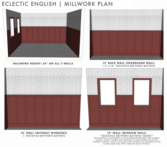
So, after playing around with it for a few hours in SketchUp (love you) I went with 54″ high on all 3 walls. It was a little over halfway up the wall which would’ve felt awkward had I not filled the walls with other visual weight. That is always something you want to consider when determining the height of your millwork and also where it will intersect your light switches (something we didn’t have to think about for our space) or other permanent fixtures along your walls. Be sure they are either included in the millwork or sit above but not half and half.

Above are the profiles I chose, with plenty of help from Charla and Justine, from our favorite vendor Metrie. They are the same two lovely ladies that helped Emily and I to pick out/design all that millwork in the Portland House. For this project, we got our material inspiration from The Gold Hive – Ashley Goldman’s Master Bedroom which included some very thin lattice which would be our flatstock with a low profile. This would take up just a little real-estate in this tiny space.
That isn’t our only small space/renter hack that we have for you today read more below.
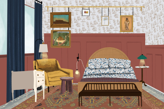
But first…here she is our Eclectic English lady!
Side Note: Some of the items in the render like the lounge chair & dresser are not the same as in the mood board. Building detailed furniture in SketchUp can be tedious and extremely time-consuming especially ones with realistic-looking cushions. So I took the easy way out (aka saved hours of on the clock time) and downloaded similar options. It was late. I was tired. And this is a skill I am working on so I think this version is much better than what I could’ve come up with. So imagine that awesome Matrix Chair from Article and this nightstand.

As Emily would describe her she is, “…just a touch senile, with a dirty martini in her hand, perhaps some sort of old Hollywood headpiece, and head to toe in patterned clothes. She freely tells us about her affair with Wes Anderson (a younger man! Grandma!) and maybe she has tons of cash hidden around the house. But she’s a little old world too – she loves a floral print, she’s always ready to put the kettle on and share some well-earned life experience, and her shelves are stuffed with souvenirs from decades of travel. My friends love her, and my kids can’t wait to visit her because surely she will tell them something they are far too young to hear.”
Do you see her? Do you love her? Or is she just a little too much for you? You can be honest cause she would tell you the harsh truth right back to your face. But then I am not her, so I ask of you be constructive in any of your criticism you might have. Thanks

5 Renter Hacks for a Small Space:
Re-think The Gallery Wall – As we all know a gallery wall is a sure-fire way to add that needed dose of personality into those box-like apartments but then you’re stuck with patching up who know how many holes when moving out. Cause I know that for every piece of art that I hang in a gallery wall there are probably 3x the amount of holes necessary behind it. Done is better than perfect around here and I don’t have the patience with templates. So instead, consider a picture hanging rod which will require minimal holes in your wall and you have more freedom to swap out art over time. This idea works well in the space since we added the millwork which projected out from the wall which let us still overlap the art.
Layer Up – If you live in a space with flooring that you wish you could just replace or snap your fingers and make them disappear, then consider getting a rug approx. the size of your space and layer a smaller rug on top. This typically works best if the smaller rug is about two sizes down and is in the same style. Also, be sure that the rug on top has a higher pile than the one below.
When in Doubt Mount It – Want to add a coat rack to your space? Try a 6-arm coat hook instead. Thinking about getting a bookcase? Maybe opt. for some shelves. Anything that you can install on your walls to free up some coveted floor space is golden in a small room.
Double Duty – In a small space it is a great idea for your furniture to serve multiple purposes when you lack the square footage. We made sure our floor lamp had a small table attached and our dresser’s marble top was the perfect place for a martini station. Although, I know I could’ve done a better job on more storage for the space like including a nightstand with a drawer or a bench with a shelf. I choose the more visual pleasing option, form over function and I am okay with my decisions. It is a showroom after all and our hypothetical lady is a maximalist minimalist at heart. Avert your eyes on this fact I just pointed out and let’s move on!
Not Your Average Sconce – Since there wasn’t going to be any overhead lighting in the space due to the lack of a ceiling which is hopefully not an issue any of you are running into in your home… We got a little creative in the lighting department. A floor and table lamp were probably sufficient enough for the space but to bump up the quirk factor I wanted to “DIY” our own plug-in sconce. Using an iron hook and utility bare bulb pendant, the plan was to wrap the cord somehow (Sara and I were going to figure out this little factor when we got there) to create a sconce.
If any of you are interested in this look here are all of the products:

1. Floor Lamp (no longer available) | 2. Accent Chair (the original one) | 3. Blue Lumbar Pillow | 4. Wallpaper | 5. Paint Color | 6. Blue Curtains | 7. Curtain Rod | 8. Endcap Finials | 9. Stool | 10. Utility Plug-In Pendant | 11. Cast Iron Hook | 12. Bar Tool Set | 13. Bar Tray | 14. Cocktail Shaker | 15. Coup Glass | 16. Smaller Red Toned Rug | 17. Bed | 18. Mattress | 19. Green Pleated Table Lamp | 20. End Table | 21. Large Light Blue Rug | 22. Nightstand with Drawers (the original one) | 23. Curtain Hook | 24. Bench | 25. Circle Pillow | 26. Pom Pom Lumbar | 27. Bed Throw | 28. Sheet Set | 29. Blue Sham | 30. Duvet Cover | 31. Curtain Rod | 32. Endcap Finials | 33. Solid-Brass Double Jack Picture Chain | 34. Pair of Heavy Open Asymetrical S-Hooks – 1 1/2″ | 35. Art-Nouveau Picture Rail Hook | 36. Broken Clouds by Stephanie Goos Johnson | 37. Winter Wren by Olivia Kanaley Inman | 38. Semicolon by Alex Isaacs Designs | 39. The Humble Egg by Monica Loos | 40. Antique Yachts Canvas 1 | 41. In The Branches Print | 42. Remember: Lily of the Valley by Renee Anne | 43. Blue Heron Framed Print | 44. Lake Air Canvas Print | 45. Alpine Lake Framed Canvas | 46. Solid Pine Panel Mould | 47. Fingerjoint Pine Stop | 48. Fingerjoint Pine Baseboard | 49. Solid Pine Lattice
There were a lot of accessories that Sara and myself were going to play with once on-site so instead of letting all those sourcing hours go to waste we figured to round them up for all you Eclectic English Enthusiasts. Enjoy!

1. Farm House by Lindsay Megahed | 2. Ribbed Blanket | 3. Natural Hyacinth Noelle Tote Basket | 4. Organic Percale Pleated Sheet Set | 5. Wheaton Striped Napkins | 6. Bunny Trinket Dish | 7. Palomino Alpaca Throw | 8. Nesting Glass Shadow Boxes – Hexagon (Set of 3) | 9. Tomah by Lorent and Leif | 10. Foundations Bowl | 11. Oversize Wool Throw | 12. Antique Florals | 13. Fiber Dye Napkins | 14. Dara Velvet Lumbar Pillow Cover | 15. Creative Women Handwoven Cotton Napkin
In lieu of the original event plan, Apartment Therapy created these adorable illustrations (see below) and animations of all 20 spaces. You can check out our space here!
Be sure to peruse all the amazing work by the rest of the designers as well including: Hilton Carter, all-of-our-favorite Orlando Soria, one of the cutest/creative couples Nate Berkus & Jeremiah Brent, one of Caitlin’s Favorites Caitlin Murray plus many many more talented designers.
That’s all she (I) wrote! I hope this brought a bit of sunshine to your Monday morning. And I can promise you that you will one day see a real room reveal again but in the meantime I’ll be practicing my SketchUp skillzzz.
For those of you that are skeptical of the Eclectic English trend, I am curious. Does this design convince you that it is the new cool trend or does it still give you frightening flashbacks?? Let’s talk more about it below!
The post The Design That We’ll Never Get to See in Person – AT’s Small/Cool Event + 5 Renter Hacks for a Small Space appeared first on Emily Henderson.
Agilenano - News
from Agilenano from shopsnetwork (4 sites) https://agilenano.com/blogs/news/the-design-that-we-ll-never-get-to-see-in-person-at-s-small-cool-event-5-renter-hacks-for-a-small-space
0 notes
Text
Cutie Reviews: Gacha Gacha crate Feb 19
I’m not actually sure if I got the March GGC yet, but I’ll be looking after I finish this to see if I did. If not then I'll be starting up my september box reviews!

(In case you were wondering, I don’t show the cover image of the pamphlet because it’s always a faded image of various Gachapon machines and that would get boring :P)
The featured topic in this months pamphlet is about Retro video games from Namco, to go with an item in the crate. It talks about 11 games, including:
Galaxian - a game there you control a spaceship at the bottom of the screen and shoot at various enemies while avoiding their attacks. Released in 1979.
Pac-Man - Everybody knows this game : D I played it a lot when I was a child. You control the little yellow Pac-Man and eat all the pellets before the ghosts get you! Released 1980.
Xevious - Some kind of piloting game where you blast various targets. Released 1982.
Mappy - You play as Mappy, a police mouse trying to find the items stolen by the Meowkies and taken to their mansion. Released 1982.
Dig Dug - The player must rid of the underground monsters by either blowing them up with an air pump or dropping rocks on them! Released 1982.
The Tower of Druaga - The player controls Gilgamesh, a hero who arrives to save the maiden Ki from the demon Druaga and must go through his 60-floor tower. Released 1984.
Valkyrie No Boken - Everyone lives together in Marvel Land in harmony, and together they work to improve it. Released in 1986.
Family Stadium - Now-a-days known as Famista, this is a series of baseball games. Released in 1986.
Dragon Buster - In the name of his father, Clovis goes on a quest to save Princess Celia from a dragon. Released 1985.
Super Xevious Gamp No Nazo - A challenging riddle game released in 1986.
Okay! Now it’s time to get on with the review!
Mt. Fuji Figure

Our first gacha is a relatively simple one. It’s a figure of Mt. Fuji, one of the highest peaks in the world and a very popular icon of Japan. This series is by Epoch and each one costs 300 yen.
This set included 4 different colorful displays one could get... and I can’t actually understand the list, so I’m not sure what mine is.
Rating: ♥ ♥
The detail on it is really nice, and it’s very clean looking. But (and I say this in hopes of offending no one) I don’t really care for it. I mean I really like Japanese culture and stuff, but I’m not really into these types of figures and I don’t see myself using it for any sort of purpose or doing anything with it. I don’t even think I’ll keep it.
Patient Cats

These little kitties are trying to patiently wait for someone to turn off/down various noise makers. This series is by Epoch and each is available for 200 yen.
There was 3 types available: television, boombox, or telephone, each in 2 colors of object and cat.

I got the white television kitty :3
Rating: ♥ ♥ ♥ ♥
What makes this really fun is that not only are you getting 2 items for one gacha, but you can also use them together or separately. They would be perfect for Re-ment displays!
The detailing on the two pieces is also really nice. There’s no paint issues or anything. It’s a really cute, simple display.
Pokemon Clinging Cable Cover
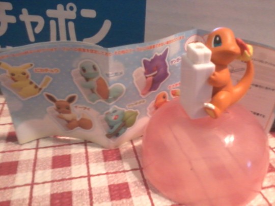
Cable covers must be really popular as of late huh? I keep finding them in my crates these days. I’m beginning to get used to them though, they are awfully cute. It’s by Kitan Club, and each is available for 300 yen. You can see whose available on the checklist in the pic.
I would have been happy getting anybody really. I really like Gengar and Eevee, but Pikachu is a must, and who doesn’t love the three original starters? My favorite of the trio is Bulbasaur, but I collected stuff of all of them when I was younger. I was pretty much happy just getting something Pokemon related.
So basically, you just pull apart the white thingy and put a coord inside, then stick it back together and attach your Pokemon to it.
Rating: ♥ ♥ ♥ ♥ ♥
Besides how difficult it was to get the thingy open to put the cord inside, I think this is really cute! I decided to swap Umbreon with Charmander, and yes My Melody is still hanging on strong! She seems happy with her new friend.
Osechi Mascot
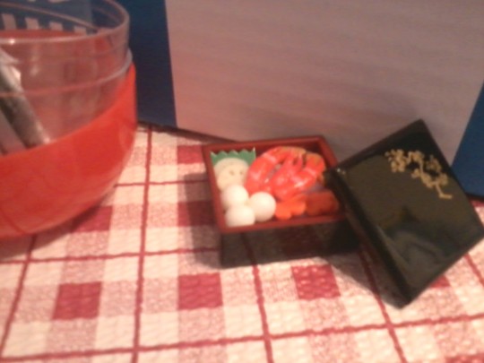
Inspired by the delicious, tiered foods eaten on New Years in Japan with loved ones. This set is single tiered, but from how it’s made I feel like you can stack the layers together. I could be wrong though.
This one came with an odd slip of paper, but I don’t really know what it means. If I had to guess I’d say it either lists materials used to make the items in this, or it lists the foods?
There is 5 available, and this series is by Toy Spirits. The one I got includes three crab claws, flower carrots, Tuna/salmon or some kind of fish, simmered vegetable, and three dumplings or rice or sesame balls or something? There is also a lobster and fish set, a scallop with tons of vegetables, a cooked fish (maybe sea bream?) and one I can’t really identify.
Rating: ♥ ♥ ♥ ♥ ♥
See this type of figure I really like! I love food based things like this. Everything is plastic, but to my surprise the balls are squishy! It’s really fun to poke~
It would also make for a fun re-ment item... and maybe it’s just me, but there’s something really fun about putting the lid on and taking it off.
Floral Card Pouch Miniature
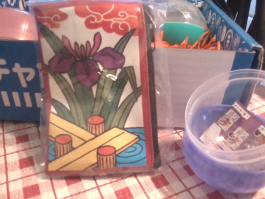
Based on Japanese Hanafuda (flower cards), this little artistic looking pouch is perfect for keeping money, cards, or other little items you often lose track of or want to carry around but worry over it’s small size.
This is another Epoch series, and there was 12 available consisting of 6 designs in either red or black. I got the red version. Each one costs 200 yen.
Rating: ♥ ♥ ♥ ♥
I think this is really sweet looking, even though it’s a little bent up from being in the capsule. It’s very well made, sort of floppy/flimsy, but the material and inside lining feel very nice. It’s really easy to close and open, and the fabric is a little flexible.
Namco Museum Cassette Pin Collection

Our final item for the month and the one related to the featured article above. As a girl obsessed with video games I’m a sucker for wearable accessories based on them, and I’ve really been into pins as of late too so this is perfect.
Each one comes in a little box with images from the game print on it, and a tiny itty-bitty description of it on the back with a screenshot. The pin resembles an old game cartridge/cassette with an image of the game and some designs and logo over it.
Rating: ♥ ♥ ♥ ♥ ♥
Dig Dug wasn’t a game I played a lot, I think I might have played it once or twice but it’s been years. It wasn’t like Pac-Man or the Mario (Donkey Kong?) games, which were everywhere. The laundry mat I used to go to as a child still has the arcade machines!
Anyway, I was still really excited. I love opening the little box and taking out the pin. It’s very well made, and it has a tiny bit of weight to it. I’m really excited to wear it or put it on something and see if anybody recognizes it :D I hope we get more cute little things like this!
♥ Cutie Ranking ♥
Quality/Pricing - 3 out of 5. Almost everything was priced, and if I can figure it out, I think they were like... 10-15 American dollars total? We pay about 30 dollars for the box, and considering how small and impractical a couple of the items are... I’m not sure it’s the best box worth the price. If we had more items like the Pokemon cord holder, pouch, and pin then yeah I’d say they were.
Content - 3 out of 5. I really liked the items we got, except for the Mt. Fuji. It, the kitty, and the little food thing are pretty impractical (unless used for re-ment, which I would do if I had sets that went with them) and I kind of hate that- but not all Gachapon can be you know? I understand that.
Total Rank: 4 out of 10 cuties. It’s not the best box in the series, but it’s still kinda new you know? I’m not trying to be really hard on it. I was pretty disappointed they didn’t give us a theme for this one though- like if it was me, I would have went super-cute and girly for Valentines Day. I know they try to cater to both genders, but I’m sure they could have found a way for both to be happy with that theme. Or maybe they could have done a video game theme to go with the pokemon and namco pin. SOMETHING you know?
♥ Cutie Scale ♥
1. Namco Pin - Of course I had to go with this one! I was geeking out over it the whole time. I wasn’t born when these games came out but I can still appreciate them!
2. Patient Cat - it’s pretty simple, but the kitty is so cute and the concept behind it makes it even cuter.
3. Osechi Mascot - I love the concept, and the squishy food inside~ I wish the whole thing was squishy though <3<
4. Pokemon Cable Protector - It’s cute, but fairly simple looking.
5. Hanafuda Pouch - It’s sort of like a simplistic art piece you can use for storing stuff in, it’s pretty cute and has a touch of elegance to it too.
6.Mt. Fuji Figure - I’m sorry but I just didn’t like it. It’s nice if you like landmark based figures and displays, but I’m more into things like train displays and stuff that moves around.
And this concludes our review! I hope you enjoyed or found it interesting. As I said on top we’ll probably be doing the Yume Twins september box next, unless I got my March gacha box already, but I don’t believe I did, that one tends to show up late for some reason.
Anyway, until next time, stay cute! And play lots of video games :3
0 notes
Last Seen Blogs


naileadevoras
ʚ・ ୨i୧・ ɞ


a-virtuous-pyromaniac
A Virtuous Pyromaniac
writerweaving
web weaving archive