#but i had originally rendered this on a desaturated green background so
Text

Inktober Day 1 - Lantern
Prompt list by melosprout on Insta
#WE'RE DOING IT#at least#im gonna try#i havent done inktober in a couple years and i dont think ive ever lasted the whole month#BUT WE'LL SEE#also I am not happy with this#Its one of those things where the sketch is SO GOOD#and the lineart is KILLER#but the rendering is severely lacking#i think its just too gray for my liking#but i had originally rendered this on a desaturated green background so#thats most likely my downfall#and i didnt want to redo it all#so#tweetie with a lantern#you're welcome#he likes getting lost in the woods#also i TRIED FORSHORTENING???#HEAD BIGGER LEGS SMALLER???#NO idea if it worked#ive been looking at it for too long#inktober#inktober 2023#mlp#digital art#art#pony#tweetie#oc
109 notes
·
View notes
Text
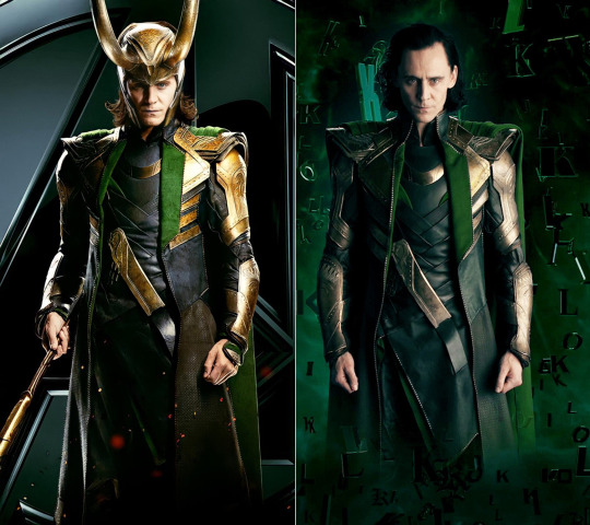
this is what happens when you try to reinvent the wheel.
it invites comparisons... and as we can see here, it has failed to deliver.
no shade WHATSOEVER to tom. but in these two promo shots are a WHOLE lot of other people. costumers, hair and makeup artists, photographers, lighting specialists, director, editors. and the shot on the right misses the mark so badly it physically HURTS. all those people had one fucking job and they screwed it up, and let tom and LOKI and all of us down.
LOKI’s expression is SO commanding and powerful on the left for the original avengers 2012 promo photo. his pose is slightly off square, it’s more dynamic and shows off his costume much better. his torso looks strong and imposing, and the width of his chest and more narrow waist contrast each other just as they do in real life. the lighting is also much more effective, with the classic rembrandt light on his face and the edge lights haloing his shoulders and arms, and coat on the left. he looks strong, vital, intelligent, powerful, in control. the way his left fist is slightly lifted gives a sense of energy, motion. and of course the sceptre leading off the frame brings the eye into his body and up to his face. his hair is of course accurate for the person we were shown in the movie, and styled as expected. each hand is doing something different and even if he wasn’t holding anything the angle would mean we would see a different surface of each fist or hand, and that would keep the interest. his expression is compelling as fuck, there is tension in the mouth without pinching, and you get a real sense of THREAT, someone to be respected and reckoned with. which is exactly who LOKI is. whoever edited this image knows what colours LOKI’s armour is, and made sure the edit delivered. BLACK, GREEN, GOLD. beautiful, and good rendering of the intricate detail in his vambraces and other metal details. even the helm is carefully presented. a highly respectful representation of a beloved and important character. bravo.
in the series promo shot on the right, LOKI’s body is fully square to the camera so it has no sense of poised energy, no motion. he’s just... standing there. his fists are more relaxed and shot from the thumb surface which makes his hands look small and uninteresting (a crime where tom hiddleston is concerned). the lighting is poorly executed, they have tried for the rembrandt angle but missed it. too much light on his left side and not enough on his right cheek. the edge lighting is also weak on his right shoulder and the bottom of his coat fades into the background, making him seem wider than he is through the body. also the fit is not great. his lapels kind of hang straight down instead of laying flat on the slope of his chest. LOKI is lean and toned, but this shot makes him look frumpy. unacceptable. due to the angle and relatively flat lighting we can’t see the shape of his figure, or the textures in his costume, which takes away from his power and strength, diminishes his energy and intensity. his hair is... not good. it’s meant to be the SAME as the 2012 poster, since this is the exact SAME person and the same moment in his life? but it’s too short, too puffy, and the style is just wrong. and finally the expression they directed him to assume is pinched, ambiguous, and not strong. rather than seeming powerful, the set of his shoulders is weak and loose. and we ALL know tom can look like anything at all he wants to look like. this is terrible direction and poor photographic execution. and finally (again) the edit is a weird colour, too blue, too desaturated. where is the burnished gold? the contrast between the green wool and the smooth black leather? i kinda wish they just gave him a long mirror and remotely operated selfie camera and told him to go for it on his own. RIP LOKI, you deserve SO much more care and respect than this shoddy attempt. aren’t these people industry professionals for fucks sake? REPRESENT OMG.
#why yes i am a photographer why do you ask?
#being a photographer i know that lighting, angles, posing, directing, and editing makes or breaks a shot and THEY SHOULD KNOW IT TOO
#seriously i cannot believe they had tom fucking hiddleston dressed as fucking LOKI of ASGARD and they fucked it up THIS badly
#yes i know these aren’t the tags
#feel free to leave your thoughts below, all respectful remarks welcome
postscript: evidence that tom is still PERFECTLY capable of looking EXACTLY like the LOKI we all remember. exhibit A - a shot from his 39th birthday party on set, after day 1 of filming had completed. and i ask you - WHERE WAS THIS LOKI IN THE SERIES? and he wasn’t even TRYING to be LOKI in this BTS footage. with the pale makeup, the LONG flicked hair, and the correctly fitting armour? because he certainly didn’t appear on disney plus. WTF disney seriously??? GIVE HIM BACK!!!

#in defense of loki#in defense of tom hiddleston#marvel hates loki and tom#the series showrunners can't shoot or edit for shit#yes i fucking said it and i have provided evidence#loki deserves better#loki deserves people handling his work who love him and respect him#tom blink twice if you need help#i'm serious tom just blink buddy
310 notes
·
View notes
Text
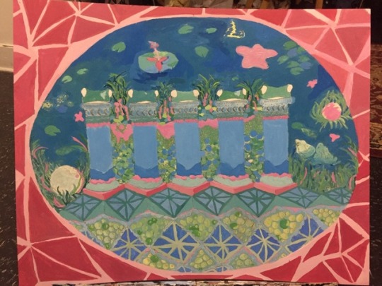


Unit 2 Final- Blending in vs Standing out
In my piece, I focused on a quote by Plato: “like frogs around a pond, we have settled down upon the shores of this sea,” which expresses how the Greeks were able to create a common culture all along the Mediterranean and Aegean Sea, even though they were originally all separate city-states. I chose this concept because I didn't want to just appropriate Greek culture by bluntly copying a common Greek design or figure thats been overdone, but make something abstract and unique. After some researching, I decided I wanted to focus more on the geography on Greece and started thinking about incorporating native flowers. When I found this quote by Plato, I researched more and found a news story about this great migration of frogs in 2010 in Greece, where they had to shut down a highway because it was overflowed with frogs. This further inspired my piece, and helped support the idea of blending in vs. standing out. The images of frogs blending into these blocked roads because of the mass quantity of them inspired me to focus on camouflage, also the obvious that frogs and amphibians use camouflage to hide from predators. I chose to use the columns with the frog heads on top because I find the Greek columns in their architecture, like the Parthenon and Acropolis to be beautiful and simple. I also really enjoy drawing them, and exaggerating different parts of the structure. I chose the Corinthian room more for it’s colors over the culture aspect of the project. The Corinthian room uses many pastels, but also heavily saturated colors, which reminded me of a 80s-90s style of color that I usually tend to use in my art. I used mainly a triadic color scheme, using a red-magenta (Rose), green-yellow, and a blue-cyan, with hints of yellow in areas. I used contrast of temperature, saturation, value, hue, and extension in my piece. For example, in regards to the background-foreground relationship within the frame, I used contrast of extension by rendering the pond area above/behind the columns to be more negative space and the blue to be the dominant color, while the pink and green is in the lesser areas of the pond, making them more active. I also made the background more cooler, and the columns warmer to create a split a definite split between foreground and background. I used more saturated colors in the columns, and more desaturated and dull colors below/surrounding them, to help create depth. This piece is abstracted in part so areas that aren't formal are purposeful, for example, the saturated pink grass within the more muted greens and blues.
0 notes
Last Seen Blogs

therjrajesh-blog
RJ RAJESH

showmewhatyouhaveon
Is that all you’ve got

lunareclipse06
Welcome To Hell
theashfords
The night turned light blue
mossyxdragon
julian