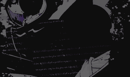
#and select 'simple mode' or smth like that
Text
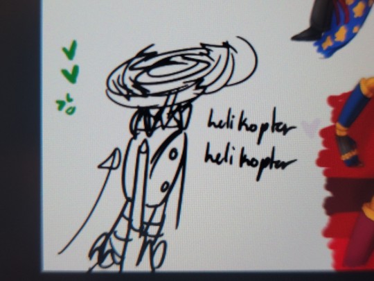
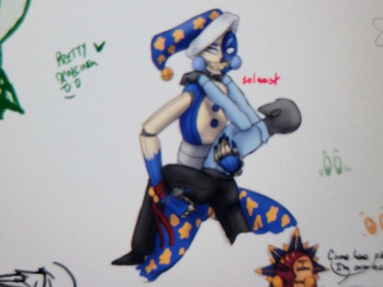

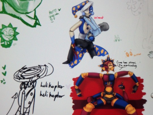
AHA I FOUND OUT HOW TO MAKE MY ART NOT LOOK SUCKY WHEN DRAWING IN MAGMA
I HAVE SO MUCH POWER
#magma moments#fun fact#to see more of the slides#click the gear next to the color wheel#and select 'simple mode' or smth like that#made my life so much easier
7 notes
·
View notes
Note
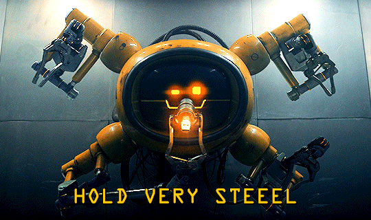
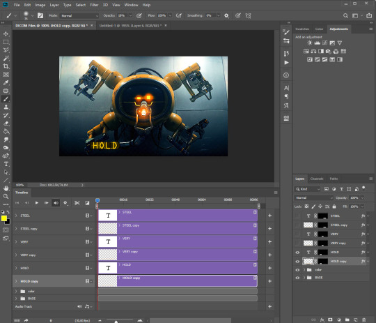
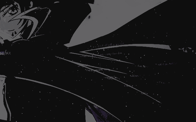
Hi! Loved your Loki "no touchy" gifset 😄 Can you tell how you made the "HOLD VERY STILL" appear like that? Looks very cool!
ty anon! 🧡
It’s actually not so difficult if you have basic knowledge of ps, but before, I wanted to say this is my way of doing this effect, might be other ways more simple or different!
[REFERRED EDIT]
program used: ps cc 2019 + patience?
step 1:
prepare your gif as usual (sharpen + color) and type your text + whatever style to it
step 2:
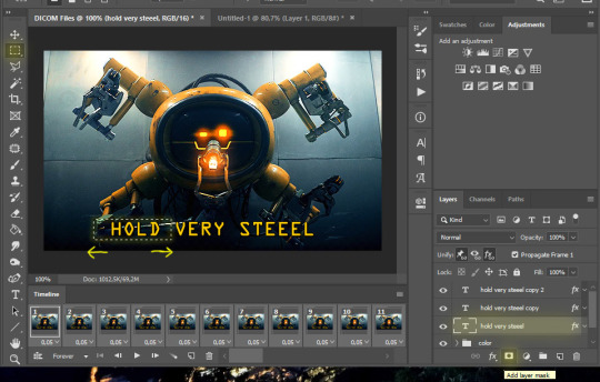
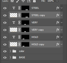
I wanted to make this motion effect for each word so I duplicate (ctrl+J) x2 my text layer in order to have 3 in total.
Now for each of the 3 layers I apply a layer mask to highlight only the selected word. So, Rectangular Marquee Tool, select the first word (HOLD) in the 1st text layer and click on “Add Layer Mask”, try to make a selection that’s more wide than the actual word.
tip: I guess you can avoid the layer mask step and just type one word in every layer but I like to make my life complicated
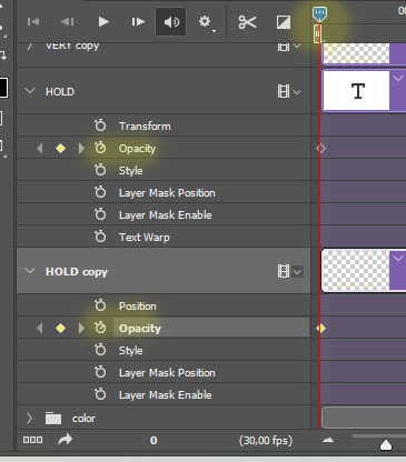
step 3:
select all text layers > duplicate them (ctrl+J) > right click on the copies > rasterize layer
you should have for each word the actual text layer and the rasterized copy, make sure you have the copies underneath the layer that has your word, like this:
step 4:
we have to add motion now for every rasterized text:
filter > blur > motion blur [angle: 0° - distance: 15/20px you choose]
-- now we have our motion blurred text, our “readable text”, we have to make the transition.
step 5:
you have to be in timeline mode, so if you’ve been working in frame animation click here: if not, good for you ™
so now, you should have smth like this: (I’ve only made visible the “HOLD” layers since we’re working on them for now)
if you drop down the menu in the timeline for both of the “HOLD” layers you should see some options like transform, opacity, style etc.. and beside there’s a clock ⏱ this will determines when your transform/opacity/-- will start and end.
We will be changing the opacity, so let’s work on this.
step 6:
tap the clock beside opacity on both “HOLD” layers.
Make sure the blue time indicator is at the start, or at least at the beginning when you want the effect to start:
now we have to change the opacity of the layer; at the beginning I want the blurred one be visible (opacity: 100%) and the clear one not (0%)
then move the time indicator to the point you want the text animation to end and we going to change the opacity setting again (no need to tap the clock again, ps will automatically save all the setting change you make on these layers from now on)
at the end I want to make the clear text visible (opacity 100%) and the blurred one not (0%) like this: [click the picture to zoom]
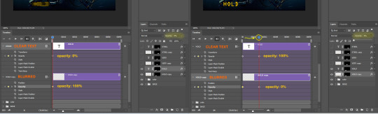
your effect should be life this:
I repeated the same process with the other 2 words, I made a quick video to show you how I set the transition:
vimeo
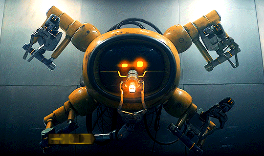
here’s the final gif:

I really hope this was helpful, I’m sorry if it turned out so long but I have no capabilities to syntax lmao and pls let me know if there's stilly any doubts ✨
#ps help#resources#tutorial#photoshop tutorial#typography tutorial#gif tutorial#allresources#i forgot to say that keyboard shortcuts are for windows users oops
162 notes
·
View notes
Note
Hey Alice, I sort of want to start editing and making graphics and i LOVE yours, so I was wondering if you could teach me how you make those?🥺 like your edits and your things (these for example) If it doesnt bother you, of course. No pressure, thank you!
hey !! sorry it took me sO long to answer this, i hope you see it. and feel free to pop in and ask anything else, i’m happy to help <3
for starting editing i would start maybe editing on your phone to just get the general gist and hang of things ... and then move onto something like photoshop after a while so its not as confusing.
i'm also going to stick this under a read more because it does get rather long
also i should probably add a quick disclaimer : i am by no means an expert, i edit for fun and have done so for just over a year, and i have only very recently started using photoshop and there are many other ways / applications to do this / use. now with that out the way lets dive in !!
okay so i’m just gonna show you how i made each edit ... for the this one i used my phone and these apps ...
phonto is for adding text, you can also download your own fonts of dafont. and polarr is for adding colouring / filters whatever u wanna call it.
so firstly i downloaded my screencaps from homeofthenutty (which is unfortunately a very temperamental website but it’s the best screencap website i’ve found so far).
so onto the actual edit ... i started off my adding my colouring in polarr
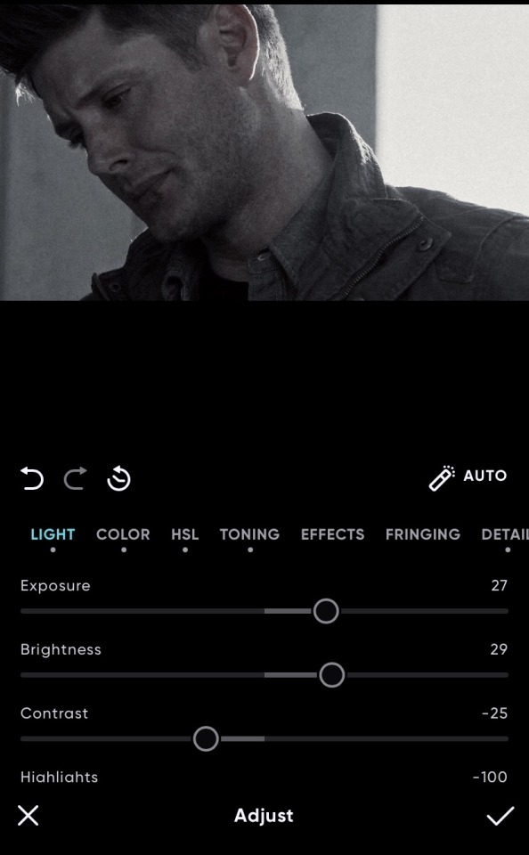
then i added a light leak
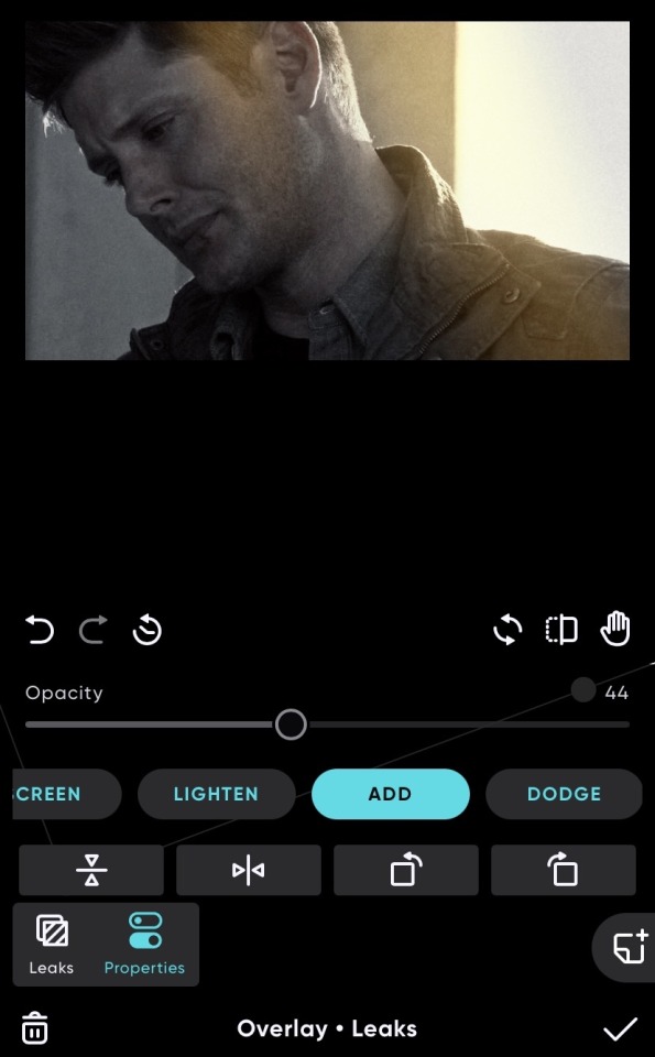
(i couldn’t remember which one i used previously ahdkkf so i just picked a random one for this)
and i did the same for the other picture which i used (same colouring, same light leak - different angle) also you can save your colourings in polarr by saving it as a style
you will get better at colouring over time ... and there’s loads of presets and tutorials out there to help you as well !
lastly (as this edit was actually quite simple) i added my text in phonto which is relatively easy to use, and i would recommend downloading your own fonts ... you can always come and ask me for font recommendations bcs i lOvE fonts ajdkfkkf. you can just go and play around with the text until you land upon something that you like.
OKAY NEXT ! x
so this one i also did on my phone using these apps

same as last time but also using picsart as well which you can do various things on but i just used to place the images
so same as before i added my colouring for each screencap ... i think i used a different colouring for the middle one of i’m remembering correctly.
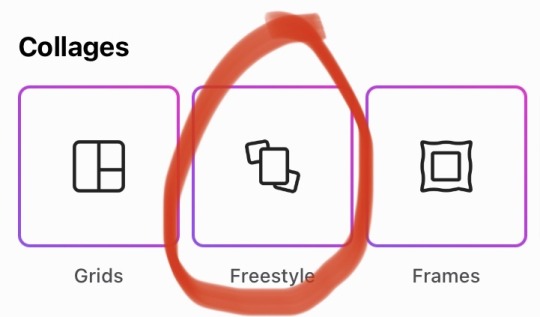
then to lay it out as i did i used picsart and went on freestyle :
and then i picked out my three edited screencaps and fiddled around a lot until i got them how i wanted
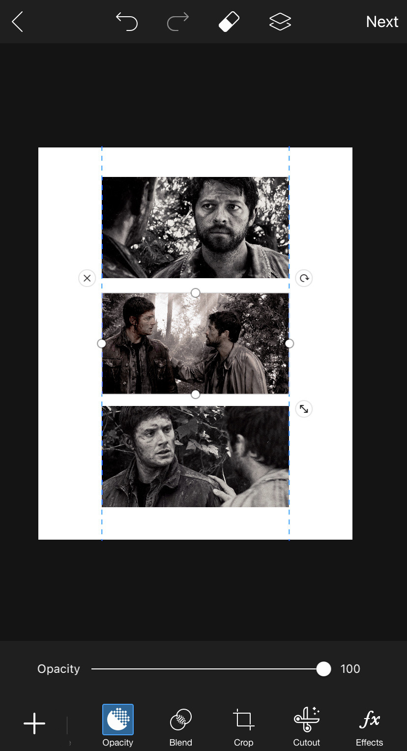
there is probably a way better application for this because it is very fiddly and requires a lot of patience to get it lined up evenly and the way you want.
after you do manage to get it how you want, i just cropped down my image size on polarr so it looked more even.
then i just added my text on phonto, and overlayed two fonts together to make it look a bit like a postcard or smth lol idk what i was going for haha.
okay last one ! x
this one was my first proper edit on photoshop / lightroom so it’s not the best ...
so i added my colouring on lightroom cc which has the same kinda layout as phonto ... kinda but it’s essentially the same thing.
i transported the coloured screencaps over to photoshop where i added highlights on dean’s face using the dodge tool on a duplicated layer which i put on the blend mode luminosity. i did the same on the screencap with cas in it and added highlights to the background and lighter parts to make it pop a bit more.
i also selected the background on both of them separately using the quick selection tool and went to filter > noise > reduce noise to make it a bit smoother.
then i just added the text on photoshop and voila done !!
if you have ANY questions AT ALL, want me to explain something in more detail or just want more tips, my ask box is always open <333
i hope this helped !! and i do hope you see it because it has been a few days ahsjkdkd
16 notes
·
View notes
Text
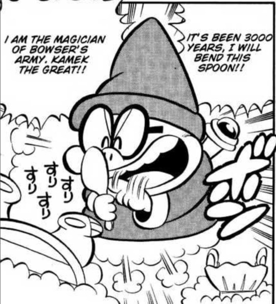
Hello. I recently posted that I figured out how to make those cool manga edits where the black lines were colored. So now I am going to show you friendos how to do it!
Here is the manga panel I am going to edit. It is from a fan translation of the Super Mario manga.
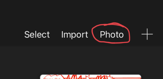
First, you are going to go into your drawing program of choice and select the import photo option and select your manga panel of choice. I use procreate, so the import photo option on there looks like this:
You can also make a new canvas, insert the photo on a layer, and then crop the canvas down, but I recommend using the import photo option as it makes your panel the size you need
When you are in your canvas, you’re next going to create a new layer. This new layer is where your colors of choice are going to go.
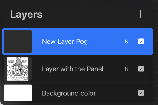
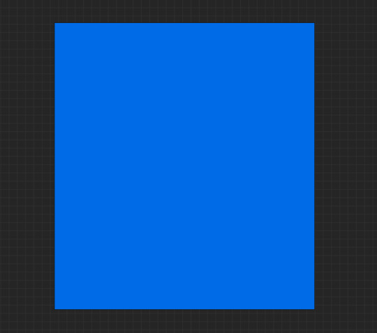
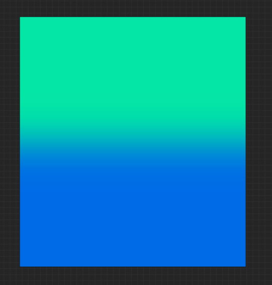
Now it’s time to color! Take your brush that you use to fill in lots of space (like when you’re making cool gradients or smth) and completely fill in the canvas on your new layer. Your canvas (with all layers on) should look like this:
You can also do cool gradients with as many colors as you want! I made a simple 2 color gradient for this panel, so my canvas looks like this:
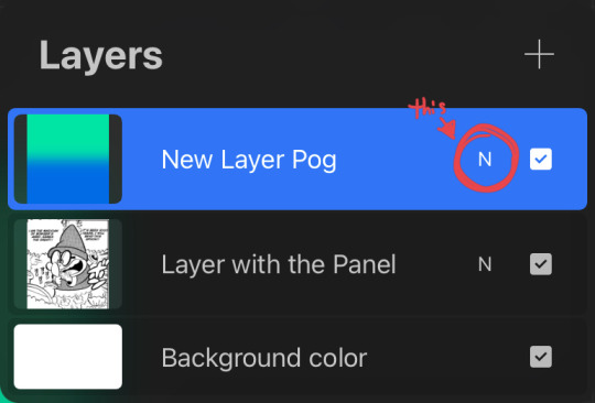
Once you have your colors done, it’s time to do the editing magic! Open your layers tab and go to the blend mode options for your color layer. For procreate, the way to open the blend mode options is to tap the small ‘N’ circled in the image below. I’ve seen other apps have the word ‘Normal’ (the default blend mode) or an arrow that has to be tapped to open the blend modes, but I’m not sure for every app.
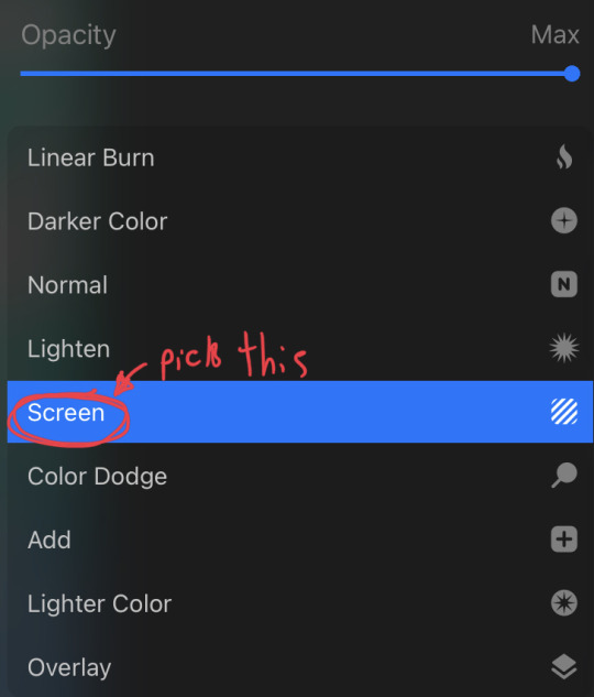
You should see an array of options. All you need to do is select the option that says ‘Screen’. It is usually located under the ‘Lighten’ category if your drawing app categorizes blend mode options.
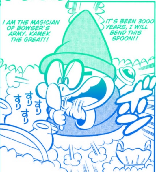
Your manga panel should now have colored lines! Here’s the result of mine:
You did it! Yay! Give yourself a pat on the back because you did good! I hope this tutorial helped those who were wondering how to do it!
5 notes
·
View notes
Note
your gifs are so pretty whats your process for coloring them?
first of all thank you so much for your words! as for a question, it’s quite hard to answer for me, as all of my psd’s are pretty different and I don’t normally use coloring from one movie/show for another. usually it goes like this: I try to make a simple psd - end up not liking it - try to make another - give up - try to use someone’s else base - don’t like it again - cry and ask film makers why do they have to make colors so shitty - finally make smth that looks at least okay to me. with some movies it’s just four layers and all done.being serious: I normally start with curves layers and set black and white point using little eyedropper things on the side. sometimes this layer make a huge difference and couple of my colorings have just this layer with little adjustments. then I go to levels and/or exposure. they work differently and you need to see a gif to decide, what you gonna use. next step is color balance. I play with all sliders in all three tonal range (shadows, midtones, or highlights). if the video colors were okay from the start, this layers will be pretty much enough. but usually i’ll keep going with more levels, some selective colors, more curves. sometimes I add black and white layer under the coloring with 7-15% opacity. It makes gif smother a little. I also like to play with gradient map with low opacity and different blend modes. that was quite vague explanation, so if you need me to make everything clearer, just dm me and I’ll answer all your questions :) if anyone wants, I can also make a tutorial with pictures and better explanations, but I don’t think I’m doing anything special. so anyway, if you want a tutorial, just let me know :) and my dm is always open for you all :)
5 notes
·
View notes
Note
this might be a strange question, but do you know a good way of making gif headers on tumblr? I figured you'd be good to ask since you seem to know how to make edits well and I thought it be okay?

Depends what you’re looking for!!
If you want to make the gifs themselves, you can use free software (a la G.ifCam or smth like it, whatever fancy dohickeys u ppl dredge up from the web… I’ve used G.ifCam a lot before myself tho hence the rec, it’s v simple JHEBRGN.)
As for making headers themselves, I use photoshop to make them, so that’s where most of my knowledge is.
In general tho, regarding what size your header should be, check out this post and base it off what you’re most concerned with. I don’t use the default tumblr theme, for instance, and idc what the header looks like in my settings, so I tend to make my headers around the 640×360 size mark for the header box popup thingy, give or take some width/height depending on the quality. (It’s better to be a little over w/ gifs rather than under, bc gif quality gets murdered if it gets resized larger.)
AS FOR TIPS & TRICKS FOR ACTUALLY CREATING HEADERS Hmmm… I can give a quick tutorial on some basic things that’ll help on the path to actually designing them, but again, just depends on what exactly you’re wanting help with, so if you have a more specific query, feel free to hmu, I don’t mind 😂 Here’s some basics tho, knowing how to do this stuff is helpful in general lesse…
I’m going to be using this gif as an example for most of this.
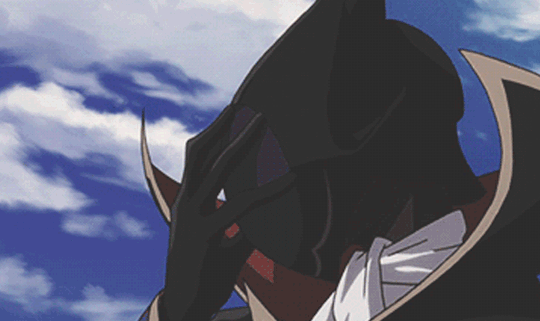
* 101.
When you put a psd over a gif, it should always be on top of all the gif layers, like so. I bring it up bc I slapped a psd on the one I’m editing. Just in case jerbng.
Ofc, you can press play on the timeline to see what the finished gif will look like.
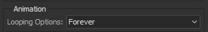
* SAVING A GIF.
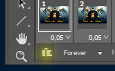
To properly save a gif in photoshop, you’ll want to go to File > Export > Save for Web.
Make sure you have the options set to GIF and looping to FOREVER.

* TWEENING / Phasing Gifs (for smoother looping)
You can do this before or after editing your gif, I suggest before just so you don’t forget about it if you’re like me and lame. But if your gif is something that doesn’t loop perfectly, you can make it phase back to the first frame assuming you’re somebody who dislikes when gifs jarringly snap back to the first frame.
Look at your timeline in PS, scroll to the last frame of the gif & select it.

Then click on “tweens animation frames” on the timeline controls.

Make sure to select FIRST FRAME for “tween with.” Add as many frames as you think makes the gift phase smoothly: I usually go anywhere from 5-10 frames. The higher number of frames you can add with it looking okay, the smoother the transition is. Just play around w/ it.

After that, create a new layer and put it under the gif’s first layer. Make it a solid color or w/e you want the gif to fade to (usually black or white is best.)

Now, you have this:

* TWO GIFS, ONE FILE.
You can combine 2 gifs into one; and I suggest using 2 gifs that have the same amount of frames since it’s just… easier. Both of the gifs I used for this have 29 frames. The one I’m adding originally had like 13, so I duplicated the frames on the timeline until it had 29. Basically just do what u gotta do to get them to the same frame number. Then, go to the gif you want to ADD to the one you’re working on, select all the frames on the TIMELINE and go to the timeline options, the lines in the corner:

Select: COPY FRAMES.
Then move past to your original gif, select all frames in that timeline, go back to timeline options and
Select: PASTE FRAMES.
You’re going to want to have “paste OVER selection” ticked.

And there you go! If you look at your layers, both gifs will be there.

In my case, I went through the timeline and removed the background of the second gif I added. You can play around and do what you will. I just tweaked the psd, cleaned up the second gif & ended up with this:

* ADDING TEXT / TEXTURES.
Just add text how you normally would with anything else. Make sure it’s above all the gif layers, either right below your psd or above it if you don’t want the psd to affect it.
For textures, also put them above all the gif layers. I’m going to apply this, for example.
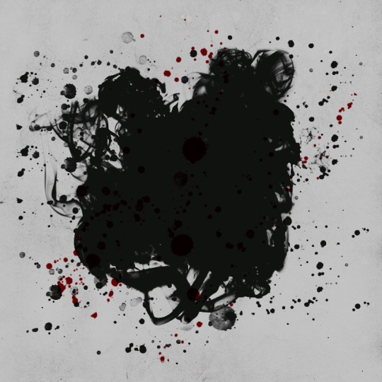
I put this above my gif layers, then played around with the blending modes to find out what worked best w/ my psd/gif selection. Blending modes are the box that typically starts out as “normal” in your layers box:
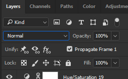
Scroll through everything offered and decide what works best. For me, it was darken: after I applied it and moved the texture around (& inversed it, in my case!), I got this:
You can do this & play around with any texture / text / font / etc combination you want to use. Different textures on different gifs / psds will require you playing around with them to get them to look nice jhebrgn.
* GIFS ON STILL IMAGES.
The last thing I’ll show you is adding a gif to a still image. IE / how people… add sparkles or flames or w/e to their headers and stuff like that. I’ll use this as a random example.
First, open the gif you want to use. I’m gonna use this one.

Resize the gif to whatever you want your banner size to be via CTRL+ALT+I.

Note: make sure the link isn’t checked so you can make the width/height whatever you want. I’m just going to make it 640x400 bc w/e.
Take whatever still image you’re going to use and drag it to the canvas. Make it the top layer.

Now go back to the BLENDING MODES OPTIONS and set it to whatever works best for you. For me, it was screen.

The goal is for the gif texture to be visible, like so:

Now I’m going to slap my PSD above the still image layer and add text / textures just like I would anything else, as explained above.
And there you go! A gif texture on a still image, which can be used for a header or w/e else.
* I’M DONE NOW JHEBRNGJEHBGN.
There you go, some basics for editing gifs that can help you style / create banners and whatnot! I went through them p quick bc gestures vaguely but like JHBERNJGBN. If anyone wants a serious, in-depth tutorial about these things you can just let me know.
I probably just rambled, I’m sorry. 😂 The question wasn’t specific so I just pulled stuffed outta my hat and it’s all centric to photoshop but JHBNERG. HOPEFULLY THIS AT LEAST HELPED…. A LITTLE…. OR FOR SOMEONE… I’m crying.
I’m awful at tutorials I tried™
#✞ ▏❝ ʷᵃᵗᶜʰ ᵐᵉ ʷʰᶦᵖ‚ ʷᵃᵗᶜʰ ᵐᵉ ⁿᵉᶦᵍʰ ⁿᵉᶦᵍʰ ❞ [;ooc.]#✞ ▏❝ ʷᶦᵗʰ ʸᵒᵘ‚ ʷᵉ ᶜᵃⁿ ˢᵒˡᵛᵉ ᵉᵛᶦˡ ❞ [;anonymous.]#rip mobile users#reference
20 notes
·
View notes
Last Seen Blogs
remscheid-official
Just Remscheid Things

betoguitarra34
Sem título

talehovadu
Untitled
ekhazaaronmeinmeribehnahaigifs
phoolon ka taaron ka sabka kehna hai

davahilakufe
Untitled