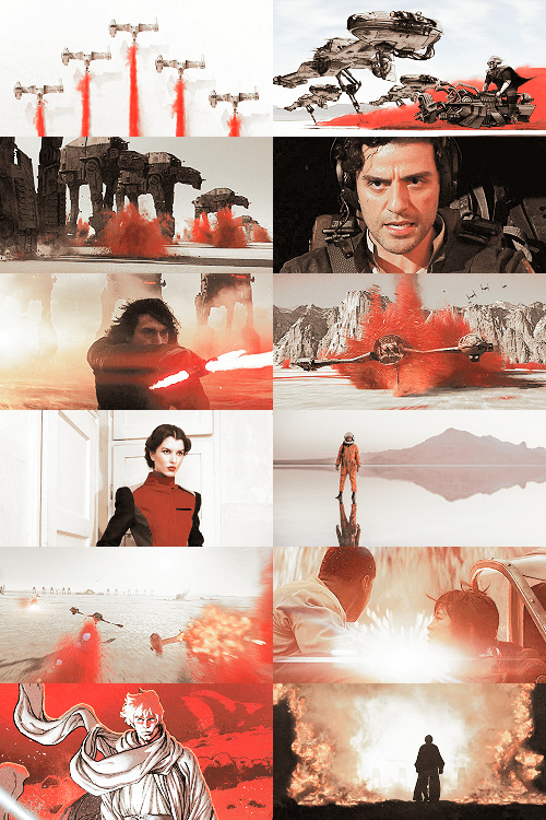
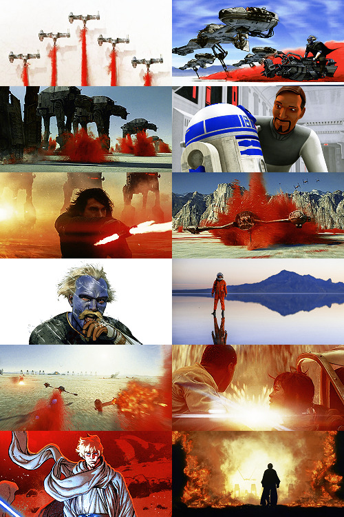
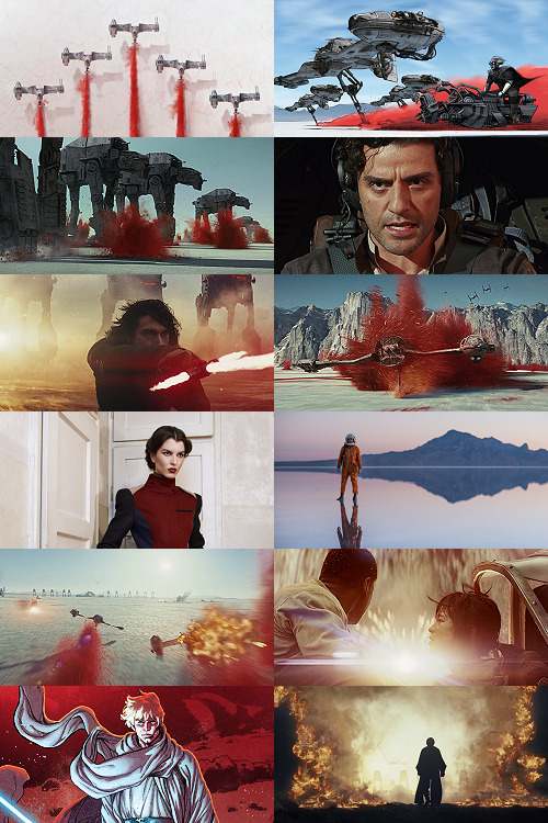
#also nancy sets with this color scheme are always so good
Text
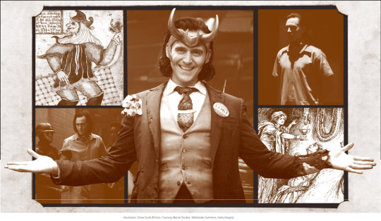
How Loki Shapeshifted From Nordic Folklore to a Marvel Icon
by Sara Durn
There are more than 800 years between the stories of Viking god Loki first being written down and his arrival (in the superb Tom Hiddleston) in the Marvel cinematic universe in 2011’s Thor. The new Disney+ series Loki, set to be released on June 9, is primed to explore more antics of Thor’s trickster brother as he attempts to fix the timeline he helped break in Avengers: Endgame. Among his many talents, Loki has cheated death a few times in the MCU, but that amounts to child’s play for this god.
In Norse mythology, Loki causes just as much confusion as his Marvel iteration. Though there aren’t any stories of him outwitting death, there are plenty of myths where he shapeshifts, swaps genders, or tricks gods into killing other gods. In the Marvel universe, he’s quite prone to allegiance swapping. Let’s dig into this troublemaker’s journey.
What is Loki’s origin?
The legends surrounding the Norse god are first documented in writing around the 13th century, primarily in Iceland. There are two versions of these legends that enter the historical record around the same time—the Poetic Edda and the Prose Edda. The Poetic Edda is an anonymous collection of Old Norse poems that are mainly pulled from an Icelandic medieval manuscript known as the Codex Regius (some of the poems date back to 800 CE). The Prose Edda is an Old Norse textbook for composing poetry that was written by a single author, Snorri Sturluson, a colorful Icelandic historian, scholar, and lawspeaker.
“Within the myths, you can see Loki moving from being just mischievous to being absolutely evil. If you think of him as only being mischievous, he’s actually a creative force and often ends up getting the gods much of their magical possessions, like Thor’s Hammer, through his cunning.”
“Pretty much everything we know about Loki came from Snorri Sturluson,” Viking scholar Nancy Marie Brown, author of Song of the Vikings: Snorri and the Making of Norse Myths, told io9. Brown says this was very appropriate given that “Snorri was quite a trickster figure himself.” While calling him the “Homer of the North,” Brown also acknowledges that Snorri spent a lifetime “double-crossing friends and family… scheming and plotting, blustering and fleeing”— a life that eventually led to his unheroic demise in a nightshirt where his (supposed) final words were “don’t strike!” In both Eddas, Loki is always portrayed as a cunning trickster. In the Prose Edda, Snorri describes Loki as “pleasing and handsome in appearance, evil in character, very capricious in behavior. He possessed to a greater degree than other [gods] the kind of learning that is called cunning.”
Besides appearances, Loki is always getting the gods into trouble and then cleverly extricating them from the mess he’s made. He fathers the Midgard Serpent destined to bring about Ragnarök, the end of the world in Norse mythology. He convinces the blind god Hodr to kill the beautiful and favored god Baldur. He kidnaps the goddess Idun to save his own hide from a furious giant. The mythological character is constantly switching sides—sometimes supporting the gods and sometimes their enemies, the giants. In the MCU, Loki is both hero and villain—in The Avengers he opened a wormhole in New York City releasing alien monsters and in Thor: Ragnarok he helped Thor save the Asgardians from Hela’s wrath.

Thorwald’s Cross, a fragmented runestone depicting Odin being consumed. Image: Public Domain
Loki might have begun as a Norse god of fire—fitting considering how fire can be both “helpful and destructive,” said Brown. Fire can both burn down your house and cook you dinner. It’s tricky that way—like Loki. As Brown puts it, “You can see his two sides there [reflected in fire].” Brown also explains that there was likely a transformation in Loki over the centuries. “Within the myths, you can see Loki moving from being just mischievous to being absolutely evil. If you think of him as only being mischievous, he’s actually a creative force and often ends up getting the gods much of their magical possessions, like Thor’s Hammer, through his cunning.” Again, it’s just like Marvel’s Loki, who sometimes helps the other gods out, like when he teamed up with Thor to escape the Grandmaster in Thor: Ragnarok.
What is Loki’s relationship with the Devil?
In the long, slow conversion of the Vikings to Christianity that took place between the 9th and 12th centuries, Loki became a parallel to the Christian Devil. The creative, positive elements of him fell away leaving only the god favored by the Father (Odin/God) before getting cast out. (It does sound a bit like Lucifer, right?) Christianity paints a world that is far more black and white, good vs. evil than the Norse pagan religion—here’s little room for a grey, ambiguous figure like Loki. As Brown puts it, “The Christian religion insists that you’re either with us or against us. Whereas in what we understand of the pagan Viking religion, there were a lot of shades of grey. There was a spectrum on which you could move back and forth. You weren’t all one thing or all the other. You weren’t all female or all male. You weren’t all good or all evil. It was more human.”
Loki always moved fluidly between those two polarities—helping Thor in one story, causing an overthrow of the gods in another. In one tale, Loki shapeshifts into a mare, becoming the mother of Odin’s great 8-legged horse, Sleipnir. In another, he fathers the wolf Fenrir. The Church couldn’t really handle all that grey area Loki liked to inhabit, and so it eventually cast him as the devil himself. “[Monks] had to sort the gods into saints and devils, and Loki by being sexually ambiguous and also morally ambiguous falls into the devil [category],” explained Brown. Though Marvel’s Loki certainly channels a bit of the devil at times, we’ve luckily yet to see him become both mother and father to world-ending, multi-legged monsters in the Marvel Universe. But, there’s still time, especially with the new Disney+ series hitting the small screen.
When was Loki’s Revival?
After the Viking conversion, the Norse myths started to fade, and Loki with them—until the 1600s, when medieval manuscripts like those containing the Prose and Poetic Edda began to be translated. “The reason [these myths] became popular was because of nationalism,” Brown told us. “In the mid to late 1800s, there was the idea that what distinguished one nation from another was its cultural heritage.” This spurred Jacob Ludwig Karl Grimm and Wilhelm Carl Grimm—known to many simply as the Brothers Grimm—to go “collect the stories of the local people to prove that Germany was a nation, not a collection of states. You had the same thing happening in Ireland to prove that they were different from the English and you have the same thing happening in Iceland, Norway, Sweden, and Denmark.” This eventually gave rise to the Nazis appropriating Norse myths in their twisted pursuit of alleging Aryan supremacy.
Following the Civil War, the United States also looked to the Middle Ages to redefine the country’s fractured identity. As Chris Bishop, author of Medievalist Comics and the American Century, explained to io9, “[the Middle Ages] offered an aesthetic that was individualistic (think: the knight errant, Robin Hood, etc.), given to interpretations of exceptionalism (Camelot, the once and future king), venerable (where old equalled established and respectable), and (unlike Classicism) Christian.” The Middle Ages, or more accurately the remixing of the Middle Ages known in academia as “medievalisms,” appealed to many Americans obsessed with ideas of American exceptionalism and singularity in the 19th century. Eventually the U.S.’s obsession with the Middle Ages made its way into comic books starting with Prince Valiant in 1937, a comic strip created by Hal Foster set in and around the legends of King Arthur. Other medievalist comics followed eventually leading to the inclusion of Norse gods like Loki, Thor, and Odin.
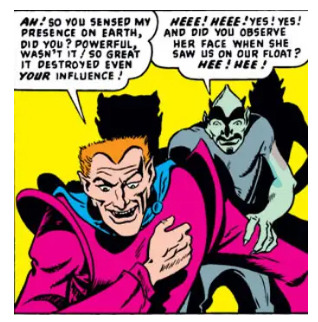
First appearance of Loki in the 1949 Venus comics. Image: Wikicommons
When was Marvel Comics’ Loki introduced?
While Loki first appeared in the 1949 comic book Venus styled after (you guessed it) the devil, the modern-age Loki didn’t hit the comic book scene until co-writers and brothers Stan Lee and Larry Lieber adapted him in 1962’s Journey into Mystery #85. It’s in that issue where Loki “becomes Thor’s enemy/ally/brother/adopted brother/etc,” said Bishop. The mischievous personality of the Norse god remains largely the same in the Loki of the comic books and films and even retains the ability to swap genders at times.
In the comics, Loki is raised as Thor’s brother in Asgard—somewhere the Marvel stories diverge from the Norse mythology. It’s Loki and Odin who are sworn brothers in the Norse myths, not Loki and Thor. As Brown explains, “Loki and Odin are blood brothers, which means they are even closer than real brothers.” In the Viking world, two people who swore a blood oath to one another formed a bond that went beyond kin, and so went the Norse Loki and Odin’s relationship. As Bishop points out, the Loki/Thor dynamic of the comics and movies is a “classic, formulaic archetype.” Thor is the “big, hunky, handsome (but slightly dumb) hero” and Loki is “his slight, quirky but super-smart frenemy. Loki is the dark, misunderstood, vulnerable shadow that audiences can relate to, reach out to, care for. Thor is that dumb jock who everyone looked up to at school, but Loki was that cool, quiet kid who went on to found a tech-empire.”
Why is Loki called a Trickster?
What does remain consistent with Loki is that he always plays the trickster. He is the manifestation of psychologist Carl Jung’s archetype: The trickster disrupts the individual and/or society causing either growth or destruction. Social scientist Helena Bassil-Morozow points out that when it comes to Loki, “despite the fact that the narrative details between the medieval Loki stories and their contemporary versions vary, the main idea remains the same—the trickster mercilessly attacks those in power and nearly causes the end of the world.” Both in the Norse myths and in Marvel, the world needs saving from Loki. He acts as the catalyst for a whole lot of upheaval—upheaval that in the Norse myths causes Ragnarök.
Loki “functions as a locus of salvation (literally, a prodigal son).” Loki just might be a savior. He’s someone audiences can look at and think “if Loki can be redeemed, so too might I.”
Perhaps that’s where the two narratives differ the most. In the Norse tales, the end of the world at Ragnarök is inevitable. Odin and Thor will die. Everything will change. Vikings lived with the knowledge that their world would end. In the MCU, we don’t know how the story ends, plus Ragnarök took place already and yet the Asgardians live on. There’s still hope that Loki will prove to be good and that the other superheroes will save the world from whatever mayhem he’s caused, or so we can hope in the upcoming Disney+ series. As Bishop puts it, Loki “functions as a locus of salvation (literally, a prodigal son).” Loki just might be a savior. He’s someone audiences can look at and think “if Loki can be redeemed, so too might I,” explains Bishop.
While the Vikings’ Loki caused the end of the world, today’s Loki might just save it. Or maybe not. And, perhaps that’s the fun of the trickster—you never quite know what they’ll get up to.
75 notes
·
View notes
Note
8 + 20 for the sappy prompts, mayhaps? -thinger-strang 💕💕💕
8. “Can I touch you?”
20. “I’ve been waiting all my life for you.”
(i’m doing this one as a continuation of this sappy prompt request, so y’all should read that one first to better understand this one)
standing at the altar, sweating just a little bit beneath his tux, billy’s stomach flip-flops nervously.
today is the big day. billy and steve’s wedding, the most anticipated event of the year. they’ve spent an ungodly amount of time making sure every last detail of this day is perfect, and throughout the process billy couldn’t find it in himself to complain even once. he wants this day to be just as perfect as steve does, and he’ll be the first to admit it.
billy is standing in front of hopper, their wedding officiant. hopper has a big, genuine smile on his face, and it’s been there since he exited the byers’ house and walked down the aisle after billy.
the backyard of the byers house was meticulously decorated by joyce, billy’s mom, and steve’s mother the day prior. dustin’s mom had helped as well, but mostly she handled the cooking for the reception.
the color scheme is primarily white, with pink and purple flowers accenting everything. steve had insisted on a blush-pink and lilac color scheme, which turned out to be rather incredible. the bridesmaids’ dresses and the groomsmens’ tuxes match the theme of the wedding, and steve had spent hours agonizing over which dresses and tuxes to pick.
the guests consist of joyce, as well as billy, steve, and dustin’s mothers, lucas’ little sister erica, tommy and carol, murray, and doc owens. jonathan had been chosen to be the wedding photographer, el the flower girl, and max the ring bearer. officer callahan had volunteered to be the wedding DJ, claiming that it’s a new hobby he’s trying out. officer powell and his wife had even shown up, and billy spots them in the crowd.
nancy, robin, and heather were chosen to be the bridesmaids, while mike, dustin, lucas, and will are their chosen groomsmen. they’re all still in the house, waiting for their moment to walk out and take their places at the altar.
it’s when the music starts up again that billy’s palms start to sweat, his heart rate kicking up. the wedding party comes out of the house first, and jonathan moves around to snap shots of everyone making their way down the aisle. then comes el, her smile wide and gleeful as she tosses petals into the air, watching happily as they fall. max is up next, exiting the house and making her way down the aisle with a soft smile, meeting billy’s eyes. she’s holding a silk lilac pillow, the rings resting on top of it.
once everyone is in their right places, callahan switches melodies. there are a few anxious moments of waiting before steve finally exits the house, and billy almost loses his balance at the sight of him.
steve is blurry and watery because billy is already crying, but billy doesn’t even attempt to hide it. he’s steeled himself so he won’t outright bawl like a baby, but it’s his wedding day. he’ll permit himself to cry around people other than steve on the most important day of his life.
steve looks breathtaking in his tux. the jacket is white with black silk lapels, and his pants and shoes are black as well. he has a set of purple flowers tucked into the pocket of his jacket, and his hair is styled as immaculately as always. billy’s tux coordinates with steve’s, though the colors are opposite. billy’s tux is black with white lapels, white pants, with a set of pink flowers tucked into the pocket of his jacket.
billy’s hands twitch by his sides, wanting to reach out and pull steve to him once he makes it to the end of the aisle. it’s only another moment before he’s standing in front of billy, smiling brighter than the sun.
“to start, i’d like to say a few words of welcome,” hopper begins once everyone is still and quiet, “and thank everyone for being here to bear witness to this union.”
billy doesn’t hear most of hopper’s introduction. he’s too busy staring at steve, and steve is staring right back. they’re both crying already, and billy can’t help but think that when they can finally kiss, they’re going to be practically bawling into each other’s mouths.
“when i first met steve, he was just a snot-nosed teenager with a penchant for getting his ass kicked,” hopper is saying, “and my first run-in with billy just so happened to be me arresting him.”
hopper gives billy a smile and a wink, and the audience laughs. billy can’t help but huff out a laugh of his own, because it’s not like he’s wrong, and steve’s laugh is a little wobbly and watery.
“i have to say, i didn’t see much in these two at the start. at the time, i didn’t much believe in change or growth, or second chances.” hopper pauses, clasping his hands together. “or even in love. i didn’t believe that love had the capacity to change people to such an impactful degree. but then you boys came along, and your souls found each other, and i saw all of that change before my very eyes.
“i’ve witnessed you boys grow and change. i’ve seen you learn from your mistakes and become better people, and i’ve seen you both do that alongside each other. the love you share is a love that has impacted not only both of you, but everyone around you. it’s opened both of your eyes, and it’s opened my eyes and the eyes of others, too. and that is a very powerful thing. this marriage doesn’t just represent love, though it is truly bursting with it. it also represents the evolution of the soul, and the capacity for the love of another human being to spark that kind of evolution.”
steve’s tears are coming harder at hopper’s words, and billy says fuck it internally, reaching out and grabbing his hand, giving it a comforting squeeze. hopper wraps up his speech a moment later, but billy has stopped listening again, focused solely on the weight of steve’s hand in his.
they’ve chosen to forego any readings, so the ceremony moves straight into their vows. steve starts them off, wiping his eyes with a shaky laugh and taking both of billy’s hands.
“billy,” steve starts, taking a deep breath. “my billy, my sweetheart, my sunshine. the love you’ve shown me, the love you’ve given me, endlessly, has been the brightest, most beautiful thing in my life. before you, i always thought i knew what love felt like, and how much of it i could give someone. but then you came along, and i never knew i could love someone so much. i never knew i could love someone the way that i love you.
“you’ve loved me, cared for me, protected me, defended me. you’ve given me everything and more, selflessly, and it’s my turn to give you that, too. i vow to love you, to care for you, to protect you, to defend you. i vow to tackle any obstacle that comes our way by your side, always. i promise that i will love you, and only you, every day for the rest of my life. i give myself, every last bit, to you. i’m yours to keep, forever. i love you, billy, and i want nothing more than to spend the rest of my life with you.”
steve squeezes billy’s hands, and billy can’t help the half-choked sob that slips from his lips. it’s more of a hiccup mixed with a joyful laugh, but steve just keeps smiling, holding billy’s hands, grounding him.
billy looks at hopper, sniffling. “is it my turn?”
“the floor is yours,” hopper tells him, smiling.
“steve, baby, princess. pretty boy, if you will,” billy begins, and steve huffs out a laugh. “every day since i’ve known you, you’ve made me want to wake up and be a better man. for most of my life, i didn’t care much about kindness or goodness. i didn’t think those things mattered much, until i met you. you, who’s overflowing with so much kindness and goodness. you, with all your patience and generosity. you’ve given me so much love that sometimes i hardly know what to do with it.
“you’ve shown me what it means to love, and what it means to be loved in return. even on my darkest days, you’ve loved me without question. without stipulation. i promise i will love you for the rest of my life, with no conditions attached. i vow to hold you in my heart until the day i die, to wake up every day and love you even more than the last. steven michael harrington, i’ve been waiting all my life for you. and i’m ready to spend the rest of it with you by my side. forever is a long time, and i intend to spend every last moment of it with you.”
steve is full-on crying now, teardrops staining the silk of his tux. max steps forward, holding out the pillow where both rings are resting. billy takes steve’s ring, and steve takes billy’s. they take turns slipping the rings onto each other’s fingers, both of them smiling like idiots through their tears.
hopper is sniffling too, but he barrels on, clearing his throat. “with that, william james hargrove, do you take steven michael harrington to be your lawfully wedded husband?”
“i do,” billy says, easily. his voice almost cracks, and he just barely manages to keep it together.
“and do you, steven michael harrington, take william james hargrove to be your lawfully wedded husband?”
“i do,” steve affirms. his voice is wobbly, but he’s smiling so wide that billy is pretty sure his cheeks are going to be sore tomorrow.
“without further ado,” hopper says, “you may now kiss -”
billy doesn’t wait for hopper to finish his sentence before he’s stepping forward, pulling steve in for a kiss. steve’s hands are on billy’s shoulders, and billy has his arms wound around steve, holding him close. the kiss is warm, and a little salty with tears, but billy smiles into it, his heart soaring.
“i now pronounce you husband, and husband,” hopper finishes, wiping his eyes.
el throws a handful of petals into the air above them, and billy is still kissing steve as they fall down around them.
it isn’t until later, until after running down the aisle with steve, after hours of dancing and eating and drinking and laughing at the reception, that billy kisses steve with more heat.
hopper has given them his cabin for the weekend, and billy doesn’t waste any time getting steve out of his tux once they’re inside, kicking the bedroom door shut with his heel.
“can i touch you?” steve asks softly, his hands pausing where they’re about to slip off billy’s tuxedo jacket.
“baby, we’re married now,” billy reminds him, pressing a kiss to his jaw, “you don’t have to ask permission.”
when they fall back into bed together, in a mass of tangled limbs, it doesn’t last long. they’re both too excited, too worked up, to hold on for more than a few minutes. but neither of them mind, because they have the rest of the evening to come together slowly, to worship each other with meticulous attention.
hell, they have the rest of their lives ahead of them. they can spend every day just like this, taking each other apart, lips and hands roaming over broad expanses of skin, giving each other every ounce of love and attention they can muster.
like billy said, forever is a long time. and they most certainly intend to spend every last second of it side by side, hand in hand.
exactly the way they should be.
114 notes
·
View notes
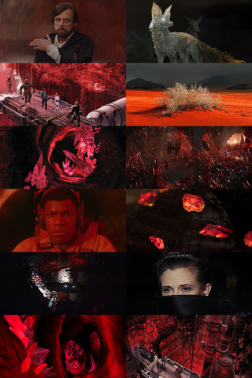
Text
Part 3: Nancy Drew & The Vanishing Set Designer
The Importance of Cohesive, Believable Game Worlds
A wall of text series on how Nancy Drew games largely lost their charm--this time with pictures!
Boasting more than 30 titles released over the course of nearly 20 years, it’s obvious why the Nancy Drew series has experienced changes in graphics. Thanks to never-ending advancements in PCs and artists who continue to hone their craft, the games moved ever closer to an ultra-realistic ideal.
Improved textures and dynamic character animations were some of the most noticeable and appreciated changes that helped to further immerse the player and create a beautiful game world. That said, a convincing game world does not require the latest and greatest graphics--it only requires cohesion. The most realistic graphics in the world are nothing without a skillful designer behind the scenes, setting the stage and making everything feel “right.” Unfortunately, that designer seemed to vanish with increasing regularity as time went on.
Empty Spaces
HER has never had a AAA budget, and that comes with certain limitations. One of the most obvious is the amount of characters that Nancy is able to interact with in each game. Since creating, animating, and voicing characters takes quite a bit of time, there are rarely more than five. This can create some challenges when it comes to creating a game world which feels lively and believable.
Some locations, like the abandoned Thornton Hall or the soon-to-be B&B in Message in a Haunted Mansion need no excuse for their limited cast, but others require a bit of explaining.
Sometimes, a story-driven explanation is given for how sparsely populated a location is. For example, in Secret of the Scarlet Hand, the museum is currently closed to visitors, just like the park in The Haunted Carousel. But other times, a few tricks are needed to seal the deal--and not every game had some up its sleeve.
The Good:
Danger on Deception Island did a good job of making the Hot Kettle Cafe, an otherwise sparsely occupied establishment, feel as if a group of bustling customers were just out of view through the use of sound effects.

Dishes are clinking, people are chatting and laughing, but only Holt and Jenna are ever seen. Yet, the simple addition of those sound effects and a little sign saying the other part of the cafe was occupied helped the player suspend their disbelief.
Perhaps even more impressive, Danger by Design managed to make a public park feel fairly believable through the use of cleverly obscured vendors, street and nature noises, a pesky squirrel, and a suspect visiting at one point.

This location, coupled with the choice to have Nancy immediately appear behind the parfait counter at Cafe Kiki against the sound of chatting customers, allows the game developers to avoid making Paris feel underpopulated even though there are only a handful of NPCs.
The Bad:
Unfortunately, The Phantom of Venice did not succeed in presenting Venice as well as DAN presented Paris. Though the Ca’ itself was beautiful and the musical score was, as usual, wonderful, the vast majority of the locations felt completely and utterly dead.

No amount of heels clicking on the pavement, people occasionally shouting Italian phrases, or flocks of pigeons landing briefly was going to make these locations--which are visited many times throughout the game--feel real.
The game designers chose to set many of the clickable buildings further back, revealing large swathes of empty streets and public squares, rather than having Nancy appear at the front door like she does in many other games.
While I can see they were clearly trying to showcase the unique architecture of Venice, it simply results in a mostly “off” feeling game world since one would expect lots of people to be roaming around.
The Silent Spy--with its basically empty train station--and Shadow at the Water’s Edge--with its barren urban environments--suffer from this problem as well, along with the game I love to hate: The Shattered Medallion.
Even though MED makes a ridiculous attempt at explaining why Sonny Joon is the only member of staff present and conveniently gets rid of the vast majority of the competitors within the first act of the game, it still utterly fails at making the player feel as if they are participating in a game show. Frankly, with the constraints put upon HER by their budget and game engine, I simply cannot imagine how they could have successfully pulled off an authentic game show experience, but the lack of competing teams was far from the only issue with MED.
The Great Outdoors
The trouble with any game world is that there almost always must be a boundary--a limit to where the player can go. Except for games that feature randomly generated locations, players can expect to--sometimes literally--hit a wall at some point. The trick is to make it seem as if there is no wall.
Outdoor locations can make pulling off such a feat difficult, because as the depth of field is increases, more and more objects are required to fill all that space. However, it is by no means impossible, and HER has marvelously pulled it off many times.
The Good:
Ghost Dogs of Moon Lake was the first game to truly offer an outdoor experience. While previous games like Treasure in the Royal Tower and Secret of the Scarlet Hand had walled gardens, DOG gave the player an expansive forest to explore during the day and night.

This game succeeds at giving the player a sense of actually being deep within a dense forest by using layers upon layers of 3D trees. No matter where you look inside the thicket, you never seem to see a “wall.”
Not only that, but allowing the player to wander in the woods rather than having every location be accessible by a jump map--like the motor boat map--makes the game world feel very large, though some players may find backtracking to be annoying over time.
Another contribution to that sense of realism, much like the Hot Kettle trick, is the use of environmental sounds and critters. Songbirds singing in the trees, the famous chirping worms of Pennsylvania, and other woodland noises play almost constantly in the background as Nancy’s feet crunch upon earth and fallen leaves.
The DOG designers also used a limited, cohesive color palette of muted, earthy tones not only in the forest but also throughout the cabin, speakeasy, and ranger station.
The result? A game which, though it may not rival the likes of Skyrim in detail or variety, feels thoroughly cohesive and drips with atmosphere.
Similar success--though on a smaller scale--was achieved by the forest in The Captive Curse, which was full of sounds, had misty depth of field and gave the player a true sense of being lost in a dark, potentially sinister place.

The Bad:
The Shattered Medallion, on the other hand, is one of the worst offenders of a poorly designed outdoor world. Given that this game was almost entirely set outside, HER certainly had a challenge on their hands, but they failed miserably.
Contrast this forest scene with the one from DOG or CAP. Those trees are almost definitely 2D photographs pasted in a row, allowing for almost no depth of field, and it’s the same story for the mountains.
Using 2D assets is not necessarily a no-no, but here they make the actual 3D models--the silver flower stations and the puzzle palace--look wildly out of place.

The same thing is happening in this other half-ass location from MED. A strange collage of photographs with a few oddly lit 3D models pasted on top makes for a very “wrong” feeling scene.
Indeed, almost every outdoor location in MED has this very weird feeling of being on a Hollywood set--like the backdrops could fall down at any moment and reveal the whole thing to be a farce--and it’s made only worse by the almost complete lack of background noise. Admittedly, I have never been to New Zealand--perhaps it really is deathly quiet--but this game could have greatly benefited from some consistent sounds of nature to liven-up its otherwise lifeless locations.
On top of all that, this game seems to have no color scheme of which to speak nor does it feel expansive. A jump map is used extensively for traversing the landscape, with many outdoor locations only allowing the player to take a mere handful of steps in any given direction.
The result? A game which simply feels “wrong” in nearly every conceivable way.
By no means is MED the only offender, though. Similar depth of field issues--though not as egregious--were present in Secret of the Old Clock, and as far as cohesion goes, I think we should all take a moment of silence for this travesty:
All I can say is, whoever approved that design was just...wrong.
The Jump Map
Jump maps can be great time-savers when going back and forth is a key gameplay element, and the Nancy Drew games certainly involve a lot of back and forth. Sometimes they save a player a lot of headache, but sometimes they break immersion--particularly when they attempt to stand in as a cheap substitute for an expansive, believable game world.
The Good:
Danger on Deception Island is one of many games which features a jump map for key locations.
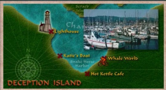
What makes this map work is simple: each location is fairly large and immersive in its own right, and there is presumably little to be gained by forcing the player to click one million times down the actual road to each place.
That said, while the player may jump from the lighthouse to the Hot Kettle with the click of a button, copious amounts of kayaking, exploring beaches and the enormous tunnel system keep the game from seeming too constrained. The player feels as if they really have explored Deception Island, rather than feeling as if they have simply visited a few buildings.
The jump map in DOG, SSH, STFD and various other titles work for the same reasons--the forest, Beech Hill museum, and WWB studio respectively seem so large that jumping around to smaller, more limited locations doesn’t actually feel very limiting at all. Plus, the art style used for the map can often add to the immersion, like the subway and train maps.
The Bad:
Though its map certainly looks plausibly like an amusement park flyer, The Haunted Carousel was the first game with a jump map that truly felt like a limitation.

Though there are double the “clickable” locations on CAR’s map in comparison to DDI’s, there simply isn’t much to explore in CAR’s locations. Indeed, the park feels very tiny, and I can’t say I truly felt like I “saw” Captain’s Cove. Perhaps if even one location had allowed for more open exploration, the game wouldn’t have felt so limited.
In the same way that mini-games and repetitive tasks can serve to artificially lengthen or beef up a game, jump maps can attempt to artificially expand a game world. Sadly, there are even more cheap tricks deployed in service of this goal.
Third Person Perspective
Secret of the Old Clock was the first game to transform the jump map into a driving simulator, and this mechanic was met with mixed reception--it seemed like players either loved it or hated it for various reasons. Regardless of opinion, this game mechanic always introduces a risk: the style of the game changes.
No longer is the player immersed in a first-person, beautifully rendered 3D world--they are now dropped into third-person on a stylized, top-down map. The effect is simple: the player is very aware they are playing a video game.
The Creature of Kapu Cave, The White Wolf of Icicle Creek, The Phantom of Venice, and The Haunting of Castle Malloy all featured variations of this third-person mechanic, and many games afterwards incorporated some form of the driving simulator to varying degrees of success, but Ransom of the Seven Ships went absolutely wild with it all.

From sailing around, to scuba diving, to rock climbing, to digging holes, to driving the golf cart around the island--the player was constantly yanked from the first-person, 3D-rendered game world and thrust into what were essentially 2D mini-games. While the color scheme was consistent, the art style varied greatly, making the game feel much less cohesive than many of its counterparts.
While RAN certainly felt like a very large game in terms of terrain--complete with copious amounts of agonizing back-tracking--it really lacked immersion. Indeed, there is no real sense of urgency like that in The Final Scene--despite it being Bess who has been kidnapped--and the focus is constantly taken off of the mystery at hand and onto figuring out how to drive correctly or sail that godforsaken boat.
A Matter of Preference
Ultimately, I think the Nancy Drew games evolved along something of a sliding scale. In the beginning, the aim was to put the player into Nancy Drew’s shoes, but this aim slowly and steadily shifted towards that of simply creating a game. And the truth is, there is nothing wrong with either aim; it’s all about what experience you’re looking to have.
When I first started playing the Nancy Drew series, I was looking for a mystery-solving simulator and I couldn’t get enough. I’ve played a lot of other detective games, but the ND games were really something special, so when they stopped delivering the same type of product, I really felt like something great had been lost.
Again, there is nothing wrong with game-y games, but there is something to be said about games that try to provide an authentic experience. It’s not every day that an ordinary person gets to solve a mystery--a mystery that seems so plausible that you feel a real sense of accomplishment when you unravel all its threads.
I missed that in so many of the later games, and I think that’s a shame.
Read Part 1: Nancy Drew & The Curse of the Pointless Task & Part 2: Nancy Drew & The Case of the Missing Realism
66 notes
·
View notes
Text
Making A Galaxy Far Far Away: An Aesthetic Photoset Tutorial
Requested by @geleixi (and varying amounts of time ago by @rockett-to-the-purple-moon, @thenameisgreed, @pizzaplanethq, and probably others who sent nice messages that I went “Oh, what a nice message this means so much I LOVE IT SO MUCH I’M TOO ANXIOUS TO ANSWER IT WRONG I’ll just do it later” and then promptly NEVER answered it.)
Brainstorming & Photo Collection
Picking a Color Palette
Choosing Images from Collection
Coloring
Textures & Effects
First off: I am not even going to remotely pretend like graphic design is a Thing I Am Better At Than Anyone Else, because that would be patently false and ridiculous, but I also get a fair number of Asks about making photosets/aesthetic posts, so here we are. I’m planning to do a separate one, maybe, for how I do the Cartoon Girls All Grown Up and Nancy Drew Dream Games series, because the “brainstorming and photo collection” part is so different that it inherently affects the rest of the process.
BUT I also feel like I don’t see a ton of tutorials that go through the brainstorming/finding images part of making aesthetics, and I tend to think of my Graphics Style(TM) as “DEEPLY Uninterested in washed-out faux sepiatone grimdark Tumblr Coloring?? + Not Good Enough At Masks To Do Negative Space Well,” which might be some people’s level of ~graphics design passion(TM)~ too, so. That’s the ride for which this ticket has been bought.

Brainstorming & Photo Collection
Obviously, the specifics of this are totally different for every aesthetic, but all of the GFFA/swworlds start from the same seed: Star Wars Aesthetic.
Star Wars itself has a very particular Lookque, imo: it’s not quite retrofuture, it’s not quite dirtpunk, it’s not quite scifi, even. There are the insanely sumptuous (and hella culturally appropriative) queens of Naboo and the ramshackle toppled AT-AT where Rey lives on Jakku and the not-even-subtle-at-all-jfc Nazi inspiration of the Empire and First Order and the straight-up millennial Tumblr witch Goffik look of the Dathomir Witches and Zabrak siths and the blue, blue water of Scarif. There “isn’t” a unifying aesthetic through Star Wars, and yet, as Gareth Edwards said, there’s a LOOK and FEEL to Star Wars: if you go a little too far to the left or right, it isn’t Star Wars anymore.*
*That said, this tutorial talks about Crait, which was invented by Rilo Jon, who went both too far left and too far right but mostly... too far-right. BA DUM BUM! Anyway.
So part of what makes Star Wars Look Like Star Wars, to me, is that it ISN’T ever Too Scifi. There’s a realism in all of Star Wars’ disparate planets -- their looks, anyway; like, talking about how Crait, in this case, makes NO ecological sense as a planet AT ALL is another post entirely. (IT MAKES NO SENSE.) It’s different from, like, Doctor Who, which I think revels in its “we can make these aliens and planets look like WHATEVER” more? Star Wars tends to be very like... “we want to use practical sets and effects.” Even for planets that only appear thus far in Clone Wars and Rebels? So it’s definitely part of the intention of SW’s Aesthetic.
ALL OF THAT TO SAY, my first step with each planet is to figure out the best way to represent it using as much real-world photography as I can and how best to channel the ~spirit of Star Wars~ in the graphic. Sometimes I fail miserably. CURSE YOU, NAR SHADAA. But most of the time it helps provide a Framework for the rest of the brainstorming and photo collection.
SO. FOR CRAIT. (For another example/totally different look and process, I wrote up a little about Haruun Kal on its post here.)
Crait has the definite benefit of appearing in one of the movies, so the first part of photo collection was to screencap TLJ. I took the caps using the 1080p digital release at a 20-frame frequency, so even once I deleted the aps that weren’t of Crait (moving the Canto Bight frames into a folder for Cantonica, of course!), I had like... 1500 images just from TLJ to start the brainstorming and collection with.
First, I trimmed down those ~1500 screencaps to 168 caps that were distinct enough from one another to give me a sense of “what happens” in the scene and, more than that, “What Crait Looks Like.” Then, because there’s additional canon material of Crait besides TLJ, I saved the unlettered images of “Star Wars: The Storms of Crait” from comic penciller Mike Mayhew’s blog @mikemayhew -- if those hadn’t been available, which they’re usually not for planets that appear in the comics (THANX MIKE MAYHEW!!!), I would have taken and cropped panels from the comic at both 100% and screen-fit/60% sizing that had utility for a graphic about planet scenery and not character.
THEN, I looked at Wookieepedia and MSW. Crait was based on the Salar de Uyuni salt flats in Bolivia, so I Google image-searched that. There weren’t actually very many images of the Salar de Uyuni salt flats that I super loved, so I ended up saving images of other salt flats as well, particularly the Bonneville Salt Flats in Utah.
THEN there was the issue of the red minerals, which were entirely fictional and not part of any real-world salt flat. BUT, there IS real red sand... so I saved some images of red-sand dunes (mostly Mui Ne in Vietnam). I also went through my Star Wars Stock Folder to find images of crystal caves and mines that I’d either saved for other planets in the past, but didn’t end up using, OR just saved because there are so fucking many crystal-based planets in SW.
Each of my big graphics series has its own Stock Folder for unorganized images that just strike the right Vibe~ and might be useful someday, in addition to every planet (or cartoon girl, or US state for the Nancy Drews, etc) having its own folder for specific/organized image collection.
My Star Wars Stock Folder:

So there were already a lot of crystals, star destroyers, blasters, and bunkers that were actually in snow but whatever it was white and crystalline, to work with. I added some workable Crait-like images from the stock folder to Crait’s collection, too.
AND THEN, finally, I LOVE the vulptices, so I searched for (and found!) some of the concept art and 3D modeling images from ILM, and I put those in the folder, as well.
I also saved this, hoping I’d be able to make it work because it’s SO CUTE, but I couldn’t, but here LOOK HOW CUTE:
And then, lest I stay in the image-collection rabbithole forever, I said, “OK, that’s enough.” I ended up starting to actually MAKE the Crait graphic from a collection of 272 images:

Picking a Color Palette
Obviously, the dominant colors of Crait are red and white, so the aesthetic had to be based in red and white. My first instinct was to make a duotone aesthetic using only red, white, and black/grayscale. Something like this:
Which... I don’t hate, or even dislike. It’s definitely more in line with popular Tumblr aesthetic, uh, aesthetics. But I usually don’t like landing on that kind of coloring because it ALWAYS, ALWAYS whitewashes people of color (and jeez, it even whitewashes white people -- look at the model in the fourth frame down on the left, or Luke in the bottom-left.) The “vibrance -100 + Selective Color Red>Red + 100″ always ends up doing the above example to, in this case, Poe: turning him into a licorice man.
So then trying to correct THAT either whitewashes the FUCK out of him/people in general:

(Toning down the red)
Or introducing other colors back into the graphic as a whole:

(Upped yellow and cyan.)
So I nixed that coloring before I even started. (These examples were made after the fact purely to serve as examples.)
I went back to the drawing board, AKA the Crait image folder.
But looking at the collected images -- especially the screencaps and the panels from the Storms of Crait comic -- I was struck by how much Crait also incorporates yellow and blue. (Note that I really, really wanted to try to include Trusk Berinato and Bail Organa... but we’ll talk through why that didn’t work out.) I LOVE @droo216‘s bright, almost jewel-tone edits which I 100% know I don’t have either the patience or skill to make, but I liked the idea of trying to make Crait’s aesthetics in a primary colors + black/white scheme.
Which I actually really like! (Again, made post-facto as an example.) But again, red vibrance DiD tHe tHiNG!!! to Poe and ESPECIALLY to Finn and Bail.
So a high-vibrance look emphasizing bright colors was a no-go. Besides, going back to the source material: high-vibrance and high-energy are the opposite of what the planet of Crait is about. It’s a dying husk of a planet, being killed slowly by its own ecology as the salt in its crust dries out everything beneath it, sucking up water until everything either evolves into living crystal-dogs or goes extinct (thank u Rilo for not including dune-worms, this is the one thing you did right). Crait wouldn’t be vibrant.
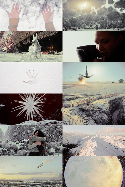
But... aha! It’s also distinctly layered. I’ve done three-panel swworlds aesthetics before, so I decided to do that for Crait, too: first a mostly-white graphic like the salt crust, then white+red+yellows in the middle, and finally a dark layer of almost entirely red like the mineral mines.
Choosing Images from Collection
With the color palette and “feel” decided (dying at the surface, then growing richer and redder and angrier as the photoset moved downwards), I was able to choose images.
NEKKID PHOTOSETS SANS ANY EDITING! XXX! But for reference to see both cropping and for reference on choosing.
TOP IMAGE, MOSTLY WHITE:
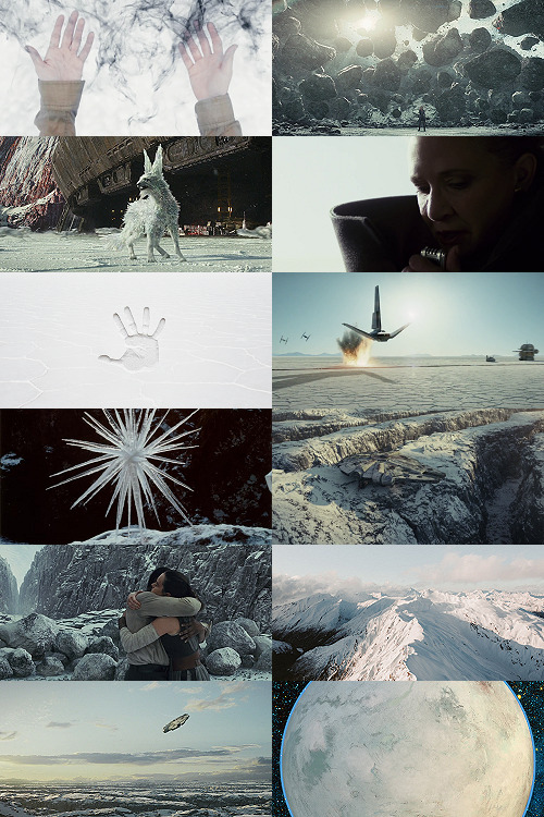
L-R, TOP-BOTTOM:
I saved this image from my dash at some point and have been tossing it into planets’ folders every time there’s a white-based color scheme. It almost got used for Ilum, but at the last second wasn’t. I felt like it fit the coalescence of Rey’s Force strength here, and also the kind of “last wisps” of Luke Skywalker, well.
“Lifting rocks.”
I’m actually still not 100% whether I should have landed on a vulptex here, but dammit they were one of the only good parts of TLJ. This vulpie baby is on the salt surface, looking out at the blinding sun, so she seemed like a good fit compared to the other caps of vulptices -- the ones loping on the canyon surface at the end were all very motion-blurry.
Carrie in that gorgeous coat in homage to Harrison in Blade Runner makes me weepy, and those were some of the most beautiful shots in the movie. This one had a good balance of white and black, so it could be placed around any level “busyness” in the surrounding photos. Especially since I suckkkk at negative space.
I saved this image to the Crait folder like the day it was announced as a planet in the upcoming Episode VIII and given its first peek. I love it!
Hi, salt flats, and also Star Wars spaceships. I actually had a lot of trouble with the level of green in this image, but the ~essence of Star Wars is PEW PEW SPACE BATTLE, so.
This is an ice sculpture in real life! It reminds me of the vulptices and is cool as hell.
The Millennium Falcon! I toyed with different caps that showed it in actual battle, but the blue would have been hardest to work with in this photoset compared to the others below. Plus, now I can save a bunch of Falcon-in-flight pictures for use on planets that only appear in the novels or comics.
NECESSARY, ICONIC, PERFECT, THE MOST IMPORTANT THING THAT HAPPENED ON CRAIT.
Fine, this is a snowy mountain and not a salt flat, but I liked the striations in color and gentle variations in grayscale.
This was the palest/least Bright Blue sky of all of the Falcon screencaps from Crait.
I tried a few screencaps of Crait from TLJ, but I landed on using the full-panel image of Crait from Storms of Crait. It has the cleanest definition of the “planet from space” options we have of Crait.
This is a promo image, not a screencap. It’s a much crisper view of the ski-speeders. I love the vivid color difference.
The blue-and-yellow additions to the color scheme didn’t work out, but I did still want to include Storms of Crait. This shot had a little more blue in it than I would have liked, but it has Leia in a ski-speeder back before the salt caused them to rust out, too!
Remember when it seemed like the Crait battle’s new AT-ATs would be super cool and like, do more than stand there menacingly behind Kyle? Me, too.
POE! DAMERON! HAS! NEVER! DONE! ANYTHING! WRONG! IN! HIS! LIFE!
KYLE! HAS! ONLY! EVER! DONE! WRONG! IN! HIS! LIFE!
I tried out like five different tiny-frame-difference screencaps of the ski-speeders kicking up red minerals, and I decided that this one, with a clearly defined spray of red surrounded by white and bluish sky, suited the placement here best: there’s red in the panel to its left as the main color, but minimal red in the above- and below panels.
I wanted to include actual Connix, but she’s wearing yellow and only ever shows up surrounded in brownish-black darkness, so here, have one of my standard Fashion Rebel Officer Stand-Ins instead -- the red and white obviously played a part in picking this shot over the rest of the options from the photoshoot.
I LOVE this slightly mystical shot of a Rebel pilot slash astronaut on a rain-slicked salt flat. How perfect?!
As we get down to the bottom of this middle panel, I wanted to include more destruction and more presence of yellow and orange. This image has a good balance of “negative space” in the sky and salt flat, and then the explosion of Nodin Chavri’s ski-speeder (I think?) ties in well to...
Finn and Rose, post-collision. I wanted to include Rose, and the almost JJ Abrams-esque white starburst in the center of this cap is a good balance to the spray of red around a ski-speeder two panels above.
Luke on Crait in the Rebel Alliance...
And Luke on Crait in the Resistance.
This was a kind of “????” moment of characterization -- and general direction -- in TLJ, but Luke surrounded by red as an old man would fall right below Luke as a young man, on his first mission after the Battle of Yavin, when the three graphics were aligned.
I wanted to use the straight-up concept art of the vulptex, but the black around it was TOO black, if that makes sense? So I layered it over a darkened cap of the vulptex who leads Poe to Rey and freedom. This is one of the very rare shots that I use an edited base image.
Han and Chewie! I had to include Han and Chewie. The unlettered panels from Storms of Crait that show the mineral mines are stunning; I highly recommend heading over to Mike Mayhew’s page and taking a look. The detailing of the crystals is something I wish I could have captured better at this scale.
This is one of the red-sand dunes I saved! Crait doesn’t have any living vegetation, but the drama of the black, stormy sky and the red sand drew me in here.
Some CGI crystal caves... I saved these ages ago for use on Ilum or Dantooine, I think? (Same with what will be #11 below.) I don’t love using CGI, but I think the crags on these crystal growths suited the images from canon!Crait.
A screencap of the TIEs chasing the Falcon through the mines. This was honestly one of the most visually stunning parts of TLJ, and it’s so split-second that most people missed it AND most of the screencaps have a lot of motion-blur. I’m really pleased that this one came out so crisp, and I knew I had to use it as an “anchor image.”
Finn, full-on, in red. I’m realizing belatedly as I write up this tutorial that I showed Poe face-on and Finn face-on, but I stupidly chose to show Rey only from a distance. I AM A FOOL! A FOOL!
Aren’t these resin crystals amazing? The full-size image actually shows them surrounded by snow, by the tree-stump they’re on wouldn’t fit Crait, so I cropped in closer on this image than I did for most of the Crait set.
Another shot of the Falcon in the mines. I like the way the framing of white sunlight here echoes...
Leia’s face, a bright spot in the dark, watching out over the salt flat. :(
(See #5 above!)
And again, the homage of Carrie’s coat looking like Harrison in Blade Runner made me sad, so I THREW IN ANOTHER HAN AND CHEWIE. The mining equipment here shows more detail than in the screencaps above, too.
Coloring
Like I mentioned waaaay above, in the intro: I never use set colorings for photosets. (Except Halloween Spookstravaganza, because jeez so many of those screencaps are like 240p VHS rips and it’s just not worth putting in Effort(TM).)
That said, I think one thing that I do differently than I see in most tutorials is this first step:

I ALWAYS start Aesthetic photosets by arranging the images and then *BRINGING THE CONTRAST ALL THE WAY DOWN.* This is especially helpful on photosets that include a mix of real photography, CGI screencaps or art, and/or comics panels, but it’s also just useful in general for photosets that use images from a wide variety of places.
The reason I do this is because it helps to “smooth out” the differences in light source, color balance, etc., that are part of the raw base images. For this set, it also helps to define the variations in color between very similar shades: the craters on Crait, the wisps of clouds, etc.
In some cases, I’ll do two layers of Contrast -50. For Crait, I did a later of Contrast -50 and then a layer of Contrast -15.
Then, I Select All > Copy Merged > [Turn Off Contrast Layer View] > Paste As New Layer.
Now, the “smoothed” version is placed as a layer above the raw layer. From there, it depends on the look of the photoset what I do -- sometimes, I leave it as-is, but I almost always lower the opacity on the “smoothed” layer until the level of contrast and balance looks consistent across the whole photoset. For Crait, I ended up with the “smoothed” layer set to Lighten 100%.
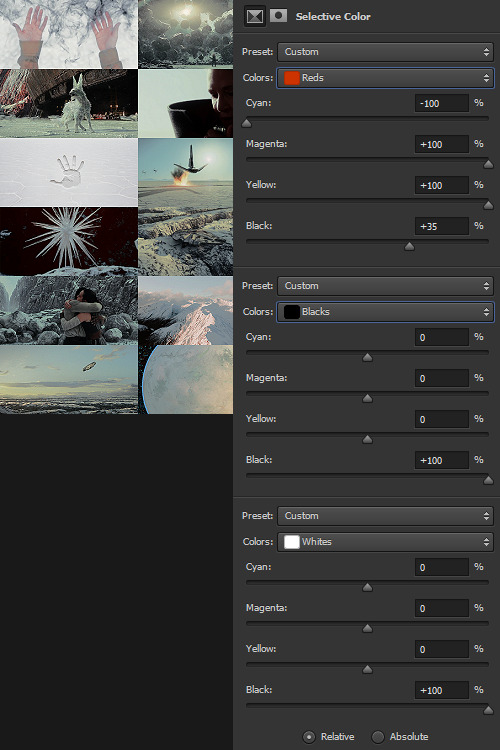
Selective Color time. There are two ways I usually start this: either one color at a time -- especially for Aesthetics like Pheryon that will essentially be monochromatic -- or, in this case, I looked at the balance of the three main colors that would carry through the entire Aesthetic.
REDS
Cyan -100 (This brightens the vivacity of the red.)
Magenta +100
Yellow +100
Black +35
BLACKS
Cyan 0
Magenta 0
Yellow 0
Black +100
WHITES
Cyan 0
Magenta 0
Yellow 0
Black +100 -- This is NOT my usual setting for adjusting white, and since white is one of the main colors in the Crait Aesthetic, it might seem counterintuitive to make the white darker instead of brighter. However, this will help to make next step of color adjustments “take” on the white/whitish surfaces a lot more easily, and it will also help to balance out the bluish sky areas with the white background areas. (I’m not sure this explanation makes sense? But it’s what I did.)
Then, I Select All > Copy Merged > [Turn Off Selective Color Layer View] > Paste As New Layer > Either COLOR or HUE 100%.
“Hue” is more effective for smaller, more incremental color adjustments -- for BIG SWEEPING COLOR CHANGES, “Color” tends to work better. But it totally depends on the photoset! Try both, and see which you like better.
I feel like this is kind of the step where my process of making aesthetics stops being any different from most tutorials -- but this has been HUGELY helpful for me, a non-graphic designer-person, to be able to create a kind of “base image” that has very similar color values, brightness/contrast, and vibrance.
Sometimes this step helps to create really extreme color differences, such as in the Raydonia Aesthetic, and other times, I use it to just adjust one or two color-values so that there’s more consistency in, say, shades of yellow or shades of green, as in the Takodana Aesthetic, for which I just wanted to create a more cohesive palette of green in particular... it started out with a zillion greens, and I wanted to bring it all together into one “aesthetic.”
I think this step, and the reasoning behind it, are why SO MANY PSDs for aesthetics rely on a layer of either gray or sepiatone-ish set to Darken or Multiply as one of their key layers. But I’m just not about the grimdark life, and if I’m making an AESTHETIC OF A THING, I want the aesthetic POST to actually HAVE THAT THING’S AESTHETICS, you know?! I want to use the colors of the thing that I’m saying is meant to evoke the visuals of the thing!
Anyway. Now you have your BASE IMAGE. Often I’ll Merge All here, just for my own sanity.
Then I go in and make any other other adjustments on a “coloring” level that I think will help with the “vibe” I’m going for! For this Crait set, I definitely needed to bring the brightness up so that the white and red popped. However, bringing up the brightness also swallowed a lot of the detail in the white surfaces -- especially the planetary surface of Crait in that bottom-right space -- so I decreased the contrast again.
Brightness +70
Contrast -50

And then I go in for the macro-level adjustments of color using any mix of Selective Color, Hue/Saturation, and Color Balance that works. For Crait, that was more Selective Color, because since I had decided on my color palette, and it sadly did not include blue, I needed to start by taking out as much of the blue, cyan, and green that I could.

And I’m ngl, I told myself the WHOLE FREAKING TIME I was making this photoset that I needed NOT TO DELETE THE PSD RIGHT AWAY LIKE I USUALLY DO so that I could write up all the settings for this step.
But it was a reflex. And I deleted the PSD right away like I always do.

So suffice to say, I just futzed with the levels one at a time until the RED was brought up a little, the YELLOW was brought up a lot, and everything else was brought down and/or hue-adjusted to sliiiide into being yellow, red, or black/white.
Another Select All > Copy Merged > [Turn Off Selective Color Layer View] > Paste As New Layer > Either COLOR or HUE 100%. I think I also DUPLICATED this layer and set it to SOFT LIGHT 50% and then duplicated it again to SCREEN 50%.

I could have left it like this, but I am me and I am nothing if not Extra All The Time, so I opened up my folder of light textures (and other textures) and decided to Go To Town.
Textures & Effects
For your Aesthetic-Making Purposes, here are the three I used on the Crait set:

The first two were set to Screen 100%, and the bottom one was set to Burn 15%. I layered them in this order.
It still looked incomplete, so I decided to use this POWDR Element from Creative Market, which is actually like 5400x5400 pixels and which I’m not going to share here because I paid for it and don’t want CM to revoke my access or whatever, but it looks like this, only HUGE:

I also set this element to Burn 15% and moved it around the image until it looked the way I wanted it.
Textures and effects aren’t In on Tumblr anymore, but I really like using them -- they add, not to be cheesier than usual, texture to an aesthetic post, and I think that they can also help less-skilled graphic-makers like me to hide any myriad of imperfections in coloring, sharpening, whatever. I’m an especially big fan of this noise element (set as a pattern on Screen), so I’m going to share it here even though I didn’t use it on the Crait set:

Most of my textures have been saved over the last literally twenty years since I started making fannish graphics and photosets, largely from defunct old LiveJournals, but there also used to some great sources for them on Tumblr and still are live sources for them on DeviantArt. Just search around and you’ll find what you want! :)

In conclusion, I think it’s infinitely more fun NOT to rely on premade PSDs or standardized Settings, but I also recognize and fully respect that if I made graphics differently, I would probably get easily 5-10x more notes on each post than I do. But I make graphics the way that’s fun for me, and I just try to learn a little something from every set I make. The GFFA Planets/swworlds in particular have been something that I started, originally, because I wanted to catch up and learn about Star Wars planets that I felt like I was missing because I don’t have any fannish history with the Old EU, and I wanted to learn about them in a way that helped me feel like I was engaging with the SW source material AND making the enormity of the canon more accessible to other newish or casualish fans, like I was two years ago when I started this aesthetic series. I like making aesthetics that are genuinely inspired by the aesthetic of the thing that I’m calling it an aesthetic of, so even when it ends up just looking like rainbow barf (CURSE YOU, NAR SHADDAA!!!) I’m having fun.
THAT SAID, here’s how the time breakdown for the Crait set works out:
TOTAL TIME INCLUDING IMAGE COLLECTION AND SCREENCAPPING: Est. 20 hours.
COLORING AND ACTUAL GRAPHIC-MAKING PART: 7 hours.
WRITING UP THIS TUTORIAL: 5 hours.
So, um, if you are so inclined, here is my Ko-Fi link. I post at least two graphic sets every week, sometimes up to 25 (usually during October).
I hope this was helpful at all! I had a good time thinking about my process in-depth like this, and I would love to get tagged in any aesthetics you might try making using a similar method! :)
57 notes
·
View notes
Text
The Canadian Ray of Sunshine
Sheridan Clark is a friend of mine I’ve taken a few classes with. When you look at her, you might get the overwhelming feeling that you just have to be their friend. Her quiet and bubbly personality meshes well with her perfectionist tendencies. Considering I am also quite shy, it took me forever to get up the nerve to talk to her! We went through almost an entire semester before I was giving more than a friendly nod. I learned that we were both taking our same professor the next semester, and this moment is when we both blossomed and really started chatting! I got up the nerve to send her a text, asking if she would be interested in being my interviewee for this project. When I got her answer, we set up a time to meet, and I briefly told her about the consent materials.
On the day of the interview, I picked her up at campus. I had already heard that she doesn’t like driving places she doesn’t usually go, and I can relate to that entirely. I had to grab gas at the nearby gas station, and it was right at 5:00. I went to turn left on a busy road and instead turned right, defeated.
“Oh, well I should have known that wouldn’t work during rush hour. I’ll just make a u-turn up here. That is if I can…” I drawled off. Sheridan pointed out the sign and said “Yeah you can! The sign’s right there. Canada has some weird laws dealing with u-turns.” “Oh, really? I thought you said you were like 3 when you moved down here, how do you remember?”
“That’s a good question,” she says as she laughs with me. “I guess sometimes you just remember random details for life.” I must have made a grimace, because Sheridan and I broke out into a little laughter. “How long have you lived in the U.S.?”
“Uh, for about as long as I can remember. I think for about 17 years?” She ended her sentence, as if questioning if she was fact checking herself. When I asked her about her memories of Canada, most of them involved her family.
Sheridan was not a U.S. citizen, and had never had been. One time in class we all showed younger pictures of us (old drivers license photos and such) and we all saw child Sheridan on her green card. She’s a passionate Canadian, usually representing her country with a little button on her hat. The rest of our conversation was rambles about classes and any little thing we felt like talking about.

Picture of Sheridan (Left) and myself during the interview (right). 2-7-2020.
My apartment isn’t the cleanest one you will ever see, but it is far from dirty either. The bar separating the kitchen and the living room tries to fool you that people use the living room. The wax warmer was turned on, illuminating the side of the wall with good lights and a slight cherry smell. The key rack is varying shades of blue, it looks as if it was painted with care and was hung up with an off colored green string. It was at an angle and the wall behind it had a few scuff marks, showing continuous use. However, the unopened mail and the red money gun that gets used only when guests are over (for a laugh) begs to differ. It seems things are tidy simply because the common space isn’t usually used. Two wood panels hang above the TV in completely different styles. The first looks rustic with blues and beiges. It states “The more people I meet, the more I like my cat.” The second one would be an important item in a mystery video game, if the game was about this apartment; it is brightly colored with orange, turquoise, pinks, and purples and says “Stay Salty.”
We sat on opposite couches, which faced each other perfectly for this type of activity. Being the scatterbrained individual that I am, I ran back into the bedroom and grabbed the letter of consent and a pen. I briefly explained to her that I will have my boyfriend record her and I talking, as well as ask permission to use any photos or files she sent my way. After she signed, I went and scanned the document before I forgot. Let the fun begins!
The lamp behind us helped fill the room. The furniture in this apartment doesn’t match, but it doesn’t look completely out of place either. The dark brown coffee table housed a few figurines: a snowman left behind from Christmas storage, handed-down coasters holding our halloween cups, and a very round green frog wearing sunglasses playing a saxophone. The TV stand was located in front of us, and held some of my artwork from classes we shared. A pumpkin was painted with a panoramic view of the night sky, with a cat walking on its fence. A metal bust of a cat with his tongue sticking out hides beneath my favorite 3D art. Made of only foamcore, masking tape, and a little glue after it was turned in, these triangles scream activated space. Activated Space was a meme from our 3-D design class, threatened to become a T-shirt design several times.
Sheridan would have a lot to say about this scene. When asked “What do all of your buttons on your bag and hat say about you?” She responded with “it’s a way to learn alot about someone right from the beginning.” For example, If you look at her beanie, you’ll see LGBT+ pins, Twenty One Pilot pins, Canadadian pins, and others. This shouldn’t be the only way you learn about someone’s interests, but you can get an idea if you will get along with them if you share similar interests. I can relate to this, as I watched back the interview footage I noticed I was wearing a flannel I have dubbed the “Bi Shirt” due to its color scheme. Nods to things like these can go unnoticed, but can become a conversation starter if one wishes.

Sheridan Clark. Personal File.
Sheridan is a very expressive individual. She can express herself in everyday life, but she also expresses herself through art. In the interview I asked her “as a fellow artist, how are you able to express your emotions so well in your art?” Learning to express yourself takes time, as well as years. As children become teenagers, they obtain more vocabulary to express how they feel. One study done by Nancy Johnson took school age kids and asked them how to answer the question “What is art?” or “What do you think art is?” (61). The younger the child, the more their response would have been like this: something fun to do, making something, using clay, etc. As the grade levels rose, so did their responses. Once you ask the third graders, they begin to use emotions along with actions. One student said “it’s just something you have fun with!” and others art as beautiful or playful (Johnson 63). High schoolers who were asked these questions responded with things that please you, an opinion, something that is relative, and other answers (Johnson 64). As we get older, we can describe our feelings better, and Sheridan is very in tune with her feelings.
Back in Professor Peterson’s class, our classmates didn’t talk much at first. By the end of the semester, we were all cracking up. The class was Concepts, Creativity, and Studio Practices. The class left most up to your imagination; the first project was simply to “make a time machine” and no further explanation was given. The last project was a research art project. It followed the usual frame of do whatever you want with no restrictions. This allowed everyone to create what they wanted and how they wanted. My project was a poster I created to advocate for the cats on the Marietta campus, and call for them to be TNR’d (trap, neuter, return).
Even sunshine will eventually meet rain. Sheridan briefly mentions that she meets with her therapist to manage her anxiety and depression. One of the things that I can resonate with her the most on is these topics. I can tell she might have been called “mature for her age” as a child. When I was smaller, I took it as a compliment, thinking I was one step closer to being an adult. However, as I got older, I started realizing it was a soft way of saying “you’ve been through some stuff, and it’s made you into a peacemaker.” Despite this, Sheridan’s bloomed into a bright little sunflower of positivity.
Sheridan’s last project was a real show stopper. She chose to research some of the most common mental illnesses and recreate them in her own way. The below piece she named “Anxiety.” The eyes everywhere to her represented the feeling of anxiety, and other ways of expressing that feeling. From some research into the Diagnostic and Statistical Manual of Mental Disorders (DSM 5), social anxiety can express itself through performing or other social events. Perhaps this form of art is a work around to this, as she can create her phenomenal works at her own home! Then later she can show them off. She also created 3 more types, with her interpretations of depression, schizophrenia, and bipolar disorder. Her determination for a perfect project-- or 4 for that matter, is prevalent here. This piece represents the feeling of being anxious in its entirety; sometimes when we feel anxious, we might wonder if we have general anxiety too. That’s what the research done by Takeshi Hamamura and Christian Chan focused on. The mere concept of being anxious correlates with increased googling “symptoms of anxiety.” Reports of self diagnosed anxiety rise as well (Hamamura and Chan 2). The good thing about Google is how soon we can pull up information, and in this case someone might be able to schedule an appointment if they need to. (Hamamura and Chan 1). If not, researching the symptoms can give you some peace of mind!
Sheridan Clark. Personal File.
Something I envy about Sheridan is her determination to have a perfect (well, um) anything. This expresses itself most often in the form of art projects. For example, in our 3D Design class we had a project called “Paper and Metal.” The goal was to make a casting of pewter and have it suspended in air only by paper and glue. The class met 6 hours a week, and she never had a moment of downtime; she was always creating the paper trees, grass, or leaves for her project. Whereas I only spent about 7 hours on my project outside of class, I’m fairly certain she spent twice that on hers. Hard work pays off, and I hope she got a well deserved break after the completion of this pristine project!

Mikayla Queen. Personal image of Paper and Metal Project.
Sheridan doesn’t stop at expressing herself through art, or style. She also has a new hobby: Furbys! In the interview, she described them as the toy she always wanted until right before Christmas, when she forgot it existed. Now that she’s out on her own, she has more freedom and goes to buy them, clean their fur, and revamp them! The tech that hides within these furbies is quite impressive. The article “There’s a lot of smart electronics inside a furby” describes this perfectly. For example, furbies are programmed to begin speaking “Furbish” and progressively learn English. (Edgar 28) To a child (or even me until I read this article), it would look like the Furby is learning directly from you! The realism packed into the fury creature is shocking, as many of its responses don’t seem to have a rhyme or reason. If you hold a furby upside down at first it will giggle, but if you keep holding it upside down it may say “I’m scared.” (Edgar 29)
Out of all the furbies I’ve seen, Cabbage is the one I’ve seen the most. But she has several more, with their names ranging from Big Mama, Shifty, and Maw. Since most of the ones she owns are ~15-20 years old, few of them speak. She enjoys taking them apart, “deskinning” them and attempting to fix them. A project she’s had in the making is to make a rainbow pride furby by dying their fur. This furby is beginning to come together as of me writing this, and has been named June. Although Cabbage doesn’t work yet, I still have hope for him!

Sheridan Clark. Personal File.
Being LGBT+ is an important part of both of our lives, and we both identify as Bisexual. A paper that Sheridan is writing this semester focuses on more education for LGBT+ students as well as just acceptance in schools. When I went to look up this topic, I found this research that came from Canada and thought it was fitting. Catherine Nash and Kath Browne talked about the importance of these topics being taught in school. With LGBT+ issues being more accepted and acknowledged, we have to remember that our society is centered around a hetronormalitive lifestyle. It has to be remembered that “The drive for LGBT integration often works in concert with broader efforts to teach multiculturalism, diversity and inclusiveness.” (Nash and Browne) School is the place where you can learn things you wouldn’t have at home, and these schools need to be a safe environment where a student won’t feel judged. Not only in Canada do LGBT+ students in school feel they are not accepted or wanted. If the environment you learn in isn’t a good one, there is a likelihood this student may not want to do work.
In the end, I feel I got to know Sheridan on a more personal level than I did from small talk from class. It’s important to listen and understand in friendships and relationships, and if you do it might help you grow. It reminded me that expressing yourself is important, and perhaps you should consider more ways than one. Picking up a hobby that others might think is quirky might just be the thing you need to ease your mind at the end of the day. If asked “Who is Sheridan?” I feel that I can confidently answer this question. Sheridan is the single beam of sunshine that sneaks through your window to wake you up gently. She is wise beyond her years, and typically acts as a “Mom Friend” in her friend group. She won’t let herself get walked all over, and she will find a better way to live! Sheridan is the definition of expressing. Whether it is through art, furbies, buttons, music, or plants, you can find a bit of Sheridan everywhere.
0 notes
Text
#SproutChat Recap: Launching & Advancing Your Career in Social Media
Whether you’re just beginning your career in social media or you’re a longtime vet, it’s good to know what skills and tactics you need to hone in on for career advancement. Knowing where to start and how to continue your professional development are just two elements in boosting your career.
In this week’s #SproutChat, we were joined by Sprout Social’s own Social Media Manager, Rachael Samuels.
Rachael shared best practices for getting started on networking through social and highlighted important skills to include on your resume.
Jump-Start Job Hunting
Before you start applying to jobs left and right, it’s best to take a step back and make sure that your name and brand are well represented.
We discuss personal brand often in social, but it’s important to audit this before you take a leap and put yourself out there in the candidate pool.
A1: I'll admit it – the first thing I do is google myself. Make sure my LinkedIn is on point, my social profiles are up to speed, SFW, and relevant. I also like to highlight a quirk of mine that sets me apart. Anyone notice I have a thing for Squirrels? #SproutChat pic.twitter.com/aSuZCUQNcB
— Rachael Samuels 🐿 (@RachaelSamuels) January 10, 2018
A1: Use a consistent photo on your profiles so no matter where someone finds you, they know you're you! I also like to keep a consistent color scheme on my website and any collateral I make/send. #branding #SproutChat
— e. (@voellercoaster) January 10, 2018
A1: The best way to prep for job hunting is to do research on the skills you’ll need for that dream job. You can do this by looking at job descriptions for one title at different companies. Do you see common skills required by both companies? #SproutChat https://t.co/NIUQUEH07F
— Simply Measured (@simplymeasured) January 10, 2018
A1 Do an audit:
1. Have an updated LinkedIn summary/profile
2. Link to your portfolio or site on your social channels
3. A visible avatar
4. Google yourself to see how you appear online
5. Attend networking events
6. Participate in online forums + publish content #sproutchat
— Nancy Casanova (@nancycasanova) January 10, 2018
A1: Be authentic, add value and be part of the conversation in your online community, and look for opportunities to network.
You have to have both online and offline skills #SprouChat
— Taylor J. Hall (@taylorjhall) January 10, 2018
A1: Use a consistent photo on your profiles so no matter where someone finds you, they know you're you! I also like to keep a consistent color scheme on my website and any collateral I make/send. #branding #SproutChat
— e. (@voellercoaster) January 10, 2018
A1. Updated LinkedIn, good references in order and always be ready to jump on opportunities. #SproutChat
— Patricia Weigle (@SocialTruffles) January 10, 2018
Highlight Skills on Your Resume
Every good social media manager should have excellent communication skills at the very least, but take note of what these participants shared. Skills will shift for each job you apply to, but knowing what to highlight is key.
A3: Organization is a key skill when it comes to social. Also, boldness and creativity are the qualities that help give you an edge. I actually wrote a full on piece about the attributes someone in social should have! #SproutChat https://t.co/Ugm7NjRAtS
— Rachael Samuels 🐿 (@RachaelSamuels) January 10, 2018
A3: Copywriting/editing; empathy; ability to work in dynamic, fast-paced environment. Also don't be afraid 2 think outside the box abt your talents and experience! That first-job, whether scooping ice cream or earwax (lol), might have provided transferrable skills! #SproutChat
— Jenny S. West (@jennyswest) January 10, 2018
A3: I think the following skills are mandatory for #socialmedia position –
Innovative, analytic (analyze audience behavior), creative (out of the box thinking) & adjustable #SproutChat
— Benny Gelbendorf (@BGelbendorf) January 10, 2018
A3: You want someone with creativity and who has experience in the social media field. Experience makes a huge difference! #SproutChat
— Express Writers (@ExpWriters) January 10, 2018
A3 Skills that are needed for Social Media jobs are organization, analyzing, a willingness and passion to learn from others about new trends, a passion to connect to other individuals, a strategic mind, branding, strategy, and a real passion for social media. #SproutChat https://t.co/ouDeFjI6D6
— Tri-County Young Professionals Network (@tricountyypn) January 10, 2018
A3: Simply be active on social media platforms yourself, outside of working hours, to get a feel for the conversations taking place and the types of content people react to! Consider it field research. #SproutChat
— e. (@voellercoaster) January 10, 2018
A3. Attention to detail, curiosity, pragmatism, proactivity and organisation. 💪🏻 #SproutChat pic.twitter.com/4JNML2C6R2
— Lisa 👩🏼💻 Social Media Manager (@lisaboylesmedia) January 10, 2018
Networking Means Consistent Engagement
Making connections via social can be highly beneficial, especially if you yourself are in the field of social media. If you network in person, be sure to follow up on social media to maintain consistent engagement and foster relationships.
A4: It's so much easier for me to network on social than it is in real life. I'm a thespian too so I can't really understand WHY I become introverted at events. My advice: 1. Say hi! and 2. Use bios for convo starters. Seriously, someone. Ask me about Squirrels. #SproutChat pic.twitter.com/yyV4Gu3ZGr
— Rachael Samuels 🐿 (@RachaelSamuels) January 10, 2018
A4: Use social media to research and bring it in-person. For instance, use LinkedIn to find out if your connections know anyone at the brand you want to apply for. Ask that person to introduce you, then set up an in-person meeting. #SproutChat https://t.co/tozNwX3ba8
— Simply Measured (@simplymeasured) January 10, 2018
Be outgoing. It's pretty rare to find people that excel at social media that aren't social offline too. #SproutChat pic.twitter.com/IG3GUkDQuy
— Contentologist: Content, Research & Slice of life (@Contentologist) January 10, 2018
A4 I like chiming in on conversations that are applicable to me or where I feel I can add value. I make time to engage in Twitter chats, send some DMs and network IRL. I'm a chameleon when it comes to networking. 🙂 #sproutchat
— Nancy Casanova (@nancycasanova) January 10, 2018
A4: Be yourself! And don't be afraid to reach out to new people and start making connections. Don't wait for people to come to you. #SproutChat
— Express Writers (@ExpWriters) January 10, 2018
A4. As an anti-social person, social media is where I do my networking! 😂
Follow and engage with those with similar expertise, interests and career goals. #SproutChat pic.twitter.com/sBCos6A7Np
— Lisa 👩🏼💻 Social Media Manager (@lisaboylesmedia) January 10, 2018
A4: Give something (even if just kudos) before you ask for anything. Don't be a stalker. Give credit when tweeting/sharing an article or link you found from them. #sproutchat
— Kathleen Gormley (@KathGorm) January 10, 2018
Maintain Knowledge Across the Board
Even if you’re just getting your footing in the industry it’s best to have knowledge of all platforms. Understanding how they work and best practices is ideal. You can hone in on your knowledge of a particular network if you plan on specializing in one.
A5: Social platforms will come and go (#ripvine) but the principles behind what "works" in social media are the same across the board. Feel free to know a certain audience type more than the other, but I encourage some familiarity with all platforms. #SproutChat pic.twitter.com/xouljdacof
— Rachael Samuels 🐿 (@RachaelSamuels) January 10, 2018
A5 I believe being knowledgable of multiple aspects of social media is best. Who knows if the aspect that you were an expert at will be there in a year. Social Media is always evolving. So you need to evolve with it and keep learning new skills. #SproutChat https://t.co/H3jAJxhP8x
— Tri-County Young Professionals Network (@tricountyypn) January 10, 2018
A5 – to be a Social Media expert you need to understand pro's and cons of all the platforms IMHO #sproutchat
— Steven Dickens (@StevenDickens3) January 10, 2018
A5. Awareness and familiarity of best practices with all is the way to go. But everyone has a favorite child. #sproutchat pic.twitter.com/RcCmGF8fp3
— Kathleen Gormley (@KathGorm) January 10, 2018
A5) Taking a multiple channel approach to understanding social media is best; very few clients want just "a Twitter guy" (although they *do* want someone with paid & organic experience) #sproutchat
— Gordon – Very Stable Genius (@gordondym) January 10, 2018
Join us next week, January 17 at 2 P.M. CST, to chat with Sprout’s SEO Strategist, Dominique Jackson, about the basics of SEO.
For more career growth opportunities be sure to check out Sprout Sessions, Sprout’s free digital conference, January 22-26.
This post #SproutChat Recap: Launching & Advancing Your Career in Social Media originally appeared on Sprout Social.
from SM Tips By Minnie https://sproutsocial.com/insights/advancing-your-career-in-social-media/
0 notes
Link
By Andrew Levine / Counterpunch
Photo by Vinoth Chandar | CC BY 2.0
There used to be “moderate” Republicans whose views were no worse than, say, Barack Obama’s. That is ancient history now.
These days, for anyone who is not at least a multi-millionaire or an acolyte of the moneyed interests, Republicans are like mosquitoes. They cannot be ignored but, from a human perspective, they do no earthly good.
And yet, they abound. This can only be because, as they say, “there is a sucker born every minute.”
How else could Donald Trump have gotten millions of votes last November, by no means all of them from “deplorables?” That so many of those voters still don’t get it – that Trump conned them into thinking that he was on their side, and that his election would do them good — proves the truth of that venerable maxim beyond a reasonable doubt.
With more than a third of the electorate still standing by the Donald, quite a few terrified Americans have gone into mosquito control mode. Some of them call themselves a “resistance.”
This is not surprising in a political culture in which the Right routinely coopts the Left’s words and in which journalists assign the color red (as in “the workers’ flag is deepest red…”) to the more pro-business – and odious — of our two semi-established political parties. Even so, this use of such an honorable word by the likes of Chuck Schumer, Nancy Pelosi, DNC chair Tom Perez and, Hillary Clinton (seriously, Hillary Clinton!) is outrageous.
Democrats weren’t always as awful as they now are. Back when there were still moderate Republicans, there were also Democrats – not many, but a few — who would do what they could to fight the good fight. For the most part, Democrats then were as pusillanimous and inefficacious as they are today. But they weren’t all servile flunkies of corporate malefactors and Wall Street predators.
It was a debatable proposition back then, but nowadays it is clear as can be: the Democratic Party is part of the problem, not part of the solution.
A big part – especially since last summer. Under the aegis first of Team Hillary, and then of the sore loser brigade that crystalized after her self-inflicted defeat in the 2016 election, leading Democrats, and their media flacks, are now actively preparing public opinion for war – or, rather for marching right up to the brink of war – with nuclear Russia.
But for the fact that lately Republicans too have jumped on the bandwagon, this would make today’s Democrats even more dangerous than their more loathsome rivals. It certainly puts the idea that, compared to Republicans, Democrats are at least the lesser evil – once practically a truism — in jeopardy.
Trump inveighs against media that oppose him. That would include nearly all media that do not deliberately reinforce the benighted views of alt-right ideologues or otherwise pander to the lost souls in the Fox News demographic. As if to provide a textbook case of the pot calling the kettle black, he faults them for reporting “fake news.”
Bravo therefore even to the most servile Democratic Party flacks for getting under the Donald’s skin. But Trump’s animosity hardly exonerates them – not while the tales they tell lay the groundwork for catastrophes ahead.
Trump seems to like CNN least of all – for reasons that are probably more personal than political. The fact is that they all pretty much the same. MSNBC, for example, is no longer just a house organ of the DNC, the Democratic National Committee. It is now also doing the War Party yeoman service.
The broadcast networks are no better; NPR and PBS are, if anything, even worse. The Washington Post at least does serious journalism from time to time; so does The New York Times in its (failing) efforts to remain “the newspaper of record.” The War Party has them too in its grasp.
For sheer professionalism, the much-vilified RT, Russia Today, is better than them all –by many orders of magnitude. There is no need to argue the point; seeing is believing. Watch RT – any segment on YouTube, for example – and then watch, say, Rachel Maddow on MSNBC. QED.
Needless to say, Rachel and the others are gung ho for “the resistance”; all good Democrats are. Therefore, in the larger scheme of things, they are not unequivocally god-awful. Indeed, insofar as they contribute, even just a tad, to keeping the Donald and his minions hamstrung, bravo to them all. As a loose cannon who seems to have become increasingly deranged since moving his dog and pony show into the Oval Office, Trump may well be even more dangerous than a hundred Rachel Maddows and the entire “bipartisan” War Party to boot.
This doesn’t diminish the culpability of the warmongers, however. “Resisting” Trump is job number one, but taking over or, if possible, replacing the clear and present danger that the Democratic Party has become is a close second.
* * *
In most so-called democracies – in other words, in most countries where there is at least some respect for liberal values and the rule of law, and where generally free and fair elections are held periodically – an obvious way to “resist” an errant political party would be to abandon it and replace it with something better.
However, the authors of our Constitution and the jurists who came after them saw to it that the obvious solution, being too (small-d) democratic for their liking, would be all but impossible to implement.
Politics being “the art of the possible,” they did this by limiting the possibilities.
In their time and place, as in ours, at least a semblance of real democracy – of government of, by, and for the people — is indispensible for securing the legitimacy of political regimes. There is therefore a limit to how undemocratic the rules regulating elections can be. We, in the United States, come perilously close to approaching those limits.
How odd therefore that nearly all of us are so tolerant of the privileges our system accords to Democrats and Republicans. It is as if those two parties were facts of nature, not politically sustained institutional constructs.
This was the situation that Tea Party Republicans came up against eight years ago. And while it might seem that only fools would follow the lead of such benighted folk on anything at all, in this case, there actually is something that can be learned from their experience.
The Tea Party came close to taking over the GOP in the years immediately preceding the 2012 election. It wasn’t easy, but the party establishment did finally secure the nomination for Mitt Romney, one of their own; and many Tea Partiers did end up voting for him, even if only for lesser evil reasons. They hated Barack Obama that much!
But the Republicans lost anyway. That was the final straw for most Tea Partiers. After Romney’s defeat, the inmates were again mobilizing to resume their struggle to take over the asylum – lock, stock and barrel.
Thus the nincompoops and incompetents who vied for the GOP nomination early on, and others of their ilk, were salivating over the prospect of becoming the party’s new grandees. Their efforts were not entirely for naught; indeed, some of them are now in Trump’s cabinet.
But they have no real power because something remarkable, something that no one expected, happened: a vulgar, ignorant billionaire mountebank from the world of sleaze ball real estate operators and reality TV producers won over the hearts and minds of the people who had crawled out from under the rocks that the Tea Party had overturned.
One would think that voters susceptible to meaningless jibber jabber about “making America great again” would die a thousand deaths before allowing someone like that to become America’s public face. But, as George W. Bush might put it: that would “misunderestimate” the stupidity of large segments of the voting public.
Who knows what Trump thought he would achieve by running. Most likely, all he wanted was boost his brand and to glorify himself.
However, to everyone’s amazement, very likely including his own, it soon became apparent that the party’s leaders would not be able to deny him the nomination. His candidacy had too much momentum, and they had no one to offer in his stead.
And so, as if History itself was inclined to make a mockery of a core idea of one of its greatest admirers, Trump seemed to be on the brink of becoming what the philosopher Hegel (1770-1831) called a “world historical figure,” a man (always a man) whose passions and interests move history along in unintended ways.
Trump’s historical mission, it seemed, was to upend America’s deeply entrenched two party system, by leading one of those parties, the GOP, to ruin.
To be sure, the general idea was that world historical figures would be men of the stature of Napoleon and Alexander the Great; not Donald J. Trump. But then Hegel also said that great historical events sometimes repeat themselves — first as tragedy, then as farce. Therefore maybe, with Trump as the agent of the GOP’s demise, he wasn’t too far off the mark.
In any case, thanks more to Clinton’s chronic incompetence than to his own political skills, the mission that Trump seemed to be executing was unexpectedly interrupted.
Instead of leaving the GOP in ruins, he led it to victory. The irony is palpable; but also, very likely, short lived.
Just a few months into his term, it has already become clear to all but the most willfully blind that Trump is no more up to the task of moving history along, even unintentionally, than he is qualified to hold any political office more lofty than, say, city councilman.
This is why, though it now looks like Trump threw the Cunning of Reason off track, in retrospect – or, as Hegel might say, “when the owl of Minerva takes flight with the setting of the sun” — it may turn out that all he did was temporarily interrupt processes already underway.
***
The Democratic Party’s contributions to those processes are on track for amounting to zilch. Today’s Democrats have nothing to offer except more of what got them into their present fix.
They cannot even get it together enough to win special elections for seats vacated by Trump appointees; and, worse, when it comes to spinning their defeats, they show themselves to be the dunces they are.
What could have prompted them to depict special elections in districts from which Trump picked off officials to serve in his cabinet, hardcore Republican districts, as de facto referenda on Trump? Could it be because they have nothing more positive to offer than a way for people to express opposition (“resistance”) to Trump’s nocturnal emissions of risible tweets?
They cannot even get it together to do more than voice support for not dismantling Obamacare. When pushed, Bernie Sanders will repeat his line about Medicare for All. But then why does he support the Affordable Care Act, the miserable half measure through which Obama and the Democratic Party leadership sought to set back the cause of Medicare for all for yet another generation?
And then there is California, where Democrats control both houses of the legislature and the governorship, and where leading officials, including the Governor, outdo one another voicing support for a single-payer health care insurance system, and where those same officials refuse to move from words to deeds. The reason why is plain: Big Pharma, the insurance industry, and for-profit health care profiteers own the political class, and they are the ones calling the shots.
All the Democrats have going for them is Donald Trump. For reasons having to do more with hope than embarrassment and disgust, he is what is holding the Republicans together too. But they may soon realize that they would be better off without him; Democrats don’t have that option.
Indeed, it takes a special kind of stupidity for Democrats not to spin their near losses in recent special elections as moral victories in districts they lost badly just half a year ago. Even the dumbest Republicans would have known to do that.
Those special elections will only be distant memories by the time the 2018 midterms come around, but even if Democrats think that it is nevertheless worth making a big deal of them now – say, to boost fund raising and anti-Trump enthusiasm — why would they squander so much of their time, effort and money, more money than was ever spent in any election anywhere for a seat in the House of Representatives, on poor Jon Ossoff’s doomed campaign in Georgia’s sixth Congressional district?
Why would they go with a wet behind the ears milquetoast straight out of the Bill and Hillary Clinton playbook? Surely, they could have found a more suitable candidate elsewhere, one with more of a common touch, to make whatever point they wanted to make.
Ossoff is plainly smarter and more capable than, say, Jared Kushner or Ivanka Trump, but his résumé is hardly more substantial than theirs, and he doesn’t even live in the district in which he was running. What were the Democrats thinking? Even a more experienced and formidable candidate would have had a hard enough time beating a Republican in a district that was once represented by Newt Gingrich and, more recently by Tom Price.
Democrats are supposed to have brains. If they do, why don’t they use them?
Democrats are hopeless, but, thanks to those damn “founders” and their successors, there is no getting rid of them.
Thus the way forward seems blocked. This is why we could do with a real resistance – one that would fight Trump by any and all means, but that would also demolish the Democratic Party and build something worthwhile out of its remains.
Sadly, this way forward is effectively out of reach in a political universe in which the Democratic and Republican Parties are, for all practical purposes, permanent features of the landscape.
However, a more “pragmatic” resistance, one that would do what the Tea Party came close to doing and, but for Trump, might have ultimately done, might be more feasible. Taking the party over and transforming it from the grassroots up just might work.
The problem, though, is that, within the ranks of the national party, there really is no Left Opposition, and therefore no foundation upon which to build. The Tea Party had plenty of rightwing Republicans to recruit from and build upon.
Yes, Bernie Sanders has his (he calls it “our”) Revolution, but, except for adjusting to twenty-first century conditions, the policies he advocates would have seemed mainstream half a century ago. They hardly offer a radical vision to rally around.
Sanders’ views on military and foreign affairs are even more mainstream. Compare Sanders, say, to George McGovern – and weep.
This is or ought to be a relevant concern for a “democratic socialist,” as Sanders calls himself, because, as LBJ discovered, “guns and butter” cannot indefinitely coexist. This was the case half a century ago, when the American economy was still on the ascendant and when America was still riding high; it is much more the case now that American world domination is sustained more by military than economic power, and when the economy on the skids.
For a Democrat, or even a Democrat who claims to be an “independent,” Sanders is about as good as it gets. If, say, Elizabeth Warren would be any better, she has yet to show signs of it.
Must we therefore abandon all hope?
It is starting to look that way, but there are still straws to grasp. Sanders and Warren and the others may be useless, but the Sanders campaign did draw many people – young and old, but especially young — into its fold. There is reason to take hope from that.
But only if Tea Party style obduracy and insistence on matters of principle does not give way to the spirit of compromise. The call has gone out from the commentariat that compromise is the order of the day. They are wrong about a lot of things, but they could not be more wrong on this.
How pathetic that it now makes sense to look to the worst of the worst, to the Tea Party no less, for guidance. But this is the hand we have been dealt.
Party unity – falling in line behind the DNC in order to make common cause with the likes of Schumer, Pelosi and the Clintons – will not help efforts to rid the world of Trump and his troglodyte toadies.
They are self-destructing in any case. Republicans can help the process along; Democrats can do no more than look on from the margins.
But, from outside the party system, any and all help from everyone who understands how great a menace Trump is can be helpful too. Those who want to call that “a resistance” should feel free. What do words matter when so much is at stake!
But people need to understand the urgency of resisting the Democratic mainstream too – with exemplary Tea Party-like obstinacy and unwavering dedication to principle.
Along with lesser evil thinking, calls for Democratic Party unity are partly to blame for the Trump v. Clinton election that made it possible for Trump now to menace the world – because, despite every imaginable advantage, Clinton only had it in her to lose. With Democrats currently hell bent on creating hell on earth, party unity is the very last thing we need.
Therefore, whatever else it may be, now is emphatically not the time, as per the old typewriter drill, “for all good men to come to the aid of the party.” It is a time for all good men and women who want the world to survive and flourish to do all they can to take that wretched party over or, better still, to smash it to smithereens.
ANDREW LEVINE is the author most recently of THE AMERICAN IDEOLOGY (Routledge) and POLITICAL KEY WORDS (Blackwell) as well as of many other books and articles in political philosophy. His most recent book is In Bad Faith: What’s Wrong With the Opium of the People. He was a Professor (philosophy) at the University of Wisconsin-Madison and a Research Professor (philosophy) at the University of Maryland-College Park. He is a contributor to Hopeless: Barack Obama and the Politics of Illusion (AK Press).
from Home http://ift.tt/2sAqL0k
0 notes
Last Seen Blogs

big-fucken-robot-cocks
Then I Fuck My Car

rose2020
واحة النصف الأخر

vulpixisananimal
Daily, Ask, Roleplay, Fancomics, and other stuff

barbequesandwichman
Barbeque Please
not-the-one-you-love
I am me