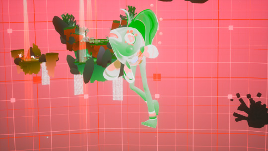
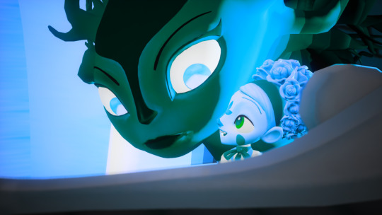
#Tatiana Palette
Photo
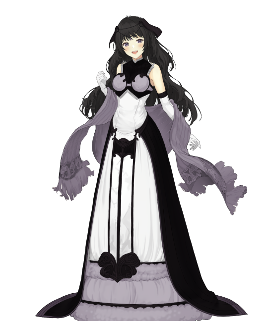
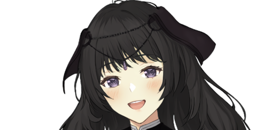
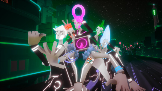
(Mod Toto) Today’s reshare is Tatiana with Madoka Magica Homura Akemi’s color palette!
They share their english VA, Cristina Vee!
#Tatiana#homura akemi#puella magi madoka magica#madoka magica#Magical Girl Madoka Magica#voice actor jokes#fire emblem#fire emblem echoes#fire emblem echoes shadows of valentia#fe echoes#fe15#fe sov#fire emblem heroes#feh#fe#color palette edit#feh edit
33 notes
·
View notes
Text
𝘐𝘵’𝘴 𝘯𝘰𝘵 𝘦𝘢𝘴𝘺 𝘣𝘦𝘪𝘯𝘨 𝘨𝘳𝘦𝘦𝘯.
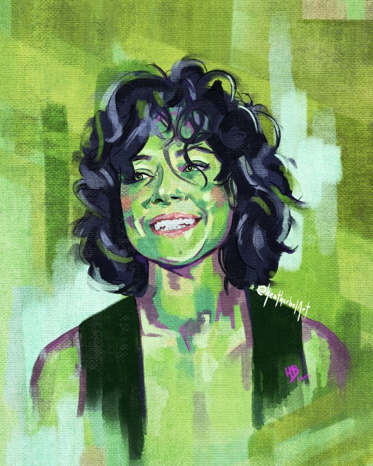
Tatiana Maslany blew me away with her work in Orphan Black and I’m really loving She-Hulk so far 💚
I had a lot of fun with the challenge of painting in such a wildly alternative palette!
Painted on Procreate in digital oils and charcoal on a waxed canvas.
#she hulk#tatiana maslany#she-hulk#she-hulk attorney at law#tatiana maslany fan art#she-hulk fan art#marvel#mcu#marvel fanart#jennifer walters#hulk#marvel phase four#marvel phase 4#portrait painting#fanartist#fan art#artists on tumblr
5K notes
·
View notes
Text
The Shadows of Valentia (+ Cipher DLC characters) bracket qualifier! Starts Thursday, May 2nd at 3pm EST
Here's how it's going to work:
There are going to be eight qualifying polls (five for the men, three for the women)
Pick your most bangable favorite from each poll
Polls will run for one week (I'd prefer 3 days but alas Tumblr doesn't offer the option yet)
The top 32 male characters and the top 16 female characters will qualify for the men's and women's bracket
Polls:
Qualifier 1 (Alm, Gray, Tobin, Massena, Clive, Lima IV, Grieth)
Qualifier 2 (Luthier, Python, Zeke, Desaix, Forsyth, Mycen, Blake)
Qualifier 3 (Boey, Saber, Slayde, Valbar, Leon, Kamui, Conrad)
Qualifier 4 (Wolff, Atlas, Jesse, Deen, Halcyon, Nomah, Rudolf)
Qualifier 5 (Berkut, Gazelle, Jedah, Fernand, Randal, Lukas, Duma)
Qualifier 6 (Faye, Silque, Clair, Mathilda, Irma, Tatiana)
Qualifier 7 (Liprica, Celica, Mae, Palla, Catria, Nuibaba)
Qualifier 8 (Sonya, Rinea, Mila, Yuzu, Shade)
I am also adding a Google Form to submit characters for an enby bracket so Limstella, Kyza, Mark, and Bramimond don't get left out. These can be characters from any game as long as there is canon basis for them being nonbinary.
Extra notes under the cut
Characters who are excluded from voting:
Anyone who obviously both looks and acts like a literal child. Some characters are borderline so discretion may be used
Palette swaps or characters who are mostly the same portrait with only slight variation to hair, outfit, etc. (I consider Hestia and Marla to fall under this category)
Anyone who lacks either a portrait or a unique name
Characters who do not have a unique human form (e.g. Grima is technically part of this game, but only appears in dragon form)
Special Notes:
There are some characters who, for spoiler purposes, technically have two different names and/or portraits. For simplicity sake I just picked one portrait/name to use for them.
I know the cipher characters are technically original to Cipher, but they're functionally SoV units in this game. And I don't really know where else I'd put them.
I am not using the unofficial datamined ages. I just think it's going to lead to way too much splitting hairs.
8 notes
·
View notes
Text
I did some more digging to get you guys the inverted disctricts, but I ended up figuring out a way to make it look less green and have a more accurate colour palette (since every district basically had the same colour)
I might need to make a part 2, but here's what I got,,,,,
Festival Plaza/B2J
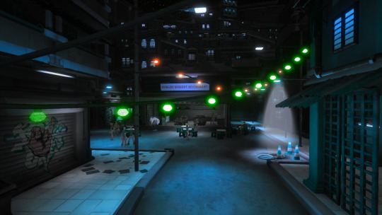

Cast Tech/DJSS

Akusuka/Sayu

Natura/Yinu

Metro Division/1010

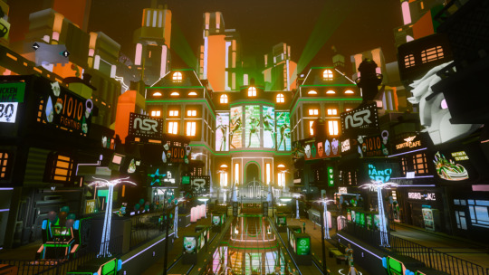
Eve and Tatiana in part 2 ! !
25 notes
·
View notes
Text
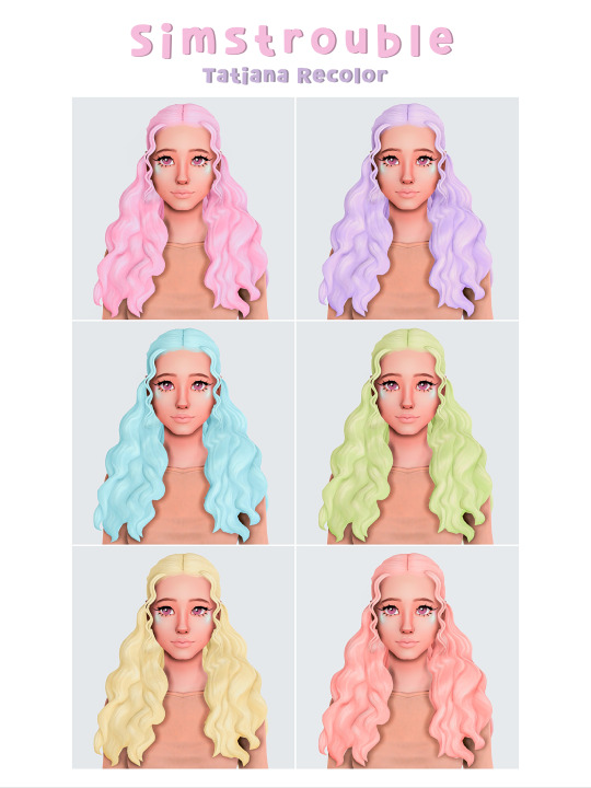
Simstrouble's Hairs in Anathema Palette Part 2

More recolors of amazing curls by simstrouble! I'm living for these.

🌸 20 swatches in anathema palette by @dustflwr
🌸 meshes by @simstrouble required
🌸 CAS standalones with my custom thumbnails for easier search
Meshes: Kima / Tyler / Tatiana
Download: SimFileShare
Please let me know if there are any issues and have a wonderful day 🤍
#heart-syrup#my recolors#anathemapalette#s4cc#ts4cc#ts4 cc maxis match#ts4 hair#ts4 cc hair#ts4 cc female#ts4mm#ts4#sims 4#maxis match#bgc#ts4 recolor#ts4 recolor dump#s4 recolor dump#s4 recolor
125 notes
·
View notes
Text
Just finished Last Exile
The aesthetics are peak and I am responding so unreasonably positively to this drab palette, camera shake, layered synth music, and artificial film grain. The particular flavor of machinery is also doing a lot for me.
Would have liked more episodes of 'underdog couriers Klaus and Lavie'. As much as I enjoyed the "show don't tell" aspects of the worldbuilding, it would have been nice to get more consistent exposure to how Blue/Claudia/water all go into Vanship fueling. I guess it's my priorities in world building shining through - much more interested in the sociological aspects of the magitek (why is Claudia both fuel and currency? How does water get purified and rated in Anatoray?) rather than the pure mechanical stuff like the big flying gunships, and it's easier to see those bits when the stakes are lower.
At the end of the day I can see why it is considered a cult classic among nerds that enjoy this stuff. Like, yes the floating space colony concept needed to be confirmed via supplemental material but man. So many concepts that have been thought out but only get a few min of screen time. This is my jam.
However I am really mad that none of the reviews actually mentioned that this was a goddamn harem show. I could forgive the love triangle but the kiss from the princess/XO was just so bizarre. Like, I know there was a stint of "different hair, different lady" trope being popular around this time but it was still so left field. The manga doesn't help by rehashing the Tatiana/Lavie/Claus bit again. And anecdotally can't tell if Claus' nobility heritage was just super obscure in world vs the author forgot but the whole bit with Tatiana's uncle was just one big eye roll. And mixed feelings on Alister somehow transforming into a drama lover.
The only character I really got attached to was Lavie but I could see glimmers of what might have made the other characters more compelling had they been presented better (Claus' obsession with finishing a job felt like there was more to unravel, Alex's angsty revenge plot didn't have quite enough meat to make me commit, and Dio's arc went out with a whimper. Also Mullin going back to be cannon fodder was pretty weird, what a confusing way of showing him figuring himself out.)
Also the ending theme slaps, while the opening is also growing on me like mold.
Time to watch the much bouncier looking sequel.
2 notes
·
View notes
Text
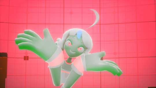
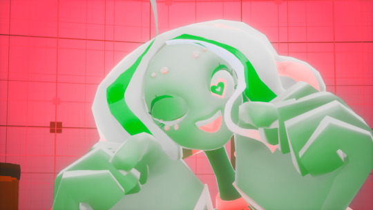
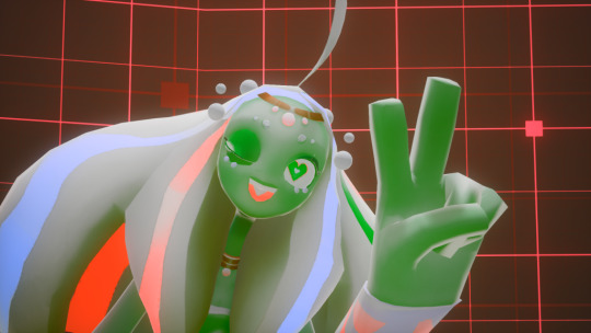
Palette 9: Tatiana
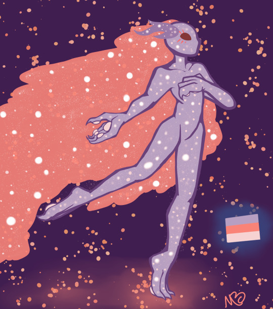
A creature made of stars and full of love to give
she gives the best hugs this side of the universe
#oc artwork#my art#oc art#digital art#oc#millbrook au#stars#creature#pretty#made of stars#a bit ethereal
2 notes
·
View notes
Text

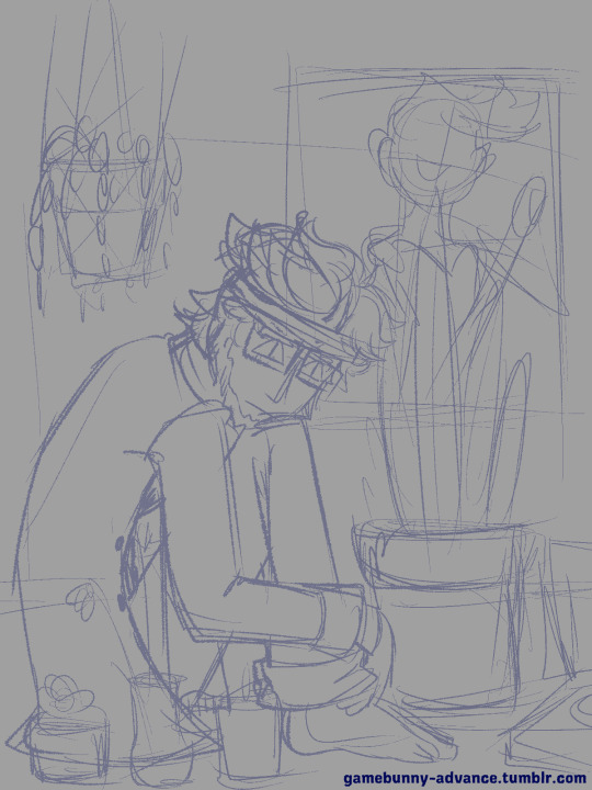
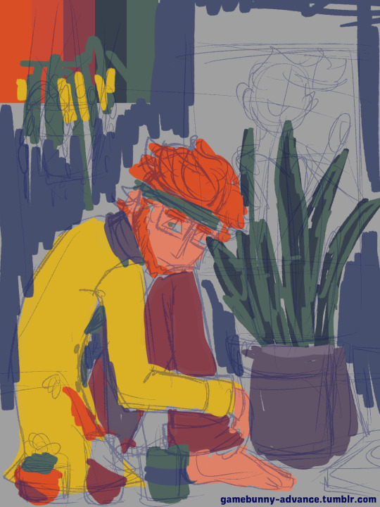

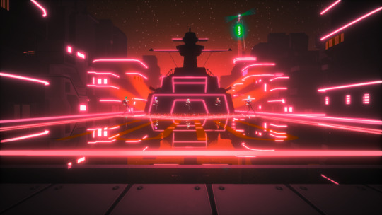
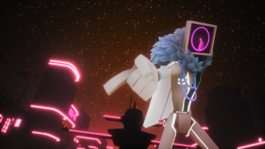
"Plants" Process (Initial Sketch | Layers)
Sure, might as well talk about this one, because I actually have a bit to say about it.
So the title I uploaded this with, "Say you will about NSR..." was originally a (*mis)quote he says in the game when you fully unlock the Natura district. The line isn't especially significant, but I've always thought of it as surprisingly "quaint." It's very small, but it serves to humanize him just a little bit when up to and after this point he's dipped into cartoon-style villainy. These brief moments of honesty within his duplicitous nature is a part of why I find him to be an endearing character.
*The actual quote is, "Say what you want about NSR..." but I mistyped it when posting it. The meaning of the line is basically the same, though.
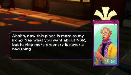
Due to this line, I've had the idea of drawing him surrounded by plants for a while. My first iterations of this idea usually involved him on an apartment balcony adorned with plants and overlooking the city. Sadly, my visions for the scene exceeded my artistic ability, so it's an idea that's been on the back burner for a while.
[A sketch I did last year based on the idea.]
It wasn't until I just randomly thought to come back to this idea that I sketched this piece.
But tbh, I don't think my vision was very clear. There's no sense that he exists in a real place (why in the world would a hanging planter be hung so low, XP). All I knew was that I wanted to draw him surrounded by plants, and that originally I wanted the color palette to be very limited.
Very recently, the SiIvagunner channel had uploaded a parody video of the Yona Yona Dance MV, which led me to listening/watching the original video (which I somehow managed to never see up to that point).
youtube
I found the limited color pallet of the video to be very striking, and I wanted to make something inspired by it combined with the experiment I did with my recent Kliff x Tati piece, which also only used about 4 colors.
However, I am abysmal at color picking, so I grabbed a color palette from @/color-palletes (link) to help the process along. In the end, I couldn't keep myself from trying to use all possible colors. Strictly speaking, there's a shade of every color in the rainbow in the final piece, which is about as far from a "limited palette" as it could be. Nonetheless, I think the darker tones of the colors do help to tie everything together, so it feels more limited than it actually is.
To return to discussing the sketch itself, there were a few ideas that changed and evolved throughout the process.
Besides moving some of the plants around, an idea I had that didn't get fully realized was that the three smaller plants in front of him were supposed to represent the game's rockstars: Mayday, Zuke and Tatiana. I had difficulty making that happen with the limited palette: since May, Kliff, and Tati share a lot of colors (notably red), and one of Zuke's main colors is green, the same color for the plants, it was difficult to main the references while still having them all not blend into each other. Perhaps with more time to think through the idea I could have reached a compromise, but as things are, that reference was more or less lost.
To get it out of the way: there isn't any real symbolism behind the plants chosen. They were picked strictly on their aesthetic value/ease of drawing them. If you wanna stretch, the Zuke vase is holding red flowers (poppies), so it's kinda referencing that time his hair was set on fire, but that's totally incidental~ However, I will say that originally that vase was supposed to hold orchids since it's apparently a flower common in Malaysia, but I had difficulty drawing them and settled on poppies. Hibiscus plants were also considered for similar reasons, but as someone who's actually grown up around hibiscus flowers, I knew I didn't really have another place to put them since those plants actually get really friggin' big.
Something else that was lost was the poster behind the snake plant. Originally I had thought to put a poster of Kul Fyra on the wall, but I honestly got pretty lazy about adding the details. That and Kul Fyra's colors would have blended into Kliff hair since she's a combination of reds and yellows. But that space felt so empty without *something* there, so I messed around with random shapes and eventually just landed on putting up some records. It's a generic detail, but I do feel like they add a "pop art" quality to the piece.
To conclude, this was very fun to work on and the turnaround on it was fairly fast. Usually for pieces like this, the process takes me a few days, but I sketched and finished this all in the same day. Had I given myself more time to sleep on this, I might have worked a little harder to incorporate some of my other ideas and clean it up a little more. That said, this is still one of my favorite pieces as of late, and I hope that I'm able to make more things like it.
#gbunny draws#nsr#kliff#gif#should i main tag this again?#i don't think so#y'all are the only ones that really benefit from hearing me ramble#if you can even call it a benefit#something i didn't mention is that i actually struggled with the face a bit#i didn't like the initial expression that much#it was a little soft for my tastes#the triangular eyes are just something i borrowed from the 'anniversary' piece i did a while back#i dunno why i did that in either case since his eyes are typically downturned#but they helped him to look sharper#so i'm okay with it
11 notes
·
View notes
Text
Here is Simstrouble's Tatiana hair recolor in my cotton candy palette 🥰.
YOU MUST DOWNLOAD THE MESH >HERE< FOR THIS TO WORK!!
Download recolor >HERE< 💜
#the sims 4#ts4 simblr#sims 4#ts4#sims 4 cc#sims 4 custom content#sims#ts4 maxis cc#sims 4 maxis cc#ts4 cas
19 notes
·
View notes
Text
Review: Max Edwards newest bedroom pop single ‘Give It All Up’ explores the nuances of love and heartbreak within a scattered downbeat sound
Max Edwards is no stranger to us, an upcoming indie gem that debuted his first single in the midst of 2020. Through following songs like ‘This Is Where I Leave You’ and ‘We Could Be Lonely’, Max has only continued to garner new audiences and prove why he’s something special on the music scene. Now as we hit 2024, Max delivers his newest song ‘Give It All Up’, the first he’s ever done 100% of the writing, producing, and mixing on - and that careful consideration and crafting is very much clear.
Like always, Max isn’t afraid to keep it raw and personal, channeling some of his real-life experiences into a musical experience that many can likely relate to their own woes. That intimate nature is one that carries straight through to the sound, slowly dancing in a bedroom pop haze of smooth electric guitar plucks and Max’s floaty vocals entwined in sweet solitude. Together they’re dreamy and sincere, slow and tranquil but not distinctly sad, simply wallowing but with such a vibrant palette it’s like despite the aching you always know blue skies lie ahead. The chorus shift embraces gentle backing hums in layers, light twinkles in sound and a loose change to the staple riff with more of a lingering hesitation in the soundscape. Max’s every word is all the more mesmerising too, his slightly raspy delivery carrying through flecks of emotion in every bristle of pain. Everything about it is mesmerising, and yet just when you feel like you know what you’re in for, ‘Give It All Up’ changes entirely.
Finding itself in scattered electronic beats, more angsty spoken-sung vocals and whirring backing effects, ‘Give It All Up’ shifts towards an indie and alt-pop vision of sound - and it’s still just as gripping as ever. As attitude finds itself a little more central to the previous downbeat admissions, this change also allows for a mirroring of emotion that’s so much more than just what you’d expect, exploring every avenue of Max’s built-up thoughts and feelings.
Clearly exploring some kind of heartbreak and the tumultuous strain it’s placed on his life, Max hides nothing as he wears his heart on his sleeve and his story cathartically penned for all. Jumping in headfirst, one of the opening lines rings out ‘all we need’s a little holiday to forget the truth’, clearly seeking an escape from the reality he’s living through. Continuing ‘with one another we tend to lose’, the toxic nature of the partnership he’s in is made boldly clear, an admission that he knows better and yet cannot tear himself away. Questioning in the pre-chorus ‘if I take a little time away will I find myself to you?’ , the song still feels ladened in misplaced hope, expecting something to change in a situation that’s not worth the hassle. It’s hard not to relate as the chorus pours out with all of the good though, rose-tinted reflections like ‘lips that taste like candy when I kiss them’ make it harder to walk away, caught in the highs and brushing away the lows. What’s most interesting about ‘Give It All Up’ is how much there is to pick apart though, a narrative never expressed with complete clarity, leaving you to find your own meaning and understanding of Max’s every word. The limitation there is just as important, wanting his art to tell the story rather than plainly telling it himself, allowing for ‘Give It All Up’ to feel just that bit more raw.
Keep listening to ‘Give It All Up’ for yourself here, it’s worth it.
Written by: Tatiana Whybrow
Photo Credits: Unknown
// This coverage was supported and created via Musosoup, #SustainableCurator.
0 notes
Note
hi hi!! thank u for answering my previous ask 🥹 ik u do requests, i was wondering if u could do simstrouble’s tatiana hair and gegesimmers raquel hair in the sorbet palette 🥹. no rush and have a good day 💖
Hii !
Sorry for the late answer !
Coming 12/8 (or 08/12) !
(no preview for the raquel hair since 'im not done yet BUT it's coming too !)
Have a wonderful day or night ! ♥

1 note
·
View note
Text
Hotel Rwanda
You know that movie about the hotel in Rwanda during the genocide? Yeah, that's the one. Hotel Rwanda is an absolute gem of a film that left me speechless after my first viewing, and it still hits me hard every time I watch it. Some people might think it's just another sad story from Africa, but they're missing out on a powerful, heart-wrenching experience.
Hotel Rwanda is set during the 1994 Rwandan genocide, when the Hutu-led government ordered the mass slaughter of Tutsis. Don Cheadle stars as Paul Rusesabagina, the manager of the Hotel des Mille Collines in Kigali, who saves more than a thousand lives by providing shelter to Tutsis and moderate Hutus in his hotel. The movie is a masterclass in storytelling and tension-building, thanks to director Terry George.
George uses various film techniques to create a sense of realism and urgency. He chooses to shoot the movie mostly handheld, giving it a documentary-like feel that makes the events seem more immediate and personal. The color palette is dominated by earthy tones, reflecting the grim reality of the situation, while the occasional bright spots of color serve as a reminder of the humanity that still exists amid the chaos.
The movie's pacing is also carefully crafted to keep you on the edge of your seat. As the situation deteriorates, we see Paul struggling to maintain control and protect those he's responsible for. The tension keeps building, with moments of hope and despair coming in quick succession, leaving you emotionally drained by the end.
Hotel Rwanda's success is due in large part to the incredible performances from its cast. Don Cheadle delivers a tour de force as Paul, showing the full range of his character's emotions, from fear and desperation to determination and strength. Sophie Okonedo, as Paul's wife Tatiana, also gives a heartrending performance, while the supporting cast brings depth and nuance to their roles.
One of the most impressive aspects of Hotel Rwanda is how it balances the brutality of the genocide with the human stories at its core. The film doesn't shy away from showing the horrors of the event, but it also focuses on the resilience and courage of those who fought to survive and save others. This delicate balance is a testament to Terry George's skill as a director.
In conclusion, Hotel Rwanda is a must-watch film for anyone interested in understanding the Rwandan genocide and the power of human compassion. It's a harrowing, emotional journey that will stay with you long after the credits roll. And even if you're not into heavy historical dramas, the captivating performances and gripping storytelling make it worth your time. Trust me, this is one movie you won't soon forget.
It earns an 8/10 on the scale of genocide themed movies :)

1 note
·
View note
Text
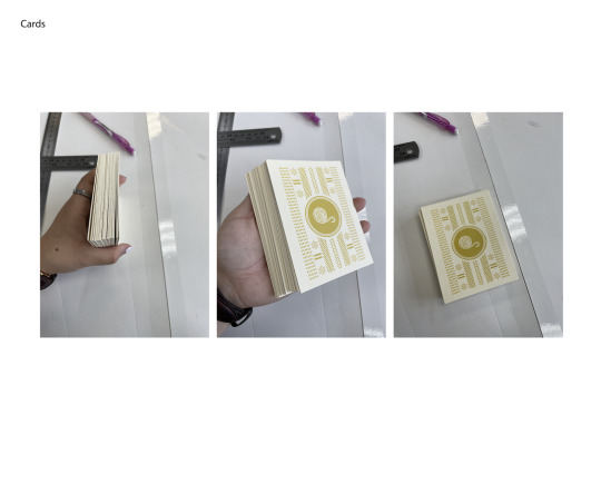
Week 10- Card making and illustrations
Illustrations:
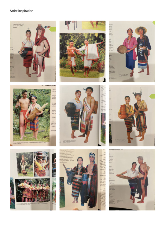
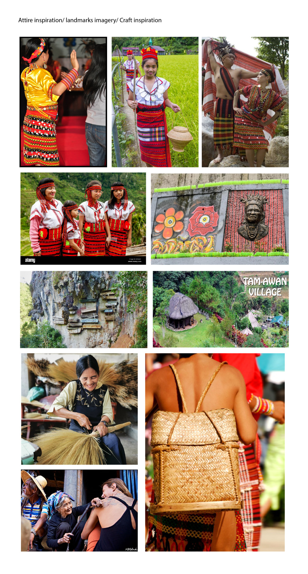

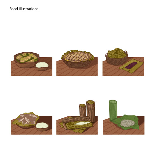
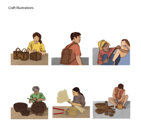
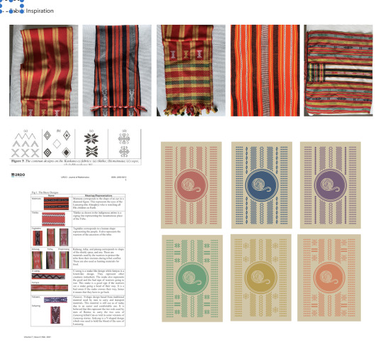
For the Illustrations, I took inspiration from some Cordillera books to use them as my references. For the cards, I had a set of 27 cards and 4 categories- attire, food/rice, craft and chance cards to make and illustrate.
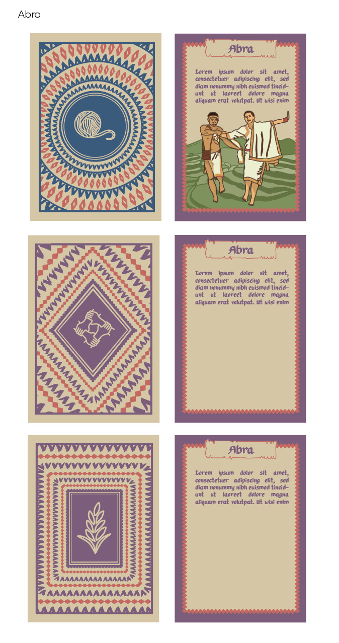
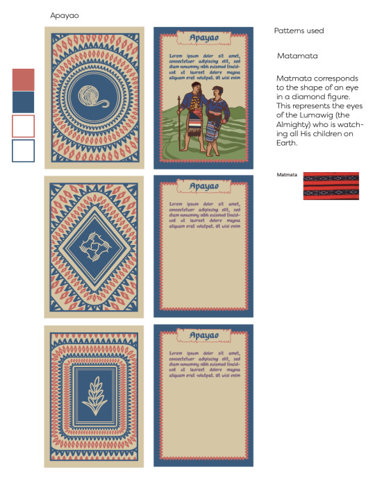
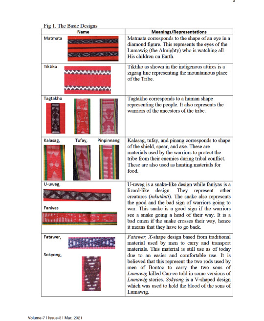
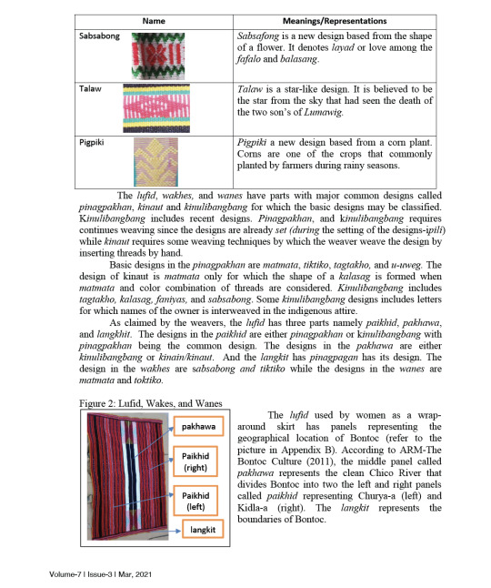
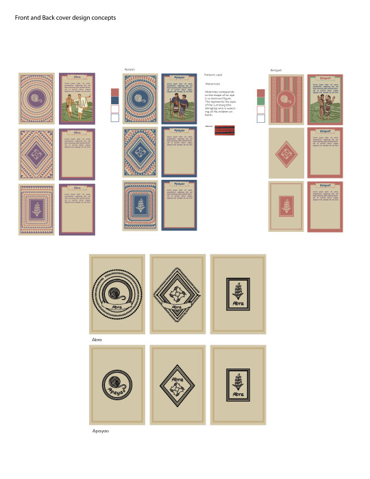
For my card design I took inspiration from the back of the game mat and from the geometric designs from the attires. I initially had the idea for the patterns to follow the shapes of the resource tokens but thought that it was too busy and had changed the layout to linear pattern and layout instead- which was cleaner to look at and would not take away the attention from the game mat when you place the cards on the game mat.
To make the cards still cohesive, I had image traced one of the attires and had used the shapes to be a reoccurring pattern among all the cards. I had also chosen one geometric shape for each province to differentiate the cards apart while using the color system.

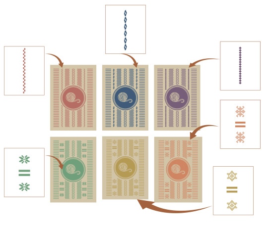
For the chance cards, which has a similar look to the game mat, I had incorporated all the symbolic elements to unify all the patterns onto one card while still keeping the linear layout.
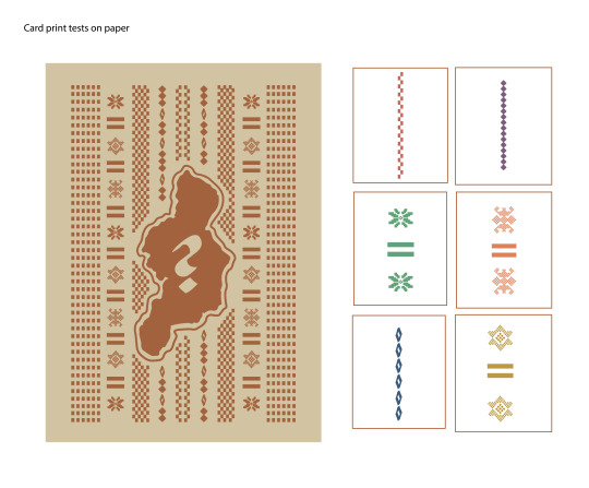
Card Production:
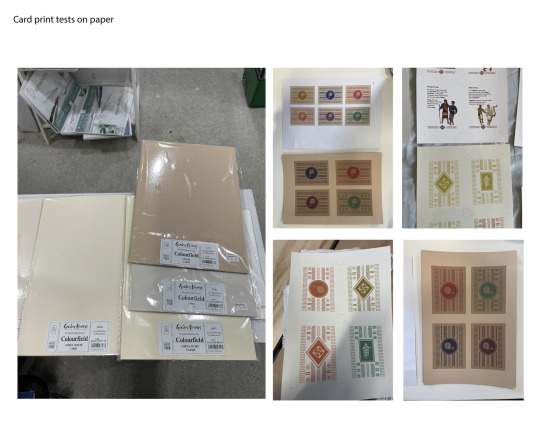
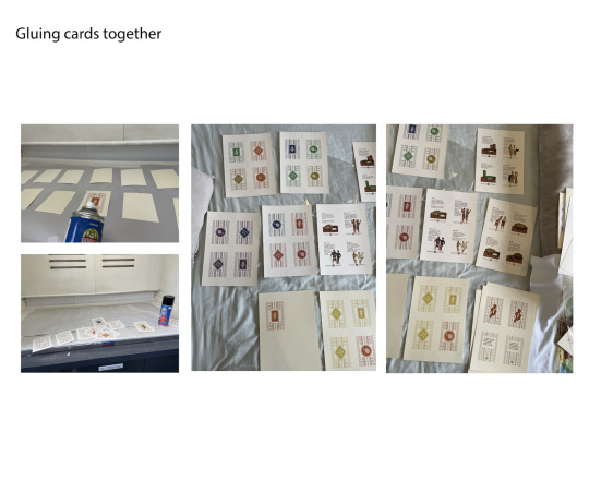
With the card stock for my cards, I took a trip to Gordon Harris and had a look at different card stock from brown to cream to continue the warm color palette. The thickest card stock I could find was about 270gsm with the colors I wanted. Tatiana had suggested to stack two papers together to have a thicker card stock to make the playing cards have more weight to it and have a card play.
I had also used spray glue to glue the front and back cards together in the spray booth at the AUT bindery. I have also realised that I have purchased two different cards which have slightly different weights and colors to it. So, I had used the darker cream color for the front of the cards and the lighter cream color on the back.
0 notes
Photo
Ностальгия по тёплому лету, Хмурым днём, в листопад, Золотыми узорами юности Украшает багряный парад. Летней дымкой плывёт аромат Южных роз в облаках Рисуя небесным огнём наугад Зарево жизни и бал-маскарад. Меняются лики звёздных зеркал Веером пляшущих масок В триумфальный финал Муз музыкальных красок. Яркой палитрой звёзд, Кистью живого мастера Создаётся шедевр Земли Вселенского мастерства. Княжна Татьяна Романова Nostalgia for a warm summer On a dull day in the leaf fall With the golden patterns of youth Decorates the crimson parade. Summer haze floats in the clouds Like an aroma of southern roses Drawing with the heavenly fire at random The glow of life and the masquerade ball. Faces of starry mirrors changing, Like the fantail of dancing masks Towards a triumphant final Of Muses of musical colors. A bright palette of stars By the living master's brush Creating the Earth’s masterpiece With the Universal skill. Princess Tatiana Romanova La nostalgie pour un été chaud Par une journée sombre dans la chute des feuilles Avec les motifs dorés de la jeunesse Décore la parade purpurin. La brume d'été flotte dans les nuages Tels l'arôme de roses du sud Dessinant avec le feu céleste au hasard La lueur de vie et le bal mascarade. Les visages des miroirs étoilés changent Tel un éventail de masques dansant Vers une finale triomphale des Muses de couleurs musicales. Une palette lumineuse d'étoiles Par un pinceau de maître vivant Est en cours de création Tel un chef-d'œuvre de la Terre De la compétence universelle. Princesse Tatiana Romanova (à Saint-Jean-Cap-Ferrat) https://www.instagram.com/p/CkRKNu4DGx-/?igshid=NGJjMDIxMWI=
0 notes
Text
5.1 and 5.2
Today during class I had a really useful long talk with Tatiana about my project and my projected next steps. I initially just needed clarification on my proposal and this was where the conversation started. I needed to understand the difference between my exegesis and my proposal. I was confused because the line between 702 and 703 seemed blurred and I was finding it difficult to differentiate between the exegesis and the proposal and what I discussed in each. This was clarified by Tatiana to be linked - the proposal should serve as a summary of the exegesis and contain content that will be explored in depth in the exegesis down the road. The metaphor she used was a ‘skeleton’ of the final exegesis. This really helped me to understand that the in-depth concepts am planning on addressing in my exegesis should be in my proposal rather than just informal information that doesn’t hold much value. My first draft of my proposal is not very relevant and I am going to rewrite it so it holds more meaning. Tatiana said that this is not necessarily a priority since the proposal won’t be graded since its only a formative however I want to take advantage of the time I have now to fully frame the ideas I am exploring in my exegesis. For me to be able to rememberer the conversation Tatiana and I had I am going to lay out our conversation about each chapter for my proposal, and in turn my exegesis, here.
Chapter 1 of exegesis/paragraph 1 of proposal:
Positioning - I have already written this section and am happy with where it is at. I want to rewrite my positioning for my proposal to more actively summarise my in-depth writing in my exegesis.
Chapter 2 of exegesis/paragraph 2 of proposal:
Introduce my audience and my design problem, which is the lack of encouragement of creativity and imagination in adulthood. In this section I will explore my two main contexts - Imagination and creativity in adults and tabletop gaming. The first part will explore:
1. The relationship between imagination and creativity as concepts
2. The relationship the average adult has with imagination and creativity.
The second part will explore tabletop gaming:
1. Dexterity, drafting and story-telling games. Exploring the game types relative to my project and the functionality of them.
2. Reflect on games that relate to my game - Pictionary, charades, etc.
3. The concept of pop up or 3d board games - examples and reflections of 3d games
Chapter 3 of exegesis/paragraph 3 of proposal:
The ‘practices’ section / the methodology of my proposal in particular needs a face lift - right now its a lot of information that is not super helpful in understanding the depth of my project. I need to outline the user experience aspect of my project and talk about the test sessions I plan on having in a pragmatic way.
1. My methodology is user experience. Under this umbrella are numerous methods I need to explore like:
PART A) Playfulness and user sessions - How a game functions in a practical sense. I need to prioritise my game FUNCTIONING. It needs to be usable and fun for people. To guarantee this I need to create sessions where the game is tested, both as individuals and in a group scenario.
PART B) Mood boards and visual exploration - How can I explore the visual aesthetics of the board game? How can the visual exploration improve the functionality (consistency in illustration and colour palette etc.) Talk about the slide packs being different aesthetics due to functionality, and the limitation of the variations in each slide to make it cohesive when playing.
PART C) Paper cut out and prototype experimentation - material thinking - consider the construction of the slides and layering techniques used - tunnel books, construction of the slides. Parallax as a constructive concept/technique.
Chapter 4 - Critical commentary
Reflect on each of the topics addressed in previous sections in relation to MY GAME. How has each concept influenced my games function?
1. As a story telling game…
2. As a popup game…
This section is not in the proposal so it was not discussed in depth just a brief over view and because this is such a large chapter it will be introduced and written further into the paper. It will be a reflection of the concepts discussed before in the other sections so this gave me the understanding not to discuss or comment on the subjects in relation to my game in depth in the previous chapters.
0 notes
Text
Week 4.2: Binding Research + One-on-One
Binding and Publication Inspiration
I am looking for alternative ideas to the printing and binding process so I can expand my palette of ideas and perspective on how the ‘making’ of this publication can be executed.
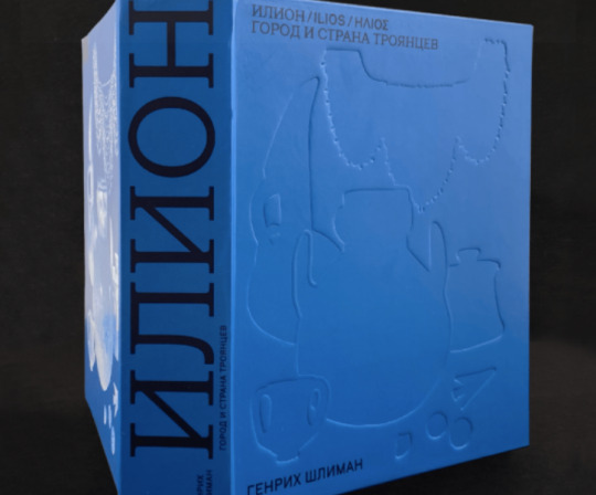
Embossing and Type Hierarchy
These examples explore the use of large and bold type in the content of the publication that I would like to play with in my own work. I like the symmetry in colour and the balance that the large lettering supplies. I like the thick cover and would potentially like to explore the idea of embossing into my publication cover, perhaps the title or a simple image like shown below.


Sleeves
These show a take to the binding process with a sleeve cover. I liked the sleeve here and it would be a unique addition to my publication. However I would need a way to tie this appropriately into my project. Perhaps the sleeve could work into the cover itself?
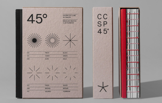


This detailing below is something else I would like to implement on my cover if I do not decide on the embossing. I thought having a small detail like this for the title would give it a more professionally done and detailed feel to it.
Since I am working with tattooing, many textures are involved in the process such as ink, skin, paper, parchment, stencils, etc. I want to extend this into my own publication so it can include a textured feel to it too.

String Binding Methods
The invisible spine on this publication is an interesting example of string binding. I like the flexibility it gives this book and it feels as if it gives a more personable and traditional feel to the design.
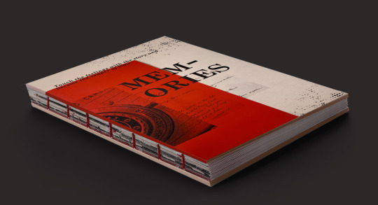
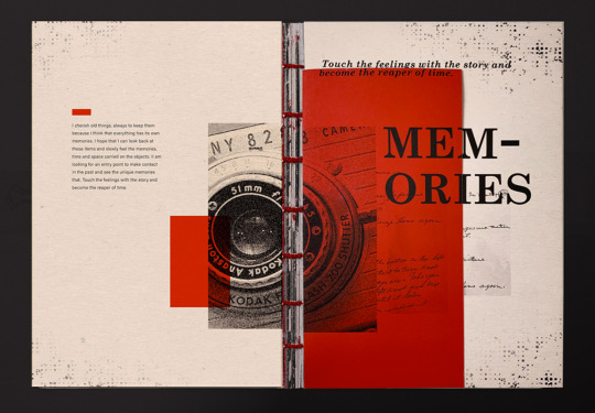
The gap in this publication is another cool way to approach a sectioned publication. Although it may not be applicable to my process it is useful to see the ways you can get creative with book making.
These string bound references shows a cool trick with the spine work. Rather than including a common spine that lays flat the text is displayed across many layered sections of the book.

Some more varied examples of different string formations and methods in binding that I found cool!


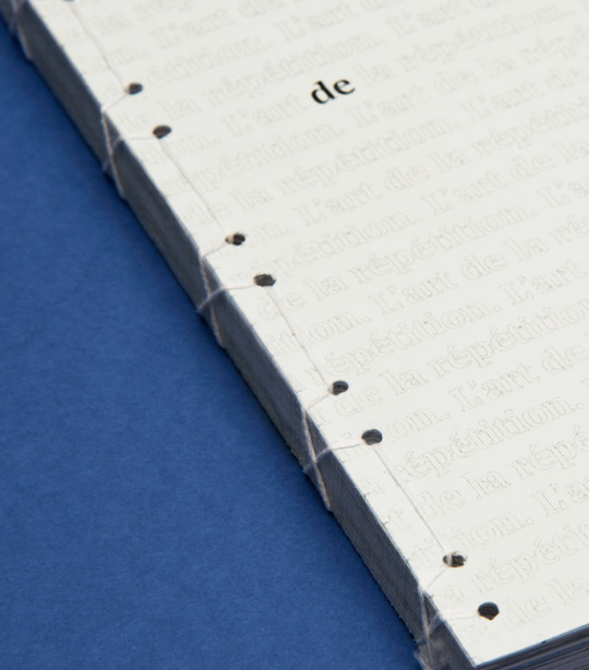
Some Japanese Methods of Binding


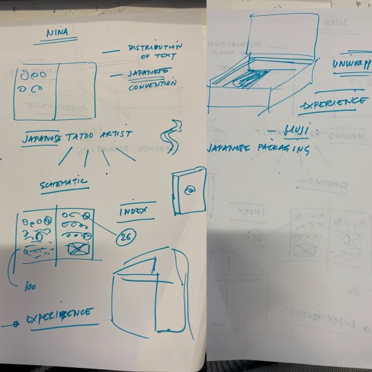
One-on-one Discussion.
Additionally in class I had a brief one-on-one session with Tatiana disclosing the direction to this class, my current progress on the project, and steps I've taken in terms of both research and creating. This helped me to expand my thinking of what my final design outcome could be created into. Possibly playing with the texture, interactivity, and form of the final publication.
Considering it is a book on tattooing which is considered an experience and quite a personal thing, maybe the publication could have a more collaborative aspect to it where the reader can interact with the contents. This could be done with things such such as tracing paper, and index with the designs where the reader can draw or select symbols, or even separate sections or pockets tp the publications where you can pull out designs and place them on your body to see how it wraps on your skin.
Tatiana discussed that in Japanese packaging there is a heavy emphasis on the actual unwrapping of items. Potentially the usage of sleeves or a contained space for the publication to sit within that provides the act of unveiling the item within could pay homage to Japanese culture and design best. Overall this opened my perspective on what my final outcome could actually be and that it is a constantly developing and growing idea. I’m going to try work with some of the ideas above as I progress to see what I can do to make my publication a more interesting and unique experience to the reader just like a tattoo is supposed to be
0 notes
Last Seen Blogs

greenwitching
Spend Your Days Biting Your Own Neck
wangxianficrecs
Wangxian Fic Recs

krystine-31652
Untitled

thiccinfinite
The Thiccest of Thicc

f-identity
this existence has been downgrading for a while