#SO MUCH SO THAT I MADE MY CLUNKY VERSION OF PHOTOSHOP FIGHT FOR ITS LIFE MAN
Text
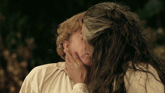
No because, the way Stede keeps his eyes blissfully closed well after the kiss ends, and the way he looks so fondly at Ed when his eyes finally open, and the way you can see Ed’s cheeks tilt upwards with the start of his own smile, and the way Ed keeps his hand gently on Stede’s face, and the way they stay so impossibly close together, and the way Ed’s nose brushes against Stede’s because they’re so close together, and—
#OFMD#Gentlebeard#Blackbonnet#Stede Bonnet#Edward Teach#Revenge Rambles#Edit#anyway yeah uhhhhhh#do y'all ever repeatedly watch the kiss and cry lmao#do y'all ever repeatedly watch the kiss just to pick apart all the little beautiful details#BECAUSE I DO#I SURE DO LMAO#SO MUCH SO THAT I MADE MY CLUNKY VERSION OF PHOTOSHOP FIGHT FOR ITS LIFE MAN#like listen it's so bad that i'm even focusing in on taika/ed's eyelashes#like you can see them open almost as soon as he pulls back#and then they dart down and back up again#almost like ed was nervously anticipating a reaction#or maybe even considering going in for another kiss#or both#like#hello?#HELLO???
2K notes
·
View notes
Note
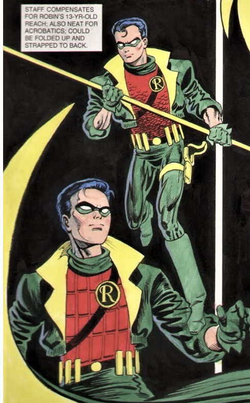
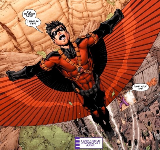
So since pretty much everyone agrees that Tim needs a name change, and I think most people dislike the first two RR costumes (I dislike the pretty much Robin one too, because it seems like he hasn’t accept losing Robin, when I feel a lot of his comics right after Bruce W died was about that?) which leads me to: What do you think Tim’s costume would look like if he got a good outfit, and what name?
o yeah i was not a fan of the cowl. and the n52 design is just… so busy and excessively accessorised (excessorised???) - i drew it a couple times for this project im workin on and the whole process was me squinting at reference panels and whispering softly but passionately “what the fuck” - and i agree on the rebirth RR design, it looks more derivative of dick and jasons retconned robin costumes than inspired by tims og 80s design (however. the unternet costume - its simple and appealing and clearly nightwing-inspired and i am a fan, also the giant scythe/halberd/mace thing was so ridiculous i loved it)
which is why i thank pat gleason for my life bc tims new outfit is such a good modernisation of his original robin design. so i mean to answer ur question i think tim has a p good design right now (although not for long i guess since they announced hed get a new look/codename soon) BUT if i were in charge of debuting a new design and name… hm……….
whatever his new name is, it’d preferably have something to do with wherever his personal storyline is headed, which i dont know, and for all my complaining abt how red robin is a shit name i dont actually have great alternatives lol. i did see somewhere the suggestion for the name “Cardinal” which i dont hate, so ill use that as a placeholder for now (although “Halcyon” is an interesting option)
tangentially, my personal preference for his robin graduation would be a miniseries featuring tim and damian both as robin, begrudgingly having to work together to fight some greater enemy and becoming true brothers along the way. ending with tim giving damian his blessing to be robin (a post-mantle blessing but still) with the first amicable passing on of the robin title literally ever
as for Look: his new design should a) accurately reflect his character b) mesh well with whatever tone his personal storyline is going for c) be a natural progression of gleasons newest iteration while still d) able to stand as its own iconic look
i always thought tim would do really well in a more grounded noir-style detective story, both using and especially subverting the tropes of the genre (for instance tim befriends every femme fatale and romances absolutely zero of them. theyre pals and have weekly movie nights or smthn) obvs using some of the mystery elements to springboard into classic comic wild times etc etc. theres also a great opportunity to include some more cyberpunk aesthetics to the look and feel ofthe story
i.e. tim is part of the waynetech r&d teams, working with them to develop new technologies, and proceeding to test out some of the prototypes while doing vigilante work (bc terry had to get his rocket boots from somewhere ok). gotham is still gotham, but its starting to see some of that neo-futuristic/blade runner flavour from batman beyond.
so. cyberpunk detective story starring cha boy tim drake. im not gonna draw it rn but lemme just gather some ref elements here in case i ever do
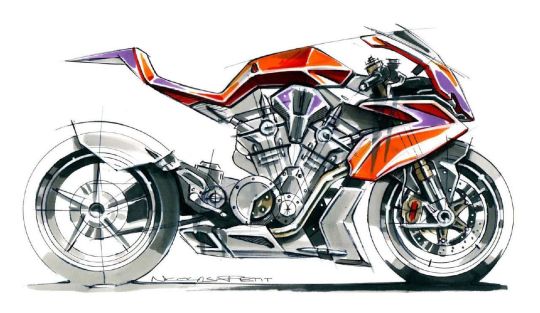
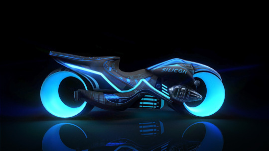
first off - motorcycle, obviously. redbird is back babey and this time its a two-wheeler. all his gear would be modded the hell out of, but the motorcycle itself would be an approximate balance of 70% ducati and 30% tron lightcycle situation. a speedy bike with ample room for the edgy overkill batfam aesthetic, with maybe a little akira in there who knows
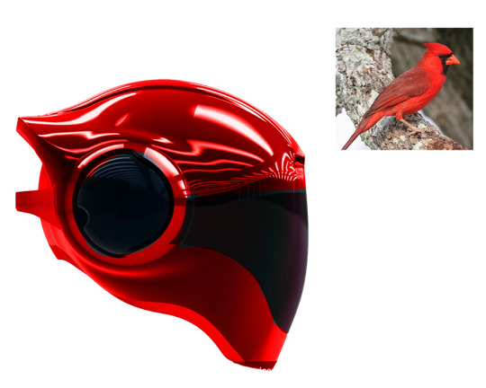
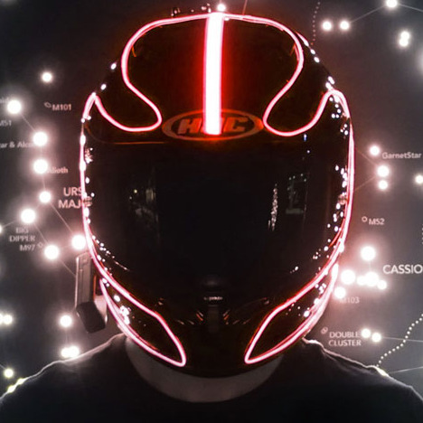
same goes for helmet; 70/30 on this modern/cyberpunk situation. heres a quickly photoshopped “cardinal” helmet lol
although theres totally room for some daft-punk leds in there. serving as a heads up display AND a fun neon aesthetic. I really want to play into that John Wick neo-noir situation.
besides that… ive got a preference for street style over the superhero spandex, so… detective jacket. every detective has a good jacket. norm breyfogle made a comment on his early tim robin designs that itd be pretty either/or on jacket vs cape, merging the two looked a little silly. for robin they probably decided on cape to keep things classic, but for cardinal i can do what i want
and i want to bring back some of this popped collar.
which i basically did for that other tim design i drew, which i still like, so this one would probably be at least a lil borrowed from that.
attempting to merge cape/jacket might end up smthn like these:
which admittedly i like.
admittedly… i do also like the concept of wings introduced in tims n52 design, i just think they couldve been hidden/incorporated better
greig rapson had a sweet robin design that had a sort of flight-suit (which dove into the actual mechanics??? i love) and since id want to dive into tim testing out waynetech prototypes, its a pretty good natural progression from him to terrys glider thing
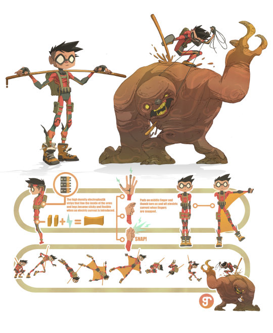
the whole ensemble would be fairly understated however - enough to semi blend in with any crowd, hero or civilian. after all the story focus would be just as much about solving the mystery as it is punching the bad guy
the various interchangeable gadgets would be both prototypes of terrys eventual batsuit, and also all the failed prototypes that never managed to get off the ground. just to add an element of tension/plot devices wherein tims gear could break or malfunction pretty much anytime.
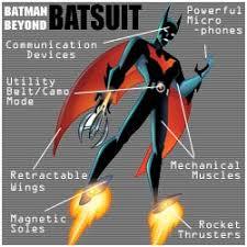
im fixated on this rocket boot situation though so itd be a paired down version of terrys eventual seamless/invisible design. still noticable and clunky, but working with the sleek modernish style outlined by gleason
smthn almost similar to the prowler actually from spiderverse - as in: Clearly Rocketboots, and clearly diy’d the shit out of, but still working with that Aesthetic
(most of the screencaps of prowler are dark af so im taking this from jesus alonso iglesias concept art)
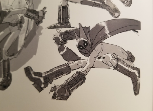
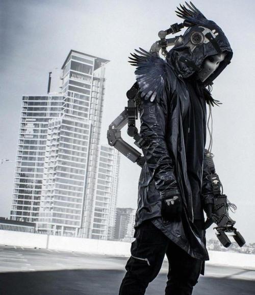
im debating on the addition of more overtly birdlike/cyberpunk elements, so ill add this here cause its dope as fuck (from ahmet atil akar).
and a lot of batclan capes tend to end with that concave spiked look, which works great for bats but not really for birds. a tailcoat might emulate the bird tail, but it also might evoke Penguin a lil too much idk.
also in the interest of keeping everything within the same sort of design language, i would Love to see some new villains emulating deconstructionist/architectural kawakubo fashion:
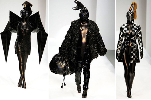
like could you imagine the supervillain potential
so uhhh yeah. budding cyberpunk detective story with a little noir and a little technological advancement progressing in fits and starts. taking from the gleason foundation with heavy black featuring brighter coloured accents and modern sleekness, made a little dorky via prototype technology, with some extra neon blade runner shit thrown in there.
depending on how much i love or hate the new codename/design reveal i might draw this via inspired motivation or spiteful motivation lol
661 notes
·
View notes
Last Seen Blogs
joao-50
Janelas
bonegloss
。゚✦ PEAK.・*00 ✦ . °
leona-helmsley
taxes...LOL
fradenburg
- ̗̀Sherlyn ̖́-

natatat-t
sorta art thoughts...