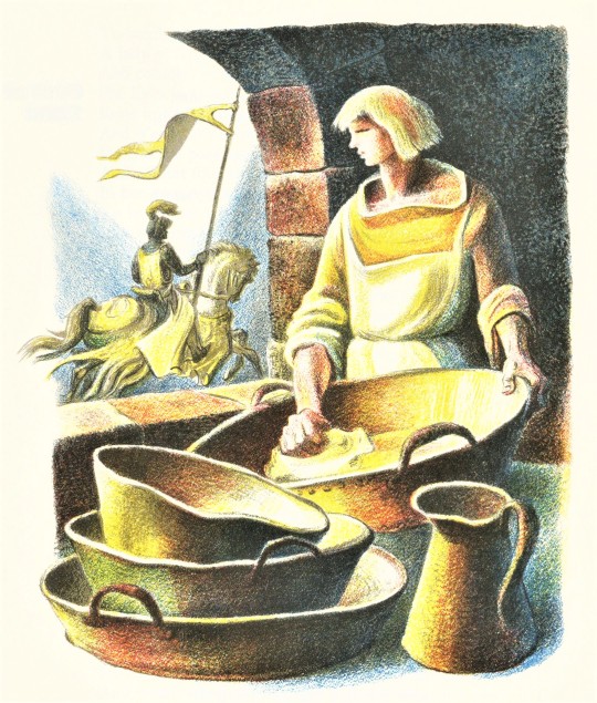
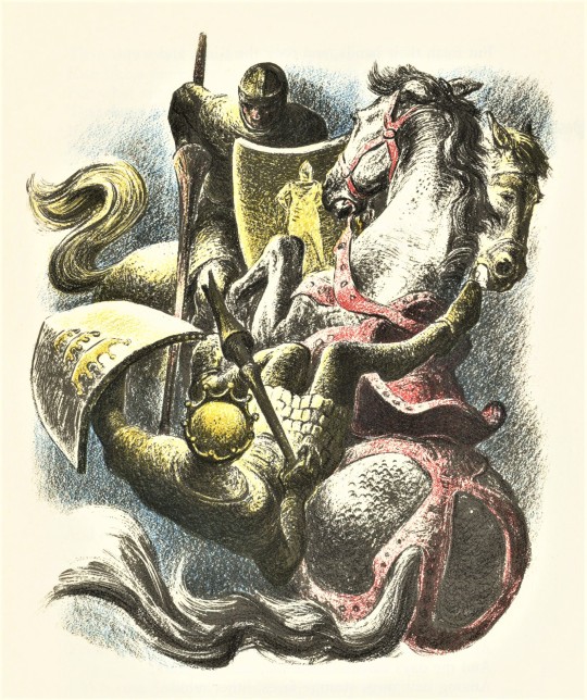
#Lynd Ward Illustrations
Text


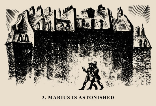

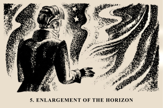

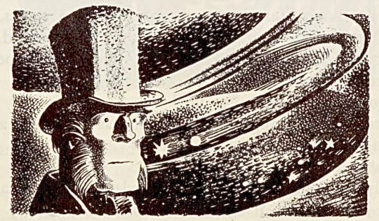
Les Misérables | THE FRIENDS OF THE A.B.C
(Illustrated by Lynd Ward, 1938)
#les miserables#les mis#les amis#enjolras#marius#lynd ward illustrations#set of illustrations#illustration#that illustration of the chapter Enlargement Of Horizon is just *chefs kiss*#it perfectly expresses how Marius enters another world and receives shocking new information again!
226 notes
·
View notes
Text

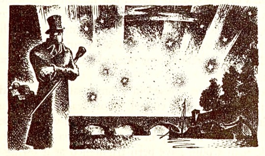


Just a couple of my favourites from Lynd Ward’s illustrations of Les Miserables
#Les Miserables#the brick#Lynd Ward#Jean Valjean#Javert#if anyone would like to pay the hundreds of dollars I’d need to do actual scans of these feel free#in the meantime be content with shitty screenies from archive dot org#can I also say how obsessed I am with the star imagery even tho like… obvi this was illustrated decades before the musical#and I feel like stars were not a big part of Javert’s thoughts in the brick
268 notes
·
View notes
Text
God's Man Wordless Novel Illustrations by Lynd Ward

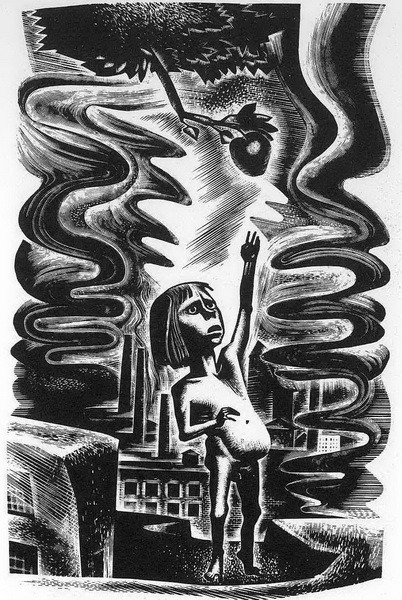
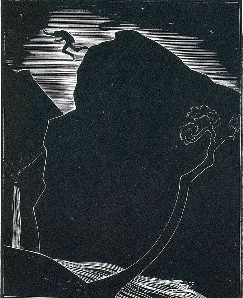
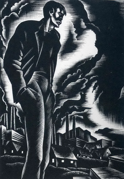


#Lynd Ward#Ward#artist#Graphic#Illustration#artwork#bw#black white#black and white#black & white#ink#wordless novel#wood engraving#God's Man#Gods Man#Madman's Drum#Wild Pilgrimage#Prelude to a Million Years#Song Without Words#Vertigo
27 notes
·
View notes
Text
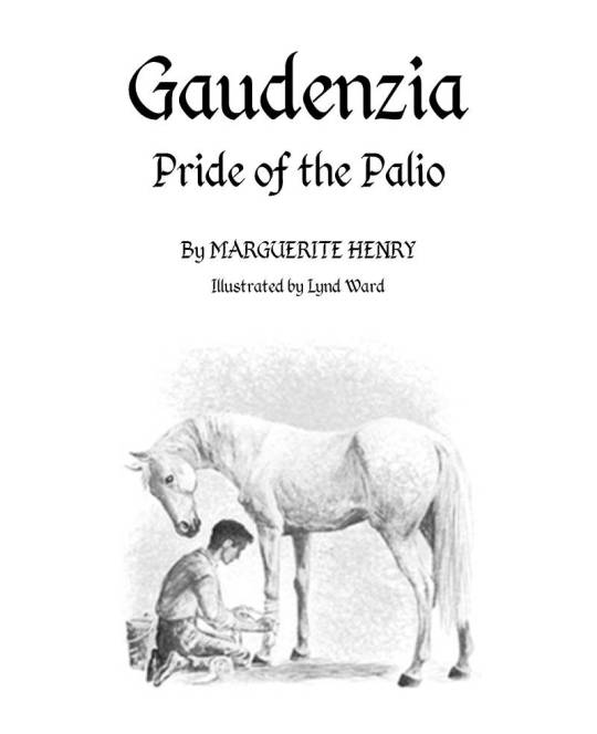


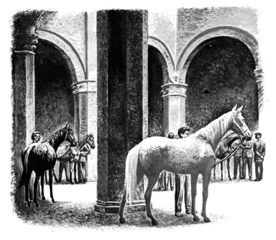
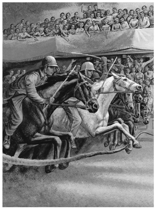


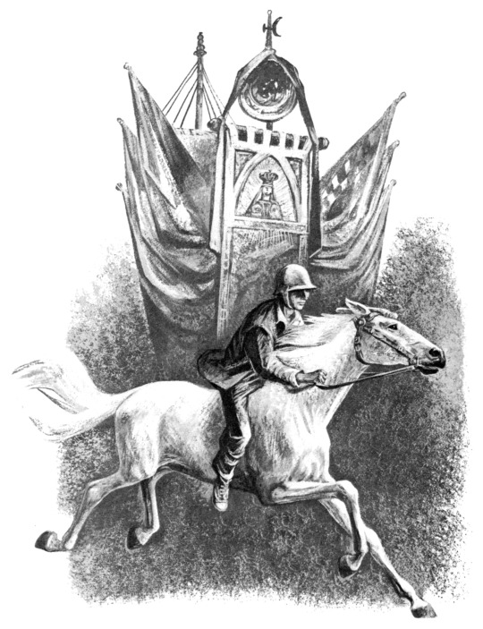
Gaudenzia, Pride of the Palio (1960) written by Marguerite Henry, illustrated by Lynd Ward
Original title page by me! See this post for the first edition title page
@antiqueanimals
#gaudenzia pride of the palio#marguerite henry#lynd ward#italy#horse racing#Italian horses#horse#horses#illustration#horse art#ink#one of the least known henry books in my opinion#this book was good though#a solid four stars#the images required little to no photo shop#besides creating a title page#but damn finding the origional was sooooo hard#mr crisp
167 notes
·
View notes
Text
I like when books have Maps and Charts in them and I think that all books should have such things.
and books which already have them? I think they should have More Maps and Charts.
#em is posting about temeraire#I do not know Where anything is or Who anyone is or What anything is and hypothetically these things should be explained by the book#but also I would like a Little Help and Visual-Spatial Understanding#what I am wishing for at this time is a Big Fucking Brick of a Book which has Maps and Illustrations and Scale Drawings#which. I do have one of those for the aubreyad and that's how I got informed about ***** ******** ***** ** * ******** ********#so it is not entirely a Good and Fun thing to have one of those#but also I have 'if it's bigger than a horse I can't conceptualize it well' kind of brain which is Hard with both ships and dragons#hey waitaminute I just remembered the fact that my very second piece of Polished aubreyad art (circa 2020) has dragons in it#y'know what lacking this maybe I will try to go back to the Very Scary Bookstore sometime soonishly#and see if they still have that copy of the hornblower companion... hardly anyone goes into that bookstore so I think they very well might#(very nearly everything about that bookstore frightens me but they have really neat stuff there! real copy of porto bello gold!#the hornblower editions with the scratchboard covers! lynd-ward-illustrated master of ballantrae!)
23 notes
·
View notes
Text

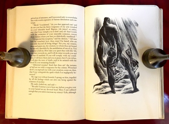
FRANKENSTEIN by Mary Wollstonecraft Shelley, Illustrated by Lynd Ward - 1988
Source: Archive.org
#frankenstein#frankenstein illustrated#frankenstiensmonster#mary shelly's frankenstein#mary shelley#lynd ward#80s#graphic novel#macabre illustrations#wollstonecrafting#the modern prometheus
24 notes
·
View notes
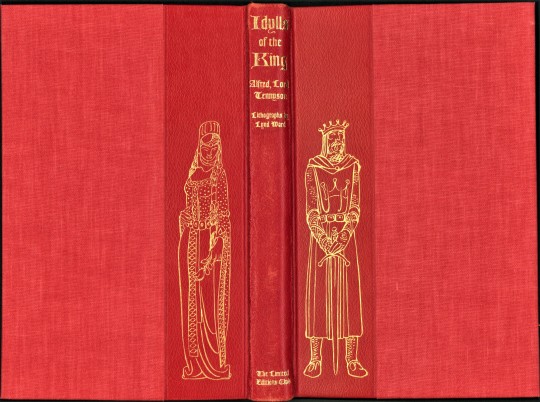
Photo

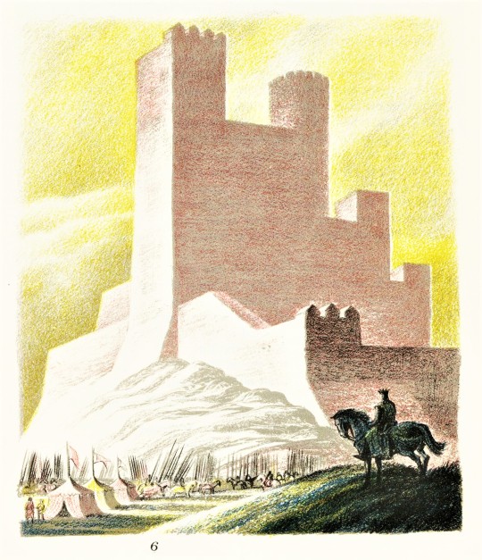


it’s Fine Press Friday!
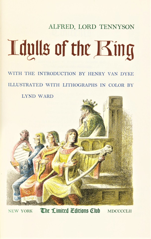
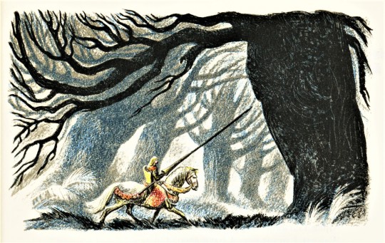
This week we present another title illustrated by American artist and illustrator, Lynd Ward (1905-1985): Idylls of the King, by English poet Alfred Lord Tennyson (1809-1892), with introduction by Henry Van Dyke, and published in 1952 by the Limited Editions Club, in an edition of 1500 copies signed by the artist. Idylls of the King was first published as a cycle of twelve narrative poems, between 1859 and 1885.
Lynd Ward made over forty individual lithograph illustrations for this fine press edition. The illustrations have at least three colors each, Ward drew directly on the printing matrix, an incredible amount of work. This direct process is sometimes called autolithography. The term, autolithography aims to differentiate the direct process of an artist drawing on the printing matrix, a stone or plate, from lithographs that are made by transferring an image to the stone by other means.
The lithographic plates were printed at the Duenewald Printing Corporation. The typographic layout was designed by Carl Purington Rollins in Bakersville types. Goudy Text was used for headers and the title. The type was printed at the Printing-Office of the Yale University Press in New Haven, where Rollins had been master printer from 1920 to 1948. It is quarter-bound in vermilion sheepskin and English buckram cloth. The cover is stamped in gold with a design by Lynd Ward.
This book is a gift of Loryn Romadka, from the collection of Austin Fredric Lutter.

View other posts with work by Lynd Ward.
View more Limited Edition Club posts.
View more Fine Press Friday posts.
– Teddy, Special Collections Graduate Intern
#Fine Press Friday#Lynd Ward#Limited Editions Club#color lithographs#Lithography#Autolithography#Idylls of the king#Alfred lord tennyson#Carl Purington Rollins#Yale University Press#Duenewald Printing Corporation#Printmaking#Fine press books#book illustration#LEC#Bakersville#Goudy Text#Fine Press Fridays#Austin Fredric Lutter#teddy
70 notes
·
View notes
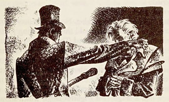
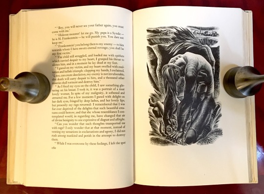
Text

Felix, son of De Lacy, attacks the monster!
Lynd Ward
14 notes
·
View notes
Text

LORD JIM: A TALE by Joseph Conrad. (New Haven: Yale University Press for The Limited Editions Club, 1959) Lithographed illustrations by Lynd Ward — some in color. Binding by Bayntun-Riviere (1967)
source
#beautiful books#book blog#books books books#book cover#books#vintage books#illustrated book#joseph conrad#lynd ward#lord jim#bayntun riviere#book design#book binding
18 notes
·
View notes
Text
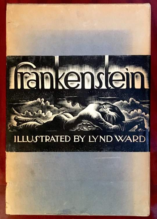
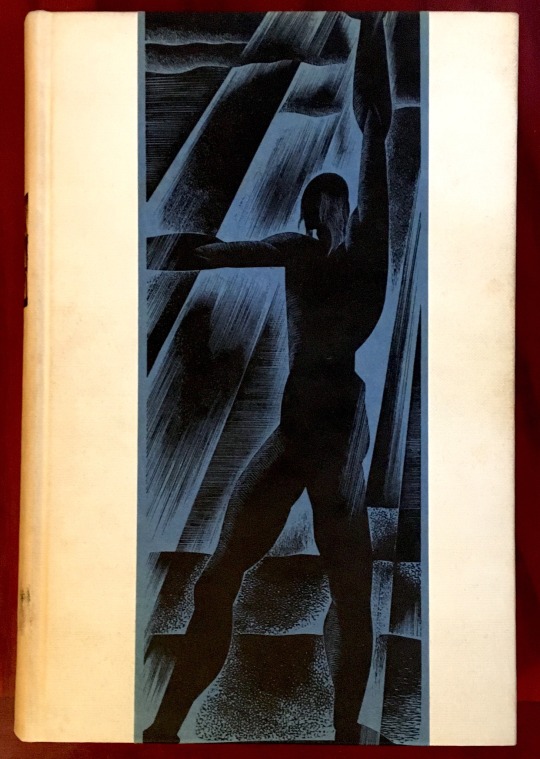
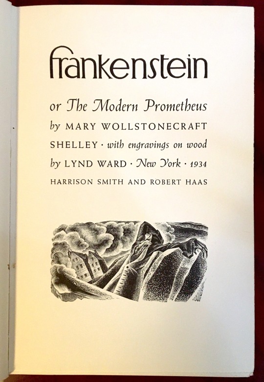

Book 357
Frankenstein, or The Modern Prometheus
Mary Wollstonecraft Shelley / illustrated by Lynd Ward
Harrison Smith and Robert Haas 1934
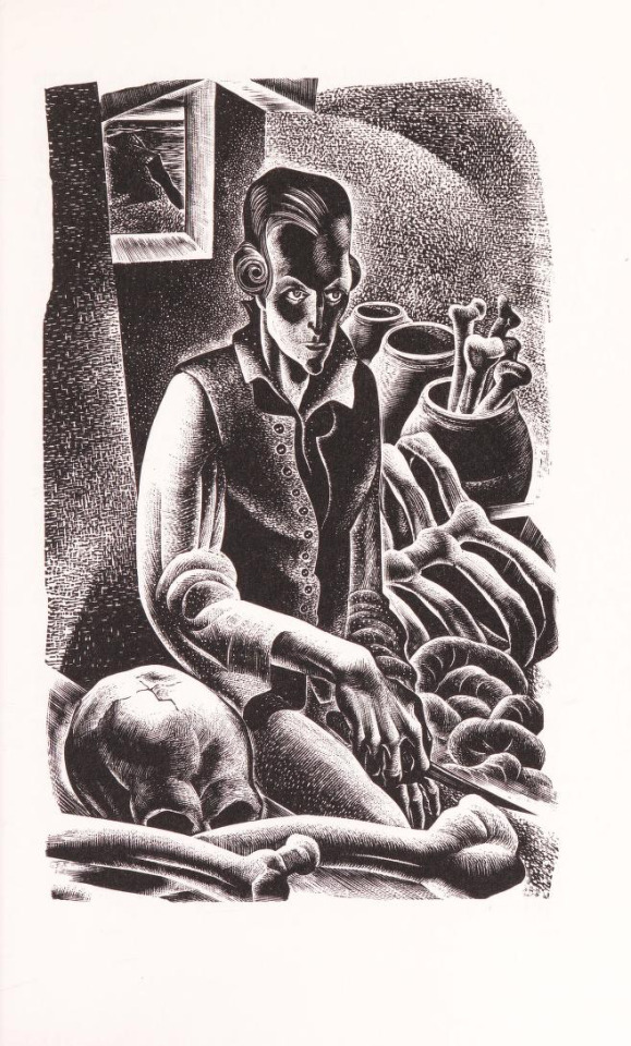
Published in 1934, this edition of Frankenstein with illustrations by Lynd Ward is a treasure. Combining elements from Art Deco and German expressionism, Ward’s 64 woodcut illustrations for Mary Shelley’s classic novel are revelatory, both subtly erotic and feverish. In Ward’s hands, Frankenstein’s creation is a looming powerful figure—human, but not quite—a figure of pity even as he inspires fear. An outstanding pairing of author and illustrator.
#bookshelf#illustrated book#library#personal library#personal collection#books#book lover#bibliophile#booklr#Frankenstein#Mary Shelley#lynd ward#Harrison smith and Robert haas#literature#illustration#fiction
25 notes
·
View notes
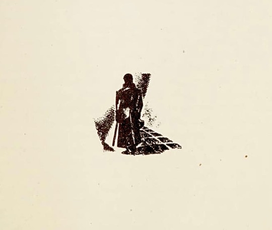
Text


The superstition of Montfermeil: it is thought that the devil, from time immemorial, has selected the forest as a hiding-place for his treasures.
— Les Misérables, II.II.II
Illustrated by Lynd Ward (Heritage Press Edition, 1938)
30 notes
·
View notes
Text
i’m weird. i’m a weirdo. have you ever seen me without another stupid copy of frankenstein? yeah. that’s weird.
#i am eyeing 2 new copies of the 1832 ver as a bday treat#so in total i would have 3#but then i also plan to buy a polsih one with the 1930s lynd ward illustrations#so it would total up to four sometime soon#man how time flies#i think ive read it for the first time two years ago or so
2 notes
·
View notes
Note
Hi, just a random question from a fan of AROS (for which I have no coherent words to decribe my admiration)- I'm sure you've been asked this a million times already, but I'm quite new to this fandom, so forgive me and feel free to ignore the question, of course- who did you base your Javert on, appearance-wise?
Actually I don't think anyone directly asked this before!
To be honest I didn't actually base him on anything or anyone in particular ... I think the reason for this is because I read the brick before ever seeing any adaptations of Les Mis, so the first Javert I pictured was just my own interpretation of him from the brick ...
And what's funny is I can't remember if I originally pictured him with short hair or long hair. I read the 1938 Heritage Press edition of the brick, which is the Wraxall translation + about 1500 Lynd Ward illustrations, and in those illustrations he has short hair. But, oddly, I didn't remember it as being short in those illustrations? I had to go back and look years layer to confirm. (Alas, my beautiful Heritage Press copy is lost somewhere now!)
So I don't know if the long hair thing was me originally picturing it that way despite the illustrations being otherwise (possibly because the illustrative style made it somewhat vague at first?), or if it was from me later getting brainrot from looking at all the post Terrance Mann Javert designs ...
Best I can say about the hair issue is, well ... I just really happen to like male characters with long hair ... idk why lol. I have a lot of male OCs with long hair and every time I make one, part of my brain goes "Another one? For real? Do we not have enough of these little bitches already? If you don't stop putting long hair on all these characters people are gonna start to think you have some kind of kink."
Which. Well. I'm actually asexual so idk lol I think it's just an aesthetic preference
ANYWAY
For his wardrobe, that's just the brick descriptions plus factual research into 1830's era menswear. The only anachronistic element of his appearance really is his hair, but I do get around that by pointing out that he could have simply picked the (older and naval oriented) style up while he was at the Bagne (which did in fact have a dress mandate for keeping long hair tied up, suggesting it was a common enough hairstyle among the guards) and just never dropped it even after it became unfashionable—because A) he doesn't seem to give two shits about being fashionable, B) keeping short hair means either spending money to keep it short or having an intimate enough relationship with someone that they will do it for you free—neither of which I can see him wanting to do—and also C) he appears to be a creature of habit, so keeping the same, easily self-maintained hairstyle over the years fits my understanding of him.
Also, I'm not even exaggerating his tools of the trade because there really is a line in the brick about him having some kind of sword, which I had to go back and reread several times because it surprised even me (but it's 3am and I'm too assed to look it up rn). And we already know he has 2 pistols and a bludgeon (which the brick says he holds tucked up invisibly in his sleeve, Assassin's Creed style, lmao).
On another subject—
Given his stiff and distanced way of interacting with the world, questionable of social skills (see him bluescreening when Fantine is pleading with him in the mairie by way of what may be thinly veiled sexual advances), as well as his black and white thinking, penchant for being distracted by his thoughts to the point of complete obliviouness, propensity to either give extremely short responses or to go into ranting monologues, with little in between—plus the idea that he hates reading but makes himself do it for self improvement reasons, and how he seems to start stimming when lost in thought—I could definitely see him possibly being Autistic or having ADHD.
Now then, about his race ...
I know originally I actually pictured him differently than the Javert I wrote for my fic—as more white, at least—the way he appeared in the Lynd Ward until I read people discussing how he was probably supposed to be part Romani. And when it came to me having to pick conclusive character designs for my fic, I thought it would be much more interesting if it was a Javert who was visibly Romani instead of white passing, which he seems to be in most everything that bothers to mention his background.
I do find it weird that he's seemingly been played by nothing but white guys except for Norm Lewis and David Oyelowo (that I can find). So there's never really been a Romani Javert in stage or screen adaptations ... However, there's still a decent amount of fanart that shows him as darker skinned/Romani, so at least there's that.
Anyway I find that a visibly non white Javert just adds a lot more nuance and depth to his character, even compared to a still Romani but white passing version of him. Because then it changes how he interacts with and views the world (and vice versa), and it changes or adds to his motivations for doing what he does. It brings his (very canon!) struggle with internal racism to the forefront, which a lot of adaptations downplay or completely ignore.
I think part of why this appeals to me is that in modern times we are very used to the idea of the shitty oppressive white cop who is approaching everything from a position of absolute privilege and authority (which is a very shallow and uninteresting archetype, character-wise) ... and brick canon Javert, regardless of whether or not he is white passing, is not coming from a position of privilege—and not just because he is poor. He is coming from a position of social insecurity and vulnerability, which (at least it seems to me) he is trying desperately to escape/overcome.
And this makes his motivations for choosing his specific job far more interesting than "shitty white cop that enforces the status quo because he gets off on exerting power over other people". It suggests a sort of willful mental dissonance and denial that also make a lot of sense in hindsight when we consider the effects of his derailment.
The idea of him snapping and realizing for the first time that most everything he was doing was morally corrupt (or at least highly questionable) is one thing (and a level of obliviousness/ignorance that is somewhat hard to believe, imo) ...
But the idea that he knew how morally reprehensible his actions were all along, and was repressing it on purpose? To gain the only foothold he could see on the ladder of a world he was born on the lowest rung of? And after decades, is forced by external factors to finally, finally look his decisions in the eye and confront himself about them?
Well, shit. That hits a lot harder, doesn't it?
And it certainly hits him pretty hard. Obviously (as I pointed out in the the fic) he did mentally store away notes of things he found morally questionable about/during his career over the years—he just didn't let himself act on them. But it implies he was aware of the injustices, even if he only relegated that awareness to his subconscious.
The brick talks about how he felt he existed outside of society and had only two choices in life—black and white thinking; criminal vs protector, etc.—and it spells out how this is pretty much the direct result of his internalized rascism—so, I mean ... I don't think it's unlikely that canon Javert knew from the beginning that he was sacrificing his his heritage, culture, and moral compass in pursuit of respect and recognition from society (and thereby, social safety).
And in a Post-Seine world, he's forced to reconcile with all of that.
I may have just spoiled a major upcoming plot point for AROS tbh but oh well I was dropping breadcrumbs of foreshadowing about it the entire goddamn time lmao
#A Reflection of Starlight#AROS#Les Mis#Les Misérables#Javert#Tell me why I just spent 2 hours writing an essay in response to a *checks notes* single sentence ask
27 notes
·
View notes
Text


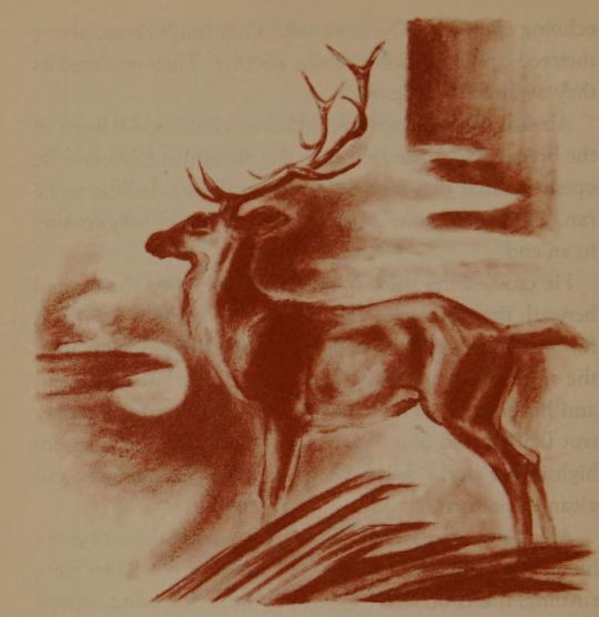
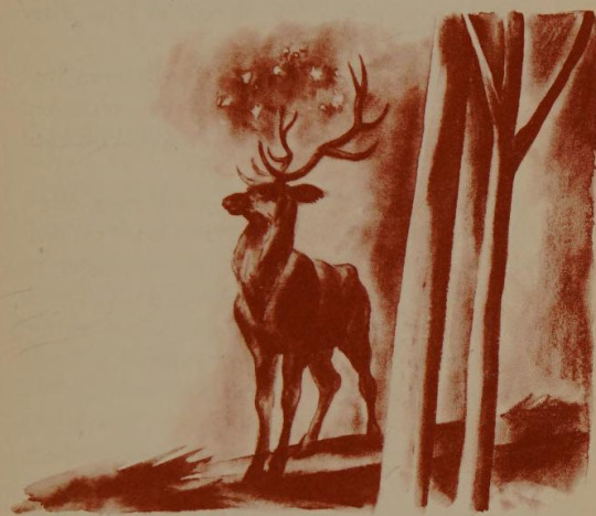
The Last Hunt. Written by Maurice Genevoix. Illustrated by Lynd Ward. 1940.
677 notes
·
View notes
Text
Darkness had no effect upon my fancy, and a churchyard was to me merely the receptacle of bodies deprived of life, which, from being the seat of beauty and strength, had become food for the worm.
FRANKENSTEIN, Chapter 4
FRANKENSTEIN by Mary Wollstonecraft Shelley, illustrated by Lynd Ward - 1988
Source: Archive.org
#frankenstein#frankenstiensmonster#mary shelly's frankenstein#mary shelley#wollstonecrafting#Frankenstein quotes#gothic#gothic writing#classical romance#lynd ward#frankenstein illustrated#macabre illustrations#1818#1988
8 notes
·
View notes
Photo


It’s Fine Press Friday!
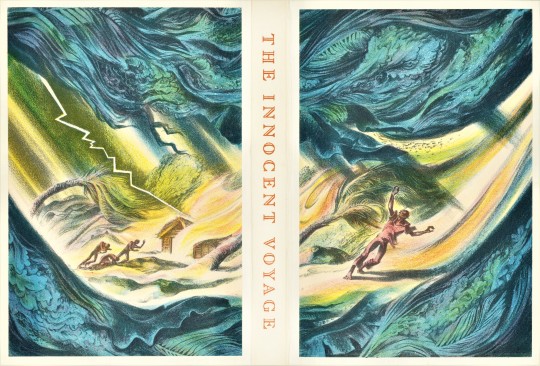
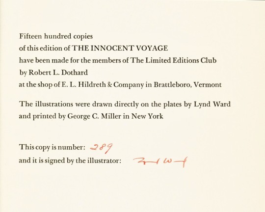
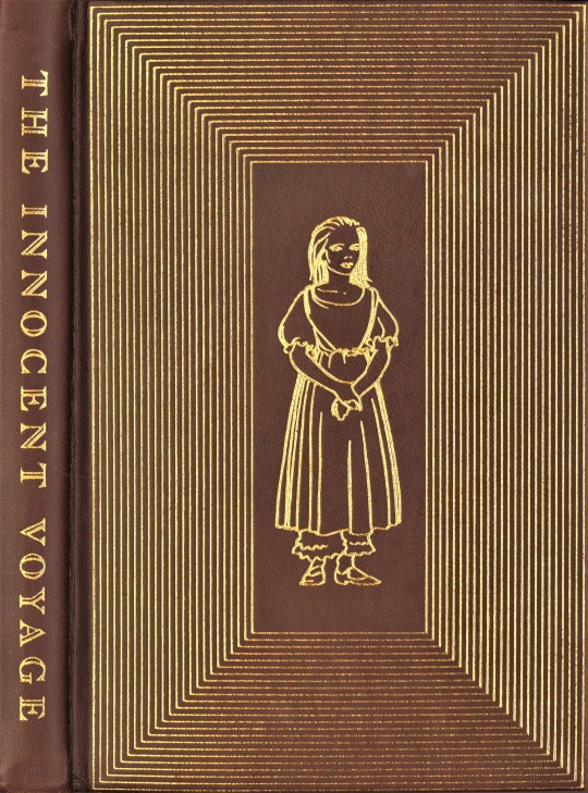
Today we present The Innocent Voyage by British writer Richard Hughes (1900-1976), illustrated by American artist Lynd Ward (1905-1985) and published in New York by The Limited Editions Club, in 1944 in an edition of 1500 copies signed by the artist. The novel was first published in the U.S. by Harper & Brothers in 1929, and in Britain by Chatto and Windus as A High Wind in Jamaica in the same year.
The novel was listed as one of the Modern Library’s 100 Best Novels. It has been adapted into film (1965) and two radio adaptations (1950 and 2000), and it is credited for influencing books such as Lord of the Flies by William Golding.
Lynd Ward created more than twenty color lithographs for this edition. Each lithograph consists of four layers of color, pink, yellow, blue, and dark blue in combination they create the great diversity of value and color that we see. Combining the layers so successfully takes the hand of a skilled artist. Lynd Ward drew his illustrations directly on the plates, which were then printed by George C. Miller (1894-1965) in New York.
This printing was published as a trade edition by Heritage Press, another imprint of George Macy, founder of The Limited Editions Club, in 1944. The trade edition does not contain original lithographs and the fine paper and binding that this edition does.
Robert L. Dothard designed this book. The text is composed in Linotype Baskerville and was printed at the shop of E. L. Hildreth in Vermont. This edition is bound in a dyed sheepskin and stamped with a decorative illustration in gold foil. The paper is all-rag and was made by the Worthy Paper Company. Each copy is housed in a solander case wrapped in white linen and a lithograph by Lynd Ward. Our copy is a gift of Loryn Romadka to Special Collections, UWM Libraries, from the collection of Austin Fredric Lutter.
View more Limited Edition Club posts.
View more Fine Press Friday posts.
– Teddy, Special Collections Graduate Intern

This image has been edited to see full complete image.
#The Innocent Voyage#Richard Hughes#Lynd Ward#Lithographs#color lithographs#Lithography#Illustration#The Limited Editions Club#LEC#A High Wind In Jamaica#Fine Press Books#Robert Dothard#E. L. Hildreth & Company#George C. Miller#Limited Editions Club#Basskerville#Worthy Paper Company#Austin Fredric Lutter
26 notes
·
View notes
Last Seen Blogs

unavagabunda
Una vagabunda

cinemarchy
Ciné Journal

kimsonvalon
(noir)
tavvoc
I'll think of a better name later

wireless-festive-minifest
Wireless Festive Minifest