#Italian landscapists
Photo

River Landscape
Annibale Carracci (Italian; 1560–1609)
ca. 1590
Oil on canvas
National Gallery of Art, Washington, D.C.
#Annibale Carracci#Carracci#Italian Baroque#Italian Baroque paintings#Italian Baroque painters#Baroque art#1590s#Italian art#Italian artists#Italian painters#Italian paintings#16th-century art#16th-century artists#16th-century painters#16th-century Italian artists#16th-century Italian art#16-century Italian painters#Italian landscapes#Italian landscapists#landscapes#landscape paintings#nature#sunlight#rivers#boatmen#boatman#poles#mountains#trees#16th century
26 notes
·
View notes
Text
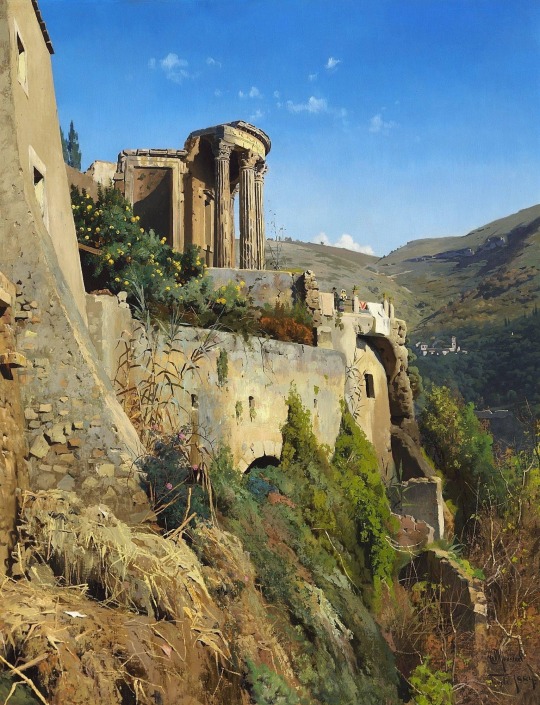
Peder Mønsted (Danish painter) 1859 - 1941
Sibylletemplet ved Tivoli (Temple of the Sibyl at Tivoli), 1884
oil on canvas
121 x 95 cm. (47.6 x in.)
signed, located and dated bottom right: P. Mønsted Tivoli 1884
private collection
© photo Bruun Rasmussen
Autotranslated Catalogue Note Bruun Rasmussen
Exhibited: Charlottenborg 1885 No. 294.Peter Mønsted made several trips to southern Europe in the 1880s, including Italy. Many of his best works date back to the decades before the turn of the century, where his work on light and color effects resulted in such mood-saturated works as the Tivoli picture here. Mønsted became extremely popular in his day and was one of the most wealthy of the Danish painters. His popularity is still high at times, and abroad has also caught the eye of the Danish painter, who equally skillfully mastered Italian summer days and Nordic snow landscapes.
* * *
Born at the end of the ‘golden age’ of Danish painting, Peder Mønsted can be described as a product of that era. A landscape painter renowned for the clarity of light common to the painters of that age, his naturalistic ‘plein-air’ views made him the leading Danish landscapist of his age. He was also known for a number of portraits, including that of King George I of Greece.
Mønsted was born in Balle Mölle, near Grenna in eastern Denmark. He studied at the Prince Ferdinand’s Drawing School, Aarhus where he studied under Andries Fritz (1828-1906), a landscape and portrait painter, before moving to Copenhagen. Here he studied at the Royal Academy of Art between 1875 and 1878, and was taught figure painting by Julius Exner (1825-1910). Here too he would have come across the work of artists such as Christen Kobke (1810-1848), an outstanding colourist and Pieter Christian Skorgaard (1817-1875), a romantic nationalist painter, a knowledge of whose work is seen in the Danish landscapes and beech forests of Mønsted’s. As early as 1874, at the age of 15, he took part in the December Exhibition in Copenhagen. In 1878 Mønsted left the Academy to study under the artist Peder Severin Kröyer (1851-1910).
Mønsted travelled extensively throughout his long career, being a frequent visitor to Switzerland, Italy and North Africa. In 1883 Mønsted travelled to Paris where he worked with W. A. Bouguereau (1825-1905) for four months. As early as 1884, he visited North Africa returning later in the decade. The early years of the 20th century saw Mønsted returning to Switzerland, the south of France and Italy, the latter being the source of inspiration for many Scandinavian artists of the 19th century. The war years curtailed Mønsted’s travel to Norway and Sweden, however the 1920’s and 1930’s saw him return to the Mediterranean. From 1879 to 1941 he exhibited regularly at the annual Charlottenborg Exhibition. Throughout his long career, Mønsted continued to paint the Danish landscape and coastline. His is a romantic, poetic view of nature; he was an artist who depicted the grandeur and monumental aspect of the landscape, with a remarkable eye for detail and colour.
His works can be found in museums in: Aalborg and Bantzen.
85 notes
·
View notes
Photo
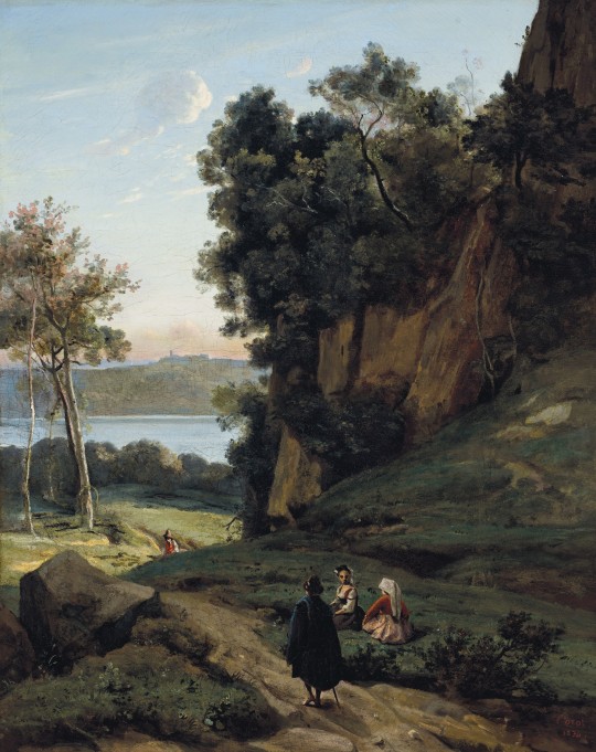
Italiens d’Albano by Jean-Baptiste-Camille Corot, 1834
In the early years of the 19th century there were two approaches to landscape taken in French art. The classical tradition, modeled after the great Italian landscapists Annibale Carracci and Salvator Rosa and the French painters Nicolas Poussin, Claude Lorrain and Gaspard Dughet, was experiencing a renaissance, fueled by the theories of Pierre-Henri de Valenciennes. These artists maintained the idealized historical landscape while at the same time renewing it with a more realistic depiction of nature. The artists who embraced this ideology all traveled to Italy, were inspired by the great French and Italian masters of the 17th century, and were all painters of historical landscapes, humanistic in approach and recomposed in the studio. During his early years, and under the tutelage of Achille-Etna Michallon, the young Camille Corot was introduced to this school of artistic thought.
In contrast to this imaginary, idealized landscape of the Neoclassicists, another approach to painting was realistic, intimate and faithful to the topography of the actual sites, drawing more on the example of Dutch and Flemish painters of the 17th and 18th centuries. These two tendencies should not be viewed as opposites and the ease with which the French painters of the early 19th century assimilated aspects of both theories cannot be ignored. Admiration for Poussin was compatible with enthusiasm for Ruisdael, while embracing the work of Claude did not discount the contributions of Hobbema.
At this time, French artists also discovered the realism of the late 18th century English landscape artists, particularly that of John Constable and Joseph Mallord William Turner. These English artists set forth a new vision with an emphasis on realism and expressiveness which would also influence Corot throughout his long career.
Corot entered the studio of Michallon in 1822 where he threw himself into landscape painting. Michallon died shortly thereafter, but he exerted a profound influence on the young Corot who wrote: ‘I made my first landscape from nature at Arceuil under the eye of this painter, whose only advice was to render with the greatest scrupulousness everything I saw before me. The lesson worked; since then I have always treasured precision’ (T. Silvestre, Histoire des artistes vivant, français et étrangers: ��tudes après nature, Paris, 1853, p. 75).
Michallon passed on to Corot his feelings for the Classical landscape tradition and through his first teacher, Corot developed the foundation of his own art, finding a balance between the realism of plein-air painting and the application of memory and imagination to works composed in the studio.
The young artist made his first trip to Italy in 1825 and remained there until 1828. While there he made numerous landscape and figure studies, architectural studies and spent a great deal of time studying the effects of light created by moving or still water and worked to master the play of light in space. Once back in France, Corot took great satisfaction in his Italian stay. He had amassed numerous studies which now embellished the walls of his studio, he had developed an excellent and unique technique for capturing nature and he had grappled with and succeeded at composing a large studio landscape which had been accepted by the Salon.
For Corot at this time, the study was an essential element that preceded the studio landscape. When working in the studio itself, the artist could dispense with the study, and instead rely on his memory and impressions. Italy had nourished his visual memories, and it was in this moment that Corot developed his passion for creating the souvenirs which would so dominate his later artistic career. The views he painted entirely or partially from nature on his return from Italy are regarded as among his most beautiful and accomplished. The artist demonstrated a complete mastery of perspective, light and construction that would pervade his life’s work and serve to inspire a generation of artists that would follow him.
In the years immediately following his return from his first trip to Italy, Corot exhibited frequently and regularly at the Salon. In 1831, he exhibited four paintings, in 1833, he exhibited one painting, and then in 1834, he showed three paintings, probably including the present lot under the title Site d’Italie. During this period, the paintings that he showed at the Salon had essentially two themes: views based upon his studies and memories of his trip to Italy, and views of the forest of Fontainebleau.
Italiens d’Albano was composed in Corot’s studio in 1834, most likely just before his second trip to Italy which lasted only six months. The work incorporates the artist’s memories of this picturesque area just outside Rome where he spent a significant amount of time during his first excursion abroad. The classical influence of his formative years under the tutelage of Michallon and his second teacher Jean-Victor Bertin is clearly demonstrated in Italiens d’Albano; however, all of the elements that contributed to the successes of his later career and earned him the title ‘Poet of the Landscape’ are evident in this charming painting.
The artist has adroitly mastered the aerial perspective, leading the eye of the viewer from a point above the landscape itself, down the winding path, through the light green meadow and to the shores of Lake Albano. The artist’s penchant for dividing the landscape into distinct fore, middle and background is accomplished with the addition of figural groups; the caped figure walking the path by the two seated women, the man in the red vest walking up the hill, the shoreline of Lake Albano and the architectural element in the far background all work together seamlessly to take the viewer on a walk through a landscape. The effects of light and shadow on the landscape itself, from the darkened rocky outcroppings that dominate the right side of the painting, to the sunlight illuminating the middle ground, to the shimmering water under the clear Italian sky in the near background, demonstrate the burgeoning abilities of an artist who would ultimately become the spiritual link between Poussin and Sisley, Claude Lorrain and Monet.
18 notes
·
View notes
Photo
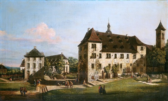


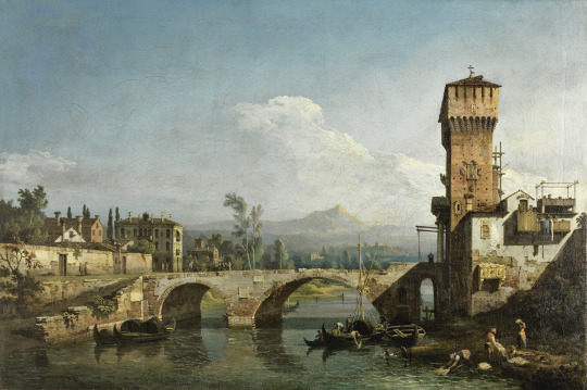

Bernardo Bellotto, The Fortress of Königstein: Courtyard with the Magdalenenburg, ca. 1756-58, oil on canvas, 48.3 x 78.7 cm, National Gallery of Art, Washington.
❧
Bernardo Bellotto, Dresden from the Right Bank of the Elbe below the Augustus Bridge, c. 1750, oil on canvas, 51.5 x 84 cm, National Gallery of Ireland.
“Dresden is viewed in morning sunlight, with the Augustus bridge and recently completed Catholic Court Church by the Italian architect Gaetano Chiavari, which partly conceals the old Castle of the Electors. Beyond is the Brühl Terrace and the dome of the Lutheran Church of Our Lady. Bellotto is meticulous in showing details of even the minor buildings.”
❧
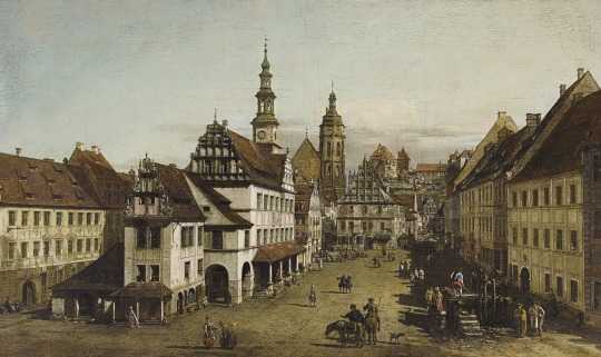
Bernardo Bellotto, The Market Square at Pirna, c. 1753-54, oil on canvas, 47 x 78.7cm, Private Collection.
❧
Bernardo Bellotto, The Fortress of Königstein, c. 1756-58, oil on canvas, 133 x 235.7 cm, National Gallery of Art, Washington.
“Nephew and pupil of the celebrated Venetian view painter Canaletto, Bernardo Bellotto began by depicting various locations in Venice in the precisely topographical style of his uncle. As he traveled throughout Italy, however, Bellotto gradually developed a distinctive and increasingly poetic manner of his own. The turning point in the artist's career came in 1747, when Augustus III, elector of Saxony and king of Poland, invited him to Dresden, where he became court painter. Though accurate enough to have served centuries later in the post-World War II reconstruction of the city, Bellotto's varied and imaginatively conceived views of Dresden transcend the limits of topography. When Prussian troops captured the Saxon capital in the autumn of 1756, Bellotto moved on to work for the courts of Vienna and of Munich, where his vedute (view paintings) became even more artistically complex. The influence of Ruisdael and other seventeenth-century Dutch landscapists played a crucial role in forming Bellotto's mature concept of landscape. After attempting unsuccessfully to resurrect his career in Dresden (his munificent patron had died), Bellotto ended by working for Augustus' successor in Warsaw, the last great European center he recorded and ennobled through his art.
Although Bellotto was primarily a painter of the urban scene, his Fortress of Königstein is one of five large canvases, commissioned by Augustus III in the spring of 1756 but never delivered, depicting the renovated medieval fortress in the countryside near Dresden. The other canvases in the series, of identical size and format, consist of images of both the interior and the exterior of the castle, viewed from a closer vantage point than that adopted for the Gallery's painting. All five paintings were probably imported into England during the artist's lifetime, and they remained there until this painting was acquired by the Gallery in 1993. The two exterior views were together in the collection of the earl of Derby at Knowsley House, Lancashire, until 2017 when one of them was acquired by the National Gallery, London. The other two views, taken from inside the castle walls, belong to the City Art Gallery, Manchester. The castle of Königstein, almost unchanged in appearance today, sits atop a mountain rising precipitously from the Elbe River valley. Exploiting the picturesque quality of the site, Bellotto invested the Gallery's picture with a sense of drama and monumentality rarely found in eighteenth-century view painting. Bellotto's panorama effectively contrasts the imposing mass of the fortress, perched on a rocky precipice, with the broad expanse of cloud-filled sky and with the bucolic scene of rustic peasants and their animals, picked out in the foreground by the flickering light. The middle ground is occupied by forests, fields, and pathways leading to the castle at the apex of the mountain. In Bellotto's interpretation, Königstein castle becomes an awesome—and ironic—symbol of his patron's might at the very moment of his defeat.”
from Italian Paintings of the 17th and 18th Centuries Catalogue: “The paint has been applied with fluent brushwork and the handling reveals considerable variety in touch and application. In many places in the landscape and fortress the paint has been applied with strong brushstrokes, employing fairly thick paint to vary thickness and texture. The deliberate use of a fairly dry brush to create texture is particularly evident in the fortress. The upperright edge of the escarpment was originally placed 4 cm to the right of its present location; indications of this change are faintly visible. In contrast, the sky has been painted more loosely and rapidly, the broad, sweeping strokes imparting a sense of active weather, light, and movement. The thinner application of paint in the sky has permitted the red ground to show through, although in certain areas the aging of the paint, previous varnish removals, and abrasion have revealed more of the red ground than was originally intended. [...] Bellotto's boldly contrived design hinges upon the equilibrium between the fortress on its rock massif and the towering expanse of the sky on the left; the interplay between the broad, distant vista stretching to the horizon and the wealth of detail in the complex of fields and paths; and, at the extreme edges of the composition, the equipoise between the Lilienstein, a prominent rock formation, and, on the right, the curving road leading to the castle. The fortress occupies the apex of a bold triangle; cold, remote, and forbidding, it is set off by its sheer height and weight from the staffage in the foreground below. The human figures and animals, representatives of everyday life, temper the heroic mood of the painting and create an idyllic and pastoral atmosphere. Their presence mitigates the dominance of the fortress, which appears to exist in a realm of eternal repose where time and change are unknown. Whether or not Bellotto intended these rustic figures to give the landscape allegorical or symbolic meaning, their importance is underscored by the fact that they are larger in scale and far more closely integrated into the landscape than in almost any of the artist's other vedute.”
❧
Bernardo Bellotto, Capriccio with a River and Bridge, ca. 1745, oil on canvas, 48.5 x 73 cm, Museo Nacional Thyssen-Bornemisza, Madrid.
“The present painting dates to Bellotto’s early period and is an example of the type of ideal landscape generally described as a Capriccio. In works of this type artists brought together real buildings from different places, changing their location and placing them next to other imaginary ones against a landscape background. In his early works Bellotto’s style was notably close to that of Canaletto. [...] Despite the evident stylistic debt to Canaletto, the painting reveals features typical of Bellotto’s own style such as the detailed description of each of the individual elements and the way they are combined to give a sense of reality to the overall view. The differences with Canaletto also extend to the use of pronounced contrasts between the areas in shadow and those illuminated by the sun. In addition, the figures are taller and less precisely painted, the chromatic range is cooler and the brushstroke more heavily charged.“
❧
Bernardo Bellotto, View of Verona with the Ponte delle Navi, ca. 1745-47, oil on canvas, 133.3 x 234.8 cm, Private Collection.
4 notes
·
View notes
Photo
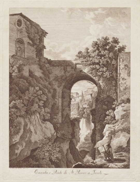
St. Rocco Waterfall and Bridge at Tivoli (Cascata e Ponte di St. Rocco a Tivoli), Albert Christoph Dies, 1795, Cleveland Museum of Art: Prints
Throughout the latter part of the 18th century, successive generations of German artists visited Italy in order to study the acknowledged masterpieces of antiquity and the Renaissance. After an unsatisfactory initial course of study of printmaking in Basel, Dies set out on foot to Rome where he remained for twenty years working as a painter and etcher. This etching of an artist sketching a picturesque view at Tivoli came from a series of Italian views. Although at the time Dies’s work was criticized for being executed too freely, this composition articulates the Romantic landscapist’s bond with nature that dominated 19th-century German art.
Size: Sheet: 39.9 x 30.7 cm (15 11/16 x 12 1/16 in.); Platemark: 36.8 x 27.5 cm (14 1/2 x 10 13/16 in.)
Medium: etching in brown ink
https://clevelandart.org/art/2002.105
3 notes
·
View notes
Text
Vermeer
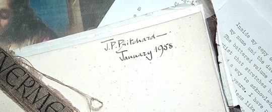
Inside my copy of Ludwig Goldsheider's Phaidon Press Vermeer I wrote my name and the date of purchase, 1958. I was then fourteen years old. The battered volume is a record, therefore, of an attraction to this artist that stretches back to childhood. Not unnaturally I would like to find a way to acknowledge all that he has meant to me over the intervening years. I have no gift to write of his art like Lawrence Gowing - still less like Proust - but in any case my preference is to use connoisseurship to extend, if possible, our understanding of his oeuvre by seeing if there are viable addenda that can be appended to it; and that is the main purpose of this Study. A secondary aim is to draw attention to the dangers involved in 'cleaning' what we already have. By way of caveat I urge any readers I may have not to expect everything adduced to look like their idea of 'a Vermeer'. Connoisseurship has to allow for development. An early Cézanne does not look much like a late one.
To begin at the beginning of Vermeer's career as a painter is chronologically proper but somewhat frustrating because we know that he is farthest from where he needs to be and where we wish him to be. Through his and his father's picture-dealing he comes into contact with Italian paintings of a religious and mythological nature which encourage him to try his hand in a similar vein. What survives of this derivative, experimental period is the St Praxedis - his version of a composition by a Florentine artist Felice Ficherelli - and the Diana and her Companions.
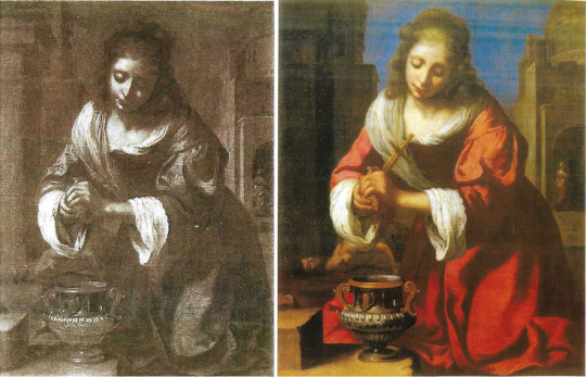
St Praxedis by Ficherelli (left) and Vermeer’s copy (right)
Being by Vermeer, these are not bad pictures; indeed the St Praxedis is that rare thing, a copy better than its original. In both works there is a fluency of brushwork, a Baroque rhythm, and a palette that at this stage includes a yellow, a deep blue, a winey brown, and a rose red that, mixed with white, becomes a violet.
I can only suggest one work to add to this early phase of Vermeer's oeuvre and that is a picture of the head and shoulders of a rosy-cheeked girl.

Portrait of a Girl by De Bray (left) and detail of St Praxedis (right)
When it passed through the hands of a London dealer (Chaucer Fine Arts) in 1989 it was attributed, not very accurately, to Jan de Bray. The face is painted in a style hard to reconcile with any of the young female faces in later Vermeer, but it does seem close to that of St Praxedis and to the facial types in the Diana picture. Common to all of them are the rose-white-violet juxtaposition, the swirling drapery and soft sfumato.

Christ at the House of Mary and Martha (National Gallery Scotland)
With the large ‘Christ in the house of Mary and Martha’ at Edinburgh we may be moving backwards rather than forwards chronologically, but Vermeer seems recognizably more Vermeerish. He is still in his broad-brush Religion and Myth phase but the religion is as domesticated as it can be in that story of Mary and Martha, so one feels that he is moving towards the territory that he will make his own. Even in the earliest pictures it is noticeable how women predominate as we know that they will in the future. On the relative merits of Mary’s life and Martha’s, Vermeer's art is, and remains, tacitly neutral: it pays tribute to both. As if to illustrate this there is a study in watercolour for the figure of Mary, and a drawing that is not for the figure of Martha (being stylistically later) but certainly alludes to her servant role.
In the Printroom at Leipzig is a remarkable wash drawing which Bernhard Degenhart included in an anthology of European drawings (Europaisches Handzeichnungen) published at Dresden in 1943 as the work of the landscapist Jan Siberechts.
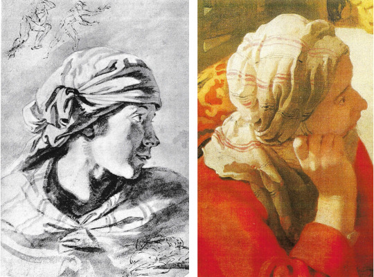
Drawing attributed to Siberechts (Leipzig) and detail of Martha
That attribution can be dismissed because there is nothing in Siberechts to support it beyond the flimsy fact of there being a landscape drawing on the verso. The little pen sketches of figures at the top and lower right of the sheet are by another artist; disregarding those, I think that there is a strong possibility that what we have here is a study by Vermeer for the figure of Mary in the Edinburgh picture; there the listening head is swivelled a little further round towards Christ. The light in consequence falls differently, but otherwise the similarities are close: there is the same profile with slightly parted lips, the same headcloth with the same striped pattern on it, and the same bright lighting from our left if we allow for the turn of her head.
It is the dramatic lighting, with maximum contrast in the folds of drapery and in the face too, not of Mary in the picture (now in shadow) but of Martha, that most accosts me. I notice as well the jugular vein in the neck of Christ. The wash is applied quickly but with complete assurance. The shadowed area of the face is conveyed in a manner that looks forward to the shadowed halves of the two heads in Washington, the Girl with a Red Hat and the Girl with a Flute.
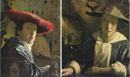
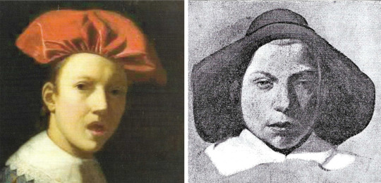
Girl with a Red Hat (left) and Girl with a Flute (right) (National Gallery Washington)
The strange wavy border that the bright light creates on her cheek, from the near edge of her eye down to her chin is typical of Vermeer’s observation of light, how it produces form, without line, in the most surprising ways. In this respect the Leipzig drawing seems more advanced and prophetic of his future powers than the painting.
The Leipzig drawing, as we have seen, is scarcely a drawing in the linear sense at all, but at Besançon there is a sketch of a more conventional kind. In what becomes his favoured graphic medium - black chalk heightened with white on blue paper - it shows a servant holding a shallow circular basket or tray.

Woman with Tray signed ‘De Hoogh’ (De Hooch)
She is probably not a study for Martha, but one can see the folds of her sleeve following the pattern of light and shadow that is distinctive at Edinburgh in the sleeves of all three participants but more particularly on Christ’s outstretched arm. Her face has the signature oval shape and high-arched brows.
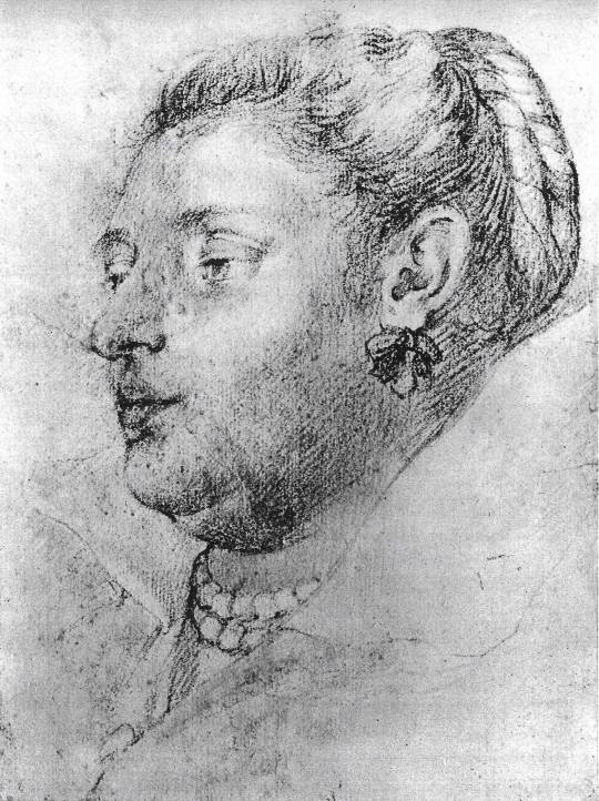
Portrait of a Lady (Royal Collection Windsor)
A third drawing may still be quite early but marks a change to something less loose, less generic, much more personal. This is in the Royal Collection at Windsor, a ‘Portrait of a Lady, Anonymous, Flemish school 91/2 x 7in, black chalk on white paper with red chalk for the flesh and the necklace of pearls’. The cataloguist comments that it is the ‘work of a follower of Rubens lacking peculiar characteristics’. If we stop thinking about Rubens, perhaps its characteristics will start to seem more peculiar, and peculiar, I suggest, to Vermeer. It is likely to be later in date than the Edinburgh picture, but the similarity of facial features if we compare the profile of this middle-aged woman with that of Christ is, for me, compelling.
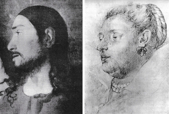
Detail of Christ at the House of Mary and Martha (left) and Portrait of a Lady (right)
It cannot be proven but my hunch is that this tender portrait is of Catarina Bolnes, Vermeer’s wife, bearer of their many children, and also likely model for the painting at Amsterdam of the pregnant Woman in Blue reading a Letter.

Woman in Blue and detail of face (Rijksmuseum)
Placing her tête-a-tête with Christ and putting aside the double chin so truthfully recorded, notice the mouth, the cupid’s bow upper lip and projecting lower, the depth of the upper eyelid, and the straight nose that nevertheless marks where the bone ends and softness begins. As for ribbons and pearls, they are fashion accessories worn by women in the paintings of other Dutch artists, so their presence in this drawing can only be corroborative evidence; still, we know from later paintings by Vermeer how much he liked his family members to sit or stand for him wearing these adornments, particularly pearls because they represented drops of light.
Whether or not I am right about Catarina, this sensitive, fairly rapid sketch does demonstrate that Vermeer needed to make drawings of his models. The camera oscura was invaluable for helping to accurately determine how furniture and figures are disposed within a chosen perspective, but that tool does not solve everything and I always thought it probable that for the faces at least he would have made some preliminary studies in chalk or oil paint on paper, even if no such drawings survived. Fortunately, as already suggested, a few have, and this is a particularly beautiful example.
Portrait of a Young Man - Anonymous
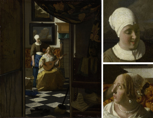
At Rennes in France there is another close-up drawing, of a youngish man's face, his eyes directed down to our left as we look up. This is texturally very similar to the Windsor drawing, but it more particularly demonstrates three features found in the paintings. One is the drawing of the eyes, the almond shape of the eye itself, the broad strap of upper lid, and the elevated brow. This is famously clear in the Girl with a Pearl Earring at the Mauritshuis, but also in the Kenwood Girl with a Guitar, the Wrightsman Study of a Young Woman (Metropolitan Museum NY) and the two close-ups at Washington, Girl with a Red Hat and Girl with a Flute.
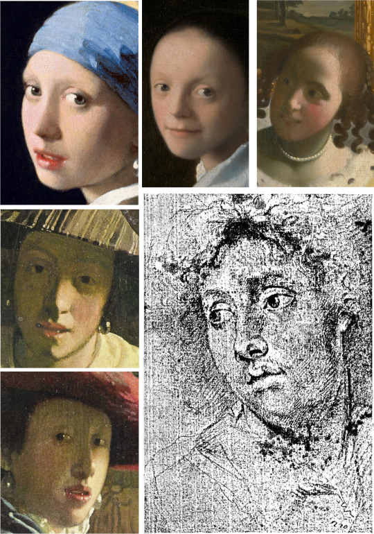
Details clockwise from top left: Girl with a Pearl Earring, Study of a Young Woman, Girl with a Guitar, Portrait of a Young Man, Girl with a Red Hat, Girl with a Flute
A second feature is the lips being parted, as in several of the works just cited. A third is the generous oval or elliptical shape of the face as a whole, which is the result of underplaying the chin and cheekbones.
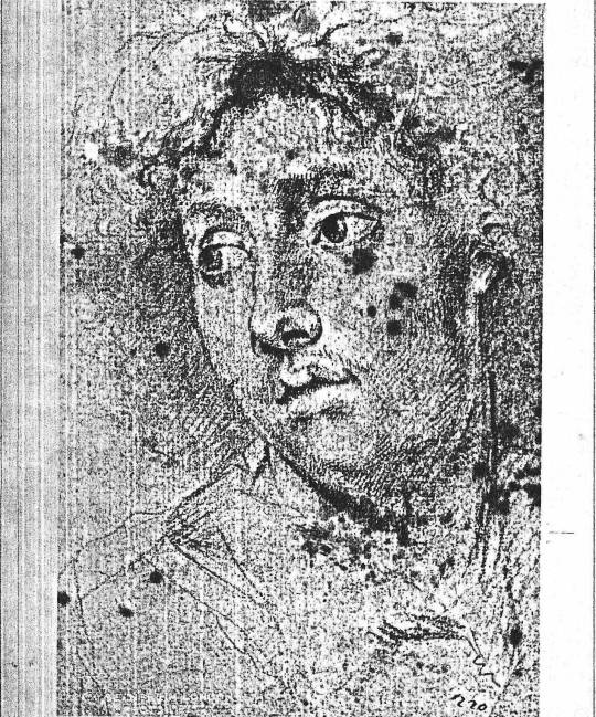
Studienkopf - Study of a Boy’s Head, attributed to Vermeer
‘Oil paint on paper’ and the above remarks about oval faces are a cue to insert here a small study of a face in that medium that is in the Berlin Printroom. This has long been attributed to Vermeer, not by all but by many scholars from 1907 onwards. It bears all the signs of being by his hand and, besides being a fine and precious thing in itself, is a helpful link to other things. Notice, again, the shape of face that is different from what we find in other artists’ work, the mouth with its wavy upper and sensuous lower lip, a certain relationship and distance between eyebrow and eye, and of course the light that shapes everything. Whether this is an abandoned self-portrait no one can say for sure, but it could be. If one looks hard at oneself in a mirror, the eyes do narrow and squint a little, producing the fixed ‘tunnel’ gaze that this face returns to us so straightly and directly while giving, it must be said, nothing away (but what else would one expect of Vermeer?).
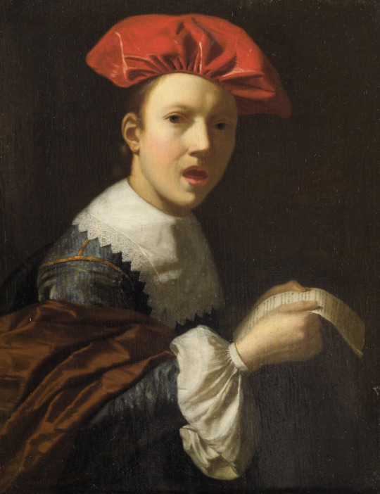
Singender Jüngling - no attribution
From Berlin to Vienna now, and from oil on paper to oil on oak: a small panel in the Kunsthistorisches Museum. This is of a young man singing (Singender Jüngling). The piece of paper he is holding does seem to be a sheet of music and as he is turned towards us with his mouth open he is probably singing, not talking to us about a letter. In any case what matters is that a living moment is caught in a turn of attention with a turn of the head, and thereby temporally and pictorially stopped for ever, as happens over and over in Vermeer. Is this picture by Vermeer? I offer it for consideration. If it is, it is not classic mature Vermeer, nor on the other hand is it very early. I would place it close to the Boston Concert (now sadly missing), the Frick ‘Girl Interrupted At Her Music’, the Metropolitan’s Servant Asleep. It is smaller than any of them, only 91/4 x 71/4 inches, the size, roughly, of the Louvre Lace Maker or the two Washington Girls.
The Concert (stolen)

Girl Interrupted at her Music (Frick)

Servant Asleep at a Table (Metropolitan Museum)
At this point the Berlin oil study on paper provides a helpful comparison: for the shape of the face and of the eyes, the form of the lips (albeit closed in Berlin) and for the lighting if one imagines the face at Vienna upright, not tilted, and facing us straight on.
Detail of Singender Jüngling (left) and Studienkopf (right)
As for the palette the wine-dark brown mantle over the Singing Boy’s right arm reminds us of the colours in the dress of the Sleeping Servant and of the companion of Diana who sponges her foot.

Details of Servant Asleep (top) Singender Jüngling (btm left) and Diana’s servant (btm right)
From surviving images of the Boston Concert, we can not be certain but it seems likely that boy's orange ‘beret’ may be comparable with the chairback of that missing artwork.

Orange beret from Singender Jüngling (left) Chair-back from The Concert (right)
Lighting here is from a source to our left, but Vermeer – if it is he - is not yet committed fully to daylight; the boy is lit within an ambient darkness, much as in a Caravaggio or any number of portraits. The other thing to notice is the way the boy is holding the paper with both hands. One might think that numerous Dutch pictures would show hands in a similar position, but it does not appear that this is so; it is, however, a gesture that recurs in Vermeer, in the Lady in Blue at Amsterdam, the Girl Interrupted at he Music in the Frick, in the Dresden Girl Reading a Letter at an Open Window and, we shall see, in another putative Vermeer.

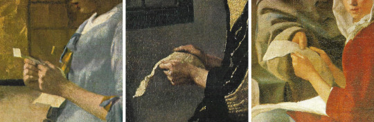
Details from Singender Jüngling (top), Woman in Blue (left), Girl Reading a Letter at an Open Window (centre) and Girl Interrupted at her Music (right)
With the Vienna Singing Youth we are, as noted, not out of dark and into sunlight; we are by no visible window and the light has no sparkle. We are in an enclosed world like that of the tavern or the brothel, the venue of the Procuress at Dresden where what light there is, golden and silent amid the muted voices, seems to move surreptitiously, illuminating part of a collar, a bit of wall, a patch of rug before landing in a blaze on a yellow jacket, a scarlet jerkin, a binary echoed in the carpet.
Here is another large early work, disconcertingly different from what precedes and what follows it. The oil medium is drier here and carefully applied with no broad-brush bravura, no squiggles of highlight. Where in the future it is light that will seem liquid, poured into a room as into a tank, here it is shadow that spreads downward, drowning much of the left side of the picture, all but hiding faces, turning the folds of the carpet into dark ravines, and generally claiming the territory. Here is an artist revealing himself, for now, to be potentially as great a poet of shadow as he will be of light; one is readily reminded of Caravaggio’s Calling of Matthew in Rome.
Detail from The Procuress
If we are to find anything to accompany the Procuress in this possibly short-lived stage in Vermeer's development, it must exhibit that dry handling of paint that we see in the depiction of the woman and her client. Again what I offer is a suggestion appended to a sad admission in this case that I have no idea where the picture is. It is a portrait known to me only as an old photo placed among other portraits that have been attributed at some time or another to Velasquez. It is at any rate not by him. It once belonged to a Mr A. W. Leatham.
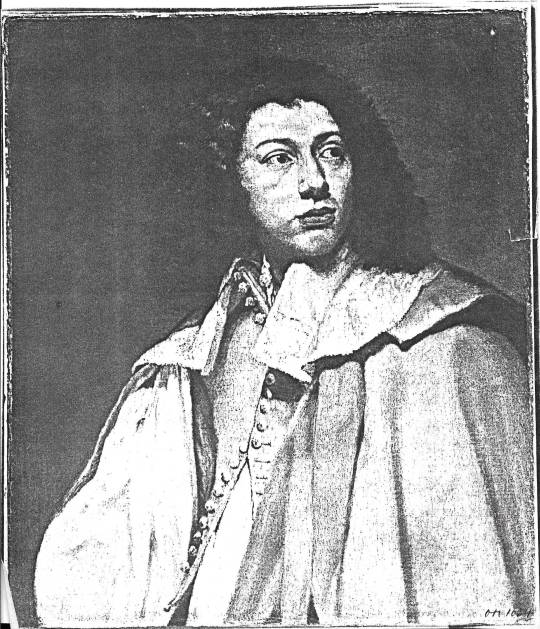
Portrait - attribution and whereabouts unknown
Here we clearly see, even in a photo, the dryness; but what lends credence to a Vermeer attribution is the face when one compares it with that of the Berlin oil study: within the same generous oval are the same eyebrows, nose and lips; the eyes in the Leatham picture are much more open but otherwise compatible. If this were to be Vermeer's it would be our only independent painted portrait - of whom we may never know.

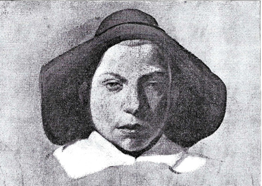
Maidservant Warming Her Feet - attributed to Vermeer
In the volume referred to at the top of this essay, the 1958 Phaidon Vermeer by Ludwig Goldscheider, there is one drawing included among the main body of plates, a drawing therefore that Goldscheider clearly thought was definitely by Vermeer. It had been published once before, by H Leporini in 1925, but Goldscheider helpfully reproduces it in its actual size. He calls it Maidservant warming her Feet; the original is in the museum at Weimar. The monochrome reproduction gives one a good idea of the soft graininess of the black chalk finely hatched in strokes that run at right angles to the pose of the seated servant. What cannot be seen are the touches of red chalk added to neck and forearm (much as in the Windsor drawing) or the white heightening that in a photo looks deceptively like the white of the paper though the paper in reality is blue.
Why is this beautiful drawing omitted from subsequent books on Vermeer? Could it be that scholars are sceptical on account of the artist’s monogram V M drawn on the side on the footwarmer? One can agree that this is unusual, but that by itself should not be ground for exclusion; genius can be allowed some eccentricity, and anyway it is not too difficult to imagine that this very finished and presentable drawing was in fact presented to someone, possibly the model for it, and that the monogram was added as a mark of the special occasion or as a token of gratitude or to pay a debt. Nobody suggests that it is an outright fake from a later century, so it has to be of Vermeer's time and I question whether any contemporary could produce a drawing of this quality and of this kind - a drawing where form is defined so consistently by light. This is Vermeer's photographic vision, as it would be Seurat’s in a later age.
The Love Letter - Vermeer’s use of light is comparable to Maidservant Warming Her Feet
The sitter, besides: is surely the family's stalwart servant, Tanneke, the same who pours milk and delivers a letter (in two paintings) and maybe holds a jug as she opens a window.
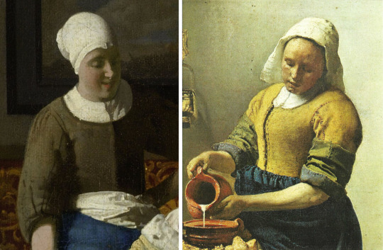
Details from The Love Letter and Milkmaid for which Vermeer used his maid Tanneke as a model
The date of the drawing is anyone's guess, but it clearly belongs in the period of the great cameral pictures. Another drawing, of unknown whereabouts and less remarkable is of similar facture and shows a servant asleep.

Drawing of a Servant Asleep - unknown
View of Delft by Moonlight - attributed to Vermeer
Scepticism regarding the Weimar drawing seems to have led to doubting generally that any extant drawing is by Vermeer. This is a pity because there is much to be learned from his draughtsmanship. Take this drawing at Frankfurt, a supposed copy of the famous View of Delft from across the canal to the south of the town.

The Original ‘View of Delft’ by Vermeer
Why would a copyist take such liberties with what he is copying from? Why alter the arrangements of the buildings, omit barges, totally change the sky and foreground, remove figures and substitute fishermen in boats? He would be a remarkably inventive copyist who did all that! How much more likely that this is a drawing Vermeer made in situ on a day when there was a busy sky with rain-threatening cloud but with sun behind him that lit the south-facing walls, towers and spires of the town. The painting in the Mauritshuis, like a large ‘Academy’ Constable, is the outcome of onsite visits and studies all of which contributed to his decision-making, but none of which was exclusively determining.
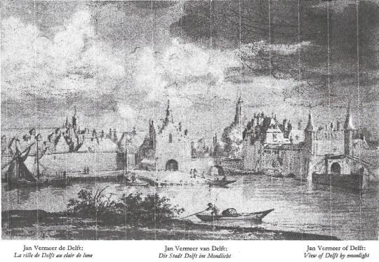
It is very believable that a painter with Vermeer's temperament, seeking always a calm resolution, would not in the end choose a hectic cloudscape, would want to clear the foreground of weeds and bushes, would reject as picturesque a man in a boat who distracts attention from the town across the water, and would decide that the town could not cohere if too many surfaces were lit at the same time across the whole piece. Instead, as we can see in his final consummation, he creates a series of long horizontals from the left, lowers the red- tiled roofline, extends the town wall and the quay, and emphasises all of this with a long placid reflection in the water.
The gap in the reflections comes where the two southern gates of the town connect at the bridge, and that is where he chooses to have the sunlight begin to illumine, not the immediate edge of the town but the buildings beyond and within it; this illumination then continues, ducking and weaving, to the limit of the picture on our right. It can therefore be said to be an outdoor view with an interior, of the town, lit from the right, as only the Lacemaker is among his indoor pictures.
Something curious about the painting vis-a-vis the drawing is the effect created by clearing the foreground of everything except very small figures that lead our eye from a point directly under the reflected left tower of the Rotterdam Gate, across the deserted sandy back to the two women talking, and thence to the group waiting for the ferry at the far left. Vermeer has radically revised in a way that manages to make the town as a whole seem nearer than the foreground figures but as calm and reflective as any of his single figures in a room. At the same time he has concentrated the light in the right half of the picture and given it a warmth to match the pale ochreous emptiness of the foreground that starts from the left, dies towards the right.
Old reproductions of this extraordinary painting show that the cloudscape was perhaps once much more modelled and interesting than it now is. As too often happens, there has been a flattening, a loss of density and volume in clouds that Vermeer knew to have both.
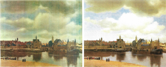
Vermeer’s painting before (left) and after (right) cleaning
If the drawing is original, then it tells us that Vermeer was no different from Ruysdael, Jan van der Cappelle or any of his country's great skyscapists in his understanding that clouds have a superstructure and an undercarriage and as such constitute a sort of moving architecture as they build, dissolve, and build again - a match for earthly buildings shaped by light.

Painting of Maid and Child - attribution and location unknown
The same lesson may be learned from the last item I can offer which, like the Leatham portrait, I know only from a photograph. I do not know its whereabouts or even whether it exists. Coming across the photo lying among unattributed Dutch paintings was nevertheless a memorable moment because I connected the image at once with Vermeer, specifically with his family’s servant, Tanneke, she of The Milkmaid, sitting in her place in the kitchen with a letter held between her hands - in that now familiar position - as she turns aside to attend to a child with a bowl. It seemed clear that the original, of which this may be the only record, was unfinished, abandoned by the artist for whatever reason.
If the original was indeed by Vermeer, then it would be unique among his known works in being a composition with a child in it. Why are there no children in Vermeer's paintings? Did he exclude them because they were too excitable, would never stay still? Did he exclude the elderly because they reminded him of the nearness of death, the fate of too many children of his time, including some of his own? In this case a child does get included, but how securely? Did the artist have doubts? If he took the child out, it would leave the servant looking down to our right for no obvious reason. Her pose is towards our left but her attention is to our right. If the child stays, the chiasm demands something - a small window - in the upper left corner.
Such is the rationale of the image as a composition, but the photo also suggested something about the original’s texture and lighting, factors which go together. What I particularly noticed and was excited by were incipient signs of those lovely beads of light so uniquely characteristic of Vermeer's art.
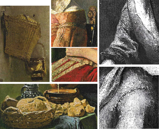
Details of painting techniques in The Milkmaid (left) and The Glass of Wine (centre) which could be compared with the portrait of Maid and Child
I had supposed that they were last touches, yet the photo appears to make them part of the earlier planning of a picture, prefigured elements in his vision of a scene. If the original ever turned up, we could be satisfied about these technical mysteries.
For myself, I am not sure that I want or need to know how Vermeer painted his pictures; I am reasonably content to marvel at the mysteries and credit them to genius. However, in view of the damage, as I see it, done by conservators to some of the Vermeers that we have in our museums the above old photo from 1947, of a lost picture that passed through the hands of a dealer called Katz, is valuable evidence that from the start of a painting Vermeer knew that what he wanted to record was light, and that light falls in a logical way which creates, according to the time of day, profound areas of shadow that can abut the light with little or no gradation.

Above are two photos using natural light and shadow (left and right) Detail from Lady Writing a Letter with her Maid (centre)
This is most true on a sunny day in the morning, less true by early afternoon. The contrast, clearly visible in the photo, between the lit and shadowed side of a sleeve is extreme. We all know this because we all live in the age of photography, the age that began just before Vermeer started to be rediscovered. Unfortunately for his paintings - and certainly not only his - we also inherit the preoccupations of the twentieth century which to a large extent revolved around the picture plane and its flatness. Combine flatness with iconography, another leading concern, and you get a visual sensibility that finds the pattern on a carpet more important to clarify than the logic of the light which would keep it dark. Here are two photos to illustrate (in the original sense of the word) the contrast that must be respected.
I am not a conservator. Even the thought of surgical intervention in the surface of a Vermeer makes me nervous; but if intervention is ever necessary I think two rules must apply: always respect the logic of the light, and never, if you can help it, reveal the canvas or other support. Vermeer's art is one of illusion, a very poetic and light-sensitive version of trompe l'oeil. Expose the canvas and you destroy the illusion; a wall ceases to ‘be’ a wall and becomes what it mostly is in de Hooch, a bit of brushwork pushed around over a bit of stretched cloth.
In conclusion I hope it is clear that drawings and even old photos can tell us important things about the essential nature of an artist's vision, the imagination that shapes images, in Vermeer's case through light and light’s dark accomplice. Having opened this essay testifying to my own long admiration for the art of Vermeer, I can best end it on a similar note but in the context of Delft. A painter called Cornelis de Man lived there at the same time as Vermeer and painted some pictures of domestic interiors that are testimony to his own admiration for those of Vermeer, a fellow-townsman and Guild member whom he personally knew.
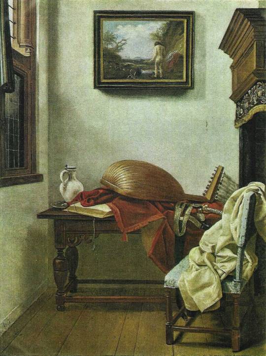
Still Life with Lute and a Jug - De Man
The picture of Vermeer that is now at Miami (and which was later engraved) is by this artist and very much in the Vermeer manner though crude and inferior by comparison.
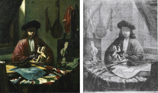
Portrait of Vermeer by De Man (left) and engraving thereof (right)
Also by this artist is a far better and more finished picture at Polesden Lacy near Dorking.
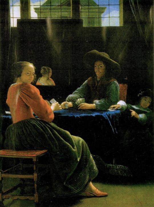
The Game of Cards - De Man
It shows a middle-aged man facing a young woman over a table where they are playing cards. A young child to the right who stands hardly higher than the table on which one hand rests looks out of the picture to direct, perhaps, another child's attention to the grown-up’s game. The young woman looks round towards us as one might turn to a camera.
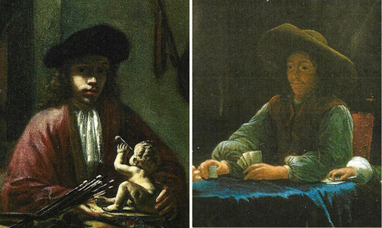
Details from De Man’s Portrait of Vermeer and The Game of Cards
Comparing the face of the man with that of the painter in the Miami picture, I think it very probable that we are looking at Vermeer himself relaxing opposite one of his daughters, with another of his many children beside him. The picture can stand in any case as a pleasant memorial to that genius of a ‘family man’, celebrant of town, home, kin and friends, who was happy to include those closest to him in what are still, despite the cleanings, some of the greatest of all representational paintings.
Julian Pritchard
March 2017
#vermeer#art history#dutch painter#flemish school#art theory#painting techniques#stolen art#frick museum#metropolitan museum of art#kenwood house#cornelis de man#girl with a pearl earring#connoisseurship
4 notes
·
View notes
Text
An Art History Primer
by Kristian Krawford
I spent many years studying art history in school and dearly loved it. So allow me a few moments to share the fruits of my education with you. Here is your art schooling without the cost of tuition. And you can really impress your friends with all your refinement!
We begin in Egypt from 3,000 to 330 BC. The style was marked by stiff figures in profile, subject matter was gods and goddesses, kings and queens, jackal-headed deities and the occasional cat. Egyptians were strong believers in the afterlife and decorated tombs with things they felt one needed in eternity.
Greece from 1200-200 BC. Not much art has survived from this period other than pots, all decorated in geometric patterns—zigzags, chevrons, checkerboards, diamonds. Also Homeric scenes and later some Kouroi statues.
Rome from 700 BC- AD 500. Virtually everything we know of Greek art comes to us from the Romans. They were the ultimate copycats, conquering the Greek world and plundering their treasures. They did the same to Egypt. They were the first art patrons and art collectors. A tradition that continued for centuries.
The Dark Ages AD 600-1350. This title is a misnomer as it was a very exciting time in the world. This was the era of beautiful churches, of Charlemagne (my own great-grandfather), the university and of some really beautiful art.
Charlemagne was King of the Franks and the first Holy Roman Emperor. His empire was called Carolingian and he set out to change the world. He built monasteries and churches, basilicas, murals, sculptures and frescoes—almost none of which have survived. What have survived are beautiful illuminated manuscripts from this time period, which is also called Romanesque because it draws on Roman models.
One way it was Roman-like was in its bigger and better churches. The architecture at the time, centered in Paris, was called Gothic by Giorgio Vasari, who intended it as an insult. It means “crude and barbaric.” Gothic style was simply the over decoration of a house of God. Elaborate stone tracery, crested finials, painted details—miscellaneous doodads. All crafted by anonymous artisans.
A French historian (Jules Michelet) coined the term Renaissance, meaning “rebirth,” in the 1800’s. And because the subject is so broad and involves so many artists, I could go on for pages. So for the sake of brevity, some things will receive only a passing mention.
The Renaissance can be divided into High and Low or Early and Late. The major artists of the Early Period were Giotto (first to paint three-dimensional people); Masaccio (mastered groups of figures); Lorenzo Ghiberti (spent 21 years working on the bronze doors of the Florence Baptistery aka. Gates of Paradise); Donatello (invented relief sculpture); and Filippo Brunelleschi (architect of the Duomo and first to apply the rules of perspective to art).
The major artists of the Late Period were: Sandro Botticelli (known for sensuous human forms, i.e. Birth of Venus); Leonardo da Vinci (arguably the most famous artist ever of the most famous painting ever, i.e. Mona Lisa); Michelangelo (started out in Florence, moved to Rome to paint the Sistine ceiling); Raphael (another darling of the papacy and one of my personal faves. I love School of Athens); Tintoretto (he closes out the High Renaissance with a Mannerist style); and Titian (greatest Venetian painter, he painted a lot of mythological subjects).
Some interest tidbits about Leonardo before closing out the Renaissance entirely. Leonardo wasn’t just an artist. He was a scientist, architect, engineer, draftsman, inventor and jack of all trades. He studied the human body by dissecting cadavers and imagined flight hundreds of years before the Wright brothers. He was interested in everything, yet finished almost nothing. He was a master of unfinished work. In fact, the Mona Lisa is one of only a handful of pieces he ever completed. And it was his personal favorite that he carried with him until his death. For centuries, Mona Lisa has remained an enigma. Not just her identity but her unusual expression. Is she or isn’t she smiling? According to Vasari, Leonardo painted a very melancholy sitter. He employed magicians, jesters and theatre performers to entertain her while he painted. It was while painting this portrait that he developed his sfumato technique (Italian for “like smoke”) in which colors and form subtly merge. It would become his trademark.
The Northern Renaissance is also divided into Low and High. These are the best known Low artists: Jan van Eyck (founder of Flemish painting, he painted the Ghent Altarpiece); Rogier van der Weyden (known for attention to detail and portraits of nobles); and Hieronymous Bosch (known for fantastical landscapes of a dark, medieval world).
The High Artists of the Northern Renaissance are: Albrecht Durer (not to my liking but this German artist is known for his engravings and woodcuts); and Pieter Breughel the Elder (Flemish painter known for allegories and parables of peasant life).
Baroque came after the Renaissance. It was a time of courtly festivals and royal ceremony. The term meant to be an insult—“degenerate.” Caravaggio was the most famous Baroque artist. A rogue character (even tried for murder), he was a naturalistic painter known for dramatic light. He placed ordinary people in his paintings of religious subjects. Scandalous! Peter Paul Rubens painted nobles while El Greco was known for his elongated figures. Rembrandt, considered the greatest Dutch painter ever, was known for his unusual lighting in which he made the most ordinary of people look mysterious. Jan Vermeer, also known for interesting light effects, enjoyed painting the Dutch bourgeoisie. Lastly, Velazquez was a great Spanish painter most interested in royalty.
From the 1700’s to the 19th century, there were four major art movements: Rococo, Neoclassicism, Romanticism, and Realism.
Rococo (c. 1730-1800) was art of the boudoir. It was a flirty, fanciful way of decorating the canvas. The main artists (all French) were Francois Boucher, Jacques-Louis David (I can’t stand that guy), Jean-Auguste Dominique Ingres, Eugène Delacroix and Gustave Courbet.
Neoclassicism (c. 1750-1820) was a genre in which artists copies the simple designs and restrained ornament of the ancient Greeks and Romans. The main artists Jacques-Louis David (I still can’t stand him), Antonio Canova, Jean-Antoine Houdon (known for his amazing bust sculptures of Ben Franklin and George Washington) and Jean-Dominique Ingres.
Romanticism (c. 1780-1850) was melodramatic portrayals of imaginary subjects. The best known artists were Eugène Delacroix, Francisco de Goya and William Blake—a wonderful writer who illustrated his poems.
Realism (c. 1848-1875) was basically a reaction to the excesses of Romanticism and some Neoclassicism. In this movement, it was the Americans who led the way. Many were painting beautiful landscapes of their young nation on large canvases. The landscapists were Thomas Cole, Frederic Edwin Church, Albert Bierstadt and Thomas Moran. Realist artists were Winslow Homer and Thomas Eakins.
Ah, Impressionism! Who doesn’t love it? It all began in 1874 when a group of Paris-based artists who’d been rejected by the Salon were mockingly called “Impressionists” by the April 25th issue of Le Charivari magazine. The name stuck. The style itself was marked by a close observation of nature whereby marks of pure color are placed side by side to create the effects of light on the canvas. They also differed in subject matter, tossing out literary subjects, mythology, and even history. They focused instead on scenes of everyday life. They also abandoned contour, modeling and precise details.
Though Èdouard Manet is the founding father of Impressionism, it is Claude Monet who is most often associated with it. Other stars are: Edgar Degas (he favored ballet dancers); Auguste Renoir (young women and rosy-cheeked girls); Alfred Sisley (the only Brit in the mix); and Mary Cassatt (the only American and most famous woman).
From 1874 to 1886, the Impressionists exhibited together a total of 8 times, but long before they broke up, the members were moving on to other things.
Post-Impressionism is a catch-all term to describe all the art that came after Impressionism. It also relied on the use of bright colors and splashy brushwork, but differed in what artists were feeling and saying. The stars of this movement were: Georges Seurat (inventor of Pointillism and a personal fave); Paul Gaugin (the native-loving man of bright colors); Vincent Van Gogh (most mad and magnetizing); and Henri de Toulouse-Lautrec (decorative posters of cabaret life).
Expressionism was marked by sometimes violent colors, abstract forms and emotional subjects. The big Expressionists were: Edvard Munch; Henri Matisse (inventor of Fauvism); Wassily Kandinsky (inventor of Abstraction); and Amadeo Modigliani (lover of long, lean bodies and necks); and the Viennese love-chronicler, Gustav Klimt.
Cubism is my least favorite genre so will receive scant mention here. It was the first totally abstract art movement—not at all representational—relying on geometric forms. Created by Pablo Picasso and Georges Braque, they were influenced by Cézanne, modern science and African masks.
Dada was a brief European anti-art movement that sprang up after WW1. It spawned the likes of Marcel Duchamp, Max Ernst and Man Ray. I take back what I said about Cubism being my least favorite. Dada is.
Surrealism came after Dada and although it was primarily a literary movement, it translated well into art. Basically about the relationship between dreams and the unconscious, this movement gave us Marc Chagall, Joan Miró and Salvador Dalí.
Constructivism was another brief art genre, this one centered in Russia. It spawned no internationally known starts, only regional artists on a mission.
Abstract Expressionism was about bigness—big canvases, big brushes, big cans of house paint, big male egos. It was also almost totally American. The main men were: Jackson Pollock (big drips and splatters); Willem de Kooning (brushy abstractions); and Mark Rothko (large blocks of color).
Pop Art is populist art. It’s representational and easily comprehensible. It’s spawned some very famous artists—Jasper Johns, Robert Rauschenberg, Andy Warhol and Roy Lichtenstein, to name a few. These artists rejected nature and instead focused on the manmade.
Minimalism came after Pop Art and spawned Frank Stella and a few minor artists.
So what genre is the art of today and where is it headed? Well, all the art since is generally lumped into the category of post-modernism and involves artists deriving their work from both natural and manmade sources. Today artists even use a third source—the wonderfully human imagination. Artists also create their work from many different mediums. Today, we have oil painters, acrylic artists, watercolorists, charcoal and pencil artists, collage artists and even mixed-media artists who use a combination of all of the above to create their unique works. And let’s not forget digital artists who create their imaginary worlds entirely on computer. Though future historians will have a difficult time categorizing the art of today, one thing is for certain: they won’t lack for interesting and beautiful paradigms to study.
#art history#artessay#artists#artprimer#arteducation#essays#essay#fyi#so you know#valuableinformation#goodstuff#artthroughtheages#history
4 notes
·
View notes
Text
Hierarchy of Genres
Ranks art forms in terms of their prestige and cultural value. The term is mostly used within the field of painting, and from the High Renaissance onwards, by which time painting had asserted itself as the highest form of art
Literature
Epic
Lyric Poetry and comic poetry
drama
novel
Music
Opera - highest form
Any element of comedy reduced the status of work, but increased popularity
Figurative Art: fully developed hierarchy in early 19th century
History Painting including historically important, religious, mythological, or allegorical subjects
Annibale Carracci, Allegory of Truth and Time (1584–5), an allegorical history painting relying very little upon realism.
Portrait painting
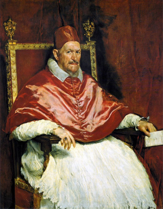
Velázquez, portrait painting of Pope Innocent X, c. 1650
Genre painting or scenes of everyday life
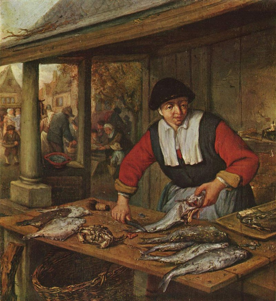
A genre painting. Adriaen van Ostade, Fishmonger, 1660–1670, oil on oak, 29 × 26.5 cm, Museum of Fine Arts, Budapest.
Landscape and cityscape art (landscapists were called "common footmen in the Army of Art" by the Dutch theorist Samuel van Hoogstraten)

A landscape. Themistokles von Eckenbrecher, View of Laerdalsoren, on the Sognefjord, oil on canvas, 1901.
Animal painting

George Stubbs (1724-1806): Whistlejacket (c. 1762), National Gallery
Still life

A still life. Heinrich Uhl, Still life with Jewelry Box, Opera Glasses, Gloves, and Bouquet of Flowers, oil on canvas, 50 x 60 cm.
The hierarchy was based on a distinction between art that made an intellectual effort to "render visible the universal essence of things" (imitare in Italian) and that which merely consisted of "mechanical copying of particular appearances" (ritrarre)
Source: Wikipedia: Hierarchy of Genres
1 note
·
View note
Photo

Scene Near Sorrento Overlooking the Sea
Martinus Rørbye (Danish; 1803–1848)
1835
Oil on canvas
Nivaagaards Malerisamling, Nivå, Denmark
#Martinus Rørbye#Rørbye#Danish painters#Danish artists#Danish Golden Age#Danish art#19th century#1830s#landscapes#Danish landscapists#Sorrento#Italy#Italian landscapes#Bay of Naples#terraces#shorelines#bays#Scandinavian art#Grand Tour#monastery#monasteries#monks#shadows#Campania#Capuchins#cypress#cypresses#sea#Scandinavian artists#trees
33 notes
·
View notes
Photo

Massa, Bay of Naples
John Brett (British; 1830–1902)
1864
Oil on canvas
Indianapolis Museum of Art, Indianapolis, Indiana
#John Brett#Brett#Massa#Bay of Naples#bays#Italy#Italian towns#mountains#Italian mountians#landscapes#British art#British painters#British paintings#1860s#19th-century art#19th-century British art#19th-century British painters#seascapes#British landscapists#19th-century landscapes#19th-century seascapes#Italian seascapes#Pre-Raphaelite Brotherhood#ships#coasts#Italian coast#Tuscany#coastal views
51 notes
·
View notes
Photo

Loggia on Procida
Martinus Rørbye (Danish; 1803–1848)
1835
Oil on paper mounted on canvas
Nationalmuseum, Stockholm, Sweden
#Martinus Rørbye#Rørbye#Danish artists#Danish art#Danish painters#Danish paintings#Danish Golden Age#1830s#19th-century art#19th-century Danish art#loggias#Procida#Italian views#Bay of Naples#landscapes#Danish landscapists#terraces#birdcages#ewers#lemons#arbors#planters#terracotta#sunlight#boats#sailboats#Island of Procida#Isola di Procida#volcano#islands
65 notes
·
View notes
Photo

Paysage italien = Italian Landscape
Achille Bénouville (French; 1815–1891)
1852
Gouache and watercolor on paper
Le Petit Palais, Paris, France
#Achille Bénouville#Bénouville#French artists#French painters#French watercolorists#French draftsmen#French watercolors#French art#French landscapists#landscapes#Arcadian#Arcadia#Italian landscapes#views#watercolors#panoramic views#panoramas#shepherds#Italian shepherds#folk costumes#luminous#rivers#Italian rivers#mountains#vistas#1850s#19th century#19th-century French drawings#19th-century French art#Campagna di Roma
11 notes
·
View notes
Photo

St. Rocco Waterfall and Bridge at Tivoli (Cascata e Ponte di St. Rocco a Tivoli), Albert Christoph Dies, 1795, Cleveland Museum of Art: Prints
Throughout the latter part of the 18th century, successive generations of German artists visited Italy in order to study the acknowledged masterpieces of antiquity and the Renaissance. After an unsatisfactory initial course of study of printmaking in Basel, Dies set out on foot to Rome where he remained for twenty years working as a painter and etcher. This etching of an artist sketching a picturesque view at Tivoli came from a series of Italian views. Although at the time Dies’s work was criticized for being executed too freely, this composition articulates the Romantic landscapist’s bond with nature that dominated 19th-century German art.
Size: Sheet: 39.9 x 30.7 cm (15 11/16 x 12 1/16 in.); Platemark: 36.8 x 27.5 cm (14 1/2 x 10 13/16 in.)
Medium: etching in brown ink
https://clevelandart.org/art/2002.105
2 notes
·
View notes
Photo

St. Rocco Waterfall and Bridge at Tivoli (Cascata e Ponte di St. Rocco a Tivoli), Albert Christoph Dies, 1795, Cleveland Museum of Art: Prints
Throughout the latter part of the 18th century, successive generations of German artists visited Italy in order to study the acknowledged masterpieces of antiquity and the Renaissance. After an unsatisfactory initial course of study of printmaking in Basel, Dies set out on foot to Rome where he remained for twenty years working as a painter and etcher. This etching of an artist sketching a picturesque view at Tivoli came from a series of Italian views. Although at the time Dies’s work was criticized for being executed too freely, this composition articulates the Romantic landscapist’s bond with nature that dominated 19th-century German art.
Size: Sheet: 39.9 x 30.7 cm (15 11/16 x 12 1/16 in.); Platemark: 36.8 x 27.5 cm (14 1/2 x 10 13/16 in.)
Medium: etching in brown ink
https://clevelandart.org/art/2002.105
1 note
·
View note
Last Seen Blogs

lofi44
hot chips enjoyer

ask-luknife-and-friends
Lunknife & friends!

tooruesque
Killing Me

tsunnychan
always me. always for you. every time.

notaluna
Aluna