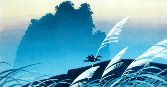
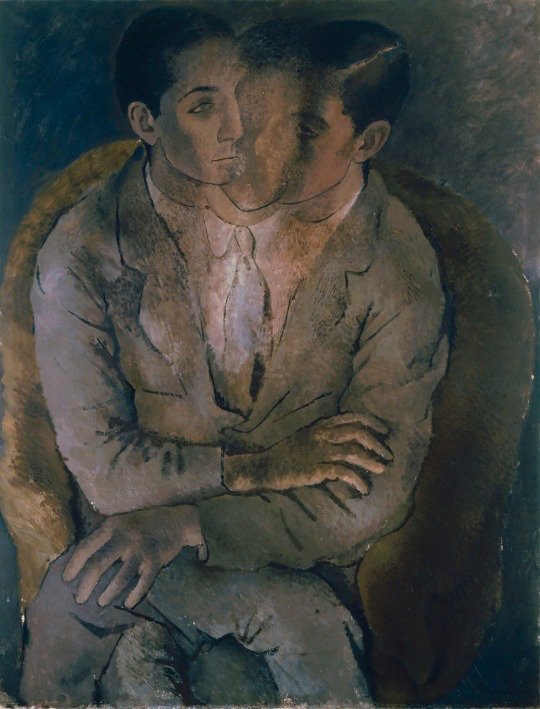
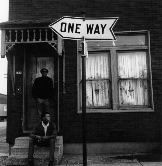
#Hans Bacher
Photo


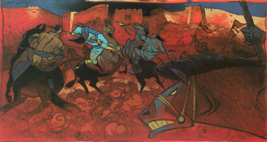
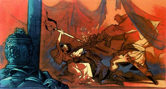
Concept art by Paul Felix and Hans Bacher for Mulan (1998)
#disney#mulan#disney concept art#visual development#art#animation art#paul felix#Hans Bacher#disney animation
5K notes
·
View notes
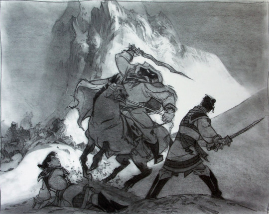
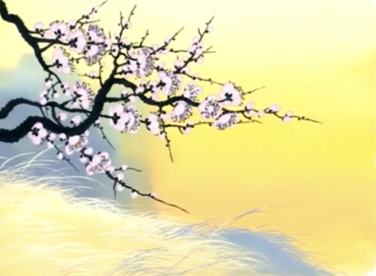
Text
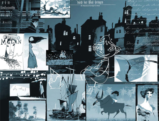
Visual development for The Snow Queen by Hans Bacher
18 notes
·
View notes
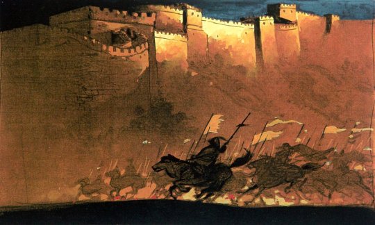
Photo


Visual development art by Hans Bacher for Mulan.
#concept art#visual development#Mulan#mulan 1998#disney#disneyedit#disney edit#capturingdisney#*#hans bacher
373 notes
·
View notes
Text

Mulan style guide
#animation#from Hans bacher IG and now in pdf form#disney#visual development#concept art#hans bacher#style guide#mulan#mulan 1998
22 notes
·
View notes
Text

Visual development for Mulan by Hans Bacher
3 notes
·
View notes
Text
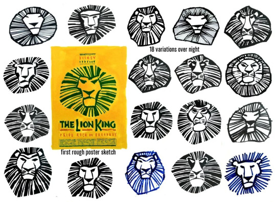
Hans Bacher, illustratore/animatore
"the making of a logo. I had to do it over night, Tom Schumacher, my boss at Disney, selected the final version, and had me erase the eyebrows. he said, the Lion King should not look threatening. and he was right. apparently everybody loves the 'King'"
0 notes
Text
''Analyze every image…around you. Always try to understand on the most basic level why something you see makes you feel the way it does. What visual elements may be contributing to that feeling? What associations or primal instincts could this visual be trying to target? What memories could the choice of light and color be tapping into?''
-Hans P. Bacher, Vision
1 note
·
View note
Note
Love your work! I wanted to ask what your process is like when it comes to coming up with a design/composition to a piece? Do you have any specific methods you use or it is more improvised:)? Thanks!
I'd say both - method and improvisation. To me all pictures are basically shapes organized in a pleasing way. Even when I draw lines I think more about overall shapes together and how I feel about them. There's a lot to consider about design and composition, some pretty smart books on the subject are Marcus Mateu-Mestre: Framed Ink and Hans Bacher: Vision - color and composition for film. I'm still learning all the time and I make mistakes but I think method to making composition comes down to: readability and narrative intention, moving from simplicity to complex. But it's also fun and important to play around and see what works, that's why my process is not always the same and I can show some examples.
Here are the sketches and final I did for my Magic card illustration:
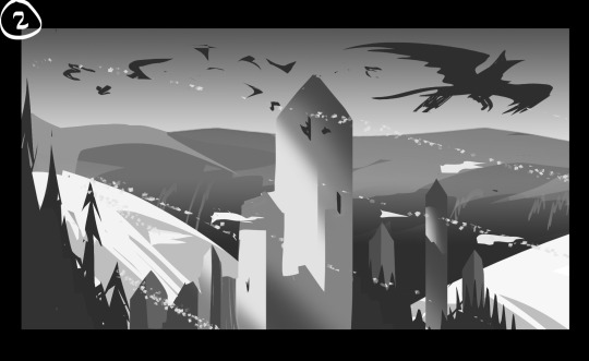

This is my go-to method when I want to rely on tried and true process and I know I won't get lost once I start drawing/painting because I can rely on my steps. I don't always do things this way, but for paid work I want the client to have as clear idea of my intention as possible.
The reasoning why 3 worked the best is because it's more dynamic and dimensional than 2, but more readable than 1. It also best showcases how the tower is supposed to be huge, something that was important for the design.
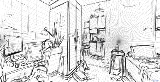
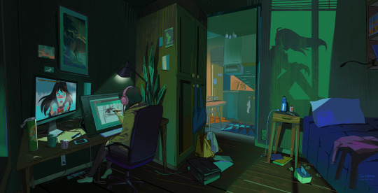
This on the other hand was personal work and I approached it in more relaxed way just to see where it goes. Still I think what made me want to finish it is I liked the variety of shapes and rhythm of the room, like how the screens lead towards the doorway, lot of rectangles but varied in their size and angle. If it was client work I probably would've been called out in the sketch, because the focal point is this empty wall that makes no sense. I came up with the idea of shadow of a window while making it and in the end it worked, but it was an example how I made a big design problem for myself that I was gambling on to figure out.
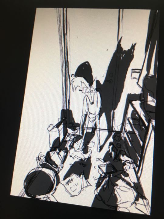

This one had very specifically just one photo reference, but I did the sketch to put down the essentials of what I was seeing in the photo. In the end I referenced dog's face and pose more from the photo so it looks more natural, which was also funnier than my own initial interpretation
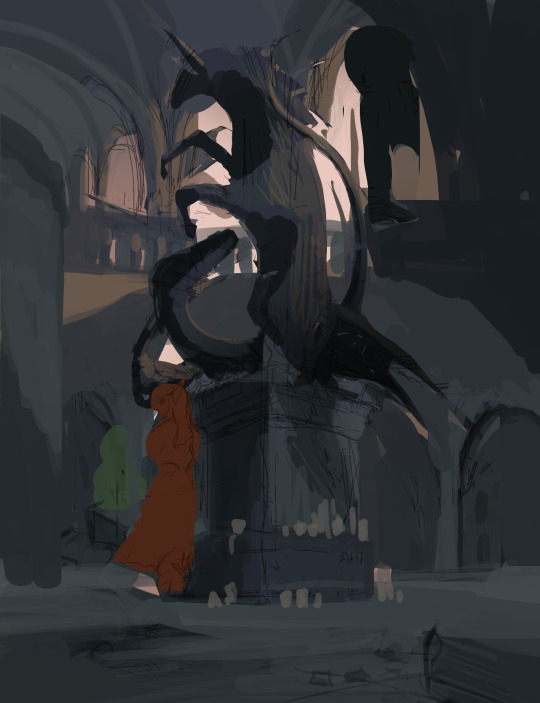

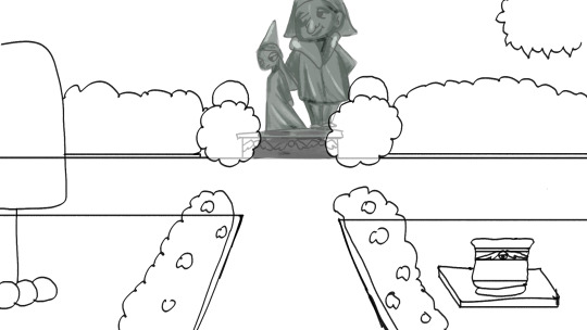
Sometimes the initial comp just doesn't pan out exactly. I did the sketch for this Unicorn fanart and I even drew the interior at some point, but it just Did Not Work for me, I also discarded the idea of medieval dragon in the statue for same reason. So it sat in my folder for a while until I could look at it again and after taking a break, I still liked the statue and the general idea, but decided to make the surroundings easier to look at so that the statue stands out better.
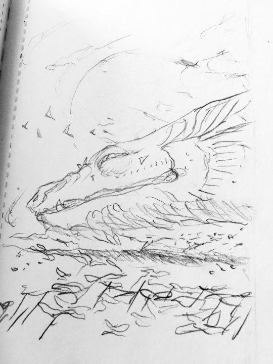
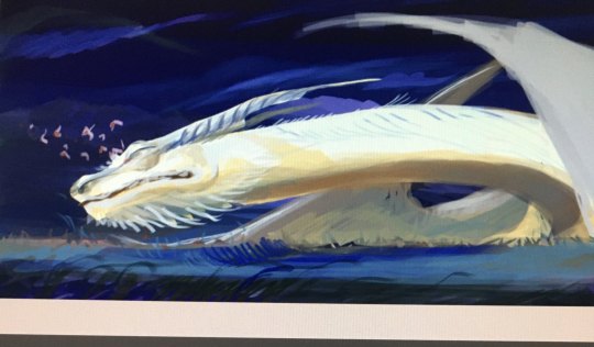
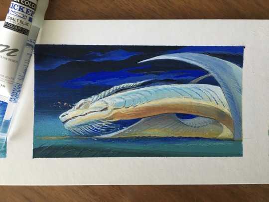
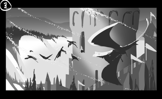
When I did the sketch for this dragon I wanted it to feel big and heavy, like lifting its head from the ground. But I didn't want to do vertical picture which lead me to painting over digitally and extending the picture, then painting the whole thing traditionally anyway.
287 notes
·
View notes
Note
literally how in the world is your art that good it literally makes my brain buffer!!
got any tips?
thank you so much mac! honestly a huge range of tips i could cover haha but i’ll see if i can give you some of my favourite tips that were the catalyst for my own improvement!
one of the biggest steps i made with painting realistically is after discovering a technique used to blend colours using gaussian blur. i dont use it as often but its still extremely useful for achieving a fast dreamy blended colour. but first i’ll explain how i use it. i’ll have my layer with my painting of say, my subjects face, duplicate the layer, set the upper layer to a lower percentage of opacity (around 50% at first but i often find that turns out too low of a %) and then i’ll go to the lower layer and add the filter gaussian blur and play around with the area to blur (often end up settling around the 20.00s) and after ive readjusted the upper layers opacity to maintain the structure of the painting the result ends up extremely dynamic with a nice blended look to it.
this was helpful for me when i started using a textured brush for quickly laying down colours without having to overly fuss about blending. because before using the textured brush i use now i used to use a soft brush to carefully blend while laying down colours and it was an Extremely slow and tedious way to paint. (oh and btw using my textured brush which is called ‘analog anabelle’ its a clip studio paint brush, adds a nice texture to just about everything, looks great for skin and for clothing, but has mixed effects for hair admittedly. i use a different textured brush i downloaded from the site called SU-Cream Pencil for fine details of hair).
it’s hard to explain in a way that doesnt reduce gaussian blur to a shortcut and a trick because the result of using the gaussian blur for the first time flicked a switch in my understanding of painting as well as speeding up my process an extreme amount. and now i dont rely on it to blend my colours anymore because its trained my eye and i can achieve a nicer blend by my own hand. i did use it recently on my house art as a finishing effect to his jacket though! a before and after image:


and it also helps for making lighting more dreamy, it came in handy for edges of wilsons face, making the rim lighting seem to bleed into the pinks of his face:

part of why this trained my eye was it helped me embrace trusting the process as well as using colours i deemed “ugly”, really it was about the idea of colours being contextual which ive known about for years but had been rejecting and winding up with paintings flooded with too many reds and pinks.

(picture of a page of hans p bacher & sanatan suryavanshis vision: color and composition for film)
the thing about thinking of colours contextually too is that it gave me a better understanding of achieving realistic effects with painting those trickier areas like eyes, which are a lot of subtle shifts in colour but sans eye makeup and/or deep wrinkles there arent really any hard lines. eyes and clothes wrinkles are all about the illusion of hard lines. (i only started really improving my art when i phased out line art which started with phasing out lines in clothes because the hard lines of the line art were competing with my subtly painted illusory hard lines) heres an example of when i was first phasing out of lines vs where i think my progress in understanding has taken effect in subtly painting illusory hard lines in clothing is most clear:

see how despite the fact i was still using line art in the left image the inside of the clothing has hardly any inner lines defining folds. but in the right image i have no line art at all and yet the folds look more structured and solid.
one more thing that was an important discovery to me is something i call overpainting. this may or may not help everyone but i keep different parts of my painting on separate layers, like a shirt layer, body layer, hair layer etc etc. and i used to have difficulties with the edges where the layers separated bc id be left with a lot of ugly sharp transitions between the body and the shirt.
an example:
but what helped me was creating a folder above all my layers and painting on an unlocked transparent pixel layer over the top and softening the transition between those layers. it also helps with making my subjects edges blend into the background heres what my edgar art looks like with and without the overpainting:

you can see the edge of his left sleeve is almost completely blurred into the colour of the stone bench, and you can see how i use the overpainting to blend hair into the background
these are all of my most recent discoveries that have helped me sorry if theyre of no use but i apply all of these in all my art to gain a more realistic effect! and if you have any further questions or need for clarification feel free to ask!
#i had to stop there because tumblrs image limit but i love talking about art so im grateful for the question🙏💕#all of what ive learned is self taught/osmosis from other artists tips online btw im not formally trained so take that into consideration#like all of this is the stuff that applies to how ive managed to improve my own art and style over the years and may not be applicable t you#asks
6 notes
·
View notes
Text
Interview with Simon Wells, Balto-1 Director
Interview with Simon Wells, Balto director, published on Animation Source in 2015. I participated too :)
Some may know him as the great-grandson of H.G. Wells, but Simon Wells has been known to have provided plenty of contributions to the animation industry. Starting off working for Richard Williams as an animator for many commercials and Who Framed Roger Rabbit, he has since provided storyboarding service to many DreamWorks Animation films, and has directed several major animated features including An American Tail: Fievel Goes West, We’re Back! A Dinosaur’s Story, Balto, The Prince of Egypt, and Mars Needs Moms. He also had a shot at directing live-action with 2002’s The Time Machine, an adaptation of his great-grandfather’s novel.
Amongst the Balto community however, fans most certainly recognise him as the director of the first Balto movie. The man in charge of providing the underrated classic that has touched the hearts of many people. Karlamon was able to get in contact with Simon, and he was more than happy to be interviewed with questions asked by the fans (minus some user-submitted questions we unfortunately could not accept), giving us the chance to to find out many of the unsolved mysteries of the first movie.
Karlamon: Have you seen the two Balto sequels [Wolf Quest, and Wings of Change]? If so, what are your thoughts on them?
SW: Actually, I haven't seen them. I'm not entirely sure why I haven't. I think perhaps the original movie was close to my heart, and I didn't want to see what other people had done afterwards. My daughters watched Wolf Quest many times when they were younger, and enjoyed it a great deal.
Nakou: What did Balto represent for you when you worked on the movie and what does he represent now? What is its place in your others projects? Are you still proud of that movie?
SW: I am very proud of the movie. It was made for a fairly modest budget - less than a third of what Disney was spending on animated movies at the time - but the crew put an enormous amount of care and attention into spending what money we did have as wisely as possible. Overall, it felt like everyone on the movie was putting their best efforts into it.
From [Cliff] Ruby and [Elana] Lesser's first draft of the script that I read, I felt that Balto was a classic animated movie: The underdog outcast who proves to be a hero. I think we all like to root for underdogs, and on some level identify with those kinds of characters. Everyone has felt misunderstood, or at times excluded, and this story gives that character a redemption in the eyes of his town.
I can't claim that Balto has a 'place' in my other projects. I haven't really had the luxury of choosing projects, beyond saying 'yes' or 'no' to projects that were offered to me. But this was a story that I lobbied Steven Spielberg vigorously to make.
(By the way, Steven liked the story, but was concerned that it wouldn't be colorful enough. Hans Bacher, our production designer, made dozens of wonderful small color studies that showed what we could do, and those reassured Steven that the movie would not just be black and white dogs in a white snow field.)
MightyBalto1925: If there's a backstory on this, how did Balto end up living with Boris?
SW: You know, I can't remember now. We made the film over twenty years ago. I think the idea was that Boris had found Balto as an outcast pup, and had stayed in Nome to look after him, so not flown South with the other geese. There is a little indication of Boris being a bit of an outcast too in the small scene on the boat where they see the geese flying overhead, and Balto asks him about it, just before Muk and Luk turn up.
(Useless trivia: I animated the longshot of the geese flying myself - I couldn't bring myself to ask any animator to do such a mundane shot.)
Somes: What was the inspiration behind Muk, Luk, and Boris? Did the staff try to pull characteristics of the character's respective voice actors into the design and personality of Balto's three sidekicks?
SW: Nicolas Marlet had done the designs for the characters before we cast the voices. Although it is common in animated movies to make the characters look similar to their voice actors, on this occasion we did not try to do this. Actually, Phil Collins created the voices of Muk and Luk in direct response to the drawn designs.
But certainly, the actors brought a great deal of themselves and their experiences to flesh out the personalities of the characters. Bob Hoskins' performance of Boris was a lot more emotional and effusive than we had originally conceived the character to be.
Fast As A Shark: What scene in Balto did you find to be the most challenging to work on?
SW: That's really hard to remember now. There was stuff that was surprisingly easier than we had expected - all the snow in the movie was done with an early CG particle animation system, and turned out far better than we had dared to hope.
The principle challenge was delivering a sufficiently lush-looking movie for the budget. We calculated that we could only have a limited amount of visual effects work in the picture, and so we would have to make hard choices between footprints or shadows, for instance. We couldn't afford to do both in most shots. We spent a lot of time figuring out what we could get away with leaving out.
Kitsune99: What exactly made you cast Jim Cummings over Brendan Fraiser as Steele?
SW: That was Steven Spielberg's call. I liked Brendan a great deal, and we did one recording session with him that was terrific. At the time, Brendan was almost unheard of - he had done Encino Man and had Airheads coming out, I think. I had pictured Steele as a kind of school quarterback jock, carried away by his own sense of importance. Brendan fitted that well, but Steven wanted to feel a clearer sense of Steele's inherent evil. Jim did a fantastic job, and totally made the character live, so I don't regret the choice.
Byanca Moureen: Balto is half wolf and half dog. He doesn't know who he is. But I just want to ask. Balto's wolf side is from his father or mother? Who was a wolf? Balto's mother or father?
SW: I always kinda assumed that Balto's father was a wolf, and that his mother had been a working sled dog. (There's probably a Romeo and Juliet-style prequel in that.) But we never state that for certain.
Nakou: I was curious about knowing if you had a precise idea about who the white wolf was for Balto: His mother? Father? Brother? Or just a random wolf with a mystical appearance?
SW: Whether the White Wolf is Balto's father or some kind of ephemeral Spirit of the Wolf is deliberately unstated. The White Wolf Sequence is still my favorite part of the movie, and James Horner's extraordinary score that accompanies it still raises the hairs on the back of my neck.
We wanted to keep it mystical and vague - is this a real event or is it some kind of hallucination that Balto is experiencing? All of these were reasons to not have the White Wolf speak or in any way explain himself. Perhaps the Wolf is a manifestation of Balto's inner voice, telling him to take ownership and use that part of him that he has always been ashamed of - certainly that is the message Balto takes from the encounter, real or not.
(And by the way, if it was really his dad why didn't the old man help him drag the antitoxin up the cliff?)
Cyclone Blaze: In your experience, what's the key for creating a good character?
SW: Character is really in the writing. Good performance animation can support the character, just as good voice acting can deliver on the promise of the written word - and even find nuances in the script that the writer hadn't considered. But fundamentally you can't make a superb character out of a lousy script. Character is not simply the statements that person makes, however. It has to stem out of the REASONS why a character chooses to do the things they do. That is by far the hardest thing to figure out. As Bob [Robert] Zemeckis told me, after you have figured out your motivations, the rest is just logistics.
Cyclone Blaze: Which characters are preferable for a story, bidimensional or really complex characters?
SW: I think it was [Alfred] Hitchcock who said you can only remember five people you meet at a cocktail party, so there should only be five principle characters in a screenplay. This isn't a hard and fast rule, but it is generally true that you only have enough time in a movie to get to know a small number of characters with any depth. Your main characters should have complexity, contradictions, subtlety, and nuance. Secondary characters tend to have simpler defining personalities, and a question and answer kind of arc, if they have any arc at all. Tertiary characters are usually simple archetypes, easily recognized and with characteristics that can be inferred.
MightyBalto1925: When you were developing Dixie, were you working from a specific breed of dog, or is she just a mixture of other breeds? Most of the fans agree that she's a Pomeranian.
SW: Yeah, I think she was intended to be a Pomeranian. I have no idea what a Pomeranian was doing in Nome, but I'm sure there is a backstory to be created there!
Karlamon: For your first two movies at Amblimation [An American Tail: Fievel Goes West, and We're Back! A Dinosaurs Story], you were co-directing with Phil Nibbelink (and two others for We're Back!). What was the reason for you directing Balto solo? Was it an extra challenge without a co-director assisting you?
SW: Phil and I started We're Back and then passed it over to the Zondag brothers [Dick and Ralph] while we developed another picture (that didn't ultimately get made.) We never worked on the picture alongside them. Steven [Spielberg] eventually dismissed them and asked us to return to finish the picture. We had started developing Balto together, but at the time we were looking to develop more movies for Amblimation to make after Balto. It made sense for Phil to peel off and finish up We're Back, then move on to developing a new picture. Before that new picture could materialize Steven got involved in setting up DreamWorks, concluded his deal with Universal and closed down Amblimation.
Nakou: How was it like to work with James Horner? How did you react to the sad new of the plane accident? Could you say something for him?
SW: James was a stunningly talented and prolific composer. He created an outstanding score for Balto, for which I will always be hugely grateful. I can't claim to have had a close working relationship with him. He was working in California, and we were based in London, England. Also James preferred to present his score as the orchestral finished product, and make alterations based on notes from that finished product as opposed to, for instance, Hans Zimmer [The Prince of Egypt], Klaus Badelt [The Time Machine], or John Powell [Mars Needs Moms] who all involved me in the composing process and played elements mocked-up in synthesizers before the final scoring days.
Ronno: Which Balto character do you feel the closest to?
SW: That's a really good question. I think there are parts of all the characters that I sympathize with strongly - you have to feel the character's drive to direct it. I think probably Balto himself is the one I feel the strongest empathy for.
MightyBalto1925: A while back a user on here attempted to decode the Morse code in the film, but came to the conclusion that the code is nothing more than gibberish. But despite their efforts, is their a message in the code (if you can recall), or is it indeed only gibberish?
SW: I wish there was! No, I'm afraid it is gibberish. If I did the film now I would certainly hide an 'Easter Egg' in there. I'm not sure where the Morse Code track came from - it may have been a sample from a sound effects library.
jerseycaptain: Why did the story writers and the production team decide against featuring the many other teams which took part in the actual 1925 Nome serum run? As we know, there were actually twenty-one teams which were intended to participate...one of which didn't, due to being bypassed by the musher of Balto's team (musher Ed Rohn, whose lead dog--interestingly enough--was named "Star").
I fully realize that, in a movie, you need to try and focus on a small cast of regulars and, ideally, one primary protagonist, but there are plenty of aficionados of the actual serum run who have always been bothered by the fact that dogs like Togo, Fritz, Scotty, Blackie, Star (the real one, who wasn't a Klee Kai because they didn't exist until the 1970s), etc., and people like Leonhard Seppala, Gunnar Kaasen, Emily Morgan, Curtis Welch, Scott Bone, Wild Bill Shannon, etc. were forgotten completely in the script (at best, Dr. Welch is indirectly nodded to by the unnamed doctor who is shown).
Plenty of people have long been curious about that. And especially as concerns the lead dog Togo (who led Leonhard Seppala's team). Togo is widely viewed as the major canine hero of the serum run even if each dog which participated did its part very well.
SW: Yes, I read a lot of the contemporary news articles about the real serum run, so I am aware that the original plan had been for Seppala to do the whole round-trip, and it was only after he had set out from Nome that the relay plan was hatched. (The truly stunning thing is that Seppala met the serum relay en route, took a turn and then handed it over to the next team in the relay, and then continued on to Nome and arrived only a day or so after the relay of fresh teams made it there.)
I can understand the concern about how far the plot of the movie deviates from the historical truth, and feel badly for the many families who are proud of their relatives' involvement in the real-life heroics.
The movie is a fantasy based (loosely) on historical events, and concentrates on one character's personal journey - and that character is highly fictionalized, too. We never set out to make a documentary, and in our defense the live-action frame of the film does indicate that what we are being told is childhood memory, and that it is being told to entertain a grandchild, so may have considerable deviations from fact in it.
I know that when the Balto statue was commissioned for Central Park, many people felt that it should have been Togo. But Balto had been the hero of the sensationalist news stories and the name everyone had heard. In compromise, the plaque does not name Balto specifically, but talks about all the sled dogs - which is also why we read it out in full in the final scene of the film.
Nakou: How did the idea of creating Balto come up? How did the character evolve?
SW: Balto originated from the writers Cliff Ruby and Elana Lesser. Elana remembers her grandfather telling her the story when she was a child, and had felt it would make an excellent animated feature. Ruby and Lesser had then approached Amblin with a screenplay, and Doug Wood and Bonne Radford passed it on to Phil Nibbelink and me in London.
We read it and thought it would make a terrific feature, and lobbied Steven Spielberg to let us make it. Phil later dropped off the project to finish We're Back, and [Roger S.H.] Schulman & [David Steven] Cohen (plus a few other uncredited writers) did further development. The essential ideas of the main characters were Ruby and Lesser's, although I think the sled dog sidekicks originated with Schulman & Cohen. (If I'm wrong about that I apologize. it was a long time ago!)
#1SteeleFan: Can you tell me more of the backstory of Steele's character in the first film? Like how he was thought up and maybe some information that we the fans may not have heard like if he had a different name or something along those lines?
SW: We originally envisaged Steele as the most popular kid in school; the king of the jocks. He has always
been the best, and never had to really work to maintain his position. In a word: cover-confident. Never having had to try very hard, he is not ready for adversity when it confronts him, and his grip on right and wrong goes away as soon as he is rattled.
I had wanted to cast Brendan Fraser (at the time almost unknown; he'd been in Encino Man and was shooting Airheads) but Steven Spielberg felt a more directly villainous take would be better, and pushed us to cast Jim Cummings (a well-known animation voice even then). Jim did a tremendous job, and we were very happy with the resulting characterization.
Byanca Moureen: I saw a lot of old backgrounds for the film. There were Northern Lights with a silhouette of a wolf, as well as a snowy owl. Can you tell me about this? It's really something mystical for me.
SW: The shape of the wolf howling in the northern lights at the end of the movie was always envisaged as the closing image of the animation, from the earliest script. I'm not sure where the owl image came from. I don't recall seeing it before, but maybe my memory is faulty.
DragonTamer: What do you think each of the characters (such as Muk and Luk or Steele's lackeys) brought to the table in terms of making the movie what it was? Were there any you thought were particularly key in their unique contributions to the finished product?
SW: Sidekick characters are always a useful element in a story. They allow the lead character to explain things to the audience, and also provide comedic relief from tension. The great thing about having silly characters is that they can say the obvious things, the things that smarter characters might be too polite or too sensitive to point out. So the sled dog lackeys are the stupid version of Steele, they back up and enhance his point of view. They also acted as the voice for all the sled dogs, as allegiances start to shift away from Steele and towards Balto.
Acanis: I understand that there were a few scenes that were cut from the final movie and in some cases it would appear that they were even animated as unfamiliar frames from the movie appear on some of the official movie merchandise items such as story books and sticker albums (for example Rosie's father chasing Balto out of the Hardware store). In addition I have been fortunate enough to acquire some of the original artwork from some of these scenes such as the "Barrel Sequence". Other cut scenes/moments include Star ripping Steele's collar off and an alternative Balto/Jenna first encounter.
Sadly it seems unlikely that we will ever see a Director's Cut or Special Edition Blu-ray so could you please give us an insight into some of the scenes that were not included in the final version?
In addition do you know if any of the footage still exists?
SW: Yeah, there were a number of bits that were in earlier versions of the story that we chose to cut down to streamline and clarify the story intent. Merchandising is often put into work before the final version of the story is nailed down, which is why episodes that are not in the film sometimes show up in these ancillary elements.
Ultimately, we felt that things like Balto being shoo'd away from the store was taking a long time to deliver an idea that we could deliver much more efficiently in Rosie's dad's reaction to Balto after the race.
Whereas in live action films the whole script is shot and then the edit is a cut-down of the material available, in animation the script is being written and reworked simultaneously with the storyboarding. So I think some of these things were discarded ideas that were replaced in the development process.
The film that we released was, in effect, the 'director's cut' in that there was no material that I wanted in the movie that wasn't there; I was not forced to cut anything out. And if you did put some of that material back (it only ever existed as storyboards, never finished animation), you'd find that there were repeated beats and the continuity would no longer make sense.
Phalynx: What inspired Balto to be made part-wolf?
SW: Again, this was a concept that was present in the earliest [Cliff] Ruby and [Elana] Lesser script. Balto's half-caste nature is not historically factual at all, but the story is being used as a vehicle for a theme about understanding and appreciating differences. The real Balto was not particularly pure-bred - he was not a racing dog, just the lead of one of the working teams that hauled cargo around the place. There is no evidence that there was any wolf blood in him.
Karlamon: Out of all the movies you've directed, which one would you say you're most proud of?
SW: I am proud of most of the movies I have directed, for different reasons.
Balto I love because it was my first solo-directing experience and the crew were a wonderfully cohesive group who really wanted the movie to turn out well, and put their hearts and souls into it. I am very proud of what we accomplished on a very limited budget, and particularly pleased that it is a picture that continues to touch people's hearts so long after it was made.
Prince of Egypt is probably the animated film for which I get the greatest credit, in that it was a truly ground-breaking movie and had some utterly spectacular animation and effects work in it.
My last picture, Mars Needs Moms, is actually one I am very proud of, even though it did not perform at the box-office. I still sincerely believe in the heart of the film, and had the most fun on it of all the pictures I have been involved in. I made a lot of very good friends and loved going to work every single day of the three years we worked on it - not a lot of jobs are that good.
Karlamon: Any future plans you got in animated filmmaking?
SW: The pictures that I am writing and developing at the moment are live action, although my wife and I have written proposals for several animated movies over the last three or four years. None of them have been picked up, but if they were I would probably direct them. By the time you have written and rewritten a script to the point where a studio feels ready to produce it, you are so familiar with it - and so connected to it - that it would feel difficult to pass it to another director. So although I haven't any immediate plans to direct an animated feature, if the right project came up I wouldn't turn it down.
As it is, I also get a big kick out of helping other filmmakers realize their visions, so I am boarding on a variety of movies - mostly for DreamWorks Animation. Among other things this year I have done stuff on Croods 2 and How to Train Your Dragon 3, both of which promise to be terrific movies.
Karlamon: In closing, we have been so thankful of you for taking your time to answer our questions, and your answers have taught us fans a lot. That, and the opportunity to contact you as one of my animation idols is truly something very special. So again, thank you very much Simon.
SW: You're very welcome! I must say it has been wonderful to see the level of interest and passion that still surrounds our little old movie. It's very gratifying - so thank all of you!
2 notes
·
View notes
Photo


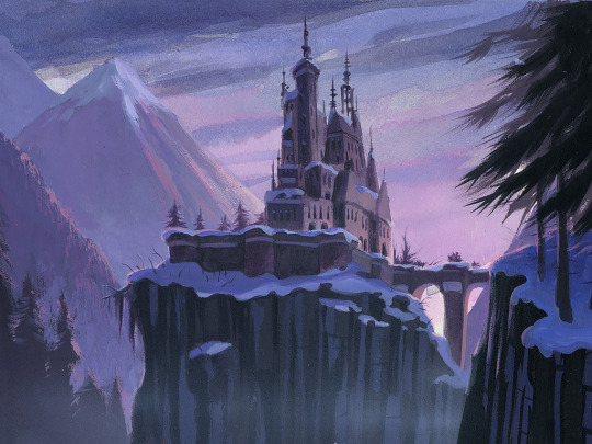
Concept art for Beauty and the Beast (1991)
#disney#beauty and the beast#disney concept art#concept art#visual development#Character Design#Glen Keane#Hans Bacher#animation art#art#artwork#disney animation
7K notes
·
View notes
Text
09/02-22/02
Background research
This is when I started to realize I didn't fully understand the role that background artists play within the animation pipeline so I decided to do more research into my specialism. This is a list of all the resources that I used to gain a deeper knowledge of background art.
Backgrounds: Layout and composition Hans Bacher
Background Art 101 (youtube.com)
Tips for Drawing Backgrounds! (youtube.com)
How I approach Backgrounds for Animation Projects (youtube.com)
I also decided to reach out to people within the industry to gain further knowledge, I am still waiting to hear back.
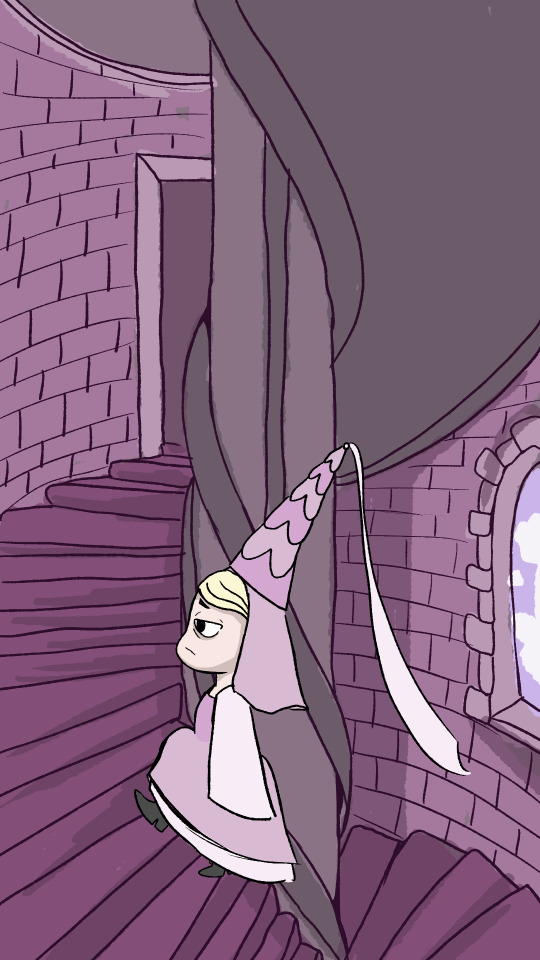
concept exploration
I decided to have a day where I just explored the shape of the princess but also inserted her into an environment that I felt we would see her in. Using an image of a medieval staircase that I had gotten from Google as inspiration. I kept the detail limited as the team wanted a very simplistic-looking style throughout.


15/02
This is when I really started to explore the warped style of our project. This is something that I am finding extremely hard to understand especially having just learned about perspective. However, I do think this may be overly detailed for what we are trying to achieve. Still keeping to layer groups so that creating them becomes muscle memory and becomes something I never forget.

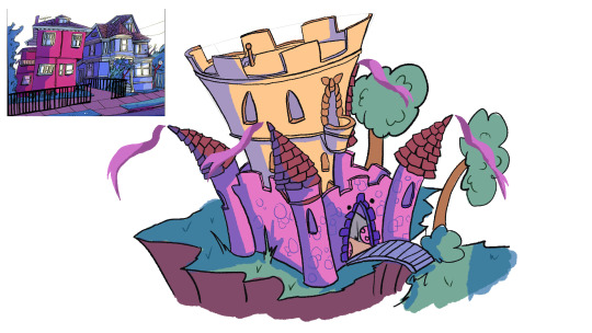
Castle exploration
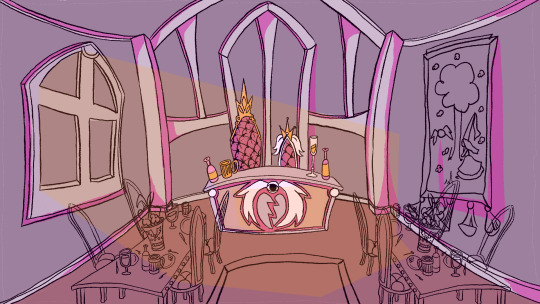
Creating a warped version of the castle plus using similar colours that are used within Vewn which is a YouTube account that makes animation shorts that our showrunner is very interested in exploring - (31) vewn - YouTube
19/02
The choosing of back ground lead + Feedback
I was happy with my feedback and fine with not being picked for background lead as I felt that I did not have aa full understanding of what we were trying to achieve in style however, I was disappointed that the praise of including angel accents within the background went to someone else as it was something I felt was quite clever of me.
screen shot taken from teams conversation
Character sketches
for fun or breaks within focused studies I started drawing forms of the princess just so that I could really have fun with in.
In our meeting we started discussing the possibility of looking at different styles. One of the styles that came up and was something our show runner was interested in exploring was late 90's and early 2000's cartoons leaning more towards ed, Edd n Eddie. I decided to do a quick study of a background within the cartoon. This allowed me to mind techniques that may have been used.
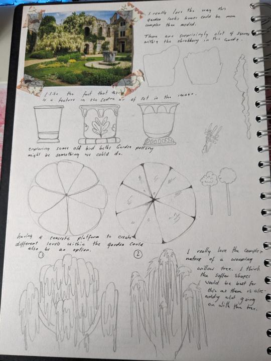
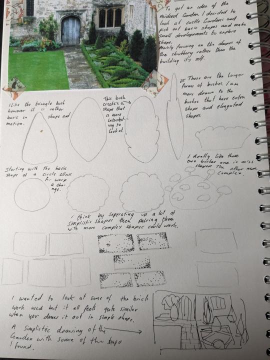
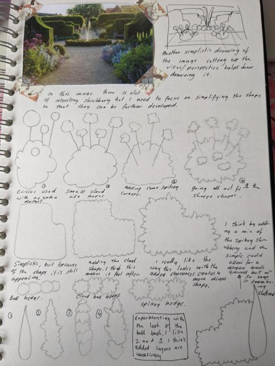
Gardens developement 20/02
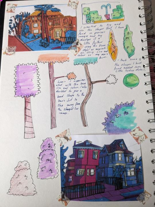
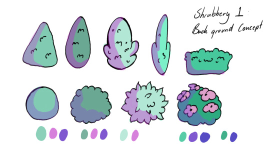
After being allocated the gardens I did a lot of initial sketch work within my sketchbooks and did some research on castle gardens and midlevel gardens, I then tried to transfer the basic shape language of bushes and trees I found with in the images I found into the style of Vewn. Then I put the original sketches into Photoshop to draw over the shape's and colour to have a small library of shrubbery.


0 notes
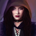
Photo
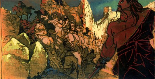

Concept art by Paul Felix and Hans Bacher for Mulan (1998)
317 notes
·
View notes
Text
Dream Worlds- Hans Bacher
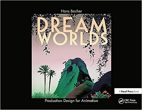
Hans Bacher is a production designer who has worked on many animated Disney films over the course of more than 20 years. In 2007 he released the book Dream Worlds, exploring what a production designer does and how to design a film well.
He suggests practicing by studying films and storyboarding existing sequences to understand the composition, lighting, and camera angles.
When working on visual development of a film before production begins, Bacher and the production design team were often sent on trips to the countries where their films were set to get a feel for the landscapes and architecture. When this wasn’t an option they would reference photos, other films, and artwork.
0 notes
Text
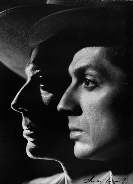
playing doubles
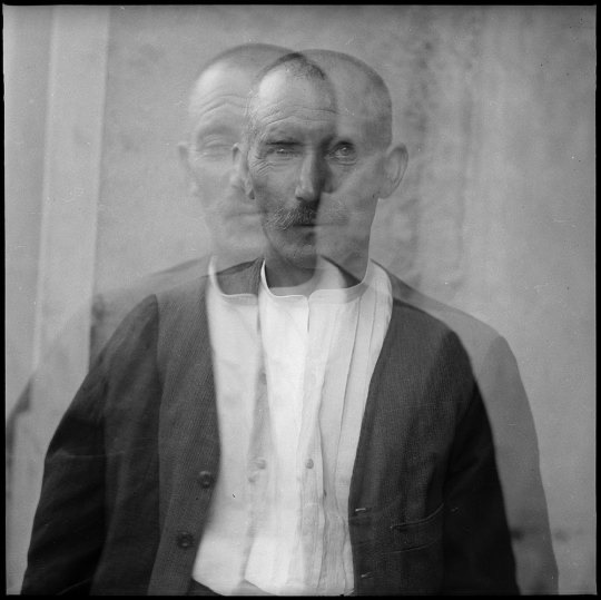
Gustave Roud - Edmond Cherpillod, 1935
::

Alberto García-Alix
::
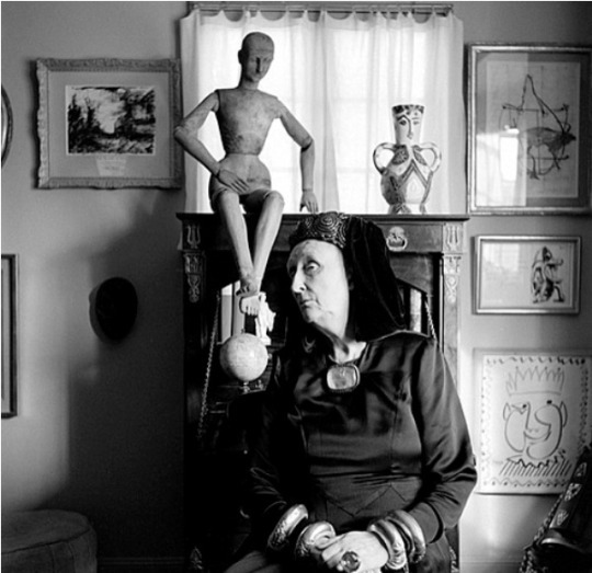
Sanford H. Roth - Dame Edith Sitwell
::
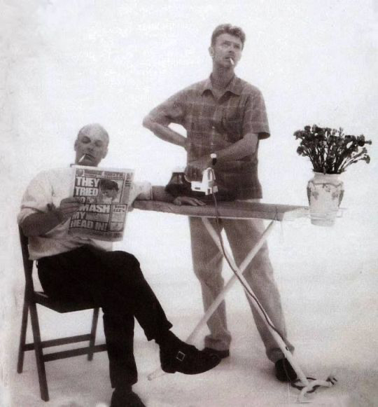
Brian Eno and David Bowie in 1995
::
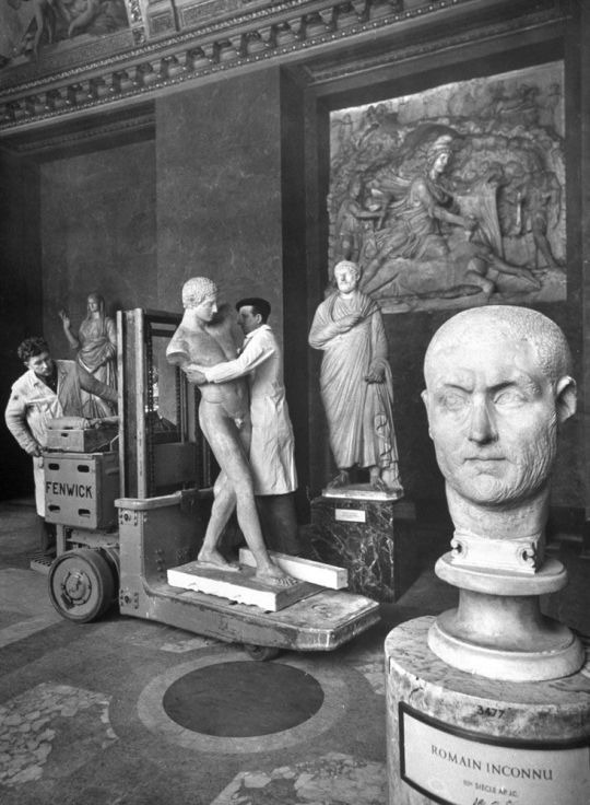
Dmitry Kessel - you lead
::
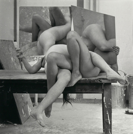
Hans Breder, 1972
::
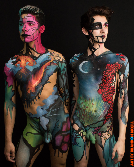
Brandon McGill - The Duality Series
::
Lutz Bacher - Boyfriends
::
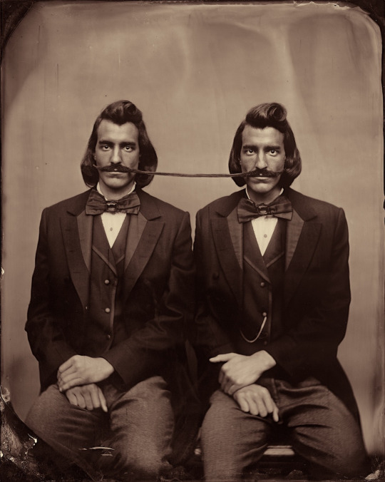
mustache whacks
::
Pavel Tchelitchew - Untitled (Seated Man, Multiple Images)
::
Vojtech Kovarik - The Present and the Past
::
Johanna Amnelin
::
Annemarie Heinrich - Antonio Ruiz Soler
::

unknown
::

Luiz Sacilotto - Concretion 58
::
Charles H. Traub
::

Juan Manuel Castro Prieto
::
Sunday: just plain folk
1 note
·
View note
Text
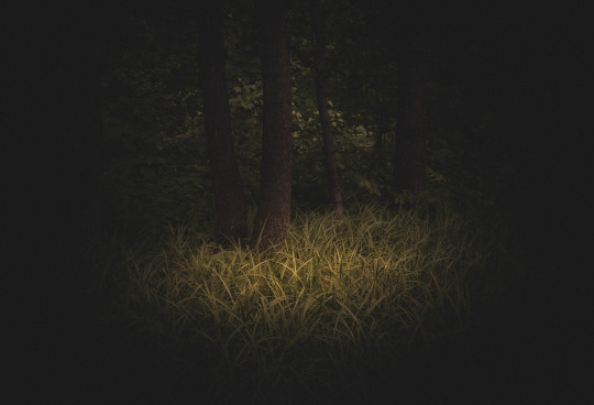
Update: Moving further with 'Light and shadow' and 'Memory and Nostalgia'
I'm proceeding with 'memory and nostalgia'. Story and Animatics are the stages completed for this. And it is so blank how to approach the animation. How to find a style for this work remained even referencing online materials. So I planned to do some book references from the library. As the treatment was the major concern now, my eyes stuck at the book 'Vision: colour and composition for film'. This book is by Hans P Bacher, who is a renowned person in the animation film industry and co-author Sanatan Suryavamshi, is an Art director. Many nice images are included in the book, that really ignites the artist inside.
This book mainly helps to use image compositions in an effective way. And the proper use of elements like shape, line, colour, harmony and contrast. Also referencing online materials continued after this activity. Also I would like to add more reference.
youtube
This Animated short inspires in background and character designs.
youtube
For the second one I have chosen 'light & shadow' and wish to do 3D treatment for the story. And I found blender will help me to do that. For that I have to get familiar with the software, so started Blender from scratch. Like every time YouTube helps me for this too.
youtube
Also referred many sources for the doubts. Created first trial for the 'light & shadow' chase scene. Due to lack of time in the second project treating in a 3D style may change to fully workout in 2D style. The shot for the firefly chased by the frog is done here.
Considering 3D treatment for the second animation assignment I have got inspiration from an artist Katarzyna Mrożewska from Behance, one of her forest photography inspired my 3D style for this Second practice
Bibliography
Bacher, H.P. (2018). Vision : color and composition for film. London: Laurence King Publishing.
www.behance.net. (n.d.). Behance. [online] Available at: https://www.behance.net/gallery/151584059/King-Midas-forest/modules/855749837 [Accessed 10 Jan. 2023].
www.youtube.com. (n.d.). are you okay? [online] Available at: https://youtu.be/tJsGGsPNakw.
www.youtube.com. (n.d.). Learn Blender 3D in 20 Minutes! Blender Tutorial for Absolute Beginners (2023). [online] Available at: https://youtu.be/Rqhtw7dg6Wk [Accessed 10 Jan. 2023].
www.youtube.com. (n.d.). Pankajakasthuri Anticid TVC | Eunoians. [online] Available at: https://youtu.be/VrpuPoC1M-M [Accessed 10 Jan. 2023].
0 notes
Last Seen Blogs
yumindhlovu
Yumi
crystalrogues
The Crystal Rogues

barbies-and-babies
The Crafty Wench
darkellaine
Darkellaine

navthecav
Untitled