#Dani and Danny's destructive tendencies
Text
DC X DP PROMT #15
Hello there Loves! New promt!
Ok, so, here's the thing. Dani didn't really mean for her and Danny to end up on the Supers radar. Really, she didnt.
She just wanted to check out if the rumors about another clone were true! And if they really were one of the Supers.
Dani wasn't at fault here, she was just looking, then found another rich douchbag who created a clone.
So, of course she had to investigate! Danny agreed with her and all! (They might not have told jazz)
So, Dani went to Lex Corp, where these rumors began. Then she found Clone machines. And plans to make MORE.
Dani didnt exactly do anything per say. She just. Went into the mainframe and deleted everything?
(She and Danny were in so much trouble)
Then, then, the next part was definitely not her fault, nope. In fact, it was Danny's. Kinda. Sorta. Ish.
Aaaand the building was on fire.
Spontaneously.
Entirely unrelated to her and Danny.
And nothing at all to do with the dynamite she had in her bag.
Nope.
The supers had not been flying after them for the past half hour.
...
(Jazz was going to kill them. Goodbye afterlife.)
Feel free to use it add on!
#dc x dp#dcxdp#dc x dp prompt#dp x dc#dp x dc crossover#dp x dc prompt#dpxdc#dc x dp crossover#lucky_fox#Dani and Danny's destructive tendencies#it was Dannys idea#not#Dani initiated it#Jazz WILL kill them#Goodluck my little ghosties#ur gonna need it
1K notes
·
View notes
Photo
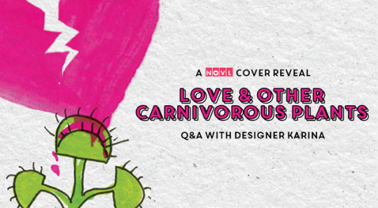
Cover Reveal: Love & Other Carnivorous Plants
Get ready for a heartbreaking yet hilarious tale of something we’re all too familiar with—that moment between adolescence and the uncertainty of the future. But we are certain of one thing: you’ll eat Florence Gonsalves’s Love & Other Carnivorous Plants right up.
Here’s what it’s all about:
A darkly funny debut for fans of Becky Albertalli, Matthew Quick, and Ned Vizzini about a nineteen-year-old girl who's consumed by love, grief, and the many-tentacled beast of self-destructive behavior.
Freshman year at Harvard was the most anticlimactic year of Danny's life. She's failing pre-med and drifting apart from her best friend. One by one, Danny is losing all the underpinnings of her identity. When she finds herself attracted to an older, edgy girl who she met in rehab for an eating disorder, she finally feels like she might be finding a new sense of self. But when tragedy strikes, her self-destructive tendencies come back to haunt her as she struggles to discover who that self really is. With a starkly memorable voice that's at turns hilarious and heartbreaking, Love and Other Carnivorous Plants brilliantly captures the painful turning point between an adolescence that's slipping away and the overwhelming uncertainty of the future.
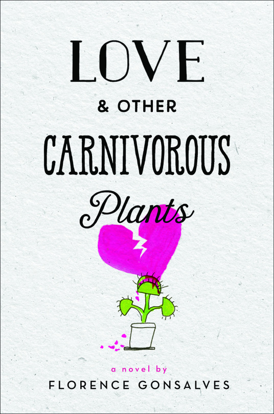
Okay, wow. This all sounds amazing, but the cover makes it even better. Are you ready? Here it is:
We asked the designer, Karina, a few questions about the cover and the process behind it, because, well, it’s face it, not just anyone can design an awesome book cover.
How do you start the design process?
Ideally the design process starts with reading the book. And in the case of Love & Other Carnivorous Plants, we had the manuscript early on, which gave me lots of time to enjoy the read, really get to know the characters and the themes, as well as search for any good symbols or imagery. We had a head start with this one in terms of imagery. A venus fly trap made sense with the title and felt like a natural pairing. However, there are a surprising large number of ways you can go about putting a Venus fly trap on the cover (more on that in a bit!). So after I read the book, I like to meet with the editor since they really have the deepest understanding of the story and the author. One of the first questions I like to ask is, "What other books is it like? Where does it sit in the bookstore?” And then, the most important question, "What is it that they find special about the book? What do we want readers to know, feel, think about the story?" I share my thoughts, but I mostly like to really listen for their thoughts. Humor and Danny’s voice came up right away in this case! With the answers to these questions, I start to play! It’s not a standardized process at all. Every book leads me through it’s own journey. I look for inspiration in ads, magazines, fashion, Instagram, blogs, Etsy, colleagues’s work, everywhere! Then I manipulate photos or stock art, look for fonts, download illustrator portfolios, doodle, paint, draw until I have a bunch of options to share with the team.
What were some of your other ideas for this cover? How did you come to a final decision?
Real-life venus fly traps and other carnivorous plants (!) are so cool! So one thought was to use a photograph. I shared a photographic option where a bee was caught in venus fly trap, which made sense since characters in the book feel trapped in their current lives. I also found a photograph light shone through the venus fly trap and you could see the shadow of a just-eaten bug inside, so I thought, what if we replace the big with the shadow of a heart, and it could look really beautiful and devastating in photographic form. And then there were some just gorgeous close-up photos of venus fly traps in vivid colors which I overlaid with large, hand-lettered type. However, one of things that I think makes this book a stand-out read is that it has not only a great balance between beauty and devastation, but it also has a tremendous sense of humor. Ultimately we, as a team, felt that this illustrated version of the cover not only had the most originality and impact, but it also captured the overall tone of the book best.
The saying goes, “never judge a book by its cover,” but we all know we do. What do you think is the most important aspect of a book cover?
I really feel like there is no one, singular, perfect cover for any book. So I don’t get overly concerned as to whether the final cover ends up being photographic, illustrated, that sort of thing. As can be seen when classic stories get repackaged, there is often more than one brilliant way to tackle the package of a book. So my biggest concern as we make final decisions is, “Does this cover feel like the book? Does is set the stage for the reader that feels accurate and true to the story?” Ultimately the purpose of the cover is to lead readers to the books they will love, so they need to be reflective of their respective stories. And then my next big concern, and this is really what differentiates a good cover from a great cover, is “What is different about this cover? What makes it stand out from the other books on the shelf?” There are a lot of illustrated YA books currently, but my hope is people will pick up Love & Other Carnivorous Plants because the cover is funny! And that it will accurately conveys that these characters are navigating messy, tough topics (such as love and sexuality and heartbreak) with a sense of humor, and a little bit of sarcasm and irreverence, that I think will feel very relatable and refreshing to the reader.
Why did you choose these particular elements for the cover, such as the typeface or the colors?
In doing research for the cover, I came across some photographs of very brightly lit venus fly traps, and they looked almost neon pink and green. I thought they were just so fresh and cool and vibrant, like the characters in the book, that it felt like a natural color scheme for the final design. Dani keeps a journal, and there are several instances of hand-written notes and letters in the book, so I wanted to bring those elements of the story to the cover through the hand-done feel to the type, as well as through the paper texture underneath. Inspiration really did come form here and there, but I think we ended up with a good balance of elements that conveyed different aspects of the story.
Thanks, Karina! This really gave us some insight into the wonderful creative process that cover design is.
We can’t wait for this book, and we hope you feel the same way. It comes out May 15, 2018. In the meantime, add Love & Other Carnivorous Plants to your Goodreads shelf, and follow #LoveCarnivorousPlants for more news about it!
#thenovl#novl#cover reveal#love and other carnivorous plants#love carnivorous plants#florence gonsalves#ya lit#young adult#contemporary#booklr#bookblr#booklr community#featured
15 notes
·
View notes
Last Seen Blogs

edinburgh-by-the-sea
Love Letter to Edinburgh

wally-b-feed
♦️♦️♦️✴️🔺🔺🔺🚨
wakemeupwhenimd3ad
smile and move on.

afterblogs-blog
Jay's Sports Blog
rookheeya
Movies, books, great detectives and coffee breaks.