#And here are some extra unordered tags
Text
"Trust you?"

"No."

"You ruined any chance of that long ago."
I had a vision, way back before the S4 special had aired, I think not too long after S4 had been released in english. I’ve only just finished it now, but I’m proud of it!
(Also here are the backgrounds because I worked really hard on them)


#Ima call them the Celestial Split Squad#Like similar to Traffic Light Trio and Disco Light Squad#But the angst comes preinstalled#Lego monkie kid#lmk#lmk nezha#lmk third lotus prince#lmk princess iron fan#lmk sun wukong#lmk monkey king#lmk azure lion#Celestial Split Squad#And here are some extra unordered tags#Nezha#prince nezha#third lotus prince#princess iron fan#Sun wukong#monkey king#lmk wukong#azure lion
959 notes
·
View notes
Text
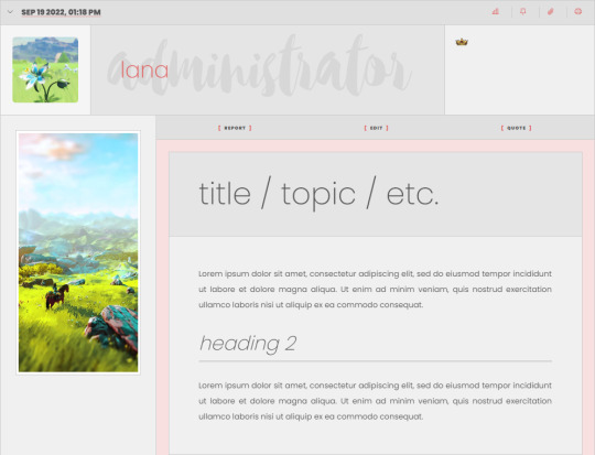


Summer Fire Template Set (F2U / PWYW)
After receiving a high level of inquiry from some of my Ko-Fi supporters about the Summer Fire templates, I finally took some time to dust them off and finish tweaking them - something that I hadn't been able to do prior to now because I've been working on my commissions in my queue. Since this didn't take long, I figured I'd dust them off and get them ready before Christmas for you guys!
These templates are intended to be used with the "Summer Fire" skin, released by Lana. The Summer Fire skin is a dual-mode skin for Jcink forums, and is a F2U/PWYW resource that can also be found in my Ko-Fi shop.
If you'd like a live preview of the skin or have questions about the skin, either message me here on Tumblr or contact me on Discord.
(The templates are listed in my Ko-Fi shop so I can maintain a uniform system for access to my work, but have no minimum price! You should be able to "purchase" it for $0! Anything extra, or donations, are always appreciated but never required.)
You can access these templates here: https://ko-fi[DOT]com/s/057f6ab4fe
Included with your purchase should be a .zip file, containing .txt files for:
Communication Templates ("Texting" template x1, "Calling" template x1)
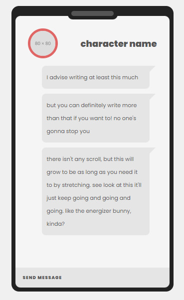
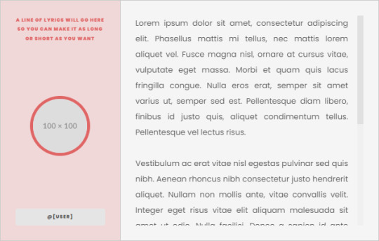
Development Templates ("Header" template x1, "Moodboard" template x1, "Aesthetic" template x1, "Playlist" template x1, "Quote" template x1)
Thread Templates (various scrolling and nonscrolling templates, with areas for lyrics/quotes, tags, and images, x4)
General / Admin Template (for staff announcements and the like)
Miscellaneous Templates (ordered/unordered list syntax for unstyled markers on lists, and a CW/TW template x1)
5 notes
·
View notes
Text
Sherlock x Mute!Reader •Part 5•

It's been three weeks now since the incident with the shooter at the London Eye, you just got out of the hospital and your boss finally allowed you to work at the cafe again, after hours of begging and doing puppy eyes.
Sherlock and Watson kept visiting you at the hospital and while your shift at the cafe and Watson updated you about the case as good as he could since the shooter turned out to be one of the Clown guys.
Lestrade had questioned him and found traces from the blacklight color on his hands, the color you and Sherlock prepared the register with before it got robbed.
But you didn't know much more about the case because Sherlock kept close about it, Watson told you that he would always do that but it still annoyed you.
And since you took the case very personally you decided to threaten Sherlock until he told you everything he knew.
He sat on his usual table again, reading the newspapers and Watson sitting in front of him, studying the menu, but you already knew that he would order, just the same as every time.
You took his order with a smile and turned around again without even looking at Sherlock, showing him the cold shoulder, which irritated Watson but he didn't say anything.
With a sweet smile on your lips, you placed a plate with spaghetti in front of Watson a few minutes later, without Sherlock's usual unordered tea in your hand.
Watson looked at you startled because of your behavior towards Sherlock, but the detective himself seemed to stay unimpressed about it, which made you even more annoyed.
After a few days of totally ignoring Sherlock and getting no reaction at all from him, you decided to use a different method.
You didn't know how and if Sherlock would react to it at all but it was worth a try.
The next morning you came to the cafe in a short skirt and a white, slightly see-through blouse.
You wore, not so high, high heels and your hair was tied into a ponytail.
The rest was just the usual routine, ignoring Sherlock and being extra nice to Watson and other customers.
At first, you got disappointed again because he still didn't seem to react to your play at all but then you actually got a glimpse of him staring at you when he thought you weren't looking.
You cheered at yourself inside 'Never underestimate the weapons of a woman!'
What you didn't notice this day were all the eyes on you from the other customers, some basically undressing you with their staring.
------------time skip to after work-----------
The cold air crawled under your thin jacket as you locked the door from the cafe.
It got pretty late this time since you needed to wash away so many dishes because the winding machine wasn't working at the moment.
Shivering you led the key slide into your pocket and crossed your arms, hugging yourself to keep your body warm while you walked down the street.
Suddenly you heard footsteps behind you, they sounded heavy and came closer.
Scared you took a random street and walked faster, but you could still hear them.
You took another and another random street until you ended up on a dead-end road.
Afraid you slowly turned around.
A tall man in a long coat walked straight towards you with fast steps. He got closer and closer and with every step he did, you stepped one back.
Until you hit the wall with your back.
"Why are you ignoring me?", the man suddenly asked and you immediately recognized his voice.
You could see his face now, he looked down at you with an empty expression but you could swear that there was a glim of sadness in his eyes.
"You shouldn't be walking around like this. It's dangerous in the night and at the café, everyone was staring at you.", Sherlock said as he took off his coat and laid it around your shoulders, closing the buttons.
You blushed deeply and your feelings were driving a roller coaster of being angry at him, loving him, being annoyed of him, and thinking of him as the sweetest man you ever met.
"So why are you ignoring me? Did I do something wrong or do you just want my attention?"
Secretly it was also because you wanted the attention but you would never admit that.
Now at this moment, you wished that you had learned sign language.
Back then you thought that no one would understand it anyway so why learn it but now it could have really helped you to talk to Sherlock.
With an annoyed expression, you pointed at him and then at yourself, forming the word 'case' with your mouth.
Then you pointed at Sherlock again, did a hand motion as if you would close your mouth like a zipper, and laid your hands over your ears, looking around like you wouldn't hear anything.
"Because I didn't tell you about my researches about the case?", Sherlock asked to know if he got that right and you nodded, still angry.
He sighed: "So that's all? That's why I didn't get my beloved tea from you anymore for a week?"
Huffing you crossed your arms in front of your chest.
But he couldn't hide a smile, you looked just too adorable in his coat which completely covered your frame.
Sherlock was silent for a moment, thinking about something before he answered softly: "I'm sorry (y/n)."
You were surprised by the tone of his voice since you have never heard him talk to anyone like this before.
"Let's go home and I'll tell you everything I know. But only if you make me tea."
You huffed amused and nodded as a response.
Sherlock had his arm around your shoulders the entire time as he walked you home to his apartment.
Watson wasn't there, he was with Marry, so you could sit on his chair, holding a hot cup of tea and wearing a pajama from Sherlock, enjoying the warmth of the fire in the fireplace as Sherlock told you about his researches.
It was one of the best evenings you ever had, you felt protected and just happy.
"I missed your tea.", Sherlock suddenly said as he noticed you drifting off to sleep.
You smiled at him before your tired eyelids closed again.
You felt how he lifted you up from the chair, bringing you to his bed.
He laid you down and covered you with the blanket, whispering a goodnight before you fell asleep.
You woke up in the middle of the night, panting and shivering.
It was this nightmare again, the nightmare about the clown guys.
They hunted you in your dreams and this time they even shoot at you.
Warm tears ran down your cheeks as you hugged your knees to your chest and buried your face in your hands, whimpering silently.
You looked around to calm yourself down and remembered that you were in Sherlock's bedroom.
Carefully you felt as if someone was laying beside you but the bed was empty.
Of course. Sherlock wouldn't sleep next to you.
But you so much wished he would. Especially now you craved a hug from him or just a touch to make you feel better.
Silently you stood up and walked on your tiptoes into the living room to see if Sherlock was there.
And he was, sitting on his armchair and staring into the fire.
He looked up as you slowly walked over to him.
"Nightmare?", he asked and looked at you concerned, probably having noticed your wet cheeks.
You just nodded and looked down, your fingers playing with the hem of the too big pajama shirt from Sherlock which you were wearing.
"Come here.", he said and gestured you to sit on his lap.
Hesitantly you walked over to him and sat down on his legs.
With a quick movement, he lifted your legs up and placed them on the armrest so that you were sitting bridal style on top of him.
You rested your head on his chest as you tried to cover the dark red blush on your face.
Did this really just happen?
His heartbeat, the way he stroked with his hand over your back and the warmth of the fire calmed you down and it didn't take you long to drift off into sleep again.
Watson walked in very early and found you and Sherlock, well, cuddling. You were still sitting on his lap, sleeping calmly and Sherlock's head rested on yours, his arms protectively around you.
Watson couldn't believe the sight and quickly took a picture of you two before sneaking down the stairs again to get Mrs. Hudson.
She needed to see this.
Mrs. Hudson giggled like a schoolgirl as she saw you both and Sherlock flinched, waking up from his nap.
I
"Have I missed something important?", Watson mockingly asked as Sherlock lifted his head and looked tardily at the two chuckling persons in front of him.
Fun fact: I keep forgetting that the reader is mute and let her talk in nearly every chapter until I notice it and then I have to somehow put the words into actions or else. 😂
This chapter is pretty story irrelevant but I thought some fluff between all this action and danger would be good :')
My Wattpad: @/lilakudo
Tag list ❤️ @misselsbells06 @fictionalhoomanofnowhere
#fanfiction#x reader#reader insert#bbc sherlock#sherlock#sherlock fandom#sherlock fanfic#sherlock x reader#sherlock x y/n#sherlockxmutereader
69 notes
·
View notes
Text
The HTML Essentials Cheat Sheet: Tags, Attributes, and More

Here we can see, "The HTML Essentials Cheat Sheet: Tags, Attributes, and More"
Get conversant in HTML tags and attributes in no time with this HTML essentials cheat sheet.
Building web pages begin with HTML. Beautifying them and making them interactive comes later. But to start out creating functional static websites, you would like an understanding of HTML. (Want a fast introduction to the present markup language? Read our HTML FAQ.)
As a part of learning the language, there is a long list of elements you would like to feature in your HTML vocabulary. And this task can seem daunting initially, which is why we've come up with the subsequent cheat sheet. It gives you a simple thanks to discovering/understanding/recall HTML elements whenever you like them.
The cheat sheet covers tags and attributes for structuring web pages, formatting text, adding forms, images, lists, links, and tables. It also includes tags that were introduced in HTML5 and HTML codes for commonly used special characters.
The HTML Essentials Cheat Sheet
Shortcut
Action
Basic Tags
...
The first and last tag of an HTML document. All other tags lie between these opening and closing tags.
...
Specifies the collection of metadata for the document.
...
Describes the title for the page and shows up in the browser’s title bar.
...
Includes all content that will be displayed on the webpage.
Document Information
Mentions the base URL and all relative links to the document.
For extra information about the page like author, publish date, etc.
Links to external elements like style sheets.
Contains document style information like CSS (Cascading Style Sheets).
Contains links to external scripts.
Text Formatting
... OR
...
Makes text bold.
...
Italicizes text and makes it bold.
...
Italicizes text but does not make it bold.
...
Strikethrough text.
...
Cites an author of a quote.
...
Labels a deleted portion of a text.
...
Shows a section that has been inserted into the content.
...
For displaying quotes. Often used with the tag.
...
For shorter quotes.
...
For abbreviations and full-forms.
...
Specifies contact details.
...
For definitions.
...
For code snippets.
...
For writing subscripts
...
For writing superscripts.
...
For reducing the text size and marking redundant information in HTML5.
Document Structure
...
Different levels of headings. H1 is the largest and H6 is the smallest.
...
For dividing content into blocks.
...
Includes inline elements, like an image, icon, emoticon, without ruining the formatting of the page.
...
Contains plain text.
Creates a new line.
Draws a horizontal bar to show end of the section.
Lists
...
For ordered list of items.
...
For unordered list of items.
- ...
For individual items in a list.
...
List of items with definitions.
...
The definition of a single term inline with body content.
...
The description for the defined term.
Links
...
Anchor tag for hyperlinks.
...
Tag for linking to email addresses.
...
Anchor tag for listing contact numbers.
...
Anchor tag for linking to another part of the same page.
...
Navigates to a div section of the webpage. (Variation of the above tag)
Images
For displaying image files.
Attributes for the tag
src=”url”
Link to the source path of the image.
alt=”text”
The text displayed when a mouse is hovered over the image.
height=” ”
Image height in pixels or percentages.
width=” ”
Image width in pixels or percentages.
align=” ”
Relative alignment of the image on the page.
border=” ”
Border thickness of the image.
...
Link to a clickable map.
...
Name of the map image.
The image area of an image map.
Attributes for the tag
shape=” "
Shape of the image area.
coords=” ”
Coordinates of the map image area.
Forms
...
The parent tag for an HTML form.
Attributes for the tag
action=”url”
The URL where form data is submitted.
method=” ”
Specifies the form submission protocol (POST or GET).
enctype=” ”
The data encoding scheme for POST submissions.
autocomplete
Specifies if form autocomplete is on or off.
novalidate
Specifies whether the form should be validated before submission.
accept-charsets
Specifies character encoding for form submissions.
target
Shows where the form submission response will be displayed.
...
Groups related elements in the form/
...
Specifies what the user should enter in each form field.
...
A caption for the fieldset element.
Specifies what type of input to take from the user.
Attributes for the tag
type=””
Determines the type of input (text, dates, password).
name=””
Specifies the name of the input field.
value=””
Specifies the value in the input field.
size=””
Sets the number of characters for the input field.
maxlength=””
Sets the limit of input characters allowed.
required
Makes an input field compulsory.
width=””
Sets width of the input field in pixels.
height=””
Sets height of the input field in pixels.
placeholder=””
Describes expected field value.
pattern=””
Specifies a regular expression, which can be used to look for patterns in the user’s text.
min=””
The minimum value allowed for an input element.
max=””
The maximum value allowed for an input element.
disabled
Disables the input element.
...
For capturing longer strings of data from the user.
...
Specifies a list of options which the user can choose from.
Attributes for the tag
name=””
Specifies name for a dropdown list.
size=””
Number of options given to the user.
multiple
Sets whether the user can choose multiple options from the list.
required
Specifies whether choosing an option/s is necessary for form submission.
autofocus
Specifies that a drop-down list automatically comes into focus after a page loads.
...
Defines items in a dropdown list.
value=””
Displays the text for any given option.
selected
Sets default option that is displayed.
...
Tag for creating a button for form submission.
Objects and iFrames
...
Describes the embedded filetype.
Attributes for the tag
height=””
The height of the object.
width=””
The width of the object.
type=””
The type of media the object contains.
...
An inline frame for embedding external information.
name=””
The name of the iFrame.
src=””
The source URL for the content inside the frame.
srcdoc=””
The HTML content within the frame.
height=””
The height of the iFrame.
width=” ”
The width of the iFrame.
Adds extra parameters to customize the iFrame.
...
Embeds external application or plugin.
Attributes for the tag
height=” “
Sets the height of the embed.
width=” “
Sets the width of the embed.
type=””
The type or format of the embed.
src=””
The source path of the embedded file.
Tables
...
Defines all content for a table.
...
A description of the table.
...
Headers for each column in the table.
...
Defines the body data for the table.
...
Describes the content for the table’s footer.
...
Content for a single row.
...
The data in a single header item.
...
Content within a single table cell.
...
Groups columns for formatting.
A single column of information.
HTML5 New Tags
...
Specifies the webpage header.
...
Specifies the webpage footer.
...
Marks main content of the webpage.
...
Specifies an article.
...
Specifies sidebar content of a page.
...
Specifies a particular section in the webpage.
...
For describing extra information.
...
Used as a heading for the above tag. Is always visible to the user.
...
Creates a dialog box.
...
Used for including charts and figures.
...
Describes a element.
...
Highlights a specific part of the text.
...
Set of navigation links on a webpage.
...
A particular item from a list or a menu.
...
Measures data within a given range.
...
Places a progress bar and tracks progress.
...
Displays text that do not support Ruby annotations.
...
Displays East Asia typography character details.
...
A Ruby annotation for East Asian typography.
...
Identifies time and date.
A line break within the content.
¹HTML5 Character Objects
" ; OR
" ;
Quotation marks
Lesser than sign ( ; OR
> ;
Greater than sign (>)
; OR
;
Non-breaking space
© ; OR
© ;
Copyright symbol
™ ; OR
û ;
Trademark symbol
@ ; OR
Ü ;
“at” symbol (@)
& ; OR
& ;
Ampersand symbol (&)
• ; OR
ö ;
Small bullet
¹Ignore space before semicolon while typing HTML character.
Conclusion
I hope you found this guide useful. If you've got any questions or comments, don't hesitate to use the shape below.
User Questions:
- What are the 4 HTML essentials?
Some of the essential tags for an HTML document are doctype, , , and . doctype is that the doctype declaration type. It's used for specifying which version of HTML the document is using. The HTML tag is that the container for all other HTML elements apart from the . you employ tags to make HTML elements, like paragraphs or links. Many elements have a gap tag and a closing tag — for instance, a p (paragraph) element features a tag, followed by the paragraph text, followed by a closing tag.
- Is HTML uses predefined tags?
HTML uses Pre-specified tags...for e.g.: . The anchor tag is additionally HTML tag. The anchor tag is employed for adding a hyperlink on an internet page.
- Feel stuck after learning HTML&CSS? Here's the way to create websites on your own
https://www.reddit.com/r/web_design/comments/2x815r/feel_stuck_after_learning_htmlcss_heres_how_to/
- I have been interviewing candidates for an internet dev position. a significant lack of data in HTML/CSS.
https://www.reddit.com/r/webdev/comments/bxrbdj/just_an_observation_i_have_been_interviewing/
Read the full article
#allattributesofbodytaginhtml#attributesofbodytaginhtml#basiccssstylesheet#commonhtmltagscheatsheet#excelformulacheatsheetprintable#excelformulascheatsheet#htmlatagattributes#htmltagattributes#htmltagcheatsheet#htmltagcheatsheetpdf#htmltagsandattributes#htmltagsandattributeslist#htmltagscheatsheet#sqlcommandscheatsheet#whataretheattributesofbodytaginhtml
1 note
·
View note
Text
30 HTML Best Practices for Beginners
The most difficult aspect of running Nettuts+ is accounting for so many different skill levels. If we post too many advanced tutorials, our beginner audience won't benefit. The same holds true for the opposite. We do our best, but always feel free to pipe in if you feel you're being neglected. This site is for you, so speak up! With that said, today's tutorial is specifically for those who are just diving into web development. If you've one year of experience or less, hopefully some of the tips listed here will help you to become better, quicker!
You may also want to check out some of the HTML builders on Envato Market, such as the popular VSBuilder, which lets you generate the HTML and CSS for building your websites automatically by choosing options from a simple interface.
Or you can have your website built from scratch by a professional developer on Envato Studio who knows and follows all the HTML best practices.
Without further ado, let's review 30 best practices to observe when creating your markup.
1: Always Close Your Tags
Back in the day, it wasn't uncommon to see things like this:
1 <li>Some text here.
2 <li>Some new text here.
3 <li>You get the idea.
Notice how the wrapping UL/OL tag was omitted. Additionally, many chose to leave off the closing LI tags as well. By today's standards, this is simply bad practice and should be 100% avoided. Always, always close your tags. Otherwise, you'll encounter validation and glitch issues at every turn.
Better
1 <ul>
2 <li>Some text here. </li>
3 <li>Some new text here. </li>
4 <li>You get the idea. </li>
5 </ul>
2: Declare the Correct DocType
When I was younger, I participated quite a bit in CSS forums. Whenever a user had an issue, before we would look at their situation, they HAD to perform two things first:
Validate the CSS file. Fix any necessary errors.
Add a doctype.
"The DOCTYPE goes before the opening html tag at the top of the page and tells the browser whether the page contains HTML, XHTML, or a mix of both, so that it can correctly interpret the markup."
Most of us choose between four different doctypes when creating new websites.
http://www.w3.org/TR/html4/strict.dtd">
http://www.w3.org/TR/html4/loose.dtd">
http://www.w3.org/TR/xhtml1/DTD/xhtml1-transitional.dtd">
http://www.w3.org/TR/xhtml1/DTD/xhtml1-strict.dtd">
There's a big debate currently going on about the correct choice here. At one point, it was considered to be best practice to use the XHTML Strict version. However, after some research, it was realized that most browsers revert back to regular HTML when interpretting it. For that reason, many have chosen to use HTML 4.01 Strict instead. The bottom line is that any of these will keep you in check. Do some research and make up your own mind.
3: Never Use Inline Styles
When you're hard at work on your markup, sometimes it can be tempting to take the easy route and sneak in a bit of styling.
1 <p style="color: red;">I'm going to make this text red so that it really stands out and makes people take notice! </p>
Sure -- it looks harmless enough. However, this points to an error in your coding practices.
When creating your markup, don't even think about the styling yet. You only begin adding styles once the page has been completely coded.
It's like crossing the streams in Ghostbusters. It's just not a good idea.
-Chris Coyier (in reference to something completely unrelated.)
Instead, finish your markup, and then reference that P tag from your external stylesheet.
Better
1 #someElement > p {
2 color: red;
3 }
4: Place all External CSS Files Within the Head Tag
Technically, you can place stylesheets anywhere you like. However, the HTML specification recommends that they be placed within the document HEAD tag. The primary benefit is that your pages will seemingly load faster.
While researching performance at Yahoo!, we discovered that moving stylesheets to the document HEAD makes pages appear to be loading faster. This is because putting stylesheets in the HEAD allows the page to render progressively.
- ySlow Team
1 <head>
2 <title>My Favorites Kinds of Corn</title>
3 <link rel="stylesheet" type="text/css" media="screen" href="path/to/file.css" />
4 <link rel="stylesheet" type="text/css" media="screen" href="path/to
/anotherFile.css" />
5 </head>
5: Consider Placing Javascript Files at the Bottom
Place JS at bottom
Remember -- the primary goal is to make the page load as quickly as possible for the user. When loading a script, the browser can't continue on until the entire file has been loaded. Thus, the user will have to wait longer before noticing any progress.
If you have JS files whose only purpose is to add functionality -- for example, after a button is clicked -- go ahead and place those files at the bottom, just before the closing body tag. This is absolutely a best practice.
Better
<p>And now you know my favorite kinds of corn. </p>
<script type="text/javascript" src="path/to/file.js"></script>
<script type="text/javascript" src="path/to/anotherFile.js"></script>
</body>
</html>
6: Never Use Inline Javascript. It's not 1996!
Another common practice years ago was to place JS commands directly within tags. This was very common with simple image galleries. Essentially, a "onclick" attribute was appended to the tag. The value would then be equal to some JS procedure. Needless to say, you should never, ever do this. Instead, transfer this code to an external JS file and use "addEventListener/attachEvent" to "listen" for your desired event. Or, if using a framework like jQuery, just use the "click" method.
$('a#moreCornInfoLink').click(function() {
alert('Want to learn more about corn?');
});
7: Validate Continuously
validate continuously
I recently blogged about how the idea of validation has been completely misconstrued by those who don't completely understand its purpose. As I mention in the article, "validation should work for you, not against."
However, especially when first getting started, I highly recommend that you download the Web Developer Toolbar and use the "Validate HTML" and "Validate CSS" options continuously. While CSS is a somewhat easy to language to learn, it can also make you tear your hair out. As you'll find, many times, it's your shabby markup that's causing that strange whitespace issue on the page. Validate, validate, validate.
8: Download Firebug
download firebug
I can't recommend this one enough. Firebug is, without doubt, the best plugin you'll ever use when creating websites. Not only does it provide incredible Javascript debugging, but you'll also learn how to pinpoint which elements are inheriting that extra padding that you were unaware of. Download it!
9: Use Firebug!
use firebug
From my experiences, many users only take advantage of about 20% of Firebug's capabilities. You're truly doing yourself a disservice. Take a couple hours and scour the web for every worthy tutorial you can find on the subject.
Resources
Overview of Firebug
Debug Javascript With Firebug - video tutorial
10: Keep Your Tag Names Lowercase
Technically, you can get away with capitalizing your tag names.
<DIV>
<P>Here's an interesting fact about corn. </P>
</DIV>
Having said that, please don't. It serves no purpose and hurts my eyes -- not to mention the fact that it reminds me of Microsoft Word's html function!
Better
<div>
<p>Here's an interesting fact about corn. </p>
</div>
11: Use H1 - H6 Tags
Admittedly, this is something I tend to slack on. It's best practice to use all six of these tags. If I'm honest, I usually only implement the top four; but I'm working on it! :) For semantic and SEO reasons, force yourself to replace that P tag with an H6 when appropriate.
1
2
<h1>This is a really important corn fact! </h1>
<h6>Small, but still significant corn fact goes here. </h6>
12: If Building a Blog, Save the H1 for the Article Title
h1 saved for title of article
Just this morning, on Twitter, I asked our followers whether they felt it was smartest to place the H1 tag as the logo, or to instead use it as the article's title. Around 80% of the returned tweets were in favor of the latter method.
As with anything, determine what's best for your own website. However, if building a blog, I'd recommend that you save your H1 tags for your article title. For SEO purposes, this is a better practice - in my opinion.
13: Download ySlow
download yslow
Especially in the last few years, the Yahoo team has been doing some really great work in our field. Not too long ago, they released an extension for Firebug called ySlow. When activated, it will analyze the given website and return a "report card" of sorts which details the areas where your site needs improvement. It can be a bit harsh, but it's all for the greater good. I highly recommend it.
14: Wrap Navigation with an Unordered List
Wrap navigation with unordered lists
Each and every website has a navigation section of some sort. While you can definitely get away with formatting it like so:
<div id="nav">
<a href="#">Home </a>
<a href="#">About </a>
<a href="#">Contact </a>
</div>
I'd encourage you not to use this method, for semantic reasons. Your job is to write the best possible code that you're capable of.
Why would we style a list of navigation links with anything other than an unordered LIST?
The UL tag is meant to contain a list of items.
Better
<ul id="nav">
<li><a href="#">Home</a></li>
<li><a href="#">About</a></li>
<li><a href="#">Contact</a></li>
</ul>
15: Learn How to Target IE
You'll undoubtedly find yourself screaming at IE during some point or another. It's actually become a bonding experience for the community. When I read on Twitter how one of my buddies is battling the forces of IE, I just smile and think, "I know how you feel, pal."
The first step, once you've completed your primary CSS file, is to create a unique "ie.css" file. You can then reference it only for IE by using the following code.
<!--[if lt IE 7]>
<link rel="stylesheet" type="text/css" media="screen" href="path/to/ie.css" />
<![endif]-->
This code says, "If the user's browser is Internet Explorer 6 or lower, import this stylesheet. Otherwise, do nothing." If you need to compensate for IE7 as well, simply replace "lt" with "lte" (less than or equal to).
16: Choose a Great Code Editor
choose a great code editor
Whether you're on Windows or a Mac, there are plenty of fantastic code editors that will work wonderfully for you. Personally, I have a Mac and PC side-by-side that I use throughout my day. As a result, I've developed a pretty good knowledge of what's available. Here are my top choices/recommendations in order:
Mac Lovers
Coda
Espresso
TextMate
Aptana
DreamWeaver CS4
PC Lovers
InType
E-Text Editor
Notepad++
Aptana
Dreamweaver CS4
17: Once the Website is Complete, Compress!
Compress
By zipping your CSS and Javascript files, you can reduce the size of each file by a substantial 25% or so. Please don't bother doing this while still in development. However, once the site is, more-or-less, complete, utilize a few online compression programs to save yourself some bandwidth.
Javascript Compression Services
Javascript Compressor
JS Compressor
CSS Compression Services
CSS Optimiser
CSS Compressor
Clean CSS
18: Cut, Cut, Cut
cut cut cut
Looking back on my first website, I must have had a SEVERE case of divitis. Your natural instinct is to safely wrap each paragraph with a div, and then wrap it with one more div for good measure. As you'll quickly learn, this is highly inefficient.
Once you've completed your markup, go over it two more times and find ways to reduce the number of elements on the page. Does that UL really need its own wrapping div? I think not.
Just as the key to writing is to "cut, cut, cut," the same holds true for your markup.
19: All Images Require "Alt" Attributes
It's easy to ignore the necessity for alt attributes within image tags. Nevertheless, it's very important, for accessibility and validation reasons, that you take an extra moment to fill these sections in.
Bad
1
<IMG SRC="cornImage.jpg" />
Better
1
<img src="cornImage.jpg" alt="A corn field I visited." />
20: Stay up Late
I highly doubt that I'm the only one who, at one point while learning, looked up and realized that I was in a pitch-dark room well into the early, early morning. If you've found yourself in a similar situation, rest assured that you've chosen the right field.
The amazing "AHHA" moments, at least for me, always occur late at night. This was the case when I first began to understand exactly what Javascript closures were. It's a great feeling that you need to experience, if you haven't already.
21: View Source
view source
What better way to learn HTML than to copy your heroes? Initially, we're all copiers! Then slowly, you begin to develop your own styles/methods. So visit the websites of those you respect. How did they code this and that section? Learn and copy from them. We all did it, and you should too. (Don't steal the design; just learn from the coding style.)
Notice any cool Javascript effects that you'd like to learn? It's likely that he's using a plugin to accomplish the effect. View the source and search the HEAD tag for the name of the script. Then Google it and implement it into your own site! Yay.
22: Style ALL Elements
This best practice is especially true when designing for clients. Just because you haven't use a blockquote doesn't mean that the client won't. Never use ordered lists? That doesn't mean he won't! Do yourself a service and create a special page specifically to show off the styling of every element: ul, ol, p, h1-h6, blockquotes, etc.
23: Use Twitter
Use Twitter
Lately, I can't turn on the TV without hearing a reference to Twitter; it's really become rather obnoxious. I don't have a desire to listen to Larry King advertise his Twitter account - which we all know he doesn't manually update. Yay for assistants! Also, how many moms signed up for accounts after Oprah's approval? We can only long for the day when it was just a few of us who were aware of the service and its "water cooler" potential.
Initially, the idea behind Twitter was to post "what you were doing." Though this still holds true to a small extent, it's become much more of a networking tool in our industry. If a web dev writer that I admire posts a link to an article he found interesting, you better believe that I'm going to check it out as well - and you should too! This is the reason why sites like Digg are quickly becoming more and more nervous.
Twitter Snippet
If you just signed up, don't forget to follow us: NETTUTS.
24: Learn Photoshop
Learn Photoshop
A recent commenter on Nettuts+ attacked us for posting a few recommendations from Psdtuts+. He argued that Photoshop tutorials have no business on a web development blog. I'm not sure about him, but Photoshop is open pretty much 24/7 on my computer.
In fact, Photoshop may very well become the more important tool you have. Once you've learned HTML and CSS, I would personally recommend that you then learn as many Photoshop techniques as possible.
Visit the Videos section at Psdtuts+
Fork over $25 to sign up for a one-month membership to Lynda.com. Watch every video you can find.
Enjoy the "You Suck at Photoshop" series.
Take a few hours to memorize as many PS keyboard shortcuts as you can.
25: Learn Each HTML Tag
There are literally dozens of HTML tags that you won't come across every day. Nevertheless, that doesn't mean you shouldn't learn them! Are you familiar with the "abbr" tag? What about "cite"? These two alone deserve a spot in your tool-chest. Learn all of them!
By the way, in case you're unfamiliar with the two listed above:
abbr does pretty much what you'd expect. It refers to an abbreviation. "Blvd" could be wrapped in a <abbr> tag because it's an abbreviation for "boulevard".
cite is used to reference the title of some work. For example, if you reference this article on your own blog, you could put "30 HTML Best Practices for Beginners" within a <cite> tag. Note that it shouldn't be used to reference the author of a quote. This is a common misconception.
26: Participate in the Community
Just as sites like ours contributes greatly to further a web developer's knowledge, you should too! Finally figured out how to float your elements correctly? Make a blog posting to teach others how. There will always be those with less experience than you. Not only will you be contributing to the community, but you'll also teach yourself. Ever notice how you don't truly understand something until you're forced to teach it?
27: Use a CSS Reset
This is another area that's been debated to death. CSS resets: to use or not to use; that is the question. If I were to offer my own personal advice, I'd 100% recommend that you create your own reset file. Begin by downloading a popular one, like Eric Meyer's, and then slowly, as you learn more, begin to modify it into your own. If you don't do this, you won't truly understand why your list items are receiving that extra bit of padding when you didn't specify it anywhere in your CSS file. Save yourself the anger and reset everything! This one should get you started.
html, body, div, span,
h1, h2, h3, h4, h5, h6, p, blockquote, pre,
a, abbr, acronym, address, big, cite, code,
img, ins, kbd, q, s, samp,
small, strike, strong,
dl, dt, dd, ol, ul, li,
fieldset, form, label, legend,
table, caption, tbody, tfoot, thead, tr, th, td {
margin: 0;
padding: 0;
border: 0;
outline: 0;
font-size: 100%;
vertical-align: baseline;
background: transparent;
}
body {
line-height: 1;
}
ol, ul {
list-style: none;
}
blockquote, q {
quotes: none;
}
blockquote:before, blockquote:after,
q:before, q:after {
content: '';
content: none;
}
table {
border-collapse: collapse;
border-spacing: 0;
}
28: Line 'em Up!
Line em up
Generally speaking, you should strive to line up your elements as best as possible. Take a look at you favorite designs. Did you notice how each heading, icon, paragraph, and logo lines up with something else on the page? Not doing this is one of the biggest signs of a beginner. Think of it this way: If I ask why you placed an element in that spot, you should be able to give me an exact reason.
Advertisement
29: Slice a PSD
Slice a PSD
Okay, so you've gained a solid grasp of HTML, CSS, and Photoshop. The next step is to convert your first PSD into a working website. Don't worry; it's not as tough as you might think. I can't think of a better way to put your skills to the test. If you need assistance, review these in depth video tutorials that show you exactly how to get the job done.
Slice and Dice that PSD
From PSD to HTML/CSS
30: Don't Use a Framework...Yet
Frameworks, whether they be for Javascript or CSS are fantastic; but please don't use them when first getting started. Though it could be argued that jQuery and Javascript can be learned simultaneously, the same can't be made for CSS. I've personally promoted the 960 CSS Framework, and use it often. Having said that, if you're still in the process of learning CSS -- meaning the first year -- you'll only make yourself more confused if you use one.
CSS frameworks are for experienced developers who want to save themselves a bit of time. They're not for beginners.
Original article source here : https://code.tutsplus.com/tutorials/30-html-best-practices-for-beginners--net-4957
1 note
·
View note
Text
Week 5/6 -Web Development
Introduction to Coding Basics
To begin with, we looked at the importance of folders, and how we needed to set them up in order to create a website.
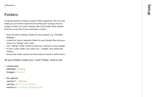
It is essential to keep the folder names as lowercase letters.

HTML
HTML stands for Hyper Text Markup Language, which creates the structure and content of a website.
CSS
CSS stands for Cascading Style Sheets, which is the styling and layout of a website. For example, font colours or background colours.
Javascript
Javascript enables extra features, such as animations or drop down menus.

We looked at the basic HTML structure, which needs to contain a html, a head, title, and body. It is essential to close brackets once they have been applied, essentially creating a sandwich between the data.

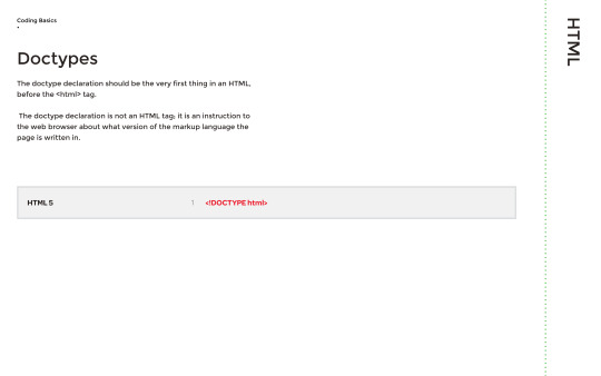
We also looked at Doctypes, which is what lets the browser know what language the code is, in in order for it to interpret that language by displaying the result on screen.
HTML tags are keywords or letters that manipulate the content, for example if I were to write a paragraph, I would put these tags outside of it:
<p> insert paragraph here </p>
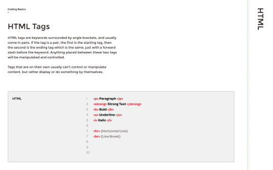
If you want to place a heading on your website, then you would need to use h1, h2 and so on, which would place a hierarchy of headlines on the page.

There are also nesting HTML tags, which places content within content, for example bold lettering, or underlined text.

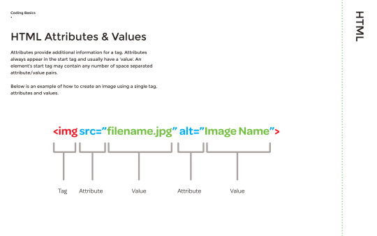
We then looked at HTML attributes and values, which essentially give a tag more information. for example, you can source an image file from your computer and give it a value, which is the name that will show on screen when you access the website.
You are able to link html files, which can be used when creating buttons on a page to link the user to other html files. The text that appears in this example below is ‘About Us’.

Afterwards, we went on to lists, which there are two types of: Unordered lists (ul) and ordered lists (ol). Essentially, these are bullet points that can be manipulated further.
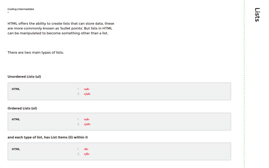
Here are some examples of unordered and ordered lists:


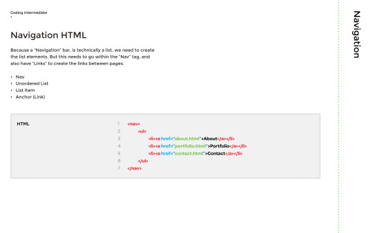
Finally, we looked at Navigation. Navigation bars are essential tools that enable a quick and easy transition between pages. Here is an example of a navigation bar on the BBC News website:

Here is an example of a navigation tag, which ensures links can be gathered together:
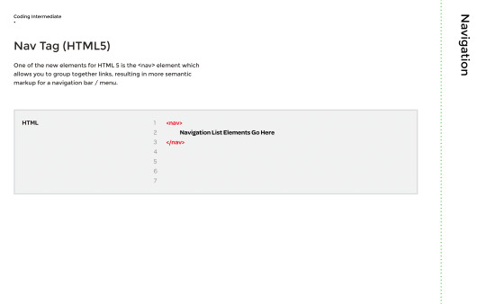
To create a navigation bar, a list needs to be created to list the content, although this time within a Navigation tag.
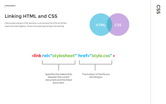
To link the HTML and CSS together, a link tag is used to locate the CSS file. This then allows the HTML to follow what the CSS is communicating, such as font colours and styles.
The CSS recognises the tags in the HTML, so for example in the CSS if it said that <h2> is in red, the <h2> will appear red on the website, unless the tag name is changed to <h3> or another name.

Pseudo classes are important when it comes to navigation bars, as they give you the option to add colours to it. This is effective as the colours will show when the user hovers over it or clicks it.

Div tags are also important, as they group content together. For example, three columns have been created in the example below:

HTML content are referred to as boxes, working with the CSS that allows me to manipulate the margins, borders, padding as well as the elements.


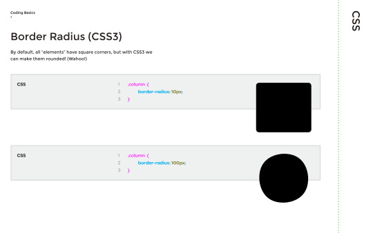
The border radius gives you the option of making rounded edges, like you can see below. This is recognisable to me as I use illustrator a lot of the time, so I am familiar with the border radius.
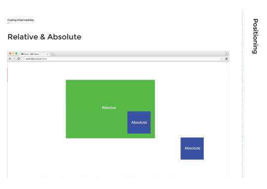
We then looked at positioning, which is critical as the layout determines the difficulty of the interactivity of the website in terms of being confusing or simple.
Fixed means that the content is placed related to the browser window, which is usually how navigation bars are positioned.

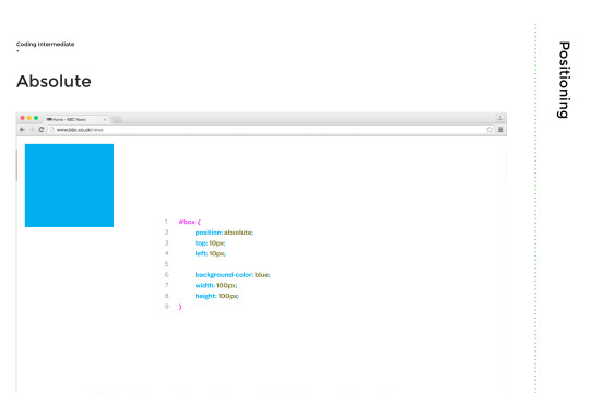
Absolute means that the content is placed absolutely to its first position.
Relative is when the content is positioned relative to its original position. Below is an example of resolute and absolute together:
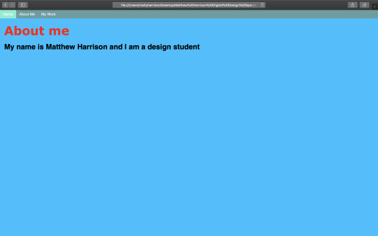
My Test Portfolio Website
HTML:

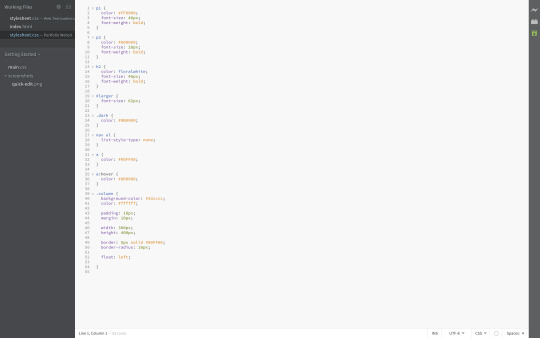
CSS:
Final Outcome:

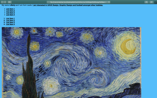


Activity
To build on our coding skills, we were given a task to create this website by using the visuals as a guide (as close to the real thing as possible):

Using (a lot!) of experimentation, I was able to create this:
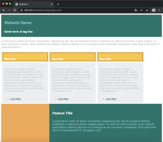
I am pleased and I’m not at the same time, as when I began this task I set myself the challenge of getting it exactly correct, which over time I found to be a monumental task for me. Coding is something I want to get better at in the future and building on this is something I am going to make sure I do in my spare time especially, however this time I have struggled slightly with it.
I think because I like to be creative and do the best work I can, I can bring myself down when I’m not at my best at certain aspects of design, such as web development. Nevertheless, this activity however was certainly one that I enjoyed. It felt like taking on a Rubik's cube!

0 notes
Text
A Community-Driven Site with Eleventy: Building the Site
In the last article, we learned what goes into planning for a community-driven site. We saw just how many considerations are needed to start accepting user submissions, using what I learned from my experience building Style Stage as an example.
Now that we’ve covered planning, let’s get to some code! Together, we’re going to develop an Eleventy setup that you can use as a starting point for your own community (or personal) site.
Article Series:
Preparing for Contributions
Building the Site (You are here!)
This article will cover:
How to initialize Eleventy and create useful develop and build scripts
Recommended setup customizations
How to define custom data and combine multiple data sources
Creating layouts with Nunjucks and Eleventy layout chaining
Deploying to Netlify
The vision
Let’s assume we want to let folks submit their dogs and cats and pit them against one another in cuteness contests.
Live demo
We’re not going to get into user voting in this article. That would be so cool (and totally possible with serverless functions) but our focus is on the pet submissions themselves. In other words, users can submit profile details for their cats and dogs. We’ll use those submissions to create a weekly battle that puts a random cat up against a random dog on the home page to duke it out over which is the most purrrfect (or woof-tastic, if you prefer).
Let’s spin up Eleventy
We’ll start by initializing a new project by running npm init on any directory you’d like, then installing Eleventy into it with:
npm install @11ty/eleventy
While it’s totally optional, I like to open up the package-json file that’s added to the directory and replace the scripts section with this:
"scripts": { "develop": "eleventy --serve", "build": "eleventy" },
This allows us to start developing Eleventy in a development environment (npm run develop) that includes Browsersync hot-reloading for local development. It also adds a command that compiles and builds our work (npm run build) for deployment on a production server.
If you’re thinking, “npm what?” what we’re doing is calling on Node (which is something Eleventy requires). The commands noted here are intended to be run in your preferred terminal, which may be an additional program or built-in to your code editor, like it is in VS Code.
We’ll need one more npm package, fast-glob, that will come in handy a little later for combining data. We may as well install it now:
npm install --save-dev fast-glob.
Let’s configure our directory
Eleventy allows customizing the input directory (where we work) and output directory (where our built work goes) to provide a little extra organization.
To configure this, we’ll create the eleventy.js file at the root of the project directory. Then we’ll tell Eleventy where we want our input and output directories to go. In this case, we’re going to use a src directory for the input and a public directory for the output.
module.exports = function (eleventyConfig) { return dir: { input: "src", output: "public" }, }; };
Next, we’ll create a directory called pets where we’ll store the pets data we get from user submissions. We can even break that directory down a little further to reduce merge conflicts and clearly distinguish cat data from dog data with cat and dog subdirectories:
pets/ cats/ dogs/
What’s the data going to look like? Users will send in a JSON file that follows this schema, where each property is a data point about the pet:
{ "name": "", "petColor": "", "favoriteFood": "", "favoriteToy": "", "photoURL": "", "ownerName": "", "ownerTwitter": "" }
To make the submission process crystal clear for users, we can create a CONTRIBUTING.md file at the root of the project and write out the guidelines for submissions. GitHub takes the content in this file and uses displays it in the repo. This way, we can provide guidance on this schema such as a note that favoriteFood, favoriteToy, and ownerTwitte are optional fields.
A README.md file would be just as fine if you’d prefer to go that route. It’s just nice that there’s a standard file that’s meant specifically for contributions.
Notice photoURL is one of those properties. We could’ve made this a file but, for the sake of security and hosting costs, we’re going to ask for a URL instead. You may decide that you are willing to take on actual files, and that’s totally cool.
Let’s work with data
Next, we need to create a combined array of data out of the individual cat files and dog files. This will allow us to loop over them to create site pages and pick random cat and dog submissions for the weekly battles.
Eleventy allows node module.exports within the _data directory. That means we can create a function that finds all cat files and another that finds all dog files and then creates arrays out of each set. It’s like taking each cat file and merging them together to create one data set in a single JavaScript file, then doing the same with dogs.
The filename used in _data becomes the variable that holds that dataset, so we’ll add files for cats and dogs in there:
_data/ cats.js dogs.js
The functions in each file will be nearly identical — we’re merely swapping instances of “cat” for “dog” between the two. Here’s the function for cats:
const fastglob = require("fast-glob"); const fs = require("fs");
module.exports = async () => { // Create a "glob" of all cat json files const catFiles = await fastglob("./src/pets/cats/*.json", { caseSensitiveMatch: false, });
// Loop through those files and add their content to our `cats` Set let cats = new Set(); for (let cat of catFiles) { const catData = JSON.parse(fs.readFileSync(cat)); cats.add(catData); }
// Return the cats Set of objects within an array return [...cats]; };
Does this look scary? Never fear! I do not routinely write node either, and it’s not a required step for less complex Eleventy sites. If we had instead chosen to have contributors add to an ever growing single JSON file with _data, then this combination step wouldn’t be necessary in the first place. Again, the main reason for this step is to reduce merge conflicts by allowing for individual contributor files. It’s also the reason we added fast-glob to the mix.
Let’s output the data
This is a good time to start plugging data into the templates for our UI. In fact, go ahead and drop a few JSON files into the pets/cats and pets/dogs directories that include data for the properties so we have something to work with right out of the gate and test things.
We can go ahead and add our first Eleventy page by adding a index.njk file in the src directory. This will become the home page, and is a Nunjucks template file format.
Nunjucks is one option of many for creating templates with Eleventy. See the docs for a full list of templating options.
Let’s start by looping over our data and outputting an unordered list both for cats and dogs:
<ul> <!-- Loop through cat data --> </ul>
<ul> <!-- Loop through dog data --> </ul>
As a reminder, the reference to cats and dogs matches the filename in _data. Within the loop we can access the JSON keys using dot notation, as seen for cat.name, which is output as a Nunjucks template variable using double curly braces (e.g. ).
Let’s create pet profile pages
Besides lists of cats and dogs on the home page (index.njk), we also want to create individual profile pages for each pet. The loop indicated a hint at the structure we’ll use for those, which will be [pet type]/[name-slug].
The recommended way to create pages from data is via the Eleventy concept of pagination which allows chunking out data.
We’re going to create the files responsible for the pagination at the root of the src directory, but you could nest them in a custom directory, as long as it lives within src and can still be discovered by Eleventy.
src/ cats.njk dogs.njk
Then we’ll add our pagination information as front matter, shown for cats:
--- pagination: data: cats alias: cat size: 1 permalink: "/cats//" ---
The data value is the filename from _data. The alias value is optional, but is used to reference one item from the paginated array. size: 1 indicates that we’re creating one page per item of data.
Finally, in order to successfully create the page output, we need to also indicate the desired permalink structure. That’s where the alias value above comes into play, which accesses the name key from the dataset. Then we are using a built-in filter called slug that transforms a string value into a URL-friendly string (lowercasing and converting spaces to dashes, etc).
Let’s review what we have so far
Now is the time to fire up Eleventy with npm run develop. That will start the local server and show you a URL in the terminal you can use to view the project. It will show build errors in the terminal if there are any.
As long as all was successful, Eleventy will create a public directory, which should contain:
public/ cats/ cat1-name/index.html cat2-name/index.html dogs/ dog1-name/index.html dog2-name/index.html index.html
And in the browser, the index page should display one linked list of cat names and another one of linked dog names.
Let’s add data to pet profile pages
Each of the generated pages for cats and dogs is currently blank. We have data we can use to fill them in, so let’s put it to work.
Eleventy expects an _includes directory that contains layout files (“templates”) or template partials that are included in layouts.
We’ll create two layouts:
src/ _includes/ base.njk pets.njk
The contents of base.njk will be an HTML boilerplate. The <body> element in it will include a special template tag, , where content passed into the template will render, with safe meaning it can render any HTML that is passed in versus encoding it.
Then, we can assign the homepage, index.md, to use the base.njk layout by adding the following as front matter. This should be the first thing in index.md, including the dashes:
--- layout: base.njk ---
If you check the compiled HTML in the public directory, you’ll see the output of the cat and dog loops we created are now within the <body> of the base.njk layout.
Next, we’ll add the same front matter to pets.njk to define that it will also use the base.njk layout to leverage the Eleventy concept of layout chaining. This way, the content we place in pets.njk will be wrapped by the HTML boilerplate in base.njk so we don’t have to write out that HTML each and every time.
In order to use the single pets.njk template to render both cat and dog profile data, we’ll use one of the newest Eleventy features called computed data. This will allow us to assign values from the cats and dogs data to the same template variables, as opposed to using if statements or two separate templates (one for cats and one for dogs). The benefit is, once again, to avoid redundancy.
Here’s the update needed in cats.njk, with the same update needed in dogs.njk (substituting cat with dog):
eleventyComputed: title: "" petColor: "" favoriteFood: "" favoriteToy: "" photoURL: "" ownerName: "" ownerTwitter: ""
Notice that eleventyComputed defines this front matter array key and then uses the alias for accessing values in the cats dataset. Now, for example, we can just use to access a cat’s name and a dog’s name since the template variable is now the same.
We can start by dropping the following code into pets.njk to successfully load cat or dog profile data, depending on the page being viewed:
<img src="" /> <ul> <li><strong>Name</strong>: </li> <li><strong>Color</strong>: </li> <li><strong>Favorite Food</strong>: </li> <li><strong>Favorite Toy</strong>: </li> <li><strong>Owner</strong>: </li> </ul>
The last thing we need to tie this all together is to add layout: pets.njk to the front matter in both cats.njk and dogs.njk.
With Eleventy running, you can now visit an individual pet page and see their profile:
Fancy Feast for a fancy cat. 😻
We’re not going into styling in this article, but you can head over to the sample project repo to see how CSS is included.
Let’s deploy this to production!
The site is now in a functional state and can be deployed to a hosting environment!
As recommended earlier, Netlify is an ideal choice, particularly for a community-driven site, since it can trigger a deployment each time a submission is merged and provide a preview of the submission before sending it for review.
If you choose Netlify, you will want to push your site to a GitHub repo which you can select during the process of adding a site to your Netlify account. We’ll tell Netlify to serve from the public directory and run npm run build when new changes are merged into the main branch.
The sample site includes a netlify.toml file which has the build details and is automatically detected by Netlify in the repo, removing the need to define the details in the new site flow.
Once the initial site is added, visit Settings → Build → Deploy in Netlify. Under Deploy contexts, select “Edit” and update the selection for “Deploy Previews” to “Any pull request against your production branch / branch deploy branches.” Now, for any pull request, a preview URL will be generated with the link being made available directly in the pull request review screen.
Let’s start accepting submissions!
Before we pass Go and collect $100, it’s a good idea to revisit the first post and make sure we’re prepared to start taking user submissions. For example, we ought to add community health files to the project if they haven’t already been added. Perhaps the most important thing is to make sure a branch protection rule is in place for the main branch. This means that your approval is required prior to a pull request being merged.
Contributors will need to have a GitHub account. While this may seem like a barrier, it removes some of the anonymity. Depending on the sensitivity of the content, or the target audience, this can actually help vet (get it?) contributors.
Here’s the submission process:
Fork the website repository.
Clone the fork to a local machine or use the GitHub web interface for the remaining steps.
Create a unique .json file within src/pets/cats or src/pets/dogs that contains required data.
Commit the changes if they’re made on a clone, or save the file if it was edited in the web interface.
Open a pull request back to the main repository.
(Optional) Review the Netlify deploy preview to verify information appears as expected.
Merge the changes.
Netlify deploys the new pet to the live site.
A FAQ section is a great place to inform contributors how to create pull request. You can check out an example on Style Stage.
Let’s wrap this up…
What we have is fully functional site that accepts user contributions as submissions to the project repo. It even auto-deploys those contributions for us when they’re merged!
There are many more things we can do with a community-driven site built with Eleventy. For example:
Markdown files can be used for the content of an email newsletter sent with Buttondown. Eleventy allows mixing Markdown with Nunjucks or Liquid. So, for example, you can add a Nunjucks for loop to output the latest five pets as links that output in Markdown syntax and get picked up by Buttondown.
Auto-generated social media preview images can be made for social network link previews.
A commenting system can be added to the mix.
Netlify CMS Open Authoring can be used to let folks make submissions with an interface. Check out Chris’ great rundown of how it works.
My Meow vs. BowWow example is available for you to fork on GitHub. You can also view the live preview and, yes, you really can submit your pet to this silly site. 🙂
Best of luck creating a healthy and thriving community!
Article Series:
Preparing for Contributions
Building the Site (You are here!)
The post A Community-Driven Site with Eleventy: Building the Site appeared first on CSS-Tricks.
You can support CSS-Tricks by being an MVP Supporter.
A Community-Driven Site with Eleventy: Building the Site published first on https://deskbysnafu.tumblr.com/
0 notes
Text
Practical Use Cases for JavaScript’s closest() Method
Have you ever had the problem of finding the parent of a DOM node in JavaScript, but aren’t sure how many levels you have to traverse up to get to it? Let’s look at this HTML for instance:
<div data-id="123"> <button>Click me</button> </div>
That’s pretty straightforward, right? Say you want to get the value of data-id after a user clicks the button:
var button = document.querySelector("button");
button.addEventListener("click", (evt) => { console.log(evt.target.parentNode.dataset.id); // prints "123" });
In this very case, the Node.parentNode API is sufficient. What it does is return the parent node of a given element. In the above example, evt.targetis the button clicked; its parent node is the div with the data attribute.
But what if the HTML structure is nested deeper than that? It could even be dynamic, depending on its content.
<div data-id="123"> <article> <header> <h1>Some title</h1> <button>Click me</button> </header> <!-- ... --> </article> </div>
Our job just got considerably more difficult by adding a few more HTML elements. Sure, we could do something like element.parentNode.parentNode.parentNode.dataset.id, but come on… that isn’t elegant, reusable or scalable.
The old way: Using a while-loop
One solution would be to make use of a while loop that runs until the parent node has been found.
function getParentNode(el, tagName) { while (el && el.parentNode) { el = el.parentNode; if (el && el.tagName == tagName.toUpperCase()) { return el; } } return null; }
Using the same HTML example from above again, it would look like this:
var button = document.querySelector("button");
console.log(getParentNode(button, 'div').dataset.id); // prints "123"
This solution is far from perfect. Imagine if you want to use IDs or classes or any other type of selector, instead of the tag name. At least it allows for a variable number of child nodes between the parent and our source.
There’s also jQuery
Back in the day, if you didn’t wanted to deal with writing the sort of function we did above for each application (and let’s be real, who wants that?), then a library like jQuery came in handy (and it still does). It offers a .closest() method for exactly that:
$("button").closest("[data-id='123']")
The new way: Using Element.closest()
Even though jQuery is still a valid approach (hey, some of us are beholden to it), adding it to a project only for this one method is overkill, especially if you can have the same with native JavaScript.
And that’s where Element.closest comes into action:
var button = document.querySelector("button");
console.log(button.closest("div")); // prints the HTMLDivElement
There we go! That’s how easy it can be, and without any libraries or extra code.
Element.closest() allows us to traverse up the DOM until we get an element that matches the given selector. The awesomeness is that we can pass any selector we would also give to Element.querySelector or Element.querySelectorAll. It can be an ID, class, data attribute, tag, or whatever.
element.closest("#my-id"); // yep element.closest(".some-class"); // yep element.closest("[data-id]:not(article)") // hell yeah
If Element.closest finds the parent node based on the given selector, it returns it the same way as document.querySelector. Otherwise, if it doesn’t find a parent, it returns null instead, making it easy to use with if conditions:
var button = document.querySelector("button");
console.log(button.closest(".i-am-in-the-dom")); // prints HTMLElement
console.log(button.closest(".i-am-not-here")); // prints null
if (button.closest(".i-am-in-the-dom")) { console.log("Hello there!"); } else { console.log(":("); }
Ready for a few real-life examples? Let’s go!
Use Case 1: Dropdowns
CodePen Embed Fallback
Our first demo is a basic (and far from perfect) implementation of a dropdown menu that opens after clicking one of the top-level menu items. Notice how the menu stays open even when clicking anywhere inside the dropdown or selecting text? But click somewhere on the outside, and it closes.
The Element.closest API is what detects that outside click. The dropdown itself is a <ul> element with a .menu-dropdown class, so clicking anywhere outside the menu will close it. That’s because the value for evt.target.closest(".menu-dropdown") is going to be null since there is no parent node with this class.
function handleClick(evt) { // ... // if a click happens somewhere outside the dropdown, close it. if (!evt.target.closest(".menu-dropdown")) { menu.classList.add("is-hidden"); navigation.classList.remove("is-expanded"); } }
Inside the handleClick callback function, a condition decides what to do: close the dropdown. If somewhere else inside the unordered list is clicked, Element.closest will find and return it, causing the dropdown to stay open.
Use Case 2: Tables
CodePen Embed Fallback
This second example renders a table that displays user information, let’s say as a component in a dashboard. Each user has an ID, but instead of showing it, we save it as a data attribute for each <tr> element.
<table> <!-- ... --> <tr data-userid="1"> <td> <input type="checkbox" data-action="select"> </td> <td>John Doe</td> <td>[email protected]</td> <td> <button type="button" data-action="edit">Edit</button> <button type="button" data-action="delete">Delete</button> </td> </tr> </table>
The last column contains two buttons for editing and deleting a user from the table. The first button has a data-action attribute of edit, and the second button is delete. When we click on either of them, we want to trigger some action (like sending a request to a server), but for that, the user ID is needed.
A click event listener is attached to the global window object, so whenever the user clicks somewhere on the page, the callback function handleClick is called.
function handleClick(evt) { var { action } = evt.target.dataset; if (action) { // `action` only exists on buttons and checkboxes in the table. let userId = getUserId(evt.target); if (action == "edit") { alert(`Edit user with ID of ${userId}`); } else if (action == "delete") { alert(`Delete user with ID of ${userId}`); } else if (action == "select") { alert(`Selected user with ID of ${userId}`); } } }
If a click happens somewhere else other than one of these buttons, no data-action attribute exists, hence nothing happens. However, when clicking on either button, the action will be determined (that’s called event delegation by the way), and as the next step, the user ID will be retrieved by calling getUserId:
function getUserId(target) { // `target` is always a button or checkbox. return target.closest("[data-userid]").dataset.userid; }
This function expects a DOM node as the only parameter and, when called, uses Element.closest to find the table row that contains the pressed button. It then returns the data-userid value, which can now be used to send a request to a server.
Use Case 3: Tables in React
Let’s stick with the table example and see how we’d handle it on a React project. Here’s the code for a component that returns a table:
function TableView({ users }) { function handleClick(evt) { var userId = evt.currentTarget .closest("[data-userid]") .getAttribute("data-userid");
// do something with `userId` }
return ( <table> {users.map((user) => ( <tr key={user.id} data-userid={user.id}> <td>{user.name}</td> <td>{user.email}</td> <td> <button onClick={handleClick}>Edit</button> </td> </tr> ))} </table> ); }
I find that this use case comes up frequently — it’s fairly common to map over a set of data and display it in a list or table, then allow the user to do something with it. Many people use inline arrow-functions, like so:
<button onClick={() => handleClick(user.id)}>Edit</button>
While this is also a valid way of solving the issue, I prefer to use the data-userid technique. One of the drawbacks of the inline arrow-function is that each time React re-renders the list, it needs to create the callback function again, resulting in a possible performance issue when dealing with large amounts of data.
In the callback function, we simply deal with the event by extracting the target (the button) and getting the parent <tr> element that contains the data-userid value.
function handleClick(evt) { var userId = evt.target .closest("[data-userid]") .getAttribute("data-userid");
// do something with `userId` }
Use Case 4: Modals
CodePen Embed Fallback
This last example is another component I’m sure you’ve all encountered at some point: a modal. Modals are often challenging to implement since they need to provide a lot of features while being accessible and (ideally) good looking.
We want to focus on how to close the modal. In this example, that’s possible by either pressing Esc on a keyboard, clicking on a button in the modal, or clicking anywhere outside the modal.
In our JavaScript, we want to listen for clicks somewhere in the modal:
var modal = document.querySelector(".modal-outer"); modal.addEventListener("click", handleModalClick);
The modal is hidden by default through a .is-hidden utility class. It’s only when a user clicks the big red button that the modal opens by removing this class. And once the modal is open, clicking anywhere inside it — with the exception of the close button — will not inadvertently close it. The event listener callback function is responsible for that:
function handleModalClick(evt) { // `evt.target` is the DOM node the user clicked on. if (!evt.target.closest(".modal-inner")) { handleModalClose(); } }
evt.target is the DOM node that’s clicked which, in this example, is the entire backdrop behind the modal, <div class="modal-outer">. This DOM node is not within <div class="modal-inner">, hence Element.closest() can bubble up all it wants and won’t find it. The condition checks for that and triggers the handleModalClose function.
Clicking somewhere inside the nodal, say the heading, would make <div class="modal-inner"> the parent node. In that case, the condition isn’t truthy, leaving the modal in its open state.
Oh, and about browser support…
As with any cool “new” JavaScript API, browser support is something to consider. The good news is that Element.closest is not that new and is supported in all of the major browsers for quite some time, with a whopping 94% support coverage. I’d say this qualifies as safe to use in a production environment.
The only browser not offering any support whatsoever is Internet Explorer (all versions). If you have to support IE, then you might be better off with the jQuery approach.
As you can see, there are some pretty solid use cases for Element.closest. What libraries, like jQuery, made relatively easy for us in the past can now be used natively with vanilla JavaScript.
Thanks to the good browser support and easy-to-use API, I heavily depend on this little method in many applications and haven’t been disappointed, yet.
Do you have any other interesting use cases? Feel free to let me know.
The post Practical Use Cases for JavaScript’s closest() Method appeared first on CSS-Tricks.
You can support CSS-Tricks by being an MVP Supporter.
via CSS-Tricks https://ift.tt/31OtbMB
0 notes
Link
HTML5: Knowledge rich guide to start your career in Web Development with HTML5 and learn how to develop static HTML pages.
What you’ll learn
Will enable you to write the basic structure of a web page using HTML.
create their own static web pages
Will help you to create any website layout you imagine
edit existing websites
Will get to know the complete scenario of web development process
read and write HTML codes
Keeps you updated with the modifying technologies
Discover the differences between HTML4 and HTML5
Give you a platform for furthur development
You will get the skills you need to make websites
Incorporates real world Web Development with creative mindset
Requirements
No prior knowledge is needed to start with this course
A computer (Windows, Mac, or Linux) with Internet access
Any modern web browser (Chrome, Firefox, Internet Explorer, Opera, or Safari)
A text editor and a passion for learning.
Description
**********************************************************************
UPDATE: Introducing ODIN WEEKLY for this ultimate course on HTML 5.
Don’t know about our new initiative? Here it is….
ODIN WEEKLY is the initiative taken by ODIN ACADEMY LLP.
What will you get under this program?
1. This course will get fresh new content every week for at least 2 years. We will continuously add new content in this course every Monday of the week. This way the course won’t get old or outdated and every change in technology will be updated here.
2. We will update all existing students through Educational Announcements about the addition of new content with their titles mentioned.
3. If you’re not free every week, you can come back to course every month and learn new concepts without paying extra.
4. You can ask through discussion board for the topics to be covered in upcoming week (suggestions are always welcome).
5. All current and new students enrolled in this course are eligible to access ODIN WEEKLY.
6. You don’t have to pay extra, once you’re inside you’ll get unlimited content for rest of the life.
TIP: Look at the curriculum below to know about the topics added recently.
**********************************************************************
Learn HTML the language of Web Designing and Styling
You can start your career in web development today by learning HTML . For this you don’t need highly qualified degrees , all you need is a computer, notepad, internet connection and some very basic concepts of HTML. Welcome to our introductory course on HTML and get your coding career gain wings.
Some features of this course includes:
HTML tags and coding structure
Title tag in HTML
Using style tag in HTML
Attaching CSS and JS files
Meta tags
Paragraphs in HTML
Pre-formatted tags
Formatting a paragraph in HTML
Working on Lists and Links
Creating lists in HTML
Ordered and Unordered lists in HTML
Definition lists
Nesting of lists in HTML
Clickable links in HTML
Changing colors of clickable links
Linking of a specific part of webpage
Some more about anchor tag
Create a download link on web page
In this course, we will start from basic tags, writing methodology, styling web pages, creating tables and much more. I’ll explain why the code we write looks the way it does. I’ll point out the simple patterns in the code, so you can learn more quickly and with more confidence. This course will surely help you make a strong base in Web Development and Web Designing.
This course is specially made for beginners and intermediates. Its helps to strengthen your concepts and realize minor but essential to be removed mistakes and coding error.
ENROLL NOW and start learning with us.
Who this course is for:
This HTML course is meant for newbies who are not familiar with HTML tags and students looking to start their carrer in Web Development.
This course is probably not for you if you’re looking to learn HTML5 or advance in HTML
People who want to better manage their web site
People who want to become web designers and developers
Business owners who want to be more efficient with WordPress, Joomla or other CMS systems
Learners of all ages who want to REALLY understand HTML and CSS –– not just memorize code!
Created by TweakCoder eLearning Solutions
Last updated 11/2018
English
English [Auto-generated]
Size: 875.76 MB
Download Now
https://ift.tt/2KATpKH.
The post HTML5: Getting smart with HTML5 [WEEKLY UPDATED] appeared first on Free Course Lab.
0 notes
Text
How to Build a Responsive, Multi-Level, Sticky Footer with Flexbox
In this tutorial, I’ll show you how to use flexbox to create a responsive, multi-level, multi-column footer that sticks to the bottom of the page, no matter what.
What We’re Going to Build
Here’s the demo we’re building. Check out the full screen version to properly appreciate its responsiveness!
Feel free to add some content to the <div class="container"></div> to see how the sticky aspect of this footer works too.
Flexbox is Great for Footers
Flexbox makes it possible to build flexible layouts that naturally adapt to different viewport sizes. Multi-level, multi-column footers are a good example of taking advantage of flexbox’s unique capabilities, specifically:
the flex-grow property allows us to stick the footer to the bottom of the page no matter what,
the flex-wrap property lets columns automatically wrap based on the viewport size of the user’s device,
the justify-content property makes it possible to display the columns in different arrangements (space-around, space-between, center, etc).
Once you’ve explored what flexbox can do for your footer layout, you’ll be free to get creative and see what is possible. Footers are the ideal place to help users continue on their journey; if they’ve reached the bottom of the page but still haven’t found what they were looking for, consider adding:
Detailed navigation
Calls to action
Newsletter signups
Social links
Reassuring proof, such as awards, commendations, (genuine) privacy badges etc.
Links for support or online help
Branding
Contact details
Perhaps a reminder of your website’s personality to raise a smile or encourage the user that it’s worth hanging around
Haswell Multi Page Template does a great job of providing users with plenty of options in its footer
Footer Structure
Although it’s also possible to create a footer with CSS grid, flexbox lets us build multiple footer levels on top of each other, where each level wraps independently. The footer we will create in this tutorial has three levels, each of which is a separate flex container:
main footer: four columns, with a newsletter signup form in the last column,
social footer: six social icons centered on the page (this level won’t wrap),
legal footer: three columns where the first two columns are positioned to the left, while the last column to the right of the screen.
In addition, the footer will also stick to the bottom of the page—even when there isn’t enough content above it. We’ll achieve this sticky effect by making the entire <body> tag a column-based flex container.
1. Set Up the HTML
Let’s start with the HTML. I’ve placed all the content into a semantic <footer> tag and the three footer levels into three <section> elements. For the social footer, I’ve used Font Awesome icon fonts.
<body> <div class="container"></div> <footer> <!-- Footer main --> <section class="ft-main"> <div class="ft-main-item"> <h2 class="ft-title">About</h2> <ul> <li><a href="#">Services</a></li> <li><a href="#">Portfolio</a></li> <li><a href="#">Pricing</a></li> <li><a href="#">Customers</a></li> <li><a href="#">Careers</a></li> </ul> </div> <div class="ft-main-item"> <h2 class="ft-title">Resources</h2> <ul> <li><a href="#">Docs</a></li> <li><a href="#">Blog</a></li> <li><a href="#">eBooks</a></li> <li><a href="#">Webinars</a></li> </ul> </div> <div class="ft-main-item"> <h2 class="ft-title">Contact</h2> <ul> <li><a href="#">Help</a></li> <li><a href="#">Sales</a></li> <li><a href="#">Advertise</a></li> </ul> </div> <div class="ft-main-item"> <h2 class="ft-title">Stay Updated</h2> <p>Subscribe to our newsletter to get our latest news.</p> <form> <input type="email" name="email" placeholder="Enter email address"> <input type="submit" value="Subscribe"> </form> </div> </section> <!-- Footer social --> <section class="ft-social"> <ul class="ft-social-list"> <li><a href="#"><i class="fab fa-facebook"></i></a></li> <li><a href="#"><i class="fab fa-twitter"></i></a></li> <li><a href="#"><i class="fab fa-instagram"></i></a></li> <li><a href="#"><i class="fab fa-github"></i></a></li> <li><a href="#"><i class="fab fa-linkedin"></i></a></li> <li><a href="#"><i class="fab fa-youtube"></i></a></li> </ul> </section> <!-- Footer legal --> <section class="ft-legal"> <ul class="ft-legal-list"> <li><a href="#">Terms & Conditions</a></li> <li><a href="#">Privacy Policy</a></li> <li>© 2019 Copyright Nowrap Inc.</li> </ul> </section> </footer> </body>
2. Define the Basic CSS Styles
Before getting started with the layout, let’s set up some basic CSS styles such as colors, fonts, and spacing. I’ve used the following style rules, however, you can use any other styling that matches your design.
* { box-sizing: border-box; font-family: ’Lato’, sans-serif; margin: 0; padding: 0; } ul { list-style: none; padding-left: 0; } footer { background-color: #555; color: #bbb; line-height: 1.5; } footer a { text-decoration: none; color: #eee; } a:hover { text-decoration: underline; } .ft-title { color: #fff; font-family: ’Merriweather’, serif; font-size: 1.375rem; padding-bottom: 0.625rem; }
3. Stick the Footer to the Bottom of the Page
With flexbox, we can create a sticky footer with just a couple of lines of CSS. The code below makes the entire body of the page a flex container which is at least 100% of the viewport’s height (100vh).
body { display: flex; min-height: 100vh; flex-direction: column; } .container { flex: 1; /* same as flex-grow: 1; */ }
The real trick lies in the addition of the flex: 1; rule to the .container element (which is above <footer> in the HTML). The flex property is a shorthand for the flex-grow, flex-shrink, and flex-basis properties. When it has just one value, it refers to flex-grow, with flex-shrink and flex-basis being set to their default values.
The flex-grow property defines what happens inside the flex container when there’s too much positive space (i.e. the flex items don’t span across the whole container). Its default value is 0 which means that all the remaining space will be equally allocated between the items. So, when we set flex-grow to 1, .container will get all the remaining space on the screen. At the same time, <footer> will get no extra space, so it will be automatically pushed down to the bottom of the page.
4. Line Up the Main Footer
Now, that the footer is neatly stuck to the bottom of the page, it’s time to line up the columns of the main footer.
The .ft-main element will be the flex container and the flex-wrap property will let the footer wrap into multiple rows based on the viewport size. To prevent columns being too narrow, I’ve also set a 200px minimum width for each flex item.
.ft-main { padding: 1.25rem 1.875rem; display: flex; flex-wrap: wrap; } .ft-main-item { padding: 1.25rem; min-width: 12.5rem /*200px*/; }
The main footer doesn’t use any specific alignment properties on smaller screens. As a result, flexbox automatically aligns each column to the start of the main axis (which, in the default case, is the left of the screen).
However, on larger screens, it looks much better when space is allocated more precisely. So, I’ve set justify-content to space-around for medium-size and to space-evenly for large screens. When you are creating another footer layout, I’d recommend some experimentation with different values of justify-content so that you can see which one fits best with your design.
@media only screen and (min-width: 29.8125rem /*477px*/) { .ft-main { justify-content: space-around; } } @media only screen and (min-width: 77.5rem /*1240px*/ ) { .ft-main { justify-content: space-evenly; } }
5. Style the Newsletter Form
The last column of the main footer contains a newsletter signup form which requires some extra attention. I’ve added the flexbox layout to the <form> element, too, so that the input field and the submit button will be neatly lined up on all viewports. Thanks to the flex-wrap: wrap; rule, the submit button will nicely slip below the input field when the viewport gets very small.
Besides, when the newsletter form wraps, there will also be some white space between the two elements due to the margin-top property set on the submit button. I’ve also added the same margin-top value to the input field so that flexbox will display it precisely next to the submit button on larger viewports.
form { display: flex; flex-wrap: wrap; } input[type="email"] { border: 0; padding: 0.625rem; margin-top: 0.3125rem; } input[type="submit"] { background-color: #00d188; color: #fff; cursor: pointer; border: 0; padding: 0.625rem 0.9375rem; margin-top: 0.3125rem; }
6. Line Up the Social Footer
Creating the layout of the social footer is relatively simple, as it’s just an unordered list of a couple of small icons. As the icons are really small, this footer level doesn’t need to wrap. The justify-content: center; rule aligns it to the center of the main axis at every screen size.
.ft-social { padding: 0 1.875rem 1.25rem; } .ft-social-list { display: flex; justify-content: center; border-top: 1px #777 solid; padding-top: 1.25rem; } .ft-social-list li { margin: 0.5rem; font-size: 1.25rem; }
7. Line Up the Legal Footer
The legal footer contains three elements: two links on the left and a copyright notice on the right. To achieve this layout, we can use the same flexbox trick as for the sticky footer. There, we have used the flex: 1; rule on the .container element, so flexbox allocated the entire positive space to it and pushed the footer to the very bottom of the page. Here, we can do the same thing.
Although .ft-legal-list is a row-based flex container while .container is column-based, we can follow the same logic. If we set flex-grow to 1 for the second column, it will automatically push the copyright notice to the right of the screen.
On mobile viewports, everything looks nice, too. In this case, flexbox displays all three elements below each other, aligned to the left of the screen.
.ft-legal { padding: 0.9375rem 1.875rem; background-color: #333; } .ft-legal-list { width: 100%; display: flex; flex-wrap: wrap; } .ft-legal-list li { margin: 0.125rem 0.625rem; white-space: nowrap; } /* one before the last child */ .ft-legal-list li:nth-last-child(2) { flex: 1; /* same as flex-grow: 1; */ }
Check Out the Demo
And, that’s all; our multi-level, multi-column, responsive, sticky footer is done! Check out the demo again to remind yourself how it looks like at different viewport sizes:
Conclusion
Flexbox allows us to create complex flexible layouts with much less code than before. Using the techniques and tricks presented in this tutorial, you can create any footer layout you want, with any number of levels and columns.
The biggest advantage of flexbox footers is that you can use different wrapping, sizing, and alignment rules for each level. As a result, you can keep the footer completely content-aware without having to use JavaScript or (many) media queries.
Learn Flexbox Basics
Flexbox syntax is varied and often confusing! Even if you’re familiar with flexbox, it’s always worth reminding yourself of the basics.
Flexbox
A Comprehensive Guide to Flexbox Alignment
Anna Monus
Flexbox
A Comprehensive Guide to Flexbox Ordering & Reordering
Anna Monus
Flexbox
A Comprehensive Guide to Flexbox Sizing
Anna Monus
CSS Grid Layout
Flexbox vs. CSS Grid: Which Should You Use and When?
Anna Monus
0 notes
Text
Gutenberg 101: What You Need to Know About the Update
Gutenberg 101: What You Need to Know About the Update
Ahh fall. Seasonal drinks, regrettable and ironic costuming decisions, a full version update to WordPress. Swaddled in the autumnal bliss of hearing your friends and relatives complain about the sheer audacity of the sun’s absence; so suddenly disabused from memories of nearly roasting alive hardly three weeks earlier… you may find yourself thinking… “What the eff is this Gutenberg thing that the shut-in developer at work keeps mumbling about?”
Send your anxieties to a lavish winter resort friend for I, that mumbling, shut-in developer, am here to provide a brief overview of what you can expect from the upcoming release of WordPress 5.0 and its new content editor riding gleefully in the passenger seat.
About Gutenberg editor
Gutenberg is the code name for the redesigned content editor in WordPress. This new editor will become the standard in WordPress 5.0 which is expected to show up November of 2018. This editor will replace that big ole text box with something more akin to a canvas to which you will add pieces or blocks of content.
If you’ve published work on Medium this new interface should feel just like home. For those familiar with editing content in WordPress this should be a welcome, but very different experience.
Our review of Gutenberg’s capabilities
The Portent development team has kept a watchful eye on Gutenberg and tested the development plugin in a few different scenarios to see the effects. Aside from a few small bumps in the road the addition of Gutenberg to various client sites (so far) has been a non-issue. Especially true for standard post content. The WordPress Community has always focused on backward compatibility for new features and Gutenberg appears to be adhering to that principle. If you would like to give the new editor a try, the plugin is available to install for free from the WordPress plugins repository.
Getting started
Before you run off and start furiously downloading I want to stress something semi-obvious: every site is unique. Even though we’ve found Gutenberg to be more-or-less harmless thus far I advise caution when adding a plugin that presents such a significant change. I also cannot speak for themes or sites that rely heavily on visual page building plugins such as Visual Composer, Divi, or Elementor. In these cases I would recommend having a developer do a diagnostic on a staging server or local machine to see how Gutenberg affects your particular site.
Handling existing content
The requisite doomsaying of the previous statement is a big reason that I wanted to write this post. Not everyone has a staging site to play with or the technical ability to spin up a local development environment for testing.
I have brought up Gutenberg in conversations at work numerous time over the last year (I’m pretty popular at the lunch tables), but perhaps you work in a “normal” office and have had only heard about this in passing with no real sense of what’s heading your way.
My goal here is to show some of the bigger changes that affect content workflow so that when you sit down with Gutenberg for the first time, you have an idea of what to do.
Now, this begs the question “What happens to my existing content?”
Format preservation
Once Gutenberg is present, content for existing posts will be placed in a block called ‘Classic’. The classic block will preserve your formatting, HTML markup, and shortcodes. You won’t need to rush out and frantically update all of your content into the new block format.

Shortcodes are still available, they are just a block now
Working within shortcodes
Neither HTML markup or shortcodes are going away with Gutenberg. Both still have their place in content creation. Both HTML and Shortcode blocks come standard in Gutenberg. Current shortcodes will still work and will continue to display as you move into block based layouts.

When the need to tinker arises you still have the option to edit as HTML
”Convert to blocks” feature
That you’ll build all your new articles and pages in Gutenberg from 5.0 on is a given, so this won’t be part of your standard workflow. But what of your legacy content?
I mentioned earlier that all existing content will be placed in a ‘Classic’ container allowing you to come back and update your posts to block layouts should you choose. There’s also a helpful extra option in Gutenberg that can provide you with a head start when converting your posts.
The ‘Convert to blocks’ option for the classic block will attempt to separate your content based on semantic HTML used in your copy. If text is wrapped in a blockquote it will be converted to a quote block, UL: unordered list or OL: Ordered list to a list block, or a header tag like H2 to a header block.

Using the convert to blocks option can give you a head start when converting older content
Adapting to Gutenberg
That’s enough about old content, let’s talk about new features that will affect your workflow.
The current standard for WordPress writers is to build their content in one large document. Paragraphs, headers, lists and other textual HTML items are manually entered. By contrast, in the new block-based editor content will be formed out of individual pieces. Pieces that can be moved freely, duplicated and adjusted in the editor.
Build your content the way chinchilla’s see the human body… in pieces
”Add Block” feature
Unlike HTML and Shortcodes, blocks are active elements. When a block is selected contextual options will become available on the right-hand side of the editor.
For instance, before Gutenberg if you needed to change the color for a portion of text you would do so in raw HTML. When working with shortcodes you add attributes in the text. Neither option would update within the editor. Anyone that has spent time working like this in WordPress knows the save-preview-edit shuffle.

Manipulate your co-workers with options… instead of emotions
”Transform to” feature
A feature available to WordPress developers which extends Gutenberg functionality is the ability tell a block what it can be transformed into.
A real-world scenario would be: you are writing an article and you add a paragraph block which later needs to become a blockquote. That paragraph block now has the ability to be transformed into a blockquote block. The important part here is: transformations allow you to quickly fix mistakes or change whole sections to another style without having to think too long about the least painful or most elegant way to do it.

Pro-Tip: This will be especially handy when using the ‘Convert to blocks’ option mentioned above.
Not ready for Gutenberg?
In preparation for the release and inevitable misgivings, the WordPress community has placed a plugin named Classic Editor on the plugin repository. The Classic Editor plugin will preserve the experience you have known and loved… at least since the last time it was updated. If you’re not quite ready to move ahead with Gutenberg but still need to update to WordPress 5.0 this plugin is the best option.
Just as not everyone was ready to stop triple tapping their flip phone keypad, not everyone will welcome a new experience and toolset in WordPress. That said, we hope you’ll be more excited and prepared for the coming changes after reading this.
As always, let us know in the comments if you have questions or anything to add from direct experience with the upgrade.
The post Gutenberg 101: What You Need to Know About the Update appeared first on Portent.
https://ift.tt/2QW5ISL
0 notes
Text
How to get started with website accessibility
When I was entering the front end developer ranks, no one talked to me about accessibility. I didn’t know you could break the law by having an inaccessible website, until one day a university client came to my team for help on performing an accessibility audit. Man was I in over my head.
I started digging in and doing research, but found a lot of the documentation intimidating. Some of it was over my head. There was so much to digest, but I eventually made my way through. (Well, I’m actually still making my way through).
I’ve since learned that accessibility doesn’t have to be intimidating, and can even be fun.
What would have helped me at the beginning were a few practical principles to help me grasp the basics.
So let me share with you: Ben’s homegrown web accessibility principles.
They’re not rules.
They are mental shifts that I had to make when I started developing accessible websites.
Let’s get into it.
Principle 1: Web design is more than graphic design
When I started my first web job, I was handed a picture of a website and asked to turn it into a website.
After I did that, the designers then meticulously compared my website to their picture of a website and told me all the mistakes I made.
Line height should be 18px, not 16.
This gray is the wrong light gray. It should be light-light gray.
The box-shadow blur is off by a pixel.
Stuff like that. They were very impressive and I learned a ton.
But none of us really considered that the web is not a controlled medium. We were so concerned with the visual elements of the work that we didn’t consider how the site might perform on a $99 Android phone over 3G, or for someone who was color blind, or someone who couldn’t see at all.
And the fact that the web can be accessed by different people in different situations is what makes web design so much more than graphic design.
So instead of focusing merely on visual elements, I split my work into three main tasks.
Three tasks of web design
Task 1: Write good (read: semantic) markup
The first task is to write good markup.
This means organizing the content on the page well. Using HTML the way it was meant to be used. HTML is accessible by default. So if we get this right from the beginning, our jobs are so much easier. We’ll spend some more time on this a little later.
Task 2: Enhance the markup with CSS
The second task is to use CSS to enhance the excellent markup that we have written.
CSS should be used to emphasize the meaning of your content. It should make it more meaningful, more impactful. But you’ve got to use the right HTML to begin with or your job will be a lot harder.
Task 3: Layer interactivity on your HTML and CSS with JavaScript
The third task is to layer interactivity over the structure and style with JavaScript.
Before and after
Before adopting this approach, I used to just reach for the element that was easiest to style, and use that.
I need big text, so I’ll use an h1.
I have a complicated accordion interface, so I’ll use a bunch of divs.
Stuff like that. But that only focuses on the visual aspects. To build accessible websites, we need to think about more than just how closely the site matches the picture. It’s more than visual design or graphic design. That’s why we call it web design.
This brings us to principle 2.
Principle 2: Be ASAP (as semantic as possible)
Here’s how I recommend doing this.
Every time you start typing <div>…
Stop.
Look in the mirror.
And ask yourself.
Could I use a more semantic element?
How do you know if there is a more semantic element to use?
The Mozilla Development Network has a page of all HTML elements organized by their purpose. (This reference is awesome — use it!)

Let’s look at some of the semantic alternatives we have for <div>s.
Alternatives to <div>
If you have a stand alone section of a page, consider using the <section> tag.
If you have a blog, news article, forum post, or any kind of self-contained piece of content, you could use an <article>.
Got several components of the same kind next to each other? Consider using an ordered or unordered list (<ul> or <ol>).
Got a top section on your blog post with title and metadata? Use a <header>. Got a bottom section with tags and such? Use a <footer>.
Got a sidebar? Use an <aside>!
Got something that needs to be clickable? Use a <button>. This one is important. If it needs to be clickable and is not a link, you should probably use a button.
Let me repeat that: If it needs to be clickable and is not a link, you should probably use a button. We’ll talk more about that later.
Just remember: Be ASAP. As semantic as possible.
Principle 3: Websites should look good naked
What I mean by this is that if you remove all the CSS from your page, your website should still be readable and usable.
This principle is really driving home the point of principle 2 ASAP.
Think about it like this: if your markup is semantic, then you are using elements that convey meaning. And that means the browser will provide affordances and signifiers for the meaning and / or functionality of your markup.
So the “naked test” is really a test of how semantic your markup is.
Your markup should look like a well-structured outline, like we used to make in school for research papers.
How do you check this?
Here is the code. If you pop this into your dev tools console, it will strip out everything from the <head> of your document, including the styles.
document.head.parentNode.removeChild(document.head);
What it’s doing is targeting the document head and then removing all its children.
Most of the time, I use this as a little bookmarklet in my browser.
javascript:(function() { document.head.parentNode.removeChild(document.head); })();
To use this as a bookmarklet, add a new bookmark in your browser. In the URL field, copy and paste the code above instead of a URL. Now, you can click this bookmark while on any site and it will remove all the styles from the document head.
Let’s look at an example of this in action.
The Google sign-in form
I think everyone is likely familiar with the Google sign-in form. It’s got a title, the email input, and a couple buttons for Forgot Email, Create Account, and Next.
The Google Sign-In Form
So what happens when we look at it naked?
Naked Google sign-in form
The Google Sign-in form with CSS removed.
After we remove the styles, we still have the nice Sign in heading, so we know what this page is about.
We have a few inputs, but the labels aren’t exactly clear.
And…where did our buttons go?
If you look closely, you can see that what used to be the “Next” and “Forgot Email” and “Create Account” buttons now all appear to be normal text.
We’ve got three inputs now, instead of the one we had before, and the labels appear to be after them.
The Next and Create Account buttons swapped positions.
So everything is still here, but I’d say the main concern I have is with the buttons not really being buttons. They aren’t clear.
And let me just say that just because Google isn’t using the HTML <button>element doesn’t mean this form is inherently inaccessible. It just means they have to do a lot more work with JavaScript and managing keyboard interactions that the browser would typically do for you.
I typically use the naked test as a gut check for myself. Just because a site fails the Naked Test doesn’t mean the site is necessarily inaccessible. You can fail the naked test and still have an accessible website. But the Naked Test will reveal areas where you aren’t using semantic markup, and these areas may need special accessibility attention.
What to look for during the naked test
Here is what I look for when I run this test.
First, I check to make sure the structure of the site makes sense. Are things in the right order? Does each section have a clear heading with the right level of heading tag?
Next, does the content appear to be organized? Can I skim the page and get an idea of the content as if I were skimming an outline?
Third, I look to see if interactive elements look to be interactive. If I’ve created a bunch of interactive elements using <div>s, they won’t appear interactive. Then I’ll know to spend a little more time checking the keyboard functionality of those elements for accessibility.
And lastly, I want to make sure inputs have clear labels.
That about sums up the naked test. To reiterate, the point of the test is to reveal weaknesses in the semantics of your site and point out the areas where you’ll need to spend a little more time testing to make sure those components are accessible.
Principle 4: Talk to your computer
Here is my fourth and last homegrown principle: Talk to your computer.
Ok, maybe don’t actually talk out loud to your computer. What I mean here is communicate with your computer — give the browser some context using ARIA attributes.
ARIA attributes
ARIA stands for Accessible Rich Internet Applications. There are ARIA states, roles, and properties that tell the browser certain things about your web page, if you choose to use them.
I am suggesting that you use them where appropriate. They won’t be visible to users, but they will be used by the browser and screen-readers to provide a little extra context to users behind the scenes.
Here are some examples:
aria-label
The aria-label attribute can be added as an attribute of an HTML element to tell a screen reader what it is. I use these on links a lot, to provide extra context to screen reader users for where the link is going.
aria-labelledby
If you want to concatenate several existing text nodes into a single aria-label, you should use aria-labelledby. This attribute will accept one or more ID references to the text nodes you want to use to label the input. Here’s an example:
<p id="sample-id">Some Text</p> <input aria-labelledby="sample-id another-id" value="" /> <p id="another id">That defines this input.</p>
A screen reader will read the input as “Some text that defines this input”.
The cool thing about this is that it concatenates the text of all the IDs you pass in. (aria-label does not have this same functionality). There are few examples of why you might want to concatenate labels on the w3 site.
aria-expanded
The aria-expanded attribute tells whether an element is open or closed. You might use this on a hamburger button that controls your main navigation. When the screen reader user focuses on the button with an aria-expandedvalue of false, the screen reader will say something like “Main Menu, collapsed button” and they will know they can open the menu.
aria-describedby
The aria-describedby attribute points to an element that describes the current element. If you want to add some error text to an input, you might use this.
Here is an example:
<label for="example-input">Email</label> <input type="email" id="example-input" aria-describedby="email-error" /> <div id="email-error"> <p>The email address is in an invalid format.</p> </div>
In this example, on form submit, the text “The email address is in an invalid format.” is added dynamically to the div. When the input is focused, this message will be read aloud to screen readers.
aria-live
aria-live lets the computer know that an area of the page will be updated later. This is really handy with AJAX stuff. It can have a value of polite, assertive, or off.
With these attributes, you are giving the browser extra context so it can have a better idea of what functionality a certain element may have, and more context to users of screen readers and other assistive technologies.
Summary of the principles
That wraps up my four simple principles.
Just to recap:
Principle 1 is that web design is more than graphic design.
Principle 2 is be as semantic as possible.
Principle 3 is that websites should look good naked.
Principle 4 is talk to your computer, use ARIA.
By minding these principles, you will be able to avoid a good chunk of the mistakes that are made by using non-semantic code concerned only with appearances.
And, if you want to see how to start putting these into practice, I’m launching a free email course: 9 Common Website Accessibility Mistakes and How to Fix Them. Get access to the course by signing up here!
The post How to get started with website accessibility appeared first on Design your way.
from Web Development & Designing https://www.designyourway.net/blog/web-design/how-to-get-started-with-website-accessibility/
0 notes
Text
Main Basics Syntax License Dingus Overview Philosophy Inline HTML Automatic Escaping for Special Characters Block Elements Paragraphs and Line Breaks Headers Blockquotes Lists Code Blocks Horizontal Rules Span Elements Links Emphasis Code Images Miscellaneous Backslash Escapes Automatic Links
Note: This document is itself written using Markdown; you can see the source for it by adding ‘.text’ to the URL. Overview Philosophy
Markdown is intended to be as easy-to-read and easy-to-write as is feasible.
Readability, however, is emphasized above all else. A Markdown-formatted document should be publishable as-is, as plain text, without looking like it’s been marked up with tags or formatting instructions. While Markdown’s syntax has been influenced by several existing text-to-HTML filters — including Setext, atx, Textile, reStructuredText, Grutatext, and EtText — the single biggest source of inspiration for Markdown’s syntax is the format of plain text email.
To this end, Markdown’s syntax is comprised entirely of punctuation characters, which punctuation characters have been carefully chosen so as to look like what they mean. E.g., asterisks around a word actually look like emphasis. Markdown lists look like, well, lists. Even blockquotes look like quoted passages of text, assuming you’ve ever used email. Inline HTML
Markdown’s syntax is intended for one purpose: to be used as a format for writing for the web.
Markdown is not a replacement for HTML, or even close to it. Its syntax is very small, corresponding only to a very small subset of HTML tags. The idea is not to create a syntax that makes it easier to insert HTML tags. In my opinion, HTML tags are already easy to insert. The idea for Markdown is to make it easy to read, write, and edit prose. HTML is a publishing format; Markdown is a writing format. Thus, Markdown’s formatting syntax only addresses issues that can be conveyed in plain text.
For any markup that is not covered by Markdown’s syntax, you simply use HTML itself. There’s no need to preface it or delimit it to indicate that you’re switching from Markdown to HTML; you just use the tags.
The only restrictions are that block-level HTML elements — e.g.
<
div>,
<
table>,
<
pre>,
<
p>, etc. — must be separated from surrounding content by blank lines, and the start and end tags of the block should not be indented with tabs or spaces. Markdown is smart enough not to add extra (unwanted)
<
p> tags around HTML block-level tags.
For example, to add an HTML table to a Markdown article:
This is a regular paragraph.
Foo
This is another regular paragraph.
Note that Markdown formatting syntax is not processed within block-level HTML tags. E.g., you can’t use Markdown-style emphasis inside an HTML block.
Span-level HTML tags — e.g. , , or — can be used anywhere in a Markdown paragraph, list item, or header. If you want, you can even use HTML tags instead of Markdown formatting; e.g. if you’d prefer to use HTML or tags instead of Markdown’s link or image syntax, go right ahead.
Unlike block-level HTML tags, Markdown syntax is processed within span-level tags. Automatic Escaping for Special Characters
In HTML, there are two characters that demand special treatment: < and &. Left angle brackets are used to start tags; ampersands are used to denote HTML entities. If you want to use them as literal characters, you must escape them as entities, e.g. <, and &.
Ampersands in particular are bedeviling for web writers. If you want to write about ‘AT&T’, you need to write ‘AT&T’. You even need to escape ampersands within URLs. Thus, if you want to link to:
http://images.google.com/images?num=30&q=larry+bird
you need to encode the URL as:
http://images.google.com/images?num=30&q=larry+bird
in your anchor tag href attribute. Needless to say, this is easy to forget, and is probably the single most common source of HTML validation errors in otherwise well-marked-up web sites.
Markdown allows you to use these characters naturally, taking care of all the necessary escaping for you. If you use an ampersand as part of an HTML entity, it remains unchanged; otherwise it will be translated into &.
So, if you want to include a copyright symbol in your article, you can write:
©
and Markdown will leave it alone. But if you write:
AT&T
Markdown will translate it to:
AT&T
Similarly, because Markdown supports inline HTML, if you use angle brackets as delimiters for HTML tags, Markdown will treat them as such. But if you write:
4 < 5
Markdown will translate it to:
4 < 5
However, inside Markdown code spans and blocks, angle brackets and ampersands are always encoded automatically. This makes it easy to use Markdown to write about HTML code. (As opposed to raw HTML, which is a terrible format for writing about HTML syntax, because every single < and & in your example code needs to be escaped.) Block Elements Paragraphs and Line Breaks
A paragraph is simply one or more consecutive lines of text, separated by one or more blank lines. (A blank line is any line that looks like a blank line — a line containing nothing but spaces or tabs is considered blank.) Normal paragraphs should not be indented with spaces or tabs.
The implication of the “one or more consecutive lines of text” rule is that Markdown supports “hard-wrapped” text paragraphs. This differs significantly from most other text-to-HTML formatters (including Movable Type’s “Convert Line Breaks” option) which translate every line break character in a paragraph into a
tag.
When you do want to insert a
break tag using Markdown, you end a line with two or more spaces, then type return.
Yes, this takes a tad more effort to create a
, but a simplistic “every line break is a
” rule wouldn’t work for Markdown. Markdown’s email-style blockquoting and multi-paragraph list items work best — and look better — when you format them with hard breaks. Headers
Markdown supports two styles of headers, Setext and atx.
Setext-style headers are “underlined” using equal signs (for first-level headers) and dashes (for second-level headers). For example:
This is an H1
This is an H2
Any number of underlining =’s or -’s will work.
Atx-style headers use 1-6 hash characters at the start of the line, corresponding to header levels 1-6. For example:
This is an H1
This is an H2
This is an H6
Optionally, you may “close” atx-style headers. This is purely cosmetic — you can use this if you think it looks better. The closing hashes don’t even need to match the number of hashes used to open the header. (The number of opening hashes determines the header level.) :
This is an H1
This is an H2
This is an H3
Blockquotes
Markdown uses email-style > characters for blockquoting. If you’re familiar with quoting passages of text in an email message, then you know how to create a blockquote in Markdown. It looks best if you hard wrap the text and put a > before every line:
This is a blockquote with two paragraphs. Lorem ipsum dolor sit amet, consectetuer adipiscing elit. Aliquam hendrerit mi posuere lectus. Vestibulum enim wisi, viverra nec, fringilla in, laoreet vitae, risus.
Donec sit amet nisl. Aliquam semper ipsum sit amet velit. Suspendisse id sem consectetuer libero luctus adipiscing.
Markdown allows you to be lazy and only put the > before the first line of a hard-wrapped paragraph:
This is a blockquote with two paragraphs. Lorem ipsum dolor sit amet, consectetuer adipiscing elit. Aliquam hendrerit mi posuere lectus. Vestibulum enim wisi, viverra nec, fringilla in, laoreet vitae, risus.
Donec sit amet nisl. Aliquam semper ipsum sit amet velit. Suspendisse id sem consectetuer libero luctus adipiscing.
Blockquotes can be nested (i.e. a blockquote-in-a-blockquote) by adding additional levels of >:
This is the first level of quoting.
This is nested blockquote.
Back to the first level.
Blockquotes can contain other Markdown elements, including headers, lists, and code blocks:
This is a header.
This is the first list item.
This is the second list item.
Here's some example code:
return shell_exec("echo $input | $markdown_script");
Any decent text editor should make email-style quoting easy. For example, with BBEdit, you can make a selection and choose Increase Quote Level from the Text menu. Lists
Markdown supports ordered (numbered) and unordered (bulleted) lists.
Unordered lists use asterisks, pluses, and hyphens — interchangably — as list markers:
Red
Green
Blue
is equivalent to:
Red
Green
Blue
and:
Red
Green
Blue
Ordered lists use numbers followed by periods:
Bird
McHale
Parish
It’s important to note that the actual numbers you use to mark the list have no effect on the HTML output Markdown produces. The HTML Markdown produces from the above list is:
Bird
McHale
Parish
If you instead wrote the list in Markdown like this:
Bird
McHale
Parish
or even:
Bird
McHale
Parish
you’d get the exact same HTML output. The point is, if you want to, you can use ordinal numbers in your ordered Markdown lists, so that the numbers in your source match the numbers in your published HTML. But if you want to be lazy, you don’t have to.
If you do use lazy list numbering, however, you should still start the list with the number 1. At some point in the future, Markdown may support starting ordered lists at an arbitrary number.
List markers typically start at the left margin, but may be indented by up to three spaces. List markers must be followed by one or more spaces or a tab.
To make lists look nice, you can wrap items with hanging indents:
Lorem ipsum dolor sit amet, consectetuer adipiscing elit. Aliquam hendrerit mi posuere lectus. Vestibulum enim wisi, viverra nec, fringilla in, laoreet vitae, risus.
Donec sit amet nisl. Aliquam semper ipsum sit amet velit. Suspendisse id sem consectetuer libero luctus adipiscing.
But if you want to be lazy, you don’t have to:
Lorem ipsum dolor sit amet, consectetuer adipiscing elit. Aliquam hendrerit mi posuere lectus. Vestibulum enim wisi, viverra nec, fringilla in, laoreet vitae, risus.
Donec sit amet nisl. Aliquam semper ipsum sit amet velit. Suspendisse id sem consectetuer libero luctus adipiscing.
If list items are separated by blank lines, Markdown will wrap the items in
<
p> tags in the HTML output. For example, this input:
Bird
Magic
will turn into:
Bird
Magic
But this:
Bird
Magic
will turn into:
Bird
Magic
List items may consist of multiple paragraphs. Each subsequent paragraph in a list item must be indented by either 4 spaces or one tab:
This is a list item with two paragraphs. Lorem ipsum dolor sit amet, consectetuer adipiscing elit. Aliquam hendrerit mi posuere lectus.
Vestibulum enim wisi, viverra nec, fringilla in, laoreet vitae, risus. Donec sit amet nisl. Aliquam semper ipsum sit amet velit.
Suspendisse id sem consectetuer libero luctus adipiscing.
It looks nice if you indent every line of the subsequent paragraphs, but here again, Markdown will allow you to be lazy:
This is a list item with two paragraphs.
This is the second paragraph in the list item. You're only required to indent the first line. Lorem ipsum dolor sit amet, consectetuer adipiscing elit.
Another item in the same list.
To put a blockquote within a list item, the blockquote’s > delimiters need to be indented:
A list item with a blockquote:
This is a blockquote inside a list item.
To put a code block within a list item, the code block needs to be indented twice — 8 spaces or two tabs:
A list item with a code block:
<code goes here>
It’s worth noting that it’s possible to trigger an ordered list by accident, by writing something like this:
What a great season.
In other words, a number-period-space sequence at the beginning of a line. To avoid this, you can backslash-escape the period:
1986. What a great season.
Code Blocks
Pre-formatted code blocks are used for writing about programming or markup source code. Rather than forming normal paragraphs, the lines of a code block are interpreted literally. Markdown wraps a code block in both
<
pre> and tags.
To produce a code block in Markdown, simply indent every line of the block by at least 4 spaces or 1 tab. For example, given this input:
This is a normal paragraph:
This is a code block.
Markdown will generate:
This is a normal paragraph:
This is a code block.
One level of indentation — 4 spaces or 1 tab — is removed from each line of the code block. For example, this:
Here is an example of AppleScript:
tell application "Foo" beep end tell
will turn into:
Here is an example of AppleScript:
tell application "Foo" beep end tell
A code block continues until it reaches a line that is not indented (or the end of the article).
Within a code block, ampersands (&) and angle brackets (< and >) are automatically converted into HTML entities. This makes it very easy to include example HTML source code using Markdown — just paste it and indent it, and Markdown will handle the hassle of encoding the ampersands and angle brackets. For example, this:
<div class="footer"> © 2004 Foo Corporation </div>
will turn into:
<div class="footer"> © 2004 Foo Corporation </div>
Regular Markdown syntax is not processed within code blocks. E.g., asterisks are just literal asterisks within a code block. This means it’s also easy to use Markdown to write about Markdown’s own syntax. Horizontal Rules
You can produce a horizontal rule tag (
) by placing three or more hyphens, asterisks, or underscores on a line by themselves. If you wish, you may use spaces between the hyphens or asterisks. Each of the following lines will produce a horizontal rule:
Span Elements Links
Markdown supports two style of links: inline and reference.
In both styles, the link text is delimited by [square brackets].
To create an inline link, use a set of regular parentheses immediately after the link text’s closing square bracket. Inside the parentheses, put the URL where you want the link to point, along with an optional title for the link, surrounded in quotes. For example:
This is an example inline link.
This link has no title attribute.
Will produce:
This is an example inline link.
This link has no title attribute.
If you’re referring to a local resource on the same server, you can use relative paths:
See my About page for details.
Reference-style links use a second set of square brackets, inside which you place a label of your choosing to identify the link:
This is an example reference-style link.
You can optionally use a space to separate the sets of brackets:
This is an example reference-style link.
Then, anywhere in the document, you define your link label like this, on a line by itself:
That is:
Square brackets containing the link identifier (optionally indented from the left margin using up to three spaces); followed by a colon; followed by one or more spaces (or tabs); followed by the URL for the link; optionally followed by a title attribute for the link, enclosed in double or single quotes, or enclosed in parentheses.
The following three link definitions are equivalent:
foo: http://example.com/ 'Optional Title Here' Note: There is a known bug in Markdown.pl 1.0.1 which prevents single quotes from being used to delimit link titles.
The link URL may, optionally, be surrounded by angle brackets:
You can put the title attribute on the next line and use extra spaces or tabs for padding, which tends to look better with longer URLs:
Link definitions are only used for creating links during Markdown processing, and are stripped from your document in the HTML output.
Link definition names may consist of letters, numbers, spaces, and punctuation — but they are not case sensitive. E.g. these two links:
[link text][a] [link text][A]
are equivalent.
The implicit link name shortcut allows you to omit the name of the link, in which case the link text itself is used as the name. Just use an empty set of square brackets — e.g., to link the word “Google” to the google.com web site, you could simply write:
Google
And then define the link:
Because link names may contain spaces, this shortcut even works for multiple words in the link text:
Visit Daring Fireball for more information.
And then define the link:
Link definitions can be placed anywhere in your Markdown document. I tend to put them immediately after each paragraph in which they’re used, but if you want, you can put them all at the end of your document, sort of like footnotes.
Here’s an example of reference links in action:
I get 10 times more traffic from Google than from Yahoo or MSN.
Using the implicit link name shortcut, you could instead write:
I get 10 times more traffic from Google than from Yahoo or MSN.
Both of the above examples will produce the following HTML output:
I get 10 times more traffic from Google than from Yahoo or MSN.
For comparison, here is the same paragraph written using Markdown’s inline link style:
I get 10 times more traffic from Google than from Yahoo or MSN.
The point of reference-style links is not that they’re easier to write. The point is that with reference-style links, your document source is vastly more readable. Compare the above examples: using reference-style links, the paragraph itself is only 81 characters long; with inline-style links, it’s 176 characters; and as raw HTML, it’s 234 characters. In the raw HTML, there’s more markup than there is text.
With Markdown’s reference-style links, a source document much more closely resembles the final output, as rendered in a browser. By allowing you to move the markup-related metadata out of the paragraph, you can add links without interrupting the narrative flow of your prose. Emphasis
Markdown treats asterisks (*) and underscores (_) as indicators of emphasis. Text wrapped with one * or _ will be wrapped with an HTML tag; double *’s or _’s will be wrapped with an HTML tag. E.g., this input:
single asterisks
single underscores
double asterisks
double underscores
will produce:
single asterisks
single underscores
double asterisks
double underscores
You can use whichever style you prefer; the lone restriction is that the same character must be used to open and close an emphasis span.
Emphasis can be used in the middle of a word:
unfriggingbelievable
But if you surround an * or _ with spaces, it’ll be treated as a literal asterisk or underscore.
To produce a literal asterisk or underscore at a position where it would otherwise be used as an emphasis delimiter, you can backslash escape it:
*this text is surrounded by literal asterisks*
Code
To indicate a span of code, wrap it with backtick quotes (`). Unlike a pre-formatted code block, a code span indicates code within a normal paragraph. For example:
Use the printf() function.
will produce:
Use the printf() function.
To include a literal backtick character within a code span, you can use multiple backticks as the opening and closing delimiters:
There is a literal backtick (`) here.
which will produce this:
There is a literal backtick (`) here.
The backtick delimiters surrounding a code span may include spaces — one after the opening, one before the closing. This allows you to place literal backtick characters at the beginning or end of a code span:
A single backtick in a code span: `
A backtick-delimited string in a code span: `foo`
will produce:
A single backtick in a code span: `
A backtick-delimited string in a code span: `foo`
With a code span, ampersands and angle brackets are encoded as HTML entities automatically, which makes it easy to include example HTML tags. Markdown will turn this:
Please don't use any <blink> tags.
into:
Please don't use any <blink> tags.
You can write this:
— is the decimal-encoded equivalent of —.
to produce:
— is the decimal-encoded equivalent of —.
Images
Admittedly, it’s fairly difficult to devise a “natural” syntax for placing images into a plain text document format.
Markdown uses an image syntax that is intended to resemble the syntax for links, allowing for two styles: inline and reference.
Inline image syntax looks like this:
That is:
An exclamation mark: !; followed by a set of square brackets, containing the alt attribute text for the image; followed by a set of parentheses, containing the URL or path to the image, and an optional title attribute enclosed in double or single quotes.
Reference-style image syntax looks like this:
Where “id” is the name of a defined image reference. Image references are defined using syntax identical to link references:
As of this writing, Markdown has no syntax for specifying the dimensions of an image; if this is important to you, you can simply use regular HTML tags. Miscellaneous Automatic Links
Markdown supports a shortcut style for creating “automatic” links for URLs and email addresses: simply surround the URL or email address with angle brackets. What this means is that if you want to show the actual text of a URL or email address, and also have it be a clickable link, you can do this:
http://example.com/
Markdown will turn this into:
http://example.com/
Automatic links for email addresses work similarly, except that Markdown will also perform a bit of randomized decimal and hex entity-encoding to help obscure your address from address-harvesting spambots. For example, Markdown will turn this:
into something like this:
address@exa mple.com
which will render in a browser as a clickable link to “[email protected]”.
(This sort of entity-encoding trick will indeed fool many, if not most, address-harvesting bots, but it definitely won’t fool all of them. It’s better than nothing, but an address published in this way will probably eventually start receiving spam.) Backslash Escapes
Markdown allows you to use backslash escapes to generate literal characters which would otherwise have special meaning in Markdown’s formatting syntax. For example, if you wanted to surround a word with literal asterisks (instead of an HTML tag), you can use backslashes before the asterisks, like this:
*literal asterisks*
Markdown provides backslash escapes for the following characters:
\ backslash ` backtick * asterisk _ underscore {} curly braces [] square brackets () parentheses
hash mark
plus sign
minus sign (hyphen) . dot ! exclamation mark
0 notes
Text
How to Use Lists Effectively in Your Blog Posts
I expect you’re already familiar with the ‘list post’.
Even if you’ve never written one, you’ll have read plenty – such as Nicole Avery’s recent post on 5 Tips to Help You Consume Content More Productively. Some sites, including List 25, publish nothing but list posts.
But lists can be useful in any post. Even if they form only a small part of the post, they can still be a crucial tool in making your post more readable and conveying information more effectively.
Why Use Lists at All?
If you’ve written essays at school or university, you may have been taught to avoid using bulleted lists. But when you’re writing for a general audience, lists make it easier to take information in. They can also create a more informal and friendly feel.
For instance, compare these two paragraphs:
Version 1:
Some useful tools for new bloggers are Google Docs, which lets you work collaboratively on blog posts; Dropbox, which stores your files in ‘the cloud’ so you can access them from any computer; Audacity, which podcasters often use to edit audio files; and WordPress (of course), which is the most popular blogging platform in the world.
Version 2:
Some useful tools for new bloggers are:
Google Docs, which lets you work collaboratively on blog posts
Dropbox, which stores your files in ‘the cloud’ so you can access them from any computer
Audacity, which podcasters often use to edit audio files
WordPress (of course), which is the most popular blogging platform in the world
The text is practically identical in both versions. But the second version is much easier to read – especially if the reader is skimming, as they can easily pick out the four tools at the start of the four bullet points.
As you can see, lists also create extra blank space (known as ‘white space’) at the start and end of each line.
Here’s a great example of using a list in a blog post. In How to Create an Efficient Contact Page That Boosts Your Productivity, Paul Cunningham lists separate problems using bullet points:
This makes it easier to distinguish the different problems Paul was facing. And while some of the bullet points are quite long, they’re much easier to read than if they’d been squashed up into a single paragraph.
Unordered vs Ordered Lists
An unordered list uses bullet points rather than numbers, as Paul used in his post. It looks like this:
Bread
Milk
Eggs
I’m calling it an ‘unordered list’ because that’s the term used in HTML code. To create this type of list in HTML you use <ul> for the opening tag, and </ul> for the closing tag. (In WordPress, and almost every other blogging system, you can create the list by simply clicking a button in the visual editor to.)
An ordered list uses numbers. It looks like this:
Bread
Milk
Eggs
Again, ‘ordered list’ is the term used in HTML – <ol> for the opening tag, and </ul> for the closing tag. Of course, as with unordered lists, you can easily create them with the visual editor.
Whenever you’re including a list in one of your posts, think about which type makes most sense: ordered or unordered.
Paul’s blog post also has a list of suggested steps near the end, which he’s formatted by using an ordered list:
Using numbers makes sense here, as Paul is recommending the reader carry out the steps in this order. But if he offered several distinct ideas the reader could pick and choose from, bullet points would work best.
Formatting Your Lists Correctly and Consistently
While writing a list isn’t hard, some bloggers make mistakes with grammar and punctuation. Here are some simple rules of thumb to follow:
Each item on your list should start with a capital letter.
The introduction to your list (e.g. “The biggest problems I noticed at the time were:”) needs to fit with each item on the list. Try reading the introduction and each list item together as a complete sentence to make sure they all work grammatically.
If your list items are longer than a single sentence, they should always end with a full stop (period).
If your list items are single words or short phrases, they don’t need to end with a full stop. But make sure you’re consistent, and that all items in the list end in the same way.
Where Could You Use Lists in Your Posts?
Blog posts can often benefit from a list (or two). Here’s where you should consider using them:
At the end of the introduction, to explain what your post will cover.
In the middle of the post, to break up a long section.
When giving suggestions or ideas.
When linking to several different resources.
At the end of a post, to help readers decide what to do next.
Of course, these won’t all be appropriate for every post. And you certainly don’t want too many lists in your post, or it could look a bit choppy.
Do you consciously use lists in your blog posts? If not, look at the last few posts you’ve written. Would any of them benefit from having a list?
The post How to Use Lists Effectively in Your Blog Posts appeared first on ProBlogger.
from http://feedproxy.google.com/~r/ProbloggerHelpingBloggersEarnMoney/~3/1OkM0FVs17w/
0 notes
Text
Practical Use Cases for JavaScript’s closest() Method
Have you ever had the problem of finding the parent of a DOM node in JavaScript, but aren’t sure how many levels you have to traverse up to get to it? Let’s look at this HTML for instance:
<div data-id="123"> <button>Click me</button> </div>
That’s pretty straightforward, right? Say you want to get the value of data-id after a user clicks the button:
var button = document.querySelector("button");
button.addEventListener("click", (evt) => { console.log(evt.target.parentNode.dataset.id); // prints "123" });
In this very case, the Node.parentNode API is sufficient. What it does is return the parent node of a given element. In the above example, evt.targetis the button clicked; its parent node is the div with the data attribute.
But what if the HTML structure is nested deeper than that? It could even be dynamic, depending on its content.
<div data-id="123"> <article> <header> <h1>Some title</h1> <button>Click me</button> </header> <!-- ... --> </article> </div>
Our job just got considerably more difficult by adding a few more HTML elements. Sure, we could do something like element.parentNode.parentNode.parentNode.dataset.id, but come on… that isn’t elegant, reusable or scalable.
The old way: Using a while-loop
One solution would be to make use of a while loop that runs until the parent node has been found.
function getParentNode(el, tagName) { while (el && el.parentNode) { el = el.parentNode; if (el && el.tagName == tagName.toUpperCase()) { return el; } } return null; }
Using the same HTML example from above again, it would look like this:
var button = document.querySelector("button");
console.log(getParentNode(button, 'div').dataset.id); // prints "123"
This solution is far from perfect. Imagine if you want to use IDs or classes or any other type of selector, instead of the tag name. At least it allows for a variable number of child nodes between the parent and our source.
There’s also jQuery
Back in the day, if you didn’t wanted to deal with writing the sort of function we did above for each application (and let’s be real, who wants that?), then a library like jQuery came in handy (and it still does). It offers a .closest() method for exactly that:
$("button").closest("[data-id='123']")
The new way: Using Element.closest()
Even though jQuery is still a valid approach (hey, some of us are beholden to it), adding it to a project only for this one method is overkill, especially if you can have the same with native JavaScript.
And that’s where Element.closest comes into action:
var button = document.querySelector("button");
console.log(button.closest("div")); // prints the HTMLDivElement
There we go! That’s how easy it can be, and without any libraries or extra code.
Element.closest() allows us to traverse up the DOM until we get an element that matches the given selector. The awesomeness is that we can pass any selector we would also give to Element.querySelector or Element.querySelectorAll. It can be an ID, class, data attribute, tag, or whatever.
element.closest("#my-id"); // yep element.closest(".some-class"); // yep element.closest("[data-id]:not(article)") // hell yeah
If Element.closest finds the parent node based on the given selector, it returns it the same way as document.querySelector. Otherwise, if it doesn’t find a parent, it returns null instead, making it easy to use with if conditions:
var button = document.querySelector("button");
console.log(button.closest(".i-am-in-the-dom")); // prints HTMLElement
console.log(button.closest(".i-am-not-here")); // prints null
if (button.closest(".i-am-in-the-dom")) { console.log("Hello there!"); } else { console.log(":("); }
Ready for a few real-life examples? Let’s go!
Use Case 1: Dropdowns
CodePen Embed Fallback
Our first demo is a basic (and far from perfect) implementation of a dropdown menu that opens after clicking one of the top-level menu items. Notice how the menu stays open even when clicking anywhere inside the dropdown or selecting text? But click somewhere on the outside, and it closes.
The Element.closest API is what detects that outside click. The dropdown itself is a <ul> element with a .menu-dropdown class, so clicking anywhere outside the menu will close it. That’s because the value for evt.target.closest(".menu-dropdown") is going to be null since there is no parent node with this class.
function handleClick(evt) { // ... // if a click happens somewhere outside the dropdown, close it. if (!evt.target.closest(".menu-dropdown")) { menu.classList.add("is-hidden"); navigation.classList.remove("is-expanded"); } }
Inside the handleClick callback function, a condition decides what to do: close the dropdown. If somewhere else inside the unordered list is clicked, Element.closest will find and return it, causing the dropdown to stay open.
Use Case 2: Tables
CodePen Embed Fallback
This second example renders a table that displays user information, let’s say as a component in a dashboard. Each user has an ID, but instead of showing it, we save it as a data attribute for each <tr> element.
<table> <!-- ... --> <tr data-userid="1"> <td> <input type="checkbox" data-action="select"> </td> <td>John Doe</td> <td>[email protected]</td> <td> <button type="button" data-action="edit">Edit</button> <button type="button" data-action="delete">Delete</button> </td> </tr> </table>
The last column contains two buttons for editing and deleting a user from the table. The first button has a data-action attribute of edit, and the second button is delete. When we click on either of them, we want to trigger some action (like sending a request to a server), but for that, the user ID is needed.
A click event listener is attached to the global window object, so whenever the user clicks somewhere on the page, the callback function handleClick is called.
function handleClick(evt) { var { action } = evt.target.dataset; if (action) { // `action` only exists on buttons and checkboxes in the table. let userId = getUserId(evt.target); if (action == "edit") { alert(`Edit user with ID of ${userId}`); } else if (action == "delete") { alert(`Delete user with ID of ${userId}`); } else if (action == "select") { alert(`Selected user with ID of ${userId}`); } } }
If a click happens somewhere else other than one of these buttons, no data-action attribute exists, hence nothing happens. However, when clicking on either button, the action will be determined (that’s called event delegation by the way), and as the next step, the user ID will be retrieved by calling getUserId:
function getUserId(target) { // `target` is always a button or checkbox. return target.closest("[data-userid]").dataset.userid; }
This function expects a DOM node as the only parameter and, when called, uses Element.closest to find the table row that contains the pressed button. It then returns the data-userid value, which can now be used to send a request to a server.
Use Case 3: Tables in React
Let’s stick with the table example and see how we’d handle it on a React project. Here’s the code for a component that returns a table:
function TableView({ users }) { function handleClick(evt) { var userId = evt.currentTarget .closest("[data-userid]") .getAttribute("data-userid");
// do something with `userId` }
return ( <table> {users.map((user) => ( <tr key={user.id} data-userid={user.id}> <td>{user.name}</td> <td>{user.email}</td> <td> <button onClick={handleClick}>Edit</button> </td> </tr> ))} </table> ); }
I find that this use case comes up frequently — it’s fairly common to map over a set of data and display it in a list or table, then allow the user to do something with it. Many people use inline arrow-functions, like so:
<button onClick={() => handleClick(user.id)}>Edit</button>
While this is also a valid way of solving the issue, I prefer to use the data-userid technique. One of the drawbacks of the inline arrow-function is that each time React re-renders the list, it needs to create the callback function again, resulting in a possible performance issue when dealing with large amounts of data.
In the callback function, we simply deal with the event by extracting the target (the button) and getting the parent <tr> element that contains the data-userid value.
function handleClick(evt) { var userId = evt.target .closest("[data-userid]") .getAttribute("data-userid");
// do something with `userId` }
Use Case 4: Modals
CodePen Embed Fallback
This last example is another component I’m sure you’ve all encountered at some point: a modal. Modals are often challenging to implement since they need to provide a lot of features while being accessible and (ideally) good looking.
We want to focus on how to close the modal. In this example, that’s possible by either pressing Esc on a keyboard, clicking on a button in the modal, or clicking anywhere outside the modal.
In our JavaScript, we want to listen for clicks somewhere in the modal:
var modal = document.querySelector(".modal-outer"); modal.addEventListener("click", handleModalClick);
The modal is hidden by default through a .is-hidden utility class. It’s only when a user clicks the big red button that the modal opens by removing this class. And once the modal is open, clicking anywhere inside it — with the exception of the close button — will not inadvertently close it. The event listener callback function is responsible for that:
function handleModalClick(evt) { // `evt.target` is the DOM node the user clicked on. if (!evt.target.closest(".modal-inner")) { handleModalClose(); } }
evt.target is the DOM node that’s clicked which, in this example, is the entire backdrop behind the modal, <div class="modal-outer">. This DOM node is not within <div class="modal-inner">, hence Element.closest() can bubble up all it wants and won’t find it. The condition checks for that and triggers the handleModalClose function.
Clicking somewhere inside the nodal, say the heading, would make <div class="modal-inner"> the parent node. In that case, the condition isn’t truthy, leaving the modal in its open state.
Oh, and about browser support…
As with any cool “new” JavaScript API, browser support is something to consider. The good news is that Element.closest is not that new and is supported in all of the major browsers for quite some time, with a whopping 94% support coverage. I’d say this qualifies as safe to use in a production environment.
The only browser not offering any support whatsoever is Internet Explorer (all versions). If you have to support IE, then you might be better off with the jQuery approach.
As you can see, there are some pretty solid use cases for Element.closest. What libraries, like jQuery, made relatively easy for us in the past can now be used natively with vanilla JavaScript.
Thanks to the good browser support and easy-to-use API, I heavily depend on this little method in many applications and haven’t been disappointed, yet.
Do you have any other interesting use cases? Feel free to let me know.
The post Practical Use Cases for JavaScript’s closest() Method appeared first on CSS-Tricks.
You can support CSS-Tricks by being an MVP Supporter.
Practical Use Cases for JavaScript’s closest() Method published first on https://deskbysnafu.tumblr.com/
0 notes
Text
How to Use Lists Effectively in Your Blog Posts
I expect you’re already familiar with the ‘list post’.
Even if you’ve never written one, you’ll have read plenty – such as Nicole Avery’s recent post on 5 Tips to Help You Consume Content More Productively. Some sites, including List 25, publish nothing but list posts.
But lists can be useful in any post. Even if they form only a small part of the post, they can still be a crucial tool in making your post more readable and conveying information more effectively.
Why Use Lists at All?
If you’ve written essays at school or university, you may have been taught to avoid using bulleted lists. But when you’re writing for a general audience, lists make it easier to take information in. They can also create a more informal and friendly feel.
For instance, compare these two paragraphs:
Version 1:
Some useful tools for new bloggers are Google Docs, which lets you work collaboratively on blog posts; Dropbox, which stores your files in ‘the cloud’ so you can access them from any computer; Audacity, which podcasters often use to edit audio files; and WordPress (of course), which is the most popular blogging platform in the world.
Version 2:
Some useful tools for new bloggers are:
Google Docs, which lets you work collaboratively on blog posts
Dropbox, which stores your files in ‘the cloud’ so you can access them from any computer
Audacity, which podcasters often use to edit audio files
WordPress (of course), which is the most popular blogging platform in the world
The text is practically identical in both versions. But the second version is much easier to read – especially if the reader is skimming, as they can easily pick out the four tools at the start of the four bullet points.
As you can see, lists also create extra blank space (known as ‘white space’) at the start and end of each line.
Here’s a great example of using a list in a blog post. In How to Create an Efficient Contact Page That Boosts Your Productivity, Paul Cunningham lists separate problems using bullet points:
This makes it easier to distinguish the different problems Paul was facing. And while some of the bullet points are quite long, they’re much easier to read than if they’d been squashed up into a single paragraph.
Unordered vs Ordered Lists
An unordered list uses bullet points rather than numbers, as Paul used in his post. It looks like this:
Bread
Milk
Eggs
I’m calling it an ‘unordered list’ because that’s the term used in HTML code. To create this type of list in HTML you use <ul> for the opening tag, and </ul> for the closing tag. (In WordPress, and almost every other blogging system, you can create the list by simply clicking a button in the visual editor to.)
An ordered list uses numbers. It looks like this:
Bread
Milk
Eggs
Again, ‘ordered list’ is the term used in HTML – <ol> for the opening tag, and </ul> for the closing tag. Of course, as with unordered lists, you can easily create them with the visual editor.
Whenever you’re including a list in one of your posts, think about which type makes most sense: ordered or unordered.
Paul’s blog post also has a list of suggested steps near the end, which he’s formatted by using an ordered list:
Using numbers makes sense here, as Paul is recommending the reader carry out the steps in this order. But if he offered several distinct ideas the reader could pick and choose from, bullet points would work best.
Formatting Your Lists Correctly and Consistently
While writing a list isn’t hard, some bloggers make mistakes with grammar and punctuation. Here are some simple rules of thumb to follow:
Each item on your list should start with a capital letter.
The introduction to your list (e.g. “The biggest problems I noticed at the time were:”) needs to fit with each item on the list. Try reading the introduction and each list item together as a complete sentence to make sure they all work grammatically.
If your list items are longer than a single sentence, they should always end with a full stop (period).
If your list items are single words or short phrases, they don’t need to end with a full stop. But make sure you’re consistent, and that all items in the list end in the same way.
Where Could You Use Lists in Your Posts?
Blog posts can often benefit from a list (or two). Here’s where you should consider using them:
At the end of the introduction, to explain what your post will cover.
In the middle of the post, to break up a long section.
When giving suggestions or ideas.
When linking to several different resources.
At the end of a post, to help readers decide what to do next.
Of course, these won’t all be appropriate for every post. And you certainly don’t want too many lists in your post, or it could look a bit choppy.
Do you consciously use lists in your blog posts? If not, look at the last few posts you’ve written. Would any of them benefit from having a list?
The post How to Use Lists Effectively in Your Blog Posts appeared first on ProBlogger.
How to Use Lists Effectively in Your Blog Posts
0 notes
Last Seen Blogs

irishcorleone
it's not personal

glitterynerdbagelgarden
Untitled

winter-clue-heart
Winter “Clue” Heart

worldofgoo
hi

diapsndabs
Daddy and Baby