#(you can accomplish the same thing regardless of inclusion but it’s annoying without it)
Text
one thing that does piss me off is removing difficulty and calling it a quality of life change
#remakes and mods alike do this#its not quality of life it’s just any semblance of a challenge#quality of life: adding the demon compendium#(you can accomplish the same thing regardless of inclusion but it’s annoying without it)#not quality of life: changed a character’s niche entirely to make them overoptimized/horrible as hell to play#(p3r i’m looking at you. i’m not forgiving you for what you did to akihiko)#like that’s not a quality of life change. that’s just changing a fundemental part of the game
22 notes
·
View notes
Photo

1112: Carnival Magic
Those of us who have heard of Al Adamson tend to associate him with movies like Psycho-A-Go-Go and Blood of Dracula’s Castle, so it’s weird to see him trying to make a family-friendly talking animal movie. He fails at it, of course, but I don’t think that’s got anything to do with the genre. Al Adamson just wasn’t any good at making movies.
Markov the Magnificent is a carnival magician who can talk to animals. You’d think he’d use that in his act but instead he mostly just annoys the other performers until they insist he be fired. This leads to the secret coming out… but it’s not Markov’s powers that are revealed, it’s those of his buddy Alex the Chimp, an animal who can talk to people. With Alex on stage, and Markov finally using some of his mind-reading and spoon-bending abilities, the carnival is suddenly the biggest thing in town. Unfortunately, some of the attention they attract is the wrong kind, like that of a scientist who would like nothing better than to dissect a live chimpanzee, I guess just because it’s the evilest possible thing to do.
Out of curiosity, have any of you ever seen a chimpanzee in a zoo? If so, you may have been surprised that it didn't look like the ones you see in movies. Movie chimps are skinny and pink, while zoo chimps are dark grey and look like they could tie you in a knot with one hand while lifting a small car with the other. Why is that? Because every chimp you've ever seen in a movie, tv show, commercial, or circus is less than about seven years old. When chimps reach puberty they not only become much bigger and stronger, they quickly realize that humans are smaller and weaker, and it gets very difficult to convince them to wear cute costumes anymore.
A movie about saving a talking animal from evil scientists so he can pursue a career in show business sounds like it ought to be fun, I guess. It would probably work better as a cartoon, where we could be confident that no real animals were abused in the making of it. Even so, most of what actually happens in Carnival Magic is just kind of dull and depressing. Occasionally you do get an attempt at something ‘zany’, but it never quite lives up to the kind of antics a description of the plot would lead you to expect. When Alex decides to steal a car and go for a joyride, for example, that sounds like it ought to be funny, but it somehow just never works. The music is an oddly un-fitting banjo piece and the screaming girl in the back seat reminds us constantly how dangerous this would be in real life.
(If you’ve ever tried to look up this movie on Wikipedia, by the way, you will have doubtless discovered that Carnival Cruise Lines owns a ship called the Carnival Magic. Should I ever find myself on board, I believe I will decline any offer to dine with the captain.)
When Alex is not getting up to supposedly hilarious hijinks, the movie has two modes. One is pastel people wandering around the carnival apparently having fun, and the other is the various characters telling us about their traumatic backstories. Markov’s pregnant wife died in a car wreck, leaving him with nothing but a talking ape and a broken heart. Stoney the carnival owner forces his daughter to dress and behave like a boy so she won’t remind him of the wife who left him. The carnival publicist ran away from home to escape a controlling and abusive father, and so on.
Of course you can make movies about this stuff. People make some very good movies about this stuff. Most of those movies, however, do not include scenes of chimpanzees wearing bras on their heads. Seeing this kind of material in Carnival Magic makes it feel like we just tuned in to that hilarious sitcom our friends have been urging us to watch, only to catch the Very Special Episode in which one of the characters did drugs or had cancer and then it was never mentioned again.
I think the ending is supposed to be about the entire carnival coming together to save Alex from the evil scientist, but we haven’t seen any sign that Alex has unified them. The people around Markov are already his friends and already committed to the survival of the carnival as a whole. If Alex had inspired carnies who were on the point of running away to become accountants or something to remain with the show that would be one thing, and they do succeed in saving Alex, but the scene is presented as if it’s a climax without a story. It’s also absolutely ridiculous watching the carnies sneak up on the secret chimp dissection lab, because they’re all very ordinary, out-of-shape people in street clothes doing their best to act like they’re on a police raid.
The evil scientist, Dr. Poole, is kind of a strange inclusion, himself. In my review of Octaman I remarked on how a lot of movies set up a conflict between scientists who want to study something and showpeople who want to ruthlessly exploit it. The 70’s King Kong remake is a pretty good example, but in that movie – and in many others – those who want to put some oddity on display for money are the bad guys and those who want to learn from it are good. Carnival Magic inverts this by suggesting that to study something is to destroy it, whereas to show it off is to help it be enjoyed by all the world.
There is a point to be made here. A fair bit of what we know about anatomy and physiology of both humans and other creatures has been learned by doing atrocious things to both the living and the dead. I don’t think, however, that Carnival Magic was the right way to make that point. For one thing, Dr. Poole’s desire to dissect Alex alive makes no sense. It’s not Alex’ physiology that makes him remarkable, it’s his behaviour. Watching him alive could surely teach us infinitely more than taking his corpse apart.
For another, the options we’re given is Alex being a specimen or Alex being a literal circus freak! Arguing that science should leave an animal alone to live out a happy life in its natural habitat seems reasonable – telling science to leave the same creature alone so it can perform for crowds of strangers is kind of horrifying. It’s like if Free Willy ended with the titular whale returned to the aquarium having been saved from a taxidermist or something. Sure, it’s better than death, but the audience still knows that this is not what’s best for this creature. If we’re supposed to believe that Alex wants to be a star, then that should have been established at the beginning of the movie, perhaps by him escaping Markov’s trailer and trying to entertain people. One or two short extra scenes about this would have made the whole arc much more palatable.
Several characters describe Alex as being something more than an animal, so I think we’re supposed to regard him as a character in his own right. This doesn’t seem entirely successful, because Alex doesn’t come across as having goals or desires of his own. He happily goes along with whatever Markov wants to do, and when Markov’s not around he wanders about getting into mischief with no real sense of direction. Part of me wants to believe this is an intentional attempt to portray a non-human mind that simply doesn’t prioritize the way we do. Another part just wants to call it bad writing and I’m not sure which I ought to listen to.
As characters go, Markov’s not a great one, either. Main characters in a movie ought to have a chance to learn and change, but Markov is pretty much the only human in the movie who doesn’t. Ellen learns to break free of her father and become her own person, and Stoney learns that she can still love him regardless. Dave the PR guys learns to be patient with women. Kirk the tiger tamer grows more bitter and hateful until it destroys him, while his girlfriend Kim comes to realize what an ass he is. Markov is exactly the same at the end as he was at the beginning – a guy with weird powers that he doesn’t put to any good use, and a talking ape for a surrogate child. Perhaps nearly losing Alex is supposed to show him how much the chimp meant to him, but he already spent half the movie telling us that Alex is all he has. He knows he’s got issues related to the death of his wife but seems unwilling to move past them.
In my review of Cry Wilderness I noted that it edged out Carnival Magic for the coveted title of ‘Worst Fucking Movie of Season 11’ mainly by being more racist. There’s a bit of racism in Carnival Magic, too, and it’s got a similar flavor although it’s not nearly so all-pervasive. Cry Wilderness had its slightly magical Native Americans, here to help and support the white people. Carnival Magic mostly cannot be bothered to have anybody who isn’t white say lines, but it still manages to have its slightly magical Buddhist Monks who raised Markov and presumably taught him his powers. This is dumb, and actor Don Stewart sounds like even he doesn’t believe it.
Considered as a whole, Carnival Magic is pretty messy and never manages to settle on a tone. Alex’ antics, Kirk’s revenge, and the various personal stories don’t quite feel like they’re all part of the same narrative. If I go back to that ‘sitcom’ metaphor, it’s like several episodes combined into a movie, but instead of being stitched end-to-end like in Riding With Death, they’ve been intercut to look like they’re all going on at once and it still doesn’t feel like a unified whole. Yet for all that, there’s something weirdly fascinating about it. Maybe it’s the contrast between the cheerful carnival setting and the often dark personal stories. Maybe it’s trying to puzzle out what Adamson hoped to accomplish by the juxtaposition. Whatever it is, it’s another reason I’d rather re-watch this than Cry Wilderness.
27 notes
·
View notes
Text
Why Web Accessibility is an Important Ingredient to your Content Curation Strategy
Content curation isn’t merely about plotting out various audiences or researching about your users’ interests. There’s a ton more to content curation. And web accessibility for all users is one of them. That means taking into consideration the 1 out of 6 visitors to your website with disability. Read on to find out why it is essential to do so.
Improves conversion and bounce rates
More than 71 percent of users with disabilities will leave a site that is not accessible to them. The result is an increase in bounce rates and an obvious loss of money-making opportunities on your website. In fact, an analysis by the UK government in 2016 found that websites lost a whopping £11 billion annually from bounce rates associated with people with disabilities.
As such, infusing elements accessibility into your content curation strategy can go a long way in helping you reduce bounce rates.
Leads to increased traffic to your website as a trusted source
Most people say that you have to earn trust. These words have never been more accurate. By making your website accessible, you show your users that you care for and appreciate them. It would be best if you used web accessibility to build trust with your users.
You can drive more traffic if your site is authoritative and accessible to all users. That overlaps with other suitable practices such as usability, SEO, and mobile web design.
It makes it easier for disabled persons to do business with you
At least 82 percent of disabled persons agree that they will spend more on an accessible site. That is regardless of the cost of services or the price tag behind products. That’s because they can do business with ease. They can also access the information on the site and make informed decisions.
An accessible website breaks the barriers of audio, visual content, and print using web technologies. Regardless of the type of disability that a user has, it will not hinder them from interacting with your website.
youtube
A strategic way to prevent ADA lawsuits against your site
While it’s easy to assume that only the government or big businesses need to make their websites more accessible, small businesses must fall in line too. It doesn’t matter whether you are running a charity website or a public or private one. The fact is failure to comply with the provisions of the ADA may land your business in trouble with the law.
Over 2000 cases of ADA lawsuits are reported yearly. To prevent your website from being a statistic, ensure that it’s ADA compliant. That will save you the headache of dealing with lawsuits and both time and money.
Gives your business a social impact
Running a business is not just about driving traffic and chasing leads. It’s also about making a difference in the community and those around you. And what better way to do that than to join the fight towards equal opportunities and access.
Your website can be an excellent place to start. That way, your users with disabilities can participate more actively in society.
How to make your website more accessible
youtube
Making your website accessible is not as challenging as it may first appear. With the right tips and tricks, you can improve accessibility for your site. Here are some of the steps that you should take.
Use descriptive link text
When curating your content, always ensure that you add descriptive texts to the links. Sure, adding color to it and underlying the links is important. But what about your audience with poor vision, color blindness, or those in poorly lit areas who can’t tell the link has color?
Descriptive texts like ‘Watch YouTube Video’ are easy to understand since they go straight to the point. Your audience does not have to wonder where the link is taking them. Plus, if your link requires the audience to download the link, you can let them know by clearly stating what they are to download.
Also, since most people use screen readers, avoid writing out the complete URL as the link text. It’s frustrating, looks clunky, and undoubtedly annoying (the screen reader will read it letter for letter).
Use simple language
One most valuable content curation strategy is using short, simple sentences. A lot of people only skim through content. So make it as skimmable as possible. If you have a problem with keeping your text short, you can use simplifying tools.
These tools replace complex vocabulary with simple ones and help you summarize your text. That way, anyone can understand your content, including people with cognitive impairment.
Format your content for access
Laying out your curated content in a clear and intuitive way can make it more accessible. That way, people can flow through it naturally and connect different sections of your content seamlessly. You can achieve all these by using simple formatting tips.
For instance, using straightforward and easy-to-read Non-Serif fonts can make a whole load of difference. Plus, you can use large, easy-to-click links that spell out the action the reader is taking by clicking.
Additionally, you can add as much color and contrast to your content. That way, people with limited vision or in low light won’t struggle to access it.
Source
Use clear hierarchy
If anyone in your audience uses screen readers (which is more than 4.4 million Americans), they depend on a clear hierarchy to understand the content. That’s why HTML tags in hierarchical headings that clearly show subheadings and titles are essential.
Make accessibility easy to find
When you add an accessibility feature to your website, the goal is to help users quickly navigate your site. But what use is it if they cannot find the feature? For instance, instead of having the accessibility page tacked away and only accessible when someone searches on Google, you can make it available on the main page.
Let users know where to go if they need to activate (or turn off) a specific feature. Ensure that the page spells out every single essential information.
Caption and transcript your videos

Source
Currently, video content is popular due to its engagement levels. However, a disabled user who is hard of hearing will have trouble accessing your content. No, subtitles don’t do the trick because the design was for people who can hear but are noisy or do not understand the language. It always leaves out some of the primary audio information like car honks, among others.
Captions, on the other hand, capture even the little audio details. That way, users can access the information better and completely. Transcripts also allow the same level of access without neglecting anything.
Simplify essential tools
Tools such as autocomplete for filling forms should not be too complicated. Instead, the user should only need to take the necessary steps to complete the action. For you to accomplish that level of functionality, you need to understand each user.
For instance, for a visually impaired user to access the tools on your site, you can include a reader. That way, they do not need to worry about typing. Even so, you may not get the tools right on the first go. But with more iterations and improvements, you can fix as many bugs as possible.
Enlarge the clickable areas
Some of the visitors to your site may have a combination of disabilities and may fail to navigate the site if everything is small. That is where the real challenge begins. The goal is to enlarge the size of your content and clickable links without making the site less adaptive.
You should ensure that your site is adaptive while increasing the hyperlinks’ size to cover more text. Users can then comfortably navigate the site regardless of their limitations, physical or otherwise.
Tag buttons, graphics and images
Source
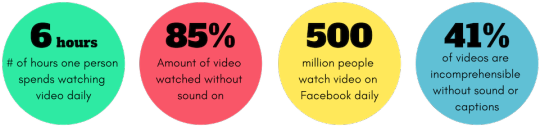
A lot of users turn to voice assistance to navigate your site. However, for the visually impaired, voice assistance is crucial. Without it, they can’t access any of the necessary information. These users listen to every element on your site, and if you include untagged visual content, they will not know it’s there.
Allow them a chance at interacting with you by tagging your visual content like graphics and images. That can be the difference between a well-informed user and an unsatisfied one. Additionally, ensure that the captions are readable, clear, and concise.
Add turn off features on video and GIF content
Web accessibility encompasses all users. It would be best if you considered your epileptic users who are sensitive to flashing content. The last thing you want is your content triggering a seizure. Users should be able to access your content without worrying about getting an epileptic attack.
A turn off feature can allow users to turn off flashing and moving visual content while surfing the web. The autoplay video feature is also a no go. Let the user decide whether they want to play the video or not.
Create an inclusive user experience
At least 90 percent of users will refrain from going back to a website with poor customer experience. Nothing spells that out more than inaccessible websites. Creating an inclusive design for your website is taking accessibility to the next level. It entails coming up with a universal design that considers all users regardless of race, gender, and age.
Final thoughts
Web accessibility is vital and beneficial to your business. The more your site and content is available, the better chances at improving your conversion rates and driving traffic. Without forgetting the ADA compliance lawsuits, an accessible site is key to staying on the right side of the law.
The post Why Web Accessibility is an Important Ingredient to your Content Curation Strategy appeared first on Scoop.it Blog.
Why Web Accessibility is an Important Ingredient to your Content Curation Strategy published first on https://improfitninja.weebly.com/
0 notes
Text
Why Web Accessibility is an Important Ingredient to your Content Curation Strategy
Content curation isn’t merely about plotting out various audiences or researching about your users’ interests. There’s a ton more to content curation. And web accessibility for all users is one of them. That means taking into consideration the 1 out of 6 visitors to your website with disability. Read on to find out why it is essential to do so.
Improves conversion and bounce rates
More than 71 percent of users with disabilities will leave a site that is not accessible to them. The result is an increase in bounce rates and an obvious loss of money-making opportunities on your website. In fact, an analysis by the UK government in 2016 found that websites lost a whopping £11 billion annually from bounce rates associated with people with disabilities.
As such, infusing elements accessibility into your content curation strategy can go a long way in helping you reduce bounce rates.
Leads to increased traffic to your website as a trusted source
Most people say that you have to earn trust. These words have never been more accurate. By making your website accessible, you show your users that you care for and appreciate them. It would be best if you used web accessibility to build trust with your users.
You can drive more traffic if your site is authoritative and accessible to all users. That overlaps with other suitable practices such as usability, SEO, and mobile web design.
It makes it easier for disabled persons to do business with you
At least 82 percent of disabled persons agree that they will spend more on an accessible site. That is regardless of the cost of services or the price tag behind products. That’s because they can do business with ease. They can also access the information on the site and make informed decisions.
An accessible website breaks the barriers of audio, visual content, and print using web technologies. Regardless of the type of disability that a user has, it will not hinder them from interacting with your website.
youtube
A strategic way to prevent ADA lawsuits against your site
While it’s easy to assume that only the government or big businesses need to make their websites more accessible, small businesses must fall in line too. It doesn’t matter whether you are running a charity website or a public or private one. The fact is failure to comply with the provisions of the ADA may land your business in trouble with the law.
Over 2000 cases of ADA lawsuits are reported yearly. To prevent your website from being a statistic, ensure that it’s ADA compliant. That will save you the headache of dealing with lawsuits and both time and money.
Gives your business a social impact
Running a business is not just about driving traffic and chasing leads. It’s also about making a difference in the community and those around you. And what better way to do that than to join the fight towards equal opportunities and access.
Your website can be an excellent place to start. That way, your users with disabilities can participate more actively in society.
How to make your website more accessible
youtube
Making your website accessible is not as challenging as it may first appear. With the right tips and tricks, you can improve accessibility for your site. Here are some of the steps that you should take.
Use descriptive link text
When curating your content, always ensure that you add descriptive texts to the links. Sure, adding color to it and underlying the links is important. But what about your audience with poor vision, color blindness, or those in poorly lit areas who can’t tell the link has color?
Descriptive texts like ‘Watch YouTube Video’ are easy to understand since they go straight to the point. Your audience does not have to wonder where the link is taking them. Plus, if your link requires the audience to download the link, you can let them know by clearly stating what they are to download.
Also, since most people use screen readers, avoid writing out the complete URL as the link text. It’s frustrating, looks clunky, and undoubtedly annoying (the screen reader will read it letter for letter).
Use simple language
One most valuable content curation strategy is using short, simple sentences. A lot of people only skim through content. So make it as skimmable as possible. If you have a problem with keeping your text short, you can use simplifying tools.
These tools replace complex vocabulary with simple ones and help you summarize your text. That way, anyone can understand your content, including people with cognitive impairment.
Format your content for access
Laying out your curated content in a clear and intuitive way can make it more accessible. That way, people can flow through it naturally and connect different sections of your content seamlessly. You can achieve all these by using simple formatting tips.
For instance, using straightforward and easy-to-read Non-Serif fonts can make a whole load of difference. Plus, you can use large, easy-to-click links that spell out the action the reader is taking by clicking.
Additionally, you can add as much color and contrast to your content. That way, people with limited vision or in low light won’t struggle to access it.
Source
Use clear hierarchy
If anyone in your audience uses screen readers (which is more than 4.4 million Americans), they depend on a clear hierarchy to understand the content. That’s why HTML tags in hierarchical headings that clearly show subheadings and titles are essential.
Make accessibility easy to find
When you add an accessibility feature to your website, the goal is to help users quickly navigate your site. But what use is it if they cannot find the feature? For instance, instead of having the accessibility page tacked away and only accessible when someone searches on Google, you can make it available on the main page.
Let users know where to go if they need to activate (or turn off) a specific feature. Ensure that the page spells out every single essential information.
Caption and transcript your videos
Source
Currently, video content is popular due to its engagement levels. However, a disabled user who is hard of hearing will have trouble accessing your content. No, subtitles don’t do the trick because the design was for people who can hear but are noisy or do not understand the language. It always leaves out some of the primary audio information like car honks, among others.
Captions, on the other hand, capture even the little audio details. That way, users can access the information better and completely. Transcripts also allow the same level of access without neglecting anything.
Simplify essential tools
Tools such as autocomplete for filling forms should not be too complicated. Instead, the user should only need to take the necessary steps to complete the action. For you to accomplish that level of functionality, you need to understand each user.
For instance, for a visually impaired user to access the tools on your site, you can include a reader. That way, they do not need to worry about typing. Even so, you may not get the tools right on the first go. But with more iterations and improvements, you can fix as many bugs as possible.
Enlarge the clickable areas
Some of the visitors to your site may have a combination of disabilities and may fail to navigate the site if everything is small. That is where the real challenge begins. The goal is to enlarge the size of your content and clickable links without making the site less adaptive.
You should ensure that your site is adaptive while increasing the hyperlinks’ size to cover more text. Users can then comfortably navigate the site regardless of their limitations, physical or otherwise.
Tag buttons, graphics and images

Source
A lot of users turn to voice assistance to navigate your site. However, for the visually impaired, voice assistance is crucial. Without it, they can’t access any of the necessary information. These users listen to every element on your site, and if you include untagged visual content, they will not know it’s there.
Allow them a chance at interacting with you by tagging your visual content like graphics and images. That can be the difference between a well-informed user and an unsatisfied one. Additionally, ensure that the captions are readable, clear, and concise.
Add turn off features on video and GIF content
Web accessibility encompasses all users. It would be best if you considered your epileptic users who are sensitive to flashing content. The last thing you want is your content triggering a seizure. Users should be able to access your content without worrying about getting an epileptic attack.
A turn off feature can allow users to turn off flashing and moving visual content while surfing the web. The autoplay video feature is also a no go. Let the user decide whether they want to play the video or not.
Create an inclusive user experience
At least 90 percent of users will refrain from going back to a website with poor customer experience. Nothing spells that out more than inaccessible websites. Creating an inclusive design for your website is taking accessibility to the next level. It entails coming up with a universal design that considers all users regardless of race, gender, and age.
Final thoughts
Web accessibility is vital and beneficial to your business. The more your site and content is available, the better chances at improving your conversion rates and driving traffic. Without forgetting the ADA compliance lawsuits, an accessible site is key to staying on the right side of the law.
The post Why Web Accessibility is an Important Ingredient to your Content Curation Strategy appeared first on Scoop.it Blog.
Why Web Accessibility is an Important Ingredient to your Content Curation Strategy published first on https://wabusinessapi.tumblr.com/
0 notes
Text
Amonkhet Commander Review: Part 1

Hello everyone and welcome back to today’s article. With Amonkhet’s spoiler season over with the set fully spoiled, it is now time to look at what new toys are in store for Commander players and the format as a whole. This 2-part article will go through the top 5 cards in each color for Commander. The first part of these series will go through the colors White, Blue, Black and Red, while the second part of the article will go through the colors Green, Multi-color, Colorless and Lands. Without further ado, prepare to start playing like an Egyptian with your Commander playgroup soon!
Before jumping into the colors, I’ll first like to mention at the release of every new set, the new Legendary creatures that are introduced for General play in Commander. Amonkhet has brought back Gods as the Legendary creature type, though not similar to the Gods of Theros, the Gods of Amonkhet share a small trait with the Theros gods. Having Indestructibility as a Legendary creature is always nice, but the new Gods do come with a slight downside, and that is not being able to attack/block unless a certain condition/criteria is fulfilled.
Also, Cycling has seen a comeback, with new cards for Commander players to experiment with as well as some small form of synergy with counters(*Atraxa players rubbing their hands in glee perhaps*).
Enough rumbling from me then, let’s get started with the first color!
White
Anointed Procession
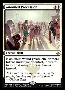
Finally White has a Parallel Lives effect, Anointed Procession will definitely see play in Commander in existing Green/White token strategies, especially for a small handful of players not being to afford Parallel Lives effect, grabbing this would probably save a couple of bucks. Mono-White generals that rely on token strategies such as Brimaz, King of Oskeros or Darien, King of Kjeldor. Overall, not a bad card designed by Wizards to push play for BW Zombies in Standard as well as tokens in Commander.
Gideon’s Intervention
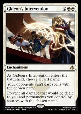
Gideon’s Intervention is a pretty niche card, it might see some fringe sideboard play in Standard, but I believe it’s truth potential lies in Commander. At 4cmc, Gideon’s Intervention seems costly as it’s effect stops 1 card from potentially being cast/dealing damage to you. However, it does seem to fair particularly well after your opponent has tutored for a card or has an infinite damage combo the following turn. It also fairs extremely well against Voltron, being able to halt your opponent’s Voltron plan before they even cast their general.
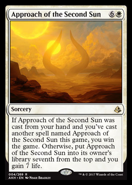
Approach of the Second Sun
Weird? High costed? Exactly what Commander asks/screams for. On paper, Approach of the Second Sun is a card you would probably find in your best friend’s shoe-box or your store’s 50 cent box of jank rares. However, it’s groundbreaking ability to win off casting a 2nd copy is something many Commander players would try to break in the format. Many have been talking about it’s “value” interaction with Remand, as well as a bunch of decks that abuse copying spells. Weird card, but could see play as a simple/efficient wincon.
Dawn//Dusk

Dawn//Dusk is an interesting card, it does remind me a lot of Austere Command. The first mode is quite powerful at 4 mana, though not on par with Wrath of God or Day of Judgement. The card pays off at the 2nd mode, where decks like Alesha or some form of Aristocrats would love to cast it’s Aftermath effect. Niche cards like these are definitely going to see some good amount of play in Commander.
Regal Caracal
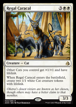
Ah look! Some Cat tribal support in Amoncat!
See what I did there? No..? :/
With that lame pun aside, Regal Caracal is actually quite a flavourful inclusion in the set. A 5-drop that’s a 3-for-1, makes 2 other Cat Tokens and acts as a Lord with additional Lifelink. Cats do not have that much of support in Commander, other than Anthem effects in form of Enchantments/Artifacts, but having a Lord now is quite the upgrade for any Cat Tribal deck.
BLUE
As Foretold
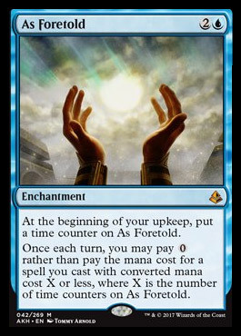
We’ll start with the bad stuff. As we all know, As Foretold has been on everyone’s radar recently and many have been trying to experiment with it in many formats. Reason being spells that have a cmc cost of “0” can be casted for free. Such spells include from simple things such as a free Evermind or even worse a free Ancestral Visions, which basically makes As Foretold an extremely powerful card being able to cheat a lot of spells into play. It also can play pretty well with decks such as Jhoria, something that already runs a host of powerful spells with the slight downside of Suspend. Or in an Atraxa deck, with the right curve and counter synergy, can work wonders. Only time will tell how soon someone is to breaking this in Commander.
Vizier of Many Faces
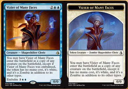
Vizier is just like any other clone effect, 4 costed and having the ability to copy a creature, but it does have Embalm for a slightly higher cost of 5. Meaning even after it has been destroyed, players still have a backup clone effect for only 5 mana. Also, it makes a token after being Embalmed, which could open up some cool and unique token strategies.
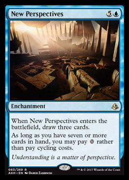
New Perspectives
Ah...another one of those really niche cards nobody would ever play anywhere else other than Commander. New Perspectives could actually push Cycling as a serious mechanic, due to the fact that it could potentially make Cycling cost 0. Although Fluctuator already makes Cycling free, some cards still require colored mana in order to Cycle. New Perspectives however, makes all cards regardless of their Cycling cost free to cycle, coming with a slight upside of drawing 3 cards as well. Cards like these in the set might actually push people to experiment more with Cycling in Commander.
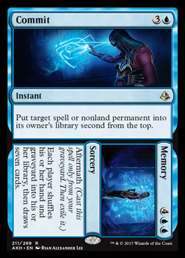
Commit//Memory
Commit//Memory might seem costly for what it does at first glance, but many have seen that Commit is already better than Venser, Shaper Savant. While Memory does seem like an overcosted Time Reversal, the card is already has value when you have used Commit or discarded it to use Memory more efficiently. Either way, the card is very versatile for Blue and I can’t wait to have it in my deck.
Glyph Keeper
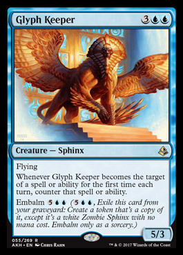
Now that is my definition of annoying! Glyph Keeper is actually a pretty simple card at first, but very troublesome to deal with. A 5/3 flyer is quite a beater, but combined with the fact it has a small built in protection and Embalm afterwards is good value. Your opponents are guaranteed to waste at least 2 cards getting rid of him, and another 2 after you Embalm it back.
Black
Liliana, Death’s Majesty
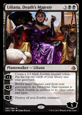
Starting off strong in Black is the new Liliana, and many Zombie-Tribal players are already in love with this set. There are so many new toys for Zombies to play with in Commander! Liliana is no exception of course, having the ability to create more Zombies while churning your graveyard, reanimating a big creature to make it a Zombie and of course, a 1-sided boardwipe for anyone not running Zombies. At 5 cmc, she is meant to carry Zombies a long way upwards.
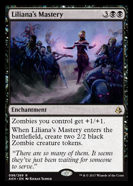
Liliana’s Mastery
If we haven’t got enough of Liliana and Zombies, you better get used to it soon. Black seems to me like full of cards specifically meant to pushing Zombies in Standard. And these cards are definitely going to see play in Commander. Liliana’s Mastery is a 5 costed Enchantment that is essentially a 3-for-1, giving 2 Zombies but acting as a effective anthem effect at the same time? Liliana and her Zombies are really partying good in Amonkhet after all!
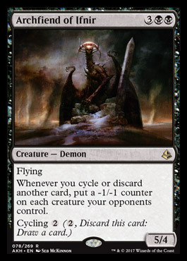
Archfiend of Ifnir
Probably one of the few big evil baddies in the set that isn’t a Zombie. Archfiend seems simple at first, but build it around a shell that likes discarding cards? Yep, decks such as Nekusar or Leovold could abuse their “Wheeling” cards and Archfiend to create an artificial but powerful 1-sided boardwipe. Other than that, Archfiend seems like it might stay in Commander for long due to it’s strong potential to easily clear an opponent’s board if he’s left unanswered.
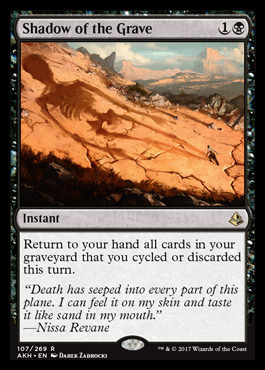
Shadow of the Grave
Now these type of cards are my favorite. Spicy, powerful in the right shell and low costed as always. Shadow of the Grave reminds me a lot of Yawgmoth’s Will, which is seen by many as a potential 10th piece of “Power” in the game, the raw power of playing the same set of cards a 2nd time is always overwhelming. Shadow, unlike Will, requires the player to discard/Cycle cards in order to recast them again, this is pretty easy to accomplish with again..Wheel Effects...being able to cast this, hold priority to discard your current hand, draw your new hand and get all your cards back? Sounds pretty fun to me!
Lord of the Accursed
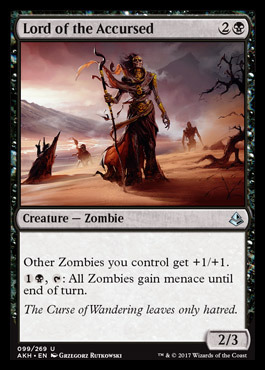
And surprise surprise! Another Zombie card to round off Black! As if anyone hadn’t knew it yet, Amonkhet is literally filled with strong Zombie cards. Lord of the Accursed is no stranger to round off Black as his childhood colors, at 3 cmc, he’s able to hit the table quickly as a cheap lord. His 2nd ability however can be used to finish someone with a low creature count off. Having another lord in Zombies really isn’t enough when they already have like....I don’t know? 7?!
Red
Glorious End
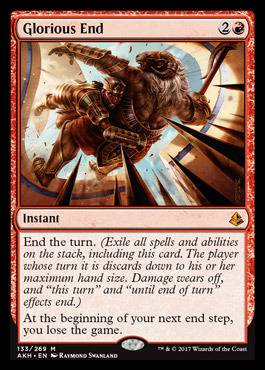
This card might very well read, “Stop whatever your opponent’s doing, and I’ll need to win the game NOW”. We’ve seen plenty of effects in Red where they do broken things such as Extra Turns, but requiring the player to win the next turn to avoid losing. Such cards include Warrior’s Oath and Final Fortune. It is pretty interesting to see an “End the Turn” effect in Red though, where the only 2 cards possible of doing so are Time Stop and Sundial of the Infinite. Overall, a pretty interesting card I would love to see being abused in Commander together with cards like Hive Mind.
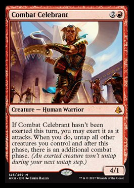
Combat Celebrant
Extra combat phase effects on creatures are always amusing. Combat Celebrant excels here due to the fact he just needs to attack, and activate Exert on him. Meaning even if he’s killed afterwards, you’ll still get the additional combat phase he gave you, even better when after he’s exerted, he need not attack again with the risk of being killed through combat damage. Fun card overall, with many players soon to break it.
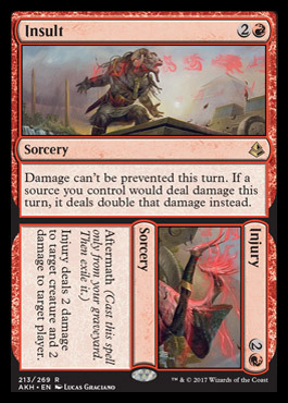
Insult//Injury
Insult does a lot for a measly cost of 3 mana, being able to not prevent damage and double your damage from any source this turn? Sign me up! Injury is not really good but can be activated late game to kill off anything small and poke a little at your opponent’s life total. I would love someone to try and play this around Storm, making each Grapeshot hit for a ton of damage :>
Hazoret’s Favor
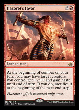
Hazoret’s Favor is an ideally good card for decks that love placing in big creatures and swinging immediately. I could see this card working better when paired with a 2nd/3rd color, decks such as Xenagos, Omnath, Animar and many others would love to have this. Low costed at 3 mana, generally Commander playable overall.
Harsh Mentor
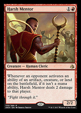
Many have begun the hype where Harsh Mentor would see play in formats such as Legacy, where it can pick off opponents for numerous strategies/decks. Harsh Mentor isn’t too bad in Commander too, many activated abilites in Commander require tapping,sacrificing creatures or simply paying mana. Harsh Mentor only targets opponents, which is definitely a huge upside considering it’s a 2/2 for 2 mana. Powerful card overall, and I could see many people seeing this as a formidable threat in a few formats soon.
Conclusion
Amonkhet does bring a lot of new toys for Commander players thus far, and I can’t wait for the set release to be able to experiment with some new strategies. That’s all for this week’s article, stay tuned next week for Part 2 of this Commander review-where I go through the remaining colors/cards for: Green,Mulitcolored,Artifacts and the Lands of the set. Until next time, happy brewing with Amonkhet!
2 notes
·
View notes
Text
Why Web Accessibility is an Important Ingredient to your Content Curation Strategy
Content curation isn’t merely about plotting out various audiences or researching about your users’ interests. There’s a ton more to content curation. And web accessibility for all users is one of them. That means taking into consideration the 1 out of 6 visitors to your website with disability. Read on to find out why it is essential to do so.
Improves conversion and bounce rates
More than 71 percent of users with disabilities will leave a site that is not accessible to them. The result is an increase in bounce rates and an obvious loss of money-making opportunities on your website. In fact, an analysis by the UK government in 2016 found that websites lost a whopping £11 billion annually from bounce rates associated with people with disabilities.
As such, infusing elements accessibility into your content curation strategy can go a long way in helping you reduce bounce rates.
Leads to increased traffic to your website as a trusted source
Most people say that you have to earn trust. These words have never been more accurate. By making your website accessible, you show your users that you care for and appreciate them. It would be best if you used web accessibility to build trust with your users.
You can drive more traffic if your site is authoritative and accessible to all users. That overlaps with other suitable practices such as usability, SEO, and mobile web design.
It makes it easier for disabled persons to do business with you
At least 82 percent of disabled persons agree that they will spend more on an accessible site. That is regardless of the cost of services or the price tag behind products. That’s because they can do business with ease. They can also access the information on the site and make informed decisions.
An accessible website breaks the barriers of audio, visual content, and print using web technologies. Regardless of the type of disability that a user has, it will not hinder them from interacting with your website.
youtube
A strategic way to prevent ADA lawsuits against your site
While it’s easy to assume that only the government or big businesses need to make their websites more accessible, small businesses must fall in line too. It doesn’t matter whether you are running a charity website or a public or private one. The fact is failure to comply with the provisions of the ADA may land your business in trouble with the law.
Over 2000 cases of ADA lawsuits are reported yearly. To prevent your website from being a statistic, ensure that it’s ADA compliant. That will save you the headache of dealing with lawsuits and both time and money.
Gives your business a social impact
Running a business is not just about driving traffic and chasing leads. It’s also about making a difference in the community and those around you. And what better way to do that than to join the fight towards equal opportunities and access.
Your website can be an excellent place to start. That way, your users with disabilities can participate more actively in society.
How to make your website more accessible
youtube
Making your website accessible is not as challenging as it may first appear. With the right tips and tricks, you can improve accessibility for your site. Here are some of the steps that you should take.
Use descriptive link text
When curating your content, always ensure that you add descriptive texts to the links. Sure, adding color to it and underlying the links is important. But what about your audience with poor vision, color blindness, or those in poorly lit areas who can’t tell the link has color?
Descriptive texts like ‘Watch YouTube Video’ are easy to understand since they go straight to the point. Your audience does not have to wonder where the link is taking them. Plus, if your link requires the audience to download the link, you can let them know by clearly stating what they are to download.
Also, since most people use screen readers, avoid writing out the complete URL as the link text. It’s frustrating, looks clunky, and undoubtedly annoying (the screen reader will read it letter for letter).
Use simple language
One most valuable content curation strategy is using short, simple sentences. A lot of people only skim through content. So make it as skimmable as possible. If you have a problem with keeping your text short, you can use simplifying tools.
These tools replace complex vocabulary with simple ones and help you summarize your text. That way, anyone can understand your content, including people with cognitive impairment.
Format your content for access
Laying out your curated content in a clear and intuitive way can make it more accessible. That way, people can flow through it naturally and connect different sections of your content seamlessly. You can achieve all these by using simple formatting tips.
For instance, using straightforward and easy-to-read Non-Serif fonts can make a whole load of difference. Plus, you can use large, easy-to-click links that spell out the action the reader is taking by clicking.
Additionally, you can add as much color and contrast to your content. That way, people with limited vision or in low light won’t struggle to access it.
Source
Use clear hierarchy
If anyone in your audience uses screen readers (which is more than 4.4 million Americans), they depend on a clear hierarchy to understand the content. That’s why HTML tags in hierarchical headings that clearly show subheadings and titles are essential.
Make accessibility easy to find
When you add an accessibility feature to your website, the goal is to help users quickly navigate your site. But what use is it if they cannot find the feature? For instance, instead of having the accessibility page tacked away and only accessible when someone searches on Google, you can make it available on the main page.
Let users know where to go if they need to activate (or turn off) a specific feature. Ensure that the page spells out every single essential information.
Caption and transcript your videos

Source
Currently, video content is popular due to its engagement levels. However, a disabled user who is hard of hearing will have trouble accessing your content. No, subtitles don’t do the trick because the design was for people who can hear but are noisy or do not understand the language. It always leaves out some of the primary audio information like car honks, among others.
Captions, on the other hand, capture even the little audio details. That way, users can access the information better and completely. Transcripts also allow the same level of access without neglecting anything.
Simplify essential tools
Tools such as autocomplete for filling forms should not be too complicated. Instead, the user should only need to take the necessary steps to complete the action. For you to accomplish that level of functionality, you need to understand each user.
For instance, for a visually impaired user to access the tools on your site, you can include a reader. That way, they do not need to worry about typing. Even so, you may not get the tools right on the first go. But with more iterations and improvements, you can fix as many bugs as possible.
Enlarge the clickable areas
Some of the visitors to your site may have a combination of disabilities and may fail to navigate the site if everything is small. That is where the real challenge begins. The goal is to enlarge the size of your content and clickable links without making the site less adaptive.
You should ensure that your site is adaptive while increasing the hyperlinks’ size to cover more text. Users can then comfortably navigate the site regardless of their limitations, physical or otherwise.
Tag buttons, graphics and images

Source
A lot of users turn to voice assistance to navigate your site. However, for the visually impaired, voice assistance is crucial. Without it, they can’t access any of the necessary information. These users listen to every element on your site, and if you include untagged visual content, they will not know it’s there.
Allow them a chance at interacting with you by tagging your visual content like graphics and images. That can be the difference between a well-informed user and an unsatisfied one. Additionally, ensure that the captions are readable, clear, and concise.
Add turn off features on video and GIF content
Web accessibility encompasses all users. It would be best if you considered your epileptic users who are sensitive to flashing content. The last thing you want is your content triggering a seizure. Users should be able to access your content without worrying about getting an epileptic attack.
A turn off feature can allow users to turn off flashing and moving visual content while surfing the web. The autoplay video feature is also a no go. Let the user decide whether they want to play the video or not.
Create an inclusive user experience
At least 90 percent of users will refrain from going back to a website with poor customer experience. Nothing spells that out more than inaccessible websites. Creating an inclusive design for your website is taking accessibility to the next level. It entails coming up with a universal design that considers all users regardless of race, gender, and age.
Final thoughts
Web accessibility is vital and beneficial to your business. The more your site and content is available, the better chances at improving your conversion rates and driving traffic. Without forgetting the ADA compliance lawsuits, an accessible site is key to staying on the right side of the law.
The post Why Web Accessibility is an Important Ingredient to your Content Curation Strategy appeared first on Scoop.it Blog.
Why Web Accessibility is an Important Ingredient to your Content Curation Strategy published first on https://improfitninja.weebly.com/
0 notes
Last Seen Blogs

fear-and-loathing-in-ferelden
gaming sideblog

frozen-heart-thoughts
toxic_thoughts

blogexpresslife
ExpressLife

quads004
Clove

terminusog
TerminusOG