#(for the original meme quoted in alt text)
Text

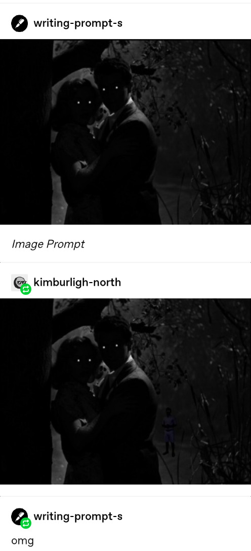
Sorry got distracted again 💥
#art#digital#meme#dare I main tag……#mmmm probably not they’re missing most of their identifying features anyways#I’m sure ppl with find it anyways#Len’en#tsubakura enraku#suzutsuba#(implied) (obviously)#suggestive#JUST COVERING MY BASES…..#listen idk what it is about suzutsuba that’s got me acting up (that’s a lie I know exactly what it is) but I swear I’m not usually like this#originally drew this shirtless but I was like mmm maybe not for my tumblr#also this was an interesting study but it did turn out pretty uncanny valley lol#if I slightly avert my eyes from it it reminds me of someone I know#suicide mention#(for the original meme quoted in alt text)#‘why did you cover up and replace the text of you’re the one who wrote it and Tsubakura wouldn’t have needed to edit it’ you ask#we’ll mainly to make it more recognizable and also cause I thought it’d be funnier#meme editing is an art form and I am an artist#*well THANKS AUTOCORRECT
13 notes
·
View notes
Text
📌 Welcome friends, foes, and passersby to my personal piece of fandom hell.
About My Blog:
18+ only; minors will be blocked
Please, please put your age in your bio!
No further DNI, but I will block bigots, bullies, and blank blogs. Terfs, aphobes, and exclusionists please exit the blog and find a hobby that isn’t bullying queer people on tumblr.
This blog was originally created as a way for me to share my fanfiction and accept requests, but has since expanded to incorrect quotes, memes, and occasionally non-fandom bs.
It runs pretty much entirely on queue and scheduled posts. I don’t have notifs turned on for the app, so I may take a while to respond to messages and asks.
Fandoms:
The Amazing Devil (Band)
Doctor Who
Fullmetal Alchemist
Harry Potter – I do not support JKR
Hazbin Hotel
Helluva Boss
Steven Universe
The Witcher
I tend to cycle through them based on the whims of my ADHD brain, and when each is posted is unknown even to me.
Tags:
#Fanby’s Fuckery – All original posts (minus ramblings)
#Fanby’s Fics – My fanfiction
#Fanby’s Headcanons – My headcanons and occasionally a few scattered plot bunnies
#Fanby Answers – Answered asks
#Fanby Adds – Reblogs where I add something (that I think is) significant
#Fanby’s Ramblings – Rants, ramblings, screaming into the void, and other general mumblings of madness that I don’t want clogging up my main tag
#Not OSHA Compliant – Content with kink and/or sexual and/or suggestive themes; original posts may also be marked with the mature filter
#Undescribed – Posts with images that do not have image descriptions
#Functionally Described – Posts that don’t have dedicated image descriptions, but describe the image in the post
#Not Fandom – Any posts not related to fandoms or fics
Posts and memes about my fics are tagged #Fanby: [fic name]
Common triggers are tagged #[trigger] cw
If you’d like something tagged, please don’t hesitate to ask.
Accessibility:
I’m currently going through old posts for an accessibility update, but once that’s done…
Original posts will all have image descriptions
IDs under two-hundred characters will be in the alt text.
IDs over two-hundred characters will be in plain text.
If an image is meant to be reposted – for example, a meme template – then the ID will be in plain text for easy copy-pasting.
If you find my content inaccessible or have a way to make it more accessible, please please tell me. I’ve been doing research, but there’s a lot to learn – not to mention the conflicting information. Criticism in regards to accessibility is more than welcome.
Refs, Recs, and Resources:
#Fanby’s Ref Folder – Catchall tag for things I want to save to revisit later (working on phasing it out)
#AO3 Tips
#Crisis Tips
#Donate Here
#Fic Recs
#Inspo
#Internet Tips
#Life Tips
#Palestine Resources
Black-and-white thinking in fandom and resources for CBT, DBT, and addressing cognitive distortions.
About Me:
My name is Nico, I’m 25, and I write fanfic. I use they/them and xe/xem pronouns, and have a whole heap of queer labels I fall under. For more info on my labels and term preferences, check out my pronouns.page.
I’m part of an real life love triangle made up of myself, my fiancé, and our boyfriend.
If you wanna read more of my work, I’m on AO3 as fanby, and have some exclusive fics posted there.
Blog’s new, but I’m not. I was on this hellsite back in the ‘go nuts, show nuts’ golden age and when they finally shut this place down, staff will have to call animal control to remove me from the air vents like the rabid little raccoon I am <3
I have a twitter, but there’s literally nothing there that isn’t here. Check it out if you prefer Musk’s bird app, I guess?
Fanfic Masterlists:
Harry Potter – WIP
Hazbin Hotel/Helluva Boss
The Witcher
Kinktober
AO3 Exclusives – Links to the AO3 collection
Requests:
Requests are currently open for mutuals only. I’m trying to limit requests at the moment, but will make an exception for mutuals if I think I can swing it.
Will Write:
Angst with a happy ending
Hurt/comfort
Fluff
Familial relationships
Found family trope
X reader
OCs
Canon x OC
Any relationship style: platonic, queer platonic, romantic, sexual, D/s dynamics
Most kinks
Explicit kink
Non-explicit sexual content
Might Write:
Hurt/no comfort
Crossovers
OOC
Non-canon disabilities and mental illness *1
Alastor as a Voodoo practitioner*2
Explicit sexual content *3
*1 If I’m going to represent a marginalized group, I’m going to do my best to do so respectfully, even in fanfiction. If I’m not confident in my ability to do that, then I may choose not to.
That being said, I’m down to research and I have lived experience with chronic pain and a few mental illnesses. I am extremely confident in my ability to project my own experiences onto my blorbos, and do so quite frequently.
*2 This is mainly for the same reason I won’t write non-canon disabilities. Voodoo is highly misrepresented and I don’t want to contribute to that. I may write him as a past practitioner depending on the circumstances and as long as his current magic is not Voodoo-based.
My personal headcanon is that he grew up practicing Voodoo and ancestral magic, but burned bridges in the pursuit of power and lost support because being a serial killer is generally frowned upon. I usually write his current magic as non-specific, demonic, or Eldritch in nature.
*3 My ability to write explicit sexual content varies, so I’ll be taking this on a case by case basis.
Won’t Write – This Fandom-Specific Content:
Note: These are due to personal preference, deeply ingrained headcanons, and nunn’yuh (none ya business). I am not judging or condemning any of these ships/headcanons/etc. or people who make fanworks involving them; it’s just a comfort thing.
Hazbin Hotel:
Rosie in an NSFW context
Chalastor
Alastor x Niffty
Angel Dust shipped romantically with women
Vaggie shipped with men
The Witcher:
Yennefer bashing
Ciri (including adult!Ciri) shipped with any Wolf School Witcher
Ciri (including adult!Ciri) shipped with Jaskier/Dandelion
Won’t Write – This General Content:
Note: A good deal of this section falls under Kinktomato or YKINMKATO (Your Kink Is Not My Kink (And That's OK)) and DLDR (Don’t Like, Don’t Read) – just like, with writing instead of reading.
I’m not here to take sides in shipcourse or police other people’s writing; this is, again, about my own comfort level with writing certain topics. That’s it.
Scat/watersports/emeto kink
Adult x minor ships
Underage NSFW/smut/explicit, including any underage kink
Incest, including adoptive/step family
Detailed or romanticized non-con *1
Detailed or romanticized dub-con *1
Detailed or romanticized suicide *2
Detailed or romanticized self harm *2
*1 I can write aftermath of non-con/dub-con or attempted non-con/dub-con, but will not go into detail or portray it as in any way positive. I won’t write the reader or a canon characters as the perpetrator, unless it’s already in canon – AKA: The Valentino Exception. This does not include negotiated CNC, which I would consider writing under specific circumstances.
*2 Any time I write content involving suicide or suicidal ideation, I write with the National Recommendations for Depicting Suicide in mind.
The way suicide is portrayed in fiction can have real world consequences:
“Studies have shown that both news reports and fictional accounts of suicide in movies and television can lead to increases in suicide. In contrast, when depictions are done responsibly, the media can help to encourage help seeking, dispel myths, and reinforce hope – and ultimately save lives.”
(Source: Alliance for Suicide Prevention)
I am a suicide survivor and have lost loved ones to suicide as well, so this is deeply personal to me. If you’re struggling with self harm or suicidal thoughts, please hold on, and don’t be afraid to ask for help:
International Suicide Hotlines
Australia Lifeline: 13 11 14
Canada Talk Suicide: 1.833.456.4566
UK Samaritans: 116 123
USA Suicide and Crisis Lifeline: 988
7 notes
·
View notes
Text
On this blog, I repost the same very popular Tweets dozens of other users have also reposted. My goal is to exclusively embed those Tweets, which automatically adds the accessibility feature that is alt text + a link to the original (with few exceptions in which I write the alt text myself, if I feel like a Tweet is notable enough but has apparently been deleted.)
By doing this, I would like to make those popular posts and memes accessible to more people. I would also like to show to more people that Tweet embeds are an option, to hopefully encourage them to use them in the future.
As a reminder, in order to embed a Tweet, all you have to do is paste its link onto your post.
You can easily copy the link of Tweets on either desktop or the app. (The placement can sometimes change on mobile from update to update, but the option should always be accessible via one of the buttons around your Tweet.)
Then open your fresh tumblr post and paste the link.
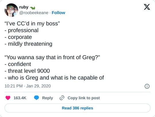
(Link to my post with only this Tweet, in case you like it and want to reblog it.)
If you're sourcing your own brand new Tweet to share to tumblr for any reason, this is arguably quicker and easier to do than taking a screenshot and re-uploading it to tumblr. Please consider this option whenever possible - it's very convenient.
In my case, since my goal is to repost Tweets that are already popular on tumblr, I use Twitter's search function, which works very well (contrary to tumblr's).
If you already have a screenshot with the person's username, unless they deleted their account or changed their username, you're certain to find the original. Of course, this is only needed if you're looking for a Tweet to repost, and you won't need to do this if you just happen into a new Tweet you want to share to tumblr.
I encourage anyone to use this instead of screenshots whenever possible, because it's more convenient than having to type the alt text yourself! Even if you don't usually provide alt text, there's no reason not to let it be automatically written for you when it can be. Plus, it leaves a link to the original Tweet, which I feel like makes it more respectful to the user who wrote the funny joke.
Alt text is an accessibility feature that mostly benefits people who use screen-readers because they, for one reason or another, can't read the words on their screen. Especially when the image is the right size - so the "alt" button doesn't come in the way - as it is automatically generated by pasting the Twitter link, there's no harm in having it there whatsoever. All it does is include more people.
Accessibility isn't a one-size-fits-all. Some users may benefit more from Image descriptions that are written in the body of the post. However, alt text is a commonly accepted and convenient accessibility feature. On top of that, accessibility for the disabled can oftentimes wind up benefiting everyone - for example, being able to click the "alt" button allows people to see the contents of the image even if they have a poor connection and the image won't load. Having a text description of any image also makes it easier to find in the future, even with tumblr's terrible search function.
I hope this post can encourage more people to include alt text and/or image descriptions more often. Even if you don't have time to include alt text all the time, you should take advantage of these embeds, which do it for you. A funny Tweet repost is the type of post to become very popular, so it's sure to land on someone's feed who wishes they could know what it says but can't when it's just an undescribed image.
(PS: as of currently, there is a slight issue in that the contents of described images included in the Tweet, or Tweets being quoted, aren't copied. Now that you know about the Twitter embed option, consider contacting support in one way or another to let them know you'd like these contents to be added to Twitter embeds. It's a really great option for simple text Tweets, and it could easily include even more Tweets. I know you just found out about it, so if you just want to use the function for those text Tweets for now, it's okay - please just consider it!)
2 notes
·
View notes
Text
HS^2 bloggin’ Patreon Commentary Catchup 2020-03-29
I know I’ve been sitting on half-a-dozen asks, but I’m gonna sit on those a little longer because after I’m done catching up on ALL the commentary I’ve missed I’ll probably be a little exhausted.
First the commentary on Chapter 5: YOUR 3Y3S H4V3 B33N CLOS3D. I skimmed this before, just so I could leave a comment about what I’d been told about the suicide feeling / Jaspers funeral when she was “eight” being way too late on the timeline. They still haven’t made any corrections to that HS^2 page. Hm. Are they just feeling the general vibe and tags to help the fandom guide things? I’m wondering if anyone came to any of them specifically with that, since Patreon commentary doesn’t seem to cut it. (Which I might be grateful for, from another point of view, because why would they favor paid methods.)
Sketches and Commentary: Chapter 5, "YOUR 3Y3S H4V3 B33N CLOS3D"
Starting commentary on why they played with the medium by opting for a Longpage with that update. Unsurprising and understandable~
Ooh, they included the commission/sketch instructions for the image they asked from Xam.
I don't know what we did to deserve Xamag.
Yeah few people dispute Xamag’s awesomeness.~
Much of this conversation was written before they launched HS^2′s first chapter, huh?
With the "primary" version of its original protagonist dead in a wallet,
Did... did Terezi or someone else put John’s body in his wallet after he died? I forget. *checks back*
(Meat 35) That’s definitely a fair question. But I have one that’s much more important for her to answer. Terezi, are you seriously just going to leave the body here? “TEREZI: HUH?” Of course not. Terezi’s a practical girl, after all. She digs the wallet out of her blood-stained pants, and captchas the corpse. She holds it close to her heart, like a secret. Like John’s stupid last words: a confession whispered for her and no one else.And then she starts walking home.
(Meat 36) Terezi’s jaw tightens. She’s not ready to hear any words that remind her of those few hours with John. Her hand goes to her pocket, where she’s keeping the wallet. She traces the contours of it with her thumb and forces a smile.
[...] Here we both are. It’s a beautiful day. You’ve got your dead boyfriend in your wallet. And we’ve already managed to strike such a nice metatextual rapport. So hear me out. [...] I ease the throttle back a bit, just enough so that I’m not whispering directly into her ear when she slips the wallet out of her pocket. She clutches it so hard in her palm that she’s digging dents into the leather, and bites her lip.
God damnit, that was an important fucking thing for me to forget. I hope she preserved his corpse in a better way than just “wallet”. And why the FUCK did Dirk think it was so important to bring him???? That’s not good, is it.
Back to the commentary, going to how the Dirk crew’s conversations especially cover the meta question of why continue the story at all...
This is actually a similar question to one explored by a series that shares a lot of Homestuck's creative DNA, Steven Universe.
Oh god damnit, what timing, huh? And then they go on about what constitutes a happy ending and what’s supposed to happen after, how work might not be done, et cetera. Hopefully these authors take a page from how SU:F finished, because Steven Universe managed to pull it back to uplifting pretty well.
These are two dangerous women, confined together long enough to learn all of each others' weaknesses, and sharp-edged enough to exploit them.
True enough.
Dirk, unfortunately, cucks the audience from seeing the scene's "true resolution." What an asshole. I've never been madder at this guy than I am right now. I bet he didn't even provide a warranty.
Pff.
On to the next commentary:
Sketches and Commentary: Catnapped, Part Three
Catnapped is some of the most fun I’ve had while writing, because Jasprose is just so goddamn fun. Cats don’t plan, they live in the moment. She’s always existing in that moment of pushing a glass off the table.
We can all agree with that I think.
Plenty they talk about here, but I’ll just quote part of anything about characterization...
First, I actually really appreciate getting a lot at Jane's genuine sympathy for Dirk here. There was quite a bit of mutual fondness and care between the two of them – but, at the same time, they enabled each others' worst tendencies.
Hm!
Swifer remains the closest thing to a "straight man" this story has. (Not in the sexuality way. In the comedy way.)
Yep.
There was no universe where we left this story without Jasprose saying "owo what's this". You know it, I know it.
Jesus Christ, I didn’t catch that.
God, Problem Sleuth just has the worst commuting luck. He should put some of his rug money into a permanent locksmith. Checking back in with these scenes is always a delight. It probably took PS like two hundred off-screen panels to get to this point. Miserable.
Wait, that’s right, Catnapped 28 is shown before DDD 12, but AFTER Dad is shown marching up handcuffed in Catnapped 26. And yet in DDD 12, Dad and DD come fetch PS from out of his office, when the handcuffed thing hasn’t happened yet in DDD. You can’t DO that, authors! It only makes RELEASE ORDER sense, not any sort of OTHER sense? What about when people come to catch up or read this later! Come on, that’s sloppy. Unless they’re going to leave PS behind to stay trapped in his office MORE, which I wouldn’t put past them. (But, wouldn’t make sense since the bullethole from C28 is already there in DDD12.) Andrew knew more of how to be responsible telling an out-of-time-sync story, believe it or not.
Commentary ends with a few sketches, like Jasprose doing a The Mask impression, appropriately.
Sketches and Commentary: Chapter 6, "A Conversation Regarding Relevance"
Oh, it’s Jade time.
On alt!Callie’s starting Space rant:
I wanted to impress on everyone just how vast it is, and also to remind the audience that alt!callie has them at the same mercy that Dirk does. She can force us to listen to her pontificate endlessly if she so chooses. She’s slightly less insufferable than Dirk, if only perhaps because her text isn’t orange.
Yep, mostly.
So here she is. Jade. We find out that not only is she conscious inside her own head, she is also incredibly chatty. And not too thrilled with her current situation. I know most of the audience isn’t either, considering the fact that Jade having no agency has basically become a meme at this point.
NEVER. AGAIN. PLZ.
As Callie told us in the beginning of the chapter, it isn’t natural for people to behave like narrative devices. Even within her own thematic framework, Callie has a habit of defaulting to behaving like a person after all.
Even alt!Callie still became a story nerd, not just original Callie -- she just became a different, more insufferable type of story nerd.
Plenty more discussion I don’t need to touch on... keep in mind I’m omitting large parts of this in most cases, again, to respect the paywall.
A remark on Dave and Karkat being two emotionally-constipated early-twenties Bernie Bros, which... I mean. Fair.
She definitely does love them, and she wanted to be with them, but also...Jade has a lot of other prospects. She’s actually the one character who seems to be enjoying her time on Earth c. Hitting up interspecies raves and getting around. We just haven’t seen any of that because none of those other people she boned are main characters.
Maybe that’s why alt!Callie was so blind and dismissive of it? Offscreen experience being less in the Light, therefore less relevant to her, even though that’s the exact attitude she’s ostensibly at war with?
Anyway Jade’s consciousness is huge.
Yep.
It’s been a while since we’ve had any sort of serious meta talk about classpects. Mostly because there’s really no use for classpects outside of the game, unless, for instance, you go around referring to everyone as the Prince or the Witch because you are a dramatic alien in a hood. It does make sense that a Witch’s powers would be more useful than a Sylph’s to a Muse.
Aaaand that’s all the classpect mention we’re gonna get isn’t it? ;P
(Yes I know, the author told us to dial it back. They ARE going ahead and prepping to answer some outstanding questions, though.)
Honestly, the Jade Situation is a tough one. To be sure, she has been sacrificed to the plot again and again, something that probably began as a coincidence and then later grew into a theme. Space players are destined to be huge, cosmic forces in the universe. Big movers. [...] But usually when we hear the story of big, god-like beings, we don’t think about the personalities behind them. What was it like for god to create the universe? Was he lonely? Did he regret it? Did he wish he could live in it instead?
And Jade WAS too powerful not to sideline, by a certain point in the plot. And before that, maybe trapped in a bit of a character arc where she had to get over some notions to step into the action.
I actually think Jade could have been okay with this. With being A Force For The Narrative. [...] But then Callie makes it personal.
Agreed. If alt!Callie hadn’t been so shitty about it in general, they could have worked things out more meaningfully; but the immense resolve and effort it took to dominate Caliborn in her origin timeline has tainted her perception ALMOST as bad as Dirk’s. Much of HS^2 is probably going to involve her gradually learning how to get over that in the background, the balance she needs to take ala the Ultimate Riddle’s lesson.
(Tangentially... it was said that it would have been nearly impossible to make alt!Callie dominate, even across ALL timelines. What if alt!Callie had her timeline’s origin explained in HS^2 by a Third Scratch at this late date with the likes of Davebot running around to do it??? That would probably make me fucking mad.)
Back to the commentary.
Admittedly these last few chapters have definitely been “girls beating the crap out of each other” heavy, and I hope that’s okay.
PFFFFF
Callie and Jade aren’t really sure who makes a decision on what is considered “just” or “heroic”. Plot twist, it’s us. We do. But also the alpha timeline does.
Hmm.
More gorgeous Xam art. Initially we were going to make it more ambiguous whether or not she actually ate the peanut butter, but we decided to have it be a decisive moment of triumph.
Really? Well, you could have made it visually clearer that the candy dropped. A lot of people visually missed that. This is a consequence of the back-and-forth artist-isnt-the-author art-commissioning going on, in part... Andrew was MUCH better at conveying what he wanted to convey BETWEEN panels than this crew, like comic book panels and their composition together; you can see that when comparing Homestuck proper’s sprite animation to that of fan adventures that used sprites, for instance. These guys are at something of a disadvantage due to their disconnect.
Commentary on the Commentary
This commentary uses "she/her" to talk about the alternate Calliope possessing Jade, while the "other" Callie (remember them?) uses they/them. This other Calliope, presumably, has a much different relationship with her gender – and her brother – than the Callie we saw discussing the subject with Roxy and John. One of my favorite things about this update (I can say that, because I'm a second person who didn't write it) was that subtle hint about how different her Caliborn must have been to allow her to predominate in the first place. I'd be really interested in fan works exploring more about her (and his) past.
Hhhhmmmmmmm.
Not sure what else to say to that, but it does make me hmmm.
Sketches and Commentary: Diamonds, Dames, and Dads, Part 1
Probably not much plot-relevant here...
Oh pff.
They had full drawings of them going in for the kiss on standby. They couldn’t resist making them.
Real talk, I have been looking forward to writing this story the most out of any other part of HS^2. Finally I get to combine my passions. Cheesy noir bullshit and old men making eyes at each other.
Pfffffff. Yes.
...the next three or four pages of this writing go on to describe how sexy this is and these characters and setting are. I can’t fault a word of any of it.
The dream team is assembled. Nothing can possibly go wrong.
Wow, I caught up on all this commentary quick. See you next time.
#Homestuck#hs2#Homestuck Liveblog#upd8#Homestuck^2#bladekindeyewear#blastyoboots#Homestuck Commentary#spoiler#spoilers
7 notes
·
View notes
Photo

Hello! I'm Jennifer and this is my guide on how to roleplay in the indie roleplay area of things. I have been roleplaying in the indie world for at least five years if not longer so this is what I have learned. This isn't everything and is based off of what I know and have done! You can send me questions about the indie world in my ask box and I will try and help you! Like/reblog if you find helpful or you use anything from this!
❖ URL
Some people replace a word in their url with a c or x. Using lyrics that are short for a url. Asking a rph like myself for url help if you can't think of a url for your blog.
❖ Finding a theme
Container themes were popular and still are pretty popular so if you want to stick with the fad using a container theme would be wise but that isn't the only theme you can use! There are so many great theme makers out there that make beautiful themes that you can use. Here are my reblogged main themes that can be used in roleplaying. Make sure that your font size is a readable size even for sup, sup, and small text since people have a hard time reading small font. I wouldn't suggest going smaller than size 10 px for text.
You can ask rphs for help finding and picking themes! Roleplay helpers can have great suggestions!
❖ Tags and tag style
This guide here is great when it comes to styling tags if you want to do something fancy. I will show you the style that I use for my tags : ** Quote goes here ❪tagnamehere❫.
Suggestions for tags for your blog are going to be split between character replated and then out of character related.
In character related: Wardrobe, isms, musing, headcanon, interaction, face claim (young), face claim (main), face claim (older), face claim (alt), interactions, and if you are running a multimuse blog, I would suggest a reply tag for every thread with all of your muses. There are more tags that you can have but this is a suggestion.
Out of character: Promos reblogged, out of character posts, self promos, answered, mun day pictures, and more.
❖ What pages do you need
Rules, about (Bio), stats for your character or characters. Rules are so important! I will cover suggestions of things that you should consider having on your rules page! A map page to navigate your blog is important.
❖ What should be on your rules page
Triggers: Do you have any triggers? Anything that causes you mental distress, gives you anxiety, brings you back to a traumatic time in your life?
Starters: Do you reply to open starters? Do you make open starters? What about greeters? Do you reply to those or make them yourself?
How do you tag triggers?: Do you go tw trigger or trigger tw
Personals: Do you mind personal blogs following you? Sending you asks?
Memes: A link to your meme tag, do you only want them for people that follow you and you follow them?
Age: How old are you? This is important for everyone's comfort! Lying about your age is wrong and shouldn't be done.
Smut: Are you comfortable with smut? Do you smut? (Remember that if you are a minor you are not allowed to smut, it is illegal and no one should be rping smut with a minor), do you fade to the black? Do you put smut under read more, tag it? Do you reblog nsfw photos and musing?
❖ What tags to track
I suggest tracking your url! Along with your favorite face claims for your character(s)!
❖ How to tag and what to tag
For starters and promos, I suggest going with something along the lines of these examples:
fandom rp, genre rp, fandomless rp, original character rp, oc rp. indie fandom rp, indie genre rp, indie fandomless rp, indie original character rp, indie oc rp
Fandom meaning if your character is in a certain fandom, genre if your character or characters are in any genre. If your character is in no fandom then fandomless rp is alright to tag.
Please remember that tumblr only tracks the first five tags!
❖ Promote yourself
The tags explaining is what I would suggest using for your promos. Using a character psd or a promo template psd. You can even ask a roleplay helper to make you a promo!
❖ What size icon should I use?
Here is a link to a visual of different icon sizes. I wouldn't suggest going smaller than 80x80 but I am sure there are other roleplayers that go smaller than that.
❖ Reply Styling
There are so many different ways to style your text that it would tag a long time to cover all of the different ways to style things. Small text with icons is really what the norm is but that doesn't mean you have to follow it
❖ Color Scheme on your blog
There are so many different places to find a good color scheme on your blog. I suggest finding a good link to show you what the background would look like with one color and the text color and see if it works and can easily be seen and readable for others.
❖ Pros and Cons of indie rping
✔ You can control how long you go between replies
✔ There is no time frame between anything that things must get done
✔ You can meet a bunch of new people
✔ Roleplay with several people that play the same character
✖ Blogs can go inactive after a while and you never hear from that mun again.
❖ Extra
Send me your questions if you have any • Any questions that I answer about indie roleplaying are in this tag
149 notes
·
View notes
Text
what memes had to do to us: breakdown for the meme-illiterate
What is a meme?
We talk about them all the time, but does anyone actually know how to define a meme? The most common form of meme is the image macro (pictures that get passed around with edited text/captions on them). But what about reaction gifs, planking/dabbing, Photoshop memes, Twitter hashtags, etc.? The image macro is only one kind of meme, though it’s the most archetypal kind of meme there is. How would one define “meme” in a way that encompasses all of these?
Time to dive into meme theory.
I’ll be basing this first part on a paper called “The Anonymity of a Murmur: Internet (and Other) Memes” by Simon J. Evnine. According to Evnine, a meme is a set of norms (Evnine 308). Or, more specifically:
Memeₒₙₜ: A meme is an abstract artefact made out of norms.
Meme𝒸ₒₙ: M is a meme if and only if M is made, as part of memographic practice, out of norms for producing things as parts of that memographic practice.
(Evnine 315)
Where memeₒₙₜ = meme (ontological) and meme𝒸ₒₙ = meme (conceptual).
The ontological is just a more general definition answering what kind of category a meme falls under, while the conceptual specifies the exact thing within that category. For example: What is a teenager? Teenagerₒₙₜ = A person. Teenager𝒸ₒₙ = A person from the ages of 13-19 (Evnine 304).
Now...Unless you’ve read the paper, chances are that means next to nothing to you. Let’s break it down, starting with the ontological definition.
By "artefact", Evnine is referring to the result of someone imposing a concept onto some sort of matter in an intentional act of creation (Evnine 314). Basically, if you take matter and have a specific concept of what you want to make out of it, then go and intentionally create that thing out of that matter, you have an artefact. The meme is an “abstract” artefect because the "matter" it is made of is a set of norms—aka, it is made out of something that is not real.
How is a meme made out of “norms”?
Well, take for example the distracted boyfriend meme, one example of the image macro. For the meme-illiterate, an example meme:
(Source x)
The “norms” of the distracted boyfriend meme is to use this picture, place text over the three figures, and have the relationship between the 3 labelled figures be that the boyfriend is distracted by/appears to prefer the girl in red over the girl in blue, who is presumably the girlfriend.
Now for the conceptual definition.
Meme𝒸ₒₙ: M is a meme if and only if M is made, as part of memographic practice, out of norms for producing things as parts of that memographic practice.
“Memographic practice” is kind of like the "meta-level" activity around a meme (Evnine 305). It is the process of sharing it, recreating it, riffing upon it, transforming it, etc.
Here are some examples of the distracted boyfriend meme that participate in memographic practice, which I found just by searching “distracted boyfriend meme” on Tumblr:
(Source x)
(Source x)
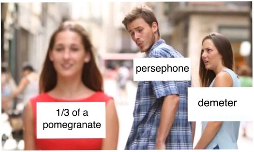
(Source x)
So basically, a meme is something that someone intentionally makes by imposing the concept of a "meme" onto a set of norms that were already pre-defined by memographic practice for the purpose of continuing memographic practice. Continuing the tradition, so to speak.
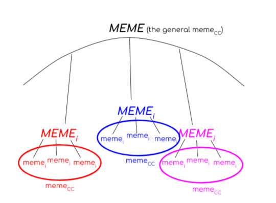
What about the first instance of a meme? When/how does a meme actually become a meme? Evnine has an answer for that, too. The first instance of a meme, i.e. the first time someone used the distracted boyfriend picture before there was memographic practice surrounding it to establish it as a meme, is part of a more general instance of meme that the Evnine calls MEME (Evnine 313).
MEME is just a meme𝒸𝒸 that results from the overall general existence of memographic practice, where meme𝒸𝒸 = meme common contents (a specific kind of meme, like the distracted boyfriend meme), and memeᵢ = one instance of a meme𝒸𝒸 (the example meme that I showed above).
So MEME covers initial instances of different kinds of meme𝒸𝒸 by being an overall meme𝒸𝒸 where its norms is the existence of memographic practice in general.
A diagram I made to illustrate this concept:
Additionally, a memeᵢ need not comply with all the norms in meme𝒸𝒸 (Evnine 317). For example, other photos of the same people in the original distracted boyfriend picture can be used, or a completely different picture could be substituted in if the relationship and positioning of the figures in that picture are recognizably similar to that of the original picture. Sometimes it isn’t text that is put on the figures, but the heads of characters from someone’s favorite show.
Some more examples:

(Source x)
(Source x)

(Source x)
The point is, not all of the norms must be followed—just enough for it to be recognizably part of that meme𝒸𝒸 tradition. Thus, the norms within meme𝒸𝒸 may change/transform over time (Evnine 318).
So that’s what a meme is. Or at least, one conception of what a meme could be. What about memes in the wild? How do they function, what is their appeal?
-
How memes work
What’s unique about memes, then, isn’t that they’re participatory, or that they remix visuals and stock figures. What makes a meme a meme instead of a cartoon, a joke, or a fad is...a meme is an atom of internet culture...Creating, sharing, or laughing at a meme is staking a claim to being an insider: I am a member of internet culture it says, and if you don’t get this, then you aren’t (McCulloch, location 3668)
The above quote is from Gretchen McCulloch’s Because Internet: Understanding the New Rules of Language (which, by the way, I highly recommend.)
The in-jokes, the drawing of boundaries between those who “get it” and those who don’t, the group-bonding—that, is essentially, the heart of memes.
According to McCulloch, the internet is a “third place”:
The first place is home, the second place is work, but people also need a third place to socialize that’s neither home nor work, like a coffeeshop (McCulloch, location 3161)
This makes the internet a major site for linguistic change and innovation. It’s a place where people who may not have had pre-existing strong ties come together and socialize or exchange ideas. This aspect of the internet is also what allows the meme to thrive: ideas that catch move fast, and they spread further than they would have if they were otherwise confined in tightly-knit groups.
However, despite the fact that the internet functions on a network of (mainly) loose connections (I’m not saying that internet friends aren’t real friends—I’m simply referring to the fact that you probably follow more people and have more mutuals than you have internet friends), memes gain popularity because they create a sense of community.
Popular posts tended to strike a balance between somewhat obscure but not too cryptic—in-jokes and references that appealed strongly to a distinct subset of people (McCulloch, location 3292)
But what makes a popular post a meme? After all, it’s not as though any post that reaches a certain number of likes, reblogs, replies, retweets, upvotes, etc. automatically becomes a meme. Well, according to McCulloch:
A meme in the internet sense isn’t just something popular, a video or image or phrase that goes viral. It’s something that’s remade and recombined, spreading as an atom of internet culture” (McCulloch, location 3431)
In this sense, McCulloch’s idea of a meme aligns with Evnine’s. What makes a meme a meme is the existence of memographic practice surrounding the meme.
What was unique about the memes that took off was not the in-jokes, but the scale: in a world where in-jokes happen all the time and distribution costs are zero, a few of them can get really big because their in-groups are actually very large, like “people who agree that this particular cat looks very grumpy,” or “people who saw the previous very popular in-joke.” (McCulloch, location 3537)
“People who saw the previous very popular in-joke” is key. A lot of memes have a kind of absurd, incomprehensible humor to them. Why are they funny? No one knows. You can talk about dada-ism (or e-dada, like this Tumblr post suggests) and the state of the world but really, the humor behind the most popular memes are self-referential. They’re funny only because you get the reference, even if the reference itself doesn’t make sense.
-
Aesthetique™
Now that we have a working definition for what memes are and how they work, I would like to talk about what memes do. The affective qualities of the meme. Or, the aesthetic.
To explicate this, I will be using, of course, loss.jpg and Lucky Luciano (aka “you know I had to do it to em” guy).
Since this is written for the meme-illiterate, I'll be using copious examples of memographic practice in an attempt to illustrate the way memes overall affect us.
Let’s start with loss.jpg.
Loss.jpg starts with this comic, drawn by Ctrl+Alt+Del:
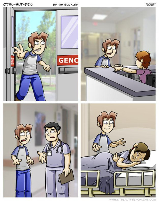
(Source x)
According to the KnowYourMeme page, the meme started out as “mockery” of the strip, generating countless parodies across the web. Though, at this point, I’d argue that loss has become so ubiquitous that even if it started out as mockery, it’s looped right back around to a kind of awe.
(Source x)
Most notable, however, is the fact that “norms” that make up loss have expanded and transformed to include minimalist portrayals of the comic.
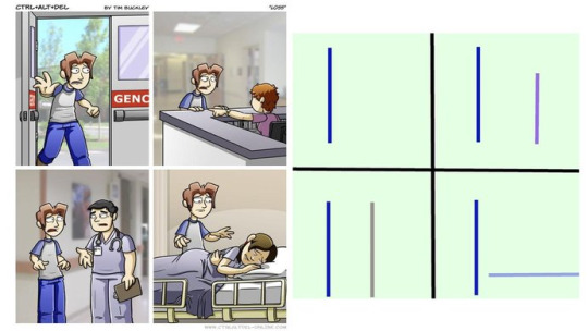
(Source: the KnowYourMeme page)
Some examples:
(Source x)
(Source x)
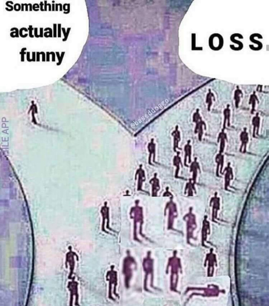
(Source x)
Lucky Luciano started out on Twitter, in a post that is no longer available to the public. Of course, the internet being what it is, it has been preserved for our viewing pleasure:

(Source: the KnowYourMeme page)
KnowYourMeme classifies this meme as type “Character, Photoshop”. The common norms of using this meme is to take a picture that someone else posted, and then repost it while hiding Lucky Luciano somewhere in the photo, “Where’s Waldo?” style. The meme became so popular that several blogs dedicated to documenting and furthering its memographic practice were created (wherethefuckishe, where-the-fuck-is-he and locate-lucky-luciano are the ones I’m aware of).
(Source x)
(Source x)
(Source x)

(Source x)
(Source x)
And my personal favorite:
(Source x)
And just for fun, here’s a combo meme:
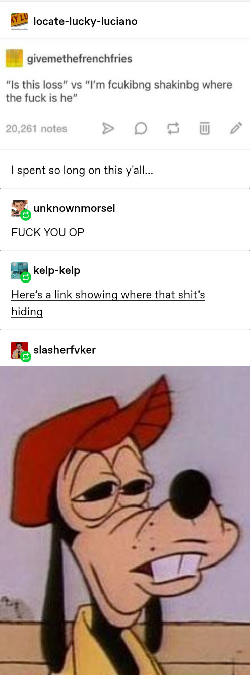
(Source x)
For those who don’t get that last one, the icon was edited to have both Lucky Luciano and loss.jpg:
The replies also included a Rickroll, which KnowYourMeme classifies as a “bait-and-switch” meme.
You might have noticed a lot of mixed reactions in the screenshots I included. “I am tired and I will never be free”, “fuck you op” (op stands for original poster in this context), or this fantastic reaction image provided in the last one:

What feeling do these reactions represent? What emotion is being evoked?
I would argue that the answer to these questions is “stuplimity”, a term coined by Sianne Ngai in her article “Stuplimity: Shock and Boredom in Twentieth-Century Aesthetics”. As the title suggests, stuplimity is described as a mixture of shock and boredom.
The sudden excitation of “shock,” and the desensitization we associate with “boredom,” though diametrically opposed and seemingly mutually exclusive, are both responses that confront us with the limitations of our capacity for responding in general. Both affects are thus frequently invoked in responses to radical art usually dismissed as unsophisticated... (Ngai)
Not all memes are created equal. Or perhaps, though they may start out somewhat equal, through memographic practice, some rise above others. I’d argue this is the case with loss.jpg and Lucky Luciano, which have become so well-known and common on the internet as to be veritable cultural phenomenona. Memes, being abstract artefacts created out of norms, are necessarily a group effort. Norms can’t be established by an individual. Memographic practice is a communal project. The first few times we see a meme, the first few times we “get” a meme, we may be delighted. But eventually, over time, many people become tired of the meme. Bored. And yet, they cannot revoke their own knowledge of the “joke”, and each time they come across a new iteration they are both astonished that there are versions they have not yet seen and bored by the same joke being used over and over. “I am tired and I will never be free” is the common sentiment, and I would label this sentiment as “stuplime”.
...a rethinking of what it means to be aesthetically overpowered: a new way of theorizing the negatively affective relationship to stupefying objects previously designated by the older aesthetic notion of the sublime. One way of calling attention to the affinity between exhaustion and the astonishment particular to the sublime, invoking the latter while detaching it from its previous romantic affiliations, is to refer to the aesthetic experience I am talking about—one in which astonishment is paradoxically united with boredom as the stuplime... (Ngai)
But this isn’t the result of a single instance of a meme. It’s the collective effect of all memographic practice surrounding a meme𝒸𝒸 that constitutes stuplimity.
Stuplimity is thus the final destination, the final form if you will, of the meme.
-
In conclusion,
(Source x)
Get it?
-
References
I’ve collected all the Tumblr memes in a tag here (though not in any particular order) and all non-Tumblr references are collected in a works cited page here (link will only work in browser).
1 note
·
View note
Text
The Rise Of Skywalker” Misinformation Hell Is The New Future Of Everything #ReleaseTheJJCut
Woody Harrington for BuzzFeed News
Last week, a post on the r/SaltierThanCrait subreddit — a forum that started as a place for Star Wars fans to pick apart 2017’s The Last Jedi — caused an eruption. Written by a user named egoshoppe, the message claimed director J.J. Abrams’ original cut of The Rise of Skywalker was 40 minutes longer than the film’s two hour, 22-minute theatrical runtime and contained a large chunk of material that would have made some fans happier, including a scene featuring actors Hayden Christensen and Samuel L Jackson, reprising their roles to help fellow Jedi Rey defeat the resurrected Emperor Palpatine.
Why would Disney, the media conglomerate that bought the science fiction franchise from its creator George Lucas in 2012, cut huge chunks out of Abrams’ final edit? According to egoshoppe, the reasons were twofold: to make the film more palatable to the Chinese government and to damage the professional reputation of Abrams, whom Warner Brothers was courting to work on films set in the DC Comics Cinematic Universe, which includes characters like Batman and Superman.
“Marvel’s biggest threat is a well-operational DC. They want to keep DC in the limbo that they’re in right now,” the post reads. “Abrams jumpstarting that franchise with something like a successful, audience-pleasing Superman movie makes them nervous. Their goal is to make JJ look bad to potential investors/shareholders.”
The post inflamed long-running Star Wars fandom paranoia that Disney has been using social media to manipulate fans. In it egoshoppe warns that all previous leaks about the The Rise of Skywalker were shared by users “tied to Disney directly.” (Fans have accused Disney of molding social media for years.)
It was impossible for Redditors to ascertain whether egoshoppe was telling the truth, trolling for fun, or lying to help Abrams, whose film has faced a critical and fan backlash. Regardless, #ReleaseTheJJCut trended on Twitter as fans pieced together links and quotes from the cast, screenwriters, and directors that seemed to prove a different cut of The Rise of Skywalker existed.
The Star Wars fandom is now a nesting doll of speculation, paranoia, and anxiety about corporate overreach — growing more insular and reactionary in the eight years since Disney took over Star Wars.
The misinformation and anger inside the Star Wars fandom is what happens after decades of corporatization and anonymous decentralized networking. It is a glimpse of a future in which anxieties over the motives of the megacorporations that drive our culture — down to our very mythologies — set off conflicts between warring information tribes who inhabit their own artificial narratives. What began with small but vocal insurgent online communities like 4chan or the alt-right has now come for the mainstream.
Except there is no “mainstream” culture — just as there is no central Star Wars fandom anymore. Today, popular culture is just Gamergates of varying size.
Frank Trapper / Getty Images
A Star Wars fan works on a computer while waiting in line to see The Phantom Menace in Los Angeles on April 15, 1999.
Fandom isn’t new. Most of the tropes we associate with modern fan communities, like fanfiction, letter-writing campaigns, zines, conventions, and infighting entered the American consciousness in the ’60s, thanks to the female audience of a different star-based sci-fi franchise: Star Trek. The girls and women who loved the show were excluded from male-dominated fan spaces and so created the networks that built the foundation for how communities now find each other online. Women all over the US started creating zines and sci-fi clubs as a way to share Star Trek fanfiction. Star Wars, released in 1977, was a late entrant.
But Star Wars fans have used the internet to socialize (and bicker) since the beginning of the franchise and the internet. The earliest archived Usenet posts about the movies date back to at least 1983, the year that Return of the Jedi came out. “Are you sure other scenes showed an abnormal (or no) star field while in hyperspace,” one user writes in a thread — which wouldn’t look out of place on Reddit in 2019 — titled “Continuity error in STAR WARS – the ANSWER.” Through every stage of internet development, Star Wars fans have been at the forefront — two of the first viral memes were “Star Wars Kid” and “It’s a trap!”
And for as long as there have been Star Wars fans, there have been discontented Star Wars fans. According to a 1999 Empire interview with George Lucas, some have been angry with him since A New Hope. “Fans absolutely hated R2 and C3PO in the first film; in the second film they hated Yoda,” Lucas said.
In 1997, Lucas, still the owner of the franchise, released a remastered version of the original trilogy. The most infamous change in the special edition concerned a shootout between the smuggler Han Solo and the Rodian bounty hunter Greedo. In the original version, Han shot first. In 1997, Greedo shot Han first, missed, and then Han shot back. Fans were outraged. The “Han Shot First” meme spread on early blogs, via novelty T-shirts sold at conventions, and in forwarded emails. The issue is still debated. (In the version of the film just released on Disney+, a new change was added. Greedo now shouts the word “maclunkey.”)
A Han Shot First moment occurs when a previously unified fandom is suddenly given two realities to choose between. Once an HSF moment occurs, it’s impossible to bring the fans back together. And Star Wars has experienced many such HSF moments since.
The Phantom Menace and the subsequent prequels Attack of the Clones and Revenge Of the Sith were never going to appease every fan, but the frenzy around the lead-up to the movies, led by early internet communities, imploded when they arrived in theaters.
There was no longer a central agreement about what Star Wars actually was. There were older fans who thought Empire Strikes Back was the only good movie, younger fans who thought the podracing in Phantom Menace was wizard, fans who thought Attack of the Clones and Revenge of the Sith should have been edited differently, and critics who retroactively decided the whole series was just embarrassing. The actor Topher Grace cut the prequels down into one 85-minute movie. There’s also the Machete Order, a way to reorder all the films. There’s even an infamous 20,000-word “Ring Theory” blog post, in which a fan spent two years writing about how the prequels and the original trilogy “rhymed” with each other when viewed within a concatenated structure. There was also Red Letter Media’s viral-before-viral 70-minute demolition of The Phantom Menace, uploaded to YouTube in seven parts, most of which have been viewed over 9 million times each.
Walt Disney Co. / Courtesy Everett Collection
Daisy Ridley as Rey (left), and Adam Driver as Kylo Ren in The Rise of Skywalker.
Things move a lot faster now. Something like Baby Yoda from the Disney+ show The Mandalorian can balloon into a worldwide phenomenon in days. And fandom toxicity can now manifest instantaneously. In 2016, fans of Cartoon Network’s Steven Universe harassed one of the show’s artists off Twitter because they were upset that an episode didn’t confirm a same-sex romance between two characters.
Disney, the current owner of both Star Wars and Marvel, has, more than any other company, figured out how to harness this chaotic energy into a massive financial engine. Marvel’s 23-movie, $22.5 billion cinematic universe is a direct descendant of Star Wars. The studio made $13 billion in worldwide box office in just 2019. And once The Rise of Skywalker crosses the $1 billion mark, Disney will have released seven movies last year that grossed that amount. Armed with a nearly unlimited portfolio of intellectual property, an integrated network of theme parks, and the new Disney+ streaming service, Disney is inching closer and closer to a completely seamless transmedia reality its audiences can live inside. Once fans would have had to travel to Disneyland for that immersion — now it travels to them online.
It isn’t just Disney. As corporate monoliths amass more money and power, consumers become more feverish, fanatical, and paranoid. Supreme hypebeasts, Fortnite players, PewDiePie commenters, VSCO girls, K-pop fans, Tesla evangelists — there seems to be a divided fan community for nearly every form of media or product or service.
And as quickly and strangely as modern fandoms form, so are they mutated by Han Shot First moments. These schisms are rarely deliberate — rather, they are sparked by a director’s cut of a popular film, an offhand remark made in an interview. They are willed into existence by conspiracy theories, by fanfiction, by leaks of material never intended to be seen.
Since Disney took the reins of the Star Wars franchise in 2012, fans had a racist meltdown over the casting of a white woman and a black man as the leads of the sequel trilogy. Some of them brigaded against 2017’s The Last Jedi because they thought it was too woke. (This campaign was amplified but not created by Russian trolls.)
These campaigns have had real consequences. Vietnamese American actor Kelly Marie Tran, who played mechanic Rose Tico in the film, suffered so much racist abuse she deleted her Instagram. Tran ended up with significantly less screentime in The Rise of Skywalker. Disney has been accused of caving to a racist and misogynistic vocal minority of fans. The film’s cowriter, Chris Terrio, said that Tran’s character Rose appeared in fewer scenes because of the difficulties that arose in repurposing footage of the late Carrie Fisher.
Walt Disney Co. / Courtesy Everett Collection
Writer Chris Terrio and director J.J. Abrams consult on the set of The Rise of Skywalker.
On websites like Tumblr, vicious fights have broken out about which characters should be shipped, or romantically paired together. Those who believed the villain Kylo Ren and the Jedi hero Rey should end up together — Reylos — have waged extensive flamewars, and in the wake of the Kylo Ren’s death at the end of The Rise of Skywalker, are sending Abrams death threats.
And it’s not just the fans: Star Wars actors have gotten in on the HSF moments too. Oscar Isaac, who played pilot Poe Dameron, has told every news outlet who will listen that he thought he and John Boyega’s character, former stormtrooper Finn, should have had a romance. Meanwhile, Boyega spent New Year’s Eve trolling Reylos on Twitter, arguing that his character should have ended up with Rey.
Any one of these things could be true. Or they could all be false. It doesn’t matter.
Whether it’s fans of the K-pop group BTS believing there’s a missing eighth member of the group, fanatical Facebook groups for enthusiasts of smart home devices like the Ring surveillance cameras, the near-constantly forming pockets of misinformation on TikTok, or the DC fans who purchased an ad at the FA Cup demanding Warner Brothers “#ReleaseTheSnyderCut” — a reference to that group’s struggle to see a different cut of the Justice League movie — we’re awash in our own home-brewed misinformation.
Seventy-one days before the release of Star Wars: The Rise of Skywalker, a Reddit user named JediPaxis published a post titled “The Rise of Skywalker: Reshoots and Edits (Story Summary v3.0)” on the r/StarWarsLeaks subreddit. The post was JediPraxis’s fifth post documenting information gleaned from what they claimed was a “trusted source.”
JediPraxis’s story summaries nailed down details with shocking accuracy. They knew the name of the planet Emperor Palpatine was hiding out on. They guessed the movie’s twist — that Rey was his granddaughter. They even knew about Babu Frik.
As with egoshoppe’s #ReleaseTheJJCut conspiracy theory, JediPraxis’s predictions meant one of three things. They’re telling the truth and had a source involved with the film’s massive production who was comfortable leaking. Or JediPraxis was actually working for the production. Or JediPraxis’s leak was sanctioned by Disney, as part of a meta-campaign by the film’s producers to fuel a grassroots hype cycle.
“I’m pretty sure [LucasFilm] is feeding a ton of [bullshit] to leakers,” one commenter wrote under the post, two months before Rise of Skywalker had hit theaters.
“It’s now MORE likely this than anything else,” another commenter replied. “What’s more likely, that a Reddit user has a direct line to the top .01% of people involved in one of the most anticipated films of the last several years, and this person is still employed despite leaking the ENTIRE plot, AND that they managed to reshoot this much of the movie AND cut it in — or that someone is taking the piss?”
Any one of these things could be true. Or they could all be false. It doesn’t matter. There will be fans who believe whatever gets posted and fans who don’t. Every leak or fan theory creates a new reality. Han shot first. Or he didn’t. ●
Sahred From Source link Technology
from WordPress http://bit.ly/2NbpObX
via IFTTT
0 notes
Text
The Keyboard Warrior Mentality
On 15 March 2019 at around 1:40 PM (local time), gunman Brenton Tarrant entered a mosque in Christchurch, New Zealand, and opened fire on the Muslims during their Friday prayers. He livestreamed the attack on Facebook, where before he went in, he was in his car listening to “The British Grenadiers” and “Serbia Strong” (also known as the “Remove Kebab” meme) and also said “Subscribe to PewDiePie”, making a reference to said YouTuber’s subscriber war with Indian film and music company T-Series. 50 people died over the course of the massacre and another 50 people were injured (as of 18 March).
It is sad that this attack happened. It is even sad that the gunman was inspired by Islamophobia and white supremacy. It is even more sad that the gunman was also inspired by memes, going so far as to quote and utilise memes as part of his motive during the attack. I read somewhere that the culture wars also formed part of his motive, given that PewDiePie was accused of being part of the alt-right late last year. Somehow, the gunman knew that the media (among other things) would blame PewDiePie for inspiring the attack, but I digress; I’ll leave it for you to figure out.
The reason why I’m making this post and titling it the way I did is because of this; before the attack, the gunman posted links to his Facebook profile and manifesto onto 8chan, an imageboard website that works similar to 4chan. Coincidentally, some past mass shooting events were linked to 4chan as well, such as the 2015 Umpqua Community College shooting in Roseberg, Oregon, which the origin of the “some of you guys are alright, don’t go to school tomorrow” meme.
The Internet and social media provides opportunities for people to express their opinions or vent their complaints on a public platform. At times, there are trolls who come along and derail conversations for their own enjoyment. One particular insult came to mind after I heard about this incident and what happened - “keyboard warrior”. Wiktionary defines the term as:
A person who behaves aggressively and/or in an inflammatory manner in online text-based discussion media, but at the same time does not behave similarly in real life, potentially due to cowardice, introversion or shyness.
I’ve seen the term being used in other contexts as well, such as in animal rights or the bystander effect, but for the purpose of this post, I’ll be staying within the context of mass shootings.
What do people who call others “keyboard warriors” expect from them? If your first thought was something along the lines of what the gunman did (may not have to be an outright shooting, but still something with some shock value to it), then you’re no better than the gunman and you could possibly be instigating someone to commit an act of violence. Also, I find it hypocritical to call someone a “keyboard warrior” on the Internet because it would involve typing on a keyboard as well, so really, they wouldn’t be any better than the person they’re writing the comment to.
If I were asked “Would you rather be the gunman or a keyboard warrior,” I’d pick the latter because obviously, murdering people is wrong, no matter the motive. From the gunman’s motives, I think it can be said that he is a “keyboard warrior” who actually took his fight to the real world.
There are other little things (that don’t involve real life things or events) where other people have been or could be called “keyboard warriors”, particularly those whose causes would not make sense if taken into the real world. At this point, calling those people “keyboard warriors” would be moot. In this context, I’ve been called a “keyboard warrior” as well, but that’s beside the point.
I’m not trying to undermine the fact that the shooting was a tragedy, but the next time you’re about to call someone a “keyboard warrior”, think about how much of a hypocrite you’re going to sound like.
Anyway, onto a couple of side notes. The day after the shooting, Queensland senator Fraser Anning got egged by 17-year-old William Connolly, also known as “Egg Boy” on the Internet. Anning slapped him a couple of times, then his supporters put him on the ground in a chokehold. And to think that people like them call others “keyboard warriors” when they see something they disagree with, yet they react like this when they actually do things outside of the Internet. If they were looking for someone to fight, then they got what they wanted.
Additionally, regarding PewDiePie, a lot of people seem to think that the media and other people reacted exactly as the gunman wanted when he mentioned him. Basically it’s a “keyboard warrior” dog-signalling other “keyboard warriors” into knee-jerk reactions while other “keyboard warriors” prove that they are overreacting and being wrong. It’s “keyboard warrior-ception”.
0 notes
Link
Look at the above image. On the left, of course, is Supreme Court nominee Brett Kavanaugh, at the Senate Judiciary Committee for his confirmation hearings. Behind him is his former clerk, longtime Republican legal operative Zina Bash. But what is Bash doing with her hand? Is she resting it normally? Is she making an “okay” sign? Or could it be that she’s making a … WHITE POWER HAND SIGNAL?
This is 2018, and so naturally, some prominent #resistance Twitter personalities jumped on the latter allegation, seeing Bash’s hand movements as proof of Republican complicity with white supremacist movements:
Kavanaugh’s former law clerk Zina Bash is flashing a white power sign behind him during his Senate confirmation hearing. They literally want to bring white supremacy to the Supreme Court. What a national outrage and a disgrace to the rule of law. pic.twitter.com/uQGOpNa6xg
— Eugene Gu, MD (@eugenegu) September 4, 2018
Eugene Gu, a prominent anti-Trump doctor who recently made news when he was accused of sexual assault, racked up more than 13,000 retweets and 17,500 likes for his tweet accusing Bash.
Keith Rubin, an Army veteran whose Twitter bio states he “love[s] everything except racism,” got even more engagement on his version of the post:
In a since-deleted tweet, Amy Siskind, the prominent Twitter personality who writes a weekly list of #NotNormal things the Trump administration has done, stated that the hand signal should disqualify Kavanaugh from the Supreme Court.
Before we go any further: Bash was not making a “white power hand signal.” You can, if you want, trust the word of her husband, John Bash, who is currently US attorney for the Western District of Texas:
Zina is Mexican on her mother’s side and Jewish on her father’s side. She was born in Mexico. Her grandparents were Holocaust survivors. We of course have nothing to do with hate groups, which aim to terrorize and demean other people — never have and never would. 2/3
— US Attorney John Bash (@USAttyBash) September 4, 2018
But if his word isn’t enough, you can listen to real experts on white supremacist movements.
“No one should assume anything about the use of such a gesture unless there are other unmistakable white supremacist signifiers in that context as well,” Mark Pitcavage, an expert on right-wing extremism at the Anti-Defamation League, tweeted, adding:
Out of all the things you should be legitimately concerned about regarding the Senate confirmation hearings in Washington, DC, today for Judge Kavanaugh & SCOTUS, handshakes and handsigns ought not be among them.
Actual serious constitutional issues are at stake.
— Mark Pitcavage (@egavactip) September 4, 2018
Jared Holt, a research associate at the left-leaning watchdog group Right Wing Watch, agrees. “It could have just been her resting her hand in a way that looked like that,” he said. “I haven’t seen anything that would lead me to believe this was intentionally a troll.”
That’s the gist of it. But there’s a backstory to why the okay gesture is perceived as a hate sign, and the eagerness of some liberals to embrace fake news on the subject is itself revealing. We have, at this point, gotten plenty of signs through actual policy decisions, and concrete connections between Trump staffers and white nationalist activists, that the Trump White House is pursuing a racist agenda. So why do people still want a secret hand signal to prove that the Trump administration is sympathetic to white supremacist goals?
As the ADL’s Pitcavage explained last year, this whole story was fueled, like so much internet nonsense before it, with a 4chan trolling effort.
Back in February 2017, Pitcavage writes, a 4chan user proposed an effort called “Operation O-KKK” in which he and allies would, in the anonymous user’s words, “flood Twitter and other social media websites … claiming that the OK hand sign is a symbol of white supremacy.” Here’s the original 4chan post, as shared by KnowYourMeme:
KnowYourMeme
The choice of the okay symbol for the prank, as KnowYourMeme editor-in-chief Brad Kim explains, was not totally arbitrary; “Sometime during the 2016 United States presidential election,” Kim writes, “Pizza Party Ben and Milo Yiannopoulos began making the gesture together at various events supporting the candidacy of Donald Trump.”
On February 13, 2017, a few weeks before the 4chan post, Jim Hoft and Lucian Wintrich of the alt-right outlet Gateway Pundit made the okay symbol in the White House Press Room. The left-leaning media watchdog Media Matters denounced it as a “hate symbol,” noting that images of alt-right mascot Pepe the Frog sometimes showed the character doing the “okay” sign:
A far bigger blow-up occurred the following April when journalist Emma Roller, then of Splinter, tweeted a photo of alt-right celebrities Cassandra Fairbanks and Mike Cernovich making the okay sign in the White House press room:
Screengrab by Know Your Meme
To Channers and alt-right loyalists, this was the ultimate proof that the prank had worked: A left-leaning journalist had been fooled into thinking an innocuous hand gesture was a secret sign of deep, racist evil. Especially funny to them was when Roller explained her tweet by referencing a diagram … originating in the 4chan post that launched “Operation O-KKK”:
Screengrab via KnowYourMeme
At first Fairbanks and Cernovich seemed to be having a laugh over the whole situation. Fairbanks told BuzzFeed News’s Joe Bernstein, “There was a troll meme going around saying that it meant white power. But it was a joke because Trump supporters are always being called Nazis even when it isn’t true.” Cernovich told Bernstein that he borrowed the hand gesture from Jay-Z, and from a conspiracy theory alleging that Jay-Z used the gesture as a sign he’s in the Illuminati.
Fairbanks would later purport to take the accusation a bit more seriously, and sued Roller for defamation in federal court. Judge Trevor McFadden of the DC District Court, a Trump appointee, dismissed the lawsuit in an opinion memorably beginning, “Plaintiff Cassandra Fairbanks trolled the web through Twitter …”
Holt at Right Wing Watch said that meanwhile, “people at the ADL and people like me who follow this stuff full-time tried to explain that this is not actually a symbol tied to white supremacy in any way.”
Another iteration of the controversy exploded in December 2017, when the Daily Mail reported that White House intern Jack Breuer had flashed a “known ‘white power’ sign during a photo-op with President Donald Trump.” Here’s the photo in question, from then-Mail reporter Jessica Chasmar:
Breuer strenuously denied the suggestion on Twitter:
In some of our intern pictures, I emulated the OK sign the President sometimes makes. That was foolish. I should have listened more closely to the Commander-in-Chief and given the thumbs up. (1/2)
— Jack Breuer (@jjbreue) December 29, 2017
I’m proud of my Jewish heritage and strongly reject the hateful views associated with racist white power organizations. I would never make common cause with them. (2/2)
— Jack Breuer (@jjbreue) December 29, 2017
Snopes, the fact-checking website, called the accusation against Breuer “unproven,” noting that the only evidence the Mail produced for the suggestion that Breuer intentionally made the sign as a show of alt-right solidarity was an anonymous quote from a fellow White House intern. Even that source conceded, “Jack’s a good kid and is probably doing it as a joke.”
Holt, at Right Wing Watch, said that while it began as a hoax, the symbol’s success as a troll has given it some new meaning in right-wing circles it didn’t have originally. He says intentional use of it falls into two camps. “One is white supremacists making a tongue-in-cheek inside joke to each other,” he said. “Then the larger contingent of people are people who do it in the photos to get a reaction and troll the libs.”
In the former camp, he includes people like Charlottesville rally organizer Jason Kessler; in the latter, folks like Cernovich, an alt-right troll who, while certainly a racist, is “probably more concerned with just trying to make liberals and the #resistance look as bad as humanly possible.”
Zina Bash, the latest conservative ensnared in an okay sign controversy, has a more intellectual pedigree than her predecessors Breuer, Fairbanks, and Cernovich. According to her LinkedIn page, she holds degrees from Harvard College, Harvard Law School, and Penn’s Wharton business school, and she clerked for both Brett Kavanaugh on the DC Circuit (hence her presence at the hearings) and for Supreme Court Justice Samuel Alito.
Until recently, she worked in the Trump White House as a special Assistant to the President for regulatory reform, legal and immigration policy. In July, she joined Texas Attorney General Ken Paxton’s office as a senior counsel.
It seems clear that Fairbanks and Cernovich were using the hand signal to troll the libs, and at least plausible that Breuer, Holt, and Wintrich were as well (the latter two are pretty prominent alt-right racists, but their incident was also before the 4chan hoax began). But was Bash? It’s certainly possible she was exposed to the idea of the troll.
That said, it’s equally if not more plausible that she was replying to a text message. (Some Twitter hand signal detectives argued she can be seen getting an alert on her phone before the hand signal appears.) Or maybe she was signaling to someone watching the livestream; sending an okay signal to a senator or staffer sitting opposite her and Kavanaugh; or just fidgeting with her fingers.
There’s simply no reason, other than an epistemological commitment to assuming the absolute worst of absolutely everyone ever associated with the Trump administration, to believe she did a small hand movement to prove her commitment to white supremacy.
It’s, of course, natural for fake news about the president and his aides to proliferate among their political critics. When I was 14, I really sincerely believed that George W. Bush had snuck in an earpiece so he could be fed answers during his debates with John Kerry, and that the “bulge” in the back of his suit jacket proved this.
This was, of course, nonsense. But Bush really was awful, and really was prosecuting a horrific war killing hundreds of thousands of people and torturing many more. That made ridiculous suggestions, like that Bush had to cheat at televised debates, seem plausible to me (that, plus I was 14 and my brain was small and unformed).
And, of course, fake news about Barack Obama (he’s secretly Kenyan!) and Bill Clinton (he’s a cocaine trafficker!) spread wildly among conservatives during their presidencies.
But in a way, the Zina Bash fake news is stranger, because it seems to confirm something we all already know: the Trump administration contains racists who want to use policy to harm nonwhite people. You don’t need a hand signal to know that.
Take, say, Rosie Gray’s exposé in the Atlantic of Homeland Security staffer Ian M. Smith, who was close with numerous white nationalists and went to a house party advertised as judenfrei (or “free of Jews”). Or take Stephen Miller, the White House domestic policy adviser responsible for the partial implementation of Trump’s promise to ban Muslims from the US and for the policy of separating immigrant families, and who alt-right leader Richard Spencer has described as a friend and ally when they were at Duke together.
Or take, I don’t know, the president: a man who as a candidate promised to ban all Muslims from the US, who calls Elizabeth Warren “Pocahontas,” who said that a Mexican-American judge is unfit to preside over cases involving him, who called Mexican immigrants “rapists,” claimed Muslim-Americans celebrated the 9/11 attacks. And then, after all that, a man who came into office and set about implementing the most anti-immigrant policies in years, slowing housing discrimination law enforcement to a halt, and reorienting the Justice Department away from fighting racial discrimination against black Americans. Oh, and who empathized with neo-Nazis after Charlottesville, and described Haiti and African nations as “shithole” countries, for good measure.
We don’t need to interpret hand signals to know where this administration stands on racism and white supremacy. We know very well where it stands.
Original Source -> No, a former Kavanaugh clerk didn’t flash a “white power sign.” Here’s what really happened.
via The Conservative Brief
0 notes
Text
How We More than Doubled Conversions &amp; Leads for a New ICO [Case Study]
Posted by jkuria
Summary
We helped Repux generate 253% more leads, nearly 100% more token sales and millions of dollars in incremental revenue during their initial coin offering (ICO) by using our CRO expertise.
The optimized site also helped them get meetings with some of the biggest names in the venture capital community — a big feat for a Poland-based team without the pedigree typically required (no MIT, Stanford, Ivy League, Google, Facebook, Amazon, Microsoft background).
The details:
Repux is a marketplace that lets small and medium businesses sell anonymized data to developers. The developers use the data to build “artificially intelligent” apps, which they then sell back to businesses. Business owners and managers use the apps to make better business decisions.
Below is the original page, which linked to a dense whitepaper. We don’t know who decided that an ICO requires a long, dry whitepaper, but this seems to be the norm!
This page above suffers from several issues:
The headline is pretty meaningless (“Decentralized Data & Applications Protocol for SMEs). Remember, as David Ogilvy noted, 90% of the success of an ad (in our case, a landing page) is determined by the headline. Visitors quickly scan the headline and if it doesn’t hold their interest, bounce immediately. With so much content on the web, attention is scarce — the average time spent on a page is a few seconds and the average bounce rate is about 85%.
The call to action is “Get Whitelisted,” which is also meaningless. What's in it for me? Why should I want to “Get Whitelisted”?
A lack of urgency to act. There is a compelling reason to do so, but it was not being clearly articulated ("Get 50% OFF on the tokens if you buy before a certain date.")
Lack of “evidentials”: Evidentials are elements that lend credibility or reduce anxiety and include things like mentions in trusted publications, well-known investors or advisors, industry seals, association affiliations, specific numbers (e.g. 99% Net Promoter Score), and so on.
Too much jargon and arcane technical language: Our research using Mouseflow’s on-page feedback feature showed that the non-accredited-investor ICO audience isn’t sophisticated. They typically reside outside of the US and have a limited command of English. Most are younger men (18–35) who made money from speculative activities on the Internet (affiliate marketing, Adsense arbitrage, and of course other crypto-currencies). When we surveyed them, many did not initially understand the concept. In our winning page (below), we dumbed down things a lot!
Below is the new page that produced a 253% gain in leads (email opt-ins). Coupled with the email follow-up sequence shown below, it produced a nearly 100% gain in token sales.
Winning page (above the fold):
Here are few of the elements that we believe made a difference:
Much clearer headline (which we improved upon further in a subsequent treatment).
Simple explanation of what the company is doing
Urgency to buy now — get 50% off on tokens if you buy before the countdown timer expires
Solicited and used press mentions
Social proof from the Economist; tapping a meme can be powerful as it's always easier to swim downstream than upstream. “Data is the new oil” is a current meme.
More persuasive elements (below the fold):
In the second span (the next screenful below the fold) we added a few more persuasive elements.
For one, we highlighted key Repux accomplishments and included bios of two advisors who are well known in the crypto-community.
Having a working platform was an important differentiator because only one in 10 ICOs had a working product. Most launched with just a whitepaper!
A survey of the token buyers showed that mentioning well-known advisors worked — several respondents said it was the decisive factor in persuading them to buy. Before, the advisors were buried in a little-visited page. We featured them more prominently.
Interestingly, this seemed to cut both ways. One of the non-contributors said he was initially interested because of a certain advisor’s involvement. He later chose not to contribute because he felt this advisor’s other flagship project had been mismanaged!
We also used 3 concrete examples to show how the marketplace functions and how the tokens would be used:
When your product is highly abstract and technical, using concrete examples aids understanding. We also found this to be true when pitching to professional investors. They often asked, “Can you give me an example of how this would work in the real world?”
We like long-form pages because unlike a live selling situation, there's no opportunity for a back-and-forth conversation. The page must therefore overcorrect and address every objection a web visitor might have.
Lastly, we explained why Repux is likely to succeed. We quoted Victor Hugo for good measure, to create an air of inevitability:
How much impact did Victor Hugo have? I don’t know, but the page did much better overall. Our experience shows that radical redesigns (that change many page elements at the same time) produce higher conversion lifts.
Once you attain a large lift, if you like, you can then do isolation testing of specific variables to determine how much each change contributed.
13% lift: Simplified alternate pageThe page below led to a further 13% lift.
The key elements we changed were:
Simplified the headline even further: “Repux Monetizes Data from Millions of Small Enterprises.” What was previously the headline is now stated in the bullet points.
Added a “5 Reasons Why Repux is Likely to Succeed” section: When you number things, visitors are more likely to engage with the content. They may not read all the text but will at least skim over the numbered sub-headlines to learn what all the points are — just like power abhors a vacuum, the mind can’t seem to stand incompleteness!
We’ve seen this in Mouseflow heatmaps. You can do this test yourself: List a bunch of bullet points versus a numbered list and with a compelling headline: The 7 Reasons Why 20,0000 Doctors Recommend Product X or The 3 Key Things You Need to Know to Make an Informed Decision.
Follow-up email sequence
We also created a follow-up email sequence for Repux that led to more token sales.
As you can see, the average open rate is north of 40%, and the goal attained (token sales) is above 8%. According to Mailchimp, the average email marketing campaign open rate is about 20%, while the average CTR is about 3%.
We got more sales than most people get clicks. Here’s a link to three sample emails we sent.
Our emails are effective because:
They’re educational (versus pure sales pitch). This is also important to avoid “burning out” your list. If all you do is send pitch after pitch, soon you’ll be lucky to get a 1.3% open rate!
They employ storytelling. We use a technique known as the “Soap Opera Sequence.” Each email creates anticipation for the next one and also refers to some interesting fact in previous ones. If a person would only have opened one email, they are now likely to want to open future ones as well as look up older ones to “solve the puzzle.” This leads to higher open rates for the entire sequence, and more sales.
The calls to action are closer to the bottom, having first built up some value. Counterintuitively, this works better, but you should always test radically different approaches.
Email is a massively underutilized medium. Most businesses are sitting on goldmines (their email list) without realizing it! You can — and should — make at least 2x to 3x as many sales from your email list as you do from direct website sales.
It takes a lot of work to write an effective sequence, but once you do you can run it on autopilot for years, making money hand over fist. As customer acquisition gets ever more competitive and expensive, how well you monetize your list can make the difference between success and failure.
Conclusion
To increase the conversion rate on your website and get more sales, leads, or app downloads, follow these simple steps:
Put in the work to understand why the non-converting visitors are leaving and then systematically address their specific objections. This is what “research-driven” optimization means, as opposed to redesign based purely aesthetic appeal or “best practices.”
Find out why the converting visitors took the desired action — and then accentuate these things.
Capture emails and use a follow-up sequence to educate and tell stories to those who were not convinced by the website. Done correctly, this can produce 2x to 3x as many sales as the website.
Simple, but not easy. It takes diligence and discipline to do these things well. But if you do, you will be richly rewarded!
And if you’d like to learn more about conversion rate optimization or review additional case studies, we encourage you to take our free course.
Thanks to Jon Powell, Hayk Saakian, Vlad Mkrtumyan, and Nick Jordan for reading drafts of this post.
Sign up for The Moz Top 10, a semimonthly mailer updating you on the top ten hottest pieces of SEO news, tips, and rad links uncovered by the Moz team. Think of it as your exclusive digest of stuff you don't have time to hunt down but want to read!
https://ift.tt/2NeQ8mM
0 notes
Text
How To Talk To Boomers And Other Older People In Your Life About Fake News
Ben Kothe / BuzzFeed News; Getty Images
This story is part of Protect Your Parents From the Internet Week.
“Look for the magnifying glass icon,” said Patrick Costales as he pointed to a tablet showing YouTube on its screen.
Costales, 15, was teaching Michele Bianchi, 81, how to search for episodes of Bianchi’s favorite Italian TV shows. This was the fifth Saturday in a row they’d met in the basement of a Toronto library so the teenager could show Bianchi how to email, read news, listen to music, and perform other online tasks as part of a program called Cyber Seniors.
After the session, Costales sat next to his friend and fellow tutor, Mareson Suresh, 15, to discuss the online behavior of the older people in their lives. Had they ever seen an adult post something problematic on social media?
“Frequently,” said Costales.
“My mom loves taking pictures, and even if she says she won’t post it, she posts it,” Suresh said. “And the thing is, I don’t follow her on Facebook or anything because I don’t use Facebook, but she’s big on it.”
Be it personal photos or false or inflammatory articles and memes, young people find themselves struggling to manage, and at times confront, the extremely online adults in their lives.
Boomers and older generations are by no means the only people having trouble in our new and chaotic information environment, although research suggests they have the most pressing challenges. Younger people also face difficulty, which is why so many news literacy programs target K-12 and college students. But the rapid pace of change on online platforms — and the lack of widespread reach of programs like Cyber Seniors — have left some older adults struggling to catch up.
“Now what are you going to do about the adults?”
The challenge is to handle the situation in a way that works and doesn’t fray intergenerational relationships, according to Mike Caulfield, director of blended and networked learning at Washington State University Vancouver. He also runs the Digital Polarization Initiative, which pioneers new approaches to teaching information literacy. Caulfield said his students see the need for older people in their lives to learn the skills he’s teaching.
“Students in every class said, ‘This is great, [now] what are you going to do about the adults?’ It’s one of the consistent things that come up. And it’s not half jokingly; I feel like it’s very sincere,” he said. “I do feel when they bring this up, they have very specific people in mind.”
Fortunately, Caulfield and other experts have advice.
So does Suresh, one of the Toronto teens who’s spent weeks helping seniors master the basics of devices and the internet. “Just say it,” he said. “I know it’s weird talking to your family about those specific topics, but it’ll benefit them much more … so you just might as well say it as soon as possible.”
Naomi Harris For Buzzfeed News
Eufemia Bianchi and her husband, Michele Bianchi, take lessons in technology with Patrick Costales and Mareson Suresh at the Toronto Public Library.
Supply the Missing Context
This one might be called the John Cusack Problem.
Last month the actor tweeted a cartoon that showed a hand emblazoned with the Star of David seeming to crush a group of people. Near it was the quote “To learn who rules over you, simply find out who you are not allowed to criticize.” It was attributed to Voltaire, but the line actually originated with white nationalist Kevin Alfred Strom. Cusack, 53, also added his own comment to the tweet: “Follow the money.”
After facing blowback for the anti-Semitic message, Cusack blamed a “bot.” Then he said he didn’t understand the implications of what he shared. “I mistakenly retweeted an alt right account I thought was agreeing with the horrible bombing of a hospital in Palestine,” he tweeted.
Caulfield said it’s common for older people to unwittingly share things that have extremist messages or iconography. “It’s very hard to see people posting stuff that may come from a kind of a dark place that they don’t realize is dark,” Caulfield said. “What do you do when your parents go from posting Minions to posting hard-right memes about cement milkshakes?”
He says it’s important to intervene privately and help the person understand the larger — and more concerning — context.
“There’s a good chance your family member doesn’t understand that and might be horrified at what they’re sharing. And so there’s a point to intervene and let people know, ‘Hey, I know, this was probably not what you meant, but…’”
Keep It Positive and Personal
Experts agree that being non-confrontational is key. Daniel Kent founded Net Literacy, a nonprofit, in 2003 when he was in middle school in Indiana. One of its first programs was Senior Connects, which helps older people get online and gain basic internet skills.
“I think it’s fundamentally about treating [older people] with concern and respect. Recognizing that … perhaps they had the best of intentions, but the execution on their part perhaps wasn’t the most, the most thoughtful and mindful,” he said.
If you do want to say something, Kent and Caulfield suggest engaging in person — or by direct message or phone if that’s not possible. If you call someone out publicly on Facebook or elsewhere, they’re likely to feel attacked or shamed, and you won’t have a chance to hear why they wanted to share a particular piece of content. Understanding where someone is coming from and why they shared or posted what they did is essential, Kent and Caulfield say.
“With our volunteers [we] preach as much empathy as possible,” Kent said.
Naomi Harris for BuzzFeed News
But Don’t Be Afraid to Go Public
While engaging privately is often best, there are cases where you may want to intervene publicly. For example, if an acquaintance is sharing false or misleading information that’s generating lots of engagement.
“You can think of yourself as intervening not really to stop the poster, but intervening on behalf of your friends who are seeing this and may get suckered by it,” he said.
The rule of not being aggressive or confrontational still applies. He suggested acknowledging the original poster’s sentiment, adding to the discussion by sharing an alternate report about the same topic, and saying why it offers a more accurate portrayal.
Get Them to Google (News) It
When someone in your life seems to share information that’s unmoored from reality, try to understand what emotion, opinion, or idea the person is trying to express — and shift them toward a better place to get that information.
“You push them to a better source that is related to their concern,” said Caulfield.
One caveat: If the particular idea or claim is odious or clearly false, it’s not your job to help them express it. “If they’re a white supremacist, don’t validate their concern,” he said. “But if they have a concern that is is somewhat valid, that comes from valid worries, you can empathize.”
“Hey, look, one of these headlines is not like the others.”
Caulfield suggests encouraging the person to search for the central topic or claim on Google News, which exercises control over which websites are included in its database. This helps locate a story from a more credible source that still acknowledges their point of view or emotion.
“Nine times out of 10, you could make your point with a story from USA Today,” said Caulfield. “It might not be the same clickbait headline, but it takes you 10 seconds to go find an [alternate] story.”
This exercise also exposes the person to different headlines about the same topic, helping them see which facts are broadly consistent across different outlets, or not. “There’s just something that is really powerful about going to Google News and scanning those headlines and seeing, ‘Hey, look, one of these headlines is not like the others,’” he said.
Naomi Harris for BuzzFeed News
Eufemia and Michele Bianchi at the Toronto Public Library.
Look in the Mirror
Be self-aware enough to realize you may also not have the best information-consumption habits, either. Practice finding other sources for a story and compare details to learn to spot inconsistencies between coverage. Then share the good stuff. You can also choose to do that instead of intervening with friends and family.
“In most cases, you’re better off sharing new material with family members that will resonate with them or focusing correction efforts on people with bigger platforms than Uncle Rick,” Caulfield said.
Even if some of the adults in your life struggle with what they share, they’re still people with a wealth of knowledge, experience, and love to offer. Suresh, the 15-year-old in Toronto, taught his 79-year-old student, Eufemia Bianchi, many things about her Samsung phone, but it has also been a learning experience for him.
“I feel like one of the biggest things about this program is having a reason to talk to elders, because as teens you don’t have that many opportunities to talk to some of the smartest people in your community, and especially people who have all those life experiences,” he said. ●
Sahred From Source link Technology
from WordPress http://bit.ly/2Yb8f3c
via IFTTT
1 note
·
View note
Text
How We More than Doubled Conversions &amp; Leads for a New ICO [Case Study]
Posted by jkuria
Summary
We helped Repux generate 253% more leads, nearly 100% more token sales and millions of dollars in incremental revenue during their initial coin offering (ICO) by using our CRO expertise.
The optimized site also helped them get meetings with some of the biggest names in the venture capital community — a big feat for a Poland-based team without the pedigree typically required (no MIT, Stanford, Ivy League, Google, Facebook, Amazon, Microsoft background).
The details:
Repux is a marketplace that lets small and medium businesses sell anonymized data to developers. The developers use the data to build “artificially intelligent” apps, which they then sell back to businesses. Business owners and managers use the apps to make better business decisions.
Below is the original page, which linked to a dense whitepaper. We don’t know who decided that an ICO requires a long, dry whitepaper, but this seems to be the norm!
This page above suffers from several issues:
The headline is pretty meaningless (“Decentralized Data & Applications Protocol for SMEs). Remember, as David Ogilvy noted, 90% of the success of an ad (in our case, a landing page) is determined by the headline. Visitors quickly scan the headline and if it doesn’t hold their interest, bounce immediately. With so much content on the web, attention is scarce — the average time spent on a page is a few seconds and the average bounce rate is about 85%.
The call to action is “Get Whitelisted,” which is also meaningless. What's in it for me? Why should I want to “Get Whitelisted”?
A lack of urgency to act. There is a compelling reason to do so, but it was not being clearly articulated ("Get 50% OFF on the tokens if you buy before a certain date.")
Lack of “evidentials”: Evidentials are elements that lend credibility or reduce anxiety and include things like mentions in trusted publications, well-known investors or advisors, industry seals, association affiliations, specific numbers (e.g. 99% Net Promoter Score), and so on.
Too much jargon and arcane technical language: Our research using Mouseflow’s on-page feedback feature showed that the non-accredited-investor ICO audience isn’t sophisticated. They typically reside outside of the US and have a limited command of English. Most are younger men (18–35) who made money from speculative activities on the Internet (affiliate marketing, Adsense arbitrage, and of course other crypto-currencies). When we surveyed them, many did not initially understand the concept. In our winning page (below), we dumbed down things a lot!
Below is the new page that produced a 253% gain in leads (email opt-ins). Coupled with the email follow-up sequence shown below, it produced a nearly 100% gain in token sales.
Winning page (above the fold):
Here are few of the elements that we believe made a difference:
Much clearer headline (which we improved upon further in a subsequent treatment).
Simple explanation of what the company is doing
Urgency to buy now — get 50% off on tokens if you buy before the countdown timer expires
Solicited and used press mentions
Social proof from the Economist; tapping a meme can be powerful as it's always easier to swim downstream than upstream. “Data is the new oil” is a current meme.
More persuasive elements (below the fold):
In the second span (the next screenful below the fold) we added a few more persuasive elements.
For one, we highlighted key Repux accomplishments and included bios of two advisors who are well known in the crypto-community.
Having a working platform was an important differentiator because only one in 10 ICOs had a working product. Most launched with just a whitepaper!
A survey of the token buyers showed that mentioning well-known advisors worked — several respondents said it was the decisive factor in persuading them to buy. Before, the advisors were buried in a little-visited page. We featured them more prominently.
Interestingly, this seemed to cut both ways. One of the non-contributors said he was initially interested because of a certain advisor’s involvement. He later chose not to contribute because he felt this advisor’s other flagship project had been mismanaged!
We also used 3 concrete examples to show how the marketplace functions and how the tokens would be used:
When your product is highly abstract and technical, using concrete examples aids understanding. We also found this to be true when pitching to professional investors. They often asked, “Can you give me an example of how this would work in the real world?”
We like long-form pages because unlike a live selling situation, there's no opportunity for a back-and-forth conversation. The page must therefore overcorrect and address every objection a web visitor might have.
Lastly, we explained why Repux is likely to succeed. We quoted Victor Hugo for good measure, to create an air of inevitability:
How much impact did Victor Hugo have? I don’t know, but the page did much better overall. Our experience shows that radical redesigns (that change many page elements at the same time) produce higher conversion lifts.
Once you attain a large lift, if you like, you can then do isolation testing of specific variables to determine how much each change contributed.
13% lift: Simplified alternate pageThe page below led to a further 13% lift.
The key elements we changed were:
Simplified the headline even further: “Repux Monetizes Data from Millions of Small Enterprises.” What was previously the headline is now stated in the bullet points.
Added a “5 Reasons Why Repux is Likely to Succeed” section: When you number things, visitors are more likely to engage with the content. They may not read all the text but will at least skim over the numbered sub-headlines to learn what all the points are — just like power abhors a vacuum, the mind can’t seem to stand incompleteness!
We’ve seen this in Mouseflow heatmaps. You can do this test yourself: List a bunch of bullet points versus a numbered list and with a compelling headline: The 7 Reasons Why 20,0000 Doctors Recommend Product X or The 3 Key Things You Need to Know to Make an Informed Decision.
Follow-up email sequence
We also created a follow-up email sequence for Repux that led to more token sales.
As you can see, the average open rate is north of 40%, and the goal attained (token sales) is above 8%. According to Mailchimp, the average email marketing campaign open rate is about 20%, while the average CTR is about 3%.
We got more sales than most people get clicks. Here’s a link to three sample emails we sent.
Our emails are effective because:
They’re educational (versus pure sales pitch). This is also important to avoid “burning out” your list. If all you do is send pitch after pitch, soon you’ll be lucky to get a 1.3% open rate!
They employ storytelling. We use a technique known as the “Soap Opera Sequence.” Each email creates anticipation for the next one and also refers to some interesting fact in previous ones. If a person would only have opened one email, they are now likely to want to open future ones as well as look up older ones to “solve the puzzle.” This leads to higher open rates for the entire sequence, and more sales.
The calls to action are closer to the bottom, having first built up some value. Counterintuitively, this works better, but you should always test radically different approaches.
Email is a massively underutilized medium. Most businesses are sitting on goldmines (their email list) without realizing it! You can — and should — make at least 2x to 3x as many sales from your email list as you do from direct website sales.
It takes a lot of work to write an effective sequence, but once you do you can run it on autopilot for years, making money hand over fist. As customer acquisition gets ever more competitive and expensive, how well you monetize your list can make the difference between success and failure.
Conclusion
To increase the conversion rate on your website and get more sales, leads, or app downloads, follow these simple steps:
Put in the work to understand why the non-converting visitors are leaving and then systematically address their specific objections. This is what “research-driven” optimization means, as opposed to redesign based purely aesthetic appeal or “best practices.”
Find out why the converting visitors took the desired action — and then accentuate these things.
Capture emails and use a follow-up sequence to educate and tell stories to those who were not convinced by the website. Done correctly, this can produce 2x to 3x as many sales as the website.
Simple, but not easy. It takes diligence and discipline to do these things well. But if you do, you will be richly rewarded!
And if you’d like to learn more about conversion rate optimization or review additional case studies, we encourage you to take our free course.
Thanks to Jon Powell, Hayk Saakian, Vlad Mkrtumyan, and Nick Jordan for reading drafts of this post.
Sign up for The Moz Top 10, a semimonthly mailer updating you on the top ten hottest pieces of SEO news, tips, and rad links uncovered by the Moz team. Think of it as your exclusive digest of stuff you don't have time to hunt down but want to read!
https://ift.tt/2NeQ8mM
0 notes
Text
How We More than Doubled Conversions & Leads for a New ICO [Case Study]
Posted by jkuria
Summary
We helped Repux generate 253% more leads, nearly 100% more token sales and millions of dollars in incremental revenue during their initial coin offering (ICO) by using our CRO expertise.
The optimized site also helped them get meetings with some of the biggest names in the venture capital community — a big feat for a Poland-based team without the pedigree typically required (no MIT, Stanford, Ivy League, Google, Facebook, Amazon, Microsoft background).
The details:
Repux is a marketplace that lets small and medium businesses sell anonymized data to developers. The developers use the data to build “artificially intelligent” apps, which they then sell back to businesses. Business owners and managers use the apps to make better business decisions.
Below is the original page, which linked to a dense whitepaper. We don’t know who decided that an ICO requires a long, dry whitepaper, but this seems to be the norm!
This page above suffers from several issues:
The headline is pretty meaningless (“Decentralized Data & Applications Protocol for SMEs). Remember, as David Ogilvy noted, 90% of the success of an ad (in our case, a landing page) is determined by the headline. Visitors quickly scan the headline and if it doesn’t hold their interest, bounce immediately. With so much content on the web, attention is scarce — the average time spent on a page is a few seconds and the average bounce rate is about 85%.
The call to action is “Get Whitelisted,” which is also meaningless. What's in it for me? Why should I want to “Get Whitelisted”?
A lack of urgency to act. There is a compelling reason to do so, but it was not being clearly articulated ("Get 50% OFF on the tokens if you buy before a certain date.")
Lack of “evidentials”: Evidentials are elements that lend credibility or reduce anxiety and include things like mentions in trusted publications, well-known investors or advisors, industry seals, association affiliations, specific numbers (e.g. 99% Net Promoter Score), and so on.
Too much jargon and arcane technical language: Our research using Mouseflow’s on-page feedback feature showed that the non-accredited-investor ICO audience isn’t sophisticated. They typically reside outside of the US and have a limited command of English. Most are younger men (18–35) who made money from speculative activities on the Internet (affiliate marketing, Adsense arbitrage, and of course other crypto-currencies). When we surveyed them, many did not initially understand the concept. In our winning page (below), we dumbed down things a lot!
Below is the new page that produced a 253% gain in leads (email opt-ins). Coupled with the email follow-up sequence shown below, it produced a nearly 100% gain in token sales.
Winning page (above the fold):
Here are few of the elements that we believe made a difference:
Much clearer headline (which we improved upon further in a subsequent treatment).
Simple explanation of what the company is doing
Urgency to buy now — get 50% off on tokens if you buy before the countdown timer expires
Solicited and used press mentions
Social proof from the Economist; tapping a meme can be powerful as it's always easier to swim downstream than upstream. “Data is the new oil” is a current meme.
More persuasive elements (below the fold):
In the second span (the next screenful below the fold) we added a few more persuasive elements.
For one, we highlighted key Repux accomplishments and included bios of two advisors who are well known in the crypto-community.
Having a working platform was an important differentiator because only one in 10 ICOs had a working product. Most launched with just a whitepaper!
A survey of the token buyers showed that mentioning well-known advisors worked — several respondents said it was the decisive factor in persuading them to buy. Before, the advisors were buried in a little-visited page. We featured them more prominently.
Interestingly, this seemed to cut both ways. One of the non-contributors said he was initially interested because of a certain advisor’s involvement. He later chose not to contribute because he felt this advisor’s other flagship project had been mismanaged!
We also used 3 concrete examples to show how the marketplace functions and how the tokens would be used:
When your product is highly abstract and technical, using concrete examples aids understanding. We also found this to be true when pitching to professional investors. They often asked, “Can you give me an example of how this would work in the real world?”
We like long-form pages because unlike a live selling situation, there's no opportunity for a back-and-forth conversation. The page must therefore overcorrect and address every objection a web visitor might have.
Lastly, we explained why Repux is likely to succeed. We quoted Victor Hugo for good measure, to create an air of inevitability:
How much impact did Victor Hugo have? I don’t know, but the page did much better overall. Our experience shows that radical redesigns (that change many page elements at the same time) produce higher conversion lifts.
Once you attain a large lift, if you like, you can then do isolation testing of specific variables to determine how much each change contributed.
13% lift: Simplified alternate page
The page below led to a further 13% lift.
The key elements we changed were:
Simplified the headline even further: “Repux Monetizes Data from Millions of Small Enterprises.” What was previously the headline is now stated in the bullet points.
Added a “5 Reasons Why Repux is Likely to Succeed” section: When you number things, visitors are more likely to engage with the content. They may not read all the text but will at least skim over the numbered sub-headlines to learn what all the points are — just like power abhors a vacuum, the mind can’t seem to stand incompleteness!
We’ve seen this in Mouseflow heatmaps. You can do this test yourself: List a bunch of bullet points versus a numbered list and with a compelling headline: The 7 Reasons Why 20,0000 Doctors Recommend Product X or The 3 Key Things You Need to Know to Make an Informed Decision.
Follow-up email sequence
We also created a follow-up email sequence for Repux that led to more token sales.
As you can see, the average open rate is north of 40%, and the goal attained (token sales) is above 8%. According to Mailchimp, the average email marketing campaign open rate is about 20%, while the average CTR is about 3%.
We got more sales than most people get clicks. Here’s a link to three sample emails we sent.
Our emails are effective because:
They’re educational (versus pure sales pitch). This is also important to avoid “burning out” your list. If all you do is send pitch after pitch, soon you’ll be lucky to get a 1.3% open rate!
They employ storytelling. We use a technique known as the “Soap Opera Sequence.” Each email creates anticipation for the next one and also refers to some interesting fact in previous ones. If a person would only have opened one email, they are now likely to want to open future ones as well as look up older ones to “solve the puzzle.” This leads to higher open rates for the entire sequence, and more sales.
The calls to action are closer to the bottom, having first built up some value. Counterintuitively, this works better, but you should always test radically different approaches.
Email is a massively underutilized medium. Most businesses are sitting on goldmines (their email list) without realizing it! You can — and should — make at least 2x to 3x as many sales from your email list as you do from direct website sales.
It takes a lot of work to write an effective sequence, but once you do you can run it on autopilot for years, making money hand over fist. As customer acquisition gets ever more competitive and expensive, how well you monetize your list can make the difference between success and failure.
Conclusion
To increase the conversion rate on your website and get more sales, leads, or app downloads, follow these simple steps:
Put in the work to understand why the non-converting visitors are leaving and then systematically address their specific objections. This is what “research-driven” optimization means, as opposed to redesign based purely aesthetic appeal or “best practices.”
Find out why the converting visitors took the desired action — and then accentuate these things.
Capture emails and use a follow-up sequence to educate and tell stories to those who were not convinced by the website. Done correctly, this can produce 2x to 3x as many sales as the website.
Simple, but not easy. It takes diligence and discipline to do these things well. But if you do, you will be richly rewarded!
And if you’d like to learn more about conversion rate optimization or review additional case studies, we encourage you to take our free course.
Thanks to Jon Powell, Hayk Saakian, Vlad Mkrtumyan, and Nick Jordan for reading drafts of this post.
Sign up for The Moz Top 10, a semimonthly mailer updating you on the top ten hottest pieces of SEO news, tips, and rad links uncovered by the Moz team. Think of it as your exclusive digest of stuff you don't have time to hunt down but want to read!
0 notes
Last Seen Blogs

sodelusionwizard
Incorrect Avengers

pungtan
Pungtan Sonyeondan

anagorah
rika

y0ongview
4.yOongi

ask-kisaragi
4510471