
strawwberrychapstick-blog
strawwberrychapstick
a blog for good and bad UX
11 posts
Don't wanna be here? Send us removal request.
Last Seen Blogs

sunsickjune
sunsickjune
charlie-rulerofhell
This blog is a multimedia project ...

tamasalami
tw

4-jk
・* :゚✧
Text
Week 12 Good/Bad UX
We made it! Week 12.
For this week, the good is the Starbucks app and the bad is the Inkscape app by Wacom.
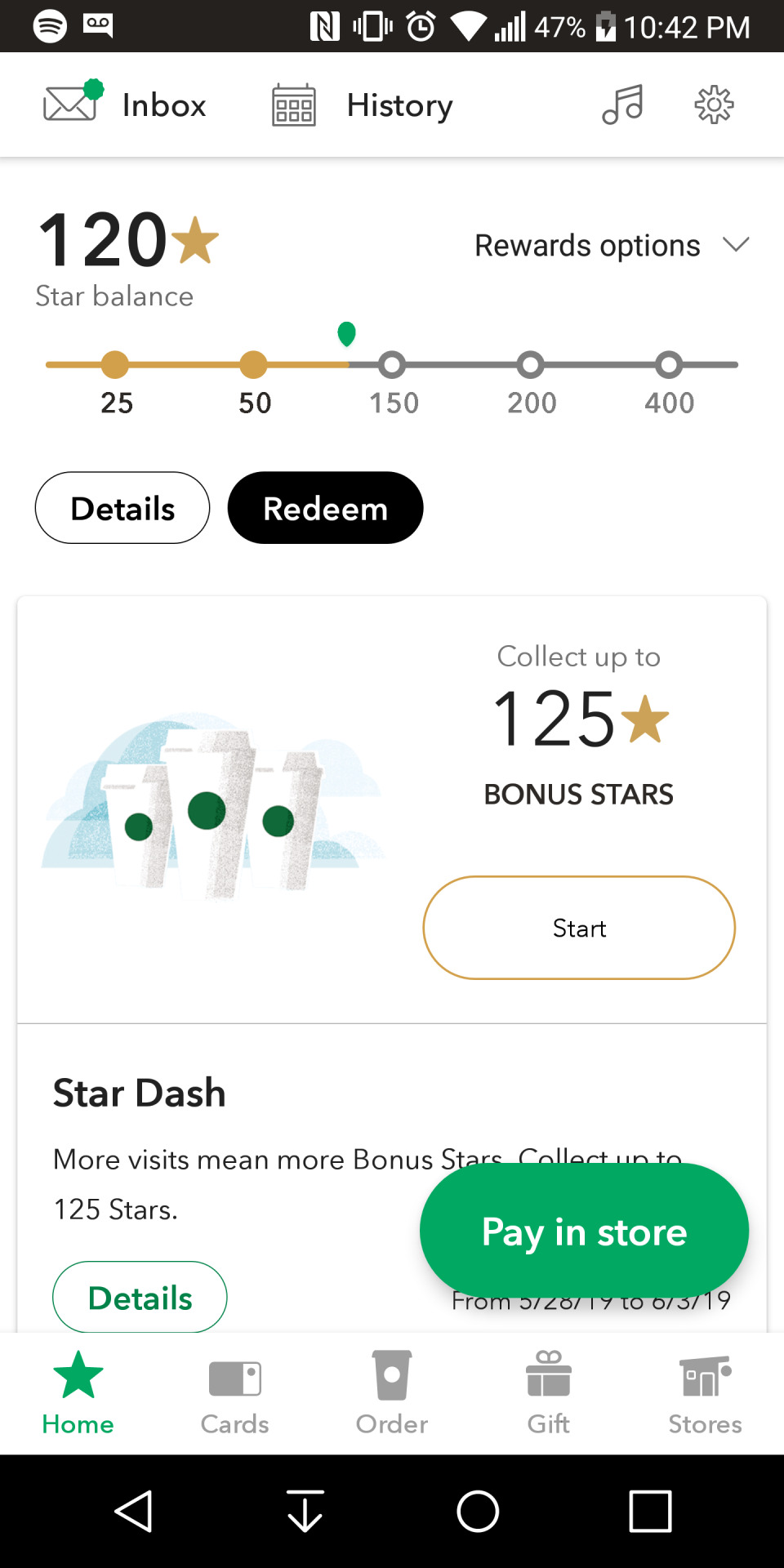
The Starbucks app is pretty useful, the home screen (shown) has all the important things; your star balance, the button to pay in store. The bottom bar has all the cards you have on file, the button to start a mobile order (my favorite), a tab for gifts and a tab for stores. I could do without the star dash events that push you to go, but I’ll allow it for the convenience factor.
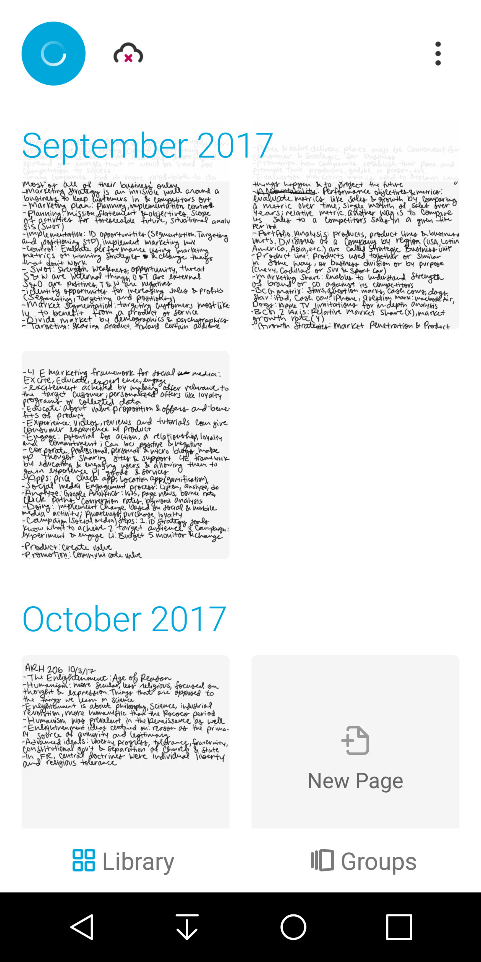
Inkspace is an app developed by Wacom that went with their folio line, and it turned hand-written notes (like with a pen and paper) into images and then also was able to read them with OCR and turn them into plaintext. There’s a reason there are no entries after October 2017, and it’s because the app stopped pairing and uploading content from my device to the app. A huge bummer, because the OCR worked pretty well. My user experience after it refused to upload more than a page was terrible. I’m struggling to find a replacement for handwritten notes to plaintext, and now that I have an iPad I guess I should invest in a decent one.
0 notes
Text
Week 11 Good/Bad UX
This week I’m going to focus on the good AND bad of Google Maps.

The Good: The UI is pretty good, and simple to use, which produces good will among users. It’s so easy a child (or an elderly person) could figure it out. It also works very well (when it works).
The Bad: It’s hard to add stops while you’re driving without a co-pilot on long trips. It can be pretty laggy if the phone it’s running on isn’t optimal for the app, which can be a safety issue if you really need navigation in a sketchy area.
0 notes
Text
Good/Bad UX Week 10
This week I chose AllTrails as good and my P.O.S. system from work as the bad.

AllTrails is a cool app, it helps you track hikes and find new ones. You can record a hike you do, plan hikes, and find hikes you’ve already done, as well as explore/look for new trails. It’s a neat app, and when you navigate to trailheads, it takes you to the coordinates.
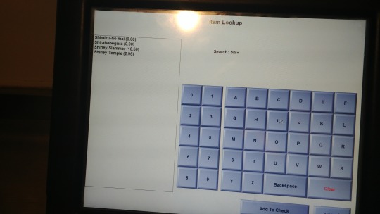
The point of sale system we use at my restaurant is called Aloha, and I think it’s an older version. The most annoying part about it is that when you can’t find a menu item, you have to search for it using a non-qwerty keyboard and it’s very hard to type on a keyboard that goes from A to Z rather than the typical setup of keyboards.
0 notes
Text
Good/Bad UX Week 9
This week I’ve focused a bit on apps. For good design, I’ve chosen Spotify, for bad I’ve chosen Snapchat. These choices are heavily influenced by personal bias and how much I like using these apps, too.

First, Spotify. I really enjoy using Spotify, except when they decide to roll out new designs that end up breaking the platform until they fix it. Overall though it’s awesome. Easy to use, easy to make playlists, find artist radio, albums, etc. I use it on all my devices, and it’s awesome. You can even use your phone as a remote for another device (an iPad or computer). I think it’s very simple to use and works well for its intended purpose.
Now, Snapchat. I have a strong dislike for this app, so much so that I uninstalled it for over a year. I don’t really know why I re-installed it, probably peer pressure honestly. But I just think it’s clunky, doesn’t load well, the filters are just... cringeworthy, the ads constantly shoved in your face are annoying, the stories made by companies are also very annoying. In addition, I recently found out they added games! Games! What on earth do you need games for on Snapchat? I think they’re trying to compete with Instagram and the story feature on there, and I think they’re actually falling flat. I wonder what will become of Snapchat, because I think that it’s run its course by now.
0 notes
Text
Week 8 UX
This week I have chosen some staples in my life.
For good UX, I chose my trusty Nalgene water bottle. It’s simple, which makes it very hard to mess up. A twist-off cap with a loop to keep it attached to the bottle. Only drawback is consumption of water in the car, it’s hard to get a sip without it all spilling.

For bad UX, it’s a bit of a small one, but my belt has a loop that falls off because it’s not attached to the main belt. I’ve almost lost it a few times, which would be problematic since there is quite a bit of excess that needs managing. Other than that the belt is awesome, but that part of it makes the experience unpleasant sometimes.

0 notes
Text
Week 7
I’m finding it increasingly challenging to find examples of good and bad UX every week. Perhaps it just means I’m not paying enough attention.
This week I’ve chosen my pencil case for good UX. It’s a vertical one, and it holds all of my micron pens and pencils in a way that I can see what thickness or hardness they are, and it also stands on a table very nicely. When opened, you can pull down the side tabs and it becomes a very nice tabletop pencil case. It fits nicely and has a narrow footprint in my backpack as well.

For bad UX, I’ve chosen my Camelbak hydration bag, because it leaks on me without fail. I expect a hydration pack to hold water well, but the actual bladder of the bag always leaks on me. There are no holes or anything in the plastic. Where the cap screws on is designed very poorly, and that’s where it leaks every time. It gets tiring preparing for activities and then having your hydration pack leak all over the place, forcing you to have to make sure it’s upright on the way to a trailhead. It also is very difficult to actually get it inside the bag it’s meant to go inside, which doesn’t help its case at all.

0 notes
Text
Week 6 Good/Bad UX
For this week, I decided to do the same object for both good and bad UX. I hope that’s okay. Today I’m going to be talking about the Apple Pencil. I think there are very good and very bad aspects of the device.

The Good: It works incredibly well. The response on the screen of an iPad is very good, and Apple did a great job making sure iPads communicate well with the Apple Pencil. You can use it and the device can tell if you’re using it on the side of the tip rather than the pointed tip. It also charges really fast. I plugged it in for about 10 minutes today and it got up to 70% battery from 5%.
The Bad: You have to charge it like this. Or you have to use their incredibly small, easily lost adaptor to use your iPad charger to charge the pencil directly. The cap comes off. Don’t lose it. Also if you do have to charge it as pictured, make sure you don’t accidentally bend it or snap the charging end. It makes the device used to charge it incredibly awkward to hold or use while the pencil is charging. Sure, you could use the tiny adaptor, but if you lose it, you have to buy another one or just do it this way, which brings you back to “extremely awkward to use.” I know in the updated version they did solve a couple of these problems, but this particular version has these problems.
0 notes
Text
Week 5 Good/Bad UX
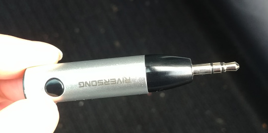
This week, I have been using a new product pretty heavily, and I’m loving it. I had issues with my aux cord and my phone in my car for a long time. One day I thought “they should make aux to bluetooth receivers!” and they DO! So, to solve this problem, I bought a bluetooth receiver that goes into the aux port of my car. It works very well, and pairing to my phone is pretty easy and quick. It’s nice to have, I don’t have to have cords hanging from my phone when I’m in the car now, and the sound quality is the same or better.
Onto the bad. This week I’ve chosen the Garmin watch and app, specifically the bluetooth syncing. It’s not because of the design or anything, but it doesn’t do what it’s intended to for me. It’s supposed to upload metrics about your activity from your watch when paired to your phone. The watch won’t sync to my phone through the app, which also uses bluetooth to sync. It’s pretty disappointing that bluetooth syncing is nonfunctional. It could just be my phone, but I think it’s a little bit my phone, a little bit the app. The watch collects data fine, but it’s useless if I can’t actually see any of it over time.

0 notes
Text
Week 4 Good/Bad UX
For this week, I have picked two examples that I use in my every day life.
First up, the bad. The Hydroflask “sport top,” designed to kind of be like a sippy cup. It would be great, if not for the fact that the plug that’s supposed to seal the cap when it’s upside down leaks. It has leaked in bags of mine before, though luckily it was in outside pockets of a water-resistant bag, so none of my electronics were damaged. I need to replace the cap with a regular one, but it’s so convenient to sip, despite its flaw. I like the feeling of the softer mouthpiece, the handle is nice. It just leaks. This has become my car water bottle so that I can have water when I’m out doing things, but it doesn’t have to come anywhere else.

Onto the good. I really enjoy my Power Beats headphones. They were a gift, I wasn’t sure I was going to like them, but I do. They are simple to use and pretty easy to pair to all of my devices, Apple or not. I like the around-ear style, because it makes them good for walking or running, or studying. I think they actually cancel noise quite decently, having worn them on a few planes with screaming kids that I didn’t even really notice with these on. In addition, they’re aesthetically pleasing to me, because baby pink is my favorite color, but the purple pairs with it very well.

0 notes
Text
Week 3 Good/Bad UX

As an example of good UX, I chose this mirror setup in the restroom of the Disney Family Museum in San Francisco. They’re visually appealing, and they also kind of form a “hidden Mickey”. I just thought that the bathroom as a whole was really well put together as well, the sinks are orange/red accents and then there are red/grey tiles on the wall to the right.
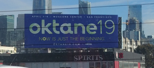

For my example of bad UX, I chose this billboard I saw driving through San Francisco. It isn’t badly designed, but it gives me almost no information about what the event really is. I would say that if a billboard doesn’t give me any information about the thing it’s advertising except the dates and location, that’s not very good design. It does list a website, but I still think that there should be a little bit of contextual information added. Apparently it’s an IT and security management conference, but I didn’t learn that from the billboard.
0 notes
Photo
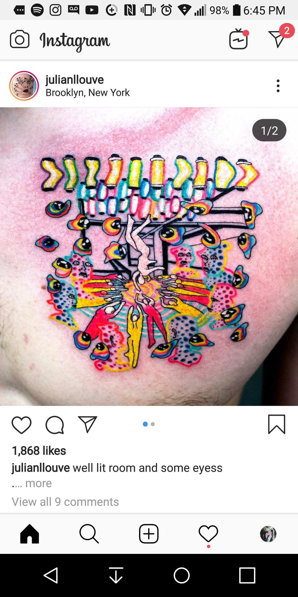
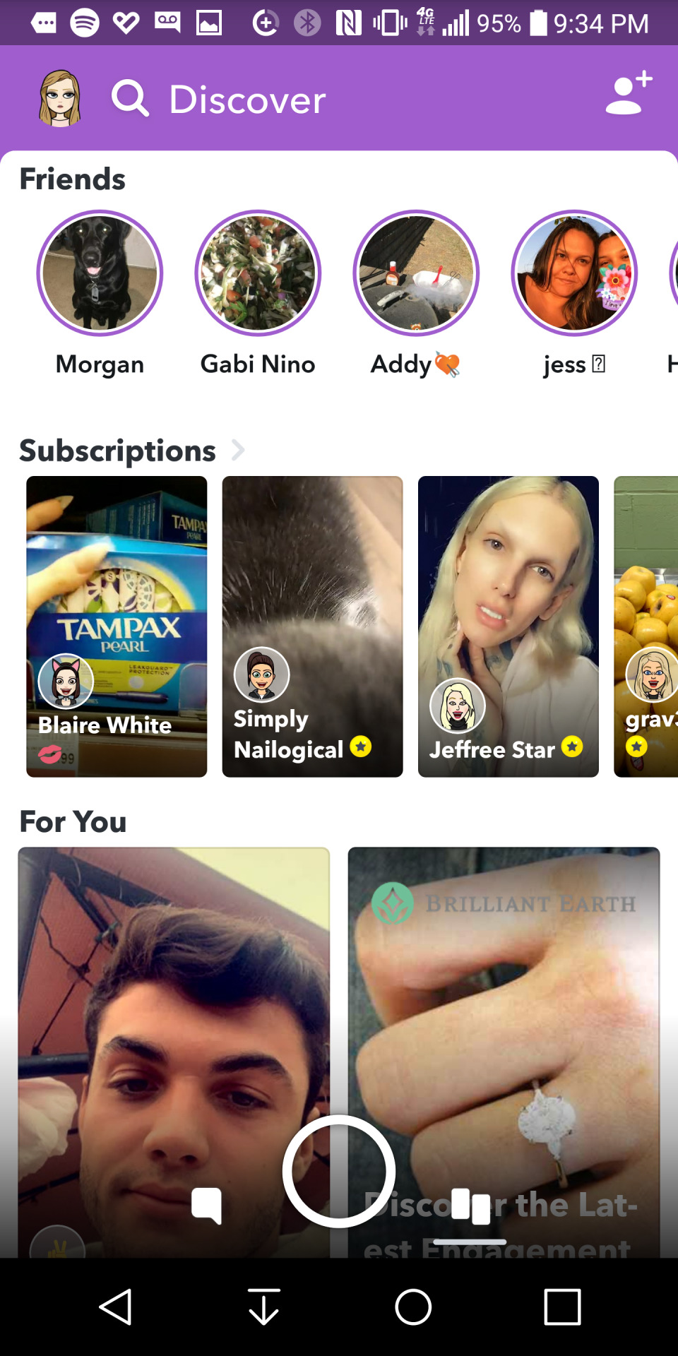
My examples this week for good UX and bad UX are the Instagram mobile app for good UX, and Tumblr as a whole for bad UX (ironic, I know). I chose to start this week with apps/websites because they’re readily available and they are something that most of us use every day. In future posts I hope to bring in real-life products as well.
Instagram does a pretty good job updating and refining their designs in subtle ways over time, and it’s fairly intuitive to use. Your key functions (home, search/explore, post, notifications, and your profile) are all neatly at the bottom of the screen, and it’s clear what their functions are. Your messages are at the top right, and if you swipe right from the home screen, you can access the IG camera, and post to your stories. I definitely remember some darker times as far as IG UX goes, but over time I’d say it’s gotten better.
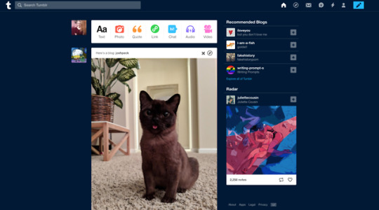
Tumblr, however, does a pretty terrible job at UX. They don’t even care, either. They made everything look “aesthetic” and kind of threw function to the wayside. It’s incredibly hard to navigate to key places, like editing your profile, and those functions are hidden within other menus that are, once again, not intuitive or easy to figure out. I don’t even think they’ve changed the design too much from, say, 2015 (when I got my first Tumblr account) to now. Which means it’s just been terrible this whole time. They added a function where you can see your blog in a “mobile view tab” type appearance. This is not desirable, especially when so many people have specifically chosen themes, just for the theme to not be shown in the tab view. It’s just honestly really poorly done and I don’t see them rising to the challenge of making it even a little bit better. Sorry for the rant, the non-user-friendliness of Tumblr has always bothered me.
1 note
·
View note