Last Seen Blogs

kanudamitrmandal
Rakesh Rajdev
brakesinreality
F U S H I O N S

johnbleepingzoidberg
sir this is a wendys

sinatiling
Untitled
thoughtleak
The ??? System
Text

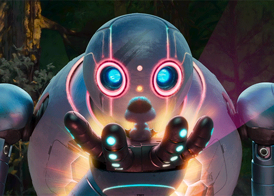
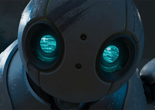
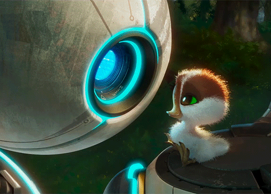
The Wild Robot (2024) - Official Trailer
71 notes
·
View notes
Text
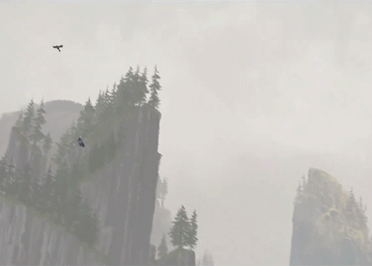
The Wild Robot (2024) - Official Trailer
3K notes
·
View notes
Text

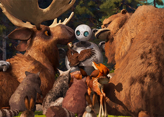
The Wild Robot (2024) - Official Trailer
257 notes
·
View notes
Text


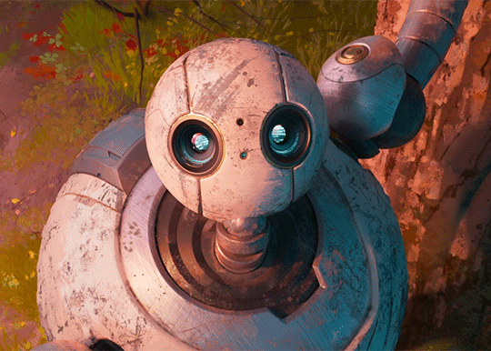
The Wild Robot (2024) - Official Trailer
198 notes
·
View notes
Text
GETTING PORTFOLIO REVIEWS
IN PERSON INTERVIEWS: Let’s say you’re coming to CTN to show you storyborads or you got a physical interview at a studio!
PLAN. AHEAD. Everyone I know (myself included) prefers reviewing PHYSICAL PAPER PORTFOLIOS over digital! (note: this is for storyboard specificially. Obviously animation needs to go digital–good luck friendos) I volunteer at the CTN DreamWorks booth reviewing story portfolios and boy howdy, the digital portfolios had some problems. First off, you can’t rely on the con internet AT ALL to view a website. Second, unless you lug a laptop around for the whole con, you’ll just be showing on a tablet or smartphone. (worst impression last year goes to the person who showed their portfolio on a shattered iphone)

SO MUCH. CAN GO WRONG. SHOWING STUFF DIGITALLY! Your site may crash. Your images could load slowly. The reviewer hits one button wrong (very likely if it’s me) and you’re back to the home screen. Batteries die. You get texts in the middle of the review. The reviewer (hello, me again) can’t get back to a specific board they wanted to give feedback on
“But Megan!” You cry, “I did all this work setting up a great portfolio website! We live in a DIGITAL WORLD?! And now I can’t show it?”
Listen friendo, here’s what you do. Have your website on your business card FOR SURE. And make sure to tell your reviewer that there’s more content (animatics etc) on your website if they are interested. BUT BRING A PAPER PORTFOLIOOOOO.
Layout your boards in what are called CONTACT SHEETS. 3x4 boards, or 3x3, 4x4, but not more than that cuz it’s too small.

Go to your school’s copy room, or kinkos or office max. Print those suckers out on 11x17 pages! Nice and big! AND THEN BUY ONE OF THESE SUCKERS:

https://www.amazon.com/gp/product/B00006IES9/ref=oh_aui_detailpage_o09_s02?ie=UTF8&psc=1
It’s like, 7 or 8 bucks! You can fit all your pages in that!
A paper portfolio is always the most professional in-person solution. It shows YOU PLANNED AHEAD. Remember that cracked iphone person I mentioned earlier? The fact they didn’t even borrow their friend’s phone just for our interview showed me they just decided last minute to get a DreamWorks review. Or maybe they didn’t and they dropped their phone in line.
Also back in my CTN atendee days before I got a job, I had someone point out pages in my portfolio that weren’t as strong as the others. Easy fix? I JUST PULLED THEM OUT before I showed them to the next person!
Final piece of advice: TAKE NOTES AT AN IN PERSON REVIEW! And MAKE. The SUGGESTED. CHANGES.
If you want to contact this person again, the email can go something like this,
Hello (name of reviewer!)
We met at (place) and you reviewed my portfolio! Since then, I’ve reworked (this particular sequence) and took your advice on (this bit and this other story part). Also, you suggested (this change here) but I thought it over and made (this other change instead). Let me know what you think!
Thanks again!
(your name)
See in that e-mail how that person made their own change? Reviewers are not the end-all be all law makers of story, and you may get conflicting notes from different people. But a suggested note means that board needs SOMETHING more, even if the review can’t put their finger on it. When a problem is pointed out, FIX THAT PROBLEM, even if it’s not the exact patch your reviewer suggested.

Other bonus advice:
Always be working on something new. Make a new short sequence every few months, and replace an older sequence on your website. Study the sort of shows you want to work on, and make those kind of boards!
And don’t despair if you get studio rejections. I had stacked up fifty four job rejections before I finally got my start at DreamWorks. Keep going! I BELIEVE IN YOU!
You can ask me any more portfolio questions here. I will tag such answers as thirdchildstory.
GOOD LUCK!
1K notes
·
View notes
Text
STORYBOARD PORTFOLIOS
Iiiiiiiit’s that time of year again! CTN is just around the corner, and I’m getting ye olde’ classic Storyboard Portfolio questions! First up, my words don’t reflect the opinions of my employer. I’m speaking from my personal years of job hunting, and two years of pro experience. SO HERE’S WHAT I GOT
HAVE A DEDICATED PORTFOLIO WEBSITE: A special tumblr or a blogspot or a squarespace site that is ONLY your porftolio. Don’t link to a general tumblr or twitter site. Have a web-space where the only images are your portfolio pieces! If you want people to see more, stick your general tumblr info on your–
COVER SLIDE: An image of your choosing with your NAME and CONTACT INFO. This means an email address you check often. It’s a good idea to have the email address be some form of your name–not only does that look more professional, it will help recruiters remember, y’know, your name.
Now for the actual story boarding stuff.
DRAW for the SHOWS you WANT TO BOARD ON. If you wanted to board on a cool show with lots of martial arts actions scenes, but only have cute bunny and kitty storyboards, you won’t get that gig.
A good, succinct portfolio has 3-5 story sequences. This means simple, one-shot stories following a character driven by a clear goal. (examples: a dog pulling off a heist, a wizard kid has to pass his final, a ballerina assasin who has to take out a clown) It MUST HAVE a beginning, a middle, and an end–or, in story terms–
SET UP, ACTION, CONCLUSION.
Let’s go with the dog heist example.
SET UP: Show the dog outside the bank–set up what obstacles she has to go through (automatic doors, a very strict “NO DOGS ALLOWED” sign, slippery floor)
ACTION: How does the dog get past the doors? Does she disguise herself as an old man? Does she try to sneak in a baby stroller?
CONCLUSION: having made it past all the obstacles–does the dog ultimately succeed or fail? Maybe you’ve tricked the audience and she’s not trying to rob the bank, just get ear scratches from her owner, the bank manager. Are you gonna end on a joke or a gut punch?
These sequences can be anywhere from 50 to 200 boards! It’s good to have varying lengths, to show you can tell shorter or longer stories. Now, you might have a–
BOARD ADAPTATION: Maybe a boarded song from a musical, or a sequence from your favorite books (GUILTY). This one can be longer than the others! But remember, a sequence like this requires familiarity with the source material and maybe the recruiter hasn’t read the book/heard the play. This needs a cover image as well–let’s say I re-imagined a scene from the Adventure Zone. A cover image must have a short set-up of the source material and CREDIT THE ORIGINAL CREATORS.
Example: The self-involved wizard Taako has taken on his very first student–the eager boy-detective, Angus McDonald. Based on a scene from The Adventure Zone podcast by the McElroys.

(taako gif by @drulidoodles )
HOW TO DISPLAY: NOT. ANIMATICS. Well, to clarify, not JUST animatics.
Many recruiters and story directors like to flip through the boards at their own pace, so they can study the drawings. It’s better to have your boards as a slideshow to flip through, or laid out in sheets with 9-12 boards on a page. In the industry, most board artists don’t edit their boards, so they aren’t looking at your editing skills. They want to see if your drawings have clarity without hearing the dialogue or leaning on the mood of the music. You CAN have animatics on your website, but make sure you also have your boards displayed.
That’s what I got for web portfolios! I’ll make another post about showing portfolios in person. Send me any more storyboard questions you may have! I’ll tag them “thirdchildstory”
328 notes
·
View notes

Photo

i started this painting during the summer when i first watched tfa. not happy with it but might as well leave it here
full view please!
5K notes
·
View notes


Note
Oh almighty napkin arm with googly eyes, I humble peregrin dare come forth with a request... could you make some character design breakdowns for some more realistic characters? Like your power ranger fanart? I tried to break them down on my own, but I'm not sure I did it that well... it's incredibly useful and interesting... Keep being awesome, and thanks for how you already helped me anyway!
Thanks for the patience, had to mull this one over. The more complex a design gets, the more difficult it is to break down. Basic character design tips may not be enough…so let’s delve into:
Character Design Tips Part 2!
Before we start, it’ll help to read my last character design post, where I laid out four concepts: shapes, silhouettes, colors, and inspiration. In this post, I aim to build on and rephrase these in a way that hopefully makes it easier to apply them. I’ll be drawing examples from my Power Rangers (2017) fanart to illustrate my points.
(Disclaimers:)
(Ideally, you should already be comfortable with drawing people. If not, look into figure drawing, gesture drawing, etc.)
(Whereas my previous tips were more tried and true, the tips here are more my own thoughts, so they may be half-formed.)
(Again, these are not rules. They’re just tips to add to your toolbox; the more tools you have, the more versatile you’ll become.)
Without further ado, let’s start!
Based off what we know about shapes, silhouettes, colors and inspiration, I want to cover: lines and angles, external and internal silhouettes, values, and references.
1. Shapes => Lines and Angles
Last time, I laid out three basic shapes:round, box, and triangle.
Problem: limiting yourself to these 3 shapes can be useful and fun for simpler designs, but they may be too simple or look out of place on more complex designs.
Solution: let’s go to the next level! Instead of shapes, shift your thinking to lines and angles!
Lines can be curved, straight, or diagonal.Angles can range from obtuse to acute angles.Follow your intuition: what feeling do you get from each line or angle?If I follow my own intuition, I see that:
curved lines = natural, soft
straight lines = balanced, grounded
diagonal lines = off-balance, in motion
obtuse angles = broad, relaxed
right angles = rigid, unnatural
acute angles = slim, dynamic
If this sounds familiar, you’re right! It’s just the shapes all over again:
curved lines make round shapes
straight lines with obtuse/right angles make boxy shapes
diagonal lines with acute angles make triangular shapes
But lo! Since we broke the shapes into their smaller components, it’s much more flexible! Now we can use lines and angles for more complex designs:

2. Silhouette => External and Internal Silhouettes
Last time, I explained the silhouette test: if you black out the figure, it should still be readable.
Problem: blacking out the figure only tests the outline of the design, i.e. the external silhouette. But what about the inside of the design?
Solution: block in the figure and test for the internal silhouette!
If you want not just an interesting outline, but an interesting costume, block in the major components of your design to see if it has a readable internal silhouette. This test can help you avoid boring or cluttered costumes and makes your design stand out. If your internal silhouette is too empty, try adding props or designs. If it’s too busy, simplify it.

3. Colors => Values
Last time, I talked about the 60-30-10 and 70-30 rules for color.
Problem: those rules work on the assumption that you’re only using 2 to 3 colors. But what if I want to use more colors?
Solution: good news! The same idea applies if you split your palette into 3 major values: shadows, midtones, and highlights.
Balance your palette by converting your colors to grayscale and applying the 60-30-10 rule to the values. This is related to the idea of silhouettes; if you get a nice internal silhouette, you’ll probably end up with a nicely balanced set of palette values, and vice versa.

(Fun fact! You can split your palette in different ways. In a watercolor tutorial, Miyazaki splits the palette into bright, dark, black, green 1, green 2, blue 1, and blue 2.)
4. Inspiration => References
“Good artists copy, great artists steal!” -Picasso
Problem: Coming up with something 100% original is tedious and doesn’t always give great results. It saps the inspiration right out of you!
Solution: It’s a lot easier to steal ideas from references!
Note: don’t just copy, steal! Cherry-pick/massage the aspects of the reference you find the most appealing and work them into your design. Ditch anything that you don’t care about. Make it your own! Make it something you can put your own name on! Below is the reference image I used for my designs:

And below is my fanart:


That’s it for now! Thanks for reading! If you guys want to see any other topics, feel free to ask and I can try my hand at it.
If you want to see my previous character design tips, click here.If you want to see the full-size Power Rangers fanart lineup, click here.If you want to see other character designs I’ve done, click here.
9K notes
·
View notes

Photo


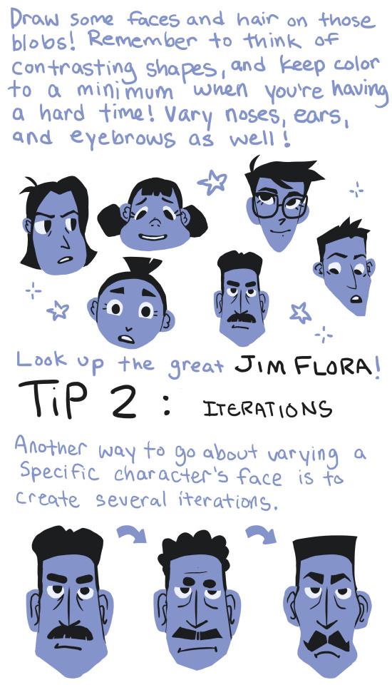

This is something I need to work on as well, so it was good practice for me! I hope this helps some of you that also struggle with same-face-syndrome!
TLDR: Just look at Jim Flora’s artwork and study from that ;)
43K notes
·
View notes
Note
I hope you don't mind me asking, you do your shadows so well and was wondering how you do them?! They set such an incredible dark mood, it makes your artwork instantly recognizable!! Thanks for your time
Im pretty shit at explaining things so i’ll use this for basic example. Firstly if you know how shadows work and stuff then it shouldnt be to hard. Otherwise go study that shit.
So you got your flat colors down for the first step

Next lay down a dark tone set to multiply, idk about 70% i guess? up to you

Start adding some shadows set on another multiply, shadows can be however dark. 50-70%

The add your light source, i used color dodge in this one. Dont use super bright color or it will look like blinding light. (again if you know light/shadows shouldnt be to hard)

I add a touch more dark in the shadows for effect…or something like that.
And there you have it, this maybe helpful lesson was brought to you by a potato, chur.
11K notes
·
View notes
Photo

channeling wistful feelings about travel into overwatch fanart for some reason
31K notes
·
View notes
Text
How to do “extra” facial expressions!
Drawing basic facial expressions is not the hardest. Most people can draw a sad face, a happy face, angry etc., but making more multidimensional expressions is more of a challenge. I have gotten a lot of compliments on how I draw facial expressions, (specifically “angsty ones”) telling me that they are very dramatic and well… expressive! And there are actually only a few things I think about when I draw faces that take them to the next level, so I thought i’d illustrate them all here!
SUPER IMPORTANT TIP BEFORE WE START: Look at your own face when you draw faces. Even making the face when you are drawing (you don’t even have to look at it), will give you some sense of how the face muscles pull and where things fold and stretch, because you can feel it. You are the best reference when it comes to facial expressions!
Angles
Draw the head in an angle that matches the expressions you want to make. It is not a requirement, but is going to add to the effect.

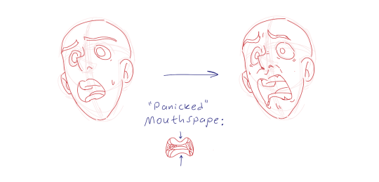
Symmetry vs asymmetry
A face is rarely symmetric. Unless the face the character is making is 100 % relaxed or even dissociating, the eyebrows, mouth and facial muscles will have different placements of their respective side. This image shows the dramatic impact asymmetry has on a face:
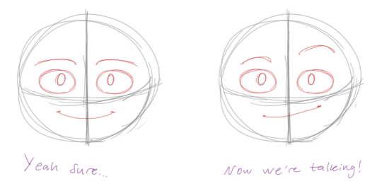
That’s the difference between a smile and a smirk!

The first one’s like “oh yeah?” and the second is like “oH YEAH??”
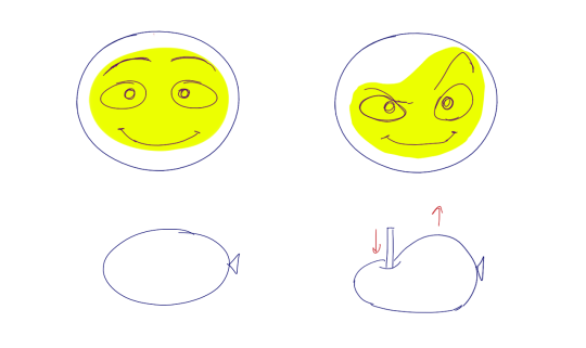
The “balloon squishing principle”
This is something I did subconsciously, and I didn’t know about until I made this tutorial. And this principle goes hand in hand with an asymmetric face. Basically, if you squish one part of the face, you need to even out the empty space by “inflating” the other part of the face so that it doesn’t appear shrunken. The picture hopefully explains it:
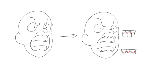
Teeth
Don’t forget to add the gum when the mouth is open to its full potential!
Squinting and folding
Adding folds around the eyes when a character is squinting makes a HUGE difference. It makes a smile more genuine and a growl more intimidating. Adding folds to the face in general makes your characters more lifelike and ‘visually relatable’. Like, they look human, and less plastic or fake.

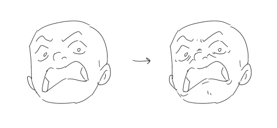
and so on..
Pupils and irises
The placement of the iris and pupil in relation to the eyelids is very important! The less of the white you see, the more relaxed the character is.
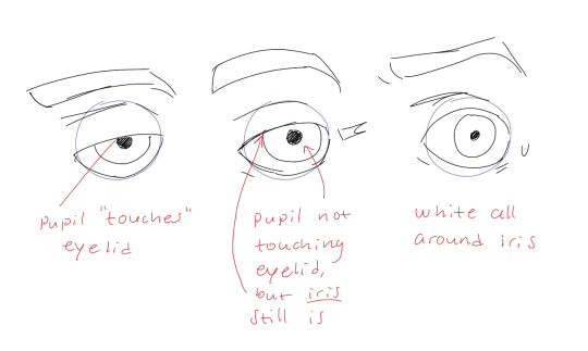
And then of course eyebrows and eyes go hand in hand!


Gestures, spitting, sweating…
Adding more elements than just a face is key to making the character actually look like they are feeling what you want them to feel. Just the tiniest sweat drop adds to their anxiety, spitting adds frustration to their rage, slouching shoulders, waving hands, a double chin, extreme angles, the list goes on! Add whatever and see what kind of impact it makes! Does it do the trick? Great! Add it!
Over exaggeration!!
Remember that you can almost always exaggerate more. Don’t be afraid to do draw “too much” because you’re just experimenting. See what works and what doesn’t. What do you like to exaggerate?

Now that you know some theory, it’s time to practice!
Practicing!!
The 25 Essential Expressions (a classic! I’ve done it multiple times)

And the one I do when I’m bored:
Fill a page with circles and fill them in with different expressions. Try and exaggerate as much as you can!

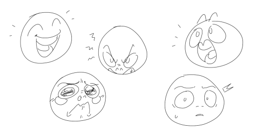
This is mostly for experimenting. They are quicker to draw than complete faces, but the same rules should apply!
And that’s about it!
I don’t know if I covered everything in this tutorial, since some things might be obvious for me, and this post perhaps only scratches the surface. So feel free to send me a message if you want an explanation about something more in depth! Thank you for reading! And now DRAW!!! ✨🎨
168K notes
·
View notes
Text
art cheats
hello i am here today to not lose track of the art cheats i have discovered over the years. what i call art cheat is actually a cool filter/coloring style/way to shade/etc. that singlehandedly makes art like 20 times better
80’s anime style
glitch effect
glow effects
adding colors to grayscale paintings
foreshortening ( coil )
foreshortening ( perspective )
clipping group (lines)
clipping group (colors)
dramatic lighting ( GOOD )
shading metal
lighting faces
that is all for today, do stay tuned as i am always hunting for cool shit like this
318K notes
·
View notes
Note
Hey Hello! You're a talented artist and I was hoping you'd be willing to answer some questions about your craft. How do you practice your drawing? And also, do you go through creative dry spells or do you draw everyday? I'm trying to be a better artist and your work is inspiring :)
Hey there!I practice drawing by, well, doing it I guess. Sometimes the easiest answer to how to go about doing that is literally just drawing what you want. As you build momentum then you can start thinking about dedicated study time for life drawing (absolutely practice with reference or live models!). But I think it’s pretty easy to get hung-up on trying to fulfil self-imposed study quotas rather than just doing the deed of picking up your pencil and noodling around for a few minutes.
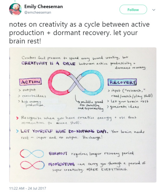
I absolutely go through creative dry spells and I can go months without having the energy to make something beyond a post-it note doodle in my off time. I do work in a studio full-time as a concept artist and I don’t have the luxury of ‘art block’ when I’m working, so in that case it’s 100% just pushing through it. The art you make during those times won’t be your best and that’s okay.This is actually a really excellent diagram by emcheeseman on Twitter that puts into perspective the reality of that ‘creativity ying-yang’:
It’s hard to manage the pressure of feeling like you should always be producing at the same pace, especially if your peers or the people you look up to seem to have an amazing level of output. The ebb and flow is normal, breaks are very important, and when it’s your livelihood: for sure you have to just push through it.
TL;DR version: just draw! If you can’t today, try again tomorrow. Build your own momentum drawing what interests you and slowly try to work some studies in as you go for improvement! If you enjoy drawing a certain character? The turn your figure-drawing poses into that character!
375 notes
·
View notes