
Last Seen Blogs

amanda-ceratops
Fascination at Its Finest

iraxme
Some Of My Art But Also Fandom Stuffs

apresentartist
Art

kosyaxd
Kosya
crumb-crumblet-s-crumbington
crumblet
Text
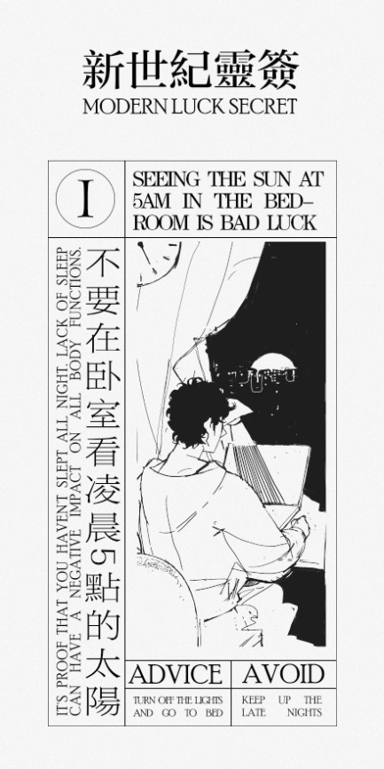
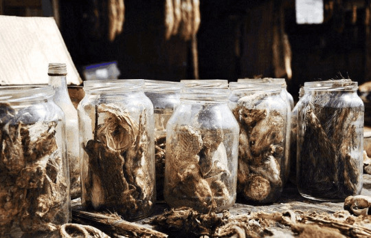
<Research Narratives> 36 A New Idea: Witchcraft
In the process of researching divination rituals, I discovered the 'witch's display of potions,' which has a mysterious atmosphere that is quite suitable for Modern Luck Secret. And a new idea comes to me.


The witch's magical potions can easily fulfill people's wishes. I replaced the strange specimens in these potion bottles with things people really need to fulfill their wishes.
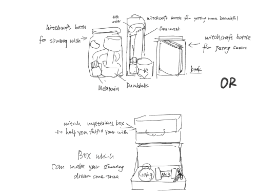
For example, a 'magical potion that can make people smarter' is a jar of books, and a 'magical potion that can make people thinner' is a dumbbell or jump rope.
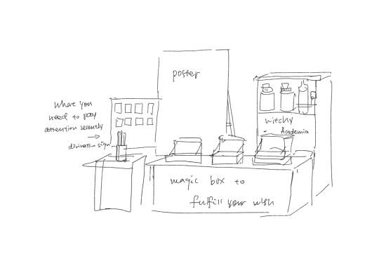
This is the ketch of the exhibition booth for the entire project.
7 notes
·
View notes
Text
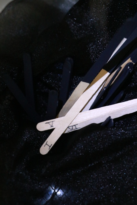
<Research Narratives> 35 Visual Experimentation 5.3 Divination Process
The video demonstrates the process of drawing a fortune-telling stick during the divination ritual.
0 notes
Text
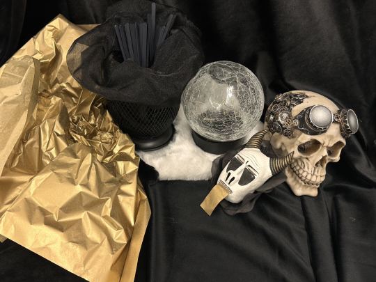
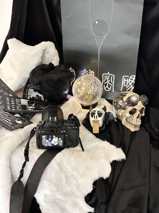
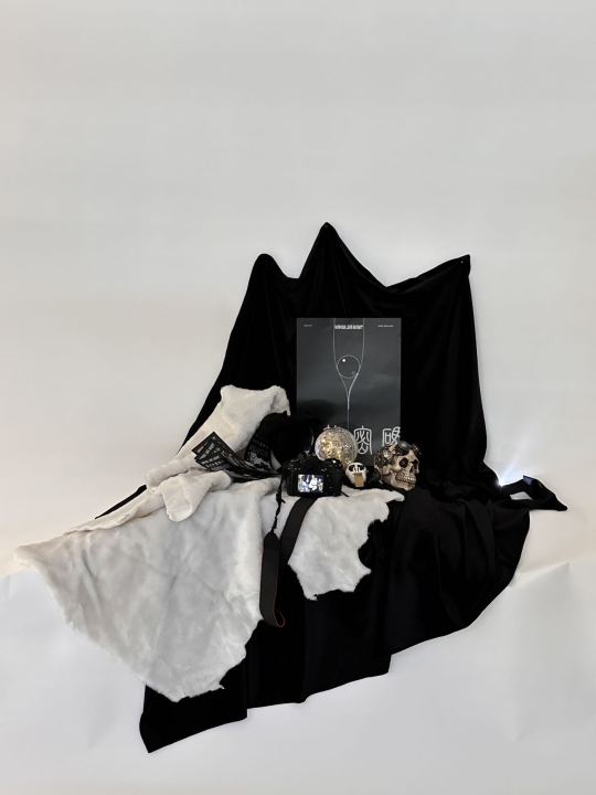
<Research Narratives> 34 Visual Experimentation 5.2 Ritual Simulation
I tried to use photography to capture the atmosphere of modern divination rituals.


However, the effectiveness of the divination sticks was not very good, because the black end of the sticks was facing outward and they were placed in a black bucket, which caused them to become invisible against the black background.
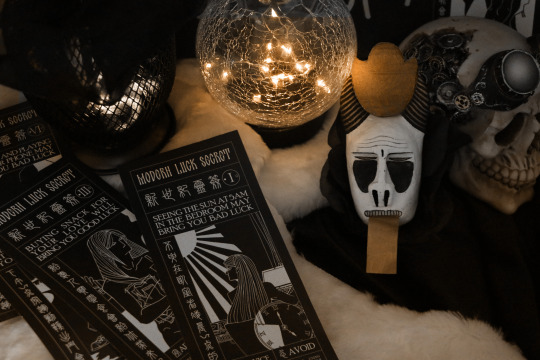
0 notes
Text
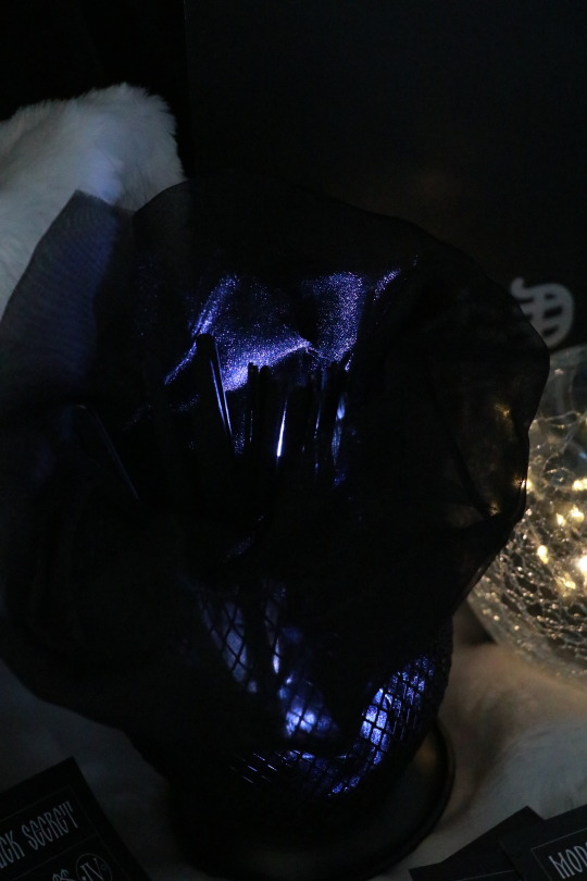
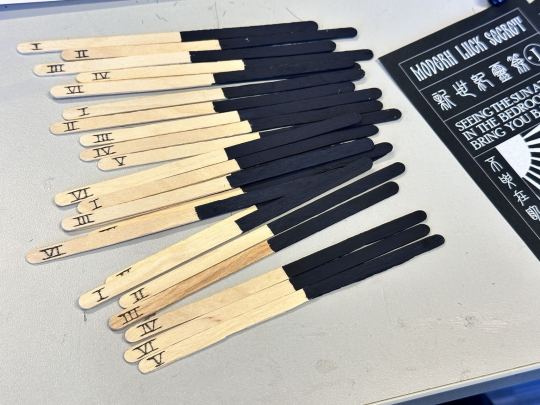
<Research Narratives> 33 Visual Experimentation 5.1 Ritual Simulation
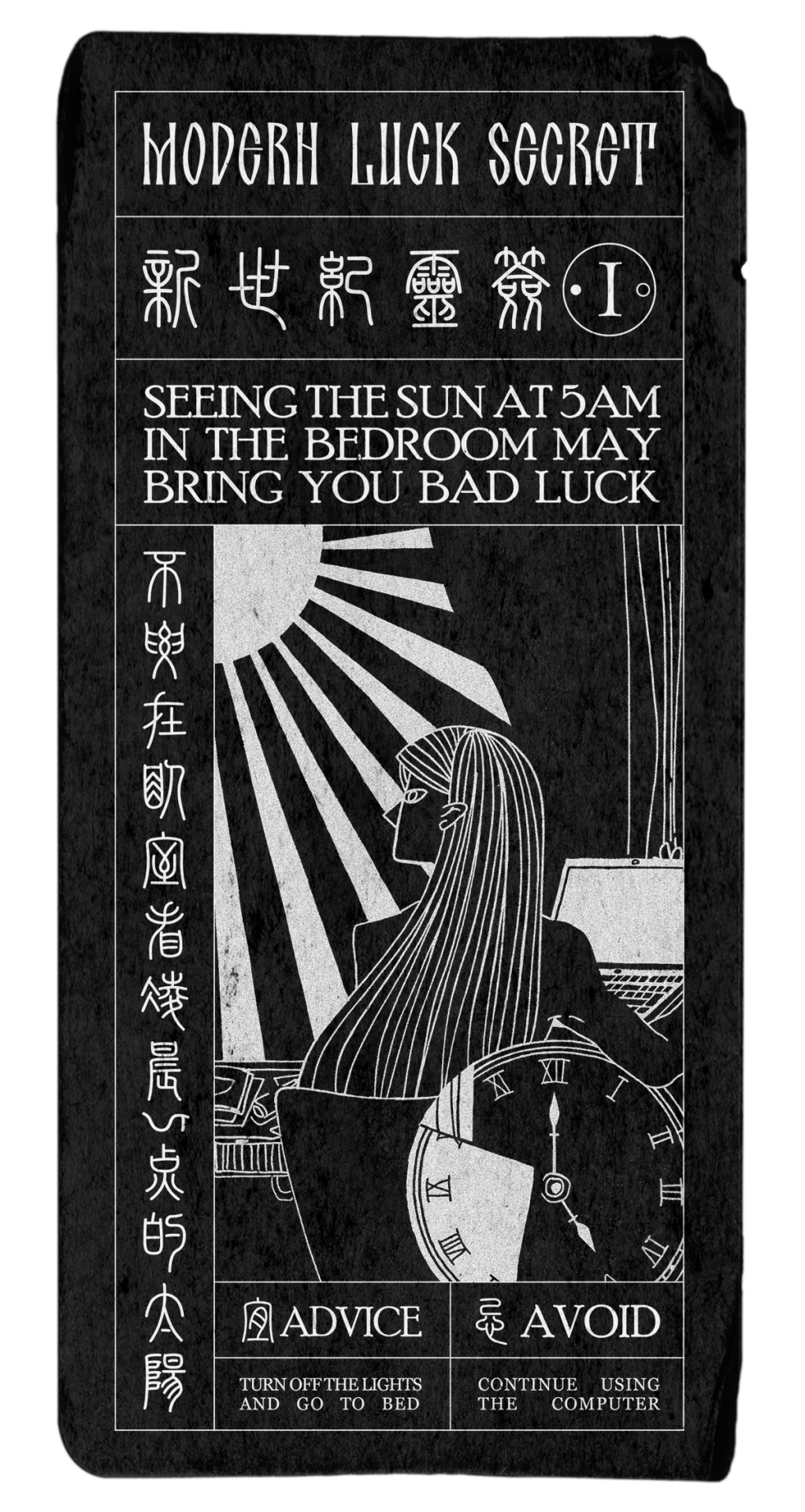
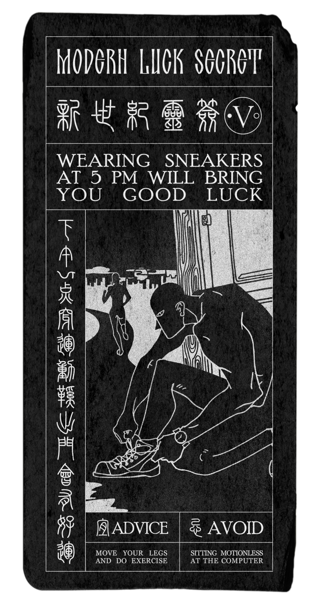
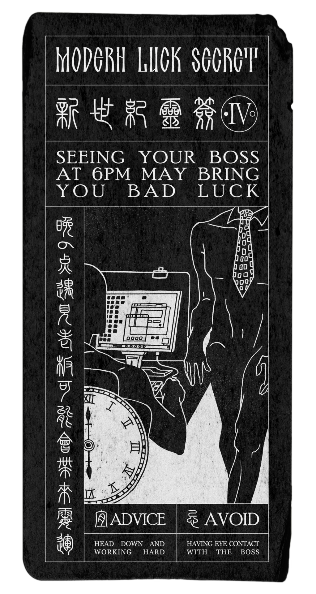
I attempted to document a complete set of divination ritual. The numbers 1-6 on the divination sticks correspond to the six Modern Luck Secrets. The sticks are made of coffee stirrers.
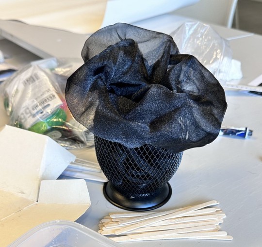
And the mysterious atmosphere was enhanced with the use of a crystal ball, corresponding to the crystal ball element in the poster.
0 notes
Text
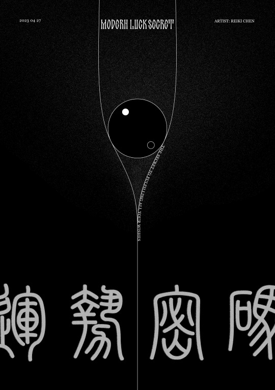
<Research Narratives> 32 Main Visual Poster
This is the first version of main visual poster for the Modern Luck Secret. The central circle can be understood as a Western divination crystal ball, or as an Eastern Tai Chi culture symbol. Above this circle, the single line was divided into two thin lines, representing the two different trends of the future luck/ two paths of the destiny.
0 notes
Text
<Research Narratives> 31 Feedback and Visual Iteration
In the last class, I received some very useful feedback. One obvious issue was the entire project did not have a unified visual style, and the previous visual attempts were not impactful enough.
The first version of the divination cards lacked visual impact, while the second version of the magic cards lost their uniqueness and became like ordinary postcards.
Left: first version, Right: second version
Both lacked a certain atmosphere, but the design of the first version of the divination cards was more distinctive. Therefore, I decided to continue with the concept of the divination cards and redesign the text of the cards.
This is the redesigned poem paper for the ritual of Modern Divination Stick.


0 notes
Text
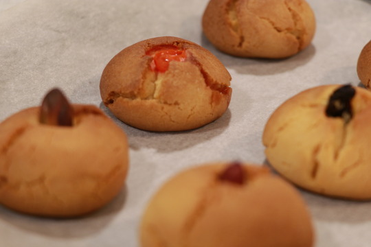
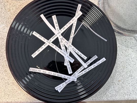
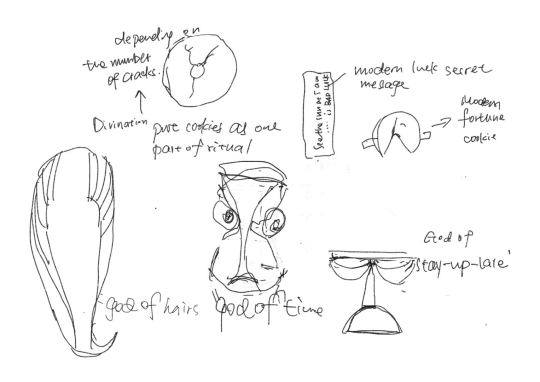
<Research Narratives> 30 Visual Experimentation 3.2
The previous Divination Cookies failed because the magic seeds for divination were placed inside the dough. This time I decided to place the magic seeds on the surface of the Divination Cookies, and judging the luck of the result by the number of cracks around the seeds.
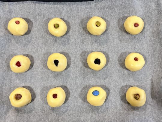
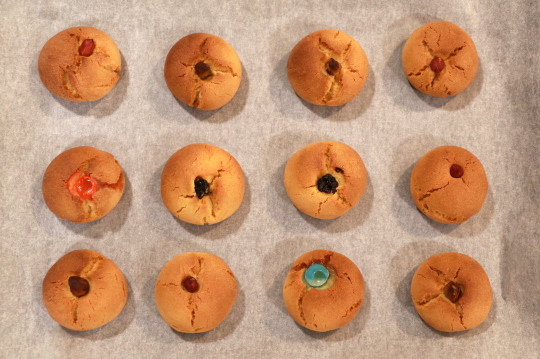
Cracks more than or equal to 3 bars is Good luck, less than 3 is Bad luck.
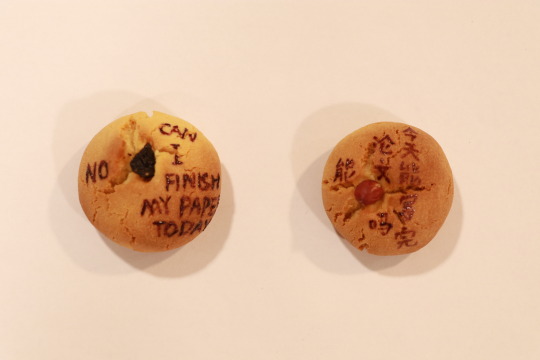
I wrote the divination questions and answers in edible colouring on the top of the cookies, imitating the oracle bones.
I also tried my hand at making Modern Fortune Cookies and wrote a rewritten Modern Luck Secret (in a more euphemistic tone) on the slips of paper.


0 notes
Text
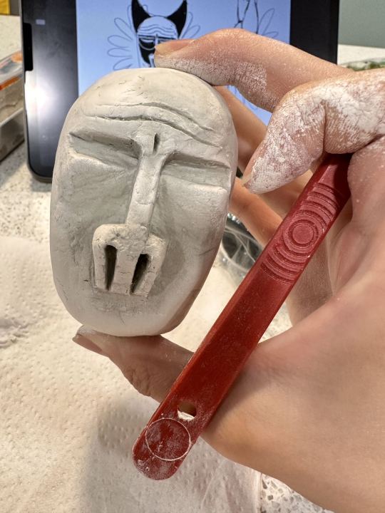
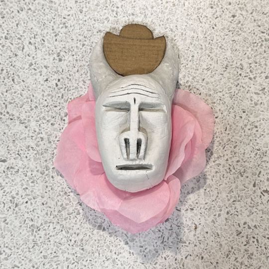
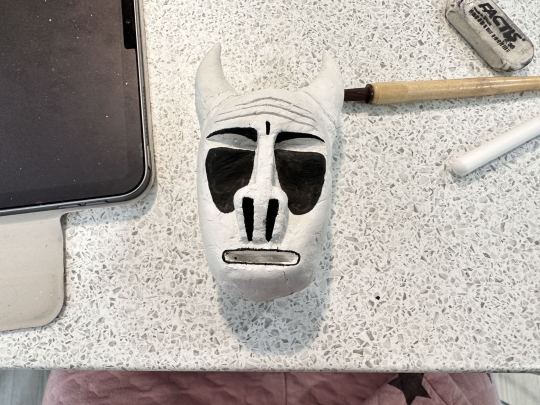
<Research Narratives> 29 Visual Experimentation 4.1 Modern Deity Mask
I tried to make the mask sketch into a real object. And I decided to start by making a scaled down version out of clay. Here is the process.
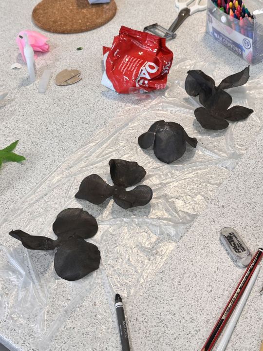
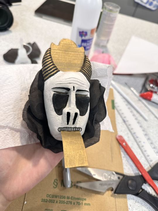
0 notes
Text
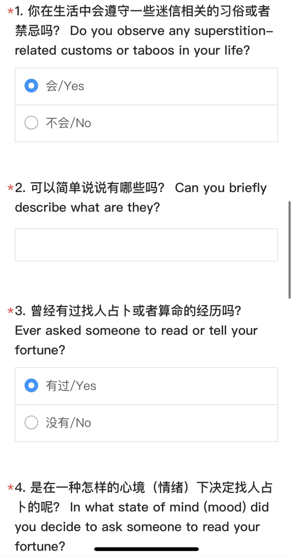
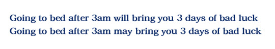
<Research Narratives> 28 Questionnaires Sum Up
I wanted to see the attitudes and feedback of my audience (15–30-year-olds) to the 'modern superstitions' I had written, so I did a questionnaire survey.

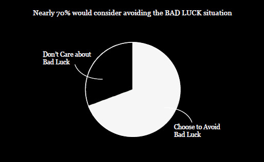
I noticed that people really rejected some of the bad superstitions. (This in turn made me aware of the need to be careful about the tone and wording used when making up the bad luck superstitions), and nearly 70% would consider circumventing the situation mentioned in the superstition when it related with bad luck.
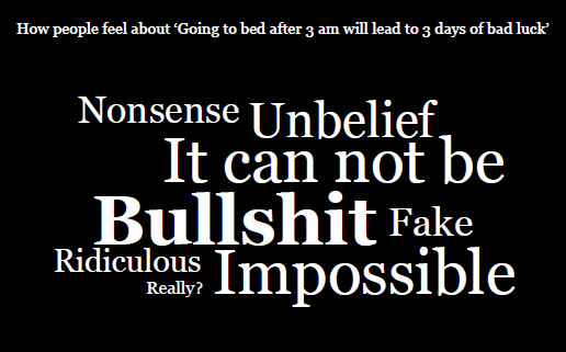
What's even more fun is that when they saw superstitions related to good luck, most of them said they would give it a go when they had the chance.
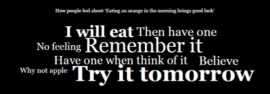
It seems that superstition has a really strong appeal!
0 notes
Text
<Research Narratives> 27 Modern Gods’ Masks Design 1
This is the sketch I drew for the gods of staying up late: a hard-working cow who stays up late working just to earn more money and treasure. (If you pray to him, you can stay up all night without hurting yourself!)
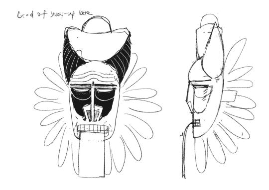
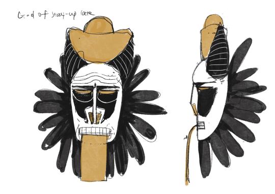
I would like to make this into a mask. This will be followed up with other masks of 'modern gods' that people will need to wear to complete the ritual.
These are some African masks I researched.
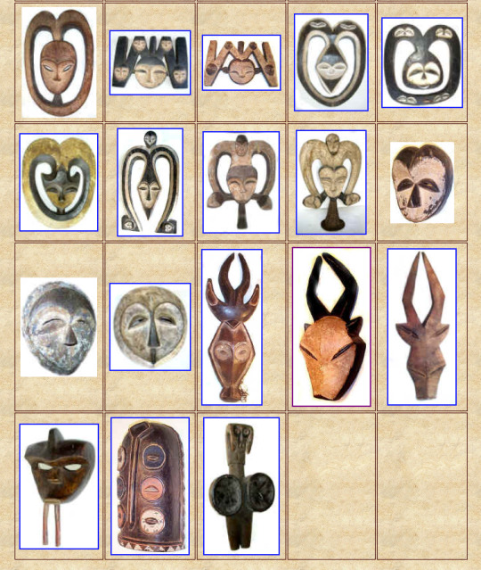
And these are the work of the artist Alice Hualice. She also designed some masks that are very interesting, filled with a modern and eerie atmosphere.


0 notes
Text
<Research Narratives> 26 Ritual and Human Well-being
As my modern superstitions involve a lot of life experiences and health issues (such as bad luck staying up late, good luck eating oranges in the morning), Mike suggested that I could dig deeper into human well-being and research some rituals to make the whole modern superstition complete and richer.
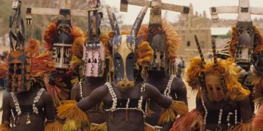
During the research, I found an interesting African Blessing Ritual. They dance with masks while sacrificing the animal they hunt, and then eat them as a way of thanking the gift of nature.
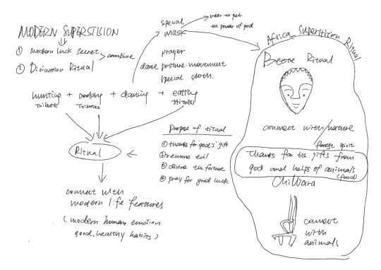
Then, I began to think, could the ritual be designed as 'modern superstition' that in tune with modern habits and zeitgeist?

Then it occurred to me that if there really was a 'modern superstitious ritual', perhaps through the ritual, my audience wanted nothing more than to stay up late without dark circles under their eyes and work overtime without losing their hair. So I created a few 'modern gods', 'gods of staying up late' 'gods of time management', to be part of the whole ritual.
0 notes
Text
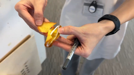
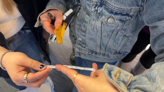
<Research Narratives> 25 Fortune Cookie Inspiration
The fortune biscuit company had previously been complained about because some of the 'prophetic notes' in it were too harsh and 'unlucky'.
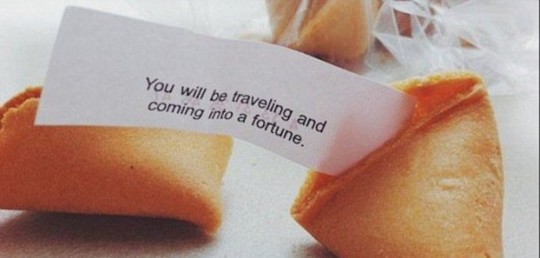
NOTE: Chinese restaurant fortune biscuits are wrapped with aphorisms or cryptic prophetic notes, translated Chinese idioms, proverbs, etc. I thought that mine could also be used as a vehicle for fortune biscuits.
This inspired me. I found that some of the modern luck guides I had written before were too sharp and perhaps the tone should have been softer like the note in the fortune biscuit.
For example, the presentation of 'modern bad luck secret’ should not directly tell the person that you will be unlucky if you do this, but instead be more euphemistic, or change it to a 'risk-averse' presentation that is more acceptable to the audience.
0 notes
Text
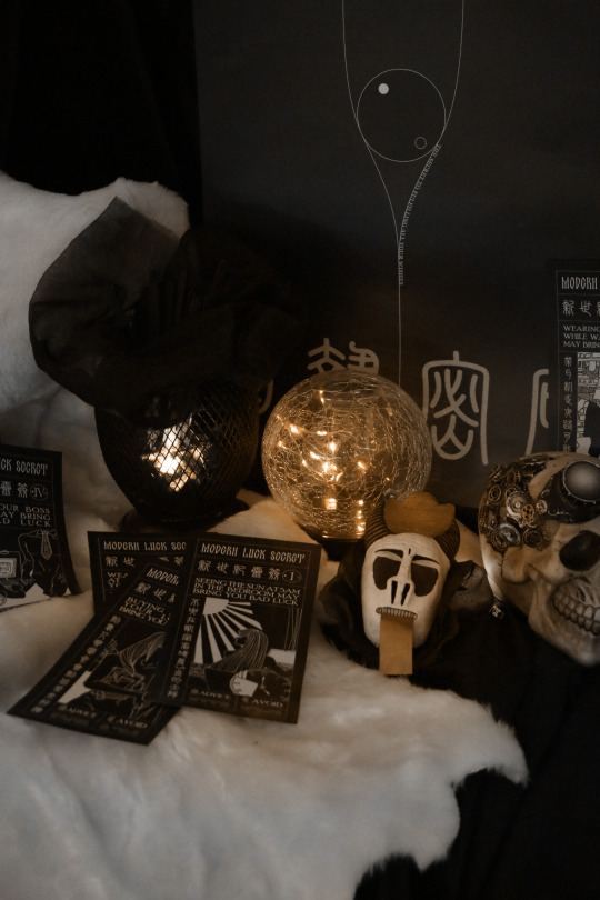
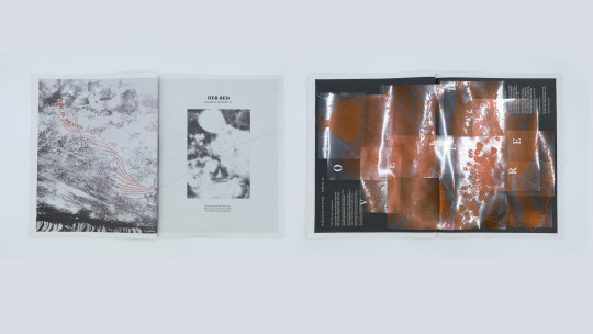
<Publication Design> 24 Physical Photographs
These are some detail pictures I took at the lightbox.


0 notes
Text
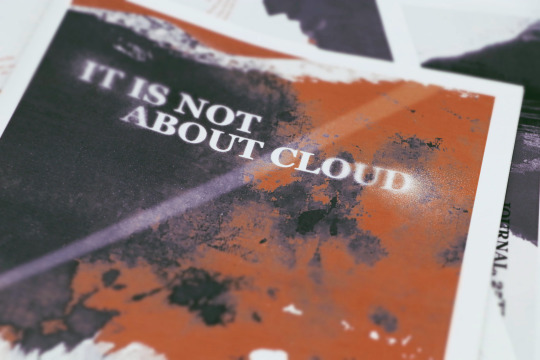
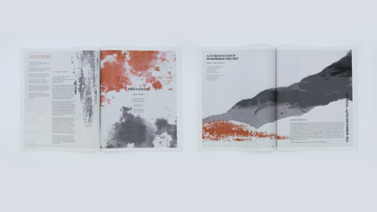
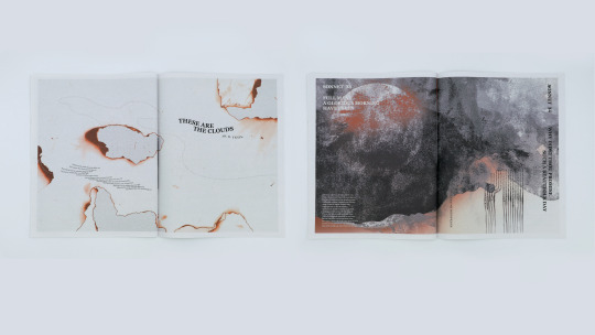
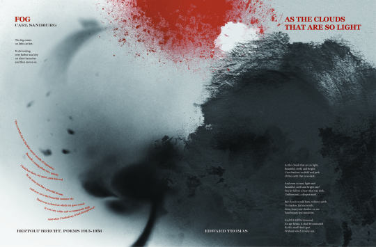
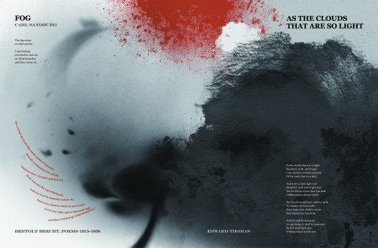
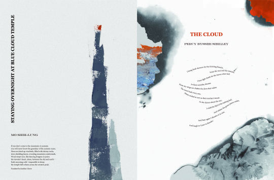
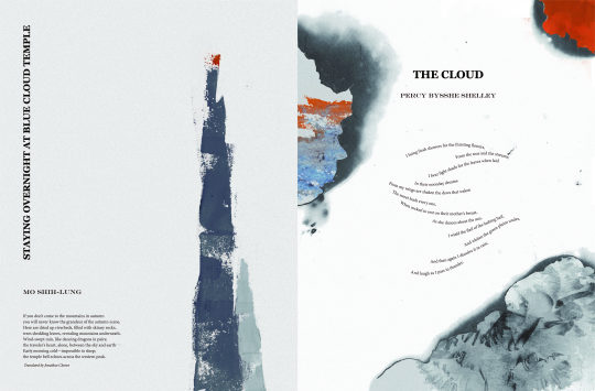
<Publication Design> 23 Final Outcome
This is the final version of my book.
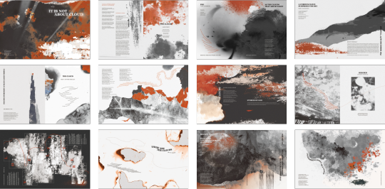
Here, the clouds images are no longer designed within a prescribed rectangle. Instead, they together with the poem text, form a wide variety of scenes with clouds in the sky.
And each one telling a unique story.
0 notes
Text
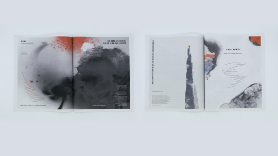
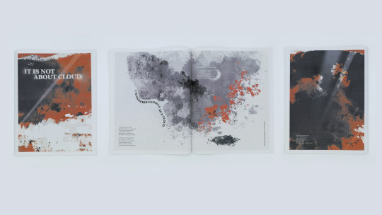
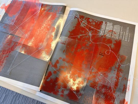
<Publication Design> 22 Visual Experimentation 3
When I designed for the poem Lover Letter, I tried to use the overlapping transparent sheets to create a kind of feeling that the author was slowly falling in process of love, where time stands still and he is wrapped up in the moment.
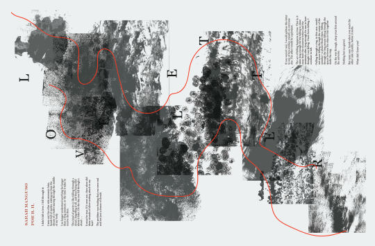
When the book is turned upside down, the cards hang down in the order of the height of the clouds, with the effect of the layers being stacked on top of each other like a slowed down fall.

The two strings running through the card are like the two protagonists of the love story.
However, there was a problem when printing the transparent card. The white pattern did not get printed on the Acetate. So I changed the colour to orange.
0 notes
Text
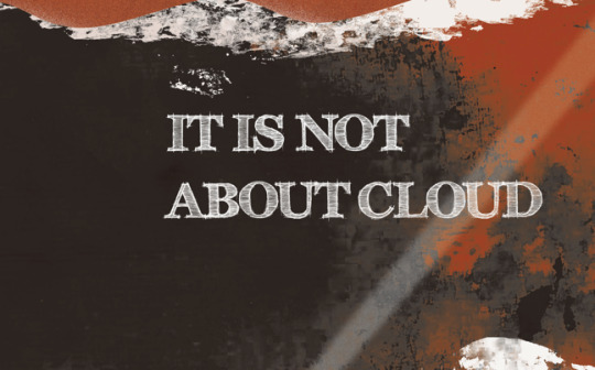
<Publication Design> 21 visual iteration 4
At first, I used to choose orange, black and white as the colour scheme on all the elements on the pages, including the text. But eventually based on Michael’s advice, I changed all the poem text to black, which I thought would be less flashy and more like a book, easier for the reader to read.
Right are the final version..

0 notes
Text
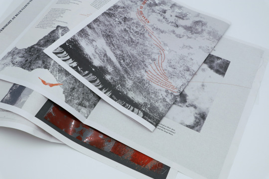
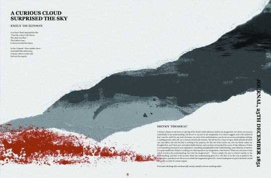
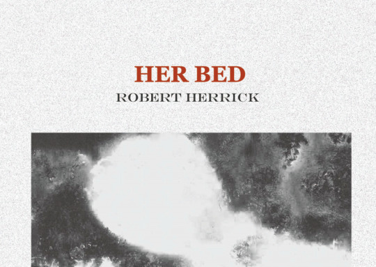
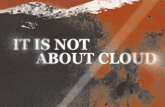
<Publication Design> 20 visual iteration 3
I tried different colour schemes for the interior pages.


During the time Marco pointed out some problems with my choice of title words. This sketchy style is too strong and perhaps too fancy when put together with the cloud motif. Thus, I tried some new fonts and finally decided to use the Georgia as first level headings.

0 notes