
purplephloxpress
Purple Phlox Press
i'm dipping my toes into bookbinding! my creations can be found under the #purplephloxpress tagmain blog: thereismusicinmysoul
219 posts
Don't wanna be here? Send us removal request.
Last Seen Blogs


jenniferbrown614
Hi! I'm Jennifer! 😏

liamarthur
Untitled


incorrect-quotes-for-everyone
Bringing Fandoms Together
Text


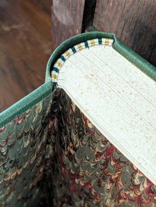


Away Childish Things by @letteredlettered
I'm so excited to finally share this bind of one of my all time favorite fics! Thanks to lettered's generous binding policy, I decided to go all out.
This bind has a foiled cover and spine, hand sewn silk endbands, and thirteen custom chapter headers. It was also my first time rounding and backing.
You can find more pictures and information about my process under the cut.
For the cover and spine, I recreated the design of Beasts of the Field (1902) by William J. Long.
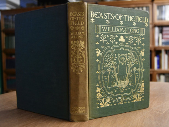
I wanted something that captured both the whimsy and maturity of the story, and this cover fit my vision perfectly. It also gave me the opportunity to recreate another antique cover from the public domain.
Unfortunately, the design was a bit complicated for my Cameo 4, so I was unable to fill the lines in. You can also tell that the foil did not adhere properly near the bottom, so the flowers are lighter than I would like them to be.
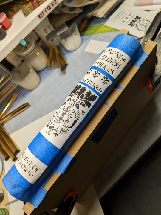
Because of the trouble I was having with my Cameo, I decided to foil the spine by hand. I deeply regretted this decision two hours later, and it took me four hours to finish foiling. My wrist still hurts!
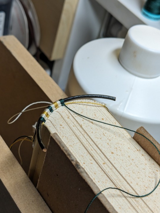
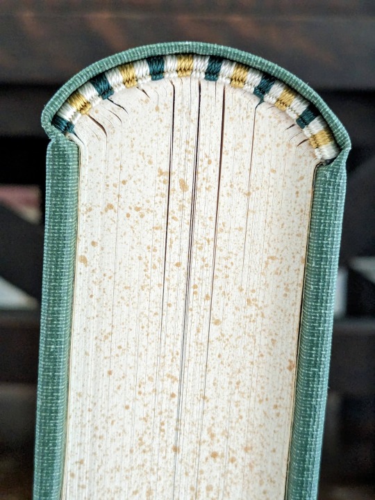
Sewing the headbands was my absolute favorite part. I was encouraged to try them by a lovely binder on Instagram, and I ended up completely addicted. I splurged on some fancy silk thread so I could give this fic the royal treatment it deserves! I think they look like beautiful little caterpillars.
As for the rounding and backing... I'm not going to talk about it. Nightmare. Lots of nervous sweating. Emotional agony. Next topic!
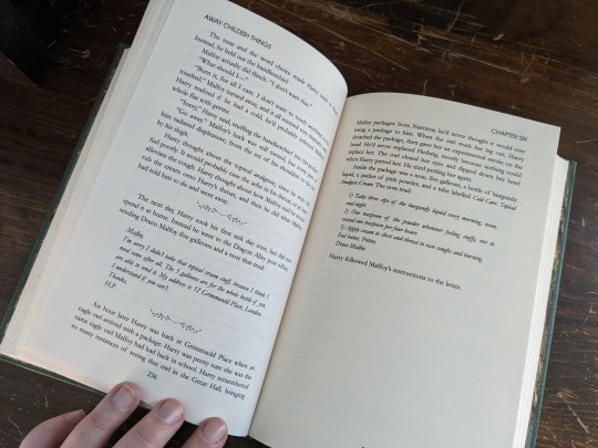
I worked on the typeset back at the beginning of January when I had some time off, and it took me a solid week of obsessive editing to complete. My sister suggested that I use Harry and Draco's patronuses for the chapter art, but there unfortunately aren't many public domain illustrations of deer and foxes playing together.
It was at that point that I also decided that I wanted the animals to match the respective ages of Harry and Draco and the tone of each chapter. For the 13 chapters I ended up editing 25 different illustrations together. The bulk of these are taken from vintage versions of Bambi and Reynard the Fox. It's possible that a few stock images from 1980s nature books snuck in there, but I did my best to keep them all pre 1925.

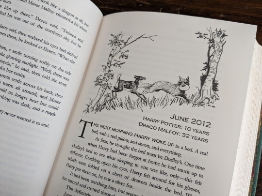


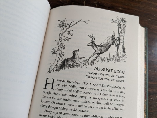


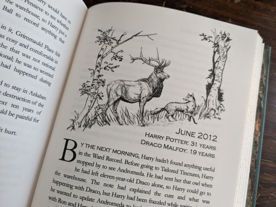


I'm not a skilled editor, and some of these are worse than others, but I'm quite proud of what I was able to cobble together. On the final page I put a young fox and deer running off together. I wanted it to seem like Harry and Draco's inner children had been freed.
I'm a bit embarrassed to say that this bind took me about 4-5 months to complete! I started in early January, and went wildly off track learning how to round, back, and sew headbands. And then I was hit by some killer creative block that only lifted last week!
There are still many things I could improve on, but I'm so proud of everything that I learned and accomplished with this bind! A big thank you to lettered for inspiring me with such a wonderful story. <3
360 notes
·
View notes
Text


My hot wife has arranged for us to have my Noir AU (both installments) bound by the awesomely talented @fantailpress and it's SO BEAUTIFUL!!! 😭😭😭😍🥰🤩 This type of binding is called "tête-bêche" or "head to foot" and I love it so much!
85 notes
·
View notes
Text
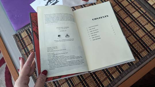
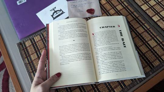
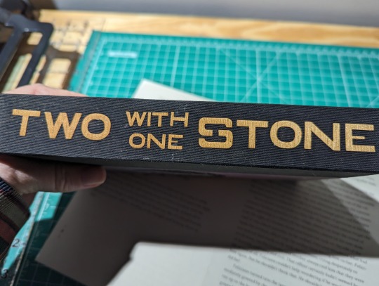
Two with one Stone
By Captainofthefallen | @captainofthefallen
word count: 177,528
Fandom: Star Wars Knights of the Old Republic


I was reached out to last year by a friend of the author about creating an author's copy of this story. And I was very excited to get to work on another Star Wars story.
I used a paper I had marbled at the '23 Renegade Retreat for the cover and I worked to incorporate some subtle elements into the design.
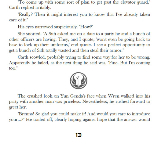
The cover titling is done in a font called Old Republic and I tried to get as close to matching the game font and color for the author name and summary section. The back image and scene breaks are the symbol of the Old Republic.

I used a double sided paper for the end pages with a purple geometric pattern on one side and stars on the other.

I also pulled in the coloring of Revan's orange and purple lightsabers for the titling and chapters headers.

I had a lot of fun setting up the chapter titles in both the English Alphabet and Aurebesh.
Had a fun little scare with this story. The story had been written 5 years ago. I had finished typesetting the whole story and would be printing it next time I got to it. Life got in my way a bit and I had to wait a week to print. When I got back on the computer I decided to just double check everything one last time before printing and I noticed that the completed date no longer said 2018 but 2023. So I jumped to the end and discovered that the author had added a new chapter the night before! 😮Luckily I hadn't started printing so I was able to add it into the book.
42 notes
·
View notes
Text
My hot wife has arranged for us to have my Noir AU (both installments) bound by the awesomely talented @fantailpress and it's SO BEAUTIFUL!!! 😭😭😭😍🥰🤩 This type of binding is called "tête-bêche" or "head to foot" and I love it so much!
85 notes
·
View notes
Text
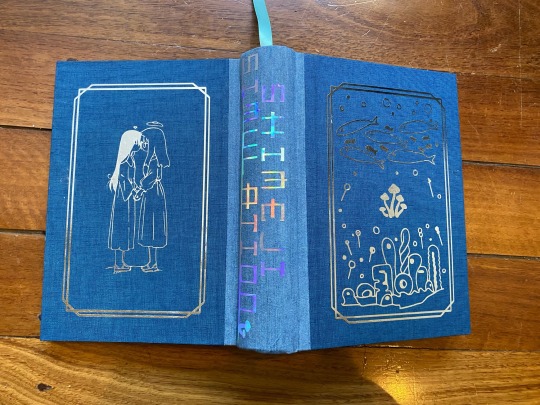


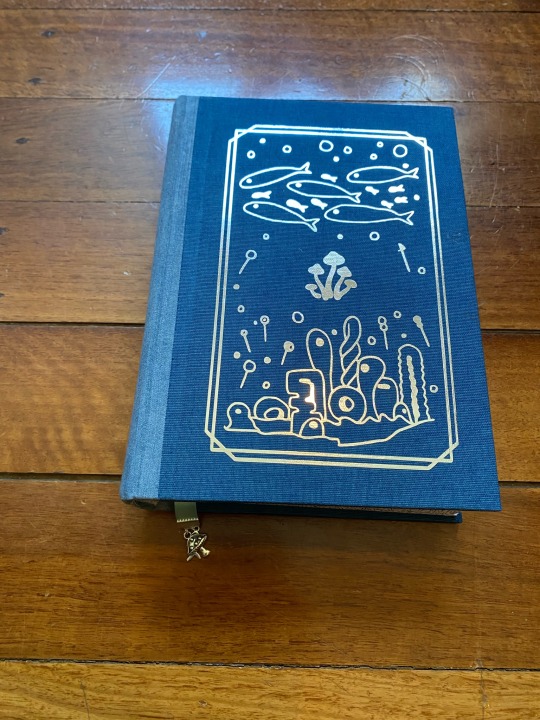

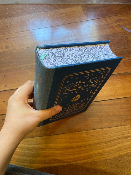

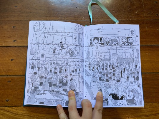
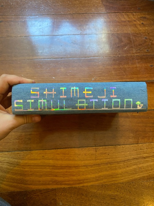

One-volume binding of Shimeji Simulation, one of my favorite mangas of all time. Folio size, Polar Duo, metallic silver HTV + case (with a little hole so you can see the girls being tender together 💙)
I made this one for a friend who mentioned that he'd be interested in reading the manga, but preferred to read manga in physical form. There's no licensed English translation OR print run of this, so I decided to make my own - I downloaded the Orchesc/a/ns translation/scan on MangaDex, compiled it all into a single volume, and reversed the PDF page order before imposing it into signature-form, so it can be read right-to-left, as intended! The edge art is hand-drawn by me, meant to mimic those geometric doodles that show up throughout the story. Hand-sewn headbands, to pull it together! And a little mushroom + fish charm bookmark, because OBVIOUSLY!
Fun fact: this is the first book I've ever bound that's been too chunky to fit in my home guillotine. It was nearly too big for my bookpress, too - but only nearly.
357 notes
·
View notes
Text
The Bolthole by aideomai and Tepre
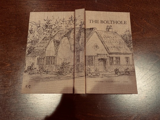
I bound this fic a month or two ago for the Renegade Guild’s Pacific Northwest server exchange, and it finally reached the recipient. It’s a lovely Drarry fic about a hoarder Harry who lives in a cottage, and Draco comes to stay with him. I printed the cover design with a laser printer on Japanese book cloth, and I was delighted with how it gave it the feel of a much older book.


The endpapers are homemade paste papers, with the book edges painted to match.
222 notes
·
View notes
Text
Fanbinding: Heart of a Volcano Series by @zimriya

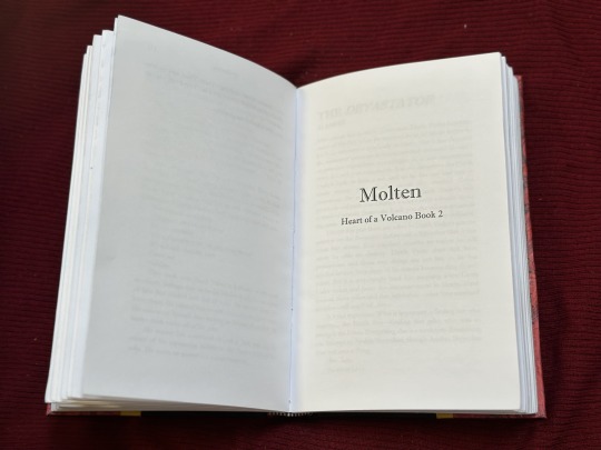

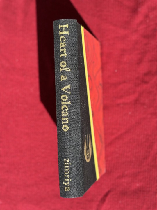
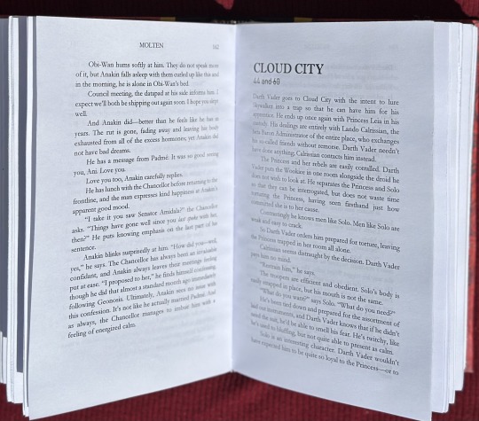
Summary: Obi-Wan Kenobi finds himself mated to Anakin Skywalker. Things are only slightly better because of it.
My biggest project of Binderary was this bind of Igneous, Molten, and Volcanic by zimriya. I read these fics last year and they basically took over my brain. I'm in love with the comparison between Obi-Wan's pov and Anakin's pov of their relationship.
This is definitely the most creative I have gotten with my covers so far! I'm still very new to this but I really wanted to try something special and different with this one. 3 fics, 3 stripes on the cover (if we want to get crazy with symbolism, I'm thinking black=igneous, red=molten, and yellow=volcanic). The paper on the front called out to me for this fic for obvious reasons. This is the second and biggest text block I've ever sewn together (12 signatures) and I think I'm getting better at it. I had fun typesetting the fic and including the age and location marks at the start of each section. Decorating the side was an interesting challenge. I initially used a gold foil quill to trace the text and Jedi symbol on the front but then decided it needed more definition. I tried one of the paint pens recommended in one of the workshops and fell in love. I can't BELIEVE how well the author name came out! The fact that my hand was steady enough to get the outline is crazy.
I'm really happy with how this turned out!
134 notes
·
View notes
Text
I decided months back that when we eloped I wanted to give B a hand-bound book of poetry and journal entries I’d written about him from the beginning of our relationship until now, ending with my vows. @a-gay-old-time helped me make this desire a reality and executed it with so much care and attention to detail. It is perfection from the color scheme to the ocean/anchor motif. I am enraptured and I hope B loves it as much as I do.


652 notes
·
View notes
Text
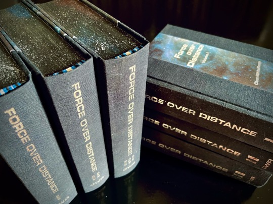
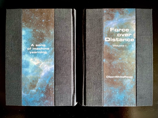
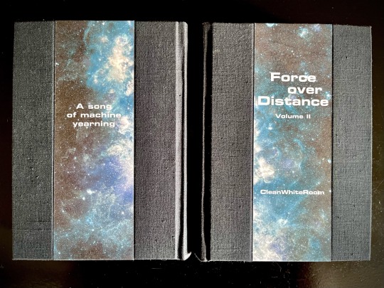
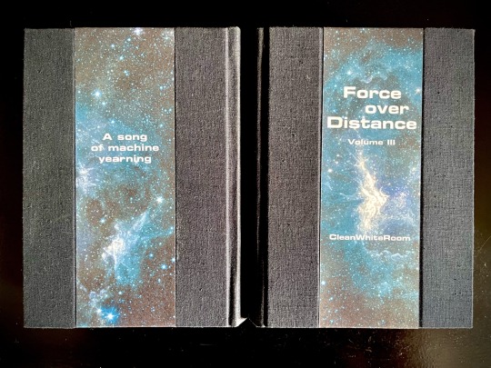

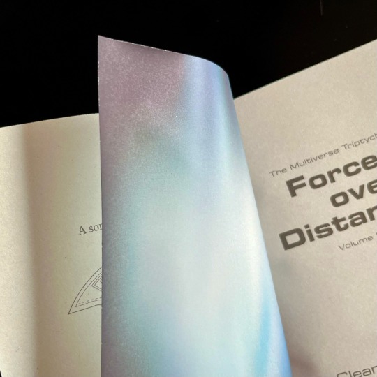

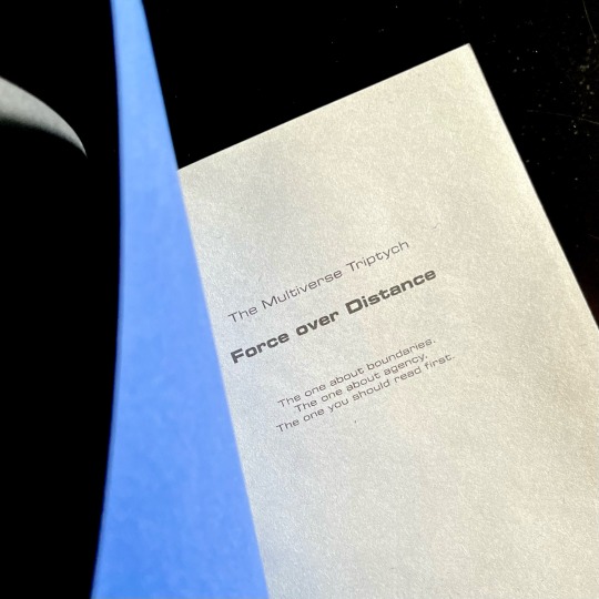
My magnum opus, the jewel of my Binderary round-up, the result of four months of hard work (that is to say, a lot of force applied over distance), the project affectionately known as The Motherfuckers (because it was rather unclear if I was going to finish these books or if they were going to be the end of me).
Force over Distance by cleanwhiteroom. It is currently also on AO3.
I was first introduced to this incredible story by a dear friend, who first sold me on actually watching SGU, and then said that they remember this fic since like 2011, which is always a promising sign. I went digging and found out I was in luck - the story was being rewritten and reuploaded on the author's blog. The next two weeks are described by the same friend as "one of the scariest moments in our cohabitation" as I'd spent literally every waking moment injecting the story directly into my eyeballs, and let me tell you, I'd not been doing a lot of sleeping at that time.
Then I gathered up my courage and reached out to CWR re: my burning desire to bind this story. And the rest, well. Let's dig into it, shall we?
This was my first time typesetting 540k words. Considering I tend to prefer larger font sizes for increased legibility, it was immediately obvious that this was going to be a multivolume project. I settled on three, as it's the relationship between three individuals that forms the core of the story.
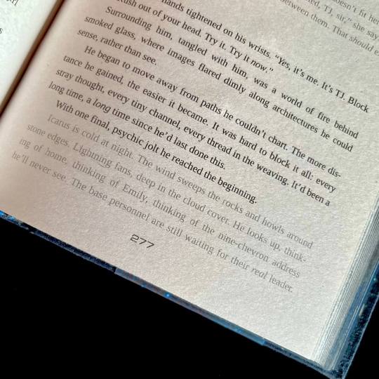
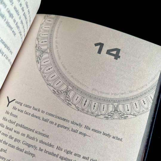
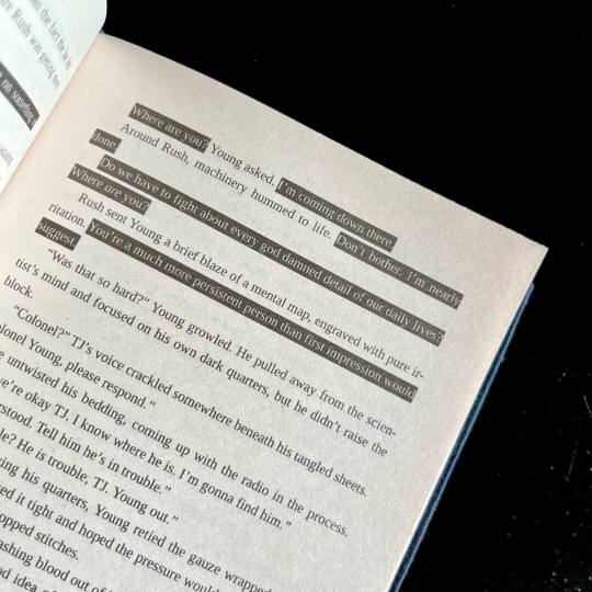
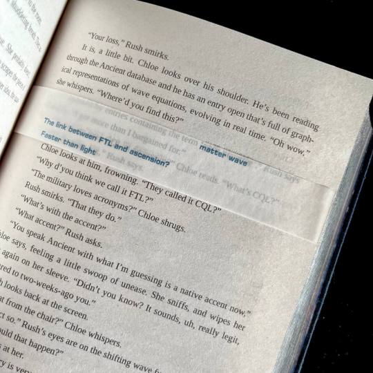
I also knew I wanted to keep the typeset in black and white, but play around with light and dark a lot. So I did. One of the first design idea I actually had was the way I wanted to handle projected speech. Mental link between Young, Rush and Destiny is THE most vital part of the story, and I wanted to make it immediatly obvious. I also wanted to be able to take one glance at the page and tell how much of the action is actually just two guys staring each other down :) Hence the blackout effect of thoughts being represented as light over darkness.
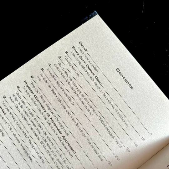
I also wanted to preserve as much of my reading experience as possible. So I saved all the chapter quotes/summaries in the TOC, and hid the chapter content warnings in the frame of the gate that marks the beginning of each chapter. For most of the chapter the warnings stay the same, so after a while you stop really noticing them, but then you open a new chapter and see that the familiar shape of the words has changed, and get this UH-OH feeling. Which, I think is very much how it works in my design, because when the warnings change there's usually another line of text added.
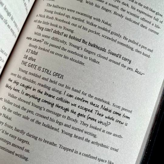
For flashbacks and dream sequences I switched from italics to a lighter shade of gray. I woudn't say it's more legible per say, but it's in keeping with the overall light/dark theme.
There are instances of people using handwritten notes in the story. I collected more than a dozen of assorted handwriting fonts, with each character having their own "handwriting". So when, for example, someone begins writing in someone else's hand, you immediately know it.
The most insane, labor-intensive part of the typeset, however, was the way I decided to handle the Ancient translations. CWR's gone through the trouble of setting up hover-to-discover for it, which gives you a very different reading experience than, say, having the translations in the endnotes. So, naturally, I said to myself that I want to replicate that, and footnotes just won't do the trick. So. Every instance of Ancient in the text has an underlay of light gray Ancient script. And an OVERLAY of paper vellum with the translation printed in blue. Now, not to toot my own horn too much, but if looks SICK AS FUCK. You also MAYBE SHOULD NOT LIVE LIKE THIS. For the two copies of this work I had to cut up 10 sheets of vellum into strips, and then spent from 20 minutes to an hour per volume tipping the strips in their proper places. I then had to wear kinetic tape on both my hands to help with the joint pain. (It was worth it.)
Now for the title spread. It is also paper vellum that you see as soon as you turn the first page (the half-title), and see it covering the title of the book and author's name. And then you turn it. And the shields sing the matter wave of Destiny through the black. And yeah, I think that's very, very clever of me, actually.
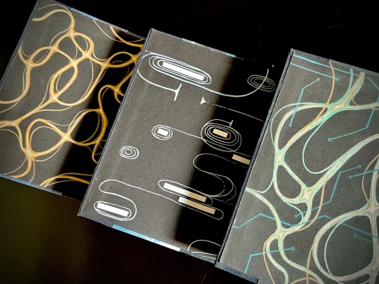
Then, of course, were the endpapers. All 12 of them are unique abstract paintings done on black cardstock by hand with brush pens and correction tape, I scanned a sample of each set for posterity. All of them are my interpretations of characters' midscapes. For volume 1 I went with the fire wind of Rush's thoughts. Volume 2 was for Young, and I went for the reverse blackout poetry effect (because for all the mental talking they do, the unprojected thoughts are opaque to their counterparts) and all the loops, hairpins and blocks he does. Volume 3 is for the combination - Rush's fire wind, changing its color to match the circuitry pattern of Destiny's AI.
The rest, in comparison, is easy. All volumes are stitched with 3 strands of embroidery floss, a combination of black, blue and silvery-gray. The French double-core endbands are sewn in the same color scheme (though with a different shade of blue and gray switched for white for added contrast). The edges are painted and splattered to look like space.
The covers feature my (signature at this point, I guess) half-cloth river pattern, with the base being dark blue linen and the printed parts being Spitzer telescope images of the W51 star forge, Jack-O'-Lantern Nebula and the Eagle Nebula (courtesy of NASA), waxed by hand for added sheen. The spines are foiled in silver with a foil quill.
Each set is 5 pound of solid hand-crafted book, with one set being my personal copy, and the other sent as a gift to the author.
And that's it, folks! This has been an incredible project to work on, and I'm very proud of what I achieved with it.
#did I share this yet?#don't even care because these are GORGEOUS and so incredibly amazing#fanbinding
426 notes
·
View notes
Text
Fanbinding: Heart of a Volcano Series by @zimriya
Summary: Obi-Wan Kenobi finds himself mated to Anakin Skywalker. Things are only slightly better because of it.
My biggest project of Binderary was this bind of Igneous, Molten, and Volcanic by zimriya. I read these fics last year and they basically took over my brain. I'm in love with the comparison between Obi-Wan's pov and Anakin's pov of their relationship.
This is definitely the most creative I have gotten with my covers so far! I'm still very new to this but I really wanted to try something special and different with this one. 3 fics, 3 stripes on the cover (if we want to get crazy with symbolism, I'm thinking black=igneous, red=molten, and yellow=volcanic). The paper on the front called out to me for this fic for obvious reasons. This is the second and biggest text block I've ever sewn together (12 signatures) and I think I'm getting better at it. I had fun typesetting the fic and including the age and location marks at the start of each section. Decorating the side was an interesting challenge. I initially used a gold foil quill to trace the text and Jedi symbol on the front but then decided it needed more definition. I tried one of the paint pens recommended in one of the workshops and fell in love. I can't BELIEVE how well the author name came out! The fact that my hand was steady enough to get the outline is crazy.
I'm really happy with how this turned out!
134 notes
·
View notes
Text
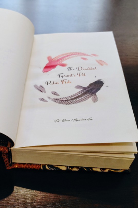
So. I know I just did a binding of The Disabled Tyrant's Pet Palm Fish, but that was a lectern book, and it's been tough to get a lectern binding that I'm completely and unreservedly happy with. If more practice is what it takes, then I'm game! But in the meantime.... this is the fish book. The romancing a fish book. The impatiently waiting for a fish demon to..... devour my essence book. The 'my servant thinks I'm fucking my fish' book. The fishpreg book. The fish themed wedding book. What, was I supposed to NOT use my exciting new fish leather??

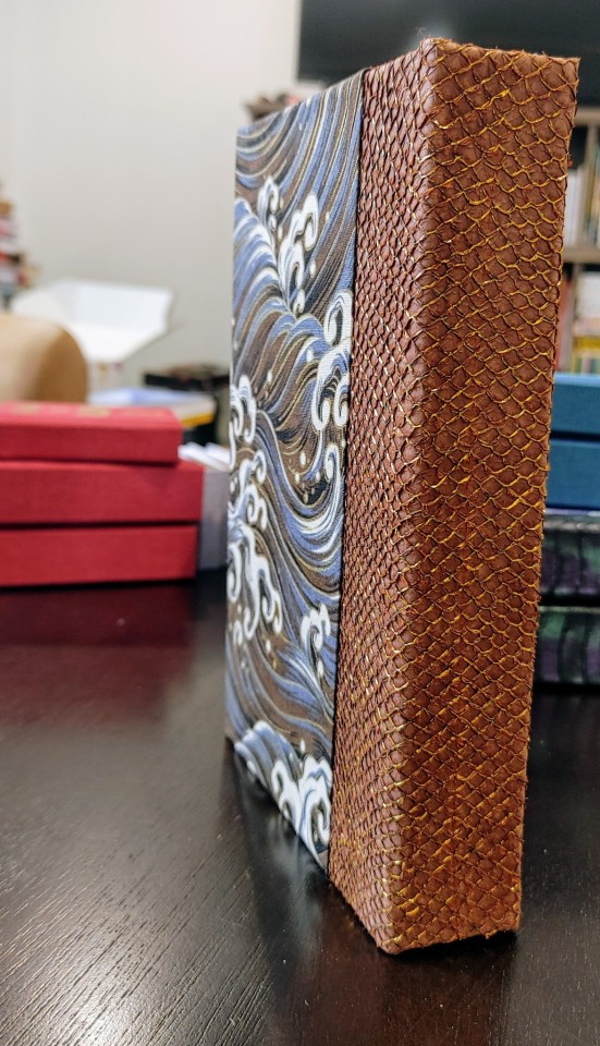
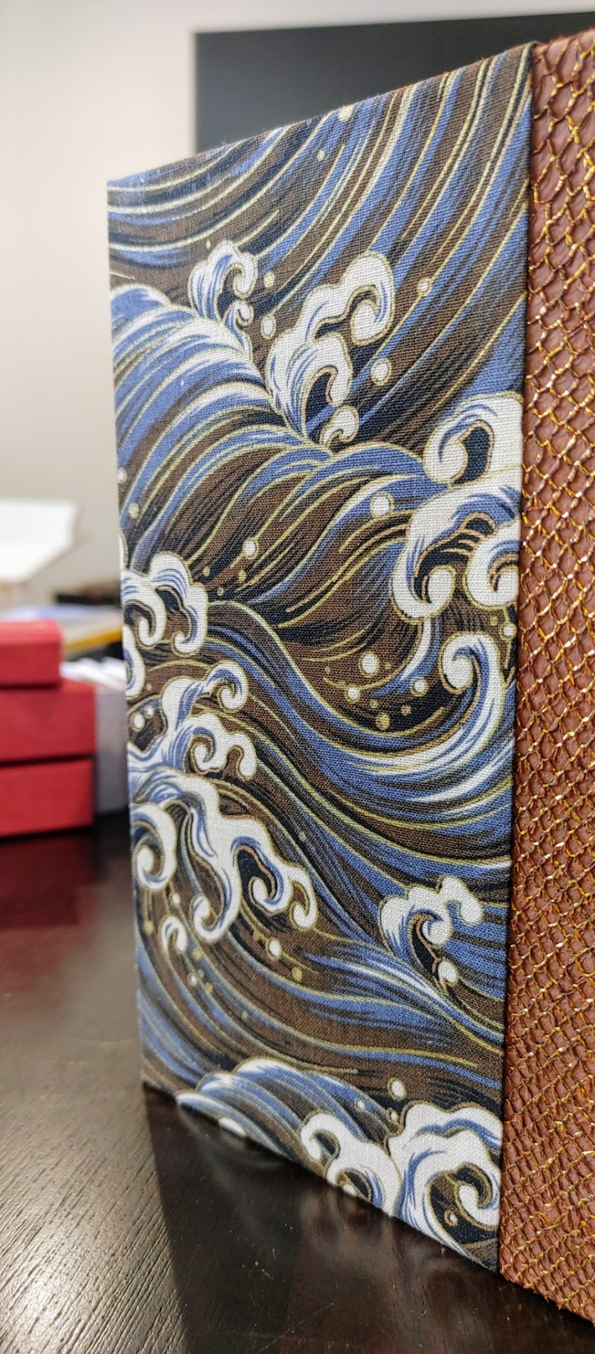
Now, the struggle with fish leather is thst it comes in very irregular oval-y shapes. I wanted the spine to have the right weight, so I cut the biggest rectangle I could wrangle from the hide, and belatedly realized my remnants weren't large enough to get good corner pieces. So that's something to consider in the future! But despite that, the fish handled like a dream, the gold and brown aligned BEAUTIFULLY with a wave fabric I had in my stash, and I shamelessly went back to the scale themed endpaper well. I usually don't like repeating myself so quickly, but I had a lot of fun designing this typeset, and this story is just a delight on every level!


296 notes
·
View notes
Text
My magnum opus, the jewel of my Binderary round-up, the result of four months of hard work (that is to say, a lot of force applied over distance), the project affectionately known as The Motherfuckers (because it was rather unclear if I was going to finish these books or if they were going to be the end of me).
Force over Distance by cleanwhiteroom. It is currently also on AO3.
I was first introduced to this incredible story by a dear friend, who first sold me on actually watching SGU, and then said that they remember this fic since like 2011, which is always a promising sign. I went digging and found out I was in luck - the story was being rewritten and reuploaded on the author's blog. The next two weeks are described by the same friend as "one of the scariest moments in our cohabitation" as I'd spent literally every waking moment injecting the story directly into my eyeballs, and let me tell you, I'd not been doing a lot of sleeping at that time.
Then I gathered up my courage and reached out to CWR re: my burning desire to bind this story. And the rest, well. Let's dig into it, shall we?
This was my first time typesetting 540k words. Considering I tend to prefer larger font sizes for increased legibility, it was immediately obvious that this was going to be a multivolume project. I settled on three, as it's the relationship between three individuals that forms the core of the story.
I also knew I wanted to keep the typeset in black and white, but play around with light and dark a lot. So I did. One of the first design idea I actually had was the way I wanted to handle projected speech. Mental link between Young, Rush and Destiny is THE most vital part of the story, and I wanted to make it immediatly obvious. I also wanted to be able to take one glance at the page and tell how much of the action is actually just two guys staring each other down :) Hence the blackout effect of thoughts being represented as light over darkness.
I also wanted to preserve as much of my reading experience as possible. So I saved all the chapter quotes/summaries in the TOC, and hid the chapter content warnings in the frame of the gate that marks the beginning of each chapter. For most of the chapter the warnings stay the same, so after a while you stop really noticing them, but then you open a new chapter and see that the familiar shape of the words has changed, and get this UH-OH feeling. Which, I think is very much how it works in my design, because when the warnings change there's usually another line of text added.
For flashbacks and dream sequences I switched from italics to a lighter shade of gray. I woudn't say it's more legible per say, but it's in keeping with the overall light/dark theme.
There are instances of people using handwritten notes in the story. I collected more than a dozen of assorted handwriting fonts, with each character having their own "handwriting". So when, for example, someone begins writing in someone else's hand, you immediately know it.
The most insane, labor-intensive part of the typeset, however, was the way I decided to handle the Ancient translations. CWR's gone through the trouble of setting up hover-to-discover for it, which gives you a very different reading experience than, say, having the translations in the endnotes. So, naturally, I said to myself that I want to replicate that, and footnotes just won't do the trick. So. Every instance of Ancient in the text has an underlay of light gray Ancient script. And an OVERLAY of paper vellum with the translation printed in blue. Now, not to toot my own horn too much, but if looks SICK AS FUCK. You also MAYBE SHOULD NOT LIVE LIKE THIS. For the two copies of this work I had to cut up 10 sheets of vellum into strips, and then spent from 20 minutes to an hour per volume tipping the strips in their proper places. I then had to wear kinetic tape on both my hands to help with the joint pain. (It was worth it.)
Now for the title spread. It is also paper vellum that you see as soon as you turn the first page (the half-title), and see it covering the title of the book and author's name. And then you turn it. And the shields sing the matter wave of Destiny through the black. And yeah, I think that's very, very clever of me, actually.
Then, of course, were the endpapers. All 12 of them are unique abstract paintings done on black cardstock by hand with brush pens and correction tape, I scanned a sample of each set for posterity. All of them are my interpretations of characters' midscapes. For volume 1 I went with the fire wind of Rush's thoughts. Volume 2 was for Young, and I went for the reverse blackout poetry effect (because for all the mental talking they do, the unprojected thoughts are opaque to their counterparts) and all the loops, hairpins and blocks he does. Volume 3 is for the combination - Rush's fire wind, changing its color to match the circuitry pattern of Destiny's AI.
The rest, in comparison, is easy. All volumes are stitched with 3 strands of embroidery floss, a combination of black, blue and silvery-gray. The French double-core endbands are sewn in the same color scheme (though with a different shade of blue and gray switched for white for added contrast). The edges are painted and splattered to look like space.
The covers feature my (signature at this point, I guess) half-cloth river pattern, with the base being dark blue linen and the printed parts being Spitzer telescope images of the W51 star forge, Jack-O'-Lantern Nebula and the Eagle Nebula (courtesy of NASA), waxed by hand for added sheen. The spines are foiled in silver with a foil quill.
Each set is 5 pound of solid hand-crafted book, with one set being my personal copy, and the other sent as a gift to the author.
And that's it, folks! This has been an incredible project to work on, and I'm very proud of what I achieved with it.
426 notes
·
View notes
Text
Did just a little bookbinding project this weekend. A few days ago, I came across this prayerbook from 1895 by Lilian Montagu, an important figure in turn of the century Reform Judaism. It's a fascinating primary source and piece of ephemera - written for the needs of busy, young working-class Jewish women, with prayers for things they would expect to deal with such as going into service, having to work on the Sabbath, and getting engaged. The final prayer is for facing antisemitic persecution.
I really love trying to match historic typesets. I retyped this largely in Century Schoolbook, with the numbers in the publishing date and table of contents in Bembo Std in order to get them oldstyle, not on the baseline. (The back copy is also in Bembo Std. I don't know how I obliterated the Renegade Bindery logo.) The blackletter font in 2001 Rotunda Formata, which was the closest match to the original I could find, although it's still unsatisfyingly different in a few ways. And one little ornament on the cover from Sughayer Separates, a very very useful group of fonts for historical typesets.
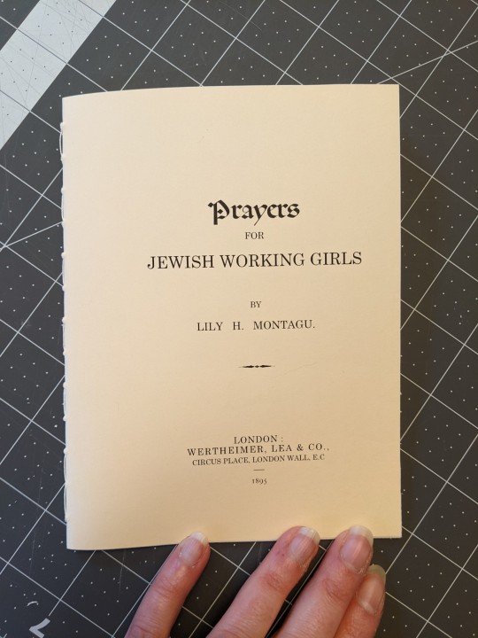


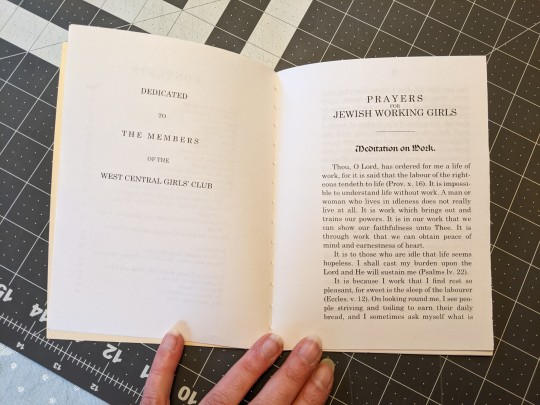
Unfortunately I'm just noticing now that I messed up the cover! Forgot about the border and the "Price Twopence." But in general, I think this looks quite a lot like the original - a credible piece of late Victorian ephemera.
Because the original is in a nonstandard page size - very tall and thin - I decided to make this version out of a nonstandard page size. I used some paper I'd had cut down to "executive" size a while back ... although I'd forgotten that my printer gets stupid with smaller page sizes, and messes up the margins. Annoying.
109 notes
·
View notes
Text

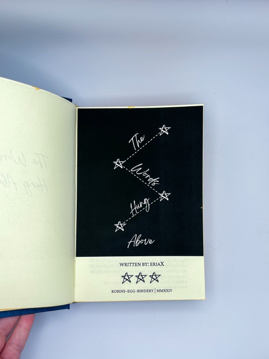
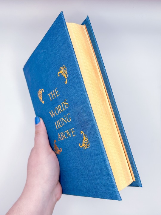
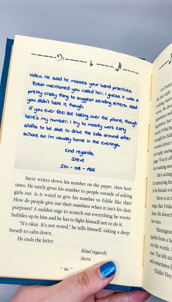


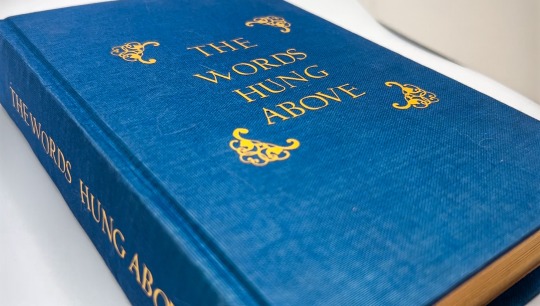
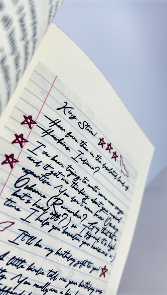
The Words Hung Above by eriaX
“I’m thinking of leaving.”
Steve almost chokes on his cigarette, hastily moving it from his lips and looking to Eddie where he stands beside him. He looks relaxed, despite the words that just left his mouth. A thin trail of smoke travels up towards the sky from his own cigarette that’s pinched between his fingers. Watching the smoke slowly fade into nothingness feels oddly foreboding. Like this small, almost-friendship he has managed to build is going to fade away, too.
He decides to hold on to it, if he can.
---------
Or, After Vecna is defeated and life returns to normal, Steve finally has a chance to become actual friends with Eddie Munson. But any potential for friendship seems lost when Eddie decides to move to Nashville to pursue music after graduating.
It’s Steve’s idea to become pen pals.
Over summer and into fall and winter, Steve battles insecurities around himself, as well as his own future and his parents’ expectations. As his friendship with Eddie deepens into something greater, Steve finds that there’s more to himself than he expected, and more to his friendship with Eddie than he ever imagined.
fic by eriaX
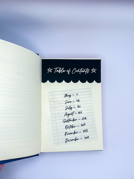
500 pages / 118,368 words
Title Font: Breathing, Crimson Pro
Body Fonts: Californian FB, The Signature, Indie Flower
Bound for the Steddie Big Bang 2023!
More info (and spoilers for the fic, beware!) below the cut!

What a project! This was an endeavor with the author for the Steddie Big Bang, and it was so fun to design the vibe of this with them! Thank you for sharing your story and this journey with me <3
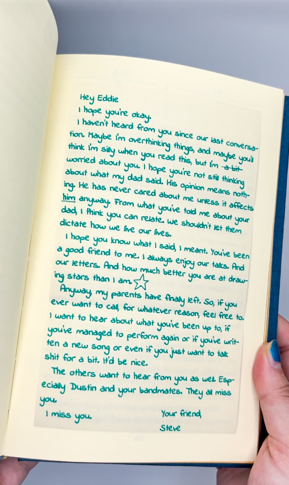
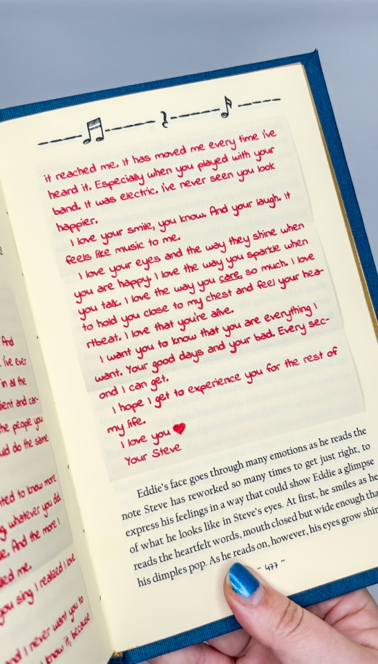
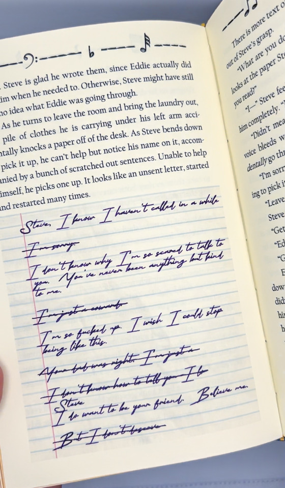
I love the letters that populate the story; if you skipped the content of them above, I highly recommend experiencing them in the context of the fic. I wanted to do something tactile to emulate them without interfering with the storytelling element; something that could stay archival in the future while also adding a dimension to the text. We selected the handwriting fonts together, and I fought the battle with my cricut to get it to write it properly. I had to go over carefully by hand to make the ink fill in well, but the result is perfect!
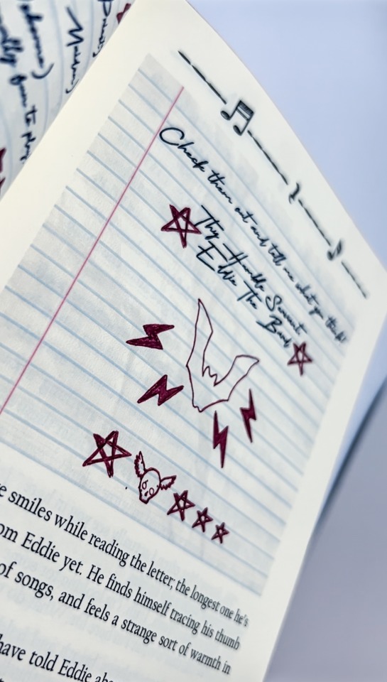
I also selected different inks as the months pass, even varying colors within Eddie's letters; I like the idea that maybe he was trying to make the letter perfect, doodling in the corners for Steve.
Music is another big device in this book, something that connects Steve and Eddie across the space between them, so musical notes and rests populate the header. Steve is Eddie's breath of fresh air amidst all the noise <3
I tried to keep the handwritten style across all the elements, including the title pages. We selected Dragonfly duo for the cover cloth, with gold accents; the deep blue color was reminiscent of the song that inspired the fic, and the gold felt fitting; the relationship that develops between Steve and Eddie being the sunlight leaking through the fear and uncertainty they face.
If you haven't checked it out yet, go read the fic!!!
121 notes
·
View notes
Text
The Silver Age by @copperbadge
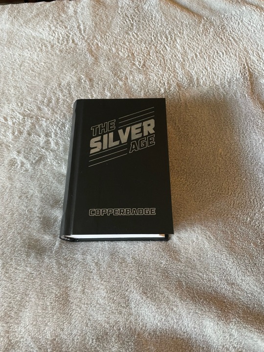

Here’s another of my fall 2023 binds that I forgot to post. Copperbadge is one of two Marvel fandom writers who helped pull me back into fanfic in 2013. This particular set of stories came a bit later, but I loved this retelling with a Tony/Bucky focus. I put the whole series in a somewhat chunky legal quarto.

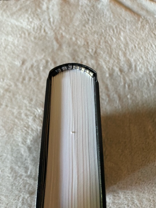
This was my first fully successful attempt at hot stamp foil, and first success with a French double core endband. I was trying for a kind of gradient, and it worked! Endpapers were a gift from Duran Binding.
Copperbadge, if you would like a copy, please let me know! I would be delighted to bind one for you if you want it.
187 notes
·
View notes
Text
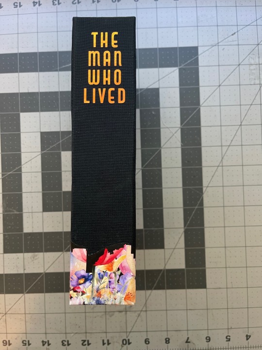
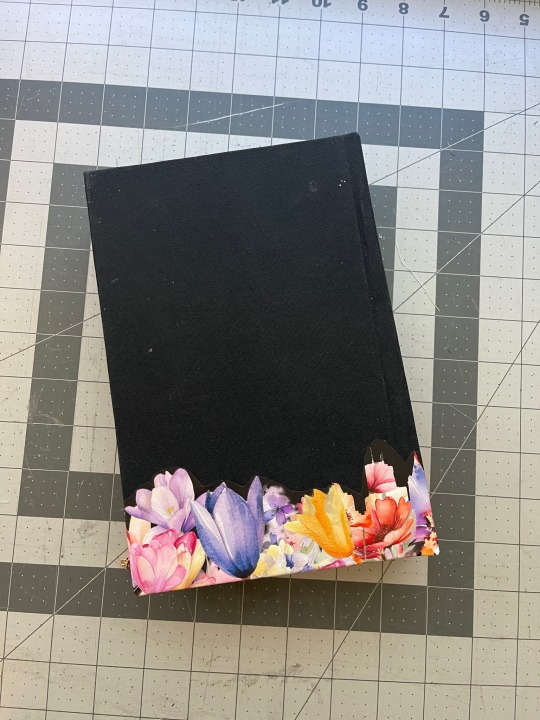
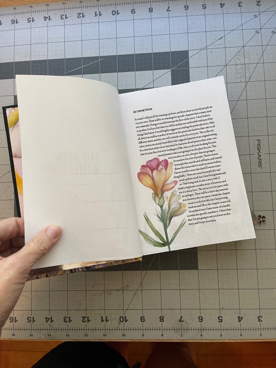
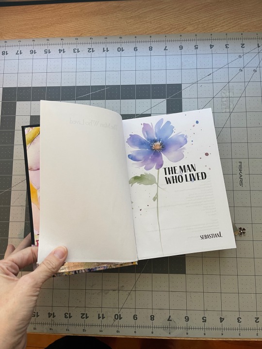
Bound: The Man Who Lived by sebastianL


Well, this was a labor of love!
I have so much to say about this bind.
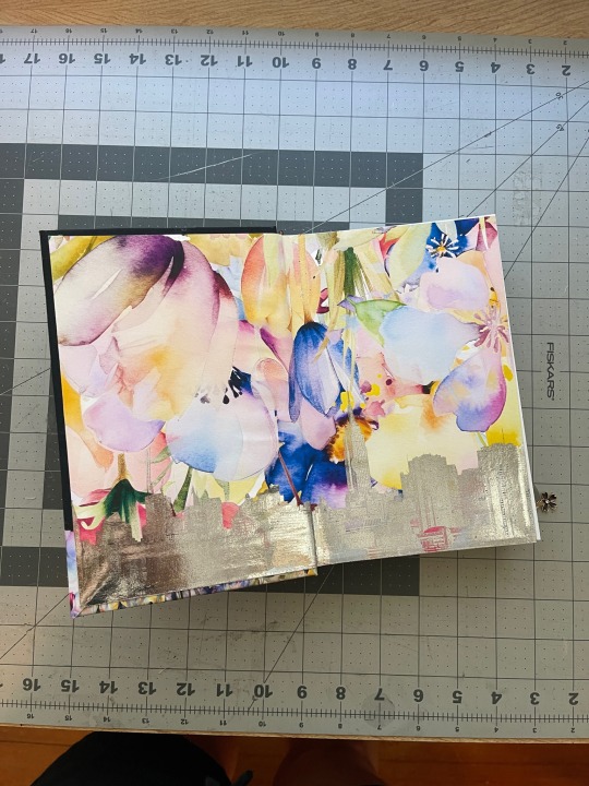
I had the idea to incorporate two themes visually in this bind - watercolor flowers (for Draco's tattoos) and New York (where he lives). I bought a set of graphics off etsy (much like I did for Grounds for Divorce and lemons) and went to town with them.
There are 42 chapters in this fic, and each chapter page has one more flower, so by the last chapter, well, there are a lot of flowers.
I wanted these pages to be more vibrant, but when I printed them, the color was bleeding through to the other side, so I had to lower the opacity on them. If this had been a shorter fic, I would have just used 26lb paper instead of 20lb, but at 685 pages, that was not an option. 😅
As it was, it baaaaarely fit under the blade of my guillotine. I definitely won't be able to trim text blocks longer than this.
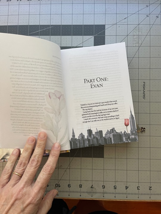
The skyline was also used a lot, even though it's the Manhattan skyline and technically Draco lives in Brooklyn but let's just call it artistic license.
The end papers are a collage of the flowers, which I then printed the skyline over with my laser printer, then foiled that.
(And let me say that my insistence on printing color pages on my inkjet and b/w pages on my laser printer meant this took forever to print and resulted in many messed up pages. I should just print the whole dang thing in inkjet. But it would take 10,000 years.)
I had a really hard time coming up with a concept for the cover. Or, rather, figuring out how to execute the concept I had in mind. Finally I remembered I had some iron on printable paper, so I printed the flower design, then cut the skyline out of it. But the paper wasn't wide enough to cover the whole front and back of the book, so on the back I had it transition into just the flowers.
Overall, I'm very very happy with how this bind came out. I love it.
Body Font: Garamond Premier
Inside title page: Fino
Cover: Capitol Capitals
P.S. Draco and I have similar tattoos (watercolor flowers) so that might be why I went in this direction. Who can say?
P.S.S. Honestly, as much as I love this bind, the best way to experience this fic is via the incredible podfic (25 hours!) by @thirdeye1234.
147 notes
·
View notes
Text
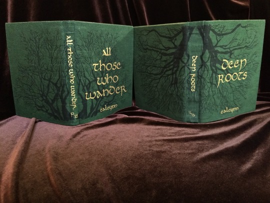


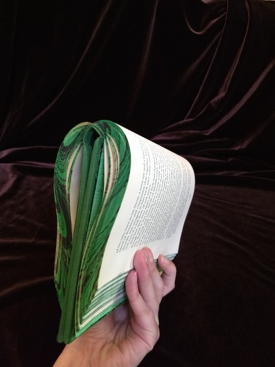
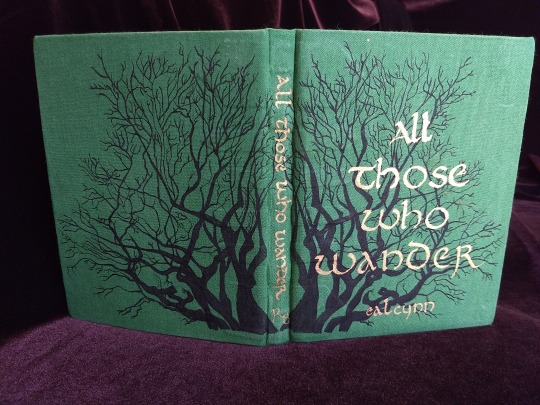
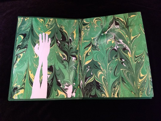
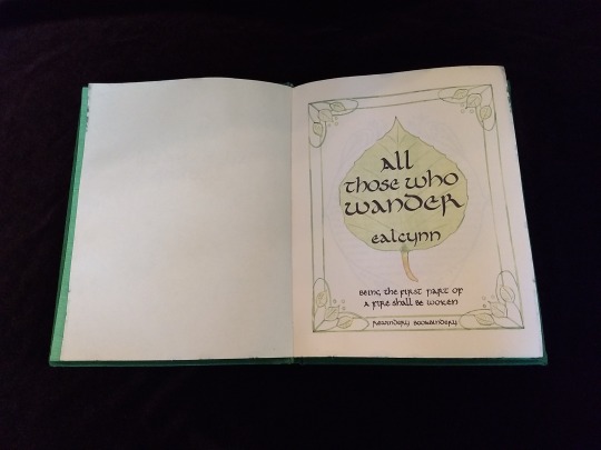
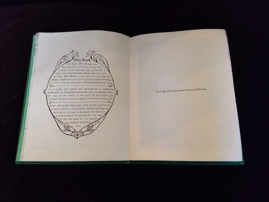

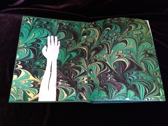
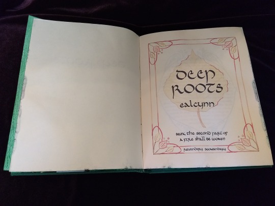
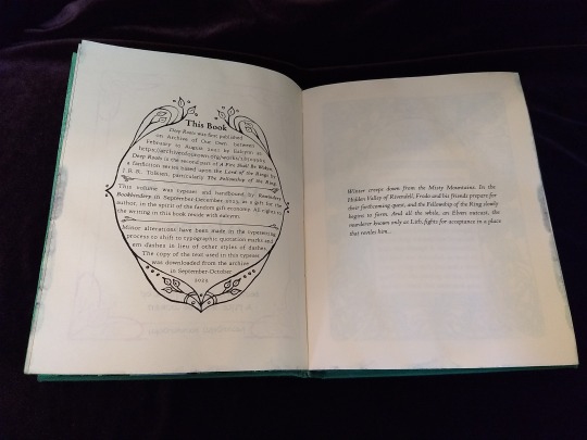
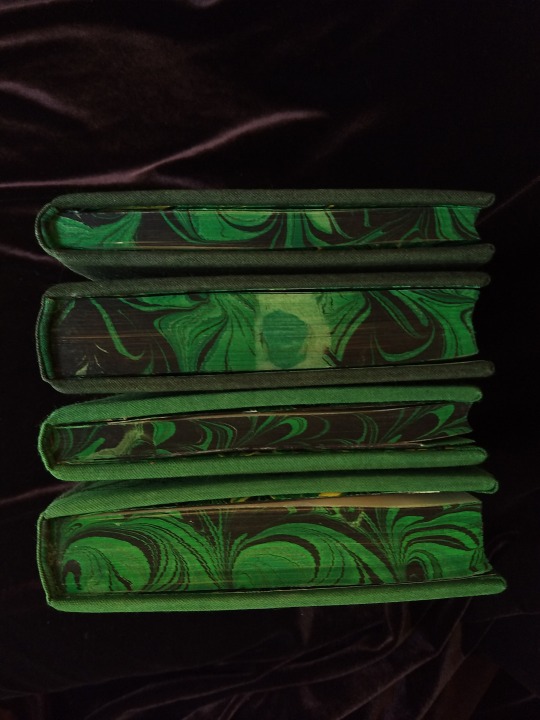


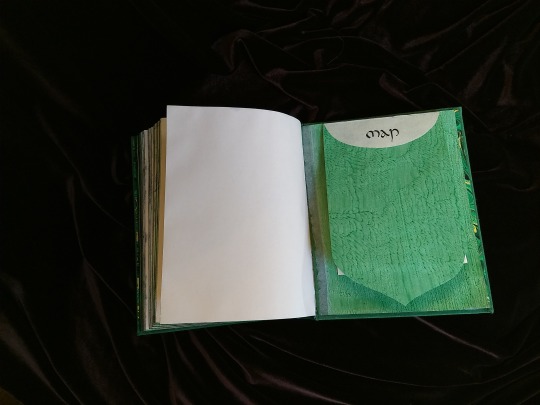

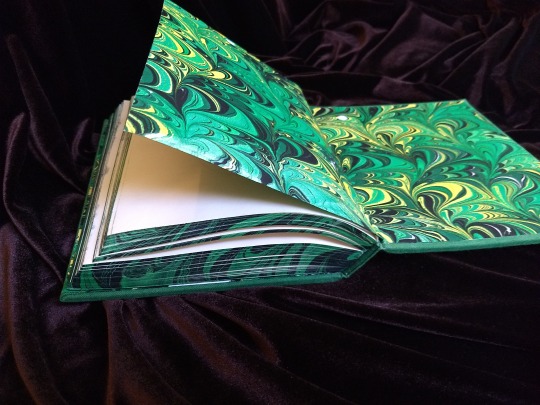

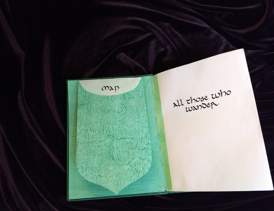

A Fire Shall Be Woken, by Ealcynn. A pair of bindings using the K118 structure, one as a gift for the author and one to keep.
Chapter page illustrations are by Alphonse Mucha, all other illustrations are hand-drawn.
I hope to make a long post later explaining the process in more depth & another to document all my mistakes, but here's the basics.
New techniques learned: Paper marbling, edge marbling, uncial calligraphy, making paste papers, drawing on bookcloth, making paste-filled cloth, fold-out maps
I began work on this project in early September and am completing the finishing touches this week.
Structures:
Binding: K118 tightback
Endpapers: Simple cloth-joined endpapers
Map fold: Turkish map fold
Materials:
Sewing supports: linen tapes
Thread: 30/3 linen thread
Spine lining: Medium weight kozo tissue bonded to linen fabric
Interior paper: Hammermill Ivory, 11x17, hand-cut to 8.5x11
Endpapers: Blick sulphite paper hand-marbled, with masked stenciled silhouettes created with freezer paper
Adhesives: Jade PVA, wheat starch paste, wheat flour paste
Covers: Davey board, laminated full thickness to half thickness
Cover fabric: Studio E shot cottons in Jungle and Emerald; filled with wheat starch paste
Cover decorations: Speedball india ink and Dr. Ph. Martin's calligraphy ink in Copperplate Gold
Inks for maps and illustrations: Speedball black india ink and a selection of watercolors thickened with gum arabic
Dip pens used for calligraphy: Combination of Brause calligraphy nibs and Leonardt tape nibs
Dip pens used for illustration: Nikko G pointed pen nib
Typesetting:
Typesetting program: Scribus 1.5.5
Body font: Coelacanth in 10 pt caption weight
Headings, titles, chapter titles, drop caps: Hand lettered uncial calligraphy, scanned
Illustrations and References:
Frames on colophon, copyright, author's notes and title page: Hand drawn, with inspiration taken from the vellucent bindings of Cedric Chivers
Frames that illustrate each chapter start: Alphonse Mucha from Cloches de Noël et de Pâques
Cover illustrations: Referenced from a photograph of an European beech tree found on iNaturalist.org
Maps of Imladris: Hand drafted with inspiration from the maps of Barbara Strachey, and Daniel Reeve
Map of Eriador: Traced from a map by Karen Wynn Fonstad, with edits made to coordinate with the geography of the fic
Frames on maps: Referenced from a drawing by Alphonse Mucha that @zhalfirin found for me
Special Thank Yous:
To the tightback council of problem-solvers in the Renegade server: Zhalfirin, Eka, @spockandawe who helped figure out many issues with the structure and technique
To the marbling experts in the Renegade server: Marissa, Aether, AGlance, Jenny, Catz, Badgertide, Rhi, and everyone else who helped me figure out beginnner marbling
To Spock for finding the K118 structure and introducing it to the server!
And to Bruce Levy, who discovered the method and shared his discoveries freely with the bookbinding and conservation world.
223 notes
·
View notes