
pixlposts
Pixel Posts
Posts on Design and Technology by Vidit Bhargava
129 posts
Don't wanna be here? Send us removal request.
Last Seen Blogs

connor-313248317-51
cawkner

titou-nz
Les voyages de Titou

notwordsspoken
Shitposting my way to the top

creamybeemovie69
Jam.

Text
Pixel Quiz January 2019
Q1. Designed by Travis Kochel, X uses the OpenType font features to create a useful utility out of a type-face. For example: Typing 50 using the X font ren- ders it into a semi circle. The reason behind creating X was to make it easier to edit a particular visualelement in graphic design software. The existingmethods would often require recreating the element every time you wanted to make an edit, and thus X was born. X uses Open Type’s Stylistic alternativesto provide different visual styles such as bubbles and floating rings. A photo of X in the Bubbles stylisticalternate is shown. What is the X font used to generate?
Q2. “They told him they’d have to cut his pocket money if he keeps doing it, so he got really angry and chucked his X out of the window.” Is a quote about Y, from a popular book. The interesting bit is, the incident quoted took place in the summer of 1994 and the X wasn’t released until December 1994, and therefore Y couldn’t have had a X in 1994. A certain Wiki suggests that X could’ve been a prototype that was pre-ordered directly from the manufacturers & knowing Y’s behaviour, that doesn’t sound like a far fetched idea, especially given the job Y’s dad had at a drill manufacturing facility. Who is Y, and What is X?
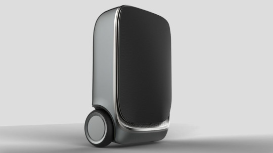
Q3. Made by a Chinese company called 90Fun, thePuppy 1 is a smart suitcase that follows you around, so you don’t have to drag it. To add a “gravity adap- tive system”, something crucial to it moving all by itself, 90Fun collaborated with X, which uses this technology in its infamous product line. In 2018, Xbecame famous for creating their “SE 3” product, which grew in popularity after a certain category of services saw a meteoric in major US cities. The SE3 major competitor in thismarket is Xiaomi. Look at the image and identify X, and what is X’s SE3 product?
Q4. Biohax Technologies is a Sweden based technology com- pany that specialises in a certain type of gadget X. X is a rage amongst the Swedes, designed to make life easier for its users, X makes it convenient to unlock smart home locks, stores eTick- ets for rail travel, and also contains a user’s emergency contactinformation. Put funda and explain what is X, and how’s it inte- grated into people’s lives.
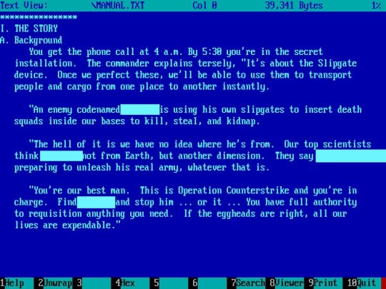
Q5. This a screenshot from the original manual of a popular game. It’s the story behind the game (popularly, it’s assumed that the game didn’t have any). Identify the game.
0 notes
Text
The Laziness of the Home Tab
If you use apps and websites like I do, you’ve probably seen a “Home” tab on many them. It’s usually meant to tell the user that it’s the first screen in a number of screens. It’s where you start your navigational journey.
I’ve been thinking about the name “Home”. It’s not really an intuitive name for the first screen on your tab. It doesn’t contain any meaning that’s relevant to the screen’s function. It’s a lazy title slapped to the screen that’s meant to be the screen that’s shown to you when you open an app and doesn’t offer any information abou the screen at all. I feel, It can definitely be labelled better. So, I looked closely at the tab bars of some apps, and indeed, digging through the UI of the default apps on my iPhone, I was able to find examples that support my idea. There isn’t a single default iOS app that contains ‘home’ as the title of a tab
Here are some examples:
Notice how each of the different states in the apps have an icon that‘s contextual and a title that‘s relevant to the purpose of the tab? There’s meaning associated with each of the names.
Other Examples
Twitter Clients
The twitter app on iOS is guilty of the home tab laziness. They call their timeline “Home”. On the other hand, Tweetbot calls it’s timeline “Timeline” (for some reason their icons don’t display text labels, but the navigation bar titles suggest these names), a slightly more appropriate title for the twitter feed.
Apollo: The Reddit Client
Apollo’s first screen is called “Posts”. It’s a simple title with icon that’s descriptive enough to let you know that it’s a text + images timeline you’re going to look at.
Instagram
Instagram uses a “Home Glyph” for its first screen. It could easily be replaced with something like “Posts”, “Feed” or even “Timeline”.
BookMyShow
BookMyShow the ticketing service also uses the home glyph, for the screen that’s supposed to let you book tickets. How about “Book Tickets”, or just “Tickets” for a title?
Netflix vs Prime Video
Netflix’s first screen is called “Home” while Amazon Prime Video’s first screen is title “Browse”. While “Browse” is fairly descriptive of the purpose of that screen, even if it doesn’t always encompass every thing that the screen does (also shows your watch list and the movies that you’re currently watching). Home doesn’t really offer any information.
There are more examples for apps that do or don’t use the Home as a tab bar button, but it’s easy to observe here, that sometimes lazy design practices easily seep into apps, and form an unhealthy tradition of sorts. There’s no reason for Instagram’s and Twitter’s timelines to be called Home. But it’s been a convenient name given to the first screen. And that tradition’s carried on.
I hope more apps switch to clearer navigation structures.
0 notes
Link
This is a really cool resource to play around with Variable Fonts. Not only can you adjust the font weight and width, but you can also adjust the ascenders, descenders, x-height and other more advanced settings in some of these fonts.
To me the difference between Variable Fonts and Static Fonts is the same as picking a colour from a grid of colours versus using an RGB colour space to pick one. Eventually, brands and designers create their own colour schemes for consistency instead of playing around with the colour space all day. Similarly, I can see designers wanting to create their own typeface-schemes which specify the attributes for different requirements like Headings, Subtitles, etc.
0 notes
Text
Pixel Quiz July 2018
Q1.When you plug your phone into a car stereo, the phone starts playing music alphabetically, this usually means that there’s one song that you’ll hear whether you want to or not. Many songs starting with the letter A have probably been ruined thanks to this quirk, but if you were to download Samir Mezrahi’s creation called “A a a a a Very Good Song” you’d be able to circumvent this problem, and be able to buy enough time to queue your music. Samir’s creation was so helpful, that when the song released, it immediately began climbing the iTunes Top Music charts. What’s so special about the song?
Q2. The word X has it’s origins in Middle English, where it meant “to roar”. Today however, it’s referred to as the onomatopoeic sound describing a low pitched noise. X is also a prominent feature in game controllers. Simply name X.
Q3. Poe’s law is an Internet adage that states that, without a clear indicator of the author’s intent, it is impossible to create a parody of extreme views so obviously exaggerated that it cannot be mistaken by some readers or viewers as a sincere expression of the parodied views.
We often see the implication of the law, when someone puts an X at the end of their post. Just so, people don’t mistake it for something genuine. Put Fundae. What is X?
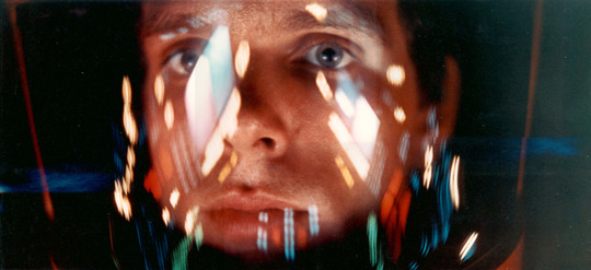
Q4. While he was designing the X for a popular movie in 2008, John Nelson hung up this poster from 2001: A space Odyssey as an inspiration. In this scene the characterDave had his helmet on, reflecting the graphics that were visible to him. The shot would end up being the inspiration for X. X went on to be a ubiquitous element of the movie. Just explain what is X and the 2008 movie.
Q5. An X attack is a dDOS attack aimed at XML parsers. An example X attack consists of defining 10 entities, each defined as consisting of 10 of the previous entity, with the document consisting of a single instance of the largest entity, which expands to a billion copies of the first entity. (Basically repeating the first defined entity, a billion times). In the most frequently cited example, the entity is a string called “LOL”. Hence the name X. What is X
0 notes
Text
Getting Started with iOS Automation
Vidit Bhargava I’ve been using the workflow app since it came out back in 2014, and over the years, I’ve been able to amass a few nifty workflows that help me increase my productivity. With Shortcuts (a successor to Workflow, which was acquired by Apple about an year and half ago), this gets taken a step further, as the app has gained some more capabilities and has Siri support, which lets users present the Shortcut’s results in a Siri Interface. So, I thought of sharing some of my favourite Shortcuts / Workflows:
Photos > PDF > Share
A simple shortcut that takes multiple photos, converts them into a PDF and then presents a share sheet to share the files. It’s a workflow that I created to share my class notes with friends back in college. You can also add a Dropbox / iCloud Drive / Google Drive upload command to upload the files to a cloud sharing service and then share its link. (I removed that after Whatsapp started allowing PDF Sharing).
Workflow | Shortcuts
Batch Resize Images
This one lets you resize multiple images to your desired size all at once, and then saves them in an iCloud Drive folder to access them later. Incredibly useful for when I need to upload images for my blog.
Workflow | Shortcuts
Live Photo To GIF or Video
Live Photos are really cool, but they’re seldom supported by websites Like Facebook or Instagram. To make them shareable one could convert them into videos or GIFs, depending on the nature of the photo.
Workflow | Shortcuts
Combine PDFs
Takes multiple PDFs and combines them into one. I’m not sure why more PDF readers don’t have this option by default. It’s such a handy tool that helps in consolidating files.
Workflow | Shortcuts
Speed Test
I found this one online but decided to a bit of customisation to get the Network Name in Shortcuts as well. So now, technically Siri can report the results for my WiFi’s speed every time I feel the need to.
Workflow | Shortcuts
Top 25 Songs
Back in the day iTunes had this cool feature which’d let you rank your songs by play count and create a smart playlist for you. This can be done by using Shortcuts in iOS now. You can even add filters to restrict the genres or artists in the list.
Workflow | Shortcuts
Device Overlay
Device Overlays are something that I often need to for my blogposts and product shots. In this shortcut it’s easy to select multiple screenshots for different devices and add overlays to them. It even masks the screenshots for iPhone X around the sensor area.
Shortcuts
Lumous Maximus
I’m a Harry Potter Fan, and I like the idea of saying magic spells to my phone. Complete with the “you must speak clearly” part! ;)
Shortcuts
Speak Clipboard
Another one that’s largely specific to the Shortcuts app, it’s a simple shortcut that lets Siri speak your clipboard items allowed, useful for proof-reading.
Shortcuts
0 notes
Text
What I want Marzipan apps to be
I’ve been observing the Marzipan* apps on Mojave for a couple of days now and there’s something that’s been nagging me.
Design paradigms on iOS are very different from that on macOS. On iOS there’s a lot of direct manipulation involved, and so it makes sense to have animations and interactions that respect that manipulation. The date picker on iOS needs to change under my finger, and it must respond to my gesture, the date picker on macOS is not that. It’s a pop down list, which makes a lot of sense for a point and click system. Buttons don’t need to be too large on macOS either, they can be much smaller.
What I hope Marzipan is about : A way to bring iOS apps on macOS so that they feel native to macOS. I shouldn’t look at them and feel as though they’re from a different world of apps. I want them to feel as native as possible.
What I hope Marzipan isn’t about : A way to bring iOS apps for developers who want make a bare minimum effort of doing it, without caring about how their apps look and feel on macOS. Such apps would stand out and would feel odd.
Apple gets to define what is Native here. But what happens if the Apps that Apple’s supplied this year don’t feel native to the platform? There’s a big responsibility on the design of these apps. And while it’s still early days and the UI will almost certainly change over time, the decisions that they make, will form the decisions made by developers in 2019. As a consumer, I don’t want iOS date-pickers on my macOS apps, ever!
--
* : I don’t usually like using unofficial names to refer to products or their features but for the lack of a better word, I’m using Marzipan to refer to Apple’s UIKit on the Mac initiative.
0 notes
Link
A unique design choice. I’m trying to wrap my head around the idea a little bit. It seems as though, On one hand, I’m not a fan of a dynamic chin being added to the phone, but on the other hand, it’s a privacy benefit, this way if an App’s trying to access the camera, you’d know because there’s a chin staring at you, plus you don’t always need a camera while using a phone. If the motorized camera is quick and durable, this isn’t a particularly bad design in my opinion.
But look at the software though! It makes Oppo’s phone look like an iPhone clone. For such a unique hardware, it’s a shame that Oppo has decided to pilfer on another OS’ UI. Unsurprisingly though, Oppo couldn’t copy the fluid interactions that the iOS UI has. From the video, the OS feels exactly what an half baked iOS for iPhone X would feel like. Horrible.
0 notes
Text
Why I prefer Markdown over Word Processing Software
Last month I completed my undergraduate engineering studies, with the submission of my Bachelors of Engineering Project, the Project was supposed to be accompanied with a 50 page report of how the project was made and what methodologies were followed.
I wrote my entire draft on an iPad app called “Editorial”. The reason was simple. Editorial provided me with two things; First, Markdown, and secondly, an automation workflow which would properly translate my draft into a Word Document, with proper section headings, et all.
Not only did I wrote those 10,000 word on Editorial, in the last 3 years I’ve switched from writing on iWork’s Pages to writing everything in Markdown, then using a word processor / Page Layout Software / Blogging platform of choice to format it, usually done through a workflow which ensures that I do minimal work.
Why do I prefer Editorial and Markdown? It gives me the freedom to write want I want to, without having to think about the formatting the document. To me that is the major problem that any word processing software has. It tries to do two things at once, it tries to layout the page while you’re writing on it. It’s a tricky balancing act and much less elegant experience to me, than to write first and then use a page layout software to create the layout that I want.
I cannot imagine writing 10,000 words on MS Word. Can you?
0 notes
Text
How does Over the Air Charging work (Truly Wireless Charging)
Vidit Bhargava
With the number of smart gadgets increasing by the day, Charging them has become a hassle. You need to charge your phones, your computers, watches, et all. at regular time intervals. And the number of wires can be staggering. One solution to this problem is Wireless Charging. Well, not exactly wireless charging but more like Induction + Resonance based Pad Charging. You place your device on a Pad and the device starts charging. These charging pads can be placed into furniture and you basically have a spot in your table where if you were to place your phone, your phone would charge.
But this isn’t truly wireless. To begin with, you need contact with a special part of the surface to charge your devices, and secondly, that pad needs to be connected to a power source too, and generally supports a single device. So what you’re doing with this kind of wireless charging is just replacing the charging cable with a pad.
What if, you didn’t need all the charging paraphernalia? What if charging happened over the air? You plug in a charger. And all your devices in the room start charging, without the need of any cables. Sounds like Science Fiction, and to be honest a little scary too, Most people I’ve talked to about it, have questioned the sanity of having “electricity through the air”. But this is a sort of technology which is on the horizon of becoming popular and more than that, it’s just about as safe as WiFi.
While exciting, Over the Air charging is still in a nascent stage, and has been approached at with multiple angles, which vary in their implementation, ef ciency and device safety. I’ll be discussing three of the popular Over the Air Charging technologies for this piece:
Radio Frequency Charging
The way this works is, Radio Waves are essentially Electromagnetic Waves (much like X-Ray, microwaves and infrared waves). A device (Hub) transmits high frequency radio waves at a fixed frequency. The phone or any other smart device can receive those waves at that fixed frequency and convert the transmitted Alternating EM Wave, to a Direct Current Wave. This is effectively how FM Radio works but instead of data, it’s power that the user gets.
Since, the EM Wave propagation attenuates (reduces) over a distance. The closer your device is to the radio wave transmitter, the faster it’ll charge.
Is it Safe?
Yes. High frequency radio waves cannot penetrate human skin. And since most of the charging technologies use only the magnetic components of EM Wave, there isn’t much of a risk anyway.
Why is it not taking the world by the storm?
The efficiency is not upto the mark, i.e. it just takes too long to charge the device at the moment. Given, that a lower efficiency isn’t much of a concern once your device is consistently charging, but there’s another concern around consistent charging. Lithium Ion Batteries only have a limited number of charge cycles they can go through, and if you’re consistently charging for long durations, that could adversely affect your device’s battery. Also, the efficiency isn’t even high enough to charge your phone while you’re using it. The charging efficiency i.e. the power it can transmit over a distance, to charge your device in a reasonable amount of time compared to current charging standards, is a major hurdle for these devices to become reality.
The efficiency though, is merely an end result of what a 3 part balancing act between the desirable power, the safe limits of power transmission via radio waves, and the distance to which it can charge at the desired efficiency. You could have higher efficiencies but would it be safe for anything other than an in-lab environment? Or will the range be big enough?
And the other reason why companies like Power Caster and WattUp have not been getting much traction is, that they need strategic partnerships for the phones to have receivers and converters which can receive their RF Transmissions and convert them to usable energy to charge the device.
Ultrasound Wave Charging
Instead of Radio Waves, uBeam’s wireless chargers use Ultrasound Waves. In principle this is similar to how RF Charging works, but instead of Radio Waves, uBeam uses Ultrasound Waves.
There are major advantage to Ultrasound waves. First, The receivers are cheap. And the devices can charge while moving. And since Ultrasound waves can transmit data as well, this can be used to connect to other smart devices. Moreover, Ultrasound waves are generally safer than Radio Waves, since these are just sound waves and not EM waves (which are only safe to a certain limit of frequency), this is also technology that has had medical implementations for quite a while.
Having said that, uBeam’s major disadvantage with Ultrasound Waves is that it needs a line of sight connection, which’d get blocked by physical barriers like Walls or Humans, and that can be a troublesome situation if your device needs to be in a specific desired location in the room to charge.
Power over WiFi
WIFi is almost everywhere! Cities have hundreds and thousands of WiFi Points and they basically use the same infrastructure that’s needed to transmit power.
WiFi Routers can be forced to send out a constant 1W Signal, and there goes the need to have a rectifier to convert AC Power to DC. The convenience of having Power Delivered by your WiFi router is gigantous. You don’t need an external hardware. Fewer Electronic components only mean that it’s going to be cheaper and the adoption to PoWiFi is going to be really fast if it starts getting traction.
Having said that, PoWiFi also has its own set of limitations. PoWIFi is much less efficient than Radio Frequency Charging or Ultrasound charging, and basically cannot charge a mobile phone.
Resonant Beam Forming Charging
Resonant Beam Forming Charging has a much more different approach to do Wireless over the air charging than PoWiFi, RF Charging or Ultrasound Charging.
Pi, a company that recently debuted this kind of a technology, aims to make a device where devices could huddle around it to get the charge. Resonant Charging is more similar to Qi based Pad Charging than any of the other above mentioned technology. Over here, the principles of pad based charging are put to use in an air medium, where a beam forming algorithm for the device is able to direct the generated magnetic field to the device’s location.
As you’d expect, this type of charging has a smaller radius than other solutions. It’s just a 12inch i.e. 30cm radius around the transmitter. So basically your devices are going to huddle around the charger instead of being in your pockets or your hands while charging.
Pi’s solution works better than the rest and they were able to show of a working device at September’s disrupt conference because they’re ambitions are much lower. They’re not promising long distance range for wireless charging or breakthrough charging tech, they’re using existing technologies and algorithms to make charging at least contactless. Even if that means sitting around their charging unit like you’d do around a campfire.
As for others, there’s still a good distance to cover in terms of the minimum efficiency you’d need to make these over the air charging devices work in a real world.
—
Over the Air Charging is a novel idea, and something that‘s been pursued for a long time now (The oldest references I found dated back to early 2000s), It’s much more convenient than the traditional charging techiques or the Pad Based charging which is often erroneously referred to as “Wireless Charging”. I think it’s a future of charging mobile devices and we’ll eventually look back at the era of Pad Based Wireless charging as a transitionary period to a much better technology.
0 notes
Text
San Francisco: Understanding the Features
Dealing with Numerals in San Francisco
The SF Pro font family provides a wide variety of adjustments and features for using numerals.
Proportional and Tabular Numbers
When numbers are used along with static text. They need to blend in with the text by following a similar baseline and having the necessary descenders and ascenders. For Example, “The answer to life universe and everything is 42”, would use proportional numbers.
However, if you are using spreadsheets or are using numbers in a situation where the text would update over time. For Example, a label saying “Downloading 42 of 97 files” in your UI, would update over time. And Propotional numbers in that case would cause the text to shift left and right according to their character widths. Using tabular (often called monospaced) numbers in such an interface element helps mitigate that issue. In spreadsheets, you need the different numbers to lineup for greater legibility, and therefore numbers that have the same width (monospaced) would be more useful.
Fractional, Inferior, and Superior Forms
The San Francisco font also has the option to enable fractionals and inferior and superior forms, so they can be relevantly used to in order to provide better readability and contextual information. This is especially useful for developers who’d otherwise have to use different fonts for providing these glyphs.
Higher Legibility Options
Apart from the above mentioned numerical features. San Francisco’s Higher Legibility feature provides the option to use alternative glyphs for certain number. So users can use, an open 4 representation instead of the closed 4, or a different glyph for 6 and 9 to improve the Legibility of the two. Higher Legibility features also differentiate more clearly between a 0 and an O. These features can also be enabled seperately.
Higher Legibility Alternatives for Text
In 2013, The DIN (Deutsche Institut fur Normung or the German Institute of Standardisation) acknowledged that certain characters can be easily confused with others. They suggested certain changes to the glyphs for better readability (especially for road signs where visibility can very and it’s highly important to ensure that the user reads the sign correctly).
The San Francisco font has a a feature to enable these higher Legibility glyphs to improve the readability. But while these make the font look more readable, they’re a departure from the standard San Francisco font glyphs, and can easily be seen as inconsistent with the system type, and therefore they should be used sparingly only when necessary.
The Reminders and Notes app in iOS and macOS use these higher legibility alternatives.
Ligatures for Enclosed Alphanumerics
Enclosed Alphanumerics were originally Intended to be used as bullets, instead of the parenthesis. And while they’re really handy at that purpose, They’ve also found their way into modern graphic in a few other ways as well. Take the New York Subway Stations for example. Enclosed Alphanumerics help in providing emphasis to certain elements.
The San Francisco font offers ligatures to combine enclosing squares and circles (or even a combination of the two) with Alphanumerals, and a bunch of other Unicode symbols to provide enclosed Alphanumerics.
— For accessing these features in your App, there are developer APIs that can be called to use them. For using them in your word processor, you need to open macOS’ “Show Fonts” tool and look for typographic options to turn them on. Make sure you have the SF Pro font to use them.
0 notes
Text
Best Apps from 2017
Halide
Professional Photographers have forever gloated on tweaking ISO, Exporsure, white balance etc, giving their photos more flexibility to look better. But what if an app were to bring these complex tools to the iPhone and make them easier to use? Halide does just that. True, there have been many apps on the platform that have provided these optionss, but Halide’s finish makes it look like a work of art. It’s a beautifully designed app, that makes complex tools appear so easy to grasp. That combined with a great redesign for iPhone X, makes Halide a must have, even if you’re not into professional photography. Trust me, you’ll want to get started after looking at the results!
Apollo
Reddit apps have forever been a designer’s playing field. While some of them have impressed with a conventional UI (like Alien Blue, which later got renamed and rebranded as the official Reddit app), other like feedworthy have impressed with innovative card based user interfaces. But there’s not been a balanced Reddit app, whiche’d make me use Reddit more often. Apollo accomplishes just that. Providing a simple and easy to use interface, the app religiously follows the HiG and creates an experience that feels native to the iOS platform. (And yea, with no hamburger menus!). Apollo is pretty much the poster child of how following good UI practices can produce great results. It’s my favourite Reddit app by a mile!
AutoSleep
An early entrant to the list, AutoSleep is an innovative app that performs advanced sleep tracking without the need of having an Apple Watch App. It’s more accurate if you’re wearing your watch to sleep but works without it too. With the watch on your wrist, the App accumalates a bunch of data to analyse your sleep, and offers it in a decent form. The best sleep tracker is the one where you don’t need to press a button to declare that you’re going to sleep or have woken up. And AutoSleep is probably the only app that does it at the moment.
Rheo TV
While their AppleTV app launched earlier last year. Rheo went through a major revamp and introduced their iOS Apps in June this year. A declaration that the service, unlike similar ones like Hyper, was here to stay and expand its offering of fun, curated internet videos. I don’t watch shows by Stephen Colbert, Jimmy Kimmel or Seth Rogen, they aren’t too accessible in India, but Rheo’s snippets of their shows are just what I need for some slacker entertainment. Most of the times, I don’t even know who’s show is going to appear next. An interface that helps proliferate consumption of content more than interaction on the TV, and just the right amount of interaction on the phone, that makes Rheo look so polished. Definitely an app that’s worth having on your iOS and tvOS devices!
Linea
Linea is a quick sketching app. It’s not meant for hi-fidelity mock-ups but for quick sketches. Even with a simplistic UI, Linea offers a host of features and can generate really hi-quality sketches. Linea’s expansive range of export options and an easy to use interface make it an ideal tool for taking sketch notes, doodling or generating low fidelity mock-ups. I’ve found my self ideating in linea more often than I originally hoped to use.
Affinity Photo
Affinity Photo is a tool for professional photographers. Providing a range of options, that pretty much match Adobe’s Photoshop, Affinity Photo provides a complete professional photo editing experience while taking advantage of the iPad Pro’s promotion display and Apple Pencil Support. Even though the interface doesn’t feel native to iOS, it’s an apt touch-screen experience anyway. Affinity Photo is a must have for photographers and graphic designers, and a great power tool to have on the go.
Paste by 53
FiftyThree Inc’s second app after six year’s is an innovative collaborative presentation tool that allows teammates to make collobarative presentations and share notes. Relying heavily on Images and pre-formatted text options, Paste simplifies the presentation experience for iPad. You don’t have to spend time adjusting the layout, you just need to type in the text, drag images and you’re done. It’s a breath of fresh air in an area that doesn’t always get attention. The app as usual offers a great user experience.
Kaleidoscope 2
A great app for conducting comparisons between text and visual files. Kaleidoscope offers powerful comparison tools in an easy to use interface. It’s a neat little utility that users’ll find useful while organising large projects. The app comes with a 14 day free trial and is definitely worth giving a shot!
0 notes
Text
Top Stories of 2017
Workplace culture finally get its due importance
2017 was the year when workplace culture, got the due attention. It started with Susan Fowler’s blogpost detailing workplace harassment at Uber. But ultimately resulted in a much bigger discussion about Silicon Valley treated its employees and was backed by many more people coming forward about the severity of the problem in the valley. We also saw positive results of the widespread attention that this story gained. Employees were fired, VCs began doing the due dilligence on harassment and we actually saw funding being withheld from a popular online trivia game because of the workplace culture. This is in many ways the most profound story of 2017.
iPhone X begins era of proactive authentication
Perhaps the most exciting part of the iPhone X, is it’s camera sensor tray (popularly called the notch). While the entire phone feels like a rethinking of the iPhone. FaceID is more interesting than it seems. Current authentication systems (even the image recognition features on other phones) have felt like reactive authentication systems where you need to perform a certain step to authenticate yourself. It’s what I like to call a “Hey, it’s me!” Authentication system, where a user is supposed to do something to tell the phone that it’s him. With iPhone X’s FaceID, this system moves to a more proactive authentication system, where the phone performs a check automatically, more like the phone saying “Hey! It’s you!” to unlock certain functionality of the phone.
Such functionality, makes using the phone more efficient, and to the owner of the phone blurs the lines between locked and unlocked states and eases more of the pain points of an authentication system. While this isn’t perfectly proactive yet, for example, iOS still requires the user to press a physical button while authenticating purchases, it’s bound to improve in speed and performance over time, and is what excites me most about the iPhone X.
Back to Pro for Apple’s lineup
This year saw Apple moving back to more professional grade computers for their product lineups. Earlier this year, Apple announced that they’re in the process of making a new Mac Pro. A rethink of the cylendrical pro that many professional users were hoping to see an update for. Apple also released an iMac Pro, that had the casing of an all in one computer with the feisty internals of a professional grade machine. While the Mac Pro would offer more flexibility, it’s not hard to overlook the fact that a lot of professional applications would find the iMac Pro to be a valid pro-machine. Apple’s renewed focus towards professional macs encourages it’s loyal but off-late angsty professional user base which’d have otherwise switched to PC in search for more lucrative machines that could actually run their heavy duty applications.
Apple’s focus towards professional computers wasn’t just restricted towards macs though. They also released two new iPad Pro devices, for the professional iOS users. These devices boasted of new technology (including Promotion displays that offer a really high-end touch screen experience, and faster chipsets) and were supported by a new completely revamped iOS for the iPad, making the iPad suitable for doing professional work like audio editing, writing and publishing, graphic designing, and photo editing. With apps like Affinity Photo, Scrivener, Ferrite, Linea and Procreate helping the iPad users to build their workflows around the touch-device.
Rise of the the Amazon Echo-System
Starting with CES where Amazon’s Alexa based speakers and devices were present everywhere, Amazon’s Alexa announced a proud dominance in the category of the smart home assistants. The year saw Amazon pushing its echo efforts even further, by launching more echo devices (including one that featured a screen to provide visual feedback) and expanding in more countries. With an expanded product range that starts at a dirt cheap price point, Amazon’s Alexa attracted a lot of skill makers, that strengthened the platform further and created a pretty booming eco-system of skills (similar to apps on your phone) that had Audio interfaces.
Almost as a testament to Amazon’s year of dominance, the company possibly enjoyed a very healthy holiday quarter with Amazon’s Alexa assistant app being one of the most searched and trending apps on the App Store. 2017 is the year when Amazon’s echo reached new heights compelling the competition to catch up to them.
Apple’s QA practices questioned
While Apple probably had a great year financially and in terms of the new devices it sold. 2017 was the year when Apple’s Quality Assurance was questioned, scrutinised and its lapses exposed to the world at large. It began in July with the accidental firmware upload of the HomePod which revealed quite a lot of details of their upcoming iPhone, a first of sorts, and just a few weeks later in a more deliberate attempt to sabotage the company’s surprise, someone released the links to the gold master software for iOS11. These slips and mistakes raise questions as to how Apple handles the security of their beta software and as to how such a situation occurred in the first place. The fact that Apple hadn’t put checks in place prior to the leaks was telling.
But that wasn’t all. Soon after iOS 11 released users witnessed another quality assurance hiccup from the tech giant, where their new calculator app failed to display correct results when the buttons were tapped quickly. But the larger issues came to light a few weeks later when first Apple had to patch a terrible root access bug that granted administrative access to anyone without the need of a password, and then followed by a date bug that crashed the springboard for some iOS users when notifications appeared on a certain date.
These quality issues affect Apple more than any other company. For a brand that’s built on quality, and has a user base that trusts Apple to do the right thing and offer a quality experience, these hiccups give the company’s reputation a severe dent.
Windows XP users “WannaCry”
Who uses Windows XP anymore? Turns out, a lot of people. Especially, in critical enterprise industries. In an industry such as that, it’d be a shame it the computers were held hostage as it’d disrupt many services. The problem was is increased if the users aren’t too tech savvy either. This is exactly what happened to users affected by the WannaCry ransomeware. The WannaCry ransomware cryptoworm encrypted the user’s data and demanded ransom payments in Bitcoin.
The ransomware affected primarily those computers which had not been updated for a while and ran unsupported versions of Windows. The impact was widespread, affecting various Hospitals and medical equipment, the ransomware also affected car manufacturers which were still relaying on older systems for condition monitoring and CAD simulations. Various banks and government offices were also affected.
Possibly the most significant malware attack of recent times, it was also a lessson for most organisations to keep updating their systems and not ignore critical security updates.
The Uber Fiasco
What began as an ambitious year for Uber with their self driving fleet of cars beginning to start on-road testing, quickly turned into a nightmare that began with Susan Fowler’s allegations on a petty and toxic work culture, followed by lawsuits that claimed that a Uber exec stole trade secrets from Waymo (Alphabet’s self driving car firm) and then followed by further allegations over a botched up lawsuit in India. But that’s not it, Uber’s unethical practices to get data on customers and drivers were also exposed. With the entire scenario turning into an uncontrollable mess, founder and CEO Travis Kelanick was fired. And Dara Kusroshahi appointed.
But Uber’s troubles didn’t seem to end there. In fact, even as late as November, it was discovered that Uber faced a massive security breach earlier in 2016, and they tried to cover it up by making deals with the ransomers. Uber admitted its fault in that case. But it’s also indicative of the fact that Uber’s 2017 fiasco may just be the tip of a larger ice berg.
Switch’s Hit
Nintendo’s latest console Nintendo Switch launched amidst a lot of excitement, the company has been reeling for a while now and desperately needed a lifeline to save them. Nintendo’s Switch did just that, bringing the company out of a slump and proving that Nintendo was still capable of making really good casual gaming hardware, even in the age of devices like the iPad.
With a mix of fun new games and old classics, bundled with modern hardware technology (including some really cool haptics), the Nintendo Switch is definitely an exciting package, and something that compels me a complete non-gamer to just try out the device, which everyone’s talking about. Switch’s success is a welcome sign of relief for Nintendo and da breath of fresh fair in the gadget space that’s becoming increasingly crowded by monotonous ‘smart’ appliances.
Return of “Nokia”
An aquisiton of Withings earlier this year, made Nokia (now a company owned by HMD Global of Finland) an instant big player in the digital health and fitness space with multiple smart health and fitness devices coming under the banner of the Nokia brand.
Closely following on the heals of the smart acquisition, HMD the parent company for Nokia, introduced their slew of Android smartphones into the market and reignited the Nokia brand. And what’s more, the devices themselves weren’t just cheap Android phones (as most of the phones in that price range are) but they were actually, well designed robust smartphones, that showed that great care was put into the making the hardware for those phones. HMD’s Nokia reboot stayed true to the brand’s name.
It’ll be interesting to see Nokia’s progress in the next few years.
Neutral Internet receives severe blows
Earlier this month, the FCC, now headed by Ajit Pai, decided to repeal several limitations put in place by the previous administration to provide telecom and internet service providers with more freedom on how to shape their internet offering. One of the most significant changes was the allowing of Fast and Slow Lanes for internet access, and the allowance for offering only a limited selection of websites to the users. Bascially, blowing away all the restrictions that ensured a free and open internet for everyone.
By repealing net neutrality laws, Pai’s not only given control to ISPs and Telecom to provide internet services with greater freedom, but armed these giants with weapons that’d allow them to prevent the rise and profileration of upcoming internet services that may harm their own competition. For example, Time Warner would be more inclined to give more bandwidth and faster access to something like HBO Go instead of say, Netflix Or any other streaming service.
One can only hope that the such ammendments are carefully scrutinised and possibly overruled as they hardly benefit users in the long run.
0 notes
Text
Pixel Quiz: December 2017
Q1. “During those bubble years while the stock price was going up 30 per cent a month, we would have all-hands meetings, and I would ask employees, ‘Please do not feel 30 per cent smarter because the stock went up 30 per cent, because when it goes down 30 per cent in a month, we’d have to feel 30 per cent dumber’.” This was the message from the CEO of one of the more successful Internet companies to his employees in 2000. In those days, this company also made investments in web properties such as living.com and pets.com. These only led to losses; the company was forced to lay off 1,300 workers when the dotcom bubble burst in 2000. Who is the CEO and which company?
Q2.Originally launched in 1993 as as IRC bot, this website’s extraordinary growth in the 1990s made it an attractive site. Satyam took a 25% stake in the company. It receives over 7 million hits daily on average and records in excess of 250 million pageviews per month. Which Website?
Q3.Set in December of 2633 AD, the game starts with the player taking control of an armed commando named Bill Rizer, or his partner Lance Bean, as they are sent to infiltrate the island headquarters of an alien army calling themselves Red Falcon and thwart their plot to invade the Earth. Much of the game’s popularity came from its two-player simultaneous gameplay, which was an uncommon feature in video games at the time of its release. Which game?
Q4. Citizen, formerly known as “Vigilante” is a Snapchat / Instagram stories clone, where users can login and watch videos shared by people, in a snapchat stories like format. The difference being that this is for a different, more specific purpose. People sharing the video can also add more information in the form of a subtitle. Location sharing is compulsory. Just explain what are the videos being shared about.
Q5. X has said to have used a software program internally codenamed “Hell”, for tracking its rival Y. X used it to figure out if someone was working both for X and Y, and what he/she was being paid when working for Y. A similar situation had surfaced in 2016, when X’s “God View” program had been exposed. Identify X and Y.
0 notes
Text
Things I learnt from the coverage on the performance downgrade issue on older iPhones
Vidit Bhargava
These last couple of weeks have been riddled with angst and reactions over the internet about iPhone’s being throttled to avoid power surge issues that need to be mitigated in order to avoid unexpected shut downs and other battery related issues. There have been interesting arguments both in favour and against Apple’s decision to do so, and there’s been a ton of faulty tech reporting as well. I’ve tried to summarise what I learnt from the entire issue and how’s it’s being addressed:
Nobody cares about “facts”. It’s 2017, nobody thinks facts are important anymore. The story should just fit in to the narrative being conveyed. That’s all. If people’s worst fears have a chance of being validated. Exploit that. In as many bold letters as you can. Facts go in the fine print. Publish as many think pieces as you can. That’s how you’ll generate money.
Fact: Apple’s intentionally slowing down iPhone’s that automatically shut down due to abnormal power surges in degraded batteries. It is doing this to ease out the power peaks on the battery and offer a longer life for the iPhone.
What’s being headlined: Apple confirms it deliberately slows down iPhones.
There’s a world of difference between the two statements above. The first one implies that Apple’s fixing a hardware flaw By slowing down iPhones, the other implies that Apple’s being crony and wants your money every two years. The perception’s that of the latter.
People are too quick to pick sides. The arguments have basically swung ranging from “It’s not apple’s fault, this is just chemistry” to “Other phones don’t slow down, why is Apple doing it, they must be lying”. I think both these arguments are unjust. It’s not just about chemistry. Batteries that force mobile phones to slow down due to power surges need to be corrected on a hardware level. This is just not the quality you’d expect from Apple. Apple’s known to go through great lengths to correct these issues. (For example.: It’d have been perfectly ordinary for iPhone X to show retention issues, because it’s an OLED display, but Apple‘s done a ton of work to mitigate that and provide a good user experience, the fact that its not being done in this case is clearly Apple’s design flaw).
What I learnt over time: While Apple’s not prying for your wallet by slowing down older iPhones, and their current solution is actually a pretty decent solution or trade off to make, given that a marginal performance downgrade offers a far longer usability for the device, they could definitely do a better job in the future with better battery technology. These sorts of issues are not expected from an Apple product. This is a critical and ugly flaw which I hope, should be addressed and fixed as soon as possible.
With no software feedback, this performance downgrade is even more arbitrary. Not communicating with the user leads to them assuming things. First they assumed that their phone’s had slowed down because they were getting old (a valid assumption but one that could be based on something that the software was doing to mitigate some other damage), and now that they’re ‘worst fears’ are appearing to be true, it’s not hard to assume that Apple’s out for their wallet. Had there been clearer information on the issue, Apple would’ve sold marginally fewer phones, but they also wouldn’t have looked so disingenuous today. Them not communicating to the user is probably what is going to hurt most.
Apple’s subsequent apology and battery replacement discount is an acceptance that Apple no longer controls the narrative on this issue. It’s well past that. Their credibility has been damaged, and it’s repair time for them now. I won’t be surprised if Apple addresseses the battery longitivity in subsequent software and hardware releases, and the first acid test could be the new SE that’s supposed to come out early next year.
In a world where news is all about hot takes, click-bait and sensationalist journalism, I think it’s going to be harder to put out facts on complex issues such as this. In my opinion, there’s no right side here. Apple’s actions didn’t have harmful or malicious intentions is evident by the fact that their software adjustments aren’t based on the iPhone models but on the condition of the phone’s battery. However, it’s also true that Apple’s fallen short of their design and quality standards this time. If the Power-surge problem in Li-ion batteries is unavoidable, then the software should do a better job at explaining this to the user. But what I really hope is, that tech-blogs are more responsible in reporting such issues. This is not only true for Apple related news, but also for every other hardware and software maker.
0 notes
Text
Pixel Quiz: November 2017
Q1. In early 1993, Charlie Jackson and Jonathan Gay, founded FutureWave Software. The intention was to create a graphic design tool that would enable pen-input for users. And so, they released SmartSketch. However, SmartSketch was a little ahead of its time and just as pen-computing didn’t take off. However, around the time, the Internet was becoming very popular, so the creators of SmartSketch decided to take on Y (a popular tech in the field of internet) and in 1995 re-released SmartSketch. SmartSketch’s pivot to a more lucrative field would eventually result in Y’s parent company acquiring FutureWave and rebranding Jackson and Gay’s creation to X, something that would be known for years to come. What is X.
Q2. In October 2016, a dDOS attack, nearly took down more than half of Internet for some time. The largest of its kind, this dDOS attack was slightly different from all other such attacks, which made the scale of it so large. The hackers used X, instead of traditional computers to orchestrate the formation of a giant botnet which would then kick in the attack. Because X are so loosely regulated and have few security standards, It was particularly easy to infect them with a malware which would gain access to these devices by using a table of more than 60 common factory default usernames and passwords. Identify X, a futuristic category of devices.
Q3. Every Image has a “focal region”: A region where the image is most interesting. The engineers at X found a way to algorithmically extract that focal region from any image. They use this to generate promotional artworks. Once X has a giant pool of artworks with small stylistic variations. They group them and conduct A/B Tests on users by showing a different group of artwork to different people. Since the homepage of X is largely a collection of spatially arranged artworks. X uses its acquired knowledge of what groups of artwork a user is most likely to be interested in. So every X profile looks slightly different even if the contents on the screen aren’t. Identify X.
Q4. Dhruv Shringi is the co-founder of which famous Indina online ticketing service?
Q5. Derived from the latin word for elite, which language is an alternative alphabet for the English language that is primarily used on the internet and uses various combinations of ASCII letters to replace alphabets?
0 notes
Text
iPhone X First Impressions
I had the opportunity to goto an Apple Reseller Store (Sadly no Apple Stores in India yet) this week and I played around with the new iPhone X. Here are a few things that I got answers answers for:
1. The Top of the Screen isn’t too far out of the reach: I’m not sure how Apple’s tweaked the grip on this phone, but the top of the screen isn’t as out of reach as some would think. I could grip the phone normally (just a little over the bottom edge of the phone) and easily pull down for Notification Center or type in URL on Safari. That being said, I wouldn’t mind if the interaction area stayed in the centre of the screen, which is much more comfortable to interact with.
2. It’s hard to ignore the blue shift: It’s uniform and it only appears at a certain angle. But its there, and hard to ignore. The blue shift isn’t a deal breaker but one doesn’t hope it to be there in an Apple device. It’s also very slight, in fact the person next to me couldn’t notice it at all. I’d like to know more about Apple’s push towards OLED in this iPhone. I really hope it’s for good reason.
3. Black backgrounds make the sensor area less striking but it’s kind of pointless anyway: Black backgrounds do a great job of hiding the sensor area. But to be honest, the sensor area doesn’t hurt the eye a lot. It’s what it is, It’s not very large or very tiny, It’s a 33pt black bar at the top. And because it’s much wider than its taller, it’s easier to ignore than the leap out at you. I feel going out of the way to hide it away would be pointless.
4. Gestures are intuitive: Gestures are easy design pitfalls, a lot of them are indescroverable and require on boarding an experience. But with iPhone X, Apple offers enough feedback to make them intuitive after first use.
As I held the device in hand, I could stop fiddling around with. The iPhone X is a remarkable device. It’s got so much that’s different about it, yet it maintains the simplicity of the original iPhone.
These are just first impressions though. I haven’t had the opportunity to use the device at length, or even use it’s most talked about feature. I only wanted to use the iPhone X today because I was concerned about some of the design decisions I made with my app LookUp (and I was pleasantly surprised with the decisions I took :) ). Hopefully, I’ll use it for a longer period of time sometime later and have more to say about it.
0 notes
Text
Don Bradman Cricket 17
The quality of a sports game can be determined by its ability to create realistically tense scenarios which provide thrilling experiences. For cricket games, winning in nail biting run chases, forming crucial partnerships by rotating the strike, successfully defending matches by picking the right fields and bowling strategies, these are the situations that make a cricket game good enough to have a strong replay value. Big Ant Studio’s Don Bradman Cricket 14 has this ability to consistently provide these experiences for a long time thanks to it varied difficulty levels. Therefore expectations were high when Big Ant came out with Don Bradman Cricket 17.
Since Big Ant’s already on its way to release a new Cricket game with “Ashes Cricket”, I feel it’s important to review how they faired with the previous title (which Ashes Cricket is probably just a minor upgrade to). And since the new game is coming out soon, I’ll only review a few key aspects of Don Bradman Cricket 17 before I share the more detailed review of Ashes Cricket, later this year.
Customisations
The Don Bradman franchise is built on customisations. Don Bradman 14 worked without licenses because it had the DBC Online Community which shared Realistic Player likenesses and Team Layouts, something that compensated for the lack of licenses in the game. DBC 17 takes this is a notch higher with the inclusion of a “Logo Creator” and a Stadium Creation tool.
The Logo Creator is basically a blanket term for an SVG editing tool Inside the game. You can import your SVG graphics to it and they can act as your team emblem, shirt sponsors, bat and kit sponsors, Stadium Advertising boards or even Jersey Artwork.
Because you can create custom logos, the ability to create custom bat stickers is also an option. You can place a multitude of logos and graphics on your bat to make it look whatever you want it to look like. This means you no longer need canned sponsors! Another nice addition to the game.
Team Kits also take advantage of the custom logo creator and makes it easier to create custom kits with a greater variety of custom graphics.
To be honest though, the SVG editor for the logo creator isn’t very good. It’s incredibly difficult to draw anything relevant to the game by using the editor’s default tools. They’re just too simple and slow to accomplish that. But what saves the SVG editor is its ability to import files. So you can create your artwork in Illustrator and import it in the game. Even this feature comes with some caveats though, the in-game tool doesn’t support translucent elements, text elements (you’ll need to convert it into an outline to import text) and doesn’t always copy complex Bézier curves accurately. Tldr; If you don’t know what you’re doing when it comes to designing the graphics for in-game customisations, I suggest downloading from the online community instead.
What’s way more thought out though, is the stadium creator. The stadium creator is much more easier to get around, you can add stands, lights, pavilions and all the paraphernalia you’d associate with a Cricket stadium to create decent replicas of existing grounds (provided they don’t have a lot of custom architecture). The interface is a simple select and place action for most of the stadium elements. I found it especially fun to be able to construct the stadium for the cricket club that I used to play cricket for! I was also able to create real world replicas for some of the other stadiums around the world. Another fun part of the stadium creator is that you can have your own brands show up on the advertising boards and pitch markings. So yeah! LookUp and Tangible Apps were able to make their presence felt too!
Customisations aren’t just restricted to kits, players and stadiums though. You can also set the level of difficulty on a more granular level. Allowing another host of difficulties to tweak and play the game with. I personally found this to be a bit of a mouthful, These are just random knobs that you play around with and not know how hard it’s going to be for you until you get to the field, and with the tweaking being in-game, this has the ability to make or break your match.
Gameplay
In terms of gameplay and controls, Don Bradman Cricket 17 has improved upon the previous game in some ways. The bowling controls are much more precise now, you can select the line, length, speed, bounce and flight in a more discoverable manner than the previous game. In fact I found the bowling controls to be so much of an improvement over the previous game that it was outright painfull to play Don Bradman Cricket 14 after trying this new control.
The in-game information has also improved from the previous game. You can now see a batsman’s strengths and weaknesses along with his current stamina and confidence. You can also get projected scores, manhattan graphs, worms and partnership information. A pleasant tactical addition to the game.
While the Bowling and Information control has improved, Batting and Fielding have deteorated significantly. When the game first released it was impossible to play shots on the back foot, multiple patches have fixed that since then, but glaring bugs still remain. Ever so often you‘d find batsmen edging a square cut and ball flying over the covers, or the batmen simply moving millimetres out of the crease but then going further away only to walk back into the crease (you know that’s an instant stumping if you are batting against spin bowling). There’s another ‘feature‘ to the batting controls which enables batsmen to move about anywhere on the pitch to take their stance and play the shot. So you can stand a good two feet out of the crease outside the off stump and play every shot to the leg side if the field is off-heavy. This, on surface is pretty realistic. We’ve seen Mathew Hayden stand far from the crease against fast bowlers, players have also stood on the off stump to mock fast bowlers line and length previously, So such an addition to the game should be welcome, but as it turns out, here’s where the controls get too Real, you want to be able to restrict batsman movement just to create a more competing gameplay, it’s just too easy to move ahead of the crease and start slogging, making it unintuitive to look for singles When trying to build a partnership. I’d love to have some of the un-real constraints to be back.
Bugs persist in the fielding department as well. One of the glaring bugs is the in-ability for fielders in the deep to respect the boundary lines. They just move in and out of the boundary line when trying to stop a boundary, you can’t rely on them to save one for you. Fielding animations are unreal, catches can appear almost superhuman with the fielders diving quite far and abruptly to take a catch. Fielding is by far the worst part of the game, and it’s so bad that I’ve switched back to playing Don Bradman Cricket 14 on multiple occasions just because the fielding never let me have much control over the match while bowling.
I mentioned at the starting of the post that a good sports game can be judged by its ability to put you in realistically tense situations which require your knowledge of the game to win the matches. What I found with Don Bradman Cricket 17 is that more often than not the games were one sided, and when they were challenging, they did give that adrenaline rush, and quite often threw up interesting scenarios to handle. So I’ll give that to Don Bradman Cricket 17, the Core of the gameplay is still solid enough to provide a thrilling experience, even if it’s only rare.
Commentry
If there’s anything that can be worse than Don Bradman Cricket 17’s fielding, it’s the in-game commentary. Two unknown commentators blurt out random phrases at set time intervals. There’s no correlation between what they say and what’s happening in the match. A bowler might go for 20 runs in an over and they’d still be calling it a “maiden over” or a great over for the fielding side. Someone may well be scoring his 20th international hundred in the game, but to the commentators it’s nearly always a century on the debut, with a bright future ahead of them. Right Arm Medium bowling the next over? He’s just too quick according to the commentators. If you felt Don Bradman Cricket 14’s commentary left a lot to be desired, wait till you hear the commentary in this game. You might want to rip your hair apart!
Graphic Optimisations
The problems don’t end at the gameplay though. Arguably a bigger problem with the game is its graphic and frame rate optimisations, which aren’t up to the mark on the PC. While the graphics have improved from the previous game, performance is poor on the lower end of the supported graphic card spectrum, but even with significantly better cards problems there are constant frame rate drops. The game just isn’t smooth enough if you aren’t completely specd out.
Bugs
I also found the PC version to be a bit buggy. There’s this constant network bug which shows up every now and then even when you are connected to the internet. Another one’s where the text rendering is completely destroyed when switching between the game and other programs on the computer. However these are minor niggles in a game which has bigger problems to address in it’s next release.
Conclusion
Don Bradman Cricket 17, for all its bugs and rough edges, is still a solid cricket game. It’s core gameplay fundamentals are still solid. And while this may not be Big Ant’s best release, the company has this great quality to listen to and work closely with Cricket game enthusiasts and the problems I’ve discussed in the Review were put up on forums quite a while back and many of them were acknowledged by the creators. What this means is hopefully, much of the games problems will get fixed in the next release i.e. Ashes Cricket.
A little bit about Ashes Cricket: Big Ant’s releasing a new Cricket game this year, this is a pleasant departure from their 18 month development cycle. A new cricket game every year is something I’ve been looking forward to for a while now. Ashes Cricket as the name suggests is a game with fully licensed players, stadia and equipment from Cricket Australia and English Cricket Board, along wiht an improved commentary team including Michael Slator. Licenses, while a pleasant addition to the game, are hardly what matter in Don Bradman Cricket, you could get much of that as Downloadable Content from the community anyway. What I’m more interested to see is how much has the game improved upon from the previous release and how does its new Mo-Cap technology work for cricketer’s batting stances and shots. If done rightly, Ashes Cricket could well be the best Cricket game to come out. Either way, I’ll offer an in-depth review of the game after it comes out in November 2017.
0 notes