
Last Seen Blogs

keytrade24
The Love of Schack 892

lmi94
·lMI·

soila-le-kariuki
Suburban stylist

carewyncromwell
The Infamous Cursebreaker Cromwell

wauuw
Unbetitelt
Text

FA222, principles of graphic design:
Instructor: mr.munwar mukhtar
@uob-funoon @mnwrzmn
Project 1: logos design
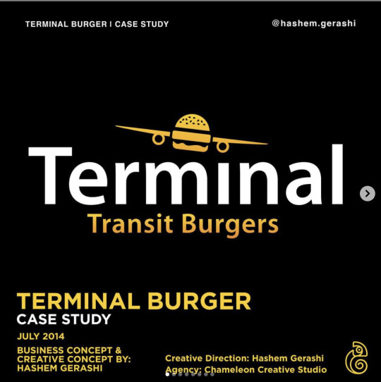
This kind of visual identity allows us to see what we are used to in business identities. As for the color, it is characterized by boldness, and it is the black color that does not attract the eye and contains more than three different lines, and this may distract the attention of the type of buyer or reader of this brand.
0 notes
Text

FA222, principles of graphic design:
Instructor: mr.munwar mukhtar
@uob-funoon @mnwrzmn
Project 1: logos design
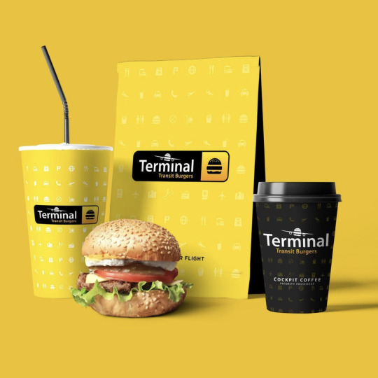
The logo contains many elements that allow the viewer not to remember this logo clearly and correctly, and then he cannot build a relationship between the buyer, which allows this logo to not succeed properly because it is one of this basic function and that the color is not suitable for a food restaurant
0 notes
Text

FA222, principles of graphic design:
Instructor: mr.munwar mukhtar
@uob-funoon @mnwrzmn
Project 1: advertisements
The clarity of the advertisement and the beauty of the colors in it gives a beautiful and comfortable impression to deal with the product Having information how many percent the customer will receive when he goes to buy the cake on the specified day. The presence of the logo of the place that supplies this product.
There are no details about the product such as how much the cake weighs and what ingredients it contains. The cake site is uncomfortable to view due to its too tilted. The presence of one small logo in the corner of the advertisement, as this contributes to stopping the acquisition of new customers.
Putting useful details about the product to enhance the customer's desire to buy. Place the product (cake) in a convenient location for the viewer's convenience. We need to choose the appropriate line with the product offered.
2 notes
·
View notes
Text

FA222, principles of graphic design:
Instructor: mr.munwar mukhtar
@uob-funoon @mnwrzmn
Project 1: advertisements
Because of placing the name of the product to be marketed (Media), and Thus the message to be conveyed to customers arrives and,The presence of the distributor's logo, the name of the agent who provides, and this product, and the contact number with him. An illustration of the product to be promoted,and The ad is very simple, making it easy to quickly read the viewer and understand its content.
The absence of product information that enhances and raises the customer's desire to acquire this product.The logo of the agent or distributor for this product is at the bottom of the player because the thickness of the line is weak in relation to the large size ofthe advertisement in addition to the contact number.The method of showing the efficiency and small size of the product in an illustration is not appropriate in the advertisement.
Putting in information that arouses the customer's desire to acquire the product.Clarify and enlarge the agent and distributor logo and place it in an appropriate place.The presence of color and movement in the advertisement to attract theattention of the viewer.
2 notes
·
View notes
Text

FA222 ,principles of graphic design:
Instructor: mr.munwar mukhtar
@uob-funoon @mnwrzmn
Project 1 : interviews
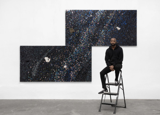
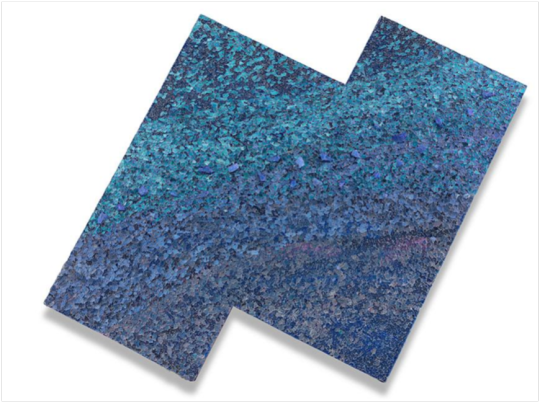
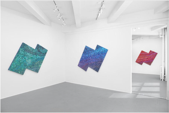
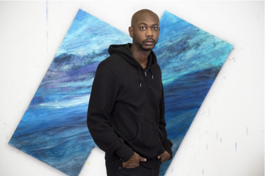
Alteronce Gumby on His Cosmic Abstractions
The artist talks about his practice of using glass and gemstones in his work, his inspiration behind his colours, and the cosmic and spiritual presence embedded in his paintings
BY ALTERONCE GUMBY AND TERENCE TROUILLOT IN INTERVIEWS | 23 APR 21
Terence Trouillot: Last time we spoke at Charles Moffett, you were telling me how you imagine the colour spectrum would be different on other planets. I wonder if you could say a little more about that and, more generally, how you approach colour in your work.
Alteronce Gumby: Considering that there are literally 100 billion of stars in the galaxy, and each one has its own spaectrum, we can theorize that, if I were to stand on another planet and hold up a prism to the light, I would see a completely different colour spectrum. Everything would change – from the vegetation, animals, minerals and soil to the ways that we have identified colour within society and radicalized it in terms of its relationship to identity. If I were to stand on that other planet, would I still be seen as a Black man? Would they even know what the colour black was if I were to identify myself as such? Imagining this allows me to think about the ways humans define colour and use its language to codify race and identity.
TT: This puts me in mind of Afrofuturism, which considers Blackness a form of technology for survival. Do you see your work as being inspired by Afrofuturism?
AG: In a way, Afrofuturism – including Sun Ra’s idea that Black people are from another planet – is about escape. Sun Ra is a huge inspiration for me. I really do look at my paintings as spaceships, as these vessels that can allow my consciousness and imagination to go to distant planets. I think about the images that I make as cosmic landscapes. I’m trying to imagine what it would be like to stand on another planet and to see colours not as fixed but as something that can shift.
I’m also looking more at astrophysics and thinking about the gemstones that are in each painting as actual fragments of materials forged from stars. They have this history of colour, energy and light that’s infused within their raw material, their raw colour. In a way, I see these gemstones in my paintings as carrying within them the energy of the universe. Quartz crystals give off a very strong frequency.
The world wouldn’t be what it is without these minerals embedded in the earth, nourishing the plants and animals that, in turn, nourish us. When thinking about colour, light and minerals, it’s important to remember that we’re all connected, from the micro to the macro.
TT: That’s a good segue into talking about your use of materials as a painter, working with glass in particular, but also these gemstones and activating them as part of your process. How did that all come about?
AG: I’m very conscious of the intentions I set within my work and the things I’m asking them. My sense of spiritualty comes from my upbringing. My mother was a minister and I grew up attending church in Harrisburg, Pennsylvania. I was always made aware of this being or energy in the world that was felt but not seen. I kept nourishing that, especially in my teenage years when I stopped going to church.
Thinking about the use of gemstones within holistic practices really interested me, especially in their relationship to colour. I activated them using moonlight to enable this strong energetic presence within my paintings. I wanted my paintings to feel alive. That was where I started.
The idea of using glass came to me one day when I went to the bodega near my studio to get a sandwich. I noticed that there was a pile of broken glass at a bus stop: it was glistening in the sunlight, rainbows flickering off it. I was like: that’s the most beautiful thing I’ve ever seen! It reminded me of Félix González-Torres’s Untitled (Portrait of Ross in L.A.) (1991). I took the glass back to my studio and sat with it. I didn’t really know what to do with it, but I started playing around with it, treating it like it was acrylic.
TT: In your latest work, currently on show at Charles Moffett in Tribeca and at False Flag in Queens, you’re embedding these gemstones within the substrate of the work, positioning them in your own zodiac constellations. Can you talk a little bit about how you see these abstractions as self-portraits?
AG: For me, putting these pieces of glass together was also a metaphor for putting myself together, especially in terms of my relationship to the cosmos and astrology. But then I’m also trying to redefine myself through colour, through abstraction, though the process of painting. Each piece of glass that I place symbolizes a moment of my life that has accumulated to form who I am as an individual sitting in front of you today.
TT: Your work is also about creating a shared experience for the viewer, to participate in this energy that your paintings give off. Are you at all concerned about who is actually experiencing the work or whether they will understand the holistic element?
AG: Sometimes, yes. I’d like to know everyone who acquires the work but, at times, it’s out of my control. Once these pieces leave the gallery or my studio, I can only guide the viewers mind’s eye to a certain perspective. I do my best to lay the path out for them. I put as much attention into the construction and conjuring of the painting I as possibly can, so that, when it leaves me, the intention and energy is still there, still set. I’m bringing these materials together, placing them in a certain way, making sure the alignment is right within them and that the palette they’re working with is also amplifying the colours these gemstones are presenting. But, in the end, I feel like there’s only so much I can do. I can only play the song: I can’t make you dance to it.
Alteronce Gumby's 'Somewhere Under the Rainbow / The Sky is Blue and What am I' is a dual-site exhibition on view at Charles Moffett, New York and False Flag, New York, through 25 April 2021.
5 notes
·
View notes
Text
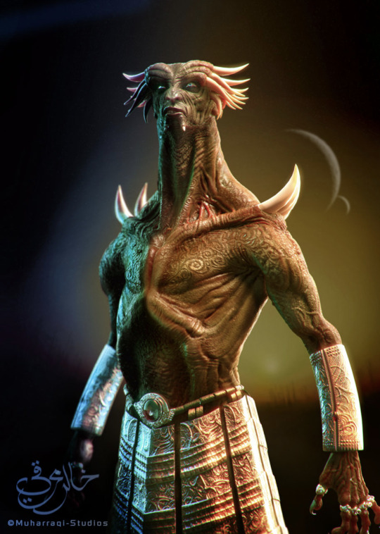
FA222 ,principles of graphic design:
Instructor: mr.munwar mukhtar
@uob-funoon @mnwrzmn
Project 1 : interviews
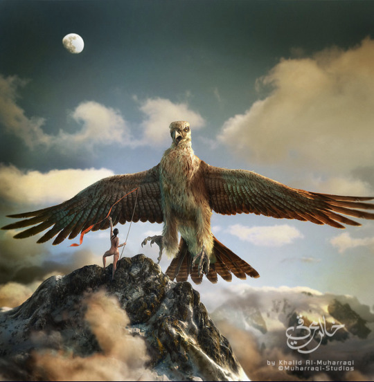
What is your given name, and user name on ZBrush Central?
My name is Khalid Abdulla Al-Muharraqi, my ZBrush Central user name is "Khalid72".
Tell us about your company, how did you start?
I set up Muharraqi-Studios to continue my family's history in the creative world and I am trying to continue to build on what my father started. The company was set up about two years ago after I left the commercial world of advertising with my partner Rashad who decided to leave a career in banking. We wanted to get together to make a place that allows us to be more creative. Since then we have been fortunate enough to work on some of the biggest projects in the middle east, and also continue working on our ideas and concepts, like our movie project. The most important thing for me is the work I do and that's what we are all about.
What is the size of your company?
The company is me and my partner, oh and our secretary... Keesha, a German Shepard! I am a hand's on guy and I do all the creative work myself. At first, I thought it was normal to carry that load because of the speed I work in, but later found out that I am actually very fast compared with bigger teams of artists in other studios. Finally I understood what people were telling me when they said I was 'unusual'. That’s why some of the CG magazines in Europe were amazed that a lot of our work is done by a one man team that puts all the 3D components together into a visualization. I work about 13 to 18 hours a day, I love 3D work, so my hobby and my work has joined into one, so … yes, very little time for a normal life.
What type of projects do you work on?
Well, I have been working on Architectural Visualizations since we started a couple of years ago, but I try to satisfy my urge to do what I really like, art!
You're located in Bahrain, somewhere most of us don't know about. Can you tell us how you learned your trade?
I love this question, Yes Bahrain is a small Island in the Persian gulf, we speak Arabic as our main language and English for the second, I will answer the second part in two parts, If you mean The art... I would say that I come from an artistic family, my father is one of the most well known artists in this part of the world, you can say that he is a household name in these parts. If you are asking were did I learn the 3D or CG art, I would say that I learned it by practicing for 8 hours a day after my official day of work, so I guess you can say I have been my own teacher in the industry.
Tell us a bit about your client base, mostly local, or do you have clients in Europe, Asia, America?
We serve clients from the Middle East, Europe and the Americas, I would say that I have been fortunate enough to have worked with some of the top people in the architectural industry, most of our clients are attracted to the type of work that we produce.
ow long have you been an artist?
Since I was six...I think! Well, the first painting I have sold when I was eleven. I was always painting and trying to find new techniques that will help create the concept in my mind.
Tell us about your background, your education, your mentors...
I studied art in Houston Texas for over seven years between interior decoration, photography, Visual communication, and digital enhancement or photo retouching, from there I have continued my working career in the commercial world. My first mentor would have to be my father, learned everything I know from him. He gave me the push start into the art world and made me feel it. There are also the books and artwork he has exposed me too with some of the top art in the world. A lot of names come to mind but I would say Frank Farazeta, Boris, The Creepy magazine and of course all the original Mad magazines and books that were very hot in the early 80's.
When you became an artist, did you first use traditional media?
For sure, I started with Pencil then got into crosshatching with ink, then I started painting with water colors and gouaches. I finally got into air brush art before I tried CG art.
What was your first CG package? What is your first 3D Package?
Nice question... first CG software was PSD, version 2, it was like magic... It felt strange especially that I was a traditional artist at the time. My first 3D package would be Alias Sketch for the Mac since I was a Mac user for a long time and did not have much 3D developers for Mac at the time. It was a new world for me and I think I still have a dusty copy of it today even after the software was canceled back in the early 90's, it just reminds me of my past.
How long have you been using ZBrush?
It has only been about six months, but I was up and running almost a few hours after I purchased it.
What made you try ZBrush?
I was watching some of the tutorial videos on how to paint details on the Gnomon training DVD's, and that's when I was shocked to see that it is art on the computer! I did not believe it at first, but It was one of the happiest moments when I first installed my first copy of ZBrush and started painting geometry for the first time, it reminded me with the days when I was pushing and pulling real clay to make a small creature of my imagination when I was a kid.
What's your favorite ZBrush feature?
The ability to paint geometry like it is physically in my hands.
How has ZBrush enabled you to express yourself in ways other packages couldn't?
Well you cant really compare it with any other software, it's simply too different! It changes how a CG artist works, it changes how he looks at things, has changed the industry to the next future leap, and who would want to go back to the past....? I would simply say that the concept of the software is very smart and impressive, my only wish to add on it is to have a bigger view port :)
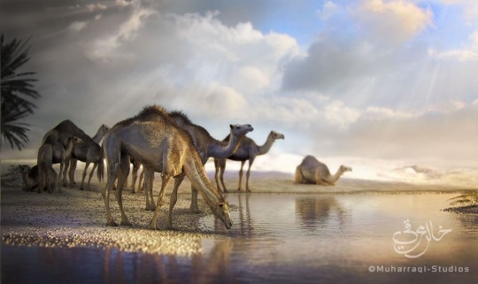
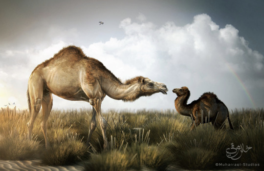
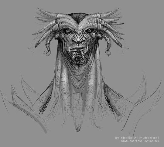
Now onto "Floating Islands"Tell us about your creative process, how did this concept emerge?
One evening when I was stuck in the studio waiting for clients approval on a project that I was preparing for the kingdom of Bahrain, I was trying to get free again and relax my mind from all boundaries, I started to sketch a concept that has bean in my mind since I was a kid, the island that was then discovered to be on the back of a whale, these were some of the old middle eastern stories about Sinbad's magical voyages.
Do ideas just come to you out of nowhere, or are there particular artists or work you are inspired by?
I am always inspired by everything that is beautiful, whether it is an artist or a design or just Gods creation, I would also say that I have always had my own style in my work and almost never try to follow a certain style that I have seen.
I love this piece, can you tell me about the process of creating it? Have you explored this style before? Or was this created for something specific?
The process was, a sketch or the map as I would call it, and that would be the basis of my creation, I almost never start without it, once I crack the direction then I would start thinking about the execution and the path to take. About the style, well I don't think of my work as style, I think it is more towards I do what I feel, it is only when I am finished with it that I say "Yes! That's what I was tying to do". I almost never tried to repeat a style that I have seen elsewhere on my work. I feel that It is like a code of respect between artists.
In your image "Floating Islands" where was ZBrush used?
ZBrush helped me sculpt the geometry and take it to the next level in a short time. Modeling, UVs, Painting and scenes setups was between Lightwave and Modo. With ZBrush I was able to put the final touches that would make it come to life. ZBrush helped me start painting the UV map textures and setting up the foundation of the look and feel. I also generated some of the whales textures by the amazing ZMapper ;)
Tell us about your pipeline.
I start with Modo, then go to ZBrush, then finally render with Lightwave. The thing with software today is that they work hand in hand to complete each other, for instance ZBrush is very specialized in what it does, it focuses on the need of the artist and helps the creator to complete his task sufficiently with a smooth flow, artists have never had it this good.
What projects are you working on now?
We have just completed the visualization for the Master Plan for the Kingdom of Bahrain with one of the leading Architectural firms in the world, we have helped restructure and rebuild old and new cities for the country. Now I will be working more onto the movie project that we have been trying to get the time to start, hopefully I will be able to focus more on creating more Characters and environments for the movie.
Any last comments for us?
I would like to say Thank you to Manuel at Pixologic and Pixologic for appreciating the work I do. I would also like to thank all the development team and staff at Pixologic for there dedication to work together to help create some of the best tools ever created for the CG industry, I always expect the ideas to be fresh and most importantly designed for the end user, the artist, allowing the artist to continue being an artist without the restrictions and boundaries of a computer.
4 notes
·
View notes
Text
FA222 ,principles of graphic design:
Instructor: mr.munwar mukhtar
@uob-funoon @mnwrzmn
Project 1 : workshops
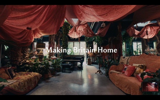
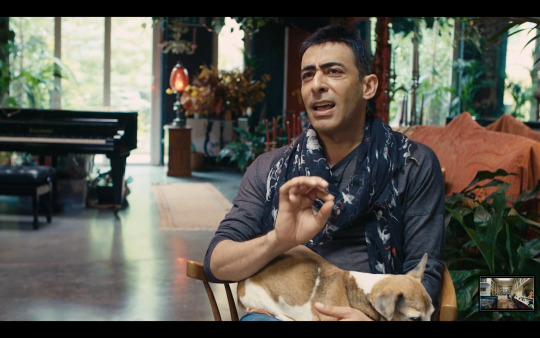
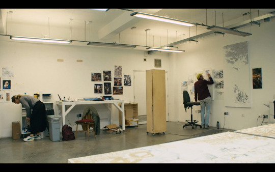
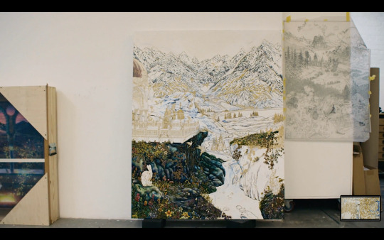
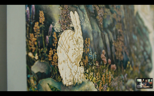
Making Britain Home: Raqib Shaw
Behind the door of a South London industrial conversion, the Indian artist has created environments of wonder equal to his paintings
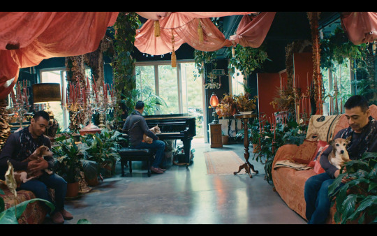
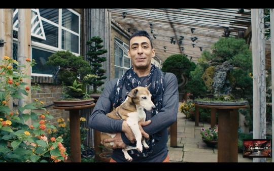
Britain has always been home to creative people from many places and cultures. In this video, Raqib Shaw gives us a peek at his combined home and studio, created in the unlikely setting of a former sausage factory in Peckham. Born into a family of merchants in Calcutta, India, Shaw decided to become an artist after moving to Britain, though his acclaimed work reflects the ‘incredible melting pot’ of Kashmir, where he grew up. The scent of jasmine flowers from the garden he created this year still remind him still of home: though he embraces gardens as ‘a British thing’. Certain flowers from the garden will appear in paintings he is currently working on in the studio, Shaw says, so ‘there is an incredible osmosis between the space and the practice.’ Jo Malone London debuts a line-up of new Home products. As the British home is a place of memory and meaning, with a character and personality that has settled layer upon layer, so each Home product is designed to tell its own inspiring story. How will you tell yours? Discover more at: www.jomalone.co.uk Watch the rest of the series to see the spaces textile designer Eva Soanike and DJ HAAi call home.
https://www.frieze.com/video/making-britain-home-raqib-shaw
5 notes
·
View notes
Text
FA222 ,principles of graphic design:
Instructor : mr.munwar mukhtar
@uob-funoon @mnwrzmn
Project 1 : lecture
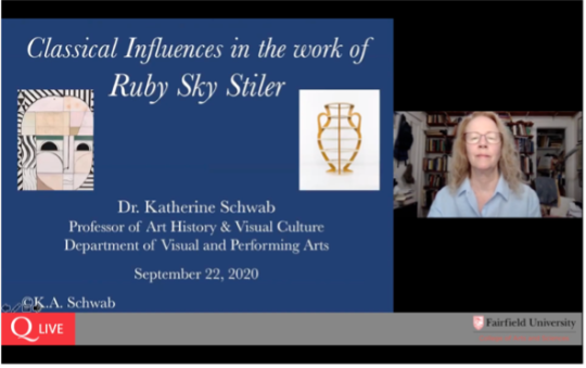
dr katherine from the institute of fine arts new york university she is and get ready for this long series of titles she is professor of art history and visual culture in the department of visual performing arts she is director of the classical studies program she is director of the school of communication arts and media in the college of arts and sciences and she is also curator of the plaster cast collection at the fairfield university arresearch focuses on the parthenon sculptural program especially the metapees scans of her metapee drawings
classical influence influences in the work of ruby sky styler one means of gaining insight into ruby's visual language
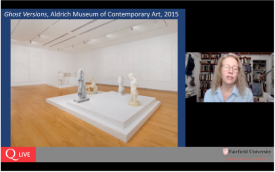
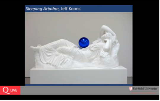
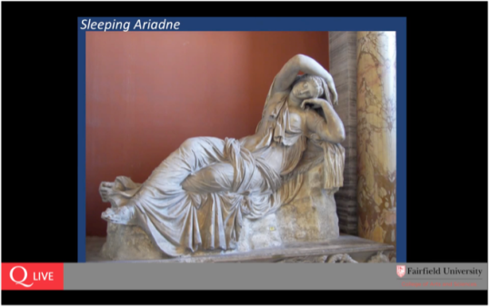
explore, it is worth noting that in terms of archaeology excavations usually don't reveal a complete object let alone a whole building instead one excavates and finds fragments uh one reveals stratigraphy or levels and one records absolutely everything we have recovered approximately three percent of the material culture or fines from ancient greece that's a very modest amount isn't it this tells you how much we do not have at the same time fragments form pieces to amuch larger image or picture and something that i often find in ruby's work when i first saw this sculpture my immediate thought was a connection to a well-known image of sleeping ariadne seen here in a roman marble version in the vatican collections the same languid sleeping ariadne was among a selection of plaster casts that formed a series the gazing blue ball series by jeff coons the idea of using plaster casts of or with ancient sculpture is a practice that we can now date back to the 4th century bce in ancient greece today one can find numerous plaster casts cast collections throughout the world we are very fortunate at fairfield to have a beautiful collection of historic plaster casts either on loan or gifted to us by such generous organizations as the metropolitan museum of art yale university art gallery as well as other sources in 2014 i had the pleasure of meeting ruby sky
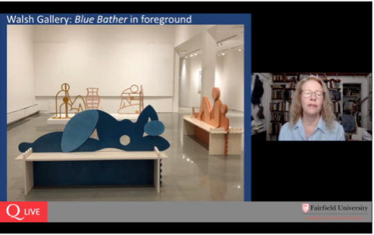
styler when she visited our campus to see the plaster cast collection she was preparing for a remarkable exhibition at the aldridge museum of contemporary art curated by amy smith stewart a view of her installation for ghost versions 2015 which you see in front of you
places our historic plaster casts on low platforms while ruby's massive relief panels in plaster are displayed on the walls for those of us fortunate enough to see this beautiful exhibition one of many aspects that stood out to me was this sense of a silent
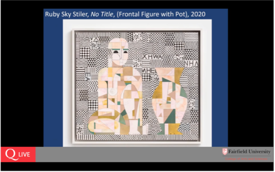
but direct communication between the historic cast representing ancient sculpture and ruby's new work from the figural to the relief we begin to notice the layers of shapes and patterns in ruby's work behind the cast of a boy closer still more details emerge of patterns
textures and letters suggesting fragments of words or language it is as if a language is being spoken but can we understand it ruby's exploration of the surface can be seen here in this outdoor sculpture bust of a woman when i first saw this sculpture only through a photograph it seemed familiar to me perhaps recalling especially this lovely female figure of a maiden or corey dedicated on the athenian acropolis by eutheticos i should note that we have a plaster cast of this maiden which might explain why it is so
familiar to me normally i see it every day that i teach in the museum classroom facial features hair texture while different nevertheless seem to share a direct and bold gaze at the viewer ruby's image on the left a head in profile required a little more sleuthing but surely its starting point is connected with the apollo piambino on the right while the ancient bronze may have been a starting point for ruby's transformation
of the image that ruby's transformation of the image is entirely contemporary and fascinating as we look through layers almost like a stratigraphy to see the rather ephemeral image recalling the ancient bronze apollo and if you look really closely you can see behind the profile image there are words let's return to the exhibition in the walsh galler starting with the sculpture male head in her september 10th conversation with ian berry ruby commented that she wanted
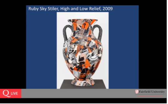
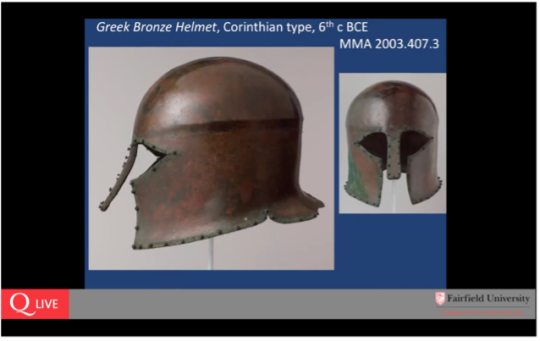
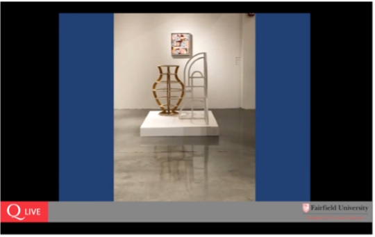
to see just how far she could take how far she could go in reducing the image to its essential elements while still being able to support itself as a sculpture the male head has multiple views from straight on and even reflected in the floor here in back view in profile where which shows us the supporting element and again reflected on the floor and even as a shadow on the low platform one is rewarded by taking the time to walk around the sculpture after all it is a three-dimensional it is three-dimensional and beckons the viewer to consider all the angles the essence of the form for a male head seems to me to be more than that and i have a difficult time not seeing the connection to this ancient greek bronze helmet the helmet contours both define a male head and distill facial features to their minimum for recognition in a similar vein the vase with sienna handles seems to capture the essence of a well-known ancient greek vessel type called an amphora which was originally designed in antiquity as a storage jar with a lid very practical phase allows us to focus purely on the structure and the contours it is both solid in its presence and wonderfully transparent
8 notes
·
View notes
Text
FA222 ,principles of graphic design:
Instructor: mr.munwar mukhtar
@uob-funoon @mnwrzmn
Project 1 : art
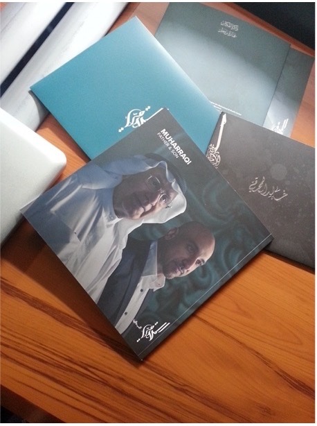
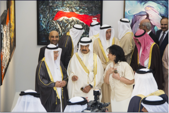
Mattar house on the 13th of March 2014
For the first time in Bahrain two Artists The Father & Son will exhibit together under one roof.
MUHARRAQI: FATHER & SON
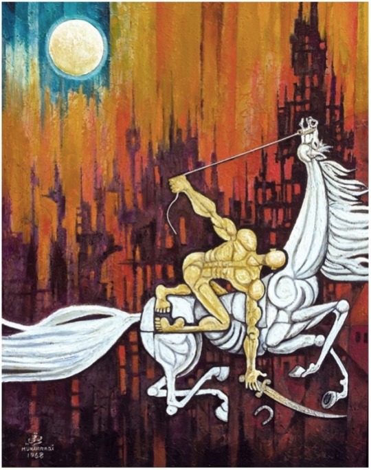
With the strokes of their brushes rendering a chorus of color, the world-renowned and award-winning Bahraini artists, Abdullah Al Muharraqi, and by his own remarkable merits, his son, Khalid Al Muharraqi will appear in a duo exhibition surmised as “Muharraqi: Father & Son” to reveal a gleaming symphony of artistic legacy and controversial imagery. The phenomenon of this unique union, is a shared light of symbolic depiction of our condition expressed through the unique work they have produced. This exhibition will be Khalid’s first in 30 years, which he will honor by joining and working alongside his mentor and father.
The father, Abdullah Al Muharraqi is one of the pioneers of contemporary fine art in the Kingdom whose a name extends in recognition in every Bahraini household and beyond. With work exhibited in Algeria, Egypt, France, Korea, Oman, Qatar, and Spain to name a few to phenomenal paintings of kings, queens, and world leaders, the surrealist artist’s rare and dystopian depictions of culture are instantly recognizable. From nations postage stamps and official emblems to his witty and bittersweet newspaper socio-political cartoons in Bahrain’s Akhbar al Khaleej and Sharjah’s Al Bayan, the living legend’s legacy continues to being honored in the most distinguished of musum halls and galleries all over the world.
4 notes
·
View notes
Text

FA222 ,principles of graphic design:
Instructor: mr.munwar mukhtar
@uob-funoon @mnwrzmn
Project 1 : design
Covering up the Cracks: The Return of Wallpaper
How artists from Édouard Vuillard to Dorothea Tanning and Kehinde Wiley used wallpaper in their work
Forget fragrant roses and honeysuckle. Forget soft-throated songbirds and sunflowers. I always see spiders in wallpaper. My eyes trace the patterns, searching them out, those crooked arachnids. The mere hint of one turns my stomach. Look: there’s one! Tarantula-black, wriggling through that ivy-blossom, crouching behind those camellias. See its distended abdomen, those unwieldy legs?
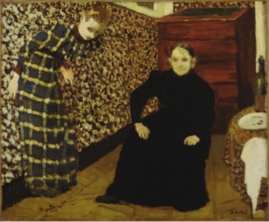
What this says about me, I don’t want to know, but spiders also spring to mind whenever I think of a certain painting by Édouard Vuillard. Interior, Mother and Sister of the Artist (1893) is a most peculiar work, wrought with invisible tensions. The manner in which Vuillard configures his mother and sister hints at a curious dynamic, one more commonly imagined between a spider and a fly. Here is Madame Vuillard, a throbbing black presence, legs set wide apart, hands placed defiantly on her knees in as dominant and sinister a pose as she can muster. To the left, Vuillard’s sister, Marie (or Mimi as she was known within the family), looks as if she is being engulfed by the wallpaper. Or is she already trapped? Can you hear the frantic buzzing as she struggles to escape? It’s almost unbearable. Marie is ensnared; it’s as if Madame Vuillard has forced her into a web. The awkward angle at which Vuillard composes his picture fosters this tension. Somehow, the artist seems to suggest, maman is driving her daughter into dangerous territory.
Or is she? Is Vuillard really attempting to convey that his mother is pushing his sister not only to the limits of physical space, but also of sanity? Although the narrative is not explicit, Vuillard painted several similar portraits of his mother and sister that imply domestic disharmony. In The Door Ajar (1891), for example, Marie appears alone, this time peering into a room as if she wants simultaneously to enter and retreat. Marie’s dress and the wallpaper are barely distinguishable from one another: the maggoty yellow pattern of the latter insidiously overlaps with the strange crescent moons of the former to suggest … what exactly? Is Marie, once again, being pushed in to the web of the wallpaper? Or is something else at play? Could Vuillard be trying to capture some deep-seated predisposition in his sister? Perhaps, psychologically speaking, Marie wants to entwine herself with the background of life. As in Interior, Mother and Sister of the Artist, rather than being pushed out of the room by maman, Marie is perhaps choosing to contort her body so as to escape? Whatever the case, for Vuillard, wallpaper is never simply decorative. Loaded with narratives, in the artist’s hands it becomes a metaphor for the divide between physical and psychological space, between inner and outer realities.
A little less than 100 years after Vuillard completed Interior, Mother and Sister of the Artist, a young woman on the east coast of America took a series of photographs, ‘Space2, Providence, Rhode Island’ (1976–77), one of which could stand as a companion piece to his painting. An eerie connection exists between the two works, a conversation of sorts across the decades. Here is the image of another young woman who appears to want to escape and who uses wallpaper as the means by which to do so. Unlike Marie, however, who is the subject of her brother’s narrative, the woman in this photograph is most definitely the author of her own disappearance. Using strips of paper to cover her face, breasts and legs, Francesca Woodman attempts to take herself out of the photographs she so carefully constructs. Like wallpaper itself, with its repeating patterns and shapes, the desire to remove herself from the picture occurs throughout Woodman’s work.
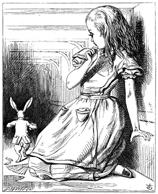
In other self-portraits, Woodman crouches beneath a tilted door, disappears through a wall, merges with mirrors, windows and fireplaces. She is a ghost light, a will-’o-the-wisp, a haze and a blur; present only in her absence, a non sequitur made physical. Indeed, looking every bit like Lewis Carroll’s Alice in Wonderland (1865), with her long blonde hair, floor-length skirts and black pumps, Woodman seems desperate to slip beyond the here and now, to use every available surface in order to vanish – not into Wonderland, but towards some other dimension. Ironically, much like the Cheshire Cat whose smile lingers long after the rest of his body has disappeared, by highlighting herself in the act of vanishing, Woodman’s spectral presence grows ever more compelling. Who is this beguiling figure dedicated to both evading and haunting? The answer is never clear. In fact, the nearest we come to it might be the manner of the photographer’s death. In 1981, at the age of 22, Woodman took her own life by jumping out of a window.
Appearance and disappearance. Repeating patterns and shapes. Integration and disintegration. A year before Vuillard completed Interior, Mother and Sister of the Artist, a novel was published in America that foreshadowed it. The Yellow Wallpaper (1892) by Charlotte Perkins Gilman takes as its subject the agonizing mental decline of an unnamed narrator who has just given birth. Confined by her husband to an upstairs nursery with bars at the window, the woman is advised to empty her mind and do nothing but rest. Instead, she begins to tell us about her predicament. Having been deprived of any mental stimulation, she begins to believe she has seen glimpses of a woman trapped behind the room’s sickly yellow wallpaper. As a metaphor for the morbidly restrictive society into which 19th-century, middle-class women were born, The Yellow Wallpaper is highly effective; on a psychological level, it is unsurpassed. As with the walls in Vuillard’s painting, the paper crawls with meaning; the narrator projects her fears onto its ‘bloated curves and flourishes’, its ‘sprawling flamboyant patterns’ and ‘wallowing seaweeds’ until, finally, they take on a life of their own and begin to seep through the paper in the shape of a deranged ‘other’. The wallpaper, in other words, has become a reproduction of what is playing out in the narrator’s misshapen psyche.
It is hard to think of Gilman’s work without being reminded of that doyen of the 19th-century British arts and crafts movement, William Morris. The intricate wallpapers and textile designs he created for Victorian homes could easily have graced the room in which Gilman’s narrator was incarcerated. This made American artist Kehinde Wiley’s first UK museum solo show, ‘The Yellow Wallpaper’, at William Morris Gallery in London earlier this year more than a little intriguing. ‘The Yellow Wallpaper is something that has haunted me for years,’ Wiley says of the novella in a short film about the making of this work. ‘The idea of being in a room and not being taken seriously.’ This is not something that can be said of the six black women and two children Wiley met on the streets of east London, whose strikingly beautiful portraits filled the exhibition. Whether sitting or standing, whether their faces turn away or directly look out, each sitter is centre stage. More than that, each is engaged in a serious dialogue with the background patterns from which they emerge. These patterns are based on Morris’s own wallpaper designs that would have papered the walls of mansions inhabited by, among others, former slave-traders and plantation owners. In doing so, Wiley’s work plays on the conflict between the sinister history embedded in the prettiest detailing and the self-possessed women who emerge from the patterns, who seem to defy anyone to repeat it.
Lindsey Mendick, ‘The Yellow Wallpaper’, 2020, installation detail, Eastside Projects,Birmingham. Courtesy: the artist and Eastside Projects; photograph: Stuart Whipps
Coincidentally, artist and sculptor Lindsey Mendick’s exhibition at Eastside Projects in Birmingham earlier this year was also titled ‘The Yellow Wallpaper’. Featuring untitled videos, ceramics and miniatures, the show pivots on a disturbing episode in the artist’s life when, during a nervous breakdown in 2006, Mendick glanced from her bedroom window to see six men dressed in black, walking up and down the street speaking into walkie-talkies. Mendick related the incident to her mother who, given her daughter’s vulnerable state of mind, found the story difficult to believe. A few days later, however, news broke that the former Russian spy, Alexander Litvinenko, had been poisoned; he was Mendick’s neighbour.
Unlike Gilman’s narrator, what Mendick had seen was real; however, in her exhibition she, too, played with the idea of wallpaper as a borderland between sanity and insanity. The show also included other domestic items as receptacles into or onto which all that was unendurable could be projected. A large teapot (with a hole in one side through which you could view the vessel’s interior) contained two small ceramic figures taking tea from a large teapot containing two ceramic figures taking tea from a teapot, in what felt like a claustrophobic dance to the death. Nor did the claustrophobia end there, for all the pieces in the small, over-lit gallery spoke of other confined and confining spaces – from the hollowed-out, ceramic head of Russian President Vladimir Putin, inside which the figure of a distraught woman (Mendick herself?) sits on a toilet within a cramped bathroom, to a 1960s-style bedside cabinet inside which reside Mendick’s family members, configured weirdly as Russian dolls. But, of all the dialogues taking place inside this room, the loudest is also the most hallucinatory: the one inside my own head between Gilman and Mendick. What is it they are saying? That yellow is an unfortunate colour with which to decorate a room? That the divide between sanity and insanity is paper-thin? Or that even the most innocuous of objects can pulsate with the unconscious?
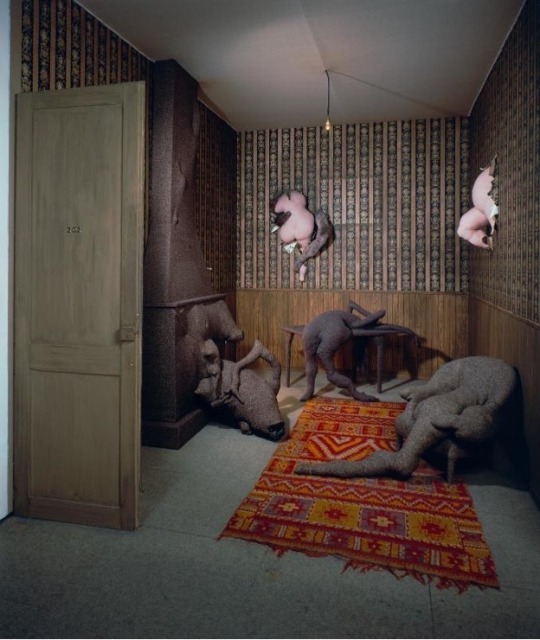
This is a sentiment with which the surrealist artist, sculptor and writer Dorothea Tanning would surely have agreed. Writing in the catalogue for her 1979 exhibition at New York’s Gimpel-Wietzenhoffer Gallery, she declared of her hometown of Galesburg, in rural Illinois, that ‘nothing happened but the wallpaper’. Tanning’s Chambre 202, Hôtel du Pavot (1970–73) is a three-dimensional, life-sized room in which two grubby pink torsos, shaped as if carved from ham, poke through the dingy wallpaper while the chimney breast gives birth to three further mutations – although whether these are animal, vegetable or some other tumorous mash-up, it is impossible to say. The work was partly inspired by a song Tanning recalled from her childhood: ‘In Room 202’ (1919) composed by Dave Harris with lyrics by Edgar Leslie and Bert Kalmar, tells the story of Kitty Kane, a gangster’s moll who poisoned herself while staying at a hotel in Chicago.
In room two hundred and two The walls keep talkin’ to you I’ll never tell you what they said So turn out the light and come to bed.
But if the song suggests talking walls, Tanning pushes this idea to its very edge, wishing to create a space in which the wallpaper, as she once explained, would ‘tear with screams’ while maintaining ‘an odd banality’. The latter is captured by the dreary ordinariness of the installation’s wallpaper while the former is contained in the hotel’s name: pavot is French for poppy, the flower from which opium is derived. By conflating these disparate ideas, Tanning succeeds in heightening the room’s creepiness; this in turn precipitates a sense of impending doom. What springs to mind is a back-street abortionist’s or the lair of a serial killer such as John Christie who, over several months in the early 1950s, murdered (among others) Kathleen Maloney, Rita Nelson and Hectorina MacLennan, hiding their bodies in a kitchen alcove, which he subsequently wallpapered over as if it were a solid wall. The women’s bodies were only discovered after Christie moved out of the house and his landlord, wanting to redecorate, tapped on what he thought was the rear wall to the kitchen only to discover it was hollow. As Ludovic Kennedy wrote in Ten Rillington Place (1961), the landlord then ‘pulled away a small piece of paper and shone his torch inside. Whatever he expected to see, it could hardly have been what he did see: the naked seated body of Hectorina MacLennan.’ You can almost envisage the landlord stumbling backwards in horror, just as the chambermaid might have done when she pushed open the door to Chambre 202. This is a room that distils much of what the work of Mendick, Vuillard, Wiley and Woodman makes clear: that wallpaper does not so much cover the cracks, as serve to reveal them.
Main image: Lindsey Mendick, ‘The Yellow Wallpaper’, 2020, installation view, Eastside Projects, Birmingham. Courtesy: the artist and Eastside Projects; photograph: Stuart Whipps
11 notes
·
View notes
Text
FA222 ،principles of graphic design:
Instructor: mr.munwar mukhtar
@uob-funoon @mnwrzmn
project 1 : events
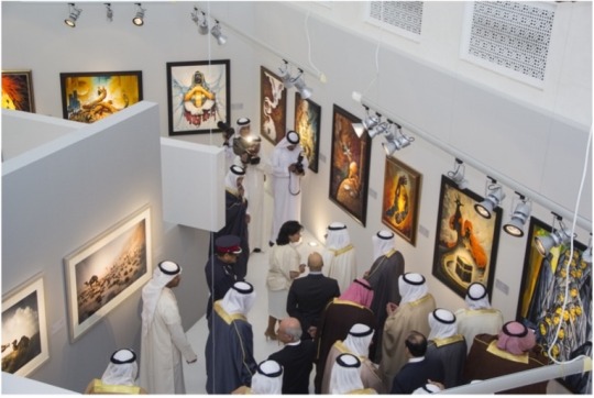
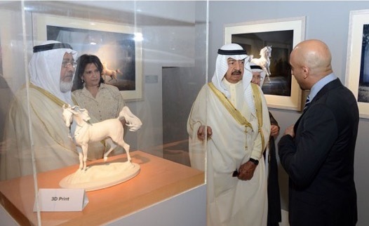
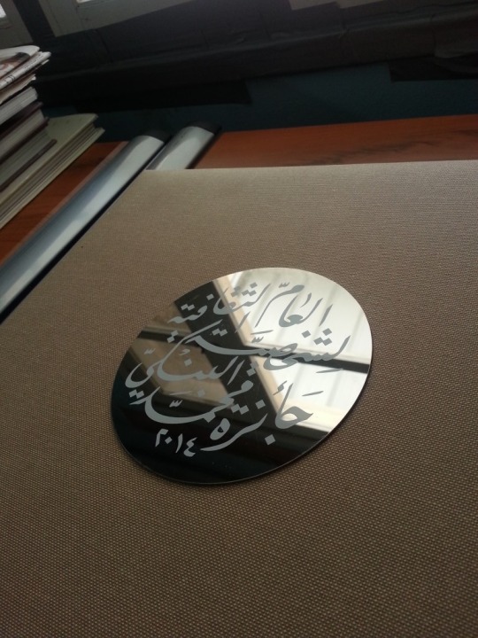
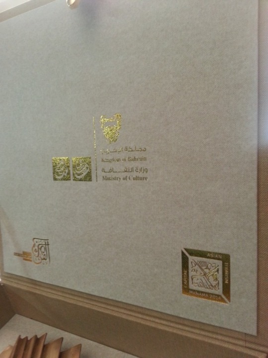
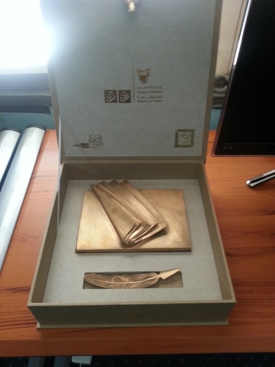
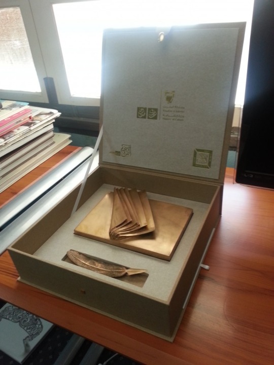
Al Banki Cultural Personality of the Year Award 2014
During ceremony held by the Ministry of Culture yesterday ( 30th March 2014), Artist Khalid Al Muharraqi was honoured with the Mohammed Al Banki Cultural Personality of the Year Award. H.E Shaikha Mai bint Mohammed Al Khalifa, Minister of Culture presented the hounour award to Mr. Al Muharraqi during a ceremony at the Culture Ministry’s stand at the 16th Bahrain International Book Fair. Artist Abdulla Al Muharraqi, Dr Salah Fadhl and Dr Yahiya Al Jamal from Egypt, and family members of former culture under-secretary Mohammed Al Banki were present.
year Khalid Al-Muharraqi, for his part, expressed his deep appreciation and thanks to the Minister of Culture and the committee for selecting him as a Winner of Mohammed Al Banki Cultural Personality of the Year Award, praising the talented and exceptional programs advocated by the Ministry for the Bahraini youth. Al-Muharrqi said “ I come from his environment, graduated from his school of thought and I will continue to contribute to Bahrain’s glory”.
Dr. Salah Fadhel, also praised the deceased’s efforts, arguing that he was his mentor and M.A supervisor, thanking the Ministry of Culture for the Award, which is aimed at commemorating Mohammed al-Banki. The idea is to encourage intellectuals, researchers, artists, creative cultural figures to come with inventive ideas regarding the visionary perspectives of culture in the Arab world, he argued.
Al-Banki family members regained some of the beautiful and bright memories and ideas advanced by the deceased, his role in developing cultural projects, his wide visions for a glorious Bahraini culture, hoping for the continuation of his journey.
3 notes
·
View notes
Text

FA222 Assignment 6 principles of graphic design:
Instructor: mr.munwar mukhtar
@uob-funoon @mnwrzmn
My first work I did this logo king’s furniture, I used one piece of a specific shape , but by zooming in and out of this piece the shape of sofa appeared so I got the harmony clearly and it look comfortable for the eye.
A Logo for eyes Hospital: The method of harmony was done by using the blue color, and this led to the integration of work and obtaining a harmony form.
8 notes
·
View notes
Text
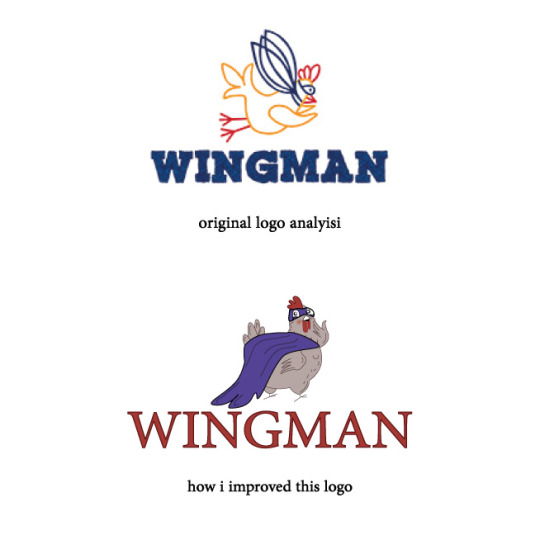
FA222 Assignment 5 principles of graphic design:
Instructor: mr.munwar mukhtar
@uob-funoon @mnwrzmn
original logo analyisi
1-The logo fonts are all equal without varying in size
2-The font thickness is very large
3-The designer relied on only lines without coloration within the shape
how i improved this logo
1-Changing The thickness font
2-Changing colors
3-Redraw the chicken symbol in a simple and convenient way
10 notes
·
View notes
Text
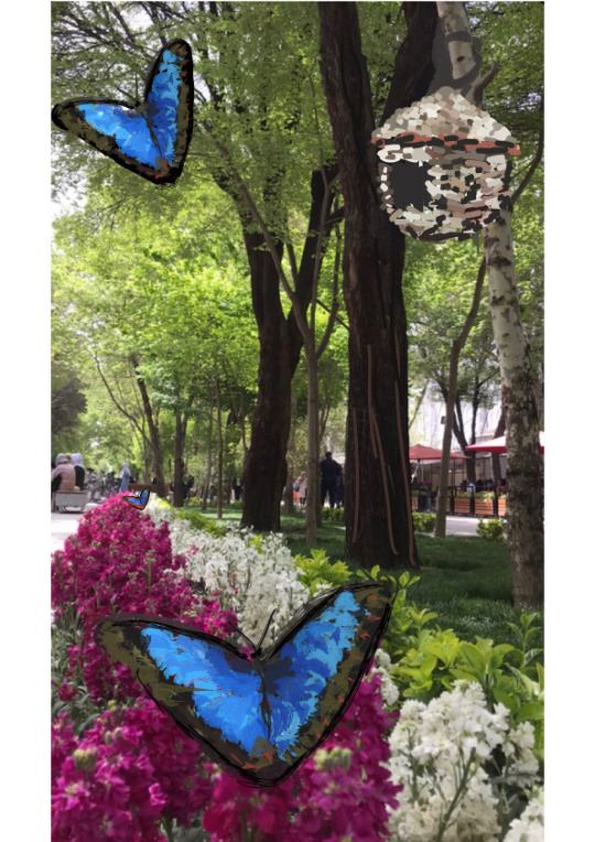
FA222 Assignment 4 principles of graphic design:
Instructor: mr.munwar mukhtar
@uob-funoon @mnwrzmn
In this work, we take a picture of any landscape, street, or house ... and draw some shapes that are clearly and understandably compatible with the image that we took.
In this picture, I liked to draw the butterfly that is proportionately above the flowers and the bird's nest whose strings are tied in the tree in compatible way to the image that I took.
12 notes
·
View notes
Text
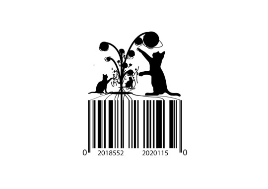
FA222 Assignment 3 principles of graphic design:
Instructor: mr.munwar mukhtar
@uob-funoon @mnwrzmn
In this work, I show how to use repeating shapes and combine them to create a new image. I also used barcode fonts in an innovative way in Adobe Illustrator.
So I liked creating a work about making a scene that cats play with wool balls and their strings roll into a barcode.
9 notes
·
View notes
Text
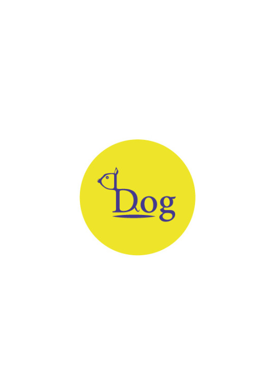
FA222 Assignment 2 principles of graphic design:
Instructor: mr.munwar mukhtar
@uob-funoon @mnwrzmn
The work request is that we choose a specific word and extract a clear and expressive form from it in the Illustrator program
So in this work I liked to refer to the word dog by turning the letter D to the head of the dog and adding some lines such as the ear and the tail and the two circles that are one of them in the eye and the second in the nose until I show the dog’s shape in this gentle way.
8 notes
·
View notes
Text
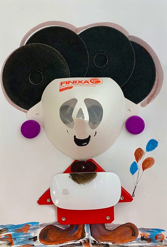
FA222 Assignment 1 principles of graphic design:
Instructor: mr.munwar mukhtar
@uob-funoon @mnwrzmn
In this assimgnment we were asked to choose an everyday object and combine it with a drawing on A4 paper
I used paint purifying filter as a child head and the bottle plastic caps that I Use them in the eye and the ears, and I use identical iron discs and place them together to show us as a hair. And I added the mouse from the Apple company, until I showed that no matter what development and technology we got, these professions of dyeing and blacksmithing cannot be dispensed with, and there are some lines that I drew to ensure the correct appearance of the child’s shape to the viewer
12 notes
·
View notes