martha-hope
CONTEXTUAL JOURNAL
Hello!
Welcome to my contextual journal for MMU Art Foundation.
All of my posts are organised through tags into different categories- articles, exhibitions, inspiration, tv, and library.
ARTICLES EXHIBITIONS LIBRARY TV INSPIRATION
9 posts
Don't wanna be here? Send us removal request.
Last Seen Blogs

spningifs
Supernatural but Recapped In Gifs

mrmichaelchadler
Michael D. Chandler Tumblr

empyrecns
𝒉𝒆𝒂𝒗𝒆𝒏 [ . . . ]

allsimsyt
AllSims

howtovidz
How To Videos
Text
Patrick Heron
Patrick Heron was a British abstract artist whose large-scale oil paintings explore colour and light. Famously, Heron objected to writing about art, and the culture of narrative, figurative paintings. He was quoted saying: “Strictly speaking painting cannot be written about.” So it might be quite hard to write about his work.
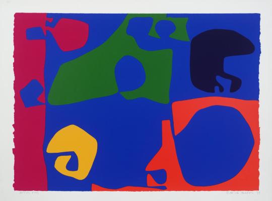
‘1973: 14′
In the painting above, Heron uses a contrasting colour palette to highlight different abstract shapes. The abstract shapes have an element of unpredictability to them, creating positive and negative space within the painting.
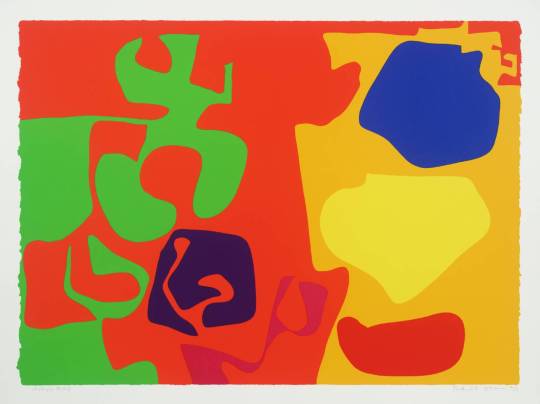
‘1973: 10′
0 notes
Photo
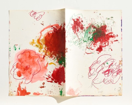
Cy Twombly, Untitled, From: In Beauty it is Finished (1983-2002)
468 notes
·
View notes
Text
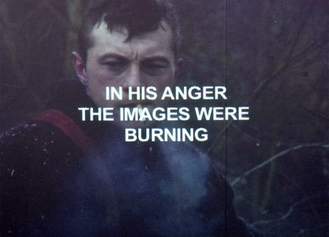
Cy Twombly- ‘Nine Discourses on Commodus’, 1964
This series by American painter Cy Twombly was inspired by the story of Commodus and the assassination of Marcus Aurelius. The series was also painted shortly after the assassination of John F. Kennedy, which is believed to have had some influence on the paintings.
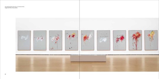
Comprised of nine paintings, the series carries a narrative through the use of expressive marks and a warm colour scheme. The first of the paintings consists of a white mass, whose large shape is juxtaposed by a visible frame structure. Throughout the series, the paintings become more wild and expressive, conveying an increase in violence and anger.
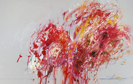
The image above shows the penultimate painting of the series. Twombly uses a minimal colour palette of reds and yellows which evoke feelings of ferocity and brutality. The animated marks and textured paint create a sense of movement within the work which tells the story effectively.
I like the use of narrative within Twombly’s work, and wish to use the form of a series in my own work in order to display information and convey the idea of journey.
0 notes
Text
Sally Waterman- ‘Journey Home’, 2002-2003
Sally Waterman is a British photography artist whose work often focuses on memory, place, and family relationships. In her 2002-2003 series ‘Journey Home’, Waterman uses the medium of photography to explore a series of journeys between London and the Isle of Wight.
This particular journey is significant, as it conveys Waterman’s experiences of living in both rural and urban environments, and the tension between them as she makes the monthly journey home to visit family.
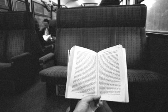
The series shows six separate journeys, which are compromised of fifteen black and white film photos. When the work was exhibited, Waterman also displayed information about each journey along with each set of photographs.
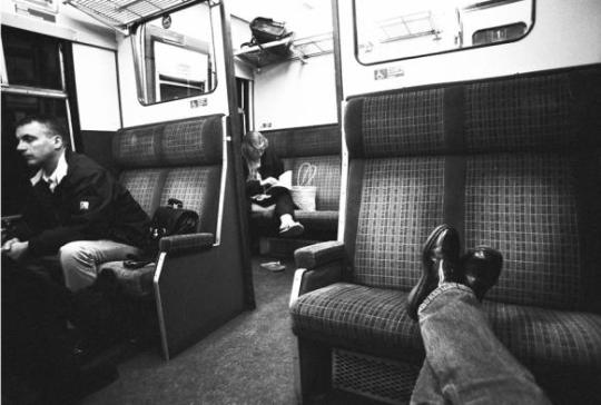
The black and white tones within the series create a nostalgic feeling to Waterman’s work. Despite the similar tones of all of the photos, Waterman focuses on composition and subject matter to communicate the changing seasons and the passing of time. For example, Waterman photographs the book she is reading, or the environment outside of the train.
0 notes
Text
Laure Prouvost- ‘Bruegel Girls’, 2017
Laure Prouvost is a French artist, known for her installation works which explore language, miscommunication, and ideas being lost in translation. As part of the ‘Journeys’ project, I will be looking at Prouvost’s film works- specifically her short film ‘Bruegel girls’, which explores heroic femininity through a sequence of short clips edited together with mismatched text.
I really like the editing style of Prouvost’s work. She uses overlays and subtitles which add an almost frantic impression. She also uses audio to express the emotions and feelings of characters in the film- this creates a deeper meaning within the work, completely changing the atmosphere of what seem to be basic scenes and clips.
Watch the short film here.
0 notes
Text
John Smith- ‘The Girl Chewing Gum’, 1976
The Girl Chewing Gum, 1976
As research for the video and sound experimentation section for the ‘Journeys’ project, I am looking at John Smith, a British artist and filmmaker. In 1976 Smith created the film ‘The Girl Chewing Gum’, which features an intersection near a cinema in Hackney, and a piece of open ground in Letchmore Heath, London shot on black and white film. Smith uses the mundane setting to play upon the film spectator's conditioned assumptions of the film.
I admire the muted colour scheme of the film, and the clever use of audio and sound recording. In my own work, I wish to record everyday sounds in and around public transport to replicate a similar feeling of monotony and humdrum. However, contrasting Smith’s work, my work will be unplanned and random.
youtube
0 notes
Photo
Displayed at ‘The Other Art Fair’, London, 2019.
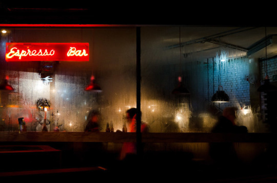
Pedro Correa: Espresso Bar (10/11), 2015
21 notes
·
View notes
Text
‘The Other Art Fair 2019′- The Guardian
Sunday 6th October 2019
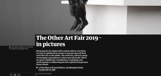
The Other Art Fair is an organisation which hosts art fairs all over the world as a way for undiscovered artists to display and sell their work to the public. The UK edition of the fair takes place in London every year.
This article, shown on The Guardian shows a snapshot of the many artists and their works shown at the 2019 event. The different artworks, created in a large variety of different mediums, show the raw talent of young artists in the UK.
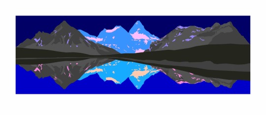
The image above is a work by artist David Wightman, titled ‘Arcadia IV’. The Guardian describes Wightman’s work as “paintings and prints of beautiful and fictional landscapes”.
I personally love the richness of the colours used in Wightman’s paintings. I think that the wide scale of this painting is very effective, as it creates somewhat of a panorama effect.

This photograph, taken by Emilie Möri, and titled ‘Red Stole, edition 2′ struck me when I first glanced over the article, as I tried to decipher the different shapes within its composition. The article describes Möri as “a Franco-Swiss multidisciplinary designer who focuses on conceptual photography and conceptual portraits”.
The stark contrast of colours in this image is very effective. I particularly like how Möri has captured the dynamic movement of sheer fabric with in the photograph.
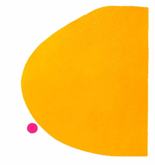
The image above shows the work of Jane Burrows in a print piece titled ‘Sunshine’. According to The Guardian, Burrows “merges the abstract with the figurative – placing gender at the core of her work and questions cultural expectations of the female form”, which is very evident within her work.
I like the subtlety of Burrows’ work, especially in this piece, using simple geometric shapes to mimic the female form in an almost comical and lighthearted way.
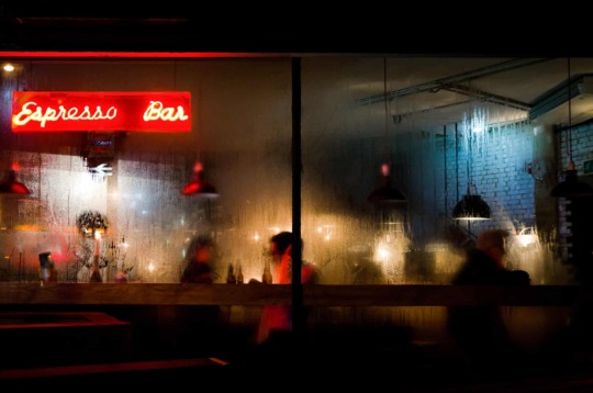
The final work from the article which I have chosen to look at is this photograph taken by Pedro Correa, and titled ‘Espresso Bar’. This is my favourite of all works showcased within the article. The Guardian writes: “After studying oil painting at the Royal Academy of Beaux Arts in Brussels, Correa moved to photography, developing an impressionistic style with a passion for capturing the ephemeral beauty of big cities.”
The photograph initially produced a gut reaction of comfort and solace, possibly due to the warm colours and glow throughout the piece. It also evokes feelings of familiarity- seeing friends chatter and a couple on a possible first date.
Read the article here.
1 note
·
View note