
madebybrass
Made by Brass
Ccreations by Mr. Fahreheit89. A place to showcase the things I make. Along with little tips and tricks I find useful.
105 posts
Don't wanna be here? Send us removal request.
Last Seen Blogs

herheartkryptonite-blog
the flowers cool
misscrazyfangirl321
Let me carry your story in my heart

caffeine-catastrophe
i've got a spark in me

ana-kareninas
darkling, I listen—

vethelp
Veterans And Community Housing Coalition
Photo
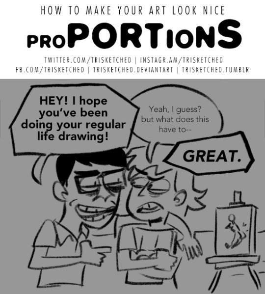


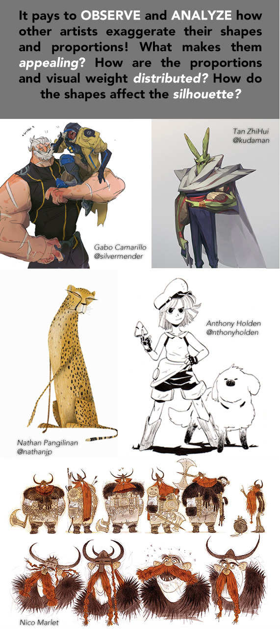
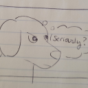
Feeling that your drawings can look a little bit more fun? Do your character designs seem a little bit static or generic? Maybe they need a small push to their proportions!
_________
The “How to Make Your Art Look Nice” Series
Developing Style | Lighting | Flow and Rhythm | Thumbnailing | Mindsets | Reference and Style | Color Harmony | Contrast
Consider supporting this series on my Patreon!
13K notes
·
View notes
Video
How to create the creepy mirror effect using a panorama. By lililwanjun10
135K notes
·
View notes
Photo
This would maje for a very interesting class.

Figure Drawing Class by Chromamancer
3K notes
·
View notes
Text

Going to be partipating this year. I'll try to upload my work as frequently as possible.
4 notes
·
View notes
Photo

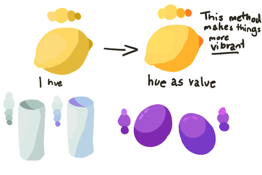

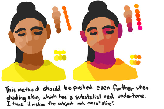
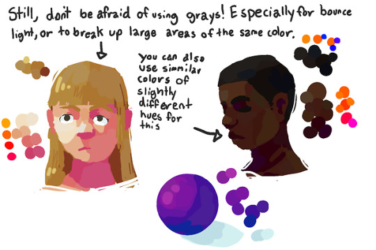
I made a color tutorial! i think the main thing is still to experiment a lot and to not be afraid of pushing it, but i hope this is helpful! i also hope my writings legible
35K notes
·
View notes
Photo
Reminder
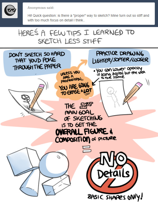
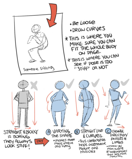
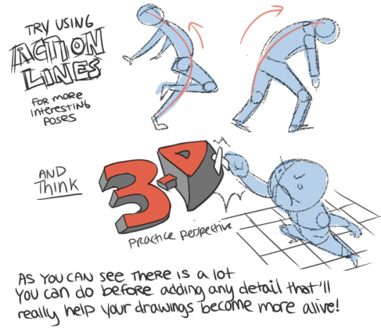

Sketching Tips
48K notes
·
View notes
Photo


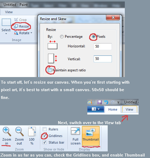


You can read it on DeviantArt too. Also please, if you’re looking to get into pixel art READ THIS TUTORIAL it’s the best one out there and explains everything so much better than I could!
I’d like to make a tutorial each week, so if you want me to cover something, send me an ask or something!
16K notes
·
View notes
Text
The big texturing tutorial
1. Definition
Texturing is a technique that involves adding local shading and details on surfaces to better represent the material of an object.
This technique is of course closely linked to shading in general.
This is usually applied after defining a global shading.

From left to right :
Lineart
Global shading
Completed sprite
One of the big differences between global and local shading is homogeneity.
The very principle of global shading is to give a sufficiently contrasting effect between the shaded and lit areas to bring out volume and depth.
Conversely, a texture must be as homogeneous as possible. It must be able to be applied on large, uniform surfaces, without making it look bad.
2. Applying a texture
A texture being homogeneous in terms of its luminosity/contrast, if it is applied to an object without taking into account the global shading, we will lose any effect of volume and depth.

A texture applied to a sphere without shading.
Only the deformation of the texture can give us a clue on the shape of the object, but it is still difficult to discern.
Homogeneous contrast
When applying a texture to an object, shadows must also be taken into account.
It is therefore important to maintain a uniform contrast between colours. A dark line separating a light zone from a dark zone should not keep the same colour between these two zones.

The color of the line will be lighter on the lighter side and darker on the darker side to preserve its contrast with the background.
In the same way it is possible to apply a texture or pattern on a shaded object, by proceeding to a simple color shifting in our palette.

Combination of a texture (left) and an object that is not textured but shaded (middle).
3. Local shading
Since shading is used to highlight the bumps, there are generally two possible cases:
A groove
A bump
Each of these cases can be more or less accentuated by playing on the colors, the intensity of shadows and lights.

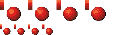
On the upper line, troughs ranging from the weakest to the strongest bumps.
On the second line, these are bumps that stand out.
The mastery of these light bumps is very important, it is the basis of the textures, and will make it possible to manage all the simple cases, such as wood or matte plastic.
Example of application on a simple object:

4. Reflections
The application of a reflection is done in a simple way, by applying diagonal strips of light of varying thicknesses, and following a few rules.

A trough or bump will create an offset at the reflection level (proportional to the height change).
As for the shadows, there is no absolute, depending on the palette or the material represented, it is possible to lighten or not the area at the reflection level.
It is also important not to have parallel light bands on faces that are not oriented in the same direction, as on this cube:

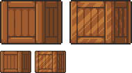
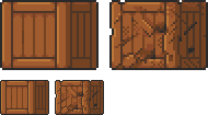
Concrete example of the application of a gold texture on our drawers:

Or, added reflections on our previous crate:
5. Dithering and granularity
Dithering consists in creating a new false color from a checkerboard or other regular pattern of two colors close enough to give an illusion of mixing.
The closer the colours are, the stronger the illusion will be. The more the colours are contrasted, the stronger the granularity effect will be.

Dithering is basically used to obtain fake intermediate shades on limited palettes, but it is also very useful for making complex and rough textures.

Example of complex dithering separating 3 colors over a wide area.
The nature of the pattern totally changes the roughness aspect.
Example of the application of a sandy rock on our drawers:

Or add grain to our crate:

6. The art of destruction
The more complex a texture is, the more it will combine fundamental techniques such as bumpiness, reflections or granularity.
However, some materials need to go further, by cutting, slash or breaking the base support.
Cuts
It works much like bump, but on a much finer surface.
We are subject to the same rules, of which here is a summary image:

From the finest to the most pronounced, on the first line of the cuts, and on the second of the bumps.
A concrete example on our crate:
Exercises
Since nothing beats practice to learn, here is a series of examples from the simplest to the most complicated.
For each exercise resolved, post your results.
Mastering tools
Add a strong bump on the text of this image, except the ‘x’ which must be a groove (the center must be dug more strongly than the rest of the ‘x’):

Palette:

Add reflections on the image obtained between the two red lines shown below:

Now cut and break the letter ‘e’ as well as possible.
Add grain to the letter ‘l’.
Finalize a sprite
Texturize/colorize this sprite:

Palette:
Add reflections on the inside of the doors to give the impression that there are windows.
Add damage (cuts etc) on the right side of the wardrobe.
Make a variant of this cabinet by redoing it in gold using the palette of the gold drawers example in the tutorial.
Palette:

Do the same with the sandy rock.
Palette:

Sample solutions
Here are some solutions by a talented friend :

Gif process
The end.
30K notes
·
View notes
Photo
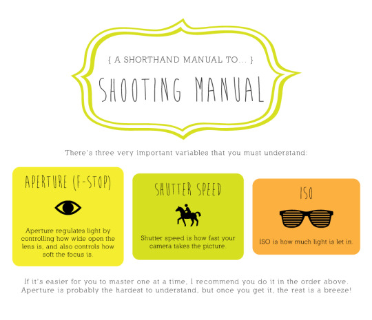
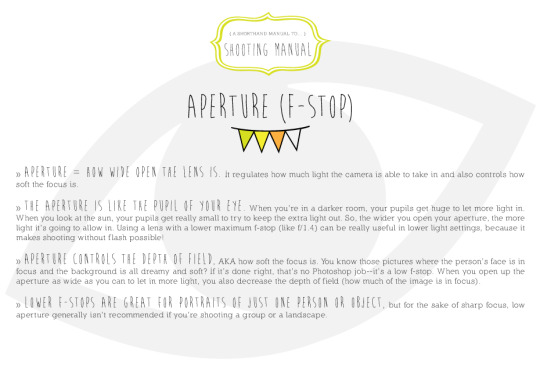


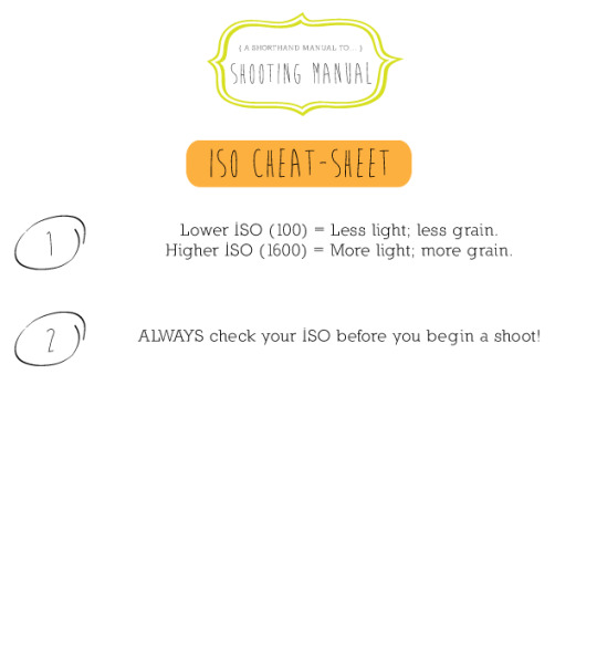
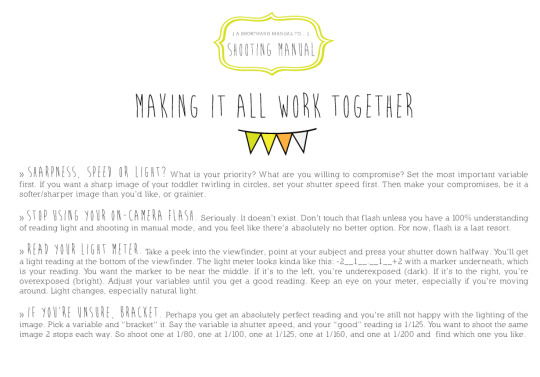
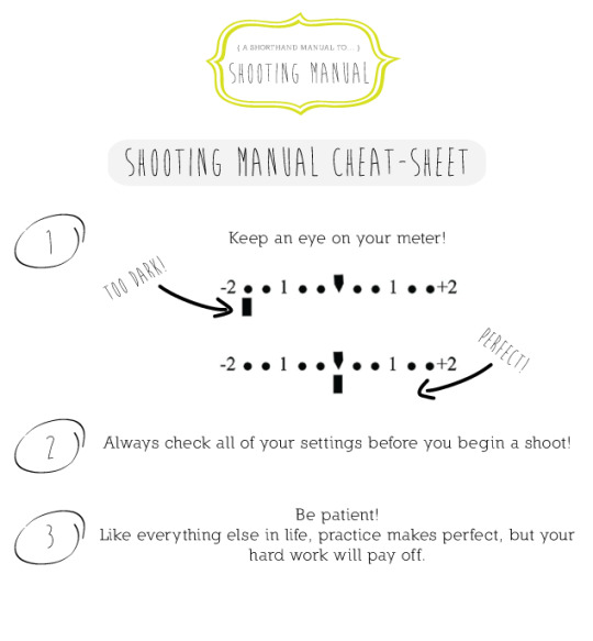
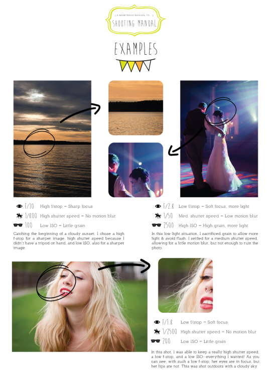
I’m always pushing everyone I know with a DSLR to learn how to shoot manual. In turn, I’ve had several friends in the past year ask me to teach them how. This usually happens when they’re across the country from me, and it’s really hard to explain over the phone. I’ve tried finding free online tutorials, but haven’t found any really good comprehensive ones. Truth is, I never shot manual or even attempted it until I went to art school and took a photography class. I looked at f-stop charts and played with shutter speed and just couldn’t get it. Hopefully, this is an easier guide than what I was able to find back in ‘08. If not, give me suggestions! I’ll gladly try again.
3K notes
·
View notes
Text
100 Photography Tips - Eric Kim
I read this multiple times a week.
1. Just because someone has an expensive camera doesn’t mean that they’re a good photographer.
2. Always shoot in RAW. Always.
3. Prime lenses help you learn to be a better photographer.
4. Photo editing is an art in itself
5. The rule of thirds works 99% of the time.
6. Macro photography isn’t for everybody.
7. UV filters work just as well as lens caps.
8. Go outside and shoot photos rather than spending hours a day on photography forums.
9. Capture the beauty in the mundane and you have a winning photograph.
10. Film isn’t better than digital.
11. Digital isn’t better than film.
12. There is no “magic” camera or lens.
13. Better lenses don’t give you better photos.
14. Spend less time looking at other people’s work and more time shooting your own.
15. Don’t take your DSLR to parties.
16. Being a photographer is sexy.
17. Making your photos b/w doesn’t automatically make them “artsy”
18. People will always discredit your work if you tell them you “photoshop” your images. Rather, tell them that you process them in the “digital darkroom”.
19. You don’t need to take a photo of everything.
20. Have at least 2 backups of all your images. Like they say in war, two is one, one is none.
21. Ditch the neck strap and get a handstrap.
22. Get closer when taking your photos, they often turn out better.
23. Be a part of a scene while taking a photo; not a voyeur.
24. Taking a photo crouched often make your photos look more interesting.
25. Worry less about technical aspects and focus more on compositional aspects of photography.
26. Tape up any logos on your camera with black gaffers tape- it brings a lot less attention to you.
27. Always underexpose by 2/3rds of a stop when shooting in broad daylight.
28. The more photos you take, the better you get.
29. Don’t be afraid to take several photos of the same scene at different exposures, angles, or apertures.
30. Only show your best photos.
31. A point-and-shoot is still a camera.
32. Join an online photography forum.
33. Critique the works of others.
34. Think before you shoot.
35. A good photo shouldn’t require explanation (although background information often adds to an image). *
36. Alcohol and photography do not mix well.
37. Draw inspiration from other photographers but never worship them.
38. Grain is beautiful.
39. Ditch the photo backpack and get a messenger bag. It makes getting your lenses and camera a whole lot easier.
40. Simplicity is key.
41. The definition of photography is: “painting with light.” Use light in your favor.
42. Find your style of photography and stick with it.
43. Having a second monitor is the best thing ever for photo processing.
44. Silver EFEX pro is the best b/w converter.
45. Carry your camera with you everywhere. Everywhere.
46. Never let photography get in the way of enjoying life.
47. Don’t pamper your camera. Use and abuse it.
48. Take straight photos.
49. Shoot with confidence.
50. Photography and juxtaposition are best friends.
51. Print out your photos big. They will make you happy.
52. Give your photos to friends.
53. Give them to strangers.
54. Don’t forget to frame them.
55. Costco prints are cheap and look great.
56. Go out and take photos with (a) friend(s).
57. Join a photo club or start one for yourself.
58. Photos make great presents.
59. Taking photos of strangers is thrilling.
60. Candid>Posed.
61. Natural light is the best light.
62. 35mm (on full frame) is the best “walk-around” focal length.
63. Don’t be afraid to bump up your ISO when necessary.
64. You don’t need to always bring a tripod with you everywhere you go (hell, I don’t even own one).
65. It is always better to underexpose than overexpose.
66. Shooting photos of homeless people in an attempt to be “artsy” is exploitation.
67. You will find the best photo opportunities in the least likely situations.
68. Photos are always more interesting with the human element included.
69. You can’t “photoshop” bad images into good ones.
70. Nowadays everybody is a photographer.
71. You don’t need to fly to Paris to get good photos; the best photo opportunities are in your backyard.
72. People with DSLRS who shoot portraits with their grip pointed downwards look like morons.
73. Cameras as tools, not toys.
74. In terms of composition, photography and painting aren’t much different.
75. Photography isn’t a hobby- it’s a lifestyle.
76. Make photos, not excuses.
77. Be original in your photography. Don’t try to copy the style of others.
78. The best photographs tell stories that begs the viewer for more.
79. Any cameras but black ones draw too much attention.
80. The more gear you carry around with you the less you will enjoy photography.
81. Good self-portraits are harder to take than they seem.
82. Laughter always draws out peoples’ true character in a photograph.
83. Don’t look suspicious when taking photos- blend in with the environment.
84. Landscape photography can become dull after a while.
85. Have fun while taking photos.
86. Never delete any of your photos.
87. Be respectful when taking photos of people or places.
88. When taking candid photos of people in the street, it is easier to use a wide-angle than a telephoto lens.
89. Travel and photography are the perfect pair.
90. Learn how to read a histogram.
91. A noisy photo is better than a blurry one.
92. Don’t be afraid to take photos in the rain.
93. Learn how to enjoy the moment, rather than relentlessly trying to capture the perfect picture of it.
94. Never take photos on an empty stomach.
95. You will discover a lot about yourself through your photography.
96. Never hoard your photographic insight- share it with the world.
97. Never stop taking photos
98. Photography is more than simply taking photos, it is a philosophy of life
99. Capture the decisive moment
100. Write your own list.
3K notes
·
View notes
Photo


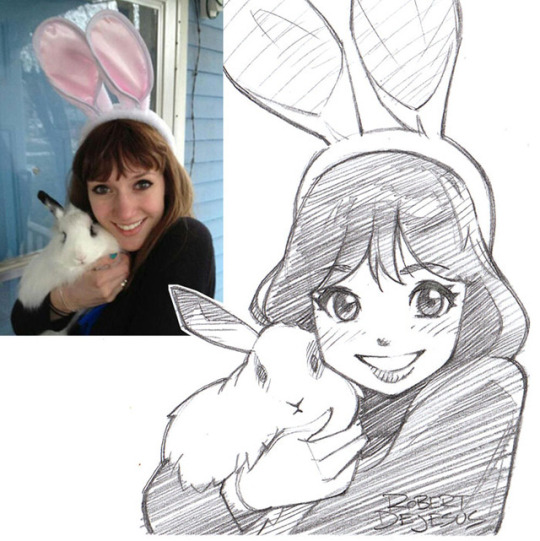
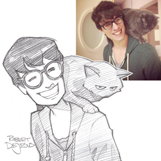
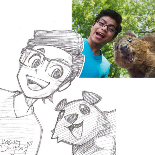


Art by IG: @rob_dejesus_art
Instagram: @artwoonz
13K notes
·
View notes
Photo
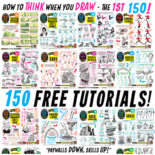
For those of you that like everything neatly organised, here’s links to EVERY ONE of my first 150 how to THINK when you draw TUTORIALS, in ALPHABETICAL ORDER for #SkillUpSunday! Enjoy, link, pin, share! Cheers!
Lorenzo!
How to draw ANGRY EXPRESSIONS
How to draw BIRD HEADS
How to draw BOOKS
How to draw BOXES
How to draw BREAKING GLASS
How to draw BRICKWORK
How to draw CABLES and WIRES
How to draw CAR CHASES
How to draw CATERPILLAR TRACKS
How to draw CAVES
How to draw CHARACTERS (3-SHAPES)
How to draw CHARACTERS (FLIPPED-SHAPES)
How to draw CHARACTER SHAPES
How to draw COMIC COVERS
How to draw COMPOSITION
How to draw CROSS-CONTOURS
How to draw EARS
How to draw FABRIC
How to draw FEET & SHOES
How to draw FEMALE HANDS PART ONE
How to draw FEMALE HANDS PART TWO
How to draw FOREGROUND MIDGROUND BACKGROUND
How to draw GAME BUILDINGS
How to draw GEMS and CRYSTALS
How to draw GIRL’S HAIR
How to draw GRASS
How to draw HAIR (1940s styles)
How to draw HAPPY EXPRESSIONS
How to draw HORNS
How to draw HORSE HEADS
How to draw IMPACT DEBRIS
How to draw IN 3D
How to draw INTEGRATING LOGOS
How to draw INTERIOR BASICS
How to draw IN-WORLD TYPOGRAPHY
How to draw JUNGLE PLANT CLUSTERS
How to draw JUNK HOUSES
How to draw LAMP POSTS
How to draw LAVA
How to draw LIGHTNING and ELECTRICITY
How to draw MECHANICAL DETAILS
How to draw MUSHROOMS and FUNGUS
How to draw MONSTER HEADS
How to draw MONSTER TENTACLES
How to draw MOUNTAINS
How to draw NEGATIVE SPACE
How to draw NEWSPAPERS
How to draw NOSES
How to draw PERSPECTIVE BOXES
How to draw PIGS
How to draw POD HOUSES
How to draw POURING LIQUID
How to draw ROBOT ARMS
How to draw ROCK FORMATIONS
How to draw RUNNING FIGURES
How to draw SAUSAGE DOGS
How to draw SEA WEED
How to draw SHADOW COMPOSITION
How to draw SHOULDER ARMOUR
How to draw SIEGE WEAPONS
How to draw SILHOUETTE THUMBNAILS
How to draw SMOKE EFFECTS
How to draw SNOW
How to draw SPACE BIKES
How to draw SQUIRRELS
How to draw STICK FIGURES
How to draw THE HORIZON
How to draw TIKI STATUES
How to draw TREASURE CHESTS
How to draw TREE BARK
How to draw TREE ROOTS
How to draw VEHICLES
How to draw VINTAGE PLANES
How to draw WATER
How to draw WOODEN HOUSES
92K notes
·
View notes
Photo


DrawingDen’s Beginners Masterlist
All the basics you need to begin learning to draw and think visually like an artist from a starter level!
Note: Feel free to leave suggestions as there may still be topics left uncovered, since art is such a wide subject the list could go on for miles so I’ve chosen what I see as the most basic fundamentals
Intro/Extras
Glossary of basic art terms
Admins online course recommendation
Light/Value
The Basics of light
Lighting terminology guide
Understanding value in colour
Materials and light tutorial
Visual structure diagram
Building values
Shading exercises and tutorial
Form/Perspective
The basics of structure
Drawing measuring techniques
How to see the world as an artist
The basics of perspective
Introduction to vanishing points
Negatives shapes exercise
Soft vs hard strokes
Colour
Guide to basics in colour
Shading in colour tutorial
Contrast in colour
Guide to picking colours
Why shadows aren’t gray
Anatomy
Basic proportions
Understanding anatomy series
Common beginner face mistakes
Eyes | Mouth | Nose | Hands
General body tutorial
Recommended Books
Fun with a Pencil
Colour and Light: A Guide for the Realist Painter
Classic Human Anatomy: The Artist’s Guide
16K notes
·
View notes
Photo
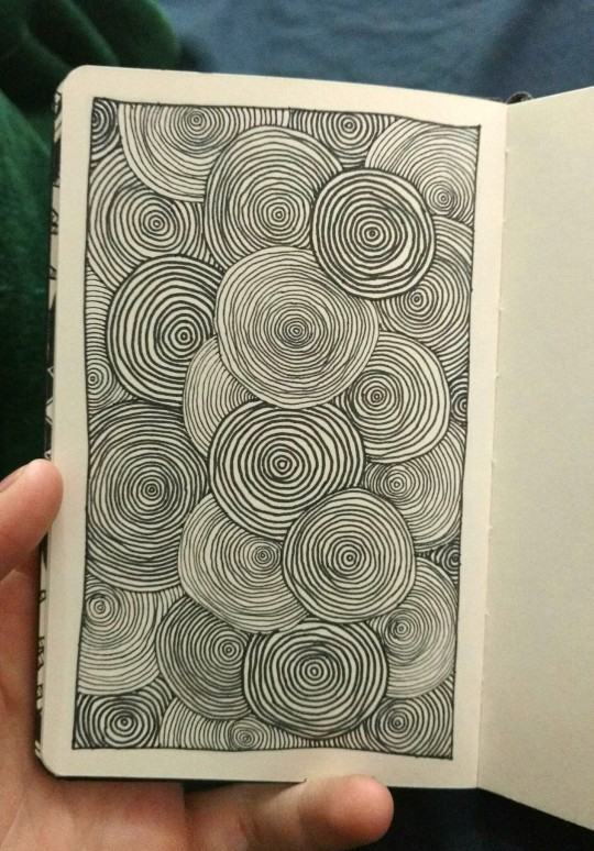
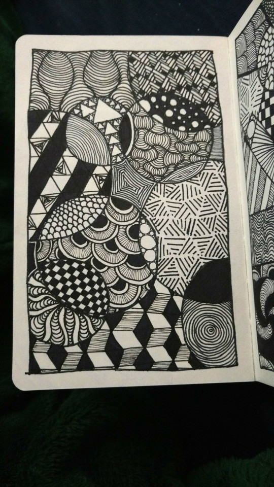
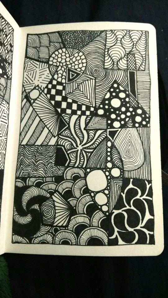
a couple pieces I finished in the past week
77 notes
·
View notes
Photo
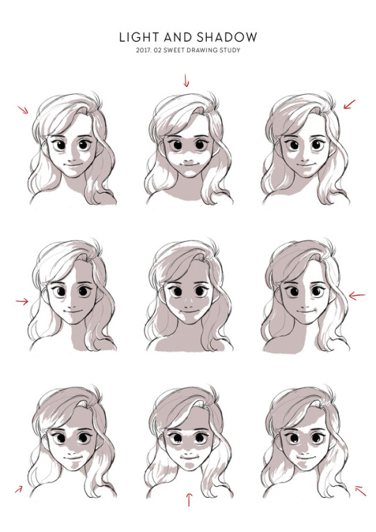
20170226
Drawing Study of February - Light and Shadow
118K notes
·
View notes
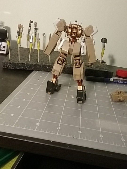
Photo
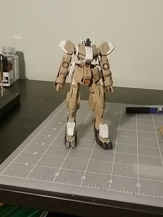
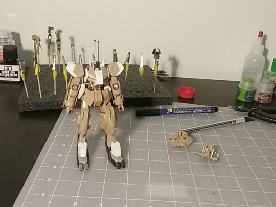
*whisle* that is one good looking Rebake. Some day.


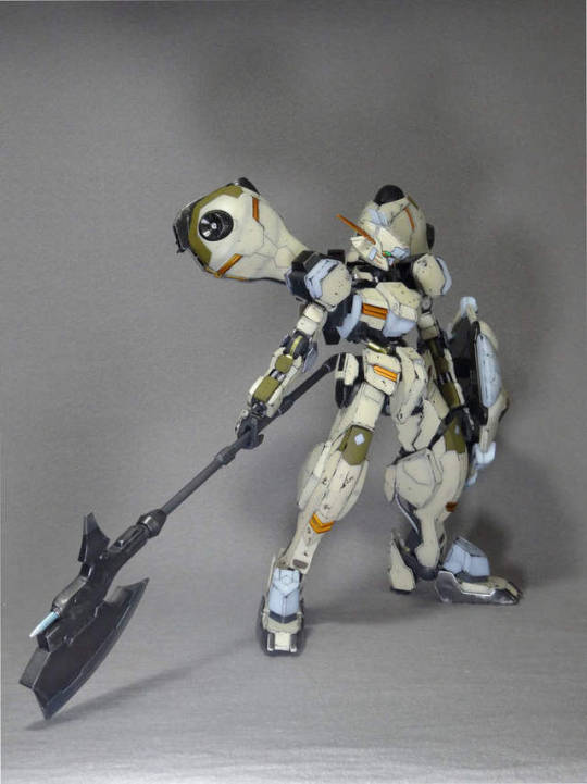

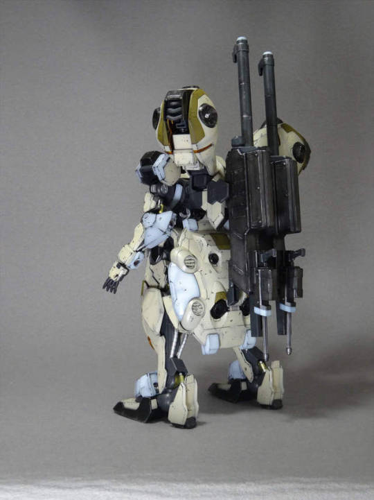
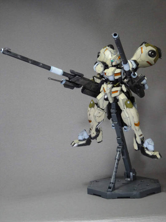
Custom Build: 1/100 Gundam Gusion Rebake [Detailed]
MODELER: kazuki
150 notes
·
View notes