Text
Final Post :(
Overall, this semester has been a rollercoaster of knowledge, new skills and all in all, great learning. I feel as though I have already gained so much from this course despite the challenges we have faced and I’m so pleased with where communication design studies has taken me.
The results of COVID-19 was seen to be a major strain on everyone’s motivation, as we were forced to transition to remote learning. Though this was very challenging, I believe it did not in any way limit what we received from the course. I am so lucky to have had Bailey as my tutor, she carries such a broad and detailed range of knowledge and is such a great teacher. She made this semester so easy to follow along or give help when needed.
Over the course I have begun to form a more personal style through my designs and better my execution of achieving the needs of the brief. I have also widened my imagination and have learnt to become more in-touch and aware of my surroundings, noticing things I would’ve normally missed. Through implementing small actions or new notions of thinking, I have evolved so much as a person and my overall way of thinking has matured (yet its more immature through its now imaginative and curious nature).
I am guttered that I didn’t get more hands on time in this course, and even more guttered that it’s over! however, I will forever cherish and continue to evolve the things I have taken from and learnt from this course for the rest of my life.
14 notes
·
View notes
Photo

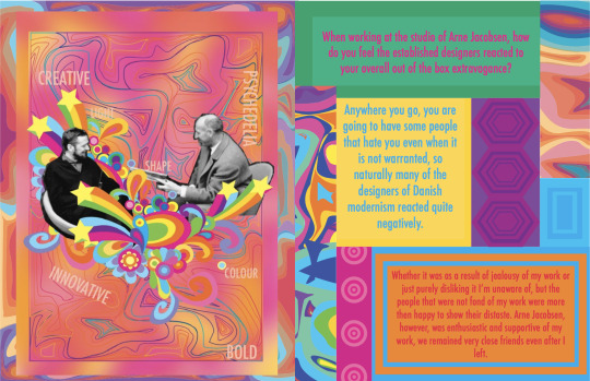
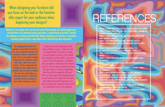
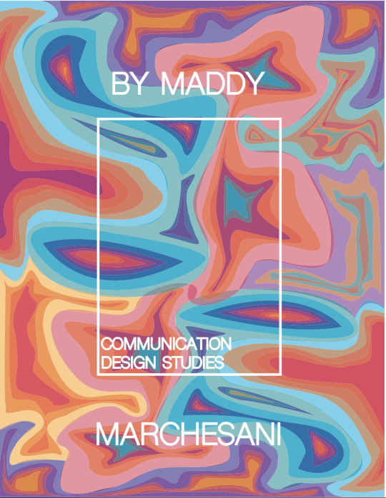
Week 12 - progress - final
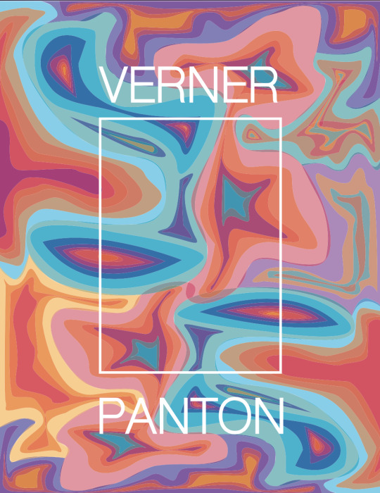
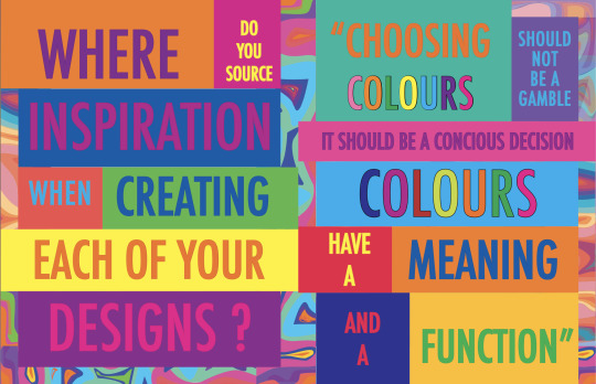
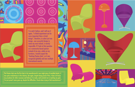
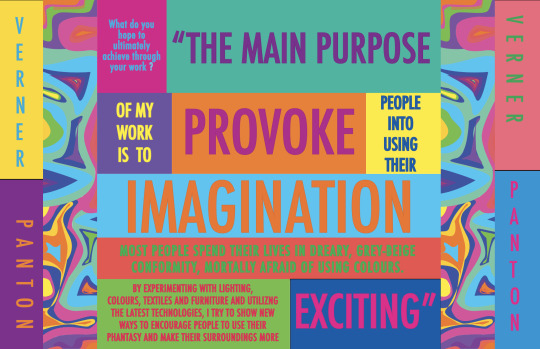
My final Zine, was heavily influenced by the vibrant colours Panton is known to implement throughout his designs. It also carries fluid and geometric shapes, further linking to his designs as well as the psychedelic era it was derived from. Verner Panton was, and forever will be an influential designer, he broke the boundaries of what was considered the normalities of design and reshaped them.
My zine was initially did not carry a common theme over all the pages. I altered this as when receiving peer feedback, I was told it did not look like linked designs and instead seperate, which created a confusing layout. Through changing my design, it has created a unified and structured appearance, while ensuring it is clear to the audience.
1 note
·
View note
Photo


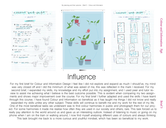
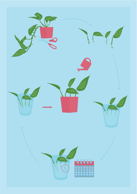
My final for colour and information design studies asked us to create an infographic without using any words and numbers. The instructions that I was given to convey was ‘how to grow a devil’s ivy from a cutting (in water)’ I made this design effective through the use of arrows and clear imagery.
This poster is created from a total of three colours, with tints and shades from these three colours to create dimension in my images. This challenging aspect of the project forced me to really consider how to effectively portray the infographic using a very limited colour palette. By doing so I believe it created a more professional and finished appearance.
We were also asked to create a gif using one aspect of our poster. For my gif I chose to use the very first instruction pictured, of where to snip your cutting.I found this task very tedious, however, very enjoyable as watching the gif at the end was very satisfying and rewarding .
0 notes
Photo
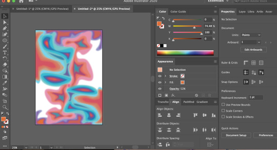
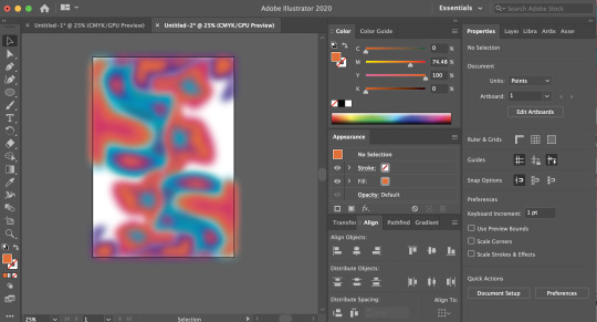


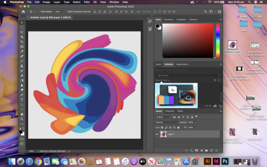

For my zine, I’ve been exploring blended, flowing and vibrant shapes to create a psychedelic appearance. I have also been experimenting with the blur tool to create a more fused and ‘trippy’ effect.
Vibrancy is a key factor when creating psychedelic inspired design as it is what made the era so enticing and memorable to all.
1 note
·
View note
Text
Week 11
What’s next for design?
The eye writer program is something that really caught my attention during this weeks lecture. This device helps those who are unable to physically write or draw, do so through the movement of their eyes. This program caught my attention as it opens an entire new scope to the design industry and allows even more people to get involved. This program not only broadens the scope of what needs and can be designed, but also who can design it, as it enables those who are physically disabled to still use their minds to design.


0 notes
Text
Week 10
Conceptualism - the idea that made ordinary objects, become artwork. This theme breaks down the traditional ideologies of what is considered art and broadens the scope to virtually anything. This could be the main cause of slurs in society that ‘anything could be art’ ‘this bin could literally be found in an art museum’ etc. because in actual fact, under conceptualism it probably could. Conceptualism is not about the item itself but instead its meaning, its surroundings and much more. This gives ordinary objects a story, causing them to be unordinary.... and therefore, art. Marcel Duchamp is a great example, as he took a male urinal and claimed it to be art.
0 notes
Photo
I find myself very drawn to organic architectural design, possibly due to how unique it is. I personally think it gives a very beautiful and soft finish, while still being extremely effective.


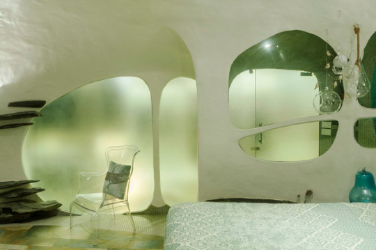

THE WHITE ROOM / The Garden Room Pali Hill, Mumbai, India - 2019; images © The White Room.
59K notes
·
View notes
Photo
I feel so satisfied viewing his works. Truly amazing!
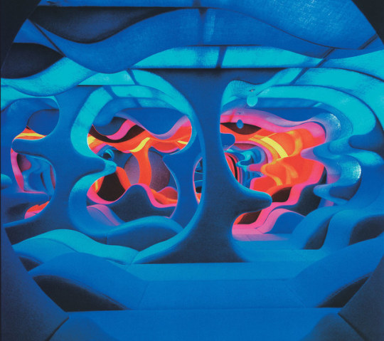
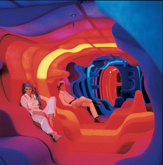
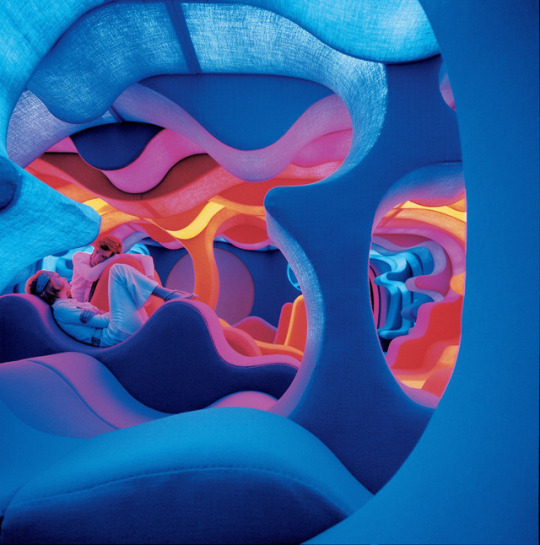
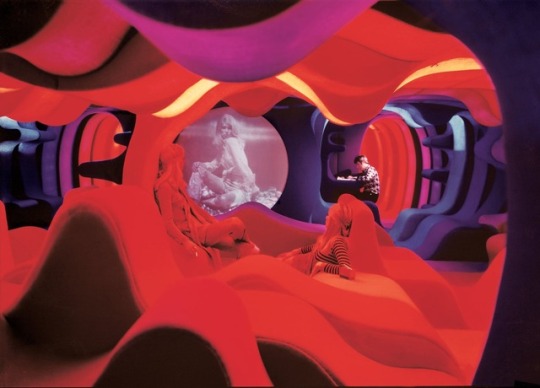
Verner Panton, Phantasy Landscape, 1970
3K notes
·
View notes
Photo
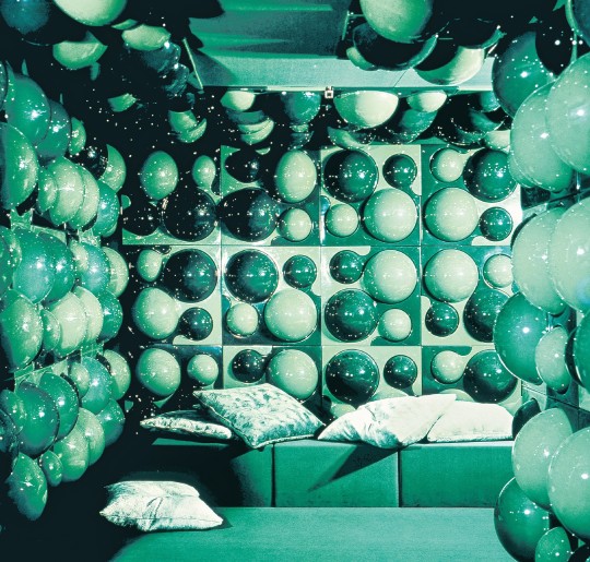
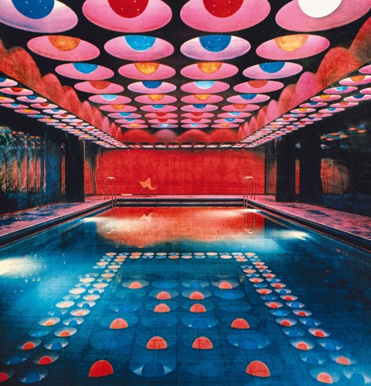


Assessment 3: The influential designer I have selected for my assignment is Verner Panton. Panton is a furniture and interior designer, he is known for his bright, outrageous designs that carry a clear theme of psychedelia. I find myself very drawn to his works, as I find the form and colours visually pleasing. I would happily live my life in a house with interior completely designed by him! what a dream!
4 notes
·
View notes
Text
Activity - LEC 07/08
ARCHITEXTURE
This activity challenged us to find letterforms in our surrounding environment while in lockdown due to COVID-19. The following photos are letterforms I have found within existing objects around my house. This activity challenged me to look closer at my surroundings and have a more imaginative mindset. This task reminded me of ‘cloud watching’ sort of mentality, innocent, youthful and fun.


0 notes
Text
Week 7
The Week 7 lecture explored the bauhaus school of design. The school passed on a clear and specific ‘bauhaus design style’ which carried a clear minimalist and simplistic approach. The principles of the “bauhaus design style” are still heavily considered and influential to this day.
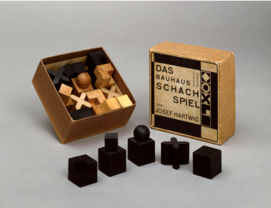

I found it interesting that this ‘design style’ was not based solely around visual aesthetic, but also efficiency. They held a heavy belief in using resources in a smart manner. I think this way of thinking is great to consider when designing, because it could lead you to places that are considered simple, but hard to get there, due to people often overcomplicating design.
0 notes
Text
Week 6
The Week six lecture was a continuation of the evolution of type. Something I took away from the lecture was the rejection letter. It was stated in the lecture that you could “feel the anger being punched through each letter” I found this comment very enlightening, as it opened my eyes to see the humour of the letter due to the passive aggressive nature of it.
I began thinking of how people are able to display their feelings over social media. It is very expansive through imagery, people are able to share gifs, images, videos and of course emojis, to share with others how they are feeling. It is also expansive through type, through the words chosen (if you are being blunt and short or asking questions and taking interest), grammar (if you are use ‘periods’ often), typing in all capitals (that implies you are yelling) and much more.
0 notes
Photo
I find the typeface enticing, due to the fact it is not easily understood at first glance due to it’s abstract, jagged appearance. This forces the audience to take a better look at an attempt to work out what is written in front of them.
- interesting concept, strength or weakness? -is lack of legibility seen to draw the audience in, or push them away?
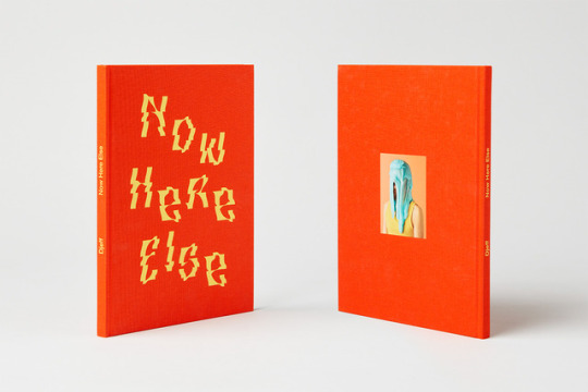
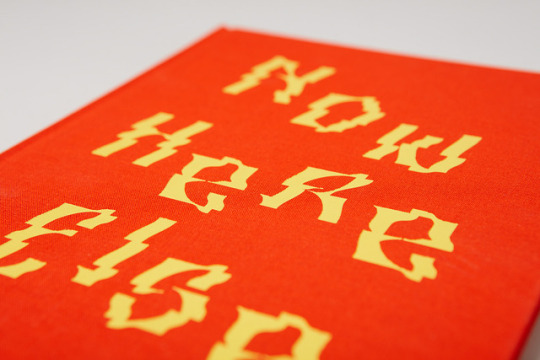

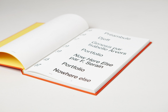

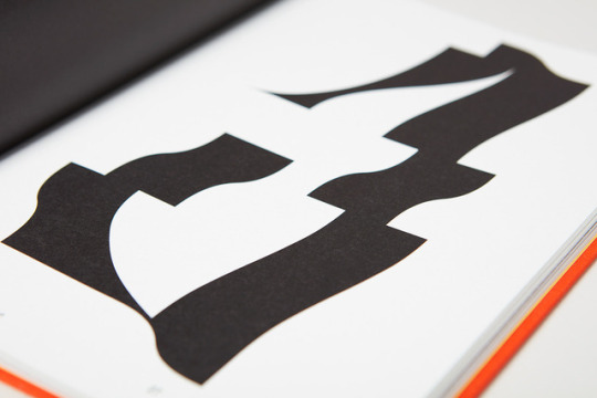
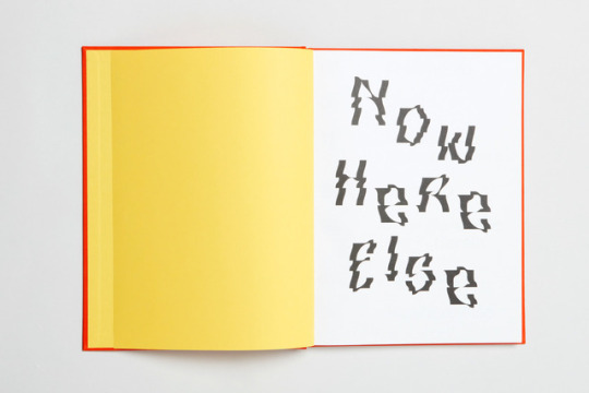

Exhibition book of the artist Djeff by Akatre
Akatre is a creative studio founded in 2007, in Paris, by Valentin Abad, Julien Dhivert and Sébastien Riveron. The trio works and expresses themselves in graphic design, photography, typography, video, artistic installation and musical creation for institutions in art, cultural, fashion, media and luxury.
T D B: instagram • twitter • facebook • newsletter • pinterest
393 notes
·
View notes
Photo
I truly admire the simplistic yet sophisticated nature of this packaging. The use of geometric shapes gives a very subtle 60′s nature to the surface design, while the pairing of the warm and cool hues creates a very polished and refined finish.
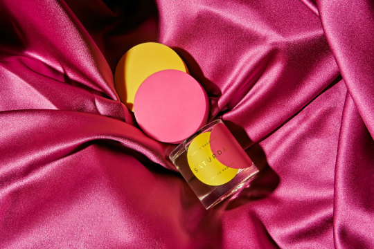
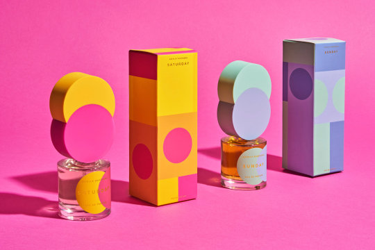

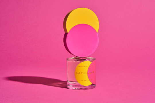
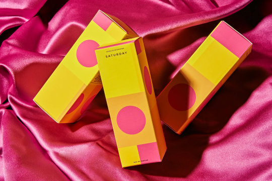


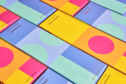
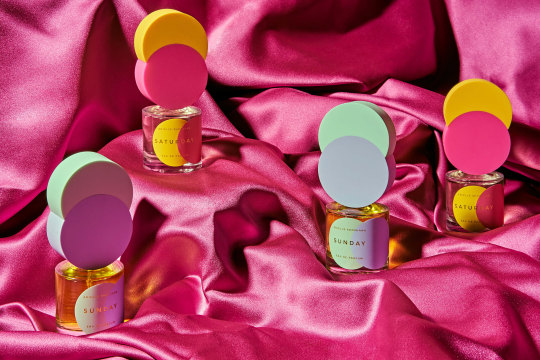
Packaging for Arielle Shoshana by Wade and Leta
After working in the scented luxury sector for years, DC-based fragrance boutique Arielle Shoshana wanted to create their own scents to capture the days of the week.
Together, we created the packaging design and developed custom-made injection molded caps to allude to the irresistible vibrancy of each scent’s notes of daily escapism. Utilizing the simple shape of the bubbly circle, we coupled the designs of the label and box to create a rich color story that looks great on its own and even better when stacked together on a shelf that can be expanded upon with future releases.
Keep reading
271 notes
·
View notes
Text
Week 5 - Colour and Information
We were given our next assignment ‘develop and adapt’ which requires us to create an infographic on a specific topic we are given without using any numbers or words. Before receiving our topics, we explored some existing wordless diagrams, which we analysed in breakout groups, to establish what makes an infographic most effective.
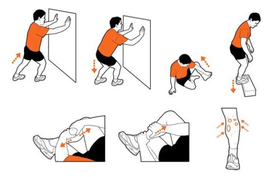
This diagram is clear through the use of arrows giving clear direction on movement required by the audience and body position through the pictured character. The diagram however, appears confusing with direction and differentiation between each stretch. I also do not understand what the last image is related to, as it is unclear on if its is associated with all the stretches or just the last one.
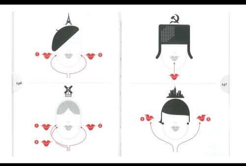
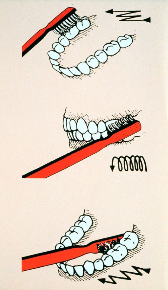
In the above diagrams, arrows are seen to be very useful when giving clear direction to the audience through imagery, however, the image must be clear and arrows minimal to avoid them doing all the work for the entire diagram.
The topic I have received for my assignment is ‘how to grow a devil’s ivy from a cutting (in water)’ I am extremely happy with my topic as I believe I will be able to create a very clear and succinct diagram for my final.
0 notes
Text

Hello, my question is....
This project required us to select an open-ended question about design, and display it through a letterform which we create through materials and objects we have in our households.
To begin my first assessment of communication design studies, I did a brainstorm. This helped me formulate a range of open-ended questions that I could use for my assignment. I then reflected on the questions I had established with some of my peers, and was able to receive some feedback on my options. This helped me narrow down my decision and assisted me in choosing a well thought out, to the point question.
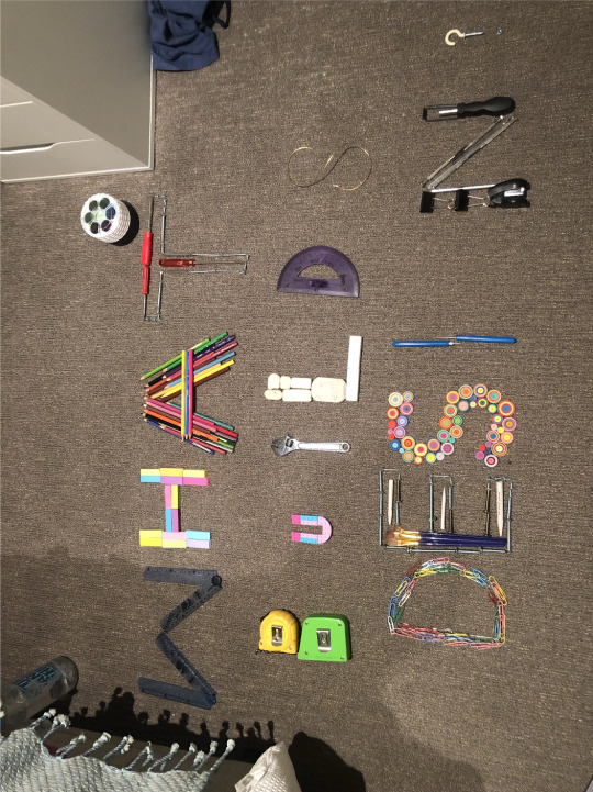
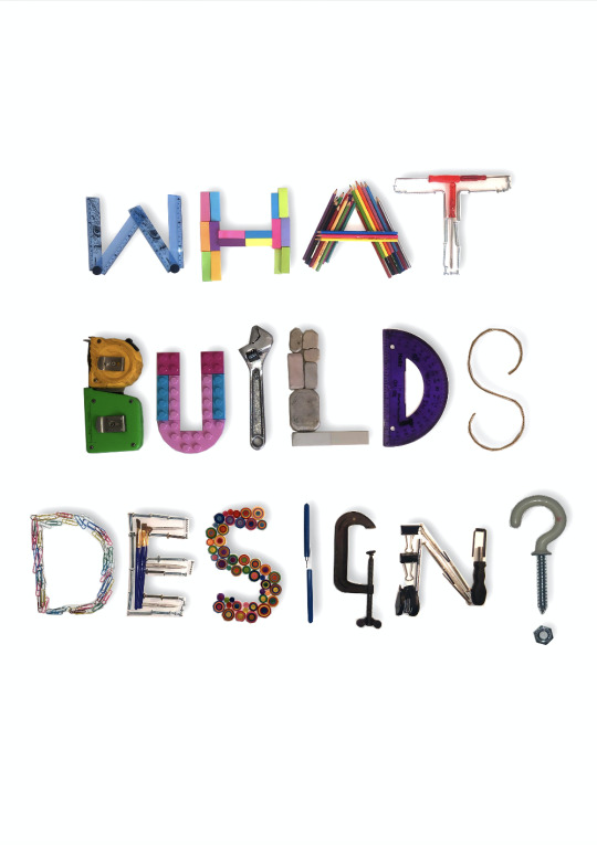
Overall throughout the project, my final underwent many changes due to difficulty with creating letterforms how I pictured them to be or the photos I took not being effective and failing to capture the intensity I desired. The question I decided to do was “What builds design?” to create this I used a range of items that would be used in various means of design. I used things such as tools, paper, stationary etc. at an attempt to capture and display the breadth of design and showcase how evident it is amongst our daily life.
0 notes